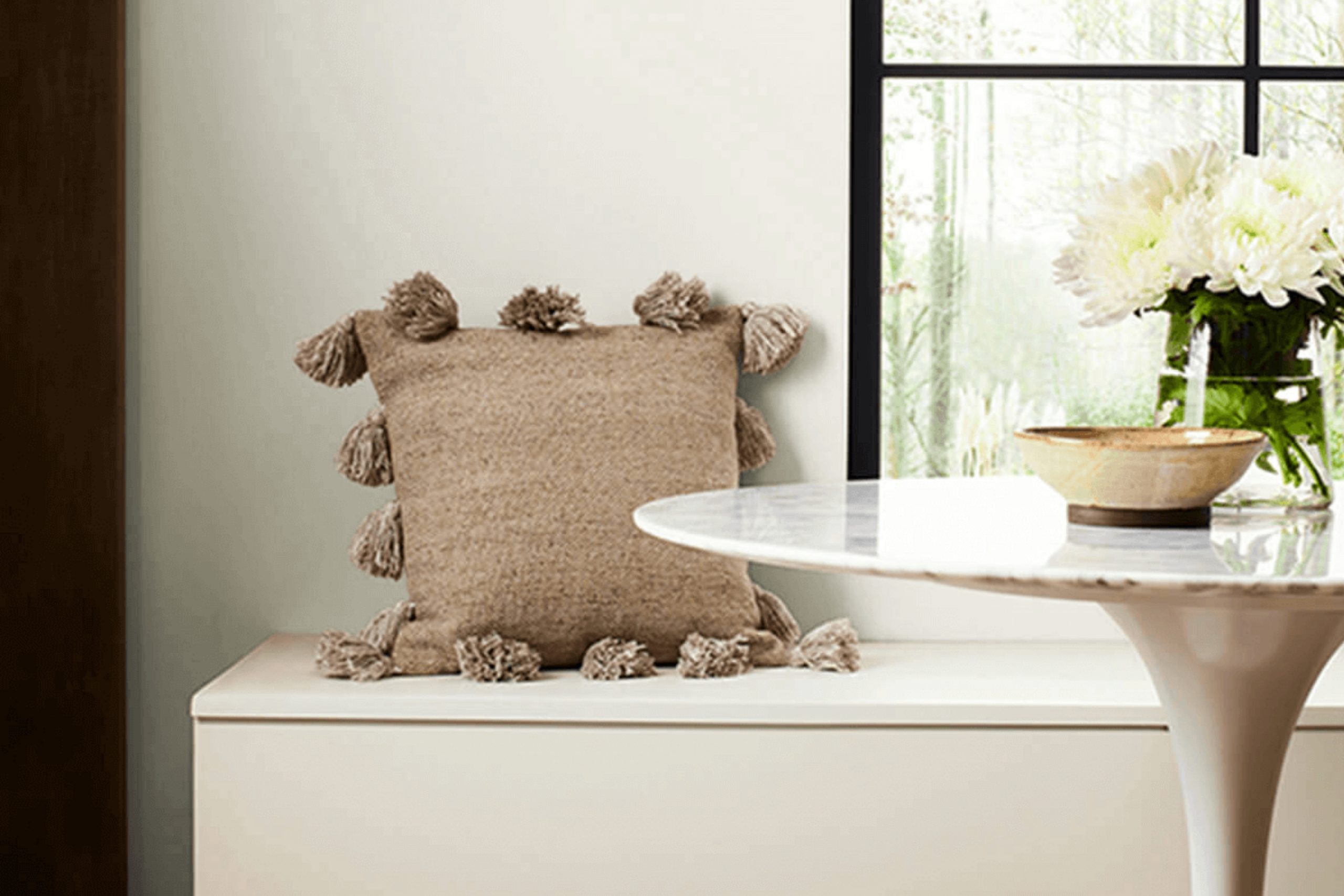
When I think about the perfect shade of white for a modern space, Sherwin Williams’ SW 6168 Moderne White instantly comes to mind. This color bridges the gap between a classic neutral and a contemporary hue, making it versatile for any room. It offers a soft, warm undertone that feels inviting, yet remains refreshingly clean and sophisticated.
Whenever I use Moderne White, I notice how it enhances the natural light in a room, creating a welcoming ambiance without overpowering. It’s the kind of white that acts as a flexible backdrop, allowing furniture, artwork, and textiles to take center stage. I’ve always been impressed by its ability to complement both bold colors and subtle tones, making it a favorite choice for those looking to create a balanced environment.
In my experience, this particular shade doesn’t just fill a space with color, but with a sense of calmness and elegance.
Whether it’s paired with sleek, modern decor or more traditional elements, SW 6168 brings everything together harmoniously. Its understated charm and universal appeal make it a go-to for anyone looking to achieve a timeless look in their home.
What Color Is Moderne White SW 6168 by Sherwin Williams?
Moderne White (SW 6168) by Sherwin Williams is a versatile and subtle off-white with a hint of warmth. This color has a creamy undertone that helps create a cozy yet fresh atmosphere. It’s an excellent choice for those who want a neutral backdrop without the starkness of pure white.
Moderne White works wonderfully in various interior styles, including contemporary, minimalistic, and transitional spaces. It can serve as the perfect canvas for rooms with sleek furniture and clean lines, and it fits equally well with more traditional or cottage-style decor.
This shade pairs beautifully with natural materials like light woods, rattan, and leather, enhancing the warmth it subtly brings to a room. It also works well with other textures, such as soft linens and textured fabrics, allowing for a comfortable and inviting environment.
When combined with metallic accents like brushed nickel or aged brass, Moderne White’s soft undertone stands out even more, adding character and depth to the space. You can use it on walls, ceilings, or trim to bring unity and a light, open feel to any room. Its adaptability makes it a favorite for living rooms, bedrooms, and kitchens, providing a gentle and welcoming ambiance.
Is Moderne White SW 6168 by Sherwin Williams Warm or Cool color?
Moderne White (SW 6168) by Sherwin Williams is a versatile, soft white paint that can brighten up any home. It has a warm undertone, which makes it feel cozy and welcoming. This color is excellent for creating a neutral backdrop that highlights other colors in the room. Because of its subtle warmth, it avoids feeling stark or cold, which can sometimes happen with other white paints.
When used in living rooms or bedrooms, Moderne White provides a clean yet inviting atmosphere. It pairs well with various styles of decor, from modern to traditional, and works nicely with wood tones and metals alike. In kitchens or bathrooms, this color can help spaces feel larger and more open.
Light reflects gently off its surface, making rooms appear airy and spacious without feeling stark. Overall, Moderne White is a great choice for those looking to create a harmonious and pleasant environment in their home.
Undertones of Moderne White SW 6168 by Sherwin Williams
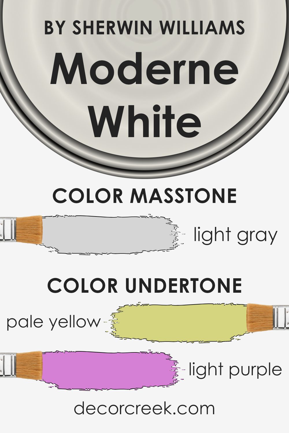
Moderne White by Sherwin Williams has a complex blend of undertones that give it a unique character. Undertones are subtle colors that can affect how we perceive the main color. In the case of Moderne White, the presence of pale yellow, light purple, light blue, pale pink, mint, lilac, and grey tones make it change with different lighting and surroundings.
These undertones can give the paint a warm or cool appearance. For example, when the light is more yellow, the pale yellow undertone might stand out, making the room feel warmer and more inviting. Conversely, in cooler light, such as that from north-facing windows, the light blue and grey undertones might become more apparent, giving the space a cooler feel.
When applied to interior walls, the shifting undertones of Moderne White can make rooms feel bright and airy. The pale pink and lilac hints can add a soft, gentle touch, while the light purple and mint undertones can add a sense of depth and interest.
Grey undertones can contribute to a balanced, neutral background, allowing other colors in the decor to pop. Overall, these undertones make Moderne White a versatile choice that works well in various environments, adapting nicely to different lighting conditions.
What is the Masstone of the Moderne White SW 6168 by Sherwin Williams?
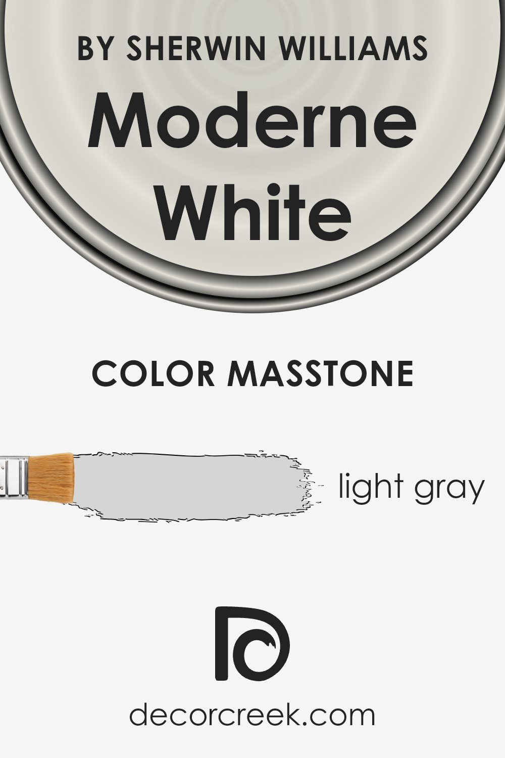
Moderne White (SW 6168) by Sherwin Williams is a light gray color with a masstone that gives it a soft, neutral appearance. The color’s light gray hue makes it versatile for home interiors.
It creates a sense of space and airiness, which can make rooms feel larger and more open. Its neutrality allows it to blend well with a variety of other colors, making it an excellent choice for those who like to change décor often.
The light masstone reflects natural light in a way that brightens rooms without being overpowering, making it ideal for spaces such as living rooms, bedrooms, and kitchens. It pairs well with both warm and cool color schemes, complementing woods, metals, and textiles. This adaptability means it can be used as a main wall color or as a backdrop to highlight artwork and furnishings. Its subtle elegance makes it a favorite choice for creating a calm, inviting space.
How Does Lighting Affect Moderne White SW 6168 by Sherwin Williams?
Lighting plays a significant role in how we perceive colors. Different light sources can change the appearance of a color, making it look either warmer or cooler. When it comes to paint colors like Sherwin Williams’ Moderne White (SW 6168), the type and direction of lighting in a room can noticeably affect its appearance.
In natural light, which changes throughout the day, Moderne White can look different based on sunlight exposure. In a north-facing room, which usually has cooler, more consistent light, Moderne White might appear slightly grayer or cooler. This is because north-facing light has a bluish tint, which can bring out cooler tones in the paint.
In a south-facing room, where sunlight is warmer and more direct, Moderne White can look warmer and brighter. The full sunlight highlights the creamier aspects of the color, giving the room a cozier feel.
In east-facing rooms, which get direct sunlight in the morning, Moderne White will look bright and inviting early in the day but may appear more neutral or slightly cooler as the sun moves away.
The morning sun can add a soft, warm glow to the color.
In contrast, west-facing rooms receive more sunlight in the afternoon and evening, so in the late part of the day, Moderne White can appear warmer and more glowing. During the morning hours, these rooms might seem dimmer and the color more muted.
Artificial light also affects how Moderne White is perceived. Warm, incandescent bulbs can bring out the yellow undertones, making the color feel warmer and creamier. Cool, fluorescent lighting might make it appear cooler and more subdued.
Overall, the lighting context is essential in determining how Moderne White behaves, so it’s always a good idea to test paint samples under different lighting conditions in your space before making a decision.
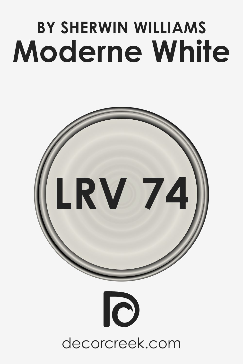
What is the LRV of Moderne White SW 6168 by Sherwin Williams?
LRV stands for Light Reflectance Value, and it is a measure of how much light a color reflects. When you look at the LRV scale, it ranges from 0 to 100, where 0 means the color absorbs all light (pure black) and 100 would mean it reflects all light (pure white). Most colors fall somewhere in between.
Understanding LRV is important because it helps you determine how light or dark a color will appear on your walls. If a color has a high LRV, it will reflect a lot of light, making the room seem brighter and more open. On the other hand, a low LRV color will make a space feel more intimate and cozier by absorbing more light.
For the color Moderne White by Sherwin Williams, which has an LRV of 74.473, it means that this color reflects a good amount of light. This makes it a great choice for rooms where you want to increase brightness and create a light, airy atmosphere. It can make a smaller room feel larger and more open by reflecting light around the space.
The relatively high LRV also means that this color can help to balance out natural light throughout the day, preventing the room from feeling too dark even in the absence of strong natural light.
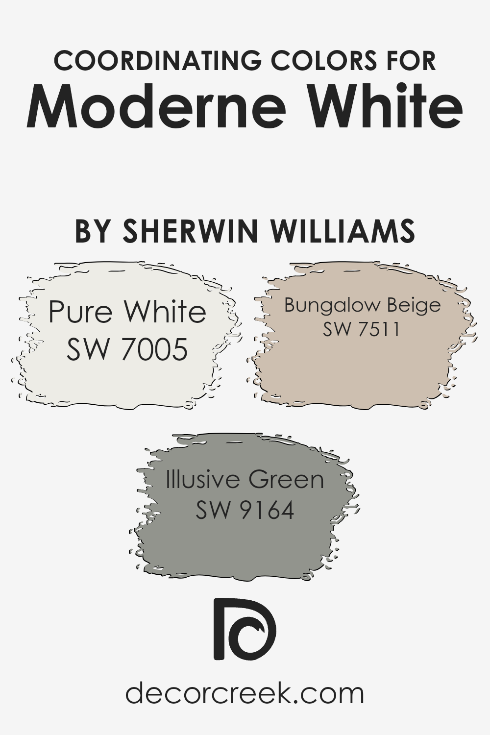
Coordinating Colors of Moderne White SW 6168 by Sherwin Williams
Coordinating colors are shades that complement or enhance the main color in a palette, creating a balanced and harmonious look in a space. These colors are chosen to work well together, providing either contrast or similarity that enhances the overall aesthetic.
For Moderne White, which is a soft and neutral hue by Sherwin Williams, Pure White, Illusive Green, and Bungalow Beige are excellent coordinating colors. Pure White, SW 7005, is a crisp and clean white that provides a fresh backdrop, helping Moderne White stand out while maintaining a cohesive look.
Illusive Green, SW 9164, brings a touch of subtle color into the mix with its gentle green tone, adding a hint of nature and calmness without being overwhelming. Bungalow Beige, SW 7511, is a warm and welcoming color, adding depth and coziness to any room.
Together, these hues create a soothing and inviting environment that is both modern and timeless. Using these colors alongside Moderne White can result in a space that feels coherent and comfortable, making it a perfect choice for anyone looking to design a room that is both stylish and harmonious.
You can see recommended paint colors below:
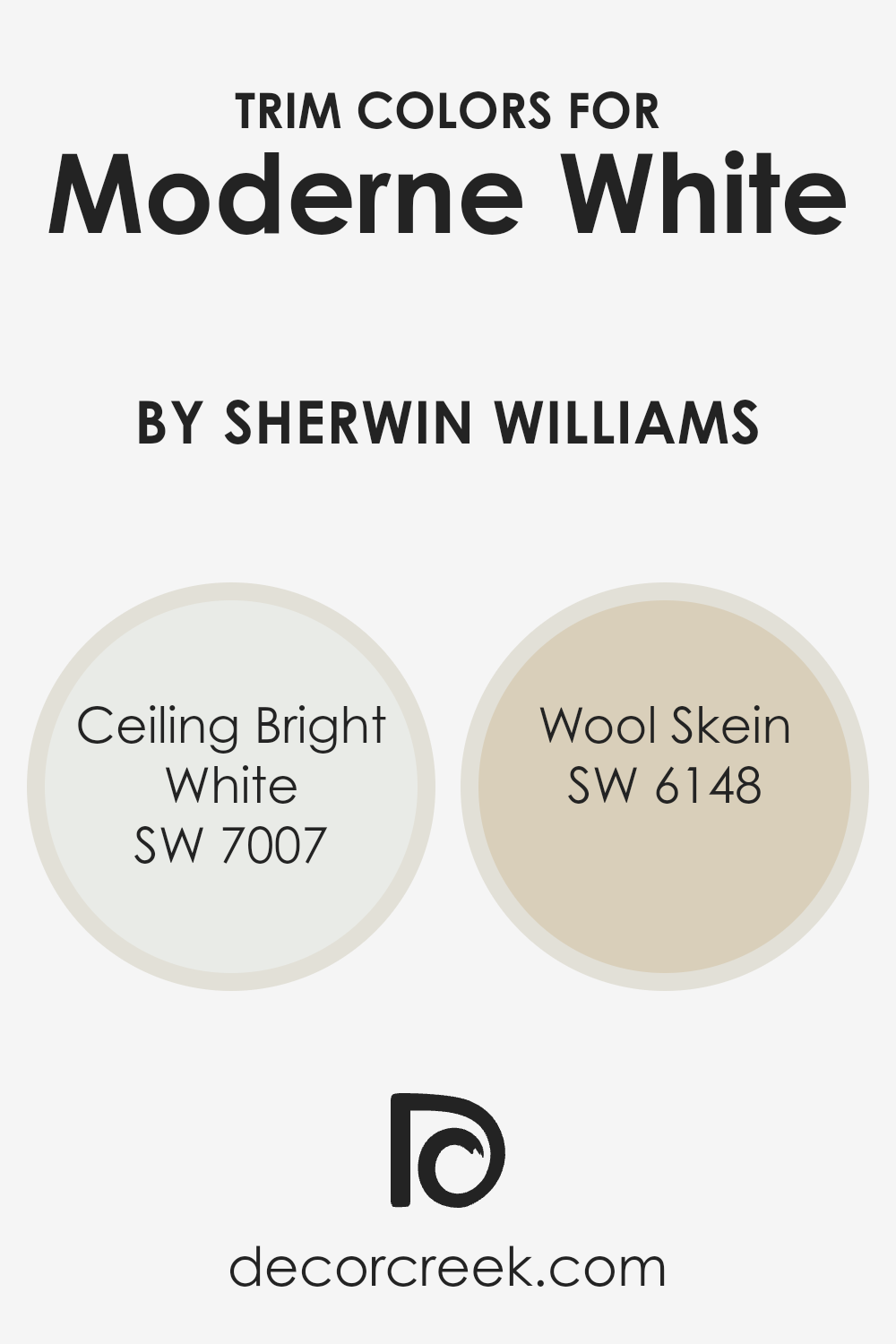
What are the Trim colors of Moderne White SW 6168 by Sherwin Williams?
Trim colors are the paints used for the borders of walls, ceilings, doors, and windows, serving as an essential element in any room’s design. They help define spaces, add detail, and provide contrast or harmony with the main wall color, which in this case is Moderne White by Sherwin Williams.
Trim colors highlight architectural features and contribute to the overall aesthetic appeal. Choosing the right trim color can change how the main color is perceived, enhancing its strengths and providing balance to the room. Pairing Moderne White with the right trim paints ensures the space feels inviting and well-designed.
Using Ceiling Bright White SW 7007 as a trim color brings a pristine and clear finish that enhances the crispness of Moderne White. This choice adds brightness to the room, creating definition and making walls appear more vibrant.
On the other hand, Wool Skein SW 6148 delivers a warm, subtle tone that complements Moderne White’s neutrality. It introduces a comforting feel, adding depth without vying for attention.
Both trim colors serve to highlight and underline the character of Moderne White, creating an overall harmonious and aesthetically pleasing environment.
You can see recommended paint colors below:
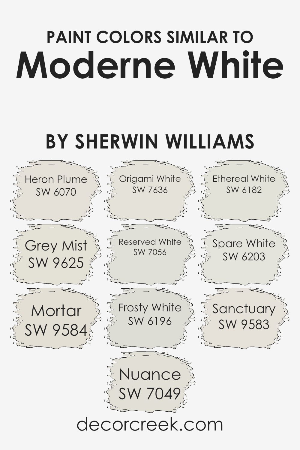
Colors Similar to Moderne White SW 6168 by Sherwin Williams
Choosing similar colors is essential because they create a balanced and cohesive look. These colors harmonize with one another and make spaces feel inviting and unified. For example, Heron Plume is a soft, neutral shade that exudes warmth, while Grey Mist carries a hint of coolness, perfect for adding a touch of calmness.
Mortar offers a stronger depth with its gray undertone, complementing the softer hues and providing contrast. Nuance adds a gentle, muted tone that fits beautifully with other shades and doesn’t overpower. Origami White, with its crisp and clean look, works wonderfully as a backdrop to highlight other colors.
Reserved White is versatile, able to mingle well with different tints or stand alone for a quiet sophistication. Frosty White brings a cooler feel, offering a more refreshing vibe to a space. Ethereal White maintains a light, airy quality that keeps rooms feeling open and spacious.
Spare White is a versatile option that works in almost any setting with its understated elegance. Sanctuary gives a sense of calm and peacefulness, making spaces feel more inviting. These colors, when used together, can help create a space that feels harmonious and thoughtfully designed, without any single color overpowering the others.
You can see recommended paint colors below:
- SW 6070 Heron Plume
- SW 9625 Grey Mist
- SW 9584 Mortar
- SW 7049 Nuance
- SW 7636 Origami White
- SW 7056 Reserved White
- SW 6196 Frosty White
- SW 6182 Ethereal White
- SW 6203 Spare White
- SW 9583 Sanctuary
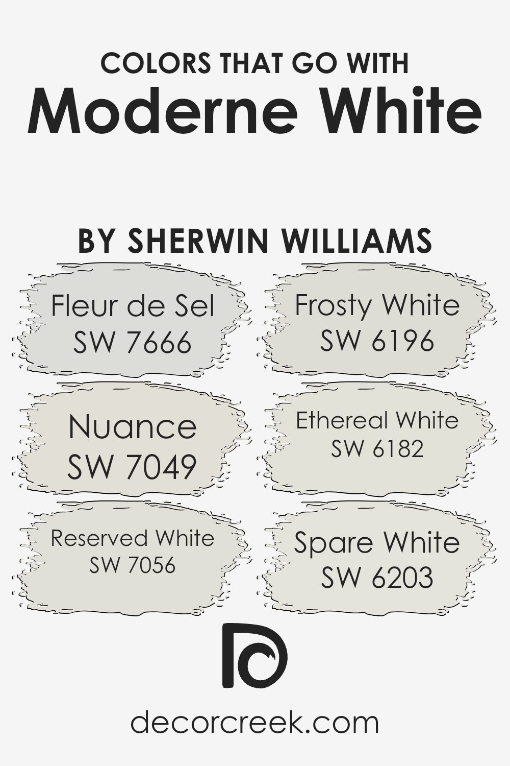
Colors that Go With Moderne White SW 6168 by Sherwin Williams
When choosing colors to go with Moderne White SW 6168 by Sherwin Williams, it’s essential to think about harmony and how each shade complements the main color. Moderne White is a warm, creamy white that works well as a neutral base.
Pairing it with the right colors adds depth and balance to a space. For instance, SW 7666 – Fleur de Sel is a soft, gentle gray with slight green undertones.
It offers a subtle contrast to Moderne White, adding a sophisticated edge without clashing. SW 7049 – Nuance, a light and airy gray, blends beautifully with Moderne White, creating a calm and inviting atmosphere.
Additionally, SW 7056 – Reserved White offers a restrained, muted white that gently contrasts with Moderne White, enhancing the space’s lightness.
SW 6196 – Frosty White is a cool white that brings a fresh, crisp feel, perfect for adding a hint of brightness. Then, there’s SW 6182 – Ethereal White, which has a whisper of warmth that pairs especially well with Moderne White’s creaminess, maintaining a cohesive look.
Finally, SW 6203 – Spare White brings in a subtle cool touch, which can help highlight the warmth of Moderne White. Together, these colors provide a harmonious palette that enhances any room’s elegance and inviting nature.
You can see recommended paint colors below:
- SW 7666 Fleur de Sel
- SW 7049 Nuance
- SW 7056 Reserved White
- SW 6196 Frosty White
- SW 6182 Ethereal White
- SW 6203 Spare White
How to Use Moderne White SW 6168 by Sherwin Williams In Your Home?
Moderne White SW 6168 by Sherwin Williams is a versatile paint color. It offers a soft, neutral white tone that can work well in various areas of the home. This color provides a clean, fresh backdrop, making it perfect for living rooms, bedrooms, or kitchens. Due to its subtle shade, Moderne White complements both modern and traditional décor styles.
You can pair it with bold accent colors or wood finishes to create a balanced and inviting space. It’s especially suitable for open-concept spaces, as it helps maintain brightness and a sense of openness.
If you want a consistent look, you can also use it on trim and ceilings. With good lighting, this hue can make your rooms feel larger and more airy. Whether for a full room or an accent wall, Moderne White can be a great choice for bringing simplicity and an understated charm to your home.
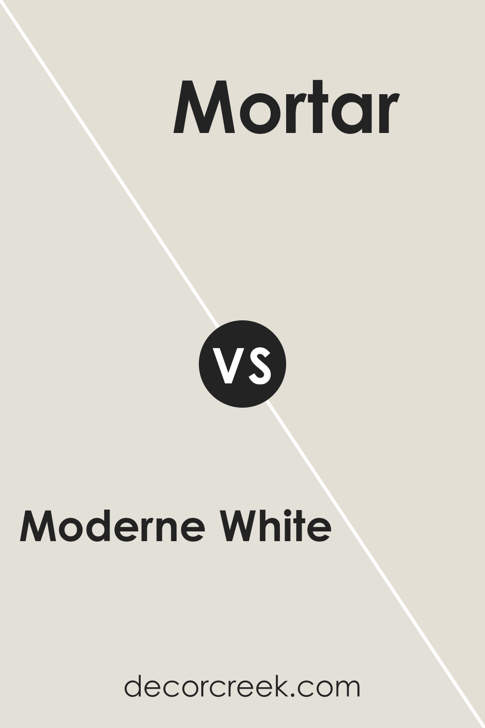
Moderne White SW 6168 by Sherwin Williams vs Mortar SW 9584 by Sherwin Williams
Moderne White (SW 6168) by Sherwin Williams is a soft, neutral white that can brighten up a room while providing a subtle warmth. It pairs well with a variety of colors, making it versatile for different styles and settings. Its understated tone can make spaces feel open and welcoming without being too stark.
Mortar (SW 9584), on the other hand, is a much deeper, grayish hue. This color has a strong presence and can add depth and richness to a room. It’s perfect for creating a focal point or adding a touch of drama to a space. Mortar can ground a room with its darker tone and pairs nicely with lighter colors for contrast.
When comparing the two, Moderne White is more about creating a fresh and airy atmosphere, while Mortar provides a strong, bold statement. Together, they can balance each other out beautifully, with each bringing unique qualities to a space.
You can see recommended paint color below:
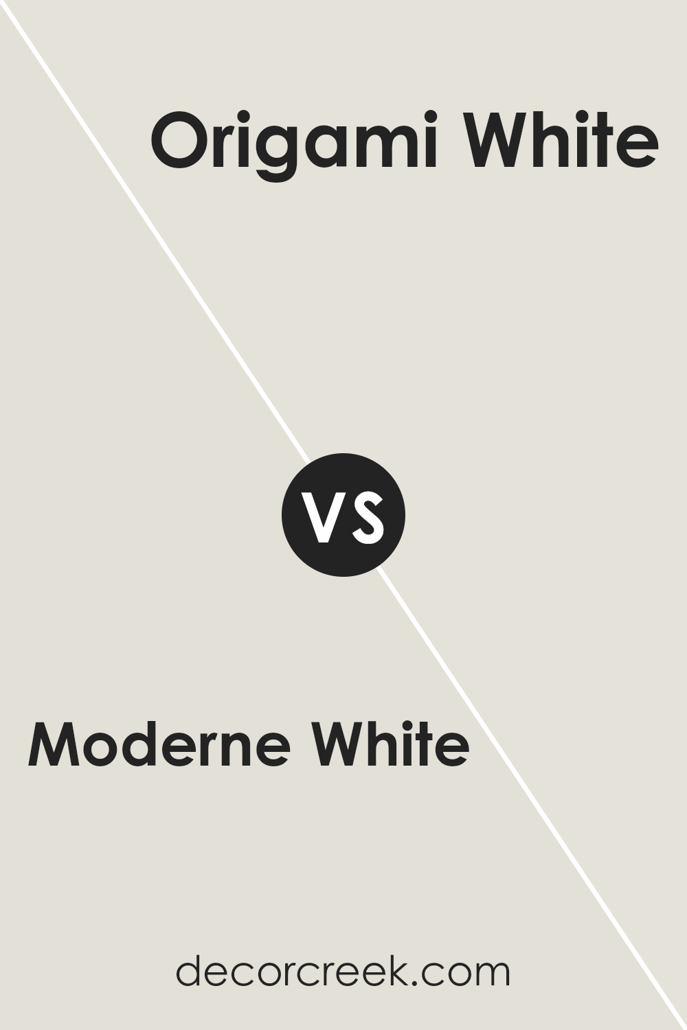
Moderne White SW 6168 by Sherwin Williams vs Origami White SW 7636 by Sherwin Williams
Moderne White SW 6168 and Origami White SW 7636, both by Sherwin Williams, are popular choices for neutral backgrounds. Moderne White leans slightly warm with subtle yellow undertones, creating a cozy and inviting atmosphere. It is versatile and pairs well with natural materials, making it a solid choice for spaces that crave warmth.
Origami White, on the other hand, has cooler undertones with a touch of gray. This gives it a clean, crisp appearance that can make a room feel more open and airy. It’s well-suited for modern spaces and goes especially well with cooler color palettes.
When choosing between these two, consider your room’s lighting and desired mood. Moderne White adds warmth and depth, while Origami White brings a brighter, more contemporary feel. Both are excellent options for different styles and settings, offering unique vibes depending on the look you want to achieve.
You can see recommended paint color below:
Moderne White SW 6168 by Sherwin Williams vs Frosty White SW 6196 by Sherwin Williams
Moderne White (SW 6168) and Frosty White (SW 6196) are both popular colors from Sherwin Williams, but they offer different vibes and uses. Moderne White is a warm, soft white with creamy undertones. It has a cozy feel that works well in living rooms and bedrooms, providing a welcoming atmosphere.
In contrast, Frosty White is a cooler, crisper white with subtle gray undertones. This makes it ideal for spaces where you want a clean, fresh look, like kitchens and bathrooms.
While Moderne White can make a room feel snug and comfortable, Frosty White brightens up spaces and gives them an airy feel. Choosing between them depends on the mood you want to create. For a warm, inviting space, Moderne White is great. If you prefer a cooler, more minimalist style, Frosty White is the way to go. Both complement different decor styles effectively.
You can see recommended paint color below:
- SW 6196 Frosty White
Moderne White SW 6168 by Sherwin Williams vs Sanctuary SW 9583 by Sherwin Williams
Moderne White SW 6168 by Sherwin Williams is a warm, inviting white with subtle beige undertones. It’s a versatile color that provides a clean and cozy appearance, making it great for living spaces where you want a welcoming feel. This color works well with both traditional and modern decor, adding a touch of warmth without being overpowering.
In contrast, Sanctuary SW 9583 by Sherwin Williams is a soothing, muted green with gray undertones. This color brings a sense of calm and relaxation to any room.
It’s ideal for creating a peaceful environment, like a bedroom or a reading nook, where you want to unwind and relax. Sanctuary pairs well with natural materials like wood and stone, complementing a more natural, earthy aesthetic.
Both colors offer a sense of comfort and relaxation but achieve this in different ways: Moderne White with its warm neutrality and Sanctuary with its cool, calming tone.
You can see recommended paint color below:
Moderne White SW 6168 by Sherwin Williams vs Heron Plume SW 6070 by Sherwin Williams
Moderne White and Heron Plume are both popular paint colors by Sherwin Williams. Moderne White is a warm, creamy off-white with a subtle hint of yellow, making spaces feel cozy and inviting. It works well in living areas and pairs nicely with both bold and neutral accents.
Heron Plume, on the other hand, is a soft, light greige (a mix of gray and beige). Its neutral tone brings a clean and calm look to rooms, making it versatile for various design styles. It’s an excellent choice for open spaces, as it reflects light and creates an airy feel.
While both colors are light and neutral, Moderne White leans warmer, while Heron Plume offers a slightly cooler, more muted vibe. When choosing between them, consider the room’s lighting and the atmosphere you want to create. Both can serve as versatile backdrops, complementing different furniture and decor styles.
You can see recommended paint color below:
Moderne White SW 6168 by Sherwin Williams vs Grey Mist SW 9625 by Sherwin Williams
Moderne White (SW 6168) by Sherwin Williams is a warm, creamy white that brings a cozy feel to a space. It’s versatile and can make rooms feel inviting and comfortable. This color works well in living areas, bedrooms, and kitchens, offering a neutral backdrop that pairs nicely with various decor styles.
On the other hand, Grey Mist (SW 9625) is a soft, light gray with a subtle cool tone. It adds a gentle and modern touch to a room, creating a clean and fresh atmosphere.
This color is perfect for those who prefer a more contemporary or minimalist look. Grey Mist is suitable for bathrooms, offices, or bedrooms, offering a calming and understated elegance.
When comparing the two, Moderne White brings warmth and coziness, while Grey Mist introduces a cooler, more modern vibe. Both colors are neutral, so they blend well with other design elements, but they set different moods in a space.
You can see recommended paint color below:
Moderne White SW 6168 by Sherwin Williams vs Reserved White SW 7056 by Sherwin Williams
Moderne White (SW 6168) and Reserved White (SW 7056) are two popular paint colors from Sherwin Williams, each offering a distinct look. Moderne White is a warm, creamy off-white with a subtle hint of beige.
It’s ideal for spaces where a cozy and inviting atmosphere is desired. The warmth in Moderne White can make a room feel more intimate and welcoming.
On the other hand, Reserved White is a cooler, softer white with a hint of gray. This makes it a great choice for modern and minimalist settings. It provides a clean and crisp backdrop that works well with a variety of accent colors. Unlike Moderne White, Reserved White’s cool undertones can help make a space feel more open and airy.
Both colors are versatile and can be used throughout a home, but the choice between them depends on whether you prefer a warm or cool ambiance in your space.
You can see recommended paint color below:
Moderne White SW 6168 by Sherwin Williams vs Ethereal White SW 6182 by Sherwin Williams
Moderne White SW 6168 and Ethereal White SW 6182 by Sherwin Williams are both versatile, neutral paint colors, yet they offer different vibes. Moderne White has a warm, creamy undertone, making it cozy and inviting. It’s a great choice for spaces where you want a snug and comforting feel.
On the other hand, Ethereal White is slightly cooler with subtle gray undertones, giving it a more airy and light appearance. It works well in rooms with lots of natural light or where you want to achieve a breezy and open atmosphere.
While both colors are neutral and can match various decor styles, Moderne White leans more towards creating a warm ambiance, making it suitable for living rooms or bedrooms. Ethereal White is often used in spaces where a fresh and calm look is preferred, like kitchens or bathrooms. Both colors can serve as excellent backgrounds for artwork and colorful furniture.
You can see recommended paint color below:
Moderne White SW 6168 by Sherwin Williams vs Spare White SW 6203 by Sherwin Williams
Moderne White (SW 6168) and Spare White (SW 6203) by Sherwin Williams are both subtle, neutral shades, but they have distinct characteristics. Moderne White is a warm, creamy shade with undertones that can add a snug and inviting feel to a space. It complements well with traditional and classic styles due to its warm tint.
On the other hand, Spare White is a cooler white with a hint of gray, giving it a more modern and clean look. It’s great for creating a sleek, fresh atmosphere and works well with minimalist or contemporary designs.
When choosing between the two, consider the lighting and mood you want to set in the room. In well-lit spaces, Moderne White can add depth through its warm tones, whereas Spare White can prevent the room from feeling too intense by providing a calming backdrop. Both colors can serve as a neutral base, but their temperature differences influence the overall ambiance.
You can see recommended paint color below:
Moderne White SW 6168 by Sherwin Williams vs Nuance SW 7049 by Sherwin Williams
Moderne White SW 6168 and Nuance SW 7049, both by Sherwin Williams, are interesting colors that have distinct characteristics. Moderne White is a warm, creamy off-white. It has subtle yellow undertones that make spaces feel cozy and welcoming.
This color works well in areas where you want a soft, inviting atmosphere, like living rooms or bedrooms.
On the other hand, Nuance SW 7049 is a light gray with a hint of warmth. It offers a softer alternative to pure whites and grays, providing a neutral backdrop without feeling cold. This shade is versatile and complements a variety of other colors, making it ideal for modern spaces or areas where you need a subtle yet sophisticated look.
While both colors are light and neutral, Moderne White is warmer, while Nuance has a gentle gray balance. Choosing between them depends on the mood you want to create in your space.
You can see recommended paint color below:
Conclusion
After looking closely at SW 6168 Moderne White by Sherwin Williams, I think it’s a color that brings a little bit of magic to a room. It’s like a gentle hug that feels calm and welcoming.
This shade of white has a special touch, like a sprinkle of warmth mixed with coolness, making it feel cozy but also fresh. When you paint your walls with Moderne White, it’s like letting a bit of sunshine inside, even on a cloudy day.
This color fits well with other shades, too. You can add bright colors if you want your room to stand out, or keep it simple with soft tones for a peaceful look. It’s like having a good friend who gets along with everyone.
In modern homes, people seem to love using Moderne White because it makes rooms look bigger without feeling empty. It’s perfect if you want a room where you can focus on reading, playing games, or just relaxing.
From kitchens to bedrooms, Moderne White by Sherwin Williams seems to make every room feel nice and complete. Using this color makes your home feel connected and whole, almost like each room is part of a happy family. If you want a color that feels welcoming and bright, but not too bright, Moderne White might just be the right choice.
Ever wished paint sampling was as easy as sticking a sticker? Guess what? Now it is! Discover Samplize's unique Peel & Stick samples.
Get paint samples

