If you’ve ever walked through a quiet forest right after a snowfall, you might recall the refreshing shade of the evergreens lightly dusted with frost. SW 9648 Frosted Fern by Sherwin Williams captures this serene green with a subtle hint of gray, making it perfect for bringing a touch of nature’s calm into your home.
I’ve been experimenting with this color in various rooms and found that it works beautifully, especially in spaces where you want to create a peaceful retreat. Whether you’re looking to freshen up your living room, bedroom, or even a bathroom, Frosted Fern has a versatile charm that pairs well with both light and dark accents.
It’s a choice that feels both grounded and uplifting, making it ideal for anyone looking to enhance their home with a new look.
In this write-up, I’ll share some insights into how Frosted Fern has transformed my space and offer tips on how it might breathe new life into yours too.

What Color Is Frosted Fern SW 9648 by Sherwin Williams?
Frosted Fern by Sherwin Williams is a soft, muted green with a gentle, soothing quality, similar to the color of a delicate fern dusted with frost. This hue belongs to the cooler spectrum and brings a fresh, natural feel to any space. With its subtle and understated character, it works particularly well in calming environments such as bedrooms and bathrooms.
In terms of interior styles, Frosted Fern is versatile but shines brightest in settings that aim for a relaxed and airy atmosphere. It complements minimalist and Scandinavian designs beautifully by reinforcing clean lines and simplicity. This color also fits well with modern farmhouse aesthetics where its natural green tones can harmonize with rustic elements and organic materials.
When it comes to pairing with materials and textures, Frosted Fern looks exceptional with light woods such as oak and birch, which emphasize its earthy roots without overpowering the space. Textiles like linen or cotton in whites or soft neutrals can maintain the light, breathable feel of the room. For a bit of contrast, incorporating elements like woven baskets or pottery can add depth and interest while keeping the overall palette grounded and cohesive.
Frosted Fern is a go-to choice for creating a fresh, natural-looking space in a subtle and inviting way.
Is Frosted Fern SW 9648 by Sherwin Williams Warm or Cool color?
Frosted Fern by Sherwin Williams is a unique shade of green that brings a fresh and lively feel to any room. This color is reminiscent of a light, airy green found in a dew-covered forest at dawn. It’s especially great for spaces where you want to add a touch of nature’s calmness without overwhelming the room with a too bold or dark color.
This light green hue works well in bathrooms and kitchens where the goal is to create a clean and refreshing atmosphere. In living rooms or bedrooms, Frosted Fern can be coupled with light woods and neutral textiles to establish a cozy yet bright feel.
It’s also versatile enough to pair well with both modern and traditional decor, helping to refresh old furniture or accent contemporary pieces. Whether you’re looking to give a small space more visual space or to liven up your home with a natural vibe, Frosted Fern is a smooth, adaptable choice.
Undertones of Frosted Fern SW 9648 by Sherwin Williams
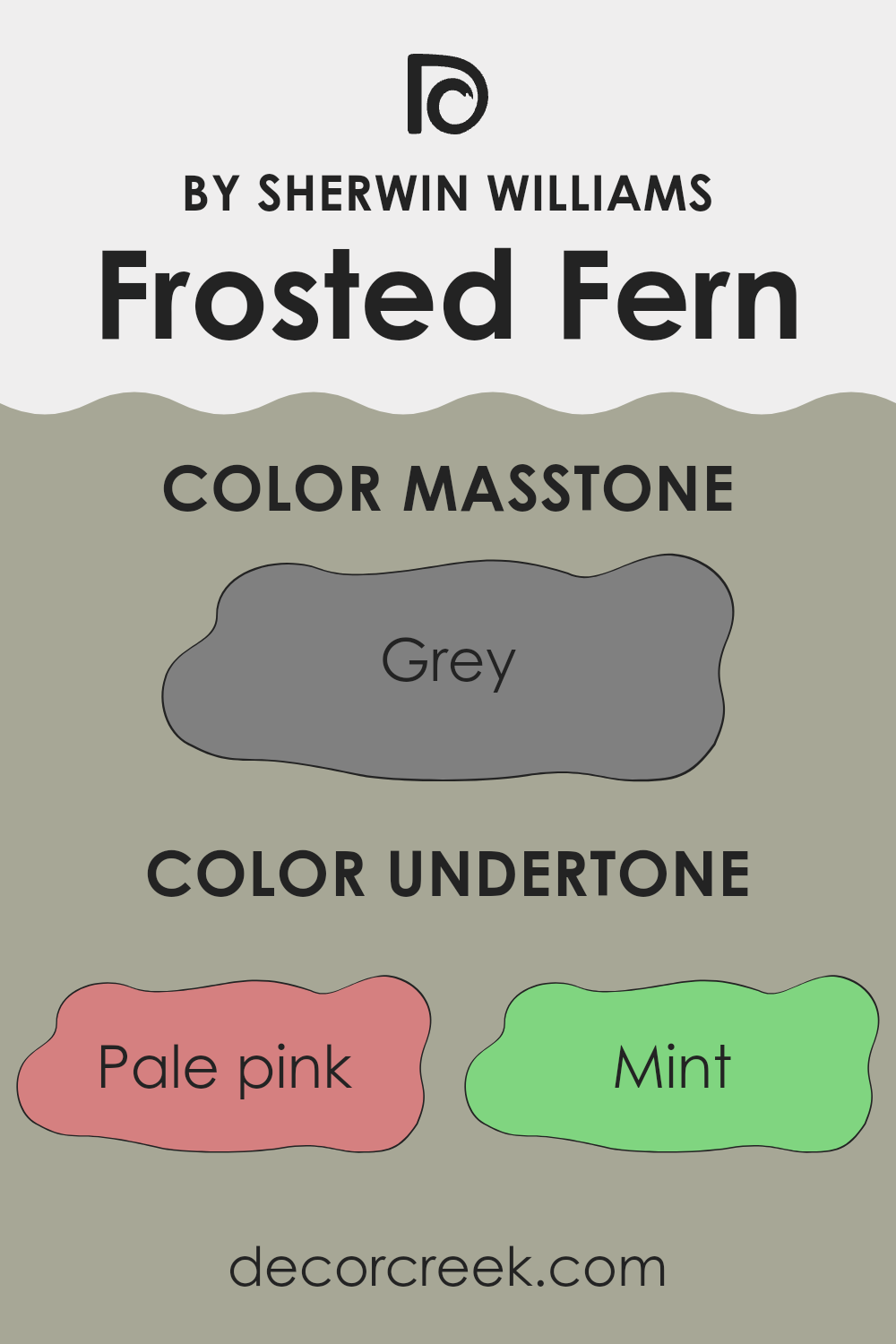
Frosted Fern, a unique paint color by Sherwin Williams, incorporates a diverse range of undertones that subtly influence its appearance under different lighting conditions. Being a neutral yet complex color, Frosted Fern contains hints of pale pink, mint, and pale yellow, along with lilac, light blue, and light purple. These softer undertones soften the color, making it versatile and harmonious for decorating.
Notably, the light gray undertone provides a grounding effect that enhances Frosted Fern’s usability in various interior spaces, whether it’s a high-traffic living room or a relaxing bedroom. Subtle influences of darker colors like olive and dark turquoise add depth, allowing the color to adapt subtly from day to night lighting.
When applied to interior walls, Frosted Fern’s blend of undertones plays an important role in dictating the mood and aesthetic of a room. In natural daylight, lighter undertones like mint and pale yellow become more pronounced, contributing to a fresh and inviting atmosphere.
In the evening under artificial light, darker undertones like olive might become more noticeable, lending a cozy feel to the environment.
This adaptability makes Frosted Fern a versatile choice for those looking to create spaces that feel connected to nature and welcoming. The color’s unique blend of undertones ensures it pairs well with a wide range of decor styles and hues, offering endless possibilities for creating appealing interiors.
What is the Masstone of the Frosted Fern SW 9648 by Sherwin Williams?
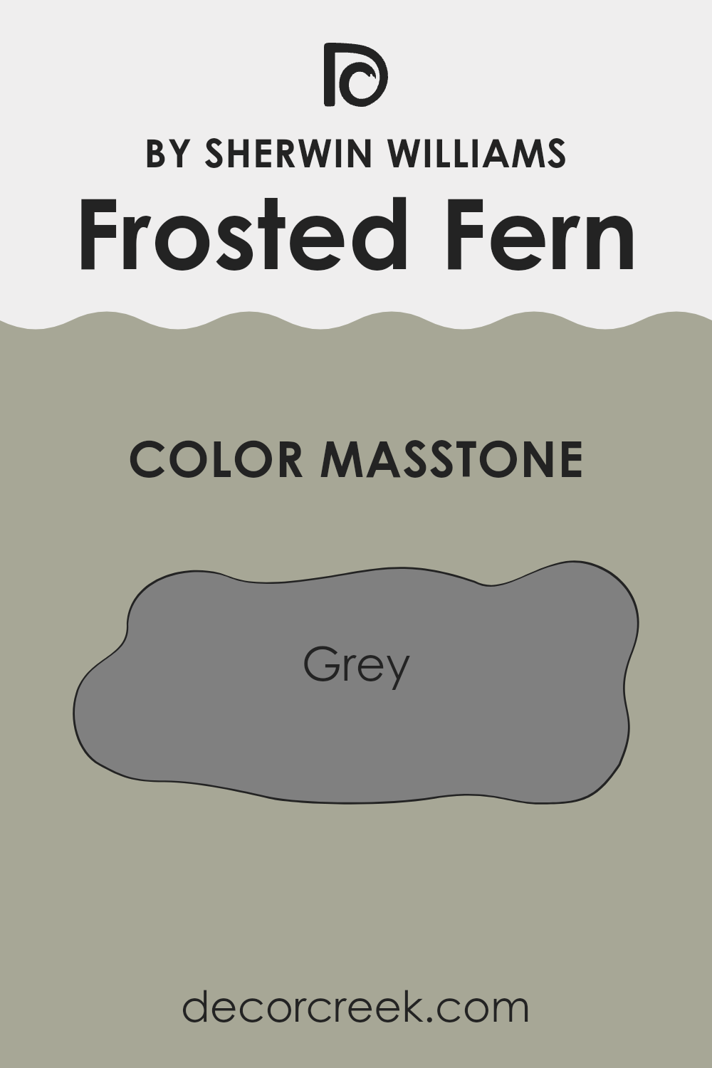
Frosted FernSW 9648 is a paint color that resembles a mid-tone grey (#808080). This masstone, or the color seen when the paint is applied thickly, is versatile and neutral, making it a popular choice for home interiors.
The grey tone provides a calm, subtle backdrop that allows other elements in the room, like furniture and decor, to stand out. It works well in various settings, from modern to traditional, because it pairs easily with both bright and muted colors. In spaces like living rooms or bedrooms, this shade of grey helps create a balanced atmosphere.
It can make small rooms feel bigger and spacious rooms feel cozy. Additionally, this color is practical as it helps to hide minor wall imperfections and is easy to maintain, making it a practical choice for busy households. The neutral quality of Frosted FernSW 9648 makes it timeless, preventing the space from feeling dated as trends change.
How Does Lighting Affect Frosted Fern SW 9648 by Sherwin Williams?
Lighting has a profound effect on how we perceive colors. It can change a color’s appearance from room to room or throughout the day, based on the light’s source and direction. For instance, consider the color Frosted Fern by Sherwin Williams, a subtle and calming green shade.
In artificial light, such as from lightbulbs in lamps or overhead fixtures, Frosted Fern tends to look a bit warmer or slightly more yellow.
This is because many artificial lights have a warm color temperature, which adds a cozy feel to the already soft green, making it appear more inviting in spaces like living rooms or bedrooms.
In natural light, this color can appear quite different depending on the time of day and the direction the room faces.
In north-facing rooms, which get less direct sunlight, Frosted Fern might look cooler and slightly muted, giving a calm and refreshing feel. This makes it perfect for creating a peaceful space.
- In south-facing rooms, which receive more direct and often brighter sunlight throughout the day, Frosted Fern will likely appear lighter and more vibrant. The ample sunlight can really bring out the lively qualities of the green, making the room feel cheerful and energetic.
- East-facing rooms get sunlight in the morning when the light is cooler and softer. Here, Frosted Fern could look especially true to its swatch, vibrant and fresh in the morning, then changing subtly as the day progresses and the natural light fades or shifts.
West-facing rooms experience the strongest sunlight in the late afternoon to evening when the light is warmer. In these rooms, during the afternoon, Frosted Fern might take on a brighter, more glowing appearance, contrasting with the morning’s softer look.
Overall, Frosted Fern by Sherwin Williams is quite a versatile color, but its final appearance in any given room depends greatly on the characteristics of the lighting in that space.
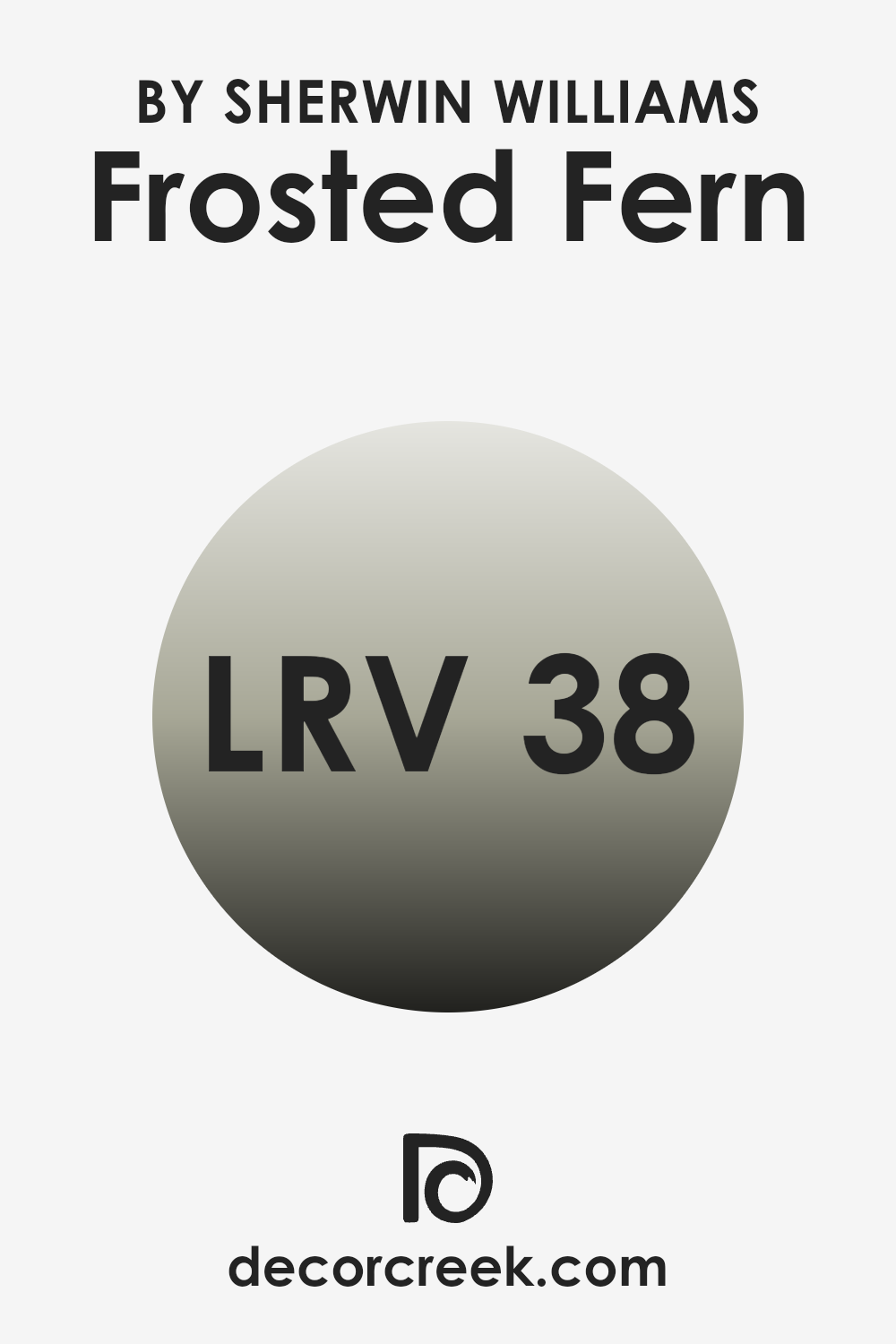
What is the LRV of Frosted Fern SW 9648 by Sherwin Williams?
LRV, or Light Reflectance Value, is a measure used to describe how much light a paint color reflects or absorbs when it is applied to a surface. This scale goes from 0 percent, meaning it reflects no light and absorbs all light, to full reflection, meaning it does not absorb light.
A higher LRV means the color will appear lighter on the walls and will make a room feel brighter as it reflects more light back into the room. Colors with low LRV can make a room feel cozier but smaller because they absorb more light. For the color Frosted Fern with an LRV of 38.033, it sits at a mid-range on the scale.
This means it manages to reflect some light but still absorbs more than it reflects, giving it a muted appearance. In natural lighting, the color will appear slightly lighter and can help in adding a subtle lively touch to a room without being overpowering. In dimly lit areas, however, it may appear darker and could make the room feel more enclosed. This balancing act makes it versatile for different lighting conditions and room sizes.
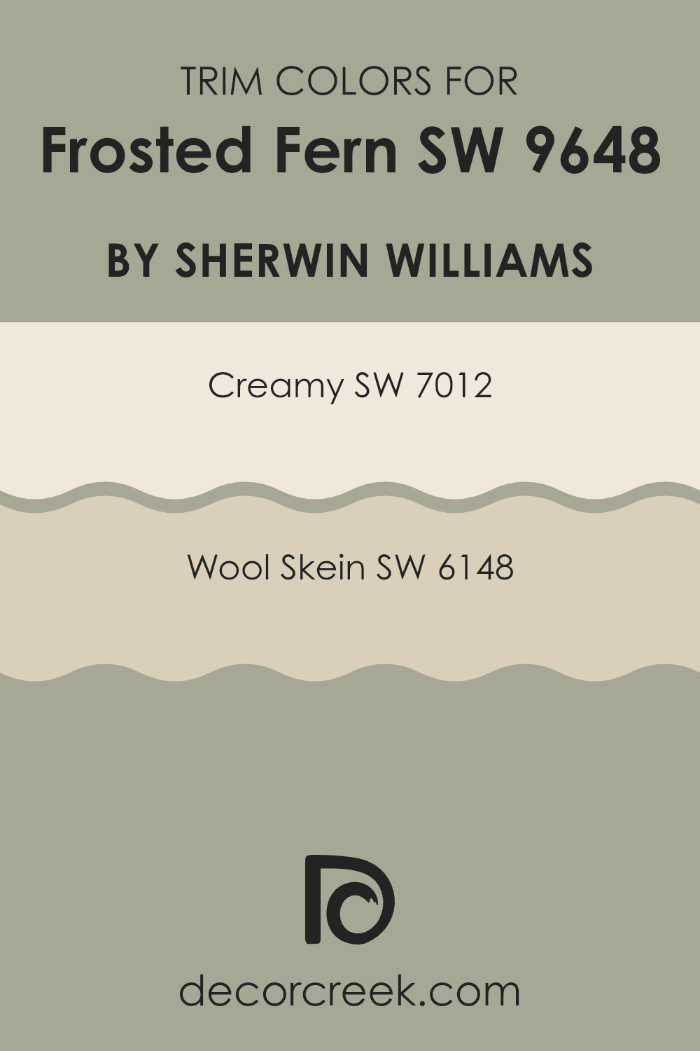
What are the Trim colors of Frosted Fern SW 9648 by Sherwin Williams?
Trim colors are essential in interior design as they help define and accentuate the architectural features of a room, such as doors, windows, and moldings. For a color like Frosted Fern by Sherwin Williams, choosing the right trim colors can enhance the overall aesthetic and create a harmonious look.
Two such colors that pair beautifully with Frosted Fern are Creamy and Wool Skein by Sherwin Williams. These colors provide a subtle contrast that can make the features of a room stand out without overwhelming the main wall color. Creamy SW 7012 is a soft, warm white that brings a gentle brightness to a space, ideal for complementing the cool tones of Frosted Fern.
It works well in creating a smooth transition between the walls and trim, adding a touch of light without stark contrasts. On the other hand, Wool Skein SW 6148 offers a more neutral, beige tone that can add warmth to the green hue of Frosted Fern. This color is perfect for creating a cozy and inviting environment, enriching the space subtly while helping to tie together different color elements within the room.
You can see recommended paint colors below:
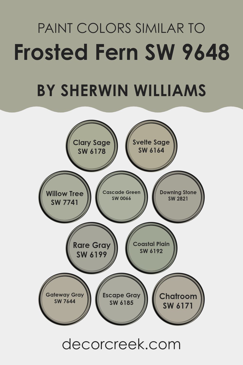
Colors Similar to Frosted Fern SW 9648 by Sherwin Williams
Choosing similar colors is crucial when designing a space because they ensure a harmonious and visually coherent environment. Colors like Clary Sage, Svelte Sage, and Willow Tree are subtle green hues that blend beautifully with each other, providing a gentle backdrop that isn’t too overwhelming.
Clary Sage is a muted green with earthy tones, adding a calm and grounded atmosphere. Svelte Sage is slightly lighter, offering a soft and discreet touch of color. Willow Tree goes a bit darker, giving depth and contrast while still coordinating well with its lighter counterparts. Colors such as Cascade Green and Downing Stone both offer unique nuances to the palette.
Cascade Green has a vibrant, leafy appeal that draws the eye without overpowering, while Downing Stone presents a blend of green and gray, creating a sturdy and neutral base. Moving into the grays, Rare Gray, Coastal Plain, Gateway Gray, Escape Gray, and Chatroom provide a spectrum from lighter to darker shades. Rare Gray and Coastal Plain bring in hints of green undertones, linking back to the other nature-inspired hues. Gateway Gray stands out with its deeper and more pronounced gray tone, offering a striking yet balanced contrast.
Escape Gray leans more towards a muted, understated look, and Chatroom concludes the range with its denser, more forthright color, perfect for adding subtle complexity to any space. These similar shades together promote a cohesive yet dynamic look, allowing for a flexible scheme that can adapt to various decor styles and personal tastes.
You can see recommended paint colors below:
- SW 6178 Clary Sage
- SW 6164 Svelte Sage
- SW 7741 Willow Tree
- SW 0066 Cascade Green
- SW 2821 Downing Stone
- SW 6199 Rare Gray
- SW 6192 Coastal Plain
- SW 7644 Gateway Gray
- SW 6185 Escape Gray
- SW 6171 Chatroom
How to Use Frosted Fern SW 9648 by Sherwin Williams In Your Home?
Frosted Fern by Sherwin Williams is a fresh and lively green hue that brings a touch of nature into any home. It works well in various rooms to create a lively and welcoming atmosphere. In the kitchen, it can make the space feel clean and invigorating, especially when used on cabinets or an accent wall.
In the living room, combining it with soft whites and natural wood elements can create a relaxed, cozy setting. If you’re looking to refresh your bedroom, painting one wall with Frosted Fern can give it a fresh, modern look without overwhelming the space.
It’s also great in bathrooms, where it complements white fixtures and brings in a sense of freshness. Adding decor pieces in earthy tones or simple, crisp whites can complete the look by balancing the color’s vibrancy with subtle elegance.
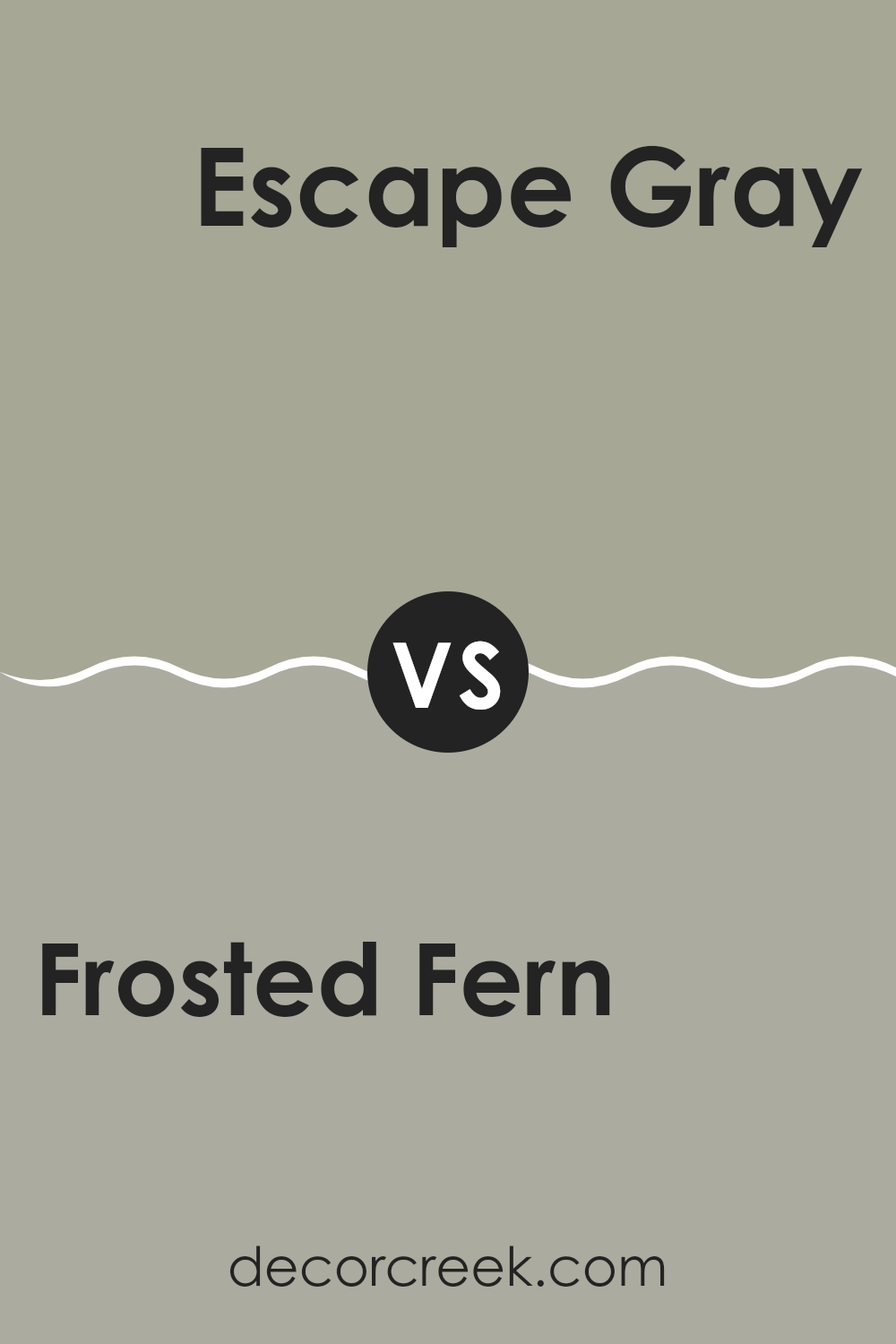
Frosted Fern SW 9648 by Sherwin Williams vs Escape Gray SW 6185 by Sherwin Williams
Frosted Fern and Escape Gray are both colors from Sherwin Williams, but they offer quite different vibes for room decor. Frosted Fern is a soft, pale green that has a subtle and fresh feel, ideal for creating a light and airy space. It’s especially good in areas where you want to add a touch of nature-inspired calm without overwhelming the room with color.
On the other hand, Escape Gray is a deeper, warmer gray that provides a grounding, more neutral backdrop. It’s versatile and works well in many settings, offering a more traditional look compared to the slightly more whimsical Frosted Fern. Escape Gray can make a room feel cozy and is easy to pair with a wide range of furniture and accent colors.
Using these two colors in combination can give a room balance, with the warmth of Escape Gray offsetting the coolness of Frosted Fern, or they can be used separately to distinct effects depending on what feel you are aiming for in your space.
You can see recommended paint color below:
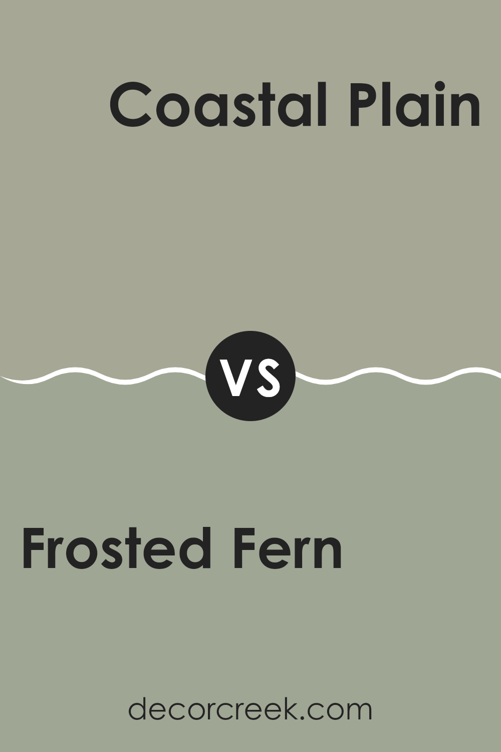
Frosted Fern SW 9648 by Sherwin Williams vs Coastal Plain SW 6192 by Sherwin Williams
Frosted Fern and Coastal Plain by Sherwin Williams are two distinct shades each having their unique appeal. Frosted Fern has a partial resemblance to the fresh, light green of young foliage during spring. This soft, muted green has a gentle touch that can bring a calm and refreshing feeling to any room.
On the other hand, Coastal Plain is a darker, more earthy green. This color has a stronger presence, drawing inspiration from nature’s deeper tones like lush forests or a dense canopy. It offers a grounding, stable effect, making it well-suited for spaces where you want to add depth and fullness.
Both colors work great for creating peaceful, natural settings in interiors but offer different moods. Frosted Fern’s lighter hue works well in spaces aimed for relaxation and lightness, whereas Coastal Plain, with its richer saturation, is ideal for areas that require a bit more warmth and enclosure. Matching them with decor accordingly can highlight their individual characteristics and the feelings they naturally inspire.
You can see recommended paint color below:
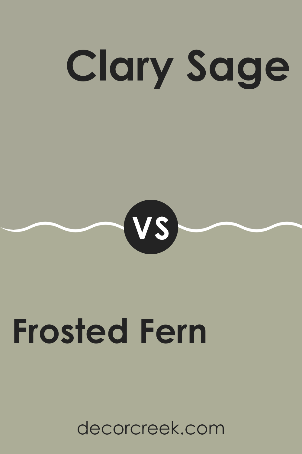
Frosted Fern SW 9648 by Sherwin Williams vs Clary Sage SW 6178 by Sherwin Williams
Frosted Fern and Clary Sage are two distinct green shades from Sherwin Williams. Frosted Fern has a fresh, minty appeal that feels light and airy, making it perfect for creating a soothing atmosphere in spaces like kitchens or bathrooms. It carries a subtle vibrancy that can brighten up a room without overwhelming it with color.
On the other hand, Clary Sage offers a deeper, more earthy tone. This color resembles the natural greenery of sage leaves and has a grounded, calming effect, making it well-suited for living areas or bedrooms where a comforting ambiance is desired. Its richness also lends itself well as a base color that can be accented with lighter or darker shades.
Both colors provide unique vibes; while Frosted Fern injects a lively freshness, Clary Sage brings a cozy, nature-inspired feel, making them appropriate for different interior moods and themes. Their versatility in matching with other colors also makes them practical choices for home decor.
You can see recommended paint color below:
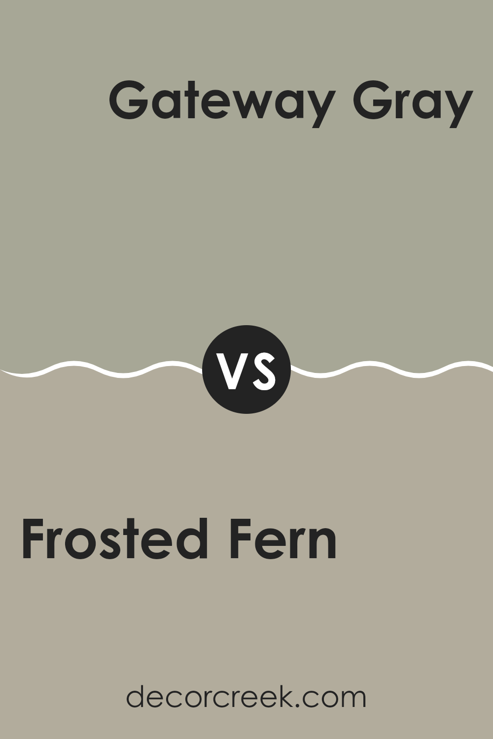
Frosted Fern SW 9648 by Sherwin Williams vs Gateway Gray SW 7644 by Sherwin Williams
Frosted Fern is a refreshing light green hue, presenting a lively yet soft vibe perfect for creating a calming atmosphere in a room. This color is subtle enough to blend smoothly into a peaceful bedroom or a restful living area, providing a touch of nature’s soothing qualities indoors.
In contrast, Gateway Gray is a versatile medium gray shade that offers a stable and grounding effect, making it suitable for a variety of spaces, both in homes and offices. Gateway Gray works well as a neutral backdrop that complements bold colors or works harmoniously with softer tones.
When comparing both, Frosted Fern injects more vibrancy due to its gentle green essence, while Gateway Gray offers a more neutral canvas, allowing for broader decorating choices. Both colors support themes of calmness and restfulness, but do so in distinct ways that cater to different design preferences.
You can see recommended paint color below:
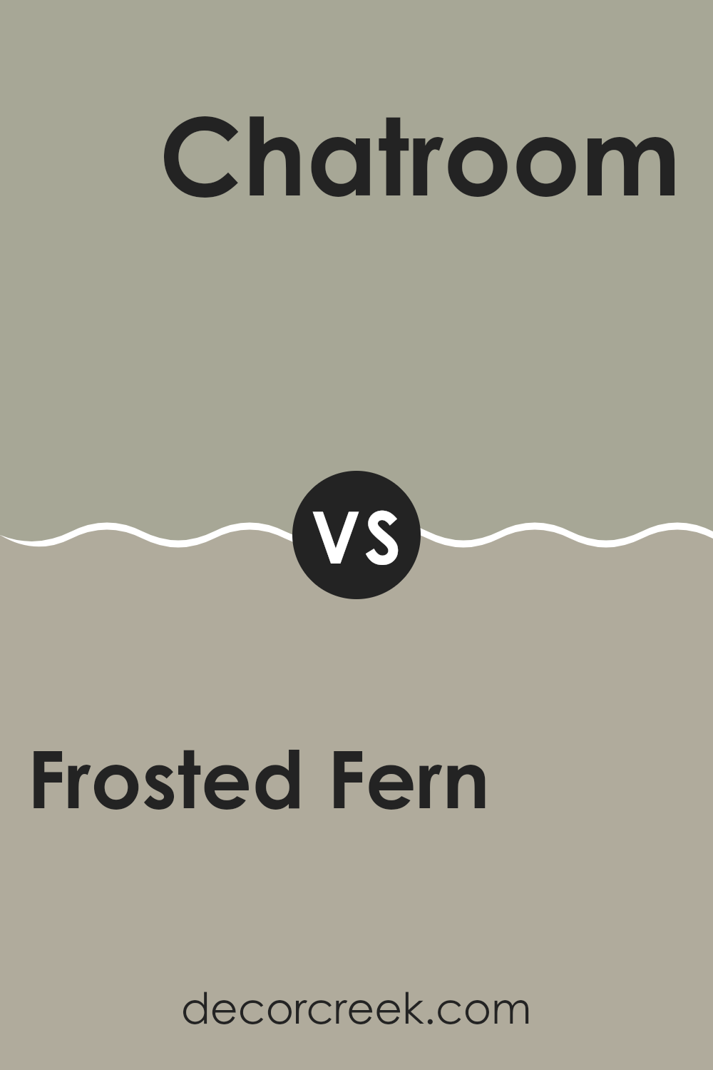
Frosted Fern SW 9648 by Sherwin Williams vs Chatroom SW 6171 by Sherwin Williams
Frosted Fern by Sherwin Williams is a gentle green hue with a soft, muted quality, giving it a calm and soothing presence. It’s a color that works well in spaces where you want a touch of nature without overwhelming brightness.
On the other hand, Chatroom by Sherwin Williams is a darker shade, leaning towards a gray-green, making it ideal for creating a cozier, more enclosed feel in a room. This color can give a room a more grounded and secure atmosphere, perfect for studies or dens.
While Frosted Fern brings in a light and airy vibe, Chatroom offers a more sheltered and intimate ambiance. Each color has its unique appeal, depending on the mood and function you want to achieve in your space.
You can see recommended paint color below:
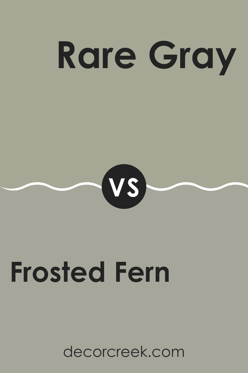
Frosted Fern SW 9648 by Sherwin Williams vs Rare Gray SW 6199 by Sherwin Williams
“Frosted Fern” by Sherwin Williams is a light, refreshing green that brings a subtle, natural feel to any space. Its gentle hue is reminiscent of fresh spring leaves and can brighten rooms without overwhelming them. It works well in areas where you want to add a touch of calmness without using strong colors.
On the other hand, “Rare Gray” is a deeper, more neutral gray that provides a strong foundation for various design schemes. This color is versatile as it pairs well with both bright and subdued tones, making it ideal for living areas, bedrooms, and even exteriors.
While “Frosted Fern” injects a hint of nature and freshness into a room, “Rare Gray” offers a grounded, more classic look that can be either elegant or casual, depending on how you style the rest of the room. Both colors provide unique benefits and can significantly enhance a space when used thoughtfully.
You can see recommended paint color below:
- SW 6199 Rare Gray
Frosted Fern SW 9648 by Sherwin Williams vs Downing Stone SW 2821 by Sherwin Williams
Frosted Fern and Downing Stone from Sherwin Williams are two very different shades that you could use in various parts of your home for distinct effects. Frosted Fern is a soft, subtle green with a hint of gray, making it a calm and gentle color ideal for creating a relaxed atmosphere in spaces like bedrooms or living areas. It reflects a light, airy vibe, which can help make smaller rooms feel larger and more open.
On the other hand, Downing Stone is a much deeper, richer color that leans towards a gray-brown. It offers a strong presence, ideally suited for areas where you want to create a more grounded and defined look, such as dining rooms or entryways. This shade can help add a touch of elegance without overwhelming the space.
Both colors present unique aesthetics and can be used to achieve different moods and styles in your decorating projects. Whether you choose the light and airy Frosted Fern or the more anchored Downing Stone depends a lot on what sort of feel you want for your room.
You can see recommended paint color below:

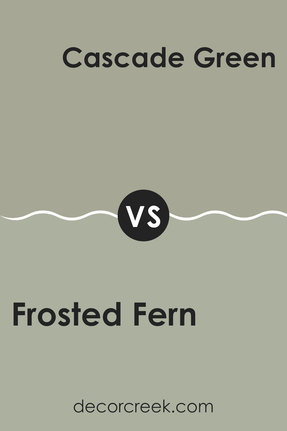
Frosted Fern SW 9648 by Sherwin Williams vs Cascade Green SW 0066 by Sherwin Williams
The main color, Frosted Fern, is a soft and light green hue with a hint of gray that gives it a muted and calm appearance. It’s an excellent choice for creating a restful and gentle ambiance in any room, particularly suitable for spaces meant for relaxation such as bedrooms and living areas.
On the other hand, Cascade Green is a deeper and more vibrant green that carries a more pronounced character, adding a lively and fresh feel to interiors. This shade is ideal for those looking to add a splash of color that still maintains a natural earthiness.
While Frosted Fern acts as a neutral backdrop, Cascade Green stands out more and can be used to make a statement in a space. The choice between these two colors depends largely on the mood and atmosphere you want to achieve in your room.
You can see recommended paint color below:
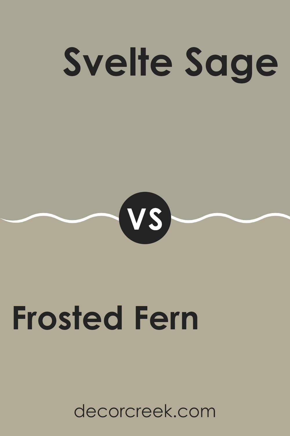
Frosted Fern SW 9648 by Sherwin Williams vs Svelte Sage SW 6164 by Sherwin Williams
Frosted Fern and Svelte Sage by Sherwin Williams are two distinct shades of green that offer unique vibes for any space. Frosted Fern is a lighter, almost ethereal green that feels fresh and clean. It’s the sort of color that can brighten a room while still bringing a touch of nature indoors. Its light tone makes it perfect for smaller spaces or rooms that don’t get a lot of natural light, as it helps to make the area feel more open and airy.
On the other hand, Svelte Sage is a deeper, warmer green. This color has a more grounded feel, providing a cozy and welcoming atmosphere. It’s great for spaces where you want to relax, like living rooms or bedrooms. The richer hue of Svelte Sage also works well in larger spaces or areas with a lot of natural light, as it complements the brightness without feeling overwhelming.
Both colors offer their unique flair and can dramatically change the mood of a room depending on what you’re looking for. Whether you prefer the lighter touch of Frosted Fern or the richer depth of Svelte Sage, both are excellent choices for bringing a touch of the outdoors inside.
You can see recommended paint color below:
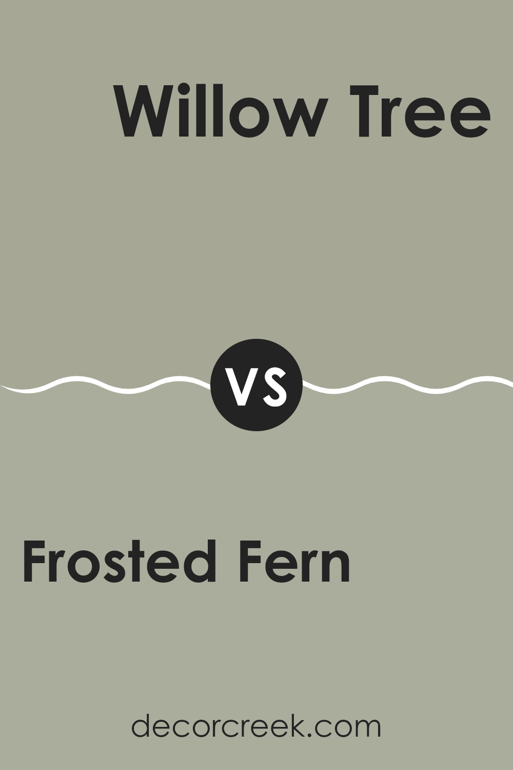
Frosted Fern SW 9648 by Sherwin Williams vs Willow Tree SW 7741 by Sherwin Williams
Frosted Fern and Willow Tree are two distinct shades offered by Sherwin Williams. Frosted Fern is a gentle, light green that brings a fresh, airy feel to any space. It resembles the color of light greenery, touched by a hint of frost. This color works well in spaces meant for relaxation, as it adds a subtle natural element.
On the other hand, Willow Tree is a darker, more earthy green. It mirrors the deep hues found in a dense forest or the robust color of a willow tree’s leaves. This shade is great for adding depth and a sense of grounding to a room. It pairs well with natural wood and stone elements.
While both colors share a green base, Frosted Fern feels lighter and more refreshing, and Willow Tree offers a richer, more grounded aesthetic. Choosing between them depends on the desired impact and mood for the room: airy and light, or strong and rooted.
You can see recommended paint color below:
- SW 7741 Willow Tree
In wrapping up my thoughts on SW 9648 Frosted Fern by Sherwin Williams, I have to say, I’m really impressed with this paint. Frosted Fern is a gentle green color that has a pleasant, calming feel to it, making any room look fresh and inviting. It’s really easy on the eyes, which is perfect for creating a cozy corner in a busy home.
I’ve noticed that this shade works well in a lot of different areas. Whether I put it in the kitchen, living room, or even a bathroom, it adds a nice touch without being too loud or bold. It’s just the right kind of green if you’re looking to liven up a space with a splash of color that’s not too intense.
Also, it mixes well with other colors. Whether you team it up with soft browns, light grays, or even some blues, it holds its own without clashing. It’s like this paint was made to make decorating as easy as pie! Using SW 9648 Frosted Fern has definitely made me realize how a simple paint color can make a big difference in a home.
It’s a great choice if someone is looking to freshen up their walls with something that feels new and natural. For anyone thinking about giving their room a mini-makeover, I’d highly recommend considering Frosted Fern. It might just be what you’re looking for to make your room look its best.
Ever wished paint sampling was as easy as sticking a sticker? Guess what? Now it is! Discover Samplize's unique Peel & Stick samples.
Get paint samples

