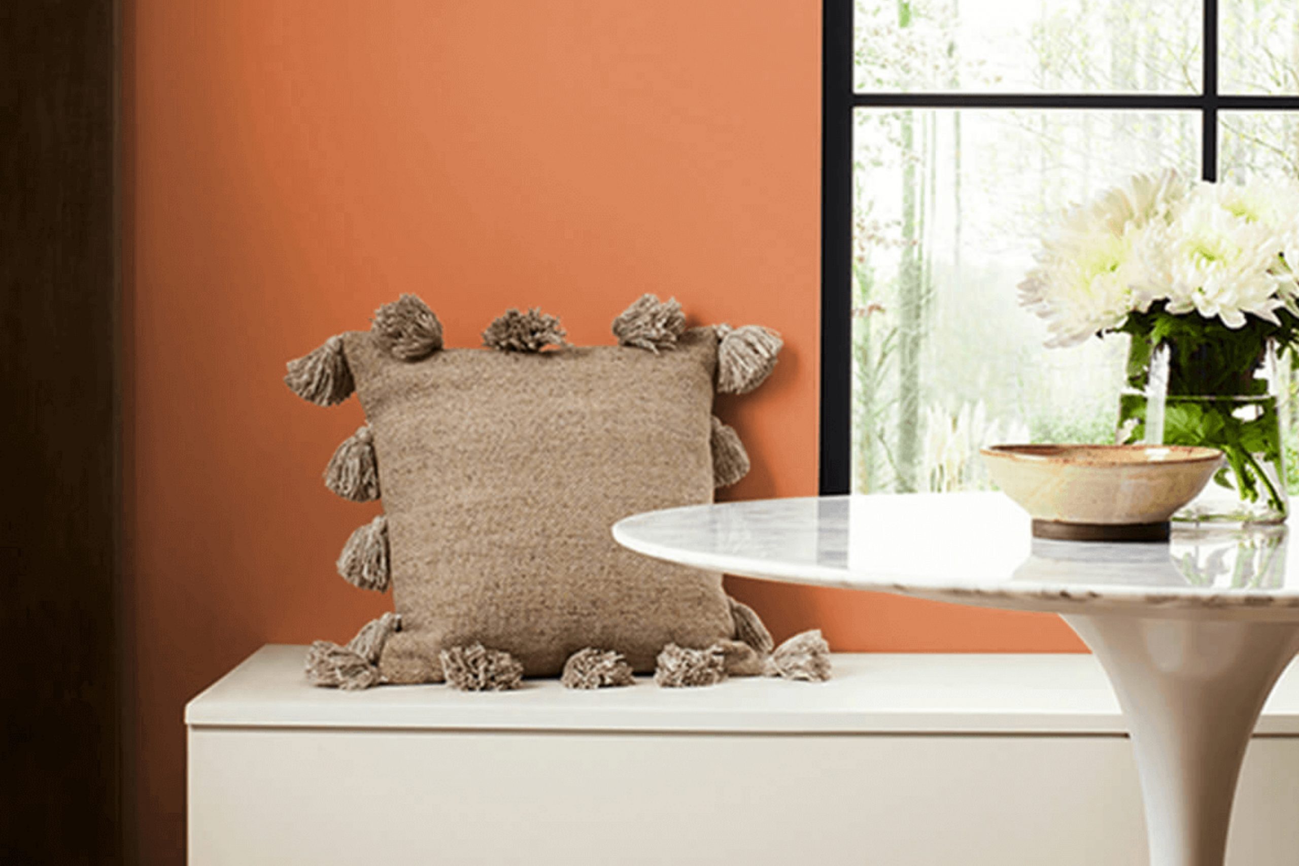
Imagine standing at the edge of a bustling harbor as the sun sets, casting a warm glow that reflects off the water with rich, coppery tones. That’s the essence of SW 6634 Copper Harbor by Sherwin Williams. This paint color draws its inspiration from those magical, fleeting moments, encapsulating a deep, vibrant orange that adds a lively spark to any room. If you’re thinking about refreshing a room or adding a pop of color to your decor, this shade could be your perfect match.
Copper Harbor isn’t just about the boldness it brings; it’s also about setting a mood that’s both welcoming and invigorating. Whether you’re painting an accent wall or considering it for an entire room, it promises to infuse your environment with warmth.
Considering how color can influence a room, incorporating Copper Harbor could energize a kitchen, enliven a living room, or make a welcoming statement in an entryway.
So, if you’re ready to bring a touch of warmth and vitality to your home, why not consider SW 6634 Copper Harbor?
It’s a choice that can make your everyday rooms feel more personal and alive.
What Color Is Copper Harbor SW 6634 by Sherwin Williams?
Copper Harbor is a vibrant, warm hue that brings a cozy and energetic atmosphere to any room. This color resembles the rich tone of autumn leaves or a sunset, making it a great choice for creating a welcoming room. It’s a deep orange with a touch of rust, which allows it to set a cheerful mood without being too strong.
This color works exceptionally well in interior styles that lean towards the rustic, such as farmhouse or southwestern themes, where its earthy quality comes to life. It also fits beautifully into bohemian decor schemes, pairing well with eclectic furnishings and varied textures.
When it comes to materials, Copper Harbor pairs wonderfully with natural wood, enhancing its warmth while contrasting nicely against darker woods or painted surfaces. Textiles like linen or wool in neutral tones can balance its intensity, while adding leather into the mix introduces a touch of luxury and durability. Metals, particularly brushed bronze or copper, echo the color’s warmth, creating a harmonious look.
For those looking to introduce a lively yet warm palette to their living room, Copper Harbor is an excellent choice. It works well in living rooms, kitchens, or even as an accent wall in a bedroom, providing a burst of color that is both inviting and comforting.
Is Copper Harbor SW 6634 by Sherwin Williams Warm or Cool color?
Copper Harbor by Sherwin Williams is a warm, vibrant shade of orange that adds a cozy and lively touch to any room. This color is perfect for rooms where energy and warmth are desired, such as living rooms or kitchens.
It pairs well with natural elements like wooden furniture or green plants, which can help balance its intensity. The brightness of Copper Harbor can make a small room feel more inviting and cheerful, making it an excellent choice for areas that need a splash of color.
It’s also great for an accent wall to draw attention and add a focal point to a room. While it is a bold color, when used thoughtfully, it can make a home feel more homelike and joyful. The best lighting for this color is natural sunlight, which enhances its vibrant tone and makes the room feel lively.
Undertones of Copper Harbor SW 6634 by Sherwin Williams
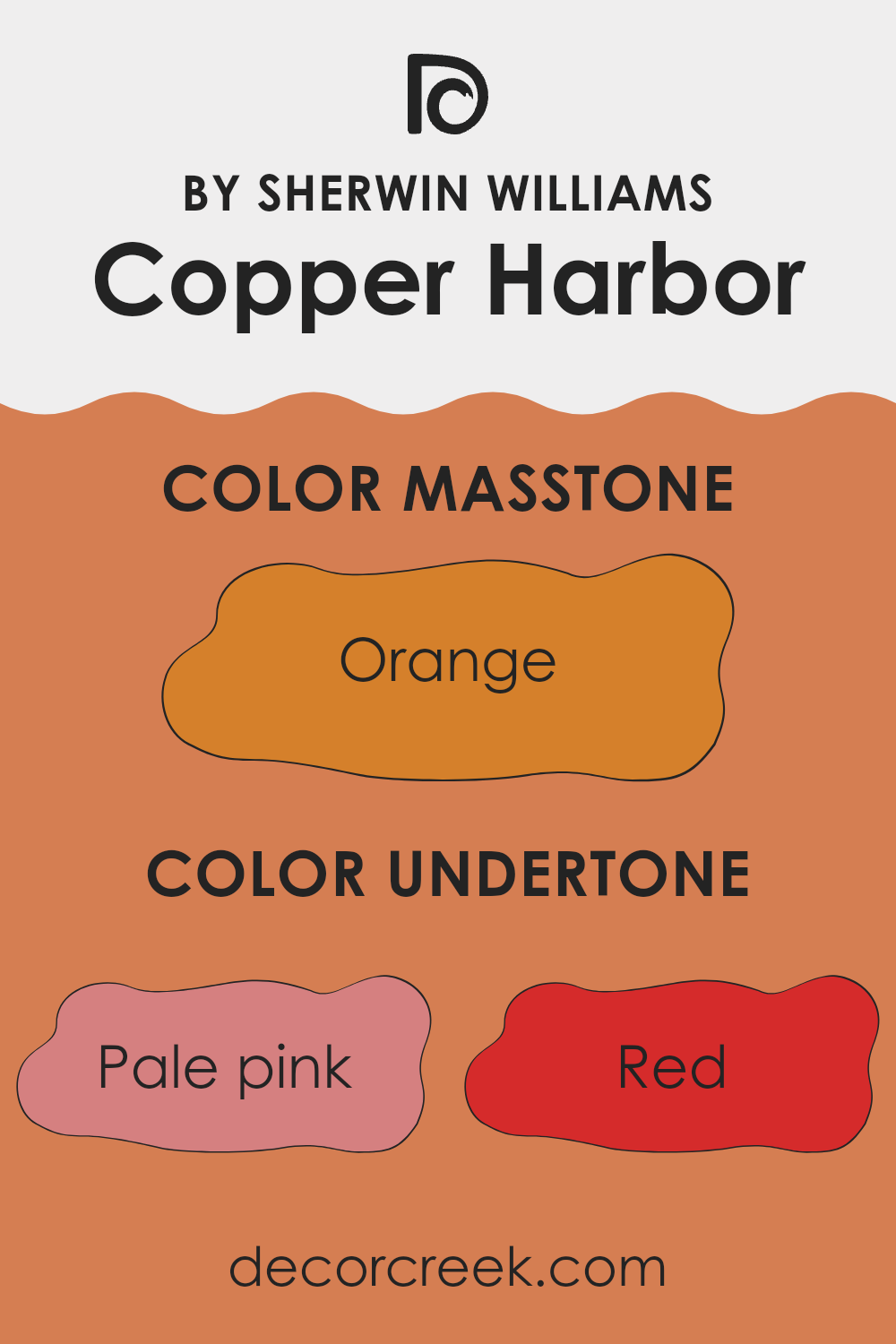
Copper Harbor is a unique paint color that contains a complex blend of undertones, impacting how it is perceived in various environments. Understanding undertones is important because they can subtly influence the overall appearance of the color under different lighting conditions. For instance, pale pink and pink undertones add a soft warmth to the color, making the room feel cozy. Red and brown undertones provide a rich depth, creating a welcoming atmosphere.
On the other hand, the presence of olive, grey, and purple can mute the color slightly, giving it a more grounded and neutral look, which is great for achieving a balanced aesthetic. Yellow and pale yellow undertones bring brightness and a sense of airiness to the room, making it feel more open and vibrant. Meanwhile, light green and mint undertones introduce a fresh, natural element to the color.
When used on interior walls, the blended undertones of Copper Harbor can affect the mood and visual dynamics of a room. In natural light, the warmer undertones might become more pronounced, enhancing the room’s inviting quality. In artificial lighting, the cooler undertones might stand out, providing a subtle elegance. This makes Copper Harbor very adaptable, suitable for various room settings and styles, shifting gently with changes in lighting and decor.
What is the Masstone of the Copper Harbor SW 6634 by Sherwin Williams?
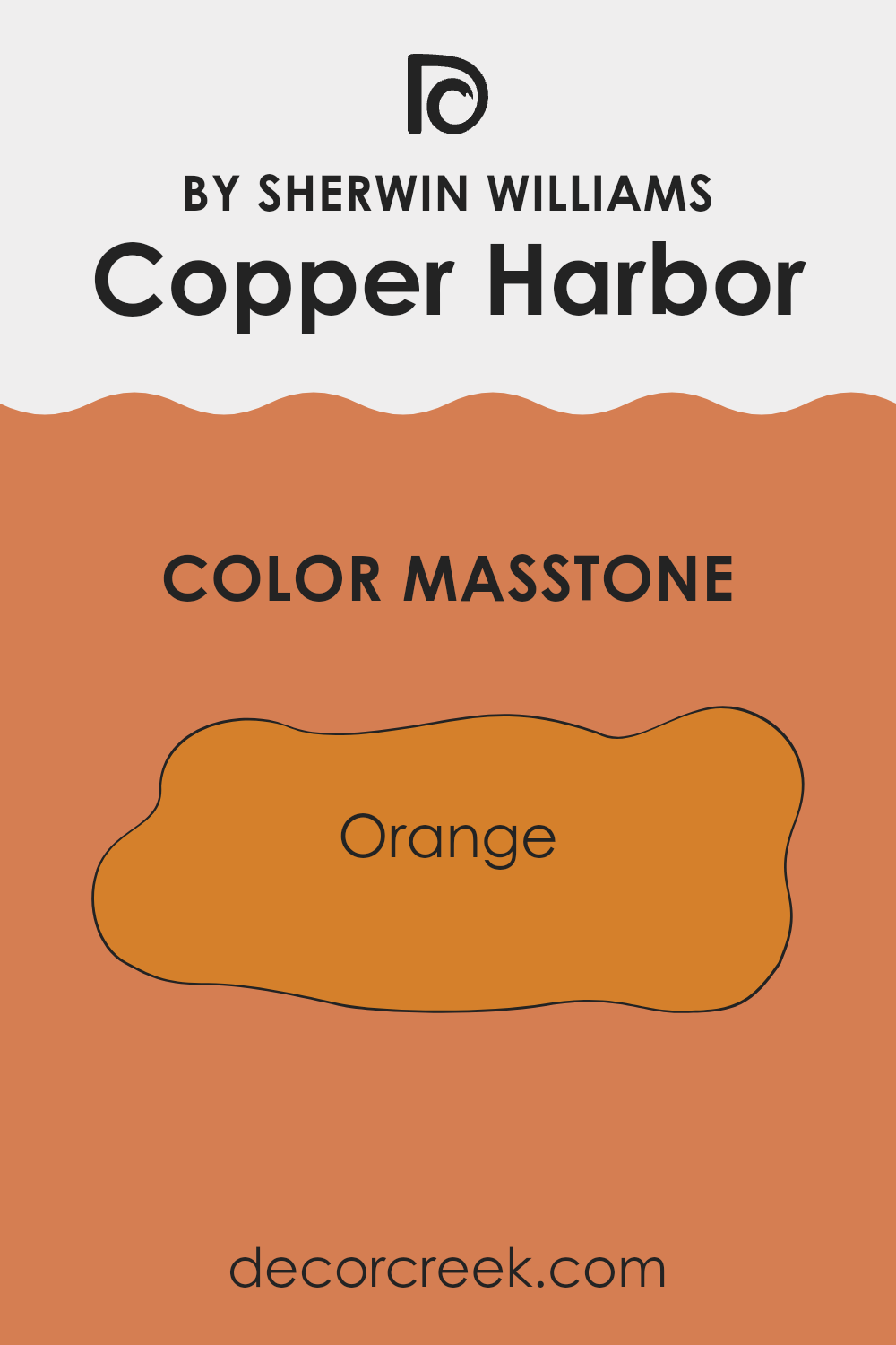
Copper Harbor SW 6634 by Sherwin Williams has a masstone of orange, specifically a hue close to #D5802B. This warm, welcoming shade adds a lively yet cozy touch to any room in a home. Since it’s a vivid color, it works beautifully in rooms that benefit from a bit of cheer, like kitchens or living rooms. It can make these areas feel more inviting and full of life.
When used on accent walls, Copper Harbor can introduce a focal point in the room without feeling too strong. Its warmth pairs well with natural elements like wood or stone, enhancing the overall feel of the room.
In bedrooms, using it sparingly can add a dash of warmth, especially useful in rooms that get less natural light. Overall, the orange masstone makes this color a great choice for adding personality and warmth to your home.
How Does Lighting Affect Copper Harbor SW 6634 by Sherwin Williams?
Lighting plays a crucial role in how colors appear in different environments, affecting both the mood and perception of a room. The color Copper Harbor, a rich and vibrant shade of copper, offers a striking example of how light can influence color appearance.
In artificial lighting, Copper Harbor tends to glow warmly, its red and orange undertones becoming more pronounced. This makes it a cozy choice for living rooms or dining areas where artificial light is often used to create a welcoming atmosphere. The type of bulb can change its appearance slightly: incandescent bulbs enhance its warmth, making it look richer, while fluorescent lights can pull out more of the green undertones, making it appear slightly harsher.
In natural light, the appearance of Copper Harbor can vary significantly depending on the direction a room faces:
- North-facing rooms: These receive less direct sunlight, which can make colors appear cooler. Here, Copper Harbor could look more subdued and slightly darker, losing some of its vibrant warmth.
- South-facing rooms: With more direct, often warmer light, Copper Harbor will appear brighter and more vivid. This setting can highlight the depth and richness of the color, making it feel energetic and lively.
- East-facing rooms: Morning light is typically cooler and can make Copper Harbor look softer and more muted early in the day, gradually warming as the hours pass.
- West-facing rooms: Evening light is warm and golden, which enhances the warm tones of Copper Harbor, making it look exceptionally radiant at sunset.
Each direction’s natural light will interact with Copper Harbor in unique ways, highlighting different aspects of its rich copper hue. This play with light is important to consider when choosing paint colors and planning the overall color scheme of a room to achieve the desired atmosphere.
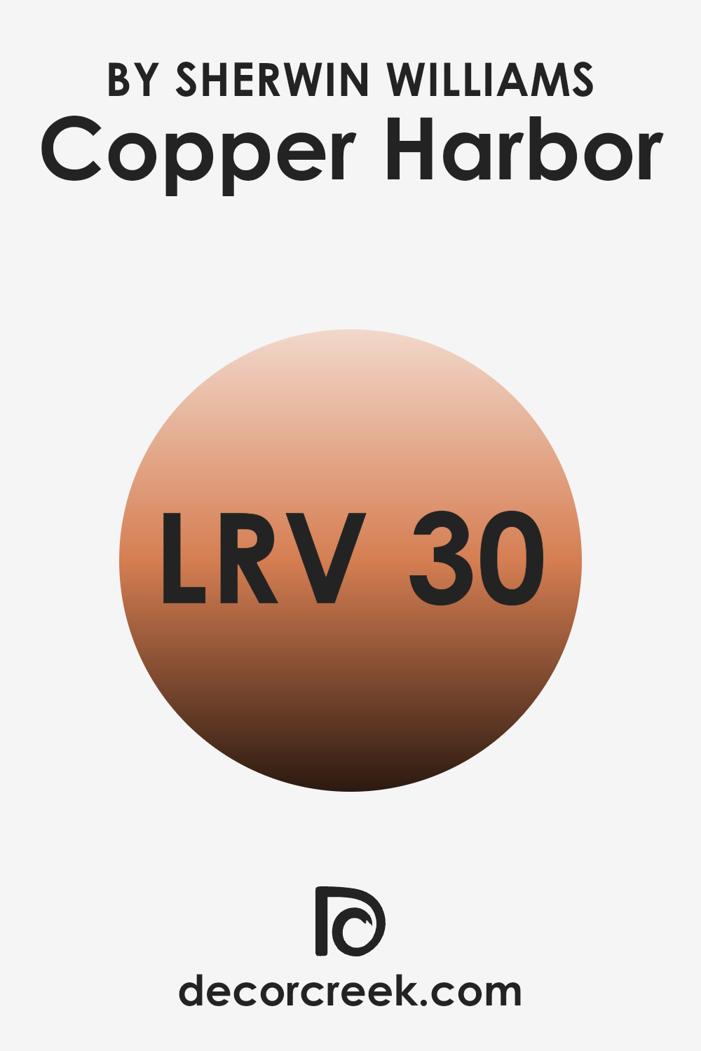
What is the LRV of Copper Harbor SW 6634 by Sherwin Williams?
LRV stands for Light Reflectance Value, a measurement that indicates how much light a color reflects back into a room. Essentially, it’s a scale from one to a larger number that helps determine how light or dark a color will appear once it’s painted on your walls.
The lighter the color, the higher the LRV, meaning it reflects more light back. This is important because it can make a room feel more open and bright. Conversely, colors with a lower LRV can make a room feel cozier or smaller because they absorb more light.
In the case of the color Copper Harbor with an LRV of 29.714, it falls on the darker end of the spectrum, absorbing more light than it reflects. This means it might not be the best choice for a small, dim room as it could make the room feel even smaller and darker.
However, in a well-lit or larger room, this color could add a warm and inviting atmosphere. The LRV tells you that this paint color could potentially create a more intimate vibe, perfect for rooms where you want a cozy and inviting feel.
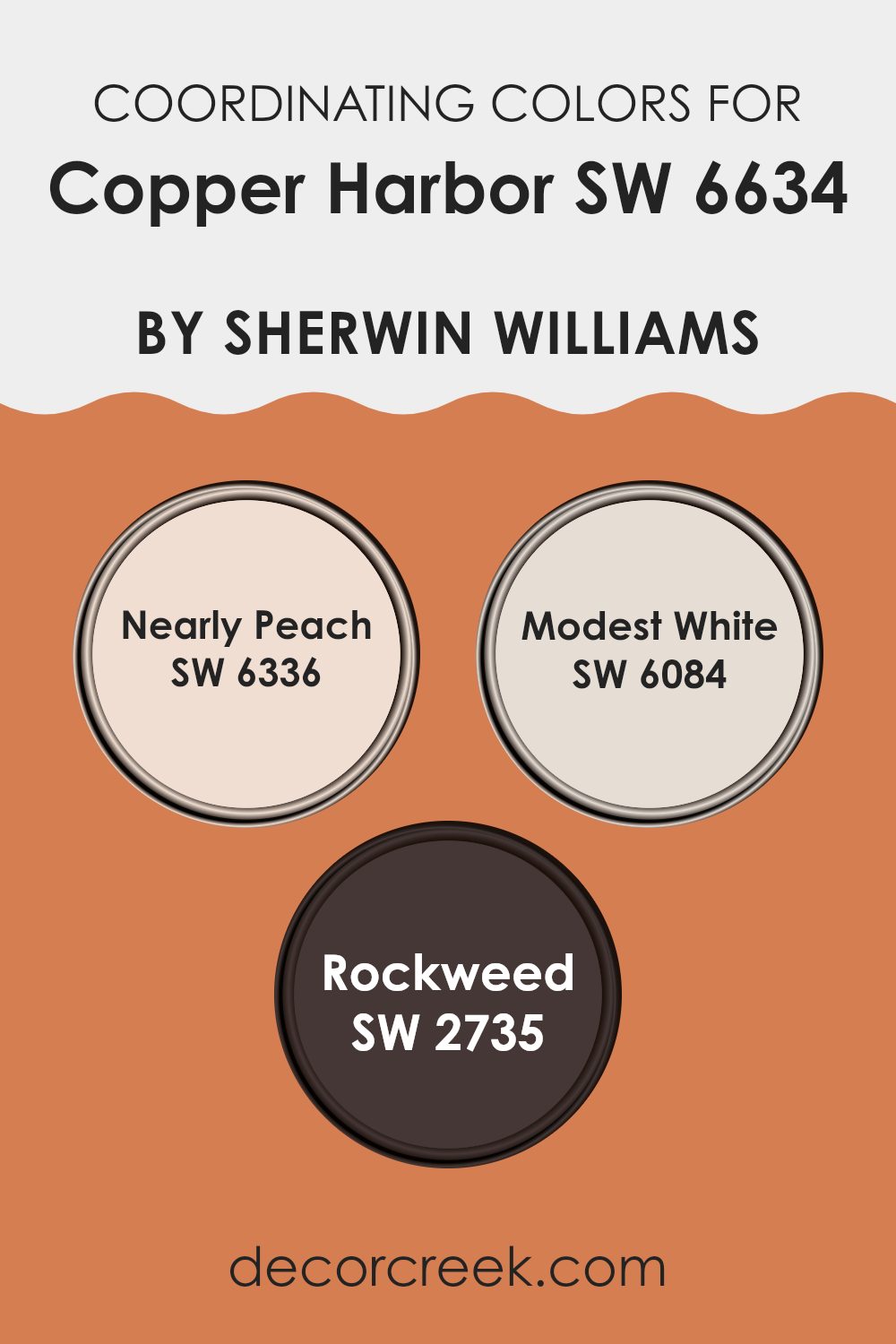
Coordinating Colors of Copper Harbor SW 6634 by Sherwin Williams
Coordinating colors are those that complement each other well, enhancing the overall aesthetic of a room when used together. They are selected based on their ability to support and accentuate a primary color, in this case, Copper Harbor by Sherwin-Williams, which is a rich, vibrant shade. The chosen coordinating colors harmonize with the main hue, bringing balance and cohesion to decor. This method helps in creating a visually appealing room that feels connected and thoughtfully designed.
Nearly Peach (SW 6336) is a soft, subtle orange that offers a gentle contrast to the robustness of Copper Harbor, giving a room a fresh and welcoming vibe. Modest White (SW 6084) is a muted, warm white that acts as a neutral backdrop, allowing more intense colors like Copper Harbor to stand out without feeling too strong.
Rockweed (SW 2735) is a deep, earthy green that complements the earth tones in Copper Harbor, adding a natural, grounding element to the palette. Together, these colors create a cohesive look that is pleasing to the eye and makes decorating easier and more harmonious.
You can see recommended paint colors below:
- SW 6336 Nearly Peach
- SW 6084 Modest White
- SW 2735 Rockweed
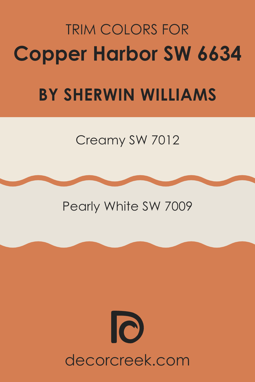
What are the Trim colors of Copper Harbor SW 6634 by Sherwin Williams?
Trim colors are specific shades used to accentuate or highlight the architectural features of a room such as door frames, window sills, and baseboards. Choosing the right trim color can greatly enhance the overall appearance of a room. When paired with a vibrant wall color like Copper Harbor, neutral trim colors such as SW 7012 – Creamy and SW 7009 – Pearly White are incredibly effective.
These lighter trim colors create a crisp, clean border that not only defines but also brightens the edges and corners of a room, making the wall color stand out more prominently and giving the room a finished look.
SW 7012 – Creamy is a soft, warm white that has a buttery tone capable of adding a subtle warmth to the edges of a room painted with Copper Harbor. It’s a gentle contrast that softens the transition between the vibrant walls and the trim, making the room feel cozy and inviting.
Meanwhile, SW 7009 – Pearly White is a slightly cooler, neutral white that offers a sharper contrast, which can help the bold Copper Harbor pop even more. It acts almost like a subtle highlighter around the room’s features, enhancing architectural details and complementing the richer wall color.
You can see recommended paint colors below:
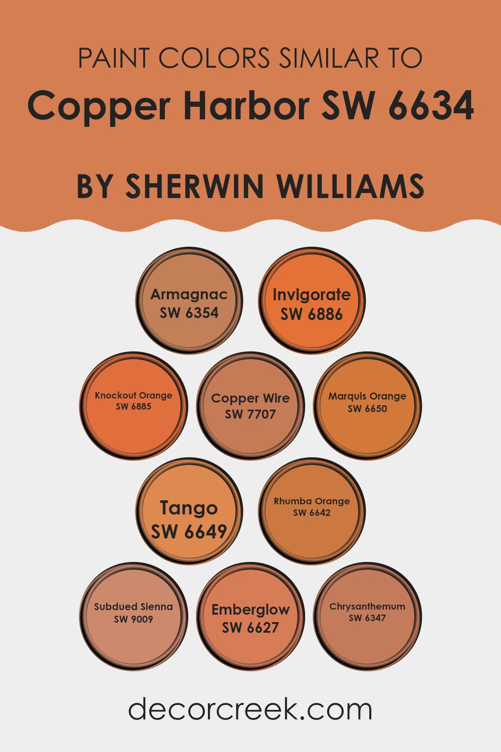
Colors Similar to Copper Harbor SW 6634 by Sherwin Williams
When redecorating or designing a room, choosing the right color palette is crucial for creating a harmonious and visually appealing environment. Colors that are similar to each other can be particularly effective in achieving this effect.
For example, colors similar to SW 6634 by Sherwin Williams are perfect for creating a cohesive look that is consistent yet dynamic enough to add interest to a room. These analogous colors usually have similar hues which make them easy to combine, ensuring that no single color feels too strong.
SW 6354 Armagnac brings a deep, warm tone that works well with natural lighting, adding a rich texture to the walls. SW 6886 Invigorate offers a vibrant pop of color that can liven up any area, perfect for accent walls or decorative elements. SW 6885 Knockout Orange is a strong, vivid color that exudes energy and can be used to capture attention in a playful way.
SW 7707 Copper Wire, resembling a burnished metal, provides a rustic touch that pairs well with industrial and vintage themes. The hue of SW 6650 Marquis Orange has a regal quality, ideal for rooms that aim for a cheerful yet elegant atmosphere. SW 6649 Tango is lively and bold, suitable for creating a statement piece or focal point in a room.
The addition of SW 6642 Rhumba Orange infuses a room with warmth, making it cozy and welcoming. SW 9009 Subdued Sienna offers a more muted option, excellent for blending with other colors without causing distraction. SW 6627 Ember Glow stands out with its soft glow, reminiscent of embers, perfect for creating a soothing yet warm setting.
Lastly, SW 6347 Chrysanthemum exudes a traditional charm with its deep floral-inspired color, ideal for adding a touch of elegance and nostalgia. Using these colors that relate well with each other can help achieve a coordinated look that binds the different elements of your décor in a subtle yet striking way.
You can see recommended paint colors below:
- SW 6354 Armagnac
- SW 6886 Invigorate
- SW 6885 Knockout Orange
- SW 7707 Copper Wire
- SW 6650 Marquis Orange
- SW 6649 Tango
- SW 6642 Rhumba Orange
- SW 9009 Subdued Sienna
- SW 6627 Emberglow
- SW 6347 Chrysanthemum
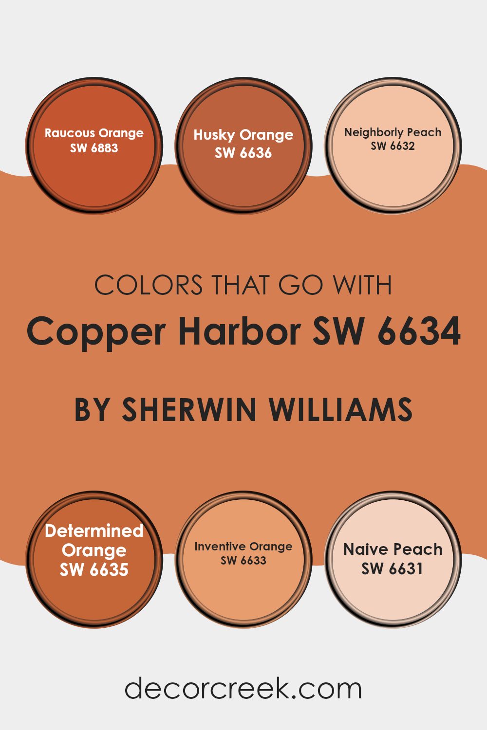
Colors that Go With Copper Harbor SW 6634 by Sherwin Williams
Choosing complementary colors for Copper Harbor SW 6634 by Sherwin Williams is crucial for creating harmonious and pleasing visual experiences in your room. Copper Harbor is a rich, deep shade with a vibrant yet earthy feel, and pairing it with the right colors can enhance its warmth and depth.
For instance, pairing it with colors like Raucous Orange or Husky Orange introduces a dynamic vibrancy. Using lighter shades like Neighborly Peach or Naive Peach gives a more subdued look that still carries energy through the room.
SW 6883 – Raucous Orange is a bold and lively color that adds a pop of energy and fun, while SW 6636 – Husky Orange is a slightly more subdued orange that still retains a sense of playfulness and warmth. Neighborly Peach, SW 6632, is a soothing, friendly peach that brings a soft, welcoming feel to any room. SW 6635 – Determined Orange has a spirited, energetic tone, making any room feel more alive.
Inventive Orange, SW 6633, is imaginative and bright, perfect for sparking creativity. Lastly, Naive Peach SW 6631 provides a gentle, youthful glow that makes rooms feel cozy and inviting. Pairing these oranges and peaches with Copper Harbor creates rooms that are vibrant yet comforting, perfect for lively living areas or creative rooms.
You can see recommended paint colors below:
- SW 6883 Raucous Orange
- SW 6636 Husky Orange
- SW 6632 Neighborly Peach
- SW 6635 Determined Orange
- SW 6633 Inventive Orange
- SW 6631 Naive Peach
How to Use Copper Harbor SW 6634 by Sherwin Williams In Your Home?
Copper Harbor SW 6634 by Sherwin Williams is a warm, vibrant shade of orange that adds a cozy and welcoming feel to any room. This lively color is ideal for creating a focal point in your home. For instance, painting one wall in Copper Harbor can make it stand out and draw attention. This is great for living areas or dining rooms where you want to add some energy and joy.
You can also use this color in smaller doses, like on a piece of furniture or in decorative accents such as cushions or vases, to brighten up your room without feeling too strong. If you’re adventurous, try using Copper Harbor in your kitchen or bathroom for a unique and cheerful look.
It pairs well with neutral colors like white, gray, or beige, which help balance its warmth and prevent it from dominating the room. This color is especially good for rooms where you gather with friends and family, as it creates a friendly and inviting environment.
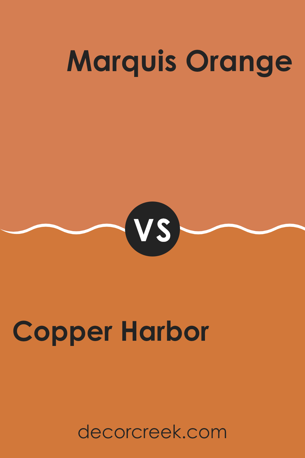
Copper Harbor SW 6634 by Sherwin Williams vs Marquis Orange SW 6650 by Sherwin Williams
Copper Harbor and Marquis Orange are two vibrant shades with their unique charm. Copper Harbor is a rich, deep orange that has a touch of rust, making it feel warm and cozy. It’s perfect for rooms where you want to add a bold yet inviting ambiance.
On the other hand, Marquis Orange is brighter and lighter, leaning more towards a classic orange. This shade is more energetic and could brighten up a room instantly, giving it a fresh and cheerful atmosphere.
Both colors are excellent choices for making a statement, but Copper Harbor might be better suited for a more subdued, warm setting, whereas Marquis Orange could be ideal for rooms that benefit from a lively, uplifting vibe.
You can see recommended paint color below:
- SW 6650 Marquis Orange
Copper Harbor SW 6634 by Sherwin Williams vs Rhumba Orange SW 6642 by Sherwin Williams
Copper Harbor is a rich, deep orange with hints of copper and terra cotta, creating a warm and welcoming feel. This color is great for rooms where you want to add a cozy, vibrant vibe, such as living rooms or dining areas. It pairs well with earthy tones and can make a room feel more inviting.
In contrast, Rhumba Orange is a brighter, more energetic orange. It’s lighter and leans towards a peachy side, giving off a playful and fun atmosphere. This shade is perfect for lively rooms or areas where creativity and energy are encouraged, like a kitchen or a children’s playroom.
Overall, while both colors share an orange base, Copper Harbor offers a deeper, more subdued look, and Rhumba Orange brings a splash of brightness and light. They could complement each other well in a room that balances energy and warmth.
You can see recommended paint color below:
- SW 6642 Rhumba Orange

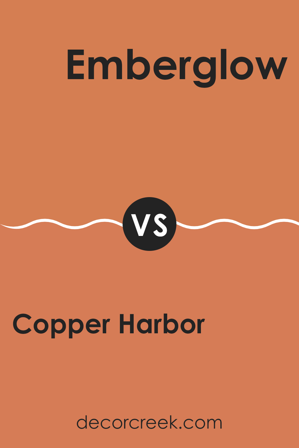
Copper Harbor SW 6634 by Sherwin Williams vs Emberglow SW 6627 by Sherwin Williams
Copper Harbor and Emberglow, both from Sherwin Williams, are rich, warm hues perfect for adding a cozy, inviting atmosphere to any room. Copper Harbor is a deep, vibrant orange with hints of coppery red, creating a bold and energetic vibe.
It’s striking and perfect for making a statement in areas like a dining room or an accent wall. On the other hand, Emberglow is a slightly muted orange with terra cotta undertones, giving it a more grounded and warm feel. It’s less intense than Copper Harbor, which makes it more adaptable for larger rooms or entire walls.
Together, these colors can work beautifully in a room that aims for a mix of dynamism and warmth, particularly when paired with natural wood or stone elements. While Copper Harbor draws the eye with its lively radiance, Emberglow offers a softer, cozy background, ideal for living areas.
You can see recommended paint color below:
- SW 6627 Emberglow
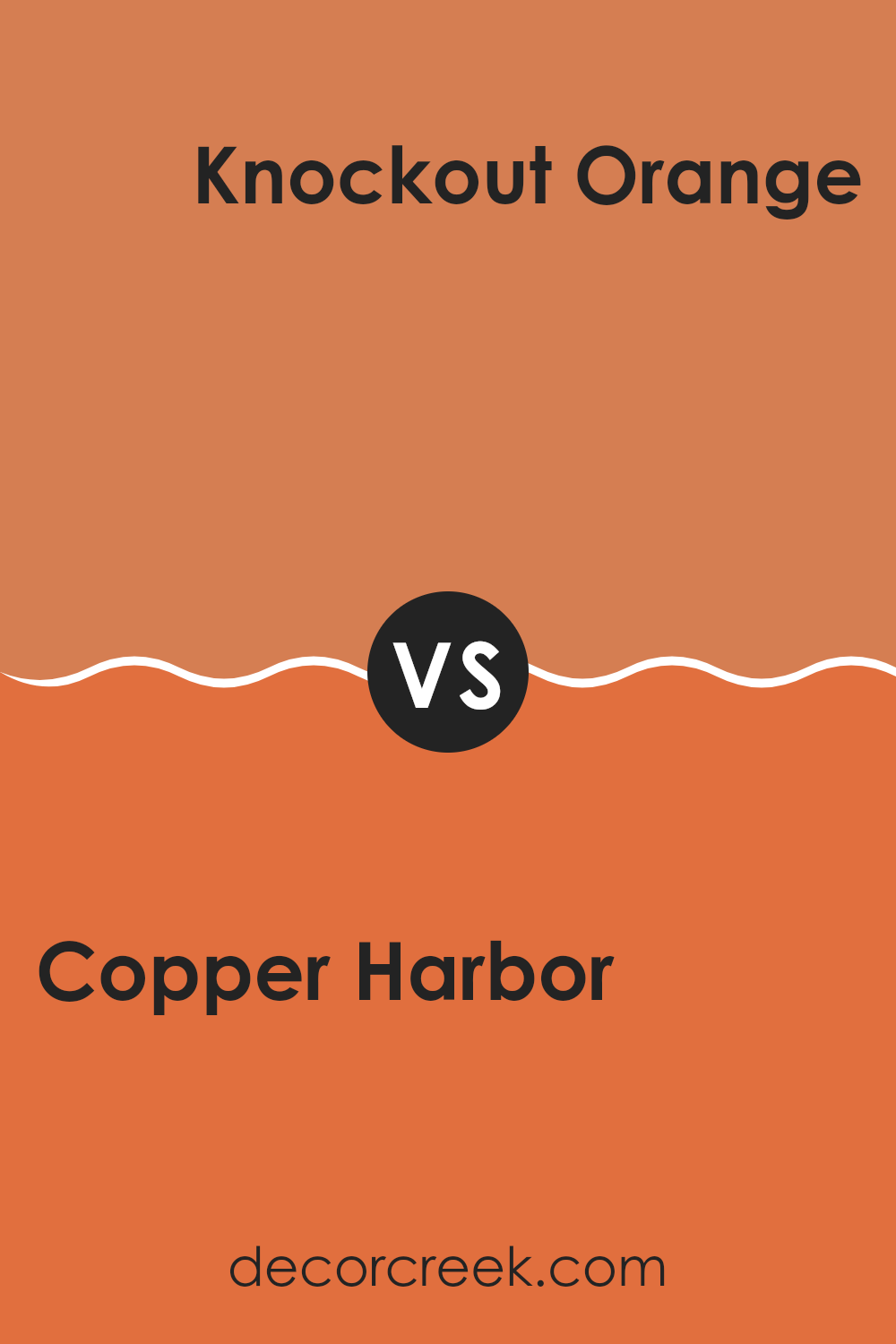
Copper Harbor SW 6634 by Sherwin Williams vs Knockout Orange SW 6885 by Sherwin Williams
Copper Harbor is a rich, warm shade that leans towards a deep terra cotta or burnt orange. It’s a color that brings to mind the rustic hues of autumn leaves or a cozy, earthy atmosphere. This color works well in rooms where you want to add a sense of warmth and coziness, making them feel more inviting and comfortable.
On the other hand, Knockout Orange is a bold, vivid orange that packs a punch. It’s brighter and more vibrant, almost neon-like compared to Copper Harbor. This color is perfect for adding a pop of energy and excitement to a room.
It can liven up a setting and is especially effective in rooms used for creativity and activity, like a game room or a creative studio. Both colors, while sharing an orange base, offer distinct vibes — Copper Harbor gives a subtle, warm touch, whereas Knockout Orange shouts for attention with its lively zest.
You can see recommended paint color below:
- SW 6885 Knockout Orange
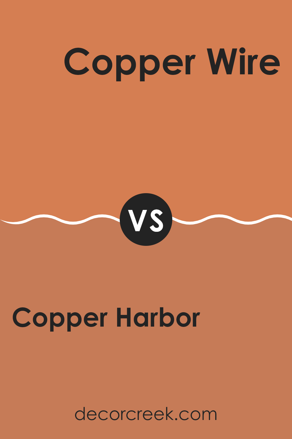
Copper Harbor SW 6634 by Sherwin Williams vs Copper Wire SW 7707 by Sherwin Williams
Copper Harbor and Copper Wire are two distinctive shades offered by Sherwin Williams that each bring their own unique vibe to a room. Copper Harbor is a bolder, more vivid color. It leans towards an intense orange with hints of deep red, making it stand out and add warmth to any area. This color works great in a room that could use a strong, energetic boost.
On the other hand, Copper Wire is a more subdued, darker shade that resembles the traditional brownish-red color of metallic copper. It’s less vibrant than Copper Harbor and offers a more grounded and muted feel, making it ideal for creating a cozy and inviting atmosphere.
Both colors share a warm base, but their intensity and depth differ significantly. Copper Harbor lights up a room with its lively hue, while Copper Wire provides a soothing, subtle backdrop. Depending on the mood you want to set, each color has its advantages.
You can see recommended paint color below:
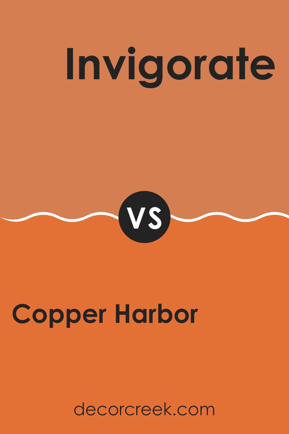
Copper Harbor SW 6634 by Sherwin Williams vs Invigorate SW 6886 by Sherwin Williams
Copper Harbor and Invigorate are two distinctive shades that carry their own unique vibes. Copper Harbor is a warm, deep orange with a rustic feel, perfect for cozy settings or as an accent wall to add warmth to a room. It resembles the hues you might see during a fall sunset, making it inviting and homey.
On the other hand, Invigorate is a bright and lively orange that really stands out. It’s much more vibrant, akin to the color of a ripe, juicy tangerine. This shade is excellent for rooms where you want to bring in energy and cheer, such as a kitchen or a playroom.
Both colors are bold and add personality to a room, but their different tones can influence the mood. Copper Harbor is more subdued and earthy, while Invigorate brings a punch of vibrancy that can spark excitement and make a statement.
You can see recommended paint color below:
- SW 6886 Invigorate
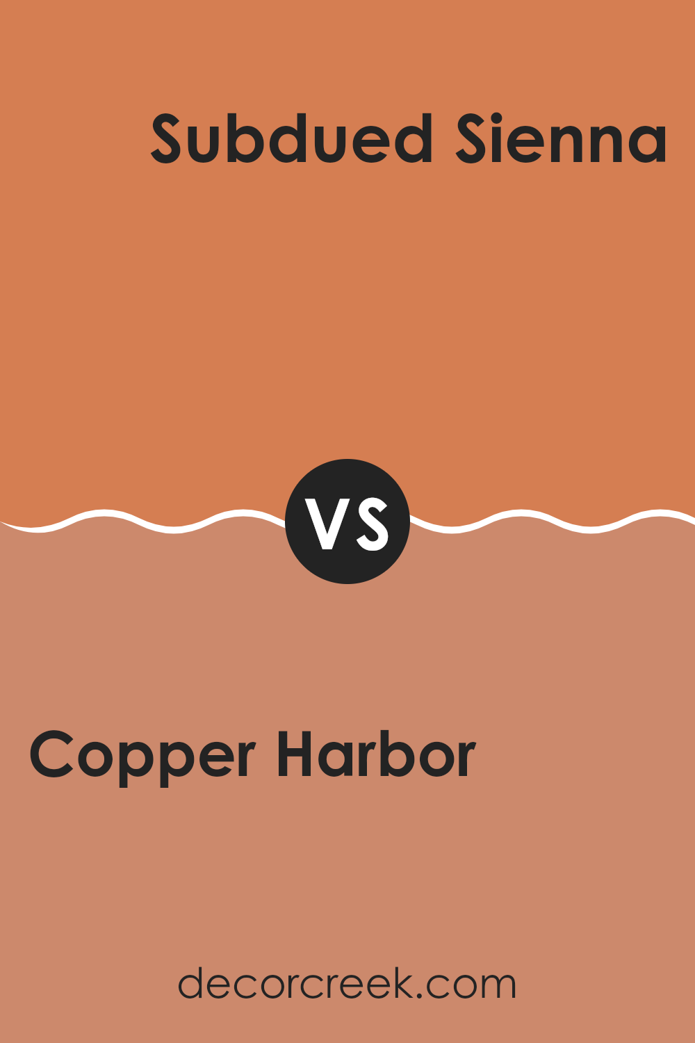
Copper Harbor SW 6634 by Sherwin Williams vs Subdued Sienna SW 9009 by Sherwin Williams
Copper Harbor and Subdued Sienna are two distinct colors by Sherwin Williams that bring unique vibes to any room. Copper Harbor is a rich, vibrant shade with a bold orange-red hue that really stands out. It’s perfect for making a statement and can add a warm, energetic feel to a room.
On the other hand, Subdued Sienna has a more muted, earthy tone. This color leans more towards a soft brown with a hint of rose, offering a cozy and calming feel, ideal for creating a relaxed environment.
Both colors are adaptable but serve different purposes due to their intensity and depth. Copper Harbor works well in rooms where you want to add a splash of color or spark excitement, like an accent wall or a playful kitchen. In contrast, Subdued Sienna is better suited for rooms where you want a gentle and soothing atmosphere, like bedrooms or living rooms. Together, they can complement each other beautifully if used thoughtfully in a color scheme.
You can see recommended paint color below:
- SW 9009 Subdued Sienna
Copper Harbor SW 6634 by Sherwin Williams vs Armagnac SW 6354 by Sherwin Williams
Copper Harbor is a vibrant shade with rich orange undertones that can add a lively and warm feel to any room. It has the energy of deep reds while keeping a touch of earthy naturality, making it a great choice for rooms where you want to add some cheer without feeling too strong.
On the other hand, Armagnac is a deeper and more muted color, leaning more towards a brownish-red. It offers a cozy and welcoming vibe, perfect for rooms where you want a more relaxed atmosphere. This color works well in intimate settings like living rooms or reading nooks, where its subtle depth can create a cozy retreat.
Both colors bring warmth to interiors but in different ways. Copper Harbor pops with energy, making it suitable for more dynamic and lively environments. In contrast, Armagnac provides a softer, grounding effect, ideal for creating a calm and cozy feel.
You can see recommended paint color below:
Copper Harbor SW 6634 by Sherwin Williams vs Tango SW 6649 by Sherwin Williams
Copper Harbor and Tango, both by Sherwin Williams, are distinct yet vibrant shades of paint that offer unique atmospheres to any room. Copper Harbor is a deep, rich orange with an almost terracotta clay tone that brings a warm and cozy feel to a room. It’s perfect for creating a welcoming and snug environment, especially in living areas or dining rooms.
On the other hand, Tango is a brighter, more energetic orange. It has a zestier look, reminiscent of a tangy citrus fruit, which can instantly perk up a room and make it feel more lively and fun. Tango works well in rooms that benefit from a splash of cheerfulness, like kitchens or playrooms.
In essence, while both colors are variations of orange, Copper Harbor offers a moodier, earthier vibe, ideal for relaxed, intimate settings. Tango, with its punchier, vibrant flair, injects excitement and vibrancy, suitable for more dynamic, spirited rooms.
You can see recommended paint color below:
- SW 6649 Tango
Copper Harbor SW 6634 by Sherwin Williams vs Chrysanthemum SW 6347 by Sherwin Williams
Copper Harbor is a rich, vibrant shade that leans towards an orange-red tone. It feels warm and bold, and is likely to make any room feel cozy yet lively. This color would stand out on an accent wall or as part of a color scheme that needs a strong, cheerful punch.
On the other hand, Chrysanthemum is a muted terracotta color with a dusty rose hue. It’s much softer and more subdued compared to Copper Harbor. Chrysanthemum gives off an earthy vibe, which can be very inviting and comforting in a home setting. It’s perfect for walls in living rooms or bedrooms where a calming, gentle atmosphere is desired.
Both colors offer warmth, but Copper Harbor does it with a shout, while Chrysanthemum speaks in a whisper. Each brings its own unique mood and could work well together or separately depending on the effect you want to achieve.
You can see recommended paint color below:
- SW 6347 Chrysanthemum
After looking closely at SW 6634 Copper Harbor by Sherwin Williams, I’ve learned a lot about this unique paint color. Copper Harbor is not just any ordinary shade. It stands out because of its deep, warm orange color that reminds me of autumn leaves or a cozy fire glow. This paint color is perfect for anyone looking to add a bit of warmth and cheerfulness to their room.
From the tests and comparisons I’ve done, I noticed that Copper Harbor works really well in living rooms and dining areas where you often have people around and want to make the room feel inviting and cozy. It pairs nicely with light-colored furniture and can be balanced with some greens or blues in decor items or wall art.
In conclusion, if you’re thinking about changing up a room in your home and want something that feels warm and happy, SW 6634 Copper Harbor is a great choice. It’s a color that makes a strong statement without being too loud, and it creates a friendly, welcoming vibe wherever you apply it.
Whether it’s a splash of color on an accent wall or used throughout a whole room, it seems like you can’t go wrong with Copper Harbor if warm and cozy is what you’re after.
Ever wished paint sampling was as easy as sticking a sticker? Guess what? Now it is! Discover Samplize's unique Peel & Stick samples.
Get paint samples

