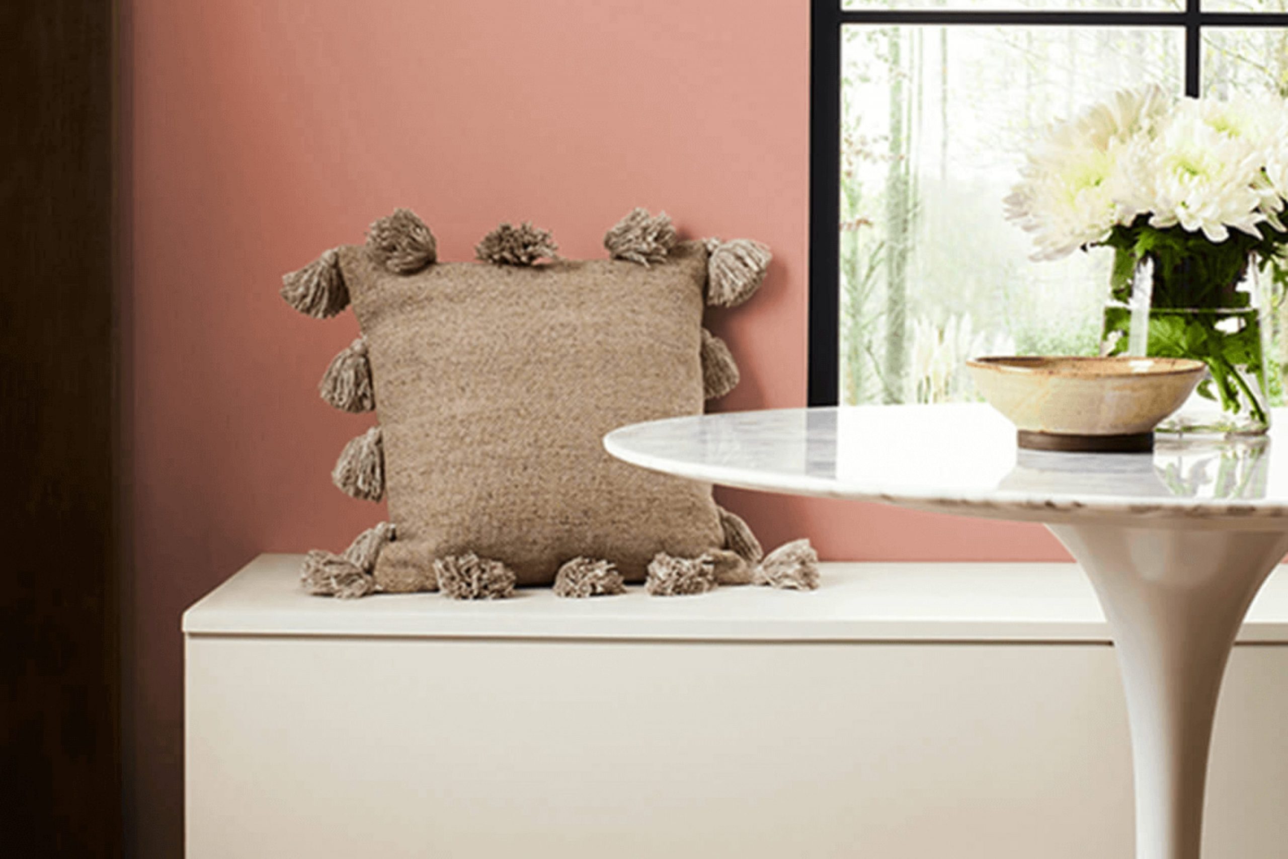
I recently painted a room with SW 6332 Coral Island by Sherwin Williams, and the result was a bright and cheerful room. This particular shade of coral has a vibrant, yet calming quality that instantly freshens up any area. It strikes a beautiful balance between pink and orange, creating a warm and inviting atmosphere that’s perfect for rooms where you want to add a splash of personality.
Choosing a paint color can sometimes be challenging, but Coral Island makes it easy to add a touch of warmth without feeling too intense. This color works well in a variety of lighting conditions, casting a soft, luminous glow that makes the room feel cozy yet open.
Whether you’re updating your living room, bathroom, or a bedroom, this flexible hue pairs nicely with both light and dark accents, allowing for adaptable decor options.
Painting with Coral Island was a straightforward way to refresh the room, and I find myself spending more time there, enjoying the new energy it brings.
What Color Is Coral Island SW 6332 by Sherwin Williams?
Coral Island by Sherwin Williams is a lively and vibrant color that brings a touch of coastal warmth into any room. This shade is a blend of pink and orange hues that mirror the natural beauty of coral reefs. Its bright yet soft appearance makes it a great choice for adding a splash of cheerfulness to your home.
This color works wonderfully in a variety of interior styles, particularly in coastal, tropical, and eclectic decor. It adds a fresh, upbeat vibe to rooms and evokes feelings of happiness and warmth. Coral Island pairs well with neutral tones such as whites, greys, and beiges, which help balance its brightness. For a bold look, it can also coordinate with teal or deep blue, drawing inspiration from ocean-inspired palettes.
When considering materials and textures to pair with Coral Island, think of natural elements that complement its lively character. Light wooden surfaces such as oak or birch can soften its impact, creating a relaxed atmosphere. Textured fabrics like linen or cotton in simple patterns help keep the setting light and airy.
Adding elements in natural rattan or wicker can emphasize a beachy, laid-back feel, perfect for interiors aiming for a refreshing aesthetic.
Is Coral Island SW 6332 by Sherwin Williams Warm or Cool color?
Coral Island SW 6332 by Sherwin Williams is a vibrant and cheerful paint color that brings a lively touch to any room. This shade is a warm blend of pink and orange, similar to the tones you might see during a beautiful sunset. When used in homes, Coral Island adds a burst of energy and friendliness to interiors.
It works well in areas like living rooms or kitchens where you want an inviting atmosphere. This color pairs beautifully with soft neutrals like light grays or whites, which help balance its brightness. It also looks great with navy or deep greens for a more dramatic look.
In a bedroom, using this color can create a cozy, yet cheerful room, especially when used as an accent wall or for decorative accessories. Overall, Coral Island is perfect for those looking to add a pop of color and warmth to their home without feeling too intense. It’s both fun and functional, making it a popular choice for anyone looking to refresh their interiors.
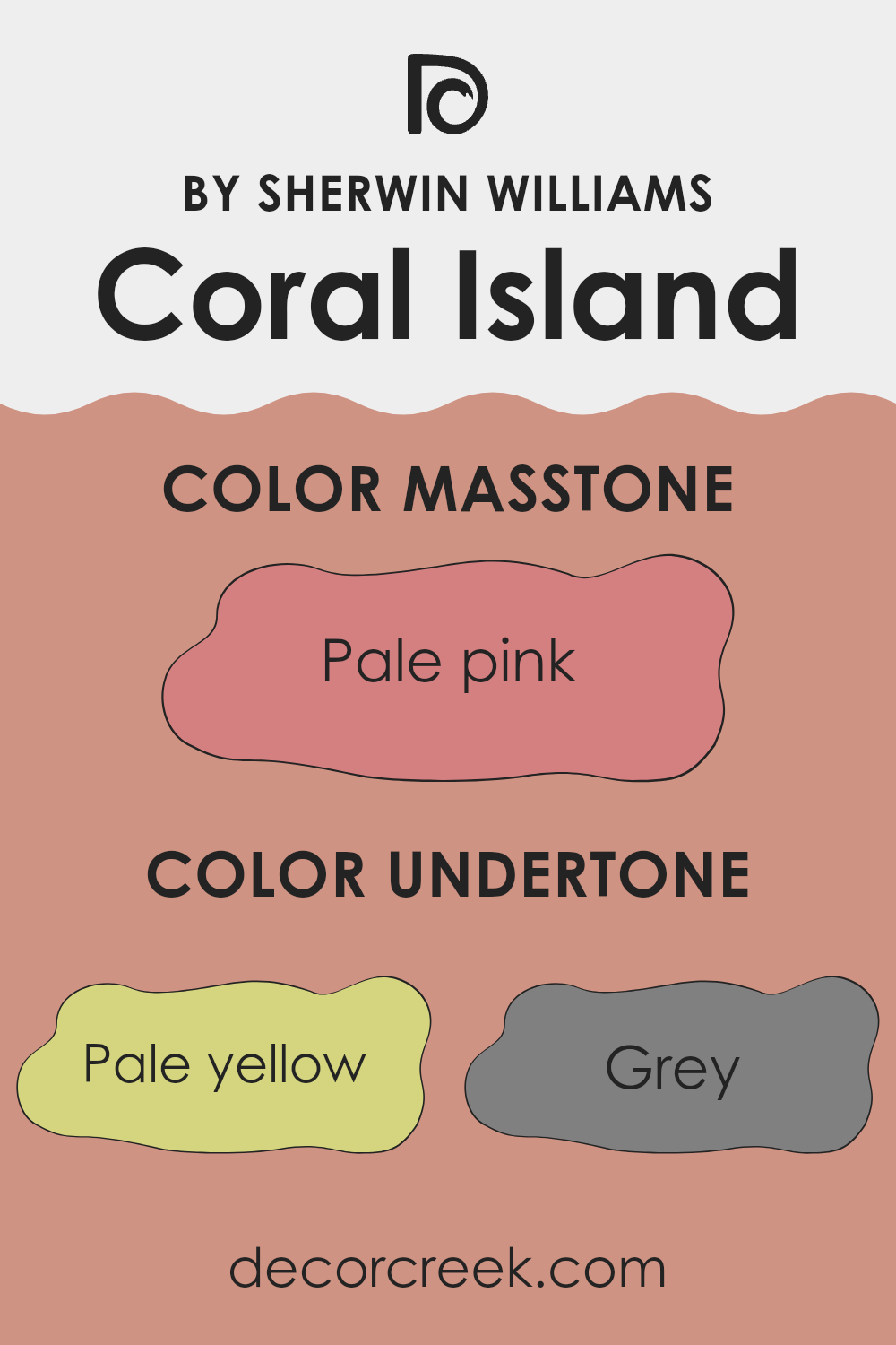
Undertones of Coral Island SW 6332 by Sherwin Williams
Coral Island is a vibrant color that can bring a room to life. The undertones present in this shade play a pivotal role in how it interacts with different lighting and surrounding colors. Undertones are subtle hues that influence the main color, making it appear different under various circumstances.
For Coral Island, the undertones range from pale yellow to deep brown. These undertones affect the way we perceive the color. Depending on the lighting, Coral Island might look more orange or more pink. In bright natural light, the yellow and orange undertones might make the color look warmer, whereas in dimmer artificial light, the grey or brown undertones might make it look more muted.
When used on interior walls, Coral Island can create a lively atmosphere. The brighter undertones like light purple, mint, and light blue can make a room look more inviting and open. On the other hand, deeper undertones like olive, purple, and brown can give the room a cozy feel. The key is balancing these undertones with appropriate lighting and complementary colors in furniture and decorations to enhance the room’s overall aesthetic.
Understanding the undertones of Coral Island can help you use the color more effectively in your decorating, ensuring that the walls complement the surroundings and achieve the desired mood for the room.
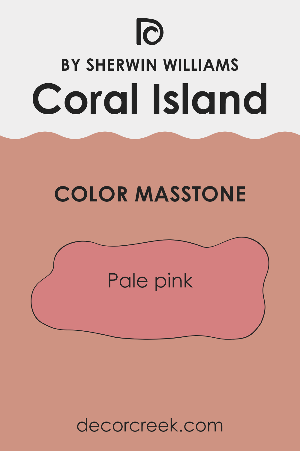
What is the Masstone of the Coral Island SW 6332 by Sherwin Williams?
Coral Island SW 6332 by Sherwin Williams is a delightful pale pink color that brings a fresh, gentle vibe to any room. This shade’s masstone, a soft version of pink, creates a cozy and welcoming atmosphere. It works well in homes because it offers a hint of warmth without being too bold or too intense. This makes it perfect for areas where you want a splash of color but still maintain a light and airy feel.
This color is adaptable across various home styles, whether you’re looking to paint a nursery, a bathroom, or just add a touch of femininity to a living area. Additionally, its understated tone pairs nicely with many other colors, from soft neutrals to darker shades, allowing for flexible design options.
Furthermore, pale pink helps to reflect light, making smaller areas appear larger and more open. This can be especially useful in rooms that lack natural light or are smaller in size. Overall, Coral Island is a lovely color choice for creating a gentle, inviting home environment.
How Does Lighting Affect Coral Island SW 6332 by Sherwin Williams?
Lighting plays a crucial role in how we perceive colors in any environment. The color of a room can appear to change under different lighting conditions due to a phenomenon known as metamerism. This essentially means that colors can look different when illuminated by different light sources.
For example, the paint color Coral Island by a well-known brand appears differently under natural and artificial light. In natural light, this coral hue tends to show its true color, vibrant and warm, uplifting the mood of the room. On sunny days, it can look quite radiant and bright, adding to its cheerful effect.
Under artificial lighting, the way Coral Island appears can vary depending on the type of bulbs used. Fluorescent lights could make the color appear cooler and slightly more muted, reducing the warmth it shows under natural light. Incandescent bulbs, on the other hand, will enhance the peachy warm tones of this color, making the room feel cozy and welcoming.
The orientation of the room also influences how Coral Island looks. In north-facing rooms, which often get less direct sunlight and more cool, blue light, this color can look a little more subdued and less vibrant. It might sometimes require additional lighting to bring out its warmth.
In south-facing rooms, Coral Island will be more vivid, energized by the abundance of bright, warm light throughout the day. This can highlight the liveliness of the color, making it ideal for lively rooms like living rooms or kitchens.
For east-facing rooms, lighting varies significantly from morning to evening. Coral Island will gleam vibrantly in the morning light and become gradually muted as the day progresses.
West-facing rooms, however, are filled with intense afternoon and evening light, which can make Coral Island radiate warmth, creating a cozy, inviting atmosphere as the day ends. This makes it perfect for rooms used more often later in the day. Overall, Coral Island is a flexible color, with its appearance warmly influenced by the light it’s under and the direction of the room’s windows.
What is the LRV of Coral Island SW 6332 by Sherwin Williams?
LRV stands for Light Reflectance Value, a measure used to understand how much light a paint color reflects. Think of LRV as a scale helping to determine how light or dark a color will look once it’s on your wall.
A higher LRV means the color tends to be lighter, reflecting more light back into the room, making the room appear bigger and brighter. Conversely, a lower LRV means the color is darker and absorbs more light, which can make a room feel smaller and cozier.
Regarding the color with an LRV of 35.52, it is in the medium range, not too dark or too light. This balance means it has enough depth to add character to a room while still reflecting some light and brightening the area compared to darker shades. The color won’t feel too intense with brightness like lighter colors might, but it also won’t make the room feel overly enclosed. It’s a flexible choice that can work in many rooms, providing warmth and depth without making the area feel closed in.

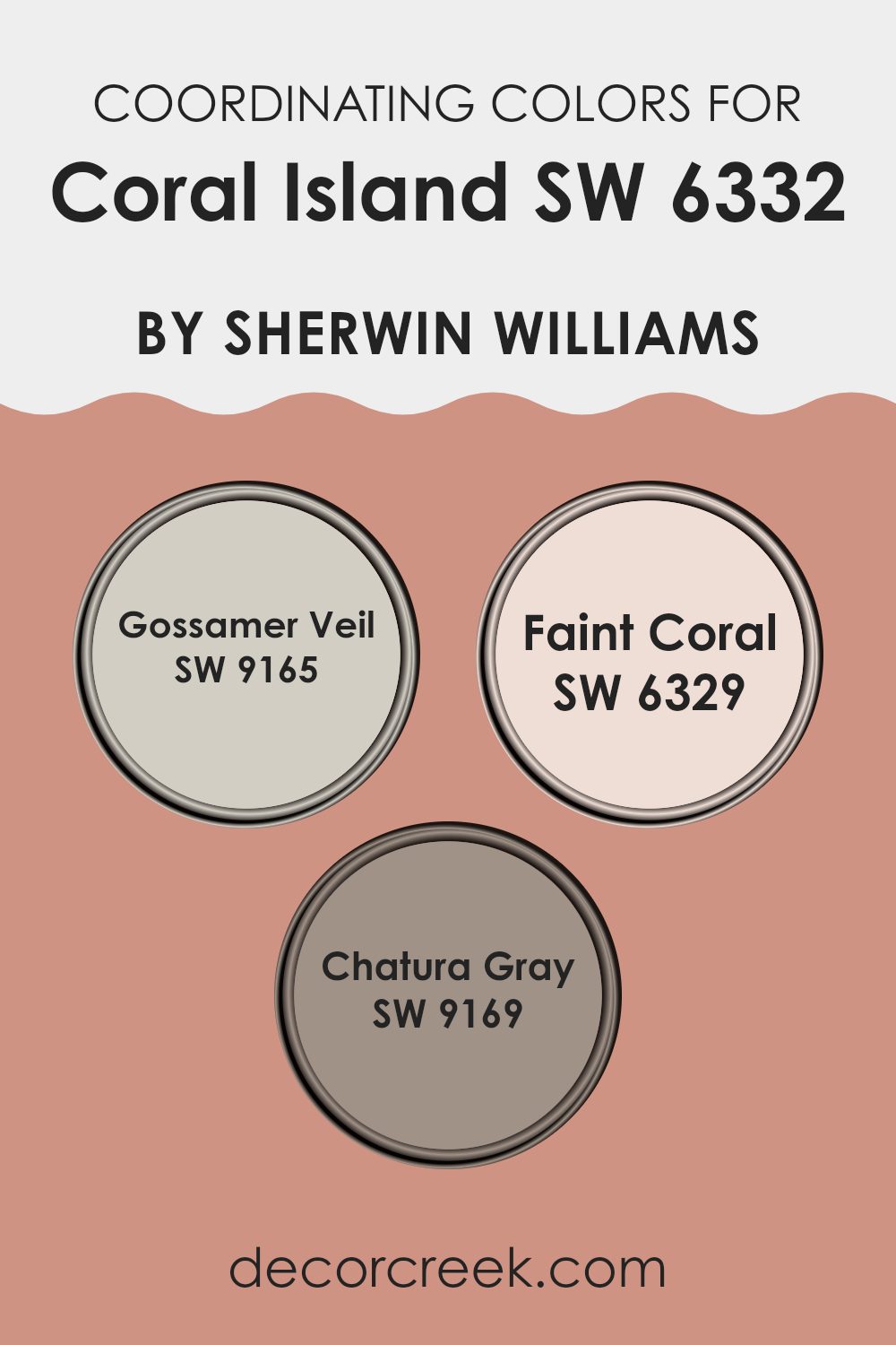
Coordinating Colors of Coral Island SW 6332 by Sherwin Williams
Coordinating colors are those that complement each other well, creating a balanced and harmonious palette in any room. When it comes to interior design, picking the right coordinating colors can enhance the mood and aesthetic of an interior.
For example, Coral Island by Sherwin Williams can be beautifully complemented by shades like Gossamer Veil, Faint Coral, and Chatura Gray. These shades are thoughtfully chosen to work well with Coral Island, ensuring the overall look feels unified and pleasing to the eye.
Gossamer Veil is a soft gray that provides a subtle contrast to the vibrant tones of Coral Island, making it a perfect choice for backgrounds or larger areas to allow brighter colors to stand out. Faint Coral is a lighter version of Coral Island, offering gentle harmony and a sense of continuity to rooms that use these two colors together.
On the other hand, Chatura Gray is a deeper, smoky shade that adds wonderful depth when paired with Coral Island, perfect for creating accent walls or for furniture pieces that need a bit more presence. Together, these colors create a balanced and inviting environment, enhancing the liveliness of Coral Island while ensuring the room remains cozy and connected.
You can see recommended paint colors below:
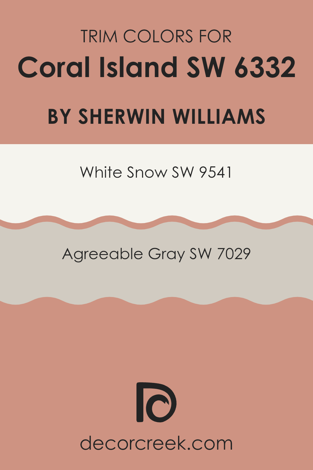
What are the Trim colors of Coral Island SW 6332 by Sherwin Williams?
Trim colors are the accents used on the edges, corners, door frames, and baseboards of a room, significantly shaping the overall appearance and feel. These colors help define and highlight architectural features, providing a crisp, finished look that contrasts with or supports the main wall color.
For example, when using a vibrant color like Coral Island by Sherwin Williams, choosing a suitable trim color becomes important, as it can either gently balance or strongly enhance the main color’s effect on the room’s ambiance.
White Snow (SW 9541) is a clean and bright white that offers a refreshing contrast to the lively Coral Island, making the room feel more open and airy. It’s an excellent choice if you want to highlight Coral Island’s vivid tones without feeling too intense.
On the other hand, Agreeable Gray (SW 7029) is a warm, light gray that provides a softer edge compared to White Snow. This color can help create a smoother transition between the walls and trim, giving the room a unified and grounded appearance. Both options offer distinct visual effects, allowing for personal customization based on the desired look and mood.
You can see recommended paint colors below:
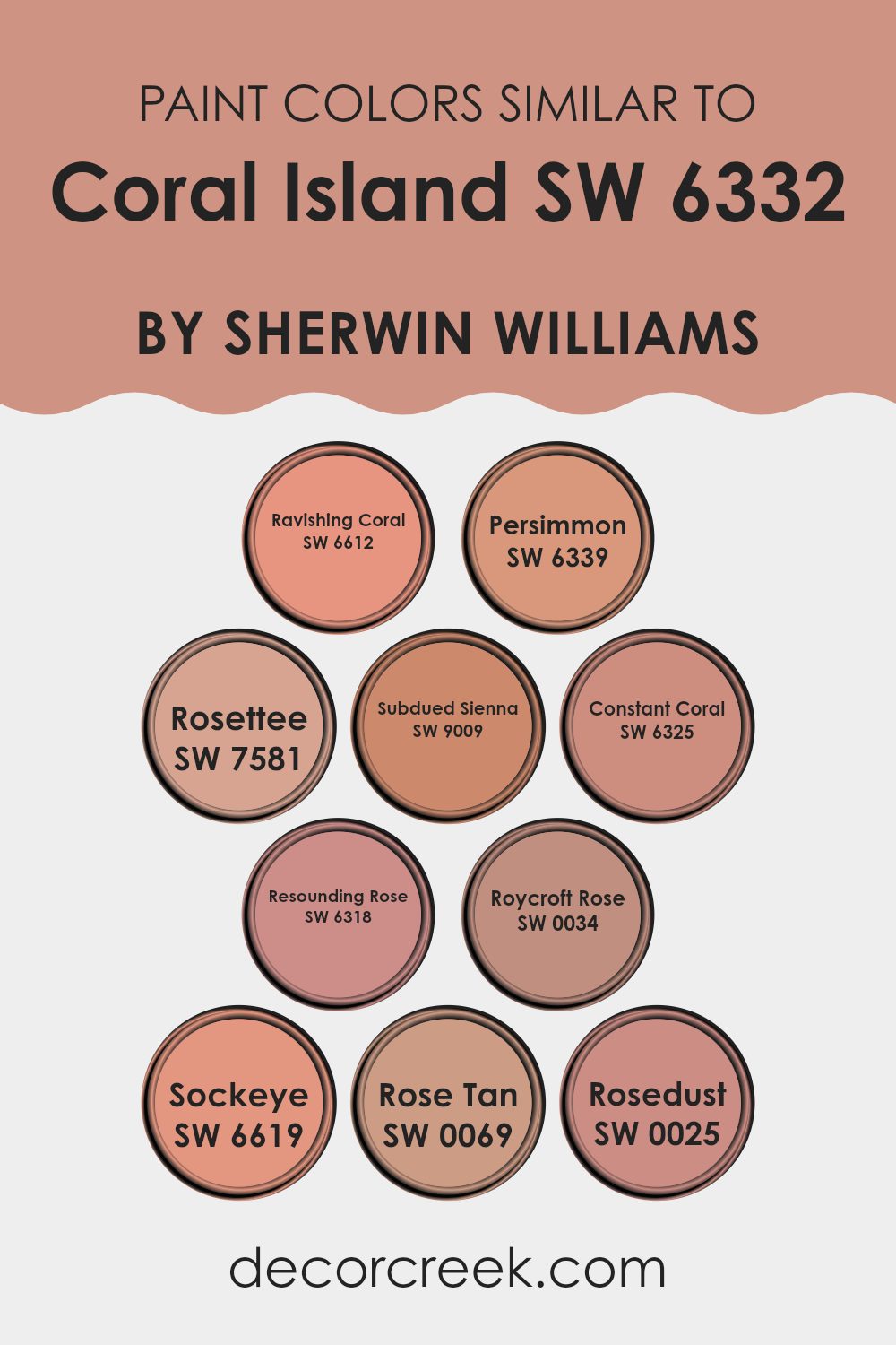
Colors Similar to Coral Island SW 6332 by Sherwin Williams
Choosing similar colors can be essential for creating a harmonious and visually appealing room. Similar colors lie close to each other on the color wheel, and when used together, they provide a subtle variation that can enhance the depth and continuity of a design. This effect can be especially effective in creating a calm and cohesive atmosphere in any room.
For example, SW 6612 – Ravishing Coral offers a bright, cheerful hue that brings a lively energy to a room. On the other hand, SW 6339 – Persimmon provides a deeper, slightly orange tone that warms up an environment in an elegant way. SW 7581 – Rosette adds a soft, reddish touch that works beautifully in more muted settings.
Similarly, SW 9009 – Subdued Sienna brings a gentle rustic feel with its understated, earthy quality. Moving a bit softer, SW 6325 – Constant Coral provides a quieter coral shade that’s easy on the eyes and great for relaxed rooms. SW 6318 – Resounding Rose presents a vibrant rose color that injects a sense of freshness.
SW 0034 – Roycroft Rose offers a historic charm with its rich, deep rose tone. SW 6619 – Sockeye includes a stronger red with a touch of coral, perfect for making accents pop. SW 0069 – Rose Tan is a dustier option that works well in refined yet straightforward designs. Lastly, SW 0025 – Rosedust gives off a muted, powdery look that softens any area it’s used in. All these colors, sharing a similar spectrum, ensure the design feels integrated and thoughtfully put together.
You can see recommended paint colors below:
- SW 6612 Ravishing Coral
- SW 6339 Persimmon
- SW 7581 Rosettee
- SW 9009 Subdued Sienna
- SW 6325 Constant Coral
- SW 6318 Resounding Rose
- SW 0034 Roycroft Rose
- SW 6619 Sockeye
- SW 0069 Rose Tan
- SW 0025 Rosedust
Colors that Go With Coral Island SW 6332 by Sherwin Williams
Choosing the right colors to complement Coral Island SW 6332 by Sherwin Williams can significantly enhance the aesthetic of any room. Colors that harmonize well create a cohesive look that is visually pleasing and pull an interior together. For example, when paired with Fired Brick SW 6335, a deep, warm red, the result is a rich, inviting ambiance. This color adds depth and warmth, making it ideal for accent walls or furniture pieces.
On a lighter note, Foxy SW 6333, a lively orange with a vibrant vibe, offers a refreshing pop when used alongside Coral Island. It injects energy and cheerfulness into interiors. Another great companion, Quaint Peche SW 6330, is a soft peach that provides a subtle contrast, softening the overall feel of the décor and adding gentle brightness. This shade is perfect for creating a calming yet cheerful room.
Rojo Dust SW 9006, leaning toward a rustic red, brings an earthy charm that complements the grounded tones in Coral Island, enriching the room with a settled feel.
Flower Pot SW 6334, a deeper terracotta, works well with Coral Island to produce a harmonious blend of warm hues reminiscent of autumnal colors, ideal for creating a cozy environment.
Its richness is perfect for textiles or a feature wall. Lastly, Smoky Salmon SW 6331 offers a muted, salmon pink that pairs beautifully with the subtle undertones of Coral Island. Its understated elegance works well in rooms aiming for a soft but colorful look. These compatible colors help create a well-rounded, attractive palette that enhances the overall appeal of any interior.
You can see recommended paint colors below:
- SW 6335 Fired Brick
- SW 6333 Foxy
- SW 6330 Quaint Peche
- SW 9006 Rojo Dust
- SW 6334 Flower Pot
- SW 6331 Smoky Salmon

How to Use Coral Island SW 6332 by Sherwin Williams In Your Home?
Coral Island SW 6332 by Sherwin Williams is a vibrant and warm paint color that can add a cheerful touch to any room in your home. This shade of coral has a lively yet calming effect, making it perfect for creating an inviting atmosphere.
You can use Coral Island in many ways throughout your house. For example, it works beautifully in a bathroom, giving it a fresh and clean look. In a bedroom, pairing this color with soft whites or light grays can create a cozy yet bright room, ideal for relaxation.
In living areas, Coral Island can energize the room when used as an accent wall. It pairs well with neutral furniture, allowing the walls to stand out without feeling too intense. For those who enjoy a bit of fun in their kitchen, painting cabinets or an island with this color can add a playful splash of brightness. This color is flexible for decorating and can help make your home feel more warm and welcoming.
Coral Island SW 6332 by Sherwin Williams vs Resounding Rose SW 6318 by Sherwin Williams
The color Coral Island is a vibrant, pinkish-orange hue that brings a cheerful and warm feel to a room. It has a bright, summery vibe that evokes thoughts of tropical beaches and sunsets. This color can really light up a room and work beautifully in areas that aim to be lively and inviting.
On the other hand, Resounding Rose is a deeper, more subdued shade of pink with a hint of purple. This color has a richer and more muted appearance, making it ideal for creating a cozy and comforting atmosphere. It suits rooms where a less intense, yet still warm and welcoming color is desired.
Together, these colors offer interesting contrasts: Coral Island presenting a light, sunny feel, while Resounding Rose offers depth and warmth. Both colors can coexist harmoniously in a room, used for different features or accents to enhance each other beautifully.
You can see recommended paint color below:
- SW 6318 Resounding Rose

Coral Island SW 6332 by Sherwin Williams vs Rosettee SW 7581 by Sherwin Williams
Coral Island and Rosettee, both by Sherwin Williams, are distinct yet harmonious shades. Coral Island is a lively and bright color that brings a cheerful vibe to any room.
It leans toward a pinkish-orange hue, reminiscent of a tropical sunset, making it perfect for adding warmth and energy to interiors. On the other hand, Rosettee offers a deeper, more subdued shade of pink.
This color has a vintage feel, almost like dusty rose, providing a sense of calm and comfort, ideal for creating a cozy atmosphere in living areas or bedrooms. While Coral Island stands out more boldly, Rosettee serves as a more understated, classic backdrop, making them both flexible in their own ways for different decorating styles.
You can see recommended paint color below:
- SW 7581 Rosettee
Coral Island SW 6332 by Sherwin Williams vs Sockeye SW 6619 by Sherwin Williams
Coral Island is a gentle, muted coral hue that brings a warm and inviting feel to any room. It’s not too bright, but instead has a softness that makes it flexible for many settings like living rooms or bedrooms.
On the other hand, Sockeye is a more vibrant and lively color, leaning toward a strong pink with a hint of red. This makes it stand out more and is perfect for adding a splash of energy to an area that needs some visual interest.
Both colors bring warmth, but Coral Island is more subdued and calming, while Sockeye offers a striking pop. Each can create a different mood and atmosphere depending on what you want to achieve in your decorating project.
You can see recommended paint color below:
- SW 6619 Sockeye
Coral Island SW 6332 by Sherwin Williams vs Ravishing Coral SW 6612 by Sherwin Williams
Coral Island and Ravishing Coral, both created by Sherwin Williams, offer two distinctive takes on the coral hue, a popular choice for adding a warm and inviting feel to rooms. Coral Island is a softer, more muted shade that leans toward a pinkish-orange, making it perfect for creating a gentle and cozy atmosphere. It’s ideal for rooms where you want a subtle touch of color without feeling too intense.
In contrast, Ravishing Coral is bolder and more vibrant, with a stronger emphasis on orange, which gives it a lively and energetic quality. This shade is great for rooms where you want to make a statement or add a burst of sunshine and cheerfulness.
Depending on your room and how you want it to feel, you could pick Coral Island for a softer look or Ravishing Coral for something that stands out more. The choice also depends on the lighting and other colors in the room, as these can influence how the paint looks once applied.
You can see recommended paint color below:
- SW 6612 Ravishing Coral
Coral Island SW 6332 by Sherwin Williams vs Rosedust SW 0025 by Sherwin Williams
Coral Island is a vibrant, pinkish-orange color that brightens up any room, giving it a cheerful and warm atmosphere. In contrast, Rosedust is a much softer color, with a dusty rose tone that provides a gentle and calming effect.
Where Coral Island stands out and grabs attention, making it perfect for lively areas or as an accent wall, Rosedust works well as a subtle background that complements more assertive colors.
Rosedust is ideal for creating a cozy and inviting environment, whereas Coral Island is more suited for energetic rooms or for livening up a decor. Both colors can warm up a room, but they do so in distinctly different ways, with Coral Island being more bold and Rosedust more understated.
You can see recommended paint color below:
Coral Island SW 6332 by Sherwin Williams vs Constant Coral SW 6325 by Sherwin Williams
Coral Island and Constant Coral are both vibrant and pleasing coral shades from Sherwin Williams, but they offer subtly different vibes. Coral Island is a deeper, more pronounced pink-toned coral. This shade is bolder and can create a striking impact in a room, making it ideal for accent walls or decor that needs to stand out.
On the other hand, Constant Coral takes a softer approach. It leans more toward a delicate coral with a slightly more muted presence. This makes it excellent for full-room applications or environments where you want a touch of color without feeling too intense. It’s lighter and can help make a room feel airy and fresh.
Both colors are flexible and can work beautifully in a variety of decorating styles, but the choice between them depends on how much intensity you want the color to bring into the room. Coral Island draws more attention, while Constant Coral blends quietly but beautifully.
You can see recommended paint color below:
- SW 6325 Constant Coral
Coral Island SW 6332 by Sherwin Williams vs Roycroft Rose SW 0034 by Sherwin Williams
Coral Island and Roycroft Rose are two distinct shades from Sherwin Williams. Coral Island is a lively, pinkish-orange color that brings a sense of cheer and warmth to any room. It’s bright enough to add some energy to a room but soft enough not to overpower.
On the other hand, Roycroft Rose is a deeper, muted rose hue with a vintage feel. This color offers a touch of elegance and a cozy aspect, making it perfect for creating a welcoming atmosphere.
Where Coral Island might be ideal for energizing a living area or a kitchen with its sunny disposition, Roycroft Rose works great in rooms where a more understated, classic appearance is desired, like in dining rooms or bedrooms. Both colors offer unique vibes and can effectively set the mood in different interior styles.
You can see recommended paint color below:
- SW 0034 Roycroft Rose
Coral Island SW 6332 by Sherwin Williams vs Subdued Sienna SW 9009 by Sherwin Williams
Coral Island and Subdued Sienna are two distinct colors offered by Sherwin Williams, each bringing their own unique vibe to interior rooms. Coral Island is a vibrant and lively shade that leans toward pink and orange hues, reminiscent of a tropical sunset. This color is bright and cheerful, making it perfect for adding a splash of energy to a room.
On the other hand, Subdued Sienna has a more reserved and earthy appearance. This color combines elements of brown and soft red, producing a warm and welcoming effect. It’s ideal for creating a cozy atmosphere in areas meant for relaxation or gatherings.
While Coral Island stands out as a more dynamic and punchy color, great for accent walls or decorative details, Subdued Sienna suits a more understated look, ideal for larger wall areas or rooms where a soothing effect is desired. Both colors offer flexibility, depending on how you want to shape your interior.
You can see recommended paint color below:
- SW 9009 Subdued Sienna
Coral Island SW 6332 by Sherwin Williams vs Persimmon SW 6339 by Sherwin Williams
Coral Island is a softer, more subdued shade that brings a gentle warmth to any room. It has hints of pink with a peachy twist, making it a great choice for those who want to add a cozy and welcoming vibe to their room without going too bright. It works well in sunny kitchens or living areas to add just the right amount of cheerfulness.
In contrast, Persimmon is a bolder and more vibrant color. It leans more toward an energetic orange, instantly drawing attention and adding a lively punch to any area it’s used in. This color is perfect if you’re looking to make a statement or add some dynamism to a room, such as in a creative area or an accent wall.
Both colors, while sharing a warm base, invite very different moods to a room. Coral Island is mellow and subtle, easiest for achieving a calm feel, whereas Persimmon is outgoing and adventurous, great for sparking energy in a room.
You can see recommended paint color below:
- SW 6339 Persimmon
Coral Island SW 6332 by Sherwin Williams vs Rose Tan SW 0069 by Sherwin Williams
Coral Island and Rose Tan are two distinct paint colors by Sherwin Williams. Coral Island is a bright and playful shade, leaning toward a pinkish-orange hue that has a lively and cheerful vibe.
It’s the kind of color that can add a vibrant touch to any room, making it feel fresh and inviting. On the other hand, Rose Tan is a subtler color, with a more muted, dusky pink tone. It gives off a quiet warmth and tends to make rooms feel cozy and welcoming without being too bold.
This color is great for creating a soft, relaxing atmosphere in interiors. While Coral Island is more energetic and draws attention, Rose Tan offers a gentle and understated charm, making both colors suitable for different moods and settings.
You can see recommended paint color below:
- SW 0069 Rose Tan

In wrapping up my thoughts on SW 6332 Coral Island by Sherwin Williams, I find that this paint color is truly special. It brings to mind the beautiful colors that you might see on a bright and cheerful summer day. The warm, peachy tones remind me of happy times, like eating a juicy peach or watching a sunset.
This color can really make a room feel warm and inviting. Whether it’s in a small room like a bathroom or a larger area like the living room, Coral Island adds a splash of joy. It works well with lots of other colors, too. You can pair it with blues to make it feel like the ocean, or with greens to think of gardens and trees.
Using Coral Island in your home is like bringing a little piece of a happy, sunny island inside. It’s perfect for anyone who wants to make their home feel more welcoming and cheerful. After giving it a try in my own home, I see how it makes every day feel a bit brighter. So, if you’re looking for a color to liven up your rooms, Coral Island might just be the perfect choice. It’s easy to see why it’s a color loved by many!
Ever wished paint sampling was as easy as sticking a sticker? Guess what? Now it is! Discover Samplize's unique Peel & Stick samples.
Get paint samples

