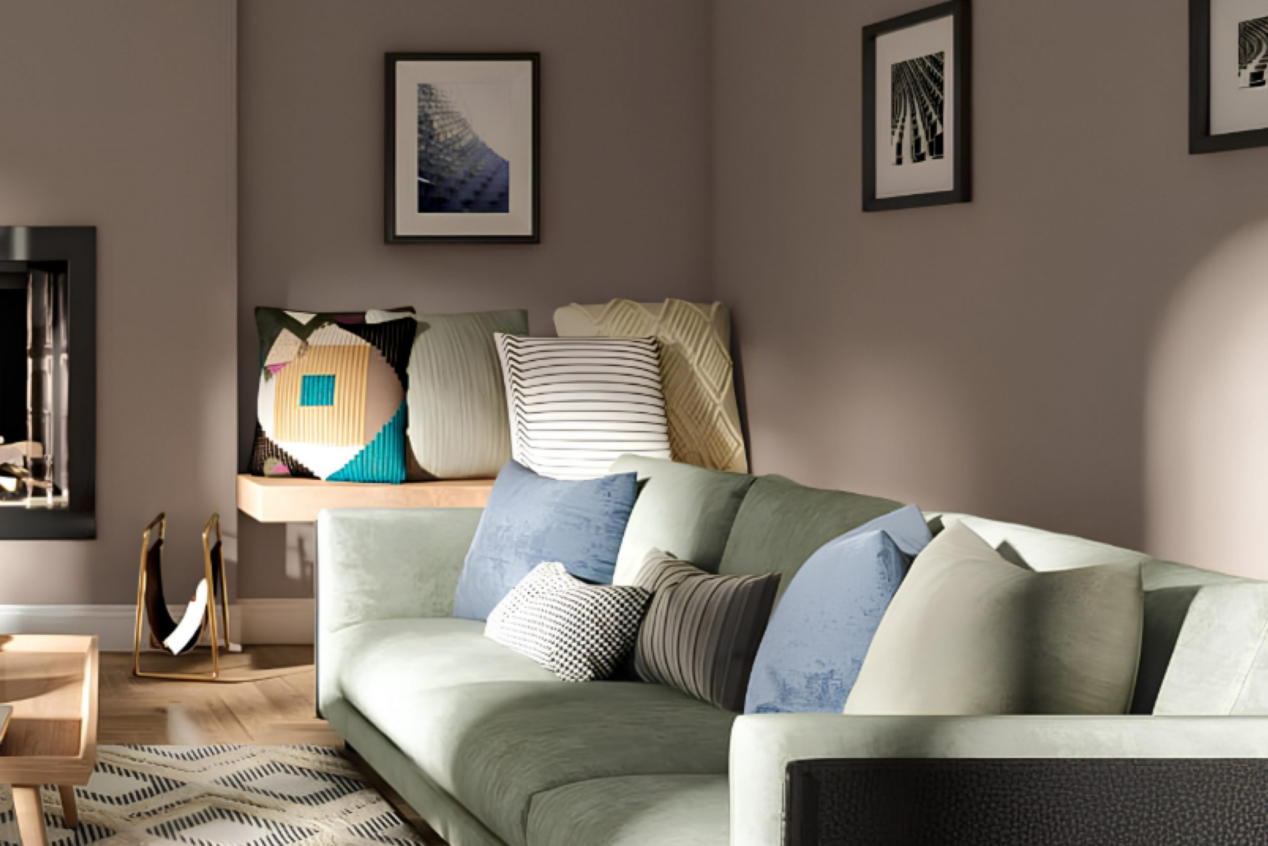
This unique gray that strikes a fine balance between warm and cool tones, making it incredibly adaptable for any space.
Whether you’re updating your living room, bedroom, or kitchen, Chatura Gray provides a soothing presence that complements various decor styles and colors. This color isn’t just another shade of gray—it has a certain depth that adds sophistication and a modern twist to your interiors.
Depending on the lighting, it can shift from a subtle charcoal to a rich hue of deep gray, offering an evolving backdrop to your daily life. Its ability to pair effortlessly with both bold and muted colors allows you to play around with different themes and accessories.
So, if you want a color that supports dynamic changes and evolves with your style, Chatura Gray might be the perfect choice for painting your home’s walls.
What Color Is Chatura Gray SW 9169 by Sherwin Williams?
Chatura Gray is a subtle and versatile shade of gray that has a soft and neutral tone, which makes it ideal for various interior design styles. This color by Sherwin Williams has a balanced mix, neither too dark nor too light, which enables it to blend seamlessly with multiple decor elements and settings.
This shade of gray works particularly well in minimalist and modern interior styles due to its clean and understated quality. It’s also quite effective in Scandinavian-themed interiors where light, muted colors are favored to enhance the sense of light and space.
Its neutrality allows it to act as a perfect backdrop for brighter colors or as a standalone color scheme when aiming for a calm and cohesive look.
Chatura Gray pairs excellently with natural materials like wood and stone, enhancing their texture without overpowering their natural beauty.
Textiles such as linen or wool in similar muted shades can complement this paint color very well, allowing for a layered, yet harmonious, aesthetic.
It also matches well with metallic finishes like brushed nickel or stainless steel, offering a modern touch to a room while keeping the overall feel warm and inviting
This color can help create a relaxed environment, suitable for spaces like bedrooms and living rooms where comfort is key.
Is Chatura Gray SW 9169 by Sherwin Williams Warm or Cool color?
Chatura Gray SW 9169 by Sherwin Williams is a popular paint color known for its versatile and neutral tone. Because of its balanced gray shade, it is favored in many homes for creating a cozy and welcoming atmosphere. This color works well in various spaces, such as living rooms, bedrooms, or kitchens, because it pairs easily with both warm and cool tones in furniture and decorations, making it easy for homeowners to match with existing décor.
Chatura Gray can also help make a room feel more spacious and open due to its light-reflecting properties. It’s a great choice for small rooms or areas with limited natural light. Additionally, it’s practical for high-traffic areas like hallways or family rooms since it can effectively hide marks or smudges.
Overall, its adaptability and understated charm make it a go-to paint color for those looking to refresh their home without making drastic changes to their interior design scheme.
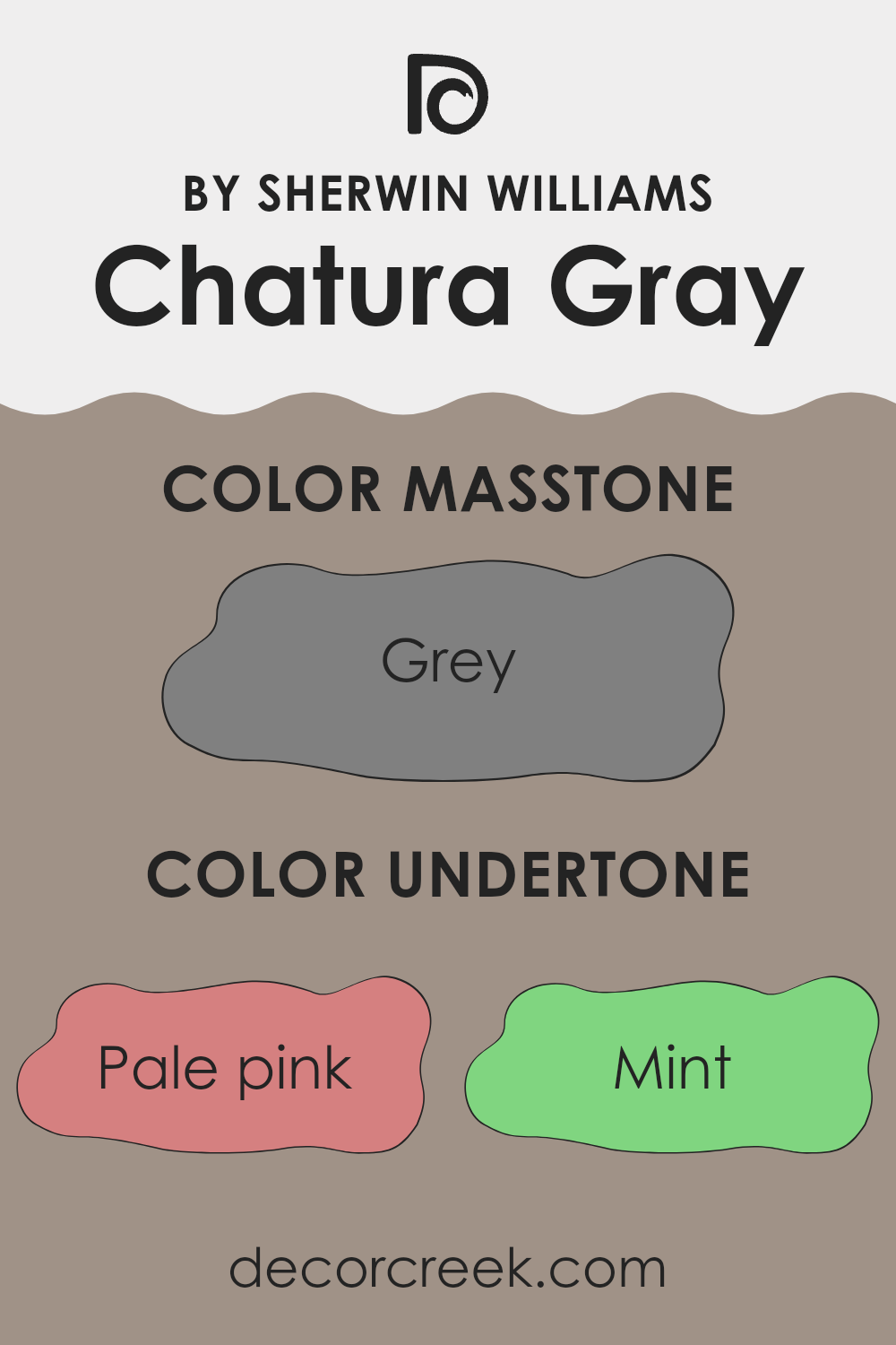
Undertones of Chatura Gray SW 9169 by Sherwin Williams
Chatura Gray is a versatile and complex paint color that can subtly shift its appearance depending on the lighting and surrounding colors. This color has a base that might look like a simple gray, but it’s actually quite intricate because of its many undertones. Undertones are the colors that lurk beneath the surface of what we see. They can make a color lean towards warm or cool and affect how it looks next to other colors.
In the case of Chatura Gray, the undertones include a wide spectrum from pale pink and mint to darker shades like navy and dark grey. Pale pink and mint bring a soft, almost imperceptible warmth and freshness to the color, making it more lively than a typical gray. On the other hand, undertones like dark green or navy add a depth that can make the gray appear more anchored and grounded.
When used on interior walls, these undertones play a significant role in how Chatura Gray will interact with other elements in a room. For example, in a space with a lot of natural light, the cooler undertones like light blue and lilac might become more pronounced, giving the room a crisp, clean look. In artificial light, warmer undertones like pale yellow and light green could make the space feel more welcoming and cozy.
Understanding these undertones is crucial. It helps in choosing furnishings and accents that will harmonize with the wall color, rather than clash with it. Moreover, knowing that these undertones are present allows for more informed choices when pairing with other paint colors to create a cohesive design scheme.
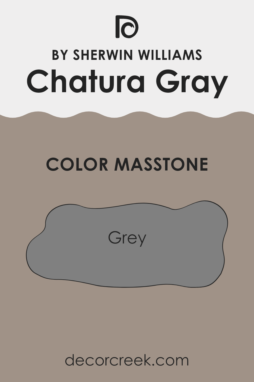
What is the Masstone of the Chatura Gray SW 9169 by Sherwin Williams?
Chatura Gray, coded as Gray (#808080), is a balanced, mid-tone gray color. This neutral hue is versatile, making it a popular choice for various spaces in homes. The masstone, or the full strength of the color when applied, provides a solid gray shade that neither dominates nor recedes too much in a room.
This characteristic makes it ideal for achieving a modern, clean look without making the space feel cold or uninviting. The neutrality of Chatura Gray allows it to work well with a wide range of other colors, from bright and bold to soft and subtle, enabling homeowners to pair it with different decor styles and color schemes.
This adaptability makes it suitable for commonly used rooms like living rooms and kitchens, as it provides a steady backdrop that can support various interior themes and personal tastes.
How Does Lighting Affect Chatura Gray SW 9169 by Sherwin Williams?
Lighting plays a crucial role in how colors appear in any environment, impacting the visual perception and mood of a space. When choosing a paint color like Chatura Gray, it is important to consider the type of light (artificial or natural) and the direction of natural light exposure in a room.
In artificial light, the perception of Chatura Gray varies depending on the color temperature of the light bulb used. Under warm lighting (incandescent bulbs), Chatura Gray may appear slightly more muted and cozier, bringing out the warmer undertones of the color. If cooler LED lights are used, the gray might appear sharper and clearer, which can make the space feel more vivid and distinct.
In natural light, the appearance of Chatura Gray changes throughout the day and depends significantly on the room’s orientation:
1. North-facing rooms receive less direct sunlight, which can make lighter colors appear slightly darker. In these rooms, Chatura Gray will look more uniform during the day, maintaining its true gray shade without varying much.
2. South-facing rooms are filled with abundant sunlight for most of the day, which can significantly brighten up colors. Here, Chatura Gray can look lighter and might even pick up some subtle warm tones in bright daylight.
3. East-facing rooms get plenty of morning light, making the color look brighter and warmer in the morning but cooler in the evening. Chatura Gray can have a pleasant, gentle appearance that shifts subtly from morning to night.
4. West-facing rooms experience the reverse of east-facing rooms, with minimal morning light but intense afternoon and evening light. This lighting can make Chatura Gray look softer and more shadowed in the morning while appearing vivid and dynamic in the late afternoon.
Considering these factors will help you choose the right room and lighting to pair with Chatura Gray, ensuring you get the desired effect you want for your space.
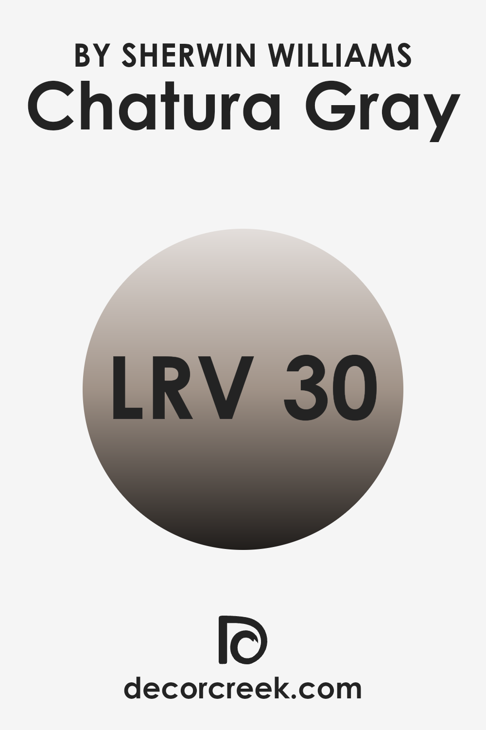
What is the LRV of Chatura Gray SW 9169 by Sherwin Williams?
LRV stands for Light Reflectance Value, which measures the percentage of light a paint color reflects back into a room. Think of it as a scale that shows how bright or dark a paint appears when it’s on your walls. The higher the LRV, the more light the color reflects, making the room appear lighter and more open.
On the other hand, colors with a lower LRV absorb more light, making a space feel cozier but also smaller and darker. For Chatura Gray, with an LRV of roughly 30, it’s on the darker side of the scale but not extremely dark. This means it won’t reflect a lot of light, rather it will absorb more, giving a room a more grounded and enclosed feel.
When used on walls, Chatura Gray can make spacious rooms feel more intimate and snug, but in a smaller room, it might make the space appear even smaller. Whether it’s a suitable choice depends on the amount of natural or artificial light a room gets and the overall atmosphere you want to create.
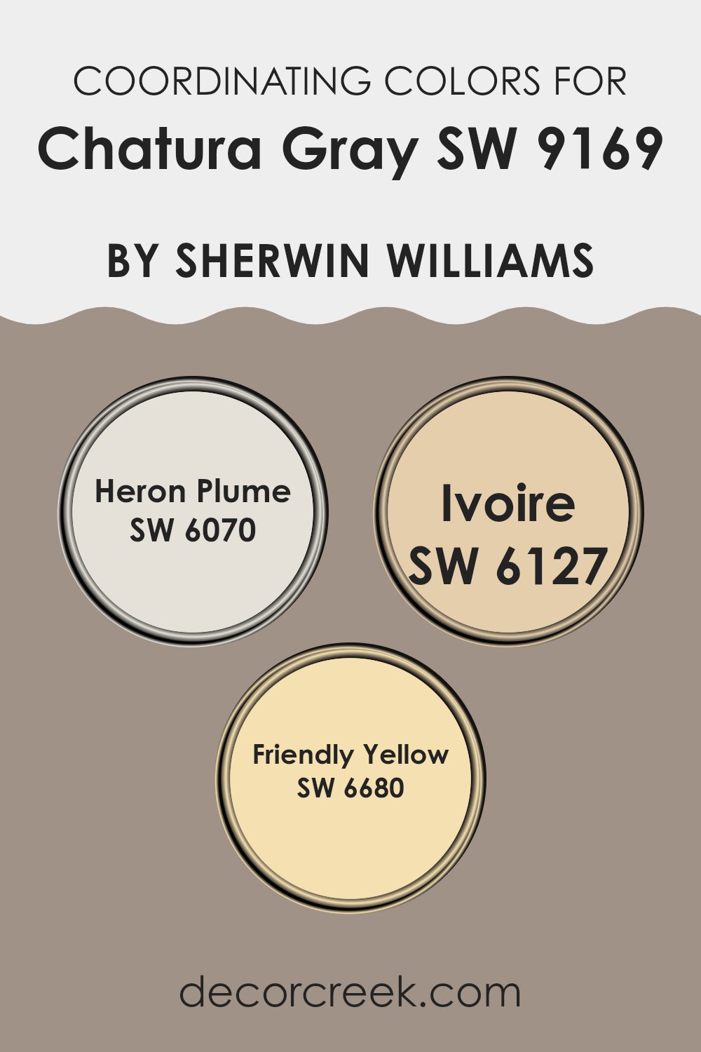
Coordinating Colors of Chatura Gray SW 9169 by Sherwin Williams
Coordinating colors are selected to harmonize with a primary hue, creating a balanced and visually appealing color scheme. In the case of Chatura Gray, a versatile neutral shade, its coordinating colors include Heron Plume, Ivoire, and Friendly Yellow, all from Sherwin Williams.
These additional colors are chosen because they complement the undertones and the overall character of the primary color, enhancing the design without overpowering it. Heron Plume is a soft, subtle off-white that brings a light and airy feel to spaces that use Chatura Gray, making it ideal for trim, ceilings, or as a main wall color in adjoining rooms.
Meanwhile, Ivoire offers a warm, creamy tone that provides a delightful contrast to the cooler gray, perfect for creating a cozy atmosphere or highlighting architectural features. Friendly Yellow adds a cheerful splash of brightness, offering a sunny lift that can energize a room and pair nicely with the calming nature of Chatura Gray in spaces like kitchens or playrooms where vibrancy is welcome. Each of these colors work together with Chatura Gray to create spaces that are harmonious and pleasing to the eye.
You can see recommended paint colors below:
- SW 6070 Heron Plume
- SW 6127 Ivoire
- SW 6680 Friendly Yellow
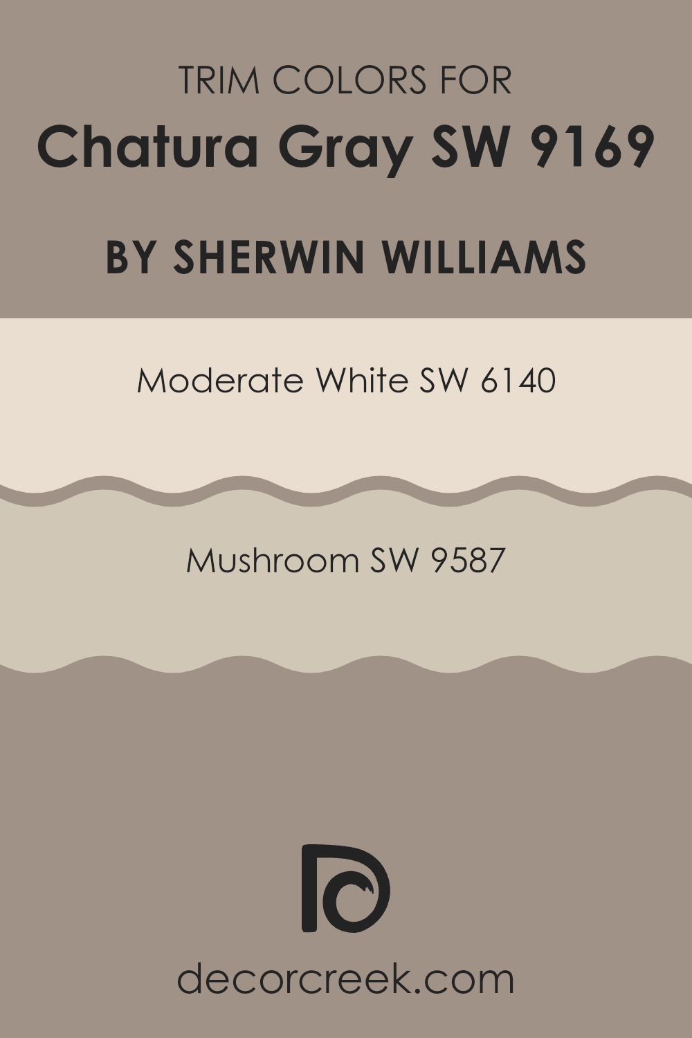
What are the Trim colors of Chatura Gray SW 9169 by Sherwin Williams?
Trim colors are essentially chosen to complement the main color used on walls, influencing how the entire room feels and appears. For Chatura Gray, a soft and versatile gray tone, selecting the right trim colors can significantly impact the room’s aesthetic coherence and visual appeal.
Trim colors like Moderate White and Mushroom are ideal for framing the subtlety of Chatura Gray, ensuring the walls stand prominently while effortlessly unifying the overall decor. Moderate White is a soothing, neutral white with subtle warmth that brings a clean and inviting contrast when used as a trim color with Chatura Gray.
It helps to brighten the space and adds a fresh, crisp finish that highlights the room’s architectural features. Mushroom, on the other hand, offers a darker, earthier tone which can lend a grounded, cozy feel to a room. This color provides a more dramatic frame for Chatura Gray, making it a great choice for creating a cozy yet distinguished aesthetic.
You can see recommended paint colors below:
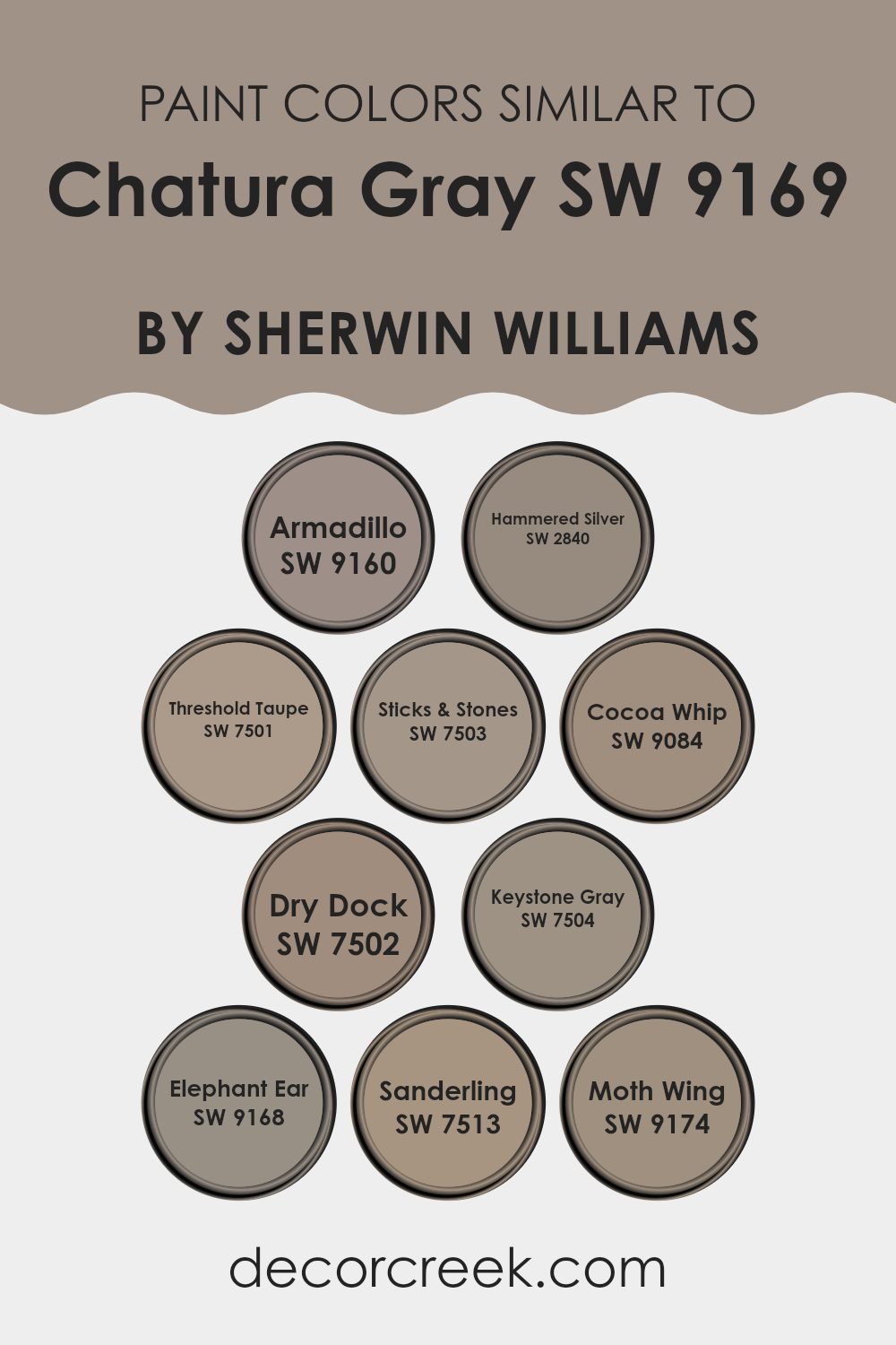
Colors Similar to Chatura Gray SW 9169 by Sherwin Williams
Similar colors play a crucial role in creating a harmonious and cohesive look in design. By using shades that closely resemble each other, such as those in the same color family, designers can achieve a subtle and unified aesthetic.
This approach allows for a refined transition from one shade to another, which can help in emphasizing textures and details without overwhelming the senses. Similar colors work effectively to enhance spatial coherence, making smaller spaces appear larger and giving a more organized feel to any setting.
For instance, if we take a look at the color Armadillo SW 9160, it offers a deeper brown-gray shade that pairs well with neutral color schemes. Hammered Silver SW 2840 is another compelling option with its silvery-greige undertones that reflect light beautifully, providing a dynamic yet understated backdrop.
Taupe SW 7501 presents a soft, warm taupe that brings a cozy warmth to environments, while Sticks & Stones SW 7503 is slightly darker, offering a grounding effect with its earthy tones. Cocoa Whip SW 9084 introduces a lighter, creamy color, perfect for creating a gentle contrast without clashing.
Another attractive choice is Dry Dock SW 7502, a slightly muted brown that works well in diverse decor settings. Keystone Gray SW 7504, with its balance of gray and brown, achieves a mid-tone that is highly versatile.
Elephant Ear SW 9168 moves towards a richer, darker hue that adds depth and character to a room. Sanderling SW 7513 offers a pale, sandy beige that is excellent for a light, airy feel. Finally, Moth Wing SW 9174 provides a darker, moodier shade which can act as a stunning accent or primary color, depending on the design objective.
Each of these colors can be used individually or alongside Chatura
Gray to create a cohesive and inviting atmosphere.
You can see recommended paint colors below:
- SW 9160 Armadillo
- SW 2840 Hammered Silver
- SW 7501 Threshold Taupe
- SW 7503 Sticks & Stones
- SW 9084 Cocoa Whip
- SW 7502 Dry Dock
- SW 7504 Keystone Gray
- SW 9168 Elephant Ear
- SW 7513 Sanderling
- SW 9174 Moth Wing
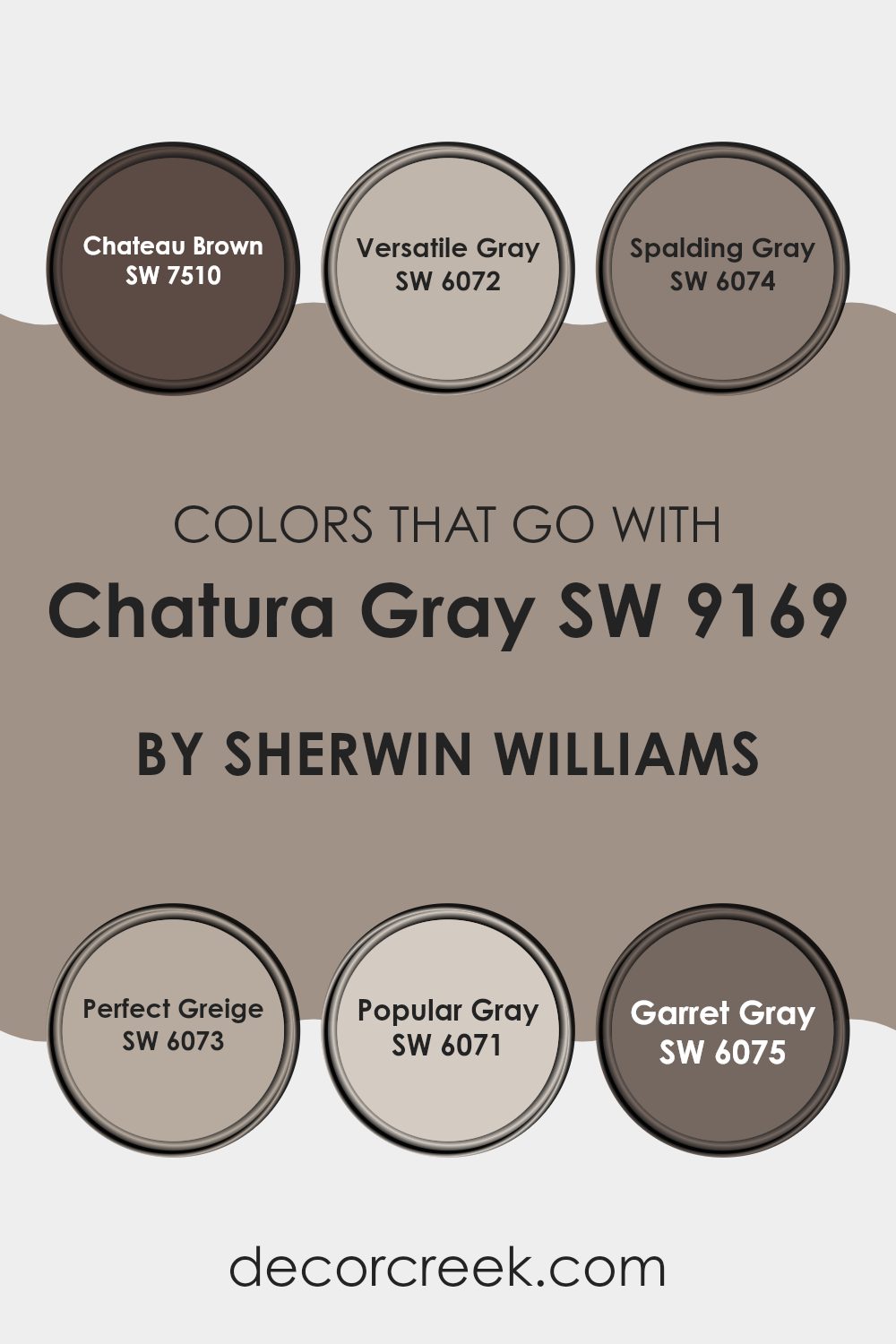
Colors that Go With Chatura Gray SW 9169 by Sherwin Williams
When pairing Chatura Gray SW 9169 by Sherwin Williams with other colors, it’s important to consider how the shades will complement each other to create a harmonious look. Chatura Gray, a deep, soothing gray, serves as a strong foundation for a palette, allowing other colors to either stand out or blend smoothly.
For instance, Chateau Brown SW 7510 provides a rich, earthy contrast to Chatura Gray, offering warmth and a grounding effect in any room. Versatile Gray SW 6072, as its name suggests, is a flexible color that merges well with Chatura Gray, softening spaces with its lighter, warmer gray tone.
Spalding Gray SW 6074 and Perfect Greige SW 6073 add subtle complexity; Spalding Gray with its deeper, almost shadow-like appearance enhances the depth of spaces, while Perfect Greige blends the warmth of beige with the coolness of gray for a balanced backdrop.
Popular Gray SW 6071 is a lighter option that injects a sense of airiness when used with Chatura Gray, perfect for creating more open, breathable spaces. Lastly, Garret Gray SW 6075, darker and moodier, works excellently for adding sophistication and drama, making it an ideal choice for accent walls or furniture pieces.
These pairings allow for a variety of moods and themes, from cozy and inviting to bold and modern, depending on the desired ambiance.
You can see recommended paint colors below:
- SW 7510 Chateau Brown
- SW 6072 Versatile Gray
- SW 6074 Spalding Gray
- SW 6073 Perfect Greige
- SW 6071 Popular Gray
- SW 6075 Garret Gray
How to Use Chatura Gray SW 9169 by Sherwin Williams In Your Home?
Chatura Gray by Sherwin Williams is a versatile gray paint color that works wonderfully in various home spaces. Perfect for creating a cozy and inviting atmosphere, it pairs well with both bright and dark colors, allowing for flexibility in decor.
You can use it in a living room or bedroom to provide a calm, neutral backdrop that complements your furniture and accessories. It’s also an excellent choice for kitchens and bathrooms, where it brings a clean and fresh look. Chatura Gray is ideal for those who want a modern feel without it feeling too cold or impersonal.
Its balanced undertones mean it can adapt to different lighting conditions, looking great in natural light during the day and under artificial light at night. Whether you’re painting an entire room or just an accent wall, this color helps create a pleasant setting that makes your home feel more comfortable.
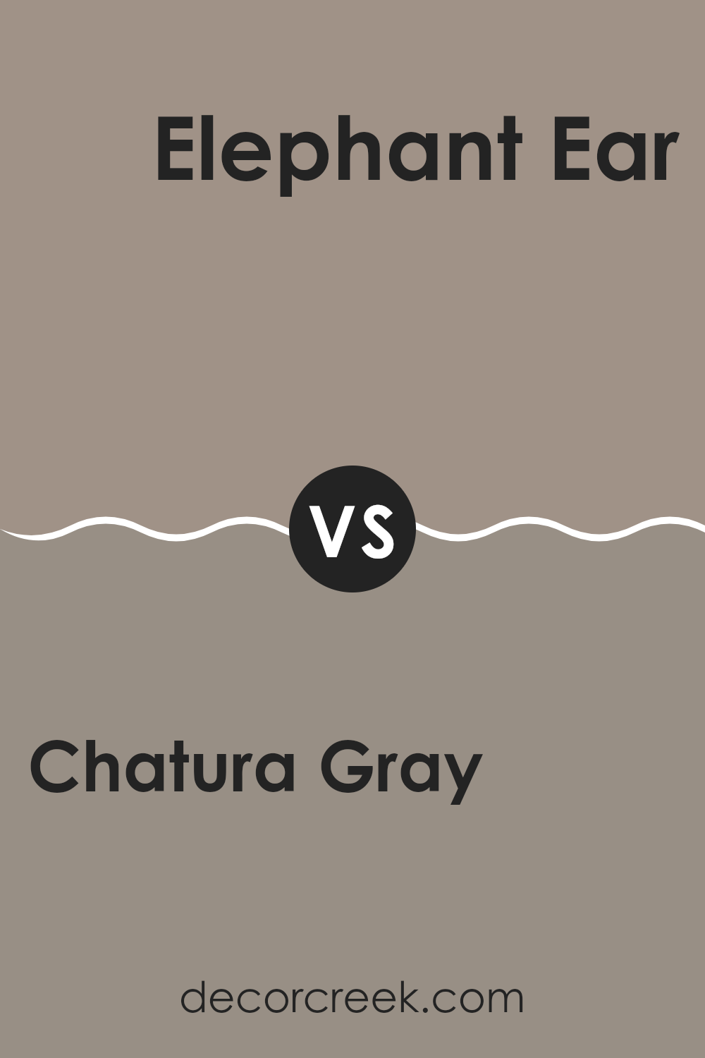
Chatura Gray SW 9169 by Sherwin Williams vs Elephant Ear SW 9168 by Sherwin Williams
Chatura Gray and Elephant Ear, both by Sherwin Williams, offer a subtle yet distinct difference in their tones. Chatura Gray presents a deeper, almost charcoal-like shade that gives a strong and bold feel to any space.
It leans more towards a darker gray, making it ideal for those looking to add a solid anchor color to their room. On the other hand, Elephant Ear has a lighter, warmer gray hue, making it more reflective and slightly softer on the eyes. This color can help in making a smaller room feel larger and more open.
Both colors could work well together in a complementary fashion, with Elephant Ear providing a soft backdrop and Chatura Gray acting as an accent. These shades are versatile and can be used in various settings, whether for creating a modern look or enhancing traditional decor.
You can see recommended paint color below:
Chatura Gray SW 9169 by Sherwin Williams vs Sticks & Stones SW 7503 by Sherwin Williams
Chatura Gray and Sticks & Stones are both gray shades by Sherwin Williams, but they present unique tones that can affect the mood of a room differently. Chatura Gray is a darker gray with a strong presence, offering a bold and grounding effect.
It works well in spaces where you want to make a statement or add a touch of drama. On the other hand, Sticks & Stones is a lighter gray that feels more open and airy. This color is great for making smaller spaces appear larger and is versatile enough to work in various settings, from modern to traditional.
While both colors are grays, Chatura Gray leans towards a more intense and moody vibe, whereas Sticks & Stones provides a softer, more relaxed feel. Choosing between them would depend on the desired atmosphere and the specific use of space in your home.
You can see recommended paint color below:

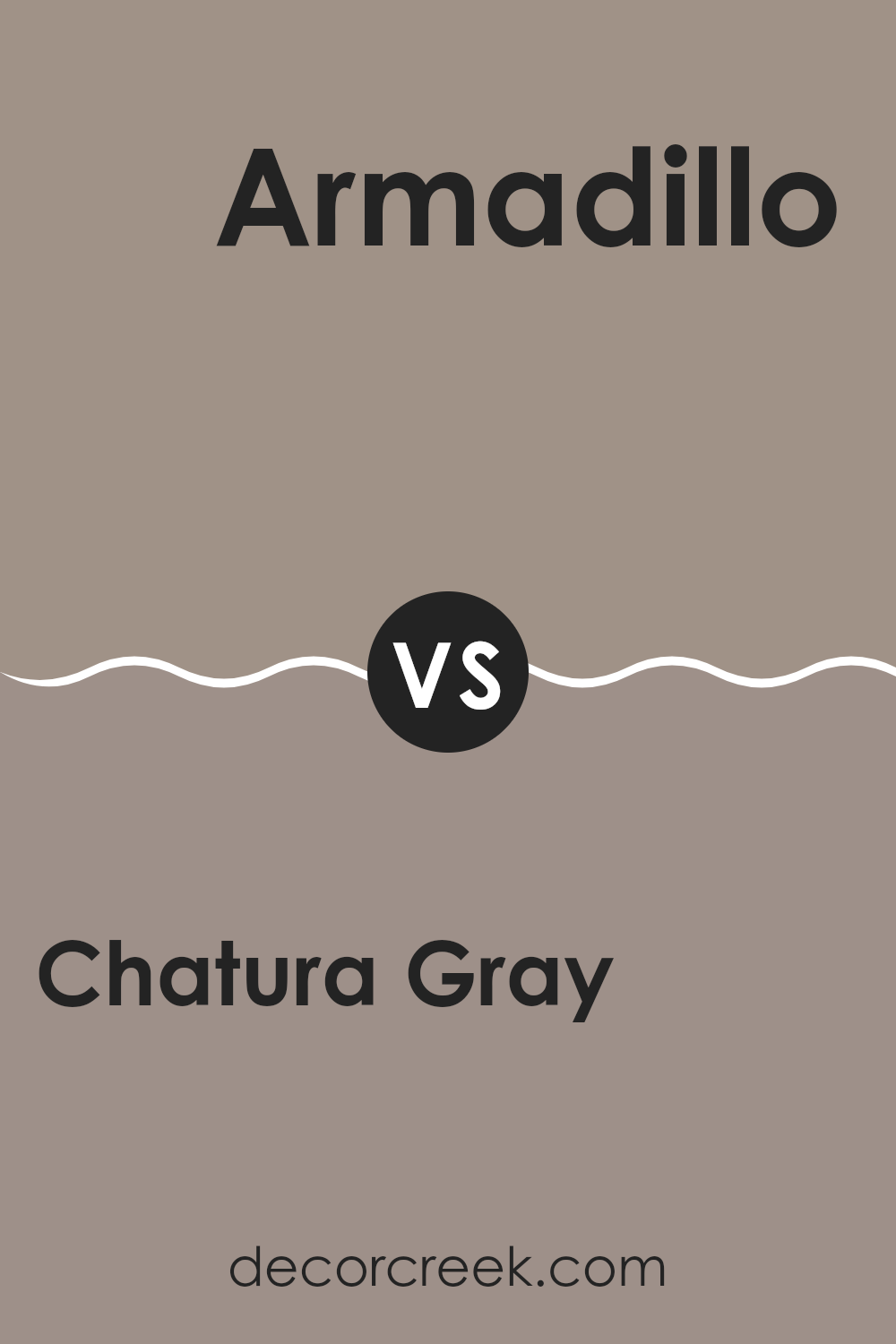
Chatura Gray SW 9169 by Sherwin Williams vs Armadillo SW 9160 by Sherwin Williams
Chatura Gray and Armadillo, both by Sherwin Williams, exhibit distinct tones that can set very different moods in a space. Chatura Gray is a deeper, neutral gray that offers a strong and grounding presence. It’s a versatile color that works well in various settings, providing a solid backdrop that complements both bright and muted accents.
On the other hand, Armadillo steps into a darker, warmer territory. This color is a rich, earthy brown with gray undertones, creating a cozy and comforting feel. It is ideal for areas where you want to foster a sense of warmth and enclosure, like in a den or a bedroom.
Both colors are great choices for those looking to create a modern and stylish environment, but your choice depends on the atmosphere you’re aiming to achieve. Chatura Gray leans towards a cooler, more neutral canvas, while Armadillo offers a warmer, more enclosed vibe.
You can see recommended paint color below:
- SW 9160 Armadillo
Chatura Gray SW 9169 by Sherwin Williams vs Hammered Silver SW 2840 by Sherwin Williams
Chatura Gray is a deep, moody gray with a hint of warmth, making it very inviting. It’s great for spaces where you want a cozy, grounded feel. On the other hand, Hammered Silver is a lighter, cooler gray that has a bit of a metallic shine.
This color is perfect for adding a modern and clean look to any room. While Chatura Gray creates a snug and secure atmosphere, Hammered Silver offers a more open and airy environment. Both colors work well for creating stylish spaces, but your choice depends on what mood you want to set.
Chatura Gray might be better suited for intimate, private areas like bedrooms, while Hammered Silver could shine in a busy kitchen or bathroom, reflecting light beautifully.
You can see recommended paint color below:
Chatura Gray SW 9169 by Sherwin Williams vs Keystone Gray SW 7504 by Sherwin Williams
Chatura Gray and Keystone Gray are both paints from Sherwin Williams that offer subtle yet distinct tones for interior spaces. Chatura Gray has a deeper, cooler tone that can make a room feel more enclosed and cozy. It’s a great choice for creating a snug, low-key environment, perhaps in a bedroom or a study where calmness is appreciated.
On the other hand, Keystone Gray is lighter and has a warmer undertone. This makes it more versatile and ideal for living spaces like living rooms or kitchens, where a welcoming and airy atmosphere is often desired. It tends to brighten up a room and gives off a friendly vibe, making spaces appear larger.
Both colors can work harmoniously in a home to define different moods and functions of spaces, depending on how you want each room to feel. While Chatura Gray sets a more intimate mood, Keystone Gray opens up a space, offering a soft, warm welcome.
You can see recommended paint color below:
Chatura Gray SW 9169 by Sherwin Williams vs Dry Dock SW 7502 by Sherwin Williams
Chatura Gray and Dry Dock are both paints from Sherwin Williams but they bring different vibes to a room. Chatura Gray is a deeper shade that leans towards a charcoal or soft black. It’s great for creating a strong, cozy feeling in a space and works well in areas where you want a bit of drama or a modern touch.
On the other hand, Dry Dock is a lighter, warmer gray that feels more like a taupe or beige. It’s perfect for rooms where you want a neutral backdrop that feels warm and inviting. This color can help make a space feel brighter and more open.
Both colors can be used in various home styles, but where Chatura Gray adds depth and definition, Dry Dock brings lightness and a soft, welcoming air. When choosing between them, consider the mood you want to set and how much natural light your room gets.
You can see recommended paint color below:
Chatura Gray SW 9169 by Sherwin Williams vs Moth Wing SW 9174 by Sherwin Williams
Chatura Gray and Moth Wing, both by Sherwin Williams, have distinct tones that set them apart. Chatura Gray is a subdued, medium gray that offers a calm, neutral base, making it very versatile for use in any room.
It pairs well with a range of colors, ensuring it fits effortlessly into a variety of design schemes. On the other hand, Moth Wing has a warmer, slightly darker hue that hints at a muddy taupe. This color lends a cozy feel to spaces, perfect for creating inviting interiors. Moth Wing’s earthy quality can help warm up a room that might feel too cold if painted with cooler grays.
Both colors work well in settings that receive limited natural light, with Chatura Gray reflecting more light and Moth Wing offering a richer depth, creating distinct atmospheres depending on the lighting and accompanying decor.
You can see recommended paint color below:
Chatura Gray SW 9169 by Sherwin Williams vs Threshold Taupe SW 7501 by Sherwin Williams
Chatura Gray and Threshold Taupe are two shades from Sherwin Williams that offer distinct vibes for room painting. Chatura Gray is a deeper, more intense color. It looks serious and straightforward, providing a strong backdrop that can make light-colored furniture or decorations stand out.
On the other hand, Threshold Taupe is a lighter, softer shade that leans towards being more welcoming and warm. It is great for spaces where you want to create a calm and inviting atmosphere. While Chatura Gray adds depth to a space, Threshold Taupe brightens a room subtly.
When choosing between the two, consider the amount of natural light your room gets and the mood you want to set. Threshold Taupe can make small spaces feel bigger, while Chatura Gray is ideal for creating a focused and grounded feeling.
You can see recommended paint color below:
Chatura Gray SW 9169 by Sherwin Williams vs Cocoa Whip SW 9084 by Sherwin Williams
Chatura Gray and Cocoa Whip, both by Sherwin Williams, present a subtle yet distinct contrast in their color tones. Chatura Gray is a deep, steely gray that gives a strong and grounded feel. It’s perfect for creating a solid, mature look in spaces.
On the other hand, Cocoa Whip has a much lighter, beige-like appearance, offering a softer and warmer feel. This color is great for adding a gentle and welcoming touch to rooms. While Chatura Gray is more about making a bold statement, Cocoa Whip leans towards creating a cozy and inviting environment.
In terms of matching with other colors, Chatura Gray pairs well with both bright and dark colors, providing versatility, whereas Cocoa Whip works beautifully with soft pastels and earth tones, enhancing a light and airy decor style. These differences make each color suitable for specific design needs and preferences.
You can see recommended paint color below:
- SW 9084 Cocoa Whip
Chatura Gray SW 9169 by Sherwin Williams vs Sanderling SW 7513 by Sherwin Williams
Chatura Gray is a deep, warm gray that gives off a cozy and inviting feel. It is perfect for creating a snug ambiance, ideal for living rooms or bedrooms where you want a sense of comfort. On the other hand, Sanderling is a lighter, beige-toned color that reflects a lot more light, making it excellent for smaller spaces or areas where you want to create a brighter, airier feel.
Both colors share a natural, earthy base that can bring a calm and grounded atmosphere to any space. However, Chatura Gray likely works best in larger or well-lit areas as its richness might make a small room feel smaller.
Meanwhile, Sanderling’s lighter tone is versatile and could be an excellent choice for almost any room, enhancing the perception of space. Overall, whether you choose the warm depth of Chatura Gray or the light neutrality of Sanderling depends on the mood and space you are looking to create.
You can see recommended paint color below:
- SW 7513 Sanderling
Conclusion
Chatura Gray is not just any gray; it’s unique with a mix of warm and cools tones that can make any room in your house look and feel just right. Whether it’s your bedroom, living room, or even your kitchen, this color can fit right in.
I learned that this color works well in many different spots because it can go well with lots of other colors. You can pair it with blues, greens, and even some yellows and it still looks amazing. It’s kind of like having a gray that knows how to get along with everyone else.
What’s really great is that it’s not too dark or too light, so if you’re worried about a room feeling too small or too big, Chatura Gray has a nice balance. It can make a small room feel just the right size and a big room feel cozy.
To sum it up, SW 9169 Chatura Gray by Sherwin Williams is more than just another paint color. It’s a gray that can do a lot for your home without making everything look the same. It’s easy to like, works with many different styles, and really makes the rooms feel good. If you ever want to pick a new color for your room, Chatura Gray could be a perfect choice.
Ever wished paint sampling was as easy as sticking a sticker? Guess what? Now it is! Discover Samplize's unique Peel & Stick samples.
Get paint samples

