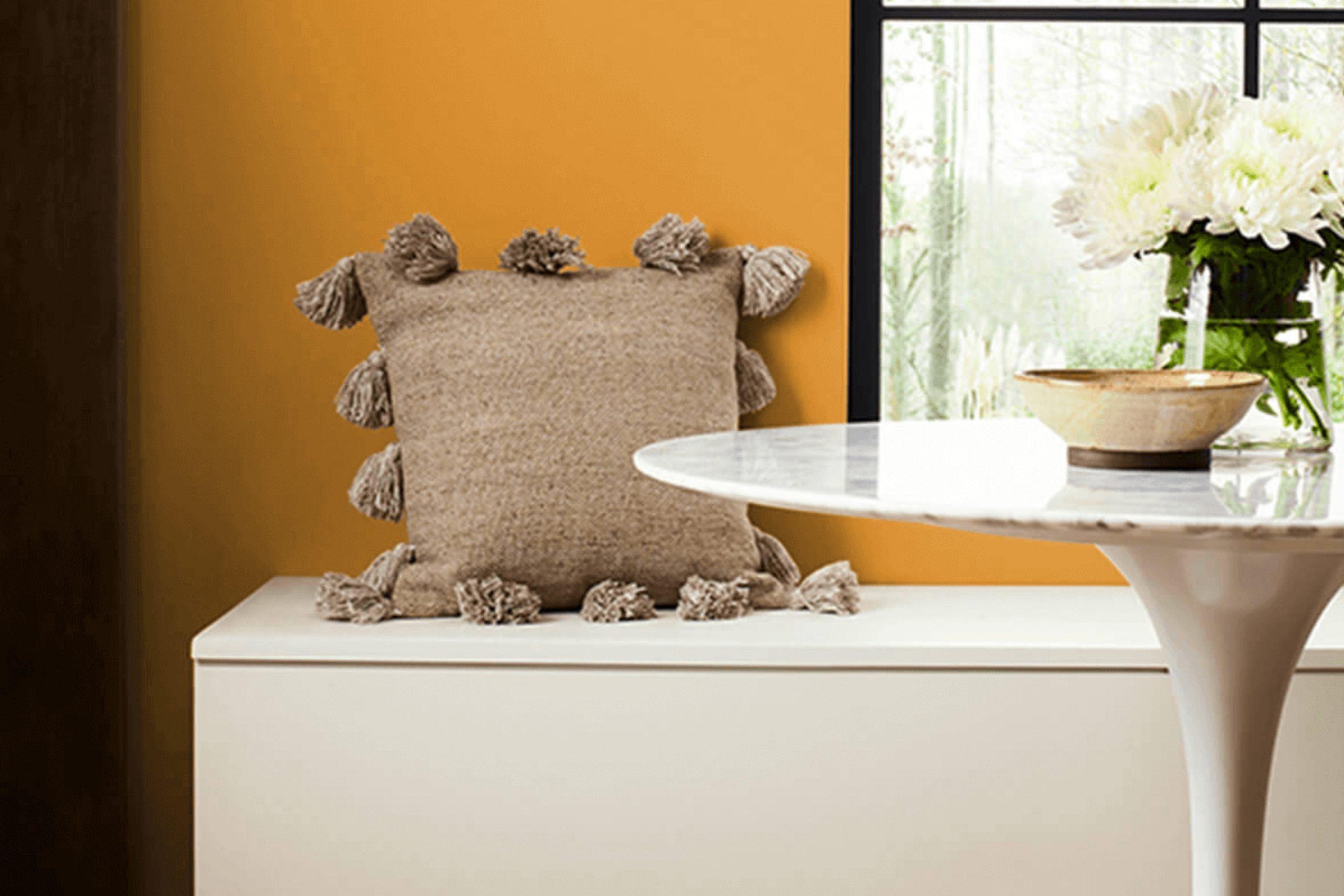
When it comes to giving your interior a warm and inviting feel, choosing the right paint color is crucial. One shade that may have caught your eye is SW 6671 Curry by Sherwin Williams. This particular hue is a vibrant, deep yellow that can instantly brighten any room.
As you consider incorporating SW 6671 Curry into your home, you might wonder about its adaptability and the best way to apply it. Whether you’re painting an accent wall or considering it for a full room, this color adds a sense of cheerfulness without overpowering the senses. It pairs well with a variety of decor styles, from rustic to modern, making it a flexible option for many homes.
In choosing this shade, pay attention to the room’s natural light, as it can affect how the color is perceived at different times of the day. The warm undertones of Curry will make your interior feel cozy and welcoming, especially in rooms used for gatherings and meals.
This color not only enhances the aesthetic appeal of your home but also influences the mood, injecting an energetic yet comforting vibe into your everyday living areas.
What Color Is Curry SW 6671 by Sherwin Williams?
Curry (SW 6671) by Sherwin Williams is a warm and vibrant yellow hue that brings a sense of energy and cheerfulness to any interior. This rich shade is reminiscent of the spice it’s named after, providing a cozy and inviting atmosphere. Because of its lively character, Curry is particularly suitable for kitchens and dining areas where it fosters a welcoming environment for meals and social gatherings.
In terms of interior styles, Curry works well in rustic and farmhouse settings, as it complements natural wood finishes, enhancing their warm tones. It also pairs beautifully with modern designs, adding a pop of color that contrasts nicely with minimalist, clean lines. Country style interiors can also benefit from this color, blending it with floral patterns or soft pastels for a balanced look.
When it comes to materials and textures, Curry pairs excellently with a variety of woods, from light pine to rich walnut. Textiles like burlap or linen provide a wonderful counterpoint to its brightness, adding texture and depth to the design. Moreover, metal accents in copper or gold can create an elegant contrast, making the yellow stand out while offering a touch of luxury.
Overall, Curry is an adaptable color that can work with multiple materials to create a harmonious and lively interior.
Is Curry SW 6671 by Sherwin Williams Warm or Cool color?
Curry SW 6671 by Sherwin Williams is a vibrant yellow paint color that brings a burst of energy to any room. This shade is perfect for adding a cheerful touch to interiors that need a bit more brightness. Since it’s a strong color, it works well as an accent wall or for smaller areas rather than covering a whole room, as it might be too overpowering.
It can really liven up areas like kitchens or bathrooms where you often want a lively atmosphere. The color pairs well with neutral shades like whites or grays which helps balance out its intensity. In terms of furnishings, dark woods or black elements can look really striking against this yellow backdrop.
However, if you want a more subtle look, pairing it with softer colors like pale blues or greens can also work well. Overall, Curry SW 6671 is ideal for those wanting to inject some cheer and vivacity into their home without completely overpowering the interior with color.
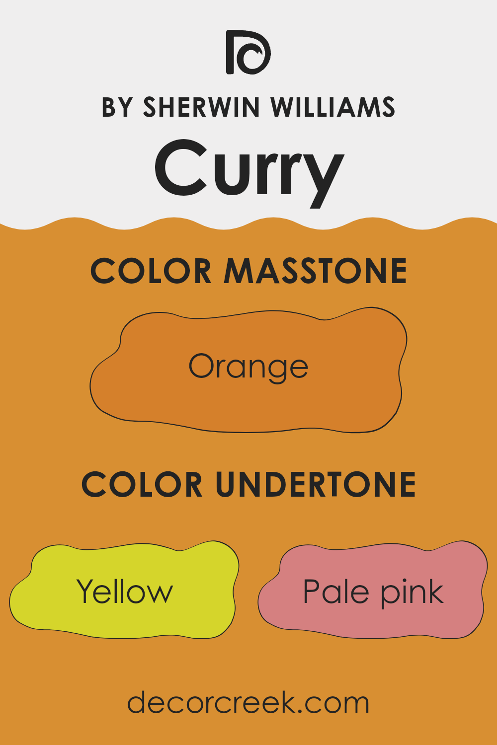
Undertones of Curry SW 6671 by Sherwin Williams
Curry SW 6671 is a unique color with a variety of undertones that subtly influence how it appears in different lighting and surroundings. The primary undertone of this color is yellow, giving it a warm, welcoming feel. However, it’s the blend of additional undertones that adds complexity and depth. For instance, pale pink and red undertones contribute a gentle vibrancy, making the color more dynamic and slightly richer.
Meanwhile, olive and light green undertones introduce an earthy quality that can help the color blend well with natural elements like wood or plants. The presence of grey mutes the brightness somewhat, making it more adaptable and easier on the eyes, which could be ideal for creating a cosy interior.
Pale yellow and mint undertones enhance the warmth and freshness of the color, respectively. These shades contribute to a feeling of lightness and airiness in a room. Brown and purple undertones provide depth and ground the color, ensuring it isn’t too intensely bright or light. When used on interior walls, the undertones in Curry SW 6671 can significantly affect the mood and visual impact of a room.
The blend of warmth with touches of earthy and vibrant colors can make an interior feel more inviting and lively without being too intense. This makes it suitable for areas where you want comfort but also a touch of brightness, such as living rooms or kitchens. The undertones play a role in complementing various decor styles and color palettes, making it an adaptable choice for many interiors.
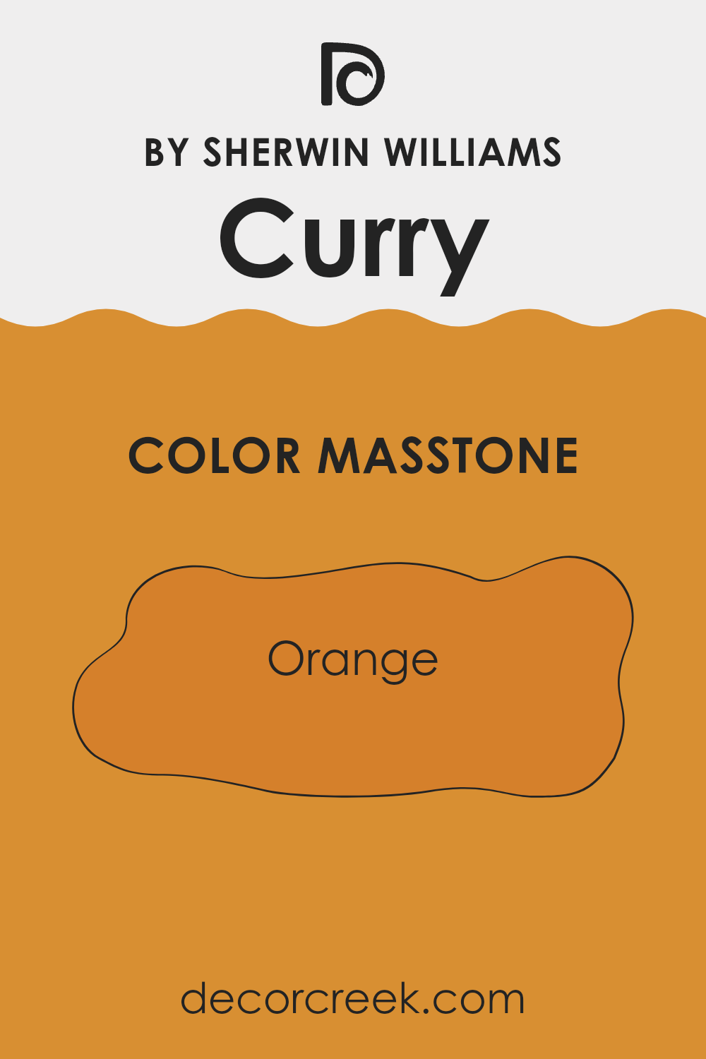
What is the Masstone of the Curry SW 6671 by Sherwin Williams?
Curry SW 6671 by Sherwin Williams, with its masstone of Orange (#D5802B), brings a warm and inviting feel to any home. This particular shade of orange is vibrant yet not overpowering, making it a suitable choice for those looking to add a splash of cheerfulness to their interiors without dominating the existing decor.
When used in living rooms or dining areas, it can create a cozy, welcoming atmosphere that encourages conversation and warmth. This shade pairs well with neutral tones such as whites, greys, and even soft browns, which helps to balance its brightness and make the interior feel more grounded.
In smaller rooms, using it on a feature wall can help to add depth and interest without making the area feel cramped. Overall, this cheerful orange can help to brighten up a home, making it feel lively and comfortable.
How Does Lighting Affect Curry SW 6671 by Sherwin Williams?
Lighting dramatically influences how colors appear in an interior. The way light interacts with a color can change its perceived shade, intensity, and mood. For instance, Curry, a specific color by a popular paint brand, can appear differently under various lighting conditions.
In artificial light, the type of bulb used matters significantly. LED or fluorescent lighting could enhance Curry’s vibrant yellow tones, making it appear brighter and more vivid. Incandescent lighting might warm it up more, giving it a cozier, muted glow. Thus, selecting the right artificial lighting is crucial to maintain the desired look and feel of the color in any setting.
Natural light brings its own dynamic to Curry. The color can shift throughout the day depending on the sun’s position and the clarity of the sky. Typically, a well-lit room with plenty of natural daylight will make Curry feel fresh and lively due to the brightness of sunlight enhancing its lively yellow tones.
Let’s take into account the direction the room faces:
- North-faced rooms tend to receive less direct sunlight, leading Curry to display a softer and more subtle hue. Here, it may appear slightly more muted than usual, sometimes even needing extra artificial lighting to bring out its true color.
- South-faced rooms benefit from abundant sunlight most of the day, making Curry radiate warmth and depth, amplifying its bright, cheerful qualities.
- East-faced rooms catch the morning sun. Curry will glow warmly in the morning but might fade into a softer yellow as the day progresses and less direct light hits the room.
- West-faced rooms will see the opposite effect of east-facing ones. Here, Curry will start softer in the early part of the day and grow progressively warmer and more vivid as it basks in the afternoon and evening sunlight.
Knowing how lighting conditions affect Curry can help in deciding where and how to use this color effectively in home decor, ensuring it always looks its best.

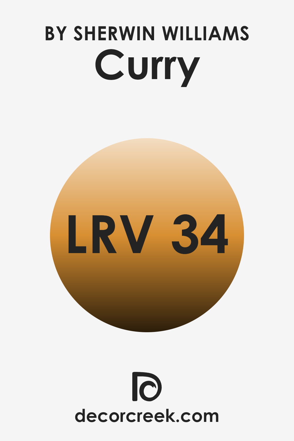
What is the LRV of Curry SW 6671 by Sherwin Williams?
LRV stands for Light Reflectance Value, which is a measure of how much light a paint color reflects back into a room, compared to the total light falling on it. Generally, colors with higher LRV make a room feel brighter because they reflect more light.
On the other hand, colors with lower LRV absorb more light and can make an interior feel cozier but darker. LRV is an important factor to consider when choosing paint colors, especially in areas where the amount of natural light is limited. It can significantly impact the atmosphere and visual perception of the interior.
For Curry SW 6671 by Sherwin Williams, with an LRV of 34.499, the color falls into the medium range of light reflectance. It means that this color will reflect some light, but not a lot. In a well-lit room, this color could enhance warmth and depth, adding a cozy ambiance without making the interior feel too closed in.
In rooms with less natural light, however, it might make the area appear somewhat darker. Thus, depending on the lighting conditions of your room, this particular LRV will influence whether the color brings a warmer and more intimate feel or if additional lighting is needed to prevent the interior from feeling too dim.
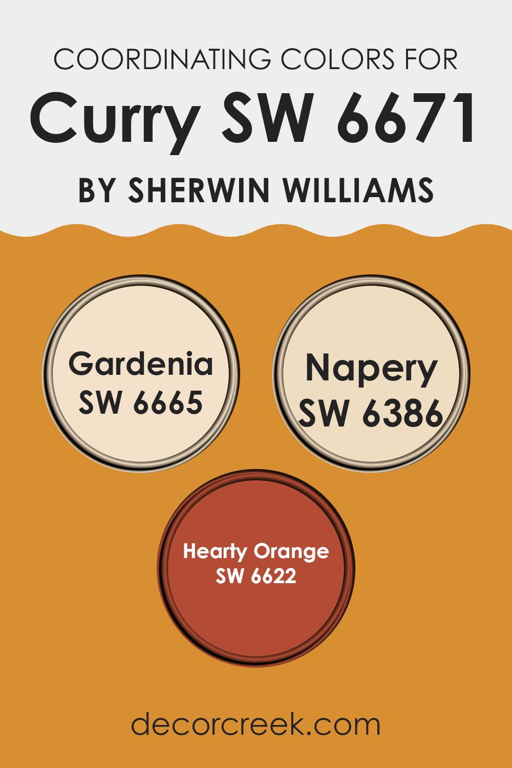
Coordinating Colors of Curry SW 6671 by Sherwin Williams
Coordinating colors are selected hues that complement a primary paint color to create a harmonious and appealing color scheme. For example, when decorating with a bold primary color like Curry from Sherwin Williams, it’s beneficial to choose coordinating colors that can balance the palette and create a visually appealing interior without overpowering the senses. Coordinating colors can be of various tones, shades, and intensities, but they all work together to support the primary color and enhance the overall aesthetic of a room.
One coordinating color frequently paired with a vibrant shade like Curry is Gardenia, which is a soft, warm white. This color serves as a subtle backdrop, making it perfect for creating a gentle contrast against more vibrant tones. It can lighten an interior while providing a sense of calm to areas that feature bolder hues.
Another complementary shade is Napery, a light buttery yellow that echoes some of the warmth of Curry but with a softer, lighter tone, making it ideal for maintaining a warm ambiance without competing for attention. Lastly, Hearty Orange, a vivid, dynamic orange, matches well with Curry by offering a more saturated, rich color that can help in forming lively and engaging interiors without clashing, thanks to their similar warm undertones. Together, these coordinating colors help in achieving a balanced and inviting environment.
You can see recommended paint colors below:
- SW 6665 Gardenia
- SW 6386 Napery
- SW 6622 Hearty Orange
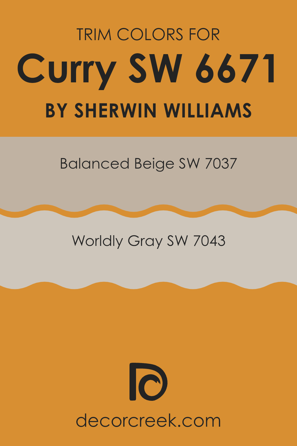
What are the Trim colors of Curry SW 6671 by Sherwin Williams?
Trim colors are specially chosen hues that are used to highlight architectural details and frame the main colors of walls or exterior elements. They are important because they help to define and enhance the overall appearance of an interior, creating clear visual boundaries and adding aesthetic appeal.
For example, using trim colors like SW 7037 – Balanced Beige or SW 7043 – Worldly Gray alongside a bolder main color like Curry can accentuate the trim areas, making them more noticeable and visually interesting. Balanced Beige is a warm neutral color that offers a clean and inviting look, making it excellent for use as a trim color where a soft contrast is desired.
On the other hand, Worldly Gray is a muted, adaptable gray shade providing a slightly stronger contrast than Balanced Beige without overpowering the primary color. Using either of these shades as trim can effectively frame and set off the walls, enhancing the overall decor scheme and ensuring that architectural details pop.
You can see recommended paint colors below:
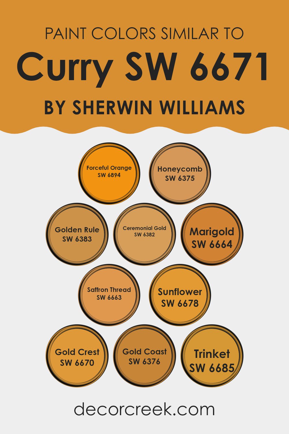
Colors Similar to Curry SW 6671 by Sherwin Williams
In interior design and decor, using similar colors can create a harmonious and cohesive look. These colors, derived from Curry by Sherwin Williams, adopt a warm spectrum ranging from soft yellows to vibrant oranges, making them perfect for cozy, inviting interiors. When colors like Forceful Orange, a bold and lively shade, or Honeycomb, a rich and amber-like hue, are used together, they stimulate a sense of balance while maintaining visual interest.
This is because they share a base tone that links them naturally. Golden Rule and Ceremonial Gold offer a regal air; the former is reminiscent of warm autumn sunlight, while the latter adds a muted, classic gold touch that’s subtly luxurious.
These yellows can be paired with brighter tones such as Marigold and Saffron Thread, both of which lend an energetic vibe to any room without being too intense due to their underlying soothing qualities. Colors like Sunflower spark a cheerful brightness, essential for areas needing a pop of joy, and Gold Crest, which has a deep, sunlit quality that can warm up cooler interiors. Gold Coast brings a dusty gold touch that’s mellow and understated, ideal for achieving a gentle yet sunny atmosphere.
Lastly, Trinket, with a hint of metallic sheen, works wonderfully to introduce a touch of glamour in a way that’s both accessible and stylish. These similar colors, when used thoughtfully, can create an interior that feels both connected and beautifully varied, offering both comfort and style without the need for drastic contrasts.
You can see recommended paint colors below:
- SW 6894 Forceful Orange
- SW 6375 Honeycomb
- SW 6383 Golden Rule
- SW 6382 Ceremonial Gold
- SW 6664 Marigold
- SW 6663 Saffron Thread
- SW 6678 Sunflower
- SW 6670 Gold Crest
- SW 6376 Gold Coast
- SW 6685 Trinket
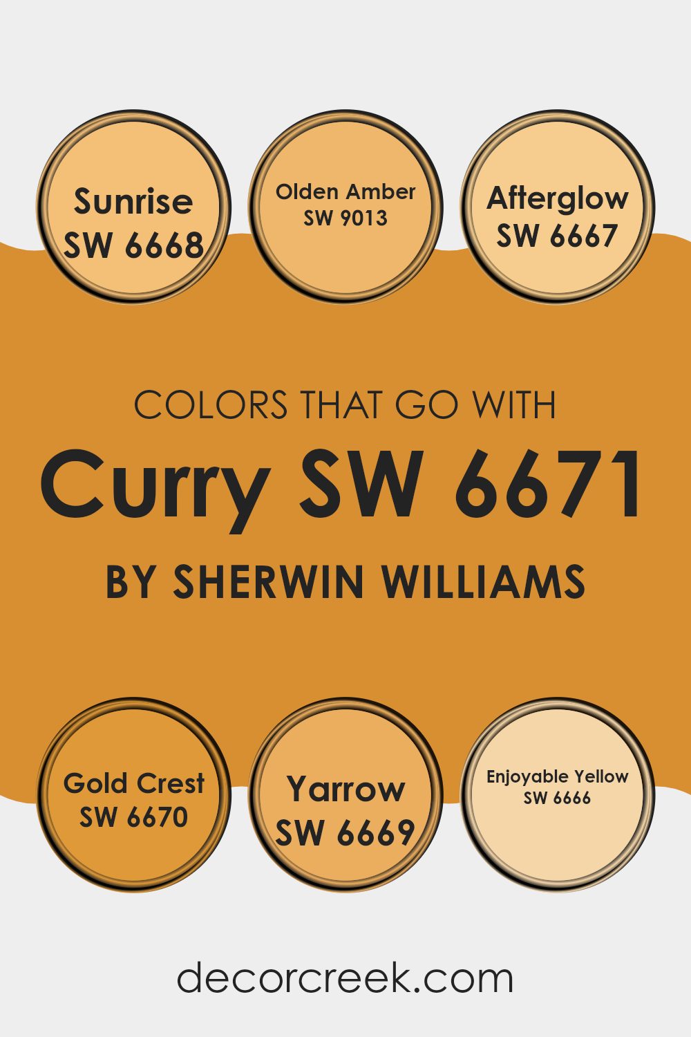
Colors that Go With Curry SW 6671 by Sherwin Williams
The selection of complementary colors for Curry SW 6671 by Sherwin Williams plays a vital role in enhancing and balancing the visual appeal of your interior. These complementary colors are crucial in creating a harmonious and pleasing environment, whether you’re painting a room, designing a theme, or coordinating furniture and decorations.
When colors like SW 6668 – Sunrise or SW 9013 – Olden Amber are used alongside Curry SW 6671, they bring warmth and a glowing ambiance to the area. Meanwhile, hues such as SW 6667 – Afterglow and SW 6670 – Gold Crest add depth and richness, rounding out the palette with their robust tones.
SW 6668 – Sunrise is a soft, gentle yellow that infuses interiors with a subtle dawn-like radiance, ideal for a soothing effect in living areas or bedrooms. SW 9013 – Olden Amber provides a deeper, more golden tone, lending a cozy, inviting feel to any interior it graces.
Moving to SW 6667 – Afterglow, this color offers a muted, dusky yellow that works well in areas that require a touch of warmth without excessive brightness. SW 6670 – Gold Crest has a more vivacious yellow, perfect for creating focal points or accent walls.
Furthermore, SW 6669 – Yarrow presents a bold, striking yellow that energizes and livens up a room, making it an excellent choice for interiors that benefit from a splash of vitality. Lastly, SW 6666 – Enjoyable Yellow is true to its name, offering a cheerful hue that makes any room feel more welcoming and joyful. These colors collectively provide a balanced spectrum of shades, ensuring that Curry SW 6671 can achieve its full aesthetic potential in various design settings.
You can see recommended paint colors below:
- SW 6668 Sunrise
- SW 9013 Olden Amber
- SW 6667 Afterglow
- SW 6670 Gold Crest
- SW 6669 Yarrow
- SW 6666 Enjoyable Yellow
How to Use Curry SW 6671 by Sherwin Williams In Your Home?
Curry SW 6671 by Sherwin Williams is a warm, golden-yellow paint color that brings a cozy and cheerful feel to any room. This vibrant shade is perfect for adding a splash of brightness, and it works well in interiors where you want to create a welcoming atmosphere. For example, using Curry in the kitchen can make the area appear warm and inviting, ideal for a place where people gather to cook and socialize.
In the living room, Curry can be applied on one accent wall to create a cheerful focal point without being too intense across the entire interior. It pairs beautifully with neutral colors like whites and grays, which help balance its brightness. For a more harmonious look, consider using it with natural materials like wood or stone.
In bedrooms, using Curry can add a sense of cheerfulness, especially when incorporated through smaller accessories or decor items, like throw pillows or curtains, rather than full walls. It’s a great way to bring in some color and warmth without it being too strong for a resting environment.
Curry SW 6671 by Sherwin Williams vs Ceremonial Gold SW 6382 by Sherwin Williams
Curry SW 6671 and Ceremonial Gold SW 6382 are both warm, inviting hues from Sherwin Williams but have distinct tones. Curry is a bold, mustard yellow that provides a strong presence in any interior, making it a perfect option for areas where you want to add a splash of brightness and energy.
On the other hand, Ceremonial Gold leans towards a more mellow, dusty gold, offering a softer and slightly more understated elegance. While Curry stands out and grabs attention, Ceremonial Gold brings a gentle warmth that is less about making a statement and more about setting a cozy backdrop.
Each color works well for creating a welcoming atmosphere, but your choice may depend on the level of intensity and mood you wish to set in your home.
You can see recommended paint color below:
- SW 6382 Ceremonial Gold

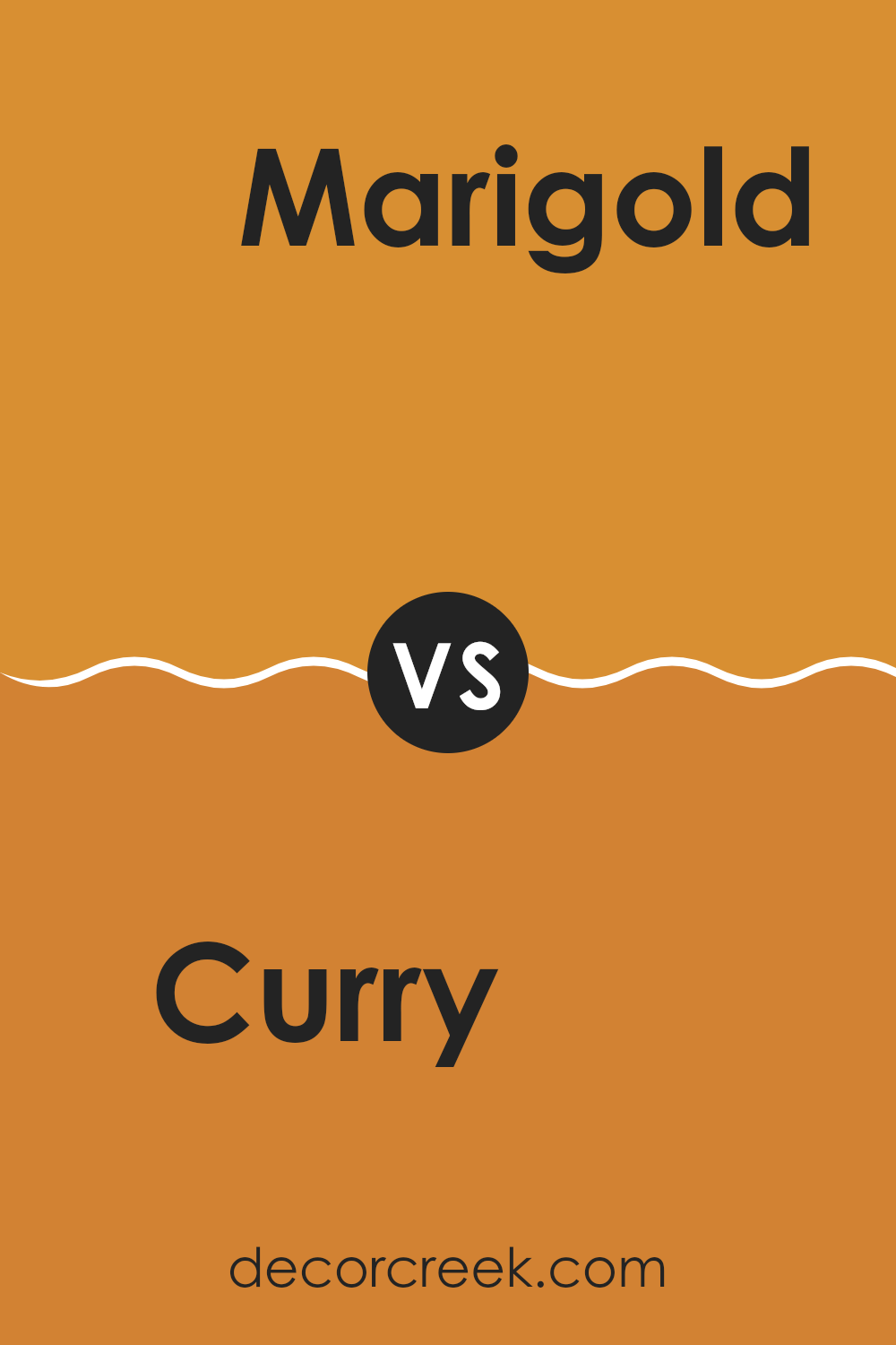
Curry SW 6671 by Sherwin Williams vs Marigold SW 6664 by Sherwin Williams
Curry SW 6671 and Marigold SW 6664, both by Sherwin Williams, are vibrant hues that brighten any interior. Curry is a deep yellow with a hint of mustard, perfect for adding warmth and coziness to a room. It pairs well with dark woods and rich fabrics, creating a welcoming atmosphere.
On the other hand, Marigold is a brighter and more vivid yellow. It has a sunny, cheerful vibe, making it ideal for interiors where you want to boost energy and positivity, like kitchens or living areas.
While Curry offers a more muted and subtle approach suitable for traditional designs, Marigold stands out with its lively intensity, fitting modern and lively interiors. Both colors are excellent choices for anyone looking to add a pop of color, though their effects differ slightly due to the depth and brightness of each shade.
You can see recommended paint color below:
- SW 6664 Marigold
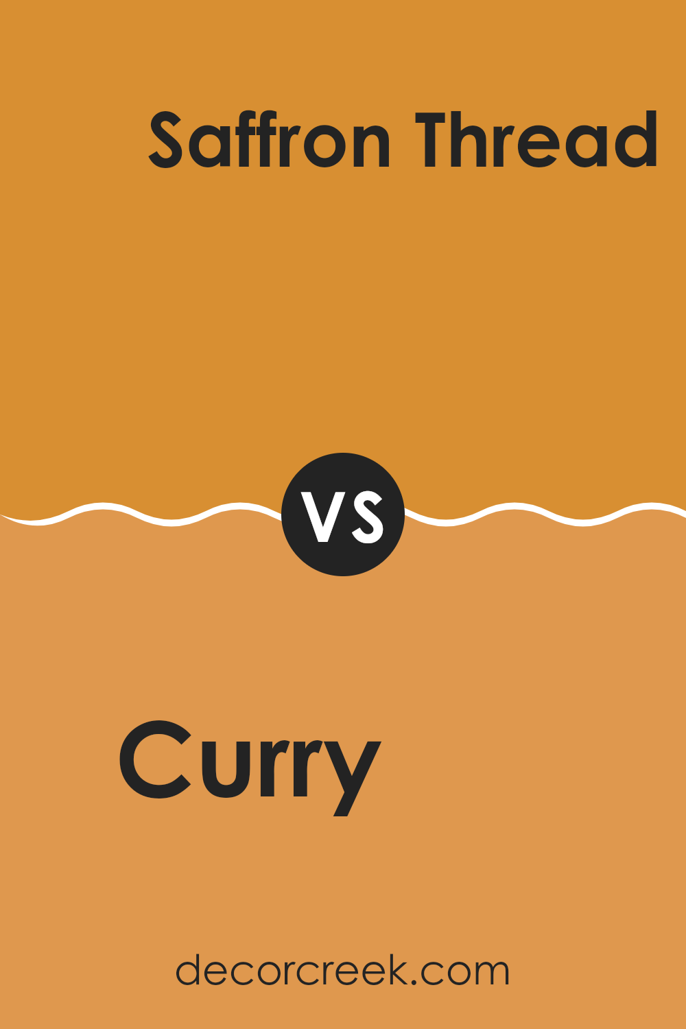
Curry SW 6671 by Sherwin Williams vs Saffron Thread SW 6663 by Sherwin Williams
Curry SW 6671 and Saffron Thread SW 6663, both by Sherwin Williams, are vibrant shades but with distinct tones. Curry is a deep, rich yellow with a golden undertone, giving it a warm and cozy feel. This color is robust and comforting, perfect for creating a welcoming atmosphere in a living room or dining area.
On the other hand, Saffron Thread is a lighter, more vivid yellow. It has a bright and cheerful feel, almost resembling the color of a lemon peel or sunflower. This shade is excellent for interiors where you want to add energy and brightness, such as a kitchen or a child’s playroom.
While both colors bring warmth and cheer to any interior, Curry offers depth and warmth, making it ideal for relaxed settings. Saffron Thread, being livelier, is better suited for more dynamic, energetic environments. Each color has its charm and is suitable for different purposes and interiors due to their contrasting brightness and saturation levels.
You can see recommended paint color below:
- SW 6663 Saffron Thread
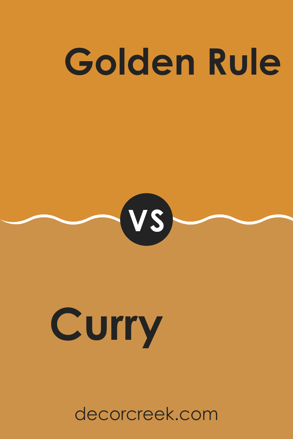
Curry SW 6671 by Sherwin Williams vs Golden Rule SW 6383 by Sherwin Williams
Curry SW 6671 is a deep, warm yellow with a slight mustard tone, making it hearty and full of life. It creates a cozy and inviting atmosphere, perfect for interiors where you want a splash of vibrancy without overpowering brightness.
On the other hand, Golden Rule SW 6383 is a brighter yellow. It has a more golden hue, adding a cheerful and sunny feel to any room. It reflects light beautifully, making interiors appear larger and more open.
While Curry offers a richer, muted shade that works well in dining areas or living rooms for a touch of warmth, Golden Rule is more suitable for kitchens, bathrooms, or interiors that benefit from a fresh, energizing look. Both colors pair well with natural elements like wood and stone but serve different moods and settings due to their varying intensities and undertones.
You can see recommended paint color below:
Curry SW 6671 by Sherwin Williams vs Sunflower SW 6678 by Sherwin Williams
The main color, Curry by Sherwin Williams, is a rich, deep yellow with a hint of mustard-like warmth. This color adds a cozy and inviting feel to any interior, giving off a homely vibe that’s perfect for rooms where comfort is key.
In contrast, Sunflower by Sherwin Williams, the second color, is a bright, vibrant yellow. It radiates energy and brightness, making it ideal for interiors that you want to feel lively and cheerful. While Curry offers a more subdued and warm atmosphere, Sunflower is all about brightness and vivacity, perfect for instilling a sense of happiness and excitement.
Both colors bring joy and a sunny disposition to interiors, but they serve different moods and settings depending on the desired impact on the room. Curry is better for a relaxed, comforting environment, whereas Sunflower suits a more dynamic and energetic area.
You can see recommended paint color below:
- SW 6678 Sunflower
Curry SW 6671 by Sherwin Williams vs Trinket SW 6685 by Sherwin Williams
Curry SW 6671 and Trinket SW 6685, both by Sherwin Williams, are vibrant colors that bring different moods to an interior. Curry is a bold, deep yellow with a golden hue, perfect for adding warmth and a hint of cheer in any room. It resembles the color of the spice, giving it an earthy, inviting feel. This makes it ideal for kitchens, dining areas, or any interior where you want a cozy, welcoming atmosphere.
Trinket, on the other hand, is a lighter, softer yellow. This color is more subdued and subtle compared to Curry, offering a gentle brightness that can make small interiors appear larger and more open. It’s great for bedrooms, bathrooms, or areas where you want a hint of color without overpowering the senses.
Together, these colors can work well if you’re aiming for a palette that includes both a striking and a gentle yellow. Curry can act as a strong focal point while Trinket complements as a lighter, soothing backdrop.
You can see recommended paint color below:
- SW 6685 Trinket
Curry SW 6671 by Sherwin Williams vs Gold Coast SW 6376 by Sherwin Williams
Curry SW 6671 is a warm, deep yellow with a noticeable golden hue. This color gives off a cozy vibe and is perfect for creating a welcoming and cheerful atmosphere in any interior. It’s especially well-suited for areas like kitchens and dining rooms, where it can add a sunny brightness.
On the other hand, Gold Coast SW 6376 is a darker, richer shade. This color leans more towards an amber or burnt orange, providing a bold and vibrant feel. It can work well in interiors that aim to make a strong visual impact, such as living rooms or entryways.
While both colors bring warmth and an upbeat ambiance, Curry is brighter and lighter, making small interiors feel larger. In contrast, Gold Coast, being deeper and more intense, tends to add a touch of drama and depth, ideal for larger interiors or as an accent wall to draw attention. Together, these colors could complement each other well in a color scheme, with Curry brightening up the environment and Gold Coast adding a grounding element.
You can see recommended paint color below:
- SW 6376 Gold Coast
Curry SW 6671 by Sherwin Williams vs Honeycomb SW 6375 by Sherwin Williams
Curry SW 6671 is a vibrant, deep yellow with a bold and warm tone. It adds a lively and energetic feel to any interior. This color is vivid, reminding one of the rich spices found in Asian cuisine, which can create a cozy, inviting atmosphere in a room.
On the other hand, Honeycomb SW 6375 is a softer, more muted yellow. It brings a gentle and cheerful brightness to an interior, but without the intensity of Curry. Honeycomb is lighter and has a subtle sweetness to its appearance, making it perfect for creating a friendly and soothing environment.
While both colors share a yellow base, Curry is the bolder choice, suited for making a strong statement. Honeycomb, however, is ideal for those who prefer a less intense color that still provides warmth and light to an interior. The choice between them depends on the desired impact and the specific mood one wants to set in the environment.
You can see recommended paint color below:
Curry SW 6671 by Sherwin Williams vs Gold Crest SW 6670 by Sherwin Williams
Curry SW 6671 and Gold Crest SW 6670 by Sherwin Williams are two vibrant shades that both belong to the yellow color family, but they have distinct tones that set them apart. Curry is a deep, warm yellow with a hint of mustard, making it a rich and cozy color. This shade can add a welcoming and cozy feel to any interior, ideal for creating a friendly and comforting atmosphere.
On the other hand, Gold Crest is a brighter and lighter yellow. It’s lively and vivid, closer to a classic sunflower yellow. This color is great for brightening up an interior and adding a cheerful, energetic touch. Gold Crest’s lighter tone makes it particularly effective in smaller or darker interiors where it can help to visually enlarge the area and reflect more light.
Together, these two shades of yellow can work well in a complementary scheme, with Gold Crest offering a brighter highlight against the more subdued, earthy Curry.
You can see recommended paint color below:
- SW 6670 Gold Crest

Curry SW 6671 by Sherwin Williams vs Forceful Orange SW 6894 by Sherwin Williams
Curry SW 6671 and Forceful Orange SW 6894 are both vibrant colors by Sherwin Williams, but they bring different vibes to an interior. Curry is a rich yellow with a warm and inviting feel. It’s perfect for creating a cozy atmosphere in a room without feeling too intense. This shade works well in kitchens or living rooms, pairing nicely with natural wood or other earth tones.
On the other hand, Forceful Orange is a bold and energetic color. As the name suggests, it has a powerful presence and can really make a statement. It’s brighter and more intense than Curry, and works best in interiors where you want to add a splash of enthusiasm, like a playroom or an exercise area.
Both colors can liven up an interior, but Curry offers a softer approach with its golden undertones, while Forceful Orange stands out with its vivid saturation, great for accent walls or decorative accessories. Choose Curry for a subtle warmth or Forceful Orange for a dynamic punch.
You can see recommended paint color below:
- SW 6894 Forceful Orange
Writing about SW 6671 Curry by Sherwin Williams has been quite the journey! This is a paint color that looks bright and warm, kind of like the color of sunshine mixed with mustard. Thinking about decorating with this color brings a lot of fun ideas. It can transform a room to feel cozy and inviting, like giving it a warm hug. This color reminds me of happy times, like enjoying a sunny day outside.
When you paint a room with Curry, it gives the room a cheerful pop. It’s great for places like the kitchen or a playroom where you want to feel energized and happy. Also, this color matches well with lots of other colors. You can pair it with dark greens, deep blues, or even gray for a look that stands out.
In conclusion, SW 6671 Curry by Sherwin Williams is a fantastic choice if you want to make a room bright and lively. Whether you’re looking to paint an entire room or just an accent wall, this color can make your home feel more welcoming and cheerful. It’s definitely a color that can make any room shine!

Ever wished paint sampling was as easy as sticking a sticker? Guess what? Now it is! Discover Samplize's unique Peel & Stick samples.
Get paint samples

