Before you decide on SW 9151 Daphne by Sherwin Williams for your next painting project, there are a few things you should consider. First, understanding the unique color tone of Daphne is crucial. It’s not just a simple shade; its subtle nuances can significantly affect the mood and style of a room.
You’ll want to think about the lighting in your room because it can change how Daphne looks at different times of the day. I’ve learned it’s a good idea to test the color in various corners of the room to get a true sense of how it will interact with both natural and artificial light.
Additionally, consider the existing decor and how this color will blend with or accentuate your furniture and accessories. Lastly, reflecting on the finish — whether matte, satin, or gloss — can influence the outcome.
Picking the right sheen can either highlight or soften the overall impact of Daphne on your walls.
Is Daphne SW 9151 Right for My Home?
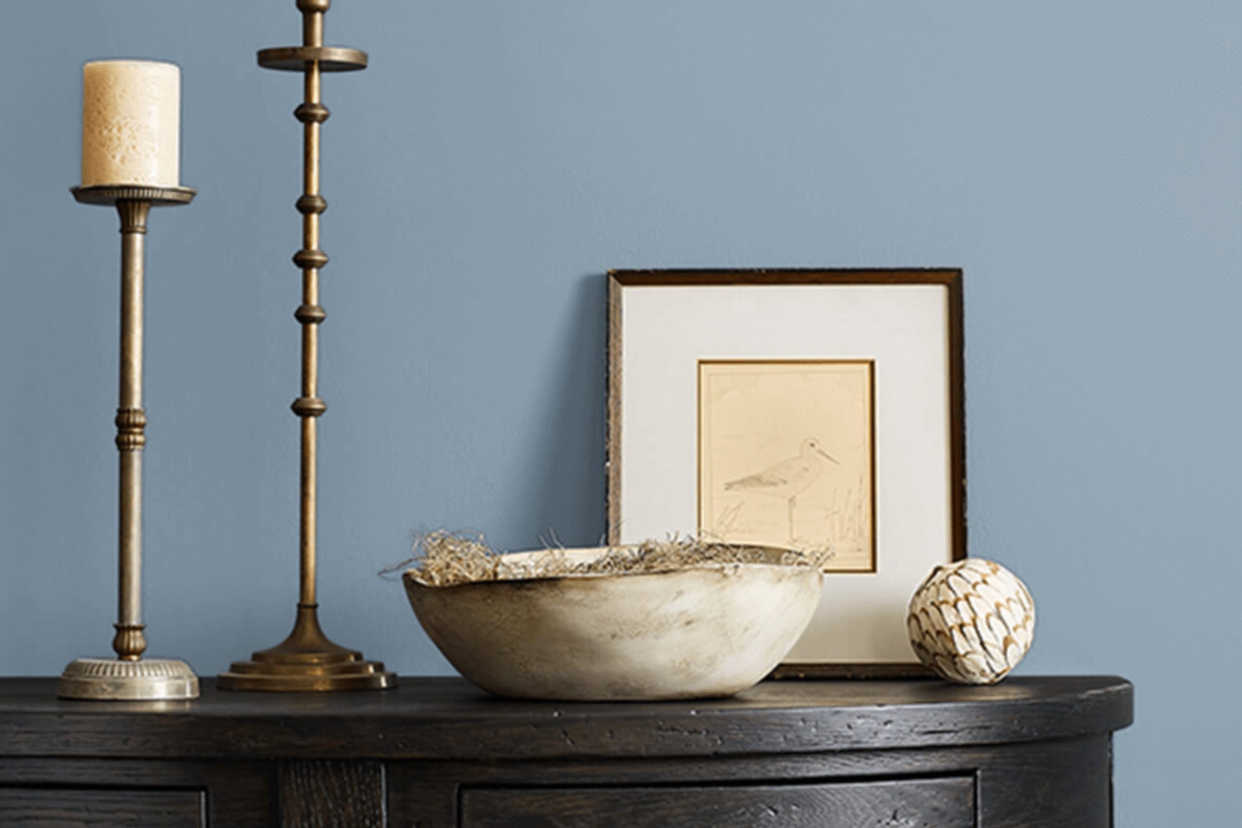
“Daphne” by Sherwin Williams is a beautiful blue with deep purple undertones that has a calming effect. In my view, this rich, muted color works wonders to add a touch of character to a room without being too intense. Firstly, it’s perfect for creating a cozy, inviting atmosphere in living rooms and bedrooms where you spend a lot of time relaxing. The color is subtle enough to work well with different design styles, but I find it particularly stunning in boho and modern interiors.
When thinking about the materials and textures that go well with this color, I love pairing it with natural wood tones, which balance out its coolness and add warmth to the room. Linen fabric or textured throws and cushions in neutral shades like beige or gray also complement it beautifully, enhancing the cozy feel.
Moreover, metallic finishes like brass or gold add a lovely touch of glamour to this color, making it feel more dynamic and interesting. Whether it’s in lamp fixtures, frames, or decorative objects, these accents can truly make a room shine. For a bolder contrast, incorporating velvet in a dark charcoal or vibrant teal brings a luxurious texture that pairs beautifully with the depth of “Daphne.” Overall, it’s an adaptable color that can bring life into rooms in a subtle yet impactful way.
decorcreek.com
What are the right undertones of Daphne SW 9151 ?
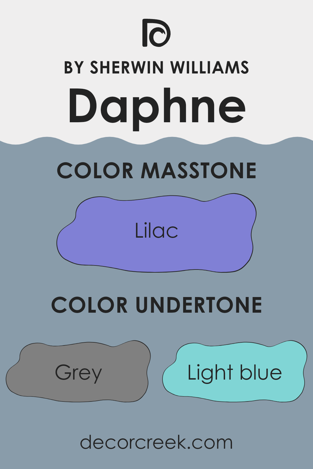
When choosing a paint color like Daphne, it’s essential to understand the undertones because they affect how the color will look in different settings. An undertone is a subtle color present within the main hue, influencing how we perceive the overall shade. Daphne has a mix of undertones including gray, light blue, mint, light purple, and more, giving it a complex appearance that can change depending on the lighting and surrounding colors.
For example, with gray and light blue undertones, Daphne might appear cooler and more neutral in a brightly lit room. This can make a room feel more open and airy. Mint and light purple undertones add a hint of freshness and softness, ideal for creating a calming environment perfect for bedrooms or bathrooms.
On interior walls, these diverse undertones allow Daphne to interact uniquely with different types of furniture and home accessories. In a room with natural wood elements, the mint and pale yellow undertones might stand out, complementing the earthy tones of the wood. In a modern setting with metal and glass, the light blue and gray undertones might become more pronounced, maintaining a sleek and contemporary look.
The true beauty of a paint color like Daphne is its adaptability, arising from its complex undertones. It can suit various decors and themes, adjusting subtly to enhance the overall aesthetic of any room. This makes it a practical choice for those looking to refresh their walls with a color that offers both beauty and flexibility.
decorcreek.com
Best Coordinating Colors to use with Daphne SW 9151 by Sherwin Williams this year.
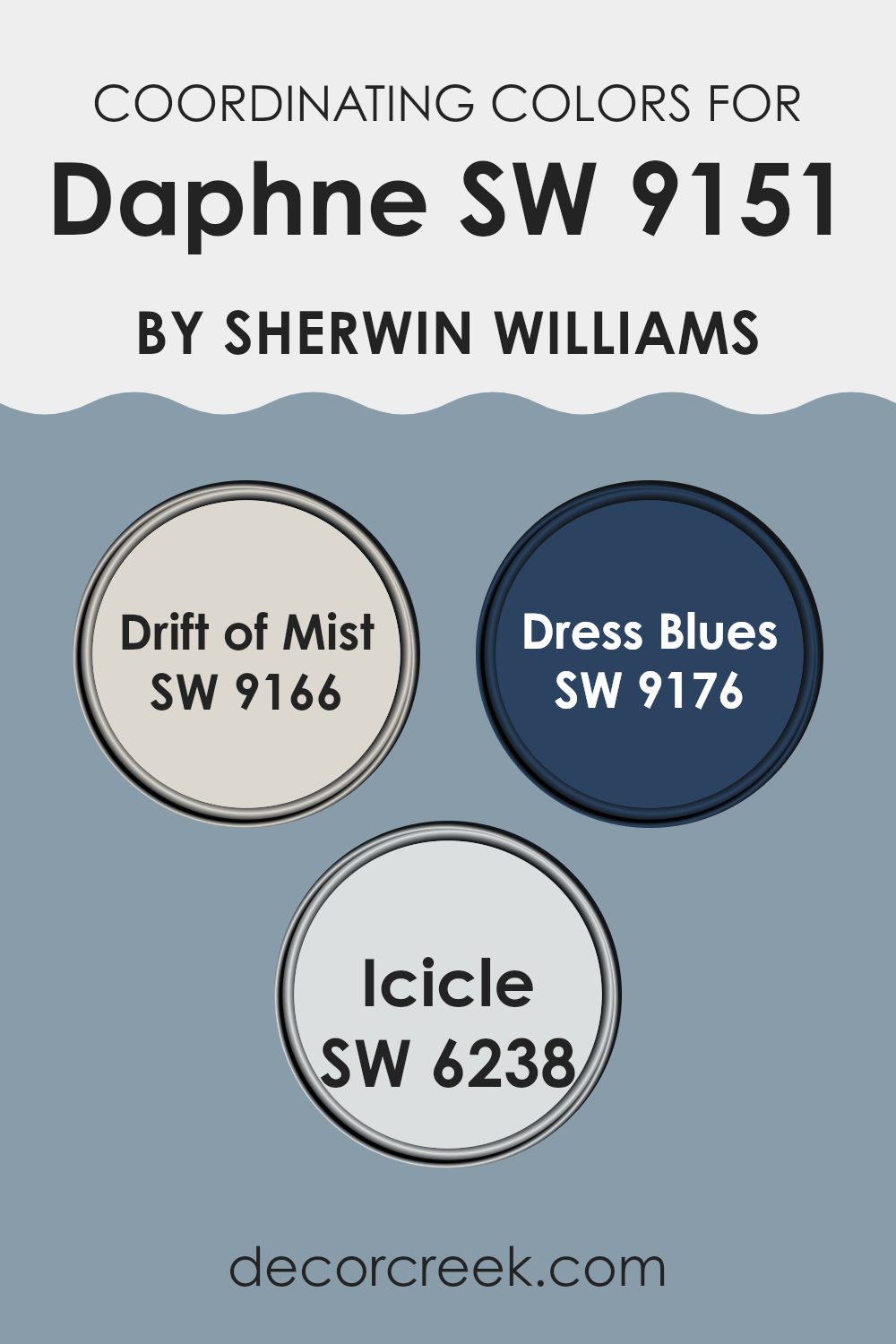
Coordinating colors are various shades and hues that complement a primary color, creating a harmonious and visually appealing palette. When using Daphne (SW 9151) by Sherwin Williams, an ideal set of coordinating colors includes Drift of Mist, Dress Blues, and Icicle, each serving to enhance the environment in different ways.
These colors are selected to balance the primary color, ensuring that the room feels cohesive and well thought out. The use of coordinating colors can bring balance, contrast, or reinforce a chosen aesthetic theme by pairing well with the main hue.
Drift of Mist (SW 9166) is a soft, subtle gray that works brilliantly to soften rooms without overpowering them. It provides a quiet background that allows other colors to stand out. Dress Blues (SW 9176) offers a striking deep blue tone that adds a dramatic flair and depth to the palette, making it a perfect choice for accent walls or decor elements. Icicle (SW 6238) is a clean, crisp light blue that brings freshness and a sense of airiness to any room, great for creating a light and open feel. Together, these colors support the primary paint color by providing variety and interest, making any decorating project look more polished and cohesive.
You can see recommended paint colors below:
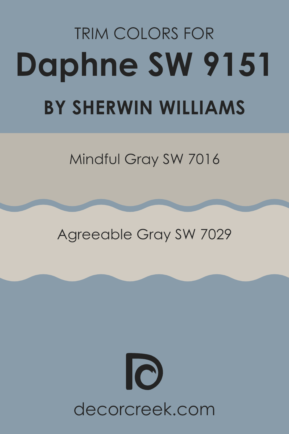
Trendy Trim Colors of Daphne SW 9151 by Sherwin Williams to use this year.
Trim colors are specific shades used on the architectural elements of a room such as door frames, window frames, and skirting boards to accentuate these features or create a cohesive look within a room. Choosing the right trim color is crucial as it outlines the room and can define the visual aesthetic.
For example, Daphne SW 9151 by Sherwin Williams, a deep and rich color, can be beautifully complemented by lighter trim colors such as SW 7016 – Mindful Gray and SW 7029 – Agreeable Gray, providing a balanced contrast that enhances both the wall color and the room’s overall appeal.
Mindful Gray is a gentle gray shade that brings a light and airy feel to the trim, offering a subtle contrast to richer wall colors like Daphne SW 9151. This makes it easier for the walls to stand out without being too intense. On the other hand, Agreeable Gray is a slightly warmer gray with a welcoming appeal that pairs harmoniously with deeper tones, ensuring the room feels cohesive and thoughtfully designed. Both these trim colors offer a lovely visual break that complements the stronger character of deeper wall colors, reinforcing the aesthetic without competing for attention.
You can see recommended paint colors below:
- SW 7016 Mindful Gray
- SW 7029 Agreeable Gray
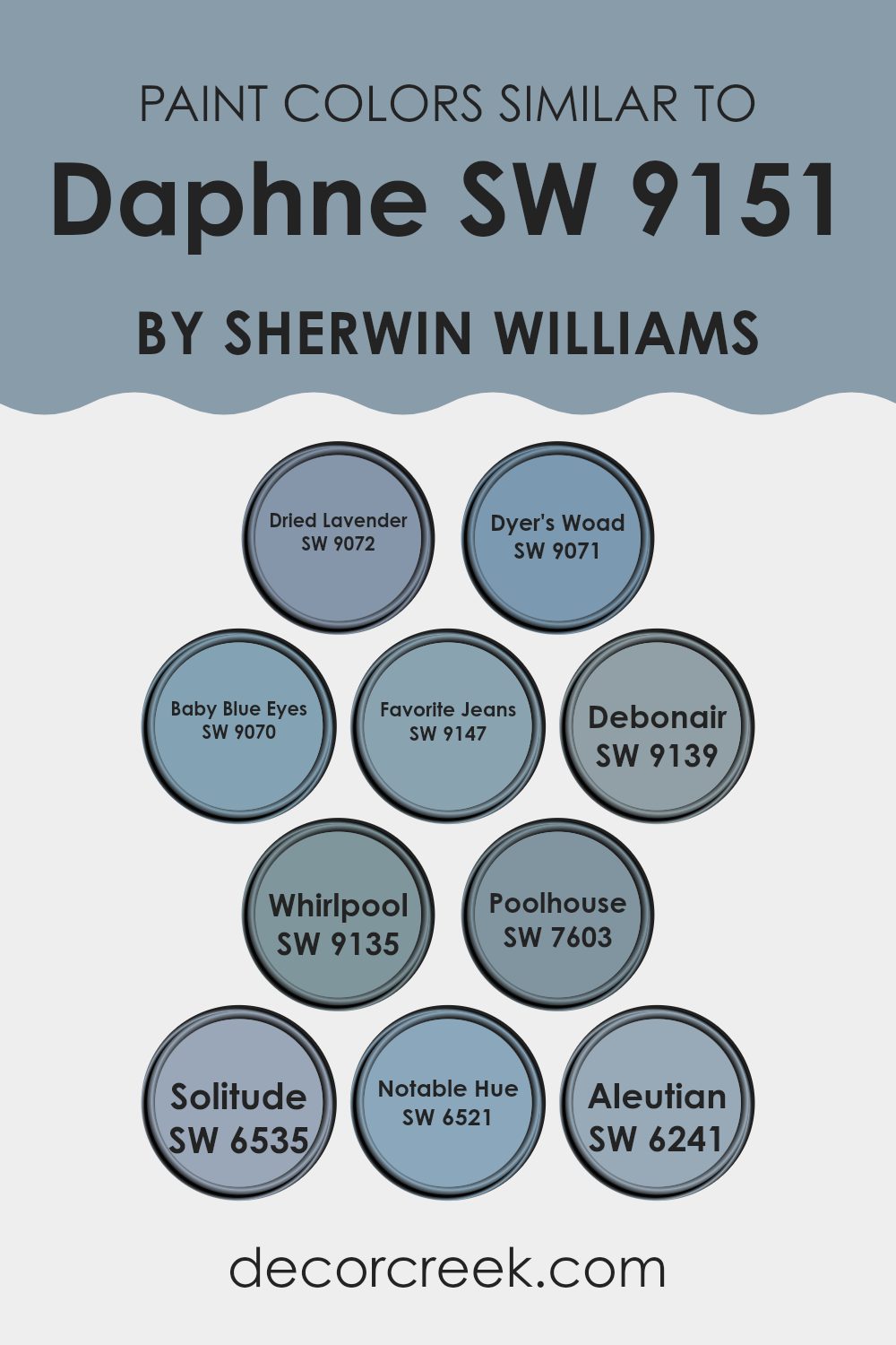
Evergreen Colors Similar to Daphne SW 9151 by Sherwin Williams
Similar colors play a crucial role in creating a cohesive and harmonious look in any room. By using colors that sit closely on the color spectrum, such as various shades of blue and purple, designers achieve a subtle and pleasing aesthetic. These similar colors can enhance the visual continuity of a room, making it appear larger and more unified. Additionally, when colors are alike, they allow for a more fluid and less distracting transition from one room to another, which is particularly beneficial in open floor plans.
For instance, SW 9072, known as Dried Lavender, displays a gentle purple that reminds you of lavender fields at dusk. Meanwhile, SW 9071, Dyer’s Woad, presents a slightly deeper tone, evoking the richness of indigo dye. Moving towards the blue spectrum, SW 9070 or Baby Blue Eyes offers a soft, almost whimsical, sky blue.
Then you have SW 9147, termed Favorite Jeans, which has a comforting familiarity akin to well-worn denim. SW 9139, named Debonair, brings a more confident shade of blue that carries a sense of calm. A bit lighter, SW 9135 or Whirlpool portrays a refreshing and clear blue, similar to a gently swirling pool. Another blue, SW 7603, known as Poolhouse, hints at the color found on the walls of a sunlit poolside retreat. Moving to SW 6535, Solitude uses a balanced blue that suggests a quiet, peaceful moment alone.
SW 6521, Notable Hue, offers a deeper, bolder blue that makes a statement without being too intense. Lastly, SW 6241, called Aleutian, provides a hint of stormy sea blues, perfect for a more dramatic but still cohesive effect. These similar tones allow for creativity and personal expression while keeping the design visually linked and smooth.
You can see recommended paint colors below:
- SW 9072 Dried Lavender
- SW 9071 Dyer’s Woad
- SW 9070 Baby Blue Eyes
- SW 9147 Favorite Jeans
- SW 9139 Debonair
- SW 9135 Whirlpool
- SW 7603 Poolhouse
- SW 6535 Solitude
- SW 6521 Notable Hue
- SW 6241 Aleutian
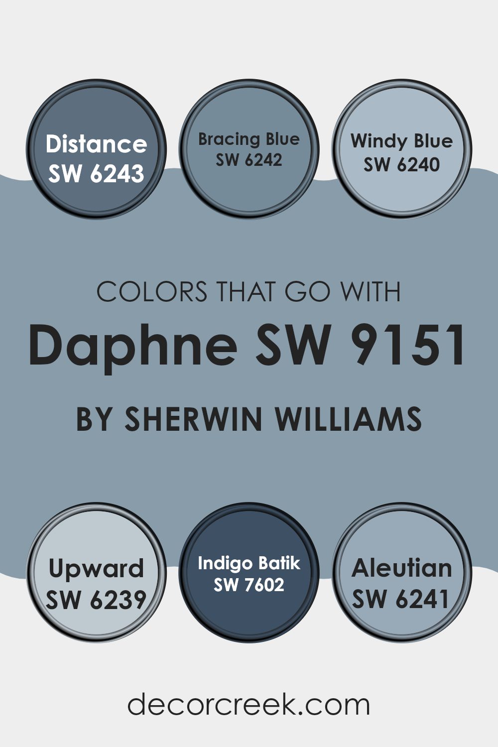
Colors that Go With Daphne SW 9151 by Sherwin Williams
Colors that harmonize with Daphne SW 9151 from Sherwin Williams are vital because they create a cohesive and appealing palette that can enhance any room’s aesthetics. These colors help in setting the right mood, complementing the surroundings, and bringing out the best in the room’s elements. For instance, using these colors together can add depth to the decor that a single color might not achieve.
SW 6243 – Distance is a deep gray-blue that evokes a stately feel, perfect for capturing a tone of professionalism or calm in a room. SW 6242 – Bracing Blue, slightly lighter, lends a cheerful yet grounded atmosphere. SW 6240 – Windy Blue has a soft, airy quality perfect for creating a gentle and inviting environment.
SW 6239 – Upward is a subtle light blue that adds a fresh, open atmosphere, ideal for a soothing touch. SW 7602 – Indigo Batik offers a much darker blue, which works well in providing striking contrasts and commanding attention. Lastly, SW 6241 – Aleutian, with its blend of blue and gray, offers a cooler tone, ideal for a subdued yet stylish backdrop. These colors can enhance the visual appeal of a room when paired correctly, creating various feelings from refined elegance to welcoming warmth.
You can see recommended paint colors below:
- SW 6243 Distance
- SW 6242 Bracing Blue
- SW 6240 Windy Blue
- SW 6239 Upward
- SW 7602 Indigo Batik
- SW 6241 Aleutian
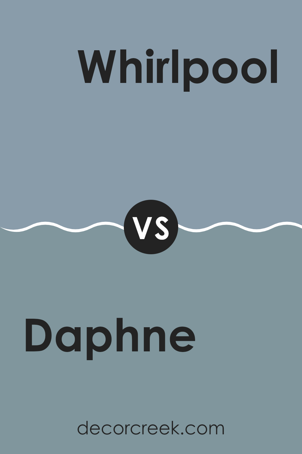
Daphne SW 9151 by Sherwin Williams vs Whirlpool SW 9135 by Sherwin Williams
The main color, Daphne, is a muted shade of blue that carries a hint of slate gray, offering a calm and cooling presence that is adaptable for different rooms. It’s subtle and can work well in living areas or bedrooms where a peaceful atmosphere is desired.
On the other hand, Whirlpool is slightly deeper and richer, with more intensity in its blue tones. This color evokes a stronger sense of personality and can make more of a statement in a room. It’s excellent for creating a focal point, whether on an accent wall or through decor pieces.
Both shades are part of the blue family, but they serve different moods and styles. Daphne is softer and more understated, making it easier to pair with various decor styles, whereas Whirlpool stands out more and pairs well with crisp whites or contrasting colors for a dynamic look.
You can see recommended paint color below:
- SW 9135 Whirlpool
Daphne SW 9151 by Sherwin Williams vs Favorite Jeans SW 9147 by Sherwin Williams
The two colors, Daphne and Favorite Jeans, both by Sherwin Williams, present distinct tones that could change the mood of a room. Daphne is a deep, rich blue with a hint of violet, giving off a subtle yet impactful presence. This color might be great for creating a cozy, inviting atmosphere in rooms like a bedroom or lounge area.
On the other hand, Favorite Jeans is a lighter, more relaxed blue. It resembles the classic blue of well-worn denim and has a friendly, approachable feel. This makes it perfect for casual rooms that benefit from a lighter touch, such as a kitchen or a family room.
While both are shades of blue, Daphne’s darker, more intense color is likely to make it feel more enclosing and warm. In contrast, Favorite Jeans, with its lighter, softer hue, seems airier and more open. Depending on the lighting and size of a room, each color can add a unique vibe, either grounding for Daphne or breezy for Favorite Jeans.
You can see recommended paint color below:
- SW 9147 Favorite Jeans
Daphne SW 9151 by Sherwin Williams vs Dyer’s Woad SW 9071 by Sherwin Williams
Daphne SW 9151 by Sherwin Williams is a light, soft violet color, giving off a subtle and soothing vibe. It has a gentle warmth to it, which makes it perfect for creating a cozy and inviting room. This color is ideal for bedrooms or living areas where a calm and peaceful atmosphere is desired.
On the other hand, Dyer’s Woad SW 9071 by Sherwin Williams is a much deeper and richer blue. This color has a certain strength to it, making it great for striking a bold statement in any room. It’s an adaptable shade that works well in rooms like home offices or dining rooms where a touch of drama is appreciated.
Both colors offer distinct feelings: Daphne is more about softness and warmth, while Dyer’s Woad leans toward boldness and depth. Whether you’re looking for something gentle or something with a bit more impact, both colors have their unique appeal.
You can see recommended paint color below:
- SW 9071 Dyer’s Woad
Daphne SW 9151 by Sherwin Williams vs Dried Lavender SW 9072 by Sherwin Williams
Daphne and Dried Lavender are two distinctive shades by Sherwin Williams that can give a room a unique feel. Daphne is a deep, dark bluish-green that conveys a sense of calm and elegance. It’s a color that tends to draw attention while remaining quite understated, making it a good choice for feature walls or furniture.
On the other hand, Dried Lavender is a soft, subtle purple with gray undertones that gives a gentle and soothing vibe. This color works well in bedrooms or other areas where you want a more relaxed atmosphere. It pairs nicely with lighter colors to create a gentle contrast.
Both colors offer their unique charm and can significantly affect the mood and style of a room. Daphne works better for a bold, dramatic look, while Dried Lavender suits rooms where a light, airy feel is desired.
You can see recommended paint color below:
- SW 9072 Dried Lavender
Daphne SW 9151 by Sherwin Williams vs Solitude SW 6535 by Sherwin Williams
Daphne and Solitude, both by Sherwin Williams, offer distinct visual experiences. Daphne is a deep blue that almost seems to lean into a soft purple realm, making it feel cozy and warm rather than stark. This color would be great in a bedroom or a cozy reading nook where you want a sense of calm and comfort.
On the other hand, Solitude stands out as a lighter, more subdued blue with gray undertones. It gives a more laid-back, airy vibe, perfect for creating a refreshing and calm room such as a bathroom or a well-lit kitchen.
Although both colors are blues, Daphne creates a more enveloping feel, while Solitude tends to open up a room more, reflecting light and giving an impression of more openness. These characteristics make each color suitable for different types of rooms depending on the effect you are aiming for.
You can see recommended paint color below:
- SW 6535 Solitude
Daphne SW 9151 by Sherwin Williams vs Aleutian SW 6241 by Sherwin Williams
“Daphne” and “Aleutian” are two paint colors from Sherwin Williams that have distinct tones and moods. “Daphne” is a lush blue-green that has a vibrant yet calming quality, perfect for creating a refreshing and lively room. On the other hand, “Aleutian” leans toward a softer, muted blue with a touch of gray, making it a great choice for a soothing and gentle atmosphere in a room.
While “Daphne” can inject energy and brightness into a room, making it feel more dynamic, “Aleutian” is better suited for areas where you might want a more relaxed and quiet vibe. The lighter and grayer undertones of “Aleutian” can make smaller rooms appear larger and more open, whereas “Daphne’s” richer hue commands attention and can make a bold statement.
Together, these colors offer a choice between a striking, eye-catching look and a low-key, cozy feel, depending on the environment and the mood you wish to set.
You can see recommended paint color below:
Daphne SW 9151 by Sherwin Williams vs Debonair SW 9139 by Sherwin Williams
Daphne SW 9151 and Debonair SW 9139 are two distinct paint colors offered by Sherwin Williams. Daphne has a rich blue tone with a subtle hint of gray, making it a vibrant yet balanced choice for any room that desires a pop of color.
On the other hand, Debonair leans toward a softer, more muted gray with a light blue undertone, providing a calm and gentle feel that’s perfect for creating a relaxing environment.
When placed side by side, Daphne stands out more due to its deeper saturation and bolder presence, which can make walls feel lively and expressive. Debonair, in contrast, works well in rooms where a light, airy feel is desired, pairing beautifully with modern and minimalist décor. The choice between them depends on the atmosphere you want to create; Daphne suits energetic, dynamic settings, while Debonair is ideal for soothing, peaceful areas.
You can see recommended paint color below:
- SW 9139 Debonair
Daphne SW 9151 by Sherwin Williams vs Baby Blue Eyes SW 9070 by Sherwin Williams
Daphne SW 9151 and Baby Blue Eyes SW 9070 are two distinct colors from Sherwin Williams, each offering a unique vibe. Daphne is a richer, darker blue with a hint of gray, giving it a muted, calming presence that is great for creating a cozy, grounded atmosphere in rooms. It works well in areas where you want a bit of a somber or grounded feel, like in bedrooms or studies.
On the other hand, Baby Blue Eyes is a much lighter and airier blue. This color is closer to a classic sky blue and brings a fresh, open feel to any room, making it perfect for nurseries, bathrooms, or anywhere you’d like a gentle, uplifting energy. It’s the kind of color that makes a room feel more spacious and light-filled.
In summary, while Daphne sets a more subdued and cozy tone, Baby Blue Eyes opens up a room with its light, cheerful hue. Choosing between them depends on the mood and function you want for your room.
You can see recommended paint color below:
- SW 9070 Baby Blue Eyes
Daphne SW 9151 by Sherwin Williams vs Notable Hue SW 6521 by Sherwin Williams
The main color, Daphne, is a deep, muted blue with gray undertones, giving it a calm and gentle feel. It’s quite adaptable for rooms that aim for a subdued yet rich atmosphere. This color is especially suited for areas like bedrooms or offices where a soothing environment is beneficial.
In contrast, Notable Hue is a lighter, vibrant teal. It’s brighter and more energetic, making it a great choice for areas that need a cheerful lift, such as kitchens or playrooms. The color carries a fresh vibe that can invigorate any room, yet it still holds a sense of calm due to its blue-green makeup.
Overall, Daphne provides a deeper, more reserved aesthetic, while Notable Hue offers a lively and refreshing look. Both colors have their unique appeal, depending on the mood and function of the room you are decorating.
You can see recommended paint color below:
- SW 6521 Notable Hue
Daphne SW 9151 by Sherwin Williams vs Poolhouse SW 7603 by Sherwin Williams
“Daphne” and “Poolhouse” by Sherwin Williams are two distinct colors, each offering a unique atmosphere. “Daphne” is a deep, muted shade of purple with hints of gray. It adds a rich and cozy feel to any room, making it perfect for creating a cozy and inviting atmosphere in areas like living rooms or bedrooms where you want a touch of understated elegance.
On the other hand, “Poolhouse” is a vibrant shade of blue that leans toward a light, breezy aquamarine. It’s a fresh and lively color, great for adding a splash of brightness to rooms that you want to feel airy and open, such as bathrooms, kitchens, or smaller rooms that could use a visual lift.
Both colors serve different moods and settings. “Daphne” is ideal for those who prefer a more understated and refined palette, while “Poolhouse” suits rooms intended to feel fresh, lively, and welcoming. Each color can significantly alter the perception and mood of a room depending on how and where it is used.
You can see recommended paint color below:
- SW 7603 Poolhouse
After learning all about SW 9151 Daphne by Sherwin Williams, I think it’s a fantastic paint color choice for anyone looking to add a fresh touch to their room. Daphne is a color that can make you feel happy and calm, perfect for a bedroom or a cozy reading nook. It’s like the color of the sky early in the morning, right when the sun is about to come up, and it sort of reminds you of a peaceful day outside.
For those who want to make their home feel welcoming and warm, Daphne is a great pick. It’s not too bold or too soft, but just right. It changes a little with the light, sometimes looking more blue and sometimes more gray. This means it can work well with lots of other colors you might already have in your home, from furniture to decorations.
Overall, if you’re thinking about giving a room a new look, SW 9151 Daphne is a color worth considering. It’s pretty, calming, and goes well with lots of things. It could help make your room a place where you love to spend time, whether you’re playing, reading, or just relaxing.
decorcreek.com
Ever wished paint sampling was as easy as sticking a sticker? Guess what? Now it is! Discover Samplize's unique Peel & Stick samples.
Get paint samples

