As you consider repainting a room or refreshing your home’s exterior, SW 9176 Dress Blues by Sherwin Williams might catch your eye. This deep, navy hue carries a sense of refinement and depth, making it perfect for a variety of areas, from a cozy study to a chic entryway.
The color’s balanced tone ensures it pairs well with both bright accents and understated neutrals. You’ll find it flexible enough to adapt to changing decor styles over the years.
While looking into options for a color that complements both modern and classic designs, Dress Blues stands out as a confident choice. It doesn’t just fill a room with color; it also introduces an atmosphere of calmness and order, which can be exactly what you need in a busy home environment.
Whether you’re painting a focal wall or considering this shade for your kitchen cabinets, Dress Blues has a lasting appeal that promises enduring style.
What Color Is Dress Blues SW 9176 by Sherwin Williams?
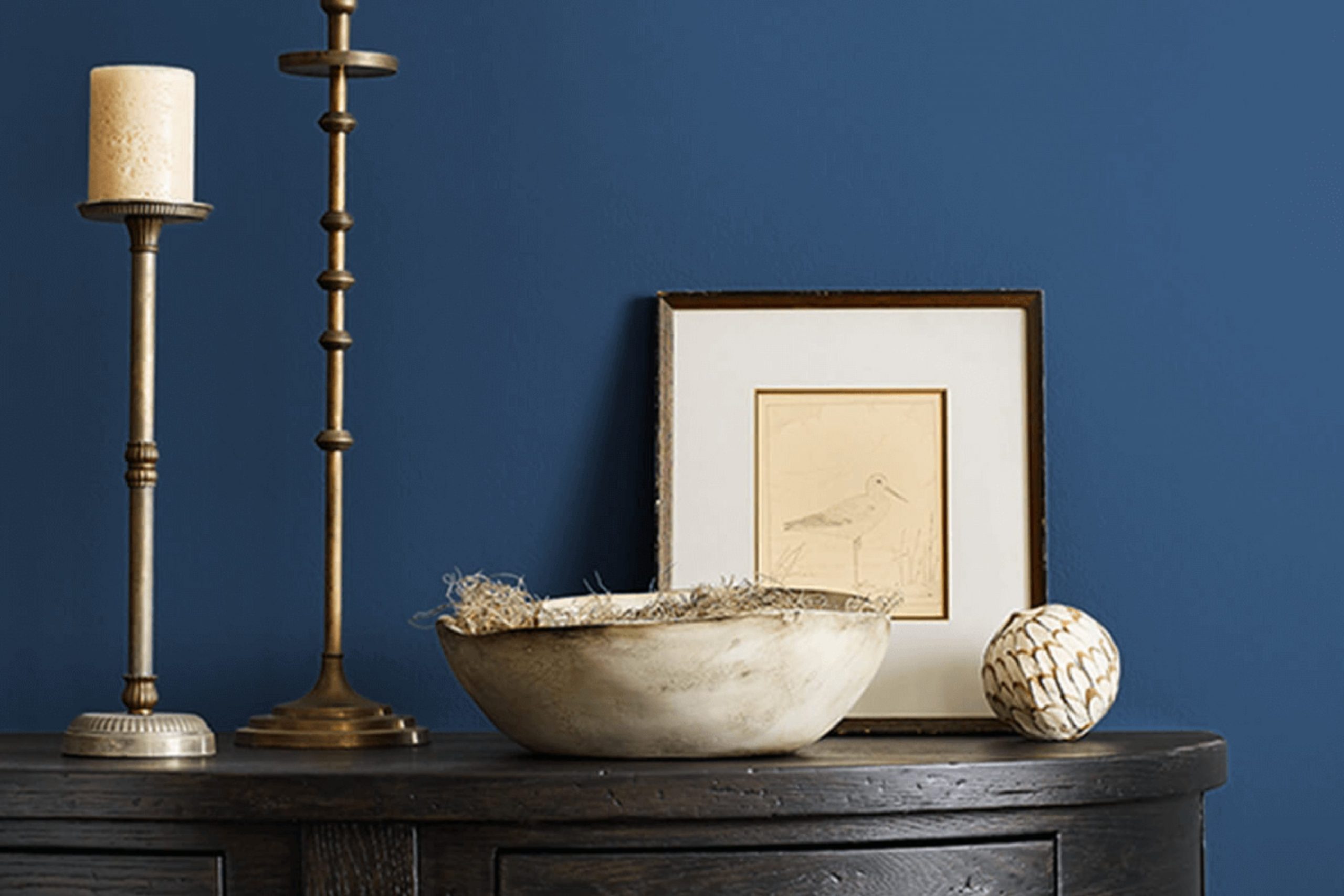
Dress Blues by Sherwin Williams is a rich and deep blue hue that exudes a classic and lasting feel. This color has a distinct character and provides a strong presence in any room, making it an excellent choice for those looking to add a bold statement to their interior. It pairs exceptionally well with an array of materials and textures, especially natural wood, which contrasts beautifully against its deep blue tones, enhancing a warm and inviting atmosphere.
Metallic finishes such as brass or gold also work well with Dress Blues, adding a touch of luxury and brightness to the area. In terms of interior styles, this color fits perfectly with nautical themes, where it can be combined with crisp whites and sandy beiges to create a fresh, coastal look. It is also ideal for a classic or traditional setting when paired with rich textures like velvet or silk, adding depth and interest to the area.
Furthermore, this color can work wonders in a modern or contemporary area, providing a dramatic backdrop for minimalist furnishings and bold artwork. Since Dress Blues has a strong personality, it’s best used in areas where you want to create an impact, like an accent wall in a living room or a thoughtful touch in a reading nook. This color brings a sense of strength and confidence to any interior design.
Is Dress Blues SW 9176 by Sherwin Williams Warm or Cool color?
Dress Blues by Sherwin Williams is a rich, deep blue color that brings a bold and strong look to any room. This shade can make a striking impact when used on walls, creating a focal point or a cozy atmosphere in areas like living rooms or studies.
When paired with neutral tones like whites or grays, Dress Blues provides a beautiful contrast that’s both stylish and lasting. It’s especially effective in a bedroom where the darkness of the color can help to make the area feel more private and restful.
For those wanting to add a touch of drama without making an area feel too much, incorporating Dress Blues in smaller elements, such as on a feature wall or in decorative accents, can be equally effective. This color works well with both modern and traditional decor, proving its flexible appeal in various home styles. Whether used extensively or sparingly, Dress Blues adds a strong visual statement to your interiors.
Undertones of Dress Blues SW 9176 by Sherwin Williams
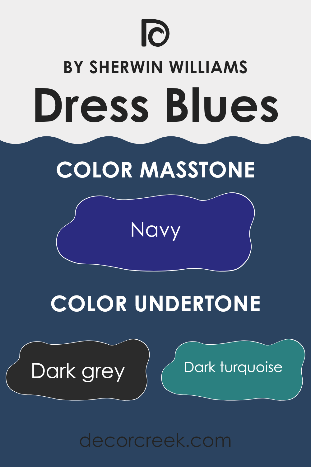
Dress Blues by Sherwin Williams is a color that contains a variety of undertones, which greatly influence how the color appears under different lighting conditions. Undertones are subtle hues that are mixed into the primary color, and they can affect the warmth, coolness, and overall mood of the color. The main undertones in Dress Blues are dark grey, dark turquoise, dark green, purple, brown, grey, olive, dark blue, blue, violet, and lilac.
When a color like Dress Blues is used on interior walls, these undertones play a crucial role in the room’s ambiance. For instance, under natural light, the blue and dark turquoise undertones might become more prominent, giving the room a cooler feel. In contrast, artificial lighting might highlight the brown and olive undertones, warming up the area.
Moreover, the mixing of cool undertones (like dark blue and violet) with warm undertones (like brown and olive) ensures that Dress Blues remains a flexible color. This flexibility means that it can easily adapt to different styles and decorations without clashing or making the area feel too much. It’s excellent for creating a balanced and inviting atmosphere.
The ability to look different under various light sources makes it a dynamic choice for interior walls, as it can continuously offer a fresh look throughout the day.
What is the Masstone of the Dress Blues SW 9176 by Sherwin Williams?
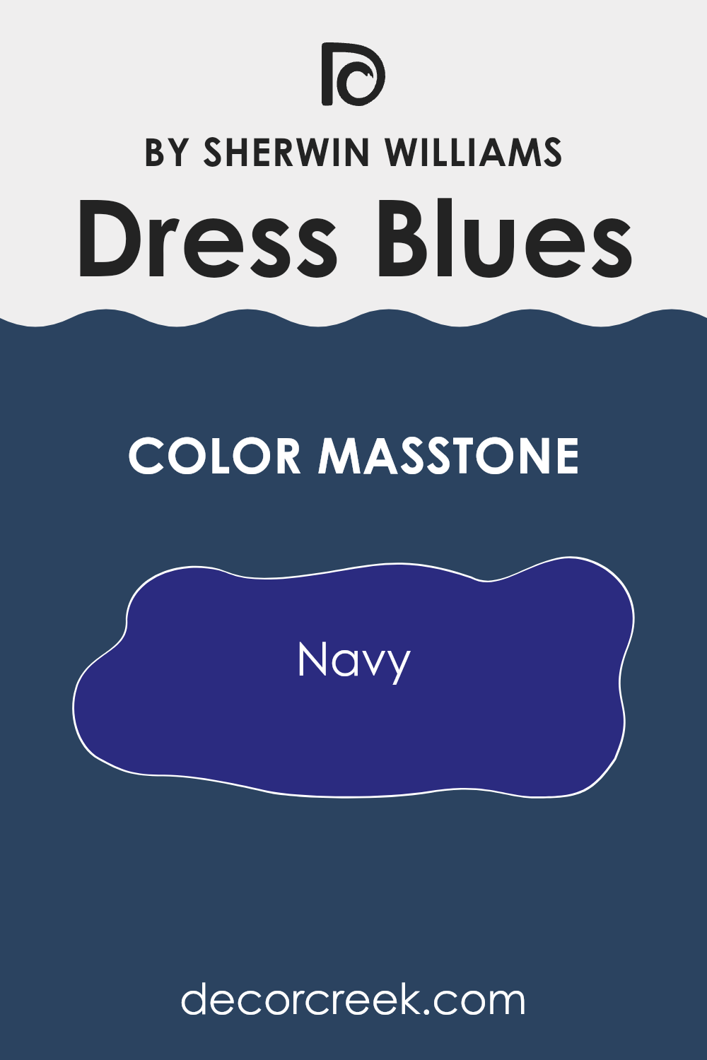
Dress Blues SW 9176 by Sherwin Williams has a rich masstone of Navy (#2B2B80), which is a deep blue shade. This color has a calming effect, making it perfect for creating a cozy, relaxing atmosphere in your home. It’s especially great for bedrooms or living rooms where you want to feel at ease. In places like a home office, this dark blue can help to focus and calm your mind, which can make it easier to concentrate.
This color also works well with natural light, appearing vibrant during the day and more intimate as the sunlight fades. It pairs beautifully with light colors like whites or grays, which can add a fresh contrast, making rooms appear larger and more open.
Additionally, Dress Blues looks stunning with wood tones, enhancing the natural elements in your area and adding a touch of elegance without being too flashy. Its ability to blend with various styles makes it a flexible choice for many homes.
How Does Lighting Affect Dress Blues SW 9176 by Sherwin Williams?
Lighting plays a critical role in how we perceive colors. Depending on whether a color is viewed under natural or artificial light, it can look dramatically different. For instance, Dress Blues by Sherwin Williams, a rich navy hue, reacts distinctly under different lighting conditions.
Under artificial lighting, Dress Blues tends to appear slightly brighter than in natural light. This is due to the typical yellow or white tones found in most artificial lighting, which can add a bit of warmth to the shade, reducing its intensity slightly and making it appear more vibrant. In areas like living rooms or dining areas, where artificial lights are often used, Dress Blues can create a welcoming yet bold statement.
In natural light, however, Dress Blues shows its true depth. Natural sunlight can highlight the complexity of this navy shade, bringing out subtle undertones and providing a crisp appearance. On a sunny day, this color can look very sharp and clear, making it perfect for areas that receive a lot of daylight.
The direction a room faces also significantly affects how Dress Blues looks. In north-facing rooms, which tend to have cooler, more muted light, Dress Blues may appear more shadowy and profound. It’s a great option for creating a more dramatic and cooler feel in an area.
In south-facing rooms, abundant in warm sunlight throughout the day, this color will look lighter and slightly more radiant. This can add a lively and fresh dynamic to the area while maintaining its boldness.
East-facing rooms get plenty of light in the morning, which can make Dress Blues look very vibrant and active in the early hours, fading into a deeper, more pronounced shade as the day progresses.
Conversely, in west-facing rooms, the color will start off more subdued in the morning and gain vibrancy during the afternoon and evening as the sun sets, casting warm light that brings out the rich undertones of the color. Understanding these variations can help in deciding where to apply this color effectively in home decor to achieve the desired atmosphere.
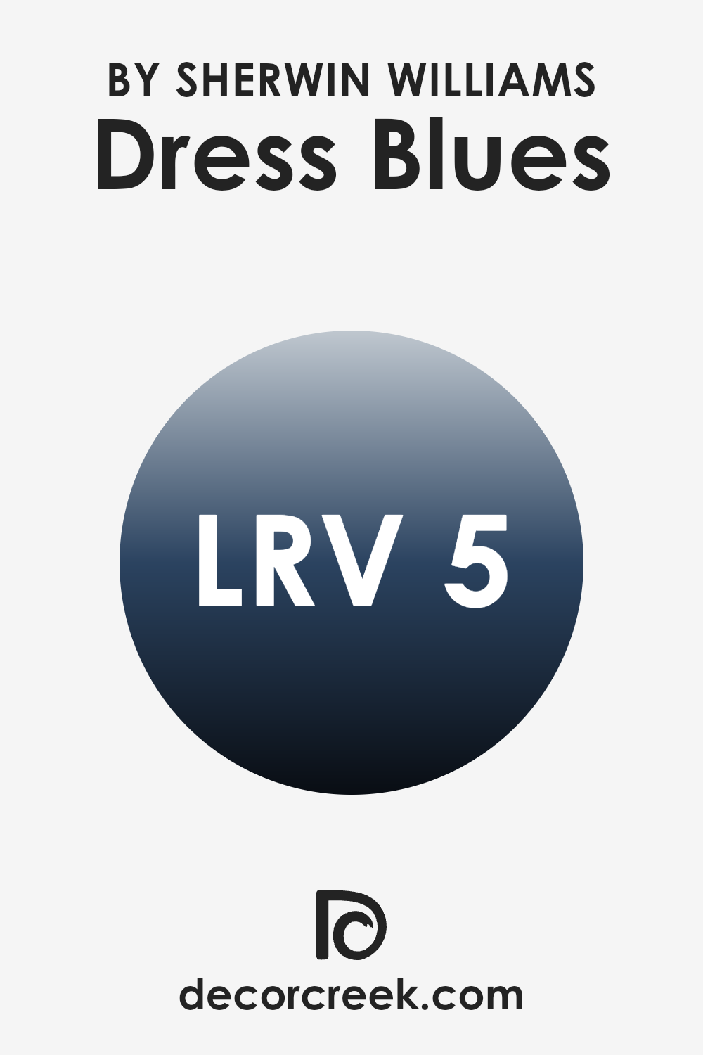
What is the LRV of Dress Blues SW 9176 by Sherwin Williams?
LRV, or Light Reflectance Value, is a measurement used to determine how much light a paint color reflects or absorbs when applied to a surface. This scale ranges from 1, which absorbs almost all light, to 99, which reflects nearly all light.
A higher LRV means the color is lighter and reflects more light, making an area feel more open and airy. A lower LRV indicates a darker color that absorbs more light, often used to create a cozier or more enclosed feeling in an area.
For the color Dress Blues with an LRV of 5.424, it falls on the lower end of the LRV scale, meaning it is a dark hue. This low LRV suggests that it absorbs a lot of light rather than reflecting it, which can make rooms painted this color appear smaller or more intimate. Such a color might be ideal for creating a dramatic or moody atmosphere. However, when using a dark color like this, it is usually good to have ample lighting, whether natural or artificial, to ensure the area doesn’t feel too closed in.
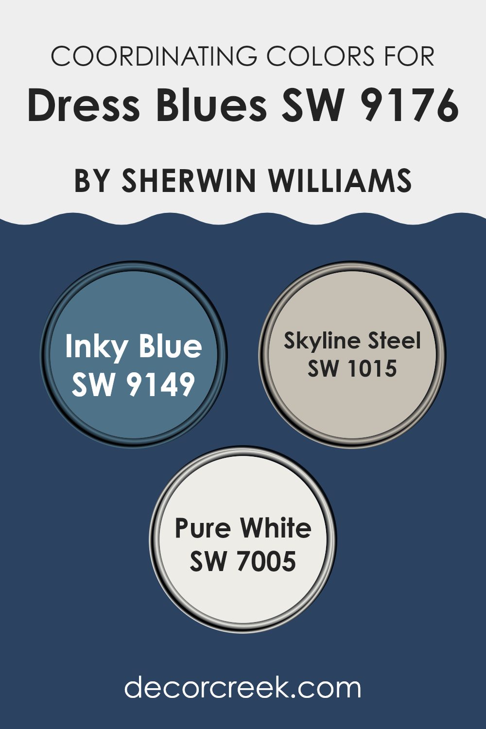
Coordinating Colors of Dress Blues SW 9176 by Sherwin Williams
Coordinating colors are selected to complement or enhance the overall appearance of a primary color, creating a harmonious and attractive color scheme. When using a distinctive color like Dress Blues by Sherwin Williams, it’s essential to choose coordinating colors strategically to achieve a balanced and visually appealing look. These coordinating colors should either contrast or blend smoothly with the main hue, depending on the desired effect, whether you aim for a bold, striking decor or a more subtle, unified ambiance.
In the case of Dress Blues, a deep, rich blue, coordinating colors like Inky Blue, Skyline Steel, and Pure White are excellent choices. Inky Blue, a slightly darker shade than Dress Blues, can provide depth and interest, making it ideal for accents or for creating a monochromatic style that’s full of character yet cohesive.
Skyline Steel, a muted grey with a touch of blue, works beautifully to soften the intensity of Dress Blues, offering a gentle transition between colors in an area. Pure White is crisp and clean, providing a striking contrast that highlights the richness of Dress Blues, ensuring that the area remains bright and lively. Together, these colors can create a visually appealing palette that enhances the unique character of the primary shade.
You can see recommended paint colors below:
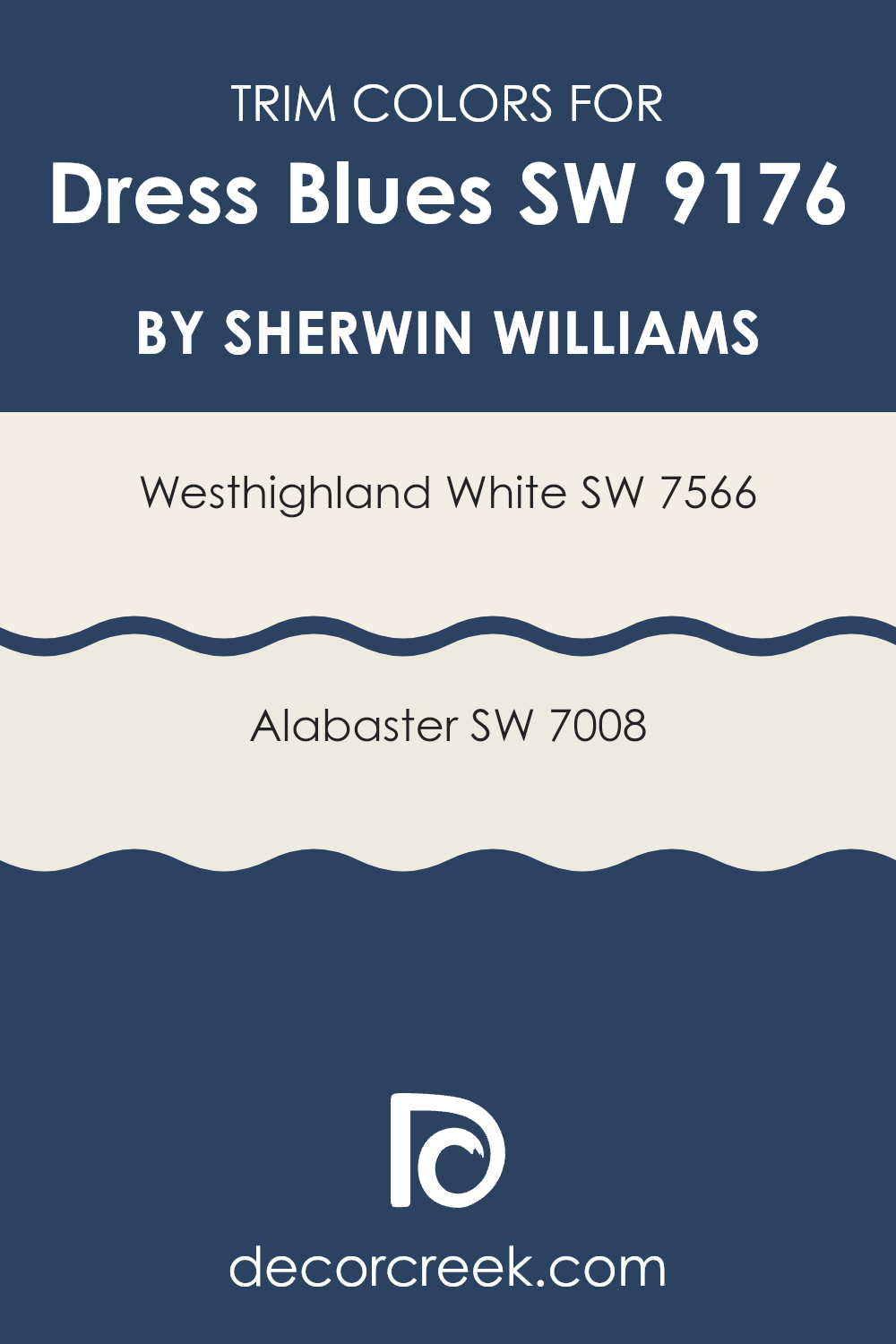
What are the Trim colors of Dress Blues SW 9176 by Sherwin Williams?
Trim colors, such as SW 7566 – Westhighland White and SW 7008 – Alabaster, are used to highlight or outline architectural features, providing a contrast or complement to the main color on walls.
When used alongside a color like Dress Blues by Sherwin Williams, these trim colors help to define edges, windows, doors, and other elements, enhancing the overall visual appeal of an area. Trims draw attention to details, accentuate the geometry of an area, and create a clean, finished look that defines the character of the area.
Westhighland White is a warm and creamy shade that offers a soft contrast when paired with bolder hues. It gently frames the main color, enriching the environment without making it too much. Alabaster, on the other hand, is a subtle, natural white that has a calm and gently refreshing effect, ideal for creating a soothing but well-delineated area. Both colors are excellent choices for trims as they provide just enough contrast to dress up the blues without causing a stark division.
You can see recommended paint colors below:
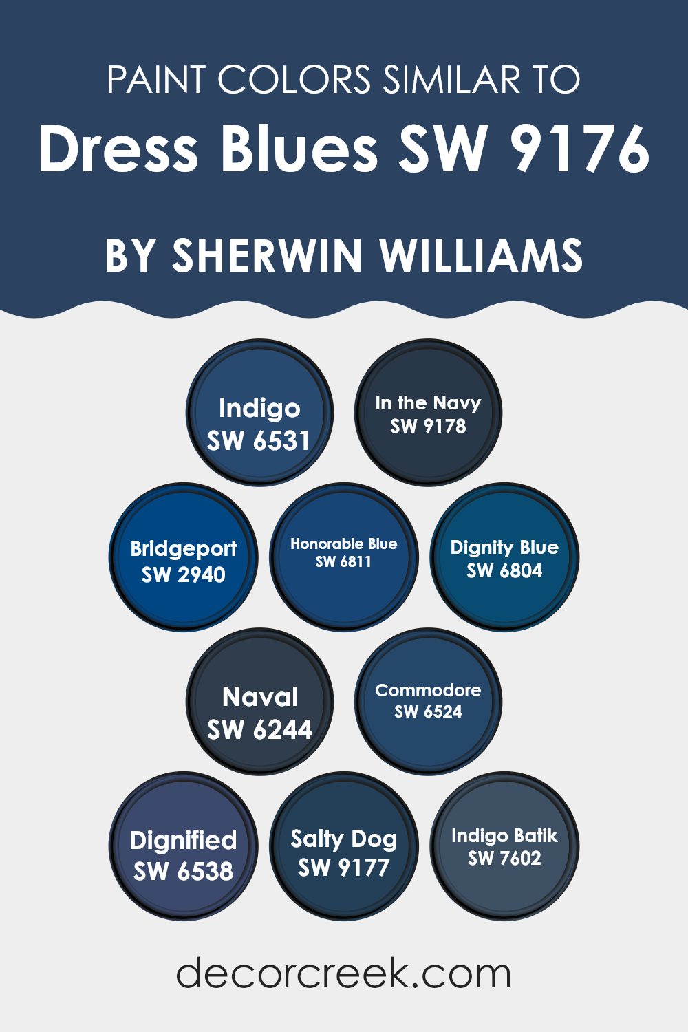
Colors Similar to Dress Blues SW 9176 by Sherwin Williams
Similar colors, especially when as subtly varied as the shades akin to Dress Blues by Sherwin Williams, play a pivotal role in creating visually harmonious and appealing areas. These hues, which share a common base but differ slightly in depth and tone, provide a seamless aesthetic flow in decor, allowing for layers of depth without making the senses feel too much. For instance, when coordinating colors like Indigo or In the Navy, one can achieve a uniform look with just enough contrast to make each element stand out. These subtle differences can highlight architectural features and furnish interiors with a cohesive yet dynamic appeal.
Indigo is a deep blue that mirrors the twilight sky, perfect for adding a touch of mystery to any area. In the Navy projects a bold, authoritative presence, ideal for accent walls or furniture pieces. Bridgeport offers a lighter, more muted blue that works beautifully in calm settings or for creating a relaxed backdrop.
Honorable Blue has a crisp clarity that brings a fresh vitality to rooms, while Dignity Blue straddles the line between playful and poised. Naval stands out as a true, dark blue that provides a grounding effect. Commodore displays a vibrant blue that is energetic and inviting. Dignified gives off a slightly grayish-blue tint, making it suitable for both modern and traditional areas. Salty Dog, slightly bolder, serves as a striking focal point. Lastly, Indigo Batik leans towards a softer, more washed-out part of the spectrum, great for areas that aim for a subtle, understated aesthetic. Each of these colors can be used to create a unique yet cohesive area that feels balanced and visually engaging.
You can see recommended paint colors below:
- SW 6531 Indigo
- SW 9178 In the Navy
- SW 2940 Bridgeport
- SW 6811 Honorable Blue
- SW 6804 Dignity Blue
- SW 6244 Naval
- SW 6524 Commodore
- SW 6538 Dignified
- SW 9177 Salty Dog
- SW 7602 Indigo Batik
Colors that Go With Dress Blues SW 9176 by Sherwin Williams
Choosing the right complementary colors for Dress Blues SW 9176 by Sherwin Williams is crucial as they help create a harmonious look that enhances the overall appeal of an area. These colors balance or accentuate Dress Blues’ deep, vibrant tone, ensuring that the environment feels cohesive and thoughtfully designed. When paired correctly, these colors can highlight the striking qualities of Dress Blues without making the senses feel too much, providing a visually pleasing palette that is both attractive and functional in a variety of settings.
Dress Blues pairs well with a variety of deep and rich tones like Anchors Aweigh SW 9179, a strong dark navy that is almost black, which adds a profound depth when used with Dress Blues. Charcoal Blue SW 2739 presents a smoky, dark blue that provides a subtle contrast, making it a perfect match for creating a distinguished and calm atmosphere.
nI the Navy SW 9178 is another excellent companion, offering a classic navy shade that reinforces a maritime feel. Naval SW 6244 is slightly brighter, injecting a crisp and fresh vibe into the area. Meanwhile, Salty Dog SW 9177 showcases an even deeper blue that can almost appear black under certain lighting, adding a dynamic element to the ensemble. Lastly, Mineral Gray SW 2740, as a lighter option, gives a soft, neutral balance that prevents the darker colors from overpowering an area, ensuring the area remains open and inviting. Each of these colors works together with Dress Blues to create a palette that is not only pleasing to the eye but also flexible for various decor styles and preferences.
You can see recommended paint colors below:
- SW 9179 Anchors Aweigh
- SW 2739 Charcoal Blue
- SW 9178 In the Navy
- SW 6244 Naval
- SW 9177 Salty Dog
- SW 2740 Mineral Gray

How to Use Dress Blues SW 9176 by Sherwin Williams In Your Home?
Dress Blues by Sherwin Williams is a deep, rich navy blue that can bring a lot of character and depth to any area in your home. It’s perfect for creating a striking accent wall in your living room or dining area, which can act as a stunning backdrop for artwork or mirrors.
This color also works well in a bedroom, lending a cozy and calming feel when combined with soft lighting and neutral furniture. If you’re hesitant to paint an entire room, consider using Dress Blues on a piece of furniture like a bookshelf or a cabinet for a pop of color that doesn’t overwhelm the area.
Additionally, this bold blue can be used in smaller areas like a bathroom or on a kitchen island, pairing nicely with white tiles or marble countertops for a clean, modern look. Dress Blues is flexible enough to fit into various styles, whether you’re going for a classic, modern, or even a rustic look.
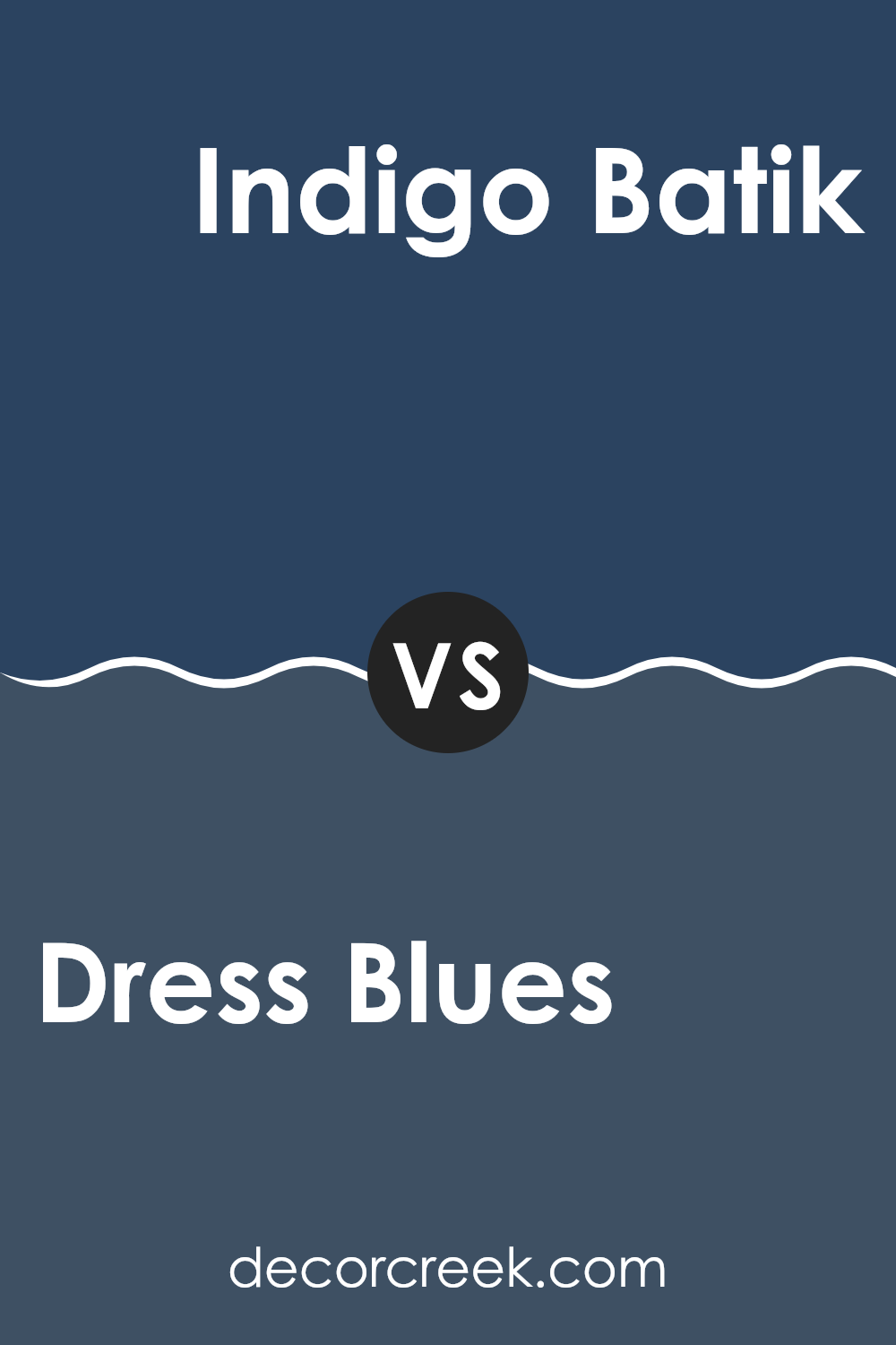
Dress Blues SW 9176 by Sherwin Williams vs Indigo Batik SW 7602 by Sherwin Williams
Dress Blues and Indigo Batik are both deep blue shades, but they have distinct tones that set them apart. Dress Blues is closer to a classic navy blue, offering a strong and traditional feel.
It’s a solid, reliable color that works well in areas that aim for a professional or formal atmosphere. On the other hand, Indigo Batik leans slightly towards a softer shade with gray undertones, giving it a more relaxed, gentle vibe.
It looks fantastic in areas where you want to create a cozy, welcoming environment. While Dress Blues is great for a sharp, clean look, Indigo Batik invites a softer, more relaxed atmosphere. Both colors pair well with neutral tones, but their individual effects on an area’s ambiance can differ significantly based on how they are used.
You can see recommended paint color below:
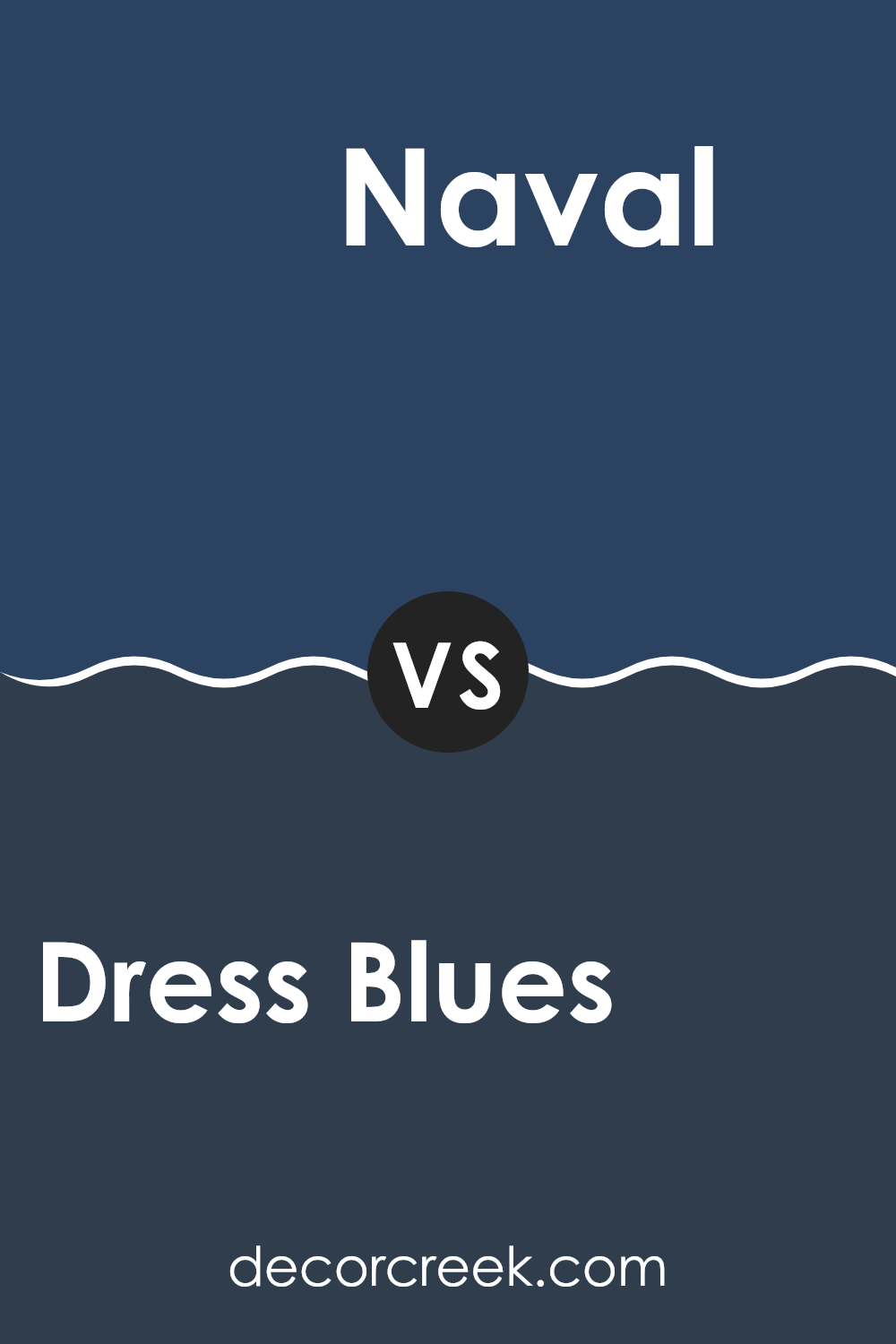
Dress Blues SW 9176 by Sherwin Williams vs Naval SW 6244 by Sherwin Williams
Dress Blues and Naval, both from Sherwin Williams, are deep, rich blues, but they have distinct tones that set them apart. Dress Blues is a slightly blackened navy shade, making it look almost dark gray in some lighting.
This color adds a bold and moody feel to any area, perfect for creating a strong statement without overpowering. On the other hand, Naval is a true navy blue that leans more towards a classic maritime feel.
It’s crisper than Dress Blues and sometimes appears brighter, making it a great choice for areas where you want a traditional yet powerful impact. While both colors convey a sense of depth, the choice between the two depends on whether you prefer the darker, subtle undertone of Dress Blues or the clearer, more distinct navy hue of Naval.
You can see recommended paint color below:
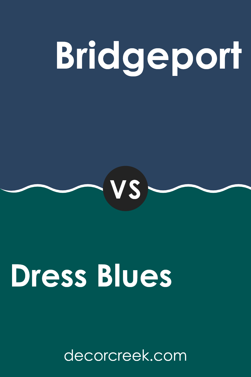
Dress Blues SW 9176 by Sherwin Williams vs Bridgeport SW 2940 by Sherwin Williams
Dress Blues and Bridgeport by Sherwin Williams are two distinct colors that can create unique atmospheres in any area. Dress Blues is a deep, rich navy blue that carries a strong sense of boldness and tradition. It’s a classic choice that pairs well with crisp white trims or warm wood tones, making it flexible for both modern and classic interiors.
On the other hand, Bridgeport is a lighter slate blue. It’s softer and more subdued compared to Dress Blues, giving a gentle and welcoming feel to rooms. This color works beautifully in areas that aim for a calm and inviting ambiance, such as bedrooms or bathrooms.
When comparing these two, Dress Blues stands out as the more striking option, suitable for making a statement. Bridgeport, being milder, is ideal for a subtle background tone that supports other colors to shine. Both colors offer unique possibilities, depending on the mood and style you’re aiming for in your decorating project.
You can see recommended paint color below:
- SW 2940 Bridgeport
Dress Blues SW 9176 by Sherwin Williams vs Dignified SW 6538 by Sherwin Williams
Dress Blues and Dignified are two distinct colors by Sherwin Williams. Dress Blues is a deep, rich navy blue that can make any area feel grounded and stately. Its strong presence often works well in areas that you want to give a feeling of formality and strength, like living rooms or offices.
On the other hand, Dignified is a vibrant teal that leans towards blue more than green. This lively color is perfect for adding a splash of brightness and energy to an area. It’s especially effective in areas where creativity or vibrancy is desired, like in a kitchen or a creative workspace.
Putting these colors in the same room could create an interesting contrast. Dress Blues offers depth and a sense of stability, while Dignified adds a punch of cheer and brightness, which can balance the seriousness of the navy blue. Both colors stand out on their own and bring unique qualities to an area depending on what atmosphere you’re aiming to achieve.
You can see recommended paint color below:
- SW 6538 Dignified
Dress Blues SW 9176 by Sherwin Williams vs Dignity Blue SW 6804 by Sherwin Williams
Dress Blues and Dignity Blue are both appealing colors from Sherwin Williams, yet they differ distinctly in their appearances and vibes. Dress Blues is a deep, rich navy that can give an area an intimate, cozy feeling. It’s perfect for creating a strong, grounded atmosphere in a room.
On the other hand, Dignity Blue is noticeably lighter and leans towards a more vibrant, lively tone. This color can bring a refreshing and energetic touch to an area, making it feel more open and airy.
Dress Blues works well in areas where a feeling of closeness and comfort is desired, like in a bedroom or a living area. Dignity Blue, with its vibrant charm, is great for invigorating areas such as kitchens or bathrooms. Both colors offer unique aesthetic benefits depending on the mood and function you want for your area.
You can see recommended paint color below:
- SW 6804 Dignity Blue
Dress Blues SW 9176 by Sherwin Williams vs In the Navy SW 9178 by Sherwin Williams
“Dress Blues” and “In the Navy” are both shades of navy blue from Sherwin Williams. “Dress Blues” has a slightly lighter, more vibrant tone compared to “In the Navy.
” This makes “Dress Blues” a good choice for areas where you want a hint of energy but still retain a calm atmosphere. On the other hand, “In the Navy” is deeper and closer to a true navy blue, giving it a stronger presence. It’s excellent for creating a more grounded and solid feel in an area.
When deciding between the two, consider how each color affects the mood and area. “Dress Blues” can brighten up an area slightly more, while “In the Navy” can make an area feel more enclosed and cozy. Both colors work well in a variety of settings, whether you’re painting walls or selecting furniture.
You can see recommended paint color below:
Dress Blues SW 9176 by Sherwin Williams vs Salty Dog SW 9177 by Sherwin Williams
Dress Blues and Salty Dog, both by Sherwin Williams, offer distinct yet complementary tones for decor. Dress Blues presents as a deep, dark navy blue, evoking a classic and lasting feel that pairs well with a variety of decor styles. This shade works beautifully in areas aiming for a strong, pronounced look without being overly dramatic.
On the other hand, Salty Dog is a step further in intensity and depth, incorporating a richer, more vibrant blue. This color is bolder and can create a striking impact in any area, making it ideal for an accent wall or to be used in areas where a punch of color is desired.
Both colors share a base of blue, but while Dress Blues leans towards a muted elegance, Salty Dog offers an energetic burst, making it more suitable for livelier areas or décor themes that seek a dynamic splash of color. Overall, these colors provide flexible options for creative home design.
You can see recommended paint color below:
Dress Blues SW 9176 by Sherwin Williams vs Indigo SW 6531 by Sherwin Williams
Dress Blues and Indigo, both by Sherwin Williams, offer unique shades of blue that can distinctly alter the mood and style of any area. Dress Blues is a deep, rich navy blue that gives a sense of strength and reliability. It’s perfect for creating a grounded, secure feeling in a room. This color works well in living areas or as an accent wall in a bedroom, providing a solid, comforting background.
On the other hand, Indigo is a lighter, more vibrant blue. It has a lively, dynamic quality that can brighten up an area while still keeping the calming presence that blues are known for. It’s great for areas that need a pop of color without overpowering the senses. Indigo can make small rooms appear larger and is ideal for bathrooms or study areas.
Both colors offer a beautiful base for decorating, depending on whether you want the stability and depth of Dress Blues or the cheerful energy of Indigo.
You can see recommended paint color below:
Dress Blues SW 9176 by Sherwin Williams vs Honorable Blue SW 6811 by Sherwin Williams
The color Dress Blues from Sherwin Williams is a deep, dark blue that gives a strong and classic vibe. It resembles the color of a traditional navy uniform, which conveys a sense of formality and seriousness. This color works well in areas where you want to establish a solid, grounded feel.
On the other hand, Honorable Blue is also a blue shade but is lighter and brighter compared to Dress Blues. Honorable Blue carries more vibrancy and is more eye-catching. It’s a great choice for areas where you want to add a lively spirit without overpowering the area with too bold a hue.
Both colors have their unique charms: Dress Blues sets a more reserved and traditional tone, while Honorable Blue adds cheer and a touch of brightness. Depending on what mood or style you’re aiming for in a room, either could be an excellent choice. Dress Blues suits a more formal or refined setting, while Honorable Blue might be perfect for a more playful or casual area.
You can see recommended paint color below:
- SW 6811 Honorable Blue
Dress Blues SW 9176 by Sherwin Williams vs Commodore SW 6524 by Sherwin Williams
Dress Blues and Commodore are both shades of dark blue from Sherwin Williams. Dress Blues is a deeper, almost navy blue that has a classic, lasting feel to it. It’s dark enough to make a statement but not so too much that it darkens a room too much. This shade works well in areas where you want a calming yet strong presence, such as bedrooms or office areas.
On the other hand, Commodore is a bolder, slightly brighter blue. It has more vibrancy and can really stand out as a focal point in an area. This color is great for those who want to add a pop of color without using overly bright or light colors. Its punchy vibe makes it suitable for accent walls, bathroom cabinets, or even a kitchen island.
Both colors are flexible, but the choice between them depends on what mood or style you’re going for in an area. Dress Blues offers more subtlety and depth, while Commodore provides a more dynamic and lively feel.
You can see recommended paint color below:
In conclusion, after looking closely at SW 9176 Dress Blues by Sherwin Williams, I found it to be a beautiful and strong color for painting walls. Its deep blue shade can make any room look more interesting and striking. I learned this color is not just any ordinary blue. It can pull off being both bold and calming at the same time, making it a perfect choice for people who want their rooms to have a bit of personality but also feel comfy to relax in.
While testing this color, I noticed it goes really well with lots of other colors. Whether it’s light colors like white or darker shades like gray, Dress Blues stands out and adds a special touch to the room. It’s particularly good for places where you want some peace like bedrooms or study areas.
Overall, SW 9176 Dress Blues by Sherwin Williams is a great pick for anyone looking to make a room more lively and neat without making it too bright.
This color proves that walls don’t have to be just background; they can be a key part of how a room feels. I’m glad I got to learn about this color and see how it could make homes nicer.
Ever wished paint sampling was as easy as sticking a sticker? Guess what? Now it is! Discover Samplize's unique Peel & Stick samples.
Get paint samples

