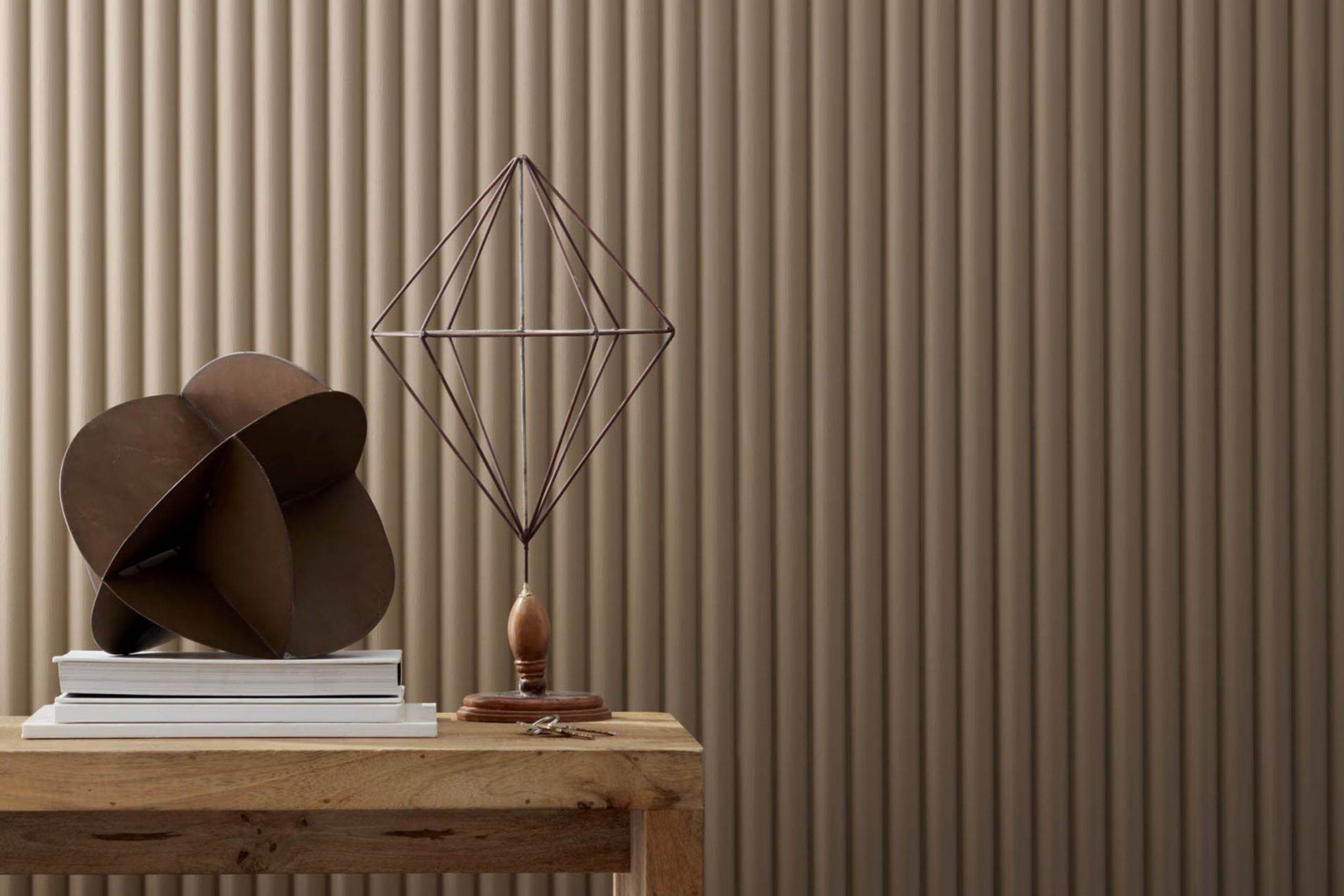
I recently came across HC-76 Davenport Tan by Benjamin Moore, a paint color that offers a cozy and warm vibe, ideal for anyone wanting to give their area a grounded and inviting feel. As I learned more about it, I found that its earthy hue pairs well with a variety of decor styles, from rustic farmhouse to modern minimalism. This paint is particularly adaptable, which means you can use it in different rooms and settings – be it a busy kitchen or a quiet study room.
The color’s subdued richness makes it a solid choice if you’re looking to create a calm yet stylish backdrop. Its ability to act as a neutral without being overly dull or common is something that caught my immediate attention. You’ll find that it blends seamlessly with both bright accents and subdued tones, allowing you to mix and match your furnishings and decor items with ease.
What adds to its appeal is that Davenport Tan is part of Benjamin Moore’s Historical Collection, which reflects colors that are historically accurate and have stood the test of time. This made me appreciate not just the look, but the depth and historical significance behind the color.
Whether you’re refreshing a single room or redecorating your entire home, this shade provides an enduring elegance that enriches the environment.
What Color Is Davenport Tan HC-76 by Benjamin Moore?
Davenport Tan (HC-76) by Benjamin Moore is a warm, deep beige that brings a cozy and inviting feeling to any room. This adaptable color has a subtle richness that works well in a variety of settings, making it an excellent choice for those looking to add a touch of warmth without overpowering a room.
The neutral tone of Davenport Tan makes it highly flexible for different interior styles. It pairs beautifully with the rustic charm of farmhouse decor, providing a soft backdrop for natural woods and distressed textures. In a modern setting, this color helps soften sleek lines and balances out the cool tones of metal and glass accents.
When it comes to materials, Davenport Tan pairs wonderfully with rich, natural textures such as leather and wool, enhancing their luxurious feel. It also complements wooden finishes, from dark walnut to light pine, creating a harmonious look that feels both grounded and inviting. In rooms with lots of natural light, this color can feel almost golden, adding a warm glow that enhances the welcoming atmosphere.
With its adaptable shade and ability to pair well with various textures, Davenport Tan is a great choice for anyone looking to create a cozy, inviting environment in their home. Its ability to work with multiple decor styles also makes it a practical choice for those who enjoy updating their area without changing the overall color scheme.
Is Davenport Tan HC-76 by Benjamin Moore Warm or Cool color?
Davenport Tan HC-76 by Benjamin Moore is a warm, earthy tone that brings a cozy and inviting atmosphere to any room. This shade works well in homes because it’s very adaptable and can complement various design styles, from rustic to modern.
The color adds a subtle elegance without overpowering the area, making it an excellent choice for living rooms and bedrooms where comfort is key. It pairs beautifully with natural materials, such as wood and leather, enhancing the welcoming feel.
Davenport Tan is also a great backdrop for both bold and muted colors, allowing for easy decoration changes. Additionally, it helps to hide marks and smudges, making it a practical choice for busy households. Overall, this color is a reliable and flexible option that helps create a warm, cozy home environment.
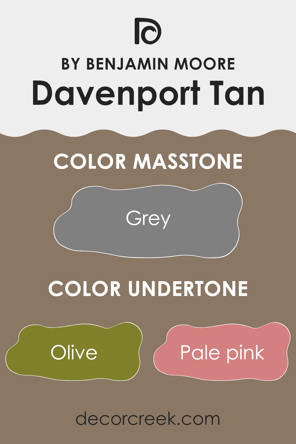
Undertones of Davenport Tan HC-76 by Benjamin Moore
Davenport Tan by Benjamin Moore is a multifaceted color that can appear differently based on its surroundings and how light hits the walls. This paint color has various undertones, including shades of olive, brown, dark grey, and light grey, which contribute to its complexity and adaptability.
The presence of these undertones means Davenport Tan can either warm up a room or provide a subtle neutral backdrop, depending on the other colors in the area and the lighting conditions.
For instance, in a well-lit room with lots of natural sunlight, the olive and light green undertones might become more prominent, giving the room a fresh and inviting feel. In contrast, in a room with less natural light, the brown and dark grey undertones might stand out more, creating a cozier and more grounded atmosphere.
When using Davenport Tan on interior walls, it’s important to consider these undertones as they can significantly influence the mood and aesthetic of a room. Furnishings and decor in similar undertone families can harmonize with the paint to create a cohesive look, while contrasting colors might make the room feel more dynamic and lively.
Overall, Davenport Tan’s range of undertones makes it a flexible choice that can adapt to various settings and styles, making it easier to use in many different types of rooms, whether you’re aiming for a light and airy feel or a warm and intimate ambiance. This adaptability is particularly useful in areas that serve multiple purposes or need to transition from one mood or function to another.
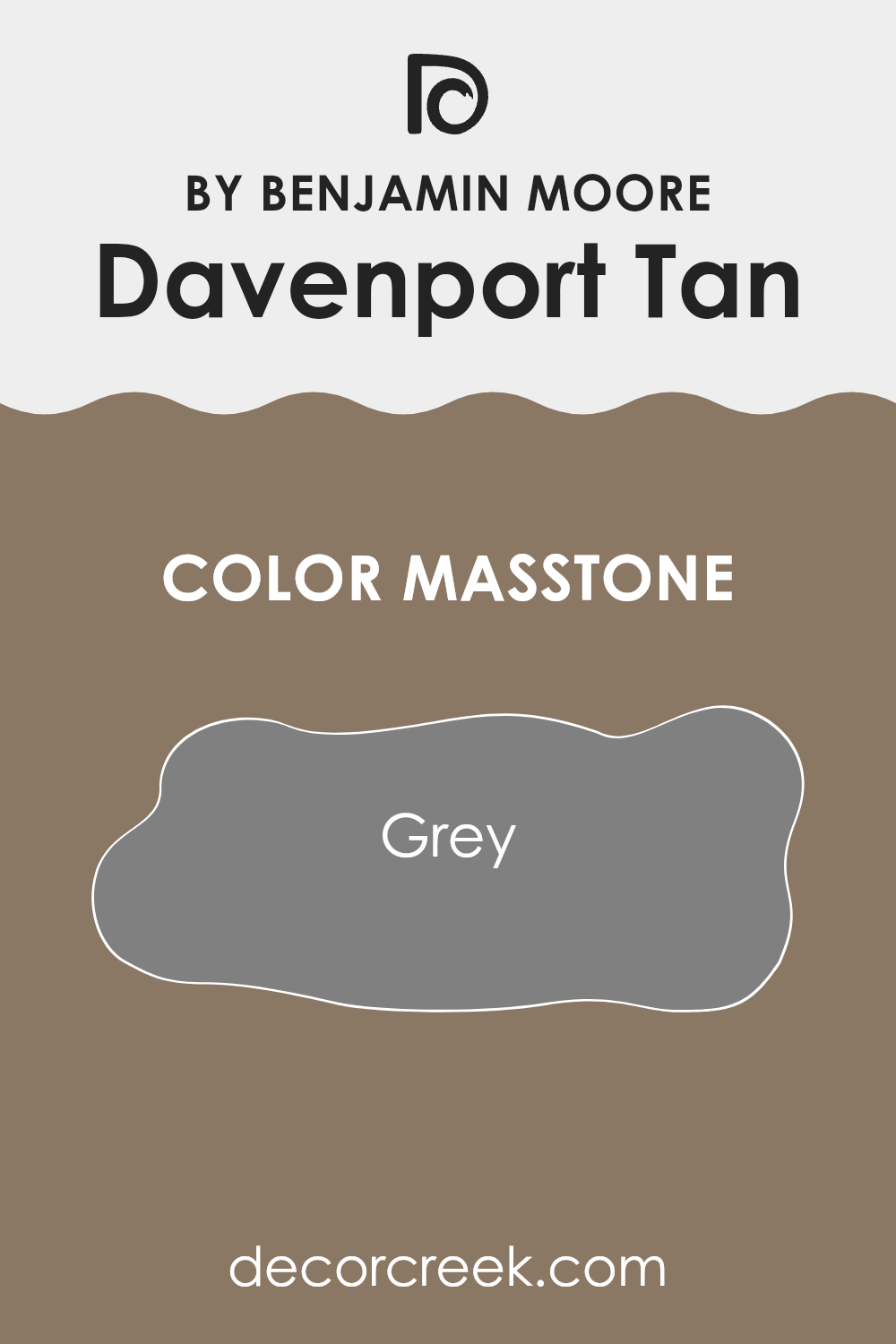
What is the Masstone of the Davenport Tan HC-76 by Benjamin Moore?
Davenport Tan HC-76 by Benjamin Moore is a classic grey color with a balanced, neutral tone. Its masstone displays a true grey that can easily blend with a wide range of interior styles, making it an adaptable choice for home décor.
This particular shade of grey is practical because it provides a neutral backdrop, allowing other colors in the room, whether on furniture, artworks, or fabrics, to stand out without clashing. The neutrality of Davenport Tan HC-76 means it works well in various lighting conditions, maintaining its true grey appearance without shifting too much into other color tones.
In homes, this grey masstone can help to create a calm and cohesive look. It’s perfect for living areas, bedrooms, or even kitchens, as it pairs well with both bright colors for a lively feel and softer hues for a more subdued atmosphere. Furthermore, its ability to hide imperfections on walls makes it a practical choice for busy areas. Adding this color can easily refresh any room with a modern, clean look.
How Does Lighting Affect Davenport Tan HC-76 by Benjamin Moore?
Lighting significantly influences how colors appear in a room. The hue and intensity of light can make colors look different at various times of the day or under different lighting conditions.
The color Davenport Tan is a warm, neutral beige that offers a cozy feel to any area. In artificial light, such as that from LED or incandescent bulbs, Davenport Tan tends to appear slightly darker and richer, bringing a sense of warmth and comfort to the room. This makes it a great choice for living areas or bedrooms where you want to create a cozy, inviting atmosphere.
In natural light, Davenport Tan’s true color is more apparent. It can look lighter and more vibrant during the day, especially in a room with ample sunlight. This makes it adaptable for rooms that benefit from a natural, airy feel during the day, while still maintaining a warm ambiance in the evening.
Regarding room orientation:
- North-faced rooms: These get less direct sunlight, which can make Davenport Tan look more muted and cooler. It’s ideal for a calming effect in areas like home offices or reading nooks.
- South-faced rooms: These receive more direct sunlight, making Davenport Tan look warmer and more vibrant. It’s perfect for living rooms or kitchens where a cheerful, inviting atmosphere is desirable.
- East-faced rooms: Morning light makes Davenport Tan look brighter and more welcoming in the morning, gradually transitioning to a neutral tone as the day progresses. Ideal for breakfast nooks or dining areas where morning brightness is appreciated.
- West-faced rooms: As sunlight intensifies in the afternoon, Davenport Tan will warm up, perfect for rooms used more in the afternoon and evening, like family rooms or dens.
Overall, Davenport Tan’s flexibility in different lighting and orientations makes it an adaptable choice for many homes, shifting its warmth and depth with the changing light.
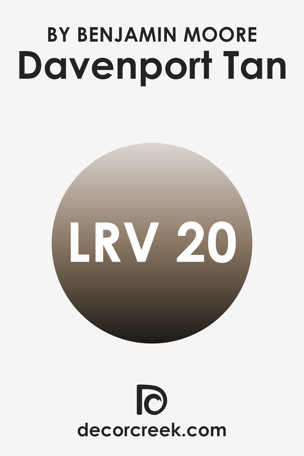
What is the LRV of Davenport Tan HC-76 by Benjamin Moore?
LRV stands for Light Reflectance Value, a measure used to indicate how much light a paint color reflects or absorbs. This value is expressed as a percentage, ranging from zero, which absorbs all light and appears completely black, to a higher value, indicating a lighter color that reflects more light.
Understanding LRV can be important when choosing paint colors for a room as it helps predict how light or dark a color will look on the walls once applied. High LRV values make rooms appear brighter as they reflect more light, while lower values create a cozier, more shadowed effect.
In the case of the specific color Davenport Tan HC-76 by Benjamin Moore, with an LRV of 20.35, the color is on the darker side, reflecting a relatively small amount of light. This means Davenport Tan HC-76 will absorb more light than it reflects, making it a suitable choice for creating a warm and inviting ambiance in an area.
However, it’s important to consider lighting conditions in the room where this paint is used. In rooms with limited natural light, this color might make the area appear darker than intended. To counterbalance this, combining it with lighter colors or using ample artificial lighting could enhance the overall appearance and prevent the room from feeling too dim or enclosed.
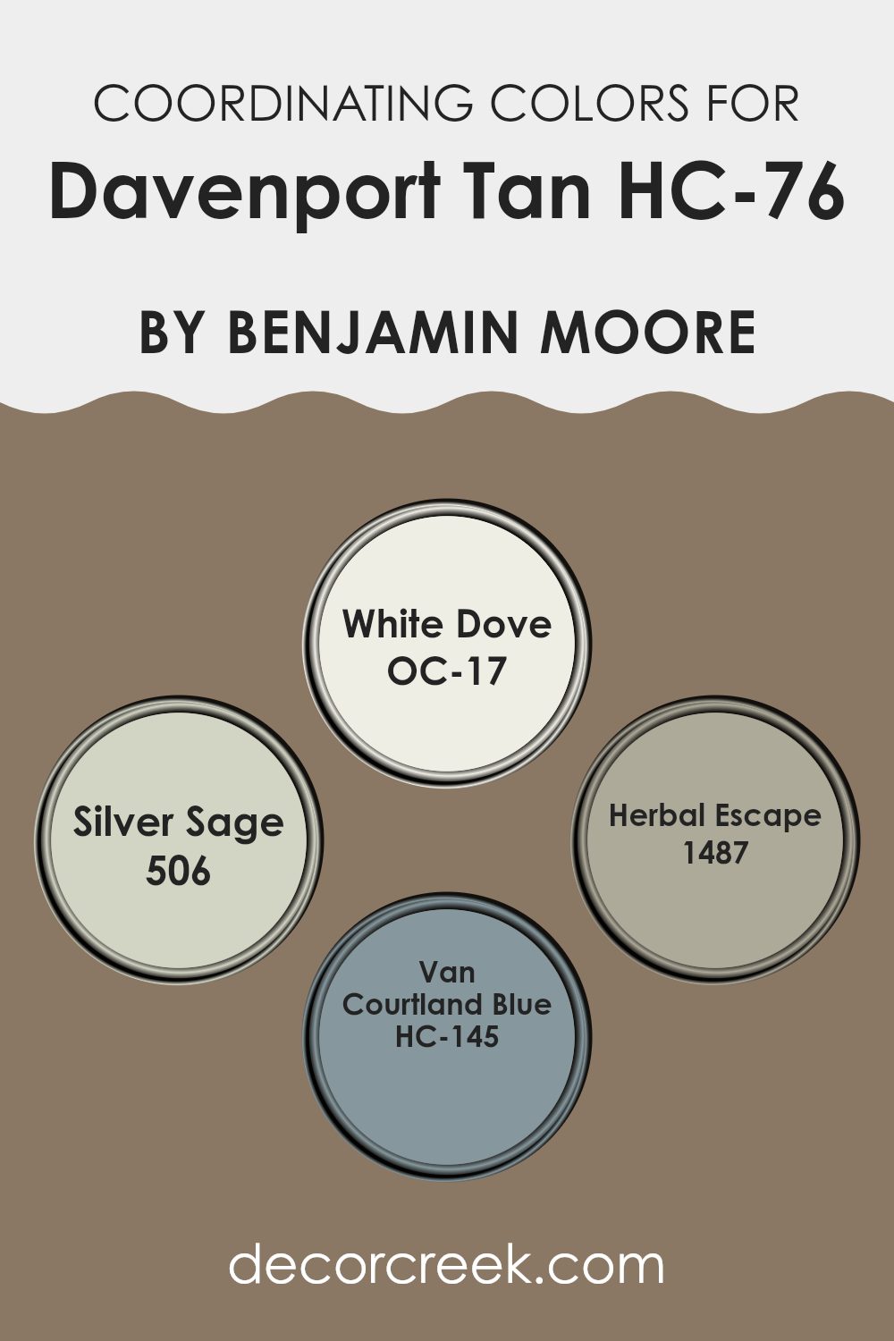
Coordinating Colors of Davenport Tan HC-76 by Benjamin Moore
Coordinating colors are shades that complement each other, enhancing the overall look of a room when used together. For instance, when decorating with a base color such as Davenport Tan by Benjamin Moore, selecting coordinating colors helps create a balanced and harmonious environment. These coordinating colors can accentuate the primary shade, add depth to the decor, and bring together various elements of the room into a cohesive design.
Benjamin Moore’s OC-17 White Dove is a clean, crisp white that works beautifully to brighten rooms and provide a subtle contrast to Davenport Tan. It’s an excellent choice for trim, ceilings, or even as an all-over color for a fresh, airy feeling.
Another coordinating color, 506 Silver Sage, offers a gentle hint of green with a muted, soothing presence, perfect for creating a soft backdrop or as an accent wall. For a touch of nature-inspired freshness, 1487 Herbal Escape provides a slightly deeper green that pairs well with wood tones and natural fabrics.
Lastly, HC-145 Van Courtland Blue introduces a soft, muted blue that recalls the sky on a cloudy day, providing a calm, restful vibe to interiors when used alongside Davenport Tan. These colors together ensure a stylish yet comfortable area that feels thoughtfully put together.
You can see recommended paint colors below:
- OC-17 White Dove
- 506 Silver Sage
- 1487 Herbal Escape
- HC-145 Van Courtland Blue
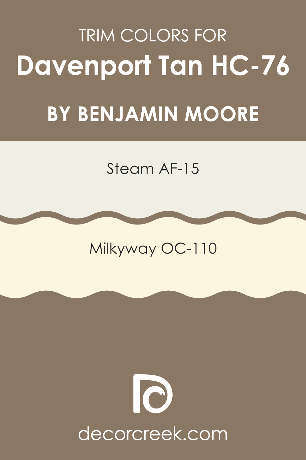
What are the Trim colors of Davenport Tan HC-76 by Benjamin Moore?
Trim colors are essentially the hues used for the edges and accents in a room, such as baseboards, moldings, doors, and window frames. They play a crucial role in enhancing the aesthetic appeal of a room, as they define and highlight architectural features, creating visual interest and contrast.
When considering an adaptable base color like Davenport Tan, choosing the right trim color can guide the room toward a desired mood and style. For example, using colors such as AF-15 – Steam or OC-110 – Milkyway as trim colors can significantly influence the overall appearance and feel of a room painted with Davenport Tan.
AF-15 – Steam is a gentle, almost ethereal white with a hint of cool undertone, excellent for a crisp, clean look that subtly frames the warm and inviting Davenport Tan. This contrast sharpens the boundaries in a room, making the architectural details pop without overpowering the primary color.
On the other hand, OC-110 – Milkyway is a warmer white that harmonizes beautifully with the warmth of Davenport Tan, providing a seamless blend that softens transitions between walls and trims. This choice infuses a slight contrast while maintaining a cohesive and welcoming environment. Choosing either of these trim colors can enhance the visual dynamics of a room while ensuring the primary wall color remains the focal point.
You can see recommended paint colors below:
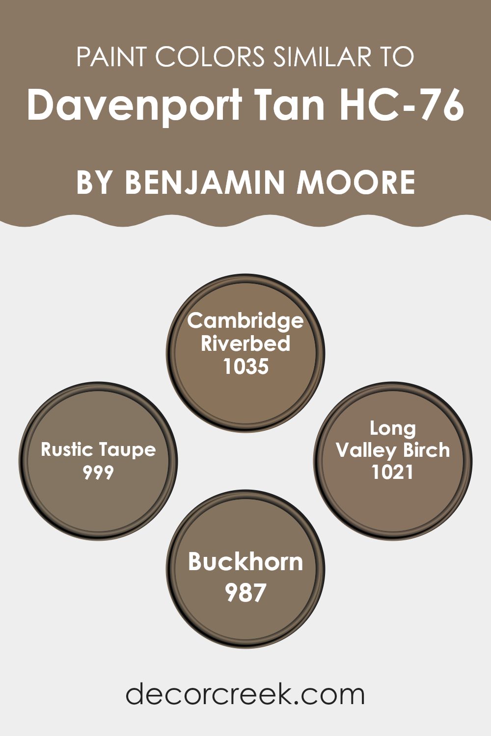
Colors Similar to Davenport Tan HC-76 by Benjamin Moore
Choosing similar colors can create a cohesive and harmonious look in any room, making it feel more unified and thoughtful. Similar colors, like those related to Davenport Tan by Benjamin Moore, work well together because they share common undertones which provide a subtle continuity, even as the shades vary slightly. This similarity in color can help achieve a smooth visual flow throughout a room or across a home, ensuring that no single element feels out of place or overly dominant.
Cambridge Riverbed is a gentle, sandy hue that whispers of river stones and soft earth, perfect for a calm setting. Rustic Taupe, as the name suggests, adds a touch of understated charm with its deeper, warm brown tone that reminds one of a weathered woodland path. Long Valley Birch offers a slightly yellower tint, suggesting the pale, sunlit wood of birch trees in early autumn.
Meanwhile, Buckhorn exudes a rich, dark tan reminiscent of the rugged outdoors and dense forests, providing a stronger accent in a palette that revolves around soft, nature-inspired tones. These colors, while unique in their specific shades, collectively contribute to creating an area that feels connected and naturally collected.
You can see recommended paint colors below:
- 1035 Cambridge Riverbed
- 999 Rustic Taupe
- 1021 Long Valley Birch
- 987 Buckhorn
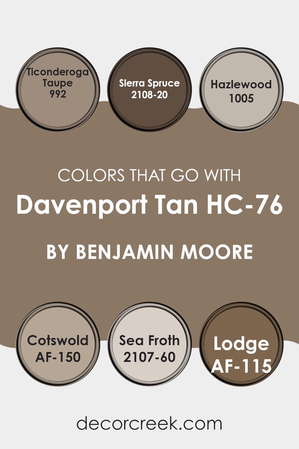
Colors that Go With Davenport Tan HC-76 by Benjamin Moore
Choosing colors that complement Davenport Tan HC-76 by Benjamin Moore is key to creating a harmonious and appealing room. The right colors enhance the warm, neutral base of Davenport Tan, allowing for a cozy yet balanced atmosphere.
For instance, Ticonderoga Taupe is a gentle brown that adds depth while keeping the environment soft and accessible. Then, there’s Sierra Spruce, a deep green that offers a bold contrast, perfect for making Davenport Tan pop without overpowering the senses.
Continuing with suitable matches, Hazlewood strikes a comfortable balance with its earthy tone that echoes the outdoors, enriching the overall warmth of the room. Cotswold follows a similar path by embodying an understated but rich yellow, reinforcing a warm and inviting feel.
Meanwhile, Sea Froth introduces a lighter, almost airy quality with its soft off-white shade, which can lighten a room beautifully when paired with the denser Davenport Tan. Lastly, Lodge is another robust choice with its subtle richness, bringing in a sense of calm depth that complements the foundational tan without dominating the palette. Each of these colors works together to create a cohesive look that enhances each individual element.
You can see recommended paint colors below:
- 992 Ticonderoga Taupe
- 2108-20 Sierra Spruce
- 1005 Hazlewood
- AF-150 Cotswold
- 2107-60 Sea Froth
- AF-115 Lodge
How to Use Davenport Tan HC-76 by Benjamin Moore In Your Home?
Davenport Tan HC-76 by Benjamin Moore is a warm and adaptable paint color that can add a cozy feel to any room in your home. It’s a mid-tone brown that pairs well with a variety of decorating styles, making it a great choice for anyone looking to refresh their area. This color works especially well in living rooms and dining areas where its inviting hue promotes a welcoming atmosphere for family gatherings or entertaining guests.
You can also use Davenport Tan in bedrooms to create a calm and comfortable backdrop for relaxation and sleep. Pair it with crisp white trim for a clean look, or choose contrasting colors like blues or greens for a bit of visual interest. In bathrooms, this color provides a warm neutral base that complements natural wood or stone finishes.
For those who prefer a subtle yet effective change in their decor, painting kitchen cabinets or islands in Davenport Tan can add depth and character without overpowering the room. Whether you’re painting an accent wall or redoing an entire room, Davenport Tan offers a stylish and easy-to-use option for any home update.
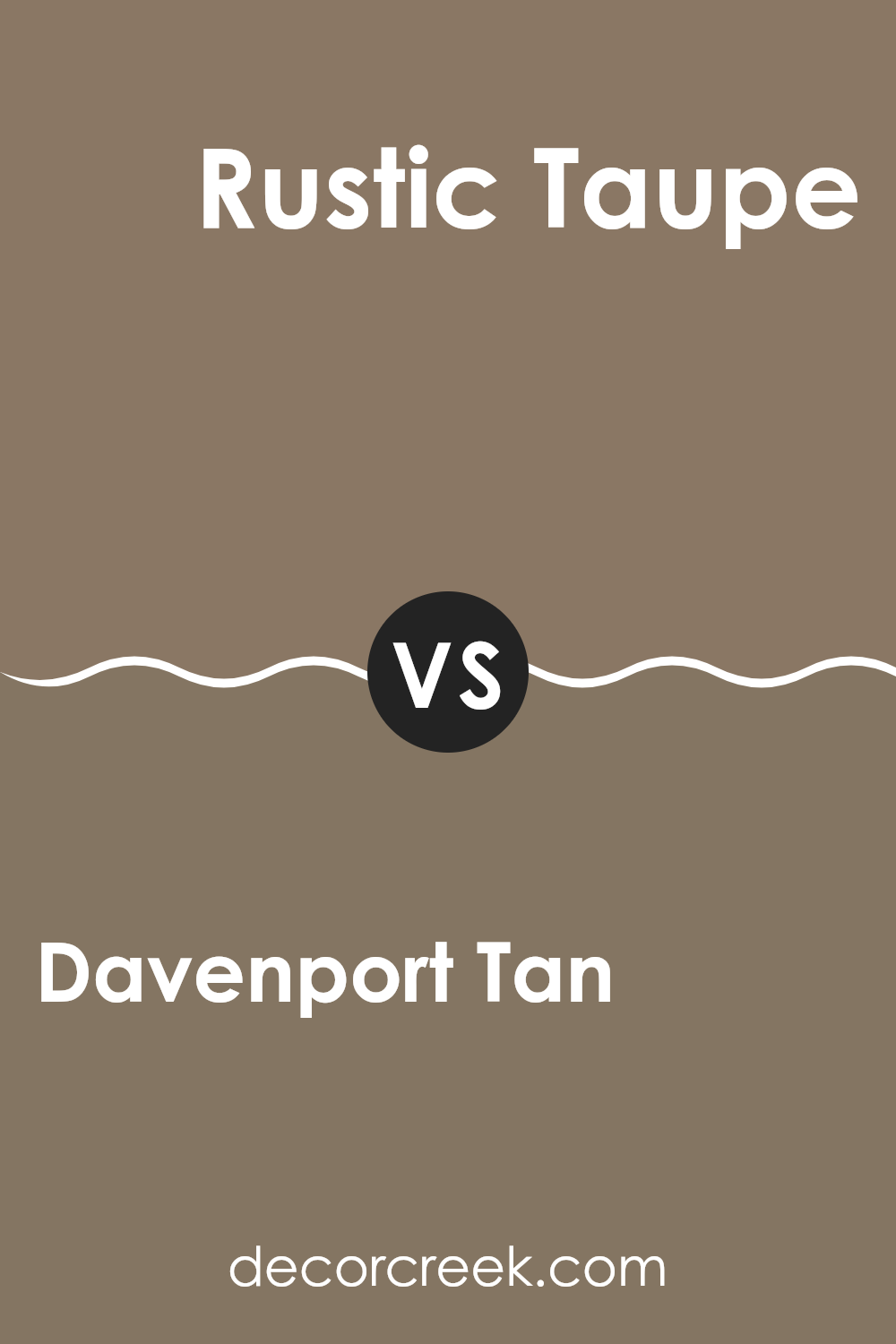
Davenport Tan HC-76 by Benjamin Moore vs Rustic Taupe 999 by Benjamin Moore
Davenport Tan and Rustic Taupe are both paints by Benjamin Moore that offer warm, neutral tones but with distinct differences. Davenport Tan is a deeper, beige color with a yellow undertone, making it feel warm and cozy.
It’s great for rooms where you want a welcoming and soft atmosphere, such as living rooms or bedrooms. In contrast, Rustic Taupe has a grey undertone that gives it a slightly cooler, more muted look. It works well in rooms where you want a subtle, modern touch without going too dark.
Rustic Taupe is adaptable, fitting well in both casual and formal areas. In summary, Davenport Tan offers a warm, inviting feel with its yellowish hue, while Rustic Taupe provides a contemporary, understated elegance with its greyish cast.
You can see recommended paint color below:
- 999 Rustic Taupe
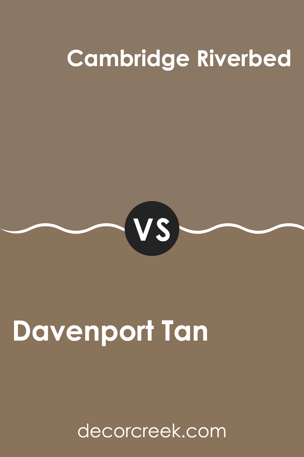
Davenport Tan HC-76 by Benjamin Moore vs Cambridge Riverbed 1035 by Benjamin Moore
Davenport Tan is a warm tan shade that gives off a cozy, inviting feeling. It’s the kind of color you might see in a lived-in, welcoming area like a family living room or a comfy bedroom. It pairs well with many other colors, from bold and bright to soft and neutral.
Cambridge Riverbed, on the other hand, is a cooler, grayish tone that lends a sleek and modern look to any room. It is perfect for creating a calm, understated vibe that’s still stylish and contemporary.
So, if you’re choosing between these two, think about the atmosphere you want to create. Davenport Tan is great for a traditional, warm feel while Cambridge Riverbed is ideal for a more modern, chic setting. These two are each adaptable in their own way, useful for different moods and design aesthetics.
You can see recommended paint color below:
- 1035 Cambridge Riverbed
Davenport Tan HC-76 by Benjamin Moore vs Long Valley Birch 1021 by Benjamin Moore
Davenport Tan and Long Valley Birch are two paints from Benjamin Moore that have some differences worth noting. Davenport Tan is a warm and inviting shade. It has rich, deep undertones that make it perfect for cozy rooms like living areas or bedrooms. It pairs easily with other warm tones and wood finishes, enhancing the room with a comforting vibe.
On the other hand, Long Valley Birch is lighter and can make a room feel more open and airy. It’s a subtle color with a gentle warmth that doesn’t overpower. This color works beautifully in smaller rooms or areas with less natural light, as it helps brighten up the room.
In summary, if you’re aiming for a snug and warm atmosphere, Davenport Tan is the way to go. But if you prefer to make your room feel larger and more luminous, Long Valley Birch is a great choice. Both colors add a pleasant warmth but cater to different aesthetic needs and ambiance preferences.
You can see recommended paint color below:
- 1021 Long Valley Birch
Davenport Tan HC-76 by Benjamin Moore vs Buckhorn 987 by Benjamin Moore
Davenport Tan and Buckhorn are both colors from Benjamin Moore’s collection, but they offer distinct vibes for room decoration. Davenport Tan is a warm, beige hue that’s quite adaptable. It can make a room feel cozy and inviting due to its subdued earthiness. This color pairs well with a variety of decor styles and brings a natural, soft touch to rooms.
On the other hand, Buckhorn is a deeper shade, leaning towards a rich brown. It’s bolder compared to Davenport Tan and makes a strong visual statement. Buckhorn can create a cozy, grounding atmosphere in a room, perfect for adding depth and warmth. When used in a room, it often works well as an accent color, drawing attention and balancing larger areas painted in lighter shades.
Overall, while both colors add warmth, Davenport Tan is lighter and softer, making rooms feel open and airy. Buckhorn, with its richer tone, offers depth and a sense of solidity, ideal for highlighting specific areas or features in a room.
You can see recommended paint color below:
- 987 Buckhorn
In wrapping up my thoughts on HC-76 Davenport Tan by Benjamin Moore, I’ve found that this paint color is truly special. It’s like a warm, gentle hug for your room, making it feel cozy and inviting. Whether you’re painting a busy kitchen or a quiet study room, Davenport Tan has a friendly and soft touch that makes every wall it covers feel more like home.
This color isn’t too loud or flashy; instead, it carries a subtle beauty, making it perfect for anyone who wants their room to have a calm and welcoming atmosphere. It’s also a great backdrop for different kinds of furniture and decorations – whether you like bright colors or stick to blacks and whites, Davenport Tan complements them well.
Using Davenport Tan could be a good choice if you’re looking to refresh your room without making too drastic a change. It works in sunlight and under lamps at night, keeping its beauty all day long. Plus, if you ever decide to switch up how your room looks with new accessories, this color will likely match whatever new ideas you have.
Overall, if you’re thinking about a new paint color and want something that’s warm, friendly, and easy to match with different styles, Benjamin Moore’s HC-76 Davenport Tan is a strong option. It makes your area feel just right – not too flashy, just very welcoming and comfortable.
Ever wished paint sampling was as easy as sticking a sticker? Guess what? Now it is! Discover Samplize's unique Peel & Stick samples.
Get paint samples

