Lodge AF-115 is a captivating and versatile color, characterized by its rich depth and inviting warmth. This hue, with its earthy and natural essence, is perfect for creating cozy and welcoming spaces. It is particularly well-suited for interior styles that emphasize rustic charm, traditional elegance, or modern simplicity.
The color pairs beautifully with natural materials like wood, stone, and leather, enhancing their textures. It also complements various fabrics such as wool, linen, and cotton, adding to the room’s tactile experience.
Lodge AF-115 thrives in settings with ample natural light or warm artificial lighting, where its depth and warmth are most pronounced.

Is It Warm or Cool Color?
Lodge AF-115 is a warm color, exuding a sense of comfort and coziness. Its warm undertones make it an excellent choice for living spaces, bedrooms, and dining areas where a welcoming and relaxed atmosphere is desired. The warmth of Lodge AF-115 contributes to a sense of intimacy and homeliness, making it ideal for family gatherings and leisurely activities.
In homes, this color can transform a room into a sanctuary of warmth, especially when paired with other warm-toned furnishings and decor.
Ever wished paint sampling was as easy as sticking a sticker? Guess what? Now it is! Discover Samplize's unique Peel & Stick samples.
Get paint samples

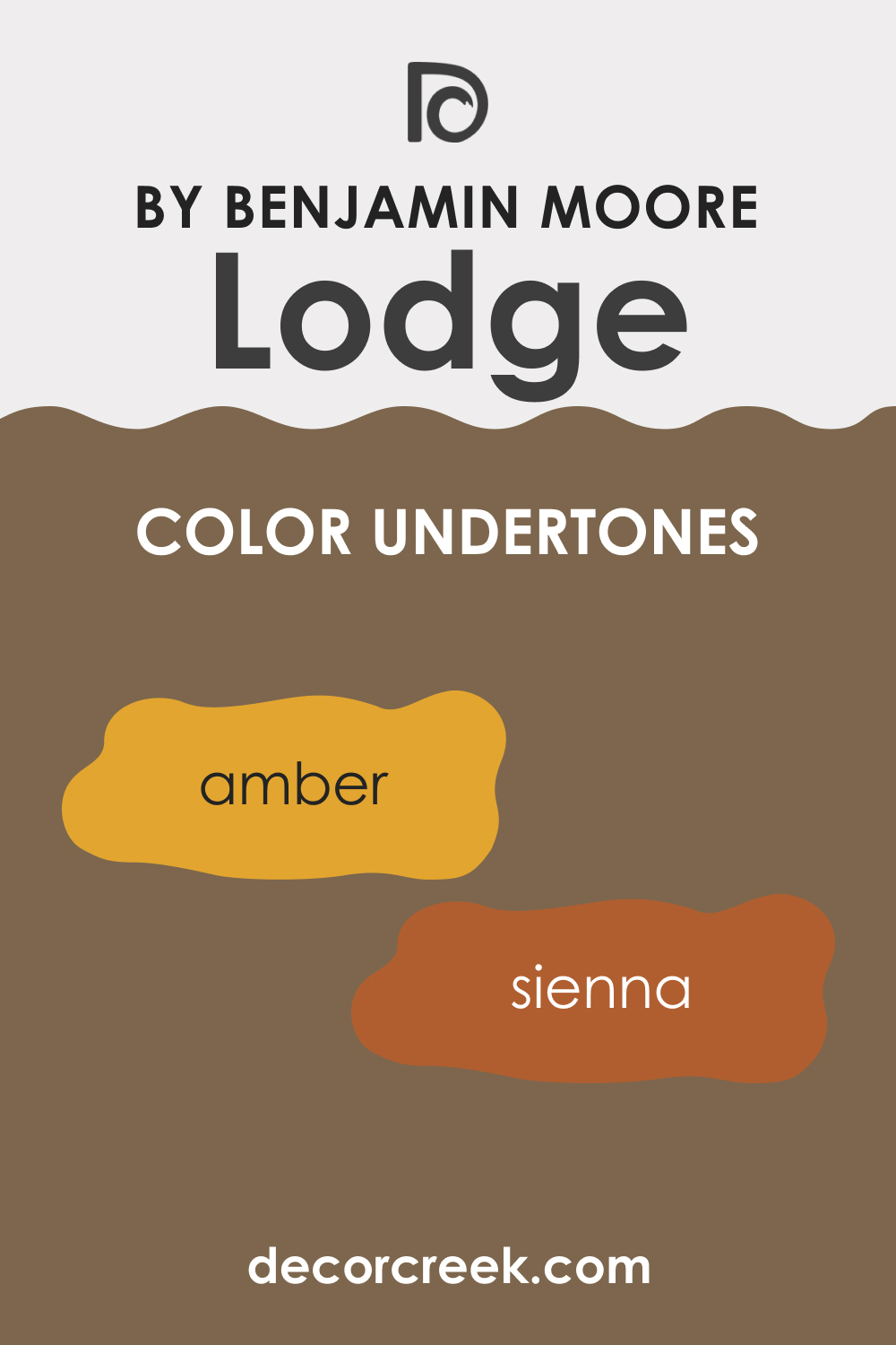
Undertones of Lodge AF-115
The undertones of Lodge AF-115 are primarily warm and earthy, with subtle hints of amber and sienna that contribute to its richness. Undertones play a crucial role in how we perceive color, often influencing the mood and ambiance of a space. In the case of Lodge AF-115, these warm undertones add depth and complexity, allowing the color to shift and change subtly under different lighting conditions.
On interior walls, these undertones create a dynamic and engaging backdrop that is both comforting and sophisticated.
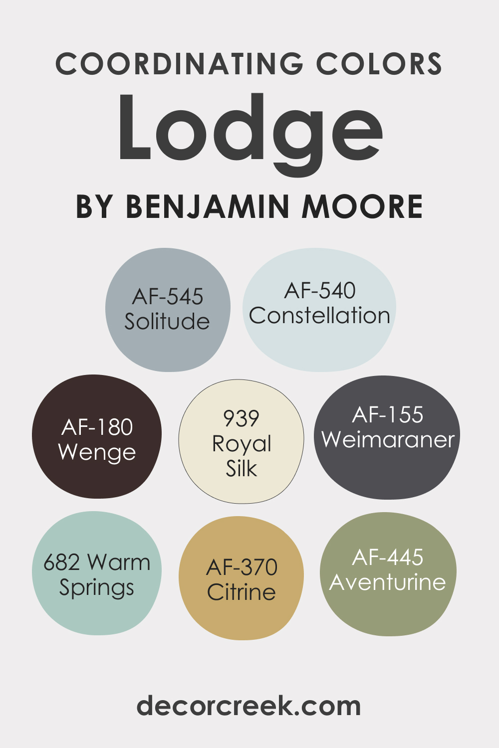
Coordinating Colors of Lodge AF-115
Coordinating colors are those that harmonize well with a primary color, enhancing its beauty and creating a balanced look. Lodge AF-115 pairs wonderfully with:
- AF-545 Solitude : A soft, muted blue-gray, offering a serene contrast.
- AF-540 Constellation : A gentle, pale blue, adding a touch of calmness.
- BM 939 Royal Silk : A luxurious, muted purple, providing a regal touch.
- BM 682 Warm Springs : A light, soothing green, bringing in a natural element.
Additional coordinating colors might include:
- AF-445 Aventurine
- AF-155 Weimaraner
- AF-370 Citrine
- AF-180 Wenge
all of which complement the warmth and depth of Lodge AF-115.
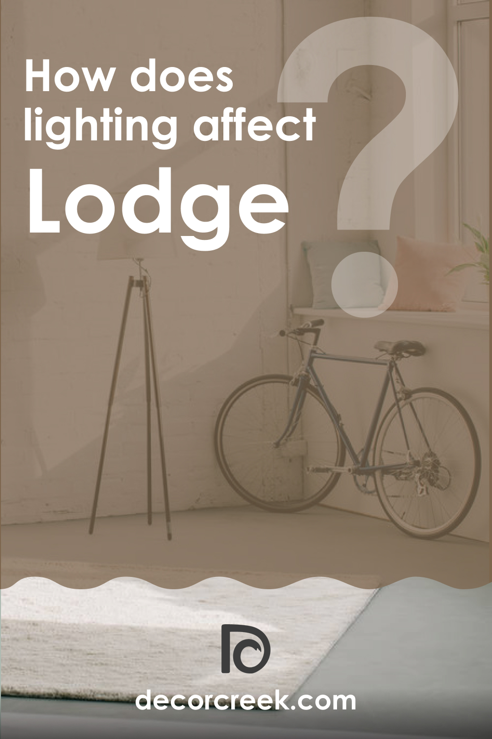
How Does Lighting Affect Lodge AF-115?
Lighting plays a pivotal role in how colors are perceived. Lodge AF-115, under artificial light, tends to reveal more of its warm, earthy tones, making spaces feel cozy and inviting. In natural light, this color can appear more vibrant and dynamic, with its undertones becoming more pronounced.
In north-facing rooms, Lodge AF-115 may seem more subdued, while in south-facing rooms, it becomes warmer and more lively. East and west-facing rooms bring out different aspects of this color at different times of the day, from a soft warmth in the morning light to a richer depth in the evening.
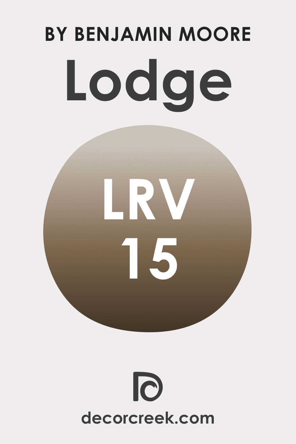
LRV of Lodge AF-115
Light Reflectance Value (LRV) measures the amount of light a color reflects. Lodge AF-115, with an LRV of 15, is on the darker end of the spectrum, meaning it absorbs more light than it reflects. This low LRV contributes to the color’s depth and intensity, making it a bold choice for walls.
In spaces with ample natural light, Lodge AF-115 can create a dramatic and cozy atmosphere, while in dimly lit areas, it can make the room feel more enclosed and intimate.
LRV – what does it mean? Read This Before Finding Your Perfect Paint Color
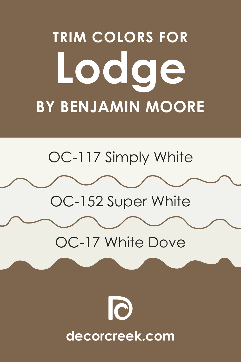
Trim Colors for Lodge AF-115
Trim colors are used for painting the architectural details like door frames, window frames, and skirting boards. They are essential for defining spaces and adding a finishing touch to a room.
For Lodge AF-115, shades of white are ideal trim colors as they provide a crisp contrast and highlight the rich depth of the color.
Whites with a hint of cream or beige would harmonize well, adding to the warmth of the room without overpowering it. For example, consider such colors as OC-152 Super White , OC-117 Simply White , and OC-17 White Dove .
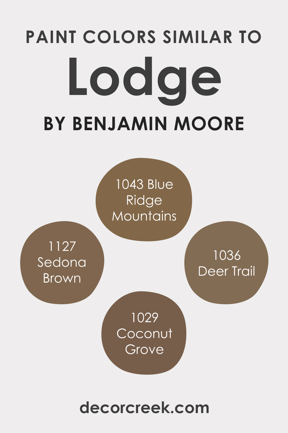
Colors Similar to Lodge AF-115
Knowing similar colors to Lodge AF-115 is crucial for color matching and creating a cohesive color scheme. Similar colors include:
- BM 1127 Sedona Brown : A deep, warm brown with a cozy feel.
- BM 1036 Deer Trail : A rich, earthy brown, reminiscent of natural landscapes.
- BM 1029 Coconut Grove : A dark, muted brown, evoking a sense of tranquility.
- BM 1043 Blue Ridge Mountains : A deep, dusky blue with a calming effect.
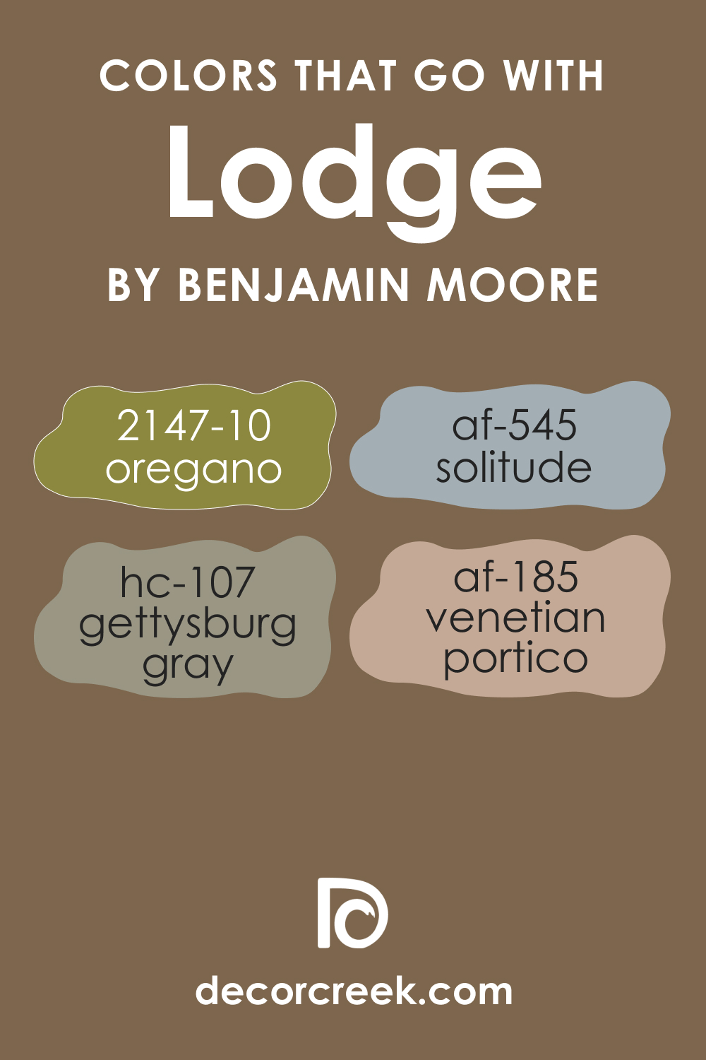
Colors That Go With Lodge AF-115
Choosing coordinating colors for Lodge AF-115 is essential for creating a harmonious and aesthetically pleasing environment. It’s important to select colors that complement rather than compete with this rich hue.
Suitable Benjamin Moore colors might include a creamy off-white, a soft gray, a muted blue, a gentle green, and a pale terracotta, each offering a unique contribution to the overall palette. E.g., consider the following options:
- AF-545 Solitude
- HC-107 Gettysburg Gray
- AF-185 Venetian Portico
- BM 2147-10 Oregano
These colors, when used alongside Lodge AF-115, can create a balanced and inviting space.
How to Use Lodge AF-115 in Your Home?
Lodge AF-115 is a versatile color that can be used in various rooms to create distinct atmospheres. It’s ideal for living rooms and bedrooms where its warm, earthy tones can create a cozy and inviting space. This color fits well with interior design styles like rustic, traditional, or modern minimalist, adding depth and character.
In dining rooms, Lodge AF-115 can create an elegant backdrop for gatherings, while in home offices, it provides a focused and serene environment. Its versatility also extends to hallways and entryways, where it can make a striking first impression.
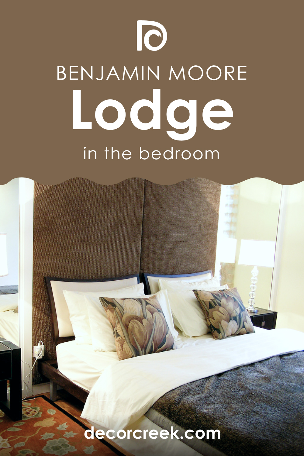
Lodge AF-115 In the Bedroom
In the bedroom, Lodge AF-115 offers a sanctuary-like feel, enveloping the space in warmth and tranquility. This color pairs beautifully with soft linens and rich textiles, enhancing the room’s comfort. For a balanced look, use lighter shades for bedding and curtains.
Incorporate elements like wood furniture and subtle metallic accents to add depth and elegance. This color works particularly well in bedrooms with good natural light, where its rich tones can be fully appreciated.
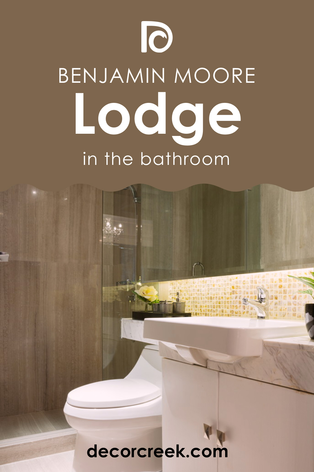
Lodge AF-115 In the Bathroom
In the bathroom, Lodge AF-115 can create a spa-like atmosphere, turning the space into a retreat. Pair it with natural elements like wood and stone for a cohesive look. Use white or light-colored fixtures and towels to provide contrast and keep the space feeling fresh and open.
This color is especially effective in larger bathrooms, where it can add depth without overwhelming the space. For a luxurious touch, incorporate gold or brass hardware.
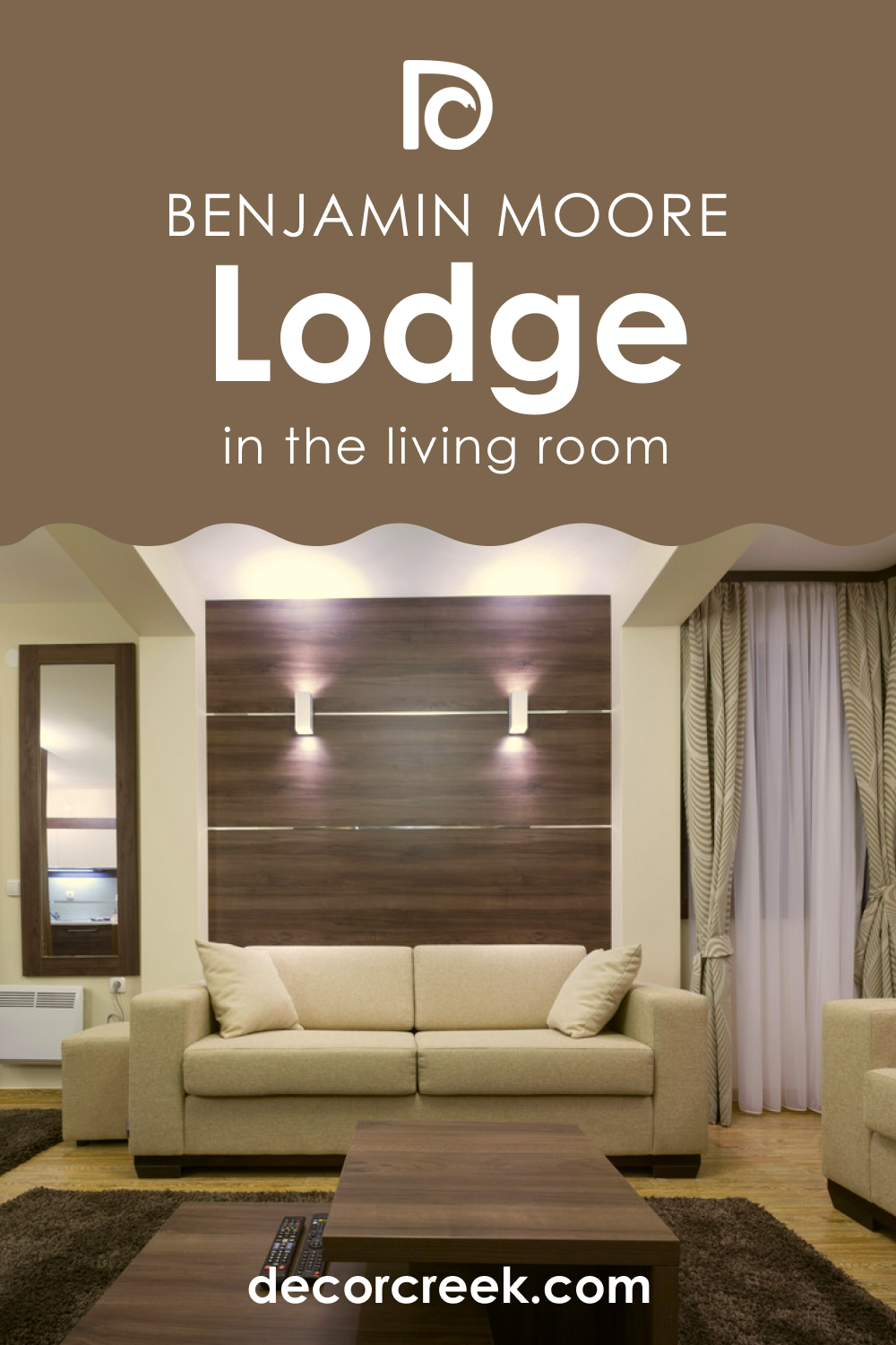
Lodge AF-115 In the Living Room
Lodge AF-115 in the living room creates a warm and welcoming environment. It pairs well with a variety of textures and materials, like leather, wool, and velvet, adding to the room’s cozy ambiance. Use it as a main wall color or as an accent to add depth and interest.
Complement it with lighter furniture and decor to balance the darkness of the color. This color is perfect for spaces that are used for relaxation and socializing.
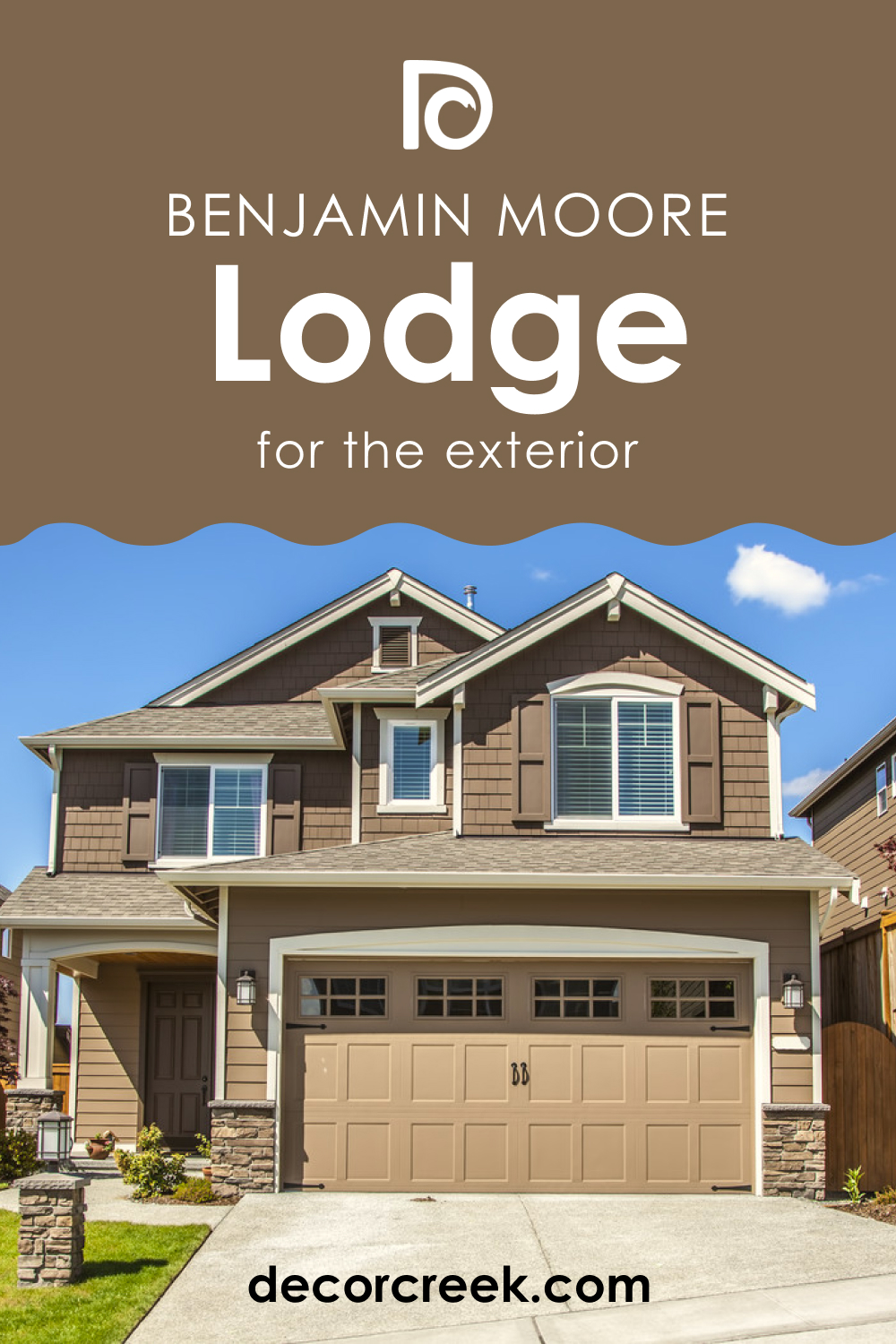
Lodge AF-115 For Exteriors
As an exterior color, Lodge AF-115 can give your home a striking and sophisticated appearance. It’s perfect for traditional and contemporary home styles, offering a timeless appeal. This color works well with natural surroundings, blending seamlessly with landscapes.
Pair it with crisp white or soft beige trim for a classic look. For a modern twist, use dark or metallic finishes for the door and window frames.
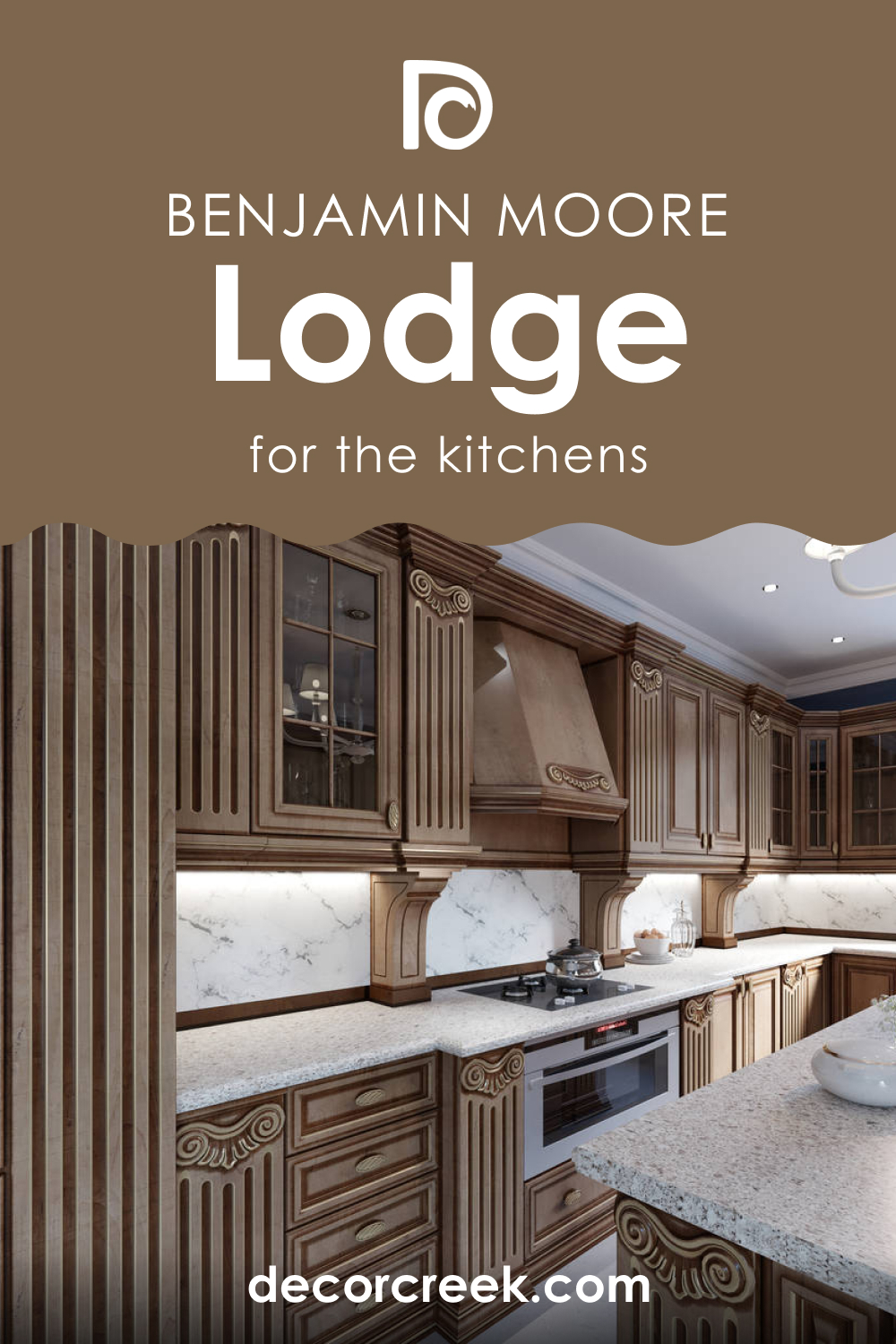
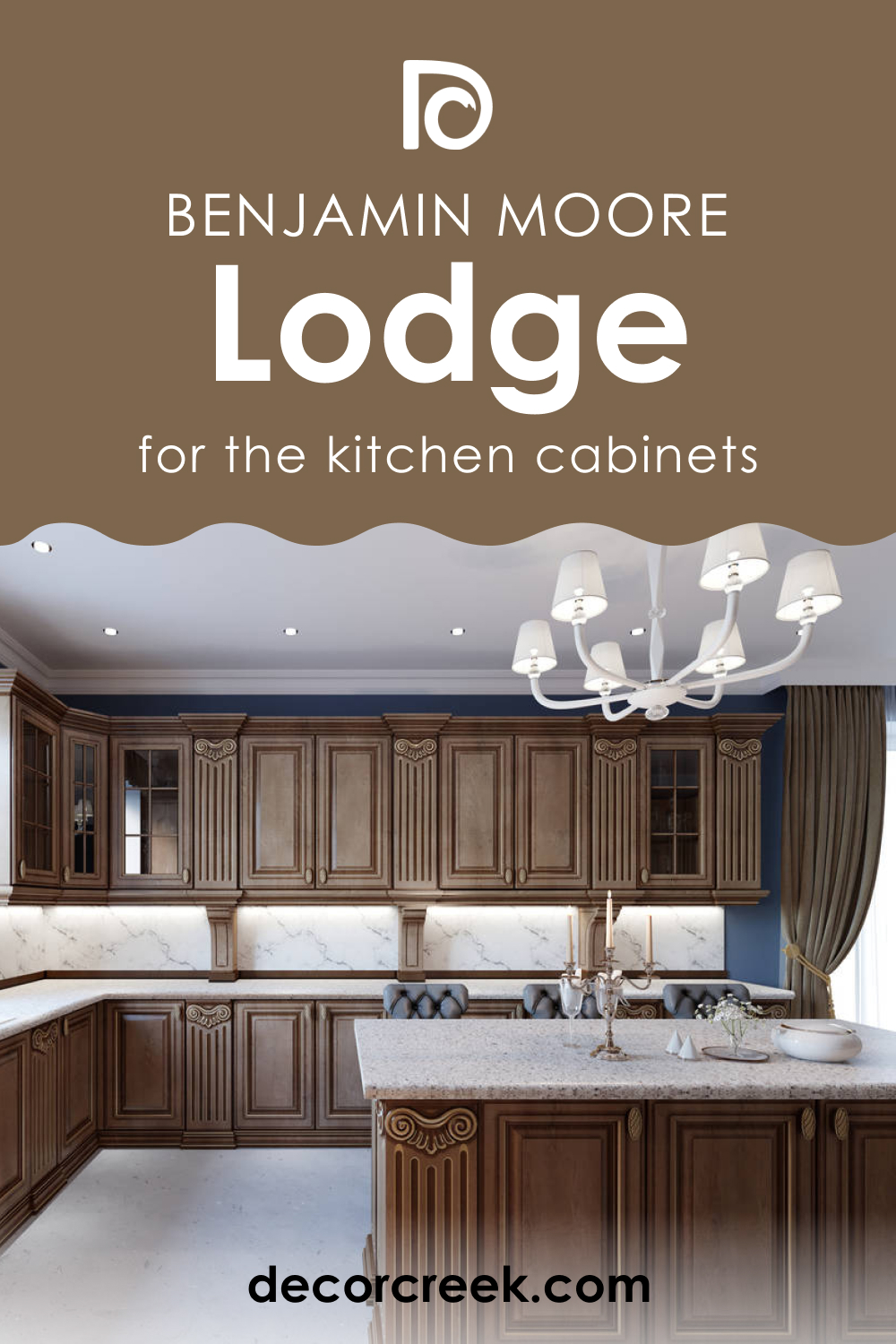
Lodge AF-115 In the Kitchen
In the kitchen, Lodge AF-115 brings warmth and depth, creating an inviting space for cooking and gathering. It pairs well with natural wood or white cabinetry, offering a balanced look. Use it on walls to create a cozy ambiance or as an accent color on a kitchen island.
Complement it with natural stone countertops and warm metal accents like copper or brass for a cohesive and stylish kitchen design.
Lodge AF-115 On Kitchen Cabinets
Using Lodge AF-115 on kitchen cabinets can transform your kitchen into a warm and inviting space. This color works well with both modern and traditional kitchen styles, adding depth and character. Pair it with light-colored walls and countertops to create a balanced look. For a cohesive design, use brushed nickel or aged brass hardware.
This color is especially effective in kitchens with good natural lighting, where it can create a rich and luxurious feel.
Comparing Lodge AF-115 With Other Colors
Comparing different colors is crucial in interior design as it helps in understanding how various hues interact with each other and the impact they have on a space. Color comparison aids in creating a harmonious color palette that enhances the desired mood and aesthetic of a room. It allows for a better understanding of color undertones, which can significantly affect how a color looks in different lighting conditions and settings. Comparing colors also assists in choosing complementary shades for accents, trims, and furnishings, ensuring a cohesive and well-thought-out interior design.
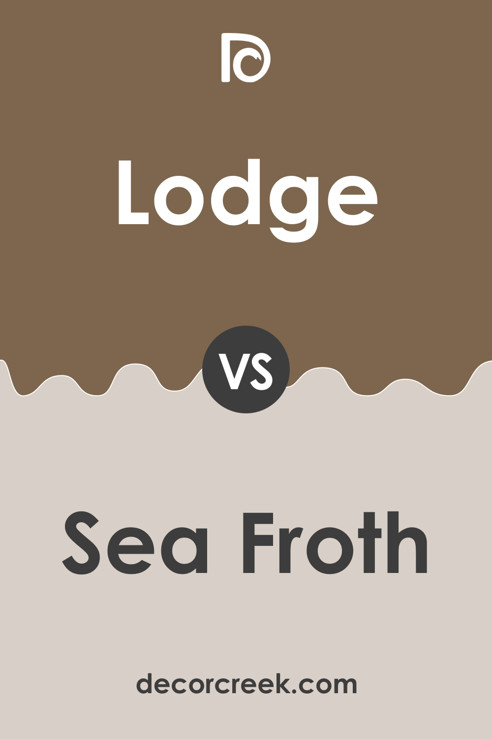
Lodge AF-115 vs. BM 2107-60 Sea Froth
Lodge AF-115 and BM 2107-60 Sea Froth present a contrast between earthy warmth and airy lightness. While Lodge AF-115 is a deep, warm hue with rich undertones, Sea Froth is a light, almost ethereal color with a breezy, calming effect. Lodge AF-115 creates a sense of coziness and intimacy, ideal for dens or bedrooms.
In contrast, Sea Froth is suited for spaces that aim for a fresh, open feel, like bathrooms or small kitchens. When used together, they can balance each other, with Lodge AF-115 grounding the space and Sea Froth adding a lightness.
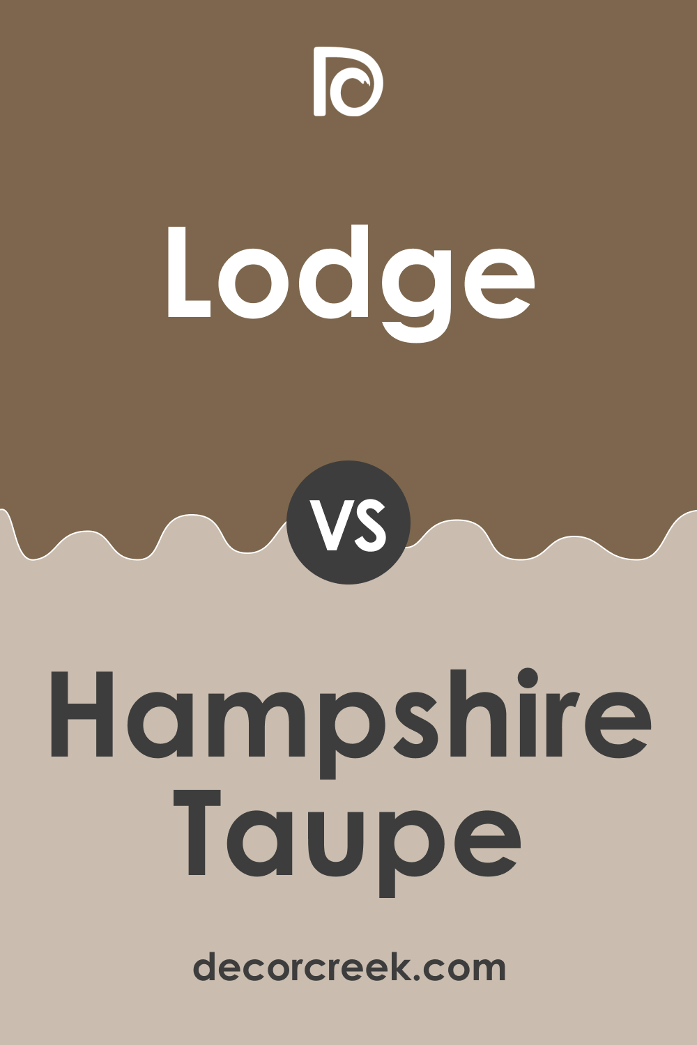
Lodge AF-115 vs. BM 990 Hampshire Taupe
Comparing Lodge AF-115 with BM 990 Hampshire Taupe highlights the variation in depth and mood between two neutral shades. Hampshire Taupe, a softer and lighter hue, offers a more subdued and versatile backdrop, ideal for various settings. Lodge AF-115, with its deeper and warmer character, brings a bold and cozy ambiance.
In a setting where both are used, Lodge AF-115 could serve as a striking feature color, while Hampshire Taupe could provide a neutral balance, especially in living areas and bedrooms.
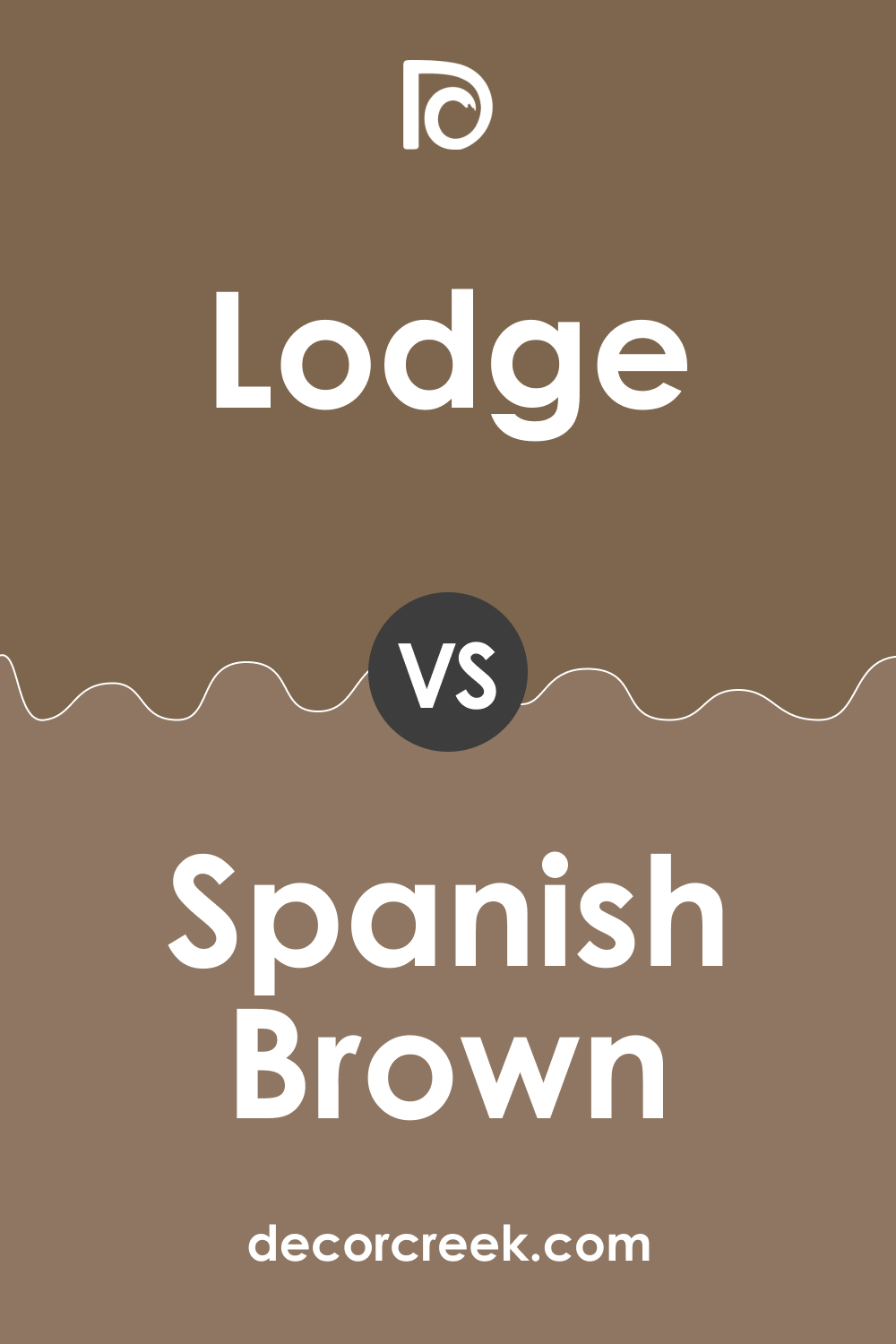
Lodge AF-115 vs. BM 1028 Spanish Brown
BM 1028 Spanish Brown and Lodge AF-115 share a similar depth but differ in their base tones. Spanish Brown has a more pronounced red undertone, giving it a slightly warmer and more vibrant appearance. Lodge AF-115, with its earthy and muted undertones, exudes a more reserved warmth.
In a comparative use, Spanish Brown can add vibrancy and energy to a space, while Lodge AF-115 would contribute to a more subdued and calming atmosphere.
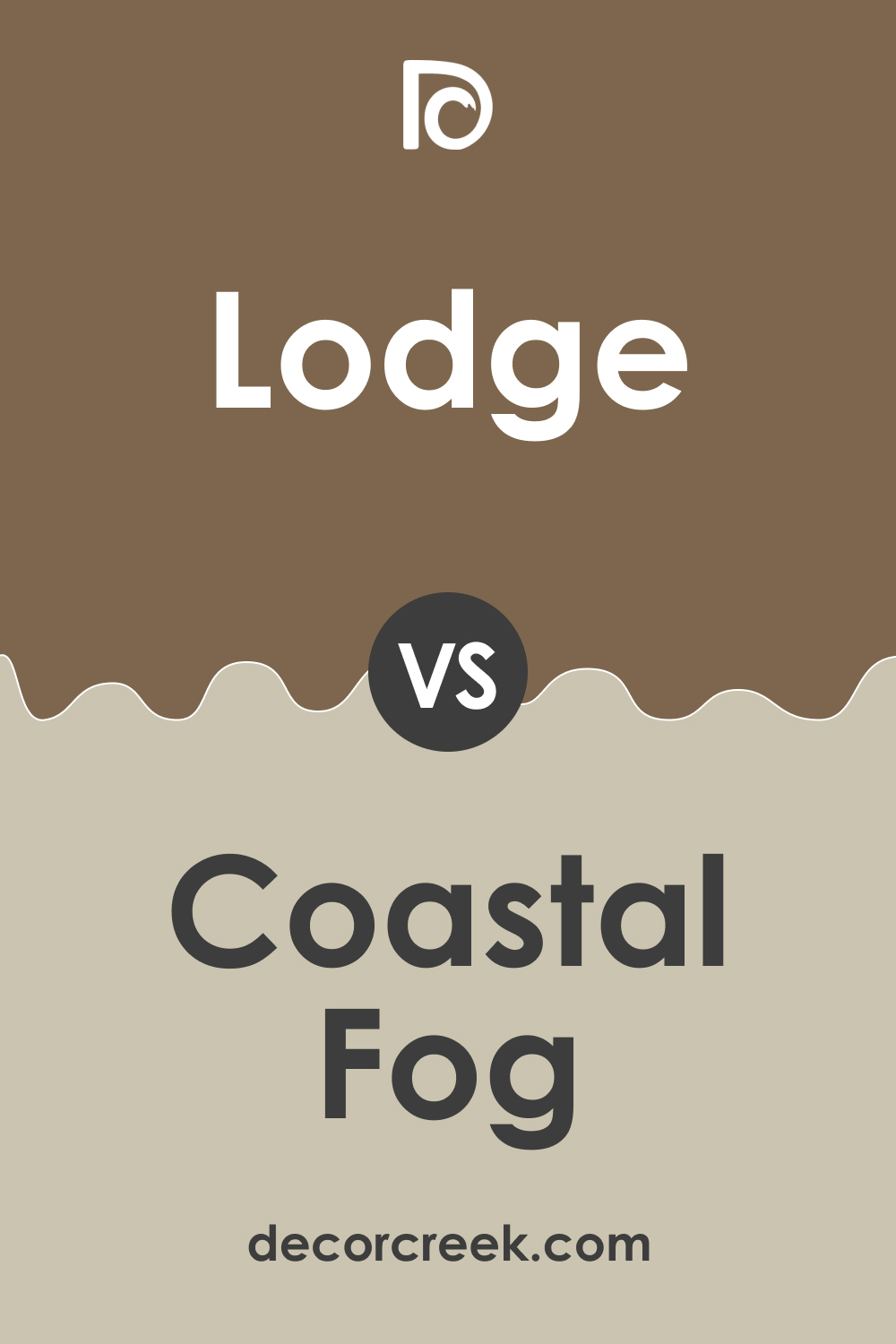
Lodge AF-115 vs. BM AC-1 Coastal Fog
BM AC-1 Coastal Fog and Lodge AF-115 offer a study in contrasts. Coastal Fog is a muted, adaptable color with a cool undertone, evoking a sense of tranquility and openness. Lodge AF-115, with its warm and enveloping character, creates a more intimate and cozy ambiance.
When used together, Coastal Fog can lighten and open up a space dominated by the depth of Lodge AF-115, especially in living rooms or open-plan areas.
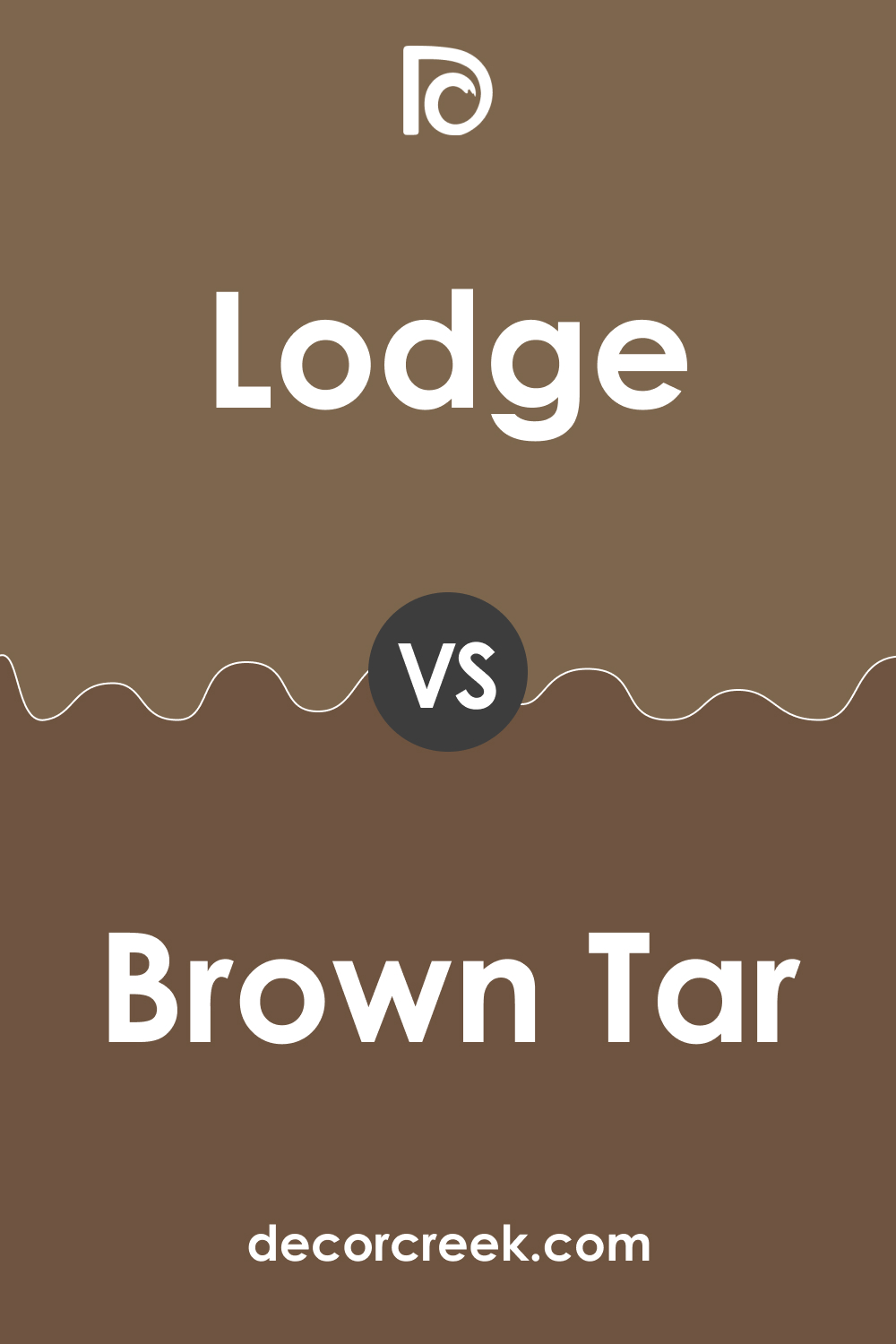
Lodge AF-115 vs. BM 2110-20 Brown Tar
BM 2110-20 Brown Tar is a deeply saturated color with a bold presence, compared to the more muted and earthy Lodge AF-115. Brown Tar makes a strong statement and is ideal for accent walls or areas where a dramatic effect is desired. Lodge AF-115, being softer and more versatile, works well as a primary wall color.
In combination, they can create a sophisticated and dynamic color scheme, especially in formal dining rooms or home offices.
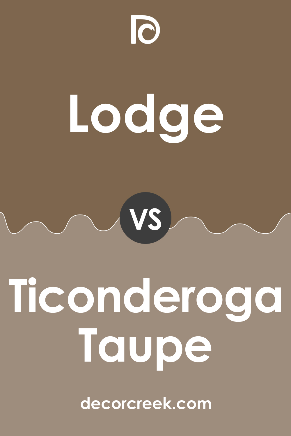
Lodge AF-115 vs. BM 992 Ticonderoga Taupe
BM 992 Ticonderoga Taupe is a balanced, mid-tone neutral, contrasting with the deeper and warmer Lodge AF-115. Ticonderoga Taupe brings a sense of understated elegance and can serve as a unifying background color. Lodge AF-115, with its rich depth, can be used to add character and warmth. Together, they can create a layered and inviting space, suitable for family rooms or master bedrooms.
Conclusion
In conclusion, comparing Lodge AF-115 with a range of other colors from Benjamin Moore’s palette reveals the importance of understanding color interactions in interior design. Each comparison highlights how different hues can change the perception of a space, affect mood, and complement each other.
From creating a contrast with lighter shades like Sea Froth and Coastal Fog to complementing deeper tones like Brown Tar and Spanish Brown, these comparisons demonstrate the versatility and impact of Lodge AF-115 in various design contexts. Ultimately, these insights aid in making informed choices for creating aesthetically pleasing and harmonious interiors.
Ever wished paint sampling was as easy as sticking a sticker? Guess what? Now it is! Discover Samplize's unique Peel & Stick samples.
Get paint samples


