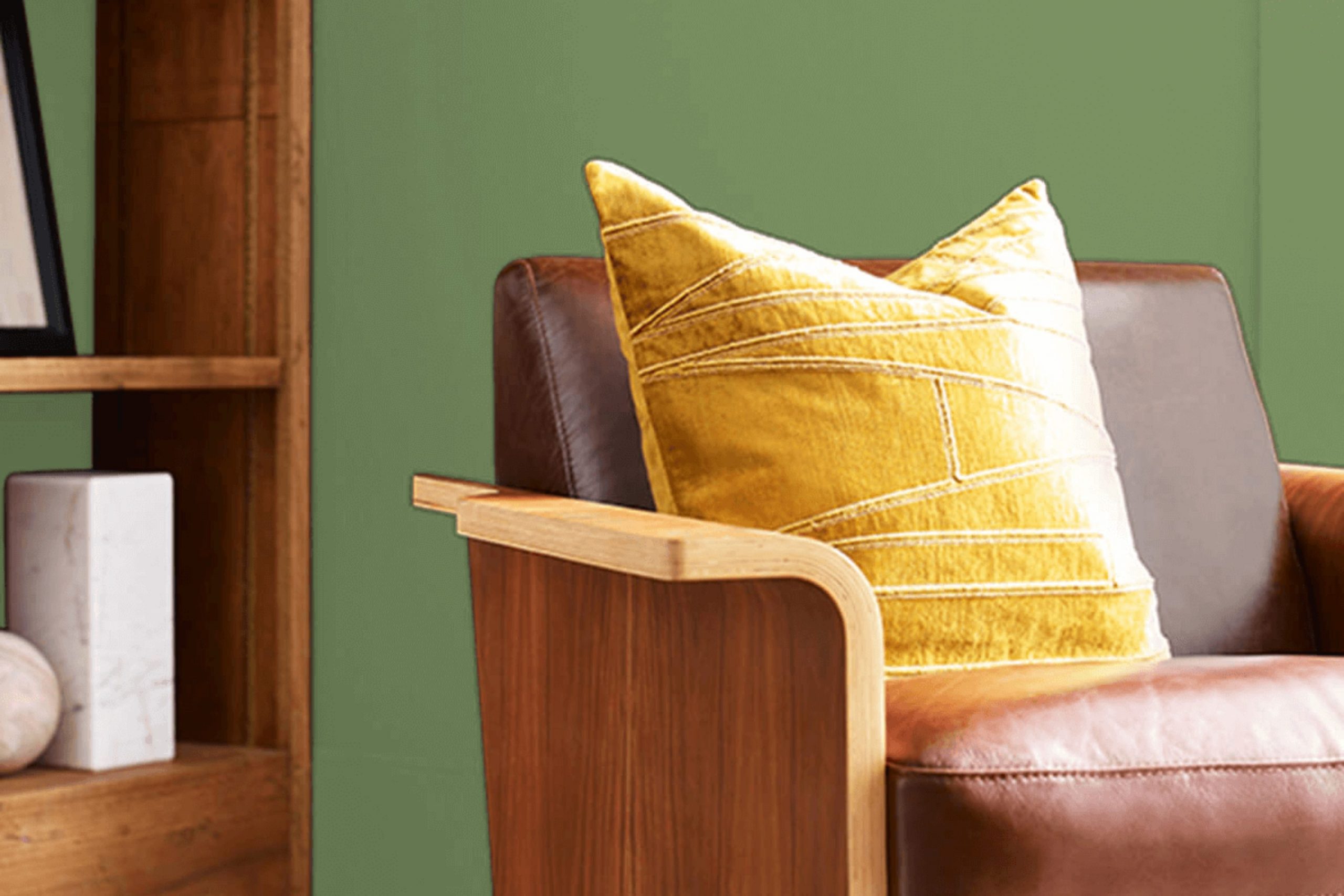
If you’re considering refreshing your area with a unique and refreshing color, let me introduce you to SW 6438 Dill by Sherwin Williams. This isn’t just any green; it strikes a lovely balance between vibrancy and softness, making it adaptable enough for either a bold statement wall or a calm backdrop for your room.
As a fan of personalizing areas, I found that the natural, earthy tones of Dill can really liven up a room without it feeling too intense. Perfect for anyone looking to add a touch of nature-inspired freshness to their home, Dill pairs beautifully with natural wood, whites, and even metallics for that chic look.
Whether you’re redoing your kitchen, bathroom, or just giving your living room a quick update, Dill provides a charming splash of color that’s both warm and inviting. It’s especially great if you love outdoor elements and want to bring a bit of the outside world into your home decor.
With Dill, you can create an environment that feels both rejuvenated and cozy, reflecting an area where you can relax and feel at ease.
What Color Is Dill SW 6438 by Sherwin Williams?
The color Dill by Sherwin Williams is a vibrant shade of green, reminiscent of fresh dill herbs. Its lively hue brings a refreshing energy to any area, making it a great choice for those looking to add a natural feel to their interiors. With its medium depth and vibrant undertones, Dill strikes a beautiful balance that’s neither too bold nor too subtle, making it quite adaptable for various decorating styles.
This particular shade of green works wonderfully in interior styles that lean towards organic and earthy aesthetics, such as rustic farmhouse, coastal, and bohemian chic. It pairs especially well with natural materials like wood, linen, and rattan, enhancing their textures and complementing their inherent beauty.
In a rustic farmhouse setting, Dill can highlight wooden beams and furniture with its refreshing contrast. In coastal styles, pairing it with sandy beige, soft blues, and crisp whites can enhance a light, airy feel. For a boho-chic room, Dill serves as a lively backdrop to eclectic textiles and artisanal decor pieces. Dill also goes well with leather and metallic finishes like brass or copper, adding a touch of warmth and luxury.
The green hue can help soften these materials, making the area feel more inviting while maintaining a fresh, modern look. Overall, Dill is a charming choice for anyone looking to create a lively yet harmonious interior.
Is Dill SW 6438 by Sherwin Williams Warm or Cool color?
The color DillSW 6438 by Sherwin Williams is a vibrant shade of green that can make any room feel fresh and alive. It’s a bold color that works especially well in areas that could use a bit of energy. When used in a home, it can give rooms a touch of nature, reminiscent of lush gardens and fresh vegetation.
This makes it perfect for kitchens where the refreshing hue can complement elements like herbs and vegetables, or in a study where the color might inspire creativity and concentration. In homes where natural light is abundant, DillSW 6438 can look exceptionally beautiful as the sunlight enhances its vividness and adds a dynamic quality to the area.
Conversely, in less lit areas, it can make the area feel smaller or darker, so it’s best to use this color in a well-lit room. Combining it with neutral tones like white, beige, or light gray can balance its intensity, ensuring that it adds just the right amount of personality without it feeling too intense.
Undertones of Dill SW 6438 by Sherwin Williams
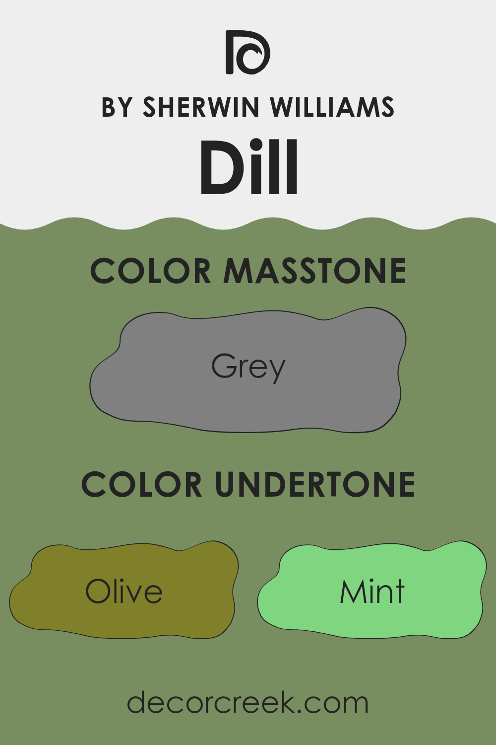
The color DillSW 6438 by Sherwin Williams might seem like a straightforward shade, but it carries a complex mix of undertones that can significantly influence its appearance depending on the lighting and surrounding colors. Undertones are subtle colors that are present within the main hue and they can shift the perception of the color. For DillSW 6438, these undertones include a spectrum from Olive to Fuchsia.
When applied to interior walls, the presence of these undertones affects how the color interacts with both natural and artificial light, as well as with the furniture and decor within the room. For example, in a room with ample sunlight, the yellow and light green undertones might become more pronounced, giving the area a fresher, lively look. Conversely, in an area with less light, the darker undertones like dark grey or dark blue might dominate, creating a cozier and more enclosed feel.
Moreover, the variety of undertones in DillSW 6438 means it can adapt subtly to different color schemes. Adjacent colors can bring out different undertones, too. If the room has several blue or turquoise decorations, you might notice those undertones come to the forefront, while elements of brown or dark green might enhance the earthier undertones.
Ultimately, the complex undertones in DillSW 6438 make it an adaptable color choice for walls, capable of both blending with a broad palette of room accents and influencing the atmosphere of the area through its interaction with light and decor.
What is the Masstone of the Dill SW 6438 by Sherwin Williams?
Dill SW 6438 by Sherwin Williams has a masstone of grey, color-coded as #808080. This shade is highly adaptable and functional, making it a superb choice for many homes. The neutral grey tone forms a solid foundation that can match with various decor styles from modern to traditional.
Its balance is perfect for rooms that aim for a subtle yet stylish atmosphere. Homeowners can comfortably pair this grey with brighter colors like blues or yellows to add a burst of energy or keep things understated with blacks and whites to maintain a minimalistic look.
This color is especially good in living areas and bedrooms, where you want a calm and low-key backdrop. It also helps in masking occasional marks and smudges, making it practical for families. Overall, this grey tone can enhance a home without it feeling too intense, supporting other design elements to stand out.

How Does Lighting Affect Dill SW 6438 by Sherwin Williams?
Lighting plays a crucial role in how colors appear in any area. The way light interacts with a color can dramatically change its look, feel, and overall impact on a room. This is particularly true for colors like Sherwin Williams’ SW 6438 Dill, a vibrant yet warm green shade.
In artificial light, Dill tends to appear slightly darker and richer. Artificial lighting, depending on its temperature (cool or warm), can cause the color to shift slightly. For instance, under warm artificial light, such as that from incandescent bulbs, Dill might have a cozier and softer appearance, enhancing its warmer undertones. Under cooler LED lights, it might look a bit more vibrant and crisp, highlighting its fresher green qualities.
In natural light, Dill shows its true color but changes subtly throughout the day. The quality and angle of natural sunlight can make Dill look differently bright and lively. In a room with lots of sunlight, the color will vividly reflect its lively green tones.
In rooms facing different directions, the appearance of Dill also varies:
- North-faced rooms: These rooms get less direct sunlight, so Dill may appear more muted and subtle. It maintains a steady, subdued look throughout the day, which can make small areas feel cozy without being too dark.
- South-faced rooms: Here, Dill will be very dynamic because these rooms receive the most sunlight throughout the day. The color will generally appear brighter and more vivid, really standing out as a lively element.
- East-faced rooms: Morning light is cooler, so Dill will appear fresher and brighter in the mornings but might lose some of its vibrancy in the afternoon as the natural light diminishes.
- West-faced rooms: In these rooms, Dill will have a softer appearance in the morning and become more intensely vibrant in the afternoon and evening as the warmer sunlight washes over it.
Understanding how lighting affects colors like Dill can help in making informed decisions when decorating areas, ensuring that the color behaves as desired in its intended environment.

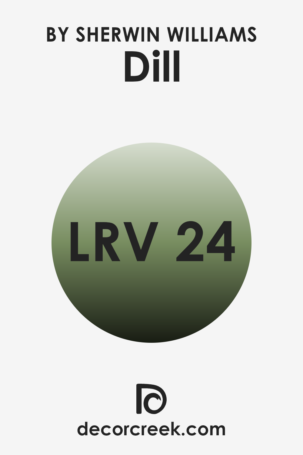
What is the LRV of Dill SW 6438 by Sherwin Williams?
LRV stands for Light Reflectance Value, which is a measurement used to indicate how much light a paint color reflects when it’s on the walls. This value is given on a scale, and the number tells you how much light that color will reflect into a room. A higher number means the color reflects more light, making the room appear brighter, while a lower number means less light is reflected, which can make an area feel cozier but darker.
This measurement is important because it helps you understand how a color will look under different lighting conditions and can assist in making a decision about which paint to use based on how light or dark you want your room to feel.
For the color with an LRV of 24.045, as mentioned, it won’t reflect much light. This means that the shade will absorb more light and will appear darker on your walls. Such a paint color can make large rooms feel smaller and more intimate, though it can also make a small room feel even smaller.
In areas with low natural light, this color could make the room feel quite dim, so additional lighting might be needed to brighten the area. In well-lit rooms, this color will have a strong and deep presence, creating a moody yet cozy atmosphere. To balance the darkness of this color, combining it with lighter colors or decor can help lighten the overall feel of the room.
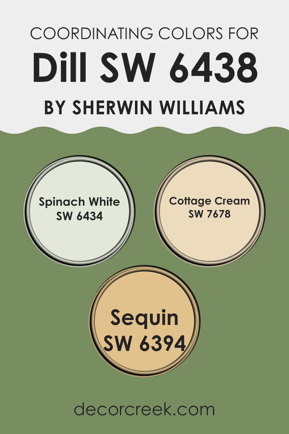
Coordinating Colors of Dill SW 6438 by Sherwin Williams
Coordinating colors are selected to complement and enhance the main color in a design or decorating scheme. Specifically, when paired with a color like SW 6438 – Dill by Sherwin Williams, these colors are chosen to create a balanced and harmonious look.
Coordinating colors can be used for different purposes such as painting adjacent walls, adding decorative accents, or selecting furniture pieces that bring out the best in the primary color. For Dill, a rich green hue, there are three coordinating colors that help to create a visually appealing and cohesive area.
The first coordinating color is SW 6434 – Spinach White, a subtle and light green that offers a gentle contrast to the deeper tones of Dill. It works well for creating a light and airy feel in a room, especially in smaller areas or spots with less natural light. Another coordinating color is SW 7678 – Cottage Cream, a soft, creamy yellow.
This color adds warmth and a slight brightness to the area, providing a delicate lift to the lush greenery of Dill without overpowering it. Finally, SW 6394 – Sequin is a light and playful yellow that brings a sense of cheer and vibrancy. It’s perfect for accents that catch the eye, adding a spot of sunshine and complementing the garden-fresh feeling imparted by Dill.
You can see recommended paint colors below:
- SW 6434 Spinach White
- SW 7678 Cottage Cream
- SW 6394 Sequin
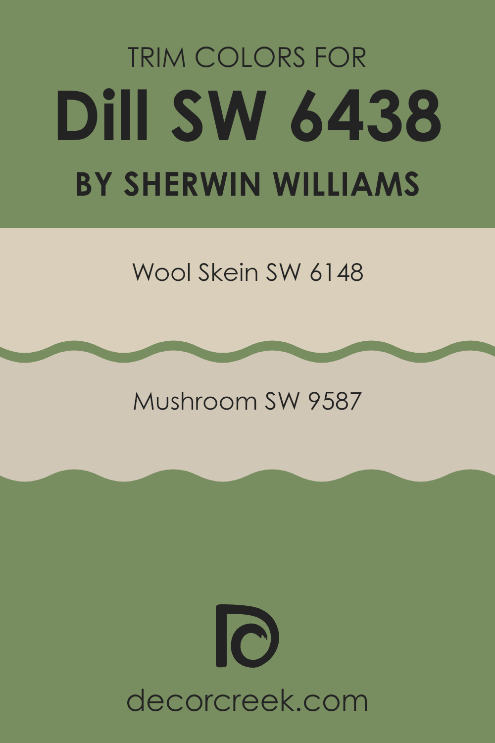
What are the Trim colors of Dill SW 6438 by Sherwin Williams?
Trim colors are essentially accent colors used on architectural elements like moldings, door frames, and window frames to enhance the visual appeal and overall cohesion of a room’s color scheme.
When selecting a trim color for an area painted with Dill SW 6438 by Sherwin Williams, a well-chosen trim color can complement the primary wall color, creating a pleasing contrast that defines and highlights architectural details. This is crucial in interior design as it brings a finished, polished look to the area, ensuring that the different elements of the room work together harmoniously.
For a color like Dill SW 6438, a muted color such as Wool Skein SW 6148 serves as an excellent trim choice. Wool Skein is a soft, warm beige with understated yellow undertones, making it a gentle complement to the more vibrant green of Dill, providing a subtle contrast that enhances both colors without it feeling too intense. Another great option is Mushroom SW 9587, a deeper, earthy beige that adds depth and warmth to the trim, framing the Dill-painted walls with a rich but neutral tone that ensures the green stands out while keeping the overall atmosphere warm and welcoming.
You can see recommended paint colors below:
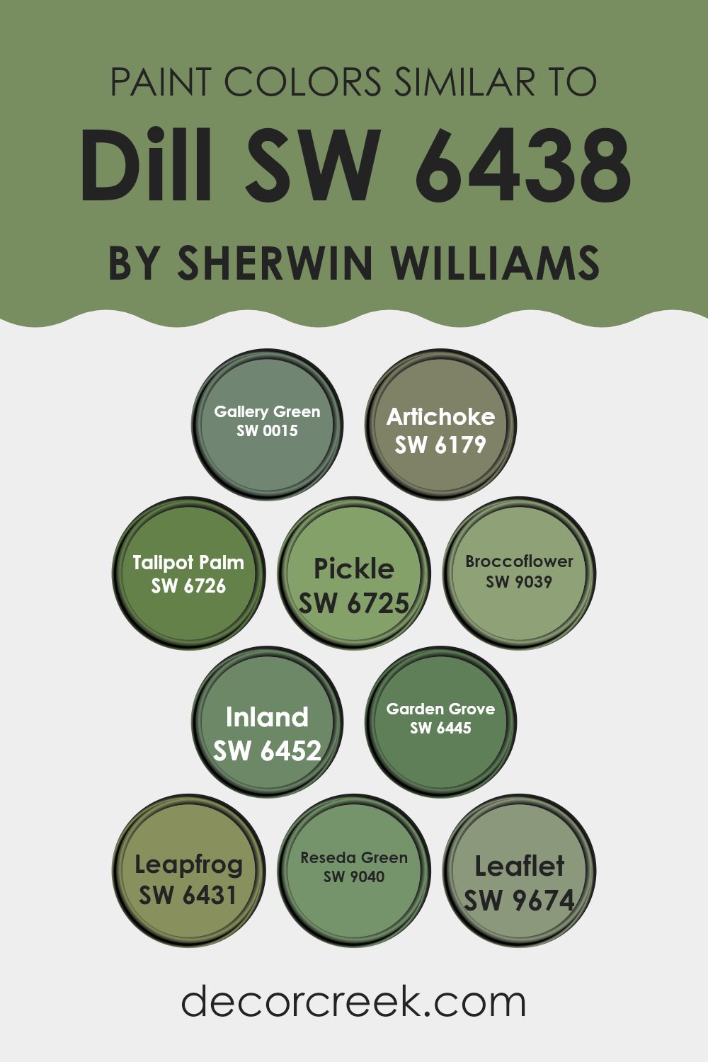
Colors Similar to Dill SW 6438 by Sherwin Williams
Using similar colors in decor and design ensures a harmonious look and feel, which is particularly important when aiming for a cohesive aesthetic. When colors like those similar to Sherwin Williams Dill SW 6438 are used together, they create a gentle flow from one area to another without stark contrasts, which can be pleasing to the eye. This continuity can make small areas appear larger and give a sense of calm and order.
For example, SW 0015 – Gallery Green provides a subtle, almost muted green hue that pairs beautifully with the richer tones of SW 6179 – Artichoke, a deeper, almost earthy green. SW 6726 – Talipot Palm offers a vibrant pop of green that adds a lively touch to any palette, whereas SW 6725 – Pickle brings in a lighter, fresher green shade that feels youthful and fresh.
SW 9039 – Broccoflower and SW 6452 – Inland offer a more subdued, gentle green that works well in areas that aim for a soft, understated look. SW 6445 – Garden Grove introduces a touch of freshness comparable to a spring garden, and SW 6431 – Leapfrog presents a lively, playful green that can brighten areas instantly. SW 9040 – Reseda Green adds a dusky, almost historic feel to the mix, and SW 9674 – Leaflet rounds out the selection with a delicate, almost tender green that can soften any decor scheme. Together, these colors offer a palette that can easily be used to craft an area that feels coherent and connected, yet diverse in its expressions of green.
You can see recommended paint colors below:
- SW 0015 Gallery Green
- SW 6179 Artichoke
- SW 6726 Talipot Palm
- SW 6725 Pickle
- SW 9039 Broccoflower
- SW 6452 Inland
- SW 6445 Garden Grove
- SW 6431 Leapfrog
- SW 9040 Reseda Green
- SW 9674 Leaflet
Colors that Go With Dill SW 6438 by Sherwin Williams
The range of colors that complement Dill SW 6438 by Sherwin-Williams essentially expands the adaptability and aesthetic appeal of the main hue. By considering colors such as Bonsai Tint SW 6436, Gratifying Green SW 6435, Broccoflower SW 9039, Greenfield SW 6439, Courtyard SW 6440, and Haven SW 6437, one can create a harmonious and appealing palette for any area.
These complementary colors help in creating depth and harmony in interior design by providing options that are both contrasting and coordinating. For instance, using a lighter shade like Bonsai Tint can brighten areas and make them appear larger, while a dark, rich tone like Greenfield offers a grounding effect, which is suitable for accent walls or furniture pieces.
Each tone brings its unique character to the ensemble; Gratifying Green offers a more intense yet fresh vibe, ideal for areas meant to invigorate and refresh. Alternatively, Broccoflower presents a unique, muted approach that works well in areas where a subtle touch of nature is desired.
Courtyard, a mid-tone, builds a solid foundation for any room looking to maintain a connection to the outdoors without going too vibrant. Finally, Haven provides a soft, gentle hue that works beautifully to soothe and calm an environment, making it perfect for bedrooms or study areas. By integrating these colors strategically, one can effortlessly create an area that feels cohesive, comfortable, and visually appealing.
You can see recommended paint colors below:
- SW 6436 Bonsai Tint
- SW 6435 Gratifying Green
- SW 9039 Broccoflower
- SW 6439 Greenfield
- SW 6440 Courtyard
- SW 6437 Haven

How to Use Dill SW 6438 by Sherwin Williams In Your Home?
Dill SW 6438 by Sherwin-Williams is a vibrant green paint color that adds a splash of energy to any area. This shade of green is lively and can brighten up rooms that don’t get much natural light. It’s perfect for a kitchen or a dining area where you might want a fresh, cheerful vibe that encourages family members or guests to feel welcome and relaxed.
Dill is also a great color for a home office or study area. The lively green can help keep you awake and focused, making it easier to get work done. Plus, it brings a bit of nature indoors, which can be soothing during a long day of work.
For bedrooms, using Dill as an accent wall behind the bed can create a fresh focal point without it feeling too intense. Pair it with softer shades like light greys or creams for bedding and curtains to balance the intensity of the green. This makes the room feel balanced and comfortable.
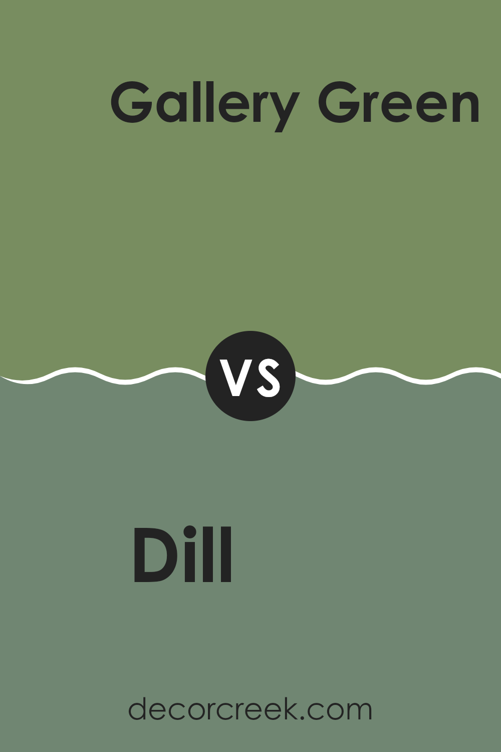
Dill SW 6438 by Sherwin Williams vs Gallery Green SW 0015 by Sherwin Williams
The main color, Dill by Sherwin Williams, is a vibrant green shade with noticeable brightness and warmth, making it perfect for areas aiming for a lively yet cozy atmosphere. On the other hand, Gallery Green is a deeper, more subdued green.
This color has a more classic feel to it, suggesting a traditional aesthetic that can ground a room with a sense of steady, enduring appeal. Dill is likely to catch your eye and can brighten up an area, while Gallery Green is better for settings where a more muted, formal look is desired.
In terms of pairing with other colors, Dill’s vivacity pairs well with light neutrals for a spring-like feel, whereas Gallery Green works well with both rich wood tones and warmer colors for a more enveloped and homely environment.
You can see recommended paint color below:
Dill SW 6438 by Sherwin Williams vs Broccoflower SW 9039 by Sherwin Williams
The two greens, Dill and Broccoflower by Sherwin Williams, are distinct shades that bring different vibes to an area. Dill is a deeper, rich green, reminiscent of a lush forest.
It creates a cozy and slightly more traditional look, which can make a room feel warm and inviting. On the other hand, Broccoflower is lighter and has a touch of gray, giving it a fresher, more modern feel. This color could brighten up an area while still keeping things calm and relaxed.
Both colors work well in various settings like living rooms or kitchens, depending on what atmosphere you want to achieve. Dill might be suited for someone looking for a more grounded, nature-inspired environment, while Broccoflower is ideal for those preferring a lighter, airier feel.
You can see recommended paint color below:
Dill SW 6438 by Sherwin Williams vs Pickle SW 6725 by Sherwin Williams
The main color, Dill SW 6438, and the second color, Pickle SW 6725, both by Sherwin Williams, are unique shades of green but have distinct differences in tone and mood they convey. Dill is a deeper, muted green with an earthy feel, resembling the color of sage leaves or a dense forest. It’s quite subdued and perfect for creating a cozy, calming environment.
On the other hand, Pickle is a brighter, more vibrant green. It’s similar to a fresh spring leaf or a crisp Granny Smith apple. This color is more energizing and feels lively and fresh, making it a great choice for areas where you want to add a pop of color and freshness.
Both colors can add personality and a natural touch to a room, but the choice between them depends on the ambiance you want. For a more grounded, quiet feel, Dill is suitable, whereas Pickle works better if you’re aiming for an upbeat and cheerful area.
You can see recommended paint color below:
- SW 6725 Pickle
Dill SW 6438 by Sherwin Williams vs Artichoke SW 6179 by Sherwin Williams
“Dill” and “Artichoke” from Sherwin Williams are two distinct shades of green that bring their unique vibes to areas. “Dill” is a vibrant green with a lively, fresh look. It’s brighter and can make areas feel lively and energized.
On the other hand, “Artichoke” is a deeper, more muted green. This color has a more grounded, calm feel and works well in areas where a softer, more subtle touch of nature is desired. Both colors reflect the natural world but in different ways: “Dill” mimics the youthful, fresh greenery of spring, while “Artichoke” draws from the richer, deeper tones seen in mature foliage.
Depending on the mood you want to create or the area you are painting, either color could enhance your room beautifully, with “Dill” adding a pop of freshness and “Artichoke” providing a more reserved, understated background.
You can see recommended paint color below:
Dill SW 6438 by Sherwin Williams vs Reseda Green SW 9040 by Sherwin Williams
The main color, Dill SW 6438, is a vibrant shade of green that brings to mind fresh herbs. It has a lively and youthful feel that can brighten up an area instantly.
In contrast, Reseda Green SW 9040 is a deeper, muted hue that resembles the softness of aged leaves or moss in a forest setting. This color can make a room feel cozy and grounded. While Dill SW 6438 tends to add energy and a touch of nature’s freshness, Reseda Green SW 9040 offers a more mature and calming atmosphere.
Both colors would work well in their preferred settings; where Dill might be perfect for a kitchen or playroom, Reseda Green could suit a library or bedroom better. Each color brings its unique touch to the environment, depending on what mood you want to set.
You can see recommended paint color below:
Dill SW 6438 by Sherwin Williams vs Leaflet SW 9674 by Sherwin Williams
Dill SW 6438 and Leaflet SW 9674 are both greens from Sherwin Williams, but they have distinct tones and moods. Dill is a deep, herb-inspired green with a somewhat muted vibe, perfect for areas where you want a touch of nature without too much brightness. It’s an adaptable color that can work well in both modern and traditional settings, adding a cozy, grounding effect.
On the other hand, Leaflet is a lighter, fresher green, reminiscent of young leaves in spring. It’s brighter and can make a room feel airy and more open. This color suits areas that aim for a cheerful, rejuvenating atmosphere, like kitchens or sunrooms.
When comparing the two, Dill presents as richer and more reserved, best for creating a calming, nestled feel. Leaflet, with its lighter and more vibrant tone, enlivens an area and introduces more light. Choosing between them depends on the desired mood and the amount of natural light in your room.
You can see recommended paint color below:
- SW 9674 Leaflet

Dill SW 6438 by Sherwin Williams vs Leapfrog SW 6431 by Sherwin Williams
Dill SW 6438 by Sherwin Williams is a soothing, earthy green hue with a muted tone that gives it a natural, calming feeling. It’s a kind of green that fits well in areas meant for relaxation or concentration, such as a bedroom or office, because it’s gentle and doesn’t overpower the senses.
On the other hand, Leapfrog SW 6431 by Sherwin Williams is a more vibrant and energetic green. This color is brighter and can make an area feel lively and cheerful. It’s great for places where you want to inject some vitality and fun, like a playroom or a creative workspace.
Both colors are green, but their impact and suggested use in interior areas differ significantly due to their brightness and saturation levels. Dill is subtler and more reserved, making it ideal for neutral themes, whereas Leapfrog stands out and can be a focal point in a room’s decor.
You can see recommended paint color below:
- SW 6431 Leapfrog
Dill SW 6438 by Sherwin Williams vs Inland SW 6452 by Sherwin Williams
Dill SW 6438 and Inland SW 6452 are two distinct colors by Sherwin Williams. Dill is a vibrant green, resembling fresh green herbs, adding a lively and fresh touch to areas. It’s a color that really pops and can bring energy and a sense of nature indoors.
On the other hand, Inland is a deeper, teal blue-green that is more subdued compared to Dill. Inland suggests the depths of a dense, lush forest, offering a calming and grounded feel. It’s ideal for creating a cozy and inviting atmosphere.
While both colors are inspired by nature, Dill is brighter and more eye-catching, suitable for accent walls or decor that needs to stand out. Inland’s darker, richer tone makes it great for creating a peaceful, quiet corner or covering larger areas without it feeling too intense. Together, these colors can be used to achieve a balance of freshness and depth in a decorating scheme.
You can see recommended paint color below:
- SW 6452 Inland
Dill SW 6438 by Sherwin Williams vs Garden Grove SW 6445 by Sherwin Williams
Dill SW 6438 and Garden Grove SW 6445 by Sherwin Williams present two distinct green shades that each offer a unique vibe to an area. Dill is a muted, soft green with a subdued, natural feel, resembling the color of dill herbs. It creates a calm and gentle atmosphere, perfect for areas where you want a touch of nature without overpowering brightness.
On the other hand, Garden Grove stands out with its brighter and more vibrant green tone. It brings a livelier feel to a room, echoing the lush greenery of a well-maintained garden. This color is excellent for areas where you want to add energy and a sense of freshness.
Choosing between the two depends on what mood or style you’re aiming for. Dill is great for a low-key, relaxed environment, while Garden Grove is better suited for areas that benefit from a splash of cheer and vitality. Both colors support a natural theme but cater to different aesthetic preferences and uses in interior design.
You can see recommended paint color below:
- SW 6445 Garden Grove
Dill SW 6438 by Sherwin Williams vs Talipot Palm SW 6726 by Sherwin Williams
Dill SW 6438 is like a soft, muted shade of green with a hint of gray, making it calm and easy on the eyes. It’s perfect for creating a cozy and relaxing atmosphere in places like living rooms or bedrooms. This color pairs beautifully with natural materials like wood and stone.
On the other hand, Talipot Palm SW 6726 is a vibrant and bright green that stands out more strikingly. This color brings a lively and fresh vibe to any area, perfect for adding a pop of color to spots that need a bit more energy, like kitchens or playrooms.
Both colors are very different in terms of mood and energy. While Dill brings a subtle, soft touch, Talipot Palm offers a bold and fresh look. Depending on what feeling you want to bring into your room, these colors can help you achieve just that.
You can see recommended paint color below:
- SW 6726 Talipot Palm
As I wrap up my thoughts on SW 6438 Dill by Sherwin Williams, I’m really struck by how special this paint color is. This green shade isn’t just ordinary; it’s like the fresh, happy feeling you get when you run around outside in spring. Whether you’re thinking about cheering up your bedroom or adding a splash of color to the kitchen, Dill can do the job nicely. It looks super fresh and can make a room feel like new without changing too much.
If you’re worried about it fitting in with your stuff, Dill has a cool way of getting along with many colors. It can hang out nicely with light colors like white and beige but can also look great with darker furniture. Using this color in your house can make it feel friendly and inviting, just the way a home should feel.
So, after looking at SW 6438 Dill, I think it’s a great choice if you want to add a bright and happy vibe to any room without going too bold. It’s pretty, cozy, and can make your area feel just right. Definitely consider it if you’re thinking about a room makeover or just want to bring some new energy into your home!
Ever wished paint sampling was as easy as sticking a sticker? Guess what? Now it is! Discover Samplize's unique Peel & Stick samples.
Get paint samples

