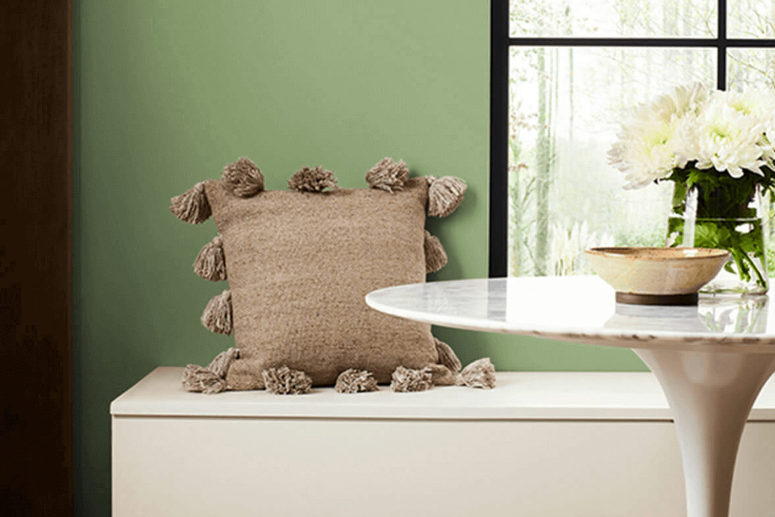
Choosing the right paint color for your home can sometimes feel overwhelming, but I found a serene shade that might just be the perfect pick for spaces that need a touch of calm and modernity. Allow me to introduce you to SW 9039 Broccoflower by Sherwin Williams.
This unique color brings a soft, understated vibe to any room, blending the freshness of green with the crisp, clean feel of gray. It’s a versatile hue that works beautifully in a variety of settings, whether you’re looking to refresh your living room, bedroom, or even your kitchen cabinets.
What I love about Broccoflower is how it harmonizes with both natural light and home furnishings, making it a robust choice for those looking to create a peaceful but stylish atmosphere.
If you’re searching for a color that’s subtle yet impactful, SW 9039 Broccoflower could be the ideal choice for bringing a new energy into your home.
What Color Is Broccoflower SW 9039 by Sherwin Williams?
Broccoflower by Sherwin Williams is a unique and refreshing shade that blends green and gray tones, giving it a versatile appeal that can suit various interior styles. This color has a calm, muted quality making it perfect for spaces where a touch of subtlety is desired alongside a pop of personality.
Broccoflower works well in modern and contemporary interiors due to its crisp and clean look. It can also adapt smoothly to rustic themes when paired with natural elements, emphasizing an earthy feel. In a Scandinavian-style setting, this color supports a minimalist aesthetic while adding a touch of warmth.
When it comes to materials, Broccoflower pairs beautifully with natural wood, helping to highlight its rich textures. It also matches well with metallic finishes like brushed nickel or matte black, adding a modern edge to the space. For textiles, consider soft, nubby fabrics like wool or linen to create a cozy, inviting atmosphere. This shade can also stand up next to marble or stone, providing a slight contrast that enhances the inherent patterns of these materials.
In summary, Broccoflower is a highly adaptable color that can help create a fresh, updated look in your home, matching well with a range of materials and suitable for various decorating styles.

Is Broccoflower SW 9039 by Sherwin Williams Warm or Cool color?
Broccoflower SW 9039 by Sherwin Williams is a unique paint color that brings a warm, inviting feel to any home space. Its pale green hue creates a freshness that resembles the light color of a broccoli-cauliflower hybrid, thus earning the name Broccoflower. This subtle yet cheerful shade works seamlessly in kitchens, bathrooms, and living areas where natural light highlights its gentle, soothing qualities.
Applying this color to walls can help small rooms appear brighter and larger. It pairs nicely with white trim and wooden accents, enhancing the cozy, homey vibe of a room. Additionally, Broccoflower is versatile to complement different home decors from modern to rustic comfortably.
For those who prefer natural tones with a dash of personality, this might be an ideal choice because it adds character without overwhelming the senses. It is a soft, approachable color that creates a relaxed atmosphere, making it perfect for homes where calm and comfort are priorities.
Undertones of Broccoflower SW 9039 by Sherwin Williams
The undertones of a color are secondary shades that are present within the main hue, subtly influencing its overall appearance. For the color Broccoflower, a variety of undertones come into play, allowing it to adapt and appear differently under various lighting conditions and when paired with different décor elements.
Broccoflower has undertones such as mint, pale pink, olive, and pale yellow, among others. These undertones can make the color shift between warmer and cooler tones depending on the environment. For instance, in a room with a lot of natural light, the pale yellow and light blue undertones might make the paint look brighter and more vibrant.
In contrast, in a space with less natural light, olive and dark green undertones could give it a more subdued, cozy feeling. When using Broccoflower on interior walls, the effect of these undertones is significant. It can complement furnishings and accents in similar or contrasting undertones creating a harmonious or dynamic look. For example, light turquoise and lilac undertones might pair well with similar colored decor to provide a gentle, unified appearance. Conversely, pairing it with contrasting colors like dark turquoise or navy can draw out a striking contrast, making the walls stand out more.
Overall, the various undertones of Broccoflower allow it to be extremely versatile, fitting well with multiple styles and palettes, making it a practical choice for those looking to paint their interiors.
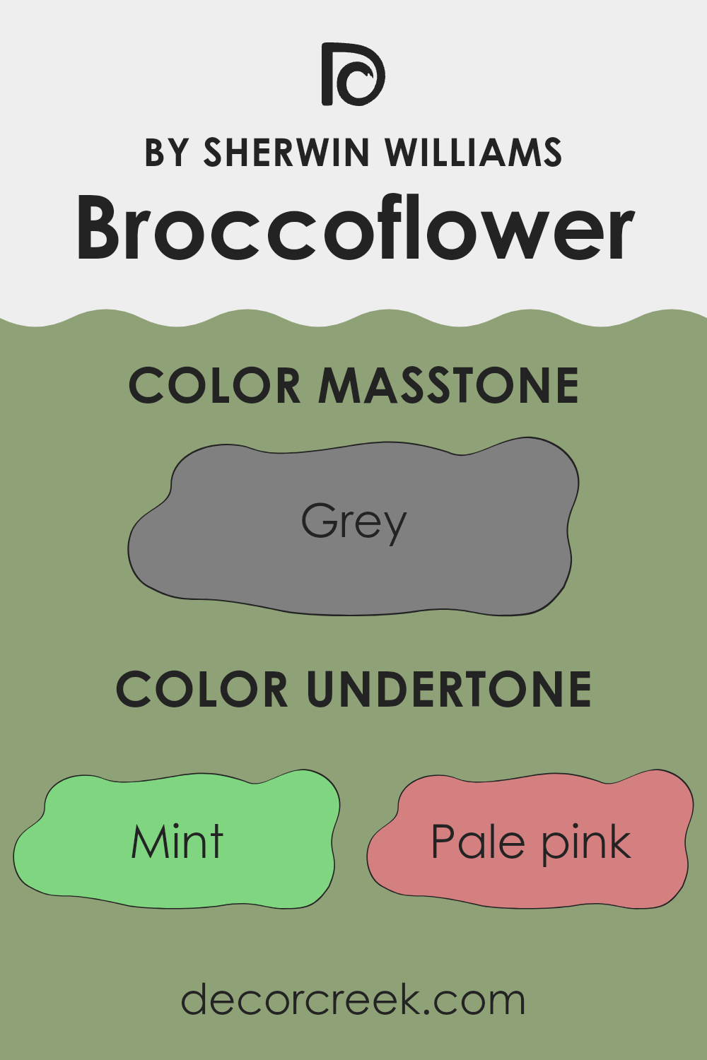
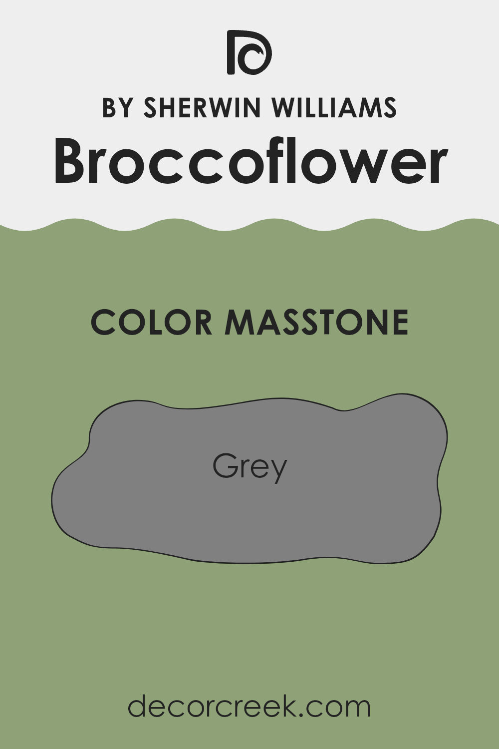
What is the Masstone of the Broccoflower SW 9039 by Sherwin Williams?
Broccoflower SW 9039 by Sherwin Williams has a masstone of Grey (#808080), a balanced shade that offers a straightforward way to style a home. This neutral grey can make any room appear more modern and clean, acting as a subtle backdrop that easily matches with a variety of decor styles and colors.
It’s particularly effective in spaces where you want to create a calm and uncluttered look. Whether you’re painting a busy kitchen or a quiet bedroom, this grey helps other colors—like bright cushions or artworks—stand out.
It’s also versatile enough to work well in both well-lit areas and rooms that might not get a lot of natural sunlight, maintaining its true color without turning too dark or too light. Overall, this shade provides a practical and stylish option for anyone looking to update their home.
How Does Lighting Affect Broccoflower SW 9039 by Sherwin Williams?
Lighting plays a crucial role in how we perceive colors, making it an essential aspect to consider when decorating a space. Different types of light can change the way a color looks in a room, often transforming its overall feel and appearance.
The color in question, Broccoflower SW 9039 by Sherwin Williams, is a unique hue that reflects light in distinct ways depending on the environment. In artificial light, such as that from LED bulbs or incandescent lamps, Broccoflower tends to appear slightly warmer, accentuating its subtle green undertones. This makes it a cozy option for living spaces where artificial lighting is often used for ambiance.
In contrast, under natural light, Broccoflower shows its true depth. Sunlight brings out its vibrant and fresh green qualities, making it ideal for rooms that receive a lot of daylight and whose owners want to create a bright and airy feel.
The orientation of the room also impacts how this color displays:
- North-faced rooms: These rooms get less direct sunlight, which can make Broccoflower appear more muted and slightly cooler in tone. The subdued lighting complements the cooler aspects of this color, making it suitable for creating a peaceful and calm environment.
- South-faced rooms: These areas are flooded with more intense, direct sunlight throughout the day, which can enhance the vibrancy of Broccoflower. It tends to look brighter and more dynamic in such settings, perfect for energizing a space.
- East-faced rooms: Morning light is cooler and can make Broccoflower appear crisper and refreshing in the morning, gradually warming up as the day progresses. It’s great for spaces used predominantly in the morning, like kitchens or breakfast nooks.
- West-faced rooms: Evening light brings a warmer glow, making Broccoflower appear richer and slightly more intense. It’s an excellent choice for living rooms or dining areas used more during the afternoon and evening.
Understanding how different lighting conditions affect the appearance of colors like Broccoflower can help in choosing the right paint for the right room, achieving the desired mood and aesthetic.

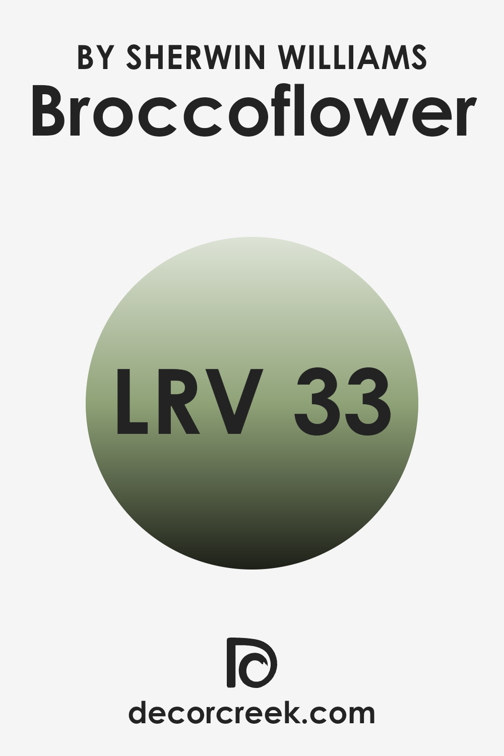
What is the LRV of Broccoflower SW 9039 by Sherwin Williams?
LRV stands for Light Reflectance Value, which measures the amount of light a paint color reflects back into a room. This value is set on a scale, with lower values meaning the paint absorbs more light and higher values meaning it reflects more. The amount of light a color reflects can significantly impact how it looks on your walls and how it affects the atmosphere of a room.
A lower LRV can make a space feel more cozy and intimate because it absorbs more light, while a higher LRV makes a room feel airier and more open by reflecting more light. For the color with an LRV of thirty-three, it falls on the lower end of the scale, meaning it doesn’t reflect a lot of light.
In practice, this means the color will appear richer and more intense, but it will also darken the space somewhat, which could make a small room feel smaller. If used in a well-lit area or combined with light-colored decor and furniture, it can create a pleasant balance and prevent the room from feeling too enclosed. When using a color like this, consider room size, lighting, and intended mood to get the best effect.
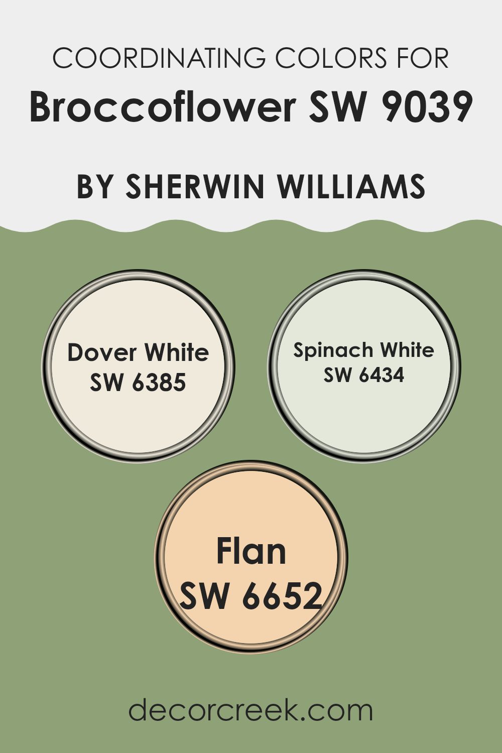
Coordinating Colors of Broccoflower SW 9039 by Sherwin Williams
Coordinating colors are hues that complement each other well and are typically used to create a harmonious color scheme in interior design. When choosing coordinating colors, it’s essential to select shades that balance each other, bringing out the best qualities of each while creating an overall aesthetic that is pleasing to the eye. For example, if a base color is a unique neutral-green like Broccoflower, finding the right coordinating colors involves picking shades that match its tone while adding either contrast or depth to the palette.
In the case of Broccoflower, paints like Dover White, Spinach White, and Flan make excellent coordinating colors. Dover White is a soft, creamy white that offers a light, fresh background which allows richer colors to stand out, perfect for trim or larger areas such as walls to complement darker or richer colors.
Spinach White has a hint of green, similar in subtlety to celery, which aligns closely with the green undertones in Broccoflower, making it ideal for blending seamlessly within a space. On the other hand, Flan is a warm, inviting cream that provides a gentle contrast and a soothing backdrop that ensures the green tones are noticeable without overwhelming the senses. Together, these colors support one another in creating a balanced and inviting color environment.
You can see recommended paint colors below:
- SW 6385 Dover White
- SW 6434 Spinach White
- SW 6652 Flan
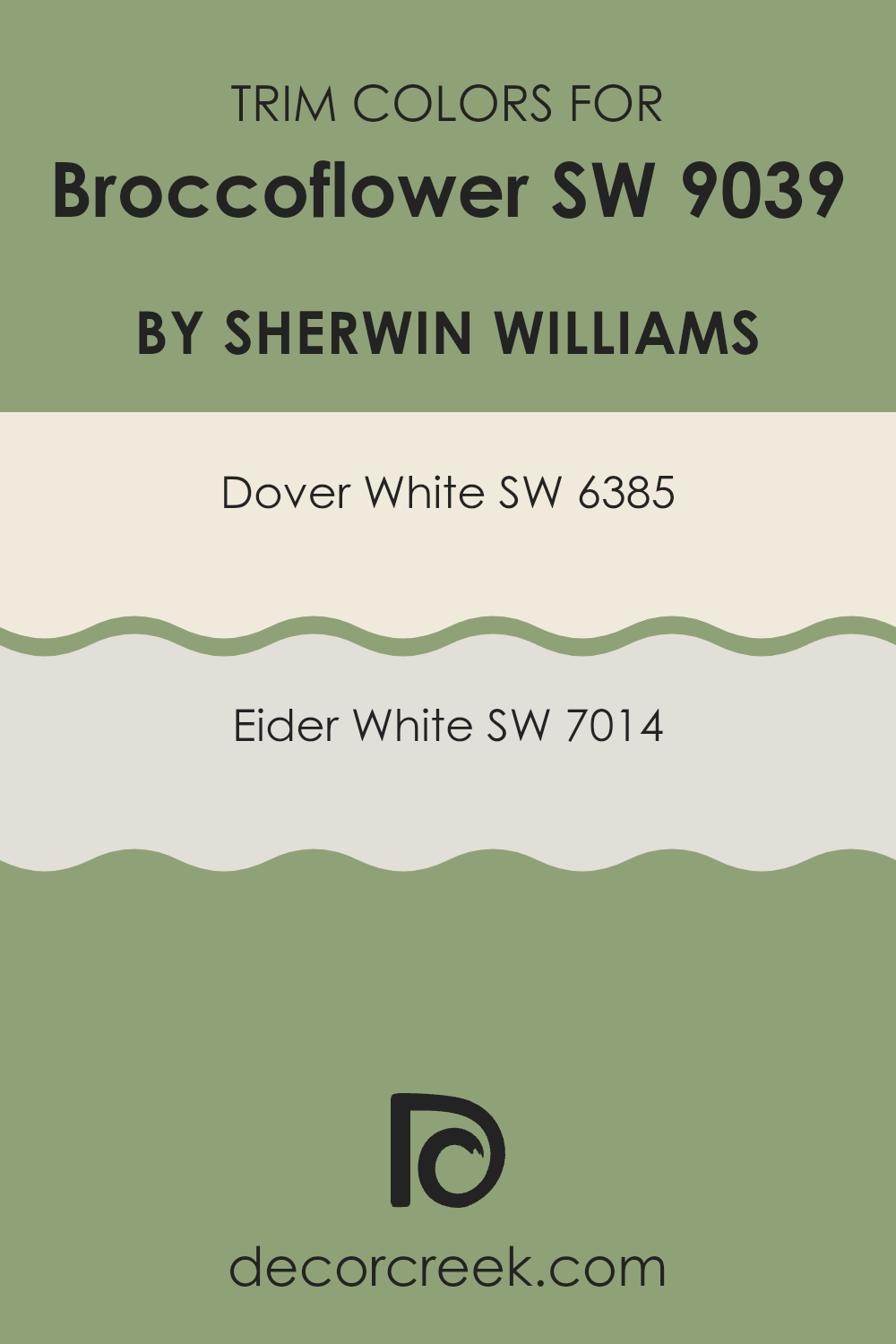
What are the Trim colors of Broccoflower SW 9039 by Sherwin Williams?
Trim colors are those used on the edges and frames of walls, doors, and windows that create visual boundaries and enhance architectural features of a room. Choosing the right trim color is crucial as it defines these details and acts as a frame for the wall colors, providing a crisp, finished look.
For a unique and lively wall color like Broccoflower by Sherwin Williams, trim colors like Dover White and Eider White are excellent choices because they harmonize without overwhelming the main hue, allowing the wall color to stand out while the trims subtly compliment it.
Dover White (SW 6385) is a warm, creamy shade that gives a soft, yet bright, outline to rooms with its inviting tone. It’s a great option for creating a gentle contrast with Broccoflower, making spaces feel cozy and cohesive. On the other hand, Eider White (SW 7014) offers a cooler, grayish-white tone which brings a more modern and clean edge to the spaces, making the borders distinct and giving the room a neat, meticulous finish. Both colors help in making the main color appear more dynamic and visually interesting.
You can see recommended paint colors below:
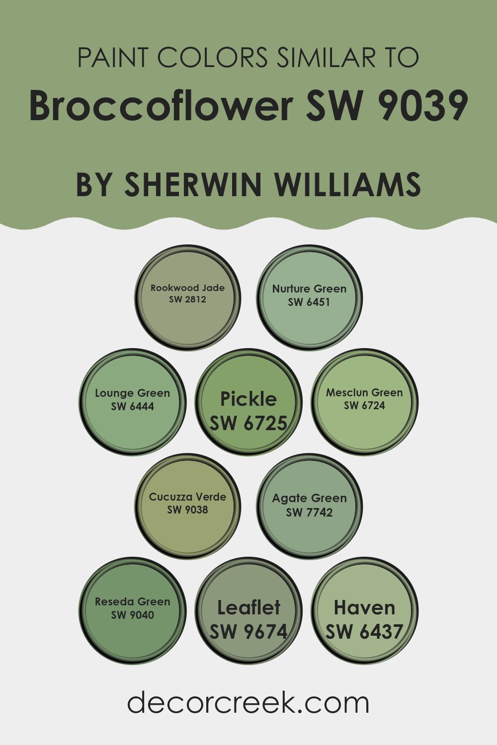
Colors Similar to Broccoflower SW 9039 by Sherwin Williams
When working with interior design or picking a paint scheme, using similar colors can create a cohesive and harmonious look in any space. When colors like Broccoflower are used, its complementary shades such as Rookwood Jade — a deep, calming green with a hint of history, or Nurture Green — a soft, nature-inspired hue, can enhance the atmosphere without overwhelming with contrast.
Lounge Green and Pickle offer slightly muted variations that blend seamlessly with slightly darker or lighter elements in your décor, helping to keep the aesthetic unified and relaxing for the eyes. Mesclun Green provides a crisp, refreshing touch whereas Cucuzza Verde deepens the setting with its earthy tones.
Further extending the palette, Agate Green is a subtle, soothing option that pairs well with natural materials like wood or stone. Reseda Green adds a vintage charm without losing the freshness of the overall scheme. Leaflet and Haven introduce a lively zest and gentle embrace to spaces, providing breaths of fresh air complimented by natural light. These similar shades not only enable a visually pleasing array of choices but also ensure that elements within the room blend smoothly without any harsh transitions, favoring congruity and aesthetic harmony throughout the space.
You can see recommended paint colors below:
- SW 2812 Rookwood Jade
- SW 6451 Nurture Green
- SW 6444 Lounge Green
- SW 6725 Pickle
- SW 6724 Mesclun Green
- SW 9038 Cucuzza Verde
- SW 7742 Agate Green
- SW 9040 Reseda Green
- SW 9674 Leaflet
- SW 6437 Haven
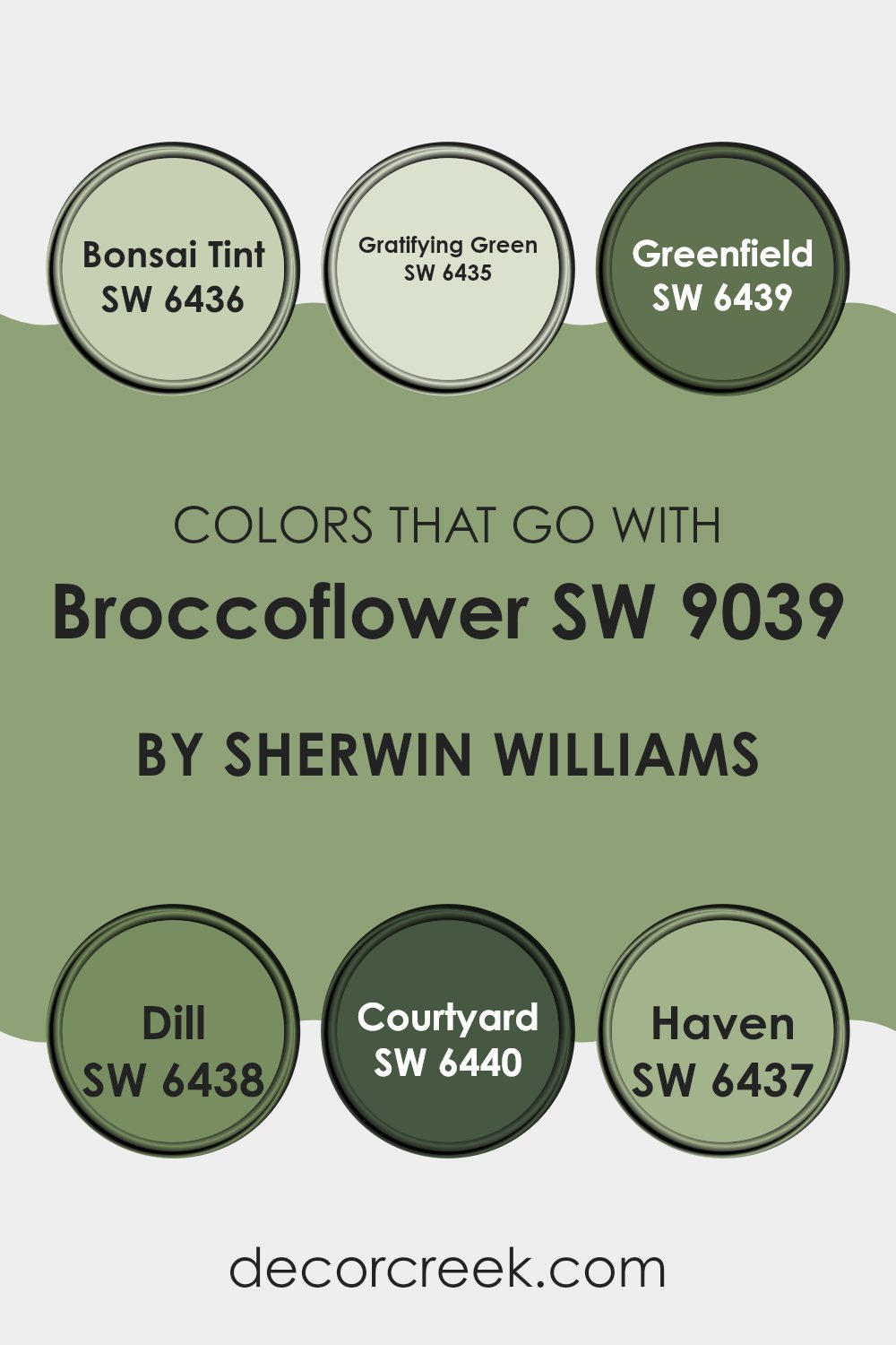
Colors that Go With Broccoflower SW 9039 by Sherwin Williams
Choosing the right colors to complement Broccoflower SW 9039 by Sherwin Williams is essential for creating a cohesive and appealing color scheme in your home. Colors that harmonize with Broccoflower can enhance the overall aesthetic, help in achieving a balanced look, and set the desired mood in a room.
For instance, Bonsai Tint SW 6436 is a soft, muted green that works well with Broccoflower, giving a subtle and soothing backdrop that is easy on the eyes. Gratifying Green SW 6435, slightly deeper than Bonsai Tint, offers a fresh and lively feel, yet remains gentle enough to support the softer tones of Broccoflower without overwhelming them.
Greenfield SW 6439 offers a richer, more intense hue that can act as a striking contrast to the lighter Broccoflower, perfect for adding a touch of drama or drawing attention to a specific area of a room. Dill SW 6438 has a natural, earthy quality that can help in grounding a space, providing a stable, comforting foundation to build upon.
Courtyard SW 6440 is a darker green that can add depth and interest to a design scheme, pairing nicely with various decor elements. Lastly, Haven SW 6437 provides a dusty, calming green that works wonderfully to create a peaceful and welcoming atmosphere.
Each of these colors can be effectively used to enhance the beauty and utility of Broccoflower, leading to a more delightful and harmonious living environment.
You can see recommended paint colors below:
- SW 6436 Bonsai Tint
- SW 6435 Gratifying Green
- SW 6439 Greenfield
- SW 6438 Dill
- SW 6440 Courtyard
- SW 6437 Haven
How to Use Broccoflower SW 9039 by Sherwin Williams In Your Home?
Broccoflower SW 9039 by Sherwin Williams is a unique paint color that blends the freshness of green with the softness of cream. This color is perfect for anyone wanting to add a touch of nature and warmth to their home.
It works well in various settings, such as kitchens and living rooms, where it introduces a calm and cozy atmosphere. Since the color is not too bold, it makes the room feel welcoming without overwhelming the space.
Using this color in a kitchen can brighten up the space, especially if you have natural wood cabinets or white countertops. In the living room, it pairs nicely with both dark and light furniture, providing a balanced backdrop that enhances other decor elements. Additionally, applying this color in a bathroom can create a fresh and clean look. Overall, Broccoflower SW 9039 is a versatile choice that can help make any room in your home feel more comfortable and pleasant.
Broccoflower SW 9039 by Sherwin Williams vs Rookwood Jade SW 2812 by Sherwin Williams
Broccoflower SW 9039 and Rookwood Jade SW 2812 are both colors from Sherwin Williams, but they have distinct tones that set them apart. Broccoflower is a light and fresh green, much like the hue you might see on a vegetable in the produce section. This color brings a natural and calming feel that is very soft and not too overpowering.
On the other hand, Rookwood Jade has a deeper and slightly muted green tone, reminiscent of rich jade stones. This color provides a sense of depth and can make a space feel more grounded and cozy.
If you’re considering one for a room, Broccoflower would be great for creating a light, airy atmosphere, whereas Rookwood Jade would suit a space where a more subtle, yet grounded ambiance is desired. Both colors offer a beautiful base for decor, but the choice depends on the vibe you want to achieve in your space.
You can see recommended paint color below:
Broccoflower SW 9039 by Sherwin Williams vs Nurture Green SW 6451 by Sherwin Williams
Broccoflower is a subtle, muted green with a gray undertone, resembling the color of the vegetable it’s named after. It has a soft and natural feel, making it easy to use in spaces where you want a touch of color without overwhelming the senses. This color works well in both modern and traditional settings, offering a calming backdrop.
On the other hand, Nurture Green is a vibrant, lively green that brings a fresh and energizing feel to any space. It’s brighter and more pronounced than Broccoflower, making it a great choice for areas where you want to add a splash of cheerfulness and vitality.
When compared, Broccoflower is more reserved and understated, while Nurture Green stands out and makes a statement. Depending on the mood and atmosphere you want to create in a room, you might choose the softness of Broccoflower for a relaxed feel or the boldness of Nurture Green for a more dynamic and lively environment.
You can see recommended paint color below:
Broccoflower SW 9039 by Sherwin Williams vs Mesclun Green SW 6724 by Sherwin Williams
Broccoflower and Mesclun Green are two unique colors by Sherwin Williams, each bringing its own charm to a space. Broccoflower is a muted tone that resembles the cross between broccoli and cauliflower, offering a subtle and natural feel. It’s soft and earthly, making it a great choice for anyone wanting a calm and grounding atmosphere in their room.
On the other hand, Mesclun Green is vivid and bright, much like the salad greens it’s named after. This color adds a fresh and lively touch to any area, perfect for those looking to inject some energy and vibrancy into their decor.
The difference between these two is primarily in mood and intensity; Broccoflower is more subdued and blends easily with other neutrals, whereas Mesclun Green stands out and demands attention. Both colors are versatile and can be used in various design styles, from modern to rustic.
You can see recommended paint color below:
- SW 6724 Mesclun Green
Broccoflower SW 9039 by Sherwin Williams vs Leaflet SW 9674 by Sherwin Williams
Broccoflower and Leaflet by Sherwin Williams are two distinct green shades that can significantly impact the ambiance of a space. Broccoflower is a muted, slightly dusty green that carries a subtle gray undertone, making it highly versatile for various home settings. It lends a calm and collected feel that is not too overpowering, ideal for creating a cozy and inviting atmosphere.
On the other hand, Leaflet is a brighter, more vivid green. This color is lively and has a freshness to it, reminiscent of spring leaves and new growth. It’s the kind of green that can energize a space and make it feel more vibrant and playful.
Both colors offer a touch of nature but in different ways: Broccoflower leaning towards a grounded, softer approach, and Leaflet bringing a burst of cheer and brightness. Choosing between them would depend on the mood one wishes to establish in their room.
You can see recommended paint color below:
- SW 9674 Leaflet
Broccoflower SW 9039 by Sherwin Williams vs Haven SW 6437 by Sherwin Williams
Broccoflower SW 9039 by Sherwin Williams is a unique hue, blending the softness of cream with a hint of green, resembling the color of the vegetable it’s named after. It provides a gentle, muted backdrop that can be soothing and natural, fitting well in spaces where calm and simplicity are key.
In contrast, Haven SW 6437 is a deeper, rich green that mimics the shades found in a lush forest or a secluded garden. This color is bolder and more expressive, bringing an earthy, vibrant feel to a room. It stands out more than Broccoflower and can make a statement on walls or as an accent color.
While both colors draw from nature, Broccoflower is subtler and lighter, making it versatile for larger areas or rooms that seek a touch of brightness without being overwhelming. Haven, with its deeper tones, works well to add depth and focus in a space, ideal for creating a feature wall or styling a cozy nook.
You can see recommended paint color below:

Broccoflower SW 9039 by Sherwin Williams vs Agate Green SW 7742 by Sherwin Williams
Broccoflower is a soft, muted gray-green, resembling the pale tones found in its namesake vegetable. It has a subtle and earthy vibe, making it easy to use in various spaces for a calm and understated look. It tends to blend smoothly with both bright and subdued decor themes, giving versatility in designing.
On the other hand, Agate Green is a deeper, more pronounced shade, leaning towards a more vibrant and lively tone. It carries a refreshing and appealing character, standing out more distinctly than Broccoflower when applied on walls or in home accents. Agate Green can bring a touch of nature inside and works well when you want a pop of color that’s still grounded and not too overpowering.
Both colors offer a connection to natural elements but differ in their intensity and presence, with Broccoflower providing a backdrop that recedes slightly, while Agate Green stands out a bit more boldly.
You can see recommended paint color below:
Broccoflower SW 9039 by Sherwin Williams vs Cucuzza Verde SW 9038 by Sherwin Williams
The main color, Broccoflower SW 9039, and the second color, Cucuzza Verde SW 9038, both by Sherwin Williams, offer unique yet subtle hues that can enhance any space. Broccoflower is a muted, soft green that resembles the color of a broccoli-cauliflower hybrid, providing a gentle and calming green tone that is versatile for any room. It pairs well with both bright and neutral shades.
On the other hand, Cucuzza Verde is slightly more vibrant and carries a fresher green look, similar to the color of the Italian squash after which it’s named. This color stands out a bit more than Broccoflower, giving a lively and refreshing feel to the walls it graces. It works great in spaces that benefit from a pop of color without overwhelming the senses.
Both colors work well together or separately, depending on the mood you want to create. While Broccoflower offers a more subdued backdrop, Cucuzza Verde is an excellent choice for adding a touch of energy to a space.
You can see recommended paint color below:
- SW 9038 Cucuzza Verde
Broccoflower SW 9039 by Sherwin Williams vs Pickle SW 6725 by Sherwin Williams
Broccoflower and Pickle by Sherwin Williams are unique colors that each bring their own flair. Broccoflower is a muted green, resembling a soft mix of gray and green, much like the vegetable it’s named after. It’s subtle and can work beautifully as a neutral base or a gentle accent in various spaces, offering a calming backdrop without being too bold.
On the other hand, Pickle is a brighter, more vivid green. It stands out more and can inject a lively burst of color into a room. This shade is vibrant and fun, making it perfect for areas where you might want to add a sense of energy or freshness, like a kitchen or playroom.
When used together, these two colors can balance each other out nicely. Broccoflower serves as a soothing foundation, while Pickle can be used for highlights and focal points, adding just the right amount of punch to a space.
You can see recommended paint color below:
- SW 6725 Pickle
Broccoflower SW 9039 by Sherwin Williams vs Lounge Green SW 6444 by Sherwin Williams
Broccoflower and Lounge Green by Sherwin Williams are two distinct shades that can create very different moods in a space. Broccoflower is a soft, muted green that resembles the pale green of a broccoli or cauliflower. This color is gentle and subdued, making it perfect for areas where you want a calm, subtle backdrop. It can make small spaces appear larger and more open.
In contrast, Lounge Green is a deeper, richer green. This shade is more vibrant and has a touch of sophistication, ideal for creating a statement or adding a touch of nature’s vibrancy to a room. It works well in spaces where you want to add character or define an area with a bolder, more noticeable color.
Both colors bring their unique touches to interior design: Broccoflower with its light, airy feel, and Lounge Green with its dynamic presence. The choice between the two would depend on the atmosphere you’re aiming to achieve in your space.
You can see recommended paint color below:
Broccoflower SW 9039 by Sherwin Williams vs Reseda Green SW 9040 by Sherwin Williams
Broccoflower and Reseda Green are two distinct shades offered by Sherwin Williams. Broccoflower is a subtle, light green hue that has a fresh and airy feel. It’s quite gentle and can make any space feel open and welcoming. This color is great for creating a calm environment without being too bold or overpowering.
On the other hand, Reseda Green is a bit deeper and more pronounced. It carries a richness that adds a touch of nature-inspired robustness to the room. It gives more warmth compared to Broccoflower and is ideal for someone looking to make a more noticeable statement with their color choice.
Both colors can freshen up a space, but Broccoflower leans towards a softer, lighter look, while Reseda Green steps it up with a bolder, earthier tone. Depending on the vibe you want, either could be a great fit: Broccoflower for a subtle touch or Reseda Green for a more vibrant impact.
You can see recommended paint color below:
In wrapping up my thoughts on SW 9039 Broccoflower by Sherwin Williams, I have to say, it’s a pretty cool paint color. This shade is not just green, not just gray, but somewhere fun and interesting in between. It makes any room feel fresh and cheerful without being too bright or too dull. I’ve learned that this color goes well with lots of other colors, making it easy to use in any room, from the kitchen to the bedroom. It’s also smooth to apply, covers the walls nicely, and stands up well to everyday bumps and scrapes, which is great for busy homes.
Throughout this review, trying out Broccoflower has shown me that a single color can really change the feel of a room. It’s calm enough for study spaces and playful enough for a living room. It’s kind of like having the best of both worlds – energetic and peaceful at the same time!
Overall, SW 9039 Broccoflower by Sherwin Williams is a win in my book. Whether someone wants to paint their entire room or just add a colorful accent wall, I think it’s a choice they’ll be happy with. It’s fun to see how something as simple as a new paint color can make home feel more lively yet restful.

Ever wished paint sampling was as easy as sticking a sticker? Guess what? Now it is! Discover Samplize's unique Peel & Stick samples.
Get paint samples

