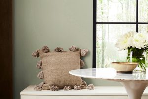
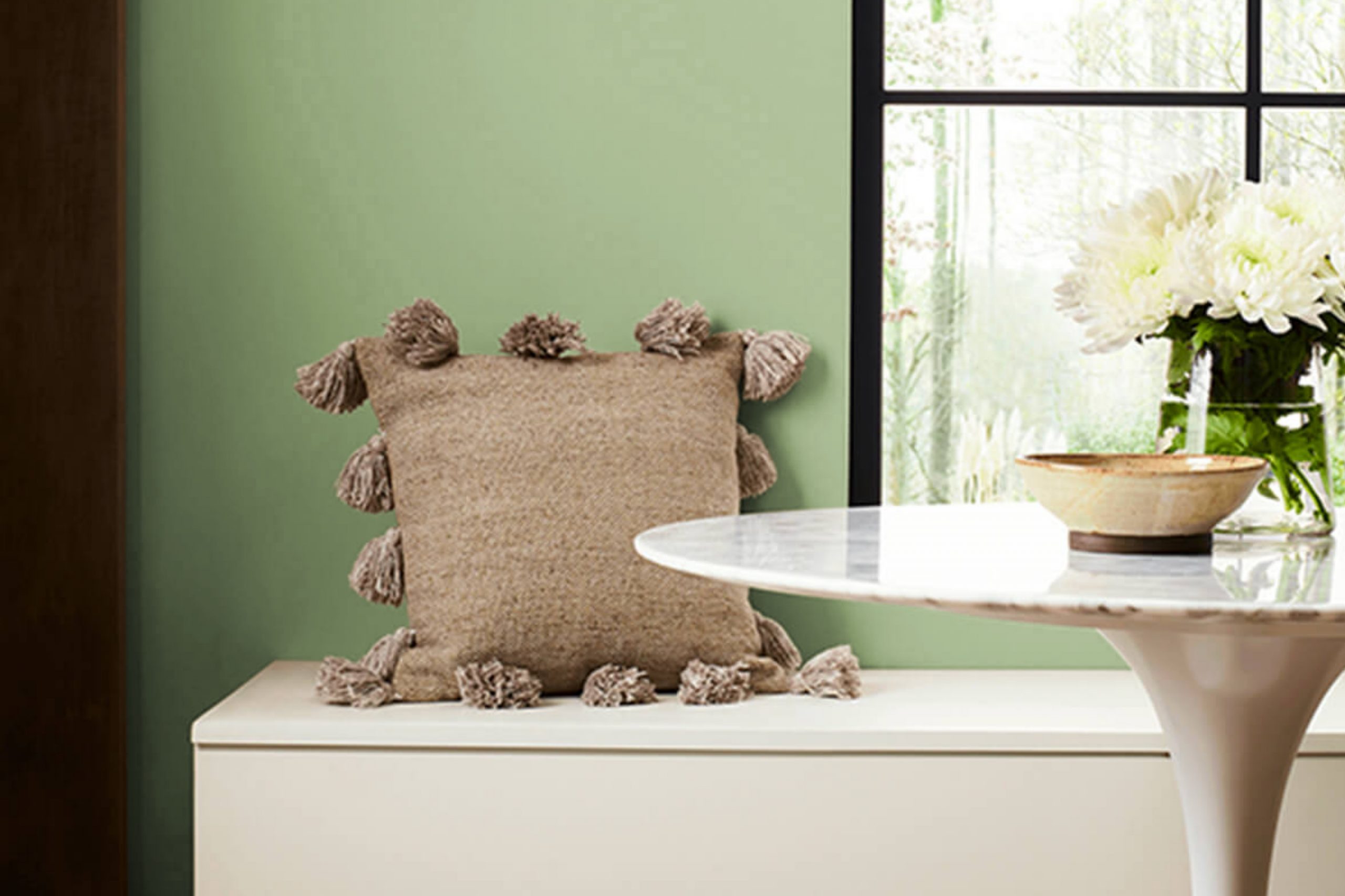
Sherwin-Williams SW 6437 Haven is a beautiful and unique hue that has the potential to transform any space into a tranquil oasis. It is a versatile color that blends seamlessly with various color schemes and creates stunning backdrops.
This color’s charm lies in its ability to evoke feelings of peace and serenity. This article offers an in-depth exploration of this delightful color, its undertones, coordinating colors, LRV, and how to use it in different rooms.
What Color Is Sherwin-Williams SW 6437 Haven? Is It a Warm or Cool Color?
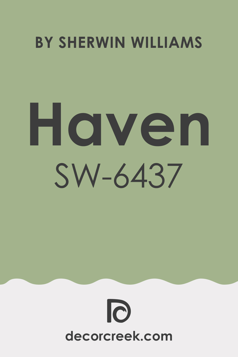
Sherwin-Williams SW 6437 Haven is a mid-tone green color. As Hextoral says, this tranquil hue carries undertones of grey, creating a calming, sophisticated blend. It rests on the cool side of the color spectrum, but its gentle warmth makes it adaptable to different settings and moods.
Ever wished paint sampling was as easy as sticking a sticker? Guess what? Now it is! Discover Samplize's unique Peel & Stick samples.
Get paint samples

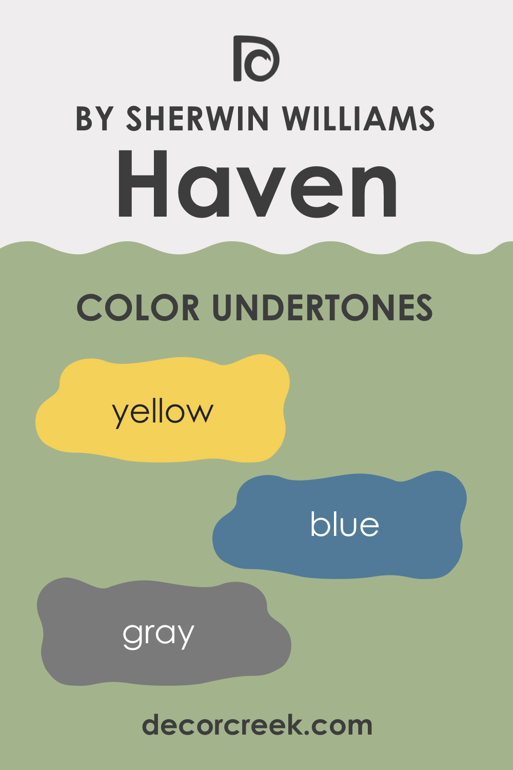
Undertones of Sherwin-Williams SW 6437 Haven Paint Color
This green color has a blend of undertones that add to its character. Here are the three most prominent undertones you should know about if you want to use SW Haven correctly:
- Grey: The most prominent undertone in Haven is grey. It tempers the green, providing a soft and understated elegance to the color.
- Blue: There is a subtle hint of blue in Haven that enhances its cool character. This blue undertone adds depth and richness to the color.
- Yellow: An underlying trace of yellow gives Haven a certain warmth, allowing it to blend with a variety of color schemes seamlessly.
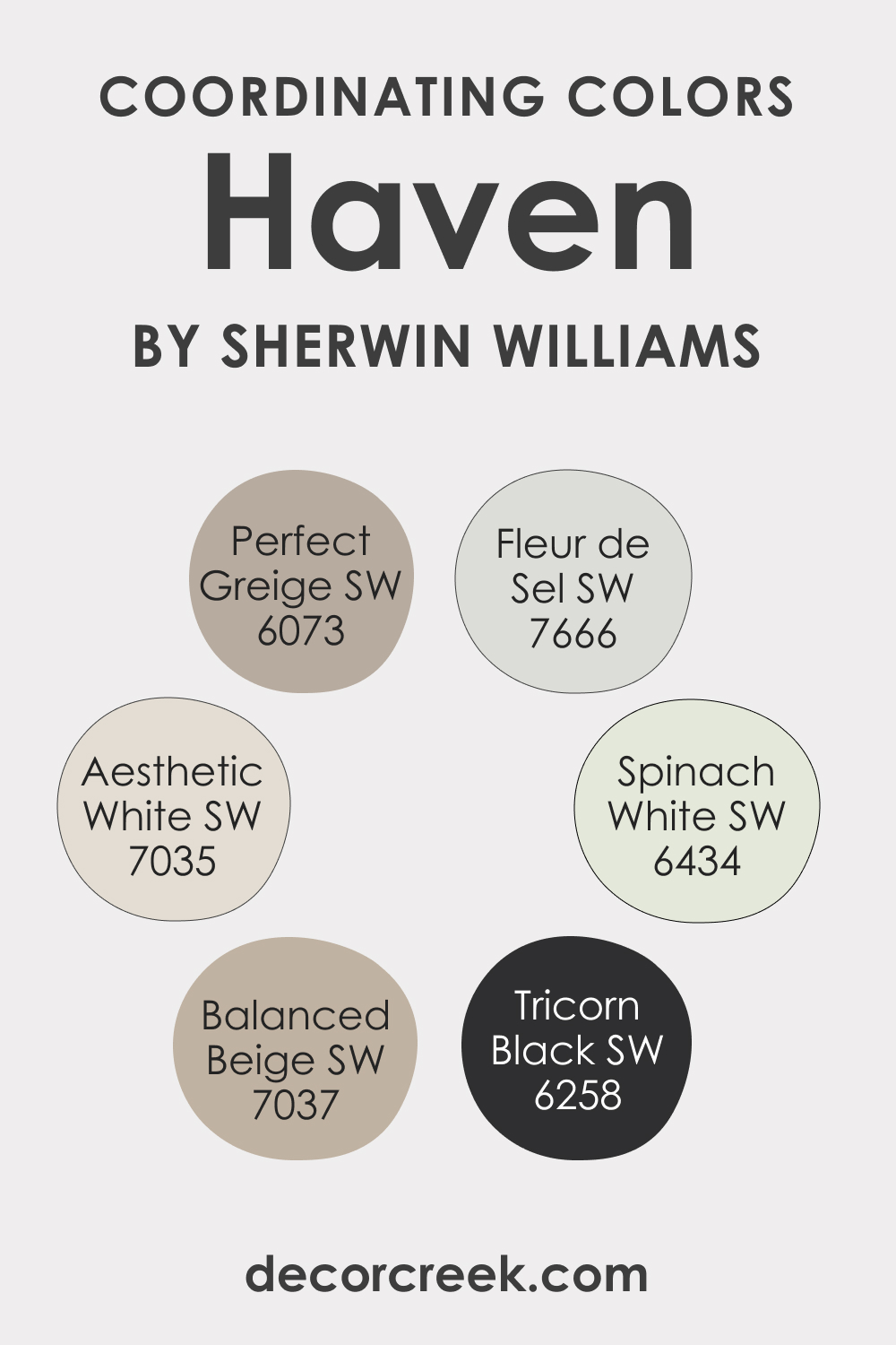
Coordinating Colors of Sherwin-Williams SW 6437 Haven
Picking coordinating colors can be fun, but only if you are aware of color theory, at least a little bit. Otherwise, this may turn into a challenge for you! Luckily, SW Haven pairs beautifully with a range of colors. Here are a few coordinating colors, along with a brief description of each:
- SW 6434 Spinach White : A muted green-white, Spinach White acts as a serene counterpart to Haven, enhancing its peaceful qualities.
- SW 7035 Aesthetic White : This warm neutral complements Haven’s cool nature, offering a pleasing contrast that balances the overall look.
- SW 7037 Balanced Beige : A warm, taupe-beige, Balanced Beige adds depth and richness when paired with Haven.
Additional coordinating colors include:
- SW 6258 Tricorn Black : This strong, neutral black serves as a dramatic counterpoint to Haven’s soft tranquility.
- SW 6073 Perfect Greige : A warm grey with a brown undertone, Perfect Greige pairs well with Haven to create a harmonious color scheme.
- SW 7666 Fleur de Sel : This soft, light gray brings out the sophistication of Haven, offering a gentle contrast.
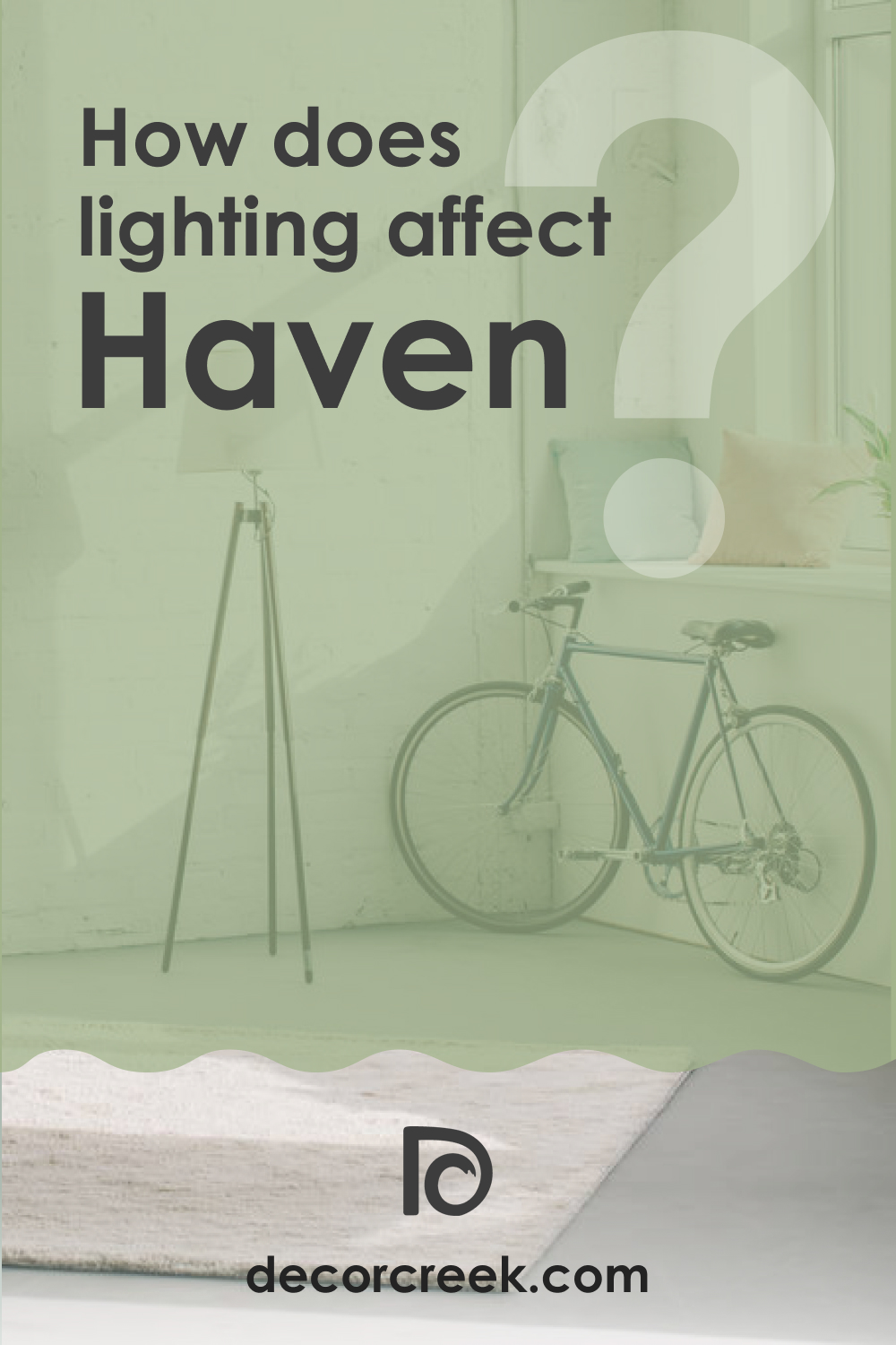
How Does Lighting Affect Sherwin-Williams SW 6437 Haven Paint Color?
The lighting in a room can dramatically alter the perception of Haven. In natural light, the color appears brighter, emphasizing its green nature. In artificial lighting, the grey undertone becomes more pronounced, giving the color a more muted, soothing effect.
In rooms with southern exposure, where sunlight is warm and strong, SW Haven can appear slightly more vibrant, making the green hue pop. In spaces with northern exposure, where the light is cooler, the blue undertone might be more apparent.
It’s always recommended to test the color in different lighting conditions to see how it changes throughout the day.
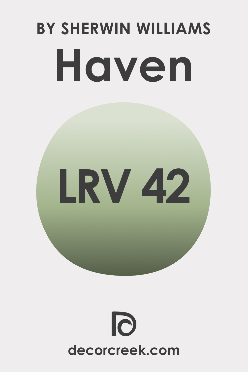
LRV of Sherwin-Williams SW 6437 Haven Paint Color
The Light Reflectance Value (LRV) of color indicates how much light it reflects. SW 6437 Haven has an LRV of 42, placing it in the mid-tone category. This means Haven has a balanced level of light absorption and reflection, making it versatile and suitable for a variety of spaces.
With an LRV of 42, SW Haven can make a room feel cozy and inviting without being too dark. It’s a great option for spaces where you want a calming atmosphere without making the room feel smaller.
LRV – what does it mean? Read This Before Finding Your Perfect Paint Color
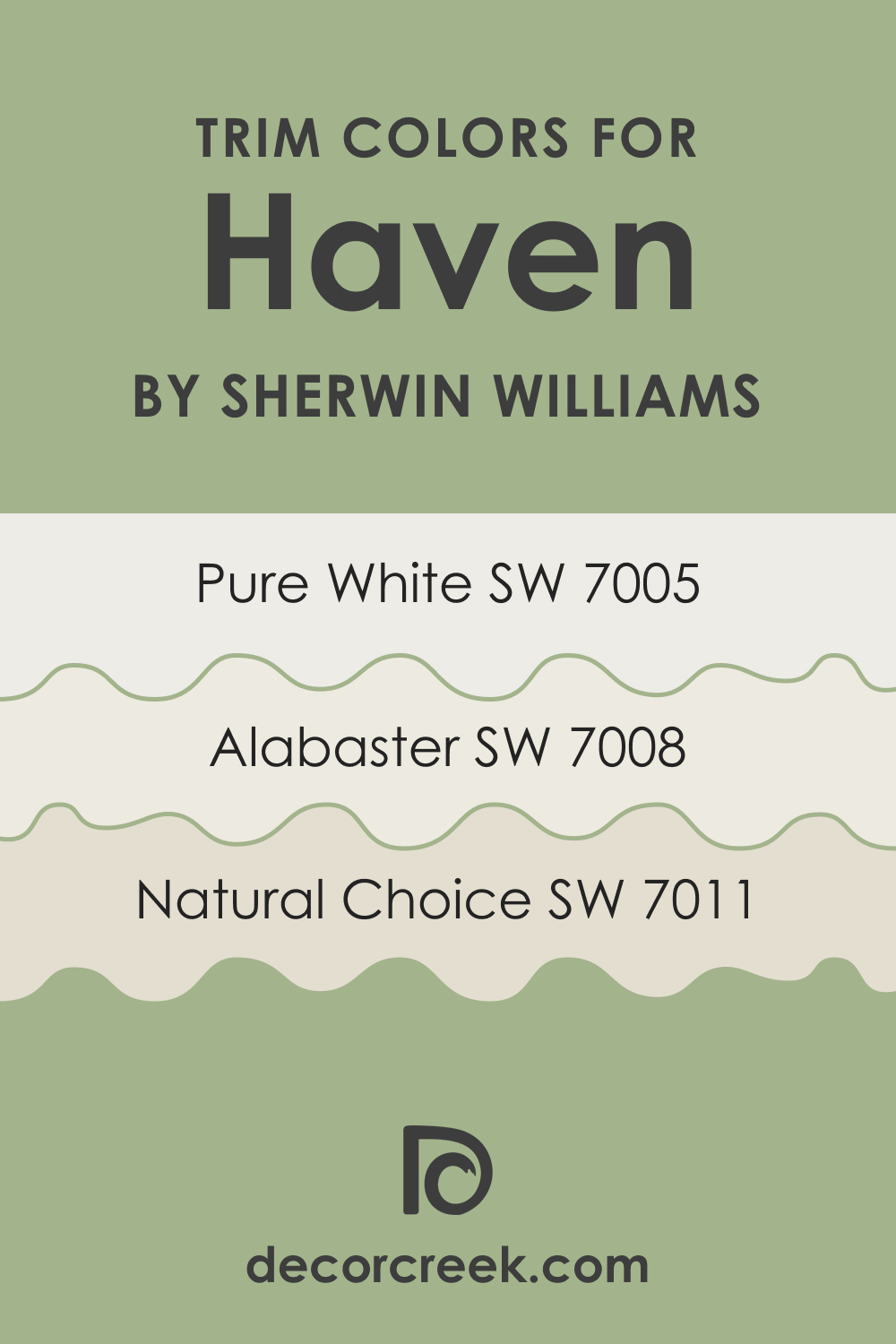
Trim Colors of Sherwin Williams SW 6437 Haven
White is a traditional trim color that works well with most hues you can use on your walls. SW Haven also pairs beautifully with lighter, neutral trim colors. Here are a few options you might want to consider:
- SW 7008 Alabaster : This is a pure, warm white that provides a fresh and clean contrast to Haven.
- SW 7011 Natural Choice : This is a warm, neutral white that subtly enhances the grey undertone in Haven.
- SW 7005 Pure White : This is a bright, crisp white that beautifully offsets Haven’s greenish hue, creating a crisp, clean look.
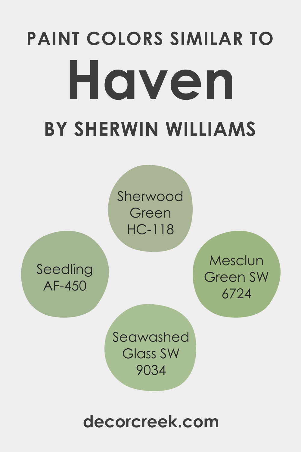
Colors Similar to Sherwin Williams SW 6437 Haven
If you want to have a few additional color options at hand in case you are not satisfied with SW Haven, check out the following recommendations:
- Seawashed Glass SW 9034
- Mesclun Green SW 6724
- Seedling AF-450
- Sherwood Green HC-118
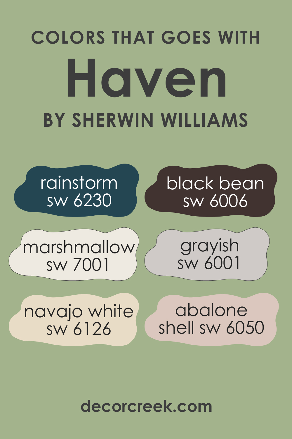
Colors That Go With Sherwin Williams SW 6437 Haven
SW Haven’s complex undertones make it a versatile color that pairs well with many hues. Here are several paint colors that go well with this beautiful green hue:
- SW 6001 Grayish : This is a warm gray color that perfectly complements SW Haven’s green undertone.
- SW 6006 Black Bean : This dark brown color provides a dramatic contrast that enhances Haven’s calming nature.
- SW 6050 Abalone Shell : This soft peach color provides a warm counterpoint to Haven’s cool undertone.
- SW 6230 Rainstorm : This deep blue color enhances SW Haven’s blue undertone and creates a serene, tranquil environment.
- SW 7001 Marshmallow : This pure white color provides a crisp, clean contrast that emphasizes Haven’s green undertone.
- SW 6126 Navajo White : This is a warm, off-white color that complements SW Haven’s yellow undertone.
How This Color Works In Your Home?
SW Haven is pretty versatile and can work well in many rooms and spaces. Below, we describe how exactly this nature-inspired hue may read in common areas of your house or apartment, as well as in more private spaces.
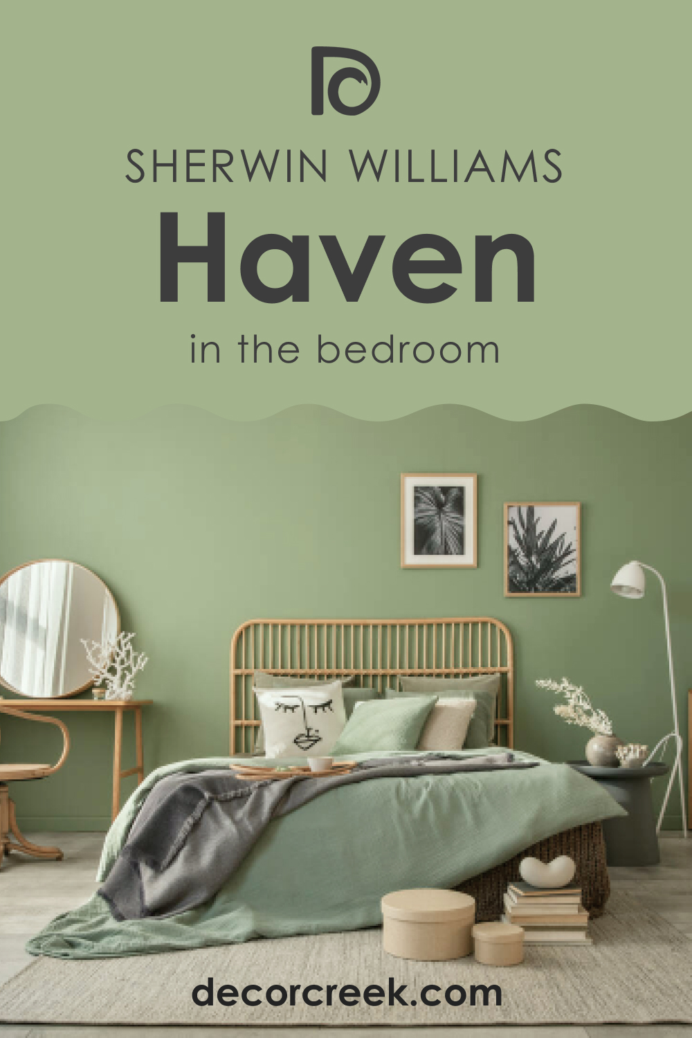
How to Use Sherwin-Williams SW 6437 Haven in the Bedroom?
SW Haven’s tranquil quality makes it an excellent choice for bedrooms. It provides a soothing backdrop that promotes relaxation and restful sleep. You can pair it with light wood furniture and white trim for a refreshing and serene ambiance. Layering different shades of green in the form of bed linens and curtains can enhance the calming effect. Metallic accents in gold or brass can add warmth and sophistication.
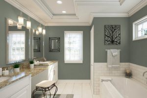
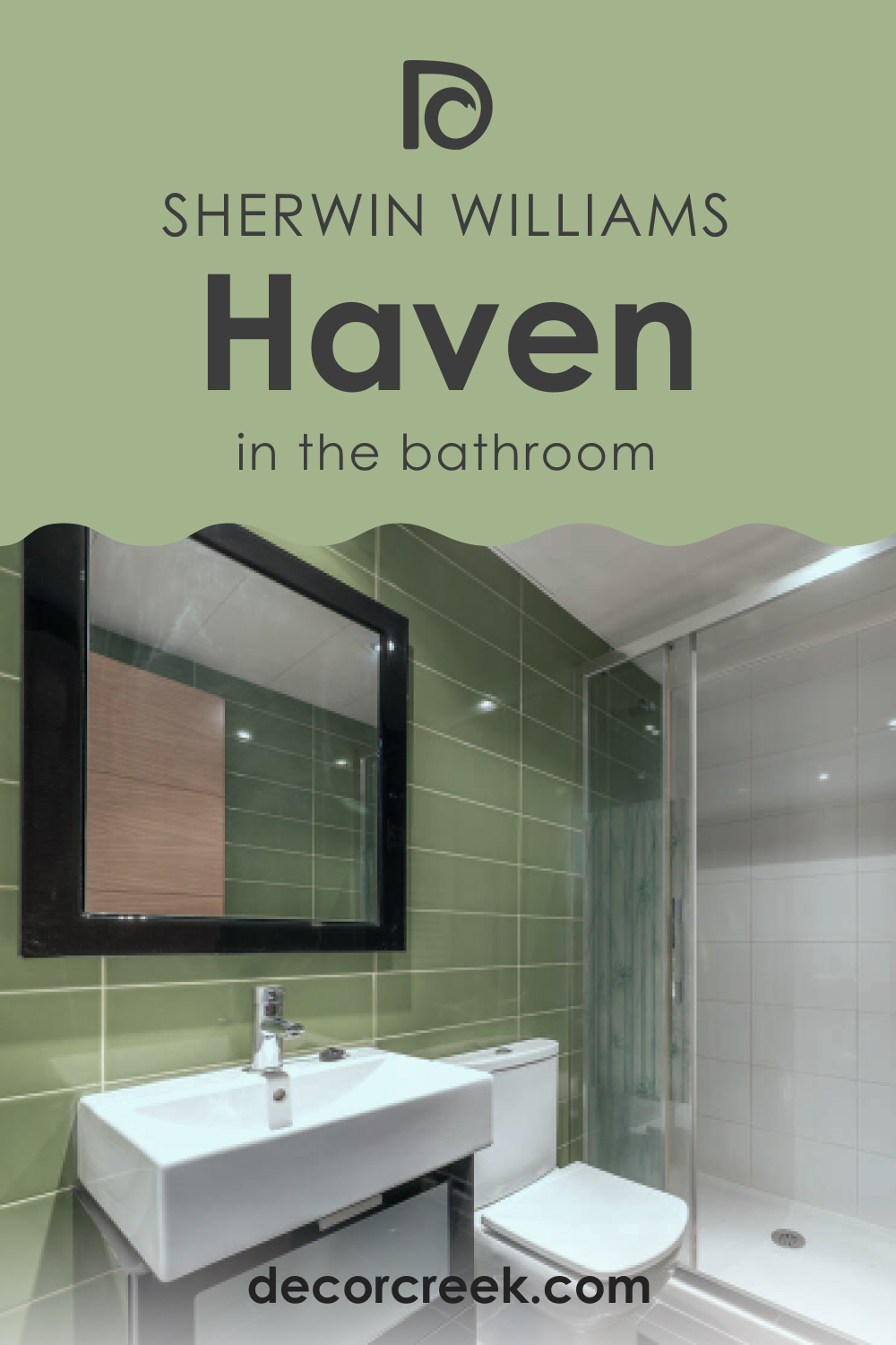
How to Use Sherwin-Williams SW 6437 Haven in the Bathroom?
SW Haven is an excellent color for bathrooms as it evokes a sense of calm and cleanliness. Paired with white fixtures and tiles, it can create a spa-like ambiance. Use Haven on the walls, and incorporate elements of white and beige to enhance its soothing nature.
Natural elements like wooden shelves or stone countertops can provide an organic touch that complements Haven’s nature-inspired hue.
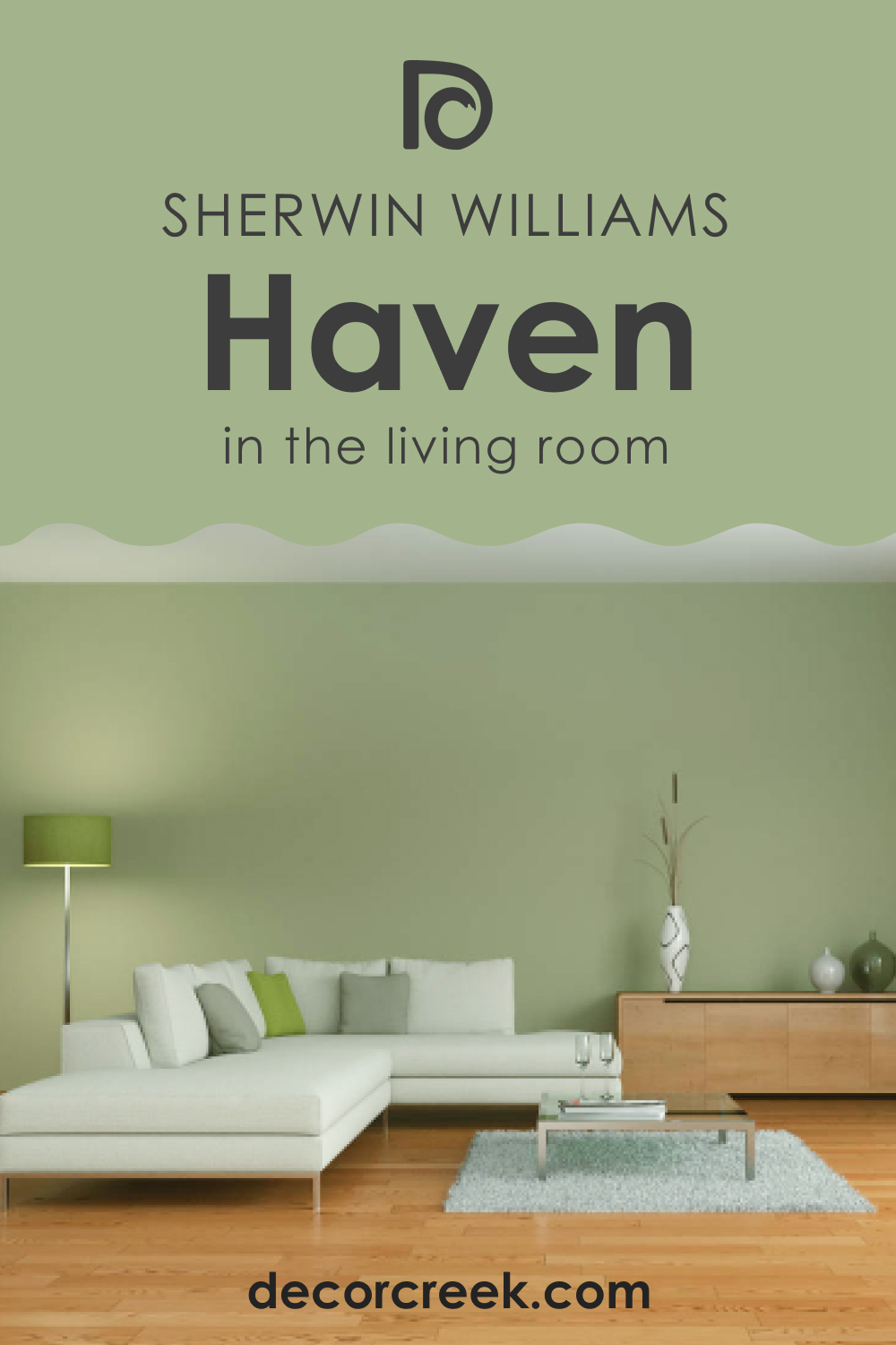
How to Use Sherwin-Williams SW 6437 Haven in the Living Room?
The living room is a communal space where Haven’s unifying quality can shine. It provides a calm backdrop that encourages relaxation and conversation. Pairing Haven with a warm neutral like Balanced Beige can create a harmonious color scheme that feels inviting and balanced.
Complement this look with natural elements like wood and leather for a cozy, earthy vibe. Green plants can enhance Haven’s natural essence, while metallic accents can provide a touch of modern sophistication.
How to Use Sherwin-Williams SW 6437 Haven in the Kitchen?
Using SW Haven in the kitchen can evoke a fresh, inviting ambiance. Pair it with white cabinets for a crisp, clean look or with dark wood for a more dramatic, grounded effect.
Incorporate metallic accents like stainless steel appliances or copper cookware to contrast Haven’s cool undertone. Warm-toned countertops or a colorful backsplash can add vibrancy and depth to the space

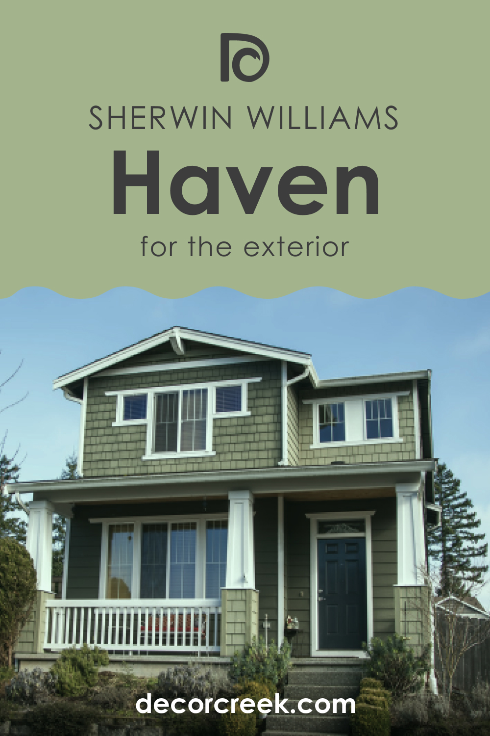
How to Use Sherwin-Williams SW 6437 Haven for an Exterior?
Haven SW 6437 by Sherwin-Williams is an exceptional choice for exterior use, offering a deep, earthy green that evokes the richness of nature and provides a warm, welcoming feel to any home. This versatile hue suits a wide range of architectural styles and beautifully complements natural elements like stone and wood, making it ideal for creating a serene and inviting outdoor space.
Its ability to shift in appearance under different lighting conditions—from vibrant and lively in direct sunlight to soft and tranquil in the shade—adds depth and complexity to your home’s exterior.
Pairing Haven with neutral trim colors and incorporating materials that echo the natural environment can enhance its organic beauty, making your home blend harmoniously with its surroundings while standing out with elegance.
How to Use Sherwin-Williams SW 6437 Haven in the Kitchen Cabinets?
Haven SW 6437 by Sherwin-Williams on kitchen cabinets introduces a vibrant and earthy green that transforms the kitchen into a warm and inviting space, reminiscent of lush outdoor scenery. This rich, soothing color works well in a variety of kitchen styles, from rustic to modern, adding depth and character to the heart of the home.
Its natural hue pairs effortlessly with a range of countertops and backsplashes, such as natural stone, wood, or neutral tiles, creating a cohesive look that brings a touch of the outdoors inside.
The versatility of Haven allows it to act as a statement color or a complementary backdrop for natural elements and metallic accents, offering a unique alternative to traditional kitchen cabinet colors and ensuring a welcoming, serene atmosphere for cooking and gathering.

Comparing SW Haven With Other Colors
To help you better see the difference between SW Haven and several alternative colors, as well as different hues, we compare this green hue with a few paint colors that look either nearly the same or distinctly.
SW 6437 Haven vs SW 6432 Garden Spot
SW Garden Spot is a brighter, more vibrant green than SW Haven. While both colors are inspired by nature, SW Garden Spot has a more lively, energetic quality. In contrast, Haven’s muted hue creates a calm, relaxing ambiance.
SW Garden Spot is better suited for spaces where you want to inject energy and vibrancy, while Haven is perfect for areas where you want to promote peace and relaxation.
SW 6437 Haven vs SW 6436 Bonsai Tint
SW Bonsai Tint is a lighter, more muted green than SW Haven. It has a slightly warmer undertone that gives it a soft, soothing quality. While SW Haven and SW Bonsai Tint both promote a tranquil environment, Bonsai Tint’s lighter hue can make spaces feel more airy and open.
SW Bonsai Tint is ideal for small spaces or rooms with little natural light, while Haven’s mid-tone makes it more versatile and suitable for larger areas.
SW 6437 Haven vs SW 6457 Kind Green
SW Kind Green is a deeper, richer green than SW Haven. It has a higher LRV, which means it reflects more light, making spaces feel larger and brighter. SW Haven’s lower LRV creates a cozier, more intimate atmosphere.
SW Kind Green is a great choice for larger spaces or rooms with plenty of natural light, while Haven is better suited for smaller rooms or areas with less natural light.
SW 6437 Haven vs BM 2147-40 Dill Pickle
BM Dill Pickle is a warm, yellow-green color that contrasts with SW Haven’s cooler undertone. It’s more vibrant and bold, providing a cheerful and lively feel. In contrast, Haven promotes a calm, tranquil ambiance.
BM Dill Pickle is best suited for spaces where you want to create a fun, energetic vibe, while Haven is perfect for areas where you want to evoke peace and serenity.
SW 6437 Haven vs. SW 6178 Clary Sage
Haven offers a vibrant, earthy green that brings a sense of warmth and nature into any space, ideal for creating a cozy and inviting atmosphere. In contrast, Clary Sage is a softer, more muted green with gray undertones, providing a tranquil and soothing backdrop that’s perfect for a more understated or serene environment.
While Haven draws inspiration from the lushness of a vibrant garden, Clary Sage evokes the calmness of a sage-filled meadow, making it well-suited for bedrooms, living rooms, and spaces where relaxation is key.
SW 6437 Haven vs. SW 6176 Liveable Green
Haven’s rich, leafy tones offer a bold statement, infusing spaces with energy and vitality. Liveable Green , on the other hand, is lighter and more subdued, with a balance of green and gray that lends an airy, more neutral feel. This color is excellent for those seeking to introduce green into their palette without overwhelming the space, making it versatile for walls, cabinets, and accents alike.
While Haven pulls in the outdoors with its robust character, Liveable Green creates a soft, harmonious environment, adaptable to various decorating styles.
Conclusion
Sherwin-Williams SW 6437 Haven is a versatile, calming color that can transform any space into a peaceful haven. Its unique blend of green, grey, and subtle blue and yellow undertones make it adaptable to various settings, moods, and color schemes.
Whether you’re looking to create a tranquil bedroom, a spa-like bathroom, a welcoming living room, or a fresh kitchen, Haven offers endless possibilities. Its balance of light reflection and absorption makes it suitable for a variety of spaces.
Remember, when choosing colors, always consider your space, lighting, and personal style.
With SW Haven, you can create your personal oasis right at home.
Ever wished paint sampling was as easy as sticking a sticker? Guess what? Now it is! Discover Samplize's unique Peel & Stick samples.
Get paint samples
Frequently Asked Questions
⭐What kind of spaces is Sherwin Williams SW 6437 Haven best suited for?
SW 6437 Haven is a versatile color that can be used in various spaces, including bedrooms, bathrooms, kitchens, living rooms, and even exteriors. Its calming, nature-inspired hue makes it ideal for spaces where a tranquil and relaxing atmosphere is desired.
⭐What colors coordinate well with SW 6437 Haven?
SW Haven pairs beautifully with several colors. Some great choices include SW 6434 Spinach White, SW 7035 Aesthetic White, SW 7037 Balanced Beige, SW 6258 Tricorn Black, SW 6073 Perfect Greige, and SW 7666 Fleur de Sel.
⭐Does the lighting in a room affect how SW 6437 Haven appears?
Yes, the lighting in a room can significantly alter the perception of Haven. Natural light makes the color appear brighter, emphasizing its green nature, while artificial light can bring out its grey undertone, giving the color a more muted effect.
⭐What is the Light Reflectance Value (LRV) of Sherwin Williams SW 6437 Haven?
SW 6437 Haven has an LRV of 42. This places it in the mid-tone category, meaning it reflects a balanced amount of light, making it versatile for a variety of spaces.
⭐How does SW 6437 Haven compare to similar colors like SW 6440 Garden Spot or SW 6436 Bonsai Tint?
While SW Haven, Garden Spot, and Bonsai Tint are all nature-inspired greens, there are distinct differences. Garden Spot is a brighter, more vibrant green, while Bonsai Tint is lighter and more muted. Haven is a tranquil mid-tone green with a unique blend of grey undertones that offers a soothing and calming quality.