Choosing the right shade of green for your space can feel like a daunting task, but I’m here to guide you through why Sherwin Williams SW 0015 Gallery Green might just be the perfect pick for you. As someone who has always appreciated the subtle impact of a well-chosen wall color, I understand how important it is to find a hue that complements your decor and personal style.
Gallery Green is a rich, robust green that brings a sense of freshness and vitality to any room without overwhelming it. Its depth allows it to stand strong in well-lit areas, yet it maintains a cozy warmth in spaces with less light. This versatility makes it an excellent choice for diverse settings, whether you’re updating your living room, bedroom, or even the kitchen cabinets.
What’s particularly appealing about Gallery Green is its ability to create an inviting atmosphere. It pairs beautifully with natural wood tones, metals, and a wide range of textile colors, offering endless decorating possibilities.
As you decide on the next step to refresh your home’s look, consider how this distinctive green could enhance your decor and improve the overall mood of your space.
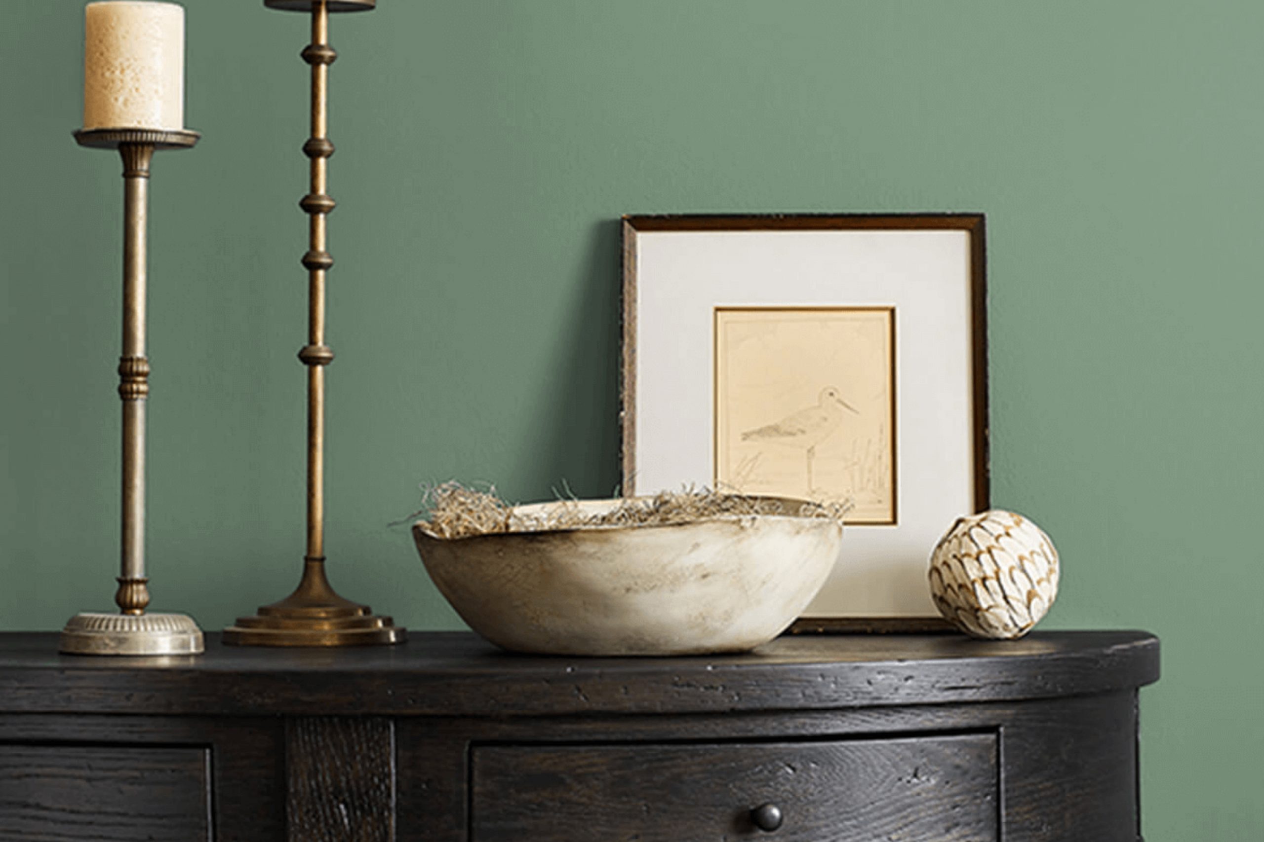
What Color Is Gallery Green SW 0015 by Sherwin Williams?
Gallery Green (SW 0015) by Sherwin Williams is a rich, deep green hue with a hint of earthiness that makes it adaptable and warm. This sturdy yet inviting color has the unique ability to provide depth and character to a space without overwhelming it, making it perfect for use in several interior design styles.
Ideal Interior Styles:
Gallery Green works exceptionally well in traditional, rustic, or colonial interiors. Its natural depth enhances the classic beauty of these styles, bringing in elements of nature and a sense of grounding. Additionally, it can be a great choice for modern or contemporary spaces that aim to incorporate bold accents without straying from a palette that promotes a sense of cohesion and comfort.
Pairing Materials and Textures:
This color pairs beautifully with natural wood, from darker mahogany to lighter oak, which can highlight the richness of the green while maintaining a balanced warmth. Leather, particularly in darker shades, also complements this green, adding a touch of luxury and durability.
For textiles, consider soft, plush fabrics like velvet or wool in neutral tones to create a cozy and inviting environment.
Brass or gold finishes on hardware or fixtures add a slight contrast, offering a hint of elegance that complements the green without competing for attention.
Overall, Gallery Green is a versatile color that can help create a striking yet inviting environment, perfect for anyone looking to add a touch of nature and depth to their interior space.
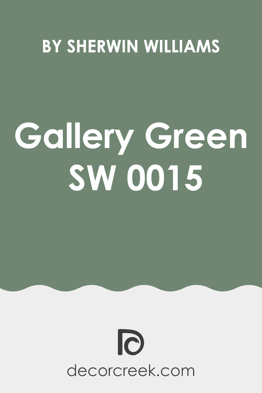
Is Gallery Green SW 0015 by Sherwin Williams Warm or Cool color?
Gallery Green, with the code SW 0015 from Sherwin Williams, is a vibrant and fresh color that can add a lively touch to any home interior. Its rich, deep green hue makes it perfect for creating a focal point in a room, whether on an accent wall or through decorative accessories.
This color works well in rooms that get a lot of natural light, as daylight enhances its lush green tones, making spaces feel lively and energetic. However, in rooms with less natural light, it can appear darker, which could create a cozy, enclosed feeling, ideal for spaces like studies or bedrooms where a more intimate atmosphere is desired.
Because Gallery Green has such a bold presence, it pairs well with neutral tones like whites, greys, or light woods, which help balance its intensity and prevent it from overwhelming the space. This makes it a versatile choice for many decorating styles, from modern to rustic.
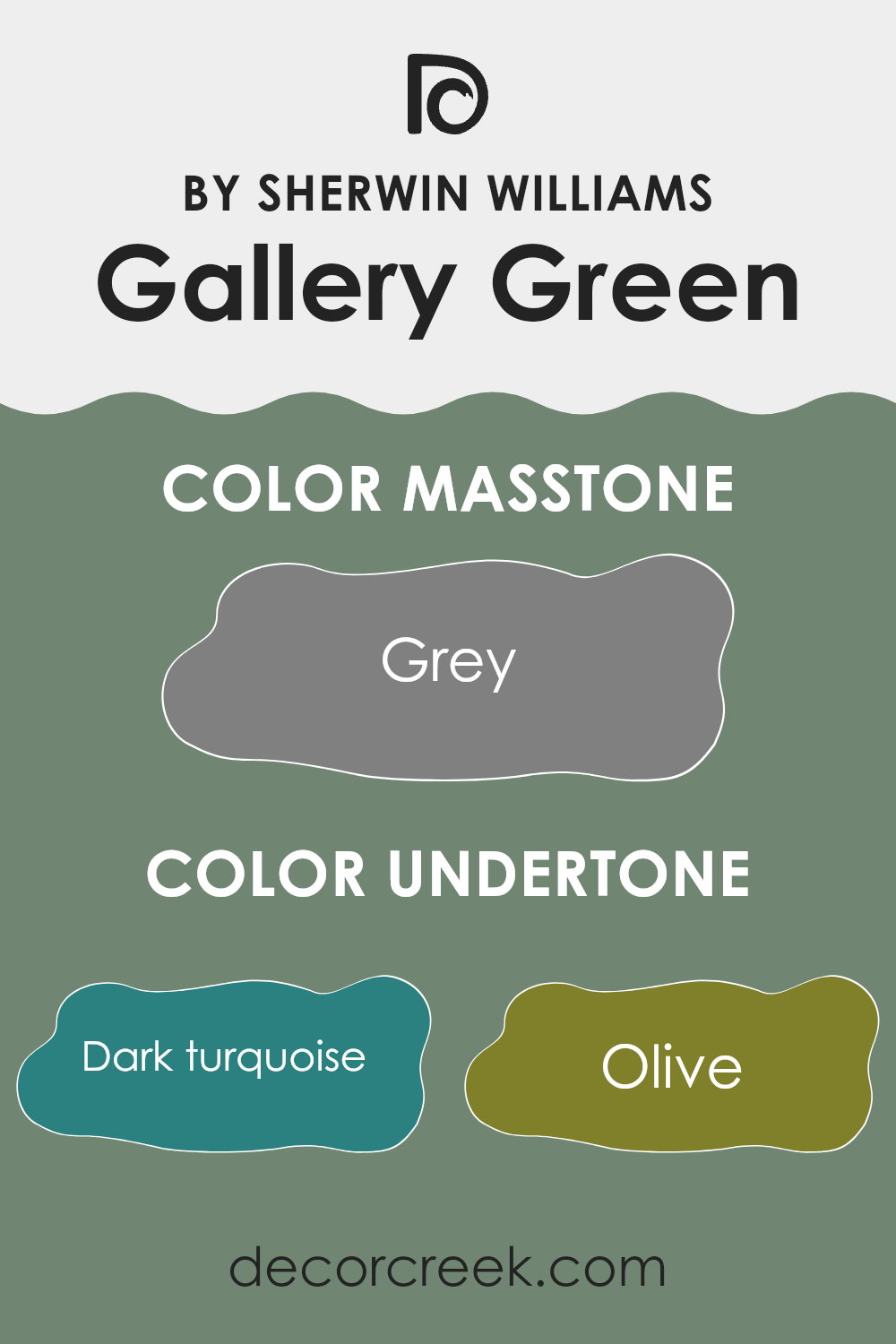
Undertones of Gallery Green SW 0015 by Sherwin Williams
Gallery Green by Sherwin Williams is a versatile shade of green with complex undertones that can subtly change its appearance based on the lighting and surrounding colors. Understanding these undertones helps in predicting how this color will behave in different settings.
Undertones are like hidden colors within the main color that influence its overall hue. For Gallery Green, undertones like dark turquoise, olive, and dark green give it a depth that makes it rich and vibrant. On the other hand, lighter undertones like mint and light turquoise add a fresh, lively feel to the color.
When you paint a room with Gallery Green, these undertones come into play, reacting with both natural and artificial light. During the day, natural light might highlight the mint and light turquoise, making the walls look more vibrant. In the evening, under artificial lighting, darker undertones like olive and dark turquoise could become more prominent, giving the room a cozy feel.
Moreover, the surrounding colors in a room can also affect the way Gallery Green looks. If the room has lots of blues and greens, it might bring out similar undertones in the paint. Conversely, if there are oranges and reds around, they might contrast with the green undertones and make the walls stand out more.
In summary, Gallery Green’s undertones make it a dynamic color that can change feel depending on the room’s lighting and color scheme. This can make it a fun choice for those who like their rooms to have a bit of personality that changes throughout the day.
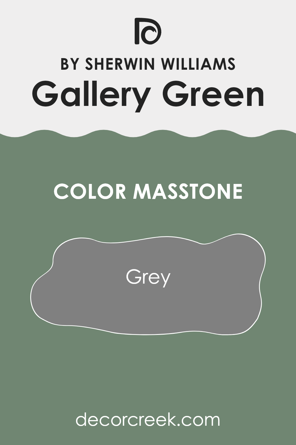
What is the Masstone of the Gallery Green SW 0015 by Sherwin Williams?
Gallery Green SW 0015 by Sherwin Williams presents a unique masstone of grey (#808080), which brings a gentle and neutral foundation to this color. When this hue is used in homes, it offers a versatile backdrop to a wide range of decor styles.
Because it’s a middle shade of grey, it can act as a subtle complement to brighter colors or serve as the primary color in a space, providing a calm, balanced atmosphere. This characteristic allows homeowners to easily switch up accents like pillows, artwork, and curtains without clashing with the walls.
Additionally, the neutrality of the grey masstone means it works well in various spaces, from modern kitchens to cozy bedrooms, maintaining a fresh and inviting feel while avoiding any overpowering or stark contrasts. This makes it a practical choice for those looking to achieve a clean and cohesive look in their home.
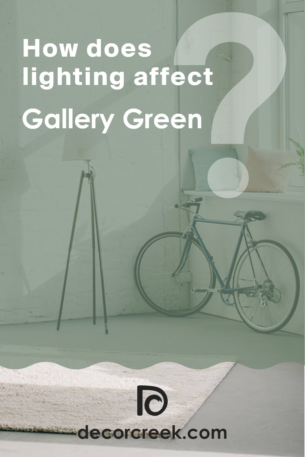
How Does Lighting Affect Gallery Green SW 0015 by Sherwin Williams?
Lighting plays a crucial role in how colors appear in different environments. For instance, a color like Gallery Green by Sherwin Williams can vary significantly depending on whether it is viewed under natural or artificial light. In natural light, this shade of green can appear vibrant and fresh, reflecting more of its true color during the day. Under artificial light, such as LED or fluorescent bulbs, the color might look slightly darker or even take on a more subdued tone, depending on the type of bulb used.
The direction of the room also affects how this color is perceived. In north-facing rooms, light tends to be cooler and can make the green appear deeper and more shadowed, highlighting darker undertones in Gallery Green. These rooms get less direct sunlight, so the color may feel somewhat muted, especially on cloudy days.
In contrast, south-facing rooms receive plenty of natural light throughout the day. Here, Gallery Green will likely look lighter and more lively. The ample sunlight brings out the brightness of the green, making the room feel welcoming and fresh.
East-facing rooms get most of their natural light in the morning when the sun rises. This early light is typically gentle and warm, giving Gallery Green a soft and pleasant appearance in the morning, which transitions to a more neutral tone as the day progresses. The color might lose some of its brightness but still retains a pleasant green hue.
West-facing rooms experience the strongest natural light in the late afternoon to evening as the sun sets. During these times, the warm tones of the setting sun can intensify the green, making it appear warmer and richer. As the sunlight fades, the color may shift back to a cooler, more balanced green.
Understanding these nuances can help in deciding where to apply this color and what kind of lighting to pair it with to achieve a desired effect in your space.
What is the LRV of Gallery Green SW 0015 by Sherwin Williams?
LRV stands for Light Reflectance Value, which is a measure used to describe how much light a paint color reflects when it’s on a surface. This value is expressed on a scale where lower numbers indicate that a color reflects less light. Specifically, this means that colors with low LRV can make a room feel cozier or smaller because they absorb more light. On the other hand, colors with high LRV make spaces appear larger and airier by reflecting more light.
Considering the LRV of Gallery Green, which is 21.66, we understand that it’s on the darker side of the scale. This value tells us that Gallery Green doesn’t reflect a lot of light, which can have a substantial effect on the atmosphere of a room.
When used on walls, this color will likely create a more intimate and denser feeling within the space. It’s ideal for rooms where you might want to foster a sense of warmth and enclosure, like in a study room or a cozy reading nook. However, if used in a small room, it might make the space feel even smaller, so ample artificial lighting or strategic placement of mirrors might be necessary to balance the effect.

Coordinating Colors of Gallery Green SW 0015 by Sherwin Williams
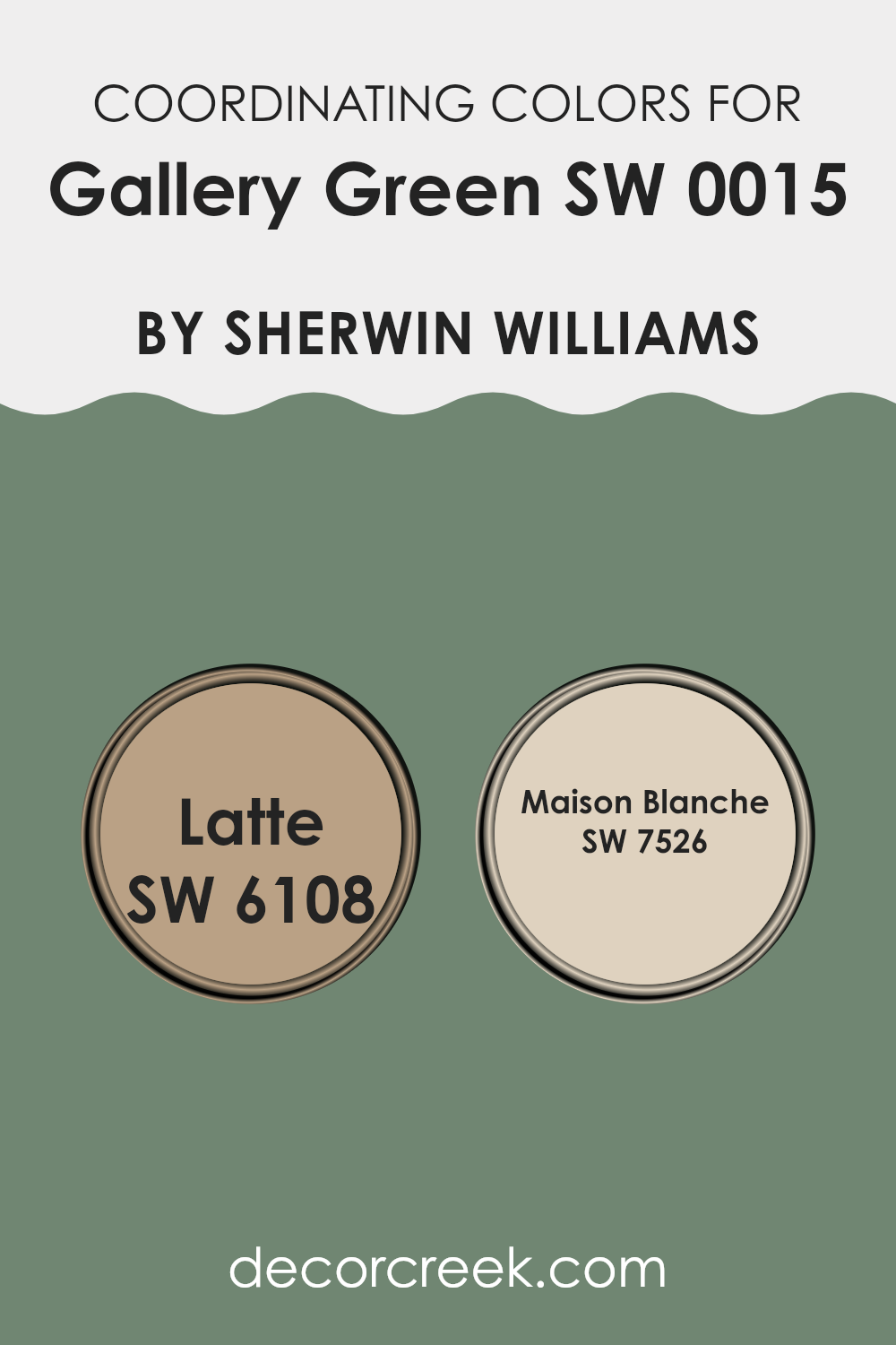
Coordinating colors are those that complement each other well when used together in decorating schemes, making spaces feel more harmonious and aesthetically pleasing. They are selected based on how they combine with a primary color to enhance the overall look and feel of a room. For example, Gallery Green, a deep muted green, can be paired with colors like Latte and Maison Blanche to create a balanced and inviting environment.
Latte, with its warm and creamy hue, resembles the color of a well-blended café latte. This color is excellent for adding warmth to spaces and pairs nicely with the cool depth of Gallery Green, offering a comfortable and earthy contrast that can make a room feel welcoming.
On the other hand, Maison Blanche, a subtle off-white with gentle undertones, acts as a perfect neutral. It provides a soft background that allows richer colors like Gallery Green to stand out, helping to brighten and visually enlarge a space without overwhelming it with color. Together, these coordinating colors work to create designs that are both beautiful and functional.
You can see recommended paint colors below:
What are the Trim colors of Gallery Green SW 0015 by Sherwin Williams?
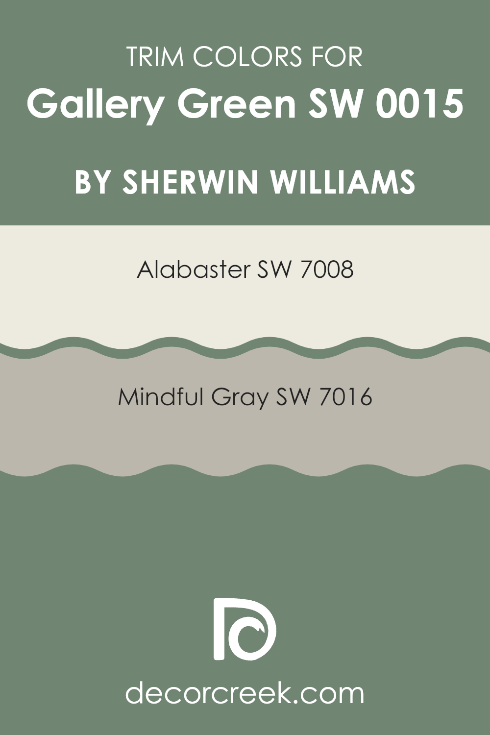
Trim colors play a crucial role in defining the architectural elements of a room, accentuating its details and enhancing the overall aesthetic appeal. When paired with Gallery Green, a vibrant and rich color, trim colors like Alabaster and Mindful Gray can create a balanced and harmonious look. Alabaster, with its clean and bright white tone, offers a striking contrast that highlights the depth of Gallery Green, making features like crown moldings, window trims, and baseboards standout beautifully.
On the other hand, Mindful Gray provides a soft, neutral backdrop that complements the boldness of Gallery Green without overpowering it. This subtle contrast adds a gentle complexity to the space, ensuring that the architecture doesn’t get lost against a strong color like Gallery Green.
Alabaster can best be described as a warm, inviting white that pulls in natural light, making spaces appear larger and more open. This color pairs well with just about any hue, adding a fresh and clean edge to any color scheme. Mindful Gray, a soft gray with warm undertones, works beautifully as a neutral base, providing a subtle, calming effect in rooms.
It’s the perfect choice for those looking to maintain a soft palette that still offers some visual interest and depth. Together, these trim colors provide flexible options that enhance the character and style of Gallery Green in different ways, whether aiming for bold contrast with Alabaster or a gentle complement with Mindful Gray.
You can see recommended paint colors below:
Colors Similar to Gallery Green SW 0015 by Sherwin Williams
Choosing similar colors can be crucial for creating a harmonious and visually appealing space. Colors that lie close to each other on the color wheel share a common hue base, making it easier to achieve a coherent look without stark contrasts.
For instance, Juniper is a deep, blue-green shade that evokes the dense foliage of its namesake tree, providing a lush, natural feel to interiors. Dried Thyme, on the other hand, offers a more subdued and earthy green, reminiscent of the aromatic herb, making it perfect for a calming environment.
Moving along the spectrum, Privilege Green adds a touch of sophistication with its muted green tone that has hints of gray, ideal for spaces that aim for an understated elegance. Surf Green is lighter and brings a breezy, fresh vibe that is reminiscent of the sea, fitting beautifully in bathrooms or airy living spaces.
Grandview is another striking option, with a darker, more pronounced green that stands out, yet harmonizes beautifully with similar hues. Inland serves as a softer, more subdued counterpart, blending seamlessly into quiet, reflective areas.Rookwood Blue Green stands out with its unique blend of green and subtle blue undertones, offering a refreshing twist that pairs well with wooden accents and natural textiles.
Jadite has a vivid, almost gem-like quality, bringing a vibrant energy that can liven up any space. Underseas pulls in the mystique of ocean depths with its rich, dark tone, perfect for creating focal points in larger rooms. Finally, Studio Blue Green bridges the gap between blue and green effortlessly, creating a versatile backdrop for both modern and traditional decors, suitable for achieving a coordinated look without compromising on color diversity.
You can see recommended paint colors below:
- SW 9679 Juniper (CHECK A SAMPLE)
- SW 6186 Dried Thyme (CHECK A SAMPLE)
- SW 6193 Privilege Green (CHECK A SAMPLE)
- SW 6473 Surf Green (CHECK A SAMPLE)
- SW 6466 Grandview (CHECK A SAMPLE)
- SW 6452 Inland (CHECK A SAMPLE)
- SW 2811 Rookwood Blue Green
- SW 6459 Jadite (CHECK A SAMPLE)
- SW 6214 Underseas (CHECK A SAMPLE)
- SW 0047 Studio Blue Green (CHECK A SAMPLE)

How to Use Gallery Green SW 0015 by Sherwin Williams In Your Home?
Gallery Green by Sherwin Williams is a rich, deep green paint that brings warmth and coziness to any space. Perfect for those looking to add a touch of nature’s calm to their interiors, this hue pairs well with natural elements like wood or stone.
If you’re thinking about using this color in your home, consider painting one accent wall in a room that gets plenty of natural light; this enhances the color without overpowering the space. Gallery Green also works beautifully on kitchen cabinets for a cozy, inviting vibe or in a bedroom to create a cozy, restful atmosphere.
Complement it with neutral tones like beige or light gray for balance and a bit of contrast, or mix it with warmer hues for a more dynamic look. Lastly, don’t forget about the bathroom – this color can turn a typically overlooked room into a stylish retreat.
Gallery Green SW 0015 by Sherwin Williams vs Grandview SW 6466 by Sherwin Williams
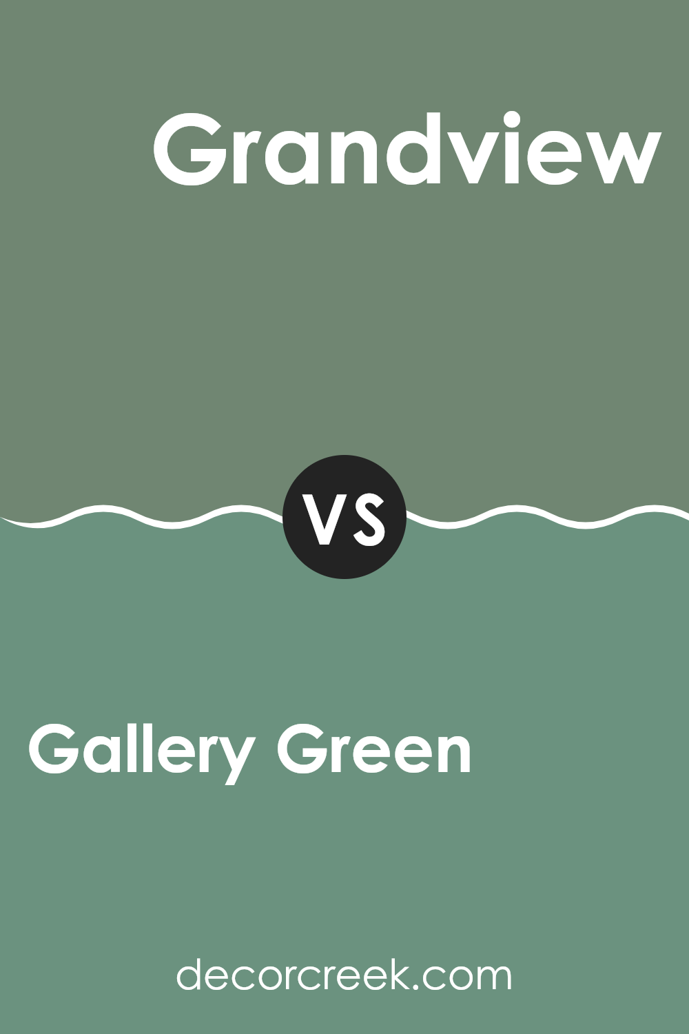
Gallery Green and Grandview, both from Sherwin Williams, offer distinct vibes for interior spaces. Gallery Green is a gentle, muted green with a soft and soothing feel. It’s perfect for creating a relaxed atmosphere in rooms like bedrooms or studies where you desire a touch of calm.
In contrast, Grandview is a bolder, deeper turquoise that carries more energy and impact. This color works well in areas where you want to add vibrancy and a focal point, such as bathrooms or kitchens.
While Gallery Green blends subtly with its surroundings, Grandview stands out, demanding attention and setting a lively tone. Both colors can beautifully complement a modern home, depending on your purpose—whether you’re aiming for gentle relaxation or a dynamic burst of color.
You can see recommended paint color below:
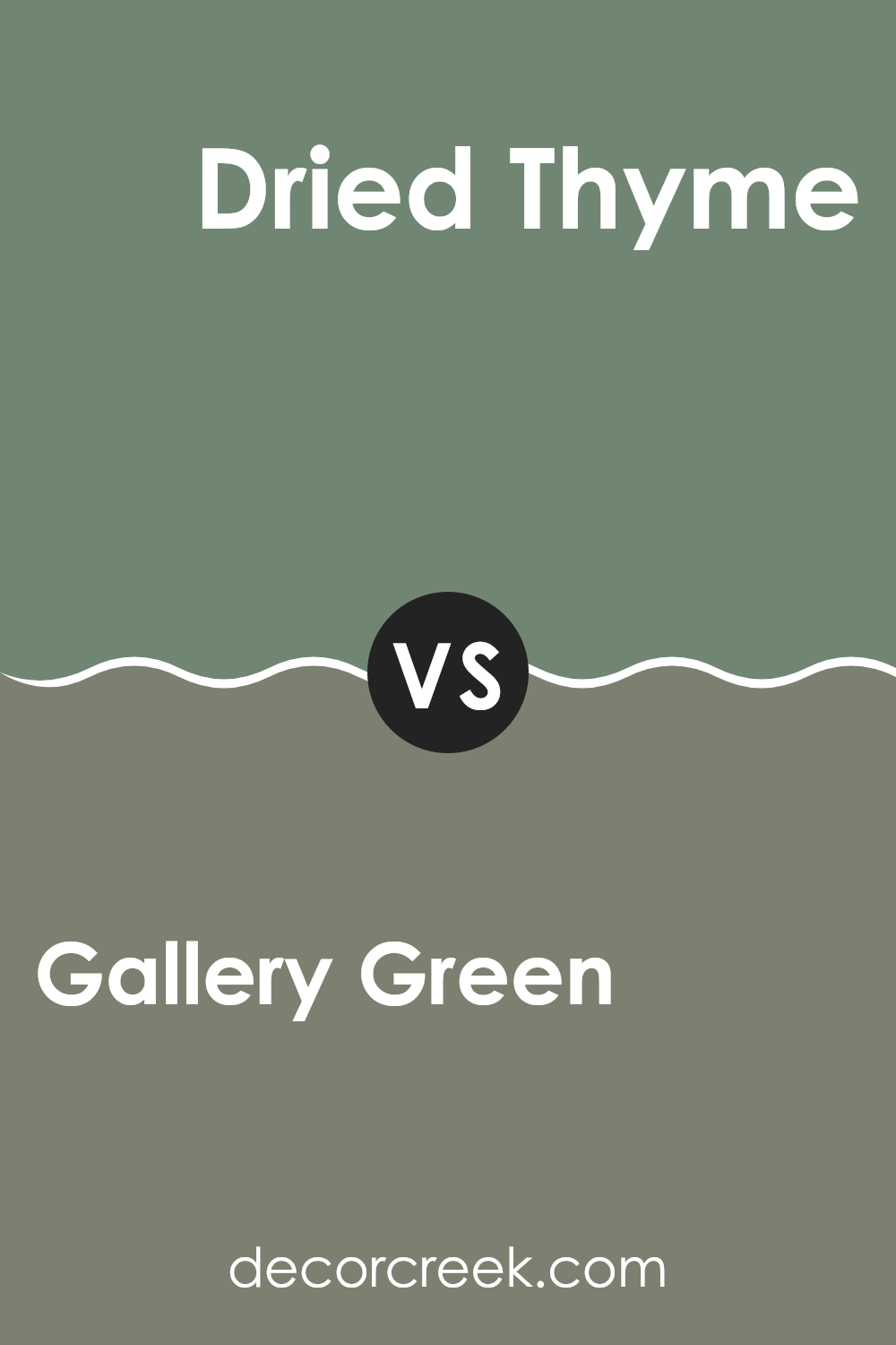
Gallery Green SW 0015 by Sherwin Williams vs Dried Thyme SW 6186 by Sherwin Williams
Gallery Green and Dried Thyme, both by Sherwin Williams, are distinctive shades of green, each offering its unique charm. Gallery Green is a light, almost neutral green with a soft, welcoming vibe. It’s perfect for creating a bright and airy feel in a room, making spaces seem larger and more open. This color works well in living rooms or bedrooms where a calm, gentle atmosphere is desired.
On the other hand, Dried Thyme is a deeper, earthier green with more gray and brown undertones. This color is ideal for those looking to add a touch of nature-inspired robustness to their spaces. It suits areas where a cozier, more enclosed feel is preferred, like studies or dining rooms. The richness of Dried Thyme can help make large rooms feel more intimate and grounded.
Both colors offer a touch of nature but differ in mood and impact, with Gallery Green being lighter and more subtle, and Dried Thyme providing a stronger, more grounding presence.
You can see recommended paint color below:
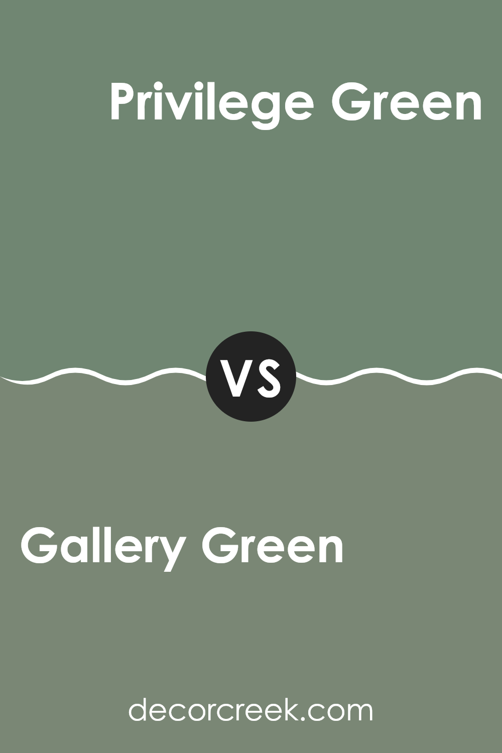
Gallery Green SW 0015 by Sherwin Williams vs Privilege Green SW 6193 by Sherwin Williams
Gallery Green and Privilege Green by Sherwin Williams are two distinct shades that can change the feel of a space. Gallery Green is a gentle, muted green with a touch of grey. This makes it very calming and easy to blend with a variety of decor styles and colors. It’s subtle enough not to overpower a room but adds enough color to make a space feel cozy and inviting.
On the other hand, Privilege Green is a deeper, more pronounced green. It stands out more and brings a lively and fresh vibe to a room. Because it’s a bolder color, it might be the better choice for making a statement in a space, such as an accent wall or in a room that needs a pop of color.
Overall, if you’re going for a soft and neutral look, Gallery Green is a great choice. If you prefer something that feels more vibrant and engaging, Privilege Green could be the way to go.
You can see recommended paint color below:
Gallery Green SW 0015 by Sherwin Williams vs Inland SW 6452 by Sherwin Williams
Gallery Green and Inland, both from Sherwin Williams, offer distinct vibes for interior spaces. Gallery Green is a deeper, more reserved green that leans towards a classic look. It’s perfect if you’re aiming for an elegant yet understated feel in a room.
On the other hand, Inland is a bolder and brighter green. This shade grabs more attention and injects a fresh, lively energy into a space. While Gallery Green works well in areas where you want a muted and calm atmosphere, like libraries or studies, Inland is suited for more dynamic areas such as kitchens or playrooms.
In terms of pairing with other colors, Gallery Green is versatile, blending nicely with both warm browns and cool grays. Inland, with its vibrancy, pairs well with crisp whites or even navy blues for a striking contrast.
You can see recommended paint color below:
- SW 6452 Inland (CHECK A SAMPLE)

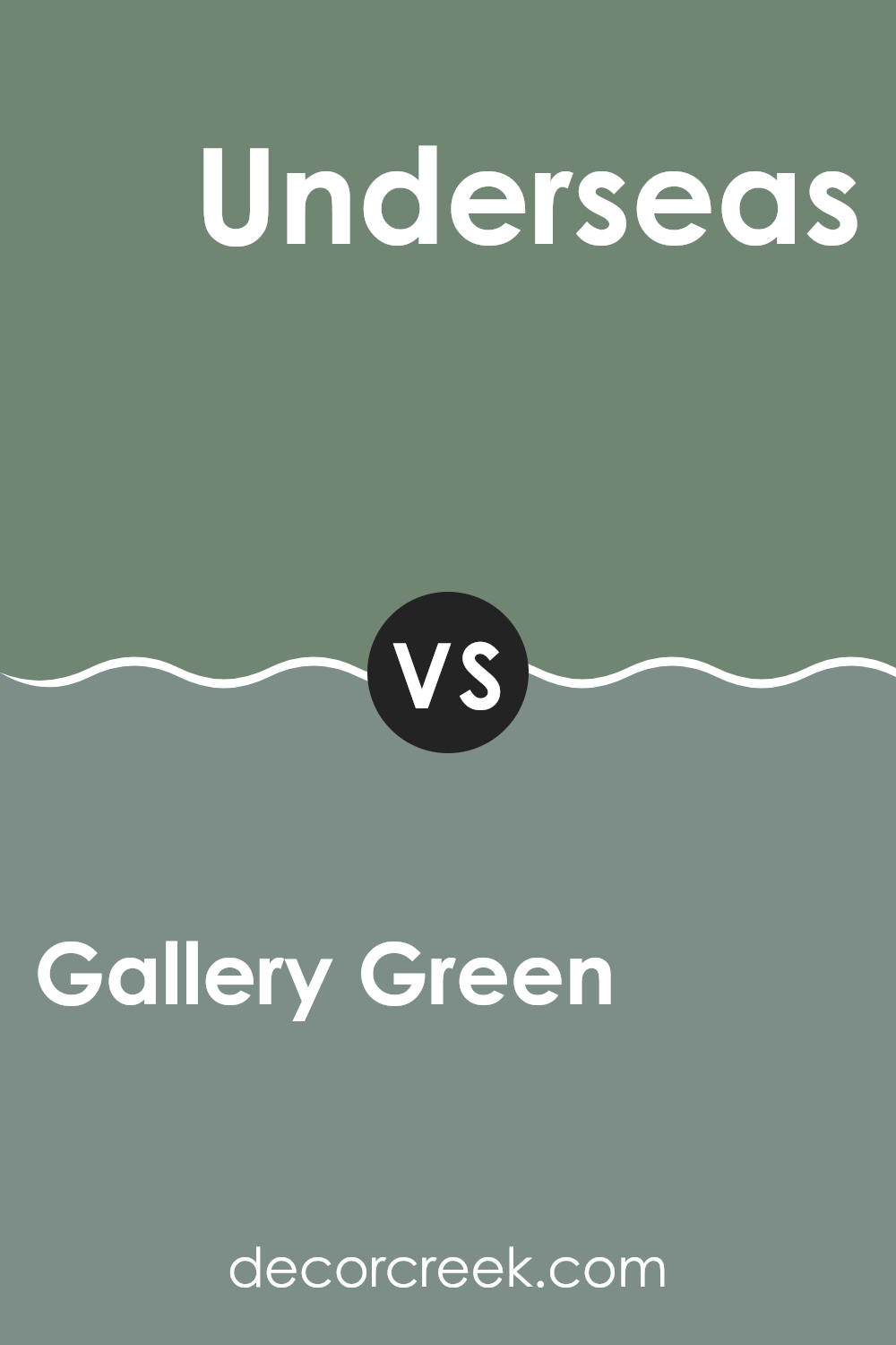
Gallery Green SW 0015 by Sherwin Williams vs Underseas SW 6214 by Sherwin Williams
Gallery Green and Underseas are two paint colors by Sherwin Williams that offer distinct vibes for any space. Gallery Green is a soft, muted green with a touch of gray. This color is versatile and understated, making it great for creating a soothing and relaxed environment. It can work well in almost any room, complementing various decor styles without overwhelming the space.
On the other hand, Underseas is a much deeper, ocean-inspired green with teal undertones. This richer, darker shade is bolder and can make a strong statement whether used for an accent wall or throughout a room. It pairs nicely with light neutrals or wood finishes, offering a nice contrast and adding a dash of drama to the interior.
Both colors are great choices, but your preference might depend on whether you want a background that’s subtle and light (Gallery Green) or something that stands out more with a touch of mystery (Underseas).
You can see recommended paint color below:
- SW 6214 Underseas (CHECK A SAMPLE)
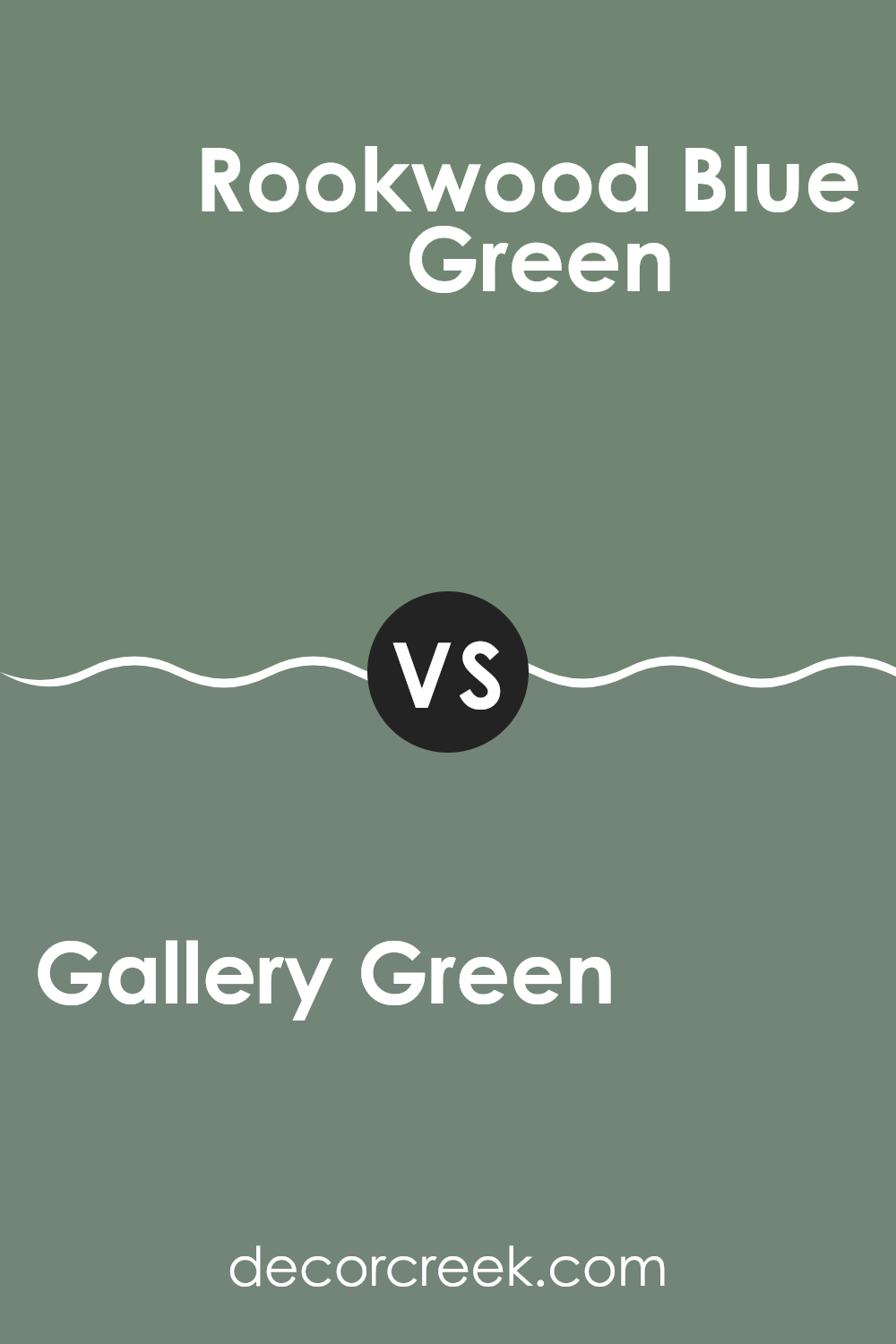
Gallery Green SW 0015 by Sherwin Williams vs Rookwood Blue Green SW 2811 by Sherwin Williams
Gallery Green and Rookwood Blue Green, both by Sherwin Williams, offer unique tones that could beautifully enhance any space. Gallery Green is a lighter green that has a subtle vibrancy, adding a fresh and airy feel to a room. This color can make small spaces appear larger and is versatile for various decor styles.
On the other hand, Rookwood Blue Green has a deeper, more muted tone that is closer to teal, blending green and blue with a sophisticated gray undertone. This color provides a more grounded, calming feel, ideal for creating a cozy and inviting atmosphere in areas like living rooms or bedrooms.
When deciding between the two, consider the mood you want to set and the natural lighting in your room. Gallery Green works well in well-lit areas or where a touch of brightness is needed, while Rookwood Blue Green is perfect for spaces where a more subtle, soothing impact is desired. Both colors are stylish choices that can refresh any space.
You can see recommended paint color below:
- SW 2811 Rookwood Blue Green
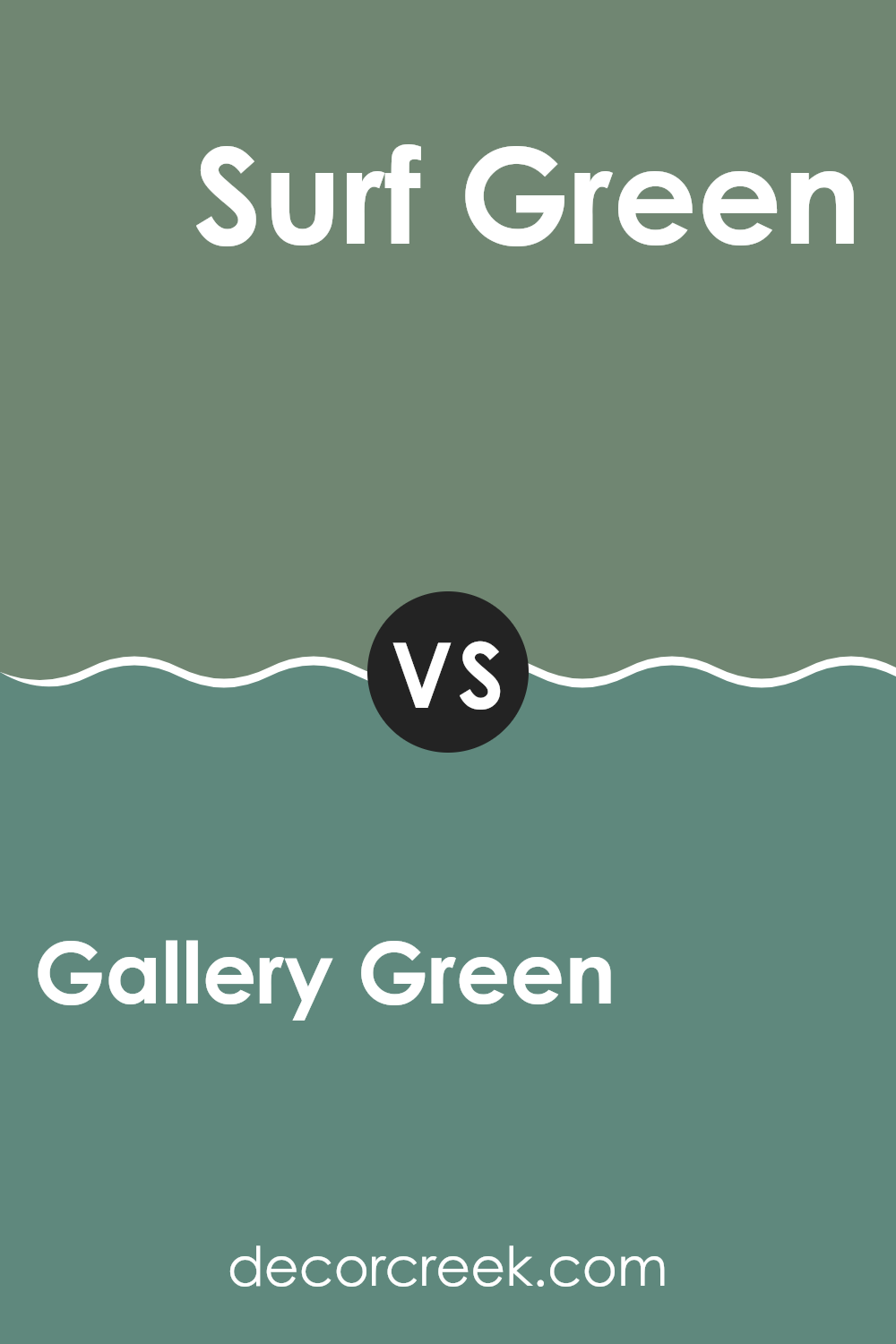
Gallery Green SW 0015 by Sherwin Williams vs Surf Green SW 6473 by Sherwin Williams
Gallery Green and Surf Green by Sherwin Williams are two distinct shades. Gallery Green is a darker, more muted green that offers a classic look. It’s a versatile color that works well in spaces where a grounded and subtle feel is desired, such as living rooms or studies.
On the other hand, Surf Green is lighter and has a more vibrant, energetic vibe. With its brighter tone, it can make small spaces appear larger and brighter. This color is great for bathrooms or kitchens where a fresh and uplifting atmosphere is desired.
While both are green, Gallery Green lends a more traditional aesthetic, and Surf Green provides a lively and refreshing look. Their uses depend largely on the mood and function of the space you are decorating. These colors could also complement each other well in a single area for those looking to combine light and dark tones.
You can see recommended paint color below:
- SW 6473 Surf Green (CHECK A SAMPLE)
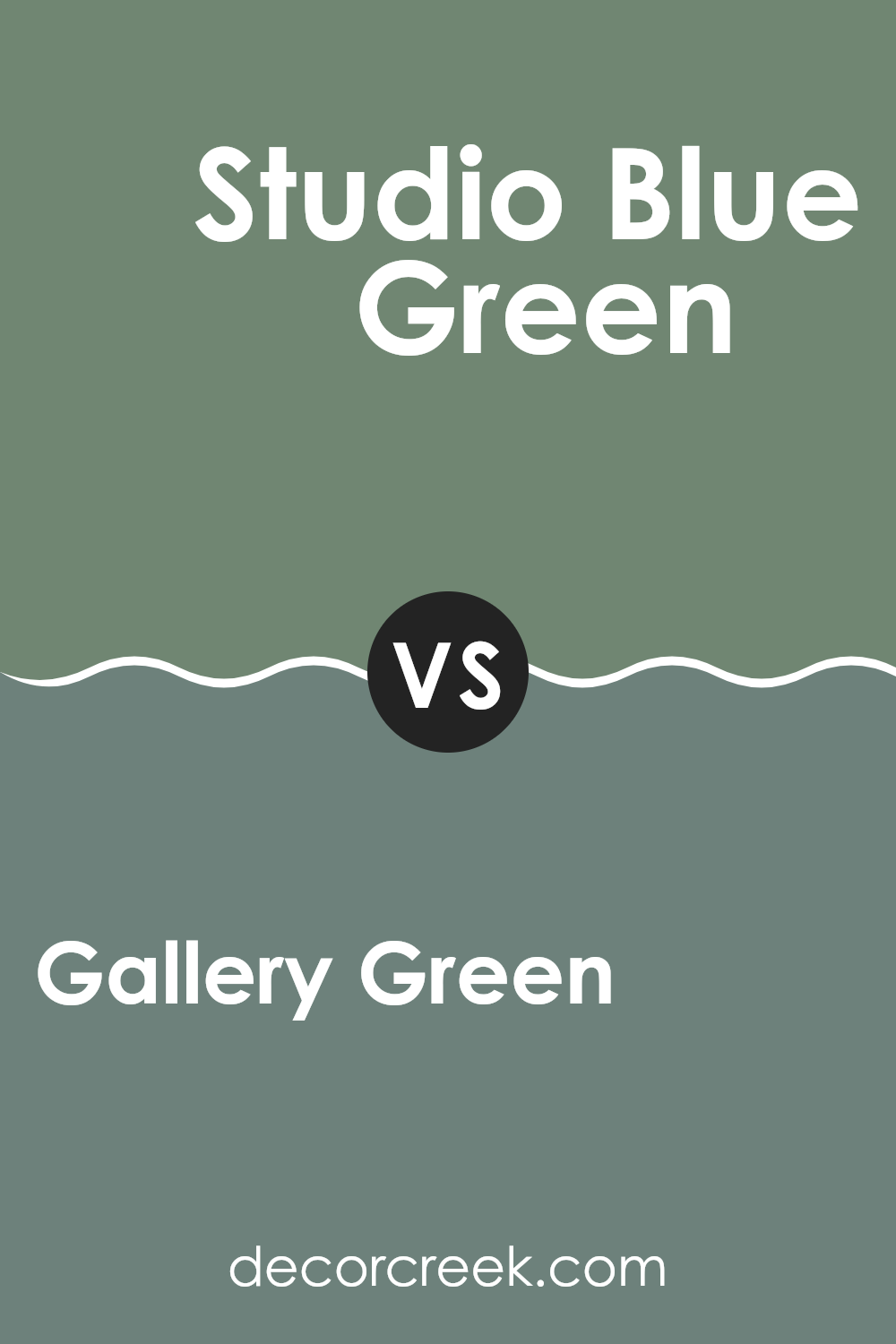
Gallery Green SW 0015 by Sherwin Williams vs Studio Blue Green SW 0047 by Sherwin Williams
Gallery Green and Studio Blue Green, both by Sherwin Williams, offer unique tones for varied interior moods. Gallery Green is a rich, deep green that provides a sense of calm and grounding to a room. It pairs well with natural materials like wood and stone, enhancing a cozy, traditional vibe.
On the other hand, Studio Blue Green has a slightly cooler tone, blending green and blue to offer a refreshing and revitalizing feel. This color is perfect for spaces that aim for a brighter, airier atmosphere, like bathrooms or kitchens.
While both colors share a base in green, Gallery Green leans towards a darker, more forest-like shade, making spaces feel more enclosed and warm. Studio Blue Green, with its infusion of blue, reflects more light and can make a room appear more spacious and open.
Choosing between the two would depend on the desired effect: a richer, more enveloping environment or a lighter, refreshing space.
You can see recommended paint color below:
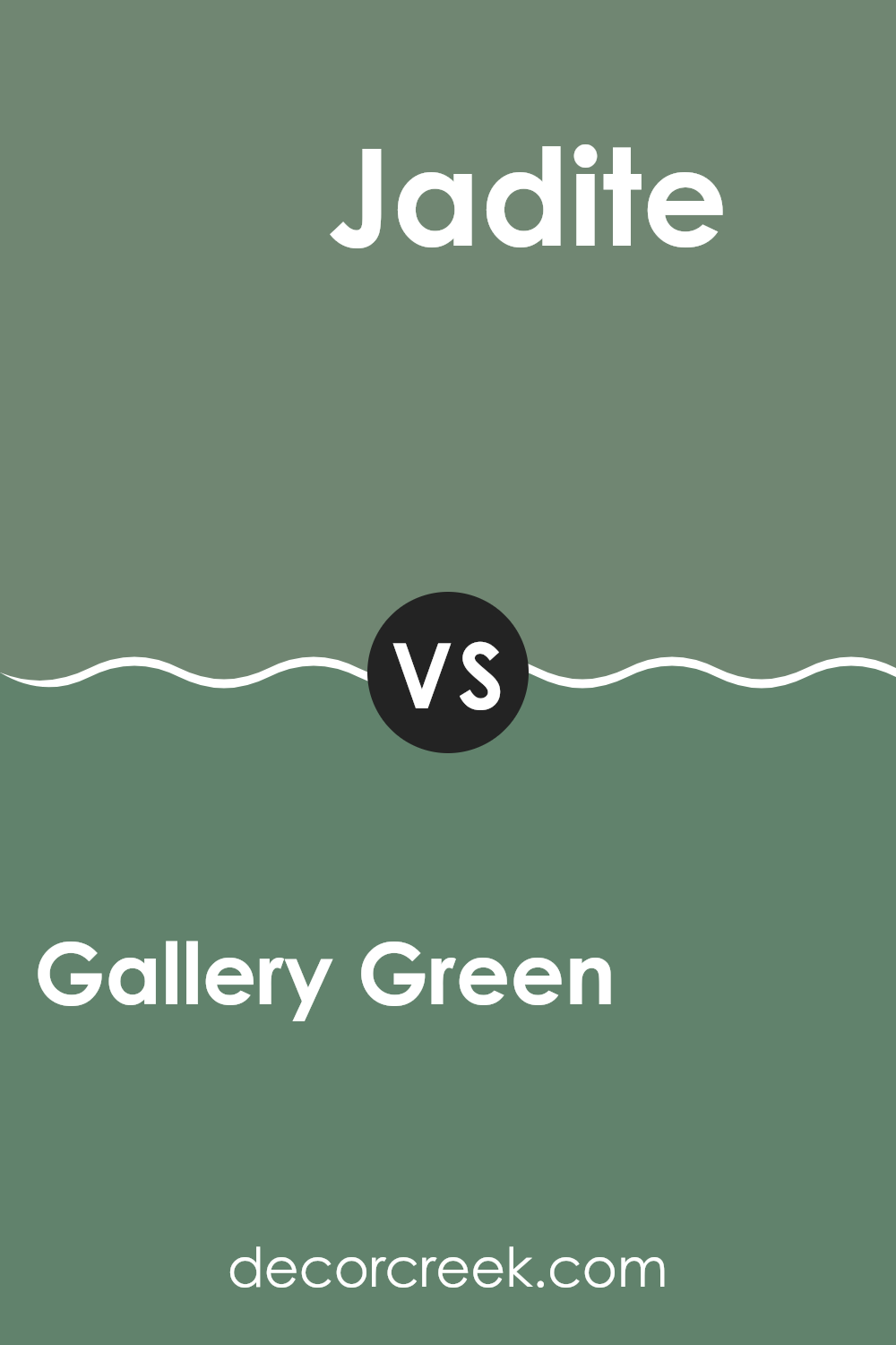
Gallery Green SW 0015 by Sherwin Williams vs Jadite SW 6459 by Sherwin Williams
Gallery Green and Jadite, both by Sherwin Williams, are unique green shades that each bring their own flair. Gallery Green is a muted, soft green that carries a sense of calmness and subtle elegance.
It’s a versatile color, perfect for creating a soothing atmosphere in a variety of spaces like living rooms or bedrooms. On the other hand, Jadite is a livelier, more vibrant green. This color has a freshness that can brighten up any space, making it ideal for areas like kitchens or bathrooms where you might want a more energizing feel.
While Gallery Green leans towards a natural, understated look, Jadite stands out with its brighter and more youthful vibe. Both colors offer a refreshing touch, but the choice between them depends on what kind of mood or style you want to achieve in your space.
You can see recommended paint color below:
- SW 6459 Jadite (CHECK A SAMPLE)
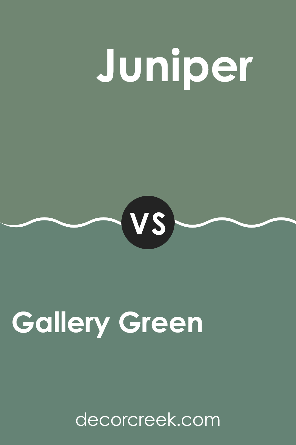
Gallery Green SW 0015 by Sherwin Williams vs Juniper SW 9679 by Sherwin Williams
Gallery Green and Juniper are both shades offered by Sherwin Williams, each bringing their unique flavor to interiors. Gallery Green is a classic, muted green with a soft, almost neutral quality, making it a great choice for those looking to add a touch of nature-inspired calmness to their spaces without overwhelming the senses. It pairs well with a variety of decor styles, from traditional to modern.
On the other hand, Juniper is a deeper, vibrant green. This shade has a more pronounced presence and can act as an eye-catching accent or a bold statement wall. Juniper provides a rich backdrop that can enhance the colors of furnishings and artworks.
While Gallery Green leans towards subtlety and versatility, blending effortlessly into a room, Juniper stands out more, demanding attention and setting a strong mood. Depending on your desired ambiance and how bold you want to go with your color scheme, each of these greens offers a distinct flavor and aesthetic impact.
You can see recommended paint color below:
- SW 9679 Juniper (CHECK A SAMPLE)
Conclusion
After writing about SW 0015 Gallery Green by Sherwin Williams, I’ve learned a lot about this particular paint color. Gallery Green is really unique—it’s not just any regular green. It has this rich depth that can make any room feel warm and welcoming. This color reminds me of a peaceful forest or the freshness of spring.
I think what makes Gallery Green special is how well it can work in different parts of the house. Whether you’re painting a living room, a kitchen, or even a little reading nook, this color brings a bit of nature inside. It’s especially good for areas where you want to relax and feel comfortable.
The best thing about Gallery Green is how it looks with other colors. It can go well with light colors like white or beige, but it also looks great with darker shades like gray or even black. This makes it easy to use no matter what your style is or what furniture you have.
Overall, SW 0015 Gallery Green by Sherwin Williams is a fantastic choice if you’re thinking of adding a new splash of color to your home. It’s pretty, easy to match with different decorations, and can make any room nicer to spend time in. Whether you want to feel cozy, refreshed, or just happy at home, Gallery Green could be the right pick for you.

Ever wished paint sampling was as easy as sticking a sticker? Guess what? Now it is! Discover Samplize's unique Peel & Stick samples.
Get paint samples


