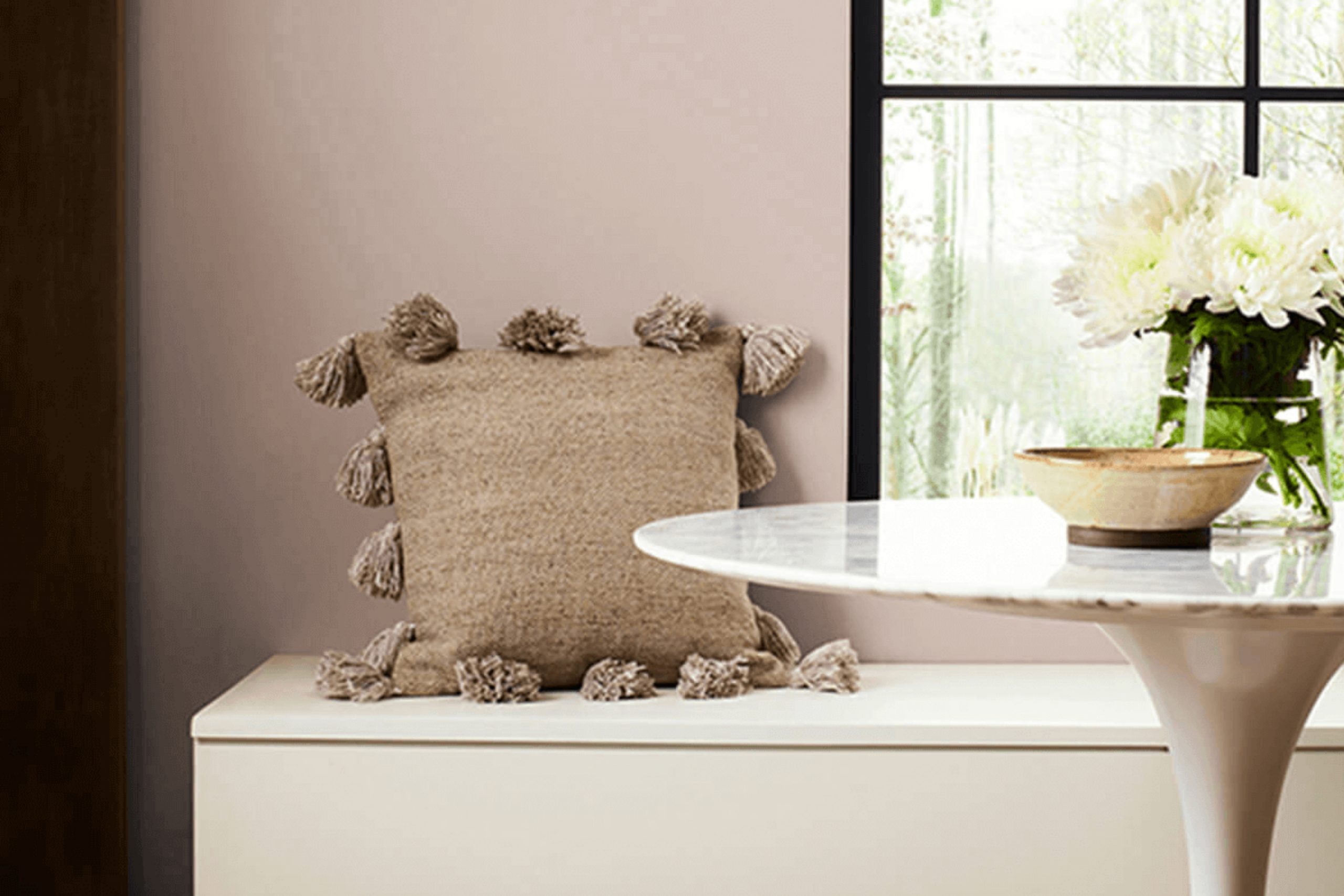
SW 6044 Doeskin by Sherwin Williams feels like a warm hug for your home. It’s the kind of soft, inviting color that makes you want to settle in and get comfortable. When you use Doeskin on your walls, you immediately notice how it creates a calm and cozy atmosphere. It’s a special shade that blends beige and subtle hints of warm brown, making it flexible enough to work in almost any room.
The beauty of Doeskin is in its simplicity and how it can beautifully complement other colors or stand alone as the main feature of your room. Whether you’re considering a refresh in your living room, bedroom, or office, this color adapts effortlessly, bringing a sense of understated elegance.
I find that Doeskin pairs well with both traditional and modern decor. It acts as a perfect backdrop for bolder accents like deep blues or vibrant greens, yet it’s lovely when combined with softer tones for a calm look. If you lean toward earthy, natural palettes, Doeskin will fit right in. It’s the kind of color that feels classic, neither too bold nor too muted, striking just the right balance.
When choosing a color that feels welcoming, warm, and wonderfully flexible, SW 6044 Doeskin might be just what you’re looking for.
What Color Is Doeskin SW 6044 by Sherwin Williams?
Doeskin SW 6044 by Sherwin Williams is a warm, earthy beige color. It falls between beige and taupe, offering a soft and inviting tone that can make areas feel cozy and comfortable. This color has a subtle depth that helps it complement various styles, making it flexible for different interior designs.
Doeskin works particularly well in traditional, rustic, or farmhouse settings, where its warmth can enhance the natural feel of the room. It can also fit into modern and contemporary designs as a grounding neutral that won’t overpower other elements. Its muted character makes it a great backdrop for highlighting artwork or colorful decor pieces.
Pair Doeskin with materials like natural wood, leather, or rattan to bring out its warmth. It also works nicely with textiles such as wool or linen, adding to the room’s comfort and texture. Combining it with white or cream trims can create a clean and classic look, while darker accents can offer a more dramatic contrast. Overall, Doeskin is a flexible color that can bring warmth and comfort to any room.
It pairs well with natural materials and textures, allowing you to create a harmonious and inviting environment.

Is Doeskin SW 6044 by Sherwin Williams Warm or Cool color?
Doeskin SW 6044 by Sherwin Williams is a warm, neutral paint color that brings a cozy and inviting atmosphere to homes. Its soft beige undertones make it flexible and easy to incorporate into various interiors. This color lends warmth to a room without overpowering the room, making it an excellent choice for living rooms, bedrooms, or hallways.
It complements both traditional and modern decor styles, allowing furniture and artwork to stand out. Doeskin is particularly effective in creating a gentle backdrop that doesn’t compete with other colors, making it easy to switch out accessories and textiles in contrasting or complementary shades.
The color works well with both natural and artificial lighting, maintaining its inviting quality throughout the day. Homeowners appreciate Doeskin for its ability to make areas feel cozy and welcoming, providing a comfortable environment for relaxation and social gatherings. Its neutral nature also makes it a reliable choice for those looking to sell or rent out their homes.
Undertones of Doeskin SW 6044 by Sherwin Williams
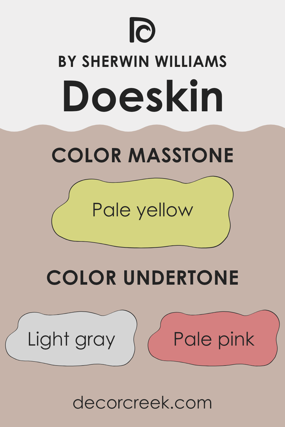
Doeskin (SW 6044) by Sherwin Williams is a warm and inviting neutral paint color. Its undertones play a crucial role in how we perceive it. Undertones are the subtle colors that are underneath the main color, influencing how it appears in different lighting conditions. For Doeskin, these undertones include a mix of light gray, pale pink, light purple, mint, light blue, grey, lilac, yellow, orange, light green, and olive.
These undertones can affect the way the color looks on interior walls. In a room with lots of natural light, the lighter undertones, like mint or light blue, might become more apparent, giving the room a soft and airy feel. In contrast, in a room with less natural light, the warmer undertones, such as pale pink or yellow, may stand out more, creating a cozy and intimate atmosphere.
Overall, Doeskin’s blend of undertones makes it a flexible choice for interior walls. It can add warmth and depth to a room without overpowering it. This makes it suitable for various rooms, from living rooms and bedrooms to kitchens and hallways, adapting smoothly to different decors and moods. The subtle play of undertones ensures it complements a wide range of furnishings and accents.
What is the Masstone of the Doeskin SW 6044 by Sherwin Williams?
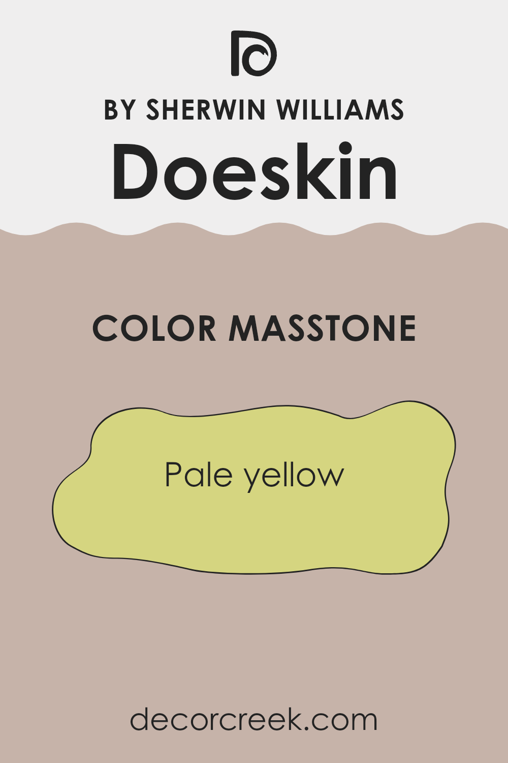
Doeskin SW 6044 by Sherwin Williams features a subtle masstone of pale yellow (#D5D580). This gentle hue brings a warm, inviting quality to areas, making rooms feel cozy and welcoming. In homes, this soft color works well as a neutral backdrop, providing just a hint of warmth that can complement various décor styles.
It can be particularly effective in living rooms, bedrooms, or any room where a comforting atmosphere is desired. The pale yellow undertone helps brighten rooms, reflecting natural light and making them feel more open and spacious.
This feature is useful in smaller or less well-lit areas, adding a sense of airiness without overpowering the senses. The subtle warmth of the masstone pairs beautifully with natural wood finishes and earthy textiles, creating a harmonious and balanced look. It matches well with both muted and vibrant colors, offering flexibility in coordinating with other design elements.
How Does Lighting Affect Doeskin SW 6044 by Sherwin Williams?
Lighting plays a crucial role in how we perceive colors. Different types of light can change the appearance of paint colors, affecting their intensity and hue. This is particularly true for Doeskin SW 6044 by Sherwin Williams, a warm, neutral color that can appear different under varying lighting conditions.
In natural light, colors are revealed in their most authentic form. However, the direction of the light can influence how Doeskin looks. In north-facing rooms, the light tends to be cool and less direct. This can make Doeskin appear slightly grayer or cooler than it does in other rooms. It might lose some of its warmth, appearing more subdued.
In contrast, south-facing rooms get warm, direct light for most of the day. In these rooms, Doeskin can look much brighter and more vibrant, highlighting its warm undertones. This natural sunlight can enhance the richness of the color, making it feel inviting and cozy.
East-facing rooms receive warm light in the morning and cooler light in the afternoon. In the morning, Doeskin will reflect the warm sunlight, making it look soft and comforting. As the day progresses and the light cools, the color may deepen slightly.
West-facing rooms get softer, cooler light throughout the morning, turning warmer in the late afternoon and evening as the sun sets. Here, Doeskin will start the day looking more muted but will warm up with the afternoon sun, bringing out its warmth.
In artificial lighting, the type of bulb used will also affect how Doeskin looks. Incandescent bulbs emit a warm glow, enhancing the warm tones of the color. Fluorescent lights, which often give off a cooler light, may make Doeskin appear more muted or washed out. LED lights come in a variety of temperatures, so the effect on Doeskin will depend on whether the bulbs emit warm or cool light.

What is the LRV of Doeskin SW 6044 by Sherwin Williams?
LRV stands for Light Reflectance Value, which is a measure of how much light a color reflects. It’s a scale that ranges from 0 to 100, where 0 means the color absorbs all light (pure black) and 100 means the color reflects all light (pure white). In practical terms, this means that colors with higher LRV values will reflect more light and make a room feel brighter and more open.
Conversely, colors with lower LRV values will absorb more light, making areas feel cozier and more intimate. This is an important factor to consider when choosing paint for your walls, as the way a room is lit and how colors look can change dramatically based on the LRV of the paint used.
For the specific color Doeskin SW 6044, which has an LRV of 47.105, it falls in the middle of the scale. Being neither too light nor too dark, Doeskin will moderately reflect light, offering a balance between brightness and depth. This means it can work well in various lighting conditions, providing a warm and welcoming feel without being overpowering.
In a dimly lit room, it won’t feel too dark, and in a brightly lit room, it won’t become overly bright. This makes Doeskin a flexible choice for areas where you want a cozy yet open feel. It won’t make the room too stark or too heavy, striking a nice balance for most interiors.

Coordinating Colors of Doeskin SW 6044 by Sherwin Williams
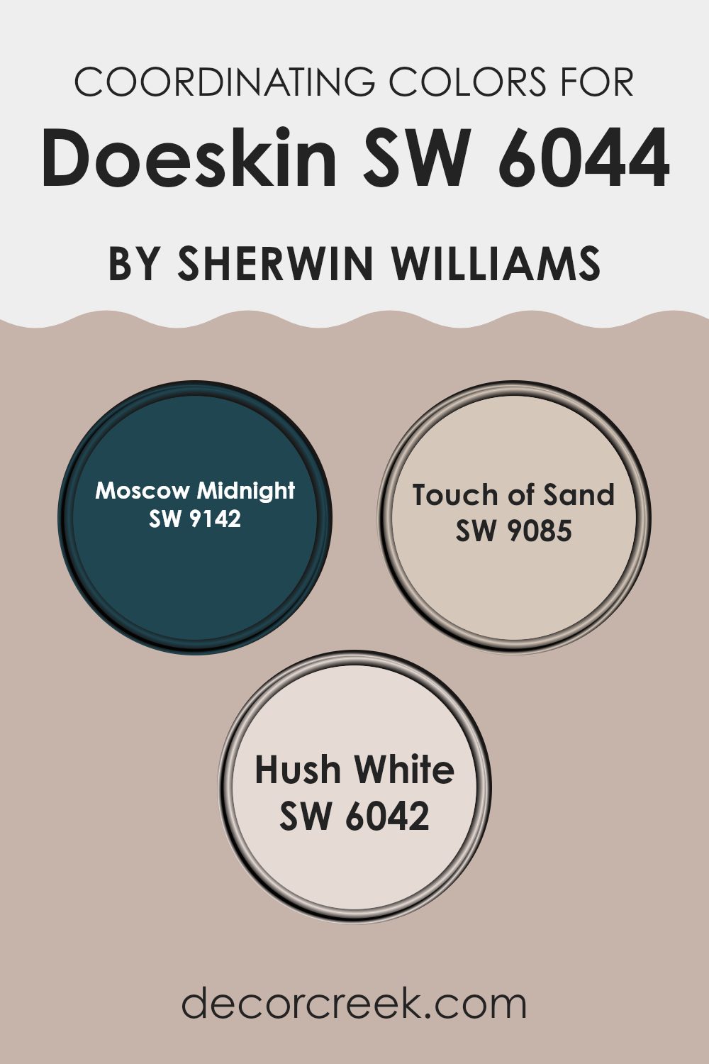
Coordinating colors are hues that are chosen to complement or enhance each other when used together in home decor or design. These colors create a balanced and pleasing look, allowing each one to stand out without overpowering the room. When selecting coordinating colors, it’s important to consider the mood and feel you want to achieve in a room. Using Doeskin by Sherwin-Williams as a starting point, we can pair it with Moscow Midnight, Touch of Sand, and Hush White for a harmonious look.
Moscow Midnight is a rich, deep blue that brings a sense of drama and depth to a room. It works well with Doeskin’s warm tones, adding a bold contrast without overpowering the softer shades. Touch of Sand is a muted, sandy beige that offers a gentle, cozy feel.
It complements Doeskin by providing a light, airy touch that balances the color palette. Hush White is a soft and subtle off-white that serves as a flexible background color. It pairs beautifully with the warm undertones of Doeskin, creating a clean and bright look. Together, these colors create a cohesive and inviting atmosphere, perfect for any room seeking a balance of warmth and depth.
You can see recommended paint colors below:
- SW 9142 Moscow Midnight
- SW 9085 Touch of Sand
- SW 6042 Hush White
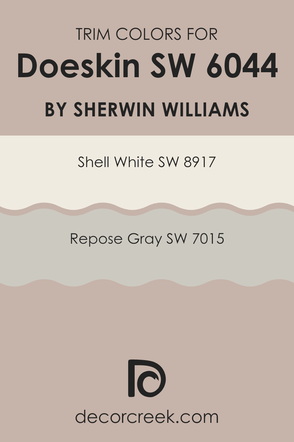
What are the Trim colors of Doeskin SW 6044 by Sherwin Williams?
Trim colors are the shades used on the edges and borders of walls, doors, and windows. They play a key role in defining the look and feel of a room, providing contrast and enhancing the primary wall color. When painting with Doeskin by Sherwin Williams, selecting the right trim color can greatly influence the overall appearance of the room.
Having good trim colors not only highlights architectural elements but also adds depth and interest to the room. They can make features pop and bring more attention to the walls and overall design, ensuring that everything looks balanced and harmonious.
Shell White, a very light and warm off-white, complements Doeskin beautifully by keeping things bright and airy. Its subtle warmth can make a room feel inviting while still maintaining a clean and fresh look. On the other hand, Repose Gray offers a gentle, soft gray hue that pairs well with Doeskin’s warm tones.
This shade adds a touch of modern elegance, providing a nice neutral contrast without being too stark. Both colors serve to enhance and highlight the main color, ensuring the room feels well-put-together. The right trim color choice can thus greatly enrich the experience of a room painted with Doeskin.
You can see recommended paint colors below:
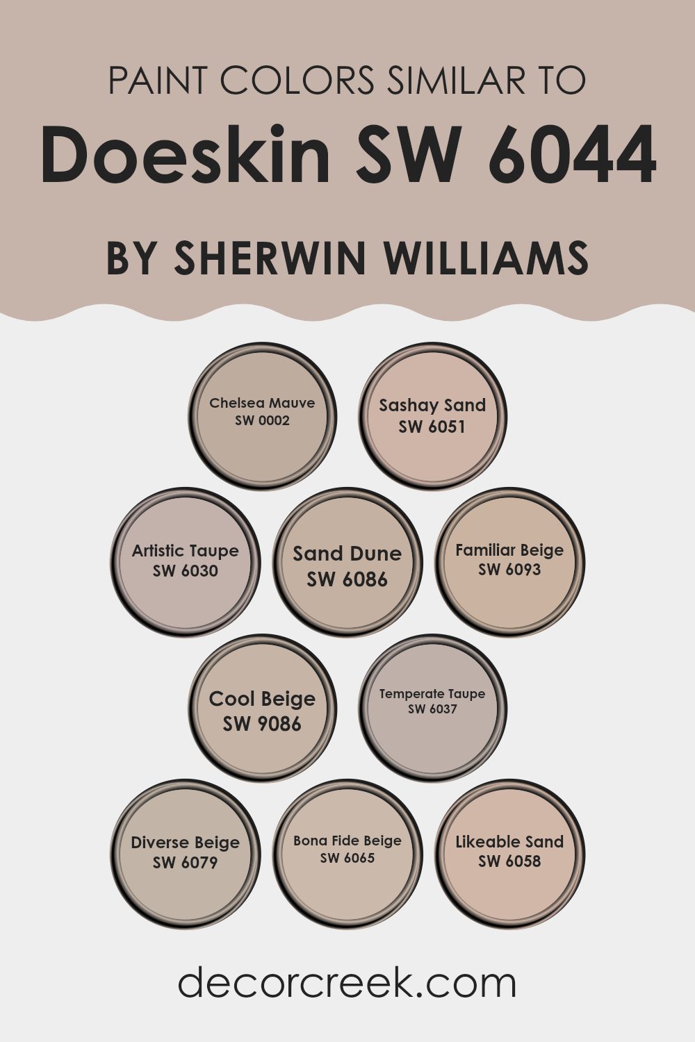
Colors Similar to Doeskin SW 6044 by Sherwin Williams
Using colors similar to Doeskin by Sherwin Williams can create a harmonious and cohesive look in any room. These colors work well together because they share undertones and complementary shades, offering a seamless transition between them. Chelsea Mauve is a soft, muted pink that adds a touch of warmth without overpowering a room.
Sashay Sand combines beige and pink tones, offering a subtle, gentle hue that’s perfect for creating a cozy atmosphere. Artistic Taupe is an understated neutral with a hint of gray, adding depth and elegance to any setting. Sand Dune is a warm, earthy beige that’s flexible and comforting.
Familiar Beige adds a classic and enduring backdrop suitable for any décor style. Cool Beige brings in a hint of gray, giving it a cooler tone that refreshes a room. Temperate Taupe plays well with both warm and cool colors, making it very adaptable for different rooms.
Diverse Beige grounds a room with its warm, inviting presence, ideal for living areas. Bona Fide Beige offers a well-balanced mix of beige tones that suit various room types. Likeable Sand invites warmth and subtlety, creating a gentle, inviting atmosphere. Together, these colors promote a consistent look while allowing for individual expressions of style.
You can see recommended paint colors below:
- SW 0002 Chelsea Mauve
- SW 6051 Sashay Sand
- SW 6030 Artistic Taupe
- SW 6086 Sand Dune
- SW 6093 Familiar Beige
- SW 9086 Cool Beige
- SW 6037 Temperate Taupe
- SW 6079 Diverse Beige
- SW 6065 Bona Fide Beige
- SW 6058 Likeable Sand
Colors that Go With Doeskin SW 6044 by Sherwin Williams
Doeskin SW 6044 by Sherwin-Williams is a warm and inviting hue that works exceptionally well with a carefully chosen color palette. Each complementary color enhances its natural charm, making interior rooms feel more cohesive and balanced. SW 6043 – Unfussy Beige is a soft, subtle shade that pairs beautifully with Doeskin’s cozy tone, creating an atmosphere that is effortlessly welcoming. SW 6046 – Swing Brown, a deep and rich tone, adds depth and a touch of elegance, anchoring the room with its solid presence.
SW 9079 – Velvety Chestnut brings a bold warmth that complements Doeskin’s subtlety, adding a layer of richness and a hint of drama to the mix. SW 6048 – Terra Brun is an earthy brown that enhances the natural feel, linking back to nature and providing a grounded, comforting feel.
SW 6047 – Hot Cocoa introduces a creamy depth that blends seamlessly and provides warmth, enhancing the overall feel of the color scheme. Lastly, SW 6045 – Emerging Taupe offers a balanced, neutral contrast, ensuring the room feels fresh and inviting. These colors work together to create a cozy, harmonious environment, ideal for making any area feel more inviting and comfortable.
You can see recommended paint colors below:
- SW 6043 Unfussy Beige
- SW 6046 Swing Brown
- SW 9079 Velvety Chestnut
- SW 6048 Terra Brun
- SW 6047 Hot Cocoa
- SW 6045 Emerging Taupe

How to Use Doeskin SW 6044 by Sherwin Williams In Your Home?
Doeskin SW 6044 by Sherwin Williams is a warm, neutral paint color that brings a cozy and inviting feel to any room. Its soft beige tone makes it flexible for various rooms within a home. This color can be a great choice for living rooms, providing a comfortable and relaxing atmosphere that works well with both modern and traditional décor.
In a bedroom, Doeskin creates a soothing backdrop, making it easy to match with colorful bedding or accessories for a personal touch. The color works well in kitchens too, blending nicely with wooden cabinets or contrasting beautifully with white cabinetry. It also complements natural materials, which can be highlighted in a dining room or study.
For those looking to refresh their home office, Doeskin offers a calm environment that enhances productivity without being distracting. Paired with soft lighting and matching furniture, it provides a balanced and cohesive look throughout the home.
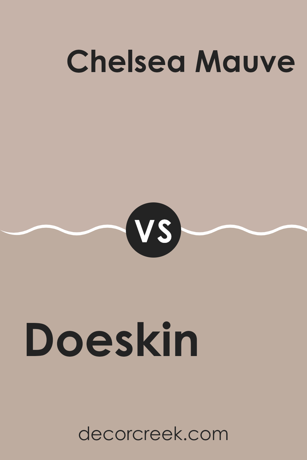
Doeskin SW 6044 by Sherwin Williams vs Chelsea Mauve SW 0002 by Sherwin Williams
Doeskin SW 6044 by Sherwin Williams is a warm, neutral beige. It’s a soft, inviting color that makes areas feel cozy and comfortable. Its understated nature allows it to work well in a variety of settings without overpowering the room’s design.
In contrast, Chelsea Mauve SW 0002 by Sherwin Williams has more character. It has a subtle purple-pink tint that adds a hint of color while still being quite gentle. This color can add a touch of elegance and create a soft, romantic atmosphere in a room.
When comparing these two colors, Doeskin is more neutral and blends in seamlessly, while Chelsea Mauve stands out a bit more due to its hue. Both colors are soft and soothing, but Chelsea Mauve brings a little more visual interest and personality, making it suitable for areas where you want a touch of warm color.
You can see recommended paint color below:
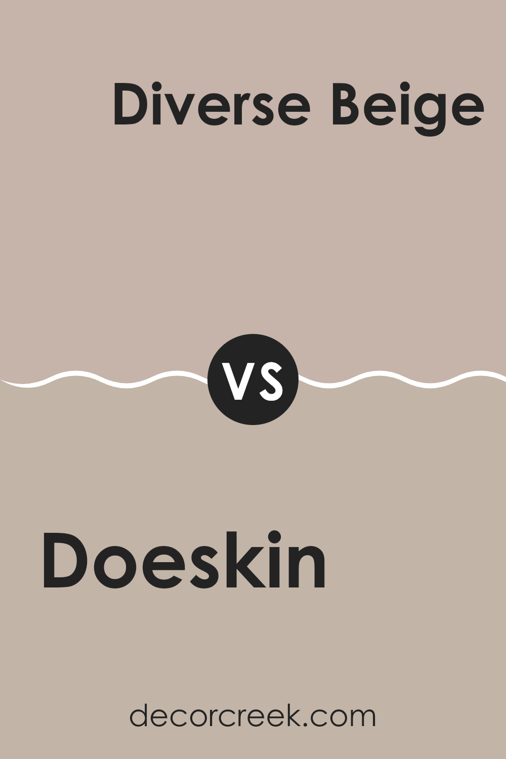
Doeskin SW 6044 by Sherwin Williams vs Diverse Beige SW 6079 by Sherwin Williams
Doeskin (SW 6044) and Diverse Beige (SW 6079) by Sherwin Williams are both neutral colors that offer different vibes for a room. Doeskin is a warm, muted taupe with a slight pink undertone, making it feel cozy and inviting. It’s soft and can create a relaxed and comfortable atmosphere. Diverse Beige, on the other hand, leans more towards a true beige with subtle gray undertones, providing a very flexible and balanced backdrop.
While Doeskin may add a touch of warmth to the room, Diverse Beige offers a more neutral palette that can match a wide range of other colors and styles. If you’re looking to add warmth and a hint of softness, Doeskin might be the better choice.
If you prefer something that is more universally complementary to various furnishings and decor, then Diverse Beige could be the right pick. Both colors are great for creating a welcoming environment.
You can see recommended paint color below:
- SW 6079 Diverse Beige
Doeskin SW 6044 by Sherwin Williams vs Artistic Taupe SW 6030 by Sherwin Williams
Doeskin SW 6044 and Artistic Taupe SW 6030 are two warm, earthy shades by Sherwin Williams. Doeskin is a soft, light beige with a hint of warmth, making areas feel cozy and inviting. It’s a flexible color that works well in various settings, adding a gentle, neutral backdrop to a room.
Artistic Taupe, on the other hand, is a slightly darker taupe with a richer and more pronounced brown tone. It provides a bit more depth and substance compared to Doeskin, giving rooms a more defined character while still keeping a neutral base.
When comparing them, Doeskin offers a lighter, airier feel, suitable for areas where you want to keep things light and open. Artistic Taupe brings a bit more warmth and depth, making it suitable for creating a more intimate and grounded atmosphere. Both colors complement each other well and can be used together to create a balanced, harmonious look.
You can see recommended paint color below:
- SW 6030 Artistic Taupe

Doeskin SW 6044 by Sherwin Williams vs Sand Dune SW 6086 by Sherwin Williams
Doeskin SW 6044 and Sand Dune SW 6086 by Sherwin Williams are both warm, neutral tones, but they have their own unique characteristics. Doeskin is a soft, muted beige with subtle gray undertones, giving it a cozy and flexible appeal.
It’s a great backdrop for a variety of decor styles, adding warmth without overpowering the area. On the other hand, Sand Dune is a slightly richer color with stronger beige and brown undertones. It feels earthy and grounded, making it perfect for creating an inviting atmosphere.
While both colors are great for neutral palettes, Doeskin is slightly cooler and more subtle, whereas Sand Dune offers a bit more depth and richness. When choosing between them, consider the amount of light in the room and the mood you want to create. Use Doeskin for a soft, understated look or Sand Dune for a warmer, more grounded feel.
You can see recommended paint color below:

Doeskin SW 6044 by Sherwin Williams vs Likeable Sand SW 6058 by Sherwin Williams
Doeskin SW 6044 by Sherwin Williams is a warm, soft beige with a slight hint of taupe, creating a cozy and inviting feel. It’s a flexible neutral, pairing well with various colors and styles. Likeable Sand SW 6058, on the other hand, is a bit lighter with a soft warmth that leans slightly more towards a sandy hue.
Both colors are understated and neutral, but Likeable Sand brings a brighter touch to a room without being overpowering. Doeskin offers a deeper, richer base, which can make a room feel snug and intimate. It’s great for living rooms or bedrooms where you want a bit more depth.
Likeable Sand’s lighter tone makes it suitable for areas that need a more airy, open feel, such as hallways or kitchens. Both colors offer a calming and pleasant ambiance, with Doeskin adding a touch more depth and Likeable Sand providing a fresh, bright backdrop.
You can see recommended paint color below:
- SW 6058 Likeable Sand

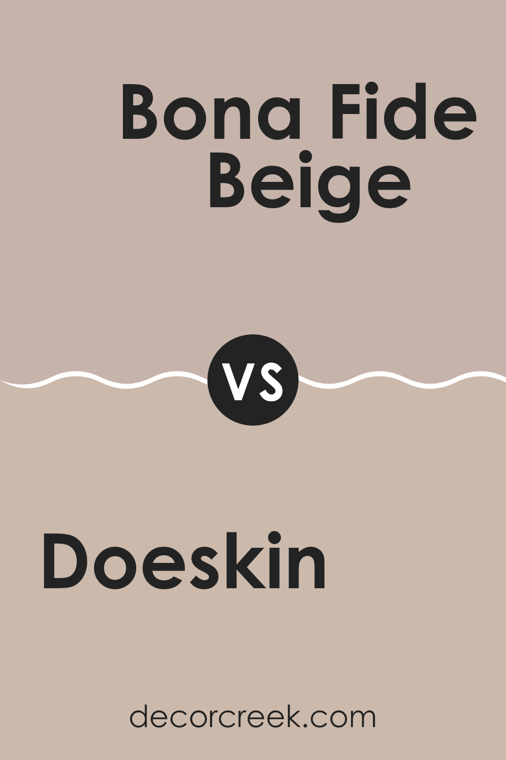
Doeskin SW 6044 by Sherwin Williams vs Bona Fide Beige SW 6065 by Sherwin Williams
Doeskin SW 6044 by Sherwin Williams and Bona Fide Beige SW 6065 by Sherwin Williams are both warm, neutral colors, but they each have their own distinct character. Doeskin is a soft, muted shade with a hint of pinkish undertone, giving it a gentle, comforting feel suitable for cozy areas. It’s flexible and pairs well with both light and dark colors, offering a balanced backdrop.
On the other hand, Bona Fide Beige is a bit more grounded with a stronger tan influence, creating a warm, earthy environment. It delivers a more traditional beige vibe that complements a wide range of architectural styles and decor choices.
While Doeskin brings a touch of subtle warmth, Bona Fide Beige offers a more robust, classic neutral. Both colors work well in living rooms, but their slight tonal differences can suit diverse design tastes and preferences in terms of warmth and ambiance.
You can see recommended paint color below:
- SW 6065 Bona Fide Beige
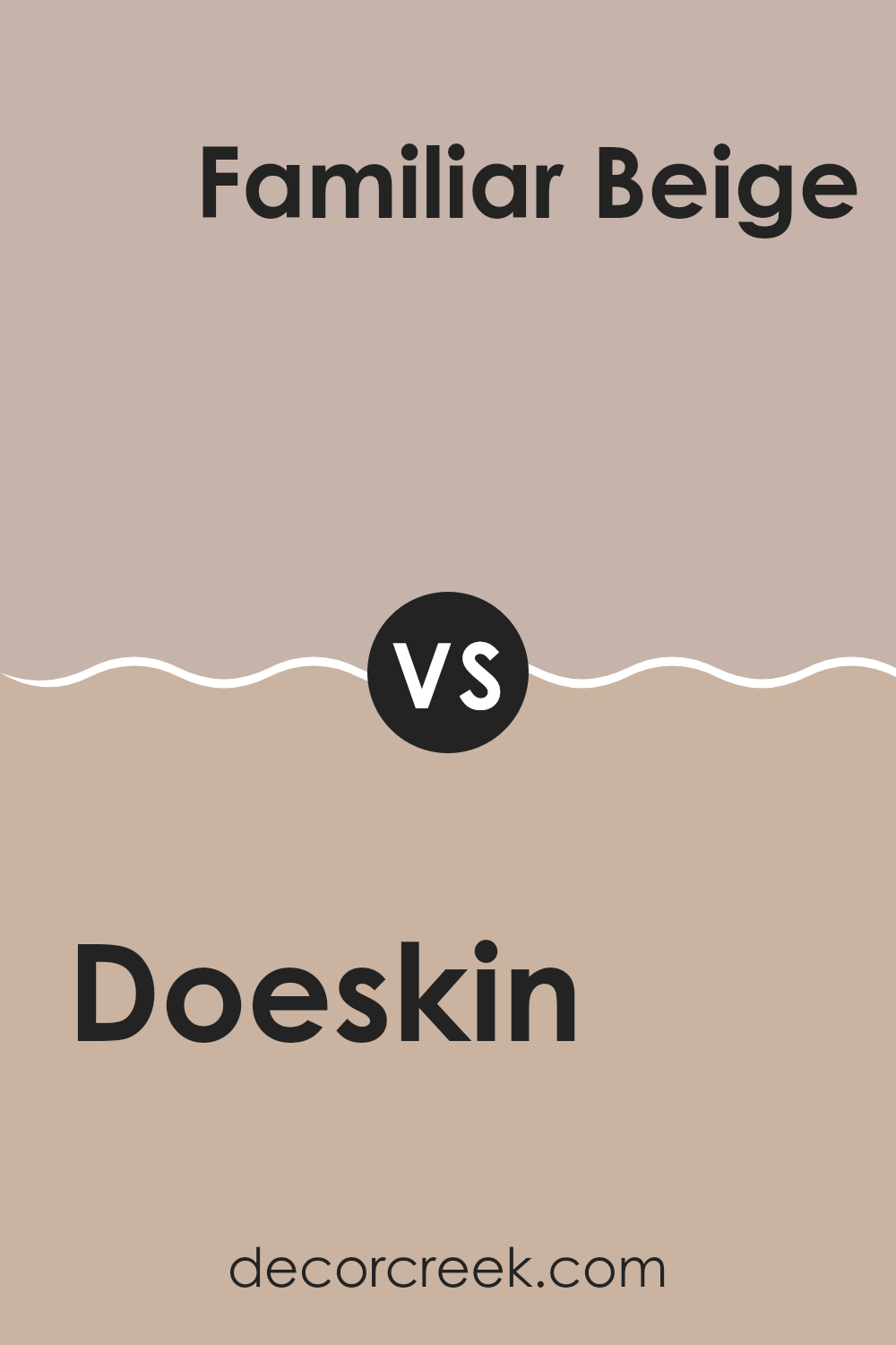
Doeskin SW 6044 by Sherwin Williams vs Familiar Beige SW 6093 by Sherwin Williams
Doeskin (SW 6044) by Sherwin-Williams is a warm, soft neutral color with hints of taupe and pink undertones. It creates a cozy and inviting atmosphere, making it suitable for living rooms or bedrooms where comfort is a priority. The color has a subtle elegance that harmonizes well with many interior styles.
On the other hand, Familiar Beige (SW 6093) is a classic beige with a slightly warmer undertone. This color is flexible and easy to coordinate with other hues. It provides a neutral backdrop without being too overpowering, making it a great choice for larger rooms like living rooms or hallways.
When comparing the two, Doeskin has a softer feel with its taupe hints, while Familiar Beige leans more toward a traditional, creamy beige. Both are welcoming colors, but Doeskin offers a hint of refinement while Familiar Beige exudes more of a classic, understated appeal.
You can see recommended paint color below:
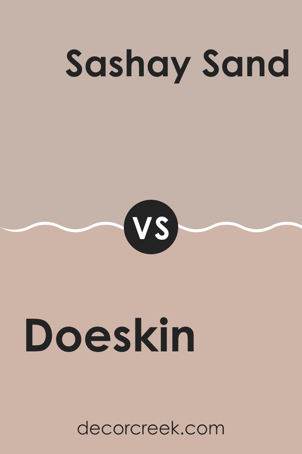
Doeskin SW 6044 by Sherwin Williams vs Sashay Sand SW 6051 by Sherwin Williams
Doeskin SW 6044 by Sherwin Williams is a warm, neutral color with a subtle beige undertone. It offers a soft, comforting feel, making it flexible for various rooms and settings. The color is gentle on the eyes and can create a cozy atmosphere in a living room or bedroom.
On the other hand, Sashay Sand SW 6051 by Sherwin Williams has a slightly pinkish undertone, giving it a warmer and more inviting appearance. This shade has more personality and can add a hint of color without being overpowering.
It works well in areas where you want to add a touch of warmth and charm, like a dining room or hallway. While both colors are warm and earthy, Sashay Sand has a bit more vibrancy compared to the understated calmness of Doeskin. Either choice can add a warm touch to a room, but Sashay Sand offers a bit more energy.
You can see recommended paint color below:
- SW 6051 Sashay Sand
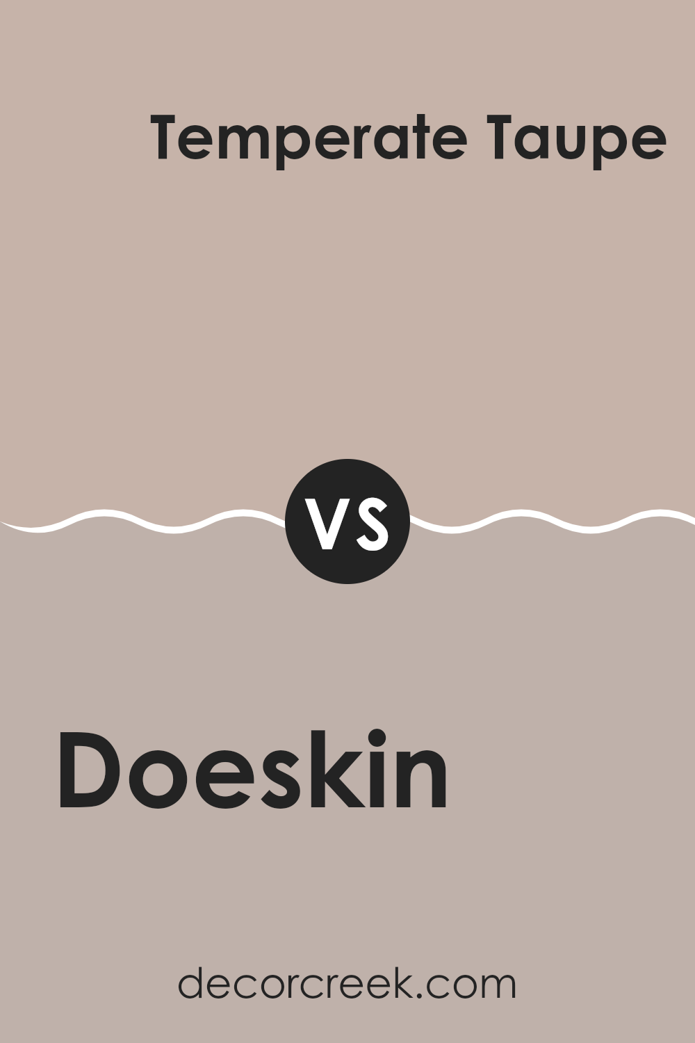
Doeskin SW 6044 by Sherwin Williams vs Temperate Taupe SW 6037 by Sherwin Williams
Doeskin SW 6044 and Temperate Taupe SW 6037 by Sherwin Williams are two warm, inviting colors that offer different aesthetic touches. Doeskin is a soft, muted, warm beige with pinkish undertones, creating a cozy and welcoming atmosphere in any room. It’s flexible and pairs well with both bold and neutral accents, lending a subtle elegance to areas.
On the other hand, Temperate Taupe is a richer, deeper taupe shade with a balance of gray and brown undertones. It provides a grounded and refined feel while being slightly darker than Doeskin. This color works well to add depth and can serve as an excellent backdrop for brighter colors or a monochromatic scheme.
Together, these colors can complement each other beautifully, with Temperate Taupe providing depth and contrast, while Doeskin offers warmth and light. They both suit a range of interiors, from living rooms to bedrooms.
You can see recommended paint color below:
Doeskin SW 6044 by Sherwin Williams vs Cool Beige SW 9086 by Sherwin Williams
Doeskin SW 6044 by Sherwin Williams is a warm, soft taupe that brings a cozy and inviting feel to areas. It has undertones that can add a touch of refinement and warmth to a room. This color is flexible and works well in both traditional and modern settings.
On the other hand, Cool Beige SW 9086 is a light, neutral beige with cooler undertones. It is lighter and feels crisper compared to Doeskin. This shade is excellent for creating a fresh and airy atmosphere, making small rooms appear larger and more open.
When comparing these two, Doeskin has a richer, warmer tone, while Cool Beige offers a lighter, cooler feel. Doeskin can add depth and coziness, making it great for living rooms or bedrooms, while Cool Beige is perfect for those seeking a fresh, clean look in any room. Both colors are flexible and can suit different styles and moods.
You can see recommended paint color below:
- SW 9086 Cool Beige
After learning about SW 6044 Doeskin from Sherwin Williams, I really got to understand why this paint color is special and why so many people like it. This color is a soft, warm shade that feels comforting, like a nice hug. It isn’t too bold or too light; it’s just right, making it friendly for any room in a house.
When you put it on the walls, the room feels cozy and welcoming. It works well in living rooms, bedrooms, or even a hallway. It’s like the color gives a gentle smile to any spot in the house. Plus, it works nicely with other colors. If you have bright pillows or colorful furniture, this paint makes those colors pop even more without stealing the show.
What I found really interesting is that this color can make a room feel homier, creating an inviting atmosphere. It’s a great choice if you’re looking to paint a room and want everyone who enters to feel comfortable and happy.
So, from my point of view, SW 6044 Doeskin is not just a paint color; it’s a pleasant and warm choice that brings good feelings to any room.

Ever wished paint sampling was as easy as sticking a sticker? Guess what? Now it is! Discover Samplize's unique Peel & Stick samples.
Get paint samples

