I recently had the chance to use SW 6037 Temperate Taupe by Sherwin Williams in a home renovation project, and I am thrilled to share my experience with you. This unique shade of taupe offers a perfect balance of warmth and subtlety, making it a goes with anything for any interiors.
It’s not just any beige; there’s a softness to it that adds both comfort and sophistication to a room without overpowering other design elements. Pairing this color with various textures and complementary shades brings a room to life.
Whether you’re aiming for a cozy bedroom ambiance or a welcoming living room, Temperate Taupe adapts beautifully. Its adaptability really shines through when used in natural light, highlighting its soft, earthy tones.
From my personal perspective, this color is a game-changer for anyone looking to refresh their room with a touch of understated elegance.

What Color Is Temperate Taupe SW 6037 by Sherwin Williams?
Temperate Taupe is a rich, warm shade of brown with subtle gray undertones, offering a cozy and welcoming vibe that fits perfectly into a variety of home decor styles. This color creates a seamless blend that can anchor a room or serve as a complementary backdrop for bolder design elements.
This hue works exceptionally well in classical, rustic, and modern farmhouse interior designs, creating a classic backdrop that lets your furniture and decor shine. Its earthy quality brings a sense of calm and warmth to any room , making rooms look well-put-together and inviting.
When it comes to pairing materials and textures with Temperate Taupe, natural elements like wood in either light oak or rich walnut finish enhance its warm undertones. Textiles like wool, linen, and cotton in natural colors work beautifully to highlight its softness. Metals like brass and copper also complement this color well, adding a touch of elegance without overpowering the subtle beauty of the taupe.
For a harmonious palette, Temperate Taupe can be paired with creamy whites, soft greens, or lighter taupe shades to create a balanced and cohesive look. Accessories in navy, burgundy, or mustard yellow can add a pop of color while keeping the overall feel of the room grounded and consistent.

Is Temperate Taupe SW 6037 by Sherwin Williams Warm or Cool color?
Temperate Taupe by Sherwin Williams is a warm and welcoming shade of taupe that is highly fits well in many different home settings. This particular color strikes a perfect balance between gray and brown, making it easy to match with a variety of decor styles and other colors. Because of its neutral nature, it works well in living rooms, bedrooms, and even kitchens, providing a cozy, comforting backdrop that feels both inviting and stylish.
One of the biggest advantages of Temperate Taupe is how it helps to create a relaxed atmosphere in a room without feeling dull. It catches natural light beautifully, shifting slightly to show off either its warmer or cooler tones depending on the time of day and lighting conditions.
This adaptability makes it a great choice for anyone looking to refresh their home with a paint that will maintain its charm and appeal through different styles and seasons. Its flexibility and gentle presence ensure it blends seamlessly with existing furnishings or can inspire a new design direction.
Undertones of Temperate Taupe SW 6037 by Sherwin Williams
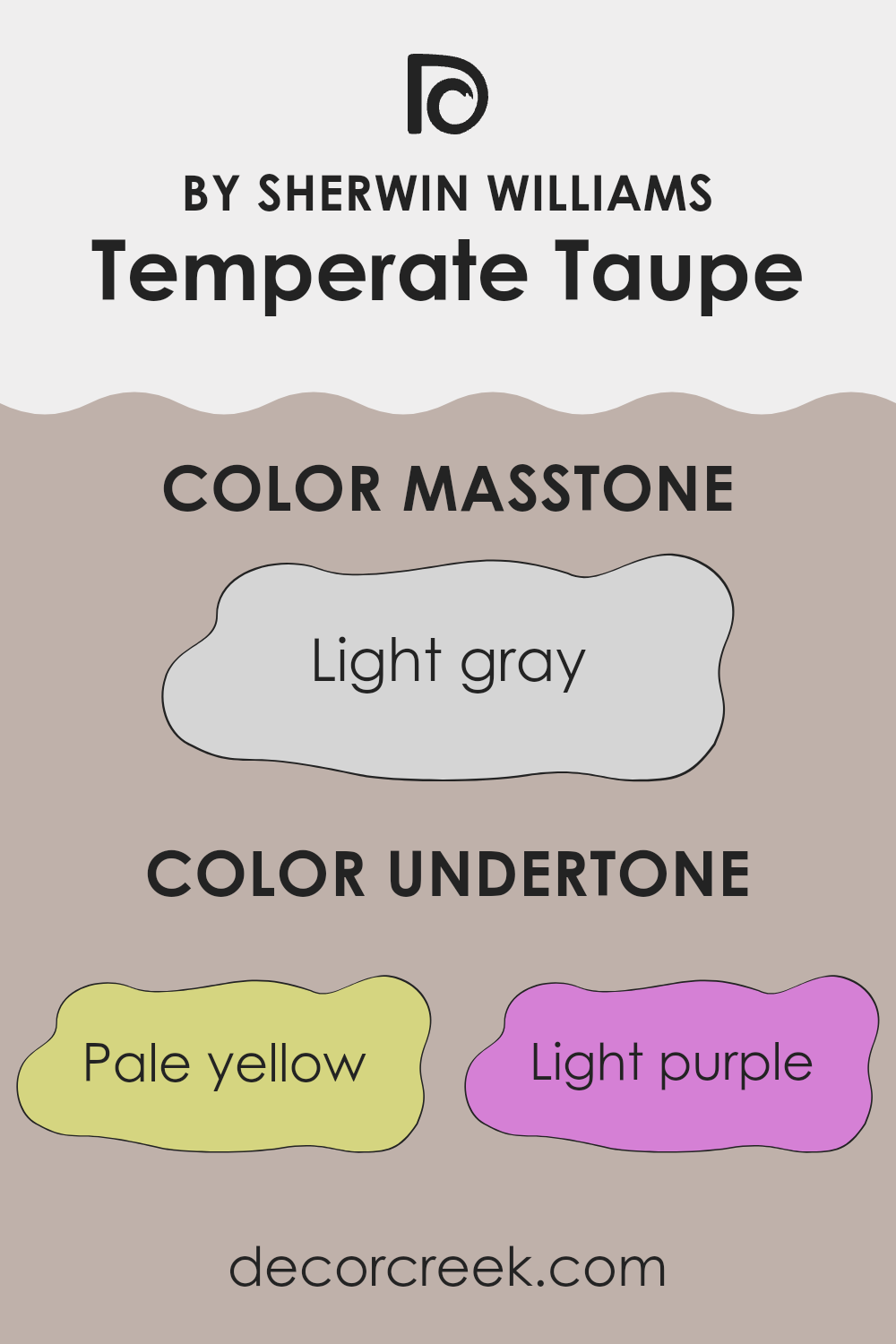
Temperate Taupe is a paint color from Sherwin Williams that can subtly shift in appearance depending on its surroundings. The undertones of a color are like hidden shades that can influence how the main color looks. For Temperate Taupe, these undertones include pale yellow, light purple, pale pink, light blue, mint, grey, and lilac. Each of these undertones can appear more prominent under different lighting conditions or when paired with specific colors in furniture or decorations.
For example, in a room with lots of natural light, the pale yellow or light blue undertones might make Temperate Taupe appear a bit cooler or slightly warmer. Similarly, in artificial lighting, the lilac or light purple might become more noticeable, giving the walls a subtle hint of these colors.
These undertones are crucial because they can impact the mood and feel of a room. A room painted with Temperate Taupe might feel more relaxing and welcoming if the warmer undertones like pale pink and pale yellow are dominant. Conversely, if cooler tones like mint or light blue come through, the spot might feel more refreshing and calm.
When choosing decor, considering these undertones can help in selecting accessories or furniture that complement or contrast effectively with the walls, enhancing the overall aesthetic of the spot. This adaptability makes Temperate Taupe an excellent choice for various interior styles and preferences.
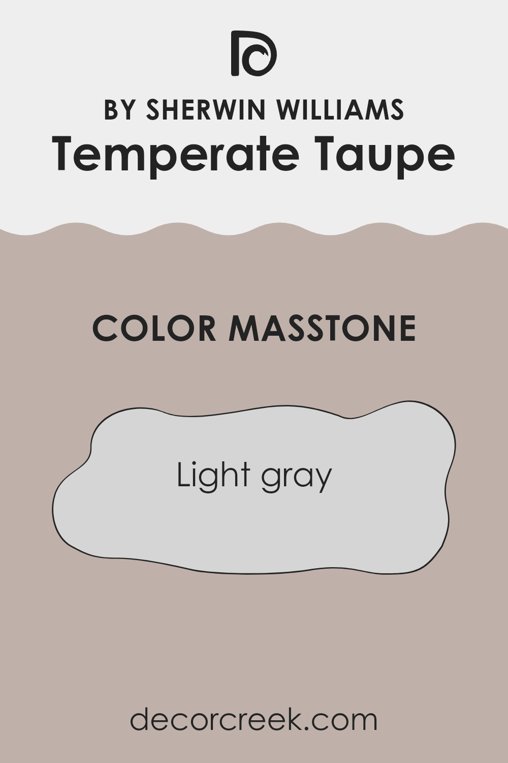
What is the Masstone of the Temperate Taupe SW 6037 by Sherwin Williams?
Temperate Taupe is known for being easy to work with, and its base shade is a light gray (#D5D5D5). This neutral color provides a fresh and airy feel to any room, making it feel more open and light.
Since it doesn’t lean too heavily towards any specific color undertone, it pairs well with both cool and warm color schemes, making it easy to work with when decorating. It acts as a subtle backdrop that allows other elements in the room, such as furniture, artwork, or decor items, to stand out.
This versatility makes it a favorite for common areas like living rooms and kitchens, as well as private areas like bedrooms and studies. The ability to blend seamlessly with various styles and components means it can fit into any home without clashing or overpowering other design choices.
How Does Lighting Affect Temperate Taupe SW 6037 by Sherwin Williams?
Lighting plays a crucial role in how we perceive colors. The same shade can look different depending on whether it is viewed under natural or artificial light. Each type of light influences colors in unique ways, affecting our perception and the ambiance of a rooms.
Temperate Taupe is a color that can appear differently under varying lighting conditions. Under artificial light, such as LED or fluorescent bulbs, Temperate Taupe tends to exhibit a warmer, richer tone because these lights can enhance the brown and gray undertones in the color. This makes it ideal for living rooms and bedrooms where a cozy feeling is desired.
In natural light, the impact on Temperate Taupe shifts throughout the day. In the bright, clear light of the morning, it might look more vibrant and lighter, showing off its subtle beige notes. As the day progresses and the light becomes more golden towards the evening, the color may appear deeper and warmer.
The direction a room faces also affects how Temperate Taupe is seen. In north-facing rooms, which receive less direct sunlight and tend to have cooler light, this color might look more muted and slightly darker. This can create a calm, subdued look ideal for rooms designed for focus and relaxation.
In south-facing rooms, which get ample sunlight, the color can appear lighter and brighter, enhancing the warmth in the shade. This makes the spot feel more open and welcoming.
East-facing rooms see the most change, as they are bathed in warm morning light and cooler evening light. Temperate Taupe will transition from a soft, warm appearance in the morning to a more subtle and cooler tone by the evening.
Lastly, in west-facing rooms, the color gets milder morning light but intense, warm light in the late afternoon and evening. This can make the paint look vibrant and rich during sunset, which could be perfect for dining rooms or place used mostly in the evening.
Overall, lighting conditions need to be considered when choosing paint colors like Temperate Taupe to ensure they work harmoniously in their intended environment.

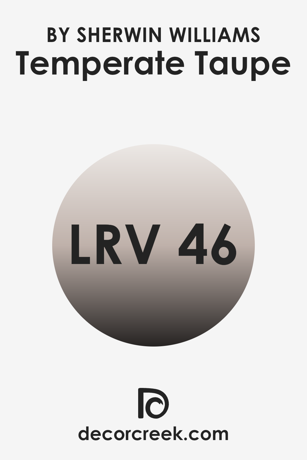
What is the LRV of Temperate Taupe SW 6037 by Sherwin Williams?
LRV stands for Light Reflectance Value, which is a measure that tells us how much light a color reflects or absorbs. This value is given on a scale from zero to one hundred, where zero means the color absorbs all light (it looks totally black) and one hundred means it reflects all light (it looks completely white).
Colors with a higher LRV make a room feel brighter and more open because they reflect more light back into the room. On the other hand, colors with a lower LRV can make a layout feel smaller or cozier because they absorb more light.
The LRV of Temperate Taupe is 45.633, placing it near the middle of the scale. This means it doesn’t reflect as much light as lighter colors, nor does it absorb as much light as darker shades. Therefore, when used on walls, Temperate Taupe can offer a balanced feel that isn’t too bright or too dark.
This mid-range LRV makes it a good choice for rooms, as it provides a moderate amount of warmth and depth to the layout without making it feel overly enclosed or cramped.
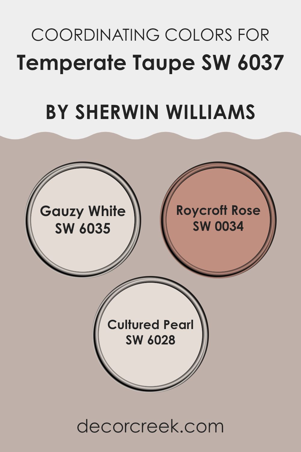
Coordinating Colors of Temperate Taupe SW 6037 by Sherwin Williams
Coordinating colors are selected to complement a base color, enhancing the overall aesthetic of a room or design. In the case of the paint color Temperate Taupe by Sherwin Williams, colors such as Gauzy White, Roycroft Rose, and Cultured Pearl are suggested as coordinating hues. These coordinating colors work together to create a visually cohesive and appealing palette. The idea is that each color supports and accents the others, providing balance and harmony in design.
Gauzy White is a light and airy color that brings a fresh and clean look to any room, making it ideal for ceilings or trim to provide a crisp contrast to richer tones like Temperate Taupe. Roycroft Rose, on the other hand, is a deeper, more romantic hue, offering a warm and inviting feel that complements the understated elegance of taupe shades beautifully.
Cultured Pearl is another gentle shade, almost like an off-white with subtle undertones that can help soften a room’s look while maintaining a chic and polished appearance, meshing well with both taupe and robust colors like Roycroft Rose. Together, these colors form a palette that can enhance the beauty of interior rooms, offering varied but complementary options for walls, trims, and accents.
You can see recommended paint colors below:
- SW 6035 Gauzy White
- SW 0034 Roycroft Rose
- SW 6028 Cultured Pearl
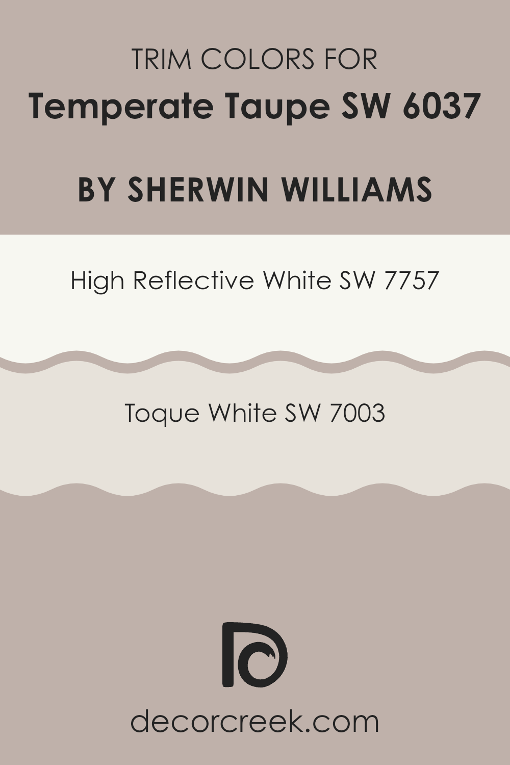
What are the Trim colors of Temperate Taupe SW 6037 by Sherwin Williams?
Trim colors are used to highlight or contrast the main color on a wall or surface, helping to define architectural details and create visual interest. In the case of Temperate Taupe by Sherwin Williams, selecting the right trim color is essential to enhance its warm.
Trim colors like High Reflective White and Toque White can effectively complement and accentuate the softness of Temperate Taupe, providing a crisp, clean border that frames each room. Using these trim colors can also make rooms appear more defined and polished, adding a subtle but noticeable contrast that enhances the overall aesthetic.
High Reflective White, as one of the options, is a brilliant white that can make any room appear brighter and more spacious. Its high reflectivity maximizes natural light, making it a popular choice for trims, especially in rooms that could benefit from a lighter, airier feel.
On the other hand, Toque White offers a slightly warmer tone, providing a soft contrast with Temperate Taupe without the starkness sometimes associated with pure white.
It adds a soft contrast that gently draws attention to the room’s details without taking away from the main color.
You can see recommended paint colors below:
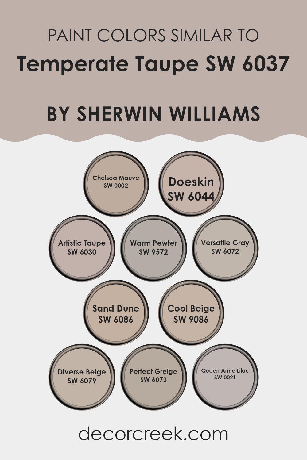
Colors Similar to Temperate Taupe SW 6037 by Sherwin Williams
Choosing similar colors can create a harmonious and cohesive look in your room, adding subtle variety without clashing. This approach is especially effective when dealing with shades close to Temperate Taupe. For example, Chelsea Mauve has a gentle, muted pink hue which complements soft, neutral settings, providing a warm backdrop that’s understated yet inviting. Doeskin, on the other hand, brings a richer, earthy tone that evokes a sense of grounded calmness, perfect for creating a cozy feel in living areas or bedrooms.
Artistic Taupe and Warm Pewter are delightful; the former offers a slightly more artistic vibe with its nuanced gray, making it ideal for contemporary rooms that lean towards a modern aesthetic. Warm Pewter brings a soft, smoky depth that works well with many decor pieces, adding character without feeling too strong.
Moving towards the grayer side, Versatile Gray and Perfect Greige present a blend of gray with warm undertones, making them adaptable for any room looking for a light, airy feel. Sand Dune has a hint of soft sandy brown, like the color of a quiet shore. It adds a gentle, calming feel to any room..
Meanwhile, Cool Beige and Diverse Beige provide a slightly different spectrum, introducing cooler, subtle hints of beige that work well to brighten darker rooms. Lastly, Queen Anne Lilac offers a unique twist with its soft lilac touch, perfect for rooms intended to have a gentle yet unique touch.
You can see recommended paint colors below:
- SW 0002 Chelsea Mauve
- SW 6044 Doeskin
- SW 6030 Artistic Taupe
- SW 9572 Warm Pewter
- SW 6072 Versatile Gray
- SW 6086 Sand Dune
- SW 9086 Cool Beige
- SW 6079 Diverse Beige
- SW 6073 Perfect Greige
- SW 0021 Queen Anne Lilac
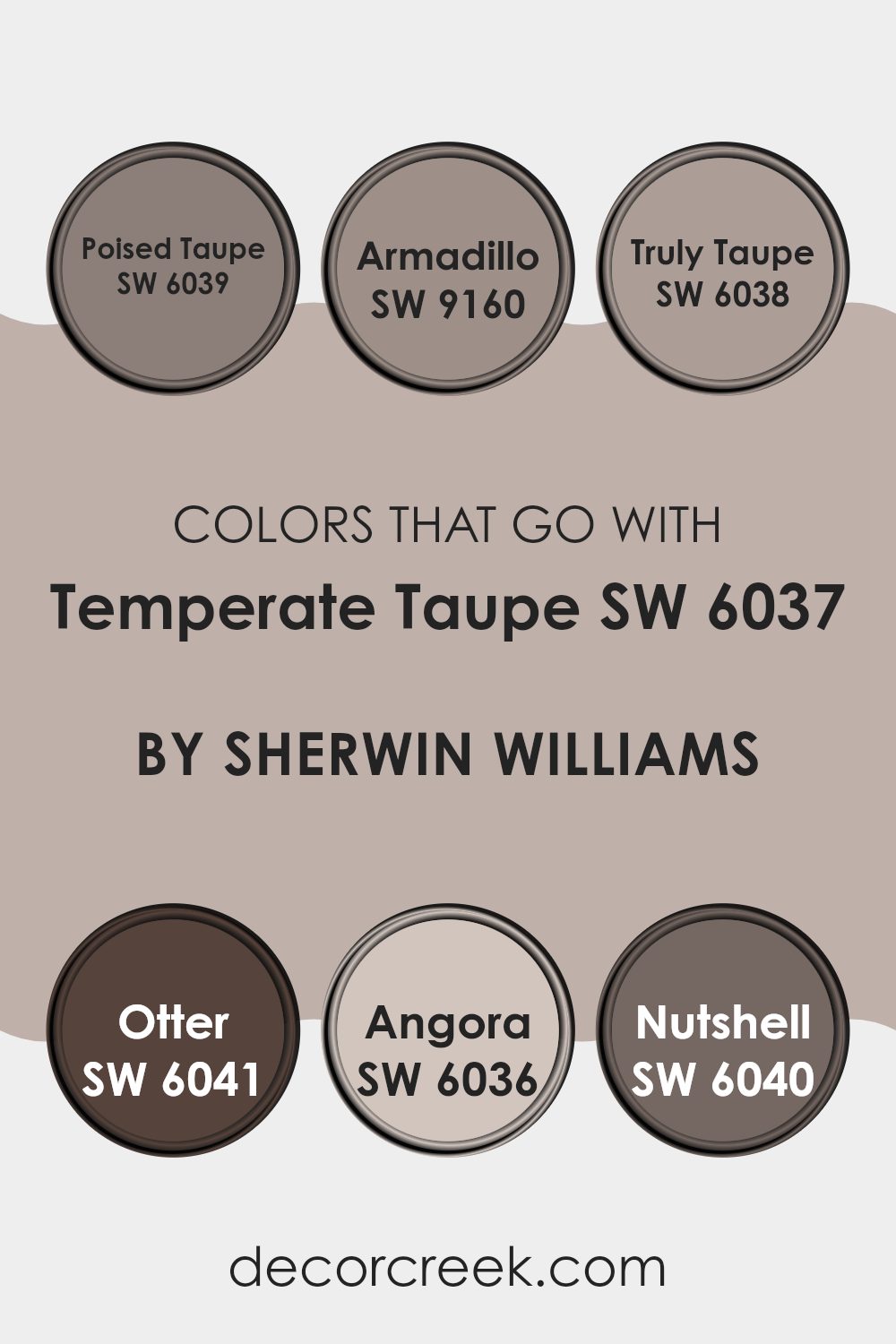
Colors that Go With Temperate Taupe SW 6037 by Sherwin Williams
Choosing complementary colors for Temperate Taupe SW 6037 by Sherwin Williams is crucial as it helps create a cohesive and harmonious look in any room . Colors like Poised Taupe, Armadillo, Truly Taupe, Otter, Angora, and Nutshell each bring their unique vibe while still aligning beautifully with Temperate Taupe. Such coordination ensures that the warmth and subtlety of Temperate Taupe is enhanced, rather than overshadowed or clashing with other hues in your decor.
Poised Taupe is like a deeper, richer sibling to Temperate Taupe, adding depth and a sense of grounding to any room. Armadillo steps in as a darker, earthier shade that pairs well to add a bit of drama and anchor lighter tones.
Truly Taupe, a slight variation of Taupe, offers a balanced middle ground, working well in places that seek a touch of elegance without being too bold. Otter brings a darker, brownish-grey tone that pairs nicely with the softness of Temperate Taupe for a more muted yet inviting atmosphere.
Angora is lighter, almost giving a soothing cream effect, ideal for brightening up places subtly while maintaining warmth. Nutshell, leaning towards a deep brown, serves excellently in adding a rich, comforting feel, ideal for cozy, intimate settings. Each of these colors supports Temperate Taupe in creating welcoming, well-rounded environments.
You can see recommended paint colors below:
- SW 6039 Poised Taupe
- SW 9160 Armadillo
- SW 6038 Truly Taupe
- SW 6041 Otter
- SW 6036 Angora
- SW 6040 Nutshell
How to Use Temperate Taupe SW 6037 by Sherwin Williams In Your Home?
Temperate Taupe by Sherwin Williams is a paint color that can bring a warm and cozy feel to any room in your home. This shade is a soft blend of beige and gray, making it a perfect neutral backdrop for both bright and subdued color schemes.
If you are thinking about refreshing your living room, Temperate Taupe works beautifully on the walls, creating a welcoming atmosphere for family gatherings. It is equally effective in bedrooms, where its soothing nature promotes a relaxed environment, ideal for winding down at the end of the day.
For those who enjoy a bit of creativity, this color pairs well with rich blues, earthy greens, or even bold yellows, allowing you to add personal flair to your room through decor and furnishings. In addition to walls, Temperate Taupe can be used for painting cabinets or shelves, offering a subtle, yet stylish enhancement to your existing interiors. Whether you have a modern home or prefer a more traditional look, this color can help make your decorating ideas come to life.
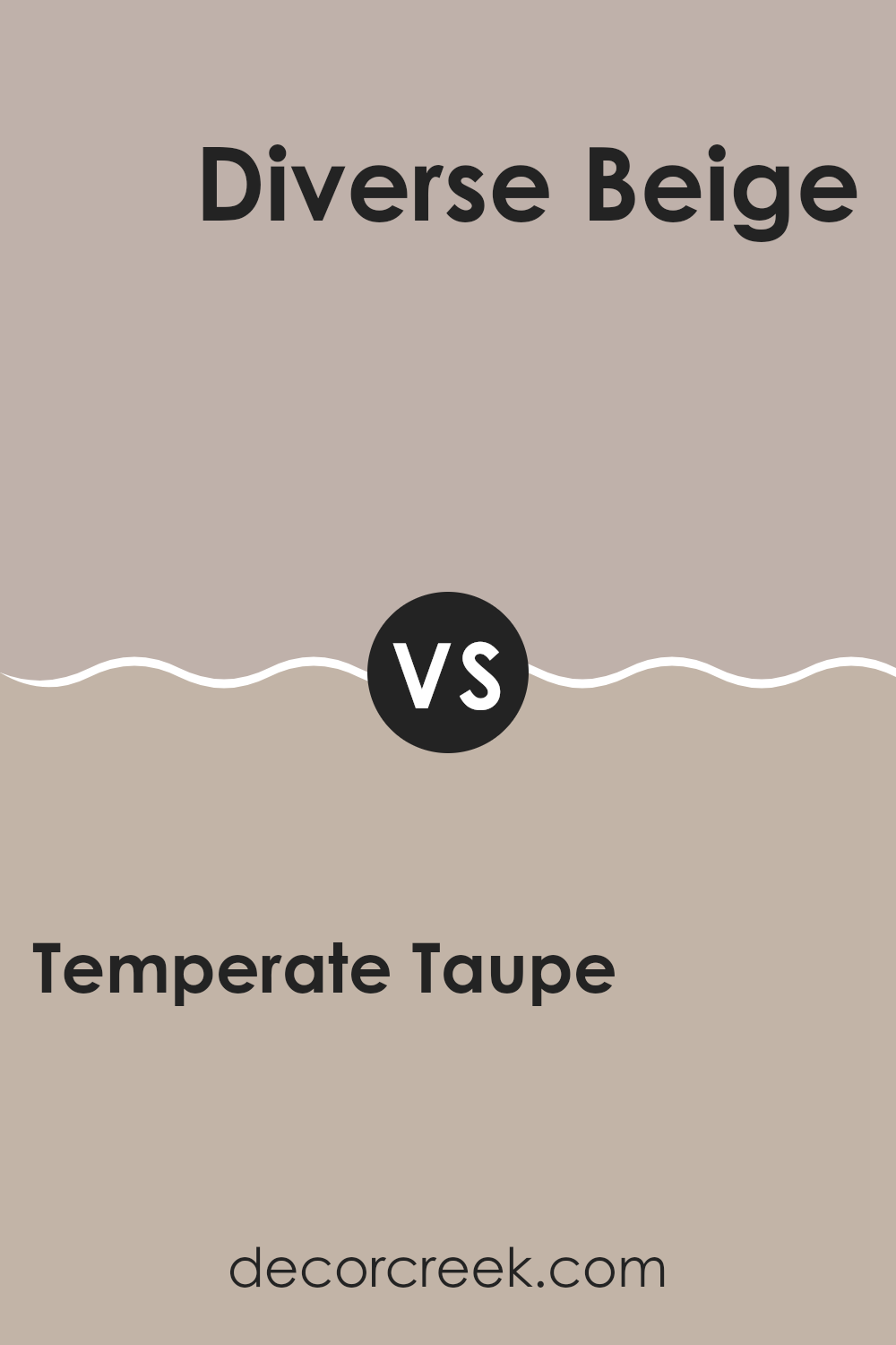
Temperate Taupe SW 6037 by Sherwin Williams vs Diverse Beige SW 6079 by Sherwin Williams
Temperate Taupe and Diverse Beige are two colors from Sherwin Williams that offer subtle yet distinct tones suitable for various areas. Temperate Taupe is a warm gray with a hint of brown, creating a cozy and inviting atmosphere.
On the other hand, Diverse Beige is a softer shade that leans more toward a light taupe. This color is particularly effective in areas where you want a neutral backdrop that is easy on the eyes, providing a light and airy feel.
Both colors are excellent choices for those looking to achieve a neutral yet warm environment, but Temperate Taupe has a slightly richer depth, making it ideal for those who prefer a bit more warmth, whereas Diverse Beige is perfect for achieving a brighter, more open setting.
You can see recommended paint color below:
- SW 6079 Diverse Beige
Temperate Taupe SW 6037 by Sherwin Williams vs Perfect Greige SW 6073 by Sherwin Williams
Temperate Taupe and Perfect Greige by Sherwin Williams are two neutral colors that have their subtle distinctions. Temperate Taupe leans more towards a warmer beige tone, making it ideal for creating a cozy and inviting atmosphere in a room. It pairs well with soft textiles and natural wood, adding a touch of warmth to any setting .
On the other hand, Perfect Greige is a blend of gray and beige but tends toward a cooler gray than Taupe. This color works well in modern and minimalistic designs, providing a neutral backdrop that allows other colors to stand out. Perfect Greige works well in different rooms — whether you’re going for a dressed-up feel or something more relaxed.
Both colors offer a way to refresh your place without being overly bold, but the choice between warmth and a hint of coolness can define the mood of your room.
You can see recommended paint color below:
Temperate Taupe SW 6037 by Sherwin Williams vs Chelsea Mauve SW 0002 by Sherwin Williams
Temperate Taupe and Chelsea Mauve, both by Sherwin Williams, are distinctive yet subtle colors. Temperate Taupe is a warm, mid-tone gray with a touch of brown, providing a cozy and grounding atmosphere to any place . It fits nicely in many rooms — from living areas to bedrooms — and doesn’t take attention away from the rest of the decor.
On the other hand, Chelsea Mauve offers a softer feel. This color is a muted pink with hints of gray, making it gentle and easy on the eyes. It’s ideal for creating a calm and welcoming environment, perfect for areas where you want to relax.
While both colors share a muted, understated nature, Temperate Taupe leans more toward earthy tones, and Chelsea Mauve presents a delicate hint of rosiness. Choosing between them would depend on whether you prefer the subtle warmth of a taupe or the soft charm of a mauve.
You can see recommended paint color below:
Temperate Taupe SW 6037 by Sherwin Williams vs Sand Dune SW 6086 by Sherwin Williams
Temperate Taupe and Sand Dune are both neutral paint colors from Sherwin Williams, yet they offer unique vibes for any place . Temperate Taupe has a gray base, which gives it a cooler feel. It works well in rooms that don’t get much natural light. This makes it great for creating a fresh, airy feel. In contrast, Sand Dune leans towards a warmer beige, which can help make a room feel cozy and inviting.
This warmth works well in areas where you want to foster a welcoming atmosphere, like living rooms or bedrooms. Furthermore, Temperate Taupe tends to pair nicely with more subtle color decor, resulting in a clean, modern look.
Sand Dune, on the other hand, is excellent for pairing with richer colors, enhancing wood features and furnishings. Choosing between them depends on the mood and functionality you’re aiming for in your place .
You can see recommended paint color below:
Temperate Taupe SW 6037 by Sherwin Williams vs Artistic Taupe SW 6030 by Sherwin Williams
Temperate Taupe and Artistic Taupe, both by Sherwin Williams, are subtle yet distinct neutral shades. Temperate Taupe is a warm, welcoming beige with a hint of gray, creating a cozy atmosphere in any interior. It is particularly effective in areas that benefit from a soft, soothing presence, like living rooms or bedrooms.
On the other hand, Artistic Taupe leans slightly more towards a grayish tone, offering a cooler feel, which can make small spots appear more open and larger. This color is ideal for modern settings or for complementing vibrant decor elements without overpowering them.
While both shades maintain a simple elegance, the choice between them depends on the desired warmth or coolness and the specific room characteristics. Combining them could also work well, using Artistic Taupe in brighter, airy spots and Temperate Taupe in areas where warmth is desired.
You can see recommended paint color below:
- SW 6030 Artistic Taupe
Temperate Taupe SW 6037 by Sherwin Williams vs Cool Beige SW 9086 by Sherwin Williams
Temperate Taupe is a cozy neutral shade that leans toward a soft brown with hints of gray, giving it a warm, inviting feel. This color blends easily with different styles and creates a calm background for both bold and soft accents.
On the other hand, Cool Beige is a lighter tone that brings a fresher, airy feel. It has more of a grayish undertone compared to Temperate Taupe, making it appear cooler and more modern. Cool Beige works well in spots that aim for a minimalist look or where you want to enhance natural light.
Although both colors come from a similar neutral palette, Temperate Taupe offers warmth and depth, making spotsfeel more enclosed and cozy, while Cool Beige keeps things light and open, offering a cleaner, crisp appearance. The choice between them can depend on the mood and function you want for your interior.
You can see recommended paint color below:
- SW 9086 Cool Beige
Temperate Taupe SW 6037 by Sherwin Williams vs Queen Anne Lilac SW 0021 by Sherwin Williams
Temperate Taupe is a warm, soft gray that provides a neutral backdrop suitable for various spots . It’s an easy shade to match with other colors, bringing warmth without taking over the room.
In contrast, Queen Anne Lilac is a gentle lilac color that brings a subtle touch of personality and softness. This light purple has a calmness that makes it ideal for rooms meant to be soothing, like bedrooms or bathrooms.
While Temperate Taupe offers a grounded, almost earthy effect, Queen Anne Lilac adds a whisper of color, creating a more defined yet understated aesthetic. Both colors work beautifully in different settings and can blend well with contemporary or traditional decor, depending on how you style them.
You can see recommended paint color below:
- SW 0021 Queen Anne Lilac
Temperate Taupe SW 6037 by Sherwin Williams vs Versatile Gray SW 6072 by Sherwin Williams
Temperate Taupe and Versatile Gray are both neutral colors from Sherwin Williams that can subtly enhance any room. Temperate Taupe has a warm, welcoming beige tone that creates a cozy ambiance. It’s perfect for living rooms where comfort is key.
On the other hand, Versatile Gray steps slightly away from beige, offering a cooler, more balanced gray that works well in both bright and dim lighting. This shade suits areas like offices or modern living rooms where a touch of professionalism is desired.
Both colors are muted enough to serve as excellent backdrops for various decor styles, allowing accent colors to stand out. Whether you opt for the warmer hue of Temperate Taupe or the cooler tone of Versatile Gray, both provide a calm, stylish base for your interior.
You can see recommended paint color below:
Temperate Taupe SW 6037 by Sherwin Williams vs Doeskin SW 6044 by Sherwin Williams
Temperate Taupe and Doeskin are two colors from Sherwin Williams that offer subtle yet distinct tones. Temperate Taupe is a warm gray with a touch of beige, which makes it a cozy pick for any room. It works with many decor styles and brings a soft, welcoming feel to the spot.
On the other hand, Doeskin leans more towards a richer tan shade, offering a slightly darker and earthier feel. This color also brings warmth to a room but with a more pronounced presence, making it ideal for creating an inviting and comfortable atmosphere.
Comparing the two, Temperate Taupe is lighter and more neutral, perfect for those who prefer understated elegance. Doeskin, with its deeper tan hue, suits rooms where a stronger, more grounded color is desired. Both colors work well in living areas, bedrooms, and other interior areas where a touch of warmth is welcome.
You can see recommended paint color below:
- SW 6044 Doeskin
Temperate Taupe SW 6037 by Sherwin Williams vs Warm Pewter SW 9572 by Sherwin Williams
“Temperate Taupe” and “Warm Pewter” are two unique shades by Sherwin Williams that add subtle elegance to any spot. Temperate Taupe is a soft, gentle brown with a warm undertone that makes it quite adaptable for various settings, providing a friendly and welcoming atmosphere. It pairs well with brighter colors or serves as a stand-alone hue for a muted, cozy vibe.
On the other hand, Warm Pewter is a slightly darker shade that leans more towards gray, offering a neutral canvas that is effortlessly chic. This color is excellent for those looking to create a modern feel in their room, as it harmonizes well with both bold and subdued accessories.
Both colors serve as excellent backdrops for either vibrant or toned-down decor styles, with Temperate Taupe bringing more warmth and Warm Pewter offering a crisp, clean look. Depending on the room’s natural light and the furnishings, each color can create its own unique feel, catering to different tastes and styles.
You can see recommended paint color below:
After learning all about SW 6037 Temperate Taupe by Sherwin Williams, I’m really impressed! This color is a warm and cozy shade of brownish-gray that feels like a gentle hug. It’s perfect for making any room in your house feel like a safe and cozy spot, like your favorite comfy sweater. Whether you want your bedroom, living room, or even your kitchen to feel more welcoming, Temperate Taupe can definitely do the trick.
It’s pretty cool how this paint can match with a lot of different things. It can look great with bright colors or softer tones. So, you can use it with lots of ideas you might have for decorating your room. Plus, it’s not just about looking good. The paint is good quality too, which means it’ll last a long time and keep looking nice.
So, whether you’re thinking about changing up a room at home or just want a fresh new look, SW 6037 Temperate Taupe is a fantastic choice. It’s simple, it’s warm, and it makes any room feel more like home.
Isn’t it exciting to think about how just changing the color on the walls can make such a big difference? I think so!

Ever wished paint sampling was as easy as sticking a sticker? Guess what? Now it is! Discover Samplize's unique Peel & Stick samples.
Get paint samples

