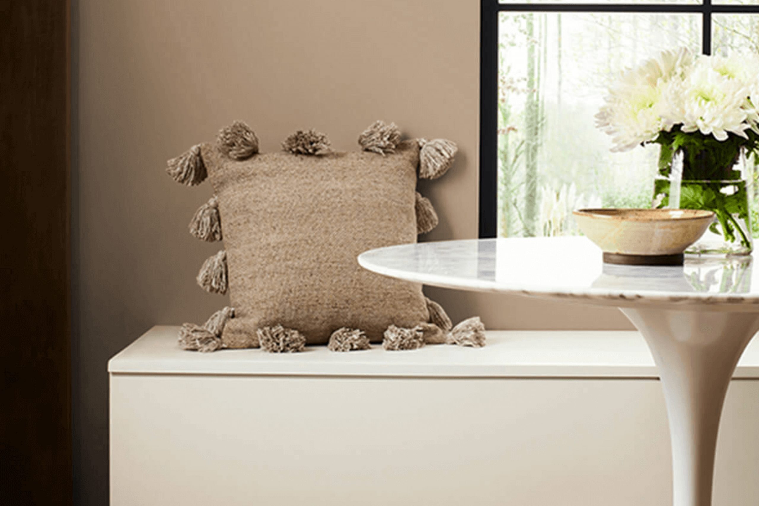
When you experience SW 7521 Dormer Brown by Sherwin-Williams, you immediately notice a warm and inviting hue that feels like a cozy hug. It’s a shade that effortlessly combines elegance and comfort, making any room feel grounded and welcoming. This color seems to gather light in the most gentle way, illuminating rooms with a rich and earthy tone.
I appreciate how Dormer Brown offers versatility, lending itself beautifully to both traditional and modern settings. It’s a color that brings to mind the comforting image of autumn leaves or a well-worn leather chair. This medium brown adds depth and character without taking over the room, making it an exceptional backdrop for various styles and accents.
Whether on walls, accent pieces, or furniture, Dormer Brown pairs wonderfully with soft creams or muted blues, providing a balanced and harmonious look. It’s a shade that invites you to settle in and relax. In busy areas or quiet corners, Dormer Brown creates a comforting environment that feels just right.
It reminds you that sometimes the simplest shades can provide the most satisfaction, turning ordinary rooms into something truly special.
What Color Is Dormer Brown SW 7521 by Sherwin Williams?
Dormer Brown by Sherwin Williams is a warm, earthy shade that sits in the medium to dark brown range. This rich color adds a cozy and inviting feel to any room, making it a popular choice for creating a welcoming setting. The warm undertones of Dormer Brown make it an adaptable option for different interior styles, especially rustic, traditional, and farmhouse designs. It pairs well with rooms that highlight comfort and natural materials.
In a rustic or farmhouse setting, Dormer Brown pairs beautifully with wooden furniture and accents, enhancing the natural grain and texture of oak, walnut, or pine. It’s also an excellent backdrop for leather chairs or sofas, adding a touch of warmth and sophistication to a living room or study.
In traditional interiors, this shade works well with heavy drapery and rich fabrics like velvet or wool, adding depth and coziness to the room. When it comes to materials, Dormer Brown pairs nicely with natural stones like slate or granite. The mix of these textures boosts the room’s natural appeal. Neutral tones such as beige, cream, and taupe complement Dormer Brown, helping balance the look, while metallic accents in bronze or antique brass can bring in a bit of elegance.
Is Dormer Brown SW 7521 by Sherwin Williams Warm or Cool color?
Dormer Brown SW 7521 by Sherwin Williams is a warm and inviting shade that can create a cozy atmosphere in any home. This color is a soft, earthy brown with subtle hints of gray, making it flexible for various rooms.
In living rooms, Dormer Brown can bring a grounded feel, making it perfect for gathering areas where you want guests to feel comfortable. It works well with natural materials like wood and stone, enhancing their textures and complementing their tones.
In bedrooms, Dormer Brown can create a restful environment, promoting relaxation and comfort. This shade pairs beautifully with neutral palettes, allowing for easy integration with existing decor. It can act as a soothing background color, letting furniture and other design elements stand out without clashing.
Additionally, Dormer Brown is easy to coordinate with different styles, from traditional to modern, making it a practical choice for homeowners looking to add warmth and depth to their interiors.
Undertones of Dormer Brown SW 7521 by Sherwin Williams
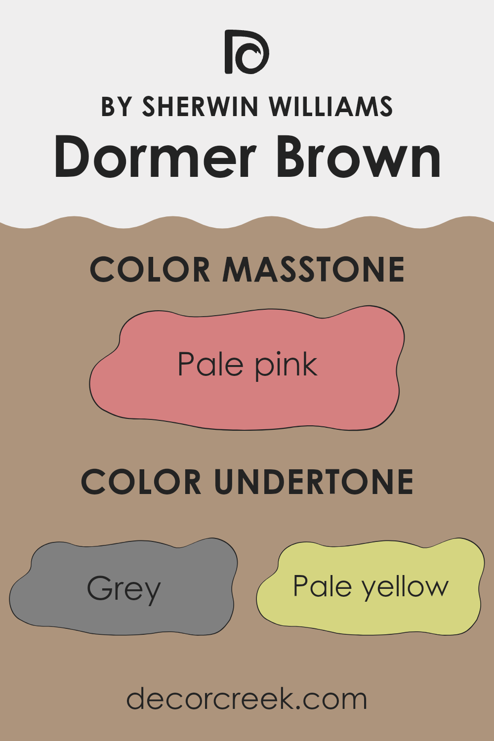
Dormer Brown by Sherwin Williams is an interesting color with various undertones that make it unique and appealing. The main undertones in Dormer Brown are gray, pale yellow, and mint. These undertones give it a warm and balanced look. Gray adds a soft, neutral touch that helps the color work well in many settings without feeling too bold. Pale yellow brings a bit of warmth and brightness, making the room feel more inviting. Mint adds a light coolness, giving the color a fresh edge that keeps it from feeling too heavy.
The impact of undertones like orange, olive, and light purple is subtle yet significant. Orange and olive add depth, providing richness and grounding to the overall color. Light purple and lilac introduce a soft, almost whimsical touch that lightens the atmosphere of the room.
Other undertones, like light blue and light green, add a gentle airiness, making the room feel open and spacious. On interior walls, Dormer Brown shifts subtly under different lighting conditions due to its complex undertones. In natural light, the pale yellow and mint undertones can pop more, creating a warm yet refreshing look. Under artificial light, the gray and light purple undertones can become more pronounced, giving the walls a soothing appearance.
Overall, these undertones work together to make Dormer Brown a flexible choice for various interior settings.
What is the Masstone of the Dormer Brown SW 7521 by Sherwin Williams?
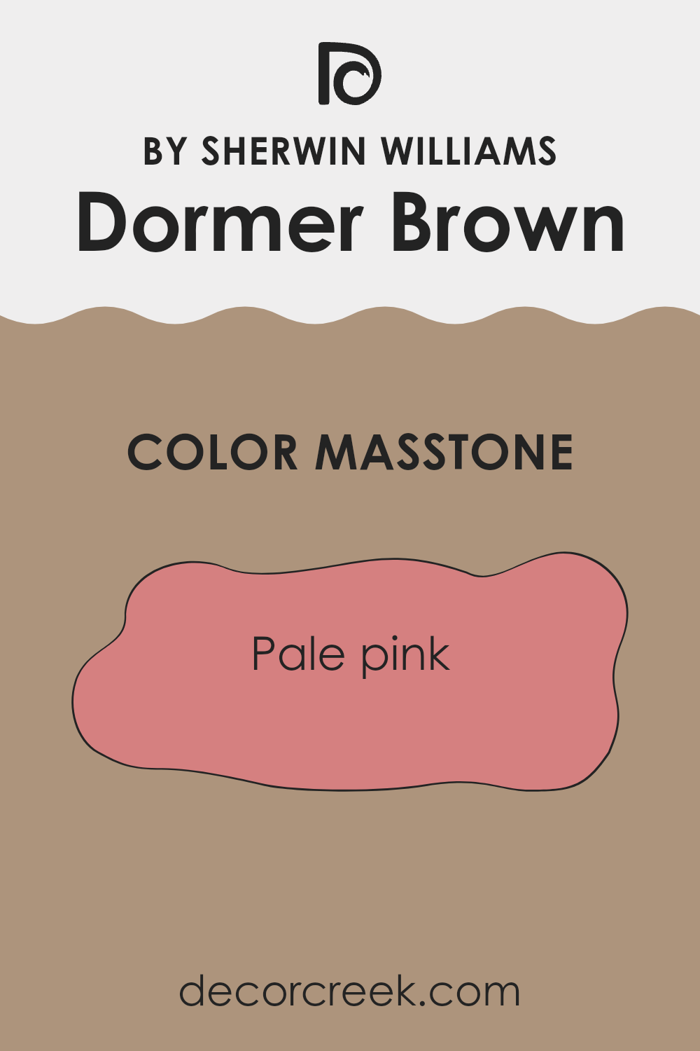
Sherwin Williams Dormer Brown, labeled as SW 7521, has a masstone of pale pink (#D58080). This subtle pink undertone brings a warm and inviting feel to a room. When used in homes, it creates a comforting and cozy atmosphere.
The gentle pink undertone adds a touch of softness to walls, making rooms feel more welcoming. It’s a flexible color that fits well in different areas, from living rooms to bedrooms. The warmth of the pale pink masstone helps balance out cool tones, making it a good choice for rooms that need a bit of added warmth.
It pairs beautifully with neutral colors and natural materials, enhancing the overall harmony of a room. Dormer Brown’s unique undertone can lighten a room without feeling too bold, giving it a soft, welcoming glow. This makes the color a great option for anyone looking to add warmth and charm to their home décor.
How Does Lighting Affect Dormer Brown SW 7521 by Sherwin Williams?
Lighting greatly influences how colors appear in a room. Different lighting conditions can change the perceived hue, saturation, and brightness of a color. In the case of Dormer Brown SW 7521 by Sherwin Williams, understanding how it looks under various lighting conditions can help you decide where and how to use it.
In natural light, how Dormer Brown looks depends on the direction the room faces. In a north-facing room, light is cooler and softer, which can make Dormer Brown appear a bit darker and cooler than it might in other rooms. The color might take on a more subtle, muted brown look with a slightly gray undertone.
In contrast, south-facing rooms receive warm and bright light throughout the day, making Dormer Brown look warmer and slightly lighter. The brown may become more pronounced and feel cozier, as the warm sunlight enhances the warm tones in the paint.
East-facing rooms get bright, warm light in the morning that fades as the day progresses. In these rooms, Dormer Brown may look warm and fresh during the early part of the day, but softer and muted by afternoon.
West-facing rooms experience the opposite, with cooler light in the morning and warm, intense light in the afternoon. As the day goes on, the color can look richer and more vibrant in the evening light.
Under artificial lighting, the type of bulb impacts the color appearance. Incandescent bulbs tend to bring out the warmer tones, making Dormer Brown feel cozy and inviting. Fluorescent lighting might make it seem cooler, potentially highlighting any gray undertones. LEDs can vary, so selecting a warmer bulb may complement the paint better.
Overall, understanding how Dormer Brown reacts to different lighting helps in choosing the right room for this paint color, ensuring it meets your expectations.
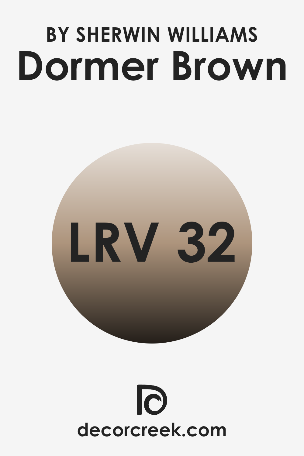
What is the LRV of Dormer Brown SW 7521 by Sherwin Williams?
Light Reflectance Value (LRV) is a measure used to describe how much light a color reflects and absorbs. It’s shown as a percentage ranging from 0 to 100, with 0 being pure black, which absorbs all light, and 100 being pure white, which reflects all light.
The higher the LRV, the more light a color reflects, and the more it can make a room feel brighter and more open. Conversely, colors with a lower LRV will absorb more light, making rooms feel cozier and sometimes more intimate.
Dormer Brown by Sherwin Williams has an LRV of 31. This means it falls on the lower end of the LRV scale, indicating it absorbs more light than it reflects. When used on walls, Dormer Brown can create a warm, inviting atmosphere, adding depth and richness to a room. This deeper tone might make smaller rooms feel extra cozy, while in larger rooms, it can offer an elegant, grounded backdrop.
Natural and artificial lighting will affect how the paint appears, with the color looking lighter or darker depending on the light conditions.
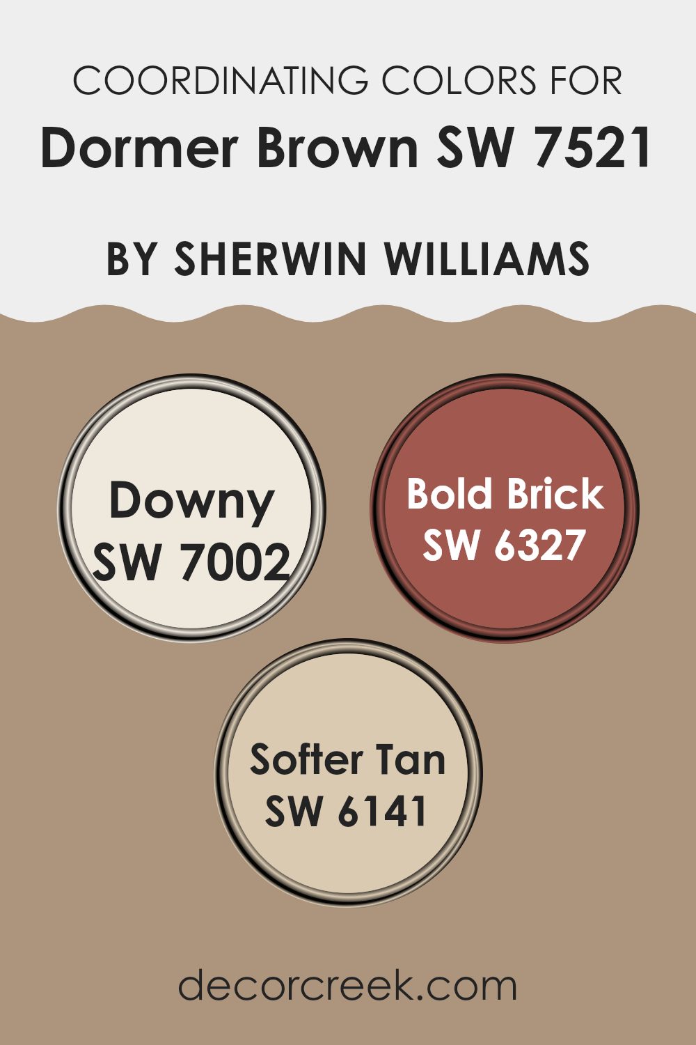
Coordinating Colors of Dormer Brown SW 7521 by Sherwin Williams
Coordinating colors are hues that work well together, creating a balanced look when used in the same room. These colors often complement the main shade, helping to highlight different qualities and moods. When pairing with Dormer Brown by Sherwin Williams, colors such as SW 7002 – Downy, SW 6327 – Bold Brick, and SW 6141 – Softer Tan can enhance the overall design.
Downy is a gentle, soft off-white that can bring a light and airy feel, balancing the warmth of Dormer Brown with its cool undertones. Bold Brick provides a striking contrast with its rich, deep red, adding a sense of vibrancy and energy to any room.
Softer Tan offers a gentle warmth that blends easily with Dormer Brown, creating a cozy and inviting atmosphere. These coordinating shades can be used in different combinations to shape various styles, whether it’s a clean modern look or a more classic setup. By choosing the right matching colors, you can highlight the mood you want to create, making each room feel thoughtful and unified. Whether it’s the soft glow of Softer Tan or the rich strength of Bold Brick, these colors work together to build a balanced and appealing design.
You can see recommended paint colors below:
- SW 7002 Downy
- SW 6327 Bold Brick
- SW 6141 Softer Tan
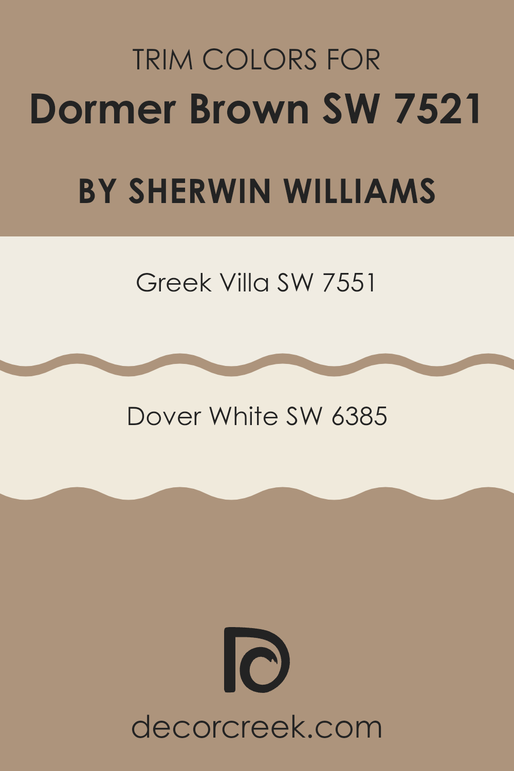
What are the Trim colors of Dormer Brown SW 7521 by Sherwin Williams?
Trim colors are complementary paint colors used to highlight architectural features such as windows, doors, baseboards, and moldings. They help frame and define these elements, making them stand out or blend harmoniously with the main wall color. In the case of Dormer Brown by Sherwin Williams, using trim colors like Greek Villa and Dover White adds a crisp contrast.
This contrast enhances the warmth and richness of Dormer Brown, keeping it from feeling too heavy in a room. Greek Villa is a soft, creamy white that adds a hint of elegance while allowing other colors to stand out.
Its subtle warmth makes it a welcoming choice for trim, providing a gentle contrast with Dormer Brown. On the other hand, Dover White is a light and airy white that offers a bright and clean look. Its slightly warmer undertone pairs well with Dormer Brown, balancing the overall effect with a fresh and inviting appearance. Together, these trim colors ensure that Dormer Brown remains a cozy yet stylish choice for any room.
You can see recommended paint colors below:
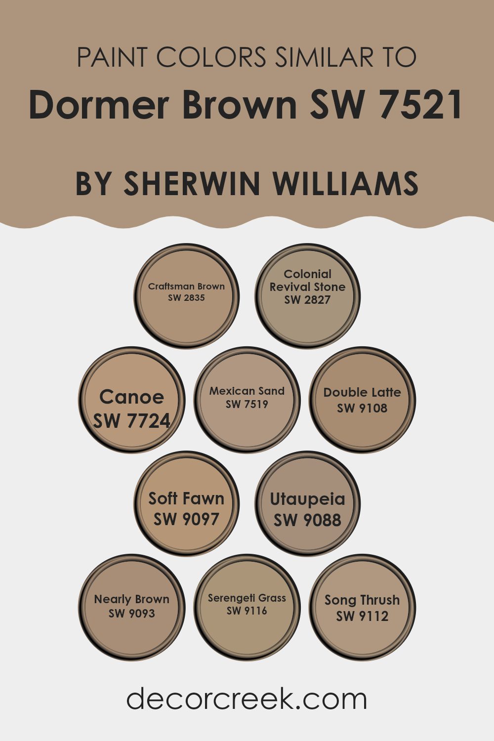
Colors Similar to Dormer Brown SW 7521 by Sherwin Williams
Similar colors are important in design because they create a sense of harmony and flow. When decorating a room, using shades close to Dormer Brown helps keep the look consistent. Craftsman Brown is a rich, deep hue that adds warmth and an earthy feel, while Colonial Revival Stone is lighter with a touch of gray, offering a softer, more relaxed look.
Canoe adds a golden touch, bringing a touch of warmth and brightness. Mexican Sand adds another layer of warmth, with its deep beige notes that enhance the atmosphere of any room. Double Latte has smooth caramel tones, evoking comfort and coziness, perfect for a welcoming room.
Soft Fawn, a gentle and light color, brings a delicate element and can make a room feel airy. Utaupeia introduces a more neutral shade, balancing the bolder colors with its subtle taupe. Nearly Brown is a balanced mix of brown and gray, offering a muted yet effective grounding effect. Serengeti Grass, with its yellow-green undertones, infuses natural freshness.
Song Thrush, similar to Dormer Brown, introduces earthy elegance, rounding out any room with its calming presence. Using these similar colors ensures that rooms feel connected and inviting, making them both eye-pleasing and comfortable.
You can see recommended paint colors below:
- SW 2835 Craftsman Brown
- SW 2827 Colonial Revival Stone
- SW 7724 Canoe
- SW 7519 Mexican Sand
- SW 9108 Double Latte
- SW 9097 Soft Fawn
- SW 9088 Utaupeia
- SW 9093 Nearly Brown
- SW 9116 Serengeti Grass
- SW 9112 Song Thrush
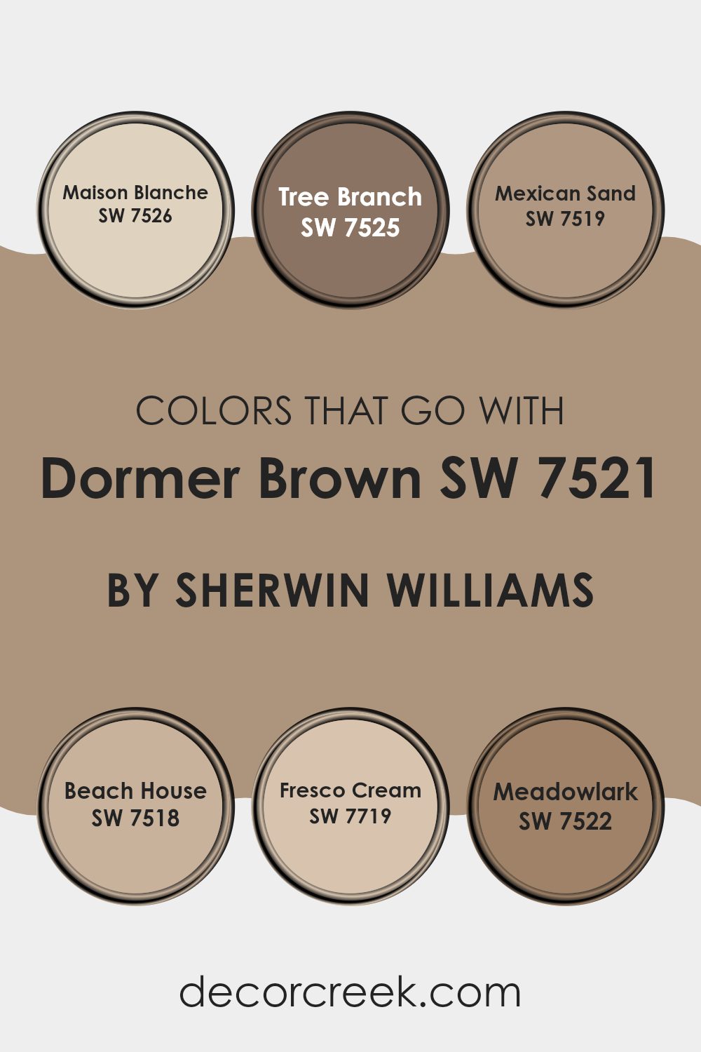
Colors that Go With Dormer Brown SW 7521 by Sherwin Williams
Colors that complement Dormer Brown (SW 7521) by Sherwin Williams are key to creating a balanced and welcoming room. Dormer Brown is a warm, earthy hue that pairs well with other neutrals and soft tones. SW 7526 – Maison Blanche adds a light, gentle touch that brightens the room and feels inviting. SW 7525 – Tree Branch brings more depth with its rich, grounded tone, boosting the cozy feel of Dormer Brown. Using these shades together helps create a room that feels connected and well put together.
SW 7519 – Mexican Sand is a richly muted beige that adds elegance while remaining soothing, perfect for creating a sense of grounded comfort. SW 7518 – Beach House exudes a breezy, warm vibe, bringing warmth and relaxation into any area.
SW 7719 – Fresco Cream is a light, buttery shade that brings gentle warmth, making it a great match for deeper tones like Dormer Brown without taking the focus away. SW 7522 – Meadowlark adds a bit of brightness with its soft yellow tones, bringing light and a cheerful touch to the mix. Together, these colors create a balanced and inviting look that feels both stylish and comfortable.
You can see recommended paint colors below:
- SW 7526 Maison Blanche
- SW 7525 Tree Branch
- SW 7519 Mexican Sand
- SW 7518 Beach House
- SW 7719 Fresco Cream
- SW 7522 Meadowlark
How to Use Dormer Brown SW 7521 by Sherwin Williams In Your Home?
Dormer Brown by Sherwin Williams is a warm, earthy shade that works well in various home settings. Its rich tone adds a cozy and inviting feel to any room. If you want to create a comfortable living area, Dormer Brown can be an excellent choice for the walls.
Pair it with soft cream or beige furniture to keep the room light and airy. In the bedroom, this color provides a restful background that helps you relax. You can add white or light-colored bedding to create a pleasant contrast.
For a more dramatic look, use Dormer Brown in a dining room or study to create a sense of intimacy and focus. Wooden furniture and natural textiles pair nicely with this shade, boosting its warm character. Adding greenery or metallic accents can bring in extra style without making the room feel too heavy.
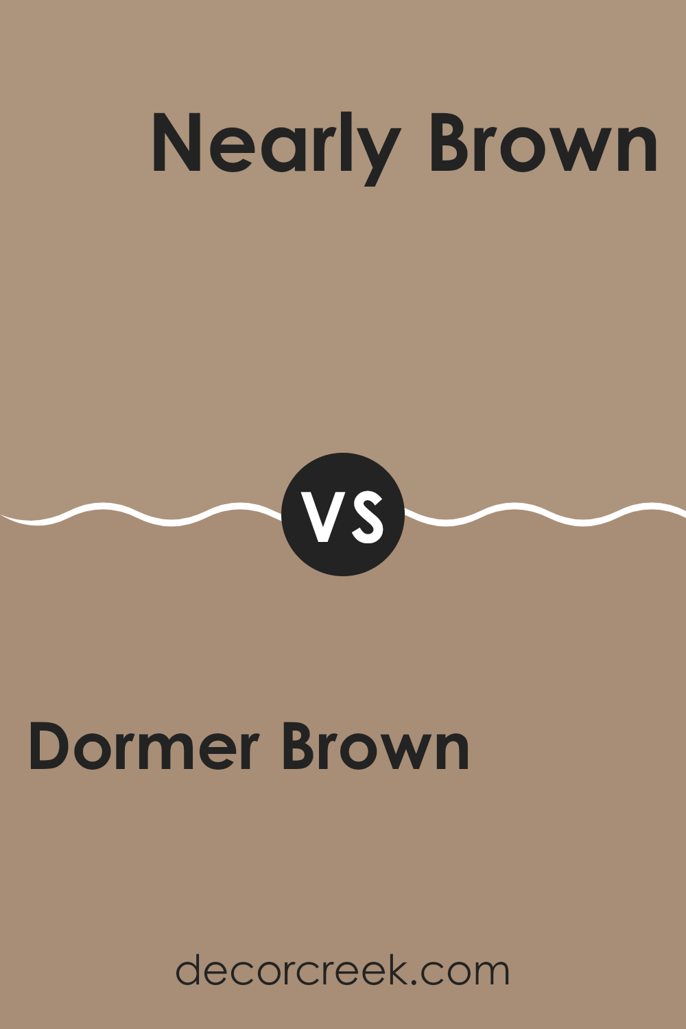
Dormer Brown SW 7521 by Sherwin Williams vs Nearly Brown SW 9093 by Sherwin Williams
You can see recommended paint color below:
- SW 9093 Nearly Brown
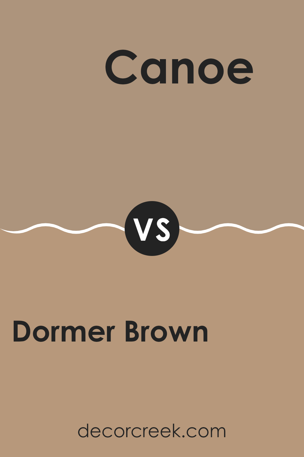
Dormer Brown SW 7521 by Sherwin Williams vs Canoe SW 7724 by Sherwin Williams
Dormer Brown (SW 7521) and Canoe (SW 7724) are two distinct colors by Sherwin Williams. Dormer Brown is a warm, inviting shade that features rich, earthy undertones, making it a flexible choice for creating a cozy and welcoming room. It often lends a comforting and grounded feel to a room, fitting well in both traditional and modern settings.
Canoe, on the other hand, is a lighter and slightly more neutral hue, offering a softer look. It brings warmth with a gentler presence compared to Dormer Brown. The lighter tone of Canoe makes it a good choice for rooms that benefit from a brighter feel, such as living rooms or kitchens, where it can help the room feel more open.
When comparing the two, Dormer Brown is stronger and bolder, while Canoe offers a more understated and gentle presence, catering to different aesthetic preferences and design needs.
You can see recommended paint color below:
Dormer Brown SW 7521 by Sherwin Williams vs Soft Fawn SW 9097 by Sherwin Williams
Dormer Brown (SW 7521) and Soft Fawn (SW 9097) are two colors by Sherwin Williams that offer different vibes. Dormer Brown is a rich, medium brown that feels warm and earthy. It can give a room a cozy and inviting atmosphere. It’s a great choice if you want a shade that brings warmth and depth without being too dark.
On the other hand, Soft Fawn is lighter and softer. It is a gentle, beige-like color that radiates calmness and comfort. Soft Fawn can brighten a room and make it feel more open while still adding a touch of warmth.
If you’re going for a cozier, more intimate feel, Dormer Brown might be your pick. For a lighter, airy ambiance, Soft Fawn could be better. Both colors work well with neutral palettes, but Soft Fawn is easier to use when you want to brighten up a room.
You can see recommended paint color below:
- SW 9097 Soft Fawn
Dormer Brown SW 7521 by Sherwin Williams vs Song Thrush SW 9112 by Sherwin Williams
Dormer Brown (SW 7521) by Sherwin Williams is a warm, earthy color that gives a cozy and inviting feel. It has rich brown tones with a slight hint of red, making it flexible for rooms like living areas or bedrooms. It pairs well with neutral or creamy shades and adds depth without feeling too strong.
Song Thrush (SW 9112) is another warm brown, but it’s slightly different. This color leans more towards a subtle yellow undertone, which gives it a more muted and gentle appearance compared to Dormer Brown. It works great in rooms where you want a softer, more relaxed atmosphere, like a reading nook or a kitchen.
Both colors are excellent for creating a warm ambiance, but Dormer Brown is slightly bolder, while Song Thrush offers a softer, more understated look. Depending on the mood you want to set, either color can bring a lovely sense of warmth to a room.
You can see recommended paint color below:
- SW 9112 Song Thrush
Dormer Brown SW 7521 by Sherwin Williams vs Serengeti Grass SW 9116 by Sherwin Williams
Dormer Brown (SW 7521) by Sherwin Williams is a warm, medium brown that gives a room a cozy and grounded feel. It’s rich and earthy, making it a great choice for creating a welcoming and comfortable setting. This color works well in living rooms or study areas where you want a hint of elegance and tradition.
On the other hand, Serengeti Grass (SW 9116) offers a lighter, more natural tone. It’s a soft, muted green with subtle yellow undertones, resembling the colors of dry grasslands. This color has a fresh and airy quality, bringing a touch of nature indoors. It’s perfect for rooms where you want to feel calm and refreshed, like a bedroom or a bathroom.
When compared, Dormer Brown leans toward creating warmth and depth, while Serengeti Grass offers a lighter and more natural feel. Together, they can balance each other in a room, with brown providing stability and green adding a touch of nature.
You can see recommended paint color below:
- SW 9116 Serengeti Grass
Dormer Brown SW 7521 by Sherwin Williams vs Mexican Sand SW 7519 by Sherwin Williams
Dormer Brown SW 7521 and Mexican Sand SW 7519 by Sherwin Williams are both earthy, warm colors that can add a cozy feel to a room, but they have distinct differences. Dormer Brown is a rich, medium-brown shade with a hint of warmth. It’s a flexible color that can work in both traditional and modern rooms, providing a solid, comforting backdrop.
Mexican Sand, on the other hand, is a lighter, sandy hue with a subtle softness. It’s less intense than Dormer Brown and gives off a more relaxed vibe. This makes it suitable for rooms where a gentle, soothing touch is desired, such as bedrooms or living rooms.
When comparing the two, Dormer Brown feels more robust and grounding, while Mexican Sand offers a breezier, more airy feeling. Choosing between them will depend on whether you’re aiming for a stronger brown tone or a lighter, more neutral backdrop.
You can see recommended paint color below:
- SW 7519 Mexican Sand
Dormer Brown SW 7521 by Sherwin Williams vs Colonial Revival Stone SW 2827 by Sherwin Williams
Dormer Brown SW 7521 and Colonial Revival Stone SW 2827 by Sherwin Williams are two distinct colors that offer different looks for various rooms. Dormer Brown is a warm, earthy shade that adds a cozy and welcoming feel to a room.
It’s perfect for those who enjoy a natural and grounded atmosphere. In contrast, Colonial Revival Stone is a more neutral and subtle tone with a hint of gray. It provides a soft and classic look, ideal for creating a calm and balanced environment.
While both colors can be used in different settings, Dormer Brown works well as an accent color, adding depth and richness to a room. Colonial Revival Stone, with its muted presence, is adaptable and pairs well with other shades, making it a good choice as a base color on walls. The choice between these two depends on the atmosphere you want and the overall style of the room.
You can see recommended paint color below:
Dormer Brown SW 7521 by Sherwin Williams vs Utaupeia SW 9088 by Sherwin Williams
Dormer Brown SW 7521 by Sherwin Williams is a warm, medium brown with a cozy feel, making it a flexible choice for rooms meant to feel inviting and grounded. It has an earthy quality that pairs well with wood tones and natural textures. This color is often used to create a comfortable and steady environment that feels rich without being too strong.
On the other hand, Utaupeia SW 9088 is a softer taupe that blends earthy brown with subtle gray undertones. It’s lighter and feels more airy compared to Dormer Brown, offering a gentle backdrop that works well with a broader range of colors. Its neutral base makes it ideal for adding warmth while maintaining a bright and open feel in a room.
When paired together, Dormer Brown can serve as an accent within a room, with Utaupeia providing a lighter, more neutral canvas, balancing the depth of Dormer Brown nicely.
You can see recommended paint color below:
- SW 9088 Utaupeia
Dormer Brown SW 7521 by Sherwin Williams vs Craftsman Brown SW 2835 by Sherwin Williams
Dormer Brown (SW 7521) and Craftsman Brown (SW 2835) are two rich, earthy shades by Sherwin Williams. Dormer Brown is a warm, inviting color, often seen as a medium to dark brown with soft undertones that suit many interiors. It’s great for creating cozy rooms and pairs well with neutrals and whites.
On the other hand, Craftsman Brown is slightly darker and carries a classic, traditional feel. It’s often used in historical homes or when aiming for a vintage look. This color can bring depth and richness to a room, helping it feel more grounded and steady.
Both colors have their strengths, but the main difference is in their tones and where they might work best. Dormer Brown is flexible for modern interiors, while Craftsman Brown can highlight historic or classic architectural features. Choosing between them depends on the mood and style you want to create in your room.
You can see recommended paint color below:
Dormer Brown SW 7521 by Sherwin Williams vs Double Latte SW 9108 by Sherwin Williams
Dormer Brown SW 7521 and Double Latte SW 9108 by Sherwin Williams are both warm, earthy colors, but they offer different vibes and uses. Dormer Brown is a rich, medium brown with a classic and cozy feel. It works well in living rooms or dining areas, adding warmth and a sense of comfort.
On the other hand, Double Latte is a lighter, softer brown with a hint of creaminess, similar to a light coffee. It’s more understated and can make rooms feel airy and open, perfect for bedrooms or kitchens where you want a more inviting look.
While Dormer Brown stands out with its strong presence, Double Latte quietly blends into rooms, offering a soft backdrop. Together, they can create a balanced and steady environment—one adding depth, the other bringing lightness.
You can see recommended paint color below:
- SW 9108 Double Latte
As I wrap up my thoughts on SW 7521 Dormer Brown by Sherwin Williams, I can say this color is like a warm hug for your home. It’s a gentle brown that makes any room feel cozy and inviting. When I look at Dormer Brown, I think of a comforting cup of cocoa or the snug feeling of a favorite blanket. This shade works well with many other colors, so you can use it in lots of different ways around the house.
Whether painting the living room or touching up a small corner, Dormer Brown has a knack for making rooms feel friendly and welcoming. It’s not too dark or too light, just a pleasant in-between shade that fits almost anywhere. What’s great is how it matches with other things like furniture or decorations, helping everything look put together without too much effort.
What’s exciting about Dormer Brown is its ability to subtly change the mood of a room without being too bold or stuffy. It can make a room seem grounded and stable, like a solid base for sharing stories or just enjoying a quiet evening.
So, if you’re thinking about giving one of your rooms a fresh look, consider Dormer Brown. It’s like bringing a bit of the outside earth inside your home.
Ever wished paint sampling was as easy as sticking a sticker? Guess what? Now it is! Discover Samplize's unique Peel & Stick samples.
Get paint samples

