SW 7502 Dry Dock by Sherwin Williams is a color that brings a unique blend of neutrality and warmth to any space. As you consider options for your upcoming painting project, you might find that this particular shade offers a calming, yet distinct presence in a room.
This color is versatile, making it an excellent choice for living rooms, bedrooms, or even home offices, where comfort and concentration are key. The subtle grayish-brown undertone of Dry Dock provides a soothing backdrop that pairs well with a variety of decor styles, from modern to rustic.
When I first used it in my studio, I noticed how it effortlessly complemented both natural light and various furnishings, enhancing the overall aesthetic without overpowering the space.
If you’re looking for a color that supports a wide range of decorating schemes while maintaining a cozy, inviting atmosphere, SW 7502 Dry Dock could be the perfect selection for your next painting adventure.

What Color Is Dry Dock SW 7502 by Sherwin Williams?
The color Dry Dock by Sherwin Williams is a warm, neutral beige with gray undertones, providing a versatile backdrop suitable for any room in your home. This subtle yet inviting shade works particularly well in creating a cozy, welcoming atmosphere. It pairs beautifully with natural materials such as wood, enhancing its grains and textures. Leather also complements Dry Dock, adding a touch of luxury and comfort without overwhelming the space.
When it comes to interior styles, Dry Dock shines in modern farmhouse settings where its rustic charm is right at home. It equally fits into minimalist designs, where its simplicity helps create a clean, uncluttered look. Moreover, this color can easily adapt to contemporary interiors, providing a sleek canvas that allows other design elements like colorful art or bold furniture to stand out.
For textures, consider soft linens or plush wool to add depth and contrast while maintaining a cohesive look. These materials not only enhance the tactile experience of the space but also help develop a layered, inviting interior.
Whether used on walls, as a color for cabinets, or even for trim details, Dry Dock serves as a sturdy foundation that supports a variety of design aesthetics without overwhelming the senses.
Is Dry Dock SW 7502 by Sherwin Williams Warm or Cool color?
Dry Dock, with the code SW 7502, is a paint color from Sherwin Williams that offers a neutral shade with a warm tone. This color is quite adaptable and blends well in various settings in a home. Its muted earthy hue brings a sense of warmth and comfort, making it perfect for living rooms and bedrooms where you want a cozy, inviting atmosphere.
Since it’s a neutral color, Dry Dock pairs well with a wide range of other colors. This versatility means that it can easily fit with both bright accents and darker furnishings, allowing for a variety of decorating styles from traditional to modern.
It’s also ideal for spaces that lack natural light, as its warm undertone helps to brighten rooms.
Moreover, for those looking to sell their home, using a color like Dry Dock could appeal to potential buyers due to its general likability and the warm, clean backdrop it provides, potentially increasing the home’s attractiveness.
Undertones of Dry Dock SW 7502 by Sherwin Williams
Dry Dock by Sherwin Williams is a color with flexibility, adapting to different lighting and surroundings due to its intriguing undertones. Undertones can significantly influence how we perceive a color. They are the subtle hues that emerge from the main color under various lighting conditions and can affect the feel of a room.
For instance, in the color Dry Dock, you can see undertones such as pale pink, mint, and pale yellow. These lighter tones can make the color appear softer and more welcoming in bright, natural light. In spaces with less light, darker undertones like olive, lilac, and purple might become more noticeable, giving the color a more grounded and cozy feel.
When used on interior walls, the effect of Dry Dock’s undertones is quite profound. In a room flooded with sunlight, the lighter undertones, like light green and light blue, can make the walls seem to lightly glow, adding a fresh and airy quality. On the other hand, in a room with limited natural light or during the evening, the darker undertones like dark turquoise and brown might make the space feel more enclosed and intimate.
Thus, understanding the undertones of Dry Dock can help in choosing the right room and lighting to use it in, to best take advantage of the mood and effect you want to create. Different undertones will emerge based on external factors like lighting and decor, making the color versatile and dynamic on interior walls.

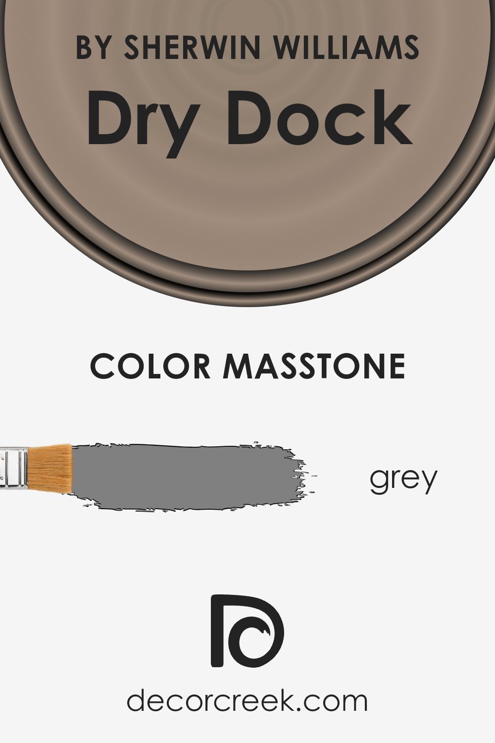
What is the Masstone of the Dry Dock SW 7502 by Sherwin Williams?
Dry DockSW 7502 by Sherwin Williams is a unique color that sports a grey masstone. This shade of grey, similar to the color code #808080, makes it very versatile and adaptable in various home settings.
Because of its neutral grey hue, it blends well with other colors and design elements without overpowering them. This characteristic is especially useful in home decor because it provides a balanced background, allowing furniture and artwork to stand out.
Additionally, grey is known for its ability to create a calming atmosphere, making it an excellent choice for bedrooms, living rooms, and study areas. Its subtle influence can help in maintaining a clean and ordered look, supporting a variety of design themes from modern minimalism to cozy traditional. Overall, this shade of grey is practical for those looking to achieve a stylish yet unobtrusive aesthetic in their spaces.
How Does Lighting Affect Dry Dock SW 7502 by Sherwin Williams?
Lighting plays a critical role in how we perceive colors in our environment. The type of light and its intensity can greatly influence the appearance of a color. For instance, under natural sunlight, colors generally appear brighter and more vivid since sunlight provides a full spectrum of light. Under artificial light, such as LEDs or fluorescent bulbs, colors may shift depending on the type of light emitted.
Dry Dock by Sherwin Williams is a neutral color with rich, warm, earthy tones that can appear differently based on the lighting conditions. Under artificial light, this color tends to look a bit more muted and cozy, providing a warm ambiance to the room. Artificial lights, especially warmer tones, can enhance its earthy quality, making a room feel more inviting.
In contrast, under natural light, Dry Dock appears lighter and more dynamic due to the broader spectrum of light. The nuances of the color are more apparent, displaying subtle variations throughout the day based on the light’s angle and intensity.
The appearance of Dry Dock also varies depending on the direction your room faces:
– North-facing rooms typically get less direct sunlight, which can make Dry Dock look more shadowed and subdued. The cooler, indirect light can enhance the depth of the color, giving it a rich appearance.
– South-facing rooms are flooded with ample sunlight, making Dry Dock look brighter and more vibrant. The warm light enhances its earthy undertones, making the room feel welcoming.
– East-facing rooms receive light in the morning when the sun is rising. This means Dry Dock will start the day with a soft, warm look, transitioning to cooler tones as the day progresses.
– West-facing rooms encounter sunlight in the late afternoon to evening. During this time, Dry Dock will glow warmly, possibly revealing more of its depth and complexity as the sunlight diminishes.
Understanding these differences can help in deciding where to use this shade to optimize its impact based on the room’s orientation and the type of light it receives.
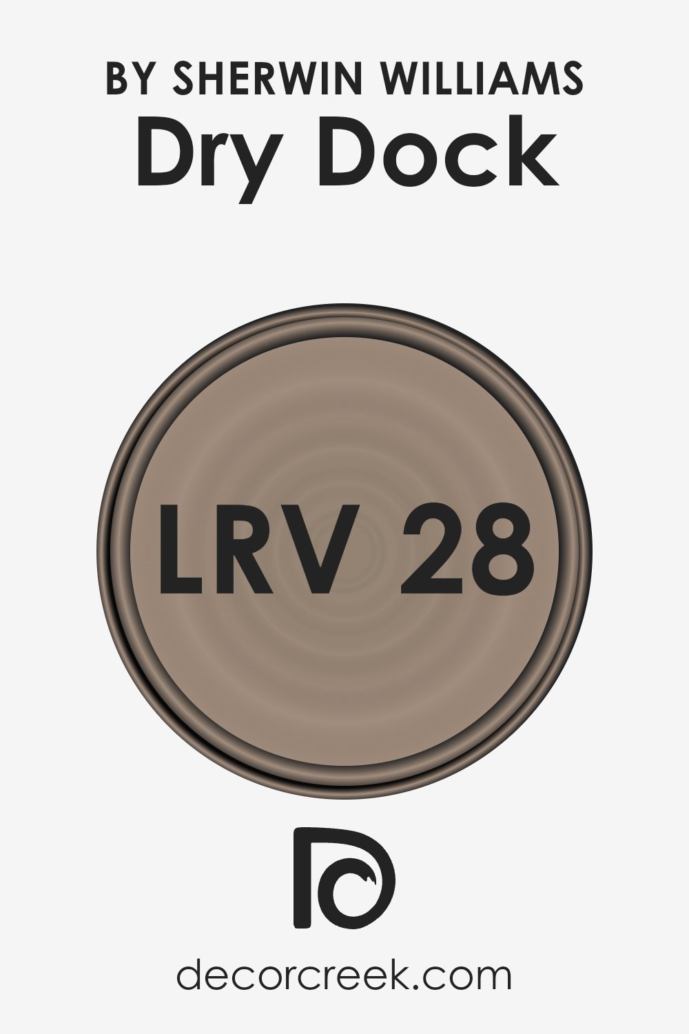
What is the LRV of Dry Dock SW 7502 by Sherwin Williams?
LRV stands for Light Reflectance Value, which is a measure that indicates how much light a paint color reflects back into a room as opposed to absorbing it. This scale measures from 1 to 99, where a higher number means the color reflects more light. Colors with a high LRV make a room feel brighter because they are reflecting more light. On the other hand, colors with a lower LRV absorb more light, which can make a space feel cozier but smaller and darker.
The LRV for Dry Dock is 28.001, which is towards the lower end of the scale. This means that it is a darker color that absorbs more light than it reflects. In practical terms, when used on walls, Dry Dock will not brighten up a space as much as a lighter color would.
Therefore, it’s ideal for creating a warmer or more intimate atmosphere in a room. However, if you’re painting a smaller or poorly-lit room, this color might make the space appear even smaller and darker, so additional lighting might be necessary to balance the effect.
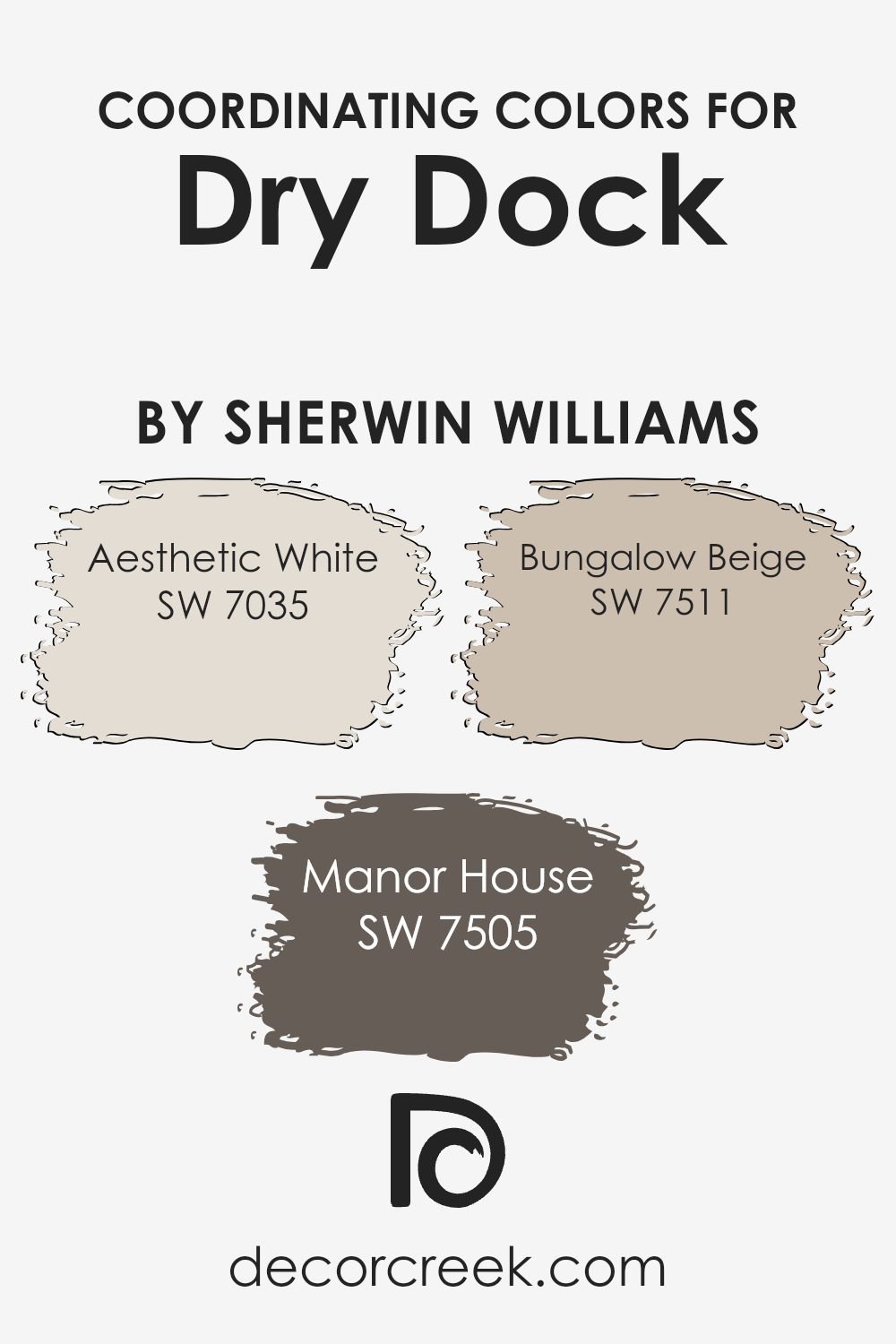
Coordinating Colors of Dry Dock SW 7502 by Sherwin Williams
Coordinating colors are hues that complement each other well when used together in decorating or design. They help in achieving a balanced and harmonious look, ensuring that no single color overwhelms the others. For example, the color Dry Dock by Sherwin Williams can be beautifully complemented by shades like Aesthetic White, Manor House, and Bungalow Beige. Such combinations can enhance the overall aesthetics of a space, making it more inviting.
Aesthetic White is a soft off-white with subtle nuances that make it a versatile background color. It pairs excellently with darker tones, providing a gentle contrast that’s neither too stark nor too bland. Manor House is a richer, deeper gray that adds a touch of elegance and grounding to interiors.
This color contrasts nicely with lighter shades, offering a sophisticated yet accessible palette. Bungalow Beige has a warm, earthy quality that brings coziness to any room. It works particularly well in spaces that aim for a natural, organic feel, complementing both light and dark colors. Together, these colors generate a cohesive color scheme that can enhance the ambiance of any home or space.
You can see recommended paint colors below:
- SW 7035 Aesthetic White
- SW 7505 Manor House
- SW 7511 Bungalow Beige
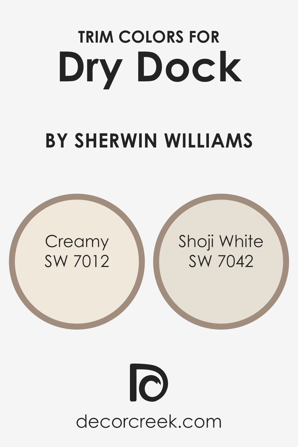
What are the Trim colors of Dry Dock SW 7502 by Sherwin Williams?
Trim colors play a crucial role in defining and accentuating the aesthetic appeal of a space, particularly when using a specific paint like Dry Dock SW 7502 by Sherwin Williams. Choosing the right trim color can highlight architectural details, frame sections of a room, or create a beautiful contrast that complements the main wall color. For a color like Dry Dock, which carries a unique and subtle tone, using lighter trim colors can help enhance its distinctiveness without overwhelming the space.
SW 7012 – Creamy is a warm, soft white that offers a gentle and inviting feel, making it a great choice for trim that creates a smooth transition between the wall color and other elements of the room.
On the other hand, SW 7042 – Shoji White is a neutral, off-white shade with a slightly gray undertone, providing a subtle distinction from pure white trims, thereby enriching visual interest and depth against the cooler tones of Dry Dock. Both choices are flexible and can help achieve a cohesive look while still allowing the main color to stand out as the focal element of the decor.
You can see recommended paint colors below:
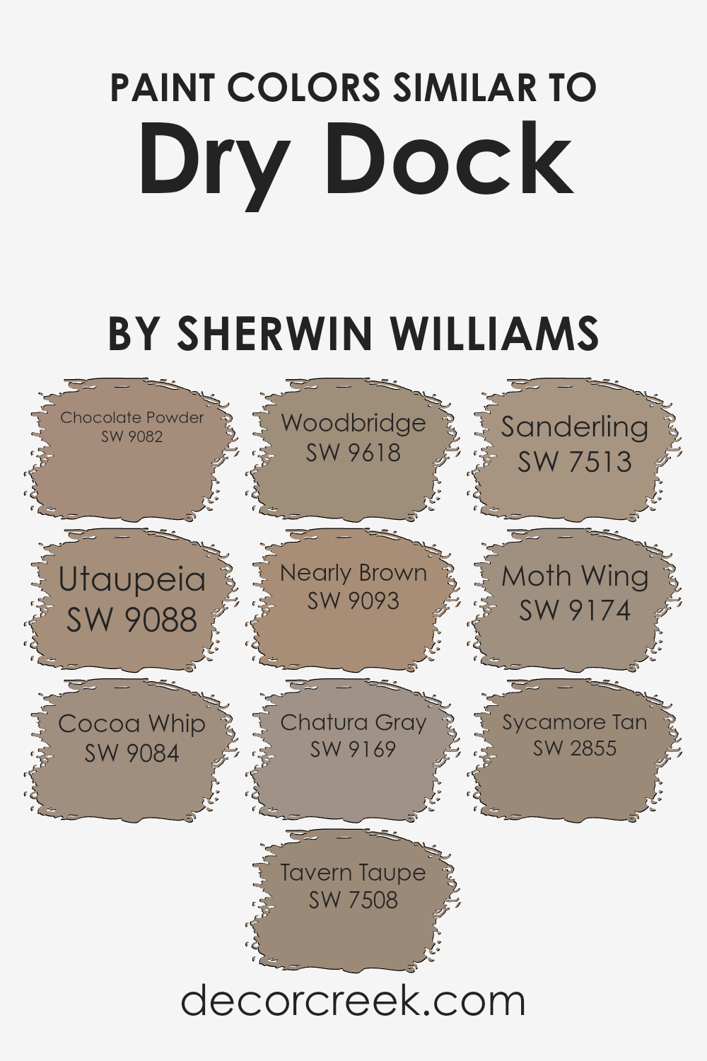
Colors Similar to Dry Dock SW 7502 by Sherwin Williams
Similar colors maintain a harmonious and aesthetically pleasing balance, making them a crucial tool in creating cohesive and inviting spaces. They are often variations of the same hue with differences in brightness or saturation. When used effectively, similar colors can create a subtle yet impactful visual experience, providing depth and continuity without overwhelming the senses. This approach can be especially useful in design and decoration, where maintaining a consistent theme is important.
Considering similar colors to Dry Dock by Sherwin Williams, such as Chocolate Powder and Utaupeia, provides insight into how varying shades contribute to designing coherent spaces. Chocolate Powder is a deep, warm brown that offers an earthy richness, perfect for adding a sense of stability and comfort.
Utaupeia, on the other hand, is lighter, blending tan and beige to produce a warm neutral that works well in a variety of settings. Cocoa Whip introduces a softer brown, which radiates warmth and coziness, while Tavern Taupe provides a stronger, more pronounced hue that brings a traditional feel.
Woodbridge has a muted, antique quality, ideal for spaces that require a touch of tradition without darkness. Nearly Brown edges towards a subtler, dusky brown, offering versatility in pairing with other colors.
Chatura Gray stands out as a gray with a hint of brown, lending it the flexibility to complement both cool and warm palettes. Sanderling leans towards lighter, sandy tones, which can brighten a space while maintaining warmth. Moth Wing, a mid-tone gray-brown, bridges the gap between darker and lighter tones, making it an excellent transitional color.
Lastly, Sycamore Tan offers a dusty, sun-baked brown that recalls natural elements, ideal for creating a rustic yet refined atmosphere. Each of these similar colors helps create a varied yet unified aesthetic, enabling designers and homeowners to craft spaces that feel both connected and enriched.
You can see recommended paint colors below:
- SW 9082 Chocolate Powder
- SW 9088 Utaupeia
- SW 9084 Cocoa Whip
- SW 7508 Tavern Taupe
- SW 9618 Woodbridge
- SW 9093 Nearly Brown
- SW 9169 Chatura Gray
- SW 7513 Sanderling
- SW 9174 Moth Wing
- SW 2855 Sycamore Tan
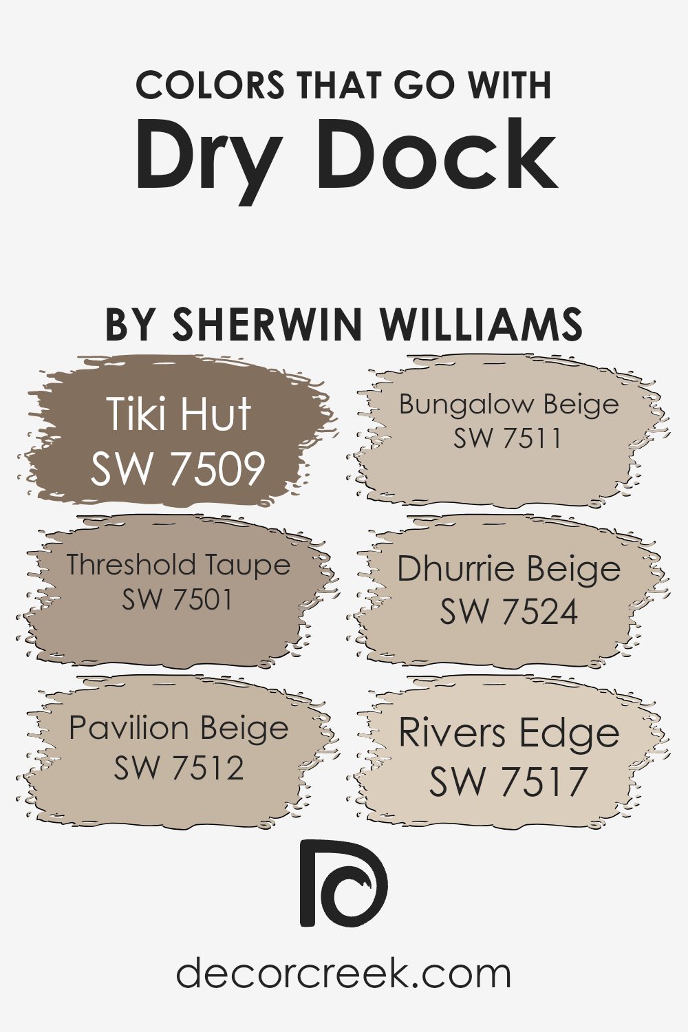
Colors that Go With Dry Dock SW 7502 by Sherwin Williams
Choosing the right colors to pair with Dry Dock SW 7502 by Sherwin Williams is crucial for creating a harmonious and appealing space. Dry Dock is a versatile neutral shade that can act as a subtle background, allowing other colors to stand out, or it can be the star itself when complemented by the right accents.
When paired with colors like Tiki Hut and Threshold Taupe, the overall aesthetic is warm and welcoming. Tiki Hut is a deeper brown that can bring a sense of coziness and grounding to a room, while Threshold Taupe adds a slightly lighter touch, keeping spaces feeling airy yet cozy.
In addition, blending Dry Dock with shades like Pavilion Beige and Bungalow Beige offers a smooth transition across a room, crafting an environment that feels cohesive and thoughtfully designed. Pavilion Beige is a light, sandy color that adds brightness to interiors without overwhelming them.
On the other hand, Bungalow Beige has a slightly richer hue that warms up a space, making it feel more intimate. For a more modern look, Dhurrie Beige provides a clean and crisp backdrop that works well in contemporary homes. Lastly, Rivers Edge serves as a striking contrast to Dry Dock, offering a deeper, more dramatic tone to create accents in decor or furnishings, lending some depth to the overarching design palette.
Effective color coordination enhances aesthetics, making spaces not just visually attractive, but also more comfortable and coherent to live in.
You can see recommended paint colors below:
- SW 7509 Tiki Hut
- SW 7501 Threshold Taupe
- SW 7512 Pavilion Beige
- SW 7511 Bungalow Beige
- SW 7524 Dhurrie Beige
- SW 7517 Rivers Edge
How to Use Dry Dock SW 7502 by Sherwin Williams In Your Home?
Dry Dock SW 7502, a color by Sherwin Williams, offers a versatile shade of taupe that brings a warm, inviting tone to any room. Ideal for creating a cozy atmosphere, this neutral hue pairs well with a variety of color palettes, making it easy to use in your existing decor.
Whether you’re looking to paint your living room, bedroom, or even a kitchen, Dry Dock has a soft, subtle charm that complements wood finishes, metals, and textiles alike.
This paint can also help enhance natural light in a space, making rooms feel larger and more open. It’s great for walls, but also works well for cabinets or as an accent color. If you’re considering a refresh for your home, Dry Dock is a reliable choice that adds warmth without overwhelming your space with strong color, ensuring a timeless look that you will enjoy for years.
Dry Dock SW 7502 by Sherwin Williams vs Tavern Taupe SW 7508 by Sherwin Williams
Sherwin Williams’ Dry Dock is a warm, beige color with a hint of gray, offering a soft and neutral choice ideal for creating a cozy atmosphere in any space. It pairs well with a variety of decorating styles and adds a subtle, gentle backdrop to rooms.
On the other hand, Tavern Taupe is a deeper, richer taupe that leans more towards a brown-gray. It’s noticeably darker than Dry Dock and brings a strong presence to a room, making it perfect for adding depth and warmth. While Dry Dock is more about softness and blending in, Tavern Taupe stands out a bit more and can make a bolder statement.
Both colors work well in a variety of settings but serve different purposes depending on the ambience you want to achieve. They can also complement each other beautifully in a single color scheme.
You can see recommended paint color below:
- SW 7508 Tavern Taupe
Dry Dock SW 7502 by Sherwin Williams vs Moth Wing SW 9174 by Sherwin Williams
Dry Dock and Moth Wing are two unique shades from Sherwin Williams. Dry Dock is a neutral beige color that brings a soft and warm atmosphere to any space. It’s light and versatile, making it a great choice for creating a relaxed, cozy environment. On the other hand, Moth Wing is a deeper, muted brown with a hint of gray.
This color is more intense and can add a sense of groundedness and richness to a room. Despite both being neutral, Dry Dock feels lighter and airier, suitable for opening up a space, while Moth Wing offers a more anchored and cozy feel, perfect for adding depth and warmth.
Together, these colors can complement each other well in a design scheme, with Dry Dock brightening areas and Moth Wing acting as a striking contrast.
You can see recommended paint color below:
Dry Dock SW 7502 by Sherwin Williams vs Chatura Gray SW 9169 by Sherwin Williams
When comparing the main color Dry Dock and the second color Chatura Gray, both by Sherwin Williams, there are noticeable differences. Dry Dock has a soft, muted beige tone that provides a warm and welcoming atmosphere. It’s a versatile color that easily pairs with various decor styles, making it ideal for living rooms or bedrooms where a cozy vibe is desired.
On the other hand, Chatura Gray presents a darker and cooler tone. This gray is more pronounced and can give a room a striking look. It’s perfect for creating a modern feel in a space and works well in areas that benefit from a more dramatic color, like dens or home offices.
Both colors offer their unique charm and can be used to create different moods in a space. While Dry Dock brings warmth and light, Chatura Gray offers depth and a contemporary edge.
You can see recommended paint color below:
- SW 9169 Chatura Gray

Dry Dock SW 7502 by Sherwin Williams vs Chocolate Powder SW 9082 by Sherwin Williams
Dry Dock SW 7502 is a warm neutral beige with a sandy tone, making it an excellent choice for creating a cozy and inviting atmosphere in any space. It pairs well with brighter colors and natural materials, offering a subtle backdrop that allows other design elements to stand out.
In contrast, Chocolate Powder SW 9082 is a deeper, rich brown that provides a stronger visual impact. This color is reminiscent of dark chocolate and is perfect for adding depth and warmth to a room. It works beautifully when used in spaces where you want to induce a sense of comfort, like in a study or a bedroom.
Both colors offer their unique charm, with Dry Dock providing a lighter, airier feel, and Chocolate Powder bringing in a more intense and hearty vibe. While Dry Dock suits spaces that aim for a soft and open look, Chocolate Powder is ideal for creating a snug, intimate environment.
You can see recommended paint color below:
- SW 9082 Chocolate Powder
Dry Dock SW 7502 by Sherwin Williams vs Woodbridge SW 9618 by Sherwin Williams
Dry Dock and Woodbridge, both from Sherwin Williams, showcase distinct color tones that serve different design needs. Dry Dock is a soft, warm gray with beige undertones, giving it a comfortable and inviting feel. This makes it great for spaces where you want a cozy and neutral background that complements various decor styles.
On the other hand, Woodbridge has a significantly darker, brownish-gray hue that suggests a more anchored, grounded feeling. This color is perfect for adding depth and warmth to a room. It works well in areas where a bold statement or a sense of solidity is desired.
Overall, while Dry Dock provides a light, airy touch, ideal for making smaller spaces appear bigger, Woodbridge offers a strong, comforting presence, suitable for creating a focal point or enhancing a room’s coziness. When choosing between these two, consider the mood and function of the room to make the best fit.
You can see recommended paint color below:
- SW 9618 Woodbridge

Dry Dock SW 7502 by Sherwin Williams vs Nearly Brown SW 9093 by Sherwin Williams
Dry Dock and Nearly Brown are both paint colors from Sherwin Williams. Dry Dock is a soft, light gray with warm undertones, making it a versatile choice for many spaces, providing a gentle and relaxed backdrop.
On the other hand, Nearly Brown leans towards a richer, darker hue, essentially a deep taupe that combines elements of brown and gray. This color can add a bit more weight and presence to a room compared to the lighter Dry Dock.
While Dry Dock reflects more light and can make a space feel more open and airy, Nearly Brown offers a cozier and more enclosed feel, making it ideal for creating a more intimate atmosphere. These colors can work well together in a home, with Dry Dock serving as a base and Nearly Brown as an accent for features like doors or furniture.
You can see recommended paint color below:
- SW 9093 Nearly Brown
Dry Dock SW 7502 by Sherwin Williams vs Cocoa Whip SW 9084 by Sherwin Williams
Dry Dock and Cocoa Whip are both neutral colors from Sherwin Williams, but they have different tones and moods. Dry Dock is a soft beige with warm undertones, giving it a cozy feel typical of many living spaces. It’s light enough to make rooms feel larger and brighter, but still adds enough color to the walls to create a welcoming atmosphere.
Cocoa Whip, on the other hand, is a darker shade that resembles the warmth and richness of light brown. This color provides a stronger visual impact and can make large spaces feel more intimate and grounded. Because of its depth, Cocoa Whip works well in areas where you want to add a bit of drama or anchor the space with a darker hue.
In summary, if you’re looking for a light, warm-neutral feel, Dry Dock is the better choice. For a deeper, cozy, and more impactful tone, Cocoa Whip would be ideal. Both colors provide a natural feel but achieve different effects in a room’s aesthetic.
You can see recommended paint color below:
- SW 9084 Cocoa Whip
Dry Dock SW 7502 by Sherwin Williams vs Utaupeia SW 9088 by Sherwin Williams
Dry Dock and Utaupeia are two paint colors by Sherwin Williams that feature subtlety and warmth, both excellent for creating a cozy atmosphere in any room. Dry Dock is a gentle gray with a touch of warmth, giving it a versatile character that works well in spaces that receive a lot of natural light or in dimmer, more intimate areas.
This color pairs beautifully with brighter colors or soft whites for a clean look. In contrast, Utaupeia leans more into the taupe spectrum, offering a slightly darker, earthier feel. It has a creamy quality that makes it perfect for settings where a calming, yet inviting ambiance is desired.
This color works well with rich woods and can also provide a beautiful backdrop for colorful decor pieces. Both colors provide a neutral palette, yet each brings its own unique mood to interior spaces, from quiet and mild to slightly bolder and warmer.
You can see recommended paint color below:
- SW 9088 Utaupeia

Dry Dock SW 7502 by Sherwin Williams vs Sanderling SW 7513 by Sherwin Williams
Dry Dock and Sanderling, both colors by Sherwin Williams, showcase subtle yet distinct differences in their hues. Dry Dock is a warm, gentle beige with a hint of gray, making it a versatile choice for rooms where you want a neutral backdrop that blends easily with other colors. It provides a comforting and soft appearance that works well in spaces such as living rooms or bedrooms where a calm atmosphere is desired.
On the other hand, Sanderling is lighter and has a touch more of the traditional sand color, lending a brighter feel. This color reflects more light, making it an excellent option for smaller spaces or areas that don’t get a lot of natural sunlight. It’s also great for creating a clean and inviting atmosphere, excellent for kitchens or bathrooms where a fresher look is often preferred.
Overall, while both colors offer neutral palettes, Dry Dock leans towards a cozier and slightly richer tone, whereas Sanderling offers a cleaner, brighter aesthetic.
You can see recommended paint color below:
- SW 7513 Sanderling
Dry Dock SW 7502 by Sherwin Williams vs Sycamore Tan SW 2855 by Sherwin Williams
Dry Dock and Sycamore Tan are both warm, inviting colors from Sherwin Williams, but they have distinct tones and uses. Dry Dock has a soft, subtle beige shade that makes it versatile for any room. It pairs well with both bright and neutral tones, allowing flexibility in decor choices.
On the other hand, Sycamore Tan carries a deeper, richer brown tone, providing a stronger presence in a space. This color works well in areas where a cozy, welcoming feel is desired, like living rooms or dining areas.
It tends to make large spaces feel more intimate and can add warmth when used on accent walls or in décor elements. While both colors can create a cozy atmosphere, Dry Dock leans towards a lighter, airier feel, whereas Sycamore Tan offers depth and warmth, making each ideal for different environments and styles.
You can see recommended paint color below:
- SW 2855 Sycamore Tan
In conclusion, SW 7502 Dry Dock by Sherwin Williams is a great choice if you want to add a warm and earthy feeling to any room in your home. Whether you’re painting a big living room or a small bathroom, this color brings a cozy and comforting vibe that makes the room feel welcoming. It works well with many different styles and decorations, so you don’t have to worry about it not fitting in with your existing furniture and designs.
The paint from Sherwin Williams is known for being high-quality, which means it will last a long time and look good for years. This makes it a smart choice because you won’t need to repaint as often. Plus, warmer colors like Dry Dock tend to make a place feel more inviting, which is perfect if you like having friends and family over.
Overall, if you are thinking about refreshing a room or updating your home’s look, SW 7502 Dry Dock is a color that could definitely meet your needs. It’s not just nice to look at but also practical, bringing warmth and a homey feel to any space without being too bold or out there.
It’s a safe and smart pick that I’m glad I considered for my home.
Ever wished paint sampling was as easy as sticking a sticker? Guess what? Now it is! Discover Samplize's unique Peel & Stick samples.
Get paint samples

