Black
Black Blue
Blue Brown
Brown Gray
Gray Green
Green Neutral
 Orange
 White
White Yellow
If you’re interested in giving your room a refreshing yet profound vibe, SW 6958 Dynamic Blue by Sherwin Williams might just be the color you’re looking for. I recently decided to repaint one of the rooms in my home and, after browsing several shades, I settled on this lively blue. It’s a vibrant hue that falls beautifully between subtlety and boldness, making it perfect for anyone wanting to add a splash of energy without being too bold.
Dynamic Blue has a unique way of bringing a cheerful feel while maintaining a soothing atmosphere, which can be quite rare in more vivid colors. It pairs wonderfully with crisp whites or soft grays, allowing for a variety of décor styles, from modern to coastal. If you enjoy changing up your decor often, you’ll find that many colors coordinate effortlessly with this adaptable blue.
So, if you’re planning to repaint your room and looking for a blue that’s both lively and calming, Dynamic Blue might be the right choice for you.
It has refreshed my room, combining just the right amount of vibrancy with a calming essence, providing a lovely backdrop for daily living.
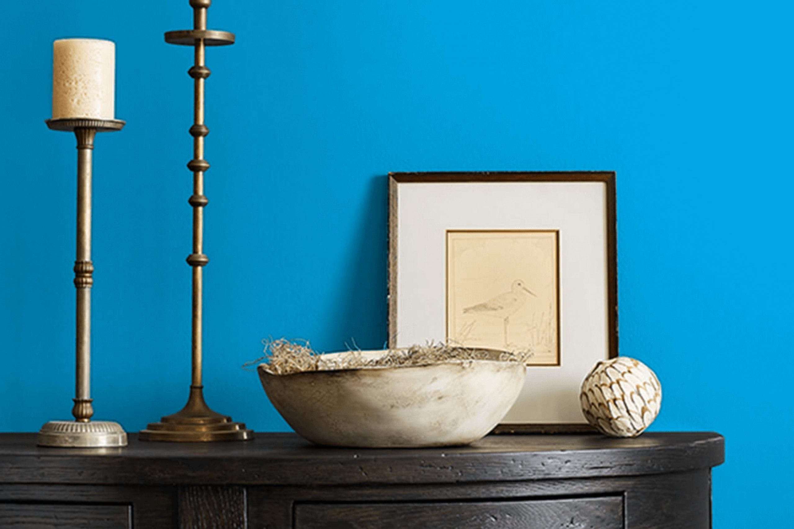
What Color Is Dynamic Blue SW 6958 by Sherwin Williams?
Dynamic Blue is a vibrant, eye-popping shade that instantly draws attention in any room. This intense blue has a lively, energetic vibe that can make a bold statement when used in interior design. Ideal for creating a striking focal point, it works particularly well on accent walls or for adding a splash of color through decorative accessories.
This powerful blue shade pairs beautifully with a variety of materials and textures. When combined with natural wood finishes, Dynamic Blue stands out even more, as the warm tones of the wood help to balance the cool intensity of the blue. Likewise, using it alongside metallic accents like brass or copper can add a touch of elegance and modern style to the room.
Dynamic Blue fits effortlessly into several interior design styles, especially modern and contemporary themes where its strong presence can be fully appreciated. It also works well in eclectic settings that favor bold, contrasting colors and textures. For a refreshing and vibrant look, pairing it with crisp whites or soft grays can keep a room feeling airy and light while still incorporating this powerful blue.
Overall, Dynamic Blue is a fantastic choice for anyone looking to inject color and vitality into their living room. Its compatibility with various materials and interior styles makes it an adaptable option for both home and office environments.
decorcreek.com
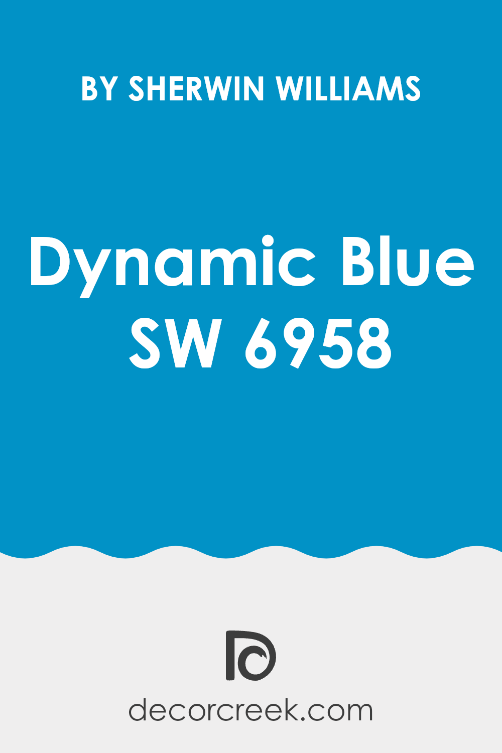
Is Dynamic Blue SW 6958 by Sherwin Williams Warm or Cool color?
Dynamic Blue is a vibrant paint color from Sherwin Williams that adds a burst of energy to any room. This shade of blue has a bold character that gives walls and rooms a fresh, lively look. It’s perfect for creating a focal point in a room, whether it’s used on an accent wall or to cover an entire room.
The intensity of Dynamic Blue can make smaller rooms feel more intimate and cozy, while in larger rooms, it brings a sense of fun and drama.
When used in homes, Dynamic Blue pairs well with crisp whites or soft grays for a balanced look. It’s ideal for living areas or bedrooms where a touch of color can uplift the mood. For those wanting to add a modern twist to their home, pairing this vibrant blue with sleek furniture and metallic accents works wonderfully. However, due to its boldness, it’s important to use this color thoughtfully to avoid being too bold.
Undertones of Dynamic Blue SW 6958 by Sherwin Williams
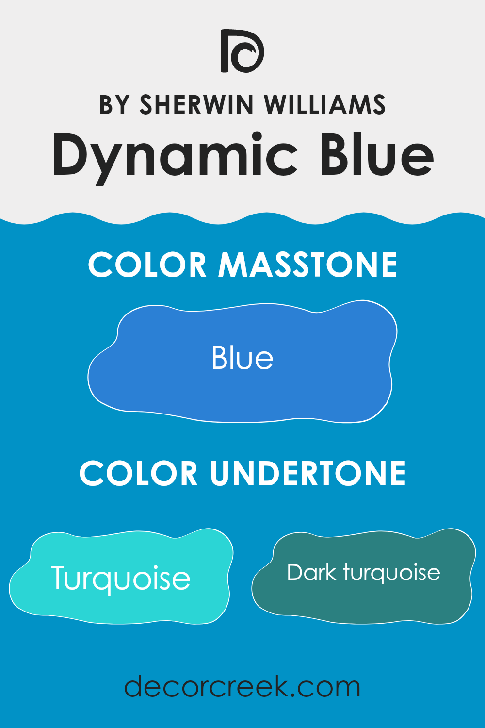
Dynamic Blue is a vivid and adaptable paint color that includes a rich palette of undertones, ranging from various shades of turquoise and blue to touches of violet and grey. These undertones play a crucial role in influencing how the color is perceived in different settings and lighting conditions.
Undertones are subtle hues that can enhance or slightly alter the main color. For example, turquoise and light turquoise provide a refreshing and vibrant feel, which can make a room feel more lively and inviting. Dark turquoise and navy add depth, making the blue appear more grounded and robust, which can be used to add a sense of stability in a room.
Grey and mint undertones bring a cool, calming effect, softening the overall look of the color, making it more adaptable to various decor styles and rooms. Conversely, lilac and violet introduce a hint of warmth and creativity, opening up options for pairing with more colorful or eclectic furnishings.
When used on interior walls, Dynamic Blue can create different moods depending on its undertones. In a brightly lit room, the lighter undertones like light turquoise and light blue might become more pronounced, giving the room a breezier feel. In rooms with less natural light, the darker undertones like dark blue and navy might stand out, providing a more intimate and cozy atmosphere.
Overall, the rich blend of undertones in Dynamic Blue makes it an excellent option for those looking to add both character and flexibility to their living rooms. The choice of exact shade and companion colors can significantly affect the ambiance of a room, making it crucial to consider the undertones when choosing this unique blue shade.
decorcreek.com
What is the Masstone of the Dynamic Blue SW 6958 by Sherwin Williams?
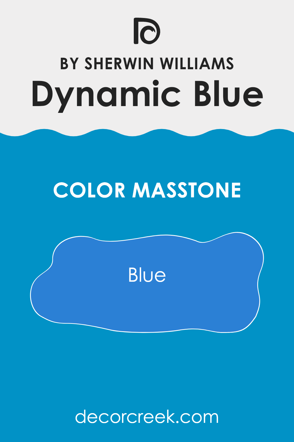
Dynamic Blue SW 6958 by Sherwin Williams has a masstone identified by the color code Blue (#2B80D5). This shade is vibrant and lively, making it a standout choice for adding a splash of energy to any room. In home decor, using Dynamic Blue can make walls pop, especially when used in well-lit rooms or as an accent.
It provides a refreshing contrast when paired with neutral shades like white or grey, ensuring that the interior feels lively but not too bold. This color works particularly well in areas that benefit from a dose of cheerfulness, such as kitchens, playrooms, or even home offices.
It can effectively brighten such rooms, providing a stimulating environment that enhances creativity and mood. Overall, Dynamic Blue can be a great option for homeowners looking to introduce color without going overboard, maintaining a fun yet manageable aesthetic in their room.
decorcreek.com
How Does Lighting Affect Dynamic Blue SW 6958 by Sherwin Williams?
Lighting plays a critical role in how we perceive colors in any setting. The way light interacts with paint color can significantly change its appearance throughout the day or under different lighting conditions. Specifically, let’s take a look at the impact of lighting on a shade like Dynamic Blue SW 6958 by Sherwin Williams, a rich and vibrant blue.
In natural light, colors can appear differently based on the direction of the light and the time of day. In a room facing north, Dynamic Blue may appear slightly cooler and more muted due to the indirect, softer light typically found here. This might make the blue seem more subtle and calm.
On the other hand, in a south-facing room, where light is more direct and often brighter for the longer part of the day, Dynamic Blue will show its richness and depth. The vibrant qualities of the blue are likely to be more pronounced in this type of lighting, making the walls look lively and bold.
In east-facing rooms, where sunlight is warm and bright in the morning, Dynamic Blue will appear very vibrant and bright during the early hours. As the day progresses and the natural light dims, the color may lose some of its vibrancy but still hold on to its depth.
For west-facing rooms, the scenario is somewhat reversed from east-facing rooms. Here, the color might look more subdued in the morning when the light is dimmer but become dramatically vibrant and intense in the evening as it catches the warm, golden tones of the setting sun.
When it comes to artificial light, the type of bulbs used can also affect the appearance of Dynamic Blue. Warm lights, like those from standard incandescent bulbs, can enrich the blue, making it look more inviting. Cooler lights, like those from fluorescents, might push it towards a slightly greener or colder tone.
Overall, Dynamic Blue’s interaction with light makes it an adaptable color that can shift in mood depending on the lighting conditions present, making it a compelling choice for various rooms and settings.
decorcreek.com
What is the LRV of Dynamic Blue SW 6958 by Sherwin Williams?
LRV stands for Light Reflectance Value, and it is a measure that indicates how much light a paint color reflects back into a room. The measurement scales from 1 to 99, with higher numbers reflecting more light. Darker colors have lower LRVs and thus absorb more light, making them less reflective.
This measure is crucial for determining how a color will look once applied to the walls of a room. It affects the overall brightness of the room and can make a small room feel more enclosed or a large room feel cozier, depending on the LRV of the paint chosen.
In the case of a color with an LRV of 24.013, like Dynamic Blue, it is on the darker end of the scale. This means it absorbs more light than it reflects, which can significantly influence its appearance and the atmosphere it creates in a room. A wall painted in this shade may appear bold and impactful, contributing to a moodier, more intense visual experience. In a well-lit room or an area with large windows and ample natural light, this color might still appear vibrant. However, in a room with limited natural light, it might make the room feel darker and more enclosed.

decorcreek.com
Coordinating Colors of Dynamic Blue SW 6958 by Sherwin Williams
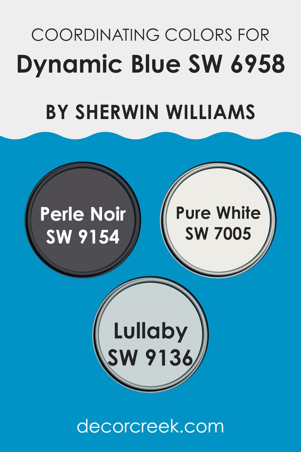
Coordinating colors are chosen to work harmoniously alongside a main color, enhancing the overall aesthetics of a room without dominating the primary hue. For instance, when working with a vibrant color like Dynamic Blue by Sherwin-Williams, select coordinating colors that can balance and complement this striking shade. A well-chosen palette can create a visually pleasing environment that reflects a sense of balance and style.
For a strong, dramatic contrast, Perle Noir is an excellent choice. This deep, almost black hue adds a bold touch, perfect for accentuating features or creating depth in a room dominated by lighter or brighter colors. In contrast, Pure White offers a clean, crisp backdrop that allows Dynamic Blue to truly stand out, providing a refreshing counterpoint that brightens and enlarges any room.
For those seeking a softer complement, Lullaby presents a gentle powder blue tone that pairs subtly with Dynamic Blue, promoting a calm and cohesive look without competing for attention. Each of these colors contributes to a well-rounded palette that enhances the original appeal of the dynamic primary shade.
You can see recommended paint colors below:
- SW 9154 Perle Noir
- SW 7005 Pure White
- SW 9136 Lullaby
What are the Trim colors of Dynamic Blue SW 6958 by Sherwin Williams?
Trim colors are specially selected shades used to accent architectural details and frames such as door frames, window trim, and skirtings, enhancing the overall aesthetics of a room. When paired thoughtfully with a bold wall color such as Dynamic Blue by Sherwin Williams, trim colors can either subtly complement the main hue or create a pleasing contrast that highlights the architectural features of a room.
Using colors like Moderate White or Repose Gray as trim options allows for a balanced visual experience that ties the room’s elements together without dominating the central theme established by the vibrant Dynamic Blue.
Moderate White is a soft and gentle shade that offers a fresh and clean look when used as a trim, providing a light contrast that can help the intensity of Dynamic Blue pop without being too bold. Repose Gray, on the other hand, is a neutral gray that provides a slightly stronger contrast against Dynamic Blue, lending a more defined and grounding edge to the room’s decor. Both colors help frame the room in an understated yet effective manner, making them excellent choices for enhancing the dynamism of Dynamic Blue.
You can see recommended paint colors below:

Colors Similar to Dynamic Blue SW 6958 by Sherwin Williams
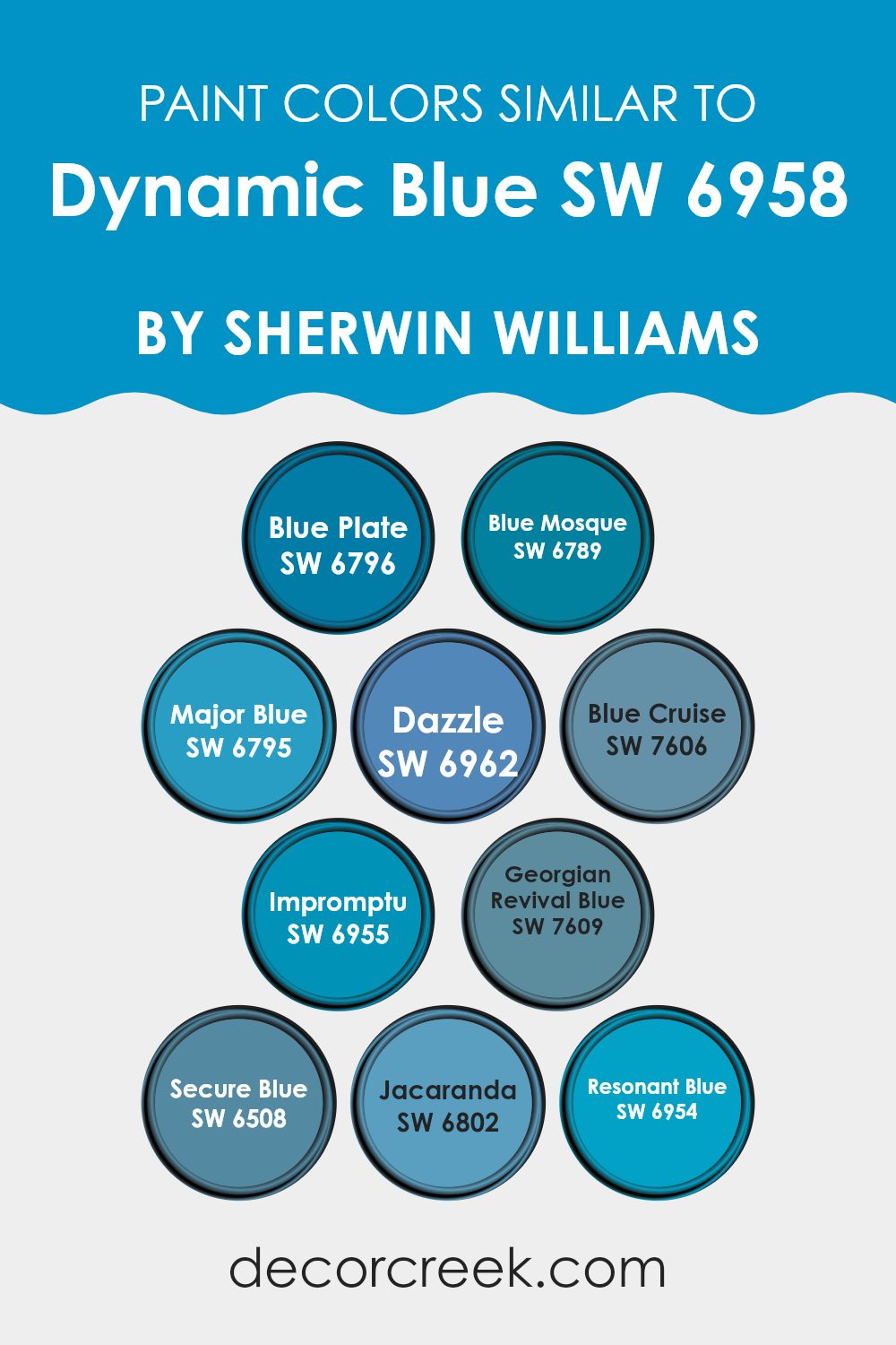
Similar colors play a crucial role in design by creating a harmonious and balanced visual experience. When colors like Blue Plate (SW 6796) and Blue Mosque (SW 6789) are used together, they provide a subtle variation that enriches the environment without being too bold.
These shades, along with Major Blue (SW 6795) and Dazzle (SW 6962), offer a vibrant spectrum while maintaining a unified look, ideal for layering and adding depth to rooms. Blue Cruise (SW 7606) and Impromptu (SW 6955) similarly offer soft transitions between colors, ensuring that each area of a design feels connected, yet distinctly unique.
Continuing with similar shades, Georgian Revival Blue (SW 7609) and Secure Blue (SW 6508) lean towards a slightly muted tone, which makes them perfect for rooms that aim for a calm yet colorful ambiance. Jacaranda (SW 6802) adds a touch of playful brightness, contrasting subtly with the deepness of Resonant Blue (SW 6954), which anchors the lighter hues and brings an element of depth. Utilizing shades like these ensures that the environment remains visually engaging and aesthetically pleasing, encouraging a dynamic yet cohesive room.
You can see recommended paint colors below:
- SW 6796 Blue Plate
- SW 6789 Blue Mosque
- SW 6795 Major Blue
- SW 6962 Dazzle
- SW 7606 Blue Cruise
- SW 6955 Impromptu
- SW 7609 Georgian Revival Blue
- SW 6508 Secure Blue
- SW 6802 Jacaranda
- SW 6954 Resonant Blue
Colors that Go With Dynamic Blue SW 6958 by Sherwin Williams
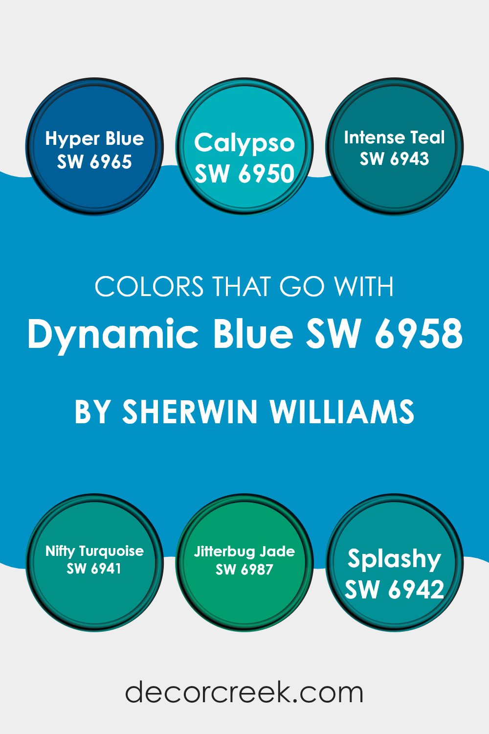
Selecting the perfect colors to accompany Dynamic Blue SW 6958 from Sherwin Williams is crucial as it helps in creating a harmonious and appealing aesthetic for any room. Such color combinations enhance the visual impact and set the desired mood within a room.
Using compatible colors like Hyper Blue or Calypso, for instance, offers a vibrant and energetic feel, suitable for dynamic and youthful rooms such as playrooms or creative studios. These colors support each other, providing a bold yet balanced environment that stimulates the senses.
Intense Teal and Nifty Turquoise are great companions for Dynamic Blue as they lend a cool and refreshing vibe, ideal for bathrooms or bedrooms where a calming yet cheerful atmosphere is desired. On the other hand, Jitterbug Jade and Splashy add a touch of lively zest, which can invigorate rooms that benefit from a splash of excitement and fun, like kitchens or dining areas. By pairing Dynamic Blue with these colors, you can ensure that each room not only stands out but also maintains a coherent and pleasant visual flow throughout your home or office. This thoughtful approach to color pairing can make decorating a truly enjoyable and rewarding process.
You can see recommended paint colors below:
- SW 6965 Hyper Blue
- SW 6950 Calypso
- SW 6943 Intense Teal
- SW 6941 Nifty Turquoise
- SW 6987 Jitterbug Jade
- SW 6942 Splashy
How to Use Dynamic Blue SW 6958 by Sherwin Williams In Your Home?
Dynamic Blue SW 6958 by Sherwin Williams is a vibrant and cheerful color that offers a fresh look to any room. This shade of blue can make rooms feel alive and welcoming.
If you’re thinking about adding a splash of color, consider painting an accent wall in your living room or bedroom with Dynamic Blue. This bold move will draw attention and make the wall stand out, adding a lot of character to the room.
You can also use this color in a bathroom or kitchen for a clean and energetic atmosphere. Pairing Dynamic Blue with neutral colors like white or gray works well, balancing the brightness with a calming base. Additionally, it’s perfect for furniture pieces that need a new life. A dresser or a set of chairs in Dynamic Blue can turn into exciting focal points. Using this color can liven up your home and make it more enjoyable.
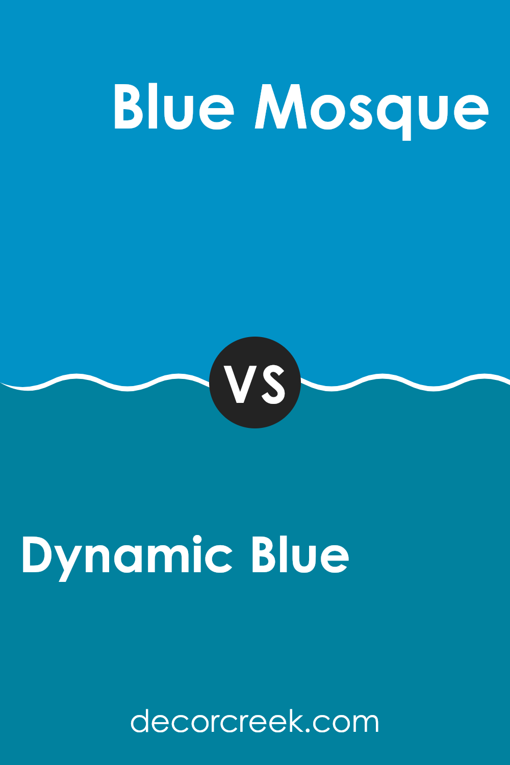
Dynamic Blue SW 6958 by Sherwin Williams vs Blue Mosque SW 6789 by Sherwin Williams
Dynamic Blue and Blue Mosque are two distinct shades offered by Sherwin Williams. Dynamic Blue is a vibrant and bold color, leaning towards a mid-tone blue with a sense of lively energy. It suits rooms where a strong, cheerful vibe is desired, like playrooms or creative rooms.
On the other hand, Blue Mosque is deeper and calmer. This shade is closer to navy, providing a more grounded feeling. It works well in areas where you want a more mature and calm atmosphere, such as bedrooms or offices.
Both colors are blue, but each brings its own unique mood to a room. Dynamic Blue adds a pop of brightness, making rooms feel more dynamic. Blue Mosque, with its darker tone, offers a sense of grounding and can make larger rooms feel cozier. Each color has its ideal applications depending on the feeling you want to achieve in the room.
You can see recommended paint color below:
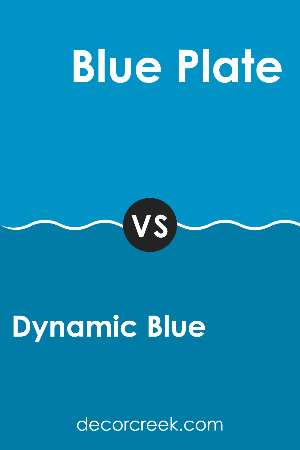
Dynamic Blue SW 6958 by Sherwin Williams vs Blue Plate SW 6796 by Sherwin Williams
Dynamic Blue and Blue Plate, both by Sherwin Williams, are distinct shades of blue that bring different vibes to a room. Dynamic Blue is a vibrant, deep blue that has a noticeable richness to it.
It is bold and can make a strong statement in a room, perfect for those who want a lively atmosphere. On the other hand, Blue Plate is a cooler, more subdued shade of blue. It’s lighter and carries with it a fresh, airy quality, making it excellent for creating a relaxed, peaceful environment.
While Dynamic Blue stands out and grabs attention, Blue Plate sets a more laid-back, calming mood. Both colors offer unique possibilities for decorating, depending on the feel you want to achieve in your room.
You can see recommended paint color below:
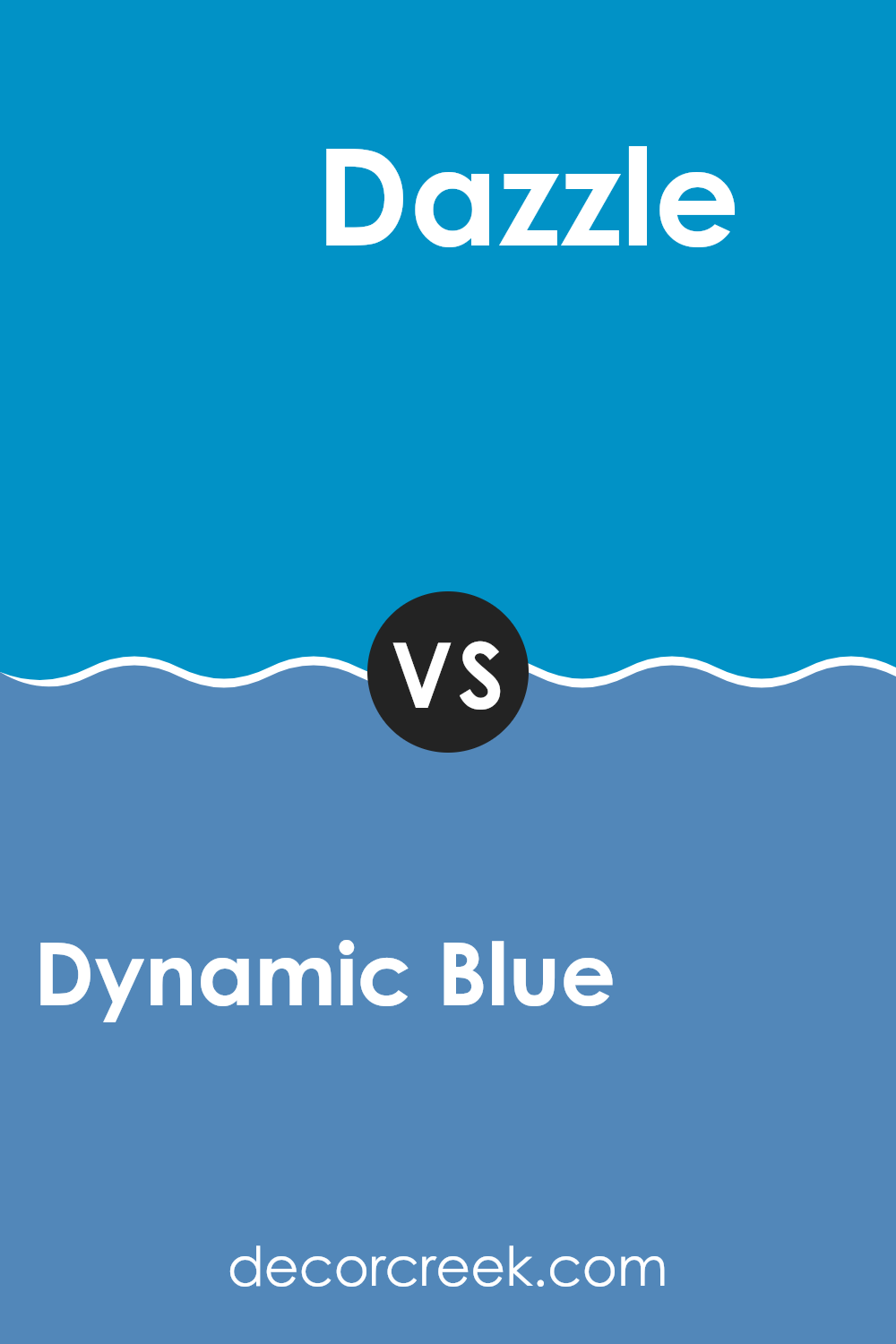
Dynamic Blue SW 6958 by Sherwin Williams vs Dazzle SW 6962 by Sherwin Williams
Dynamic Blue and Dazzle, both from Sherwin Williams, offer distinct tones that can significantly impact the atmosphere of any room. Dynamic Blue is a deep, rich blue with a strong presence that can make any room feel more substantial and grounded. It’s an excellent choice for creating a bold statement wall or for accenting smaller areas to draw attention.
On the other hand, Dazzle is a vivid, electric blue that stands out due to its brightness and energy. This shade is perfect for rooms where you want to inject vibrancy and enthusiasm, such as a playroom, creative room, or an accent feature in a modern kitchen.
While both colors share a blue base, Dynamic Blue leans towards a more conservative and traditional feel, whereas Dazzle offers a lively and youthful vibe. Choosing between them would depend on the mood you’re aiming to achieve – calm and steady with Dynamic Blue or exciting and vibrant with Dazzle.
You can see recommended paint color below:
- SW 6962 Dazzle
Dynamic Blue SW 6958 by Sherwin Williams vs Major Blue SW 6795 by Sherwin Williams
Dynamic Blue and Major Blue, both from Sherwin Williams, offer unique shades of blue that can greatly influence the feel of a room. Dynamic Blue is a rich, deep blue with a hint of brightness that brings energy and vibrancy to any area. It has a lively quality that makes it suitable for rooms used for activities and social gatherings.
On the other hand, Major Blue has a lighter, more playful tone. It leans towards a slightly sky-blue hue that feels refreshing and calming. This color is ideal for creating a relaxed atmosphere in places like bedrooms or bathrooms, where a softer touch is often appreciated.
When you compare the two, Dynamic Blue stands out as more striking and bold, while Major Blue offers a lighter, soothing feel. Choosing between them depends on what mood or style you want to set in your room.
You can see recommended paint color below:
- SW 6795 Major Blue
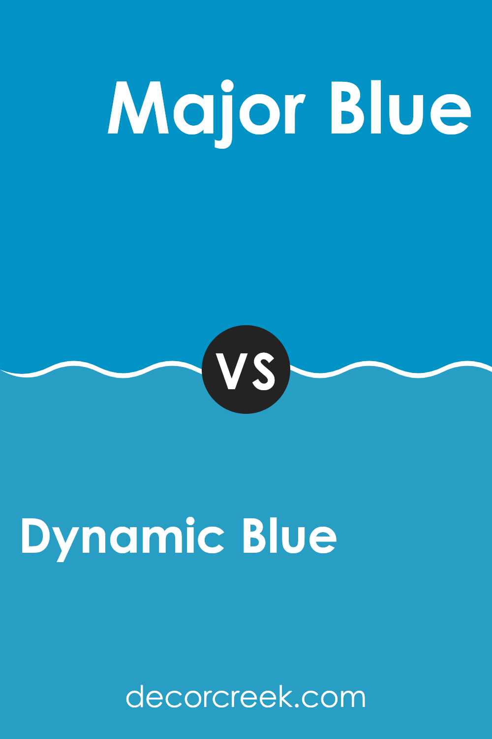
Dynamic Blue SW 6958 by Sherwin Williams vs Georgian Revival Blue SW 7609 by Sherwin Williams
Dynamic Blue and Georgian Revival Blue, both from Sherwin Williams, present distinct vibes due to their unique tones. Dynamic Blue is a vivid, bold blue with a bright presence that catches the eye. This shade is electric and can energize a room, making it cheerful. It’s an excellent choice for areas where you want to make a strong visual statement.
On the other hand, Georgian Revival Blue has a softer, more muted quality. It is not as intense as Dynamic Blue but instead offers a lighter, airier feel, reminiscent of a calm sky or a gentle sea. This color is ideal for creating a relaxed and inviting ambiance, perfect for rooms meant for resting or subtle decoration.
Both colors support different design needs — Dynamic Blue for a lively burst and Georgian Revival Blue for a gentle touch of blue. Choosing between them depends on the atmosphere you want to achieve in a room.
You can see recommended paint color below:
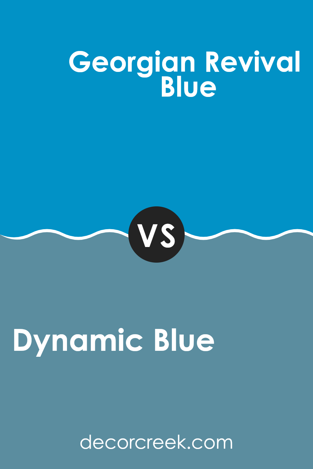
Dynamic Blue SW 6958 by Sherwin Williams vs Secure Blue SW 6508 by Sherwin Williams
Dynamic Blue is a rich and lively shade that pops with vibrancy. This makes it a great choice for adding a burst of energy to any room. Its bold tone pairs well with lighter colors, creating a striking contrast that can liven up a room.
On the other hand, Secure Blue has a more subdued quality. It’s a cooler shade that leans towards a calming presence, making it perfect for places where you want to relax, like a bedroom or bathroom. This color is softer and less intense compared to Dynamic Blue, providing a gentle backdrop rather than standing out sharply.
Overall, while both colors come from the blue family, Dynamic Blue stands out more and adds energy, whereas Secure Blue offers a more subdued, calming atmosphere. Each has its unique appeal depending on the mood and style you want to achieve in your room.
You can see recommended paint color below:
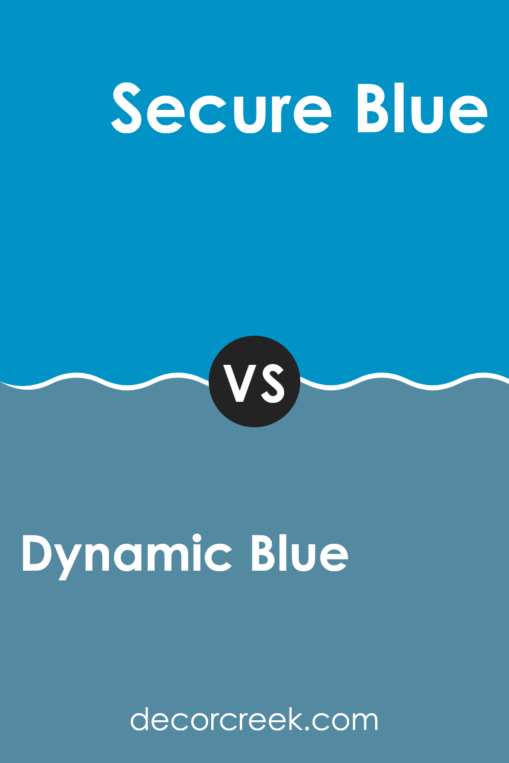
Dynamic Blue SW 6958 by Sherwin Williams vs Resonant Blue SW 6954 by Sherwin Williams
Dynamic Blue and Resonant Blue by Sherwin Williams are both appealing shades, but they have distinct differences. Dynamic Blue is a strong, vivid blue. It’s quite bold and can really make a statement in a room, adding a punch of color that stands out.
On the other hand, Resonant Blue is a bit softer. It’s still clearly blue, but with a slightly muted tone that feels more subtle. This makes Resonant Blue a better choice if you’re going for a calm feel without being too bold.
When thinking about using these colors in a home, Dynamic Blue would be great for a focal point or an accent wall, especially in a modern setting where you want a splash of brightness. Resonant Blue works well in areas where you prefer a gentle backdrop that complements other design elements rather than dominating them. Both colors work nicely with neutral tones, but the choice between them depends on whether you want the color to pop dramatically or blend smoothly.
You can see recommended paint color below:
- SW 6954 Resonant Blue
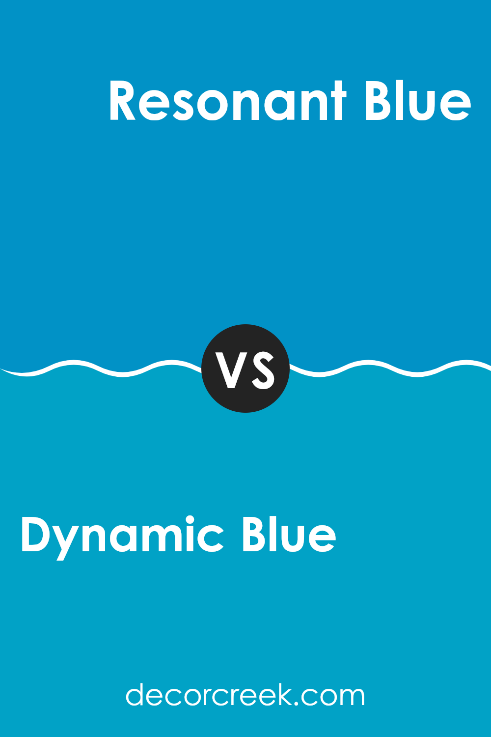
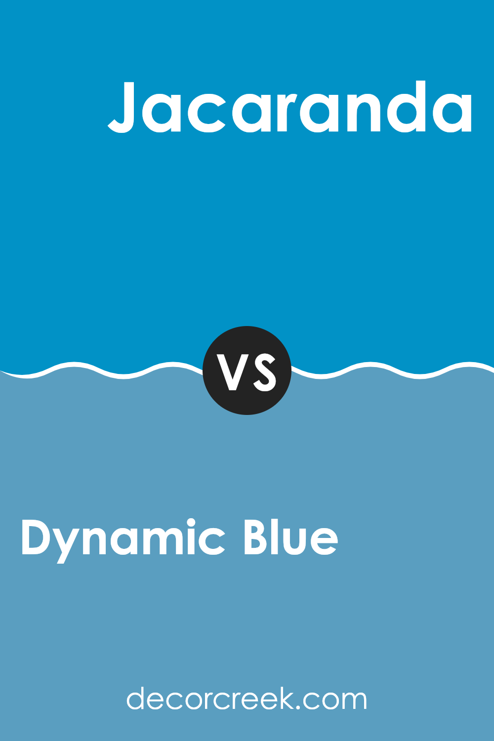
Dynamic Blue SW 6958 by Sherwin Williams vs Jacaranda SW 6802 by Sherwin Williams
Dynamic Blue is a vibrant shade of blue that is both bright and lively. It provides a playful yet strong ambiance to any room, making it perfect for creating a statement. Contrastingly, Jacaranda has a purplish tint, leaning more towards a deeper, moodier vibe.
While Dynamic Blue attracts attention with its energetic presence, Jacaranda offers a more subdued, yet equally striking appeal, ideal for adding a touch of mystery to interiors. Both colors are unique, but they serve different moods and themes in decor.
Dynamic Blue is great for rooms meant to energize, like a game room or a creative room, whereas Jacaranda suits areas where a more calming but rich color is desired, like bedrooms or libraries. Whether choosing the cheerful punch of Dynamic Blue or the enigmatic depth of Jacaranda, both hues have their own charm and can dramatically affect the atmosphere of a room.
You can see recommended paint color below:
- SW 6802 Jacaranda
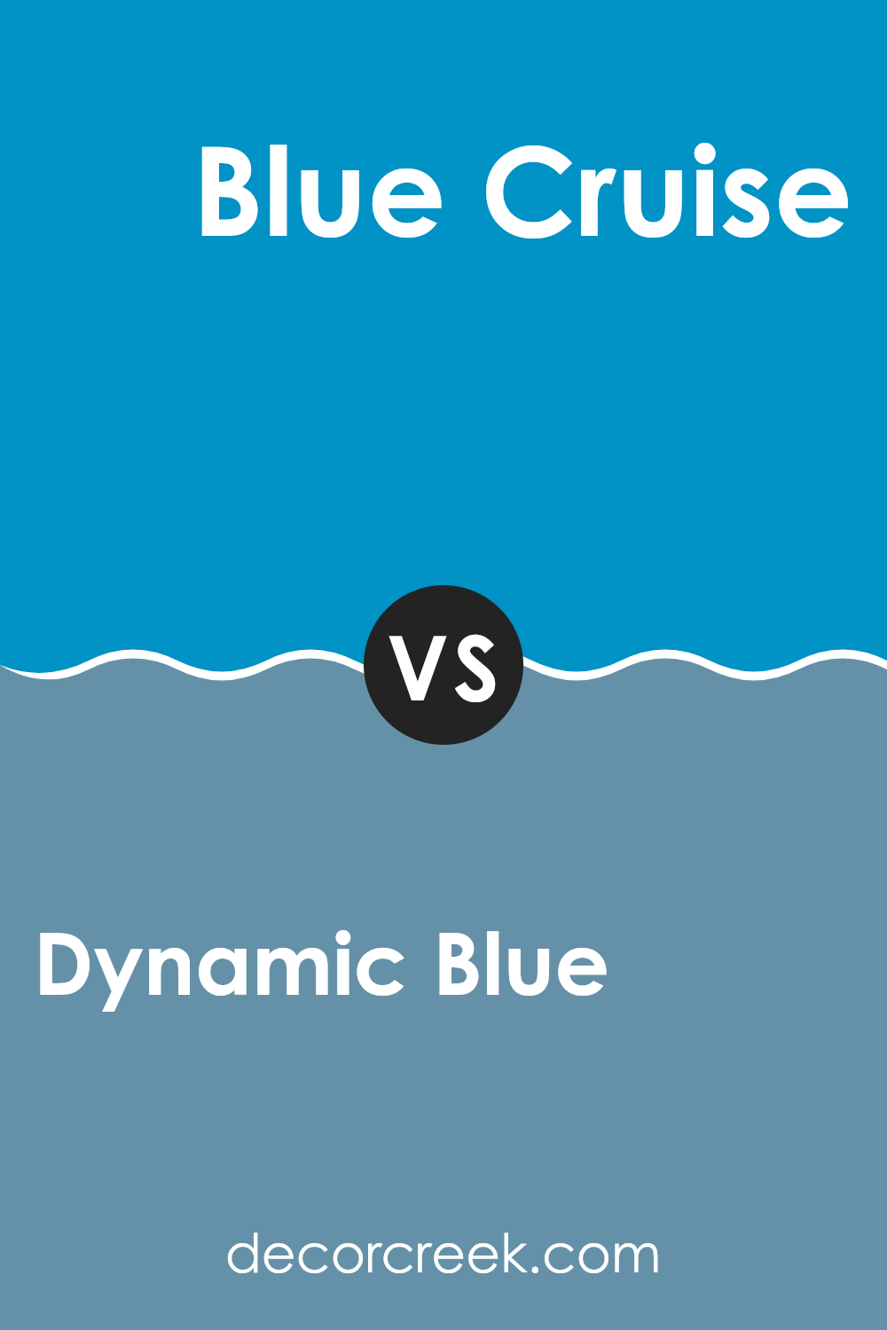
Dynamic Blue SW 6958 by Sherwin Williams vs Blue Cruise SW 7606 by Sherwin Williams
Dynamic Blue is a vibrant shade of blue that is both bright and lively. It provides a playful yet strong ambiance to any room, making it perfect for creating a statement. Contrastingly, Jacaranda has a purplish tint, leaning more towards a deeper, moodier vibe.
While Dynamic Blue attracts attention with its energetic presence, Jacaranda offers a more subdued, yet equally striking appeal, ideal for adding a touch of mystery to interiors. Both colors are unique, but they serve different moods and themes in decor.
Dynamic Blue is great for rooms meant to energize, like a game room or a creative room, whereas Jacaranda suits areas where a more calming but rich color is desired, like bedrooms or libraries. Whether choosing the cheerful punch of Dynamic Blue or the enigmatic depth of Jacaranda, both hues have their own charm and can dramatically affect the atmosphere of a room.
You can see recommended paint color below:
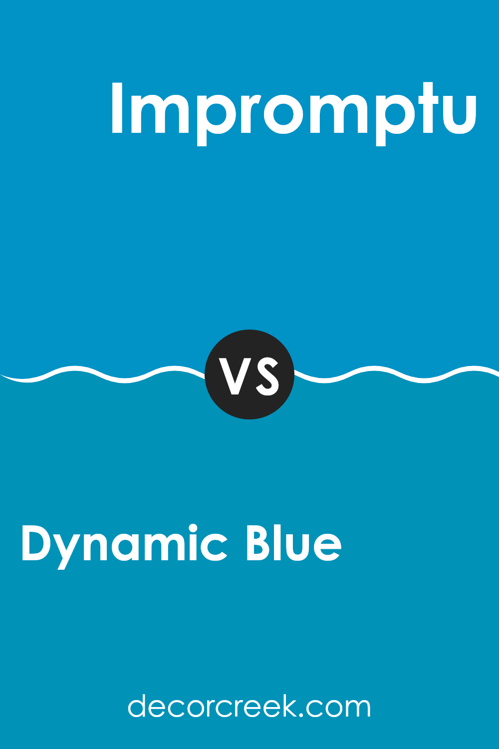
Dynamic Blue SW 6958 by Sherwin Williams vs Impromptu SW 6955 by Sherwin Williams
Dynamic Blue and Impromptu, both from Sherwin Williams, offer unique takes on the blue color spectrum. Dynamic Blue is a vivid, striking shade that brings a sense of energy and brightness to a room. It’s bold and tends to stand out as a primary color in any room, making it a great choice for focal walls or decorative accents.
In contrast, Impromptu is a softer, more subdued blue. It leans towards a slate color, providing a calming effect. This makes it adaptable for larger areas, as it doesn’t dominate with brightness but instead adds a gentle touch of color.
While Dynamic Blue is more about making a strong visual impact, Impromptu is about blending seamlessly into a design, offering a quiet anchor to various decorating styles. Together, they could complement each other in a room where Dynamic Blue draws the eye and Impromptu provides a soothing background.
You can see recommended paint color below:
- SW 6955 Impromptu
In conclusion, SW 6958 Dynamic Blue by Sherwin Williams is a really cool color that can make any room look better. It’s a bright blue that can cheer up a room and make it feel fresh and alive. I think it’s perfect for places where you want to feel happy and energetic, like a playroom or even a kitchen.
This blue isn’t just pretty to look at, but it’s also strong and can hide scuffs and marks well, which is great for places that get a lot of use. I tried it in my own home and noticed that it keeps looking good even after a few bumps and scratches.
If you’re thinking about adding a new color to your walls at home, SW 6958 Dynamic Blue is worth considering. It’s fun, lively, and really makes the room light up. It’s a good choice whether you’re just adding touches with this color or painting a whole room. Overall, Dynamic Blue is a simple way to make a big difference in how a room feels and looks.
Plus, it makes me smile every time I walk into the room painted with it!

decorcreek.com
Ever wished paint sampling was as easy as sticking a sticker? Guess what? Now it is! Discover Samplize's unique Peel & Stick samples.
Get paint samples