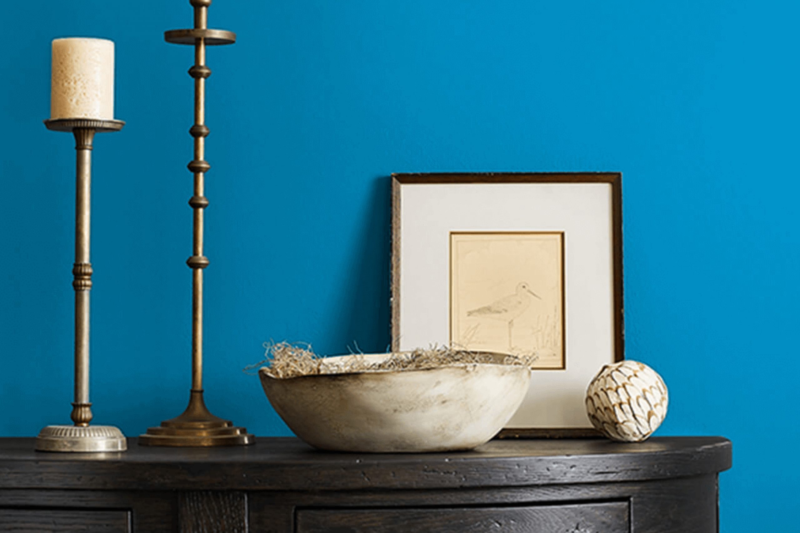
Choosing the right shade of blue for your walls can really change the mood of a room. Recently, I decided to refresh my home office and I stumbled upon SW 6796 Blue Plate by Sherwin Williams. This shade of blue is unique; it isn’t too bold or too subtle, striking a fine balance that enhances both focus and calmness in my work room.
As I applied the first swatches on the wall, the color’s true beauty started to show. Blue Plate has a soothing quality without being overpowering, and it pairs wonderfully with white trims, bringing a fresh and airy feel to the room. The more I looked at it, the more I appreciated how this particular tone could shift the ambiance from strictly functional to a more relaxed and pleasant area.
For those of you considering a new look for a room, especially one where you spend a lot of time, consider how the color affects both aesthetics and mood. In using SW 6796 Blue Plate, I found that it added just the right amount of energy and calm to encourage productivity and creativity.
Consider how a balanced blue like Blue Plate might renew your own room.
What Color Is Blue Plate SW 6796 by Sherwin Williams?
Blue Plate by Sherwin Williams is a vibrant and rich shade of blue that instantly brings a fresh and lively atmosphere to any room. This particular blue has a strong presence, yet it’s not overpowering, making it a great choice for both accent walls and full-room coverage. Its vividness enables it to stand out, yet it retains a certain warmth that makes it welcoming and comfortable to live with.
This color works exceptionally well in contemporary and modern interior designs due to its crisp and clean appeal. However, it’s also flexible enough to fit into more traditional settings, especially when paired with the right materials.
Blue Plate goes beautifully with natural wood tones, from light beech to dark walnut, which help to ground the vibrant blue with their natural warmth. For a sleeker look, pairing it with materials like polished marble, stainless steel, or glass can create a more refined aesthetic.
Additionally, combining Blue Plate with various textures can enhance its dynamic quality. Soft furnishings like velvet cushions or a woolly throw add a touch of luxury and comfort, contrasting nicely with the blue’s boldness. In terms of metallic finishes, both brushed silver and matte gold fixtures or decor items can offer a delightful contrast that highlights the depth and allure of this special blue.
Is Blue Plate SW 6796 by Sherwin Williams Warm or Cool color?
Blue Plate by Sherwin Williams is a unique and soft shade of blue that offers a refreshing pop of color to any room. This hue has a soothing quality without being too bold, making it a great choice for nearly every room in a home.
Whether it’s the living room, kitchen, or bedroom, Blue Plate creates a friendly and welcoming atmosphere. It pairs well with various decor styles, from modern to traditional, providing a flexible backdrop for furniture and accessories.
Blue Plate also helps to brighten rooms that don’t get a lot of natural light. By reflecting even small amounts of light, it can make rooms appear larger and more open. Additionally, this color works beautifully with white trim or cabinets, which can enhance its fresh and clean appearance. Overall, Blue Plate is a practical choice for those looking to add a touch of color while maintaining a calm and cozy living environment.
Undertones of Blue Plate SW 6796 by Sherwin Williams
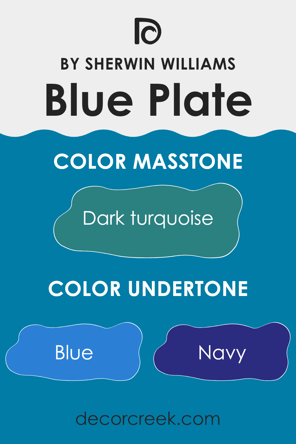
The color Blue Plate SW 6796 includes a palette of other shades which impact how it appears in different lights and settings. These shades range from various tones of blue to grays, greens, and even hints of purple and brown. Understanding these undertones helps in appreciating how the color will interact with other elements in a room.
Blue undertones like Navy and Dark Blue give the color depth and richness, making it a strong presence on walls. The addition of Dark Grey and Grey softens this impact, lending a more grounded and calm feel. Light Turquoise and Turquoise add a hint of freshness and vibrancy, which can make a room feel more lively and inviting.
When Blue Plate is used on interior walls, these undertones play a significant role. In natural light, for instance, the lighter undertones might become more prominent, making the room feel airy and roomy. Under artificial lighting, however, the darker undertones might be emphasized, creating a cozier and more intimate atmosphere.
The subtle inclusion of Green, Violet, and even Brown affects how well this color pairs with natural materials like wood or greenery, enhancing the overall harmony of the room. Therefore, acknowledging these undertones is crucial for anyone looking to use this color in their decorating scheme, as it ensures the color performs as desired in its intended environment.
What is the Masstone of the Blue Plate SW 6796 by Sherwin Williams?
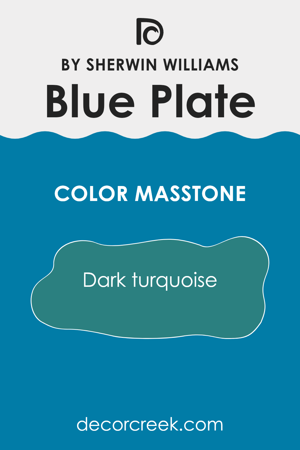
Blue Plate SW 6796 by Sherwin Williams has a masstone of Dark Turquoise. This is a rich color that looks like the middle ground between blue and green. In a home setting, this color brings a fresh and lively vibe to any room.
It can be especially effective in areas like the living room or kitchen where you spend a lot of time and want a cheerful atmosphere. The dark turquoise shade of Blue Plate is flexible enough to be paired with both light colors like soft whites for a stark contrast, or it can be used with darker shades for a more uniform look.
The color is also quite adaptable to different styles, whether you’re aiming for a more modern look or something classic. It can act as a strong backdrop for various decor elements like wood, metals or even pastel shades, allowing for creative freedom in your decorating choices.
How Does Lighting Affect Blue Plate SW 6796 by Sherwin Williams?
Lighting has a crucial impact on how colors appear in different environments. For instance, the color Blue Plate by Sherwin Williams can look significantly different depending on whether it is viewed under artificial or natural light.
In artificial light, particularly warm-toned light bulbs, Blue Plate may appear slightly muted with a soft, cozy vibe. This is due to warmer yellow or orange lights making the blue look less vibrant and more subdued. On the other hand, in natural light, especially in bright sunlight, this blue will look more true to its original shade, displaying its full vibrancy and freshness.
The appearance of Blue Plate also varies depending on the orientation of the room in relation to the sun. In north-facing rooms, which often get less direct sunlight, this blue can appear somewhat darker and more shadowy, giving a cooler and calm feel to the room. In contrast, in south-facing rooms that receive ample sunlight throughout the day, Blue Plate maintains its lively and bright appearance, making the room feel lively and inviting.
For east-facing rooms, the morning light can make Blue Plate look very bright and energetic in the morning, gradually moving towards a softer tone by afternoon as the direct sunlight moves away. In west-facing rooms, the situation is the reverse; the color may appear duller in the morning light but becomes dramatically brighter and more dynamic in the evening as it catches the sunset rays.
Overall, the effect of lighting on Blue Plate reveals how dynamic and adaptable the color can be. Adjusting lighting conditions or choosing rooms with specific lighting can drastically alter the mood and appearance of this beautiful shade of blue. This makes lighting a key consideration when deciding where to paint this particular hue to match the desired atmosphere of a room.
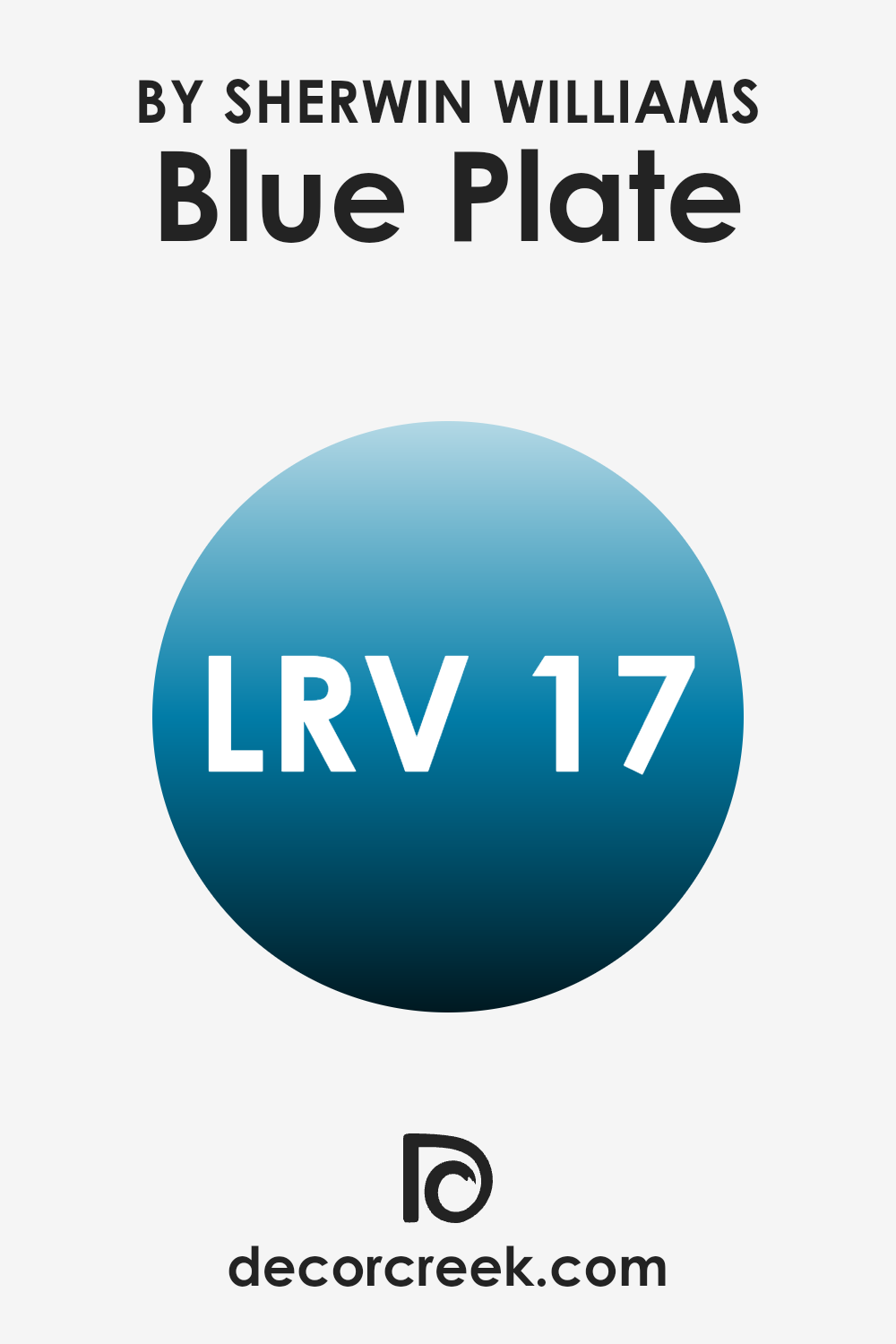
What is the LRV of Blue Plate SW 6796 by Sherwin Williams?
LRV stands for Light Reflectance Value, which is a measure of how much light a color reflects back into a room compared to how much it absorbs. Put simply, if a paint’s LRV is close to zero, it means the color is dark and absorbs more light, making a room look darker.
On the other hand, a high LRV paint will reflect more light and brighten the room. This value is crucial for deciding how a color will impact the overall feel of the room. A brighter room can feel more open and airy, whereas a darker room might feel cozier but smaller.
Considering the LRV of Blue Plate, which is 16.673, this paint color will reflect a relatively small amount of light and absorb more, lending a darker, more subdued feel to the walls where it’s used. This lower LRV makes it ideal for creating a more intimate atmosphere in a room such as a bedroom or a den. However, it’s essential to balance it with good lighting and lighter accents to prevent the room from feeling too enclosed or gloomy.
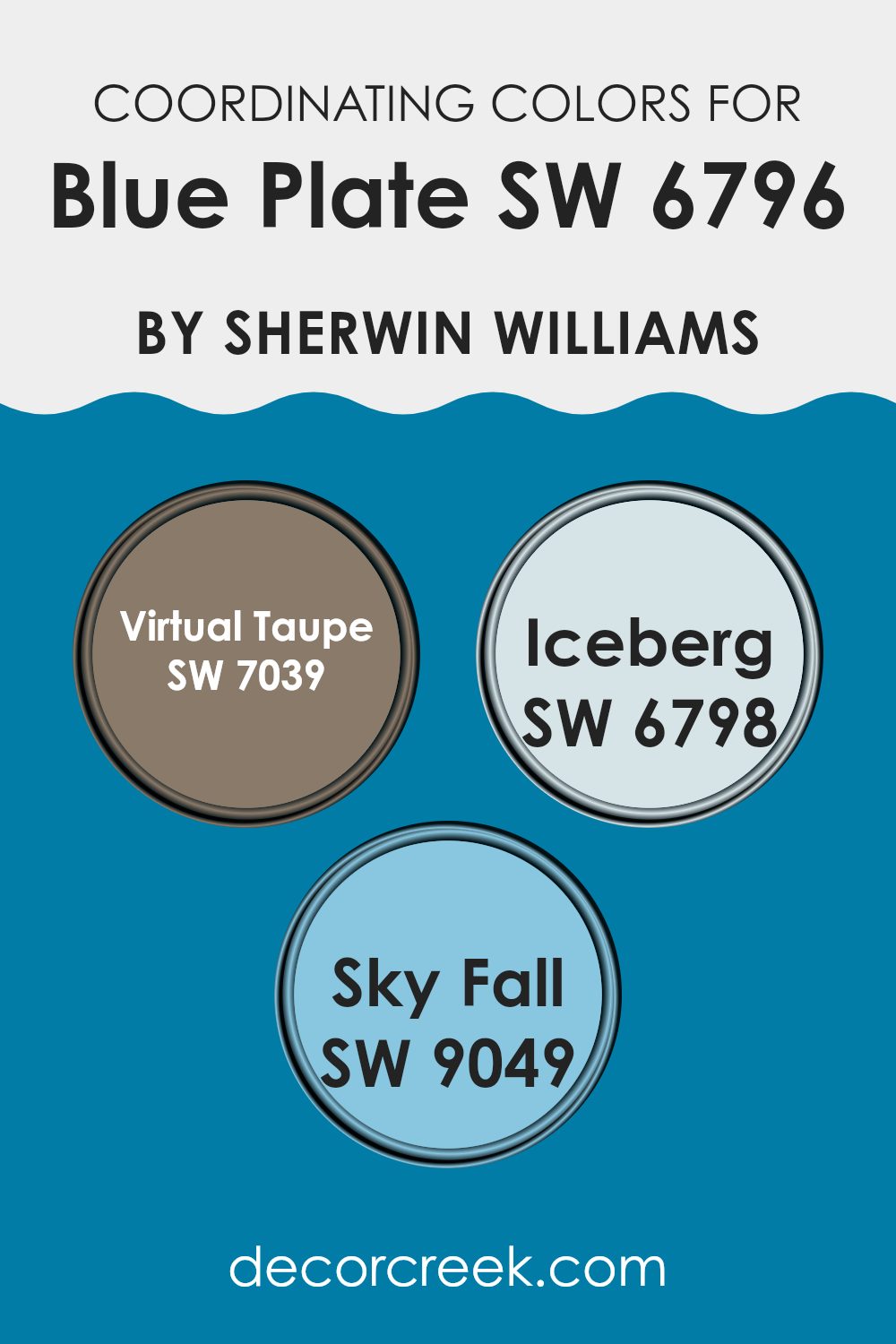
Coordinating Colors of Blue Plate SW 6796 by Sherwin Williams
Coordinating colors are shades that complement each other seamlessly and help create a harmonious environment in any room. When used alongside a main color, like Blue Plate by Sherwin Williams, coordinating colors such as Virtual Taupe, Iceberg, and Sky Fall can enhance the overall aesthetic and mood of a room. These colors work well together because they share similar undertones or contrast in a way that is pleasing to the eye, making them ideal for creating a cohesive look.
Virtual Taupe is a warm and flexible shade that adds a grounded, neutral background, which can make the vibrant tones of Blue Plate stand out. It acts as a solid foundation, allowing more lively colors to pop without overpowering the senses.
On the other hand, Iceberg is a lighter, crisper blue that echoes some of the cooler tones in Blue Plate, creating a seamless blend between the colors. This can give a sense of continuity and flow to your design. Lastly, Sky Fall is a deeper blue that provides depth and can be used to bring a sense of richness and contrast against the lighter Blue Plate, offering a dynamic yet well-balanced color scheme for any decorating project.
You can see recommended paint colors below:
- SW 7039 Virtual Taupe
- SW 6798 Iceberg
- SW 9049 Sky Fall
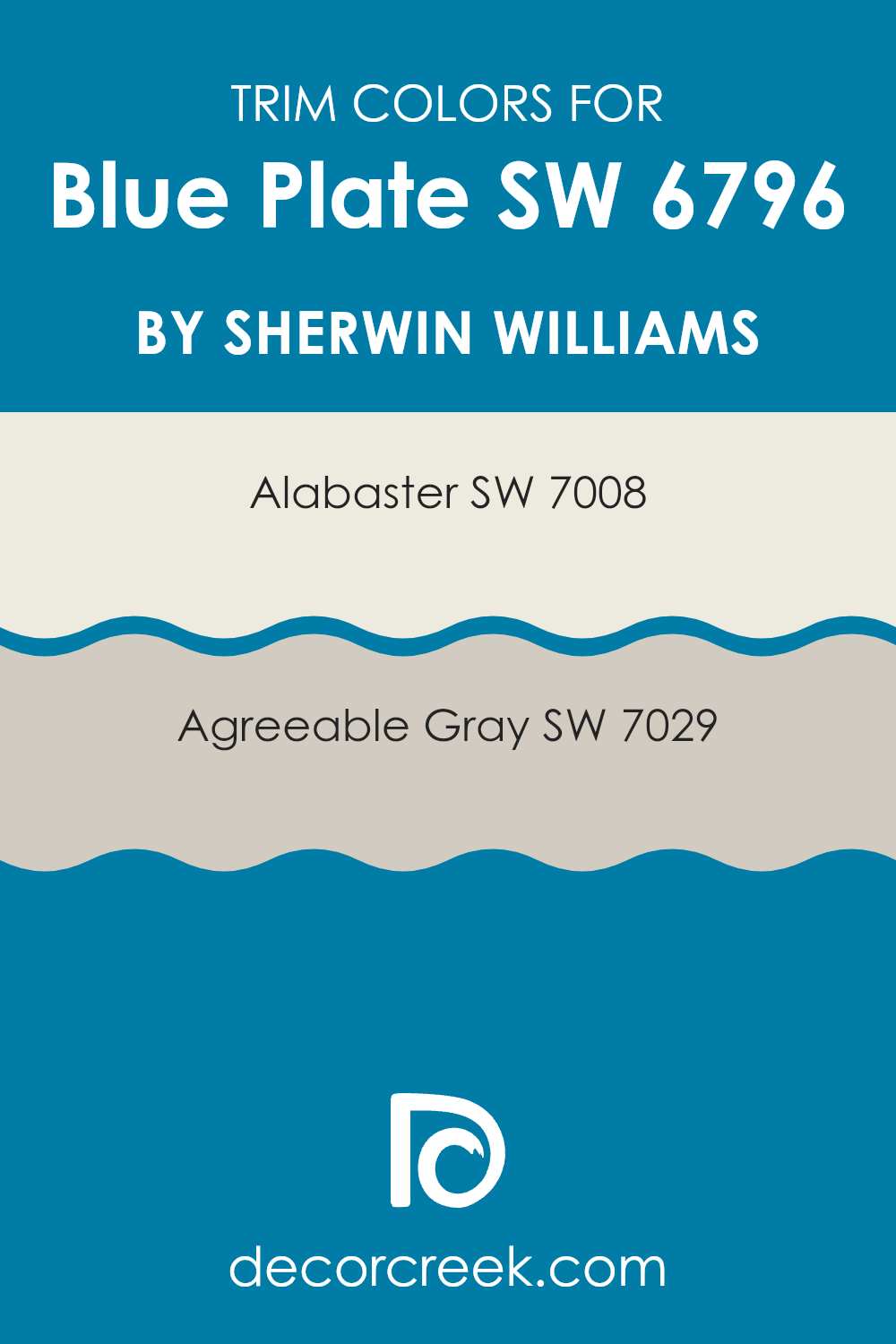
What are the Trim colors of Blue Plate SW 6796 by Sherwin Williams?
Trim colors are used to accentuate the main color of a room, providing contrast and highlighting architectural details. For a vivid shade like Blue Plate SW 6796 by Sherwin Williams, choosing the right trim color is key to creating a balanced look.
Trim colors, such as SW 7008 – Alabaster and SW 7029 – Agreeable Gray, are perfect options to pair with bolder hues because they help ground the color scheme and make the primary color stand out beautifully.
Alabaster SW 7008 offers a warm, creamy white that works beautifully as a trim color, providing a gentle contrast that is neither too stark nor overpowering. On the other hand, Agreeable Gray SW 7029 delivers a neutral, soft gray that harmonizes well with cooler tones, ensuring that the bold Blue Plate does not overpower the room. Both of these choices enhance the room’s aesthetics by clearly defining edges and details, giving it a clean and coordinated appearance.
You can see recommended paint colors below:
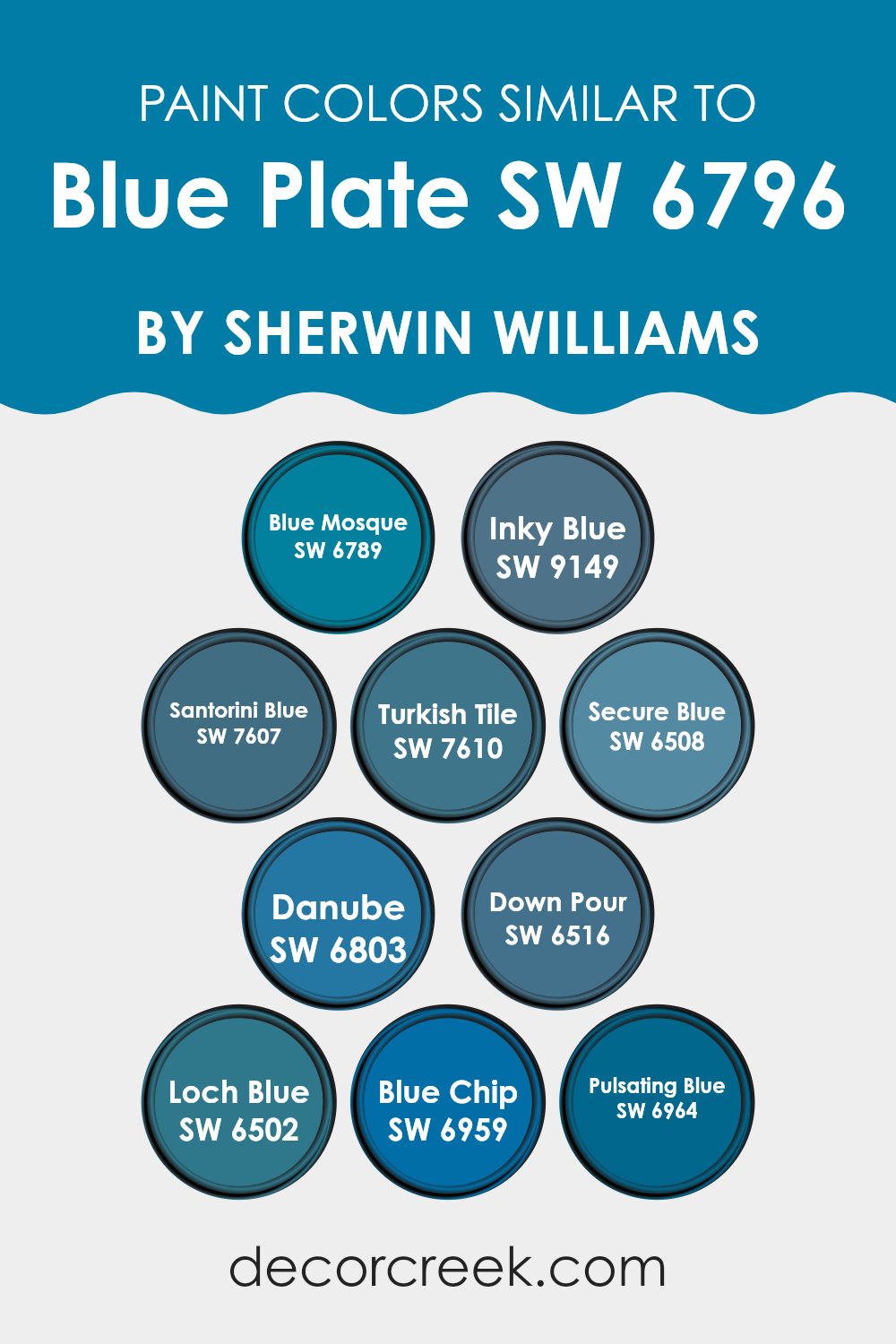
Colors Similar to Blue Plate SW 6796 by Sherwin Williams
Choosing similar colors to Blue Plate by Sherwin Williams allows for creating harmonious and appealing color schemes in various design settings. Similar colors help in maintaining a cohesive look while offering slight variations that add interest and depth to the aesthetics.
Such colors are particularly useful in larger rooms where one might use different shades for different zones but aims to maintain an overall unity. For example, employing variations of a similar hue can subtly define areas without the stark contrast that might make the room feel disjointed.
Blue Mosque is a slightly darker shade that adds a touch of depth to rooms, perfect for adding a pop of color without overpowering a room. Inky Blue is a deep, almost oceanic color that creates a strong focal point in areas needing more character. Santorini Blue draws inspiration from the sea and skies – a cheery hue that enhances rooms with a fresh, lively vibe.
Turkish Tile is vibrant with a touch of green, great for adding a splashy yet elegant appeal to any room. Secure Blue has a calm yet strong presence, useful in achieving a confident and cohesive interior look. Danube brings a bright and refreshing touch, ideal for invigorating a room. Down Pour is a bold and engaging color, excellent for making statements in strategic spots.
Loch Blue exudes a slightly muted feel compared to others, offering a subtle distinction. Blue Chip is clean and clear, ideal for a crisp look, while Pulsating Blue adds a dramatic flair with its vibrant intensity, perfect for creating energy in creative rooms. These shades, all variations of Blue Plate, help enhance different design elements by offering a palette that is coherent yet flexible enough to give each room its unique feel.
You can see recommended paint colors below:
- SW 6789 Blue Mosque
- SW 9149 Inky Blue
- SW 7607 Santorini Blue
- SW 7610 Turkish Tile
- SW 6508 Secure Blue
- SW 6803 Danube
- SW 6516 Down Pour
- SW 6502 Loch Blue
- SW 6959 Blue Chip
- SW 6964 Pulsating Blue
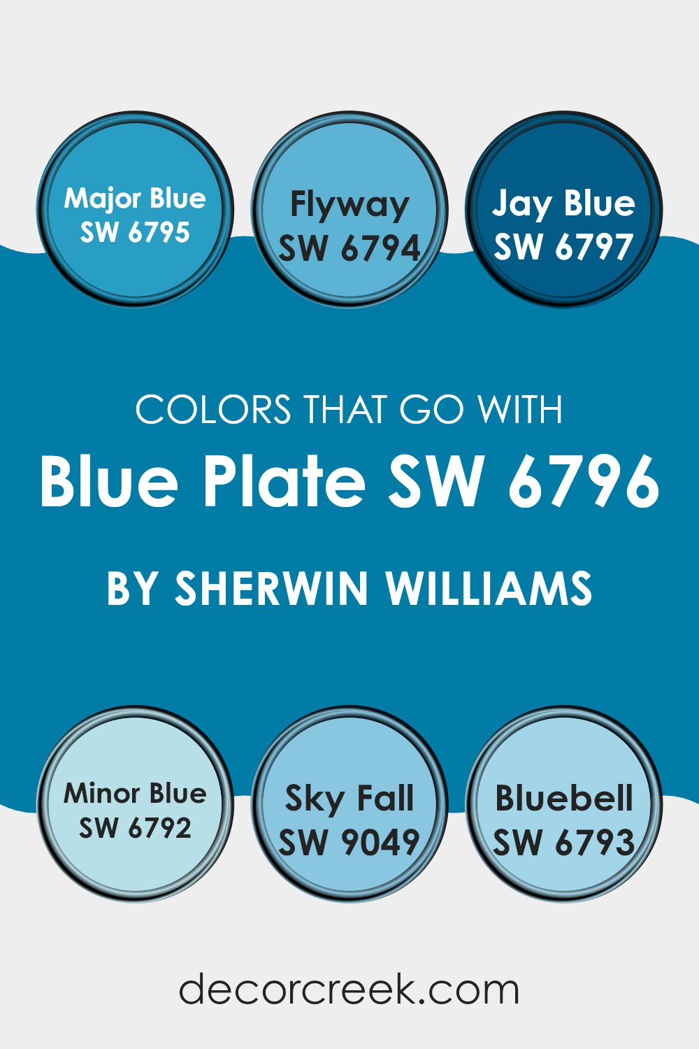
Colors that Go With Blue Plate SW 6796 by Sherwin Williams
Choosing the right colors to pair with Blue Plate SW 6796 by Sherwin Williams is essential for creating a harmonious and appealing room. These colors enhance the beauty of Blue Plate, each adding its unique touch. SW 6795 – Major Blue is a deeper, stronger shade of blue that provides a striking contrast, making it perfect for accent walls or furniture. SW 6794 – Flyway offers a lighter, airy feel, ideal for creating a breezy and relaxed atmosphere in rooms like kitchens or bathrooms.
SW 6797 – Jay Blue is another vibrant option that can invigorate a room with its lively hue, great for kids’ rooms or creative rooms. For those looking for a subtler companion, SW 6792 – Minor Blue is a soft, muted blue that pairs wonderfully for a cohesive look.
SW 9049 – Sky Fall has a dusty quality, blending beautifully with Blue Plate for a muted yet inviting environment. Lastly, SW 6793 – Bluebell, with its touch of periwinkle, adds a playful flair, perfect for adding a bit of fun to any decor. These colors work together by either contrasting or complementing the central hue of Blue Plate, thus allowing for a variety of moods and themes in decorating.
You can see recommended paint colors below:
- SW 6795 Major Blue
- SW 6794 Flyway
- SW 6797 Jay Blue
- SW 6792 Minor Blue
- SW 9049 Sky Fall
- SW 6793 Bluebell
How to Use Blue Plate SW 6796 by Sherwin Williams In Your Home?
Blue Plate by Sherwin Williams is a vibrant shade of blue that brings a fresh and lively feel to any room. This color can work beautifully in various rooms such as kitchens, bathrooms, or bedrooms. For example, painting kitchen cabinets with Blue Plate can give your cooking room a cheerful and inviting atmosphere.
In a bathroom, pairing Blue Plate with white tiles and fixtures can create a clean and refreshing look. If you want to add a pop of color without overpowering the room, consider using Blue Plate for an accent wall in your living room or bedroom.
This will draw attention and add a touch of playfulness. For those who prefer a more subtle approach, you can use Blue Plate in home accessories like throw pillows, curtains, or vases to add hints of color throughout your home. This blue is adaptable and works well with both modern and traditional decor, making it a great choice for refreshing your room.
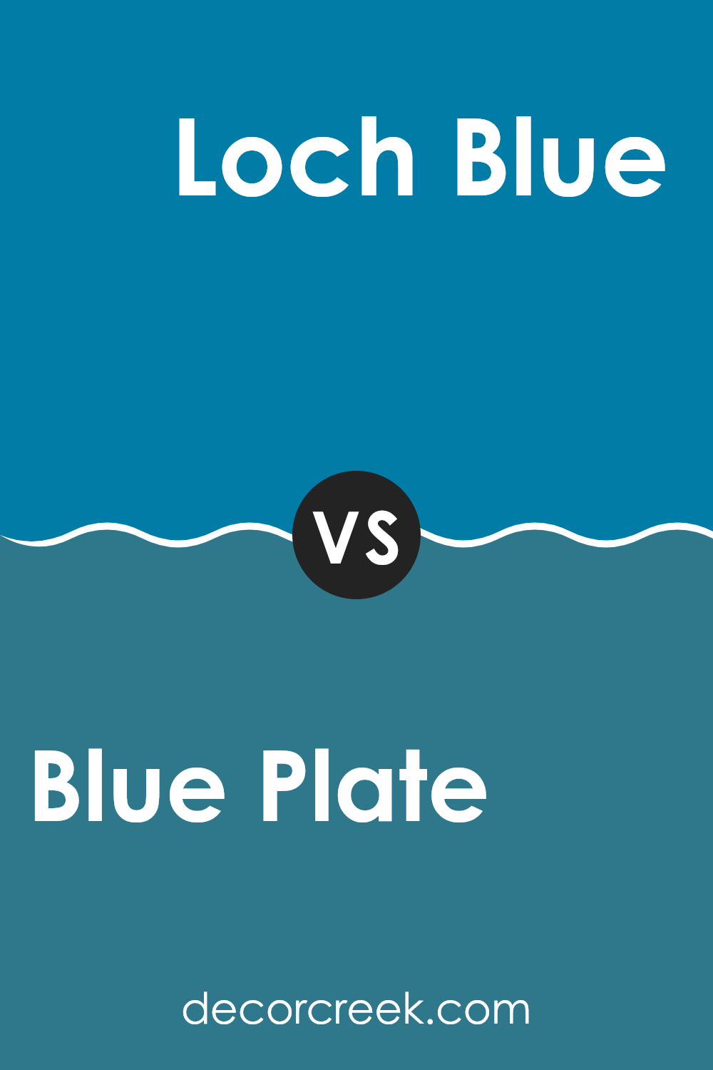
Blue Plate SW 6796 by Sherwin Williams vs Loch Blue SW 6502 by Sherwin Williams
Blue Plate and Loch Blue are both colors by Sherwin Williams but they have different tones and vibes. Blue Plate is a deep, somewhat vibrant shade that leans towards a rich maritime blue.
This color can give a strong and steady feel to a room, perfect for creating a bold yet welcoming room. On the other hand, Loch Blue is lighter and softer. It’s an aquatic-inspired shade that resembles the clear blue of a highland lake.
It’s more subdued than Blue Plate, making it ideal for a calming setting, like a bedroom or bathroom, where a gentler touch of blue is preferable. In summary, if you’re looking for a bolder, standout blue, Blue Plate is a great pick. If it’s a softer, more gentle atmosphere you’re after, Loch Blue might be the better choice.
You can see recommended paint color below:
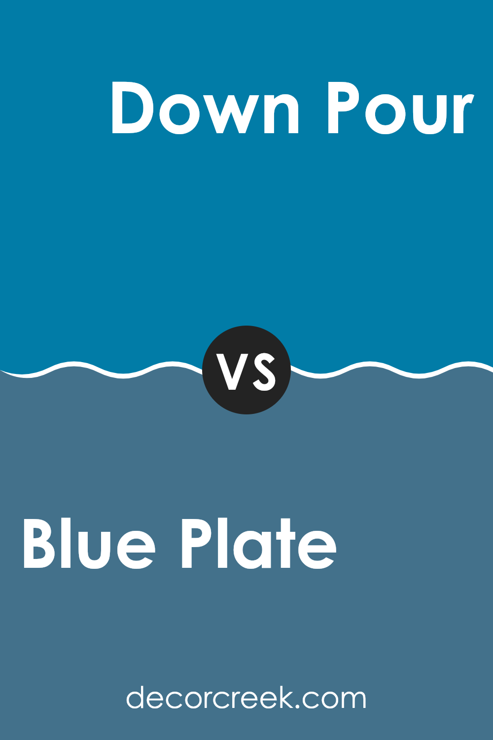
Blue Plate SW 6796 by Sherwin Williams vs Down Pour SW 6516 by Sherwin Williams
Blue Plate and Down Pour, both by Sherwin Williams, are interesting shades of blue. Blue Plate is a vibrant, almost playful color that brings a lot of brightness to any room. It has a lively and fresh vibe and tends to make rooms look cheerful and inviting.
On the other hand, Down Pour is a much deeper and darker blue. It’s closer to navy and carries a strong presence, making it ideal for settings where you want a feeling of depth or a more dramatic look.
This deeper blue can make large rooms feel more intimate and cozy, whereas the lighter Blue Plate can make a small room feel larger. Both colors are adaptable and can be used in many different types of rooms, from kitchens to bedrooms, each creating a unique atmosphere.
You can see recommended paint color below:
Blue Plate SW 6796 by Sherwin Williams vs Blue Chip SW 6959 by Sherwin Williams
Blue Plate and Blue Chip are both appealing shades by Sherwin Williams but they have distinct vibes. Blue Plate is a lighter, more subtle blue. It’s quite gentle on the eyes, making it perfect for creating a calm and relaxed atmosphere in rooms like bedrooms or bathrooms. This color can make small rooms appear a bit bigger and more open.
On the other hand, Blue Chip is a deeper and more vivid blue. It has a bold presence, which works well in areas where you want to make a strong impression, such as living rooms or dining areas. Because it’s a darker shade, it adds a sense of depth and can make large rooms feel more gathered and intimate.
Both colors can be used effectively depending on the desired effect and room function. Lighter Blue Plate can help open up a room, while darker Blue Chip can be utilized to add a punch of color and character.
You can see recommended paint color below:
- SW 6959 Blue Chip
Blue Plate SW 6796 by Sherwin Williams vs Danube SW 6803 by Sherwin Williams
Blue Plate and Danube, both by Sherwin Williams, are distinct shades of blue. Blue Plate is a softer, more muted blue that gives a gentle and understated touch to rooms. It works well in environments where you want a calming effect without a strong, bold presence. It tends to blend subtly with surroundings, making it adaptable for various decor styles.
On the other hand, Danube is a deeper, more vibrant blue. This hue stands out more and can make a striking impact in a room. It is excellent for making a statement or accenting a room, effectively drawing the eye and adding a splash of energy.
While both colors share a blue base, Blue Plate is lighter and less imposing, making it suitable for a relaxed atmosphere. Danube, being bolder and more intense, is ideal for dynamic, lively settings or as a focal point in a room. Each color serves different aesthetic needs, depending on the vibe and functionality desired in the room.
You can see recommended paint color below:
- SW 6803 Danube
Blue Plate SW 6796 by Sherwin Williams vs Santorini Blue SW 7607 by Sherwin Williams
Blue Plate and Santorini Blue are two shades offered by Sherwin Williams that offer different vibes when used in decor. Blue Plate is a deep, rich blue with a hint of green. It gives a strong, bold feel to walls or furniture, making it ideal for creating a statement in a room.
In contrast, Santorini Blue is lighter and leans slightly towards a dusty blue. It’s more subdued compared to Blue Plate and works well for creating a calm and welcoming atmosphere. While Blue Plate is more striking and can dominate a room, Santorini Blue is softer and easier to pair with various decor styles and colors.
If you’re looking for a color that stands out and adds depth, Blue Plate is the go-to. However, if you prefer a gentler look that blends seamlessly into a peaceful setting, Santorini Blue would be a better choice. Either way, both colors offer unique qualities that can enhance the look and feel of your interior depending on what you’re going for.
You can see recommended paint color below:
Blue Plate SW 6796 by Sherwin Williams vs Turkish Tile SW 7610 by Sherwin Williams
Blue Plate and Turkish Tile are two appealing shades offered by Sherwin Williams. Blue Plate is a soft, soothing blue with a muted feel, making it perfect for creating a relaxed and calming atmosphere in rooms like living rooms or bedrooms. It’s not too bright, providing a gentle backdrop that’s easy on the eyes.
In contrast, Turkish Tile has a vibrant, more pronounced blue hue with touches of green, making it eye-catching and energetic. This color is ideal for adding a dash of brightness to a room or serving as an accent wall that really pops.
While Blue Plate sets a more subtle, understated mood, Turkish Tile offers a bold and lively vibe. Both colors work well in various interior design styles, but your choice would depend on the mood you want to set in your room. Whether it’s the calming hug of Blue Plate or the vibrant pulse of Turkish Tile, each brings its unique personality to the room.
You can see recommended paint color below:
Blue Plate SW 6796 by Sherwin Williams vs Secure Blue SW 6508 by Sherwin Williams
Blue Plate and Secure Blue, both by Sherwin Williams, present distinct shades of blue, each creating a unique mood and atmosphere. Blue Plate is a light and soft blue that feels airy and gentle, making rooms feel open and fresh. It’s ideal for a calming effect in rooms like bedrooms or bathrooms where you want a soothing vibe.
In contrast, Secure Blue is a deeper, more intense blue. This color offers a bold and striking look, ideal for adding a strong accent in rooms that benefit from a dash of drama, such as dining areas or living rooms. Its richness can also be used effectively in smaller details or furniture, providing a pop of depth against neutral tones.
Both colors fulfill different roles in interior design, with Blue Plate imparting a gentle, relaxing feel, while Secure Blue commands attention and adds vibrancy to a room.
You can see recommended paint color below:
Blue Plate SW 6796 by Sherwin Williams vs Inky Blue SW 9149 by Sherwin Williams
The Blue Plate and Inky Blue colors, both from Sherwin Williams, offer different shades of blue that can greatly impact the feel of a room. Blue Plate is a lighter, more vibrant blue that adds a cheerful and airy touch to rooms.
It reflects light well, making it a good choice for rooms like living rooms or kitchens to create a welcoming atmosphere. On the other hand, Inky Blue is a much darker blue, almost leaning towards navy.
This depth in color gives a strong, bold feel and is more suited for rooms where you might want to create a sense of focus or drama, such as in a dining area or as an accent wall in a bedroom. The lighter Blue Plate can make rooms appear larger, while the rich depth of Inky Blue can make large rooms feel cozier. Depending on what feeling you want to achieve in your room, either color can be a great choice.
You can see recommended paint color below:
Blue Plate SW 6796 by Sherwin Williams vs Blue Mosque SW 6789 by Sherwin Williams
Blue Plate and Blue Mosque are both shades of blue offered by Sherwin Williams, but they present distinct tones. Blue Plate is a deep, strong blue with a hint of teal, making it vivid and bold. It stands out in a room and can make a dramatic statement. It’s perfect for creating a focal point in rooms.
On the other hand, Blue Mosque has a softer, lighter blue tone, which feels airy and refreshing. This color can open up a room and bring a light, breezy feeling, making it ideal for bedrooms or bathrooms where you want a calm atmosphere.
In terms of pairing with other colors, Blue Plate’s richer hue pairs well with neutrals like whites or light grays to balance its intensity. Blue Mosque works similarly but lends itself better to a wider range of colors due to its lighter and less saturated nature.
Choosing between them depends on the desired mood and size of the room. Blue Plate’s intensity suits a bold, vibrant look, while Blue Mosque is better for a gentle, relaxed vibe.
You can see recommended paint color below:
Blue Plate SW 6796 by Sherwin Williams vs Pulsating Blue SW 6964 by Sherwin Williams
Comparing the two colors from Sherwin Williams, Blue Plate and Pulsating Blue, you can see some interesting differences. Blue Plate is a deeper, more classic shade of blue. It feels stronger and more traditional, making it a great choice for rooms where you want a sense of steady calm and a touch of elegance without being too bold. It pairs well with neutral tones and can be a smart pick for a cozy den or a formal dining area.
Pulsating Blue, on the other hand, is much brighter and lively. This color has more vibrancy, and it leans a bit towards a teal blue, making it more energetic and fun. It’s a good fit for areas where you want to add a pop of color without overpowering the room, like in bathrooms or as an accent wall in a modern living room.
Overall, if you are going for a more subdued, classic look, Blue Plate might be your color. But if you want something more exciting and noticeable, Pulsating Blue is the way to go.
You can see recommended paint color below:
- SW 6964 Pulsating Blue
In conclusion, my review of SW 6796 Blue Plate by Sherwin Williams highlights its unique appeal and functionality as a paint color. This shade of blue stands out for its calming effect, making it an excellent choice for rooms where you want to feel relaxed, like bedrooms or living rooms. It’s especially good in places that have a lot of light, as it keeps its cool, soothing vibe without going too dark.
Another great thing about Blue Plate is how well it matches with different styles and decorations. Whether you have a modern look or something more classic, this color fits easily, making it simple to use without needing to change everything else in your room.
Throughout my review, I also pointed out that the paint is of high quality, meaning it’s likely to last a long time before you need to think about repainting. It goes on the walls smoothly and covers well, which saves time and effort during the painting process.
Overall, if you’re looking for a new color for your room and you like blue, SW 6796 Blue Plate could be the perfect fit. It’s peaceful, pretty, and practical, making it a reliable choice for anyone looking to freshen up their home without too much fuss.
Ever wished paint sampling was as easy as sticking a sticker? Guess what? Now it is! Discover Samplize's unique Peel & Stick samples.
Get paint samples

