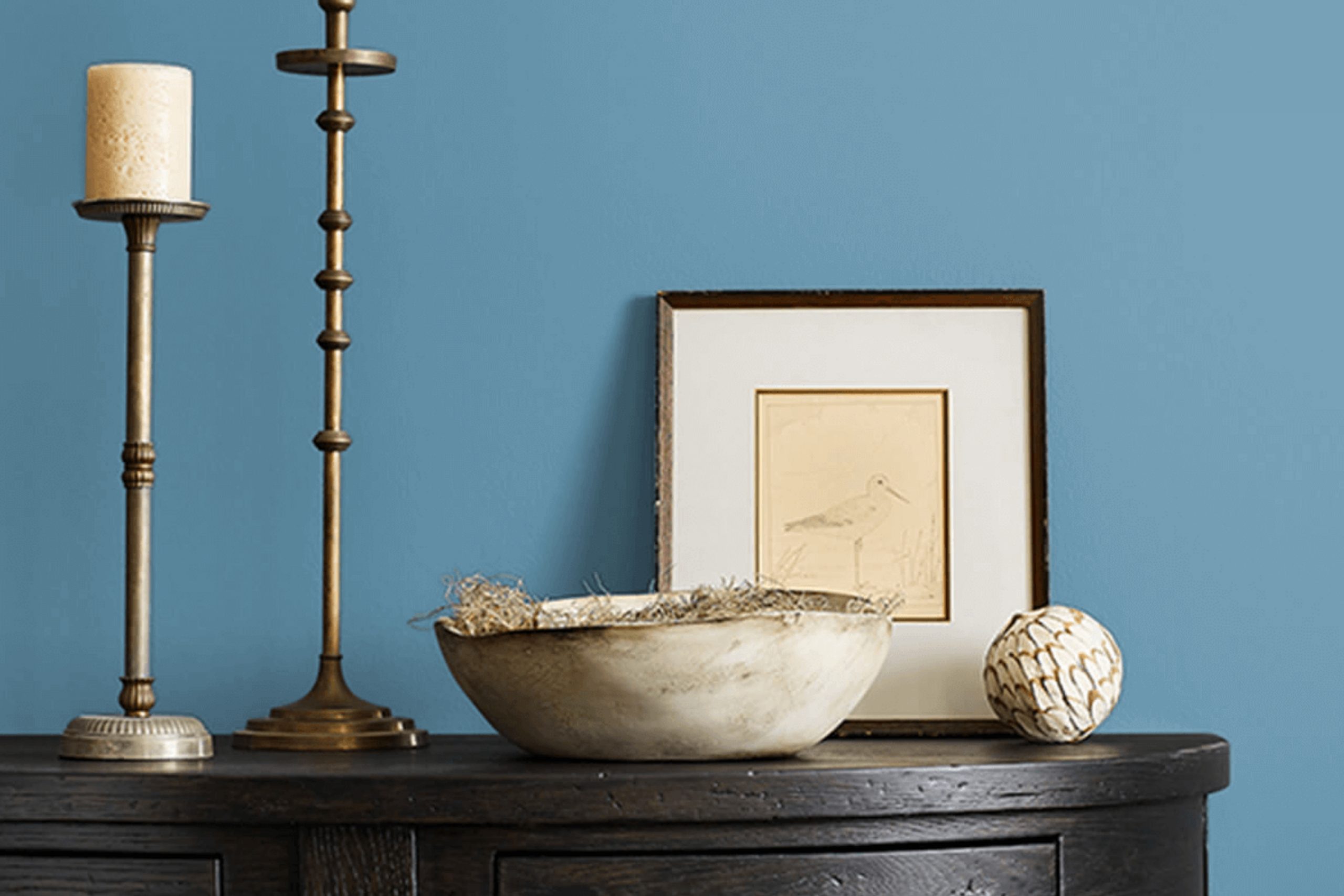
When I think about creating a calming space, SW 7606 Blue Cruise by Sherwin Williams comes to mind. It’s a shade that evokes a sense of peace and relaxation. Imagine yourself in a room painted with this color; it’s like being gently enveloped in the soft hue of a serene sky. The blue has an almost oceanic quality, making it perfect for areas where you want to unwind after a long day.
I often find myself drawn to this color because it pairs well with both modern and traditional décor. It blends harmoniously with neutral tones but also stands out beautifully against brighter accents.
Whether on the walls of a cozy living room or as a refreshing touch in a bedroom, Blue Cruise has a unique way of tying elements together effortlessly.
What I appreciate most about this shade is its versatility. It’s not just a background color; it’s a statement in itself. It brings a sense of calm without being overpowering or too bold.
There’s something about it that creates an inviting atmosphere, making any space where it’s used feel more welcoming and harmonious. If you’re looking to create a soothing environment, SW 7606 Blue Cruise might just be the color you need.
What Color Is Blue Cruise SW 7606 by Sherwin Williams?
Blue Cruise by Sherwin Williams is a calming shade that leans slightly towards the cooler side of the blue palette. This color exudes a sense of peace, making it an ideal choice for spaces where relaxation is the goal. Its subtle undertones allow it to work seamlessly in a variety of interior styles, from coastal and beach-inspired themes to modern and minimalist designs.
In a coastal setting, Blue Cruise provides the perfect backdrop to whitewashed wood, soft beige textiles, and jute or sisal rugs.
Add in some wicker or rattan furniture to complete the look. In a modern setting, the color pairs beautifully with sleek silver or chrome accents, and it can soften the starkness of black or white furnishings, offering a gentle touch without overwhelming the space.
Blue Cruise also complements natural materials like light oak or maple wood, emphasizing their warmth and grain.
It works well with soft textures like plush velvets, which add a touch of luxury, or with simple cotton and linen for a more casual vibe. The color’s versatility makes it suitable for living rooms, bedrooms, bathrooms, and even kitchen accents. It creates a welcoming, inviting atmosphere that’s easy to enjoy.
Is Blue Cruise SW 7606 by Sherwin Williams Warm or Cool color?
Blue Cruise by Sherwin Williams, labeled SW 7606, is a paint color that brings a fresh, calming vibe to any room. This shade is a soft blue with subtle hints of gray, making it versatile and easy to blend with various décor styles. In homes, it works well because it creates a peaceful atmosphere without overwhelming the space.
It pairs wonderfully with neutral tones like whites and grays, as well as natural wood finishes, enhancing a room’s overall feel.
For living rooms or bedrooms, Blue Cruise can make the space feel open and airy, promoting relaxation and comfort. Meanwhile, in kitchens or bathrooms, it adds a clean and refreshing touch. Its muted tone ensures it doesn’t clash with other colors or patterns, giving homeowners flexibility in their design choices.
Overall, Blue Cruise is a timeless and adaptable color that can suit many settings, ensuring rooms remain inviting and pleasant.
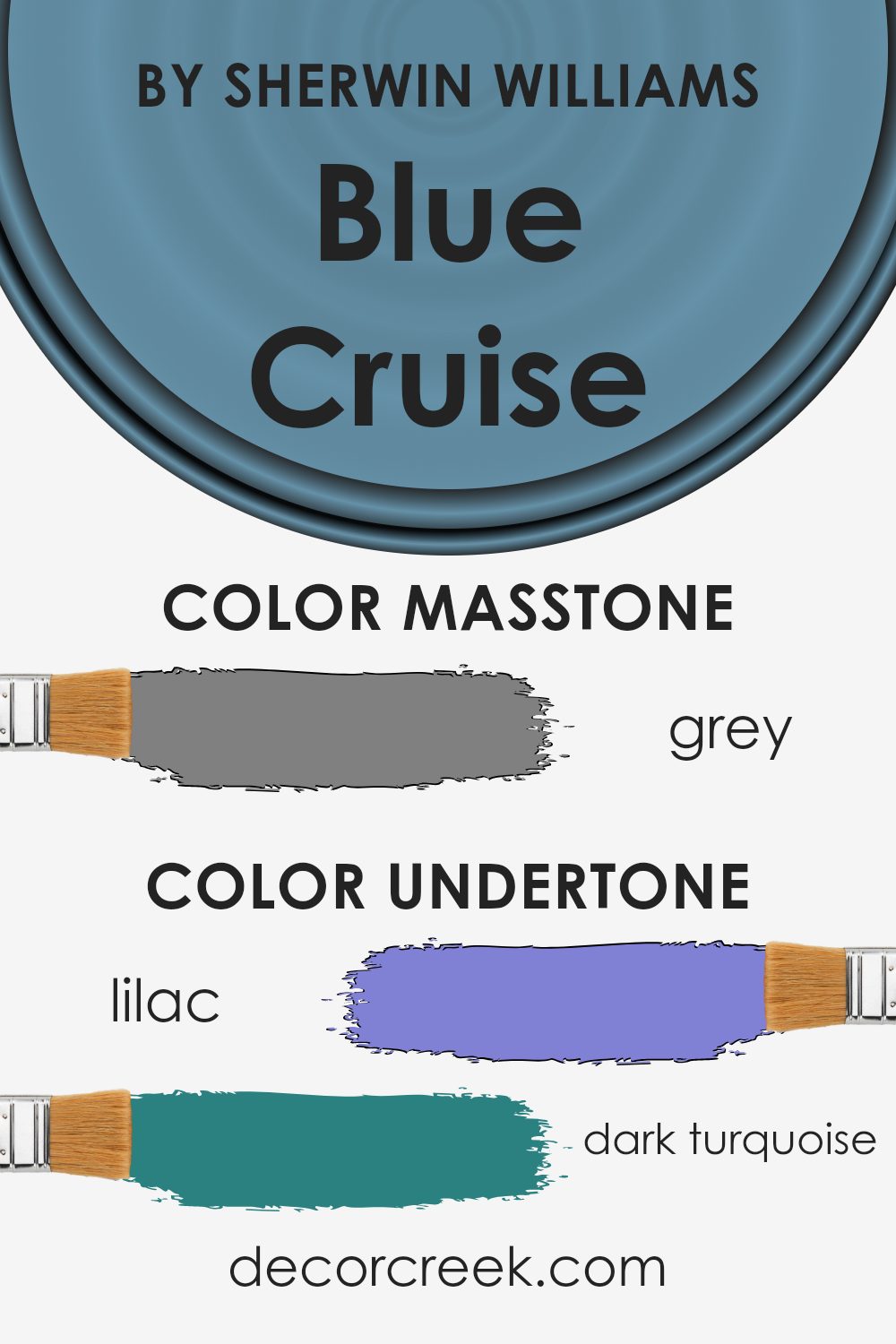
Undertones of Blue Cruise SW 7606 by Sherwin Williams
Blue Cruise by Sherwin Williams is a color with a mix of subtle undertones that can influence how it looks in different settings. These undertones, like lilac, purple, violet, and dark turquoise, can make the color appear cooler or warmer depending on the lighting. When you see this color on a wall, these undertones interact with the room’s light, furniture, and other colors to create different vibes.
In sunny rooms, the pale shadow of yellow or light green undertones can make Blue Cruise feel fresh and vibrant, highlighting its lighter, more joyful shades. Meanwhile, in a room with less natural light, the darker undertones, like navy or dark blue, might become more noticeable, leading to a cool and calm feeling.
Warm undertones such as pale pink and orange can give Blue Cruise an inviting touch, making a space feel cozy and comforting. In contrast, the presence of cooler undertones like mint, light blue, or turquoise adds a crisp and refreshing note to a room.
The interactions of all these undertones mean that the color can adapt to various settings, making it versatile for interior walls while giving each room a unique atmosphere.
This is why the underlying colors are essential; they subtly change the perception of Blue Cruise as lighting and environmental factors change, letting it blend harmoniously into any decor style.
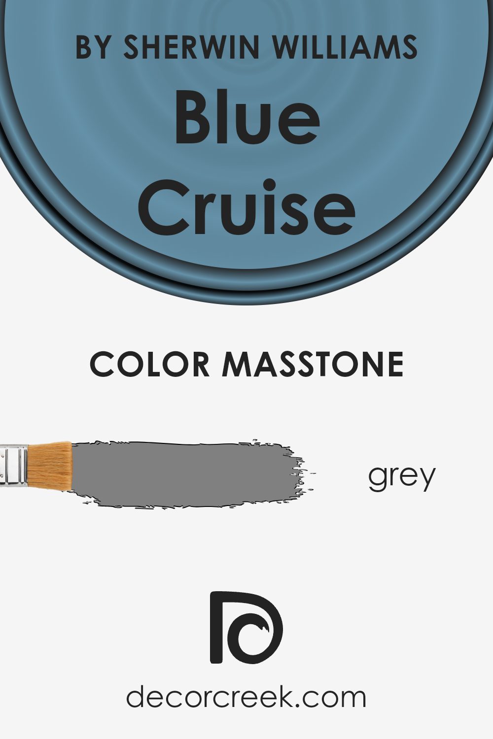
What is the Masstone of the Blue Cruise SW 7606 by Sherwin Williams?
Blue Cruise SW 7606 by Sherwin Williams is a color that offers a gentle blue with a hint of gray, closely related to a neutral gray (#808080) masstone. This subtle gray base plays a significant role in how the color behaves in different spaces within a home.
The gray undertone helps the blue feel calming and steady, making it a great choice for areas where relaxation is key, such as living rooms or bedrooms. This color can complement a wide range of furnishings and decorations, from modern to traditional.
In brighter spaces with lots of natural light, Blue Cruise appears more vibrant and lively, while in darker areas, it feels more muted and cozy. The color’s balance between blue and gray allows it to work well with both warm and cool tones, offering versatility in design schemes.
It adapts easily, being neither too bold nor too basic, perfect for creating a soothing environment.
How Does Lighting Affect Blue Cruise SW 7606 by Sherwin Williams?
Lighting plays a crucial role in how we perceive colors. The type of light, its direction, and its intensity can all alter the appearance of a color. For Blue Cruise (SW 7606) by Sherwin Williams, the effect of lighting can be observed differently under artificial and natural light.
In artificial light, the color Blue Cruise may show variations depending on whether the light is warm or cool. Under warm, incandescent lights, this blue might appear softer and slightly muted. In contrast, under cool, fluorescent lighting, Blue Cruise can look brighter and more vibrant.
Natural light brings out different qualities in colors based on the direction a room faces. In north-facing rooms, which typically receive cool light, Blue Cruise might appear grayer or more subdued due to the lack of direct sunlight. The cool light enhances the blue tones, but can also make the space feel a bit chilly.
In south-facing rooms, where sunlight is more direct and plentiful, Blue Cruise will likely appear warmer and more saturated. The consistent natural light throughout the day helps maintain its brightness, making the space feel lively.
East-facing rooms receive warm, yellow light in the morning and cooler light in the afternoon. This means Blue Cruise might look bright and cheerful in the morning, but calm and more muted later in the day when the warm light diminishes. This shift can provide subtle variations that add interest to the color.
In west-facing rooms, the light is softer and cooler in the morning, becoming brighter and warmer as the day progresses. Here, Blue Cruise can start the day with more subdued tones and end with richer, deeper blues in the late afternoon and evening.
Understanding these lighting effects can help you decide how Blue Cruise will fit in your space, ensuring it complements the room’s lighting conditions.

What is the LRV of Blue Cruise SW 7606 by Sherwin Williams?
Light Reflectance Value, or LRV, is a measure of how much light a color reflects. It is a scale from black to white, where 0 would be absolute black, reflecting no light, and 100 would be pure white, reflecting all light. LRV is essential because it helps determine how bright or dark a color will appear when painted on a wall.
Colors with a high LRV, like whites and pastels, tend to reflect more light and can make a room feel brighter and more open. Conversely, colors with a low LRV absorb more light, making them appear darker, and they often create a cozier, more intimate atmosphere in a room.
The LRV of Blue Cruise is 25.8, placing it on the lower end of the LRV scale. This means it is a relatively dark color, absorbing more light than it reflects. When used on walls, this shade can significantly impact the mood and feel of a space. It may give a room a more intimate and enclosed feel, which can be comforting and calm.
This effect also means that Blue Cruise might work well in spaces where you want to create a sense of warmth and coziness, like a cozy corner or a study.
On the other hand, if used in a room with little natural light, it might make the space feel even dimmer, so it’s often a good idea to balance it with lighter furnishings or decorations.

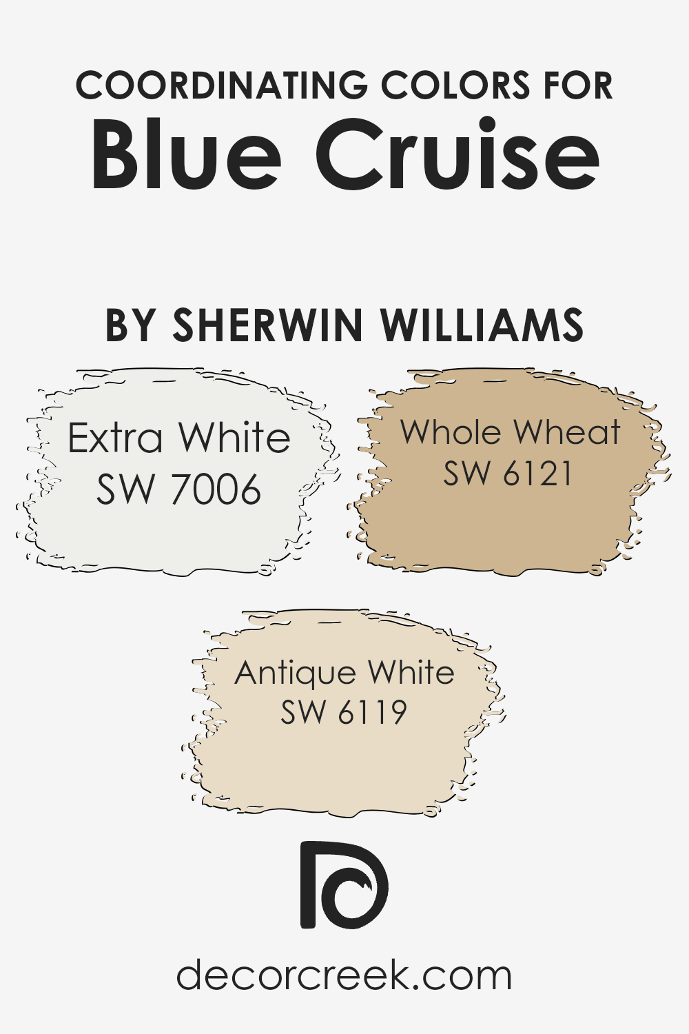
Coordinating Colors of Blue Cruise SW 7606 by Sherwin Williams
Coordinating colors are hues selected to complement and enhance the main color in a space, creating a harmonious and visually appealing environment. In the context of Blue Cruise by Sherwin-Williams, coordinating colors help balance its cool, tranquil tone.
They can be used on adjacent walls, trim, or accents to create a cohesive look that feels natural and pleasing to the eye.
Extra White (SW 7006) is a crisp and clean color that provides a fresh contrast to Blue Cruise, adding brightness and highlighting architectural details without overpowering the palette.
Antique White (SW 6119) offers a warm and creamy undertone that softens the intensity of Blue Cruise, creating a cozy atmosphere.
Whole Wheat (SW 6121) brings warmth and earthiness, grounding the space and adding an inviting, golden hue that pairs well with the calming nature of Blue Cruise. Together, these colors form a balanced setting that feels both fresh and welcoming.
You can see recommended paint colors below:
- SW 7006 Extra White
- SW 6119 Antique White
- SW 6121 Whole Wheat
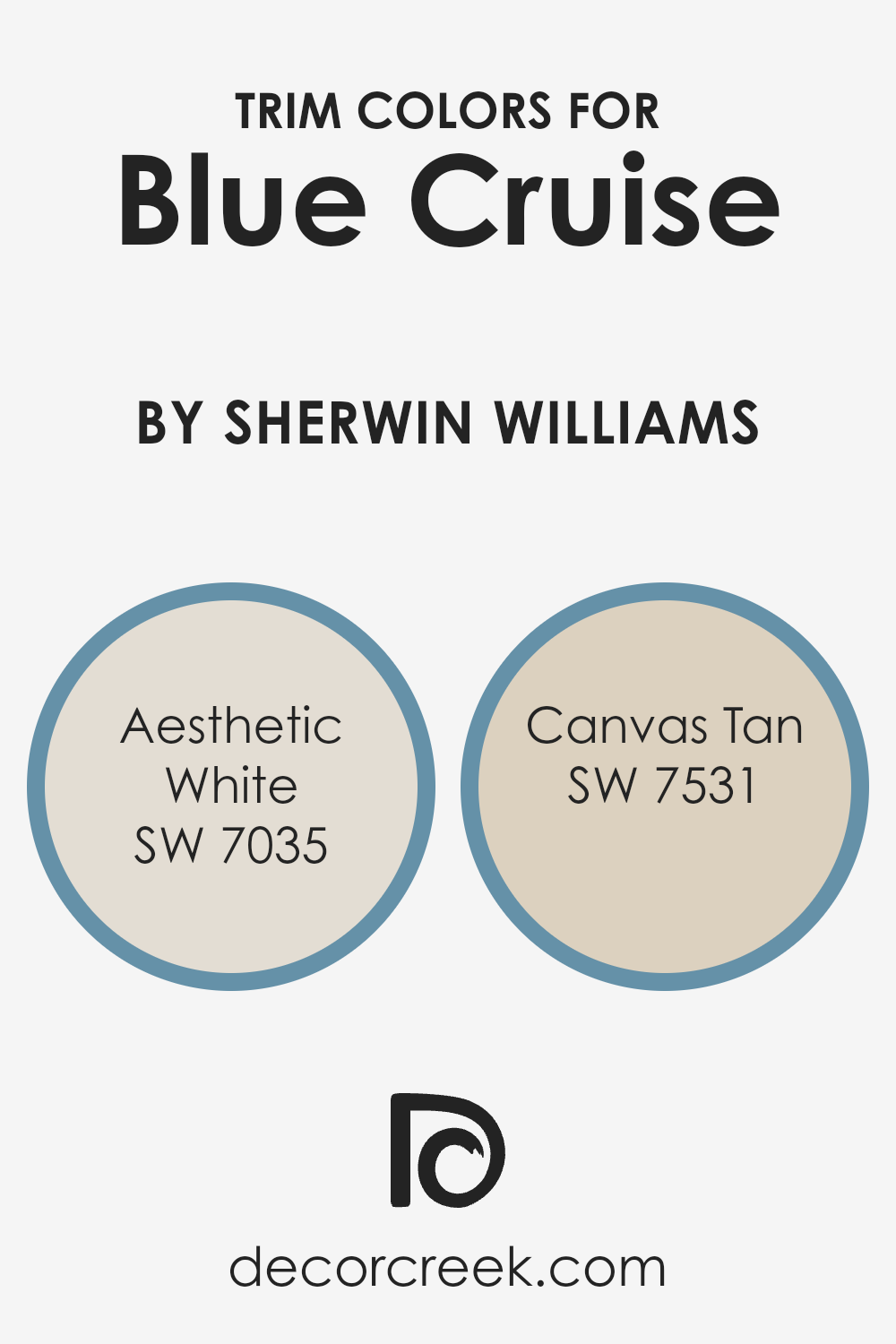
What are the Trim colors of Blue Cruise SW 7606 by Sherwin Williams?
Trim colors are the hues used to highlight the edges and borders of walls, ceilings, doors, and windows, adding definition and contrast to a room. In the context of using Blue Cruise by Sherwin Williams, a well-chosen trim color can enhance the cool, soothing atmosphere it brings.
Trim colors are essential because they serve to frame and emphasize the primary wall color, making the overall design more cohesive and visually appealing.
When you pick a trim color like SW 7035 – Aesthetic White or SW 7531 – Canvas Tan, you’re adding just the right touch to complete the look and feel of the space, ensuring the blue tones are harmonized with the rest of the decor.
Aesthetic White is a soft, muted shade that offers a warm, off-white tone, making it an excellent choice for trim when you want a subtle contrast that doesn’t overpower Blue Cruise.
This shade creates a gentle boundary that complements the cool blue backdrop. On the other hand, Canvas Tan provides a slightly richer, beige trim that adds warmth and depth, offering a contrast that is gentle yet distinctly noticeable.
This trim color can help create a welcoming and cozy environment, highlighting the soothing essence of Blue Cruise without clashing with its calm nature.
Together, these trim colors complete the room’s aesthetic and enhance the main wall color’s impact.
You can see recommended paint colors below:
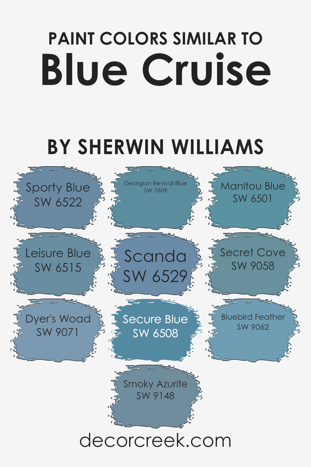
Colors Similar to Blue Cruise SW 7606 by Sherwin Williams
Using similar colors to Blue Cruise by Sherwin Williams can create a cohesive and harmonious space. These shades offer subtle differences that can enhance the feel of any room. Sporty Blue is a lively color with a vibrant energy that can brighten a space without overwhelming it.
Leisure Blue is more relaxed, evoking a sense of calm that’s perfect for areas meant for relaxation. Dyer’s Woad is rich and deep, adding a touch of depth and creating a cozy atmosphere. Smoky Azurite has a dusty, muted tone that works well in modern designs, offering a fresh yet understated elegance.
Georgian Revival Blue brings a classic and timeless feel to interiors, reminding one of historical homes with its dignified charm. Scanda offers a Scandinavian touch with its light, airy quality that can open up smaller spaces. Secure Blue has a reassuring depth, providing a stable and comforting backdrop.
Manitou Blue, with its natural feel, connects well with earthier elements for an inviting look.
Secret Cove is intriguing, offering a darker shade that adds mystery and allure. Bluebird Feather is light and delicate, introducing a gentle touch to settings and adding a whimsical aspect to the palette. These colors enhance any design by blending different moods while maintaining a pleasant similarity.
You can see recommended paint colors below:
- SW 6522 Sporty Blue
- SW 6515 Leisure Blue
- SW 9071 Dyer’s Woad
- SW 9148 Smoky Azurite
- SW 7609 Georgian Revival Blue
- SW 6529 Scanda
- SW 6508 Secure Blue
- SW 6501 Manitou Blue
- SW 9058 Secret Cove
- SW 9062 Bluebird Feather
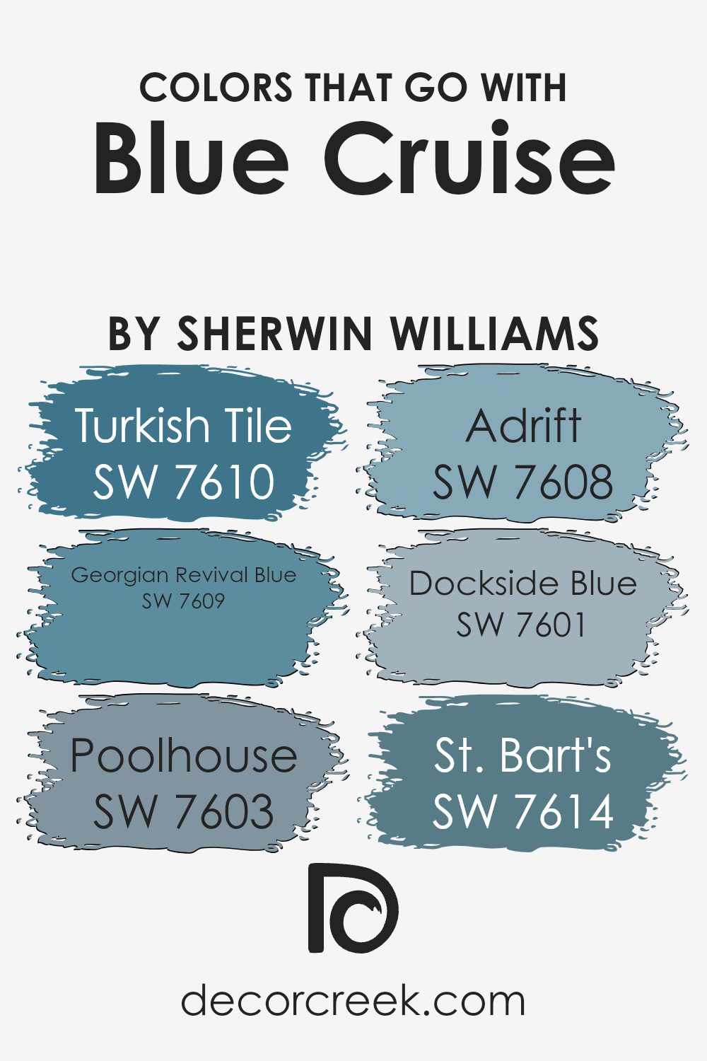
Colors that Go With Blue Cruise SW 7606 by Sherwin Williams
Colors that go with Blue Cruise SW 7606 by Sherwin Williams play a crucial role in creating a harmonious and balanced space. These complementary colors can enhance the overall mood and feel of a room. By combining these hues, you can bring out different aspects of Blue Cruise, making your interiors more vibrant and inviting.
SW 7610 – Turkish Tile is a rich, deep blue that adds a bold touch. It pairs well with Blue Cruise to create a dramatic effect. SW 7609 – Georgian Revival Blue is a timeless, classic shade, lending an air of elegance alongside Blue Cruise. Together, they create a soothing atmosphere.
SW 7603 – Poolhouse is reminiscent of coastal waters and provides a gentle, laid-back feel when used with Blue Cruise. This pairing is perfect for creating a relaxed setting. SW 7608 – Adrift is a light, breezy blue that brightens up space and adds a sense of airiness when used with Blue Cruise.
SW 7601 – Dockside Blue has a subtle, muted tone that complements Blue Cruise’s vibrancy, enhancing balance.
Finally, SW 7614 – St. Bart’s is a crisp and fresh blue that, when paired with Blue Cruise, brings a refreshing vibe, perfect for spaces meant to inspire calm and peace.
You can see recommended paint colors below:
- SW 7610 Turkish Tile
- SW 7609 Georgian Revival Blue
- SW 7603 Poolhouse
- SW 7608 Adrift
- SW 7601 Dockside Blue
- SW 7614 St. Bart’s
How to Use Blue Cruise SW 7606 by Sherwin Williams In Your Home?
Blue Cruise by Sherwin Williams is a soft, soothing shade of blue that can bring a calm atmosphere to any room in your home. This light blue color works well in various spaces, from living rooms to bedrooms, creating a sense of peace and relaxation.
In a bedroom, Blue Cruise can be paired with crisp white bedding and natural wooden furniture to create a fresh, airy feel.
In a living room, this shade complements gray or beige couches and can add a touch of coolness to the space. If you’re considering painting a bathroom, Blue Cruise can evoke the peaceful feeling of the sea, especially when paired with white tiles and beach-themed decor.
It’s a versatile choice that matches well with both modern and traditional styles, making it easy to mix with other colors and materials, like metal accents or natural fibers.
Blue Cruise SW 7606 by Sherwin Williams vs Secure Blue SW 6508 by Sherwin Williams
Blue Cruise SW 7606 and Secure Blue SW 6508 by Sherwin Williams are two distinct shades of blue. Blue Cruise is a lighter, more muted color that offers a calm and relaxed atmosphere. It’s versatile and pairs well with a variety of other colors due to its understated appearance.
This makes it an excellent choice for spaces where a gentle touch is needed, such as living rooms or bedrooms.
On the other hand, Secure Blue is a deeper, more intense shade. It provides a strong presence and can add a dramatic effect to a room. This bold color is ideal for creating a statement wall or adding depth to a smaller space like a study or a cozy corner. While both colors bring unique qualities, Blue Cruise leans towards a softer, more airy feel, whereas Secure Blue offers richness and depth.
Choosing between them depends on the desired mood and ambiance of the space.
You can see recommended paint color below:
Blue Cruise SW 7606 by Sherwin Williams vs Sporty Blue SW 6522 by Sherwin Williams
Blue Cruise (SW 7606) and Sporty Blue (SW 6522) from Sherwin Williams are two distinct blue shades with unique qualities. Blue Cruise is a rich, deep blue that brings a sense of calm and stability to any space. It is a versatile color that works well in various settings, adding a touch of warmth and depth to a room without being overwhelming.
On the other hand, Sporty Blue is a lighter, more vibrant blue. It feels fresh and energetic, making it a great choice for areas where you want to introduce some brightness and life.
While Blue Cruise is more muted and subdued, giving a classic and timeless feel, Sporty Blue leans towards being lively and playful. Both colors can create different moods: Blue Cruise is perfect for a cozy, relaxed environment, whereas Sporty Blue is ideal for invigorating and refreshing a space.
You can see recommended paint color below:
- SW 6522 Sporty Blue
Blue Cruise SW 7606 by Sherwin Williams vs Georgian Revival Blue SW 7609 by Sherwin Williams
Blue Cruise and Georgian Revival Blue are both beautiful colors from Sherwin-Williams, but they have distinct characteristics. Blue Cruise is a soft and muted blue with a touch of gray, making it feel calm and quiet. It’s perfect for creating a relaxed environment, and it pairs well with neutral tones and soft whites.
On the other hand, Georgian Revival Blue is a bit darker and richer. It has a more traditional feel, reminiscent of classic architecture and historical designs. This deeper shade of blue can add a sense of depth and richness to a room, offering a more formal atmosphere.
When choosing between the two, consider the mood you want to create. Blue Cruise is great for a peaceful and airy vibe, while Georgian Revival Blue is more about adding depth and a classic touch. Both colors are versatile and can complement a variety of interior styles, depending on your preference.
You can see recommended paint color below:
- SW 7609 Georgian Revival Blue
Blue Cruise SW 7606 by Sherwin Williams vs Bluebird Feather SW 9062 by Sherwin Williams
Blue Cruise SW 7606 by Sherwin Williams is a rich, deep blue that feels both calming and classic. It’s the kind of color that can stand out as a feature wall or blend smoothly into a more neutral palette. Its boldness makes it perfect for adding some depth to a room without being overwhelming.
In contrast, Bluebird Feather SW 9062 is a much lighter and softer blue. It brings a sense of airiness and is reminiscent of a clear sky on a sunny day. This lighter shade can make a room feel more open and welcoming, and it’s great for spaces where you want a light and refreshing look.
While both colors are blue, Blue Cruise has a stronger presence, making it ideal for creating focal points, while Bluebird Feather is better for creating a soft, soothing atmosphere. Each color has its own personality, offering different vibes for your space.
You can see recommended paint color below:
- SW 9062 Bluebird Feather
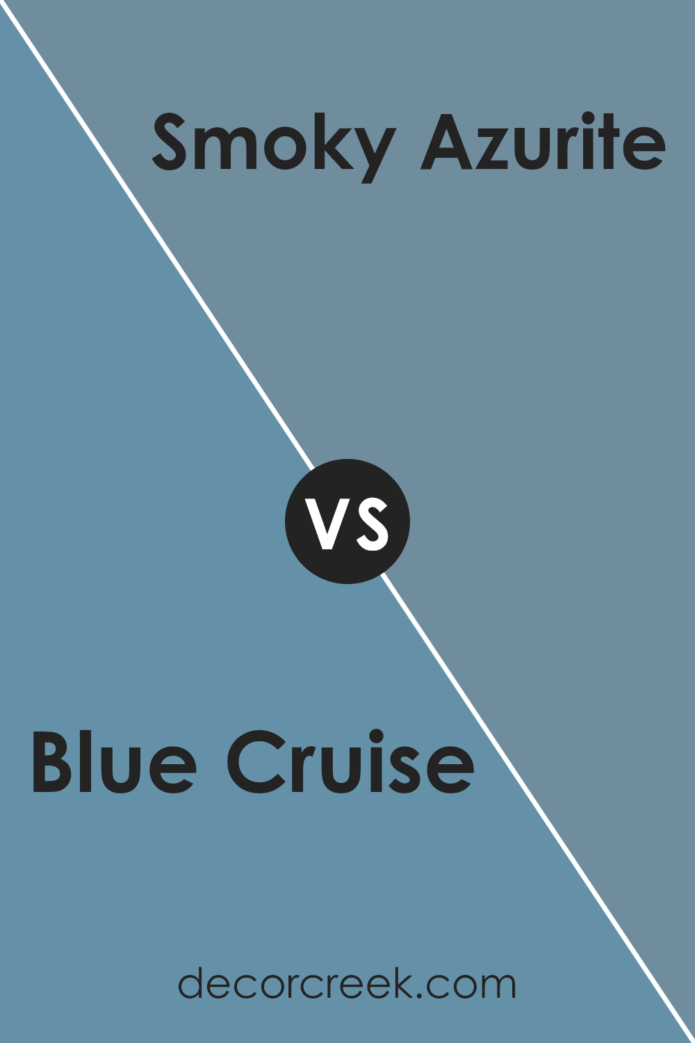
Blue Cruise SW 7606 by Sherwin Williams vs Smoky Azurite SW 9148 by Sherwin Williams
Blue Cruise SW 7606 by Sherwin Williams is a soft, soothing blue with a hint of gray, making it a versatile choice for many spaces. It provides a calming atmosphere, working well in bedrooms and living areas where relaxation is key. Its muted undertones allow it to pair easily with various furnishings and accents, adding an understated elegance without overwhelming other design elements.
On the other hand, Smoky Azurite SW 9148 by Sherwin Williams offers a deeper, more intense shade of blue. It leans towards a rich teal, giving it a cozy and inviting feel.
This color is perfect for creating focal points, such as feature walls or cabinetry, where a bolder statement is desired. Smoky Azurite feels warm and enveloping, bringing a touch of dramatic flair.
Both colors are blues with unique attributes—Blue Cruise being calm and neutral, while Smoky Azurite adds depth and richness to any setting.
You can see recommended paint color below:
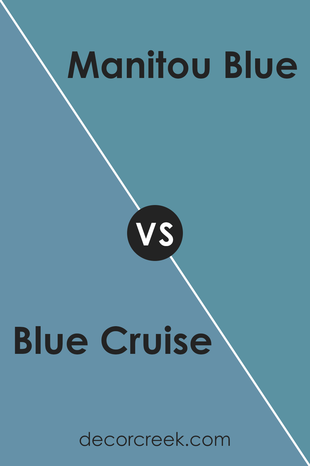
Blue Cruise SW 7606 by Sherwin Williams vs Manitou Blue SW 6501 by Sherwin Williams
Blue Cruise (SW 7606) by Sherwin Williams is a soft and muted shade of blue that gives off a calm and relaxed vibe. It’s not too bright, making it suitable for creating a soothing environment. This color pairs well with neutral tones and can be used in bedrooms or living rooms for a peaceful feel.
On the other hand, Manitou Blue (SW 6501) is a richer and more vibrant shade. It’s bolder than Blue Cruise, providing a more energetic and lively atmosphere. Manitou Blue can be a good choice for a feature wall or to add a pop of color in a space, drawing attention and adding personality.
While both colors are shades of blue, Blue Cruise is more subtle and calming, making it ideal for spaces where relaxation is key. In contrast, Manitou Blue brings more vibrancy and energy, suitable for areas where you want to make a statement.
You can see recommended paint color below:
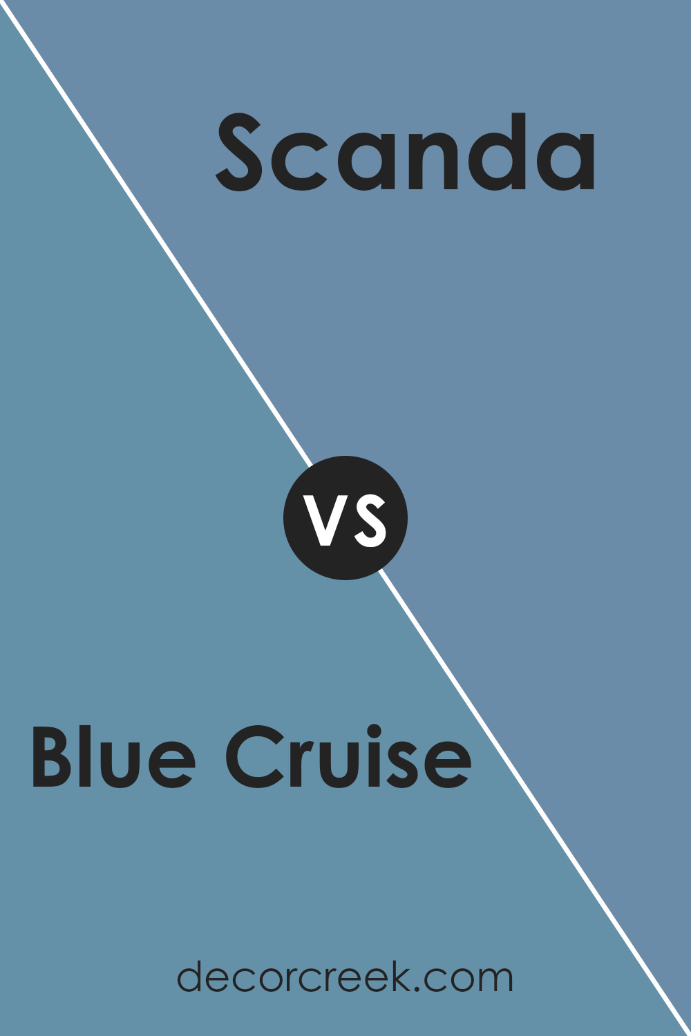
Blue Cruise SW 7606 by Sherwin Williams vs Scanda SW 6529 by Sherwin Williams
Blue Cruise SW 7606 by Sherwin Williams is a calm and muted shade of blue. It has a soothing appearance, making it ideal for spaces where you want to create a serene atmosphere. This color is versatile and blends well with neutral tones, offering a clean and peaceful look.
In contrast, Scanda SW 6529 by Sherwin Williams is a bolder, more vibrant blue. It brings energy and life to a room with its lively character. Scanda is suitable for spaces where you want to add a little excitement and playfulness. Its brighter hue can make a room feel more open and cheerful.
While Blue Cruise is perfect for creating a relaxed and understated environment, Scanda’s vivid nature makes it stand out as an accent in any space. Both blues add unique qualities to interiors, depending on whether you seek calmness or a burst of energy.
You can see recommended paint color below:
- SW 6529 Scanda
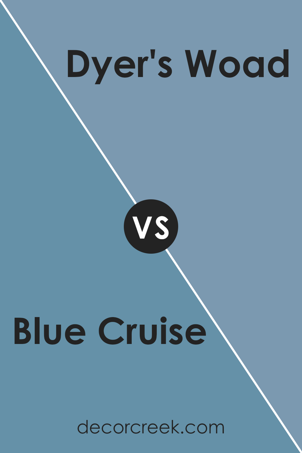
Blue Cruise SW 7606 by Sherwin Williams vs Dyer’s Woad SW 9071 by Sherwin Williams
Blue Cruise SW 7606 and Dyer’s Woad SW 9071 by Sherwin Williams are two distinct shades of blue. Blue Cruise is a calm, medium-toned blue that brings to mind the gentle waves of a quiet sea. It is slightly muted with a hint of gray, making it versatile and easy to pair with other colors.
On the other hand, Dyer’s Woad is a deeper, more intense blue. It has a strong presence and can add a bold touch to any space. While Blue Cruise offers a softer feel, Dyer’s Woad commands attention with its rich depth.
Both colors can be used in various design settings. Blue Cruise works well in spaces where a softer ambiance is desired, such as bedrooms or living rooms. Dyer’s Woad, with its striking hue, might be better suited for accent walls or places where you want to make a statement. Both colors bring a unique vibe to a room, tailored to different moods and styles.
You can see recommended paint color below:
- SW 9071 Dyer’s Woad
Blue Cruise SW 7606 by Sherwin Williams vs Leisure Blue SW 6515 by Sherwin Williams
Blue Cruise SW 7606 is a calming and versatile color by Sherwin Williams. It is a medium blue with a subtle gray undertone, making it a great choice for creating a peaceful atmosphere in various spaces. Its muted tone allows it to blend well with other colors and styles, offering a modern yet timeless feel.
Leisure Blue SW 6515, on the other hand, is a brighter and more vibrant blue. It evokes a sense of freshness and energy, bringing a lively touch to any room. This color is more saturated, making it stand out more compared to the softer Blue Cruise.
Leisure Blue works well in spaces where you want to add a splash of excitement and playfulness.
Overall, Blue Cruise offers a reserved and soothing appearance, while Leisure Blue brings a lively and cheerful vibe.
Both colors are delightful in their own way, suited for different moods and settings.
You can see recommended paint color below:
- SW 6515 Leisure Blue
Blue Cruise SW 7606 by Sherwin Williams vs Secret Cove SW 9058 by Sherwin Williams
Blue Cruise SW 7606 is a light, muted blue with a subtle gray undertone. It’s a soothing color that’s versatile for many spaces, providing a calm and relaxed atmosphere. It’s perfect for creating an airy and peaceful room, making it ideal for settings like a bedroom or living room.
In contrast, Secret Cove SW 9058 is a darker, deeper blue with hints of teal. It has a rich and moody feel, adding depth and character to a space. This color works well as an accent or feature wall, making a bold statement in spaces like a study or dining room.
While Blue Cruise is more muted and soft, Secret Cove offers a more dramatic and intense vibe. Both colors bring a sense of peace and calm, but they do so in different ways—one with lightness and openness, the other with depth and richness.
You can see recommended paint color below:
- SW 9058 Secret Cove
This color makes everything feel calm and relaxed, and it can make a room come alive with its gentle and peaceful vibe.
Whether it’s used on walls, furniture, or small decorations, Blue Cruise seems to fit well in many places. It’s like a friendly companion for other colors too, so you can pair it with a wide range of shades. If you like a room that’s bright and cheerful or one that’s calm and peaceful, this color can help make that feeling happen.
For people who want their homes to be a haven of comfort and joy, SW 7606 Blue Cruise is a great choice. It’s not just paint; it’s a simple way to bring happiness and beauty into everyday life. After reading about this color, I’m inspired to use it in my own home to see the magic it can create.
Ever wished paint sampling was as easy as sticking a sticker? Guess what? Now it is! Discover Samplize's unique Peel & Stick samples.
Get paint samples

