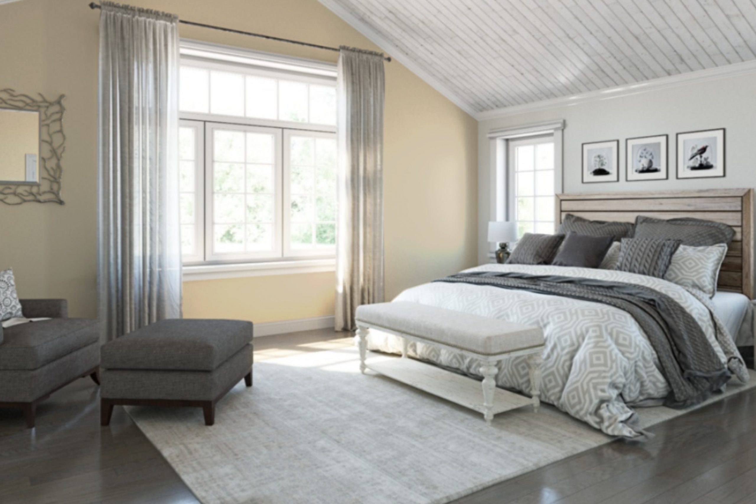
When I first saw SW 7574 Echelon Ecru by Sherwin Williams, I was drawn to its gentle and comforting vibe. It reminded me of the warm hues of a sunlit field, something that instantly felt both calming and welcoming. This shade of ecru is subtle yet so effective in creating a cozy atmosphere in any room.
Its soft, light tones bring out an elegant simplicity that works beautifully with a variety of styles, whether you’re going for a modern, minimalist look or something more traditional.
Echelon Ecru doesn’t just sit on the walls; it interacts with the natural light and the elements you choose to complement it. Throughout the day, the color changes subtly, bathing your spaces in different shades, which adds depth without being overpowering. It’s one of those colors that can easily adapt to your mood, whether you’re looking for a serene retreat or a space to entertain guests.
In a way, this hue has the power to enhance your living environment, making it both inviting and uplifting. With Echelon Ecru, I found a color that effortlessly balances charm and versatility, making any space feel just right.
What Color Is Echelon Ecru SW 7574 by Sherwin Williams?
Echelon Ecru (SW 7574) by Sherwin Williams is a soft, warm neutral color that brings a cozy and inviting feel to a room. It carries subtle undertones of beige and can be described as a light taupe shade. This color is versatile, making it suitable for various interior styles. It works well in traditional settings, adding warmth and elegance. In modern and contemporary spaces, it provides a grounded backdrop that allows bold furniture or accents to stand out without clashing.
Echelon Ecru pairs beautifully with natural materials, such as wood and stone. Light oak or pine floors complement its warmth, while stone countertops or accents enhance its earthy tones. This color also works well with soft textiles like linen or cotton, offering a calming and inviting environment.
For an inviting and balanced look, combine Echelon Ecru with soft whites, pale grays, or muted greens. Such combinations can create a harmonious atmosphere, perfect for living rooms, bedrooms, or kitchens.
Pairing it with metallics like brass or copper can add a touch of sophistication and warmth. These elements contrast beautifully with the neutral base color, providing interest and depth to the room. Echelon Ecru provides a comforting and flexible color choice for any home.
Is Echelon Ecru SW 7574 by Sherwin Williams Warm or Cool color?
Echelon Ecru SW 7574 by Sherwin Williams is a warm, inviting color. It’s a soft beige with a hint of gray, making it a versatile choice for many homes. This color can create a cozy atmosphere, especially in living rooms or bedrooms, where you want a relaxing and comforting environment.
Because it is neutral, it can easily match with a variety of other colors, allowing for flexibility in decorating. You can pair it with darker shades for contrast, or keep it light with other neutral tones for a seamless look.
In a well-lit room, Echelon Ecru can make spaces feel open and airy, reflecting light in a gentle way. In dimmer spaces, it maintains warmth without feeling too dark. It’s a practical choice for those looking to update their walls with something that complements both classic and modern décor. This color makes a subtle statement without overwhelming other design elements in your home.
Undertones of Echelon Ecru SW 7574 by Sherwin Williams
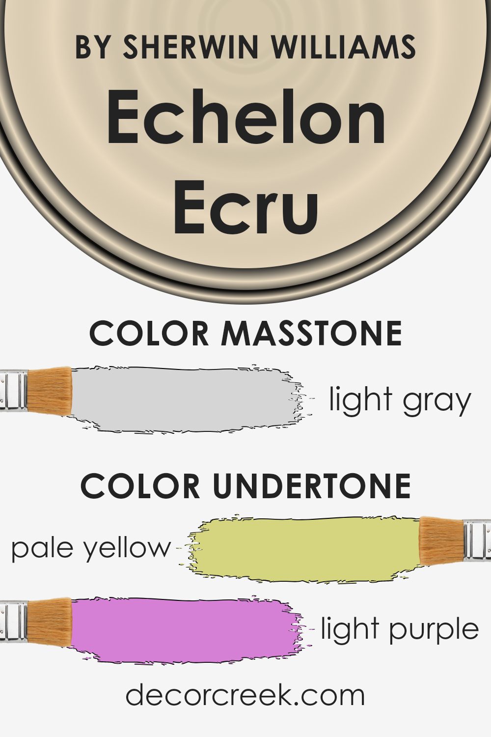
Echelon Ecru by Sherwin Williams is a soft, neutral color with a warm, inviting hue. The undertones of a paint color significantly affect its appearance, giving it depth and complexity. In general, undertones can change how a color looks under different lighting conditions. They can make a color appear warmer or cooler, more vibrant, or muted.
For Echelon Ecru, the presence of pale yellow undertones helps create a warm and inviting space, adding a hint of sunshine to a room. This warmth is balanced by light purple and lilac undertones, which add a subtle richness and depth, giving the color a slight softness and muted vibe.
The light blue and mint undertones can introduce a cooler, refreshing feel, making the color more versatile and adaptable to various lighting situations. Pale pink adds a touch of warmth and softness, providing warmth without overpowering it.
Natural or artificial light can bring out different undertones, affecting how Echelon Ecru appears on walls. It can look slightly different in the morning sun compared to evening light or under fluorescent versus incandescent bulbs. This dynamic nature makes the color an excellent choice for interior walls, as it can adapt to suit the mood of the room.
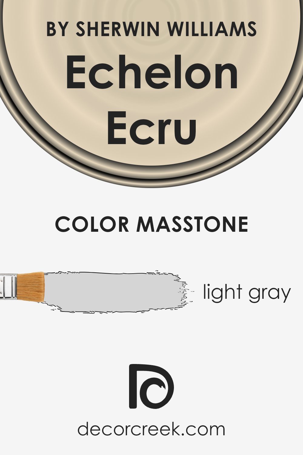
What is the Masstone of the Echelon Ecru SW 7574 by Sherwin Williams?
Echelon Ecru SW 7574 by Sherwin Williams has a soft and calming masstone of light gray (#D5D5D5). This gentle hue makes it a versatile choice for home interiors. The light gray undertones give it a neutral and balanced look, making it easy to match with other colors and decorations.
In a room, this color can create a comfortable and welcoming atmosphere. It reflects light well, helping spaces to feel larger and more open, which is ideal for smaller rooms or areas with limited natural light. This color works well in living rooms, bedrooms, or any space where you want a laid-back and cozy vibe.
subtle look allows for flexibility in design, as it pairs nicely with a variety of textures and finishes. Whether as a backdrop for bolder elements or as a main wall color, Echelon Ecru offers a harmonious and refined appearance for any home.
How Does Lighting Affect Echelon Ecru SW 7574 by Sherwin Williams?
Lighting plays a significant role in how we perceive colors. It can change the way a color appears on our walls and affect its intensity and mood. Echelon Ecru (SW 7574) by Sherwin Williams is a neutral, soft beige with warm undertones. It can look quite different depending on the lighting conditions in a room.
In natural light, colors appear more accurate to what one might see on a color swatch. North-facing rooms typically receive cooler, bluish light. This can make Echelon Ecru look a bit cooler and perhaps slightly more muted. Because north-facing rooms don’t get direct sunlight, they can feel dimmer. Echelon Ecru might appear more like a subtle, cooler beige in these spaces.
South-facing rooms enjoy the most direct sunlight throughout the day, often giving them warm, yellow-toned light. In these rooms, Echelon Ecru will likely appear warmer and more vibrant. The sunlight enhances the creamy tones of the color, making it feel cozier.
East-facing rooms get bright, clear sunlight in the morning and softer, more muted light later in the day. In the early hours, Echelon Ecru can appear warmer with the morning sun, but as the day progresses, it may shift to feel more neutral or slightly cooler.
West-facing rooms have the opposite pattern of east-facing rooms. They receive softer light in the morning and warmer, golden light in the afternoon and evening. This means that Echelon Ecru can look quite warm and rich later in the day, enhancing its natural undertones.
In artificial light, which can range from warm to cool depending on the bulbs used, Echelon Ecru may display a range of appearances. Warm bulbs will bring out its cozy, warm notes, while cooler fluorescent lighting may make it seem more neutral or even cool. Understanding these effects can help in choosing the right spaces and lighting to use this color effectively.
What is the LRV of Echelon Ecru SW 7574 by Sherwin Williams?
Light Reflectance Value (LRV) is a measure that tells us how much light a paint color will reflect or absorb. It is presented as a percentage, with 0% meaning the color absorbs all light (total black) and 100% meaning the color reflects all light (pure white). This is an important consideration when choosing paint, as it affects the mood and brightness of a room.
Colors with a high LRV, like pastels and light neutrals, tend to reflect more light, making a space feel brighter and more open. Conversely, colors with a low LRV absorb more light, which can make a room feel cozier or even smaller.
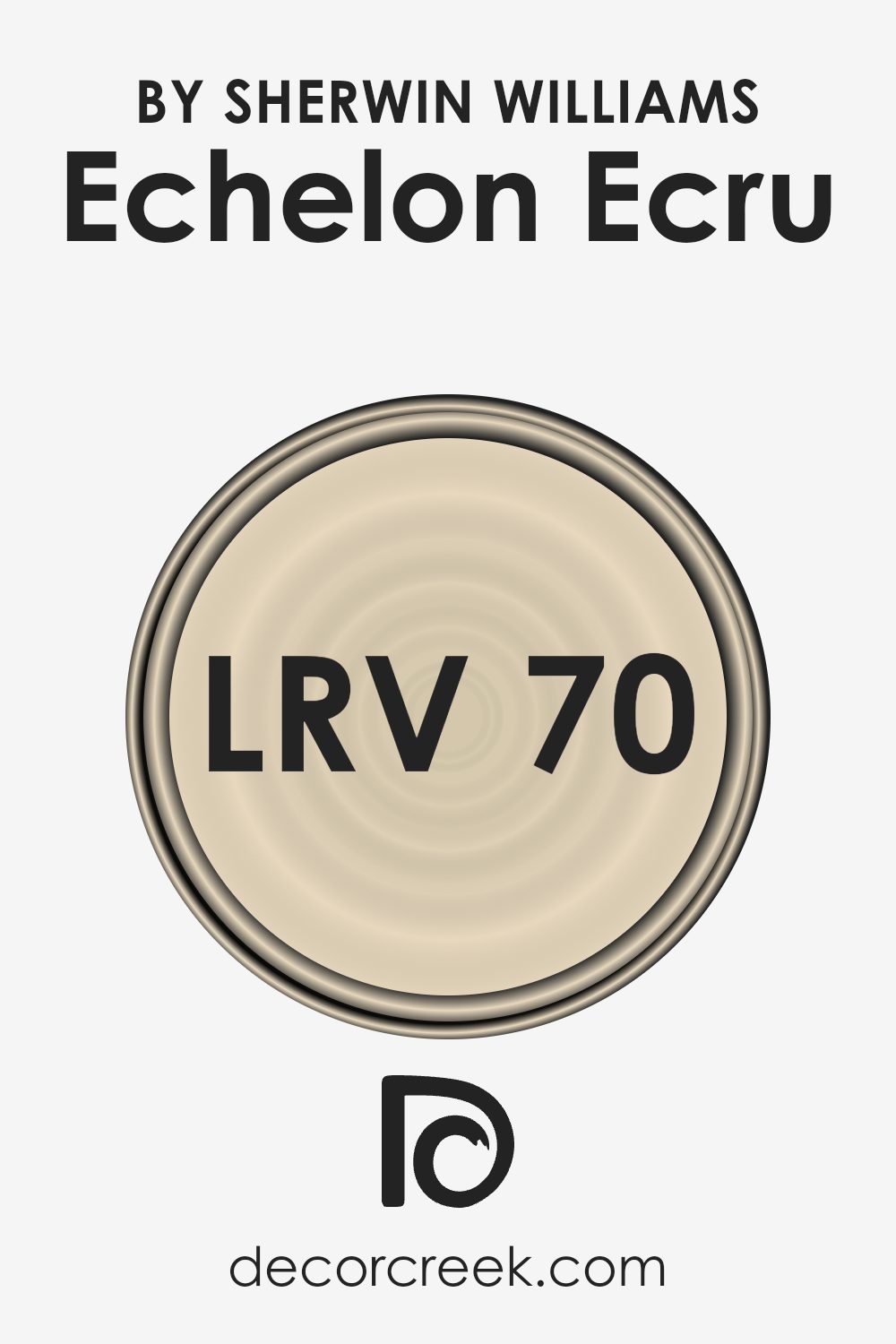
Echelon Ecru by Sherwin Williams has an LRV of 69.903, which means it reflects a considerable amount of light. This makes it a good choice for rooms where you want to enhance natural light and create an airy feel. With an LRV close to 70, Echelon Ecru will brighten up a space without being overly stark or sterile.
Its ability to reflect light well can help smaller spaces appear larger and more inviting. However, in very bright rooms, it may look even lighter than expected, so it’s always a good idea to test a sample on the wall to see how it interacts with the specific lighting conditions in the room.
Coordinating Colors of Echelon Ecru SW 7574 by Sherwin Williams
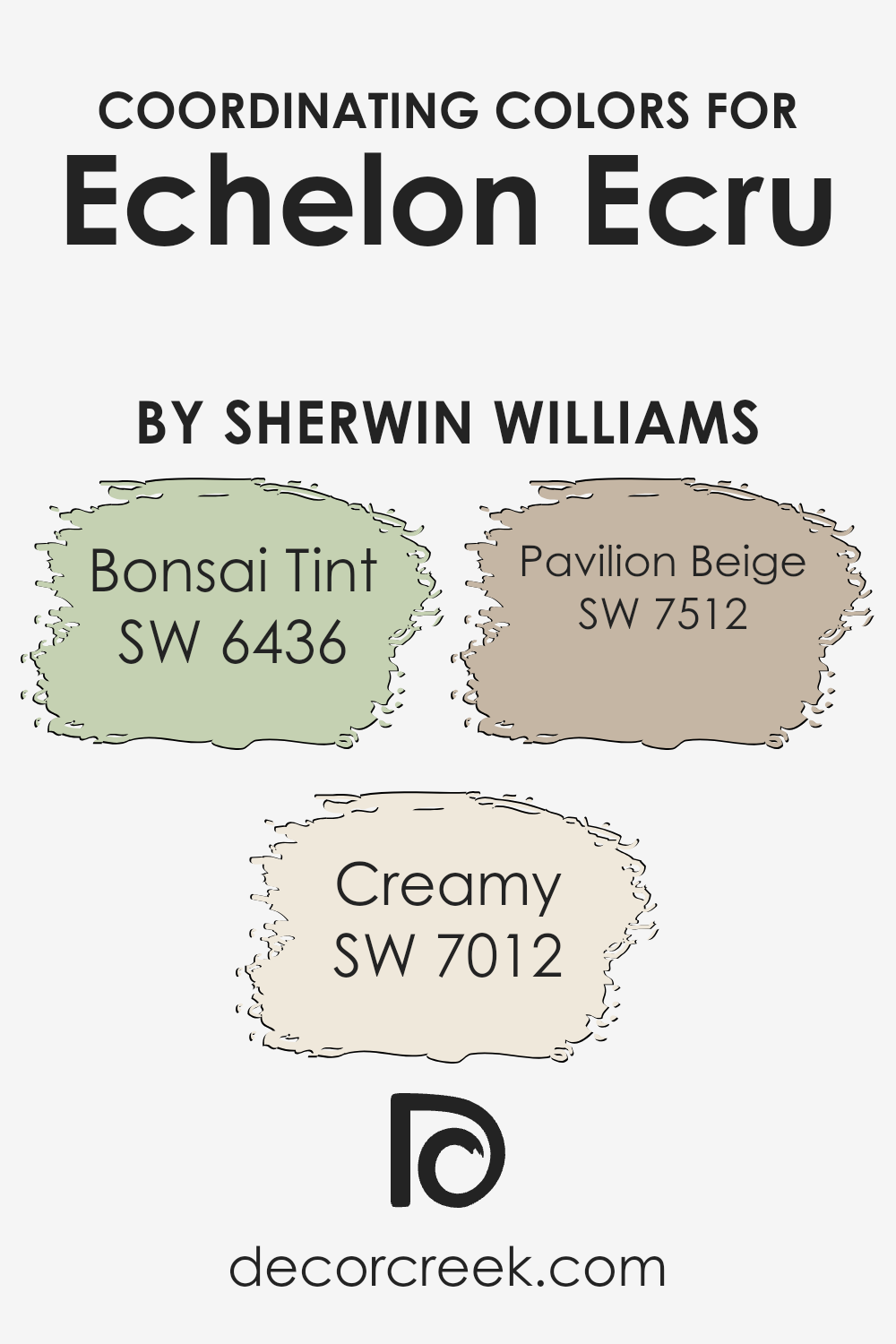
Coordinating colors are hues that complement or enhance the primary shade used in a space, creating a harmonious and visually pleasing design. When working with a color like Echelon Ecru by Sherwin Williams, coordinating colors help create balance and contrast. For example, Bonsai Tint (SW 6436) introduces a soft, muted green into the palette.
This color adds a touch of nature and calmness, making spaces feel fresh and inviting. Creamy (SW 7012), a warm, subtle off-white, offers a sense of warmth and coziness, making any room feel welcoming and comfortable. Lastly, Pavilion Beige (SW 7512) is a gentle, neutral beige that ties everything together, giving your space a cohesive look without overpowering the other colors.
Using these coordinating shades with Echelon Ecru provides a balanced backdrop for any room. This approach allows you to create an atmosphere that feels both stylish and comfortable. Bonsai Tint could be a perfect choice for accent walls or accessories, bringing a touch of the outdoors in. Creamy, with its warm undertones, works well for trims and ceilings, offering a seamless transition between walls and other elements.
Finally, Pavilion Beige can serve as a neutral base for larger surfaces, ensuring that the overall look remains gentle and cohesive.
You can see recommended paint colors below:
What are the Trim colors of Echelon Ecru SW 7574 by Sherwin Williams?
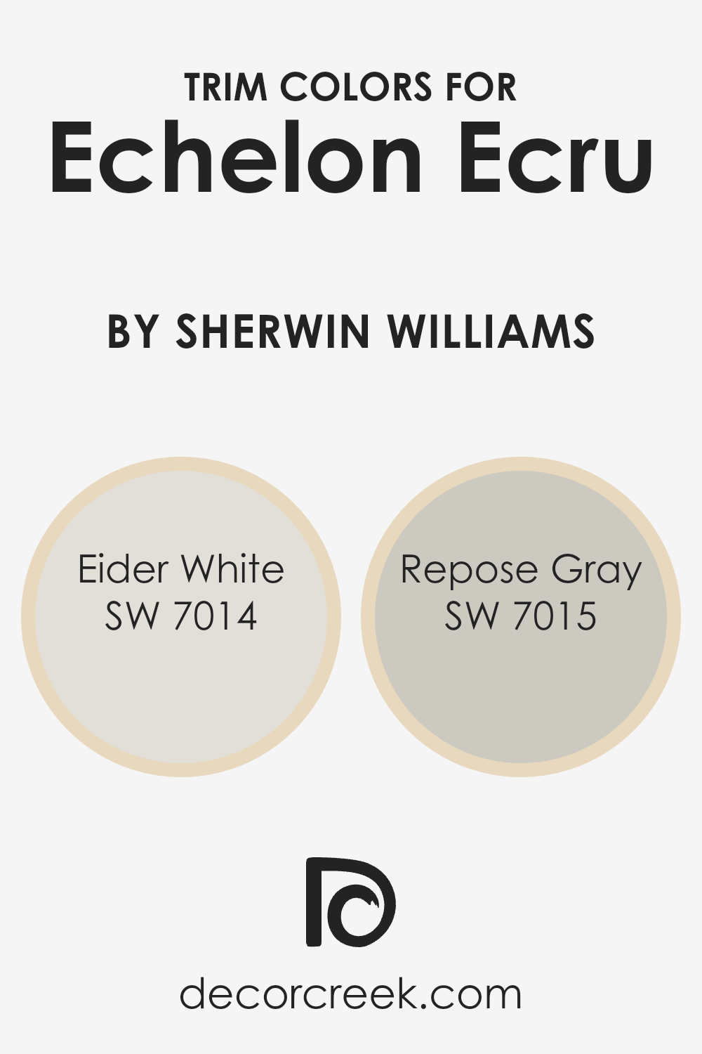
Trim colors are the shades used on the edges and boundaries of walls, doors, and windows to create contrast or harmony with the main wall color. They play an essential role in defining and highlighting the architectural features of a room. When paired with Echelon Ecru by Sherwin Williams, trim colors like Eider White and Repose Gray can enhance the overall look of a space.
Echelon Ecru is a comforting neutral, and using the right trim colors can help set it off beautifully, either by creating a gentle contrast or by blending seamlessly for a cohesive look.
Eider White, with its soft and clean appearance, offers a delicate touch that can subtly frame Echelon Ecru, adding brightness and a touch of sophistication. It’s a light grayish-white that works well to keep things airy and refined. On the other hand, Repose Gray brings in a deeper, more grounded contrast without overpowering the Echelon Ecru.
It is a versatile gray with warm undertones that complements the gentle warmth of Echelon Ecru, making it a perfect choice for those who want a more defined edge to their design elements. Together, these trim colors help in crafting a balanced and visually appealing space.
You can see recommended paint colors below:
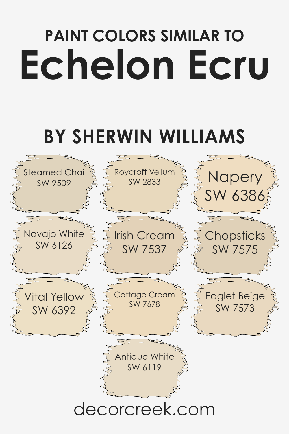
Colors Similar to Echelon Ecru SW 7574 by Sherwin Williams
Similar colors are essential in design because they create a harmonious look and feel. When you use colors that are closely related, like those similar to Echelon Ecru by Sherwin Williams, it creates a sense of unity and balance. These colors blend seamlessly, offering a soothing backdrop that doesn’t distract but instead complements various elements within a space.
Steamed Chai (SW 9509) has the warmth of a gentle, creamy brown, while Navajo White (SW 6126) is a soft, sunlit off-white that brightens any room. Vital Yellow (SW 6392) adds a hint of cheer with its warm, buttery tones.
Antique White (SW 6119) delivers a timeless appeal with its warm, aged creaminess, ideal for traditional or rustic settings. Roycroft Vellum (SW 2833) offers a subtle, historic vibe with its muted beige tone. Irish Cream (SW 7537) brings comfort with a creamy, light beige, perfect for cozy spaces. Cottage Cream (SW 7678) exudes a gentle, light warmth, similar to fresh cream.
Napery (SW 6386) has a delightful soft yellow hue, perfect for enhancing sunlight-lit rooms. Chopsticks (SW 7575) and Eaglet Beige (SW 7573) provide richer, earthy tones that ground a palette, tying everything together beautifully with their deeper hues. These similar shades enhance the design by offering subtle contrast and comfortable warmth.
You can see recommended paint colors below:
- SW 9509 Steamed Chai
- SW 6126 Navajo White
- SW 6392 Vital Yellow
- SW 6119 Antique White
- SW 2833 Roycroft Vellum
- SW 7537 Irish Cream
- SW 7678 Cottage Cream
- SW 6386 Napery
- SW 7575 Chopsticks
- SW 7573 Eaglet Beige
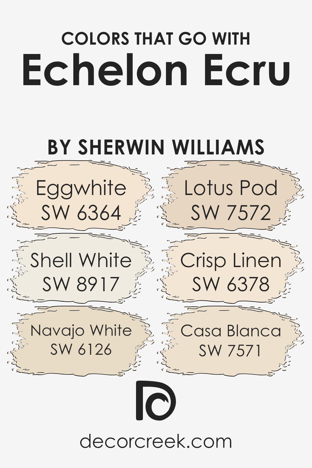
Colors that Go With Echelon Ecru SW 7574 by Sherwin Williams
Echelon Ecru SW 7574 by Sherwin Williams is a warm, neutral tone that provides a great backdrop for a variety of settings. Its versatility allows it to pair well with several complementary colors, bringing balance and cohesion to a space. Colors like SW 6364 Eggwhite add a soft and inviting feel, creating an airy atmosphere.
Shell White SW 8917 offers a hint of warmth and is an excellent choice for those who prefer a slightly deeper white without venturing into darker tones.
Navajo White SW 6126 boasts a comforting, creamy look that blends nicely with the warm undertones of Echelon Ecru. Lotus Pod SW 7572, with its subtle earthy hues, enhances the richness of Echelon Ecru, adding depth to the decor.
Crisp Linen SW 6378 gives a fresh, clean vibe, making spaces feel light and open. Finally, Casa Blanca SW 7571, with its gentle beige undertones, creates a seamless transition between spaces. Pairing these colors with Echelon Ecru results in a harmonious and cozy environment, perfect for making any room feel welcoming and cohesive.
You can see recommended paint colors below:
- SW 6364 Eggwhite
- SW 8917 Shell White
- SW 6126 Navajo White
- SW 7572 Lotus Pod
- SW 6378 Crisp Linen
- SW 7571 Casa Blanca
How to Use Echelon Ecru SW 7574 by Sherwin Williams In Your Home?
Echelon Ecru by Sherwin Williams is a versatile paint color that can add warmth and coziness to a home. This shade is a soft, neutral beige that works well in almost any room. It creates a welcoming atmosphere without being too bold or dark.
You might consider using Echelon Ecru in living rooms or bedrooms to create a relaxed space. It pairs nicely with both vibrant colors and other neutrals, making it easy to match with furniture and decorations. Adding white trim and light-colored decor can freshen the look, while darker accents can bring a bit of contrast.
In kitchens and dining areas, Echelon Ecru can make the space feel open and inviting. It complements natural materials like wood and stone, enhancing their natural beauty. Use it in hallways or entryways to create a seamless look throughout your home. This color’s flexibility makes it a popular choice for many homeowners looking for a classic and timeless feel.
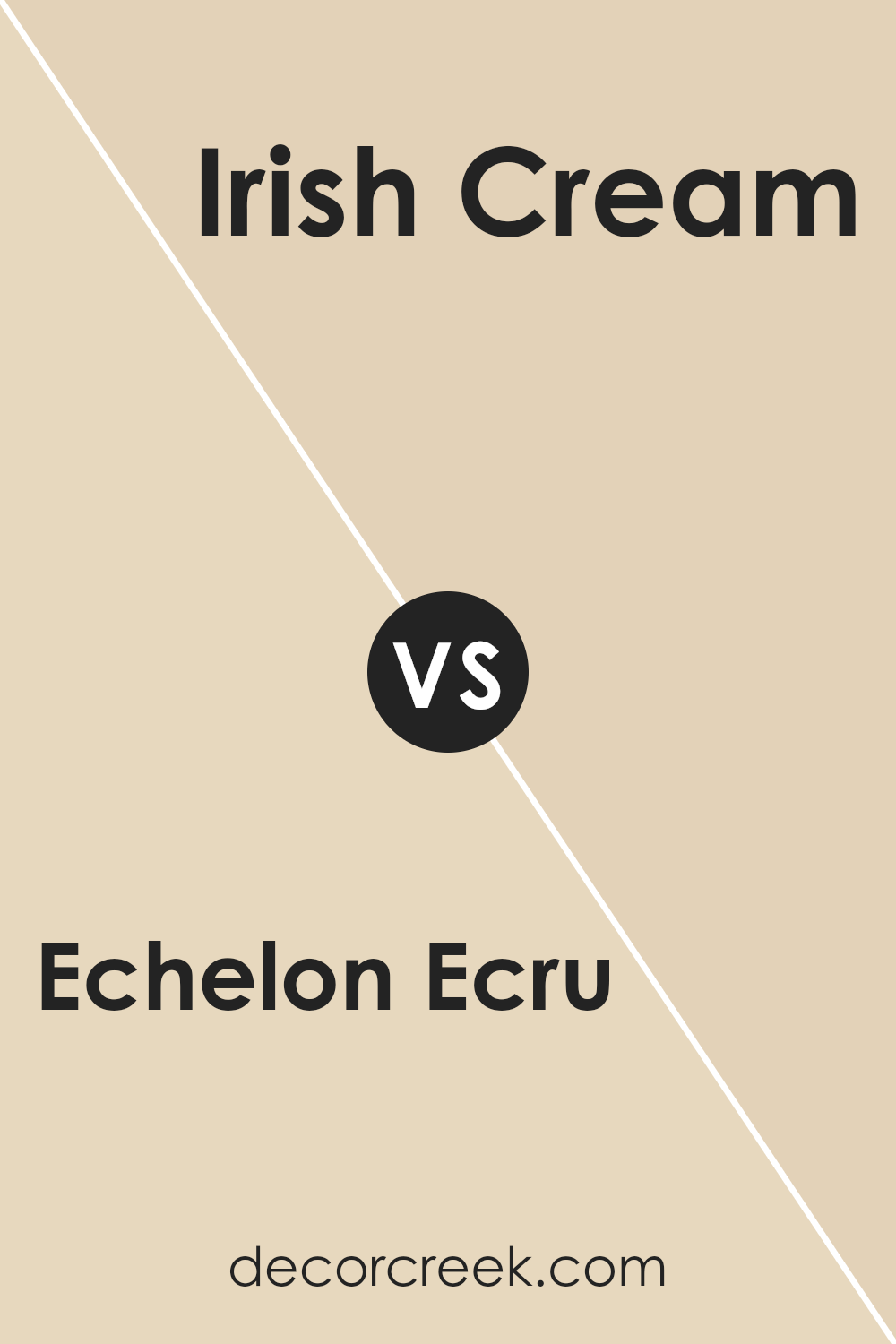
Echelon Ecru SW 7574 by Sherwin Williams vs Irish Cream SW 7537 by Sherwin Williams
Echelon Ecru SW 7574 and Irish Cream SW 7537, both by Sherwin Williams, offer warm, inviting tones ideal for home interiors. Echelon Ecru, a muted beige, provides a light, neutral backdrop that can make spaces feel open and airy.
It pairs well with both modern and traditional furnishings due to its versatility. On the other hand, Irish Cream has a slightly richer, creamy hue with subtle yellow undertones, giving it a cozy, welcoming appearance. This shade works particularly well in living areas, creating a more intimate atmosphere.
While Echelon Ecru is great for a clean, understated look, Irish Cream adds a hint of warmth.
Choosing between them depends on the desired ambiance: Echelon Ecru for a more neutral, spacious effect, or Irish Cream for a comfortable, homey vibe. Both colors suit different styles, but their shared warmth ensures they complement each other nicely in a single space.
You can see recommended paint color below:
- SW 7537 Irish Cream
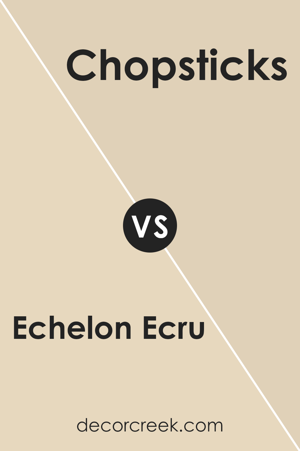
Echelon Ecru SW 7574 by Sherwin Williams vs Chopsticks SW 7575 by Sherwin Williams
Echelon Ecru SW 7574 and Chopsticks SW 7575 are two warm paint colors from Sherwin Williams, perfect for creating cozy spaces. Echelon Ecru is a soft, neutral beige that has a calming presence, making it a great choice for living rooms or bedrooms.
It adds a touch of warmth without being overpowering. On the other hand, Chopsticks is slightly darker with a hint of brown, bringing a richer, earthier feel into a space. This makes Chopsticks ideal for accent walls or areas where you want a deeper tone. Both colors complement a variety of décor styles, from traditional to modern.
When used together, Echelon Ecru can be the primary color, offering a light, airy backdrop, while Chopsticks can be used for focal areas to add depth and contrast. Overall, these colors work well together to create a harmonious and inviting environment.
You can see recommended paint color below:
- SW 7575 Chopsticks
Echelon Ecru SW 7574 by Sherwin Williams vs Cottage Cream SW 7678 by Sherwin Williams
Echelon Ecru and Cottage Cream are two soft and neutral colors from Sherwin Williams that bring warmth and simplicity to any space.
Echelon Ecru is a gentle, beige tone with a hint of gray, making it a versatile choice that works well with various styles. It’s not too bold and adds a quiet elegance to rooms, matching easily with many other colors.
Cottage Cream is more of a warm, creamy shade. It radiates a cozy feeling and can make a room feel more inviting and cheerful. Its rich undertone brings a bit of sunshine indoors, which is great for creating a welcoming atmosphere.
Both colors are wonderful for living rooms, bedrooms, or any area where you want a calm and inviting feel, but Echelon Ecru offers a more understated look, while Cottage Cream adds a touch of warmth and coziness. Either choice would enhance your home’s aesthetic with ease.
You can see recommended paint color below:
- SW 7678 Cottage Cream
Echelon Ecru SW 7574 by Sherwin Williams vs Roycroft Vellum SW 2833 by Sherwin Williams
Echelon Ecru (SW 7574) and Roycroft Vellum (SW 2833) are two distinct paint colors by Sherwin Williams, both offering warm, inviting vibes. Echelon Ecru is a soft, neutral cream with slight yellow undertones, which creates a cozy and subtle backdrop that suits many home environments. It is ideal for spaces where you want to keep things light and airy.
On the other hand, Roycroft Vellum is a deeper, more saturated hue with golden undertones, reminiscent of antique parchment. It brings a little more richness and depth compared to the lighter ecru. This color works well in rooms where you want a touch of history or a warmer ambiance.
While Echelon Ecru is great for open, bright spaces due to its lightness, Roycroft Vellum can add a touch of warmth to more traditional or eclectic settings. Both colors offer versatility for enhancing different room atmospheres.
You can see recommended paint color below:
- SW 2833 Roycroft Vellum
Echelon Ecru SW 7574 by Sherwin Williams vs Vital Yellow SW 6392 by Sherwin Williams
Echelon Ecru SW 7574 by Sherwin Williams is a soft, neutral shade. It has a warm undertone, making it a versatile choice for many spaces, creating a soothing and comfortable atmosphere. Its subtle nature allows it to blend well with various design elements and keeps a room feeling light and airy.
In contrast, Vital Yellow SW 6392 is bright, cheerful, and bold. This color brings energy and a sense of playfulness to any environment. It’s more robust and attention-grabbing than Echelon Ecru, making it ideal for adding a pop of color to a room or creating a focal wall.
When placed together, Echelon Ecru can act as a calming backdrop, allowing Vital Yellow to stand out even more. While Ecru maintains a classic and understated feel, Yellow injects vibrancy and liveliness, making them an interesting pair for those who like mixing neutral and vivid colors in their designs.
You can see recommended paint color below:
- SW 6392 Vital Yellow
Echelon Ecru SW 7574 by Sherwin Williams vs Napery SW 6386 by Sherwin Williams
Echelon Ecru (SW 7574) and Napery (SW 6386) are both warm, inviting colors from Sherwin Williams. Echelon Ecru is a soft and creamy off-white with subtle hints of beige, making it a versatile choice for a neutral color palette. It can add warmth and coziness without overwhelming a space, making it suitable for main walls or ceilings.
Napery is a warm, light yellow that brings a cheerful, sunny feel to a room. It is darker and more vibrant than Echelon Ecru, which makes it great for adding a pop of color while still maintaining a relaxed atmosphere. Napery is perfect for accent walls or spaces where you want a hint of brightness.
When comparing the two, Echelon Ecru offers a more subdued and gentle touch, while Napery provides energy and warmth. Both colors work well together or individually, complementing various design styles and preferences.
You can see recommended paint color below:
- SW 6386 Napery
Echelon Ecru SW 7574 by Sherwin Williams vs Eaglet Beige SW 7573 by Sherwin Williams
Echelon Ecru (SW 7574) and Eaglet Beige (SW 7573) are two warm, neutral colors by Sherwin Williams. Echelon Ecru is a light, creamy color with soft yellow undertones. It adds warmth and brightness to a room without being overpowering.
It’s a great choice for those who want a subtle but inviting feel. On the other hand, Eaglet Beige is slightly darker and more on the beige spectrum. It carries a hint of gray, making it more muted and earthy compared to Echelon Ecru. While both are versatile, Echelon Ecru is better for spaces where you want more light reflection, giving an airy feel.
Eaglet Beige offers a touch more depth, suiting spaces where a cozy and grounded atmosphere is desired.Together, these colors can be used to create a cohesive look, with Echelon Ecru highlighting features and Eaglet Beige offering a warm backdrop.
You can see recommended paint color below:
- SW 7573 Eaglet Beige
Echelon Ecru SW 7574 by Sherwin Williams vs Antique White SW 6119 by Sherwin Williams
Echelon Ecru SW 7574 and Antique White SW 6119 are both soft, neutral colors by Sherwin Williams, but they offer different tones and feelings. Echelon Ecru is a warm, beige color that brings a cozy and welcoming atmosphere to any space. It has a subtle yellow undertone that makes it feel sunny and lively without being too bright.
On the other hand, Antique White is a creamy, off-white color that feels more muted and classic. It has a slight touch of warmth, but compared to Echelon Ecru, it’s softer and more subdued. This makes it ideal for spaces where you want to keep things simple and timeless.
While both colors can be used in various rooms, Echelon Ecru tends to energize a space a bit more, while Antique White maintains a calm and neutral backdrop. They both serve as versatile choices for those looking to keep their interiors light and natural.
You can see recommended paint color below:
Echelon Ecru SW 7574 by Sherwin Williams vs Steamed Chai SW 9509 by Sherwin Williams
Echelon Ecru SW 7574 by Sherwin Williams is a warm, neutral beige with a soft undertone that creates a cozy atmosphere. It’s versatile and works well in different spaces, providing a classic backdrop that complements various styles of decor.
On the other hand, Steamed Chai SW 9509 is a lighter, creamy beige that feels airy and bright. This color adds a gentle warmth without being overwhelming, making spaces feel open and inviting.
Comparing the two, Echelon Ecru leans more towards a rich, deeper tone, while Steamed Chai is softer and lighter. Echelon Ecru is suitable for rooms where you want to create a snug and intimate setting, whereas Steamed Chai is perfect for areas where you want more light and an open feel. Both colors are great neutrals, yet they offer slightly different moods and can influence the ambiance of a room in unique ways.
You can see recommended paint color below:
Echelon Ecru SW 7574 by Sherwin Williams vs Navajo White SW 6126 by Sherwin Williams
Echelon Ecru SW 7574 and Navajo White SW 6126 are two warm, neutral paint colors by Sherwin Williams. Echelon Ecru has an inviting balance of beige and cream, offering a soft and welcoming look. Its subtle undertones can create a cozy atmosphere, making it perfect for living rooms or bedrooms.
On the other hand, Navajo White is a bit warmer and has more yellow undertones compared to Echelon Ecru. This makes it feel sunnier and more cheerful. It can brighten up a space while still maintaining a neutral backdrop. Navajo White is versatile and works well in both traditional and modern settings.
Both colors are great for creating a warm and inviting space, but Echelon Ecru is more muted and understated, while Navajo White brings a sunnier, more vibrant feel to a room. Choosing between them depends on how much warmth and light you want in your space.
You can see recommended paint color below:
Conclusion
After looking into the color SW 7574 Echelon Ecru by Sherwin Williams, I feel it’s a kind color that can fit in almost any place. It’s a soft, gentle shade that’s kind of like a warm hug for a room. Not too bright, not too dark—just right. It makes me think of cozy places and comforting moments, like a soft blanket on a chilly day.
This color works well on walls because it isn’t too loud but isn’t boring either. It can make rooms feel warm and inviting, like a nice cup of cocoa. It goes well with lots of other colors, like white, gray, or even brighter shades. Think of it as a friendly background that lets other colors shine without stealing the show.
Whether in the living room, bedroom, or even the kitchen, Echelon Ecru can help make a room feel welcoming and calm. It’s like a great base for any style you want, whether you’re into modern looks or cozy, classic ones. Kids and adults alike can appreciate its friendly and warm vibe.
Overall, I think Echelon Ecru is like a good friend to any room. It helps make a place feel comfy and nice, which is something everyone can enjoy.
Ever wished paint sampling was as easy as sticking a sticker? Guess what? Now it is! Discover Samplize's unique Peel & Stick samples.
Get paint samples

