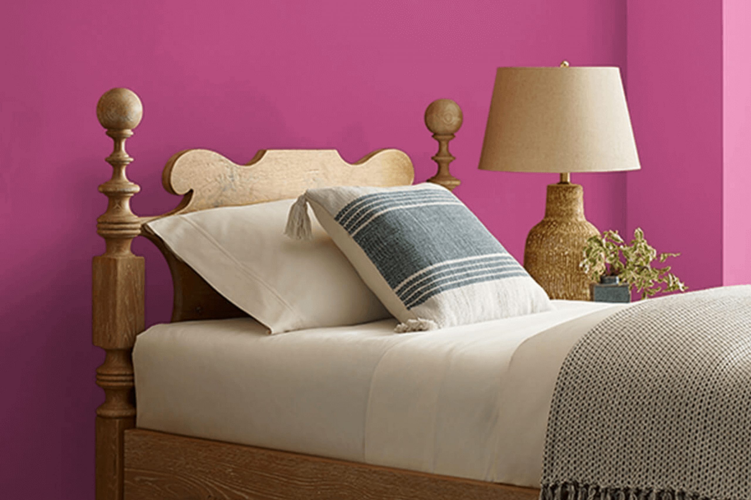
When I think about a color that injects life and energy, SW 6840 Exuberant Pink by Sherwin Williams comes to mind. This vibrant shade immediately fills any room with a sense of joy and excitement. You can feel the lively pulse of this color the moment you see it, as it creates an atmosphere that is welcoming and full of personality. Often, pink hues can feel soft or understated, but Exuberant Pink breaks that mold with its boldness and clarity.
Imagine walking into a room painted with this shade; it’s like a warm hug, radiating positivity and warmth. The color serves as a statement piece all on its own, needing little else to make any area feel complete. Its rich and lively tone acts almost like a mood lifter, making everything seem a bit brighter.
You’ll find yourself wanting to spend more time in a room painted with Exuberant Pink, as it brings a kind of cheerful energy that feels contagious. Choosing a color for your area is a deeply personal decision, and Exuberant Pink speaks to those who aren’t afraid to showcase a bit of flair.
Whether you use it as an accent or make it the star of the show, this pink turns simple walls into a lively canvas, making every moment spent in the room feel slightly more joyful.
What Color Is Exuberant Pink SW 6840 by Sherwin Williams?
Exuberant Pink by Sherwin Williams is a lively, bold shade that infuses a room with energy and cheerfulness. This vibrant color is perfect for those looking to add a playful and dynamic touch to their interiors. Its vivid pink hue can serve as a striking accent wall or be used in accessories to bring a pop of color to any room.
This color works particularly well in eclectic, modern, and bohemian interior styles. In eclectic areas, it can be combined with various colors and patterns to create an eye-catching environment. In modern settings, Exuberant Pink can act as a focal point against clean lines and neutral tones. Bohemian interiors benefit from its cheerful undertone, blending seamlessly with other bright colors and natural elements.
For materials, Exuberant Pink pairs beautifully with both light and dark woods, adding contrast and warmth. It complements metals like gold and brass, adding a luxurious touch to the decor. When it comes to textures, this pink works well with plush fabrics such as velvet and silk, enhancing its rich feel. S
oft, textured textiles like woven throws and rugs can balance its brightness, creating a cozy yet stylish atmosphere.
Is Exuberant Pink SW 6840 by Sherwin Williams Warm or Cool color?
Exuberant Pink by Sherwin-Williams is a vibrant and lively color that can brighten up any room in a home. It’s a bold shade of pink that injects energy and joy into a room, making it perfect for areas where you want to create a cheerful and welcoming atmosphere.
In living rooms, Exuberant Pink can make the room feel inviting and fun, encouraging social interactions and lively conversations. In a child’s bedroom, it can inspire creativity and playfulness. This shade works well as an accent wall, bringing focus and excitement to a single area without being too strong.
Pairing it with neutral tones like whites or grays can help balance its intensity, ensuring the room feels energetic but not too overpowering. Additionally, it complements natural light beautifully, enhancing any beams of sunshine that filter into the area. Overall, Exuberant Pink is a dynamic color choice for those looking to add a burst of happiness to their home décor.
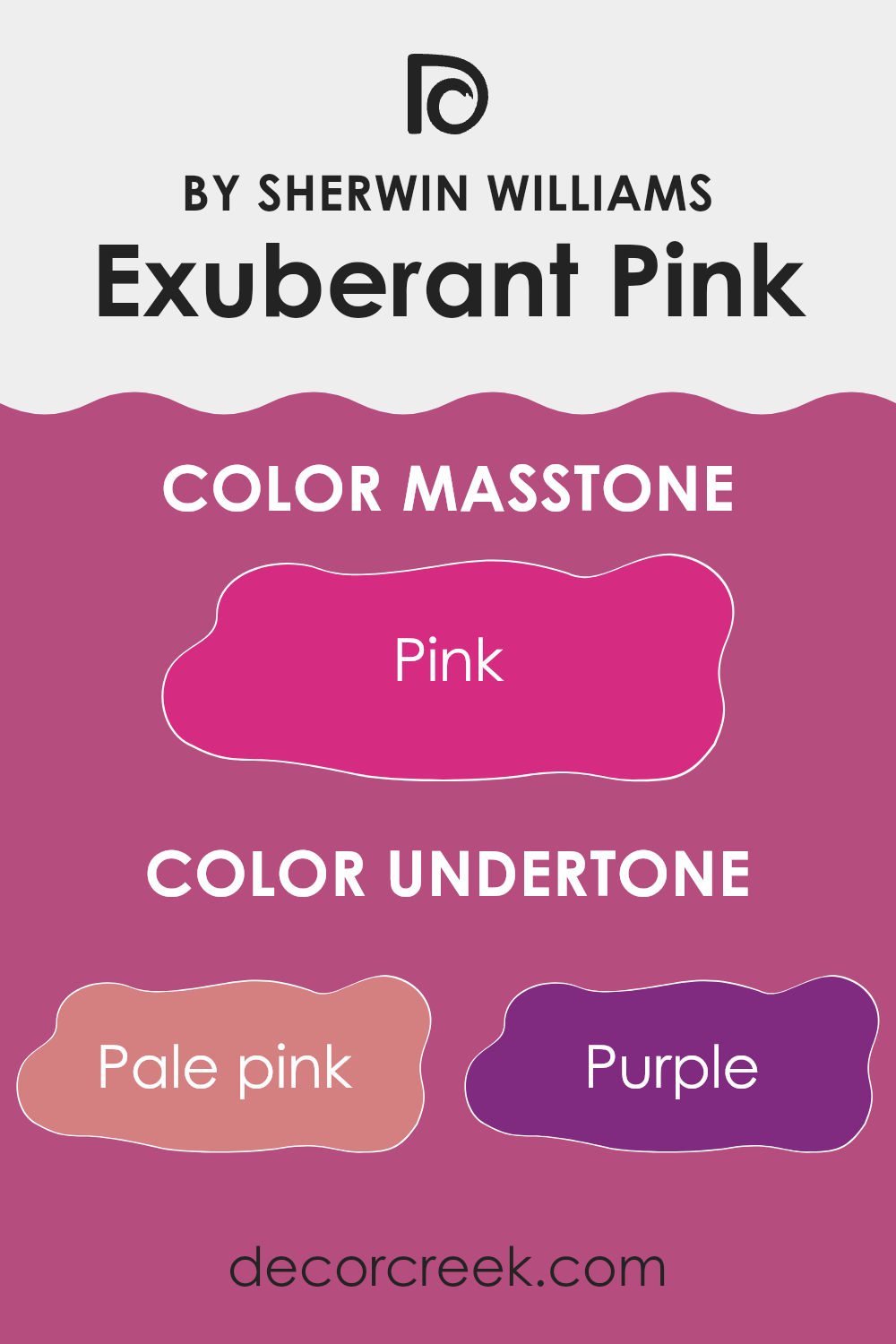
Undertones of Exuberant Pink SW 6840 by Sherwin Williams
Exuberant Pink SW 6840 by Sherwin Williams is a lively and vibrant color that brings a burst of energy to any room. Its complex undertones include shades of pale pink, purple, grey, red, fuchsia, orange, light purple, brown, violet, olive, and lilac. These undertones create a unique color that can change depending on the lighting and surrounding colors.
Undertones play a crucial role in how we perceive a color. They can make a color appear warmer, cooler, softer, or more intense. For instance, the warm red and orange undertones in Exuberant Pink give it a bold and lively feel, while the purple and lilac accents add a touch of depth and richness. The grey undertone, though subtle, brings a grounding effect, making the color less strong.
When used on interior walls, Exuberant Pink can create a striking focal point. The warm undertones make the room feel cozy and vibrant, while the cool undertones add a sense of balance and sophistication. This color can energize a living room or bring warmth and cheer to a bedroom or kitchen. It pairs well with neutral colors, helping these undertones to stand out and provide a dynamic and engaging atmosphere.
What is the Masstone of the Exuberant Pink SW 6840 by Sherwin Williams?
Exuberant Pink, also known by its masstone Pink (#D52B80), is a bold and lively color by Sherwin Williams. This shade brings energy and vibrance to any room. In homes, it can be used to create a fun and dynamic atmosphere, making it a great choice for areas like children’s rooms, playrooms, or any area that needs a burst of life.
This color is bright and cheerful, and it can stimulate creativity and playfulness. However, because of its strong presence, it’s often best used as an accent rather than covering entire walls, which could become too strong.
Pairing Exuberant Pink with neutral colors like whites, grays, or soft shades can help to balance its intensity while still allowing it to shine. Accessories like cushions, artwork, or a feature wall can incorporate this color without overpowering the room, making it both modern and inviting.
How Does Lighting Affect Exuberant Pink SW 6840 by Sherwin Williams?
Lighting plays an essential role in how we perceive colors. It can change the appearance of paint colors dramatically. For a vibrant color like Exuberant Pink SW 6840 by Sherwin Williams, understanding how it reacts under different lighting conditions can help you decide where to use it effectively.
Under artificial light, the warmth or coolness of the light bulbs will significantly affect how Exuberant Pink appears. Incandescent bulbs tend to give off a warm, yellow glow, which can make the pink appear warmer and more intense. On the other hand, fluorescent lighting, often cooler and more bluish, might make the pink appear slightly subdued or less intense.
When it comes to natural light, the direction a room faces can have a considerable impact. In north-facing rooms, where the natural light is cooler and softer, Exuberant Pink might appear a bit muted compared to its vibrant swatch. It could have a slight bluish undertone, making the pink feel less intense.
In south-facing rooms, which receive warm, bright light throughout the day, Exuberant Pink is likely to look its most vivid. The strong sunlight enhances the color’s natural brightness, making it a great choice if you want a bold and lively atmosphere.
East-facing rooms benefit from the warm, golden light of the morning sun. Exuberant Pink will appear bright and warm in the morning, but as the day progresses and the sunlight fades, the color might appear softer and more subdued.
West-facing rooms receive the warm glow of the setting sun in the afternoon and evening. In these areas, Exuberant Pink may look more intense and warmer later in the day, potentially casting a cozy, vibrant glow as the day ends.
In summary, Exuberant Pink SW 6840 changes in tone and intensity depending on both artificial and natural light, as well as the direction of the room.
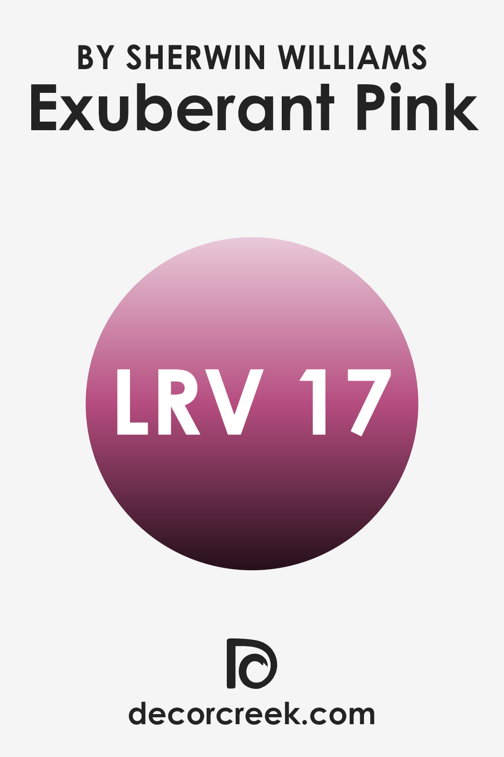
What is the LRV of Exuberant Pink SW 6840 by Sherwin Williams?
Light Reflectance Value, or LRV, is a measurement that tells us how much light a color reflects or absorbs. It is measured on a scale from 0 to 100, where 0 means the color absorbs all light (think deep black), and 100 means it reflects all light (like bright white). When it comes to paint colors, LRV helps you understand how bright or dark a color will appear on your walls.
A paint color with a low LRV will absorb more light, making the room feel warmer and potentially smaller, while a high LRV will reflect more light, making the room feel brighter and more spacious. With an LRV of 16.597, Exuberant Pink is fairly low on the scale, meaning it is a deeper and more intense color.
This LRV suggests that Exuberant Pink will absorb a lot of light, making the color appear rich and vibrant in a room. Rooms painted with this color may feel cozy or intimate, as the color will not reflect much light to brighten up the room. It’s a bold choice, so it would work well in areas where you want to make a dramatic statement, especially when paired with lighter accents to balance the boldness of the pink.
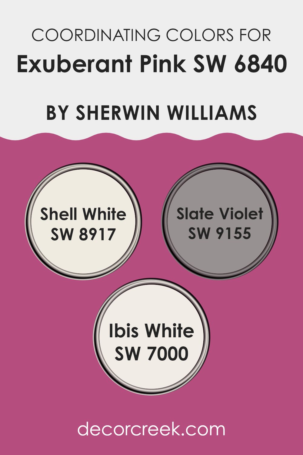
Coordinating Colors of Exuberant Pink SW 6840 by Sherwin Williams
Coordinating colors are hues that work well together to create a balanced and pleasing look. When you are decorating or painting a room, choosing the right coordinating colors can make a huge difference in the overall feel of the room. For instance, Exuberant Pink by Sherwin Williams is a vibrant and energetic shade.
To complement this lively color, you might consider using Shell White, Slate Violet, and Ibis White. Shell White is a light and soft shade that brings a sense of warmth and openness to a room, making it perfect for areas that need a subtle and inviting background.
Slate Violet, on the other hand, is slightly more muted and offers a touch of elegance and depth, providing a calm contrast to the pink’s intensity. Meanwhile, Ibis White is clean and bright, offering a neutral base that can highlight the more dynamic colors in the room. Together, these colors can create a harmonious and appealing area. They work together to balance each other out, with some adding vitality and others providing a soothing effect. By blending these hues, you can design a room that is both lively and welcoming without being too strong on the senses.
You can see recommended paint colors below:
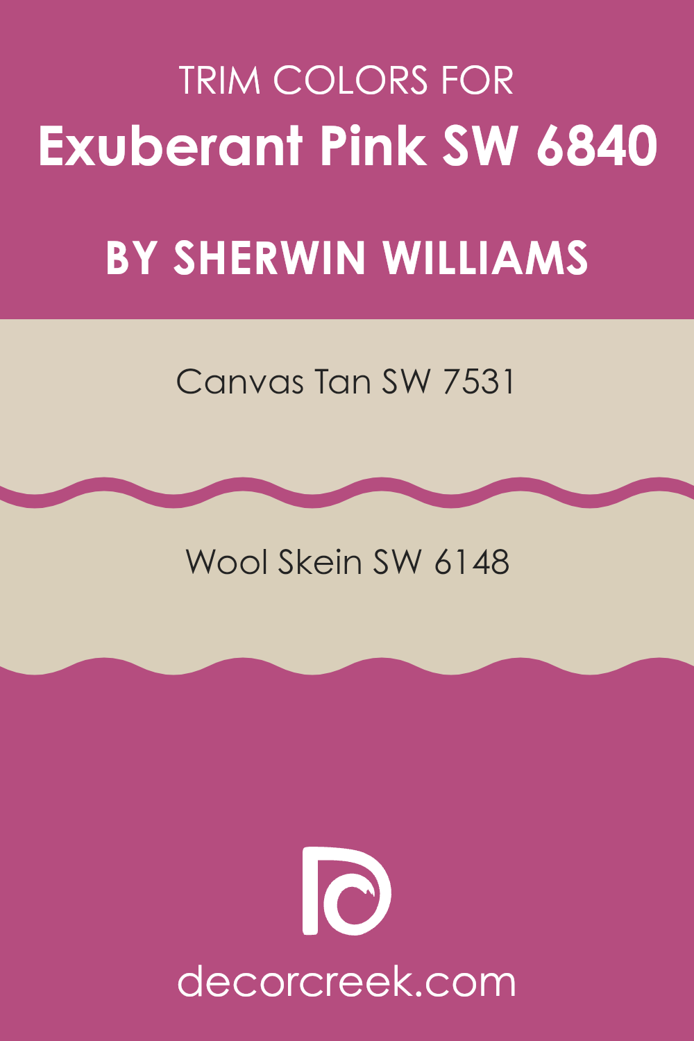
What are the Trim colors of Exuberant Pink SW 6840 by Sherwin Williams?
Trim colors play a crucial role in defining the overall look of a room. When paired with a bold wall color like Exuberant Pink by Sherwin Williams, the right trim colors can create a harmonious balance and make the pink stand out without being too strong in a room.
Using neutral colors like SW 7531 Canvas Tan and SW 6148 Wool Skein as trim provides a subtle backdrop that enhances the vibrancy of the pink while offering a touch of elegance and visual relief. Canvas Tan is a warm, light beige with gentle undertones that can create a cozy atmosphere, making it a perfect match for warmer, bolder wall colors.
In contrast, Wool Skein is a soft grayish beige, adding a touch of neutrality that complements even the brightest colors with a sense of calm and understated charm. Together, these trim colors can frame Exuberant Pink beautifully, giving a refined edge to its energetic personality.
The importance of choosing the right trim colors with a bold wall color cannot be overstated, as they ensure the area feels balanced and cohesive. Canvas Tan brings in warmth and subtlety, giving the room a grounded feel without clashing with the pink’s brightness.
Meanwhile, Wool Skein offers a neutral, slightly muted tone that complements the pink’s boldness but doesn’t take away from its vibrant nature. Employing these colors in a room can enhance the overall aesthetic, creating an inviting and visually appealing atmosphere. By selecting the right trim colors, one can enjoy the energetic spirit of Exuberant Pink while maintaining a polished and well-coordinated look in any room.
You can see recommended paint colors below:
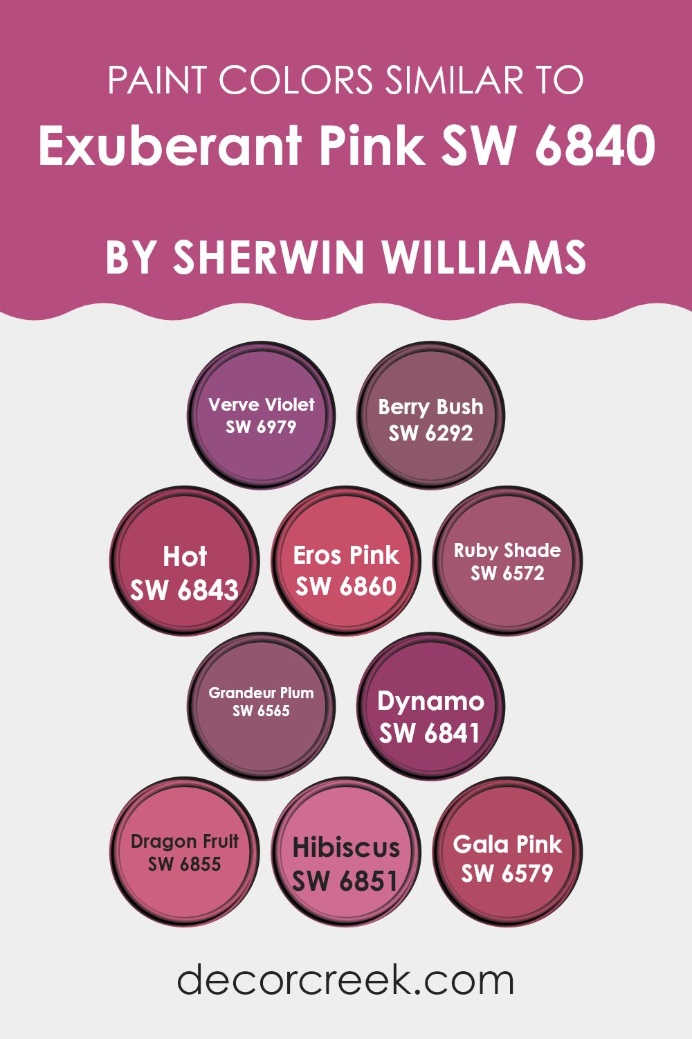
Colors Similar to Exuberant Pink SW 6840 by Sherwin Williams
Similar colors play a crucial role in creating cohesive and harmonious designs, helping to balance visual interest without being too strong for the viewer. When working with Exuberant Pink from Sherwin Williams, selecting similar colors ensures a more seamless integration, enhancing the main shade’s vibrancy.
The color Verve Violet, with its rich and energetic tone, complements Exuberant Pink by adding depth and dynamism. Berry Bush brings a touch of warmth with its deep berry undertones, perfectly harmonizing with pink hues. Hot adds an extra layer of brightness, giving a lively feel to any room. Eros Pink offers a softer touch, subtly blending with the bolder tones.
Ruby Shade brings a luxurious and rich hue, creating a bold yet balanced look. Grandeur Plum’s deep and regal color provides an elegant contrast, enriching the pinks’ vibrant qualities. Dynamo carries a bold presence similar to Exuberant Pink, intensifying the color harmony.
The bright and tropical tone of Dragon Fruit injects energy, while Hibiscus delivers a playful and fresh vibe. Lastly, Gala Pink rounds off the palette with a delicate and charming touch. Using these colors together ensures a smooth visual flow, maintaining excitement while nurturing the overarching themes of vibrancy and unity.
You can see recommended paint colors below:
- SW 6979 Verve Violet
- SW 6292 Berry Bush
- SW 6843 Hot
- SW 6860 Eros Pink
- SW 6572 Ruby Shade
- SW 6565 Grandeur Plum
- SW 6841 Dynamo
- SW 6855 Dragon Fruit
- SW 6851 Hibiscus
- SW 6579 Gala Pink
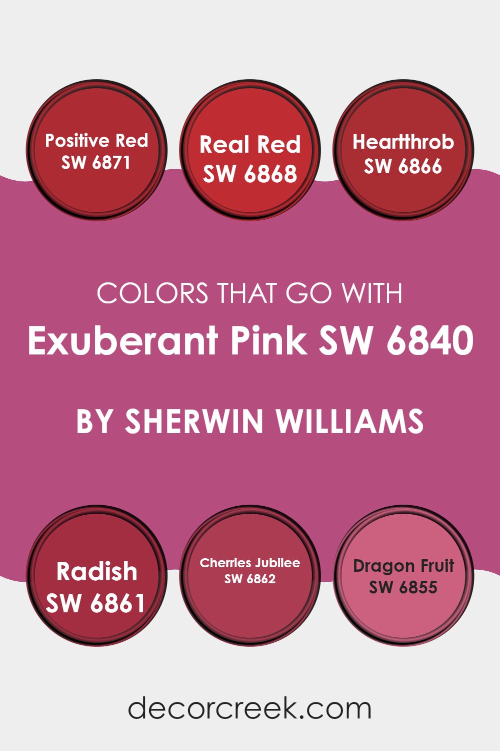
Colors that Go With Exuberant Pink SW 6840 by Sherwin Williams
Creating a vibrant and balanced area with Exuberant Pink SW 6840 by Sherwin Williams involves choosing colors that complement and enhance its lively hue. Positive Red SW 6871, with its bright and energizing tone, plays off the playful nature of Exuberant Pink, adding excitement and a sense of intensity to any room.
Real Red SW 6868 brings in a classic red shade that adds warmth and richness, providing a nice contrast to the more playful pink. On the other hand, Heartthrob SW 6866 introduces a deeper, darker red that adds a touch of drama and depth, grounding the brightness of Exuberant Pink.
Radish SW 6861 is a soft, muted tone that balances the fiery nature of Exuberant Pink by offering a subtle touch, allowing the pink to stand out without being too strong in a room. Cherries Jubilee SW 6862, with its slightly darker tint, works beautifully to create a more harmonious and cozy atmosphere, blending well with the vivid pink.
Lastly, Dragon Fruit SW 6855 offers a bold and exotic feel, with its bright and adventurous character complementing Exuberant Pink’s playful essence. These colors, used alongside Exuberant Pink, create a lively and inviting environment, allowing both bold statements and balanced designs to flourish.
You can see recommended paint colors below:
- SW 6871 Positive Red
- SW 6868 Real Red
- SW 6866 Heartthrob
- SW 6861 Radish
- SW 6862 Cherries Jubilee
- SW 6855 Dragon Fruit
How to Use Exuberant Pink SW 6840 by Sherwin Williams In Your Home?
Exuberant Pink SW 6840 by Sherwin Williams is a lively and vibrant color that can bring a cheerful feel to any room in your home. This shade of pink is perfect for people who want to add a pop of energy and fun to their rooms. It’s ideal for a child’s bedroom or playroom, where its bright and playful nature can boost creativity and joy.
If you’re feeling bold, consider using Exuberant Pink as an accent wall in your living room or home office. It pairs well with neutral colors, allowing it to stand out without being too strong in the area. You can also use this color in small doses, like on picture frames, shelves, or decorative pillows, to create a lively look.
For a cohesive design, complement this pink with other bright and bold colors, or soften it with whites and grays. Exuberant Pink is sure to make any room feel lively and joyful.
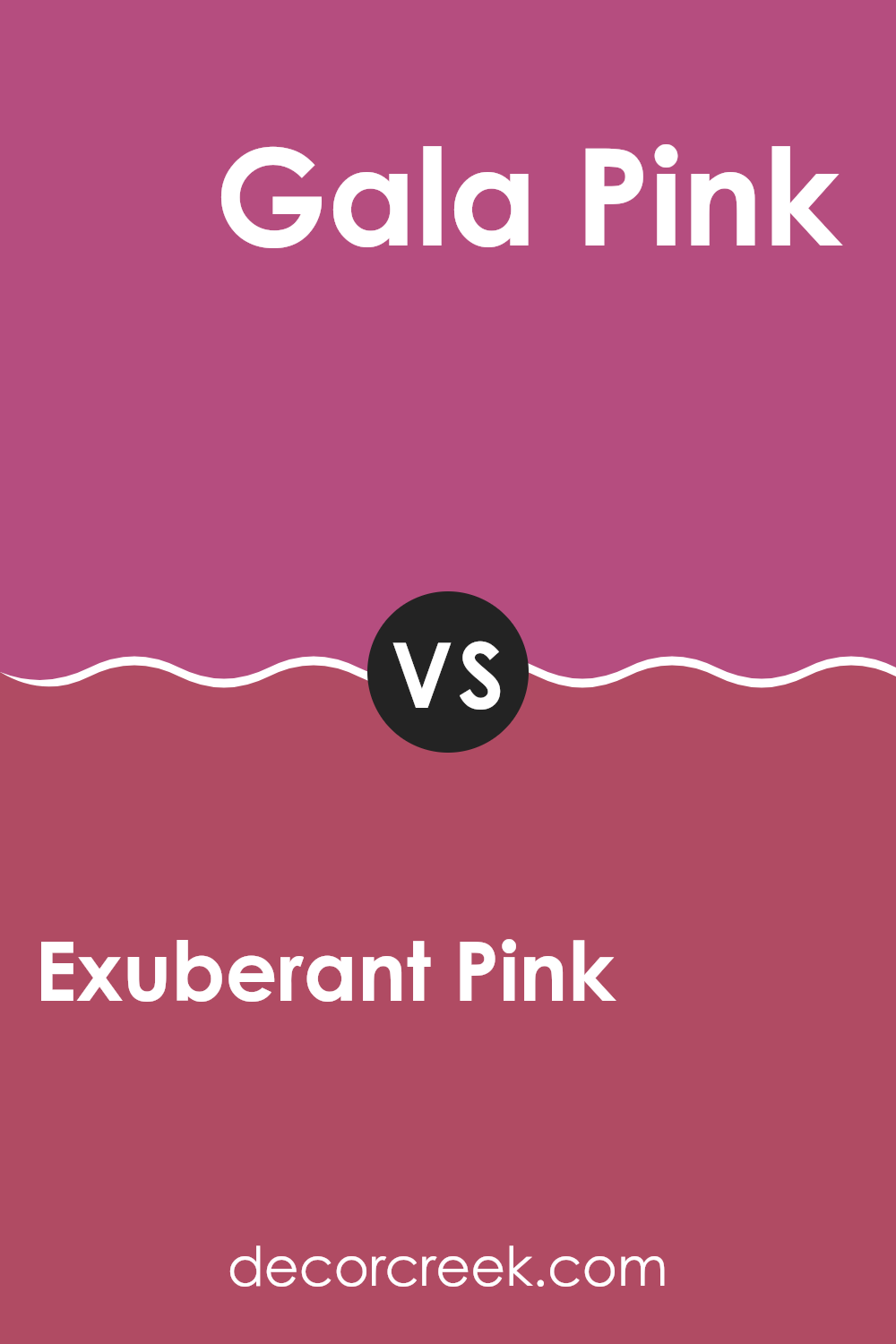
Exuberant Pink SW 6840 by Sherwin Williams vs Gala Pink SW 6579 by Sherwin Williams
Exuberant Pink (SW 6840) and Gala Pink (SW 6579) are both lively shades of pink offered by Sherwin Williams, but they have distinct characteristics. Exuberant Pink is a bright, bold shade that almost screams energy and liveliness. It’s a vivid pink that can act as a statement piece in any room, grabbing attention and infusing it with a sense of youthfulness and cheer.
In contrast, Gala Pink is a softer, more muted hue. It retains the charm of pink but with a slightly more gentle and subtle presence. This shade offers a warm and inviting feel that can create a comforting atmosphere in a room, making it more flexible for different settings.
While Exuberant Pink is great for areas where you want to create an energetic vibe, Gala Pink works well in area where a touch of gentle warmth is desired. Both can brighten a room but in their own unique ways.
You can see recommended paint color below:
- SW 6579 Gala Pink
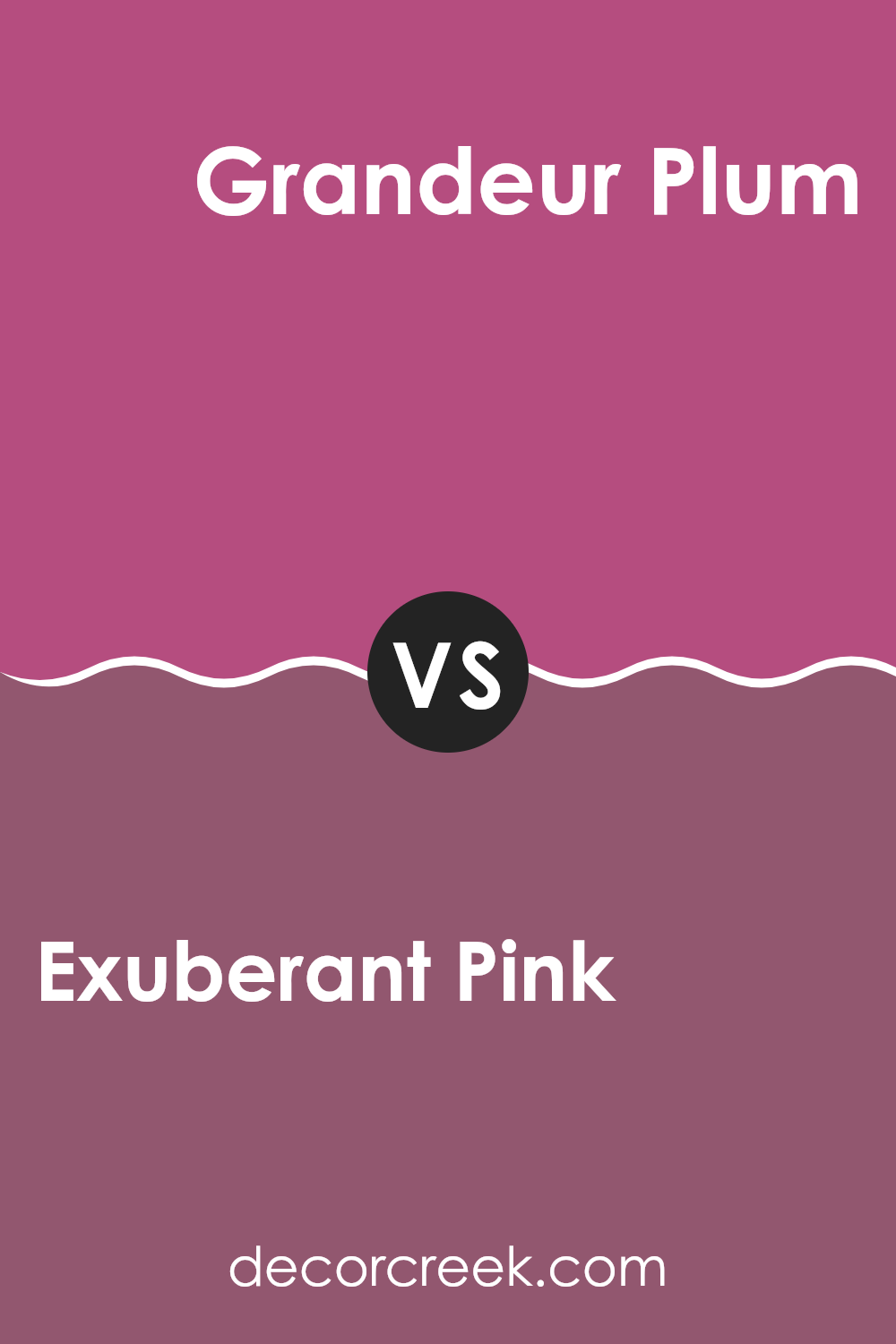
Exuberant Pink SW 6840 by Sherwin Williams vs Grandeur Plum SW 6565 by Sherwin Williams
Exuberant Pink (SW 6840) and Grandeur Plum (SW 6565) by Sherwin-Williams offer distinct personalities that can shape the vibe of a room. Exuberant Pink is a lively, vibrant shade that exudes energy and excitement.
It’s great for areas where you want to encourage creativity and playfulness, such as a child’s playroom or an accent wall in a lively area. In contrast, Grandeur Plum offers a deeper, more muted tone that feels rich and cozy. This plum color is ideal for creating a warm, inviting atmosphere, making it a good choice for bedrooms or cozy living rooms.
While Exuberant Pink draws attention and adds a burst of energy, Grandeur Plum brings a sense of warmth and depth. When paired together, these colors can balance each other out, with the pink adding excitement and the plum providing a grounding, soothing effect.
You can see recommended paint color below:
- SW 6565 Grandeur Plum
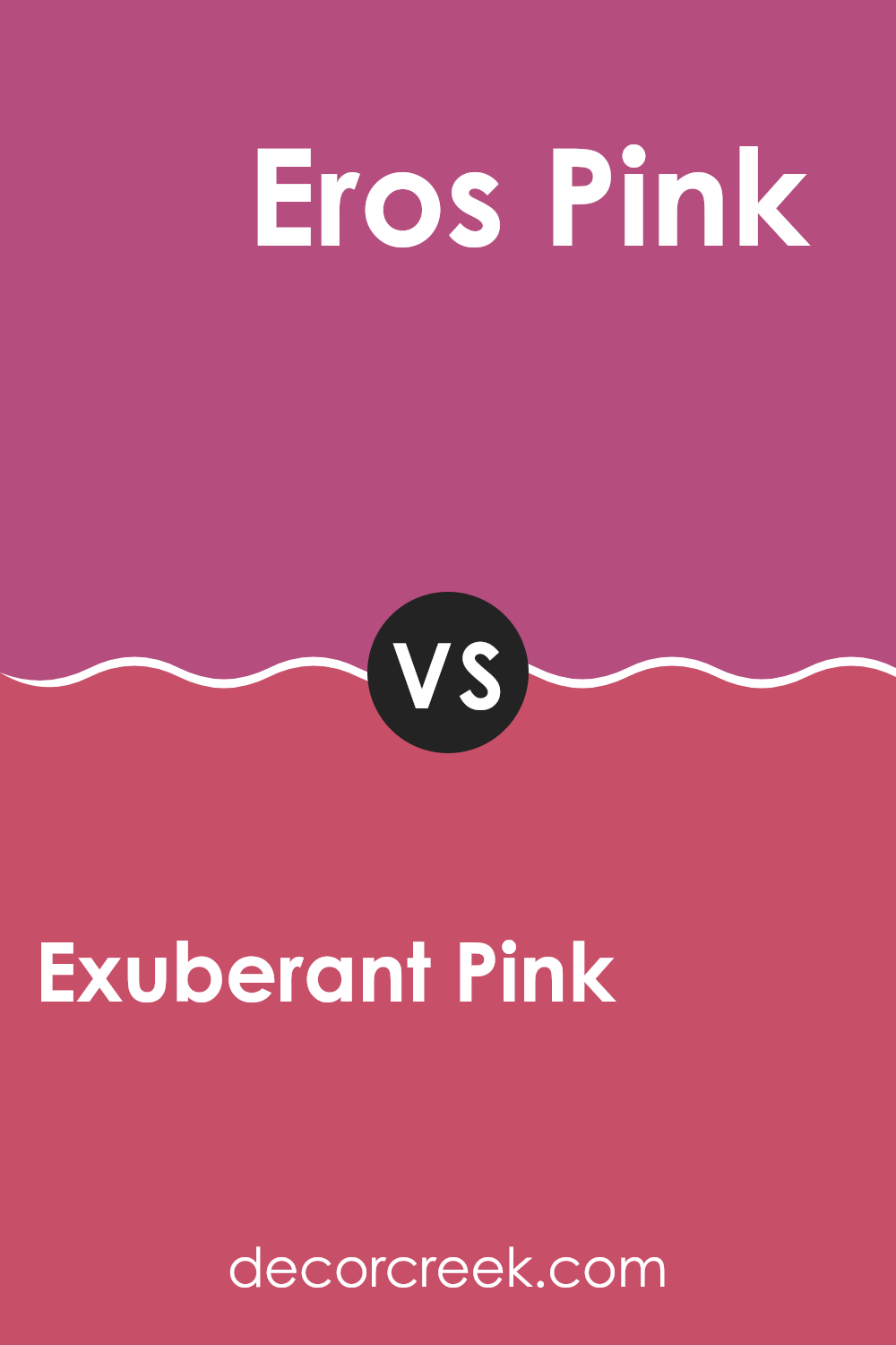
Exuberant Pink SW 6840 by Sherwin Williams vs Eros Pink SW 6860 by Sherwin Williams
Exuberant Pink SW 6840 and Eros Pink SW 6860 by Sherwin Williams are both vibrant shades of pink that can add a lively touch to any room. Exuberant Pink is more intense and brighter, perfect for making a bold statement or creating an energetic environment. It is highly saturated and works well in areas where you want to inspire creativity or excitement.
On the other hand, Eros Pink is slightly softer and less intense than Exuberant Pink. It has a gentler touch, making it suitable for areas where a lively yet not too strong atmosphere is desired. Eros Pink can add a sense of warmth and playfulness without being too overpowering.
Both colors can be used in various parts of a home, such as accent walls, children’s rooms, or playful living areas. Choosing between them depends on whether you prefer a more vibrant or slightly toned-down pink.
You can see recommended paint color below:
- SW 6860 Eros Pink
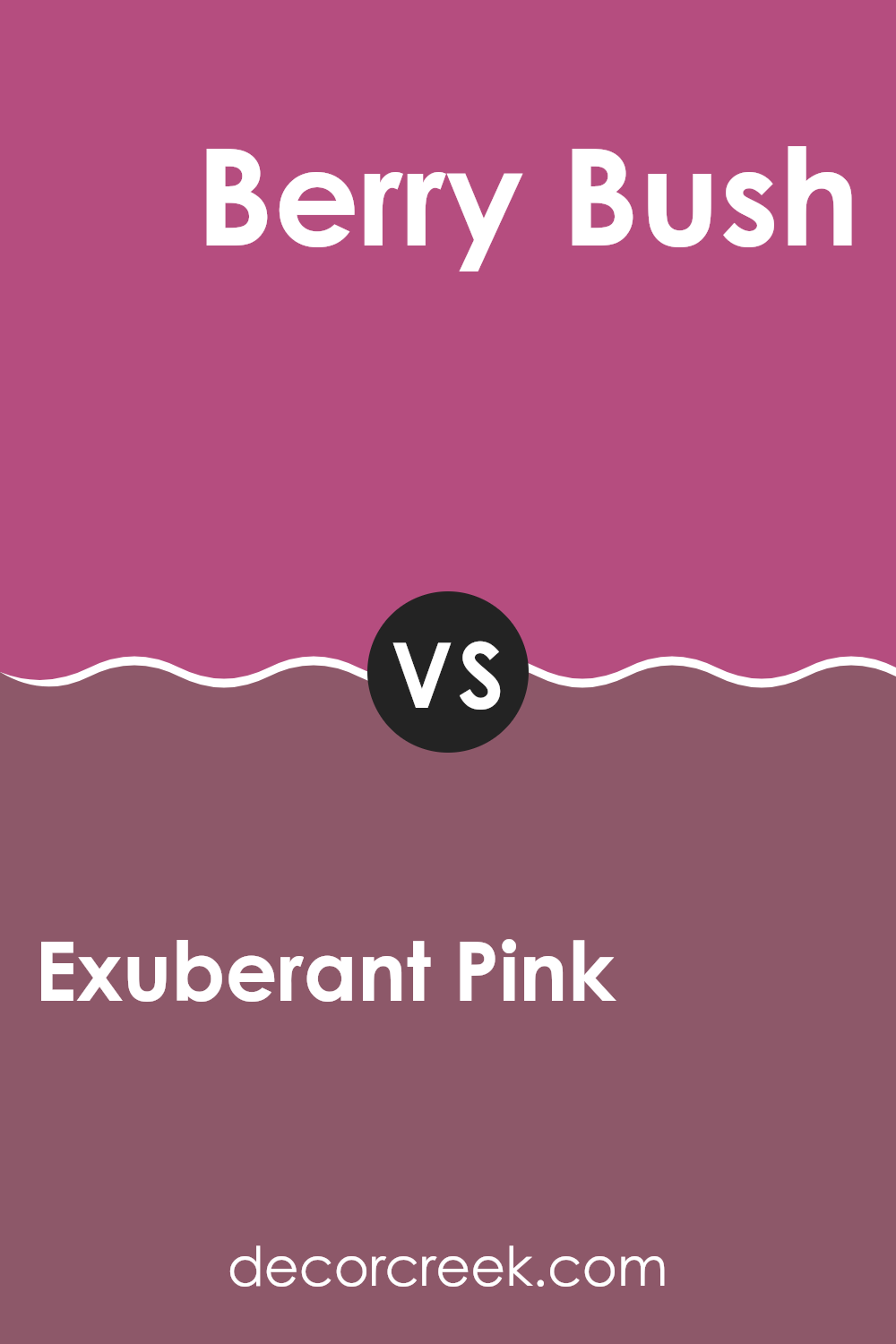
Exuberant Pink SW 6840 by Sherwin Williams vs Berry Bush SW 6292 by Sherwin Williams
Exuberant Pink SW 6840 by Sherwin Williams is a vibrant and playful shade. It’s bold, energetic, and makes a strong statement in any room. This color can add excitement and cheerfulness to a room, making it perfect for areas where you want to encourage social interaction and activity, like living rooms or playrooms.
On the other hand, Berry Bush SW 6292 is a richer, deeper color. It has a mellow and warm feel, bringing a sense of coziness to a room. This shade is ideal for creating a more intimate and comfortable atmosphere, such as in bedrooms or cozy reading nooks.
Both colors have pink undertones, but Exuberant Pink is brighter and more lively, while Berry Bush is more subdued and comforting. Choosing between them depends on the mood you want to create and the energy level you desire in your room.
You can see recommended paint color below:
- SW 6292 Berry Bush
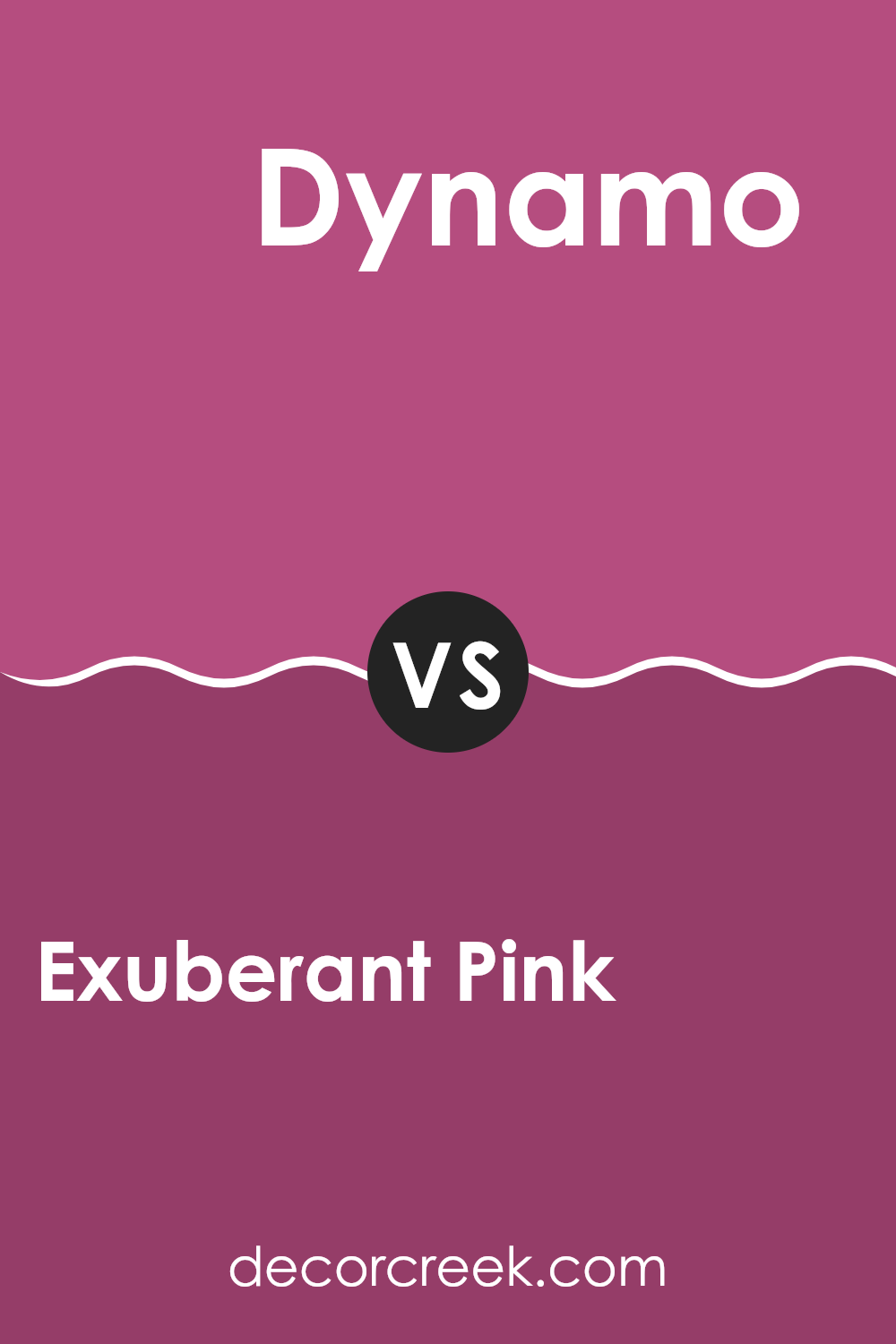
Exuberant Pink SW 6840 by Sherwin Williams vs Dynamo SW 6841 by Sherwin Williams
Exuberant Pink (SW 6840) and Dynamo (SW 6841) by Sherwin Williams are two vibrant shades of pink, each with its own unique flair. Exuberant Pink is a bold, bright hue with a cheerful and energetic vibe. It is lively and can add a fun, playful touch to any room.
On the other hand, Dynamo is slightly deeper and richer, offering a more intense pink with a touch of red. While both colors are vivid, Dynamo has a bit more warmth due to its red undertone.
In terms of usage, Exuberant Pink is great for creating an eye-catching statement wall, bringing life to a room that needs a bit of excitement. Dynamo, with its intensity, is well-suited for areas where a bit of dramatic flair is desired, such as a dining room or a creative workspace. Both colors are perfect for those who love bold and expressive design choices.
You can see recommended paint color below:
- SW 6841 Dynamo
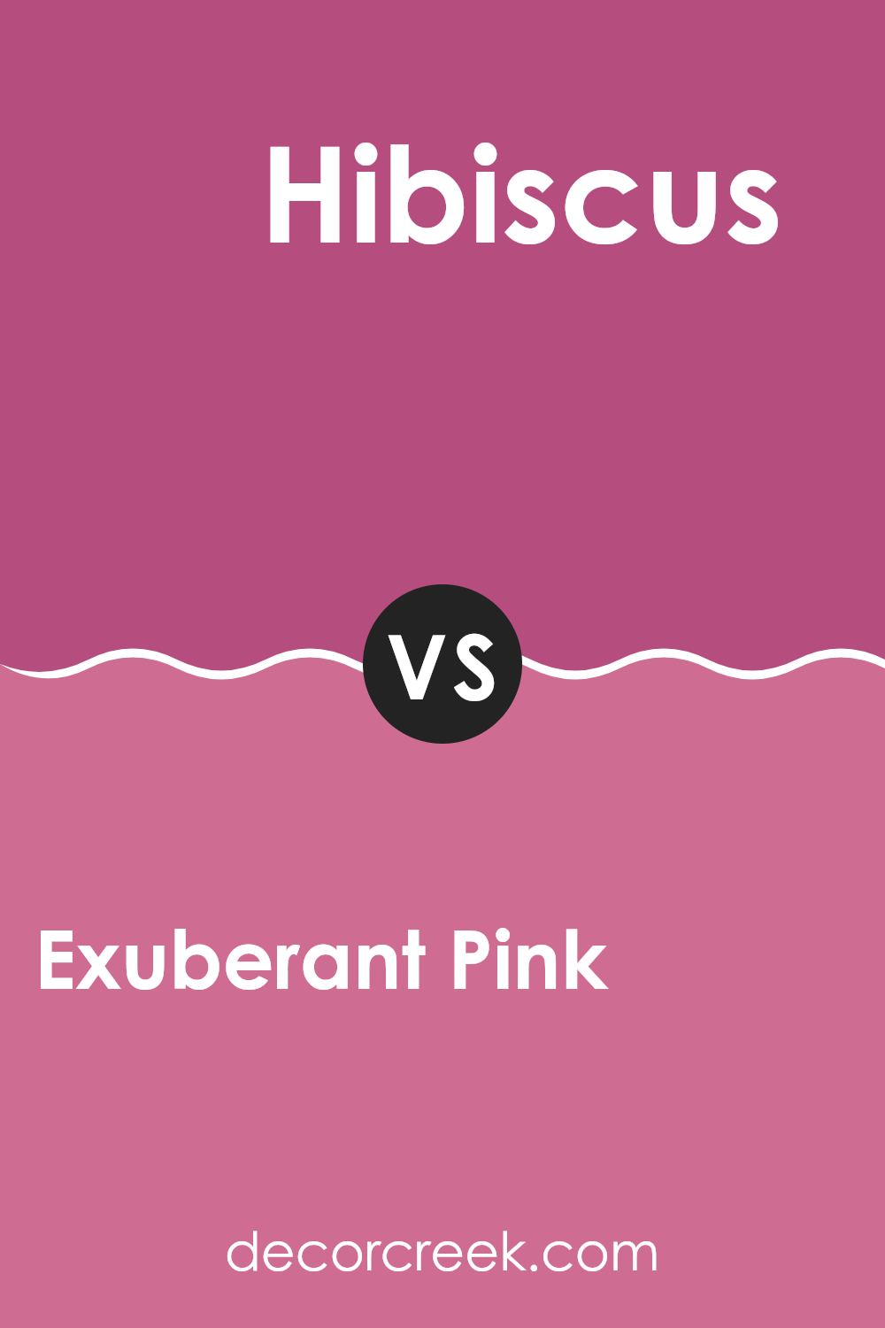
Exuberant Pink SW 6840 by Sherwin Williams vs Hibiscus SW 6851 by Sherwin Williams
Exuberant Pink SW 6840 and Hibiscus SW 6851, both by Sherwin Williams, are vivid shades of pink but with noticeable differences. Exuberant Pink is a bright, lively hue that can energize a room with its bold presence. It stands out with its intensity and is great for areas that want to convey a sense of fun and excitement.
On the other hand, Hibiscus is slightly more subdued than Exuberant Pink. It maintains the vibrancy of pink but leans a bit warmer and softer. Hibiscus can add a cheerful yet cozy feel to a room, making it suitable for areas where a warm, welcoming atmosphere is desired.
Both colors are attention-grabbing, but where Exuberant Pink demands to be the focal point, Hibiscus offers a balance between being vivid and approachable. Choosing between these two depends on whether you want a strong, dynamic effect or a lively yet inviting ambiance.
You can see recommended paint color below:
- SW 6851 Hibiscus
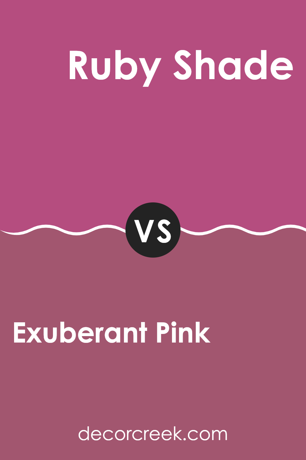
Exuberant Pink SW 6840 by Sherwin Williams vs Ruby Shade SW 6572 by Sherwin Williams
Exuberant Pink (SW 6840) and Ruby Shade (SW 6572), both from Sherwin Williams, are vibrant and lively colors, but they have different moods and visual impacts. Exuberant Pink is a bright and playful shade with high energy. It captures attention and adds a cheerful and bold touch to any room. This pink is great for energizing a room or adding a fun accent wall.
In contrast, Ruby Shade is a deep, rich color with an elegant feel. While it’s still bold, it has more depth than Exuberant Pink, giving it a more serious and mature vibe. Ruby Shade can add elegance to a room and pairs well with neutral tones to provide a sense of luxury.
Overall, Exuberant Pink is more youthful and dynamic, ideal for playful settings, whereas Ruby Shade is more refined and intense, perfect for creating an elegant atmosphere. Both colors add warmth and interest, but each serves a different purpose depending on the desired mood.
You can see recommended paint color below:
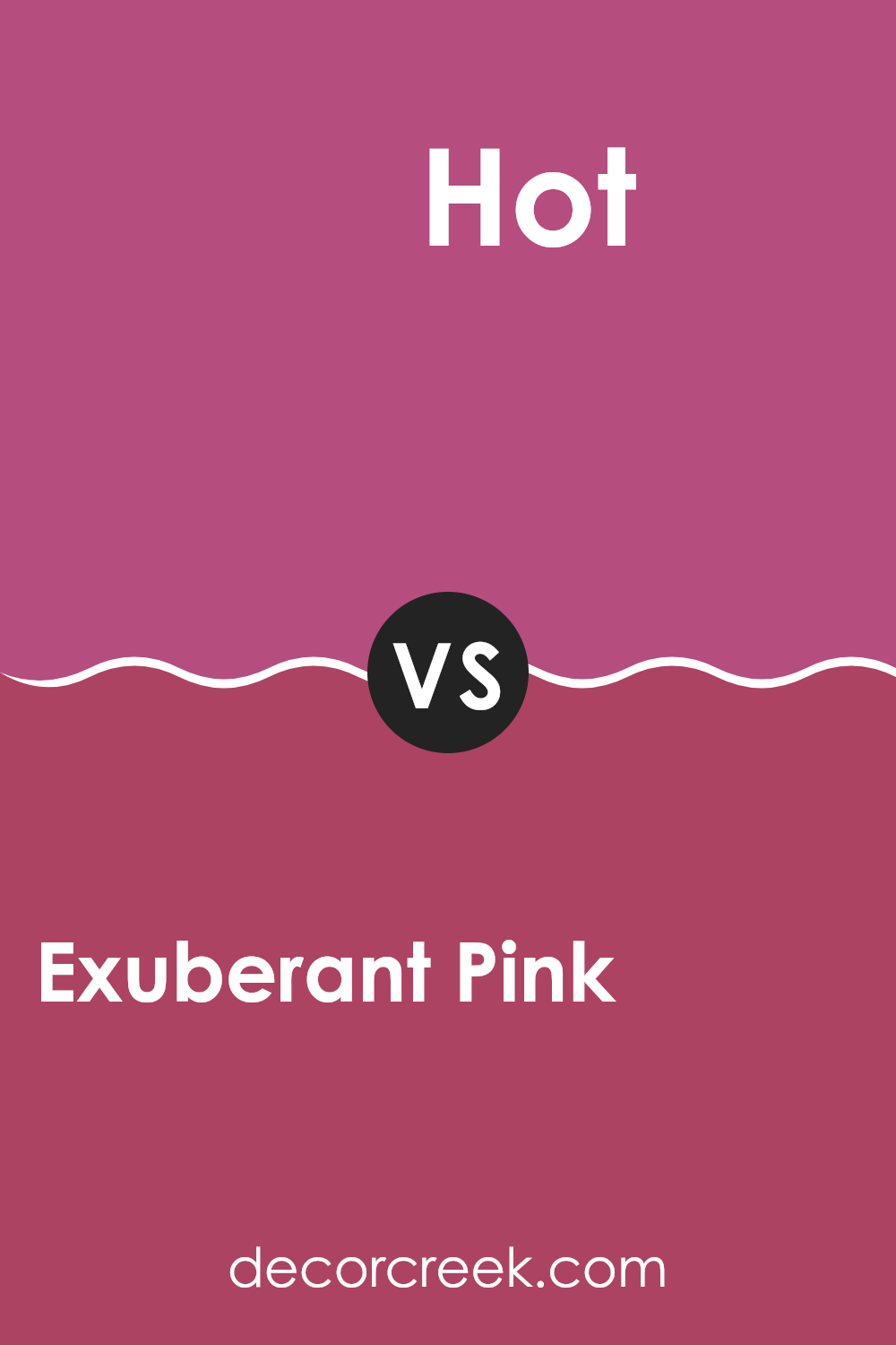
Exuberant Pink SW 6840 by Sherwin Williams vs Hot SW 6843 by Sherwin Williams
Exuberant Pink (SW 6840) and Hot (SW 6843) are both vibrant and lively colors by Sherwin Williams, but they each bring a distinct character to a room. Exuberant Pink is a bold, bright pink that adds energy and a sense of fun. It works well in creative areas or as an accent where you want a pop of color.
On the other hand, Hot is a deeper shade with more red undertones, giving it a warmer feel compared to the more playful Exuberant Pink. Hot can add a sense of drama and passion to a room. It’s often used in areas where you want to make a statement or create a bold atmosphere.
While both colors command attention, Exuberant Pink is more playful and youthful, whereas Hot feels richer and more intense. The choice between them depends on the mood you wish to set in a room. Both colors offer impactful and lively options for interior design.
You can see recommended paint color below:
- SW 6843 Hot
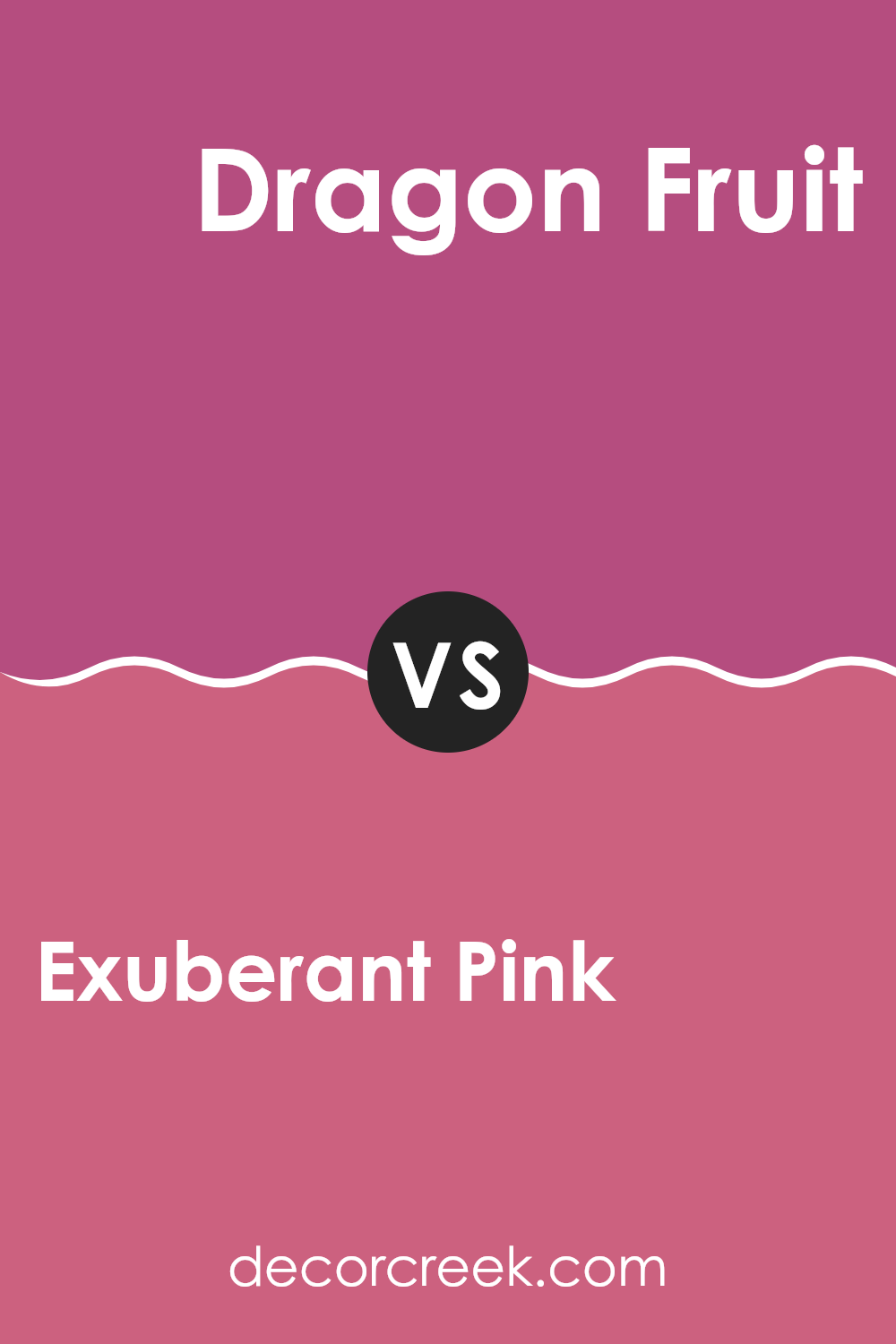
Exuberant Pink SW 6840 by Sherwin Williams vs Dragon Fruit SW 6855 by Sherwin Williams
Exuberant Pink and Dragon Fruit, both by Sherwin Williams, are vibrant shades of pink, but they have distinct differences. Exuberant Pink is a bright and lively hue, full of energy and playfulness. It’s a bold choice that can add a cheerful touch to any room.
On the other hand, Dragon Fruit is slightly deeper and richer with a hint of red undertones. This makes it feel a bit more intense and dramatic compared to the lighter and more straightforward Exuberant Pink.
When choosing between the two, consider the mood you wish to create. Exuberant Pink is perfect for a fun and energetic room, great for areas where you want to inspire activity and joy. Dragon Fruit, with its deeper shade, works well when you want to add a dramatic flair or an elegant touch to a room. Both colors will make a statement, but they convey different feelings and energies.
You can see recommended paint color below:
- SW 6855 Dragon Fruit
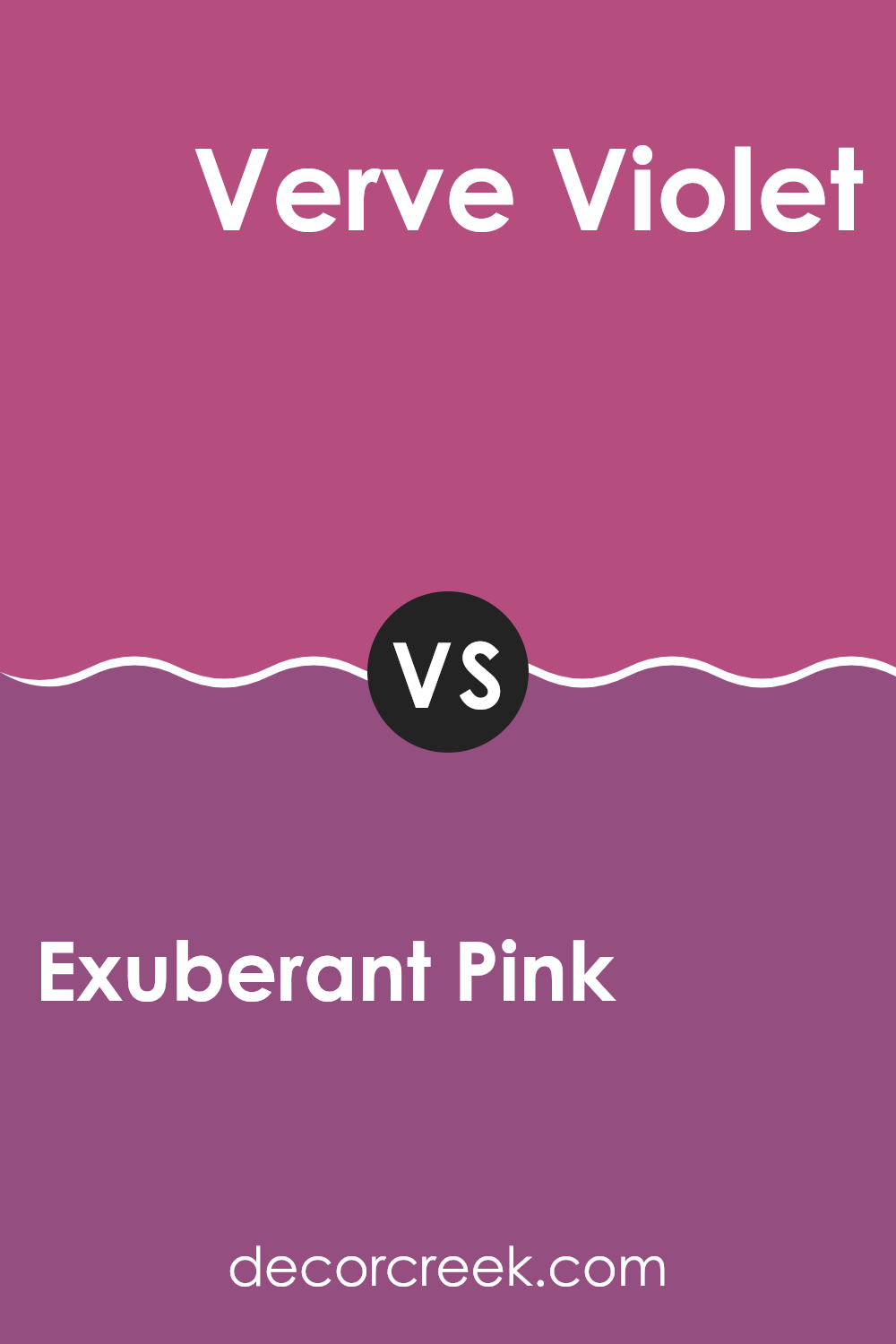
Exuberant Pink SW 6840 by Sherwin Williams vs Verve Violet SW 6979 by Sherwin Williams
Exuberant Pink (SW 6840) and Verve Violet (SW 6979) by Sherwin Williams are both vibrant colors, but they have distinct personalities. Exuberant Pink is a bold, lively color with a playful and energetic vibe. It’s a bright pink that can add a burst of fun and excitement to any room . It’s great for making a bold statement or adding a touch of whimsy.
On the other hand, Verve Violet is a rich, deep purple that exudes strength and creativity. It has a sense of mystery and depth, often associated with luxury and elegance. While Exuberant Pink is lively and cheerful, Verve Violet is more dramatic and intense.
Both colors can complement each other well when used together, creating a dynamic and eye-catching combination. Exuberant Pink can lighten the mood in a room dominated by Verve Violet, while Verve Violet can add depth to a room with Exuberant Pink accents.
You can see recommended paint color below:
- SW 6979 Verve Violet
When I think about SW 6840 Exuberant Pink by Sherwin-Williams, my mind fills up with images of joy and energy. This color isn’t just any pink—it’s strong, bright, and fun. Imagine a room where the walls are painted in this cheerful shade. It’s like the whole room is smiling at you!
For kids, a bedroom painted with Exuberant Pink could be the happiest place, full of excitement for play and creativity. It’s like waking up in a world where every day feels like a celebration. Even in a grown-up’s setting, maybe in a living room or a cozy reading nook, this color can bring warmth and happiness. It’s like wrapping up in a cozy blanket of cheerfulness.
Exuberant Pink also pairs well with other colors. Think how fun it would be to put it alongside yellows, whites, or even some light blues. These colors can play together in a room just like friends on a playground, each one making the others look their best.
In the end, choosing Exuberant Pink can be like inviting a burst of happiness into your home. It’s a color that says, “Let’s have fun and enjoy life!” It’s bright, it’s bold, and it can make any day feel like a sunny day.
Ever wished paint sampling was as easy as sticking a sticker? Guess what? Now it is! Discover Samplize's unique Peel & Stick samples.
Get paint samples

