Favorite Tan SW 6157 Paint Color by Sherwin Williams
Warm Up Your Room with the Perfect Shade of Tan
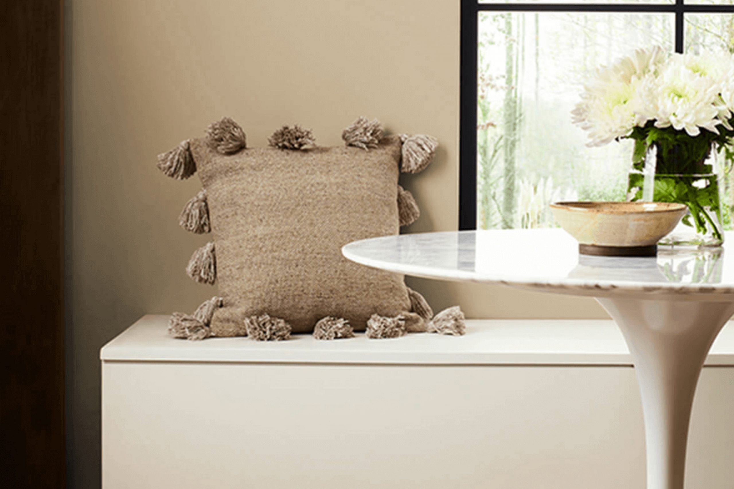
If you’re looking for a paint color that can add a cozy and soothing atmosphere to any room, let me tell you about my experience with SW 6157 Favorite Tan by Sherwin Williams. When I decided to refresh the look of my living area, I found myself drawn to neutral tones that wouldn’t overpower the eye but would still provide a warm and inviting backdrop. After experimenting with several samples, Favorite Tan stood out as the perfect choice for achieving a calm and peaceful environment.
This particular shade of tan has a soft, earthy quality, which makes it incredibly adaptable. Whether applied in a sunlit kitchen, a quiet study, or a comfortable living room, it has the ability to harmonize with various decor styles and color schemes. I especially appreciated how it complemented wood furniture and natural elements, enhancing their natural beauty without competing for attention.
The warmth of Favorite Tan also turned out to be a great way to soften rooms that receive a lot of natural light, preventing them from feeling too stark while still appearing bright and airy.
If you’re considering this hue for your next painting project, I believe it could be a subtle yet effective way to bring a sense of comfort and calm into your home.
via sherwin-williams.com
What Color Is Favorite Tan SW 6157 by Sherwin Williams?
The color Favorite Tan by Sherwin Williams is a warm and cozy beige that brings a sense of calm and comfort to any room. This soft hue has a slightly yellow undertone that makes it feel inviting and homey, perfect for creating a relaxing atmosphere. Its adaptability allows it to fit into various areas, whether you’re looking to paint a living room, bedroom, or entryway.
Favorite Tan works exceptionally well with natural materials, enhancing the beauty of wood, leather, and linen. These textures blend seamlessly with the color to create a rustic or country chic look, ideal for those who appreciate a more down-to-earth style of decor. Additionally, this color pairs nicely with wrought iron or brushed nickel finishes, adding a touch of subtle contrast to the softness of the tan.
In terms of interior styles, Favorite Tan is a fantastic choice for traditional, farmhouse, and even modern interiors that lean towards a neutral palette. Its earthy quality complements a variety of decor elements, from antique wooden furniture in a traditional setting to jute rugs and woven baskets in a farmhouse-inspired room. This color is also a practical choice as it hides small imperfections and dirt, making it suitable for high-traffic areas.
decorcreek.com
Is Favorite Tan SW 6157 by Sherwin Williams Warm or Cool color?
Favorite Tan SW 6157 by Sherwin Williams is a warm and inviting color that adds a cozy feel to any room in the house. This shade of tan works well in living rooms and bedrooms, as it creates a comfortable and welcoming atmosphere. It’s also adaptable, blending nicely with many different types of decor and furniture colors, from dark woods to lighter fabrics.
In homes, Favorite Tan can help make rooms feel more connected and harmonious. Its subtle warmth can soften the look of large, open areas or bring a sense of calm to smaller rooms without making them feel cramped. Additionally, this shade is great for areas that receive a lot of natural light, as it can help balance the brightness without darkening the interior.
This neutral color is also practical because it doesn’t show dirt and smudges as easily as lighter shades, making it a good choice for high-traffic areas like hallways and playrooms. Favorite Tan is an excellent option if you want a color that’s both functional and stylish.
Undertones of Favorite Tan SW 6157 by Sherwin Williams
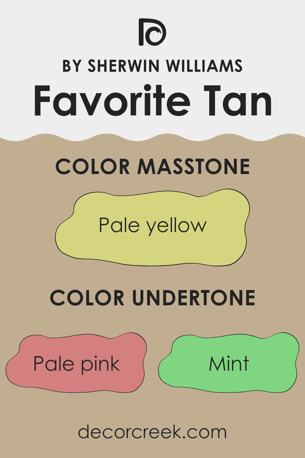
Favorite Tan is an adaptable paint color known for its ability to adjust to various lighting conditions, mainly due to its complex undertones. Undertones are secondary colors that influence the primary color viewed under different types of lighting or when next to other colors. For Favorite Tan, these undertones include shades like pale pink, mint, light gray, grey, light purple, light blue, lilac, yellow, orange, light green, and olive. These undertones subtly affect how we perceive the color, making it change slightly depending on the light sources and surrounding colors.
In interior rooms, the effect of Favorite Tan’s undertones can create a warm and inviting atmosphere. The pale pink and light purple undertones add a soft, gentle touch, while the mint and light blue bring a hint of freshness. Yellow and orange undertones can make the tan feel warmer, ideal for living areas that aim for a cozy vibe. The addition of light gray and grey helps to ground the color, preventing it from becoming too vibrant and ensuring it remains a neutral choice suitable for many settings.
When used on interior walls, these undertones combine to offer a dynamic yet subtle background that complements a wide range of décor styles and personal tastes. The color can appear more muted or slightly brighter depending on the room’s light, furniture, and accent colors, providing flexibility and ease in decorating. This makes Favorite Tan a practical choice for those looking to create a comfortable, adaptable room.
decorcreek.com
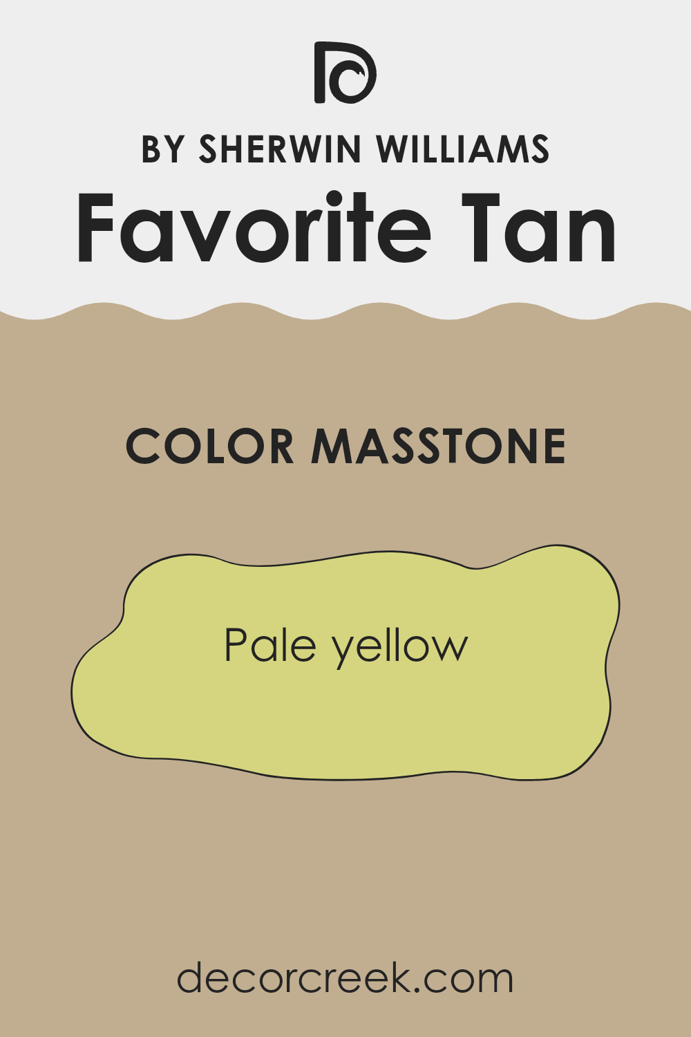
What is the Masstone of the Favorite Tan SW 6157 by Sherwin Williams?
Favorite Tan by Sherwin Williams is a cozy pale yellow hue that can make any room feel welcoming and warm. This color has a light and airy feel, allowing it to blend beautifully with a wide range of decorating styles, from rustic to modern.
In homes, this pale yellow tone is especially helpful in rooms that don’t receive much natural light, as it subtly brightens the area without being too strong or bold. Moreover, Favorite Tan is adaptable enough to pair with other soft shades like gentle blues or greens, making it an excellent choice for creating a relaxed atmosphere in bedrooms and living areas.
Because it’s a softer shade, it doesn’t overpower the room but instead adds a touch of warmth that makes the home feel more inviting and comfortable. This makes it a wonderful option for anyone looking to refresh their room with a gentle and welcoming vibe.
decorcreek.com
How Does Lighting Affect Favorite Tan SW 6157 by Sherwin Williams?
Lighting plays a crucial role in how colors appear in different settings. The way a paint shade like Favorite Tan by Sherwin Williams is perceived can shift noticeably under various lighting conditions. This happens because different light sources have unique color temperatures and intensities that interact with paint pigments in distinct ways.
Under artificial light, the look of Favorite Tan depends on the type of bulbs used. Incandescent bulbs, which emit a warm, yellowish glow, can make Favorite Tan appear richer and cozier, emphasizing its beige and soft brown undertones. In contrast, fluorescent lighting, which gives off a cooler, bluish cast, can make the shade seem more subdued and less warm.
In natural light, Favorite Tan also changes depending on window direction and sunlight exposure. Natural light tends to reveal the truest version of the color.In north-facing rooms, which receive cooler, indirect light, Favorite Tan may appear slightly darker and less warm, creating a calm and comfortable feel.
South-facing rooms, filled with bright, direct light, bring out the color’s warmth and depth, making the room lively and welcoming.East-facing rooms glow warmly in the morning light, giving Favorite Tan a brighter, golden appearance before softening later in the day.In west-facing rooms, the opposite happens—the color feels gentler in the morning but deepens into a warm, radiant tone by evening as the sun sets.
Overall, the appearance of Favorite Tan shifts naturally throughout the day, with lighting direction and intensity playing a key role in shaping its warmth and character.
decorcreek.com
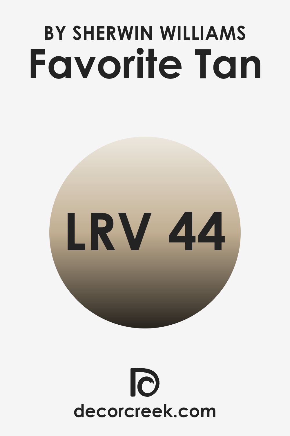
What is the LRV of Favorite Tan SW 6157 by Sherwin Williams?
LRV stands for Light Reflectance Value, which measures how much visible light is reflected from a painted surface when light hits it. It’s shown as a number from 0 to 100 — the higher the number, the lighter and more reflective the color; the lower the number, the darker and more light-absorbing it is.
A color with an LRV around 50 is considered medium, meaning it balances light reflection and absorption evenly. Understanding LRV helps you see how a color will look in different lighting — whether it will brighten a room or create a more grounded and intimate feeling.
The LRV of Favorite Tan SW 6157 by Sherwin Williams is 37, which places it in the medium-dark range. This means it reflects a moderate amount of light, giving spaces a cozy, warm, and inviting feel. In rooms with lots of natural light, Favorite Tan appears soft and balanced, while in dimmer spaces, it can look richer and more enveloping.
Because of its moderate LRV, this color works beautifully for creating warmth without making a space feel too dark. It pairs well with crisp white trim or soft creamy neutrals, adding depth and comfort without overwhelming the room.
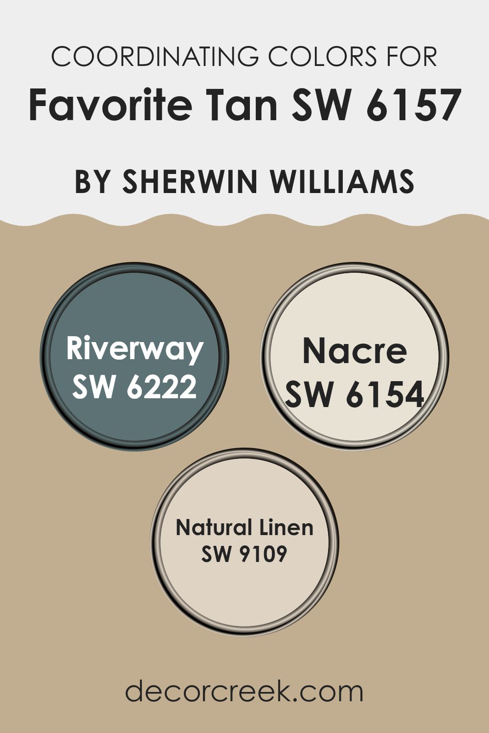
Coordinating Colors of Favorite Tan SW 6157 by Sherwin Williams
Coordinating colors are chosen to complement a primary shade in a way that creates balance and harmony. These carefully selected hues work together to enhance the overall look of a room, ensuring a smooth flow of color throughout. For example, starting with a neutral base like a warm beige, adding coordinating colors can introduce depth and visual interest.
Using the warm beige of SW 6157 by Sherwin Williams as a base, one could pair it with SW 6222 – Riverway, a deep teal. This darker tone creates a striking contrast against the beige, making it ideal for accents such as doors, cabinets, or feature walls. On the lighter side, SW 6154 – Nacre offers a delicate ivory that complements the warmth of the primary color. It’s perfect for ceilings, trim, or adjoining walls where a soft, seamless look is desired.
Another great option is SW 9109 – Natural Linen, which carries a muted tan balanced between beige and gray. It works beautifully for connecting rooms or enhancing furniture tones, maintaining harmony without overpowering the main color. Together, these coordinating shades form a cohesive and inviting palette that enhances the design while preserving balance and comfort.
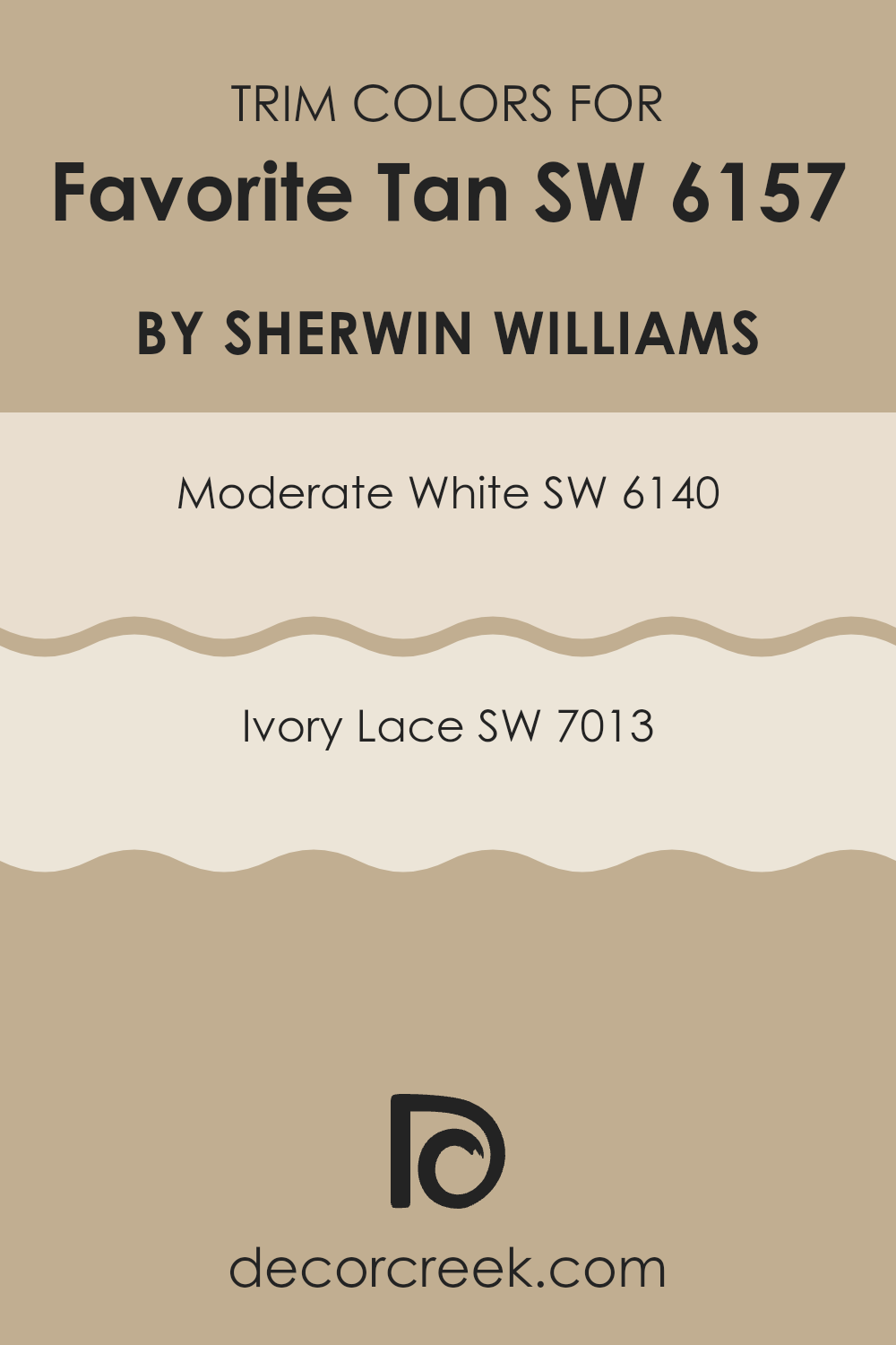
What are the Trim colors of Favorite Tan SW 6157 by Sherwin Williams?
Trim colors are selected to complement the primary wall color by adding contrast that defines and enhances architectural elements such as door frames, moldings, and baseboards. When pairing with Favorite Tan by Sherwin Williams, it’s important to choose trim shades that highlight its warm, welcoming tone while maintaining a clean, polished appearance.
Moderate White and Ivory Lace are two excellent options for this purpose; they accentuate the beauty of Favorite Tan without overshadowing it, enhancing the overall balance of the room. Moderate White is a soft, creamy hue that offers a gentle contrast to the warmth of Favorite Tan. It creates a smooth, cohesive transition that allows the tan to shine while keeping the look calm and unified.
Ivory Lace, in contrast, introduces a slightly deeper and warmer undertone, establishing a soft yet distinct outline against the tan walls. This shade complements Favorite Tan effortlessly, adding a touch of elegance and depth without overpowering the main color. Together, these trim choices ensure a refined, inviting aesthetic that feels both balanced and enduring.
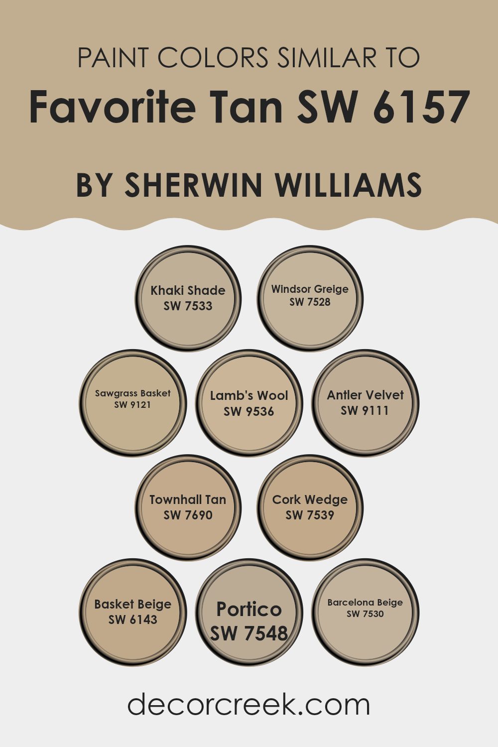
Colors Similar to Favorite Tan SW 6157 by Sherwin Williams
Similar colors play a crucial role in interior design by creating a cohesive and harmonious atmosphere. By using shades like Favorite Tan and its related hues, rooms can have a seamless flow without sharp contrasts, which often helps in making areas appear larger and more connected. These similar colors, when used together, can subtly define different functional zones within a single room without the abrupt separation that contrasting tones can create. This approach is ideal for achieving a gentle and inviting mood throughout the home.
Colors such as Khaki Shade and Windsor Greige offer a muted foundation that pairs well with various decor elements, providing adaptability. Sawgrass Basket and Lamb’s Wool bring in a touch of warmth, making interiors feel cozy and welcoming. Antler Velvet and Townhall Tan lean toward a richer spectrum, adding depth and character to any room.
On the lighter side, Cork Wedge and Basket Beige work wonderfully in areas that receive plenty of natural light, reflecting it beautifully to brighten the interior. Finally, Portico and Barcelona Beige are excellent options for those who prefer an understated yet warm tone that fits seamlessly in both traditional and modern settings, making them quite flexible for different styles and preferences.
Using these colors in your design palette can help you achieve a look that feels unified and naturally balanced throughout your home.
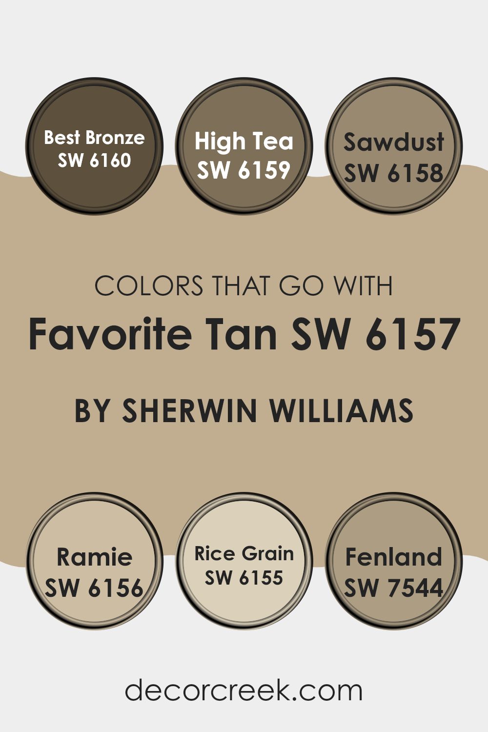
Colors that Go With Favorite Tan SW 6157 by Sherwin Williams
Appreciating the colors that complement Favorite Tan SW 6157 by Sherwin Williams is essential for creating a cohesive and visually appealing atmosphere. These coordinating shades work together to ensure a smooth, balanced flow throughout a room, enhancing both its mood and style. Colors such as Best Bronze, High Tea, Sawdust, Ramie, Rice Grain, and Fenland are perfectly suited to harmonize with Favorite Tan, resulting in interiors that feel thoughtfully composed and inviting.
Best Bronze SW 6160 is a warm, deep shade that feels cozy and grounding, ideal for introducing richness and depth. High Tea SW 6159 is slightly lighter, offering refined softness that complements the gentle warmth of Favorite Tan. Sawdust SW 6158 carries a sandy, neutral tone that fits effortlessly into any setting, blending seamlessly without overpowering surrounding elements.
Ramie SW 6156 brings a touch of natural vibrancy, its earthy tone enhancing materials like wood and leather beautifully. Rice Grain SW 6155 is lighter and fresh, brightening interiors while maintaining balance—perfect for well-lit rooms. Fenland SW 7544, with its deeper green essence, introduces a nature-inspired accent that pairs wonderfully with the subtle warmth of Favorite Tan, making it an excellent choice for creating cozy corners or accent features.
You can see recommended paint colors below:
SW 6160 Best Bronze
SW 6159 High Tea
SW 6158 Sawdust
SW 6156 Ramie
SW 6155 Rice Grain
SW 7544 Fenland
decorcreek.com
How to Use Favorite Tan SW 6157 by Sherwin Williams In Your Home?
Favorite Tan by Sherwin Williams is a warm, neutral beige paint color that brings a cozy feeling to any room. It’s flexible, making it perfect for living rooms, bedrooms, and even kitchens, where it helps create a welcoming atmosphere. This shade pairs effortlessly with different furniture styles and colors, whether you prefer sleek modern accents or classic wooden pieces.
When using Favorite Tan on your walls, try combining it with crisp white trims or ceilings to keep the room feeling bright and open. It also pairs beautifully with soft, earthy tones like greens and browns, giving your decor a balanced and inviting look.
For a touch of contrast, adding darker accents such as navy blue or deep gray can create a more dynamic effect. Whether you’re refreshing your room or setting a calm, relaxing tone, Favorite Tan is a reliable choice that complements your home’s character without overpowering it.
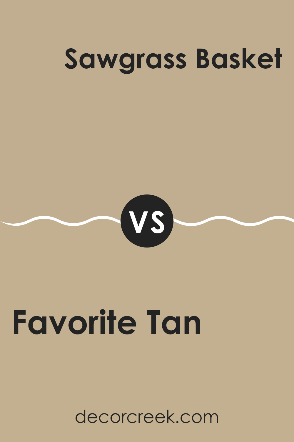
Favorite Tan SW 6157 by Sherwin Williams vs Sawgrass Basket SW 9121 by Sherwin Williams
Favorite Tan SW 6157 and Sawgrass Basket SW 9121 are two warm and inviting shades by Sherwin Williams, each bringing a different mood to a space. Favorite Tan is a medium beige with a soft, cozy undertone that adds a feeling of comfort and stability. It’s perfect for living rooms, bedrooms, or any space where you want to create a grounded and welcoming atmosphere. This shade pairs beautifully with natural wood tones, soft whites, and warm neutral accents, making it a timeless and flexible choice.
Sawgrass Basket, on the other hand, is a lighter beige with a subtle golden undertone. It feels airy and open, offering a gentle brightness that can make a room feel larger and fresher.
This color is ideal for spaces that need a bit more light or where you want to keep a soft, relaxed look. It pairs well with creamy whites, natural textures, and earthy décor for a serene and inviting feel.
Both colors share a warm, neutral base but create different effects — Favorite Tan brings depth and warmth, while Sawgrass Basket adds lightness and soft elegance.
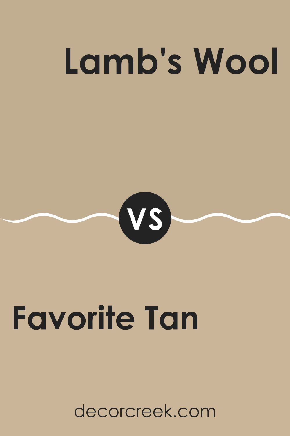
Favorite Tan SW 6157 by Sherwin Williams vs Lamb’s Wool SW 9536 by Sherwin Williams
Favorite Tan SW 6157 and Lamb’s Wool SW 9536 are two warm, neutral shades by Sherwin Williams, each with its own personality and charm. Favorite Tan is a medium tan with a cozy undertone that brings warmth and comfort to a space. It feels grounded and rich, making it a perfect choice for living rooms, family spaces, or bedrooms where a welcoming, homey atmosphere is desired. This shade pairs beautifully with crisp white trim or creamy neutrals, creating a balanced, timeless look.
Lamb’s Wool, on the other hand, is a lighter, creamier beige that feels soft and airy. With its slightly higher LRV, it reflects more light, giving rooms a bright, open feel.
It’s ideal for smaller spaces or areas with limited natural light, helping them feel more spacious and fresh. Lamb’s Wool works especially well with warm whites, natural wood, and gentle earth tones.
Both colors offer a natural warmth that complements a wide range of styles — from classic to modern farmhouse.
While Favorite Tan adds depth and coziness, Lamb’s Wool keeps things light and inviting, making either choice a beautiful foundation for your interior design.
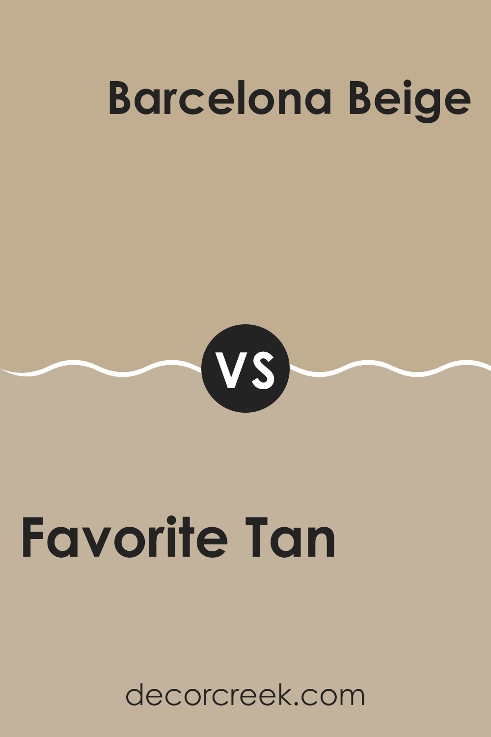
Favorite Tan SW 6157 by Sherwin Williams vs Barcelona Beige SW 7530 by Sherwin Williams
Favorite Tan and Barcelona Beige are both neutral shades from Sherwin Williams, yet they bring distinct tones and moods to a room. Favorite Tan is a soft, warm beige with a cozy and welcoming quality. It carries a hint of yellow, giving it a gentle, sunlit undertone that makes interiors feel inviting and comfortable. This shade is ideal for living rooms and bedrooms where you want to create a friendly, relaxed atmosphere.
Barcelona Beige, in contrast, has a cooler undertone that leans toward a grayish beige. It’s more subdued than Favorite Tan, offering a calm and refined backdrop that complements a variety of decor styles. Barcelona Beige is adaptable enough for rooms that call for a balanced neutral palette—perfect for modern living rooms, offices, or minimalist interiors.
In short, choose Favorite Tan if you want warmth and a touch of brightness, or opt for Barcelona Beige if you prefer a more understated, balanced look that works seamlessly with both warm and cool tones.
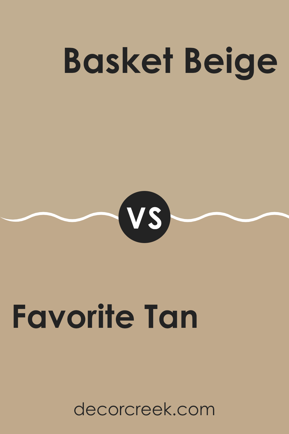
Favorite Tan SW 6157 by Sherwin Williams vs Basket Beige SW 6143 by Sherwin Williams
Favorite Tan and Basket Beige are both warm, neutral tones from Sherwin Williams that create a cozy foundation for any room. Favorite Tan is slightly deeper, offering more dimension and richness. It leans toward a brownish undertone, making it ideal for achieving a snug and inviting look.
Basket Beige, on the other hand, is lighter with a creamy softness that helps smaller areas appear more open and airy. This quality makes it perfect for areas where you want to maximize light and maintain a gentle, comfortable feel.
Both shades are adaptable and blend effortlessly with various decor styles—from rustic and traditional to modern and minimal. They also complement bold accent hues like navy, olive, or muted teal. When deciding between the two, consider your room’s lighting: Basket Beige enhances dim rooms by adding brightness, while Favorite Tan brings warmth and depth to sunlit interiors.
You can see recommended paint color below:
SW 6143 Basket Beige
decorcreek.com
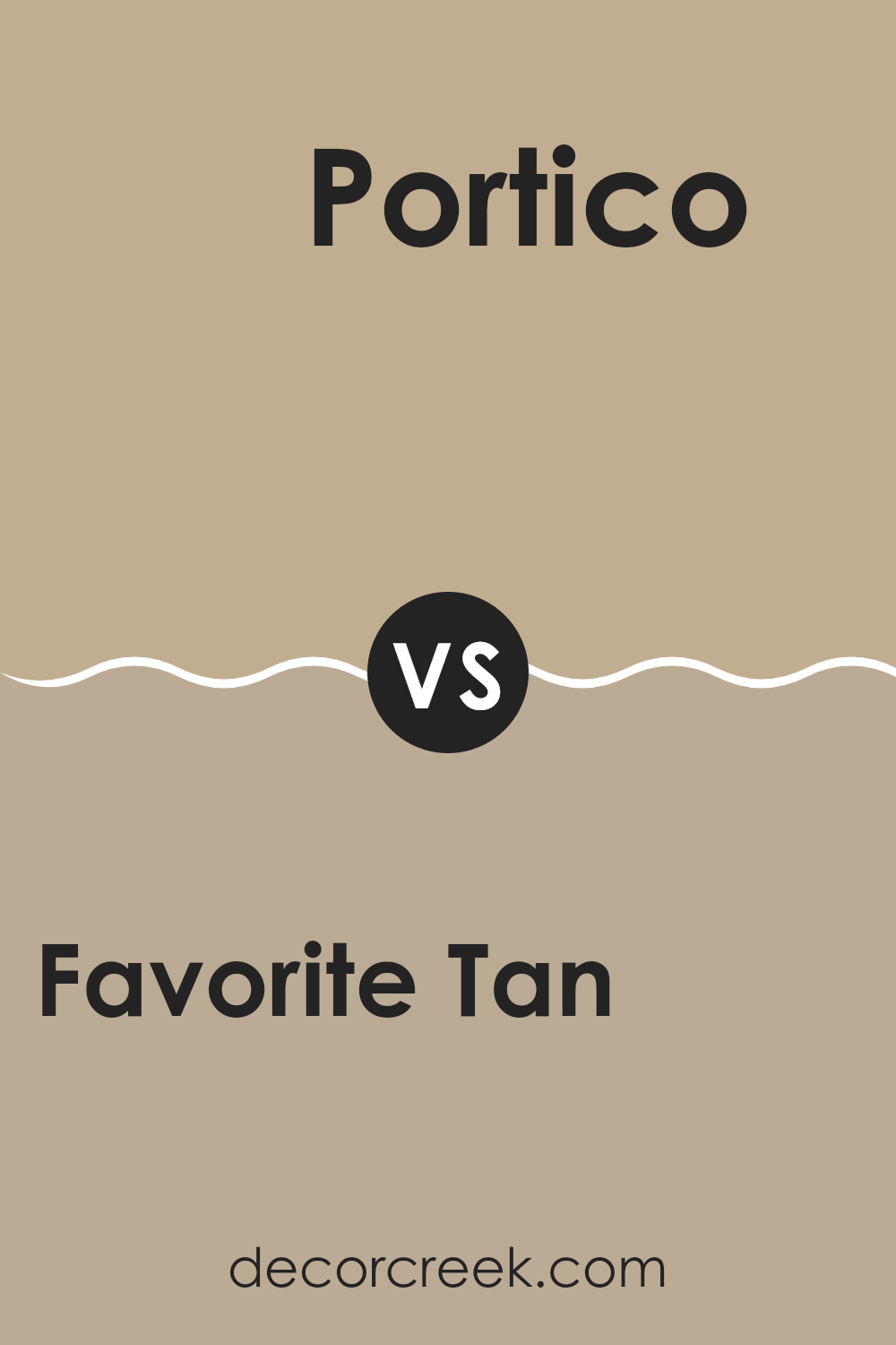
Favorite Tan SW 6157 by Sherwin Williams vs Portico SW 7548 by Sherwin Williams
“Favorite Tan” and “Portico” by Sherwin Williams are two neutral paint colors that each bring a unique mood to a room. “Favorite Tan” is the warmer of the two, with a soft, sand-like tone that adds coziness and comfort. It’s ideal for living rooms or bedrooms where a welcoming, warm feel is desired.
“Portico,” on the other hand, carries a slightly cooler touch with a subtle gray undertone. It’s adaptable and works beautifully in rooms aiming for a calm, understated look. This shade can also help smaller areas feel more open, making it a great choice for modern or minimalist interiors.
Both colors are light and easy to coordinate with different styles, though “Favorite Tan” delivers a warmer, more relaxed vibe, while “Portico” provides a fresher, balanced atmosphere. Choosing between them depends on whether you prefer a cozy warmth or a soft, neutral calm in your room.
You can see recommended paint color below:
SW 7548 Portico
decorcreek.com
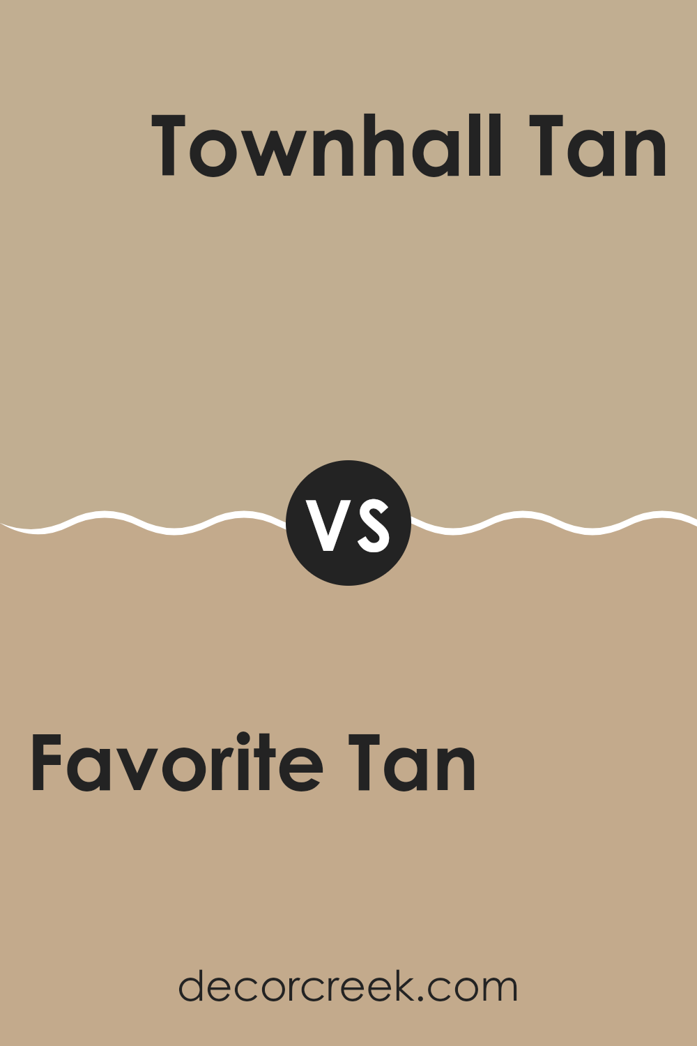
Favorite Tan SW 6157 by Sherwin Williams vs Townhall Tan SW 7690 by Sherwin Williams
Favorite Tan and Townhall Tan by Sherwin Williams are two nuanced shades that each bring a distinct mood to a room. Favorite Tan is a warm beige with subtle peach undertones, giving it a cozy and welcoming feel. Its lighter nature helps make smaller rooms appear more open and bright.
Townhall Tan, on the other hand, is a deeper, more classic beige with a touch of gray. This tone creates a solid, grounded presence, making it a great choice for larger or sunlit areas where it won’t feel too heavy. It’s perfect for achieving a calm, stable atmosphere.
Both shades are adaptable and blend beautifully with a range of decor styles and complementary colors. Favorite Tan works wonderfully in relaxed, casual settings, while Townhall Tan—with its richer depth—is ideal for more formal or refined interiors. The choice between them ultimately depends on the mood and balance you want to create in your room.
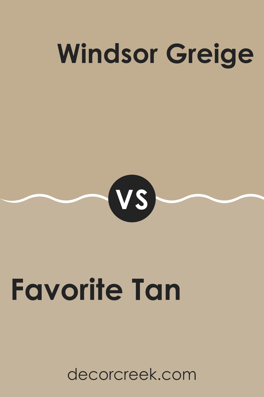
Favorite Tan SW 6157 by Sherwin Williams vs Windsor Greige SW 7528 by Sherwin Williams
Favorite Tan and Windsor Greige are two shades by Sherwin Williams that bring distinct moods to interior rooms. Favorite Tan is a warm neutral with a sandy beige undertone that creates a cozy and welcoming atmosphere. It’s an excellent choice for rooms where you want an inviting, comfortable feel without introducing too much darkness or intensity.
Windsor Greige, on the other hand, carries a deeper tone with a balance of gray and beige. This blend results in a refined greige that adapts well to different lighting conditions and pairs effortlessly with both warm and cool accents. Its muted character lends itself perfectly to modern interiors that favor a clean, subtle aesthetic.
Both colors are highly adaptable and work beautifully in living rooms, bedrooms, and beyond. Favorite Tan adds warmth and approachability, while Windsor Greige provides a grounded, contemporary elegance—making the right choice dependent on the overall mood and style you wish to achieve.
Favorite Tan SW 6157 by Sherwin Williams vs Khaki Shade SW 7533 by Sherwin Williams
Favorite Tan and Khaki Shade are two distinctive colors from Sherwin Williams, each offering its own character and appeal. Favorite Tan is a soft, warm neutral with a creamy beige undertone that creates a cozy and inviting atmosphere. It’s perfect for living rooms, bedrooms, or any area where comfort and warmth are desired. This shade complements a wide range of decor styles, blending effortlessly with both light and dark accents without dominating the room.
Khaki Shade, by contrast, is richer and leans closer to a traditional khaki tone. It carries subtle green undertones that lend it an earthy, natural quality. This makes it an excellent choice for rooms where you want to bring in a grounded, organic feel—such as studies, home offices, or cozy reading nooks. It pairs beautifully with wooden furniture, natural textures, and greenery to enhance its outdoorsy charm.
Both colors are adaptable and work well across different design styles. Favorite Tan brings warmth and softness, while Khaki Shade adds depth and a touch of nature-inspired calm. The choice between them depends on whether you prefer a bright, welcoming mood or a more grounded, earthy atmosphere.
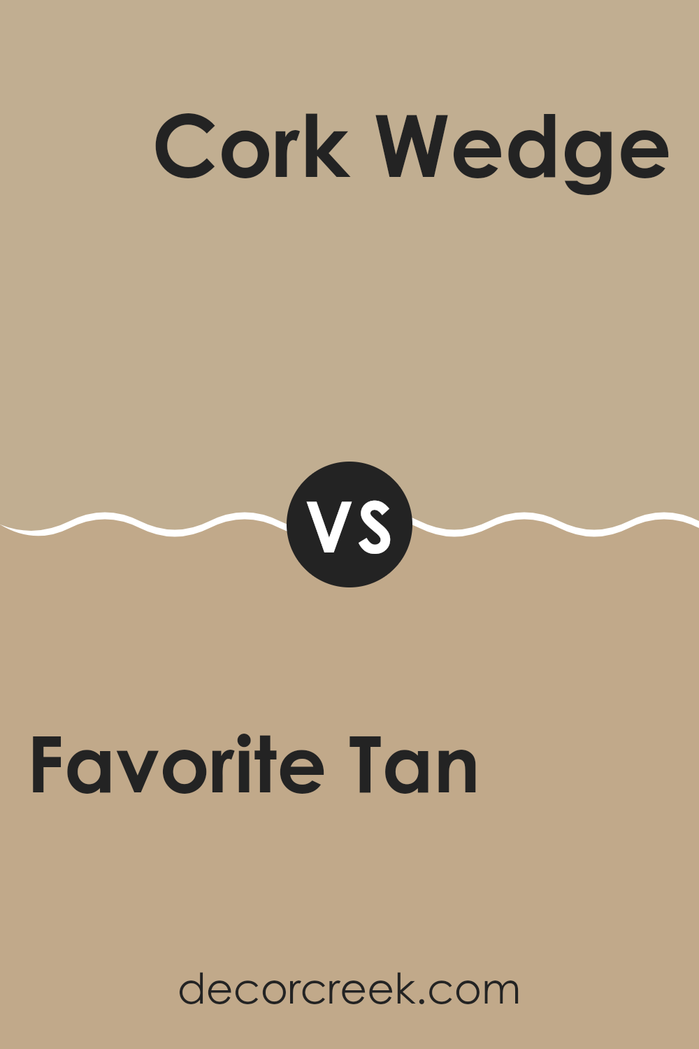
Favorite Tan SW 6157 by Sherwin Williams vs Cork Wedge SW 7539 by Sherwin Williams
Favorite Tan and Cork Wedge are two warm, inviting shades from Sherwin Williams, each offering a cozy atmosphere in distinct ways. Favorite Tan is a soft, muted beige with a creamy undertone that makes it adaptable for nearly any room. It brings a light, open feeling to interiors, promoting a sense of ease and comfort.
Cork Wedge, in contrast, is a deeper and richer tone, reminiscent of natural cork. With its golden-brown undertones, it introduces more warmth and depth, making it ideal for rooms that aim to feel grounded and intimate. This color works beautifully in living rooms, dining areas, or anywhere a touch of coziness and sophistication is desired.
While both share a warm foundation, Favorite Tan provides a softer, understated backdrop perfect for airy, light-filled settings. Cork Wedge, on the other hand, delivers a stronger presence with added character, making it great for accent walls or rooms where you want to create a more enveloping feel. The choice between them depends on whether you prefer a gentle, relaxed mood or a rich, inviting atmosphere.
You can see recommended paint color below:
SW 7539 Cork Wedge
decorcreek.com
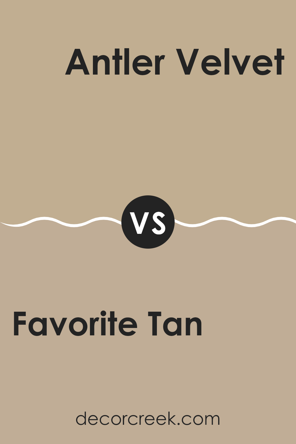
Favorite Tan SW 6157 by Sherwin Williams vs Antler Velvet SW 9111 by Sherwin Williams
Favorite Tan and Antler Velvet, both by Sherwin Williams, have their own unique appeal and work in different settings. Favorite Tan is a warm, inviting beige that brings a classic, cozy vibe to any room. It’s a medium shade that pairs well with a wide range of colors, perfect for living areas where comfort is key.
This color adds a soft, subtle presence without overpowering a room, making interiors feel welcoming and homely. On the other hand, Antler Velvet is a darker, muted gray-brown tone. It’s more understated than Favorite Tan, providing a strong backdrop that stands out especially in well-lit rooms.
This shade is ideal for creating a striking contrast with lighter elements or for cozy, dimmer areas where a deeper color can make the room feel more enclosed and intimate. In summary, while Favorite Tan offers a warm, soft atmosphere, Antler Velvet presents a more pronounced, grounding effect, ideal for different decorative purposes.
After taking a good look at SW 6157 Favorite Tan by Sherwin Williams, I really think it’s a wonderful choice for anyone wanting to make their room feel warm and welcoming. This shade is like a soft hug in the form of paint — it makes any room feel cozy without making it too dark. Whether you’re painting a bedroom, a living room, or even the kitchen, Favorite Tan has a friendly and inviting vibe that makes you feel right at home.
What’s also great about this color is how well it works with others. It looks beautiful with soft whites or even bold tones like navy or forest green. You can use it as the main wall color or as an accent for added depth. Plus, it’s a color that stays appealing over time. It’s a reliable pick because it has remained popular for years and will likely continue to be a favorite for many more.
So, if you’re thinking about giving your room a new coat of paint and want something easy to coordinate, pleasant to live with, and full of warmth, then SW 6157 Favorite Tan could be the perfect option for you. It’s simple, charming, and makes any room feel just right.
decorcreek.com
The Only Samples You Need
Ever wished paint sampling was as easy as sticking a sticker? Guess what? Now it is! Discover Samplize's unique Peel & Stick samples.
Maisie is a skilled Home Designer with a passion for color and personalized interiors. Since 2015, she has transformed homes across the U.S. A graduate of Savannah College of Art and Design (SCAD) with a BFA in Interior Design, she continues to build her knowledge through certifications and industry involvement.