If you’re on a quest to find a perfectly balanced neutral paint color, you may want to consider SW 7528 Windsor Greige by Sherwin Williams. I recently decided to refresh my home’s interior and stumbled upon this flexible shade. Windsor Greige is a unique blend that hits just the right note between beige and gray.
It’s a color that provides a cozy warmth due to its beige undertones, yet remains sufficiently airy and open thanks to hints of gray. This shade is exceptionally adaptable, making it an ideal choice for almost any room in your home, from the living room to the bedroom.
I have found that it pairs beautifully with a wide range of decor styles, whether you’re leaning towards contemporary or more traditional furnishings. Moreover, Windsor Greige works well in various lighting conditions, maintaining its beauty in rooms flooded with natural light as well as those relying on artificial illumination. Another aspect I appreciate about Windsor Greige is its subtlety.
It’s a color that doesn’t overpower but rather complements other design elements in the room. Whether you are looking to create a calm workspace or a welcoming family area, Windsor Greige offers a solid foundation that pulls various components together harmoniously. So, if you’re planning a decorating project, Windsor Greige by Sherwin Williams could be the perfect backdrop to your vision.
What Color Is Windsor Greige SW 7528 by Sherwin Williams?
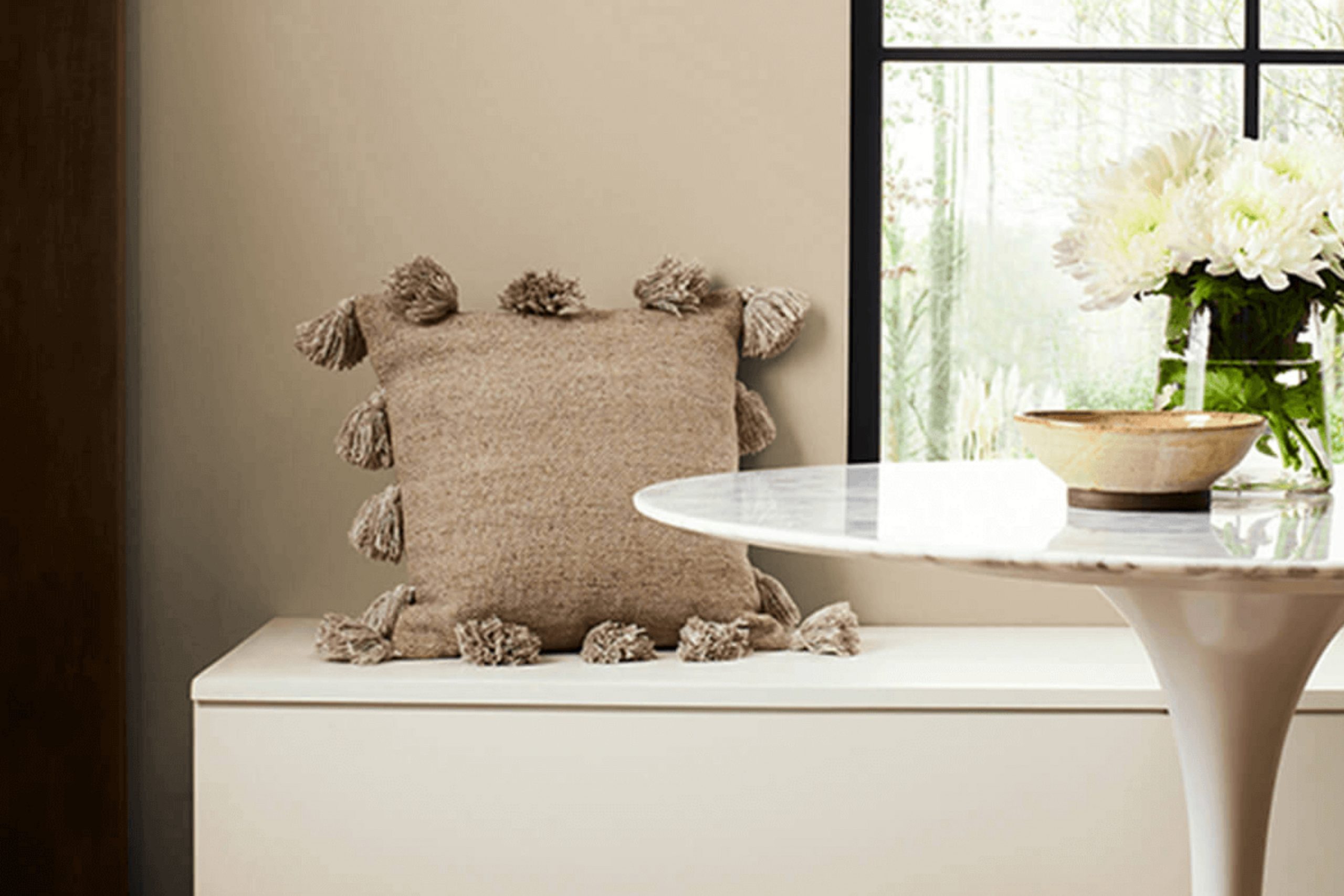
Windsor Greige by Sherwin Williams is a flexible and warm paint color that blends beige and gray to create a cozy, inviting hue. This color is perfect for those looking to add a subtle elegance to their living rooms without overpowering the senses. Its balance makes it an ideal choice for various interior styles, particularly modern farmhouse, traditional, and contemporary.
This color works wonderfully in rooms that desire a neutral backdrop that still offers warmth and character. It’s especially effective in living rooms, bedrooms, and kitchens where the heart of the home feels welcoming and relaxed.
In terms of pairing with materials and textures, Windsor Greige goes beautifully with natural wood, enhancing the richness of oak or pine. It also complements brushed metals like nickel or bronze, lending a touch of rustic charm to a room. For those favoring a softer look, it pairs well with textiles like linen or cotton in light creams or whites, which can lighten the overall feel of a room while maintaining a cohesive look.
Overall, Windsor Greige offers a flexible palette that supports a range of decorating choices from understated to dynamic, depending on how it’s styled with other elements in your interior décor.
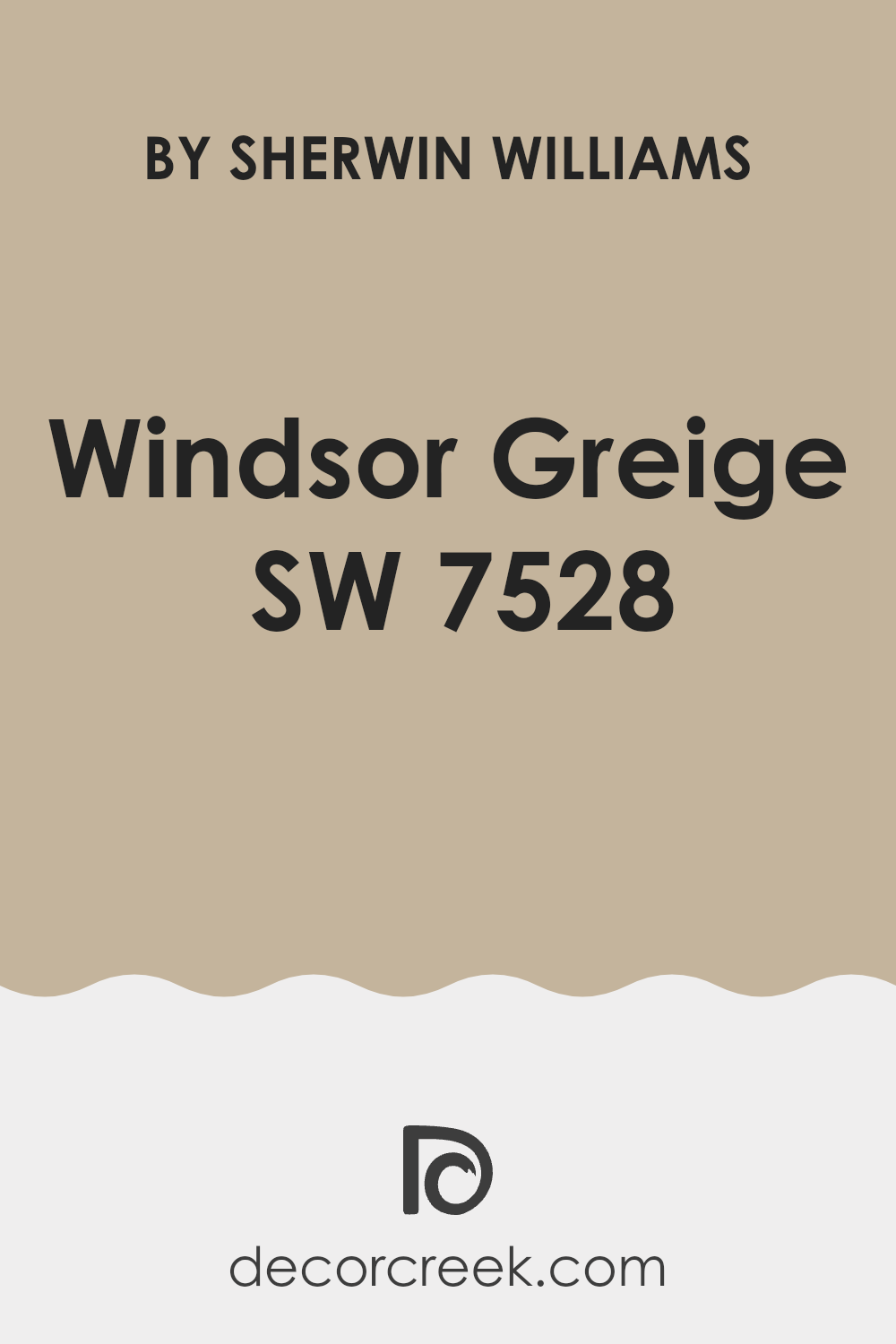
Is Windsor Greige SW 7528 by Sherwin Williams Warm or Cool color?
Windsor Greige by Sherwin Williams is a warm and welcoming paint color that can be a great addition to any home. Its subtle blend of beige and gray makes it flexible, allowing it to fit with both modern and traditional decor.
This shade is particularly effective in living rooms and bedrooms where its softness creates a cozy and relaxing atmosphere. Because Windsor Greige isn’t too dark or too light, it works well in areas that get various amounts of natural light throughout the day.
It can make small rooms appear bigger and brighter, while still bringing warmth to larger areas. This color pairs easily with other colors and materials. For example, it looks beautiful next to white trim or wood furniture, and it can also harmonize with vibrant colors in art or soft furnishings. Windsor Greige is a practical choice that adds a gentle touch of style without overpowering the room.
Undertones of Windsor Greige SW 7528 by Sherwin Williams
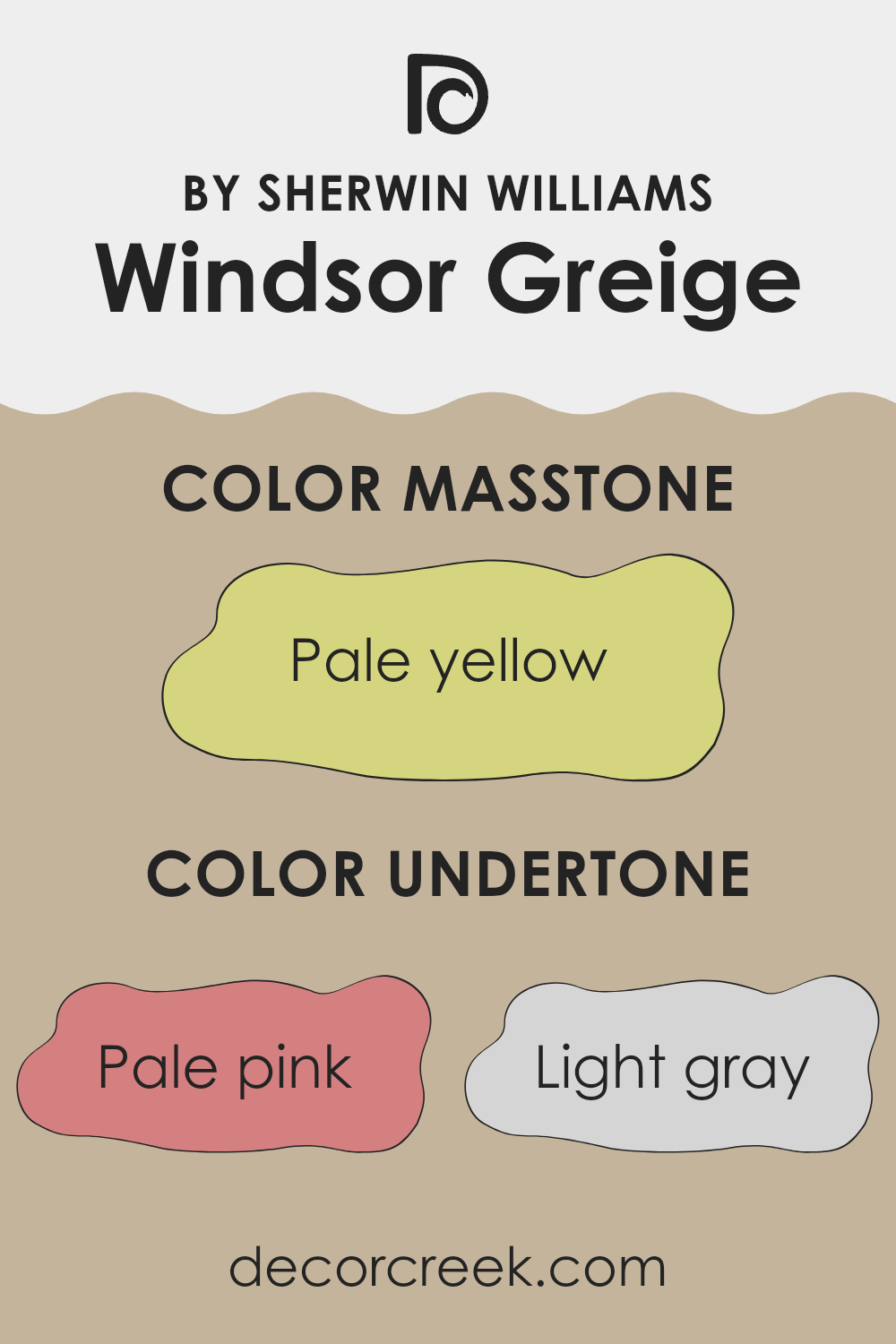
Windsor Greige is a flexible and subtle paint color that can appear different depending on its surroundings due to its complex undertones. This color primarily exhibits a rich, warm greige—which is a blend of gray and beige—but it’s the range of its undertones that makes it truly unique.
The undertones of a color are secondary hues that are often not immediately visible but influence how the color is perceived under various lighting conditions. Windsor Greige includes undertones like pale pink, light gray, and light purple which can impart a soft warmth to the color. Meanwhile, touches of mint, light blue, and lilac can give it a cooler, more refreshing feel.
When used on interior walls, these undertones interact with both natural and artificial light. In a room with ample sunlight, for instance, light purple and pink undertones might make Windsor Greige feel warmer and more inviting. In artificial lighting, the gray or light blue undertones could become more pronounced, lending the room a more grounded and calm atmosphere.
Colors like yellow, orange, and light green within Windsor Greige can add a subtle vibrancy, enhancing the liveliness of a room without overpowering it. Olive and grey undertones help in maintaining a neutral base, making it easier to match with a wide range of décor.
Overall, the unique composition of undertones in Windsor Greige can dramatically affect the mood and character of a room. This makes it an excellent choice for those looking to achieve a specific ambiance in their home while maintaining a cohesive look.
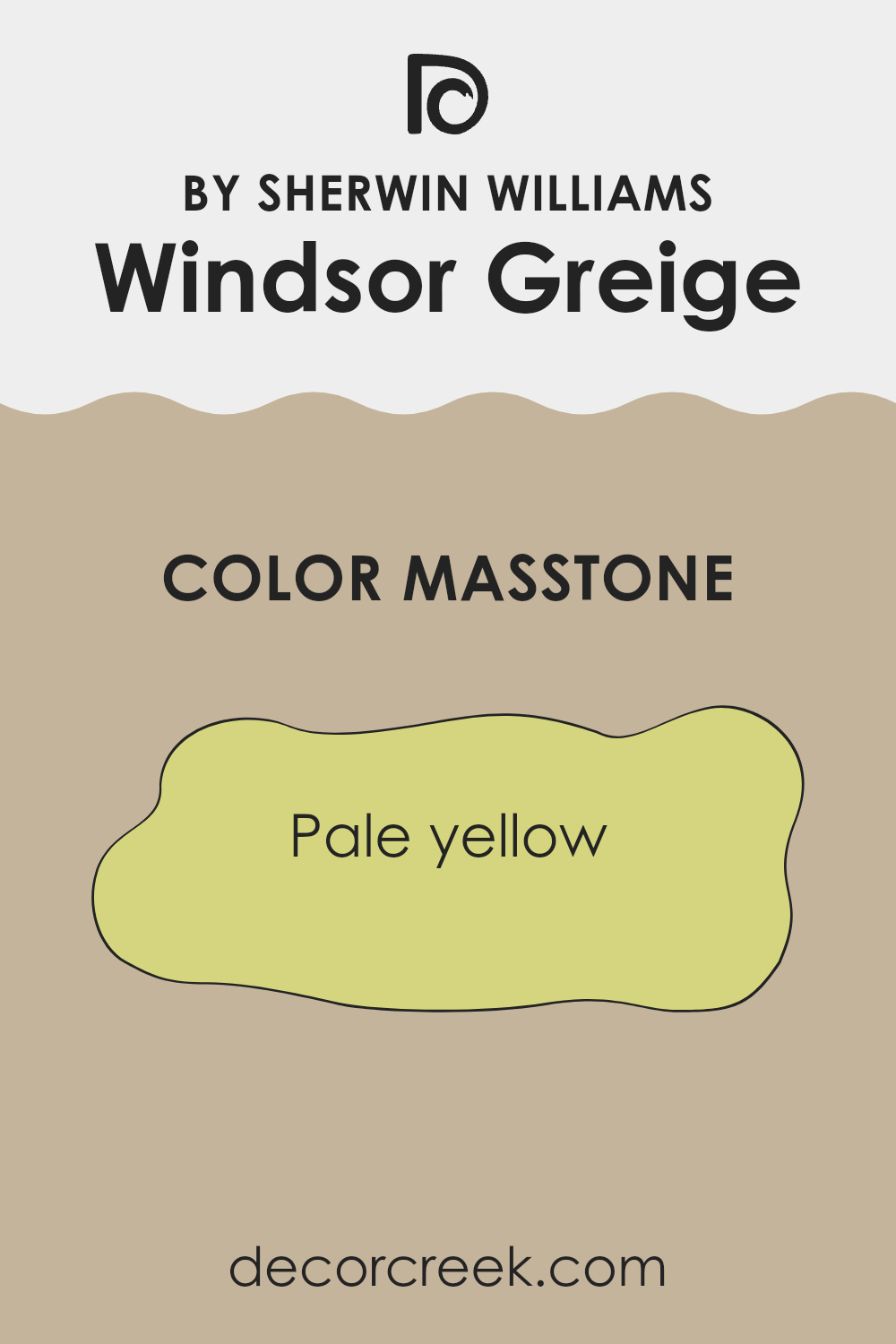
What is the Masstone of the Windsor Greige SW 7528 by Sherwin Williams?
Windsor Greige SW 7528 by Sherwin Williams has a masstone, or primary color tone, of pale yellow (#D5D580). This unique shade influences how it performs in residential rooms. The pale yellow masstone creates a warm and welcoming vibe in any room, making it excellent for living areas or bedrooms.
This color works well with natural light, brightening up areas that don’t get much sunshine. It also pairs nicely with both dark and light furnishings, offering versatility in interior design options.
Moreover, this color helps small rooms appear bigger and more open because of its light and airy quality. It’s a great choice for those looking to add a subtle hint of warmth without overpowering a room with strong color. This flexibility and adaptability make Windsor Greige a smart choice for homeowners looking to create a cozy yet stylish environment.
How Does Lighting Affect Windsor Greige SW 7528 by Sherwin Williams?
Lighting plays a crucial role in how colors appear in any setting. Depending on the type of light—natural or artificial—the same color can look different. This happens because light sources vary in their color temperatures, affecting how we perceive colors.
Let’s consider the color Windsor Greige SW 7528, a flexible neutral shade with a blend of gray and beige tones. In natural light, this color appears lighter and can pick up subtle undertones that you might not immediately notice under artificial lighting.
Natural light, especially that which comes indirectly or from a north-facing window, can make Windsor Greige look more gray, giving it a cooler and more consistent appearance throughout the day.
In contrast, artificial lighting, such as LED or incandescent bulbs, can change how Windsor Greige looks. Warm-toned bulbs can make it appear softer and warmer, bringing out beige undertones, while cooler bulbs can enhance its gray aspects, making it look more stark or crisp.
The direction your room faces also affects how Windsor Greige will look:
– North-faced rooms: These rooms get less direct sunlight, which can make Windsor Greige appear more consistent and subtly gray throughout the day.
– South-faced rooms: With more direct sunlight, Windsor Greige can warm up significantly, looking lighter and more beige during the day.
– East-faced rooms: Morning light can make Windsor Greige look warm and welcoming in the morning, but it might turn cooler as the natural light fades.
– West-faced rooms: Expect this color to look neutral in the morning but gain warmth and depth in the evening as the sun sets.
Thus, when using Windsor Greige, consider both the room’s lighting and its orientation to fully take advantage of this adaptable color. This understanding will help you achieve the desired mood and style for your room.

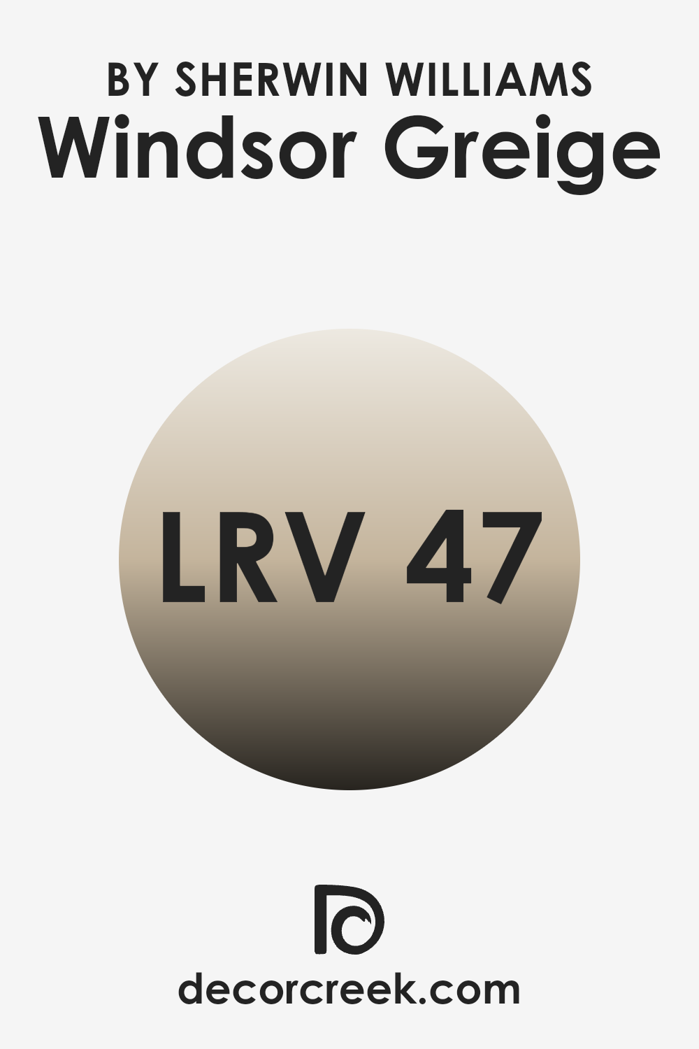
What is the LRV of Windsor Greige SW 7528 by Sherwin Williams?
LRV, or Light Reflectance Value, is a measure used to describe the percentage of light a paint color reflects from or absorbs into a painted surface. When you consider a scale where zero means the color absorbs all light (total absorption, appearing very dark) and a higher number up to a maximum leads toward total reflection (appearing much lighter), LRV helps people understand how bright or dark a color might look once applied to a wall.
The value is particularly useful when deciding paint colors for your home, as it can significantly affect the perceived size and mood of a room. Darker colors with low LRV can make a room feel smaller and cozier, while lighter colors can make a room seem larger and more open.
With an LRV of 46.731, Windsor Greige tends to be more towards the middle of the scale but leans slightly darker. This means it doesn’t reflect over half of the light that hits it but does reflect a substantial amount.
In practical terms, this color could provide a balanced ambiance to a room, not too bright and not overly dark, making it flexible in various lighting conditions. In areas with less natural light, this color might look slightly darker, while in well-lit, especially naturally lit environments, the true beauty and depth of Windsor Greige can truly come alive, making it a flexible choice for many interiors.
Coordinating Colors of Windsor Greige SW 7528 by Sherwin Williams
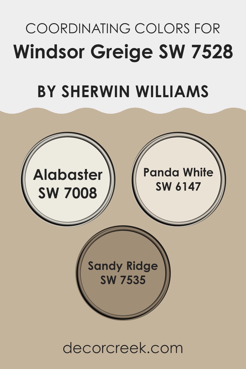
Coordinating colors are hues that complement each other, enhancing the overall look and feel of a room. When picking colors that coordinate with a base shade like Windsor Greige, a comforting medium tone greige, it’s important to select colors that maintain the room’s harmony while providing either contrast or a continuity in theme. Windsor Greige fits well with various decor styles, and its coordinating colors can help to pull a room together.
Alabaster is a warm, soft white with a hint of creaminess, perfect for creating a calming and welcoming atmosphere. It contrasts subtly with greige, providing a light, airy feel that can make smaller areas seem larger.
Panda White is a slightly darker shade than Alabaster, with a hint of beige that works well to maintain warmth in a room while adding depth when used alongside greige. Lastly, Sandy Ridge, a deeper, earthy taupe, offers a grounding effect. It complements the muted tones of Windsor Greige, offering a robust color that provides balance and a touch of nature-inspired richness to any interior design scheme. Together, these coordinating shades support an environment that is cohesive and visually appealing.
You can see recommended paint colors below:
- SW 7008 Alabaster (CHECK A SAMPLE)
- SW 6147 Panda White (CHECK A SAMPLE)
- SW 7535 Sandy Ridge (CHECK A SAMPLE)
What are the Trim colors of Windsor Greige SW 7528 by Sherwin Williams?
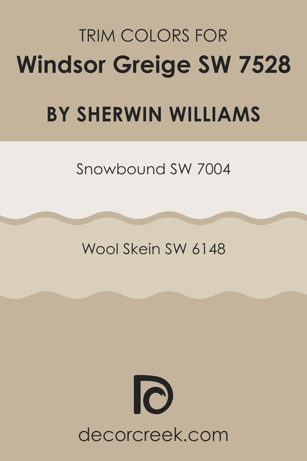
Trim colors are essentially accent colors used on the molding, door frames, window frames, and baseboards of a room to highlight or offset the main wall color. Selecting the right trim color can significantly enhance the aesthetic of a room, creating a visually pleasing contrast that defines the rooms or edges clearly.
For a color like Windsor Greige by Sherwin Williams, which is a flexible and warm neutral, choosing the right trim colors can bring out its richness without overpowering the room. Snowbound (SW 7004) is a clean, crisp white with a subtle gray undertone that provides a fresh contrast to the warmer tones of Windsor Greige, making the walls appear more prominent and neatly defined.
On the other hand, Wool Skein (SW 6148) is a soft, neutral beige with yellow undertones, offering a smoother transition between the wall and trim, and subtly highlighting the architectural features without creating too sharp a contrast. Both colors support the main hue without competing for attention, allowing for a harmonious overall appearance.
You can see recommended paint colors below:
Colors Similar to Windsor Greige SW 7528 by Sherwin Williams
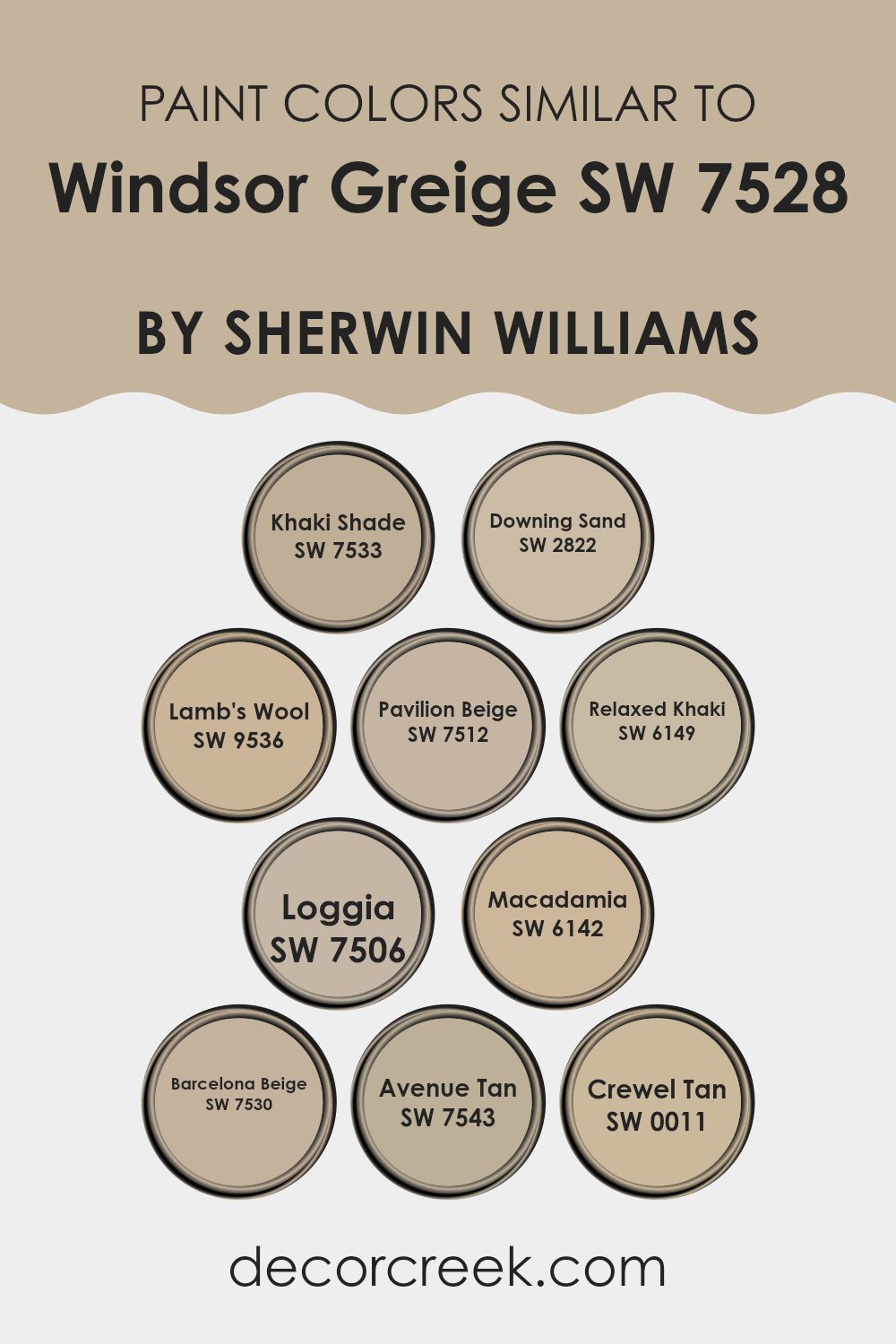
Similar colors, like shades closely related to Windsor Greige by Sherwin Williams, play a key role in creating a visually coherent and aesthetically pleasing room. By using colors that belong to the same family, designers achieve a seamless look that enhances the environment’s overall feel without dramatic shifts in tone. For instance, Khaki Shade is a deeper, earthier color that offers warmth to areas without overpowering. Downing Sand provides a slightly sunlit, sandy appearance that harmonizes beautifully with natural light.
Lamb’s Wool is a soft, creamy color that radiates a gentle, welcoming vibe, making it perfect for living areas. Pavilion Beige steps in as another unassuming yet enriching color, adding just the right amount of depth to avoid blandness. Relaxed Khaki brings in a subdued, natural green undertone that pairs well with wood and other organic materials.
Loggia carries a dusky undertone that grounds the lighter shades in the vicinity. Macadamia offers a nuttier, more muted backdrop, suitable for those looking for a subtle diversity in neutrals. Barcelona Beige tilts towards a slightly peachy complexion, brightening rooms with its understated warmth. Avenue Tan introduces a hint of shadow, ideal for creating dimension without the stark contrasts.
Lastly, Crewel Tan has a hint of old-world charm, casting a nostalgic and warm atmosphere that complements traditional decors. By integrating these sufficiently harmonizing shades, one’s decor becomes more cohesive and inviting, promoting a unified look that is both functional and appealing.
You can see recommended paint colors below:
- SW 7533 Khaki Shade (CHECK A SAMPLE)
- SW 2822 Downing Sand
- SW 9536 Lamb’s Wool (CHECK A SAMPLE)
- SW 7512 Pavilion Beige (CHECK A SAMPLE)
- SW 6149 Relaxed Khaki (CHECK A SAMPLE)
- SW 7506 Loggia (CHECK A SAMPLE)
- SW 6142 Macadamia (CHECK A SAMPLE)
- SW 7530 Barcelona Beige (CHECK A SAMPLE)
- SW 7543 Avenue Tan (CHECK A SAMPLE)
- SW 0011 Crewel Tan (CHECK A SAMPLE)
Colors that Go With Windsor Greige SW 7528 by Sherwin Williams
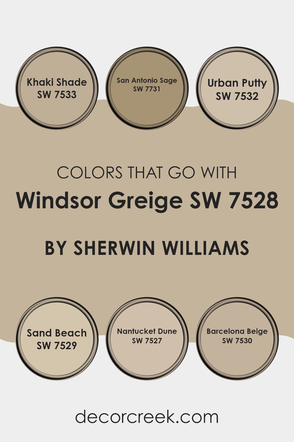
Choosing the right colors that complement Windsor Greige SW 7528 by Sherwin Williams is crucial for creating a harmonious and cohesive look in any room. When matched with compatible colors like Khaki Shade, San Antonio Sage, Urban Putty, Sand Beach, Nantucket Dune, and Barcelona Beige, Windsor Greige can help establish a welcoming and soothing atmosphere.
These combinations allow for a seamless aesthetic flow between rooms, enabling each color to enhance the features of Windsor Greige, while also allowing some flexibility in decoration and style continuity across different areas.
Khaki Shade SW 7533 offers a gentle earth tone that beautifully pairs with the soft warmth of Windsor Greige, providing a grounded feeling. San Antonio Sage SW 7731 whispers of subtle green hues which add a refreshing touch to the neutral backdrop of Windsor Greige.
Urban Putty SW 7532 serves up a slightly deeper neutral, ensuring a solid foundational pairing that’s neither too bold nor too subdued. Sand Beach SW 7529 brings in a lighter, sandy contrast that brightens areas subtly without overpowering. Nantucket Dune SW 7527 resembles a soft brown that adds depth and interest, working well in areas seeking a touch of gravity.
Lastly, Barcelona Beige SW 7530 rounds out the selection with its mild, welcoming beige that ensures rooms feel open yet cozy. These colors work together to support Windsor Greige in setting the desired tone and mood in your decorating projects.
You can see recommended paint colors below:
- SW 7533 Khaki Shade (CHECK A SAMPLE)
- SW 7731 San Antonio Sage (CHECK A SAMPLE)
- SW 7532 Urban Putty (CHECK A SAMPLE)
- SW 7529 Sand Beach (CHECK A SAMPLE)
- SW 7527 Nantucket Dune (CHECK A SAMPLE)
- SW 7530 Barcelona Beige (CHECK A SAMPLE)
How to Use Windsor Greige SW 7528 by Sherwin Williams In Your Home?
Windsor Greige SW 7528 by Sherwin Williams is a warm, flexible paint color that blends taupe and gray hues. It’s perfect for creating a cozy and inviting atmosphere in your home. You can use this color in various rooms. In the living room, applying Windsor Greige can make the area feel welcoming and relaxed, which is great for family gatherings or just chilling out.
In the bedroom, it adds a soft backdrop, promoting a comforting vibe that’s ideal for rest. The kitchen benefits from this color too, as it pairs well with both wood and modern cabinetry, bringing a fresh yet warm feel to the room.
Furthermore, Windsor Greige works well in bathrooms and dining rooms, offering a neutral base that matches a wide range of decor styles. So whether you’re painting walls, trim, or cabinets, Windsor Greige provides a stylish, subtle look that’s easy to live with.
Windsor Greige SW 7528 by Sherwin Williams vs Loggia SW 7506 by Sherwin Williams
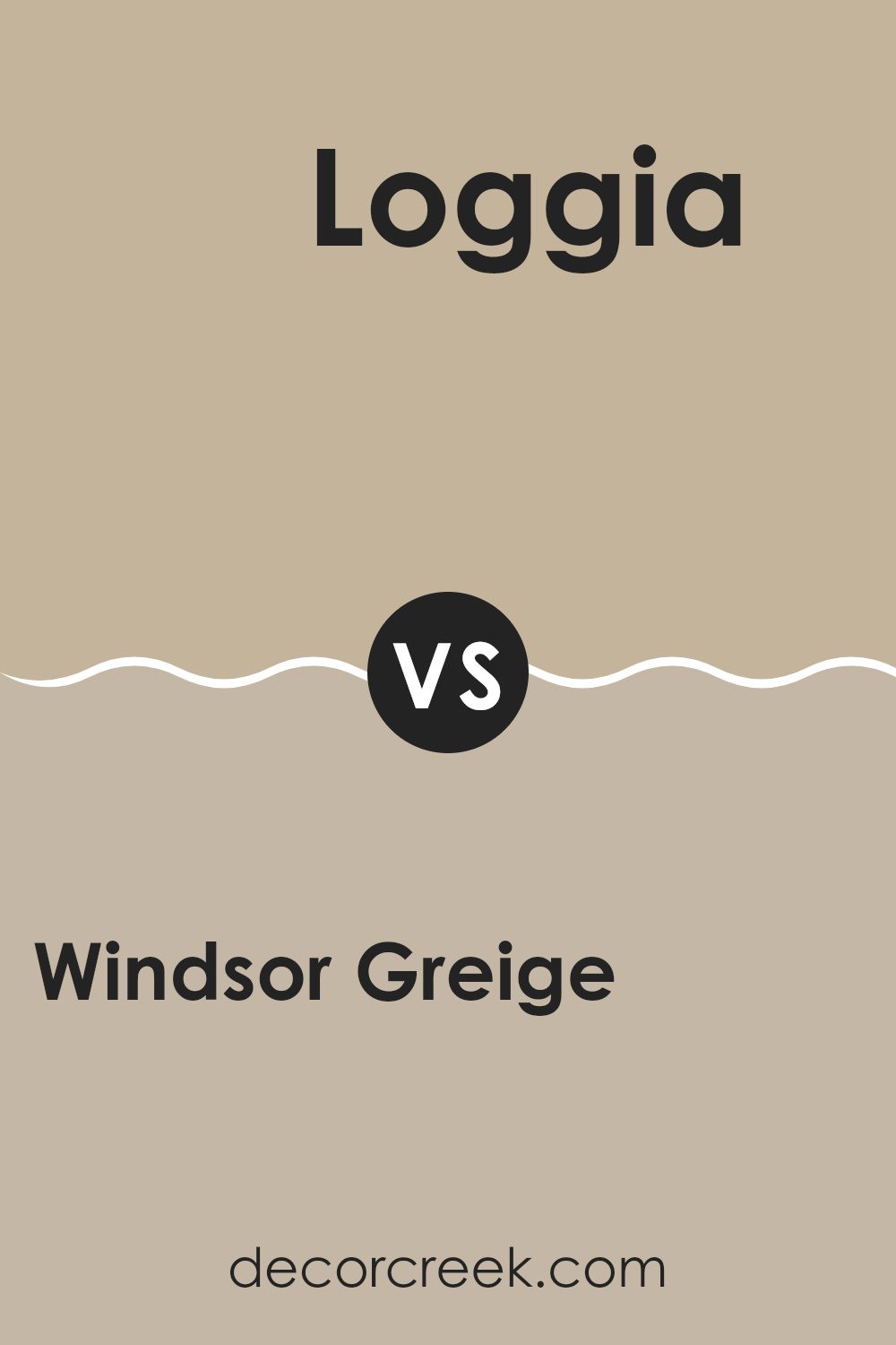
Windsor Greige and Loggia are two popular paint colors by Sherwin Williams, but they have distinct tones and vibes. Windsor Greige is a warm greige (a blend of gray and beige) with a welcoming feel, making any room cozy and comfortable. This color is flexible and fits well in areas that aim for a soft, neutral backdrop that leans towards a beige warmth.
On the other hand, Loggia is a shade darker and resembles a muted taupe with a touch of gray. This color adds a bit more depth to walls and can give a room a grounded, calming atmosphere. Loggia is great for settings where you want a hint more richness without overpowering the room with darker colors.
Both colors work well in various decorating styles, from modern to traditional. They pair nicely with other colors and can help bring together different design elements in a room.
You can see recommended paint color below:
Windsor Greige SW 7528 by Sherwin Williams vs Relaxed Khaki SW 6149 by Sherwin Williams
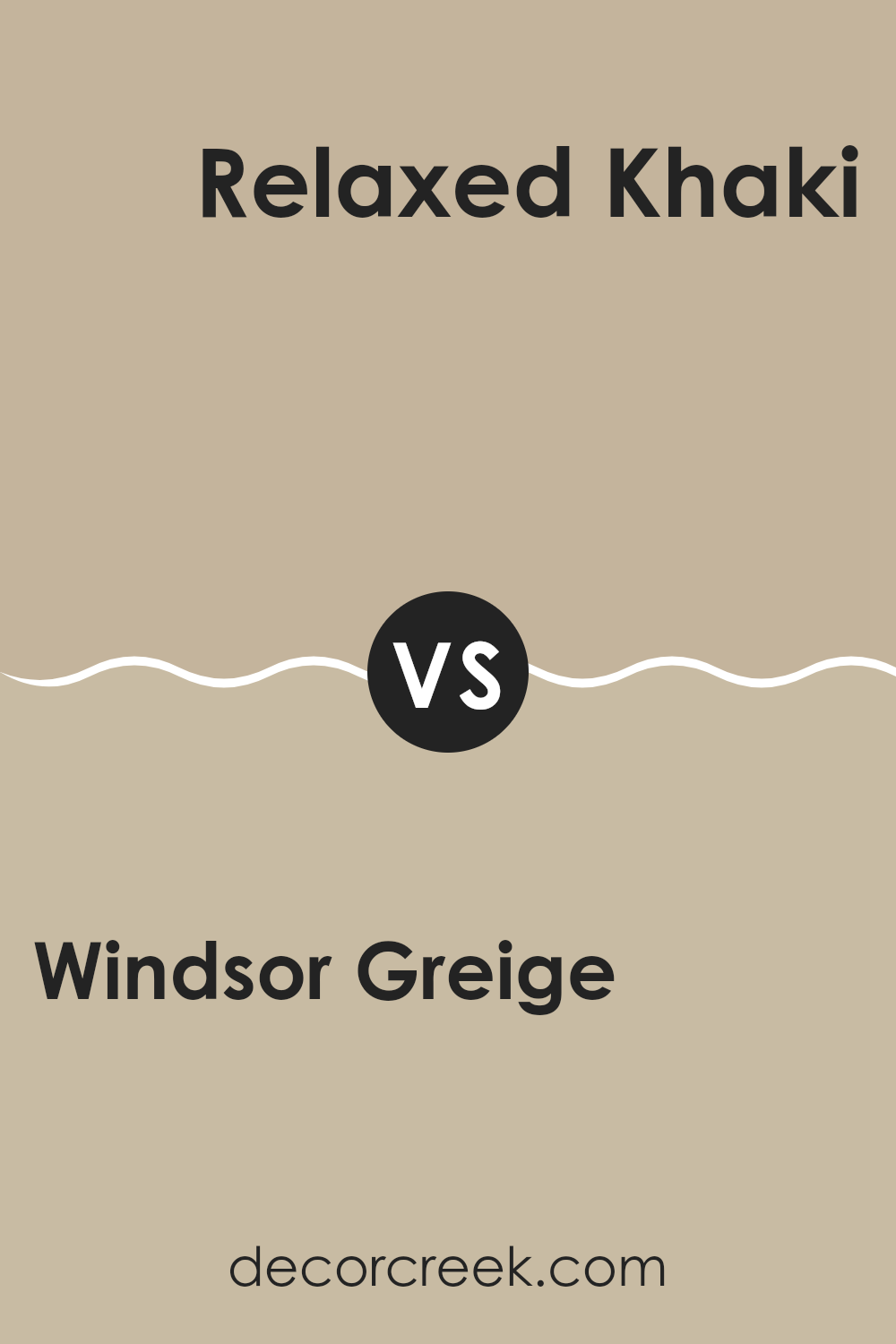
Windsor Greige and Relaxed Khaki are two neutral paint colors from Sherwin Williams, each offering a unique vibe to any room. Windsor Greige has a deeper, grayish tone that provides a strong yet warm foundation for a room.
It can make an area feel cozy and inviting. In contrast, Relaxed Khaki is lighter and leans more toward a soft, sandy beige. This color can brighten a room and give it a more open, airy feel. Both colors are flexible and can easily blend with various decor styles, from modern to traditional.
Windsor Greige typically works well in areas that benefit from an elegant backdrop, while Relaxed Khaki is perfect for creating a relaxed, clean look in areas like living rooms and bedrooms. Choosing between them depends on the mood you’re aiming for and how much natural light your room gets.
You can see recommended paint color below:
- SW 6149 Relaxed Khaki (CHECK A SAMPLE)
Windsor Greige SW 7528 by Sherwin Williams vs Khaki Shade SW 7533 by Sherwin Williams
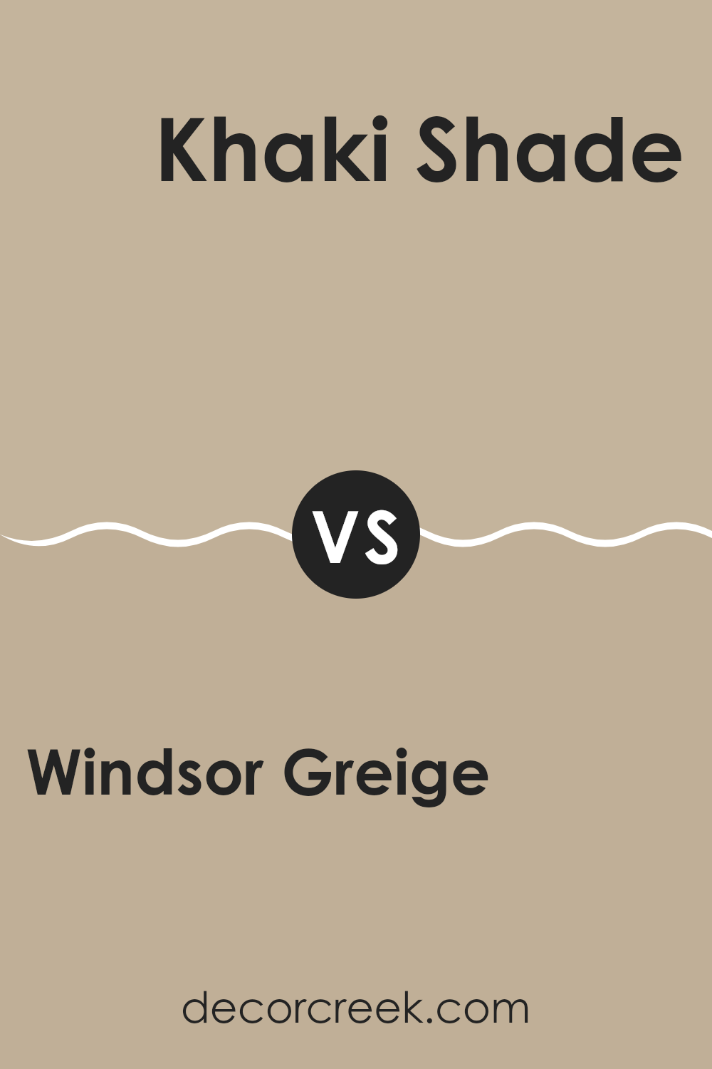
Windsor Greige and Khaki Shade are two flexible paint colors from Sherwin Williams that can create subtly different atmospheres in a room. Windsor Greige is a warm greige that combines gray with elements of beige, resulting in a cozy and inviting neutral hue. Its balanced blend makes it an excellent choice for creating a soothing background that’s easy to accessorize with bolder or contrasting colors.
On the other hand, Khaki Shade is a lighter color that leans more towards a soft, sandy beige than the deeper blend of Windsor Greige. It gives off a fresh and airy feel, making it perfect for smaller rooms or rooms that aim to have a more open and light-filled ambiance.
Both colors offer flexibility in terms of decor and styling, complementing a wide range of furniture and finishes. Whether you choose the richer depth of Windsor Greige or the lighter, breezier feel of Khaki Shade, both colors provide a solid foundation for creating a welcoming room.
You can see recommended paint color below:
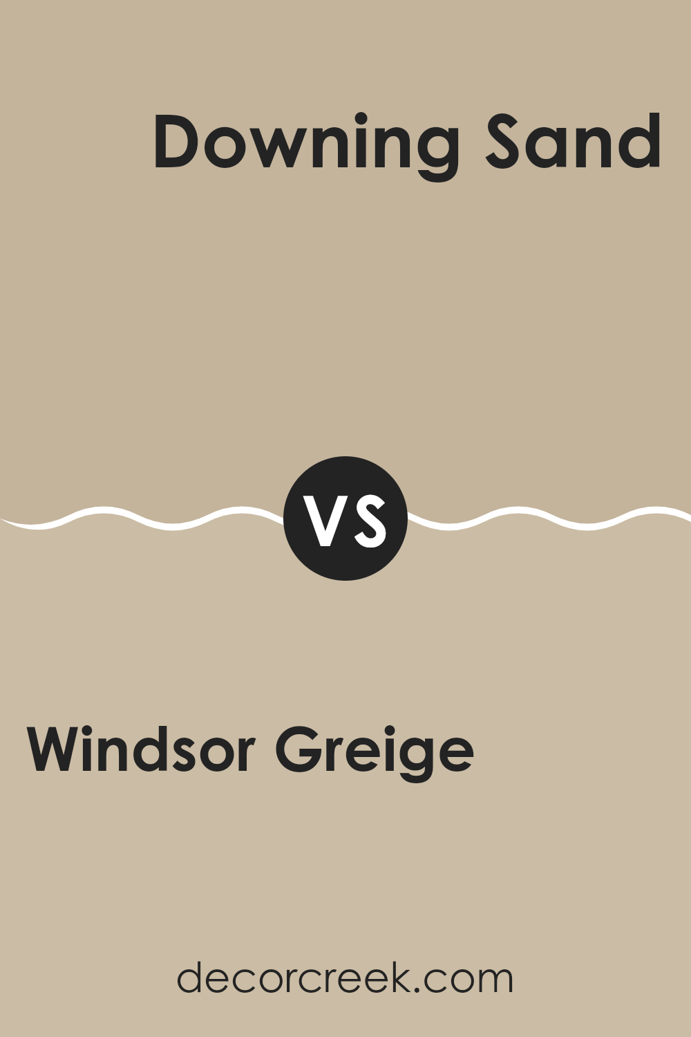
Windsor Greige SW 7528 by Sherwin Williams vs Downing Sand SW 2822 by Sherwin Williams
Windsor Greige and Downing Sand are two colors from Sherwin Williams that offer unique tones for interior rooms. Windsor Greige is a warm greige (a blend of gray and beige) that provides a cozy and inviting atmosphere. Its balanced composition makes it highly flexible and suitable for various rooms, ranging from living areas to bedrooms.
On the other hand, Downing Sand is a lighter, sandy beige color. This color is softer and brighter, creating a gentle, welcoming vibe. It’s perfect for areas where you want to introduce more light and give the impression of more area.
When comparing the two, Windsor Greige tends to add a bit more depth and warmth, making it ideal for creating a snug, comfortable environment. Downing Sand, being lighter, can make a room feel more airy and open. Both colors work well in a range of decorating styles, from modern to traditional, depending on the accompanying decor and furnishings.
You can see recommended paint color below:
Windsor Greige SW 7528 by Sherwin Williams vs Macadamia SW 6142 by Sherwin Williams
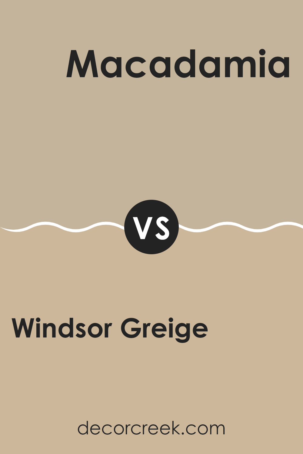
Windsor Greige and Macadamia, both from Sherwin Williams, offer subtle yet distinct tones that can enhance any room. Windsor Greige is a smooth blend of beige and gray, providing a solid, neutral backdrop that pairs well with a variety of decor styles. It’s perfect for those looking for a classic color that stays stylish over time.
On the other hand, Macadamia leans towards a softer, warmer beige with a comforting feel. It’s an excellent choice if you want to create a cozy and inviting atmosphere in your room. The warm undertones of Macadamia can make a room feel more welcoming and are particularly good for living areas or bedrooms.
Both colors are flexible, but while Windsor Greige offers a cooler, more balanced look, Macadamia brings warmth and a homely touch. Depending on the mood you want to set and the natural light in your room, either could be a great choice.
You can see recommended paint color below:
- SW 6142 Macadamia (CHECK A SAMPLE)
Windsor Greige SW 7528 by Sherwin Williams vs Crewel Tan SW 0011 by Sherwin Williams
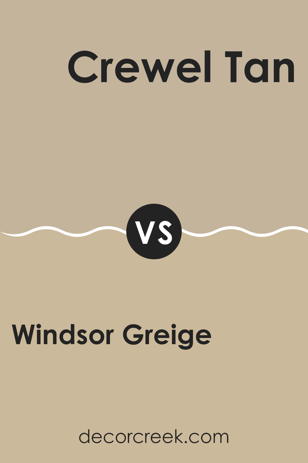
Windsor Greige and Crewel Tan are two distinct paint colors from Sherwin Williams that both offer a subtle, warm backdrop to any room. Windsor Greige leans towards a light to medium grey with a hint of beige, making it a perfect neutral choice that pairs well with various decor styles. It’s flexible enough to use in any room, providing a calm, fresh look while still bringing warmth.
On the other hand, Crewel Tan has a more pronounced tan shade that exudes a cozy, welcoming vibe. This color is slightly darker and warmer compared to Windsor Greige, and it enhances rooms by adding a richer, earthy touch. Crewel Tan works exceptionally well in areas where a soft, yet inviting atmosphere is desired.
Both colors are great for creating a modern yet classic environment, but their different tones set them apart in terms of mood and style impact. Windsor Greige offers a cooler neutrality, while Crewel Tan brings in warmth, making each suitable for specific design intentions.
You can see recommended paint color below:
- SW 0011 Crewel Tan (CHECK A SAMPLE)
Windsor Greige SW 7528 by Sherwin Williams vs Avenue Tan SW 7543 by Sherwin Williams
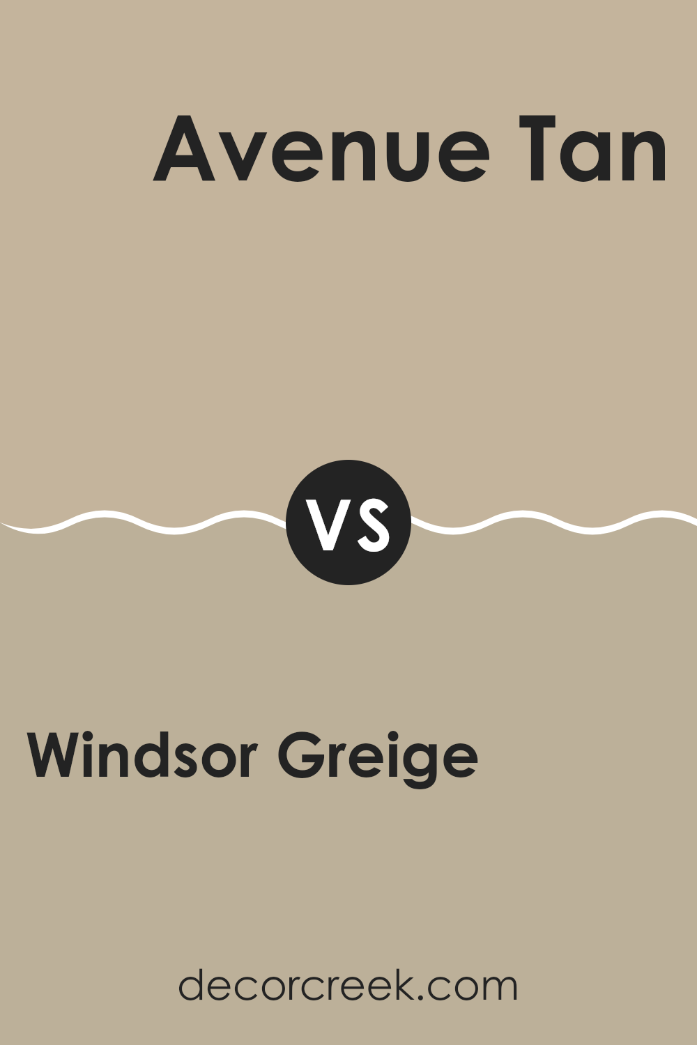
Windsor Greige and Avenue Tan by Sherwin Williams are two neutral paint colors with distinct characteristics. Windsor Greige leans towards a soft, light gray with a hint of beige, making it a more muted and flexible background color. It’s ideal for those looking to achieve a subtle yet inviting ambiance in their room. It pairs well with a variety of decor styles and adds a gentle warmth to rooms without overpowering with color.
On the other hand, Avenue Tan is darker and noticeably warmer, with a richer tan shade that tends to make areas feel cozier and more comforting. Its earthy tones bring a sense of warmth, making it a great choice for areas where a more pronounced, yet still neutral, color is desired.
The depth of Avenue Tan can help in creating a more defined and cozy atmosphere compared to the lighter Windsor Greige. Both colors offer a backdrop that is easy to work with, accommodating various furnishings and accessories. Choosing between them depends on the desired mood and the natural light in your room.
You can see recommended paint color below:
- SW 7543 Avenue Tan (CHECK A SAMPLE)
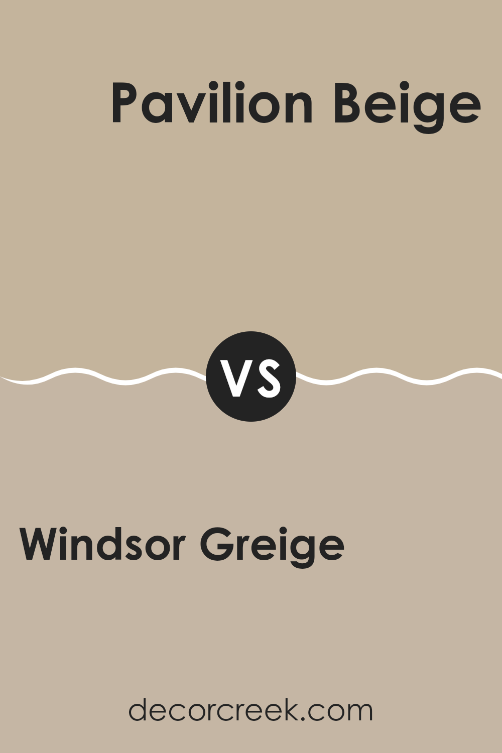
Windsor Greige SW 7528 by Sherwin Williams vs Pavilion Beige SW 7512 by Sherwin Williams
Windsor Greige and Pavilion Beige, both by Sherwin Williams, offer subtle yet distinct tones perfect for different decorating styles. Windsor Greige leans towards a cooler, more neutral grey with hints of beige, making it a flexible choice for modern and traditional rooms alike. It pairs well with a variety of decor and can help other colors stand out.
On the other hand, Pavilion Beige has a warmer, more inviting quality due to its stronger beige base with slight grey undertones. This color is excellent for creating a cozy atmosphere and works well in living areas or bedrooms where a softer, more welcoming feel is desired.
While both colors provide a neutral palette, Windsor Greige is better for those who prefer a faintly cooler touch that maintains a modern edge. Pavilion Beige is ideal for someone looking for warmth and a classic appeal. Each offers a unique vibe and can effectively enhance the aesthetic of a room depending on your style preference and the mood you want to set.
You can see recommended paint color below:
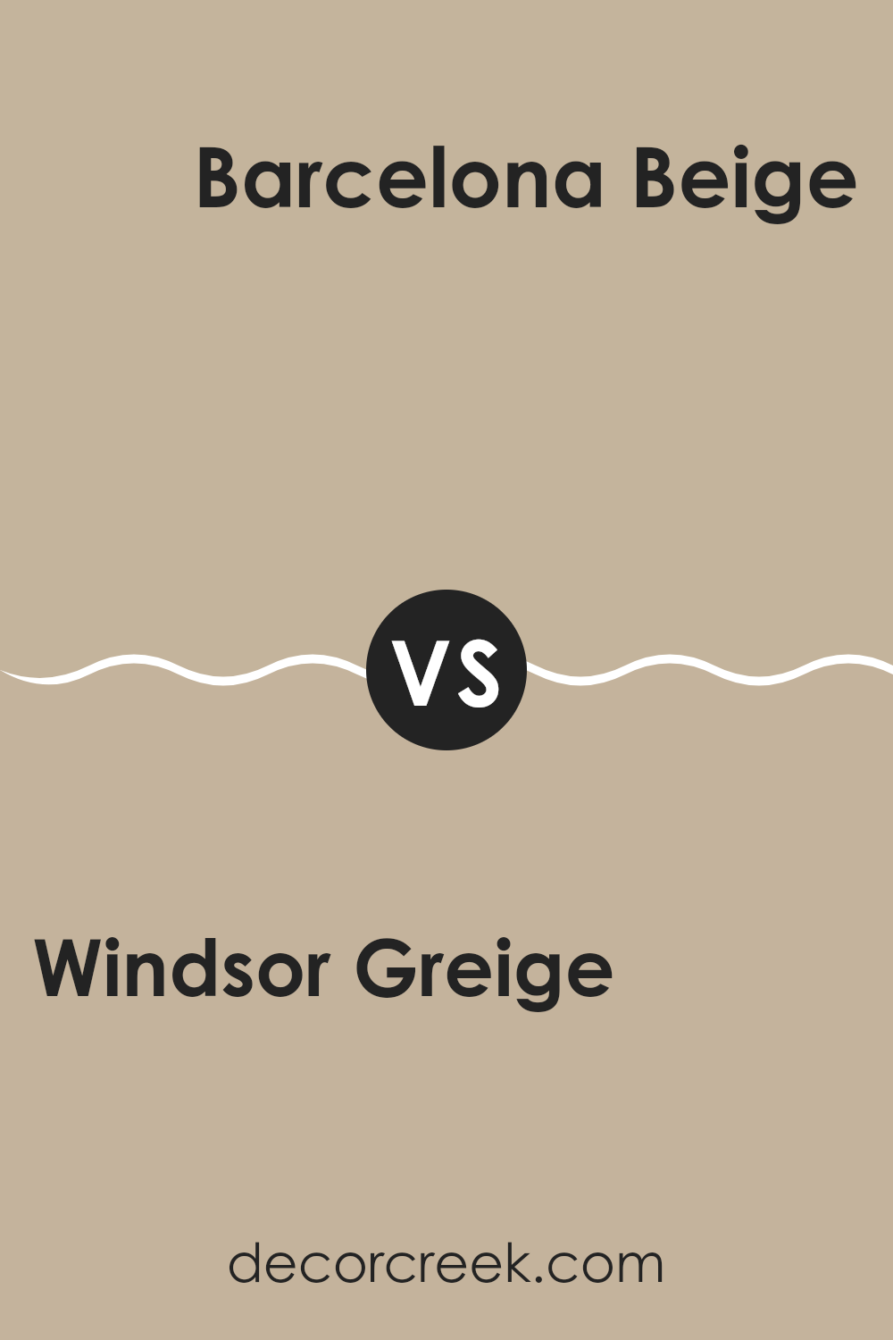
Windsor Greige SW 7528 by Sherwin Williams vs Barcelona Beige SW 7530 by Sherwin Williams
Windsor Greige and Barcelona Beige are two shades from Sherwin Williams that each provide a subtle and warm backdrop for any room. Windsor Greige is a cool, greyish hue that offers a slight hint of beige, making it very adaptable to different lighting and decor styles. It’s a great choice if you want a color that’s neutral but still has a bit of depth.
On the other hand, Barcelona Beige leans more towards a warmer tone, with a stronger presence of beige that can make a room feel more inviting and cozy. It fits well in areas where you want a touch of warmth without overpowering the room with too much color intensity.
Both colors are excellent for those seeking a clean and minimal aesthetic, but your choice between the two might depend on the atmosphere you’re aiming to achieve – cooler and subtler with Windsor Greige or warmer and more welcoming with Barcelona Beige. They both work wonderfully in various settings and complement a wide range of furnishings and accessories.
You can see recommended paint color below:
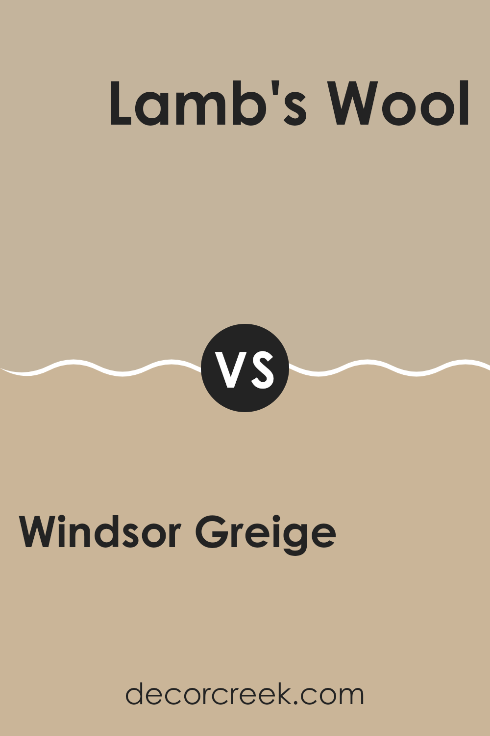
Windsor Greige SW 7528 by Sherwin Williams vs Lamb’s Wool SW 9536 by Sherwin Williams
Windsor Greige and Lamb’s Wool are both warm, inviting paint colors from Sherwin Williams, but they have different tones and atmospheres. Windsor Greige is a deeper, beige color with a hint of gray, offering a cozy and comforting feel, making it ideal for areas where you want a touch of richness without being too dark. It’s great for living rooms or dens where its depth can make a room feel more intimate.
On the other hand, Lamb’s Wool is lighter and leans more towards a soft, creamy beige, with a touch of warmth that brightens up rooms effortlessly. It’s an excellent choice for areas where natural light is abundant, like sunrooms or kitchens, as it can make these areas feel airier and more open.
Both colors are flexible and work well in various decorating styles, but Windsor Greige tends to lend a grounding, homey feel, whereas Lamb’s Wool is better for creating a light, fresh atmosphere. The choice between them would depend on the mood and functionality you want to bring to your room.
You can see recommended paint color below:
After learning all about SW 7528 Windsor Greige by Sherwin Williams, I feel ready to recommend this paint color to anyone looking to freshen up their home. Windsor Greige is a warm and welcoming color that makes just about any room feel cozy and inviting. Whether in a bedroom, living room, or even the kitchen, this color creates a comfortable backdrop that goes well with different decorations and furniture styles.
One great thing about Windsor Greige is that it’s not too dark or too light. It’s just right for making a room feel grounded without making it feel too closed in. It also has this nice way of making other colors in the room pop, which is perfect if you like having colorful art or bright cushions around.
For anyone worried whether this color will stay in style, I think it’s a safe bet. Neutral colors like Windsor Greige have a classic appeal—they don’t go out of fashion quickly. So, it’s a good choice if you want your home to look nice for a long time without needing to repaint too soon.
All in all, SW 7528 Windsor Greige by Sherwin Williams is a solid choice for bringing warmth and a welcoming atmosphere into a home. It’s easy to see why it could be the perfect color for many people and their different homes!
Ever wished paint sampling was as easy as sticking a sticker? Guess what? Now it is! Discover Samplize's unique Peel & Stick samples.
Get paint samples


