Welcome to a quick look at SW 0023 Pewter Tankard by Sherwin Williams, a paint color that brings a unique and versatile shade to any room it graces.
This particular gray has a depth that is both elegant and understated, making it perfect for those looking to add a touch of sophistication to their space without overwhelming it.
Pewter Tankard is a favorite among homeowners and interior designers alike for its ability to complement a wide range of decor styles and color schemes.
Whether you’re aiming for a modern minimalist look or something more classic and cozy, this shade has the flexibility to fit right in. It’s particularly great for those seeking a neutral backdrop that still has a bit of character.
In this article, we’ll explore the qualities that make SW 0023 Pewter Tankard stand out from other grays.
From the best rooms to paint it in, to tips on accent colors and decor that bring out its best, we’ll cover everything you need to know to make an informed decision about whether this color is right for your home.
If you’re on a quest for a paint color that is both timeless and trendy, Pewter Tankard might just be the perfect pick for you.
What Color Is Pewter Tankard SW 0023 by Sherwin Williams?
Pewter Tankard by Sherwin Williams is a rich, medium-tone gray color that carries a subtle hint of warmth.
This makes it incredibly versatile in interior spaces, providing a cozy yet sophisticated backdrop that can blend seamlessly with various design styles.
The beauty of Pewter Tankard lies in its ability to adapt – it can look incredibly modern when paired with sleek, contemporary furnishings or take on a more classic, timeless appeal in traditionally styled rooms.
This color works exceptionally well in industrial, modern farmhouse, Scandinavian, and transitional interior styles. Its neutral yet deep tone provides a great base for layering textures and materials, enhancing the room’s overall aesthetic depth.
Pewter Tankard pairs beautifully with natural wood tones, from light, airy oaks to deeper walnuts, adding warmth and inviting contrast.
In terms of textures, it complements rough, tactile materials like wool, linen, and burlap, as well as smoother surfaces like leather and metal, creating a well-rounded and appealing sensory experience.
Incorporate this color through wall paint, furniture pieces, or accent decor to introduce a grounded, sophisticated feel into your space.
Pewter Tankard’s flexibility in matching with various materials and its suitability for numerous interior styles make it a fantastic choice for those looking to add a touch of understated elegance to their home.
Ever wished paint sampling was as easy as sticking a sticker? Guess what? Now it is! Discover Samplize's unique Peel & Stick samples.
Get paint samples

Is Pewter Tankard SW 0023 by Sherwin Williams Warm or Cool color?
Pewter Tankard by Sherwin Williams is a unique shade of gray that brings a sense of sophistication and calmness to any home. This color has a warm undertone that makes it incredibly versatile, perfectly fitting both modern and traditional interiors.
Since it’s not too dark or too light, Pewter Tankard works wonderfully in living rooms, bedrooms, or even in kitchens, providing a cozy yet elegant backdrop to a variety of décor styles.
This shade of gray acts as a neutral, meaning it pairs well with a wide range of other colors, from soft pastels to bold hues. It also has the ability to make small spaces appear larger and more open, while giving larger rooms a more intimate feeling.
Whether used as a main wall color or as an accent, Pewter Tankard adds depth and character to spaces without overwhelming them. Its subtle warmth ensures a welcoming atmosphere, making any house feel more like a home.
Undertones of Pewter Tankard SW 0023 by Sherwin Williams
Pewter Tankard by Sherwin Williams is a unique color that might seem straightforward at first glance, but it’s more complex once you take a closer look.
This is mainly because of its undertones, which are subtle hints of color that can affect how we perceive the main color.
Specifically, Pewter Tankard has undertones of pale pink and mint, which are quite unusual but incredibly interesting when it comes to interior design.
Undertones play a huge role in how we see color. They can make a color feel warmer or cooler and can dramatically change its appearance under different lighting conditions.
For instance, in bright, natural light, the pale pink undertone of Pewter Tankard might give a soft, warm glow to a room, making it feel cozy and inviting.
On the other hand, the mint undertone can bring a fresh and calm feeling, especially in spaces with a lot of daylight.
When used on interior walls, these undertones mean Pewter Tankard doesn’t just act as a simple gray. Instead, it brings a subtle complexity that can complement a wide range of décor and furnishings.
The pale pink and mint undertones can help in softening the overall look and feel of a room, making it more dynamic and visually interesting.
This is particularly beneficial in rooms that aim for a touch of sophistication without being too bold or overpowering. Such undertones can also help in connecting different color elements and materials in the room, creating a cohesive interior space.
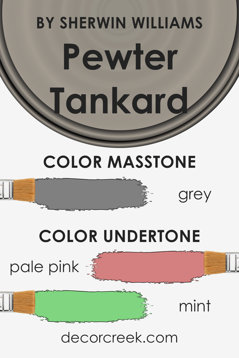
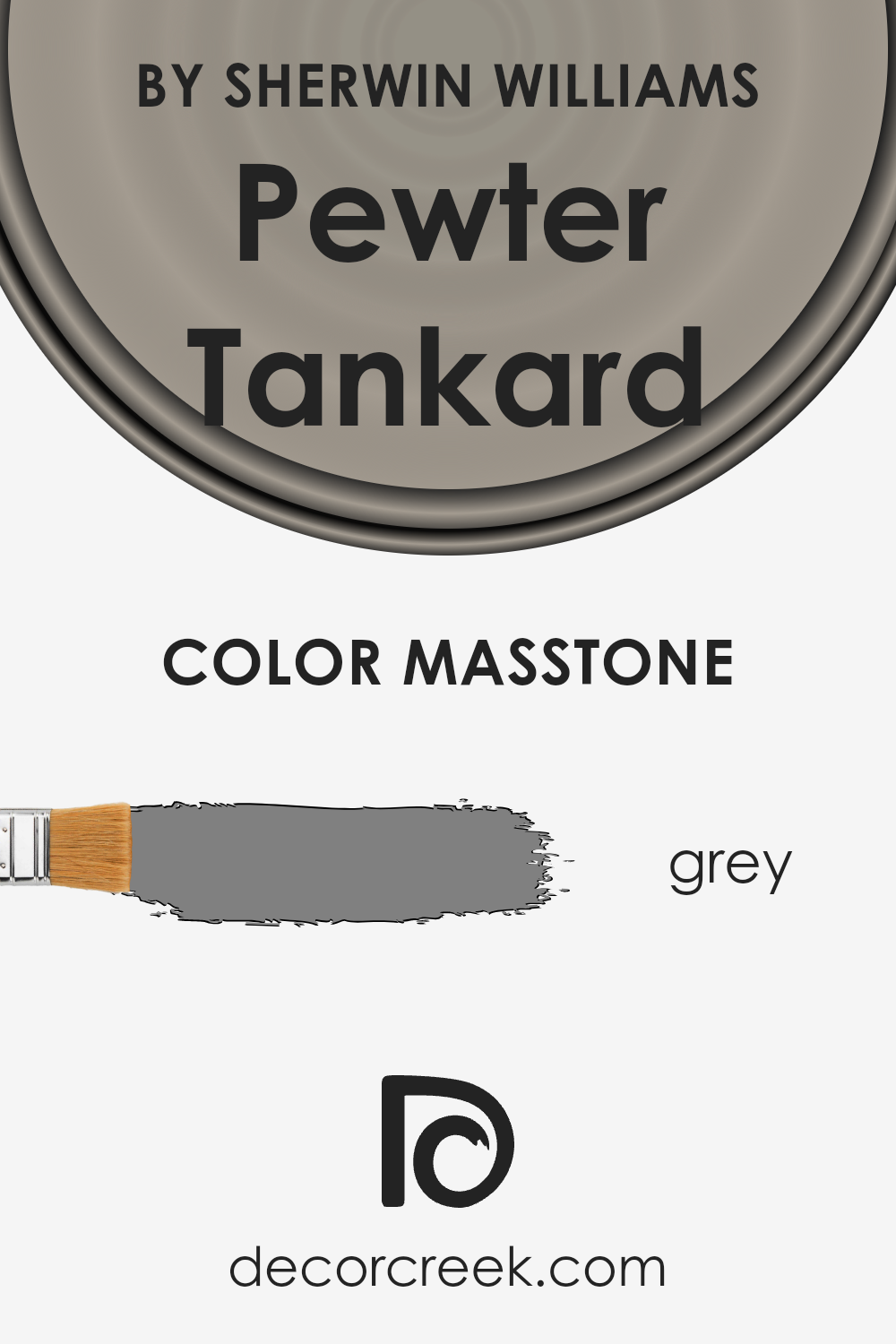
What is the Masstone of the Pewter Tankard SW 0023 by Sherwin Williams?
Pewter Tankard SW 0023 is a unique shade of grey that can make a big difference in homes. With its masstone being grey (#808080), it offers a neutral yet rich backdrop that works well in various settings.
This particular grey has a balanced tone that can make spaces feel more grounded and inviting. When used on walls, it can help rooms look more spacious and open, without making them feel cold or impersonal.
This color is versatile enough to complement a wide range of decor styles and color schemes.
Whether it’s a modern minimalist look or a cozy traditional setting, Pewter Tankard adds depth and character without overwhelming the space.
Its neutrality allows for vibrant accents to pop and softer hues to blend seamlessly. In spaces like living rooms and bedrooms, it can create a soothing atmosphere, helping them feel like comfortable retreats.
Overall, Pewter Tankard is a fantastic choice for bringing a subtle yet impactful warmth and sophistication into your home.
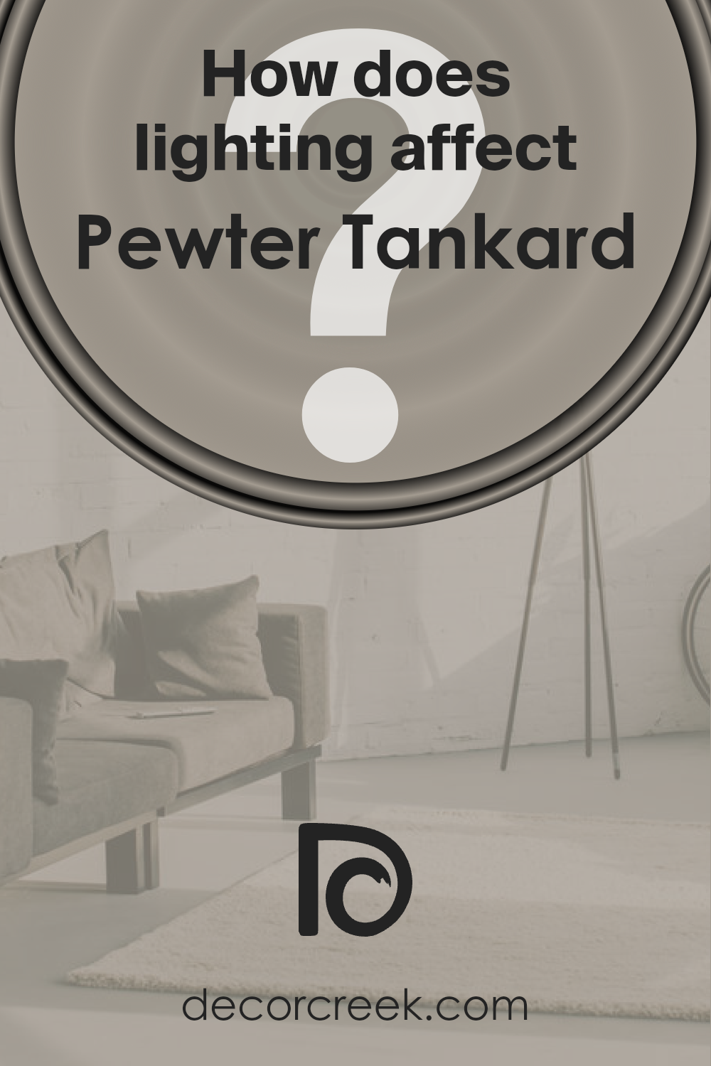
How Does Lighting Affect Pewter Tankard SW 0023 by Sherwin Williams?
Lighting has a big impact on how we see colors. It can change the way a color looks, making it appear lighter, darker, or even a different hue.
This is why the same wall color can look different throughout the day or in various rooms of your house. The color Pewter Tankard by Sherwin Williams is a great example to explore this effect.
It’s a versatile shade that can shift in appearance depending on the light it’s under.
In artificial light, such as LED or incandescent lighting, Pewter Tankard might appear warmer and more welcoming.
Artificial light, depending on its kind (warm or cool), can either enhance its gray tones, making the color seem cozier, or highlight its underlying hues, giving it a slightly different character.
Natural light, on the other hand, plays a fascinating role in displaying the true essence of Pewter Tankard. In rooms facing north, which receive less direct sunlight, the color can look cooler and more muted, emphasizing its subtle gray qualities.
This can create a serene and calm atmosphere, perfect for spaces meant for relaxation.
South-facing rooms get a lot of direct sunlight, making Pewter Tankard warm up and reveal its hidden warmth.
This creates a lively and inviting space, with the color looking more dynamic and rich under the bright, natural light.
East-facing rooms see the most change, with Pewter Tankard appearing gently warm and soft in the morning light, transforming the space into a welcoming area.
As the day progresses, and the direct sunlight fades, the color can return to its more neutral, calm state, providing a peaceful retreat.
West-facing rooms have the opposite effect. The color stays more true to its neutral, balanced self during the first part of the day when the sunlight is weaker.
In the late afternoon and evening, as sunlight intensifies, Pewter Tankard might appear bolder and more pronounced, making the room feel cozy and snug.
Understanding how lighting affects colors like Pewter Tankard can help in making informed decisions about paint choices for your rooms, ensuring the color works with the light to create your desired atmosphere.
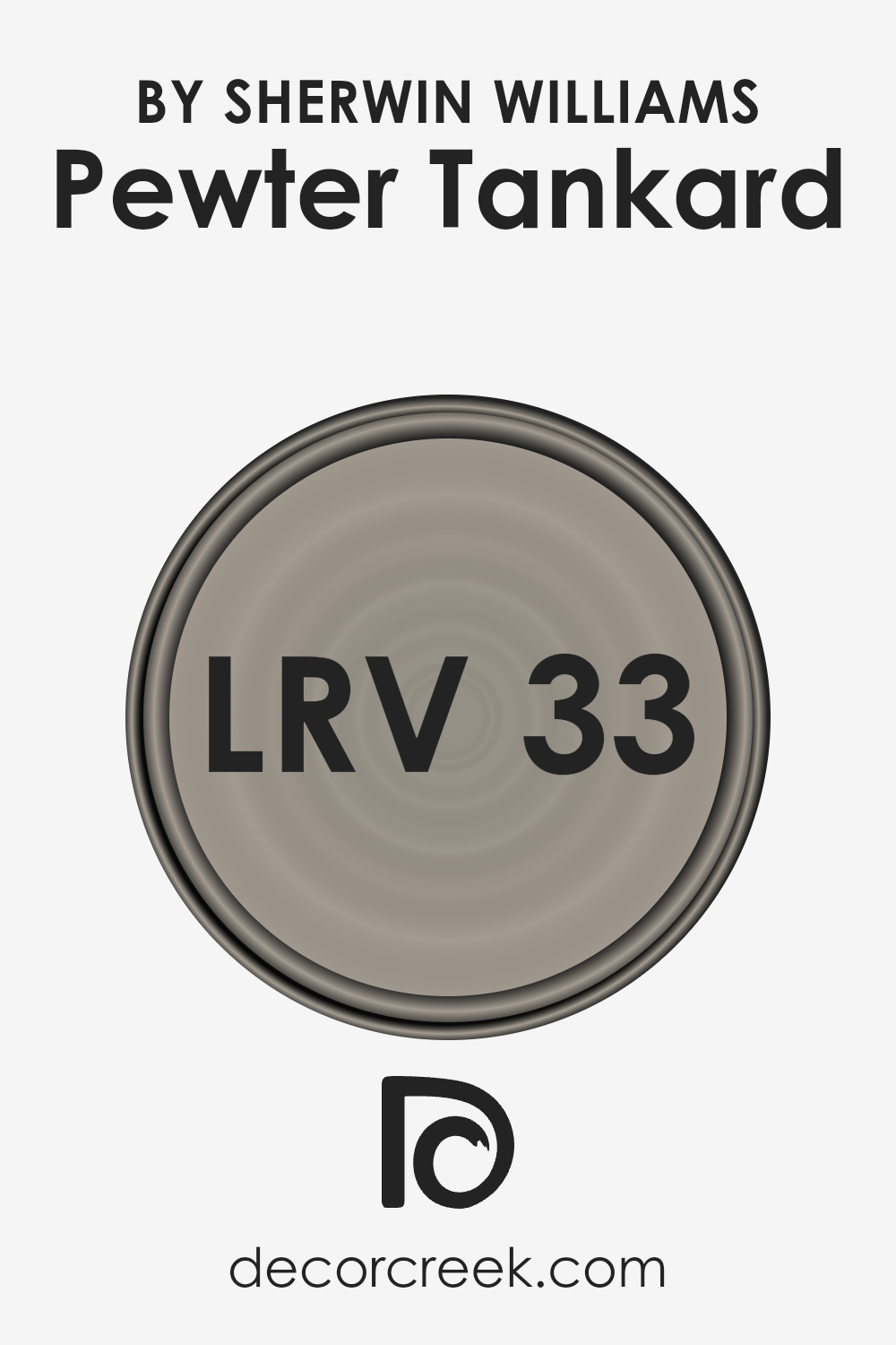
What is the LRV of Pewter Tankard SW 0023 by Sherwin Williams?
LRV, short for Light Reflectance Value, is a measurement used to show how much light a paint color reflects or absorbs.
Basically, it runs on a scale from 0 to 100, where 0 means total absorption (a perfectly black surface that doesn’t reflect any light) and 100 means complete reflection (a perfectly white surface that reflects all light).
This number helps in choosing paint colors because it gives us an idea of how light or dark a color will look on the walls of a room.
Higher LRV colors make a room feel brighter and more open because they reflect more light around the space, while lower LRV colors can make a room feel cozier or smaller because they absorb more light.
The LRV of Pewter Tankard, which is 33.144, puts it in the lower-mid range of light reflectance.
This means it’s neither too light nor too dark but falls into a comfortable medium where it can add depth and character to a space without making it feel too enclosed.
In practical terms, this LRV value indicates that Pewter Tankard will absorb more light than it reflects, which can create a warm, inviting atmosphere in a room, especially in spaces with adequate natural lighting where its unique color qualities can truly shine.
However, in smaller, darker spaces, care should be taken with lighting to ensure that the room doesn’t feel too dark.
LRV – what does it mean? Read This Before Finding Your Perfect Paint Color
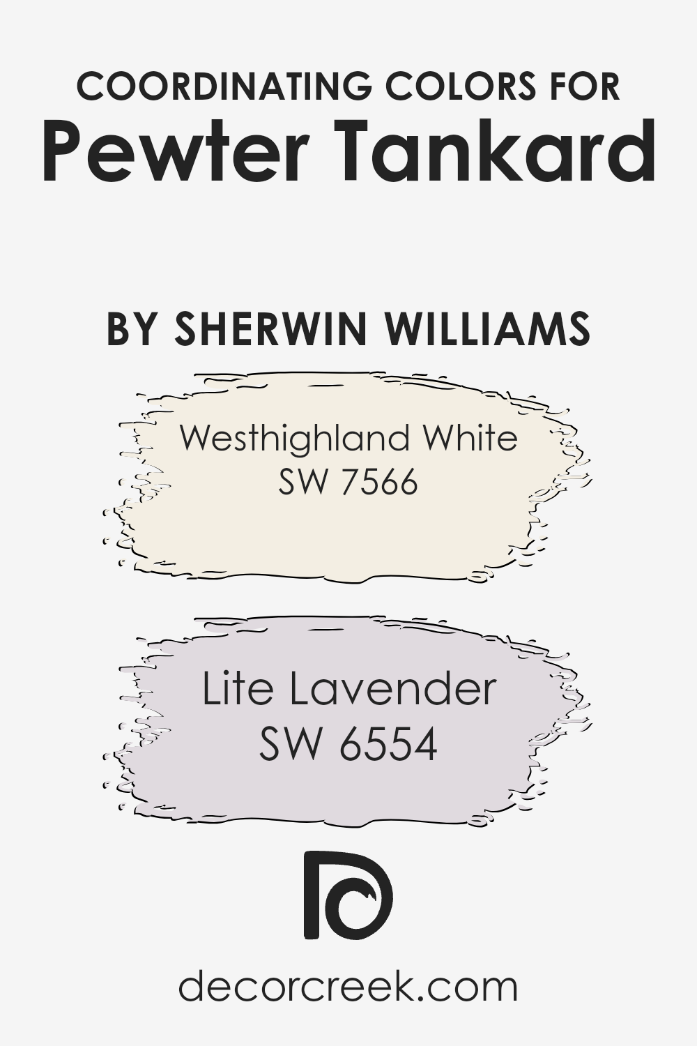
Coordinating Colors of Pewter Tankard SW 0023 by Sherwin Williams
Coordinating colors are hues that complement each other when used together in a room, creating a harmonious and pleasing effect.
They are selected based on their positions on the color wheel, their shades, tints, or tones, ensuring they enhance the aesthetic of the primary color without overshadowing it.
For example, when working with a sophisticated shade like Pewter Tankard by Sherwin Williams, finding the right coordinating colors can transform a space into a well-balanced and inviting area.
This specific shade is a versatile grey that acts as a perfect backdrop for a variety of coordinating colors.
One excellent coordinating color for Pewter Tankard is Westhighland White (SW 7566), which offers a clean and serene look, acting as a soft counterbalance to the deeper hues of Pewter Tankard.
Westhighland White is ideal for trim, ceilings, or even as a main wall color in adjacent rooms, providing a sense of continuity and brightness.
Another coordinating color, Lite Lavender (SW 6554), introduces a subtle hint of color, adding a unique and gentle layer of interest to the space.
This soft lavender works beautifully with Pewter Tankard, bringing in a touch of warmth and playfulness without overwhelming the space.
Together, these colors create a cohesive palette that enhances the beauty and depth of Pewter Tankard, offering a range of possibilities for decorating and styling.
You can see recommended paint colors below:
- SW 7566 Westhighland White
- SW 6554 Lite Lavender
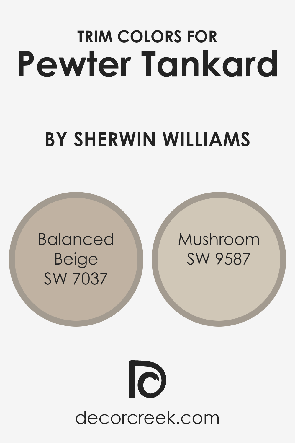
What are the Trim colors of Pewter Tankard SW 0023 by Sherwin Williams?
Trim colors are essentially the accents or finishes applied to the borders around windows, doors, and baseboards in a room, contrasting or complementing the main wall color to enhance the overall aesthetic appeal.
When considering Pewter Tankard by Sherwin Williams, a sophisticated and versatile shade, the choice of trim colors plays a crucial role.
The right trim color can subtly elevate the appearance of a room, defining and highlighting architectural details, or creating a seamless transition between spaces.
It’s not just about aesthetic appeal; trim colors can also influence the perception of space and proportion, making rooms feel more cohesive, spacious, or cozy depending on the chosen contrast or harmony with the wall color.
For Pewter Tankard, a hue that carries a depth and richness, trim colors like SW 7037 – Balanced Beige and SW 9587 – Mushroom are perfect complements.
Balanced Beige is a warm, inviting neutral that offers a soft contrast, gently framing the depth of Pewter Tankard without overpowering it, perfect for creating a harmonious and welcoming atmosphere.
On the other hand, Mushroom brings a slightly earthier tone into the mix, providing a subtle yet distinct boundary that enhances the sturdiness of spaces, adding character with its richer, grounded feel.
Both colors, in their own right, contribute to accentuating the sophisticated essence of Pewter Tankard, ensuring the space feels thoughtfully curated and pleasantly balanced.
You can see recommended paint colors below:
- SW 7037 Balanced Beige
- SW 9587 Mushroom
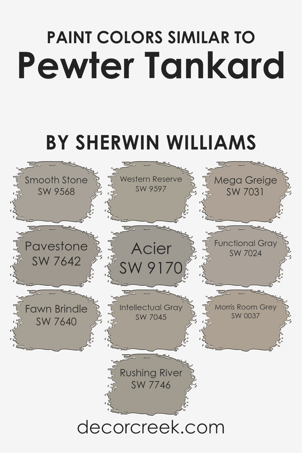
Colors Similar to Pewter Tankard SW 0023 by Sherwin Williams
Similar colors play a crucial role in creating a cohesive and harmonious look in any space, subtly tying together different elements and textures.
They work by sharing a common hue, intensity, or undertone, making it easier to mix and match décor and furnishings without the fear of clashing.
Especially when considering variations of a neutral color like Pewter Tankard by Sherwin Williams, choosing similar shades allows for a sophisticated layering effect, providing depth and interest to interiors.
These colors can effortlessly flow from one room to another, establishing a unified theme throughout the home.
Smooth Stone is a gentle hue, offering a soft backdrop that’s easy on the eyes, perfect for living spaces looking for a touch of warmth.
Pavestone has a stronger presence, giving a bit more weight to the walls it adorns, ideal for creating a focal point without overwhelming.
Fawn Brindle steps into the realm with a dusky quality, enveloping rooms in a cozy atmosphere, while Rushing River introduces a hint of movement with its slightly more dynamic tone.
Western Reserve, on the other hand, brings a subtle rustic charm, infusing spaces with a grounded, earthy feel. Acier, with its steely demeanor, offers a modern twist, perfect for sleek, contemporary designs.
Intellectual Gray whispers sophistication, blending effortlessly into mature, design-conscious settings. Mega Greige bridges the warm and cool divides, providing a versatile backdrop for any style.
Functional Gray, true to its name, delivers a no-fuss elegance that works well in utilitarian spaces.
Lastly, Morris Room Grey rounds out the selection with its historical depth, adding character and a sense of timelessness to interiors.
Together, these colors illustrate the power of similar hues in crafting visually appealing and cohesive spaces.
You can see recommended paint colors below:
- SW 9568 Smooth Stone
- SW 7642 Pavestone
- SW 7640 Fawn Brindle
- SW 7746 Rushing River
- SW 9597 Western Reserve
- SW 9170 Acier
- SW 7045 Intellectual Gray
- SW 7031 Mega Greige
- SW 7024 Functional Gray
- SW 0037 Morris Room Grey
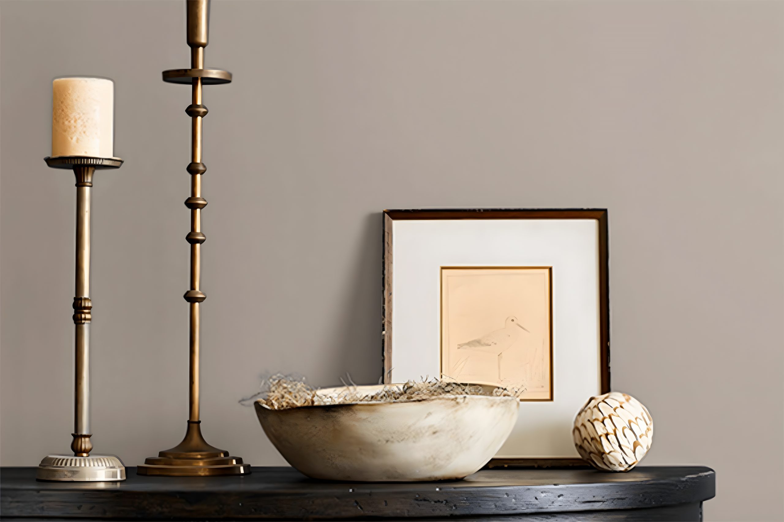
How to Use Pewter Tankard SW 0023 by Sherwin Williams In Your Home?
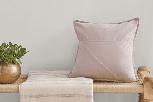
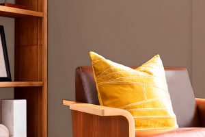
Pewter Tankard by Sherwin Williams is a versatile gray paint color that offers an easy and effective way to refresh your home’s look. This shade has a unique blend of gray tones that can make any room feel cozy and welcoming without overpowering the space.
Whether you want to give your living room a new vibe, make your bedroom a calm retreat, or even update your kitchen cabinets, Pewter Tankard can be a great choice.
Since it’s a neutral color, it pairs well with a wide range of other colors, from bright and bold to soft and subtle, allowing you to customize your space to match your personal style.
It can also serve as a stylish backdrop for art, furniture, and decor, highlighting these elements without stealing the spotlight. Using Pewter Tankard in your home can give your space a modern look while offering the flexibility to change your decor over time.
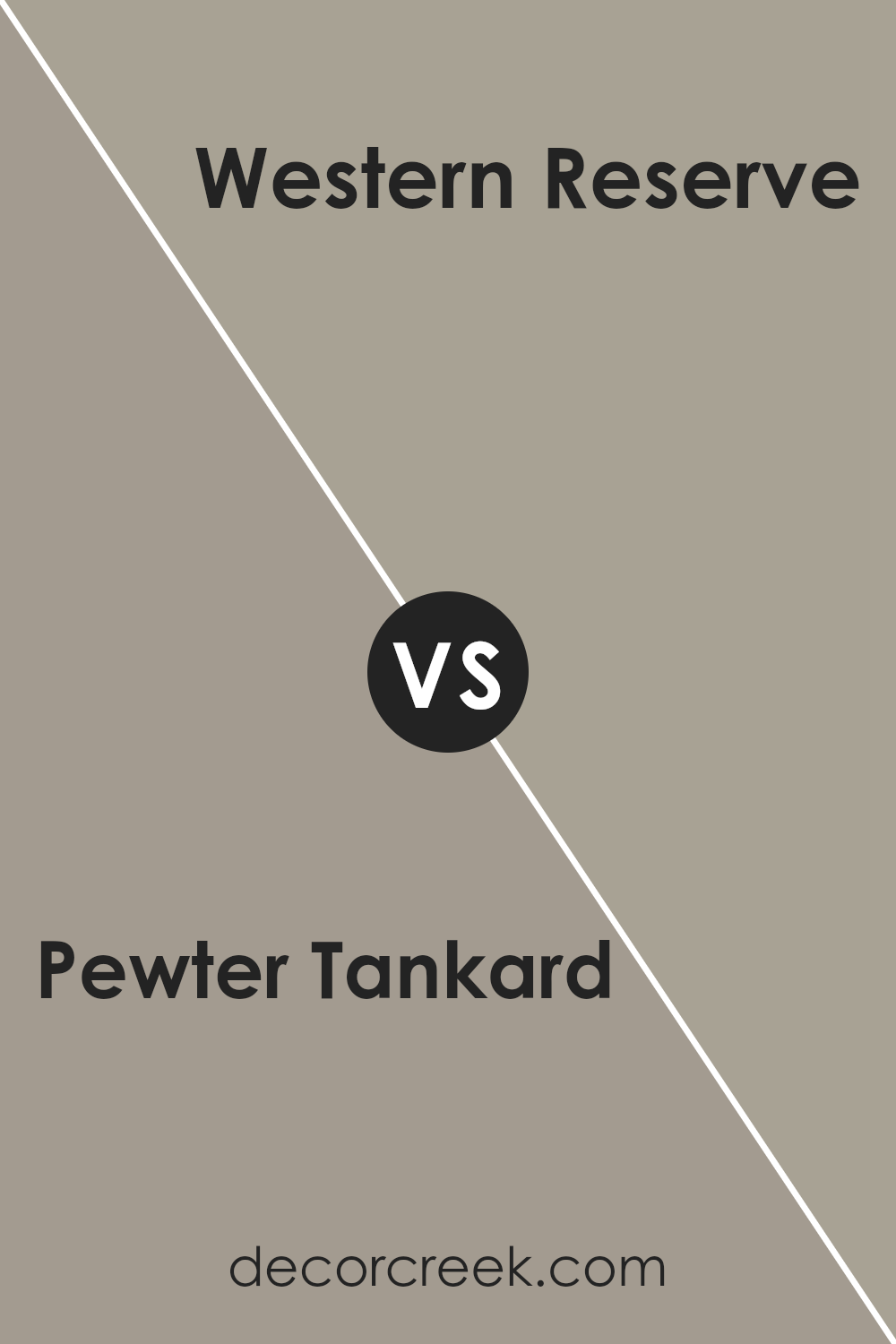
Pewter Tankard SW 0023 by Sherwin Williams vs Western Reserve SW 9597 by Sherwin Williams
Pewter Tankard and Western Reserve by Sherwin Williams are two unique colors with their own characteristics. Pewter Tankard is a versatile shade with a blend of gray and a touch of brown, giving off a warm, inviting vibe.
It’s a color that can easily complement various decor styles, making rooms feel cozy yet sophisticated. On the other hand, Western Reserve offers a deeper, richer tone.
This color leans towards a more traditional, classic look, providing spaces with a sense of elegance and depth.
Although both shades come from the same gray family, Pewter Tankard has a lighter, more neutral appeal, making it suitable for spaces you want to feel more open and airy.
In contrast, Western Reserve is perfect for creating a bold statement, ideal for accent walls or spaces where you want to add a bit of drama.
Both colors can make a room look stunning, but your choice depends on the atmosphere you’re aiming to achieve.
You can see recommended paint color below:
- SW 9597 Western Reserve
Pewter Tankard SW 0023 by Sherwin Williams vs Morris Room Grey SW 0037 by Sherwin Williams
Pewter Tankard and Morris Room Grey, both by Sherwin Williams, are unique shades of grey, each with its own character. Pewter Tankard has a warmer, slightly darker tone, making it perfect for cozy, inviting spaces.
It’s like a soft, warm blanket, offering comfort and a touch of sophistication to any room. On the other hand, Morris Room Grey is cooler and lighter, bringing a crisp, fresh feel.
It’s like the first breath of fresh air on a cool morning, making spaces feel more open and serene. While Pewter Tankard adds a feeling of warmth and depth, Morris Room Grey gives a more airy and refreshing vibe.
These differences make Pewter Tankard ideal for areas where you want to relax and unwind, whereas Morris Room Grey fits perfectly in spaces that aim to be calm, clear, and light-filled.
Both colors offer unique atmospheres, depending on what feeling you want to create in your space.
You can see recommended paint color below:
- SW 0037 Morris Room Grey
Pewter Tankard SW 0023 by Sherwin Williams vs Acier SW 9170 by Sherwin Williams
Pewter Tankard and Acier, both by Sherwin Williams, are two unique shades that offer distinct vibes to any space. Pewter Tankard is a warmer, deeper gray with a touch of brown, giving it a cozy, inviting feel.
It’s like wrapping yourself in a soft blanket on a cool evening. This color shines in spaces where you want a touch of sophistication without going too dark or overpowering.
Acier, on the other hand, is a cooler, lighter gray. It’s more neutral and versatile, giving off a sleek and modern vibe. It fits well in a variety of settings, from living rooms to bedrooms, adapting easily to different decor styles.
Acier can make small spaces appear larger and more open, thanks to its light-reflecting qualities.
Despite their differences, both colors maintain a certain level of understated elegance. Pewter Tankard brings warmth and depth, while Acier offers a crisp, airy feel.
Depending on what atmosphere you’re aiming for, either shade could be the perfect choice for your space.
You can see recommended paint color below:
- SW 9170 Acier
Pewter Tankard SW 0023 by Sherwin Williams vs Functional Gray SW 7024 by Sherwin Williams
Pewter Tankard is a unique shade that lands somewhere between a gentle gray and a soft, muted brown. It’s a versatile color that can add warmth to a space while keeping the feel quite grounded and calm.
On the other hand, Functional Gray is a true gray that leans slightly cooler compared to Pewter Tankard. It’s a solid choice for those looking for a more classic gray that can easily blend with various decor styles, providing a modern and sleek look.
While both colors come from the same family, Pewter Tankard brings in a hint of warmth and coziness, making it ideal for living areas or bedrooms where you want to create a more inviting atmosphere.
Functional Gray, with its cooler undertones, is perfect for spaces that aim for a more contemporary edge, like kitchens or bathrooms.
Choosing between the two ultimately depends on the mood and style you want to achieve in your space.
Pewter Tankard offers a softer and warmer look, whereas Functional Gray delivers a cleaner and more straightforward gray experience.
You can see recommended paint color below:
Pewter Tankard SW 0023 by Sherwin Williams vs Pavestone SW 7642 by Sherwin Williams
Pewter Tankard and Pavestone are both colors by Sherwin Williams, but they offer distinct vibes for any space. Pewter Tankard is a unique gray with a warm, soft undertone.
It’s like the color of a cloudy sky that promises a little sunlight might sneak through. It’s gentle and inviting, making rooms feel cozy yet spacious.
On the other hand, Pavestone leans towards a cooler, stonier gray. It’s reminiscent of natural stone, giving a serene, calming effect to walls. This color is great for creating a peaceful, solid background that makes your furniture and decor pop.
While Pewter Tankard brings warmth and a hint of brightness into a room, Pavestone offers a more grounded, earthy feel.
If you want a room to wrap you up in a warm hug, Pewter Tankard is your go-to. But, if you’re aiming for a calm, collected atmosphere, Pavestone has got your back.
Both colors play well with lots of lighting situations and pair nicely with a wide range of decor styles.
You can see recommended paint color below:
Pewter Tankard SW 0023 by Sherwin Williams vs Rushing River SW 7746 by Sherwin Williams
Pewter Tankard and Rushing River are both colors by Sherwin Williams, but they offer different vibes for your space. Pewter Tankard is a muted gray with a touch of warmth, making it versatile for many settings.
It’s like a cozy, gray blanket – comforting and soft, but still stylish. Think of it as a neutral background that can let other colors pop or stand strong on its own for a minimalist look.
On the other side, Rushing River has a cooler, more greenish-blue tint. It’s reminiscent of a serene, flowing river, bringing a calm and refreshing feel to any room.
This color leans towards nature, creating a feeling of tranquility and freshness. It’s perfect for spaces where you want to add a touch of calmness without going too bold.
In comparison, while both colors bring their unique charm, Pewter Tankard offers a warmer, cozier feel suitable for creating a snug ambience.
In contrast, Rushing River introduces a crisper, more refreshing vibe, ideal for a calming retreat. Choosing between them depends on the mood you’re aiming to achieve in your space.
You can see recommended paint color below:
- SW 7746 Rushing River
Pewter Tankard SW 0023 by Sherwin Williams vs Fawn Brindle SW 7640 by Sherwin Williams
Pewter Tankard and Fawn Brindle, both by Sherwin Williams, are unique colors offering distinctive vibes for your walls.
Pewter Tankard sits on the cooler side of the spectrum, echoing a steely grey with hints of warmth, making it versatile for rooms needing a balanced, neutral backdrop.
Think of it as a cozy grey that doesn’t feel too cold. On the other hand, Fawn Brindle steps into a warmer territory. It’s like a soft hug from a warm, taupe-grey that brings an inviting warmth to any space.
This color feels more like a gentle, welcoming blanket, perfect for creating a snug and homely atmosphere.
While Pewter Tankard might remind you of a cloudy sky, Fawn Brindle evokes the warmth of sun-kissed earth. Each has its charm, either bringing a cool elegance or a warm embrace to a room without making it feel overwhelming.
Whether looking for a cooler, sophisticated edge or a cozy, enveloping feel, your choice between these two can significantly affect the mood and style of your space.
You can see recommended paint color below:
- SW 7640 Fawn Brindle
Pewter Tankard SW 0023 by Sherwin Williams vs Intellectual Gray SW 7045 by Sherwin Williams
Pewter Tankard and Intellectual Gray are two popular shades by Sherwin Williams, each with its unique charm. Pewter Tankard is a mid-tone gray with a subtle brown undertone, giving it a warm, versatile appearance.
This color works well in spaces where you want a cozy yet sophisticated feel. It’s like a soft, inviting blanket, perfect for creating a comfortable atmosphere.
On the other hand, Intellectual Gray has a lighter, more subdued look. This color leans towards a soft, elegant gray with a hint of green undertone.
It’s excellent for rooms needing a touch of calmness and serenity, reflecting a sense of tranquility. Intellectual Gray is like a gentle whisper in a room, adding a sophisticated and soothing touch without overpowering the space.
Both colors offer a beautiful palette for interiors, but their differences lie in their warmth and depth.
Pewter Tankard brings a richer, warmer feel, ideal for welcoming spaces, while Intellectual Gray provides a light, refreshing touch, perfect for creating a serene environment.
You can see recommended paint color below:
Pewter Tankard SW 0023 by Sherwin Williams vs Mega Greige SW 7031 by Sherwin Williams
Pewter Tankard and Mega Greige, both from Sherwin Williams, offer distinct shades that can beautifully enhance your space. Pewter Tankard is a versatile gray with a deep, warm undertone.
It’s like a cloudy sky before a storm, offering a cozy yet robust vibe to any room. This color works great in spaces where you want a bit of sophistication without going too dark.
On the other hand, Mega Greige has a softer approach. It’s a perfect blend of gray and beige, making it the ideal neutral.
This color is like the warm, sandy edge of a beach that comfortably fits into almost any setting, providing a light, welcoming atmosphere. It’s especially good in areas where you want to add warmth without sacrificing the clean, open feel of a room.
In a nutshell, Pewter Tankard brings a deeper, more dramatic mood, perfect for creating a statement. Mega Greige, conversely, offers a lighter, more subtle touch, excellent for a calm and inviting space.
You can see recommended paint color below:
Pewter Tankard SW 0023 by Sherwin Williams vs Smooth Stone SW 9568 by Sherwin Williams
Pewter Tankard is a deeper, gray shade with a hint of warmth, making it cozy and flexible for various spaces.
Think of it as a color that brings a subtle, soothing mood to a room without overwhelming it. It’s like the gray you see in stones by a river, natural and calming.
Smooth Stone, on the other hand, is lighter and leans towards a cooler, more neutral gray.
It’s the kind of color that brightens up a space gently, giving it a fresh and airy feel. Imagine the soft color of pebbles on a beach under the morning sun.
Both colors are from Sherwin Williams, and while they share the gray family resemblance, they set quite different tones.
Pewter Tankard is your go-to for a cozy, grounded atmosphere, whereas Smooth Stone is perfect if you’re aiming for a lighter, more refreshing vibe.
Whether you prefer the depth and warmth of Pewter Tankard or the light and cool essence of Smooth Stone depends on the mood you want to create in your space.
You can see recommended paint color below:

Conclusion
Pewter Tankard by Sherwin Williams is a unique color that has found its place in many homes due to its versatility and warmth.
This gray shade with a hint of brown offers a soothing presence in any space, making it a popular choice for those looking to create a cozy yet sophisticated ambiance.
Whether applied in living rooms, bedrooms, or even in kitchen cabinets, Pewter Tankard serves as a neutral backdrop that pairs well with a wide range of decor styles and colors, providing a timeless look that remains stylish over the years.
The adaptability of Pewter Tankard means it can be used in various lighting conditions, always presenting itself in the best possible way.
In spaces with abundant natural light, it reveals a soft, welcoming glow, while in areas with limited light, it contributes depth and warmth.
Homeowners and designers alike appreciate how this color seamlessly blends with other elements in a room, making it easy to achieve a harmonious design.
Whether you’re looking for a color to refresh your walls or to add a touch of elegance to your furniture, Pewter Tankard stands out as a reliable and attractive option.
Ever wished paint sampling was as easy as sticking a sticker? Guess what? Now it is! Discover Samplize's unique Peel & Stick samples.
Get paint samples