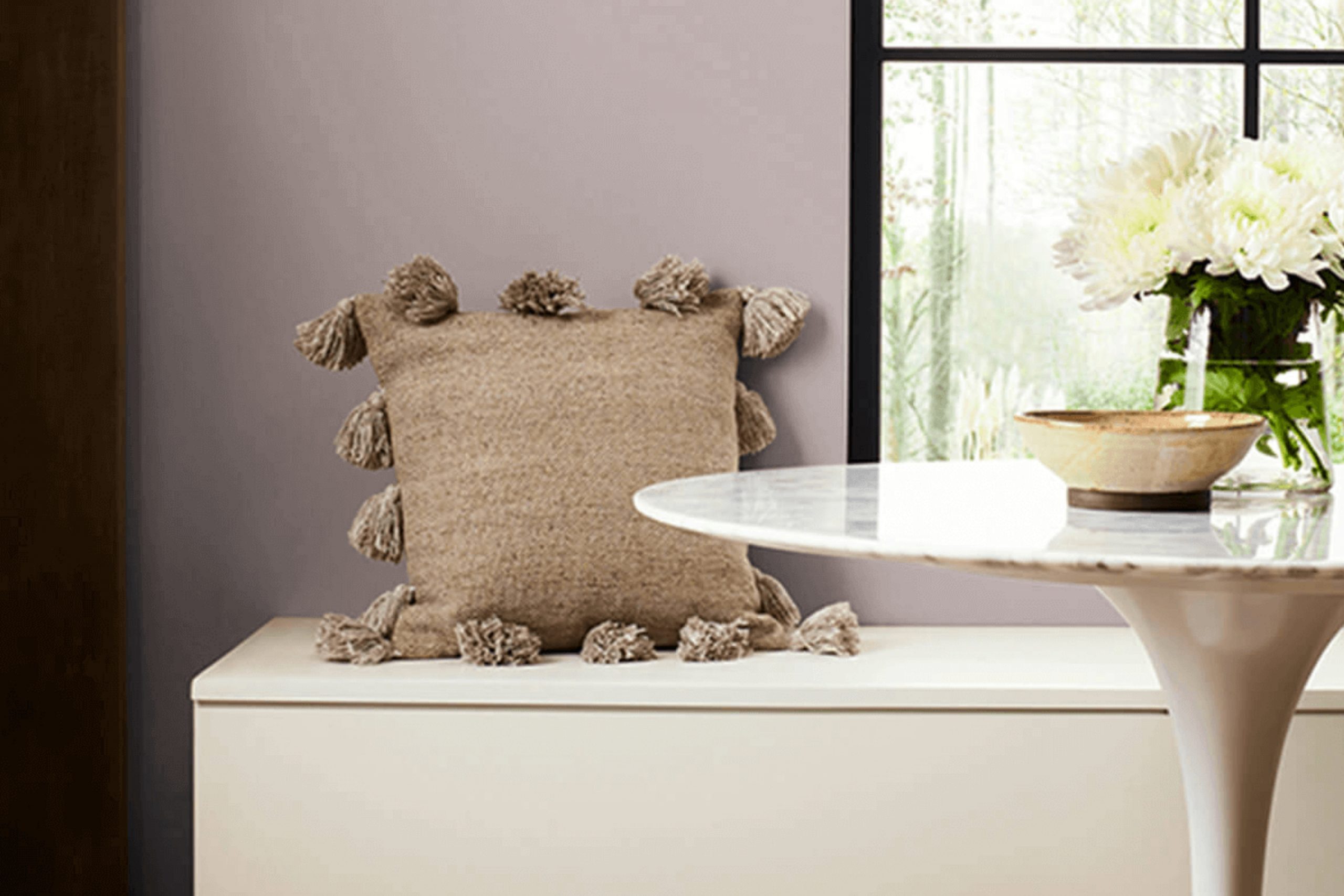
Choosing the perfect paint color for your home can often feel challenging with all the options out there. But if you’re considering a adaptable shade that balances well with both warm and cool tones, SW 6010 Flexible Gray by Sherwin Williams might just be the ideal choice for you. I recently decided to give my own living room a makeover, and after skimming through countless swatches, Flexible Gray stood out as a clear winner.
This particular gray has a unique ability to adapt to various lighting conditions, appearing more as a subtle slate in natural light while exuding a softer, more delicate hue under artificial lighting. It effortlessly complements a wide range of décor styles, from modern minimalism to cozy traditional, making it a go-to for anyone looking to refresh their room without committing to a bold color that could quickly go out of style.
I’ll walk you through how Flexible Gray can enhance different rooms in your home and why it maintains its popularity among homeowners and interior designers alike.
Whether you’re aiming to create a calm workspace or a welcoming living area, this color offers the flexibility needed to achieve your aesthetic goals, acting as a foundational tone that supports a variety of design elements.
What Color Is Flexible Gray SW 6010 by Sherwin Williams?
Flexible Gray by Sherwin Williams is a adaptable paint color with a balanced blend that can lighten up a room while still bringing depth and warmth. This shade of gray is not too dark or too light, making it just right for areas where you want a modern yet cozy atmosphere. Its neutral tone serves as a perfect backdrop that can complement various design aesthetics, from minimalist to rustic and even industrial styles.
In terms of interior styles, Flexible Gray works particularly well in contemporary and modern settings due to its clean and understated vibe. However, it’s also a great match for transitional areas where elements of traditional and modern decor mix. Its neutrality allows for flexibility in pairing with both bold and subdued color schemes.
When it comes to materials, this gray pairs beautifully with natural wood, helping to bring out its rich, organic textures. It also looks stunning with metals like brushed nickel or stainless steel, offering a sleek look that’s ideal for kitchen or bathroom fixtures. Textures like soft linen or smooth leather also complement this color well, adding to the overall sense of comfort and style in any room. This color is a smart choice for those looking to create a stylish yet adaptable area.
Is Flexible Gray SW 6010 by Sherwin Williams Warm or Cool color?
Flexible Gray SW 6010 by Sherwin Williams is a adaptable paint color that enhances the look and feel of any room in a home. This shade of gray balances perfectly between a cool and warm tone, making it an excellent choice for various decorating styles.
Whether you have a modern minimalist home or a cozy traditional setting, Flexible Gray fits right in. It works well in areas that get a lot of sunlight as well as in darker rooms, as it helps to brighten areas naturally. When paired with bright colors, it allows them to pop, yet it can also create a calm, understated look when matched with other neutrals.
This adaptability makes it a go-to color for homeowners who enjoy updating their decor frequently without having to repaint every time. Overall, Flexible Gray is practical for living rooms, bedrooms, and even kitchens, adding a fresh, clean backdrop to your living area.
Undertones of Flexible Gray SW 6010 by Sherwin Williams
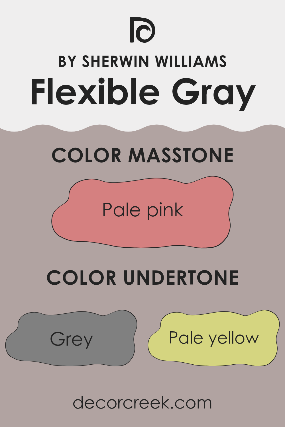
Flexible Gray is a adaptable paint color that subtly incorporates various undertones, influencing how it’s perceived in different settings. The main undertones of this shade include a mix of both cool and warm tones: gray, pale yellow, light purple, mint, lilac, light gray, light blue, orange, pink, olive, yellow, purple, fuchsia, light green, violet, red, and brown.
Each undertone plays a role in how Flexible Gray looks on an interior wall, affecting the mood and style of a room. For instance, gray and light gray provide a calm base that is widely fitting for any room. However, the addition of subtle hues like pale yellow or mint can warm up the area or add a fresh feel, respectively.
When painted on walls, these undertones can emerge depending on the lighting and surrounding colors. Natural light could highlight the cooler undertones like lilac or light blue, creating a soothing effect ideal for bedrooms or bathrooms. Artificial light, on the other hand, might draw out warmer tones like orange or pink, adding warmth to living rooms or dining areas. The complex mix of undertones in Flexible Gray makes it a forgiving color that adapts well to different decors and styles.
From a practical standpoint, this means the color can easily align with various furniture pieces and fabrics, ranging from modern metal accents to classic wooden finishes, without clashing or feeling out of place. The multitude of undertones in this shade ensures it can suit many tastes and settings, making it a popular choice for those looking to refresh their home interiors.
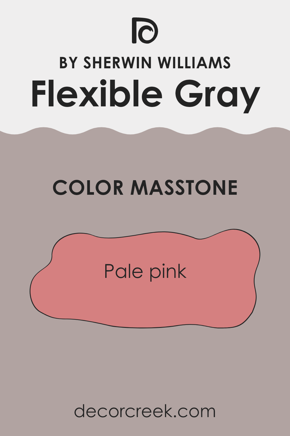
What is the Masstone of the Flexible Gray SW 6010 by Sherwin Williams?
Flexible Gray SW 6010, despite its name, actually shows a masstone, or main tone, of pale pink. This soft pink hue provides a warm and inviting atmosphere in any room. Using it in homes adds a gentle touch of color that isn’t intense, making it perfect for creating cozy areas.
This color works well in spots like living rooms or bedrooms where comfort is key. It’s also light enough to help small areas appear slightly larger and more open. Additionally, this pale pink pairs easily with many other colors, allowing for adaptable design choices.
It complements whites, greys, and even darker shades like navy or black, offering beautiful contrast. Furniture and decor in natural wood tones or metallic finishes also look striking against this subtle backdrop. Homeowners appreciate this flexibility because it allows for personalization in decorating without committing to bold colors that might be harder to match or update later.
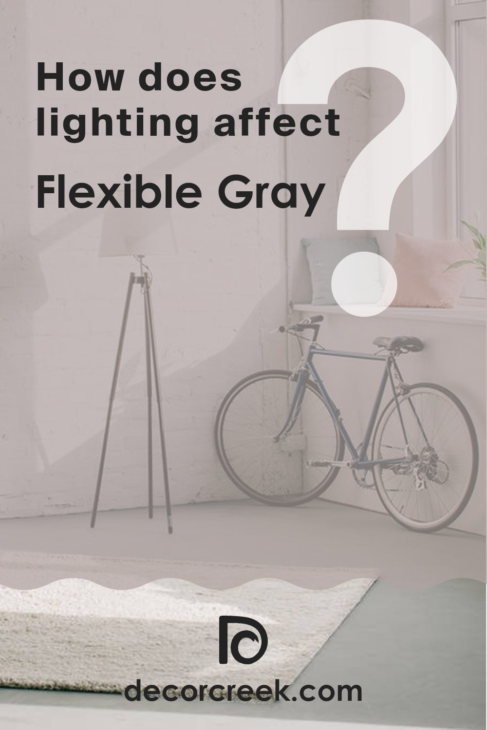
How Does Lighting Affect Flexible Gray SW 6010 by Sherwin Williams?
Lighting plays a crucial role in how colors are perceived in any area. Depending on whether light is natural or artificial, the same color can look different. Let’s consider the color Flexible Gray by Sherwin Williams and how lighting affects its appearance.
In artificial light, colors can either be warmed up or cooled down depending on the light bulb used. For Flexible Gray, under warm artificial lighting, it tends to appear softer and slightly more beige, giving a room a cozy feel. Under cooler artificial lighting, however, the gray becomes more pronounced, giving a sharper, cleaner look.
In natural light, the appearance of Flexible Gray varies throughout the day and depends on the direction of the room’s windows. In north-facing rooms, which don’t receive direct sunlight and have cooler light, Flexible Gray will show its true gray nature, providing a consistent and neutral backdrop. It remains subtle and does not overpower the area.
South-facing rooms enjoy abundant light for most of the day, which can make Flexible Gray look lighter and slightly warm, enhancing its inviting qualities. The paint color adapts to the bright, sunny atmosphere, reflecting a lot of natural light and giving the room an airy feel.
In east-facing rooms, the morning light can make Flexible Gray look soft and warm, perfect for starting the day with a calm, gentle vibe. As the day progresses and the natural light diminishes, the color may shift back to cooler gray tones.
West-facing rooms will experience the opposite effect. The color will appear cooler in the morning and then gain warmth in the late afternoon and evening as sunlight fills the room, highlighting warmer tones in the paint.
Overall, Flexible Gray is a adaptable color that adjusts well in various lighting settings, changing subtly to fit the mood of each room as the light changes.
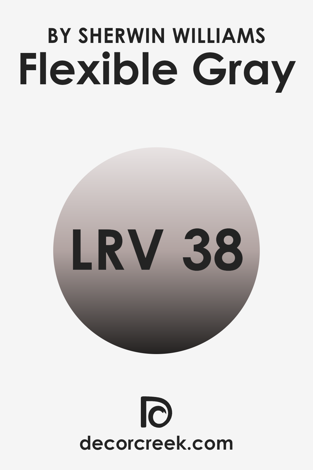
What is the LRV of Flexible Gray SW 6010 by Sherwin Williams?
LRV, or Light Reflectance Value, is a measure that indicates how much light a paint color reflects back into a room. This value is expressed on a scale from 0 to 100, with 0 being completely black (absorbing all light) and 100 being pure white (reflecting all light). Color choices matter because they influence the mood, perceived size, and lighting of a room.
A higher LRV can make an area appear larger and brighter because it reflects more light, while a lower LRV tends to create a cozier and more intimate atmosphere, absorbing more light. The LRV for the color mentioned, which is 38.126, means it’s on the darker side of the scale, meaning it will absorb more light than it reflects.
This can affect the appearance of an area by making it feel smaller or more enclosed. However, it also adds richness and depth to the area, providing a strong character that lighter colors might not achieve. When using this color on walls, it is ideal for larger or well-lit areas to prevent the area from feeling too dark. Bright accents and furnishings can also balance the darkness of the walls, creating an appealing contrast.
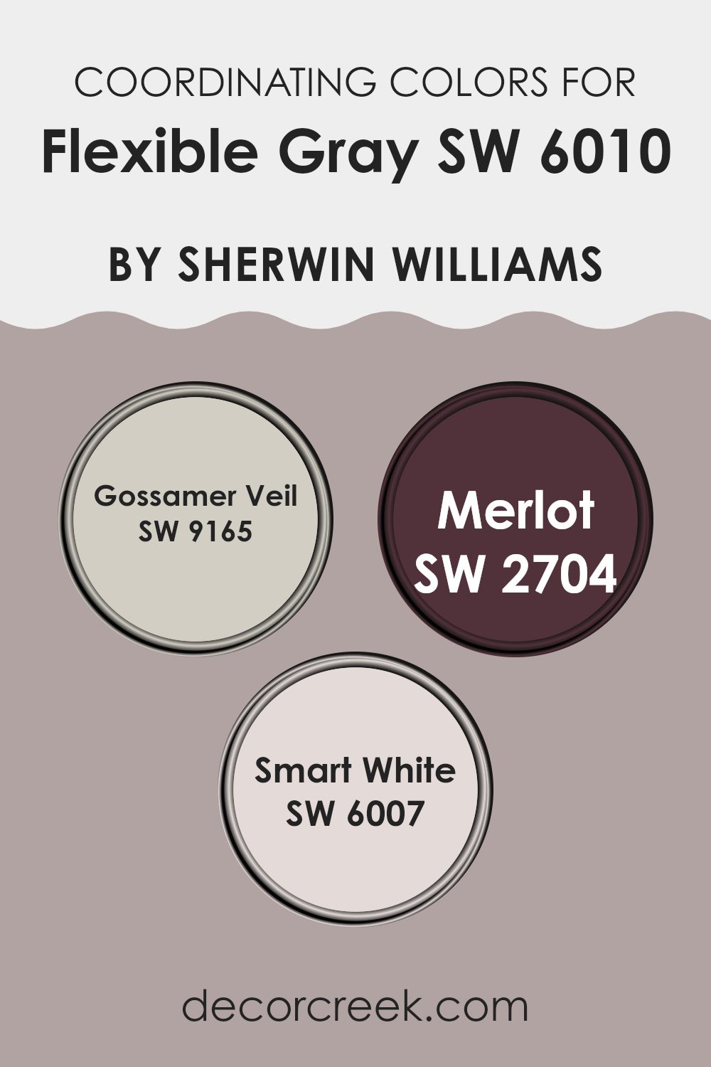
Coordinating Colors of Flexible Gray SW 6010 by Sherwin Williams
Coordinating colors are complementary shades that work well together to enhance the overall appearance of an area when used alongside a base color. In the case of Flexible Gray by Sherwin Williams, three coordinating colors that complement it are Gossamer Veil, Merlot, and Smart White. These colors not only balance each other out but also help in creating a harmonious and balanced visual impact. By selecting these color pairings, you can effortlessly create a cohesive look throughout a room or home.
Gossamer Veil is a soft, warm neutral tone that serves as an excellent backdrop for various decor styles and pairs beautifully with the understated elegance of Flexible Gray. It’s subtle enough not to overpower, yet offers a distinct presence that adds depth to any area. On the other end of the spectrum, Merlot is a rich, deep red color that provides a striking contrast to Flexible Gray’s muted tones.
This bold hue can inject energy and drama into an area, making it perfect for accent walls or decorative accessories. Lastly, Smart White is a crisp and clean shade, ideal for trim, ceilings, and woodwork, enhancing the other colors’ features and ensuring the area feels bright and airy. Using these coordinating colors, you can create an inviting and well-balanced color scheme in your decorating projects.
You can see recommended paint colors below:
- SW 9165 Gossamer Veil
- SW 2704 Merlot
- SW 6007 Smart White
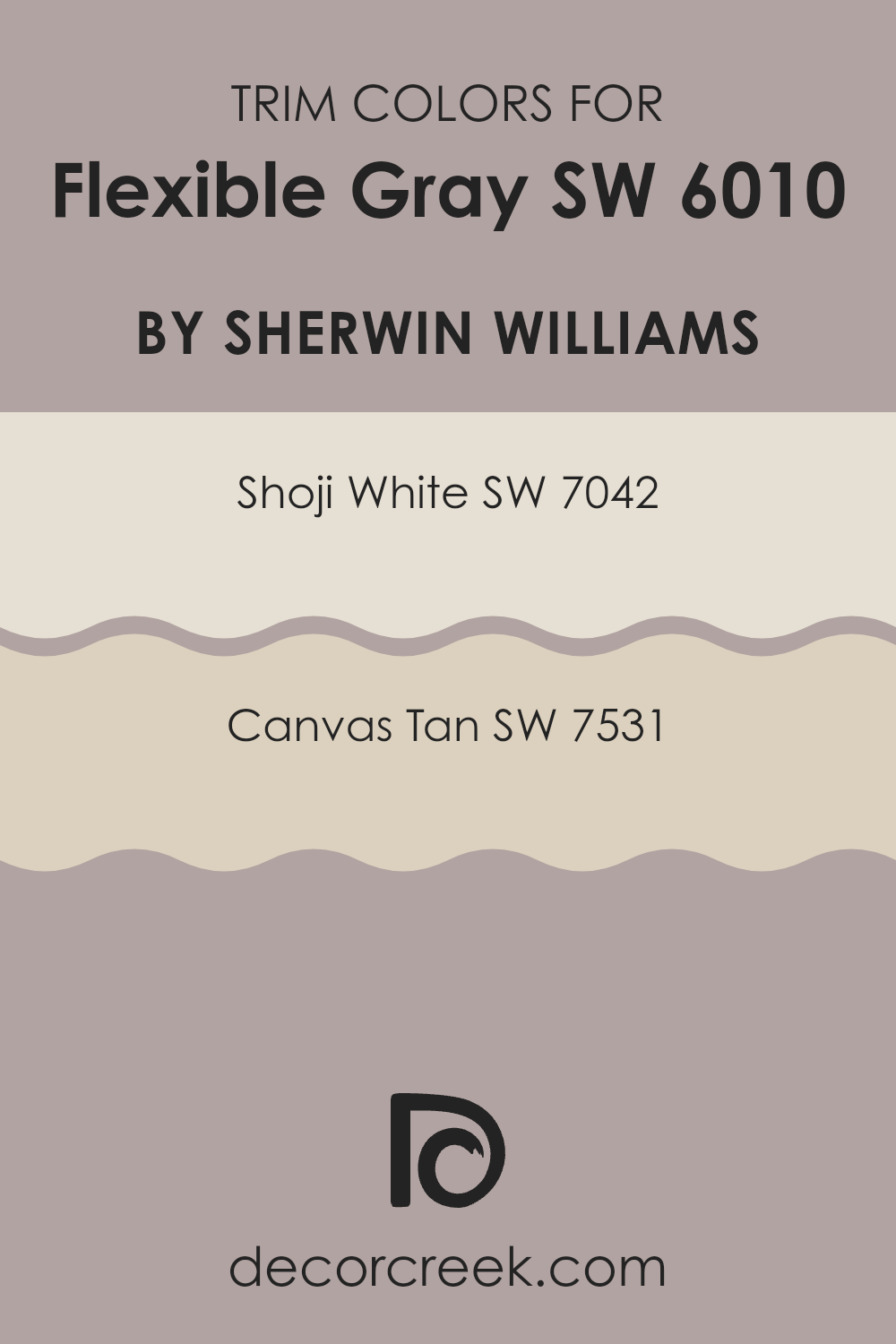
What are the Trim colors of Flexible Gray SW 6010 by Sherwin Williams?
Trim colors are specific shades used to accentuate or frame various elements like doors, window frames, baseboards, and crown molding, which differentiates them from the main wall color, enhancing overall aesthetic appeal. For a neutral but strong base like Flexible Gray by Sherwin Williams, selecting the right trim colors can significantly impact the perception of the area, making it appear more polished and well-thought-out.
Shoji White and Canvas Tan are two trim colors that beautifully complement this shade of gray. Shoji White SW 7042 is a gentle off-white with a warm undertone that provides a subtle contrast against Flexible Gray, making the features of the area pop without overpowering the main hue.
Canvas Tan SW 7531, on the other hand, offers a deeper, beige color that adds a touch of warmth, tying in beautifully with the cooler tones of Flexible Gray to create a welcoming and balanced environment. Both colors work harmoniously to highlight the architectural features of an area while maintaining a coherent and inviting look.
You can see recommended paint colors below:
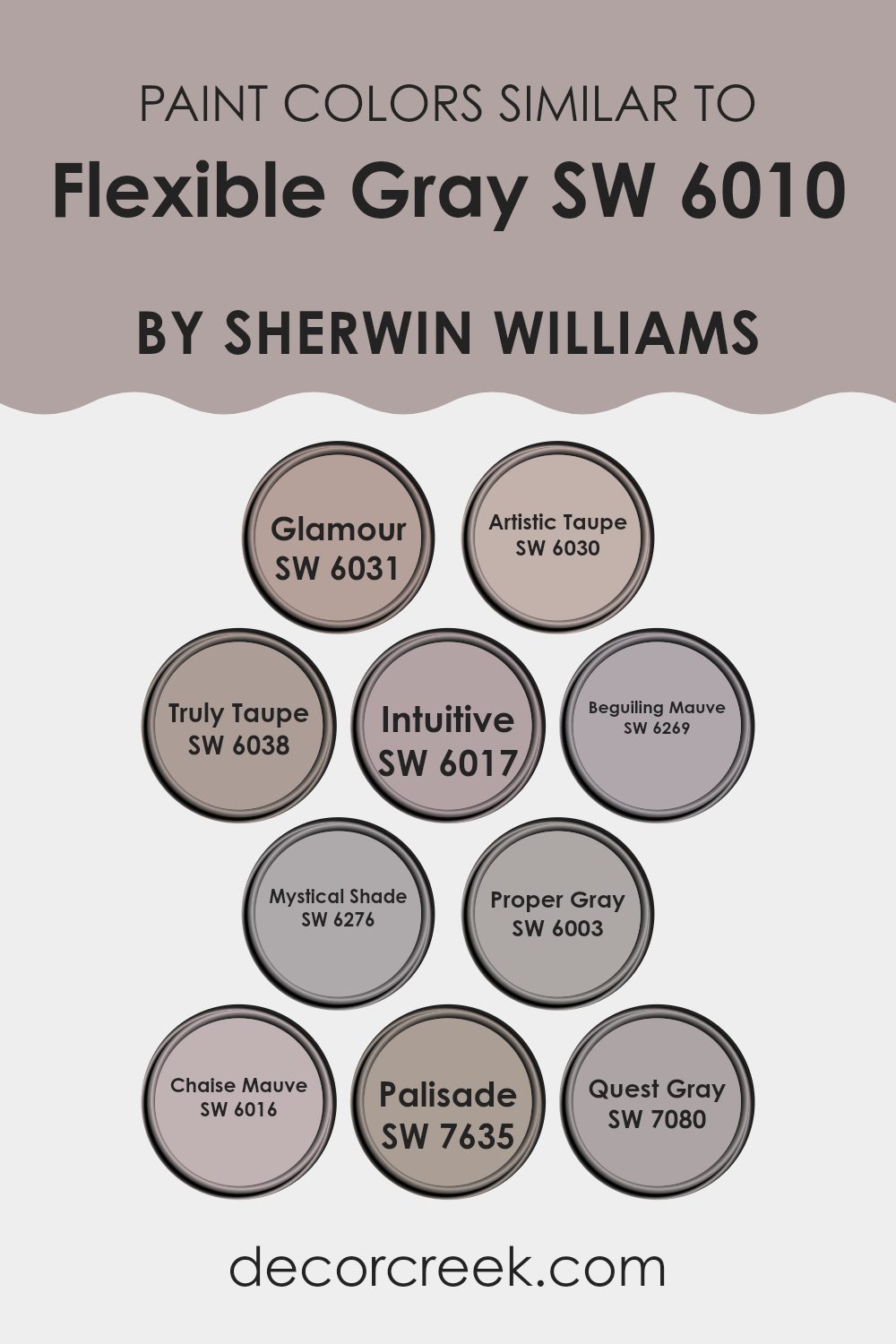
Colors Similar to Flexible Gray SW 6010 by Sherwin Williams
Choosing similar colors for a paint project or room design is crucial because it ensures a cohesive and harmonious look. Colors that closely complement each other create a subtle visual flow, making areas feel more balanced and unified without harsh contrasts. This resemblance in hues can also enhance the aesthetic appeal of a room by softly blending the walls with the decor, thereby providing a soothing visual experience.
For example, SW 6031 – Glamour, a muted peony pink, offers a gentle pop of softness that aligns closely with deeper shades like SW 6030 – Artistic Taupe, a warm, earthy tone, to produce a nurturing and welcoming atmosphere. SW 6038 – Truly Taupe brings a slightly grayer touch, marrying well with surrounding elements for a refined look.
Then there’s SW 6017 – Intuitive, a light pastel lavender that provides a hint of whimsical color while still maintaining a laid-back vibe. SW 6269 – Beguiling Mauve and SW 6276 – Mystical Shade are deeper mauve shades that add depth and interest, contrasting subtly yet effectively with lighter tones.
SW 6003 – Proper Gray is a true gray with balanced undertones, perfect for creating a neutral backdrop that can support both warm and cool colors. SW 6016 – Chaise Mauve introduces an understated mauve that works beautifully to support a smooth transition between related colors.
Further, SW 7635 – Palisade opts for a more stone-like appearance, providing a solid foundation that pairs effortlessly with other neutrals. Finally, SW 7080 – Quest Gray is the darkest of these shades, offering a strong but not intense presence, which makes it excellent for accent walls or as a counterbalance to lighter hues. Together, these colors form a adaptable palette that suits a variety of design preferences while maintaining visual coherence.
You can see recommended paint colors below:
- SW 6031 Glamour
- SW 6030 Artistic Taupe
- SW 6038 Truly Taupe
- SW 6017 Intuitive
- SW 6269 Beguiling Mauve
- SW 6276 Mystical Shade
- SW 6003 Proper Gray
- SW 6016 Chaise Mauve
- SW 7635 Palisade
- SW 7080 Quest Gray
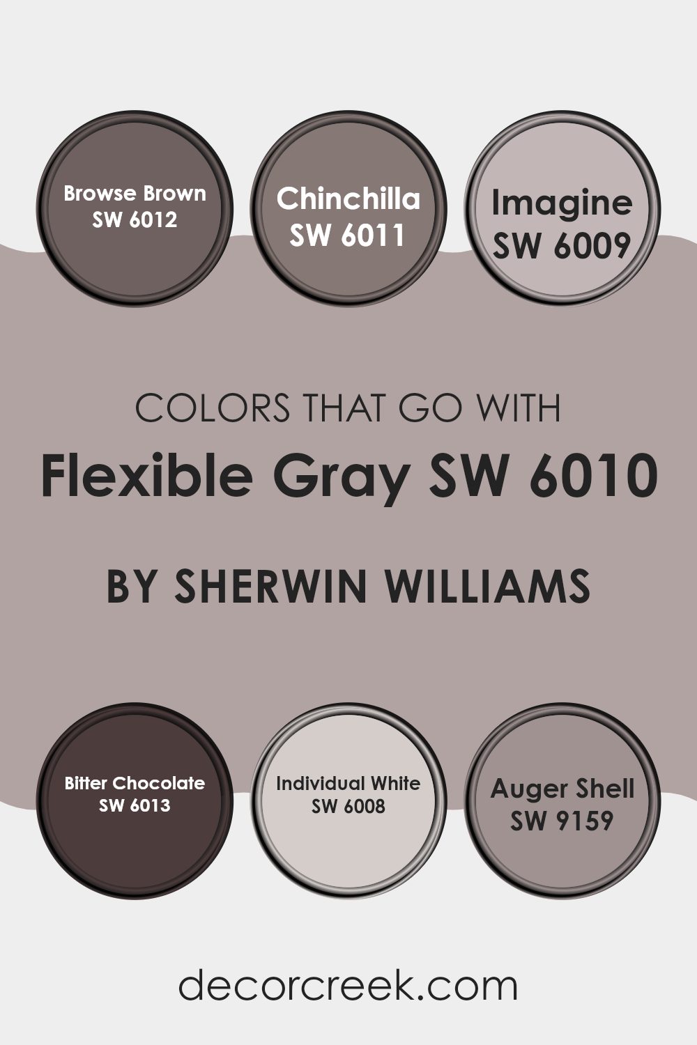
Colors that Go With Flexible Gray SW 6010 by Sherwin Williams
Choosing the right colors to pair with Flexible Gray SW 6010 by Sherwin Williams is key to creating a harmonious and inviting area. Flexible Gray is a adaptable shade that acts as a solid foundation, allowing other colors to stand out and enrich the environment.
For instance, Browse Brown is a warm, deep brown that adds a cozy and comforting feel to a room, making it perfect for creating a snug and welcoming atmosphere. Chinchilla, on the other hand, offers a gentle contrast with its softer, muted gray-brown tone, providing a subtle differentiation without being too strong on the senses.
Imagine is a lighter gray that can brighten areas while maintaining a smooth flow when paired with Flexible Gray. This combination can enhance the airiness of a room without creating too stark of a contrast. Bitter Chocolate serves as a rich, dark anchor that brings depth and definition, ideal for accentuating key areas or furniture pieces.
Individual White is a clean, crisp white that reflects light and gives a fresh, clean look to the area, helping to illuminate and make the other colors pop. Auger Shell, with its soft, sandy hue, offers a hint of warmth and natural simplicity, creating a peaceful and relaxed setting. Together, these colors complement and balance the neutrality of Flexible Gray, ensuring that each room feels thoughtfully designed and visually appealing.
You can see recommended paint colors below:
- SW 6012 Browse Brown
- SW 6011 Chinchilla
- SW 6009 Imagine
- SW 6013 Bitter Chocolate
- SW 6008 Individual White
- SW 9159 Auger Shell
How to Use Flexible Gray SW 6010 by Sherwin Williams In Your Home?
Flexible Gray SW 6010 by Sherwin Williams is a adaptable neutral paint color that bridges the gap between warm and cool shades. It offers subtlety with its soft gray tone, making it an excellent choice for creating a cozy, inviting area in your home. This shade pairs well with various color schemes and decor styles, giving you loads of flexibility when deciding on accessories and furniture.
You can use Flexible Gray in several areas around your house. It’s perfect for living rooms or bedrooms where you want a calm, understated look. Also, it works nicely in bathrooms as it coordinates well with common fixtures and tile colors.
Applying this shade to kitchen cabinets can refresh the area without it feeling too stark or cold. Moreover, incorporating Flexible Gray on accent walls can help to unify differing colors and textures in your home, making decorating less challenging. This paint can definitely help you achieve a new look without feeling too strong in your living area.
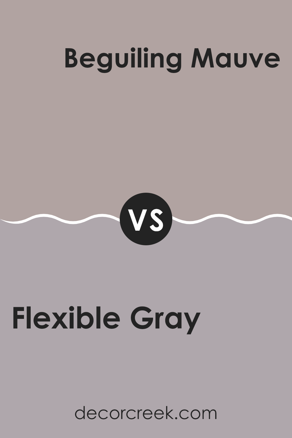
Flexible Gray SW 6010 by Sherwin Williams vs Beguiling Mauve SW 6269 by Sherwin Williams
The two colors from Sherwin Williams, Flexible Gray and Beguiling Mauve, offer distinct vibes for any room. Flexible Gray is a soft and adaptable gray that provides a subtle, calming backdrop. It pairs well with many other colors and decor styles, making it ideal for a minimalist or a modern look.
On the other hand, Beguiling Mauve has a warmer, deeper tone, with hints of purple adding richness and a touch of romance. This shade can add a cozy, welcoming feel to areas, perfect for creating a relaxed atmosphere.
If you’re deciding between the two, consider the mood you’d like to set: if subtle and neutral is your goal, go for Flexible Gray. For a room with a bit more warmth and character, Beguiling Mauve might be your choice. Both paint colors offer beautiful options but cater to different aesthetic preferences and functions within a home.
You can see recommended paint color below:
- SW 6269 Beguiling Mauve
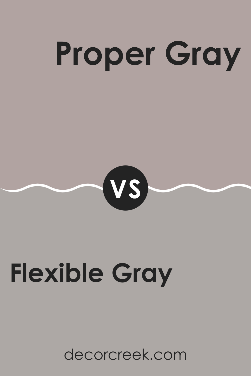
Flexible Gray SW 6010 by Sherwin Williams vs Proper Gray SW 6003 by Sherwin Williams
Flexible Gray and Proper Gray are both adaptable colors from Sherwin Williams, with subtle differences that make each unique. Flexible Gray is a lighter shade that offers a soft, neutral backdrop. It’s gentle and provides a calm, understated feel to a room, making it very user-friendly for areas that seek a laid-back vibe.
On the other hand, Proper Gray is slightly deeper and tends to stand out a bit more. It carries a bit more weight, which can enhance the mood of an area, offering more definition without being too strong.
Both colors are excellent choices for those looking to achieve a modern yet classic look in their interior areas. Proper Gray works well in spots that require a touch of formality, while Flexible Gray fits seamlessly into casual settings.
You can see recommended paint color below:
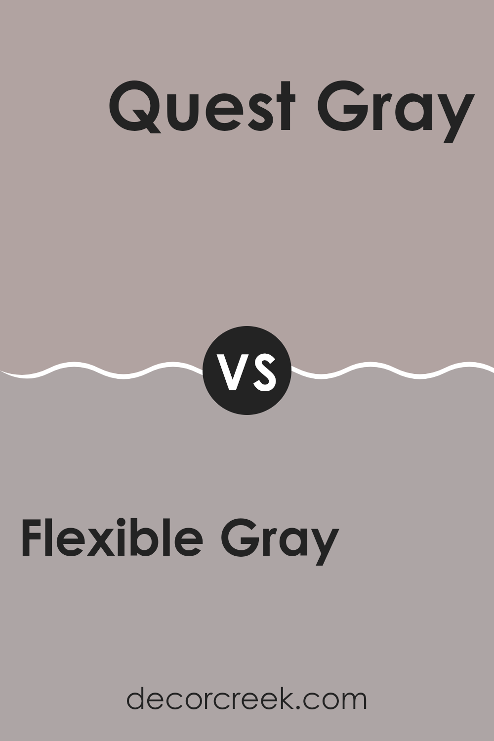
Flexible Gray SW 6010 by Sherwin Williams vs Quest Gray SW 7080 by Sherwin Williams
Flexible Gray SW 6010 by Sherwin Williams and Quest Gray SW 7080 also by Sherwin Williams are both unique shades but they exhibit different styles for interior areas. Flexible Gray has a lighter and softer tone that creates a cozy and inviting atmosphere in rooms. It brilliantly balances between gray and beige, making it a neutral choice that pairs well with many decor styles and colors.
On the other hand, Quest Gray is a darker and more intense gray. This color offers a stronger presence in an area, providing a robust backdrop that can highlight artworks, furniture, or accent pieces. It leans more towards a pure gray, offering depth and a certain richness that is not as pronounced in Flexible Gray.
When deciding between the two, consider the size of your room and the amount of natural light it receives. Flexible Gray works beautifully in smaller areas or spots with limited light, while Quest Gray can be ideal for larger areas or well-lit rooms, where its depth enhances the overall aesthetic.
You can see recommended paint color below:
- SW 7080 Quest Gray
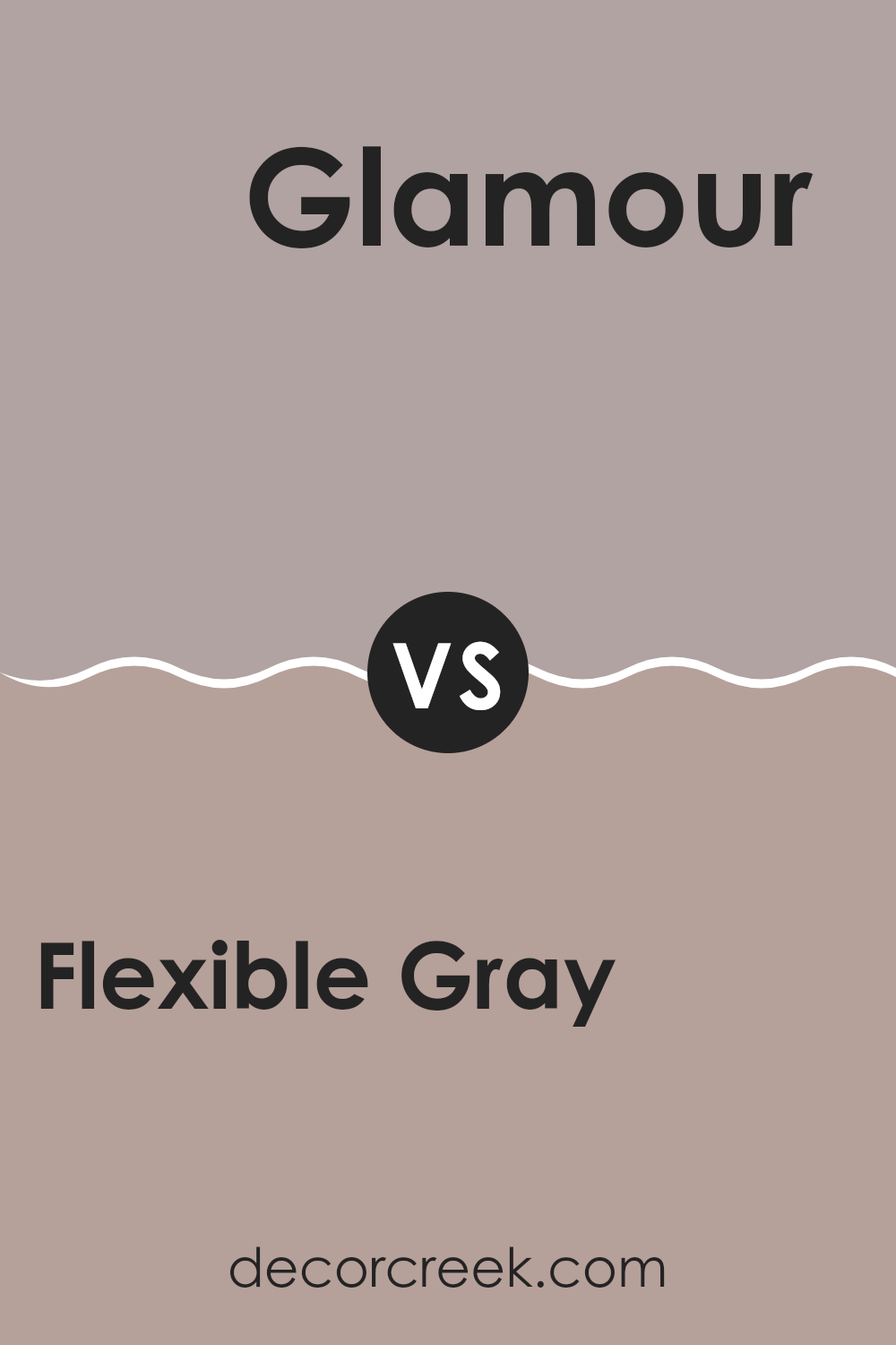
Flexible Gray SW 6010 by Sherwin Williams vs Glamour SW 6031 by Sherwin Williams
The main color, Flexible Gray, is a soft, adaptable gray with a subtle blue undertone, making it a great choice for a neutral backdrop in any area. It pairs well with a variety of decor styles and can help to create a calm, soothing environment.
On the other hand, Glamour, the second color, is a much warmer, light pink tone that brings a gentle and inviting aura to a room.
Where Flexible Gray is understated and blends easily with other colors, Glamour adds a hint of cheerfulness and warmth, making it ideal for areas where you want to add a soft, welcoming touch. Both colors work well in their own right, depending on the mood you want to set in your area: calm and grounded with Flexible Gray or warm and gentle with Glamour.
You can see recommended paint color below:
- SW 6031 Glamour
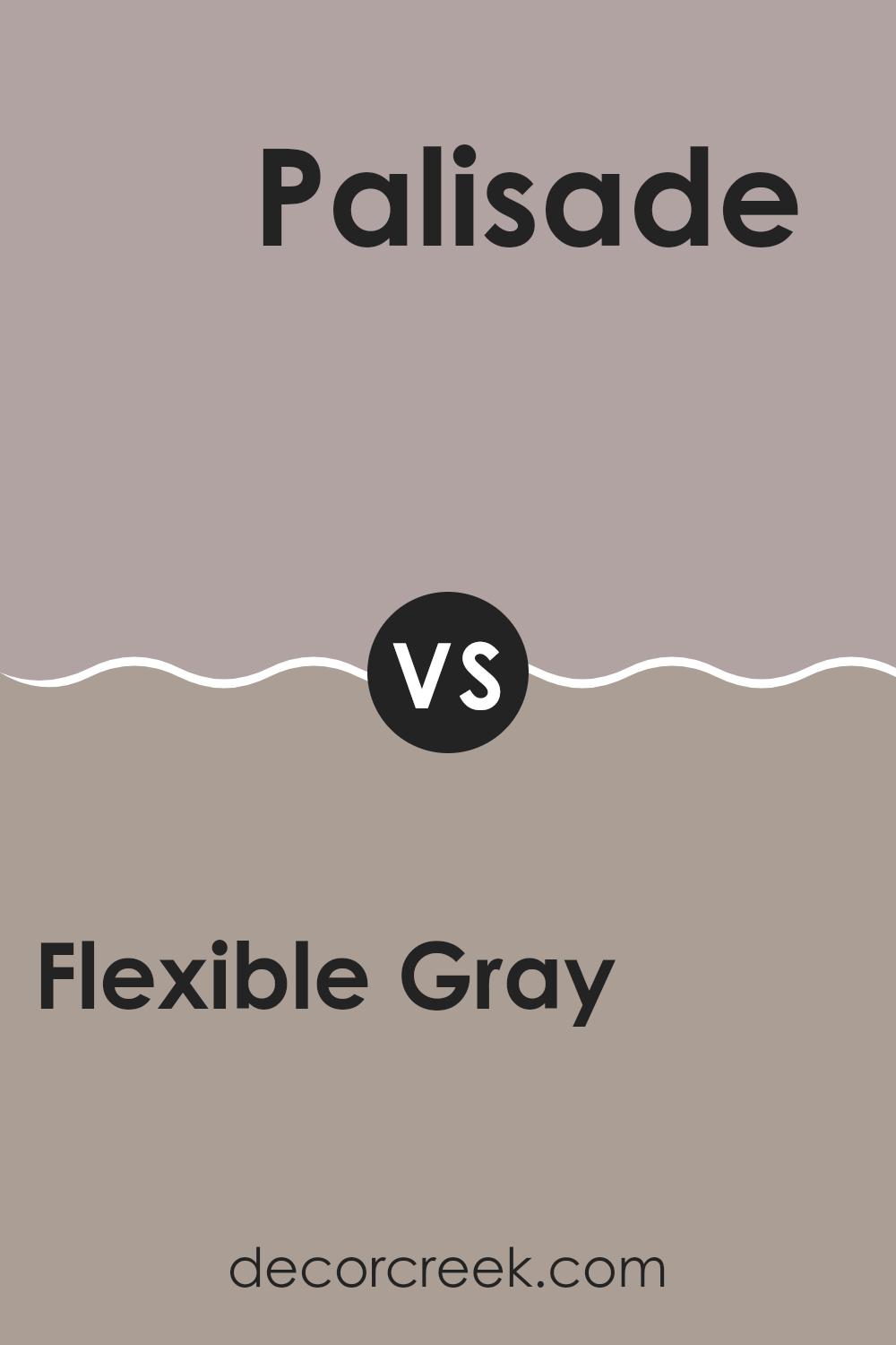
Flexible Gray SW 6010 by Sherwin Williams vs Palisade SW 7635 by Sherwin Williams
Flexible Gray and Palisade by Sherwin Williams are two distinct paint colors that serve different design needs. Flexible Gray is a medium-dark gray with a slight warmth to it, making it adaptable for various areas, whether in a home or an office. It has a balanced, neutral tone that works well with both bright and subdued accent colors.
On the other hand, Palisade is a soft, muted taupe that leans more toward a beige-gray. This color is lighter than Flexible Gray and offers a gentle, calming appearance. Palisade is excellent for creating a cozy and inviting atmosphere in rooms that get a lot of natural light.
Both colors can pair well with a range of décor styles, from modern to traditional, but Palisade might be the better choice for smaller areas or rooms you want to appear more open and airy. Meanwhile, Flexible Gray can make a stronger statement and may be better suited for larger areas or as an accent wall.
You can see recommended paint color below:
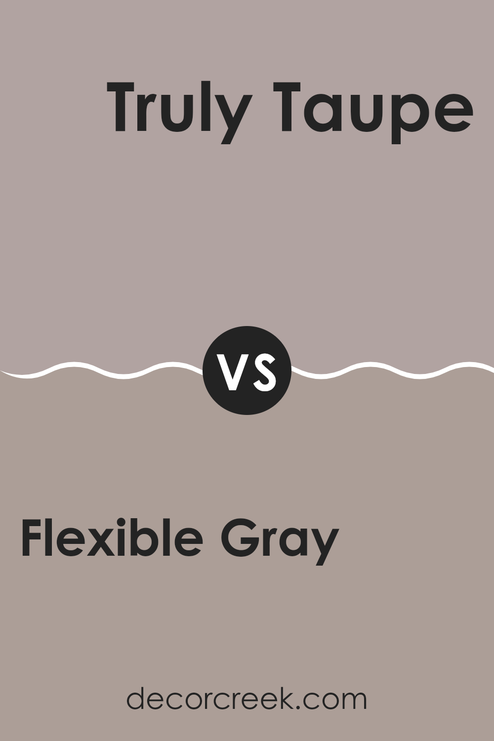
Flexible Gray SW 6010 by Sherwin Williams vs Truly Taupe SW 6038 by Sherwin Williams
Flexible Gray and Truly Taupe are both neutral colors, but they bring different vibes to an area. Flexible Gray is a true gray shade, offering a clean and balanced look. It’s perfect for creating a calm and pleasant atmosphere in any room, making areas look organized and neat.
On the other hand, Truly Taupe has a warmer tone, combining elements of both brown and gray. This color adds a cozy and welcoming feel, ideal for living areas where comfort is key.
While Flexible Gray suits modern and minimalistic designs well because of its cool undertones, Truly Taupe works beautifully in settings that aim for a more inviting and slightly rustic charm thanks to its warmth. Choosing between the two depends on the mood you’re trying to set and the existing colors in your decor. Both colors are adaptable and can work in a variety of areas and styles.
You can see recommended paint color below:
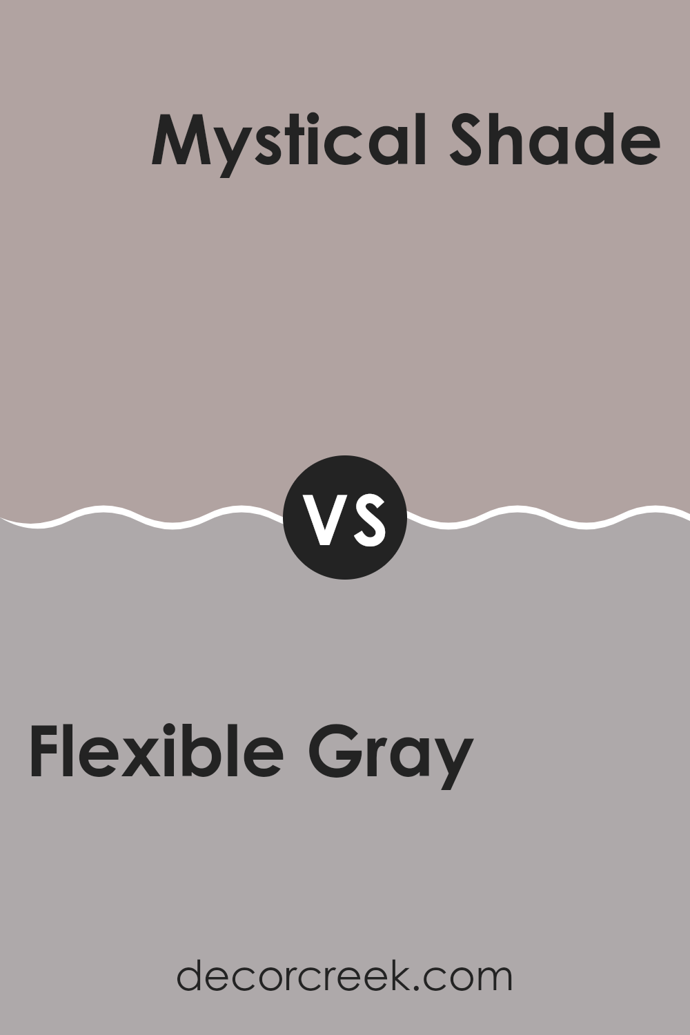
Flexible Gray SW 6010 by Sherwin Williams vs Mystical Shade SW 6276 by Sherwin Williams
Flexible Gray is a soothing and adaptable color that closely resembles a light medium gray. It provides a clean and approachable look that works well in various areas, lending a sense of brightness while maintaining a cozy, welcoming vibe. It’s adaptable enough to serve as a backdrop in living rooms, bedrooms, and even kitchens, pairing well with both bright and muted accents.
On the other hand, Mystical Shade is a darker, more intense color. This shade is a deep gray that leans towards blue, offering a bold and rich feel wherever it’s used. It’s perfect for creating a strong, noticeable impact in an area, suitable for accent walls or for rooms where you want to make a statement with depth and moodiness.
While both colors are grays, Flexible Gray is lighter and more neutral, making small areas feel larger and more open. Mystical Shade, being darker and richer, brings an element of drama and intensity, ideal for areas intended to feel more enclosed and cozy.
You can see recommended paint color below:
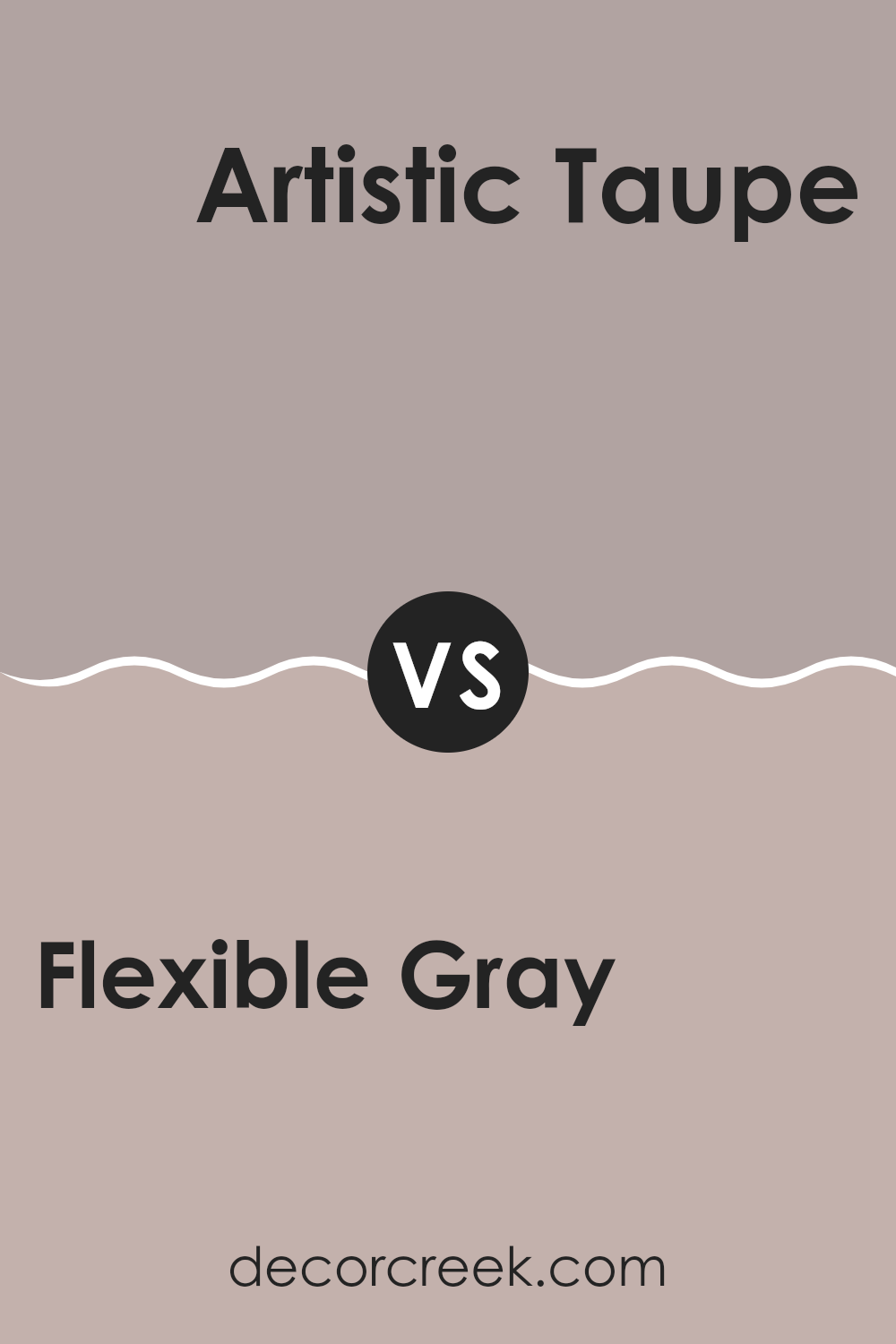
Flexible Gray SW 6010 by Sherwin Williams vs Artistic Taupe SW 6030 by Sherwin Williams
Flexible Gray and Artistic Taupe are two distinct shades offered by Sherwin Williams, each creating its own unique vibe in an area. Flexible Gray is a solid, medium gray that holds a perfect balance between warm and cool tones, making it highly adaptable for any room. It pairs well with a variety of decor styles, adding a clean, straightforward touch to interiors.
On the other hand, Artistic Taupe is a warmer, softer color, leaning towards a beige-brown mixture. This color is ideal for those who want a cozy and inviting atmosphere without going too dark or too light. It brings a welcoming feel to living areas, perfect for rooms that aim for a comfortable and relaxed setting.
Together, both colors offer adaptability in design options. While Flexible Gray provides a stronger, more neutral base, Artistic Taupe contributes a gentle warmth, which can beautifully soften architectural elements or furnishings. They can also be paired together to complement each other in rooms where balance is key.
On the other hand, Artistic Taupe is a warmer, softer color, leaning towards a beige-brown mixture. This color is ideal for those who want a cozy and inviting atmosphere without going too dark or too light. It brings a welcoming feel to living rooms, perfect for rooms that aim for a comfortable and relaxed setting.
Together, both colors offer versatility in design options. While Flexible Gray provides a stronger, more neutral base, Artistic Taupe contributes a gentle warmth, which can beautifully soften architectural elements or furnishings. They can also be paired together to complement each other in rooms where balance is key.
You can see recommended paint color below:
- SW 6030 Artistic Taupe
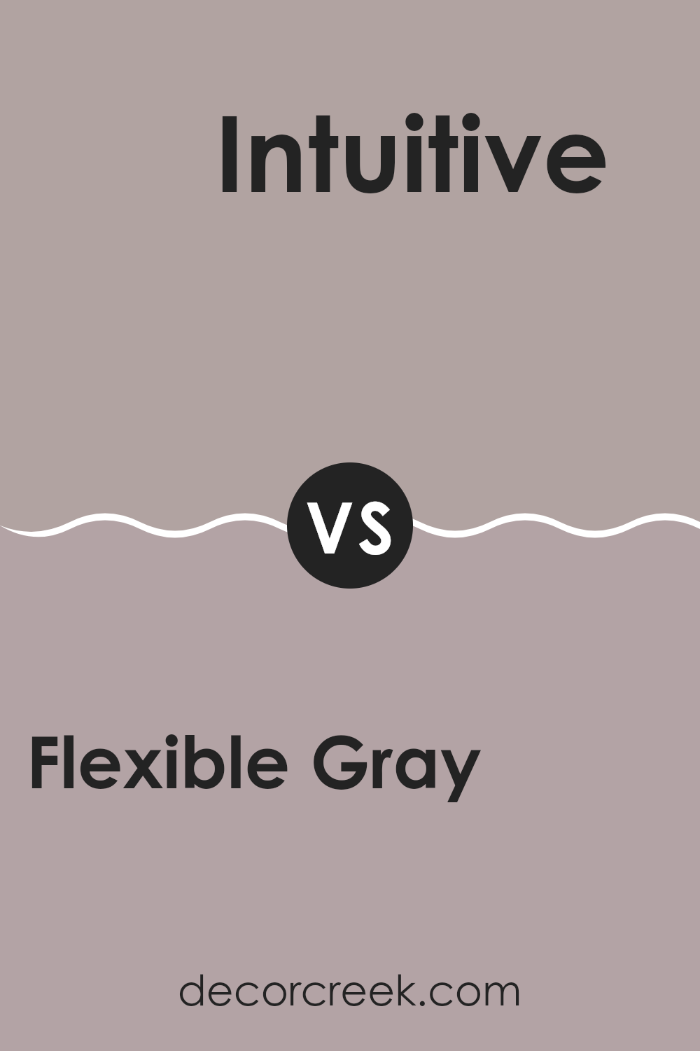
Flexible Gray SW 6010 by Sherwin Williams vs Intuitive SW 6017 by Sherwin Williams
Flexible Gray and Intuitive are both paints by Sherwin Williams, but they have distinct vibes. Flexible Gray is a mid-tone gray that feels quite neutral and adaptable, which means it can work well in many different areas and with various decor styles. It’s neither too dark nor too light, making it a practical choice for anyone who wants a classic look that stays stylish over time.
On the other hand, Intuitive is slightly lighter and has a soft, subdued quality to it. This color leans towards a cooler tone, providing a calm and gentle background that can help to make a room feel more open and airy. Intuitive is great for smaller areas or spots where you want to enhance natural light.
When deciding between the two, think about the mood you want to set and the size of your area. Flexible Gray is more of a go-to for enduring appeal, while Intuitive is ideal for creating a light and breezy feel.
On the other hand, Intuitive is slightly lighter and has a soft, subdued quality to it. This color leans towards a cooler tone, providing a calm and gentle background that can help to make a room feel more open and airy. Intuitive is great for smaller rooms or areas where you want to enhance natural light.
When deciding between the two, think about the mood you want to set and the size of your room. Flexible Gray is more of a go-to for enduring appeal, while Intuitive is ideal for creating a light and breezy feel.
You can see recommended paint color below:
- SW 6017 Intuitive
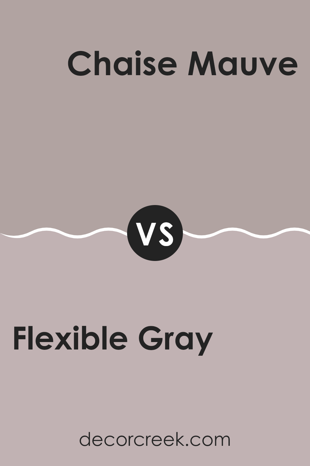
Flexible Gray SW 6010 by Sherwin Williams vs Chaise Mauve SW 6016 by Sherwin Williams
Flexible Gray and Chaise Mauve, both by Sherwin Williams, are distinct in their tones and the ambiance they set. Flexible Gray is a adaptable neutral with a balanced blend of gray that can easily complement a variety of decor styles and colors, making it a solid choice for many areas in a home. It’s neither too dark nor too light, striking a nice middle ground that offers a backdrop that’s understated yet appealing.
On the other hand, Chaise Mauve brings a gentle hint of color to a room with its subtle purple tones. This color can add a touch of soft warmth to areas, ideal for creating a more inviting and gentle feel. It suits spots where a calm but slightly more colorful atmosphere is desired, like bedrooms or cozy reading nooks.
Both colors offer their unique appeal, with Flexible Gray providing a strong foundation for any room, and Chaise Mauve adding a splash of gentle color. Each can be used to create a distinct look and feel depending on the mood you want to achieve.
You can see recommended paint color below:
After studying SW 6010 Flexible Gray by Sherwin Williams, I really got to know this unique paint. It’s not just any gray; it’s a warm, welcoming shade that seems to fit in any room. Whether it’s your bedroom or the living room, Flexible Gray makes the whole area feel cozy and friendly.
Even though the name has ‘gray’ in it, this paint has hints of beige which soften it up and make the rooms feel lively, not gloomy at all. I found that it works great with lots of different colors for decorating, from bright reds to soft whites. It’s like a friend to other colors, helping them look their best.
For anyone thinking about giving their room a fresh look, SW 6010 Flexible Gray is a solid option. It’s friendly, it blends well, and it turns any area into a cozy spot. Putting this color on your walls could be a neat way to freshen up your place without making it too bright or too dark. It’s like the perfect middle ground that’s both warm and inviting.
Overall, this color really stands out as a safe and happy choice for bringing new life to a room.
Ever wished paint sampling was as easy as sticking a sticker? Guess what? Now it is! Discover Samplize's unique Peel & Stick samples.
Get paint samples

