When I first came across Sherwin-Williams’ SW 7730 Forestwood, I was instantly drawn to its rich, earthy tone. To me, this color is more than just a shade on the wall; it brings a sense of nature into my home. Forestwood feels like a mix of deep green and brown, reminiscent of a lush forest path, offering a comforting and grounded presence in any space.
Using this color in my home has completely changed how I feel about my surroundings. It adds depth and warmth, creating a cozy atmosphere that invites relaxation.
It’s the kind of color that complements both modern and traditional decor, making it versatile for any room.
Whether I’m looking to refresh my living room or add a pop of richness to my kitchen, Forestwood has become a go-to choice. It pairs beautifully with natural wood finishes and lighter neutral tones, striking just the right balance.
I find it perfect for those who appreciate a touch of the outdoors and want to bring that feeling indoors. If you’re someone who enjoys the feel of nature around you, SW 7730 Forestwood might be just what you need to make your space feel truly inviting.
What Color Is Forestwood SW 7730 by Sherwin Williams?
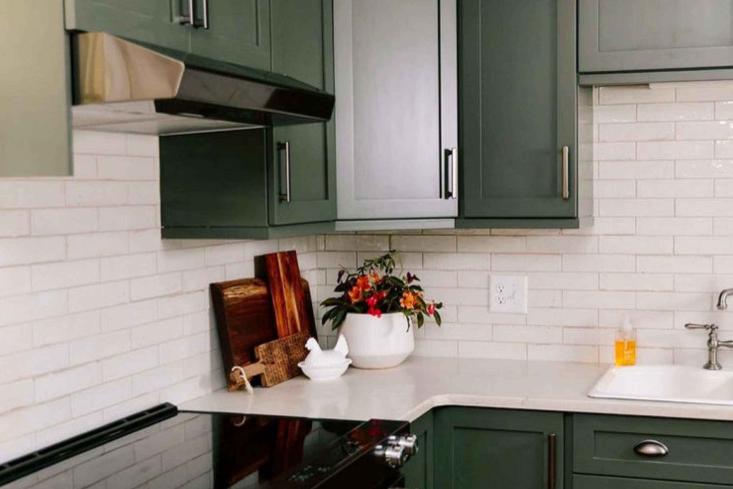
Forestwood by Sherwin Williams is a deep, earthy green with a hint of gray, reminding one of a dense forest canopy. This rich color brings a sense of warmth and nature into a space. Due to its grounding quality, Forestwood works wonderfully in interior styles such as rustic, traditional, and modern farmhouse.
It adds depth and character, making it a perfect choice for accent walls, cabinetry, or even cozy living room spaces.
Because of its versatile and natural tone, Forestwood pairs beautifully with materials such as reclaimed wood, which enhances its earthy feel. It also complements stone textures, whether in flooring or on a fireplace, providing a seamless connection with indoor-outdoor elements. For softer textures, consider pairing Forestwood with natural fibers like linen or cotton in pillows and throws, which adds a comfortable and inviting touch.
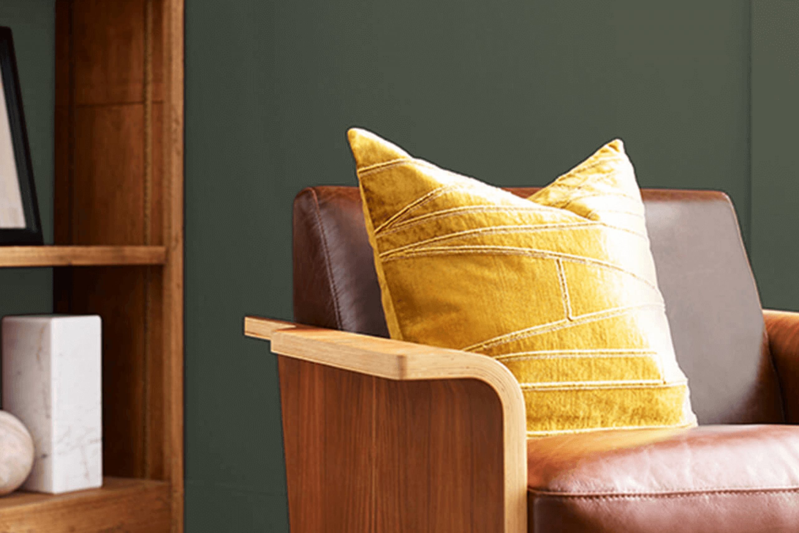
This color also works nicely alongside metals like bronze or matte black. These metals enhance the depth of the green, delivering an elegant contrast without overpowering.
In lighting or hardware, these metallic elements can pull together a room, especially when combined with the deep richness of Forestwood. Whether in a cozy cabin or a suburban home, this color delivers a natural, inviting atmosphere.
Is Forestwood SW 7730 by Sherwin Williams Warm or Cool color?
Forestwood SW 7730 by Sherwin Williams is a dark green color that brings an earthy feel to homes. Its deep hue can make a room feel cozy and inviting. When used on walls, it can create a calm and restful atmosphere, perfect for spaces like bedrooms or living rooms where you might want to relax. This color works well with natural materials like wood and stone, enhancing the overall warm and organic vibe of a room.
Forestwood pairs nicely with neutral colors such as beige or off-white, which can help balance its intensity. Additionally, accents of gold or brass can add a touch of elegance without overwhelming the space.
This shade is versatile and can suit both traditional and modern styles, depending on the other elements in the room. Using Forestwood in your home can create a stylish and comfortable environment that feels connected to nature.
Undertones of Forestwood SW 7730 by Sherwin Williams
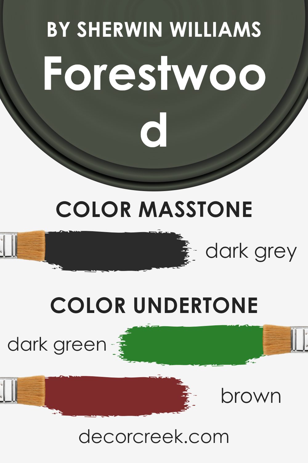
Forestwood SW 7730 by Sherwin Williams is a complex color with a blend of undertones that change your perception depending on the lighting and surroundings. This color leans heavily towards a rich, nature-inspired green, but its undertones can influence how it appears in a room.
The dark green and olive undertones give Forestwood a grounding, earthy feel. These elements can create a sense of calm and connection to nature, ideal for spaces where you want to relax. Brown undertones add warmth and make the color feel cozy and inviting.
They can make the room feel more welcoming, suitable for living rooms or bedrooms.
The presence of navy and dark turquoise undertones introduces a subtle depth, hinting at a coolness that can make the color feel more balanced. This can prevent the green from becoming too overwhelming and help maintain a fresh vibe.
Purple and grey undertones can add a hint of sophistication and neutrality, which softens the color. They can help the paint work well with other design elements, such as furniture or decor in lighter shades.
Overall, the undertones in Forestwood SW 7730 create a dynamic and flexible color, allowing it to adapt to different interiors while maintaining its inviting and grounded character. Depending on light and decor, it may seem warmer or cooler, making it versatile for various spaces.
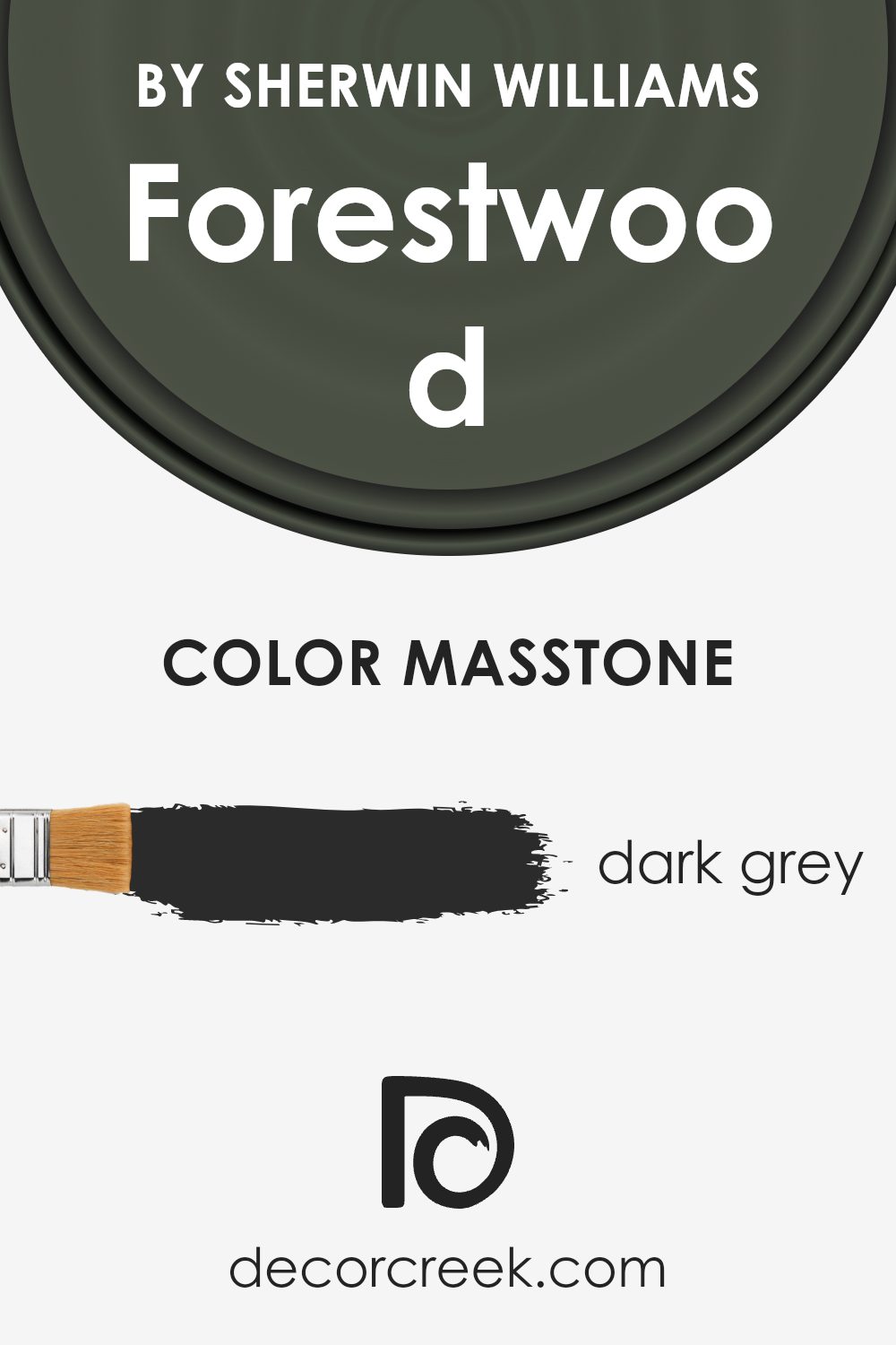
What is the Masstone of the Forestwood SW 7730 by Sherwin Williams?
Forestwood SW 7730 by Sherwin Williams is a dark grey color with the masstone of #2B2B2B. This deep grey shade can have a big impact when used in homes. Its dark hue creates a cozy and intimate feeling in a room, making larger spaces feel more inviting.
When used on walls, it provides a bold backdrop that highlights lighter furniture and decor. This contrast can make a room feel balanced and visually interesting. The neutral nature of dark grey allows it to pair well with many other colors, so it can easily be incorporated into various design styles.
Using it in living rooms or bedrooms can add a touch of elegance and warmth, making these spaces feel more comfortable. However, because of its depth, it’s essential to use it thoughtfully, balancing it with lighter tones and ample lighting to keep the room from feeling too dark or enclosed.
How Does Lighting Affect Forestwood SW 7730 by Sherwin Williams?
Lighting plays a crucial role in how we perceive colors. Different lighting conditions can change the appearance of a color dramatically. For example, the color Forestwood (SW 7730) by Sherwin Williams can look quite different depending on whether it’s viewed in natural or artificial light.
In natural light, which varies throughout the day, Forestwood can appear richer and more vibrant. Morning light, which is cooler and bluer, can bring out cooler tones in the color, making it look slightly different than it does under the warm, reddish light of late afternoon.
In artificial light, the effect depends on the type of bulbs used. Incandescent lighting, which has a warm tone, might make Forestwood appear warmer and more muted. On the other hand, fluorescent lighting, which often has a cooler tone, might bring out cooler undertones in the color, making it look different than expected.
When it comes to how this color looks in rooms facing different directions, each orientation offers unique lighting conditions. A north-facing room typically receives cooler and indirect natural light throughout the day.
This means Forestwood might appear more muted and cooler in such spaces. It may seem darker and less vibrant due to the lack of direct sunlight.
In contrast, a south-facing room gets plenty of direct sunlight for most of the day. Here, Forestwood can appear much brighter and more vibrant, showing its full depth and richness under warm, consistent lighting.
East-facing rooms have plenty of morning light, which is generally cooler. In these rooms, Forestwood might appear crisper and more refreshing in the mornings, but as the day progresses and the light fades, it can look slightly different.
West-facing rooms are the opposite, with warm afternoon and evening light. Forestwood will look warmer and more inviting in the late afternoon, possibly showing a slightly golden or earthy hue as the sun sets. Each room orientation provides a unique environment that affects how the Forestwood color is perceived.
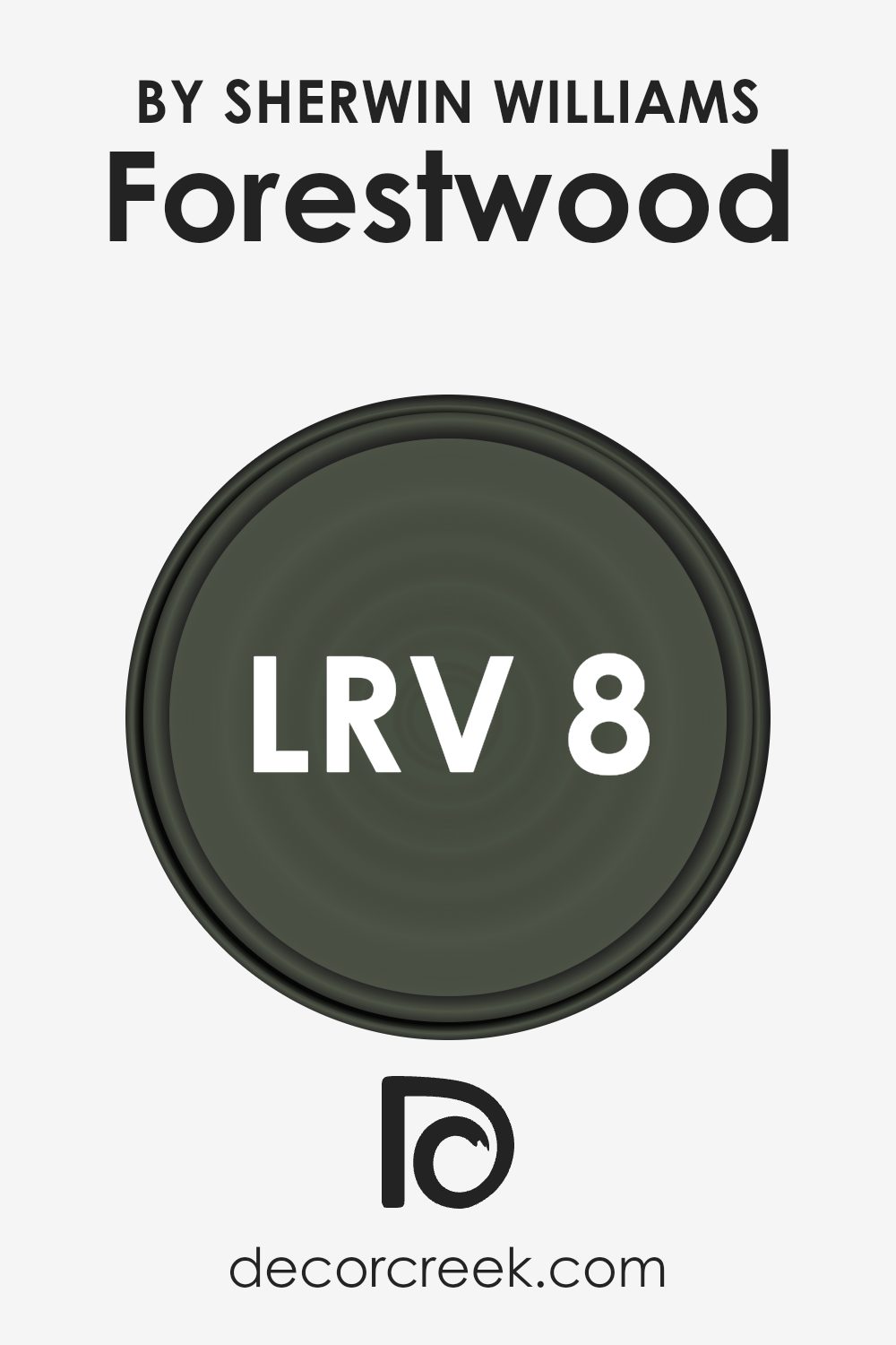
What is the LRV of Forestwood SW 7730 by Sherwin Williams?
Light Reflectance Value, or LRV, is a measurement that tells us how much light a color will reflect. The scale goes from 0, which is completely black and reflects no light, to 100, which is fully white and reflects all the light. In simple terms, LRV helps us understand how light or dark a color will appear in a space.
Colors with lower LRV absorb more light and can make a room feel more intimate or cozy. On the other hand, colors with higher LRV reflect more light, making spaces feel larger and more open.
This is a crucial factor to consider when choosing paint, as it affects not just the brightness of the room, but also the mood it imparts.
For Forestwood by Sherwin Williams, which has an LRV of 8.276, it means that the color is quite dark. Being a rich, deep color, it will absorb most of the light entering the room, which can create a warm and inviting atmosphere.
However, in a small or poorly-lit room, it might make the space feel even smaller and more enclosed, because there’s not enough light bouncing around.
In a well-lit area, it can add a sense of depth and make a bold, stylish statement. When using a color with such a low LRV, it’s often a good idea to balance it with lighter elements in the décor or ensure there is sufficient lighting to prevent the space from becoming too dark.
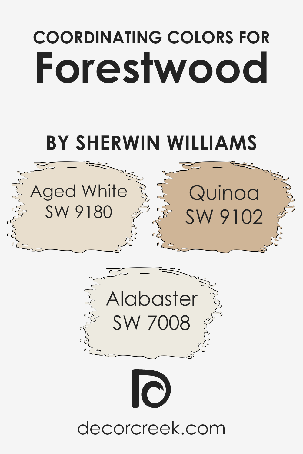
Coordinating Colors of Forestwood SW 7730 by Sherwin Williams
Coordinating colors are hues that complement each other to create a harmonious and cohesive look in a space. They work by balancing and enhancing the primary color, like Forestwood SW 7730 by Sherwin Williams, to create a unified and appealing aesthetic.
When used together in a room, coordinating colors can help tie everything together, from walls to décor, resulting in a well-put-together space that feels natural and balanced.
Aged White SW 9180 is a warm, creamy color that can add a sense of coziness and comfort. It pairs beautifully with Forestwood, offering a contrast that is soft yet crisp. Alabaster SW 7008 is a versatile white that brings light and airiness, making rooms feel bigger and more open without being stark.
It provides a classic backdrop that complements darker, earthy tones like Forestwood. Lastly, Quinoa SW 9102 is a muted, golden hue that adds warmth and depth.
It works well to punctuate and accentuate the richness of Forestwood, while also creating highlights that keep the palette interesting and dynamic. Together, these colors create a balanced combination that is both inviting and easy on the eyes, ideal for creating a naturally cohesive atmosphere.
You can see recommended paint colors below:
- SW 9180 Aged White
- SW 7008 Alabaster
- SW 9102 Quinoa
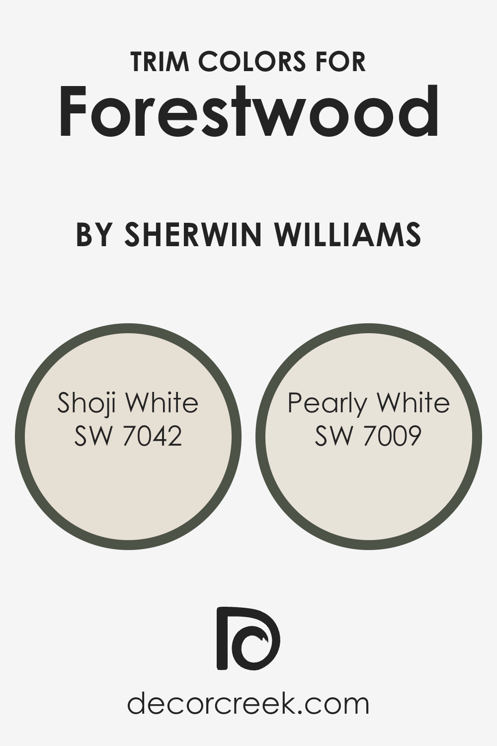
What are the Trim colors of Forestwood SW 7730 by Sherwin Williams?
Trim colors are the shades used on the edges and details within a room, such as around windows, doors, and baseboards. Choosing the right trim color can highlight architectural features, add depth to a space, and make the primary color pop.
For wall colors like Forestwood, a deep, lush green by Sherwin Williams, using trim colors like SW 7042 – Shoji White and SW 7009 – Pearly White can provide a bright and clean contrast. The trim’s purpose is to create a visually appealing boundary that enhances the overall design and ties the entire room together.
Trim colors are important as they help define spaces and add character, balancing darker or more vibrant wall shades by adding light and contrast, making the overall look feel complete and intentional.
Shoji White is a soft, warm white with subtle hints of beige, adding a touch of warmth without being overpowering. Pearly White, on the other hand, offers a delicate and airy feel with its slight gray undertones, providing a modern and crisp finish.
Both these trim colors work well with Forestwood by lighting up the room and drawing attention to the woodwork and architectural details.
The combination of these soft whites with the lush green tones of Forestwood fosters a welcoming environment, ensuring that the spaces look well-coordinated and thoughtfully designed.
You can see recommended paint colors below:
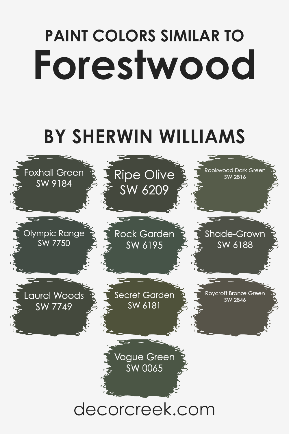
Colors Similar to Forestwood SW 7730 by Sherwin Williams
Similar colors play a significant role in design because they create harmony and cohesion within a space. Using hues that are close to each other on the color wheel, like those similar to Sherwin-Williams’ Forestwood, helps create a unified and balanced look.
These shades often evoke natural, calming atmospheres, perfect for creating a soothing environment. Colors such as SW 9184 Foxhall Green with its deep forest undertone, SW 7750 Olympic Range resembling mossy surfaces, and SW 7749 Laurel Woods mimicking lush wooded areas each have unique characteristics yet maintain a complementary relationship with Forestwood.
Similarly, SW 0065 Vogue Green and SW 6209 Ripe Olive bring a sense of natural charm through their earthy undertones.
SW 6195 Rock Garden offers a robust, garden-like feel, while SW 6181 Secret Garden adds mystery with its rich, verdant impression. SW 2816 Rookwood Dark Green provides a classic, historical vibe, complementing vintage aesthetics.
Meanwhile, SW 6188 Shade-Grown features a luxurious depth, implying maturity and confidence in a space. Finally, SW 2846 Roycroft Bronze Green delivers a complex blend of green and bronze, offering a touch of elegance that pairs beautifully with the natural notes found in greens.
These colors collectively enhance spaces with their natural essence and make surroundings feel more inviting and connected to nature.
You can see recommended paint colors below:
- SW 9184 Foxhall Green
- SW 7750 Olympic Range
- SW 7749 Laurel Woods
- SW 0065 Vogue Green
- SW 6209 Ripe Olive
- SW 6195 Rock Garden
- SW 6181 Secret Garden
- SW 2816 Rookwood Dark Green
- SW 6188 Shade-Grown
- SW 2846 Roycroft Bronze Green
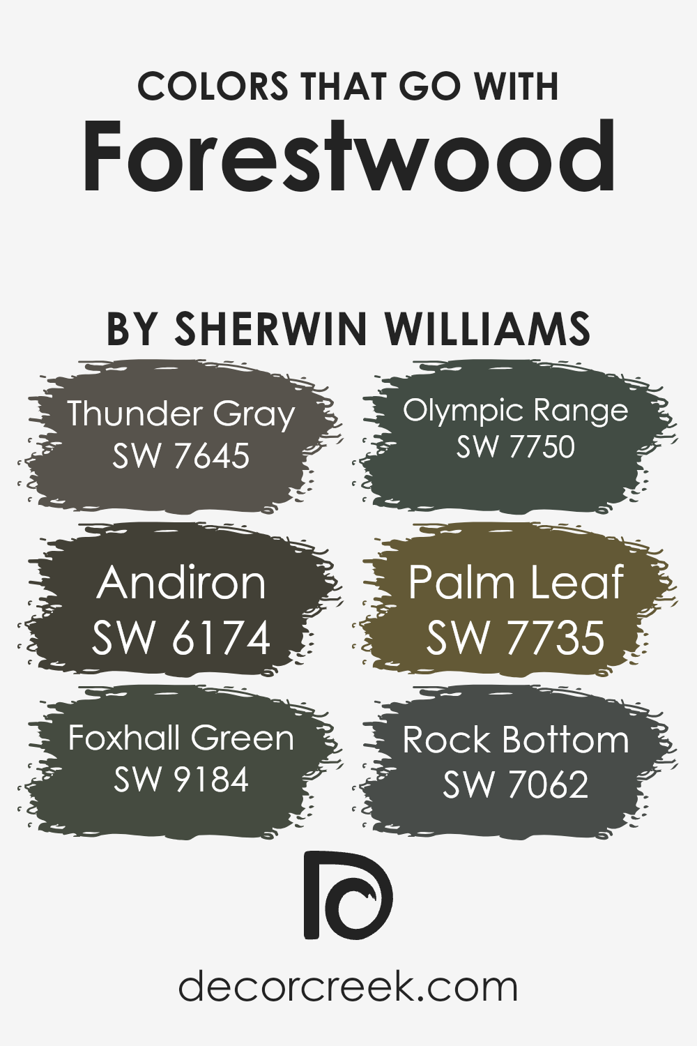
Colors that Go With Forestwood SW 7730 by Sherwin Williams
Colors that complement Forestwood SW 7730 from Sherwin Williams play a crucial role in creating a harmonious and inviting space. Forestwood is a rich, earthy green that brings a touch of nature indoors. By pairing it with the right supporting colors, you can highlight its beauty and create a balanced look.
For instance, Thunder Gray SW 7645 is a cool, deep gray that adds contrast and depth to the warm tones of Forestwood, while also providing a neutral backdrop. Another great companion is Andiron SW 6174, a warm brown that enhances the natural aspect of Forestwood with its earthy tone.
Foxhall Green SW 9184 offers a darker shade of green that complements Forestwood by adding a subtle depth, perfect for cozy, intimate spaces. Olympic Range SW 7750 is an olive green that works well with Forestwood to create a relaxed and connected feel.
Palm Leaf SW 7735 introduces a lighter green that brightens the space, making it feel more lively, while still staying true to the natural theme.
Lastly, Rock Bottom SW 7062 is a nearly-black color that can provide a dramatic edge when used in small doses, making Forestwood stand out more prominently. Together, these colors form a cohesive and inviting palette that enhances any room’s appearance while maintaining a natural and balanced atmosphere.
You can see recommended paint colors below:
- SW 7645 Thunder Gray
- SW 6174 Andiron
- SW 9184 Foxhall Green
- SW 7750 Olympic Range
- SW 7735 Palm Leaf
- SW 7062 Rock Bottom
How to Use Forestwood SW 7730 by Sherwin Williams In Your Home?
Forestwood SW 7730 by Sherwin Williams is a rich, earthy green paint color that brings a touch of nature into your home. It works well in a variety of spaces, offering a warm and inviting feel. This color is perfect for living rooms or bedrooms where you want to create a cozy and comfortable atmosphere.
Pair it with wooden furniture and natural textures to enhance its earthy vibe. Forestwood can also be a great choice for an accent wall, adding depth and interest without overpowering the room. Consider combining it with lighter neutrals or creamy whites to balance its richness and create a harmonious look.
In kitchens, it provides a natural backdrop that pairs beautifully with both modern and rustic styles. Whether you use it in large areas or small accents, Forestwood SW 7730 adds a touch of the outdoors, making your home feel welcoming and connected to nature.
Forestwood SW 7730 by Sherwin Williams vs Secret Garden SW 6181 by Sherwin Williams
Forestwood SW 7730 and Secret Garden SW 6181 are two beautiful shades of green from Sherwin Williams. Forestwood has a deep, earthy tone with brown undertones, making it a warm and natural choice. It brings a sense of coziness and grounding to any space, resembling the rich colors found in the woods.
On the other hand, Secret Garden SW 6181 is a darker, cooler green with grey undertones. This color creates a more modern and elegant feel. It has a mysterious and luxurious vibe, making it suitable for creating bold statements in a room.
While both colors belong to the green family, Forestwood leans more towards a brownish green that feels rustic and natural. In contrast, Secret Garden offers a refined and contemporary look with its grey influence. Both colors would work well in living spaces, but each gives a different atmosphere depending on the desired mood.
You can see recommended paint color below:
- SW 6181 Secret Garden

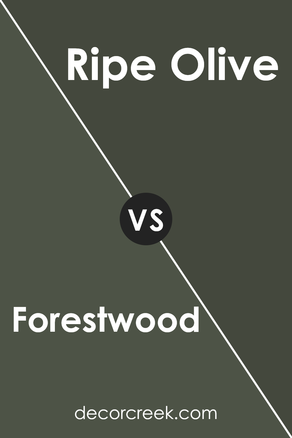
Forestwood SW 7730 by Sherwin Williams vs Ripe Olive SW 6209 by Sherwin Williams
Forestwood SW 7730 by Sherwin Williams is a deep, earthy green, bringing to mind the rich tones of a dense forest. It’s darker and has more of a brown undertone compared to other greens. Ripe Olive SW 6209, on the other hand, is also a deep green but leans more towards a classic olive shade with slightly more yellow undertones.
While both shades are dark and cozy, Forestwood feels slightly warmer due to its brownish tint. Ripe Olive offers a slightly lighter, fresher appearance with its olive tones.
These subtle differences make Forestwood more suitable for a warm, natural look, while Ripe Olive can add a slightly brighter, yet still rich, touch to a space.
In terms of versatility, both colors work well in various settings, from exteriors to interiors. Forestwood is perfect for creating a snug atmosphere, while Ripe Olive offers a bit of freshness to any room.
You can see recommended paint color below:
Forestwood SW 7730 by Sherwin Williams vs Shade-Grown SW 6188 by Sherwin Williams
Forestwood SW 7730 and Shade-Grown SW 6188 are two rich green shades from Sherwin Williams. Forestwood SW 7730 is a deep, earthy green with warm undertones, resembling the rich, natural hues found in dense forests. It brings an inviting and cozy feel to spaces, making it excellent for creating a warm, grounded environment.
On the other hand, Shade-Grown SW 6188 is also a dark green but with cooler undertones. It’s reminiscent of the lush greenery found in shaded garden areas. This color has a slightly more muted and calming effect, providing a soothing touch to interiors.
While both colors share a green palette, the key difference lies in their undertones. Forestwood brings warmth and a strong, rooted presence, while Shade-Grown leans towards a cooler, more tranquil vibe. Depending on one’s desired atmosphere, either color can beautifully complement natural materials like wood, stone, or metal.
You can see recommended paint color below:
Forestwood SW 7730 by Sherwin Williams vs Rookwood Dark Green SW 2816 by Sherwin Williams
Forestwood SW 7730 is a warm, earthy green that brings a natural and grounded feel to spaces. Its rich undertones of brown make it a versatile choice for creating a cozy environment. This color pairs well with natural materials like wood and can bring a sense of comfort and familiarity to any room.
Rookwood Dark Green SW 2816, on the other hand, is a deeper, more intense green. With its historical roots, it offers a classic and timeless appeal. This color has cool undertones, which can create a dramatic and bold statement in a room. Rookwood Dark Green is ideal for adding a sense of depth and sophistication to a space.
Both colors have their strengths: Forestwood for warmth and natural coziness, and Rookwood Dark Green for depth and bold elegance. Choosing between them depends on the mood you want for your space – whether you seek a warm, earthy vibe or a strong, classic look.
You can see recommended paint color below:
- SW 2816 Rookwood Dark Green
Forestwood SW 7730 by Sherwin Williams vs Olympic Range SW 7750 by Sherwin Williams
Forestwood SW 7730 is a deep, earthy green that brings to mind the lush hues of a dense forest. It has a warm undertone, making it feel inviting and cozy, ideal for spaces where you want a strong connection to nature. It can add warmth and depth to a room while being versatile enough to fit in traditional or modern settings.
On the other hand, Olympic Range SW 7750 is a mid-tone mossy green with a softer appearance. It feels lighter and more airy compared to Forestwood, offering a calm and peaceful atmosphere without being overwhelming.
Olympic Range is suitable for spaces where you want a refreshing touch of green that is subtle yet noticeable. While both colors offer a connection to nature, Forestwood is more intense, while Olympic Range provides a gentler, more soothing option. Both colors can work well together or individually, depending on the mood you wish to create.
You can see recommended paint color below:
- SW 7750 Olympic Range
Forestwood SW 7730 by Sherwin Williams vs Laurel Woods SW 7749 by Sherwin Williams
Forestwood and Laurel Woods are two warm and rich colors from Sherwin Williams, each offering its unique vibe. Forestwood is a deep, earthy green with brown undertones. It feels rustic and grounded, perfect for creating a cozy, natural atmosphere. This color fits well in spaces where you want to bring in an organic, wooded feel.
Laurel Woods, on the other hand, is a darker green with a slightly more muted tone. It has a subtle depth that makes it a bit more sophisticated. It’s ideal for spaces where you want a touch of drama while still staying connected to natural hues.
Both colors work well with earthy accents and natural materials like wood and stone. Forestwood is the choice for a more traditional or rustic look, while Laurel Woods offers a slightly more modern, subdued palette. Each brings a sense of nature indoors but in its unique style.
You can see recommended paint color below:
Forestwood SW 7730 by Sherwin Williams vs Rock Garden SW 6195 by Sherwin Williams
Forestwood (SW 7730) and Rock Garden (SW 6195) are two rich and earthy green colors from Sherwin Williams. Forestwood is a darker shade, offering a deep, almost woodsy hue that brings to mind dense forests and natural landscapes. It has a warm undertone, making it perfect for creating a cozy and inviting atmosphere in any space.
On the other hand, Rock Garden is slightly lighter and more muted. It resembles the natural green found in moss-covered rocks or shaded gardens. This color carries a hint of coolness that can provide a refreshing look to a room or exterior.
While both colors are grounded in nature, Forestwood suits spaces looking for a more intimate or dramatic feel, whereas Rock Garden might be preferred for settings that need a little more openness and airiness. Together, they can work harmoniously in designs that want both warmth and a touch of natural freshness.
You can see recommended paint color below:
- SW 6195 Rock Garden

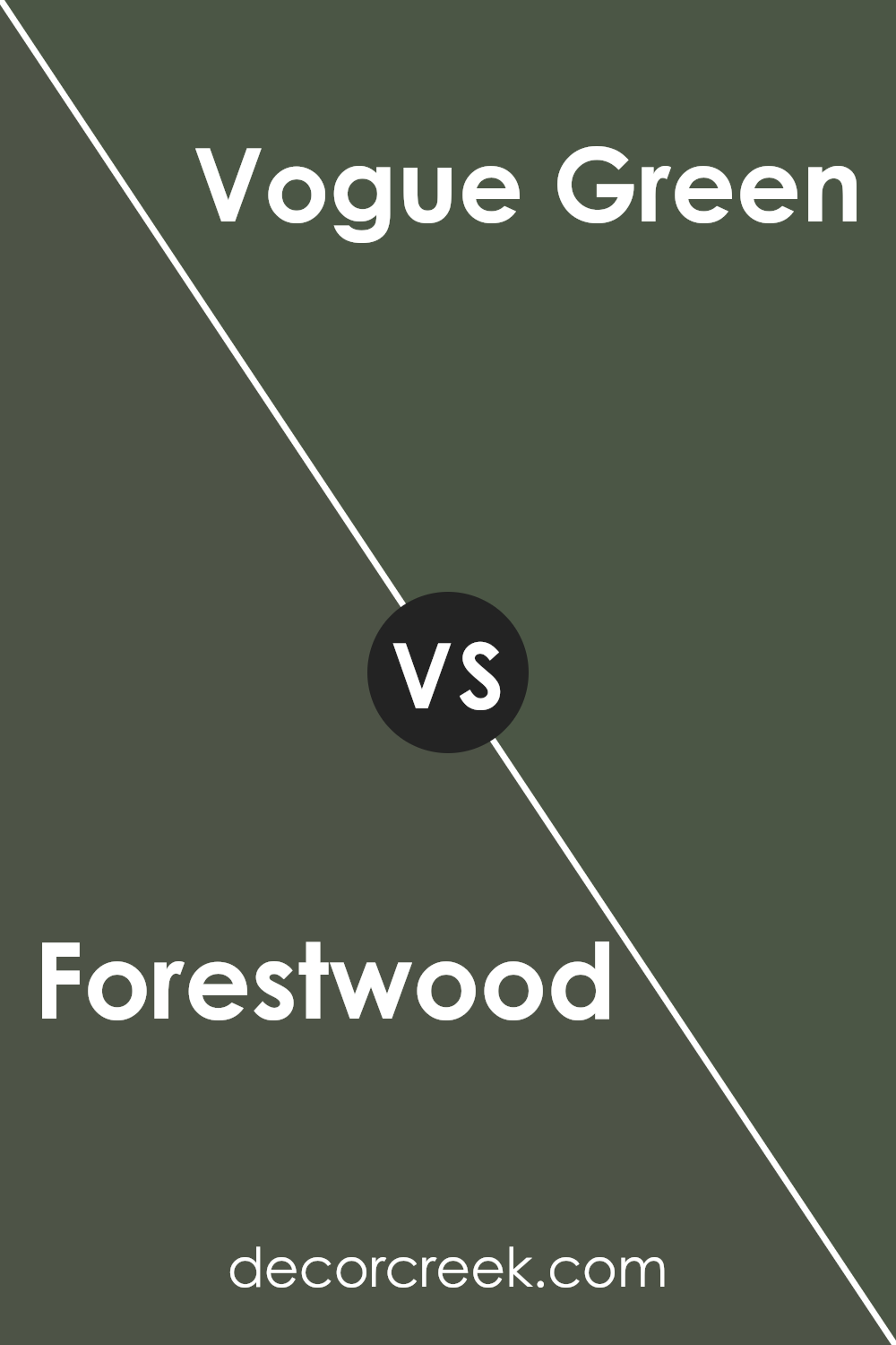
Forestwood SW 7730 by Sherwin Williams vs Vogue Green SW 0065 by Sherwin Williams
Forestwood (SW 7730) and Vogue Green (SW 0065) are two distinct shades offered by Sherwin Williams. Forestwood is a rich, earthy green with brown undertones, giving it a grounded and natural feel. It’s a color that mimics the shades found in dense forests, making it suitable for spaces where you want to evoke a sense of nature and warmth.
On the other hand, Vogue Green is a deeper, more vibrant green with a classic feel. It’s a bold choice that stands out and can add a pop of color to a room while still maintaining an elegant appearance.
Where Forestwood’s muted tones create a cozy atmosphere, Vogue Green’s intensity adds energy and a touch of glamour.
Both colors can work well in different settings: Forestwood for a more rustic or subdued look and Vogue Green for a more striking, stylish impression. Integrating them into your space depends on the feel you wish to achieve.
You can see recommended paint color below:
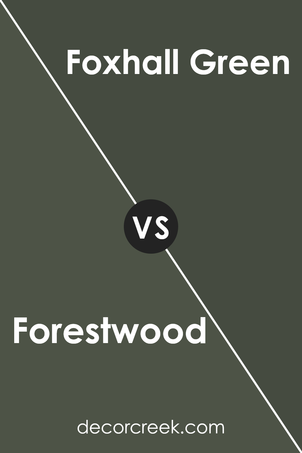
Forestwood SW 7730 by Sherwin Williams vs Foxhall Green SW 9184 by Sherwin Williams
Forestwood SW 7730 and Foxhall Green SW 9184 by Sherwin Williams are two distinct green shades that offer different vibes. Forestwood is a warm green with brown undertones, giving it an earthy feel. It’s reminiscent of deep forest landscapes, creating a cozy and grounded atmosphere in any space.
Foxhall Green, on the other hand, is a darker, richer green. It’s less earthy and more formal, evoking a sense of elegance. This color can add depth to a room and pairs well with neutral or lighter colors for a striking contrast.
While Forestwood feels more rustic and organic, Foxhall Green has a classic look. Both colors are versatile and can be used in various spaces, but your choice will depend on whether you’re looking to create a warm, inviting environment or a more refined, classic ambiance. Both greens have their unique charm and can enhance any home.
You can see recommended paint color below:
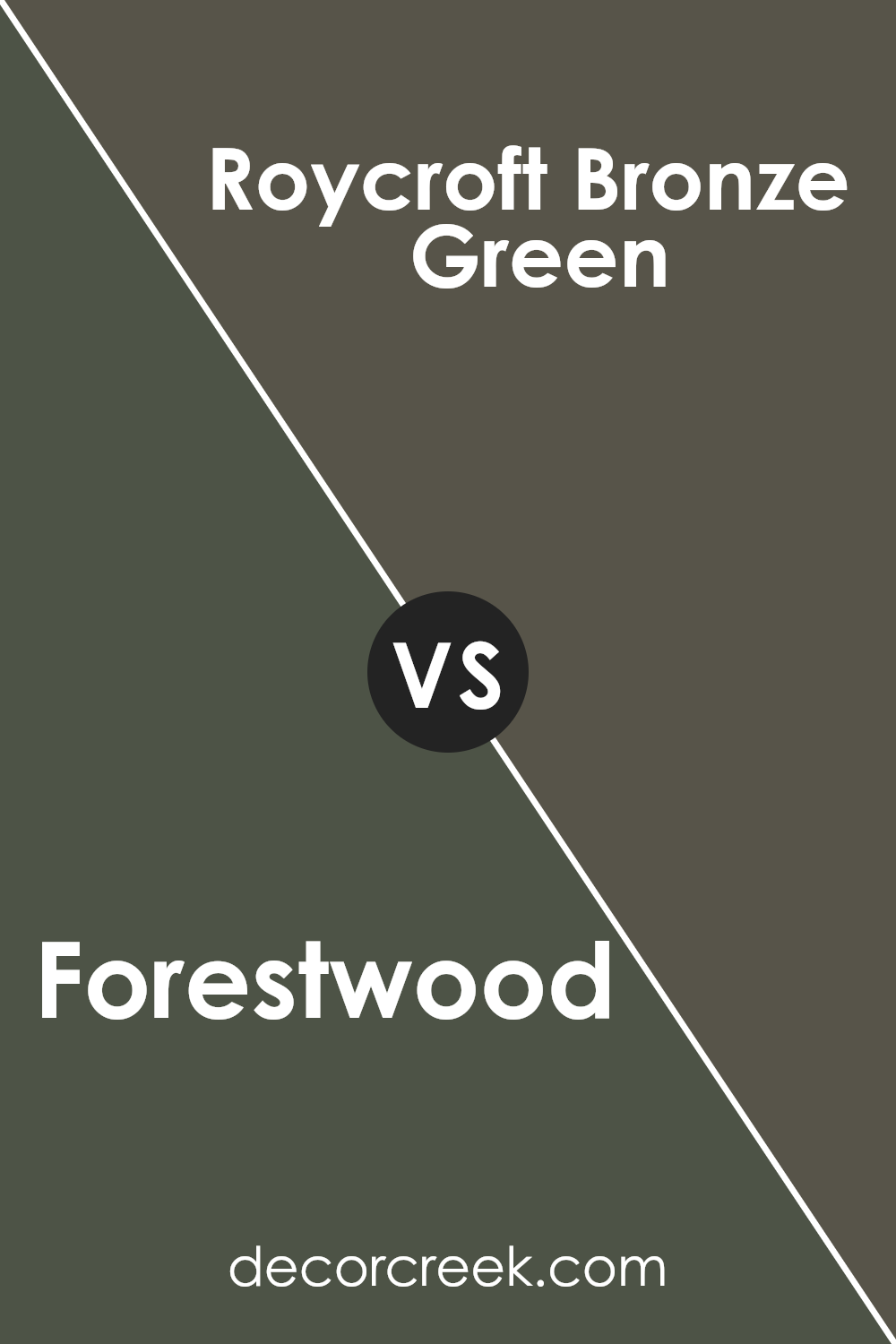
Forestwood SW 7730 by Sherwin Williams vs Roycroft Bronze Green SW 2846 by Sherwin Williams
Forestwood and Roycroft Bronze Green are two distinct shades by Sherwin Williams, each bringing its own vibe to a space. Forestwood is an earthy, muted green with brown undertones, evoking the feeling of dense, wooded areas. It’s a warm, grounded color that can make a room feel cozy and connected to nature.
On the other hand, Roycroft Bronze Green is a deeper, richer hue, reminiscent of historic woodwork or old-fashioned libraries. It has more of a bold presence compared to Forestwood, offering a touch of drama and traditional charm.
While both colors belong to the green family, Forestwood leans more towards a neutral and subtle appearance, making it versatile for various settings. Roycroft Bronze Green, however, provides a striking contrast and can serve as a statement color. Each choice depends on whether you want a space to convey calmness and warmth or a more dramatic, classic ambiance.
You can see recommended paint color below:
- SW 2846 Roycroft Bronze Green
Conclusion
After learning about SW 7730 Forestwood by Sherwin Williams, I have a clear picture of how special this paint color is. Forestwood is a gentle green that feels like a walk in a lush forest. It’s a mix of brightness and calmness that can make a room feel fresh and cozy at the same time.
Using Forestwood in my home seems like a great idea because it brings the feeling of nature inside. It’s a perfect choice for people who enjoy having a touch of the outdoors indoors. When I imagine painting a room with this color, I think it would feel refreshing, just like a breath of fresh air.
One of the best parts about Forestwood is how well it goes with other colors. This means I can match it with whites, browns, or even darker shades to create a nice look. It’s like having a color that gets along with everyone!
In short, SW 7730 Forestwood is a wonderful paint choice that can make any room feel more connected to nature. It’s friendly and adaptable, making it a simple yet beautiful way to refresh a space.
Now, I feel ready to pick up a brush and see how Forestwood changes the atmosphere in my home.
Ever wished paint sampling was as easy as sticking a sticker? Guess what? Now it is! Discover Samplize's unique Peel & Stick samples.
Get paint samples

