As you’re considering updates to your home’s palette, let me introduce you to a color that has caught my attention: SW 6163 Grassland by Sherwin Williams. This shade stands out as a serene and lush green, subtly imbued with earthy undertones that evoke the open spaces and gentle calm of sprawling fields. In rooms that need a touch of nature’s tranquility without overwhelming the senses, Grassland proves to be a versatile choice.
The beauty of Grassland lies in its adaptability. Whether in a sunlit living room or a dimmer, cozier study, it manages to pull in elements of the outdoors in a sophisticated yet understated manner. It pairs wonderfully with natural wood accents, stone features, and a wide range of neutrals.
If you’re thinking about crafting a space that feels grounded and peaceful, this color might just be the perfect backdrop.
Its ability to harmonize with various decor styles and settings makes it a reliable choice for those looking to refresh their walls with something that promises both beauty and longevity.
What Color Is Grassland SW 6163 by Sherwin Williams?
The color Grassland by Sherwin Williams is a refreshing shade of green with hints of gray, making it a versatile choice for home interiors. This subtle green tone resembles a lush meadow, offering a calm and cozy feel to any room. It works exceptionally well in creating a natural and inviting atmosphere.
Grassland pairs beautifully with light woods such as oak and maple, enhancing their natural grains and warm undertones. This color also looks stunning with white trim or cabinetry, which helps to create a crisp and clean look. For a rustic vibe, combining it with materials like linen or burlap can add a charming, earthy touch.
When it comes to interior styles, Grassland fits perfectly with a range of designs. It’s ideal for modern farmhouse décor, where its earthy tone complements natural elements and neutral palettes. This color also suits Scandinavian interiors well, as it harmonizes with minimalist design and functional furnishings. Additionally, for those who prefer a more traditional setting, Grassland works well with classic wooden furniture and rich textures like wool or woven rugs.
In summary, Grassland is a flexible color choice that enhances various materials and textures, fitting seamlessly into multiple decor styles while promoting a warm and welcoming environment.

Is Grassland SW 6163 by Sherwin Williams Warm or Cool color?
Grassland SW 6163 by Sherwin Williams is a warm and inviting paint color that looks great in homes. This hue integrates shades of green and beige, making it versatile for various living spaces. It excels in rooms that get plenty of natural light but also adds warmth to darker spaces.
Grassland is ideal for creating a cozy, welcoming environment in living rooms or bedrooms. Its soothing quality makes it suitable for home offices too, where it fosters a calm working atmosphere. When pairing with decor, this color matches beautifully with both lighter and darker woods, enhancing the natural elements of a room.
In terms of style compatibility, it goes well with rustic, traditional, and even modern decor, offering flexibility in design choices. Overall, it’s a practical choice for those looking to add a touch of warmth and nature to their living spaces without overwhelming the senses with bold colors.
Undertones of Grassland SW 6163 by Sherwin Williams
GrasslandSW 6163 is a unique paint color that includes a mix of subtle undertones that can significantly influence its appearance in different settings. The undertones in any color can change how it looks depending on the light source or other colors nearby. For example, in the case of Grassland, it has a variety of undertones such as light gray, pale pink, light purple, mint, light blue, grey, lilac, yellow, orange, light green, and olive. These undertones add depth and complexity to the main color.
When applied to interior walls, the range of undertones in Grassland means that the color can adapt slightly under different lighting conditions. In natural sunlight, you might notice the light blue or mint undertones making the room feel more open and airy. Meanwhile, in a room with less natural light, the grey or light gray might become more pronounced, giving the space a cozier feel.
This adaptability makes Grassland a versatile choice for decorating. It can easily complement various decorations and furniture styles. For instance, the lilac and pale pink undertones might pair well with soft textiles and romantic décor, while the mint and light green can harmonize with a more nature-inspired or minimalist style.
Choosing a color like Grassland for your walls means you’re bringing in a palette that can subtly shift and play with the space, partially reflecting its surroundings and the time of day, offering constantly refreshing perspectives in your home.
What is the Masstone of the Grassland SW 6163 by Sherwin Williams?
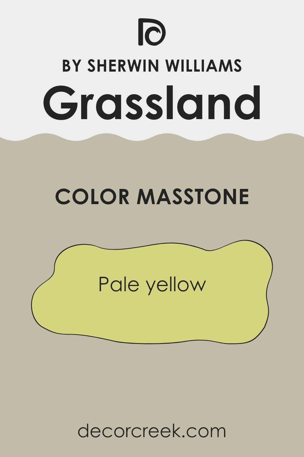
Grassland SW 6163 by Sherwin Williams is a soft, pale yellow color that instantly adds a light and airy feel to any room in the house. When you paint a room with this color, it creates a cheerful and welcoming environment. The light yellow hue is not too bright, so it doesn’t overwhelm the senses. Instead, it helps rooms appear more spacious and open.
This color works well in areas that don’t get a lot of natural light, as its light-reflective quality can help to brighten up dark spaces. It’s also versatile enough to be paired with a variety of décor styles and colors, from whites and beiges for a gentle look to darker greens and blues for a colorful contrast.
In a family home, this color can work wonders in living areas and kitchens where a friendly and inviting atmosphere is key. Overall, Grassland SW 6163 is a great choice if you’re looking for a light, neutral color that makes your space look and feel cheerful and relaxed.
How Does Lighting Affect Grassland SW 6163 by Sherwin Williams?
Lighting plays a crucial role in how colors appear in a space, affecting both mood and aesthetics. The color perception of paint like Grassland by Sherwin Williams can significantly change under different lighting conditions due to its undertones and saturation level.
Artificial Light:
In rooms lit with artificial light, the type of bulb (LED, fluorescent, halogen) impacts how a color is perceived. LEDs tend to emit a cooler, brighter light, making Grassland appear more vibrant and slightly cooler.
Fluorescent lights could bring out the green undertones, while halogen lights, which mimic natural light and are warmer, might make the color look softer and warmer.
Natural Light:
Grassland can look dramatically different in natural light depending on the time of day and the room’s orientation. Natural light is often considered the best type of light for viewing true color, but it can still alter the appearance of paint.
Room Orientation
– North-facing rooms: These rooms get less direct sunlight, which can make colors appear cooler. Grassland might look more subdued and slightly darker in these rooms.
– South-facing rooms: These receive more intense, direct sunlight, brightening colors. Here, Grassland can look lighter and reveal more of its vibrant, fresh green qualities.
– East-facing rooms: These rooms enjoy bright light in the morning, which can make the paint look very lively and warm as it catches the morning sun. As the light fades, the color may appear cooler and more muted.
– West-facing rooms: The afternoon and evening light in these rooms is warm and golden but less intense than morning light. Thus, Grassland can appear warmer and more inviting in the afternoon than in the morning.
In summary, Grassland’s appearance can shift from being more vibrant and lighter in a well-lit, south-facing room to more reserved and cooler in a north-facing room with less direct light. This variability shows why testing paint colors in your specific environment is essential.
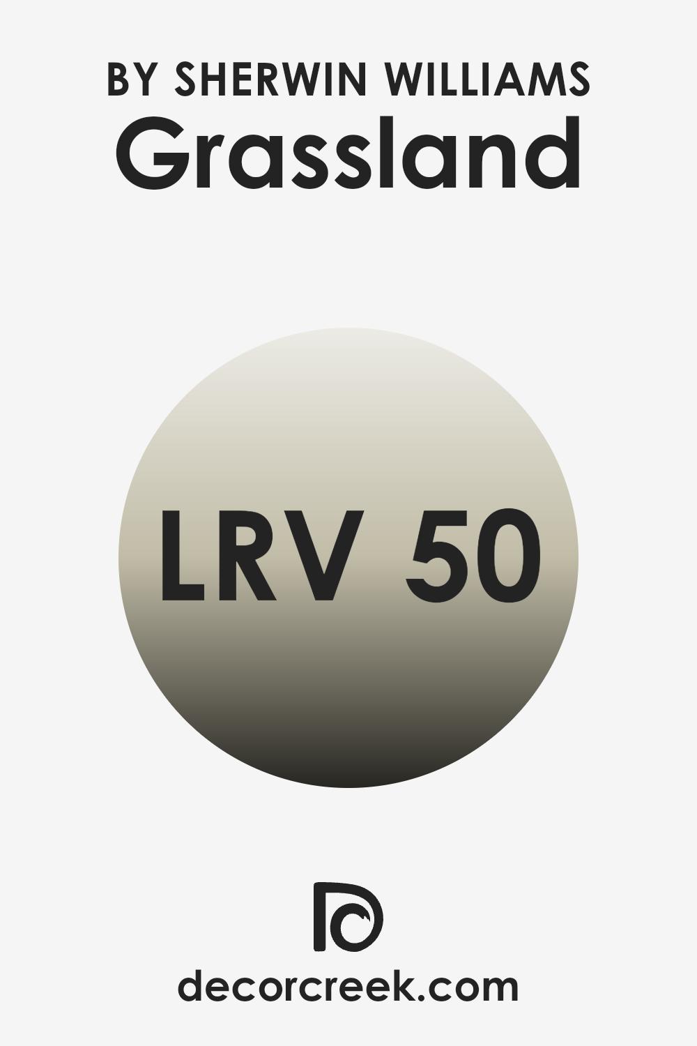
What is the LRV of Grassland SW 6163 by Sherwin Williams?
LRV stands for Light Reflectance Value, which is a measure used to describe the amount of visible light a paint color reflects when it’s applied to a surface. This value is particularly useful when choosing paint colors for your space, as it helps you understand how light or dark a color will appear once it’s on your walls.
A higher LRV means that the paint will reflect more light, making the space appear brighter and more open. Conversely, a lower LRV indicates that the color absorbs more light, typically making a room feel cozier and slightly smaller.
In the case of the paint color with an LRV of 50.108, it stands exactly in the middle of the scale, reflecting a moderate amount of light. This midpoint LRV makes it a versatile choice for many spaces, neither too dark nor too light. It’s a balanced choice that can work well in a variety of lighting conditions, helping to maintain a consistent look throughout the day. Whether in a well-lit living room or a dimly lit study, this color will retain a steady appearance, providing a neutral backdrop that complements various decor styles and furnishings.
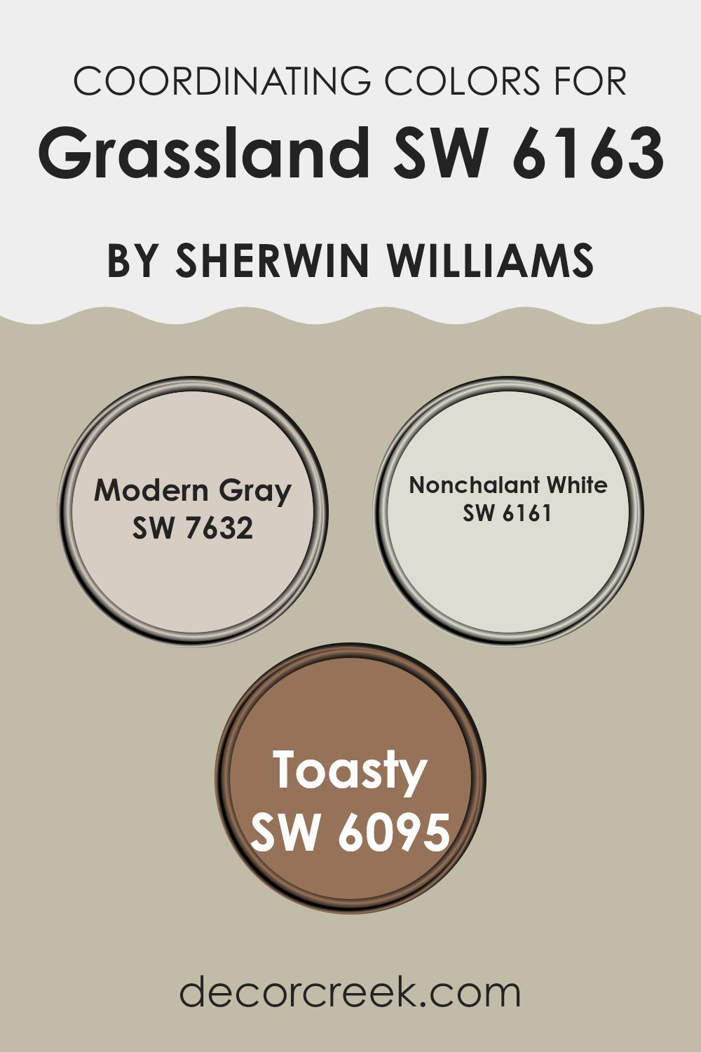
Coordinating Colors of Grassland SW 6163 by Sherwin Williams
Coordinating colors are shades that complement a primary color, in this case, the light green hue Grassland by Sherwin Williams. These coordinating shades enhance the primary color’s aesthetic and create a balanced visual flow in any space. They work by harmonizing with the primary color to produce a cohesive and pleasant atmosphere. For instance, a neutral color can provide a backdrop that allows a more vibrant primary color to stand out, while a deeper or contrasting shade can add depth and interest.
Modern Gray (SW 7632) is a gentle gray that works as a subtle background, allowing colors like Grassland to pop without overwhelming the senses. It’s perfect for those who want a fresh, clean look that still feels warm and inviting. Nonchalant White (SW 6161) is a soft, creamy white that offers a crisp contrast to deeper tones, highlighting their richness without competing for attention.
It’s ideal for trim or ceilings to give a lifted effect to the room. Lastly, Toasty (SW 6095) is a warm, cozy brown that pairs beautifully with the natural tones of Grassland. It adds an earthy richness that complements the freshness of the green, perfect for creating a comforting and inviting space. Together, these colors create a harmonious palette that enhances Grassland’s natural charm.
You can see recommended paint colors below:
- SW 7632 Modern Gray
- SW 6161 Nonchalant White
- SW 6095 Toasty
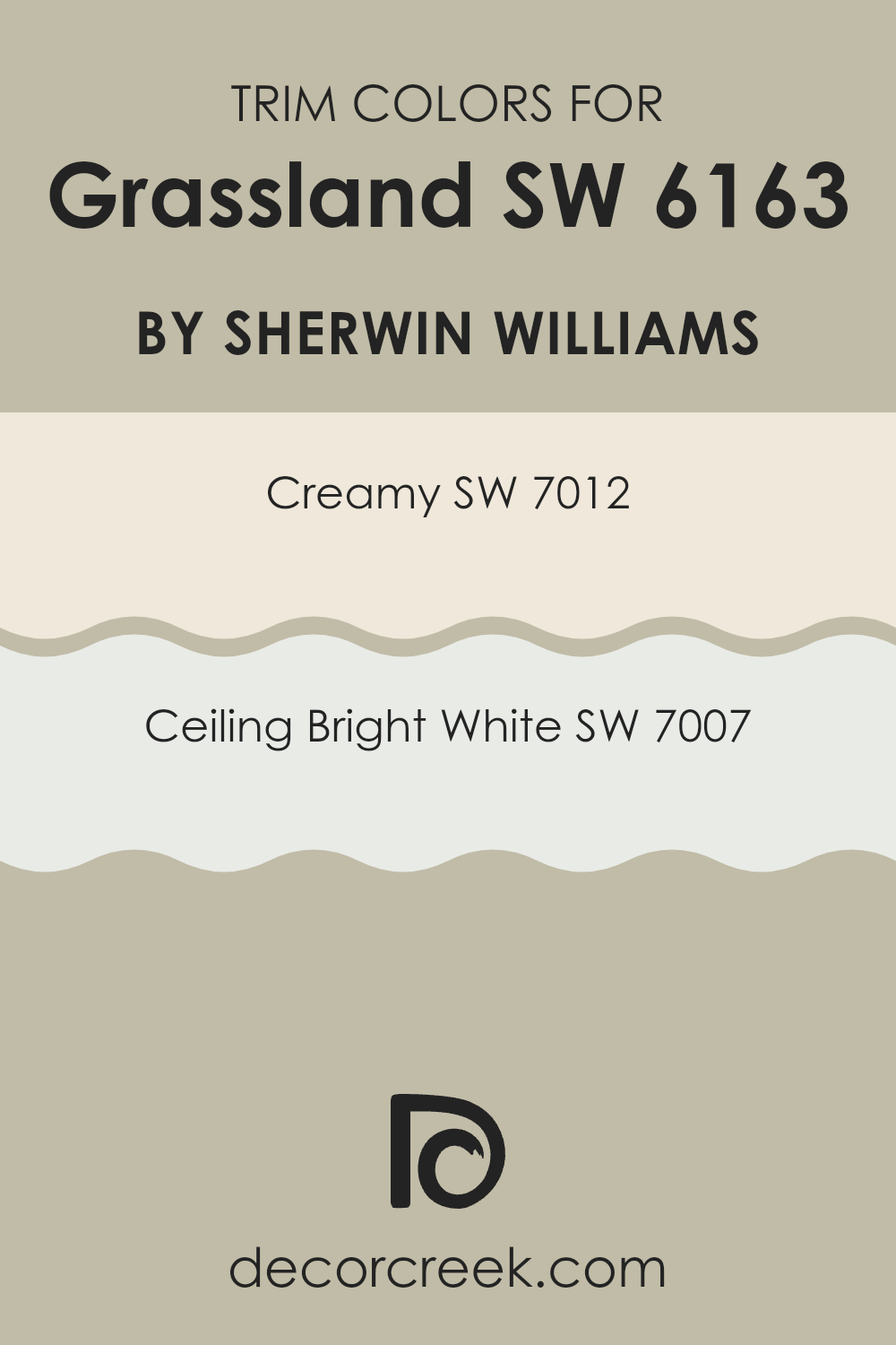
What are the Trim colors of Grassland SW 6163 by Sherwin Williams?
Trim colors are used to highlight architectural details and frames in a space, such as doorways, window frames, and baseboards. Choosing the right trim color can significantly affect the feel and aesthetic of a room.
For example, using trim colors like SW 7012 – Creamy or SW 7007 – Ceiling Bright White with a main color such as Grassland by Sherwin Williams can enhance the harmonious look of a space. These trim colors provide a subtle contrast that can make wall colors more vivid and create a clean, finished look in any room.
SW 7012 – Creamy is a soft, warm off-white that adds a gentle brightness without overpowering. It’s a great choice for creating a cozy and welcoming ambiance when used as a trim color. On the other hand, SW 7007 – Ceiling Bright White is a crisp, pure white that offers a sharp contrast, perfect for bringing a fresh and airy feel to a room. This color is ideal for making other colors stand out and for adding a sense of clear definition to the decorative elements of a room.
You can see recommended paint colors below:
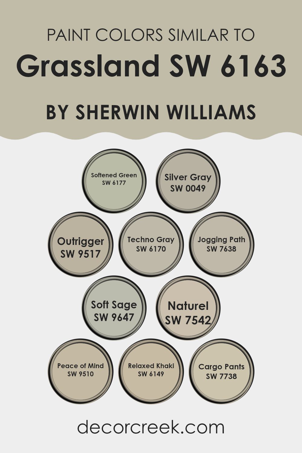
Colors Similar to Grassland SW 6163 by Sherwin Williams
Using similar colors in decorating can create a harmonious and cohesive look in any space. This approach is especially useful when one wishes to enhance a room’s aesthetic without adding visual clutter. Picking colors that share a subtle connection can unify a room while subtle differences in shade can accord depth and interest.
For example, Softened Green SW 6177 has a gentle, muted tone, which can invoke feelings of relaxation and calmness, making it great for living rooms or bedrooms. Silver Gray SW 0049 brings a light, airy quality.
Its neutral shade is versatile, perfect for spaces that benefit from a soft, understated atmosphere. Outrigger SW 9517 offers a darker, moodier green, adding a touch of drama and character, ideal for a feature wall or accents. Techno Gray SW 6170, a deeper gray, works well in modern settings and pairs nicely with brighter colors for a balanced look.
Jogging Path SW 7638 is a warm gray that evokes a welcoming vibe, suitable for communal areas like hallways and kitchens. Soft Sage SW 9647 has an understated, earthy green which complements natural materials like wood or stone. Naturel SW 7542 translates into a creamy beige, providing a soft backdrop that allows other elements of the room to stand out.
Peace of Mind SW 9510 is a soothing blue, ideal for creating a pleasant and restful environment in places of retreat. Relaxed Khaki SW 6149 brings a richness, offering warmth that’s great for cozy, inviting spaces. Lastly, Cargo Pants SW 7738, a bold khaki, can give depth to a room, suitable for spaces that require a robust, grounding color scheme.
You can see recommended paint colors below:
- SW 6177 Softened Green
- SW 0049 Silver Gray
- SW 9517 Outrigger
- SW 6170 Techno Gray
- SW 7638 Jogging Path
- SW 9647 Soft Sage
- SW 7542 Naturel
- SW 9510 Peace of Mind
- SW 6149 Relaxed Khaki
- SW 7738 Cargo Pants
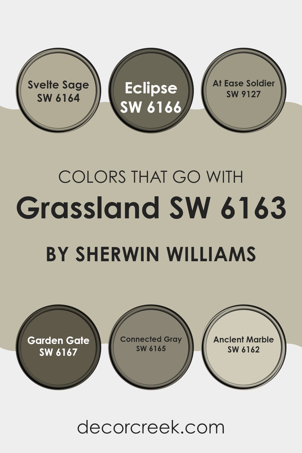
Colors that Go With Grassland SW 6163 by Sherwin Williams
Selecting the right colors to complement Grassland SW 6163 by Sherwin Williams can greatly enhance the aesthetic appeal and harmony of a space. When coordinated well, these colors can create an inviting and coherent look, whether you’re aiming for a comforting home vibe or a professional office environment. Choosing the right combination can add depth and bring to life the overall interior design.
For instance, Svelte Sage SW 6164 provides a subtle green that works effortlessly with Grassland, giving spaces a soft, natural look. On the other hand, Eclipse SW 6166 offers a much darker hue, resembling a deep twilight sky, which can act as an excellent accent for more dramatic and contrasting designs.
At Ease Soldier SW 9127 steps in as a mild, soothing olive green, ensuring a calm and grounded feeling, perfect for relaxed spaces. Garden Gate SW 6167 is a tad deeper than Grassland, which can help in creating a harmonious flow in color transition from room to room. Connected Gray SW 6165 is a neutral, modern choice that can help in tying different color themes together without clashing.
Lastly, Ancient Marble SW 6162 offers a lighter, almost ethereal touch of green which can brighten spaces while keeping them cozy and warm. Each of these colors holds the potential to blend beautifully with Grassland, ensuring a tailored space that’s both pleasant and stylistically coherent.
You can see recommended paint colors below:
- SW 6164 Svelte Sage
- SW 6166 Eclipse
- SW 9127 At Ease Soldier
- SW 6167 Garden Gate
- SW 6165 Connected Gray
- SW 6162 Ancient Marble
How to Use Grassland SW 6163 by Sherwin Williams In Your Home?
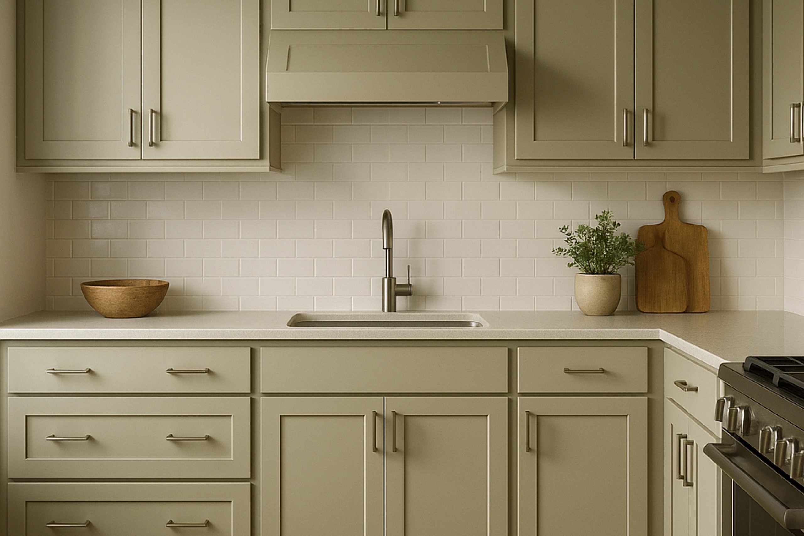
Grassland SW 6163 by Sherwin Williams is a gentle green hue that brings a touch of nature into your home. Its soft, earthy quality makes it ideal for creating a cozy and welcoming atmosphere in any room. You can use it in your living room or bedroom to add a calm, refreshing vibe. This color works well with natural materials like wood or wicker, enhancing a rustic or country-style decor.
In the kitchen, Grassland can freshen up the space, especially when paired with white cabinets or natural stone countertops. It’s also a great choice for bathrooms, where it pairs nicely with light-colored tiles, creating a light and clean look.
For those who enjoy DIY projects, you could paint a piece of furniture in this color to introduce an accent piece that is both unique and stylish. Overall, Grassland SW 6163 offers a versatile option for adding a natural touch to your home decor.
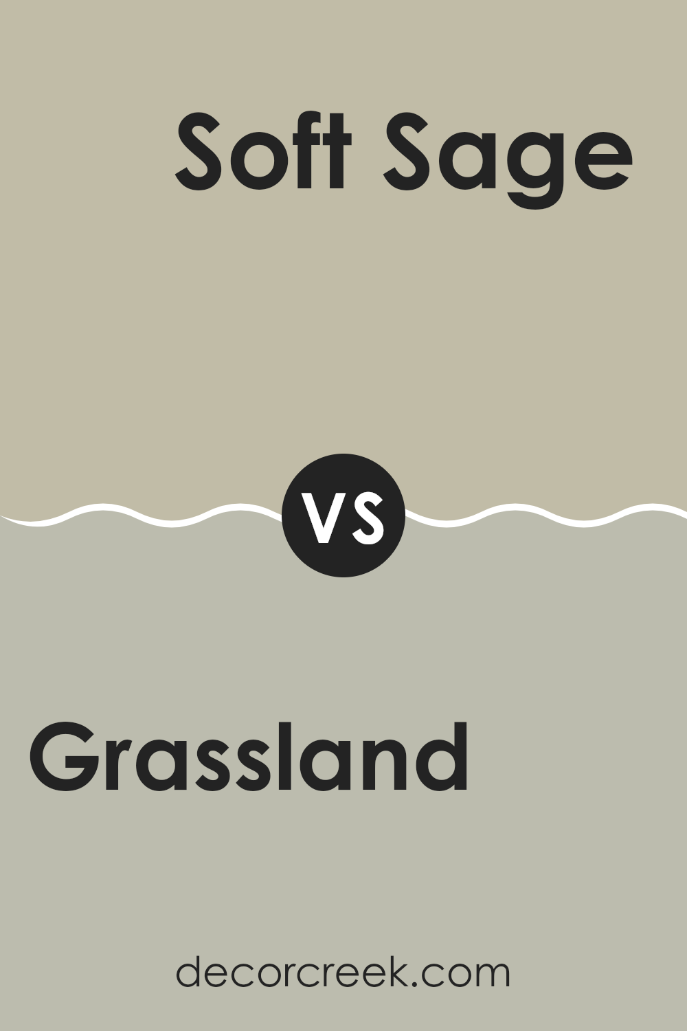
Grassland SW 6163 by Sherwin Williams vs Soft Sage SW 9647 by Sherwin Williams
Grassland SW 6163 and Soft Sage SW 9647, both by Sherwin Williams, offer unique shades of green, each creating a different mood and style. Grassland is a deeper, more vibrant green, reminiscent of lush, verdant fields.
It gives a sense of liveliness and freshness to a room, perfect for energizing a space. On the other hand, Soft Sage has a lighter, more muted tone. This color leans towards a more subtle and gentle feel, making it ideal for a calm and relaxing environment.
It’s especially well-suited for bedrooms or areas where you want a less intense color impact. When comparing the two, Grassland stands out as the bolder choice, while Soft Sage provides a softer, more understated look. Depending on the ambience you want to create in your space, either color could be the perfect choice.
You can see recommended paint color below:
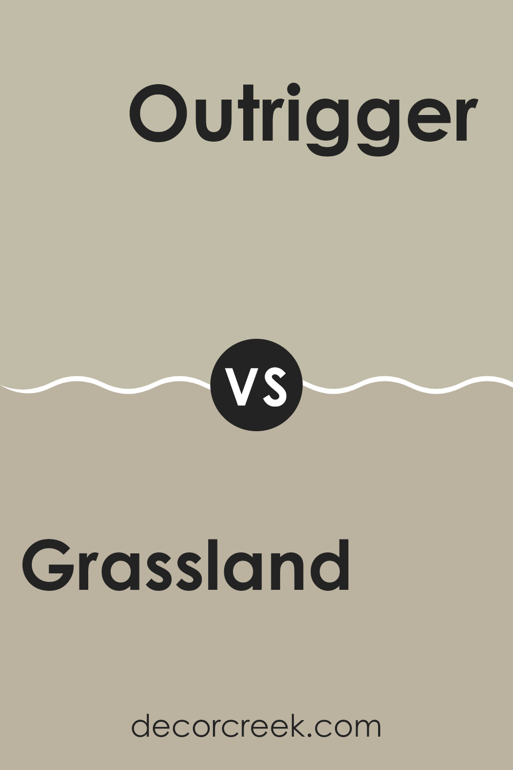
Grassland SW 6163 by Sherwin Williams vs Outrigger SW 9517 by Sherwin Williams
Grassland SW 6163 and Outrigger SW 9517 by Sherwin Williams are unique in their own ways. Grassland is a soft, muted green, reminiscent of a calm, lush meadow. It provides a natural and fresh vibe, making spaces feel airy and relaxed.
This color works well in rooms that get a lot of sunlight, where its true beauty and gentle green tones can shine through. On the other hand, Outrigger is a much deeper, intense color. It resembles the mysterious depths of the ocean and can bring a strong, dramatic feel to any space.
This darker hue is perfect for accent walls or for creating a focal point in a room. When comparing the two, Grassland offers a more understated and refreshing feel, while Outrigger goes bold and impactful, adding depth and drama to interior spaces.
You can see recommended paint color below:
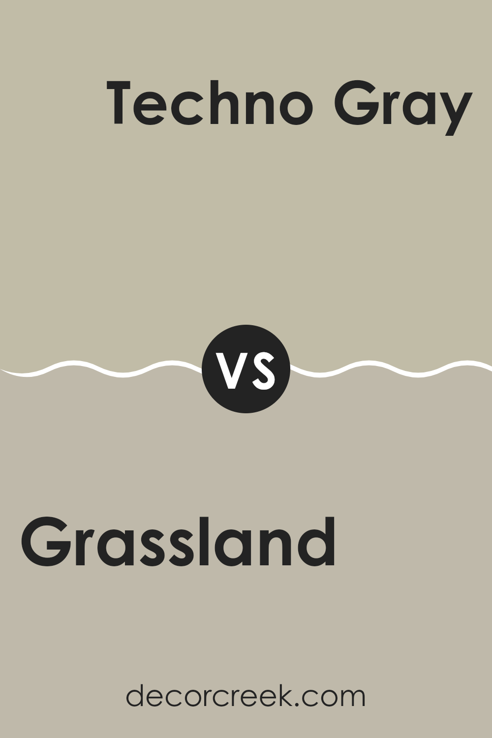
Grassland SW 6163 by Sherwin Williams vs Techno Gray SW 6170 by Sherwin Williams
Grassland by Sherwin Williams is a gentle green hue that often brings to mind open meadows or a subtle, leafy undertone. It’s a fresh and calming color that is versatile for various spaces, encouraging a relaxed and breezy feel. On the other hand, Techno Gray is a darker, more muted shade with a modern twist.
Its gray tones are balanced and neutral, making it an excellent choice for those seeking a contemporary look without being too bold. When you compare the two, Grassland offers a touch of nature and lightness, likely making a room feel more airy and open.
Techno Gray, in contrast, provides a sense of grounding and might typically make a space feel cozier and more enclosed. These two colors could work well together, with Techno Gray providing a solid base and Grassland adding splashes of brightness and nature-inspired freshness.
You can see recommended paint color below:
- SW 6170 Techno Gray
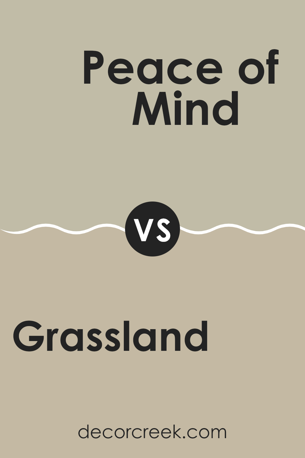
Grassland SW 6163 by Sherwin Williams vs Peace of Mind SW 9510 by Sherwin Williams
Grassland and Peace of Mind are both colors by Sherwin Williams, but they have distinct tones that set them apart. Grassland is a more earthy, green shade, resembling the natural color of lush fields. It is a deeper, more nature-inspired green that brings a sense of freshness and vitality to a space. It works well in areas where you want to add a touch of nature’s calmness without being too bold.
On the other hand, Peace of Mind is a softer, lighter blue. This color has a gentle, airy quality that makes it perfect for creating a relaxed and easygoing atmosphere in a room. It can make small spaces appear larger and brighter, while adding a soothing vibe to any room.
When comparing the two, Grassland introduces a robust, natural feel, whereas Peace of Mind offers a light, airy ambiance. Whether you want the grounding influence of a green or the open, expansive feel of a blue, depends on the mood you’re looking to create in your space.
You can see recommended paint color below:
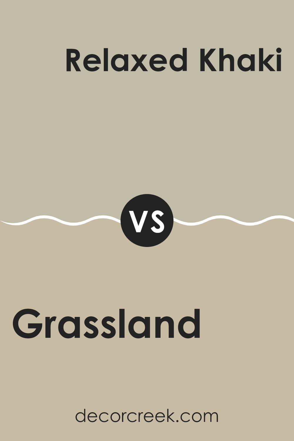
Grassland SW 6163 by Sherwin Williams vs Relaxed Khaki SW 6149 by Sherwin Williams
Grassland SW 6163 and Relaxed Khaki SW 6149 are two earthy paint colors by Sherwin Williams, each presenting its own unique vibe. Grassland is a fresh, vibrant green that mimics the lush hues of a sunlit field.
It’s bright and lively, making it perfect for spaces where you want a natural yet cheerful atmosphere. On the other hand, Relaxed Khaki is a softer, more muted color. Closer to a light brown with hints of green, it offers a calm, cozy feel that’s ideal for creating a peaceful setting in a room.
While Grassland brings a burst of energy, Relaxed Khaki provides a gentle warmth, making it more suited for relaxing spaces. Both colors can freshen up a space but in distinctly different ways: one energizes, while the other soothes.
You can see recommended paint color below:
- SW 6149 Relaxed Khaki
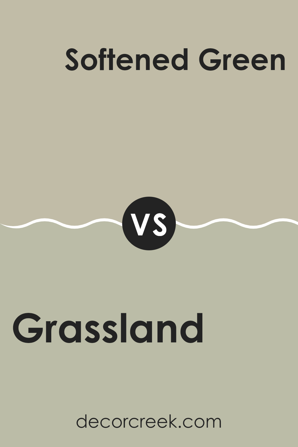
Grassland SW 6163 by Sherwin Williams vs Softened Green SW 6177 by Sherwin Williams
Grassland and Softened Green, both from Sherwin Williams, offer distinct green hues that can influence the mood and style of a space. Grassland has a more vivid and rich green tone that can bring a sense of freshness and vitality to a room. It mimics the vibrant hues of a well-kept lawn or a lush garden, making it ideal for those looking to infuse a natural and energetic vibe into their space.
On the other hand, Softened Green is a more muted green with a subtle gray undertone. This color is softer and less intense, providing a calm and soothing feel. It’s perfect for creating a relaxed atmosphere in spaces like bedrooms or studies where you want a less dynamic and more gentle ambiance.
Overall, Grassland offers a bolder and more dynamic choice, while Softened Green is better for creating a gentle and soothing environment. Both colors can enhance a room in different ways, depending on the desired outcome.
You can see recommended paint color below:
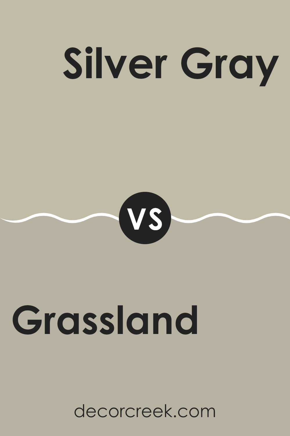
Grassland SW 6163 by Sherwin Williams vs Silver Gray SW 0049 by Sherwin Williams
Grassland SW 6163 by Sherwin Williams is a soft green shade that resembles the colors you might see in a meadow or open field. It gives off a natural and fresh vibe, making it a great choice for spaces where you want to add a touch of nature. On the other hand, Silver Gray SW 0049 by Sherwin Williams is a light gray color that provides a clean and subtle look. This color is very versatile and works well in many areas of a home, adding a gentle, understated elegance.
When comparing these two, Grassland brings in more warmth and energy due to its green hues, suggesting growth and renewal. This makes it ideal for areas like a kitchen or a sunroom, where you might want a lively atmosphere.
Silver Gray, with its cooler tones, offers a more neutral backdrop, making it excellent for bedrooms or living rooms where a calming effect is desirable. Both colors are quite adaptable and can be used in various living spaces to create the desired mood.
You can see recommended paint color below:
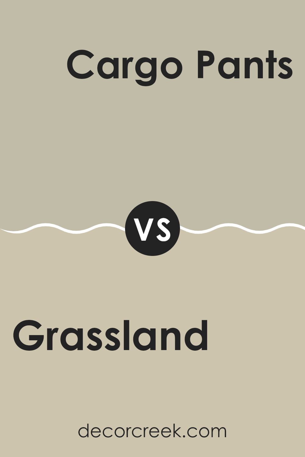
Grassland SW 6163 by Sherwin Williams vs Cargo Pants SW 7738 by Sherwin Williams
Grassland and Cargo Pants, two distinct paint colors from Sherwin Williams, offer unique vibes for home decor. Grassland is a light, soft green that brings a fresh and airy feel to any room. It’s like having a hint of spring greenery indoors, which can make a space feel more lively and inviting.
On the other hand, Cargo Pants is a darker shade of olive green. This color has an earthy, grounding effect, providing a calm, cozy atmosphere. It’s great for creating a more secluded and intimate setting, like in a study or den.
Both colors pair well with natural materials such as wood or stone, enhancing the overall organic appeal of a room. However, Grassland is typically better suited for spaces that benefit from a bright, open look, such as kitchens and bathrooms, while Cargo Pants works well in areas where a more subdued or restful ambiance is desired.
You can see recommended paint color below:
- SW 7738 Cargo Pants
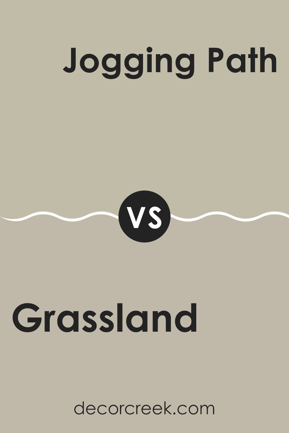
Grassland SW 6163 by Sherwin Williams vs Jogging Path SW 7638 by Sherwin Williams
Grassland and Jogging Path, both by Sherwin Williams, present subtle yet distinct differences in their tones that can affect the mood and style of a room. Grassland is a gentle green that echoes the colors of a field rich with new growth. It’s light and airy, providing a fresh, calming natural vibe to spaces, making it ideal for rooms that benefit from a touch of nature’s soothing qualities.
On the other hand, Jogging Path is a neutral gray with hints of green, giving it an understated earthiness. This color is more subdued compared to Grassland, lending a feeling of stability and quiet sophistication to any space. It works beautifully in areas where you want a color that balances well with both warm and cool tones, making it versatile for various decorating styles.
Choosing between them depends on your desired atmosphere: Grassland injects vibrancy and life, giving a room an open, welcoming feel, while Jogging Path offers a calm, grounding backdrop, suitable for a more muted or conservative design palette.
You can see recommended paint color below:
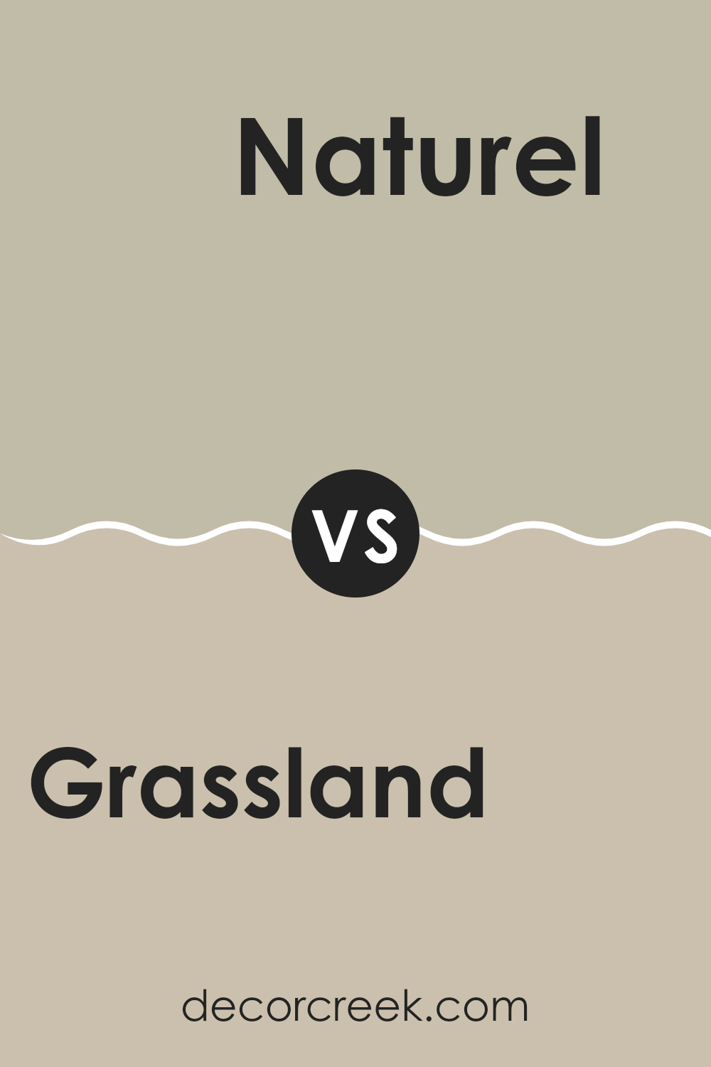
Grassland SW 6163 by Sherwin Williams vs Naturel SW 7542 by Sherwin Williams
Grainland SW 6163 by Sherwin Williams is a refreshing green tone, reminiscent of lush, vibrant grasslands under clear skies. It’s bright and fresh, offering a revitalizing feel to any space. This color is perfect for bringing a touch of the outdoors inside and works well in areas that benefit from a lively, natural ambiance.
On the other hand, Naturel SW 7542, also by Sherwin Williams, is a subtle, earthy beige. It’s more understated than Grainland, providing a neutral backdrop that complements a wide range of décor. This color suits those looking for a calm, soothing vibe in their room without the intensity of brighter colors.
Both colors reflect elements of nature but in distinct ways. Grainland injects energy and vividness, ideal for spaces like kitchens or playrooms. Naturel, meanwhile, is better suited for relaxing spaces like living rooms or bedrooms, where a soft, gentle atmosphere is desired. Together, these colors can harmonize well, with Naturel balancing the vitality of Grainland.
You can see recommended paint color below:
- SW 7542 Naturel
As I wrap up my thoughts about SW 6163 Grassland by Sherwin Williams, I’m reminded just how powerful a simple can of paint can be when it comes to making a room feel fresh and new. Grassland isn’t just any green; it’s a soft, soothing color that reminds me of a peaceful day in the park. It’s gentle enough to make any room feel more welcoming, from kitchens to bedrooms or even a bathroom.
I learned that when you pick a color like Grassland for your walls, it helps other colors in your room stand out. Imagine having bright blue pillows or a sunny yellow blanket; these colors will really pop against a Grassland backdrop. This paint isn’t too bright, so it won’t tire your eyes, but it still adds a lovely touch of cheer to any room.
Using SW 6163 Grassland is like giving your room a new personality. It’s subtle yet effective in changing the mood. Whether you want a place for relaxing or a fun spot for playing games, this color adds just the right touch.
In conclusion, trying out SW 6163 Grassland by Sherwin Williams was a great decision. It’s easy to see why it’s a popular choice: it’s friendly, calm, and works well in so many different rooms. So if you’re thinking about giving a room in your house a little makeover, you might want to consider this beautiful green to create a fresh, inviting atmosphere.
Ever wished paint sampling was as easy as sticking a sticker? Guess what? Now it is! Discover Samplize's unique Peel & Stick samples.
Get paint samples

