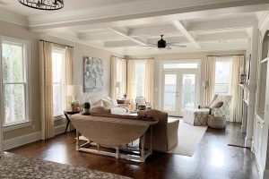
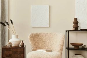
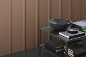
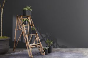
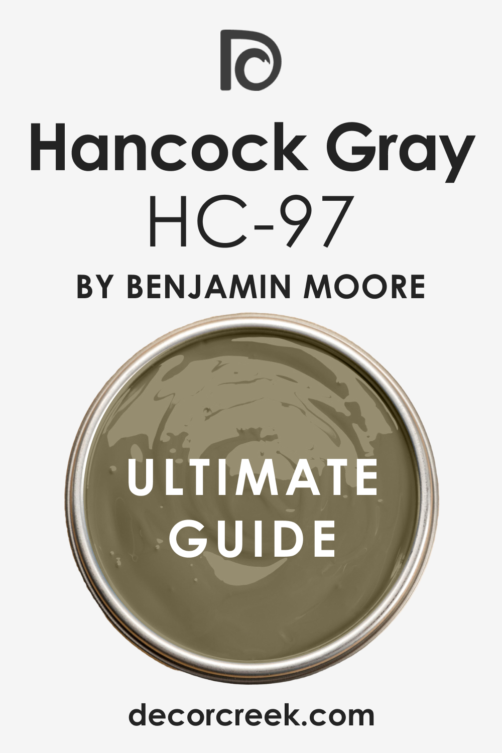
Colors play a significant role in setting the mood and ambience of our spaces. One such color that has gained popularity in modern homes is Hancock Gray HC-97.
Through the facets of undertones, LRV, coordinating shades, and effects under different lighting, let’s uncover the intricacies of this intriguing hue.
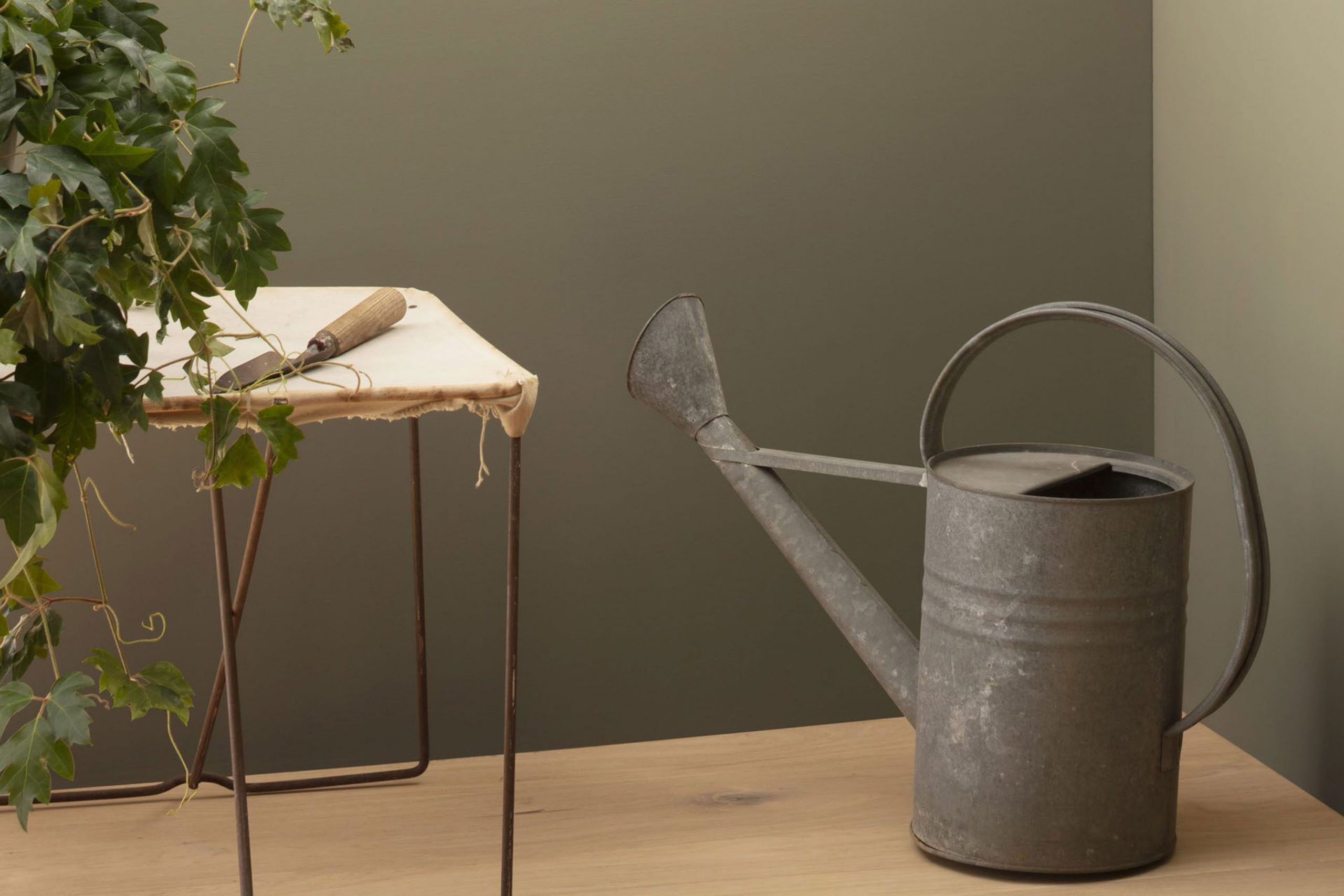
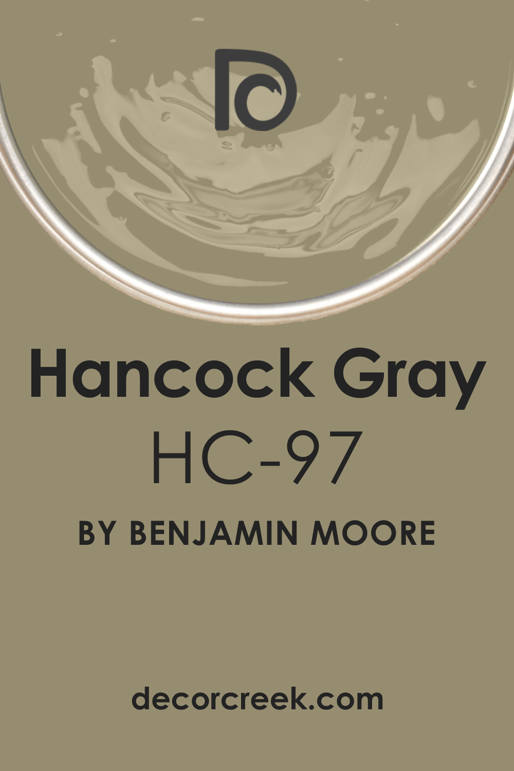
What Color Is Hancock Gray HC-97?
Hancock Gray HC-97 is a serene and sophisticated gray that exudes a touch of elegance. It has a tranquil demeanor, making it ideal for spaces where calmness is the order of the day. This shade harmonizes seamlessly with contemporary, minimalist, and even traditional interior styles.
When paired with organic materials such as wood and stone or soft textures like velvet or linen, its beauty truly shines.
Ever wished paint sampling was as easy as sticking a sticker? Guess what? Now it is! Discover Samplize's unique Peel & Stick samples.
Get paint samples
Is It a Warm Or Cool Color?
Hancock Gray HC-97 leans towards the cool spectrum. This cool essence grants homes a crisp, airy ambiance, enhancing feelings of spaciousness.
Such cool tones are known to evoke a sense of peace and relaxation, making Hancock Gray a top choice for bedrooms, bathrooms, or any space that benefits from a tranquil atmosphere.
Undertones of Hancock Gray HC-97
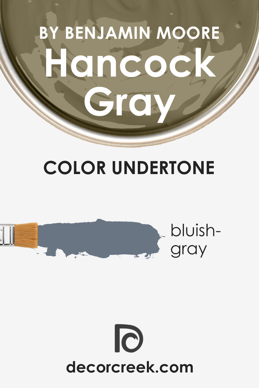
Like all colors, Hancock Gray possesses undertones that subtly influence its appearance. It carries bluish undertones, which, when played up against certain backdrops, might make it appear slightly more blueish-gray than a true gray.
Undertones are essential as they can change the perception of a color. In the case of Hancock Gray HC-97, its undertones, when painted on interior walls, could create a cooler ambiance, particularly if paired with contrasting colors.
Coordinating Colors of Hancock Gray HC-97
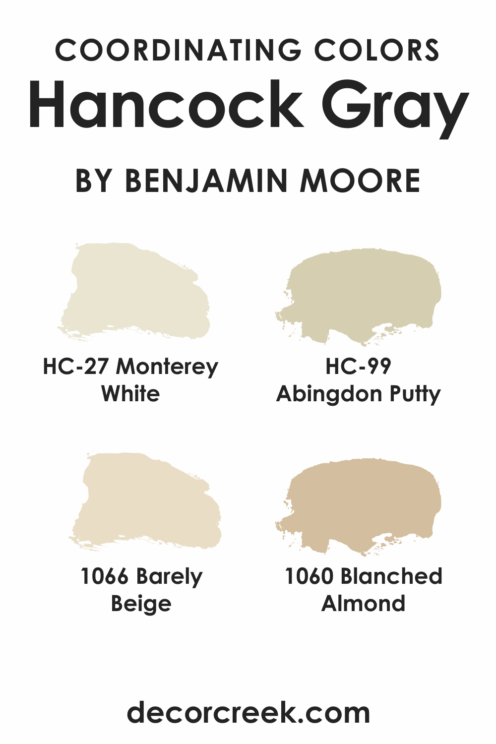
Coordinating colors provide harmony and balance to a color scheme. For Hancock Gray HC-97, some notable coordinating colors include:
- HC-27 Monterey White: A delicate, airy white.
- HC-99 Abingdon Putty: A soft, muted beige.
- BM 1066 Barely Beige: A light, warm beige.
- BM 1060 Blanched Almond: A creamy off-white.
Additionally, consider integrating shades like BM 1062 Bleeker Beige, BM 1059 Toasted Almond, and BM 1064 Ashley Gray for further harmony.
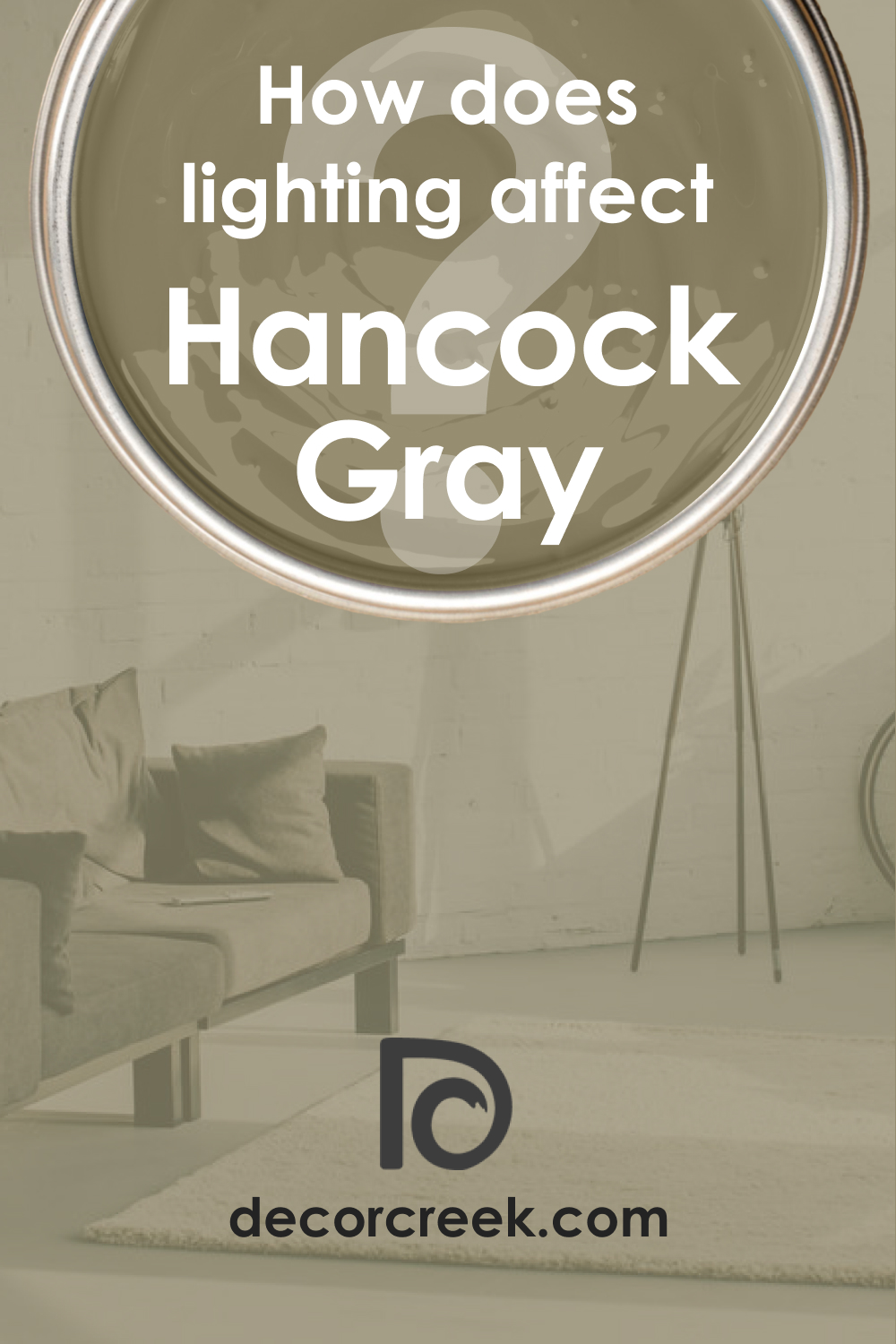
How Does Lighting Affect Hancock Gray HC-97?
Lighting can dramatically change the appearance of a color. Under natural daylight, Hancock Gray HC-97 appears as a pure gray, but artificial light may emphasize its blue undertones. In north-faced rooms, it might appear cooler and slightly darker due to the indirect sunlight.
South-faced rooms will highlight its truest form, as the generous sunlight will enhance its clarity. In east-faced rooms, morning light will present it as a crisp gray, while the afternoon light in west-faced rooms might lean into its bluish undertones slightly.
LRV of Hancock Gray HC-97
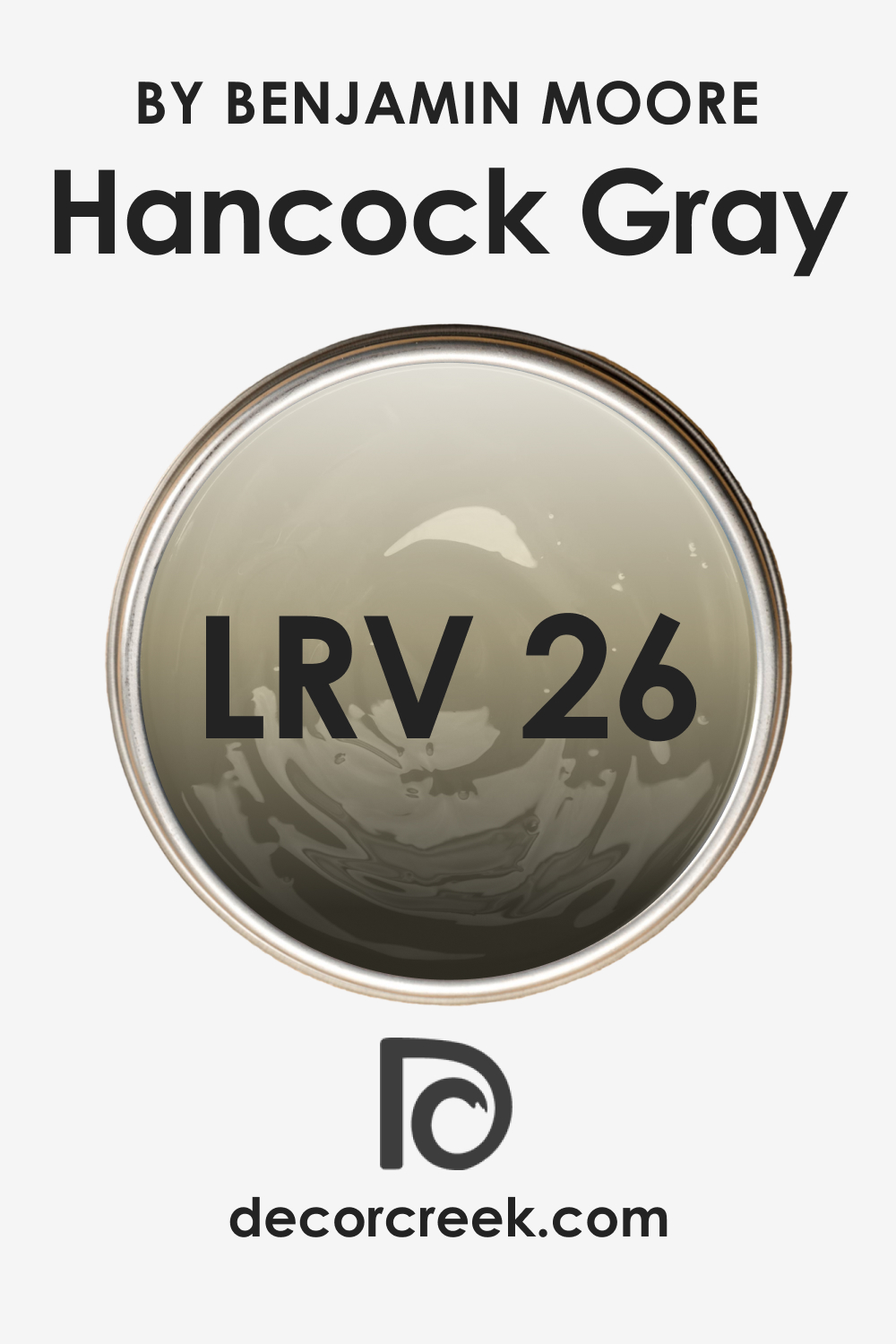
LRV, or Light Reflectance Value, indicates how much light a color reflects. With an LRV of 26, Hancock Gray is on the darker side, suggesting it absorbs more light than it reflects. This means in smaller spaces or rooms with limited natural light, it might make the area feel cozier or slightly more confined.
Conversely, in well-lit spaces, the color remains true and doesn’t overpower the ambiance.
LRV – what does it mean? Read This Before Finding Your Perfect Paint Color
Trim Colors of Hancock Gray HC-97
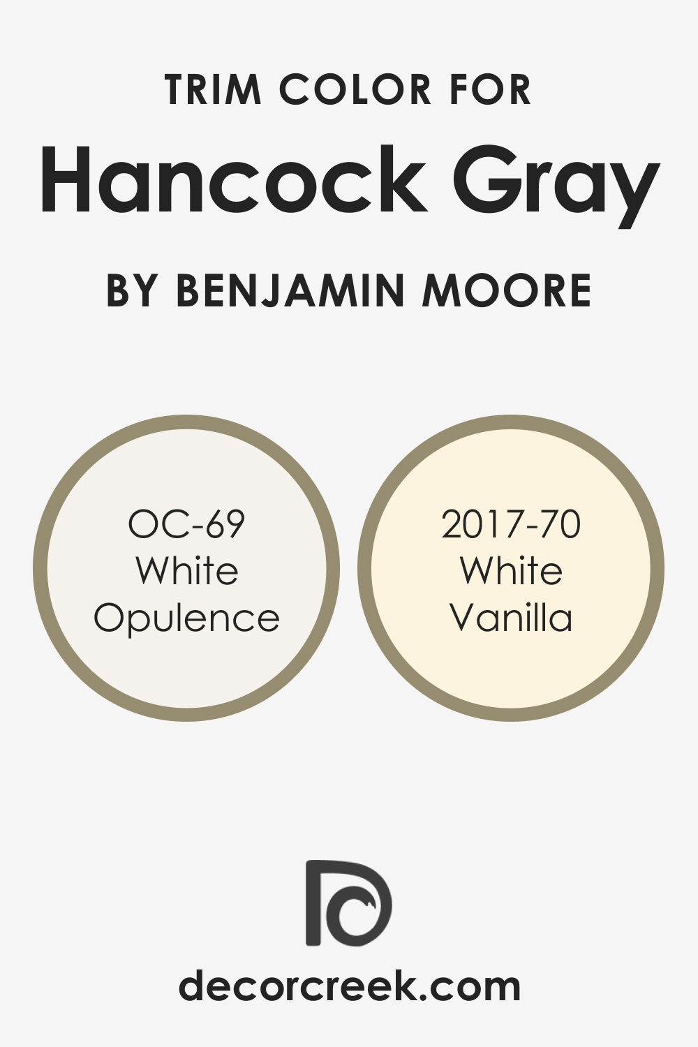
Trim colors are crucial as they frame and accentuate a space. For Hancock Gray HC-97, opting for whites from the same brand creates a polished look. Consider OC-69 White Opulence and BM 2017-70 White Vanilla.
These shades offer a crisp contrast, making the gray stand out while ensuring the room remains cohesive.
Colors Similar to Hancock Gray HC-97
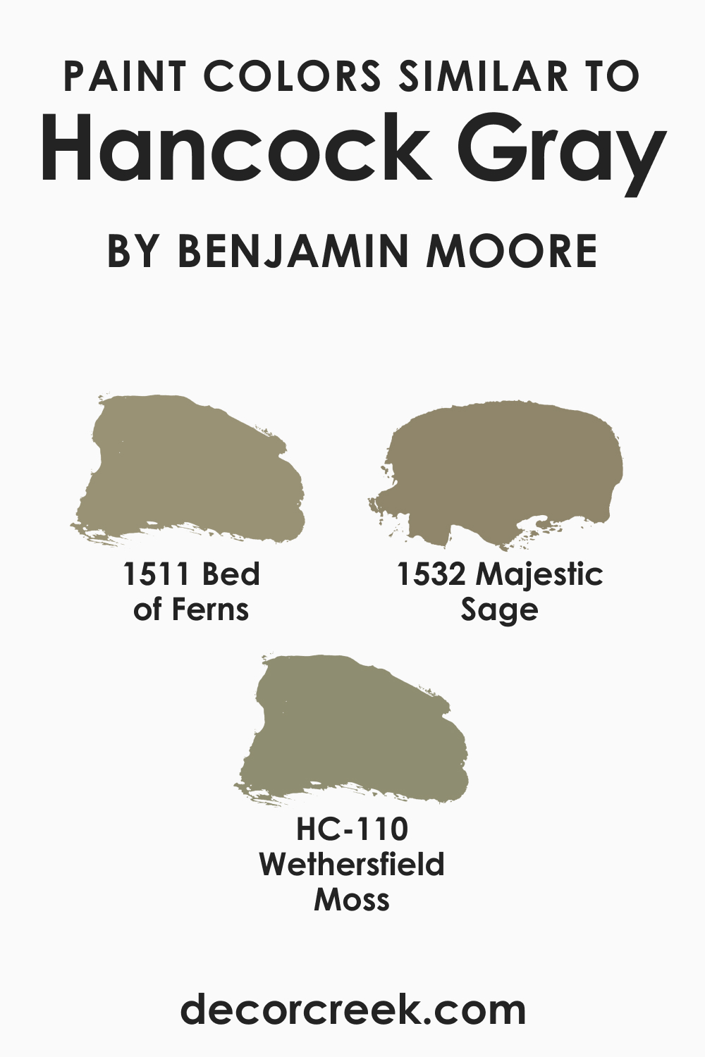
Knowing similar colors helps in making informed decisions, especially if a particular shade is unavailable. Abbey Brown 1225 is comparable to:
- BM 1511 Bed of Ferns: A subdued green-gray.
- HC-110 Wethersfield Moss: A muted, mossy green.
- BM 1532 Majestic Sage: A soft sage with earthy undertones.
Colors That Go With Hancock Gray HC-97
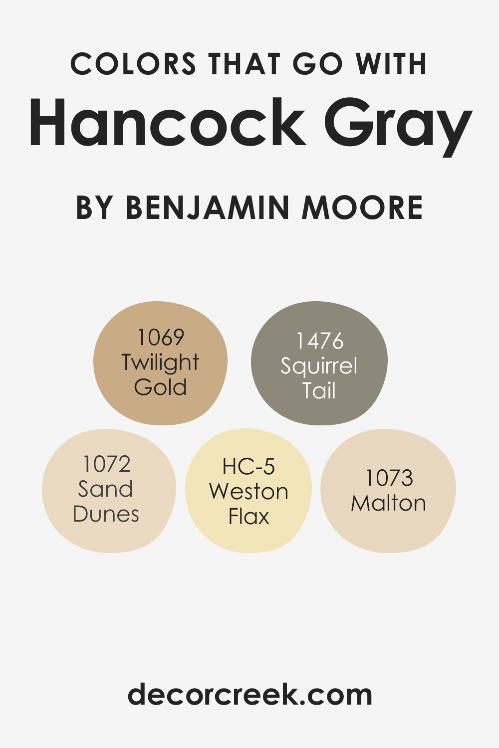
Complementary colors create visually appealing spaces. For Hancock Gray HC-97, Benjamin Moore offers:
- HC-5 Weston Flax: A cheerful light yellow.
- BM 1069 Twilight Gold: A soothing warm brown.
- BM 1476 Squirrel Tail: A mellow brown-gray.
- BM 1072 Sand Dunes: A muted beige.
- BM 1073 Malton: A neutral, earthy taupe.
These shades, combined with Hancock Gray, craft interiors that exude elegance and harmony.
How to Use Hancock Gray HC-97 In Your Home
Hancock Gray HC-97 is a versatile hue that lends itself to various rooms and design aesthetics. It’s a fit for modern, minimalist, and even traditional settings. From serene bedrooms to elegant living rooms, this shade adds sophistication. Given its calming aura, it works perfectly in bathrooms, bedrooms, and even on exteriors for a modern touch. In the kitchen, it can be used on walls or cabinets to evoke a sense of cleanliness and order.
The neutrality of Hancock Gray ensures it complements a multitude of interior styles, making it an excellent choice for holistic home design.
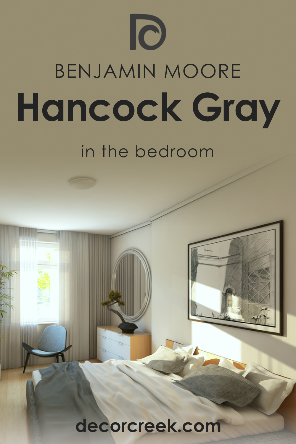
Hancock Gray HC-97 in the Bedroom
For a bedroom exuding serenity and calm, Hancock Gray HC-97 is a prime choice. The cool undertones promote relaxation, vital for a restful night. Pair with soft white linens and natural wooden furniture to accentuate its elegance.
Consider silver or blue-toned accents for a complete harmonious look, ensuring your bedroom remains a haven of tranquility.
Hancock Gray HC-97 in the Bathroom
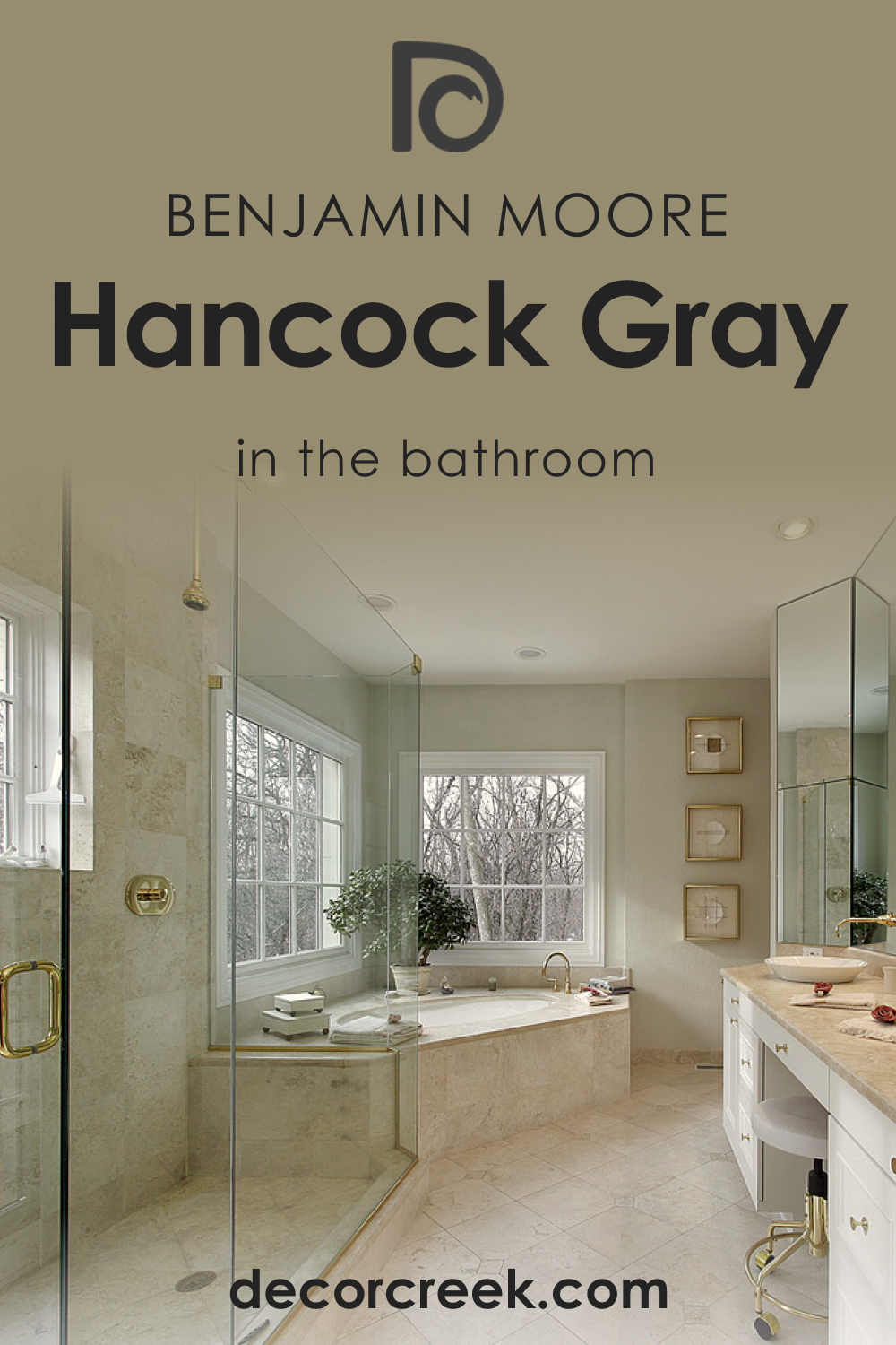
In bathrooms, Hancock Gray HC-97 provides a spa-like atmosphere. The cool undertones radiate cleanliness, and when paired with marble or white tiles, the space feels luxurious.
For an added touch, chrome or brushed nickel fixtures enhance the sophisticated vibe, creating a bathroom where pampering feels innate.
Hancock Gray HC-97 in the Living Room
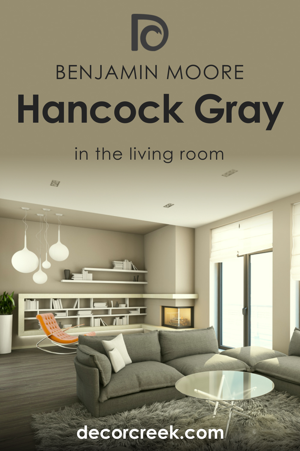
Hancock Gray HC-97 in the living room offers a chic, contemporary ambiance. Its muted tone provides a backdrop for vibrant artworks or colorful cushions.
Paired with plush sofas in neutral shades and modern metallic accents, this color transforms the living area into a space of elegance and comfort, ideal for entertaining or unwinding.
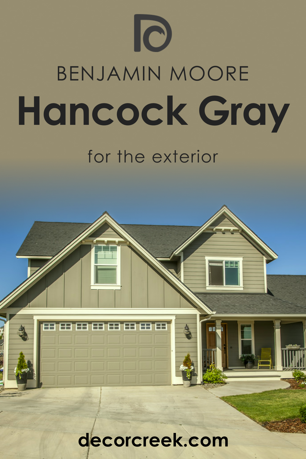
Hancock Gray HC-97 for an Exterior
For exteriors, Hancock Gray HC-97 offers a modern, sleek appearance. The shade contrasts beautifully against lush green landscapes, and when used alongside white trims, it gives a timeless appeal.
Whether for a contemporary home or a traditional one, this gray elevates the facade, making your home stand out with understated grace.
Hancock Gray HC-97 in the Kitchen
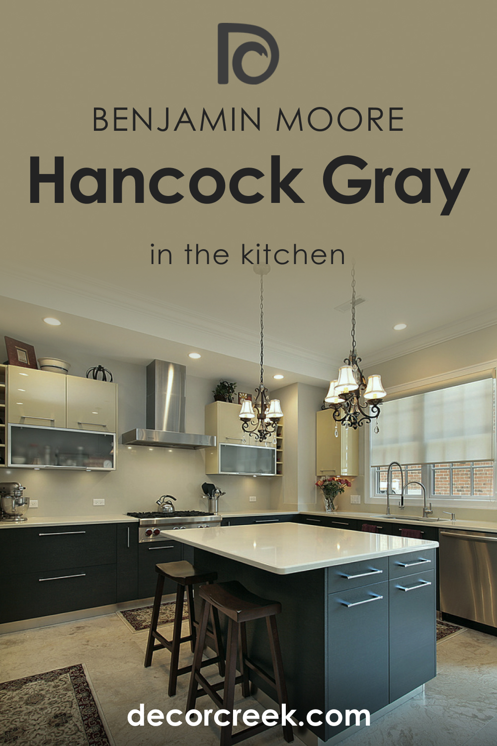
A kitchen donning Hancock Gray HC-97 feels clean and modern. Its neutrality complements stainless steel appliances seamlessly. Pair with open wooden shelving and white countertops for a balanced look.
For a pop, consider a backsplash in muted colors, allowing Hancock Gray to shine while ensuring the kitchen remains the heart of the home.
Hancock Gray HC-97 on the Kitchen Cabinets
Using Hancock Gray HC-97 on kitchen cabinets lends an air of sophistication. The shade allows for versatility; you can opt for a monochromatic look with similar-toned countertops or create contrast with lighter worktops.
Matte gold or silver hardware completes the look, providing a kitchen where style meets functionality.

Comparing Hancock Gray HC-97 With Other Colors
Drawing comparisons between different colors is crucial. Why? Because colors aren’t just visual experiences; they evoke feelings, influence moods, and play a central role in setting the ambiance of a space. A particular shade may seem perfect when viewed in isolation, but when juxtaposed with others, it might fade or overpower. By comparing colors, we get a clearer understanding of how they’ll work in conjunction, how they relate in terms of undertones, and how they might affect the overall design aesthetic.
his exercise is especially relevant when selecting colors for interiors where harmony and cohesiveness are vital.
Hancock Gray HC-97 vs. HC-101 Hampshire Gray
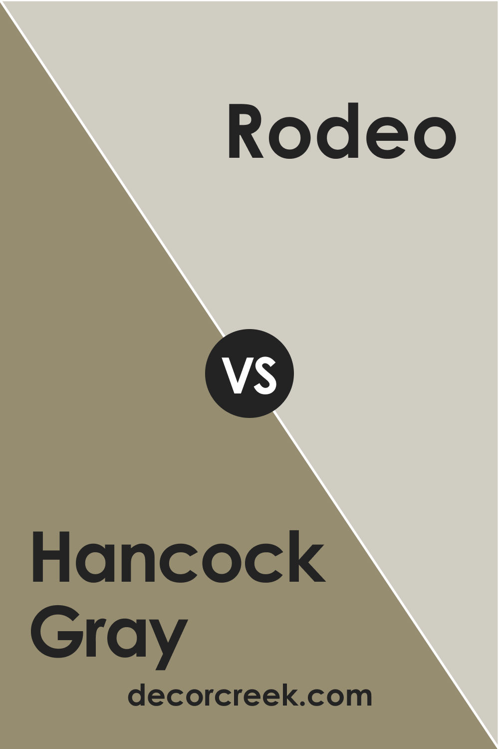
While both are in the gray family, Hancock Gray leans cooler with blue undertones. In contrast, Hampshire Gray is more of a deep, muted green-gray, giving spaces a slightly earthier feel. Where Hancock Gray imparts tranquility, Hampshire Gray offers a touch of nature’s depth.
Hancock Gray HC-97 vs. BM 1534 Rodeo
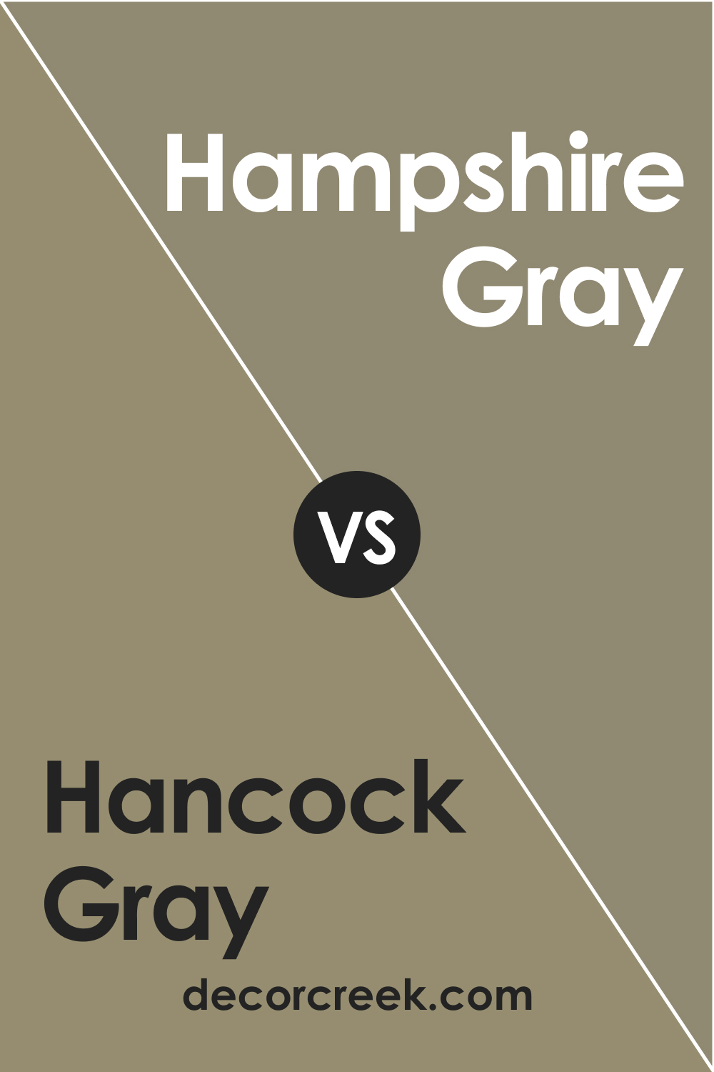
Rodeo is a soft, light gray with a touch of beige, presenting a warmer appearance. In contrast, Hancock Gray, with its cooler undertones, provides a crispness. While Rodeo gives a room a cozy ambiance, Hancock Gray adds a contemporary edge.
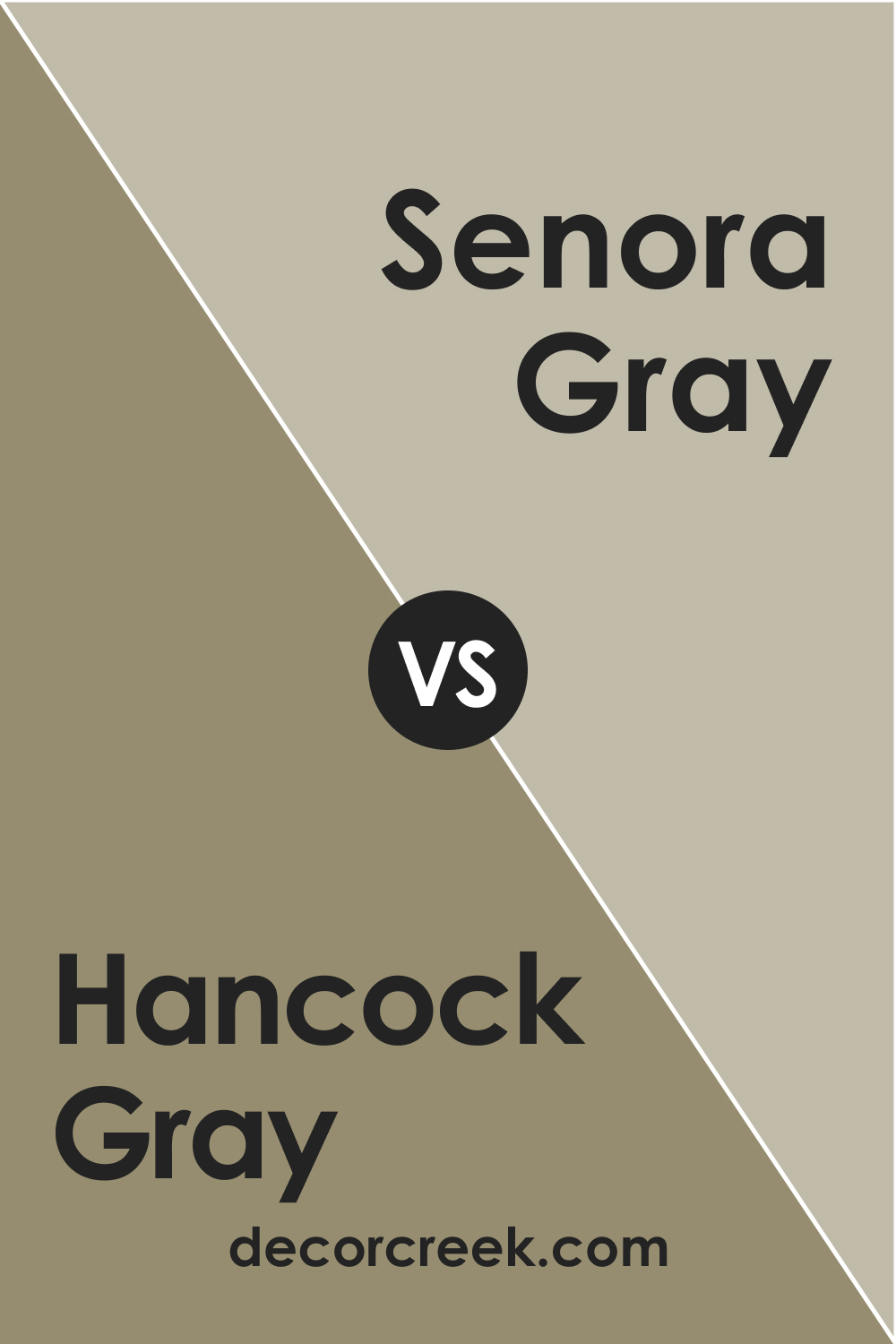
Hancock Gray HC-97 vs. BM 1530 Senora Gray
Senora Gray is a medium-dark gray with evident blue undertones. While both colors lean on the cool side, Senora Gray‘s deeper shade makes it ideal for accent walls or spaces that need depth, whereas Hancock Gray provides a more neutral backdrop.
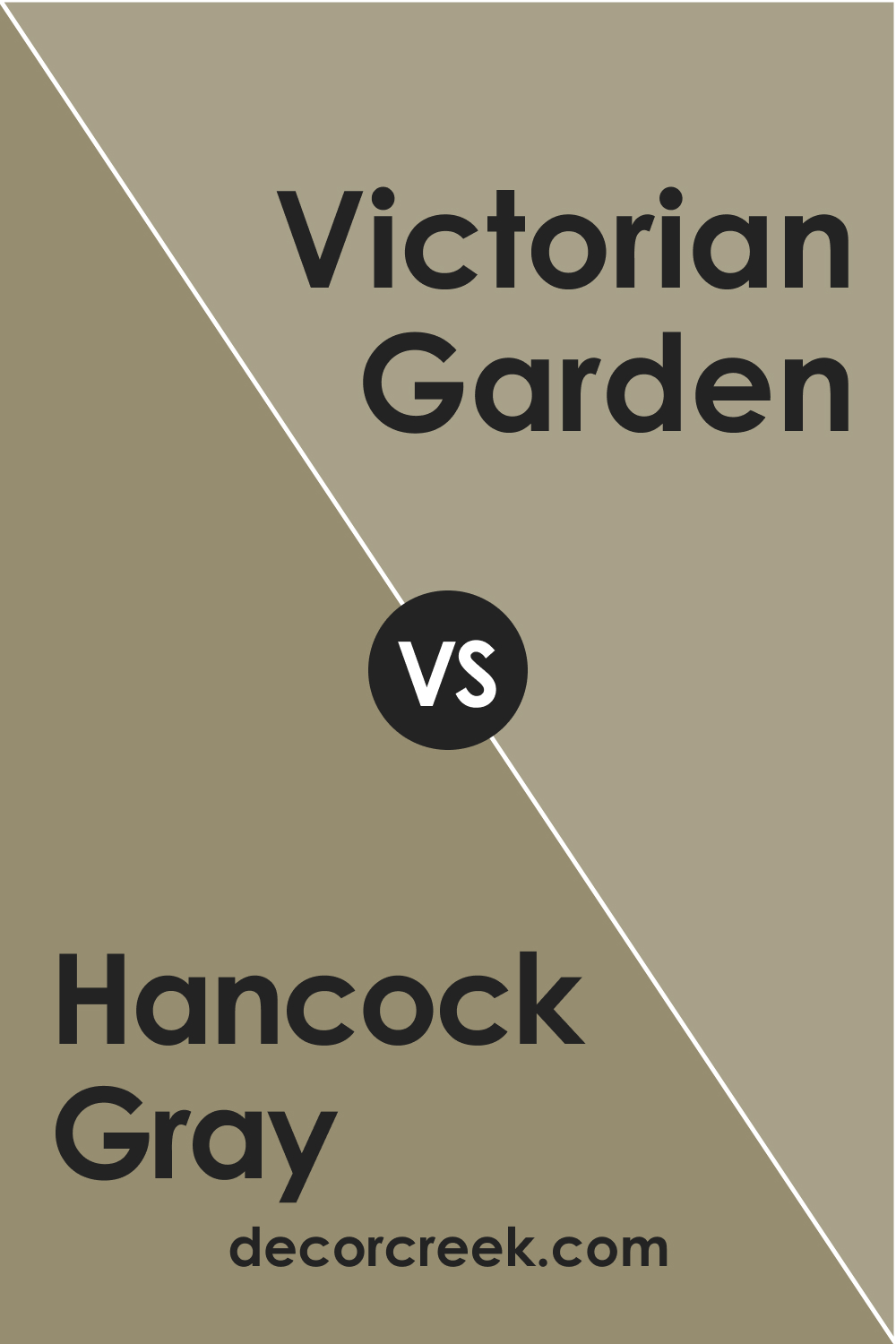
Hancock Gray HC-97 vs. BM 1531 Victorian Garden
Victorian Garden, with its gentle blend of gray and soft lavender, emits a whimsical vibe. In contrast, Hancock Gray remains steadfastly gray, offering modern simplicity. Victorian Garden is perfect for spaces seeking a touch of vintage charm, while Hancock Gray serves contemporary tastes.
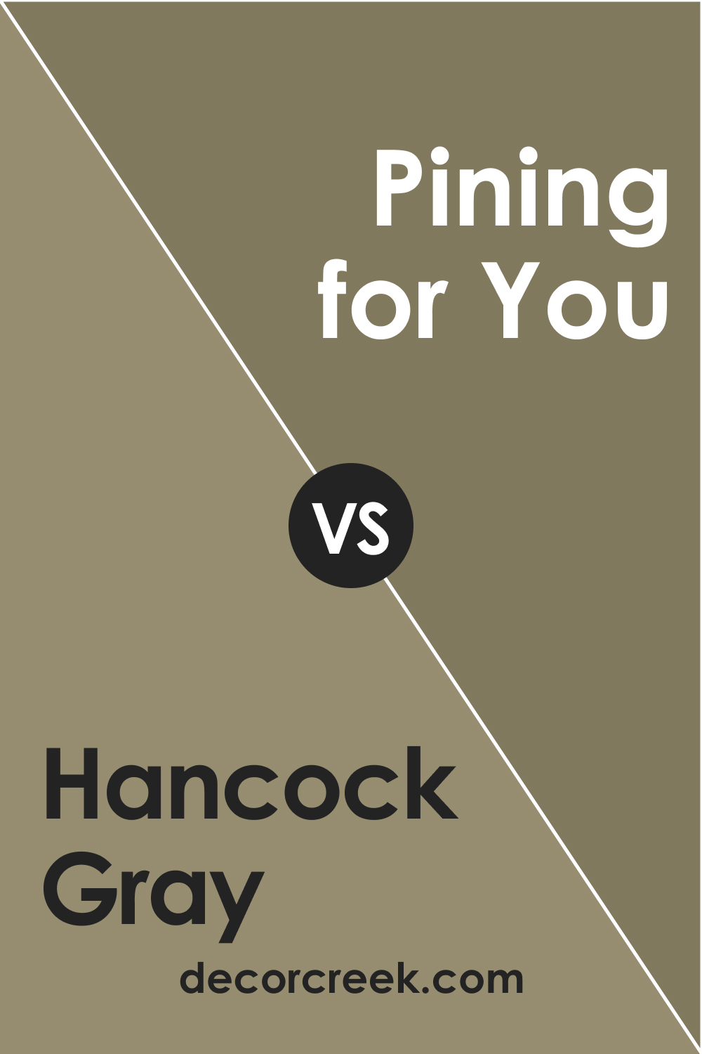
Hancock Gray HC-97 vs. BM 1512 Pining for You
Pining for You is a muted green-gray, reminiscent of quiet forest glades. Next to Hancock Gray, it brings in a touch of the outdoors. While Hancock Gray speaks of urban sophistication, Pining for You whispers tales of nature.
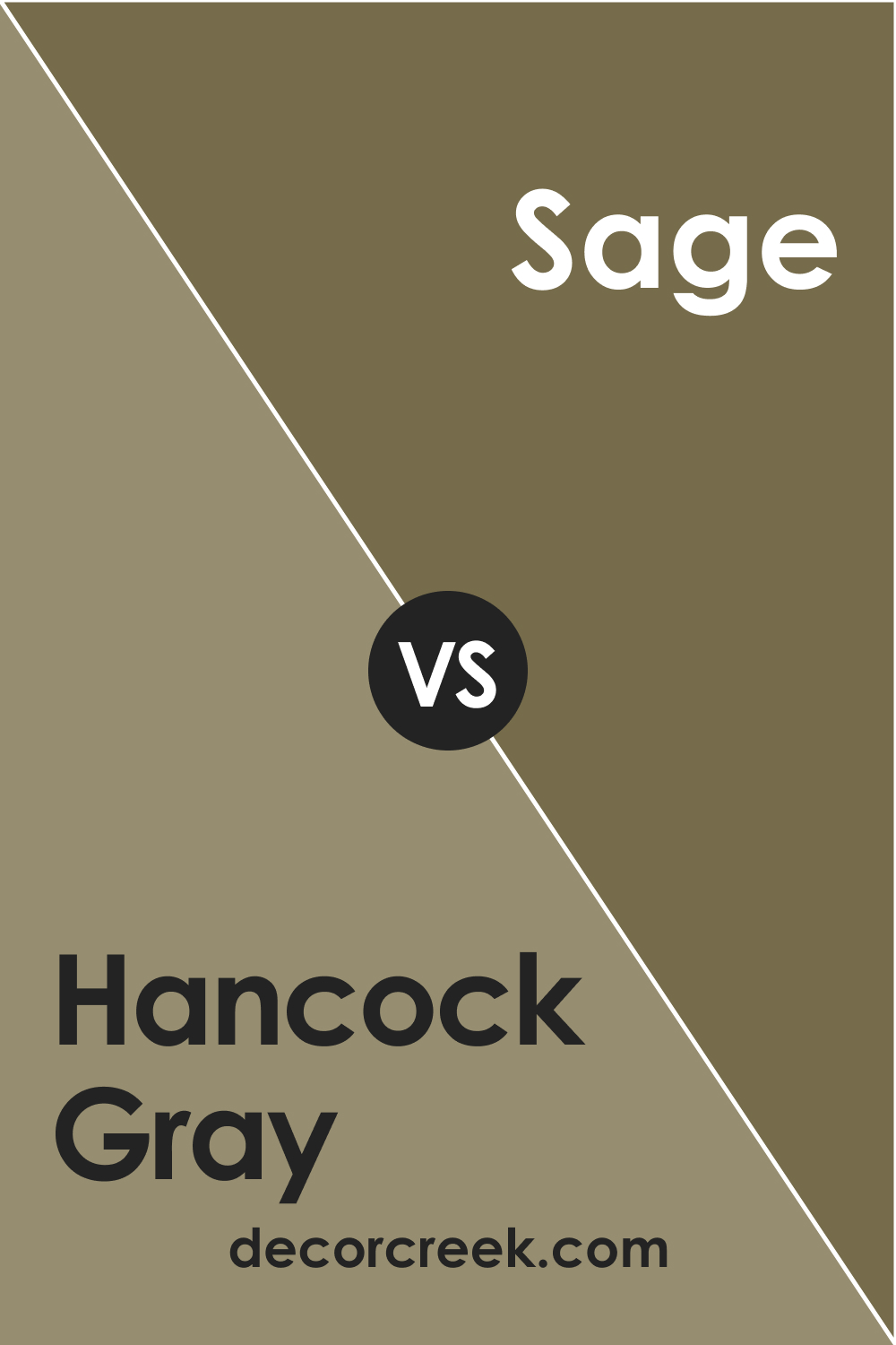
Hancock Gray HC-97 vs. BM 2143-10 Sage
Sage is a deep, earthy green, offering a rich, organic feel. When pitted against Hancock Gray, its verdant depth stands out, making it an excellent choice for rooms that crave a strong nature connection. Hancock Gray, meanwhile, remains the go-to for modern elegance.
Conclusion
Selecting the perfect shade for a room isn’t merely about choosing a color you like; it’s about understanding its relation to other colors and how they collectively shape a space’s vibe. Hancock Gray HC-97, with its unique characteristics, has been a favorite for many.
However, by comparing it with other shades, one can appreciate its versatility and understand how to utilize it best in different design scenarios. As with any color decision, it’s always a blend of personal preference and understanding the broader color spectrum nuances.
Ever wished paint sampling was as easy as sticking a sticker? Guess what? Now it is! Discover Samplize's unique Peel & Stick samples.
Get paint samples


