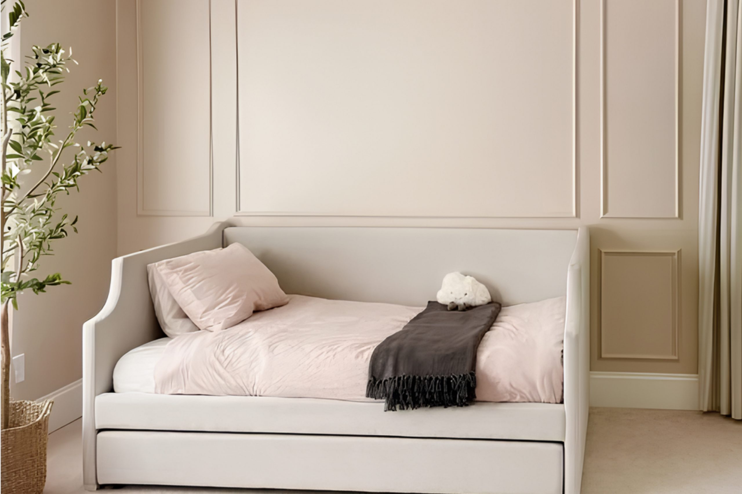
When considering the perfect shade of white, SW 6035 Gauzy White by Sherwin Williams caught my attention for its soft, inviting nature.
Unlike many whites that can feel stark or cold, this shade offers a warmth that adds a gentle glow to any room. It manages to balance elegance and simplicity effortlessly, making it adaptable to various spaces.
Whether you’re painting a living room or a cozy bedroom, this color establishes a serene atmosphere without overwhelming the senses.
The beauty of Gauzy White lies in its versatility. It complements both bold and subtle decor, allowing personal style to shine through. You might find it works equally well with modern furniture as it does with vintage pieces.
Its understated charm makes it an ideal backdrop for artwork or statement pieces, letting them take center stage.
What I find most appealing is how it can subtly shift in different lighting situations. During the day, natural light gives it a lively yet calm appearance, while in the evening, softer lighting can bring out its warmer undertones.
If you’re in search of a neutral color that adds warmth to your room without being too bold, SW 6035 Gauzy White could be the perfect choice. Its gentle elegance and adaptability might just make it your favorite white.
What Color Is Gauzy White SW 6035 by Sherwin Williams?
Gauzy White (SW 6035) by Sherwin Williams is a soft and subtle shade that adds warmth and comfort to any room.
This color is a gentle cream with just a hint of warmth, creating an inviting atmosphere. Gauzy White is suitable for a variety of interior styles, including modern farmhouse, traditional, and contemporary designs.
It provides a neutral backdrop that complements both bold and soft color schemes, making it versatile for different spaces.
Gauzy White pairs beautifully with natural materials like wood and stone. Consider using it alongside rich wooden floors, exposed wooden beams, or stone fireplaces to create a cozy and harmonious look.
The color also works well with textures like linen, cotton, and wool, which add depth and interest to the space without overpowering the subtlety of the wall color.
In kitchens and bathrooms, Gauzy White complements stainless steel appliances and fixtures, as well as marble or quartz countertops. It brightens up the room without feeling stark or cold. Light fixtures in matte black or brushed nickel can enhance the simplicity and elegance of the space.
Overall, Gauzy White is a versatile and neutral color choice that creates a warm and welcoming environment, easily adapting to various design elements and styles.
Is Gauzy White SW 6035 by Sherwin Williams Warm or Cool color?
Gauzy White SW 6035 by Sherwin Williams is a soft, off-white paint color that adds a gentle touch to any home.
This color works beautifully in spaces because it reflects light well, making rooms feel bright and open. Its subtle warmth provides a cozy atmosphere that makes living areas feel inviting and comfortable.
Gauzy White pairs well with a range of other colors, whether bold or neutral, allowing for versatile design options in different rooms. In a living room, its light tone can create a spacious feeling, while in a bedroom, it encourages relaxation.
Because it doesn’t have the starkness of pure white, it adds depth without overwhelming other features in the space. It works equally well on walls, ceilings, or trim, offering a unified look throughout the home.
Overall, Gauzy White is a versatile choice for those looking to brighten their space without compromising on warmth and comfort.
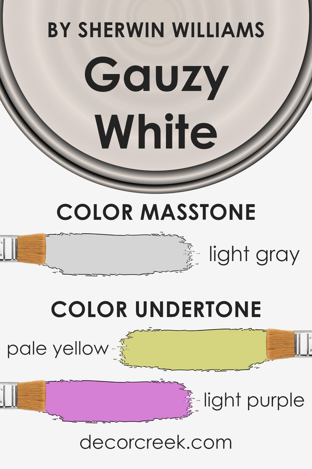
Undertones of Gauzy White SW 6035 by Sherwin Williams
Gauzy White SW 6035 by Sherwin Williams is a subtle, soft color with many undertones. These undertones are pale yellow, light purple, light blue, pale pink, mint, lilac, and gray.
When looking at this paint color, these undertones can affect how it appears on indoor walls. The color changes depending on lighting and surrounding colors. For example, in natural sunlight, the pale yellow undertone might become more noticeable, making the room feel warmer.
Under artificial lighting, the light purple or pink undertones could stand out, giving a hint of softness and romance to the space. Undertones are important because they influence our perception.
They can make a color look cooler, warmer, or more neutral. In Gauzy White, the light blue and mint might create a calming and refreshing atmosphere in well-lit rooms. Meanwhile, the gray undertone gives a stable and balanced look, allowing the color to adapt to different settings.
When used on interior walls, this color can bring a gentle and versatile backdrop. Depending on a room’s lighting and other colors, you can notice different undertones, which makes it an adaptable choice for various home spaces.
The shifting undertones add depth, making the walls interesting yet subtle.
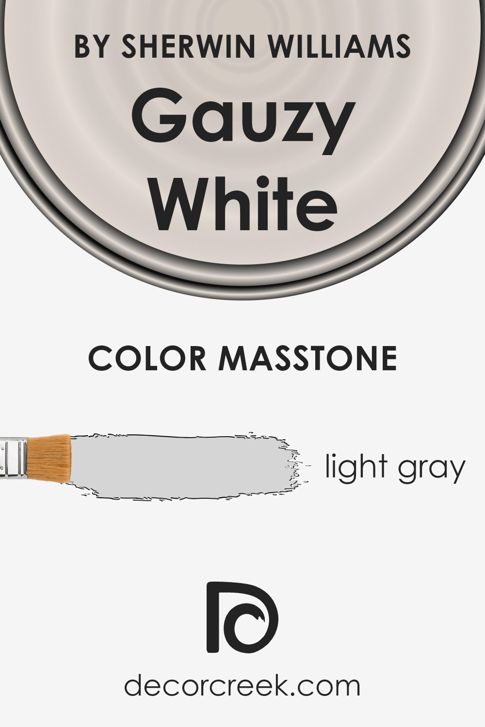
What is the Masstone of the Gauzy White SW 6035 by Sherwin Williams?
Gauzy White by Sherwin Williams, known as SW 6035, is a calm and gentle light gray with the hex code #D5D5D5. This soft color is great for home interiors because it enhances spaces with a fresh and airy feel.
Its lightness helps make rooms look bigger and more open, which is perfect for smaller spaces or areas with limited natural light. The subtle gray tones in Gauzy White create a neutral backdrop that pairs well with many other colors, whether you want to add bright accents or keep things subdued and muted.
This color adds a warm and welcoming feel without being too stark. Ideal for walls, trim, or even furniture, it sets a harmonious and balanced atmosphere.
When used throughout a home, it creates a continuous flow, making spaces feel connected and cohesive. Overall, Gauzy White is versatile and easy to use in various home styles.
How Does Lighting Affect Gauzy White SW 6035 by Sherwin Williams?
Lighting plays a crucial role in how we perceive colors. The same color can look very different depending on the type and angle of light it is exposed to. Gauzy White (SW 6035) by Sherwin Williams, for example, can change under different lighting conditions.
In natural light, Gauzy White takes on its truest tone. It is a soft white with subtle undertones that can appear warm or cool depending on other colors in the room and the direction the room faces.
In a north-facing room, natural light tends to be cooler and less direct. As a result, Gauzy White may appear a bit grayer or bluer in these spaces, since northern light is often diffused and creates a more shadowy illumination.
In a south-facing room, natural light is typically warmer and more direct, especially in the afternoon.
This means Gauzy White can appear brighter and more radiant, with any warm undertones becoming more apparent.
In an east-facing space, light is cooler in the morning and warmer as the day progresses. In the early hours, Gauzy White might look more subdued; however, as the sun moves and the room gets warmer light, the color may look more cheerful and inviting.
For west-facing rooms, the light is warmest in the late afternoon and evening. During midday, the light can be more neutral or even slightly cool.
Therefore, Gauzy White might look cooler earlier in the day but become slightly creamy or warmer as the sun sets.
When it comes to artificial lighting, the type of bulbs used will also affect the color. Warm bulbs will enhance any warm tones in Gauzy White, making it cozy.
In contrast, cool or white bulbs might emphasize its cooler characteristics, giving it a crisper appearance. Always consider lighting when choosing paint colors to ensure the desired effect in your space.
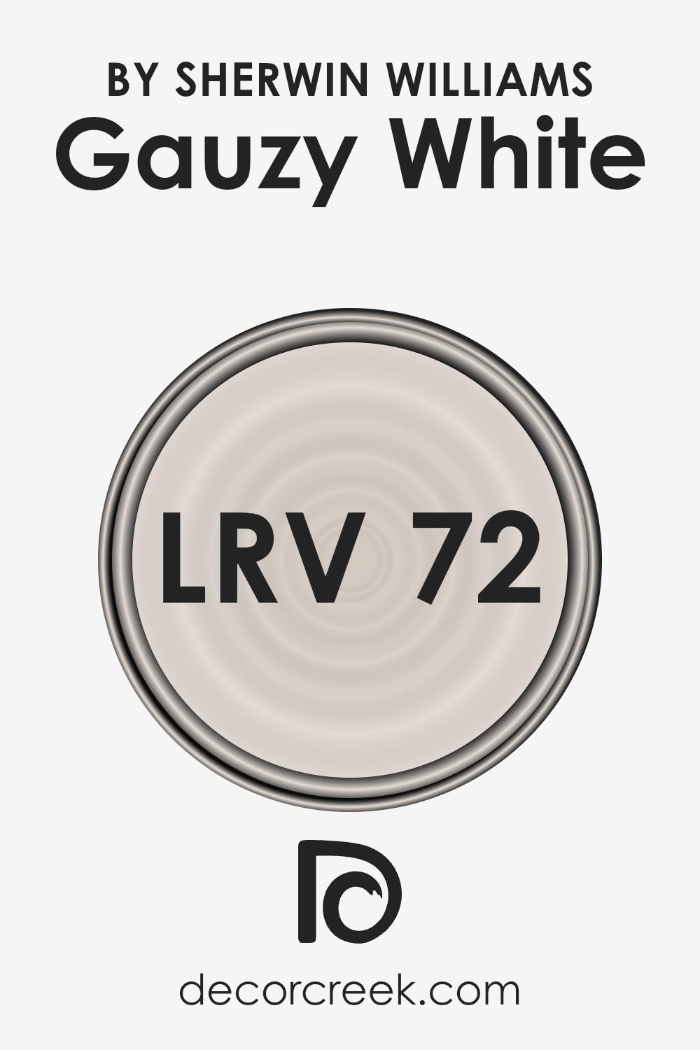
What is the LRV of Gauzy White SW 6035 by Sherwin Williams?
LRV stands for Light Reflectance Value, a measurement used to express the percentage of light a color reflects. It is a scale that ranges from 0 (absolute black, reflecting no light) to 100 (pure white, reflecting all light).
Essentially, the higher the LRV, the lighter and more reflective the color is. When a color has a high LRV, it can make a space feel bright and more open because it reflects a significant amount of light back into the room.
Conversely, colors with a low LRV absorb more light, making a space feel cozier or sometimes even smaller. Understanding LRV helps in selecting the right paint color to achieve the desired brightness and mood in a room.
The light reflectance value of 71.685 means Gauzy White reflects a substantial amount of light. It is bright without being stark, making it a good choice for rooms where you want a light, airy feel.
Because it reflects a lot of light, it can help make smaller rooms appear bigger and more spacious. Additionally, in rooms with little natural light, this color can help enhance brightness by maximizing the use of the available light.
On sunny days, Gauzy White won’t feel overwhelming either, as its higher LRV enables it to diffuse light gently, creating a balanced atmosphere.
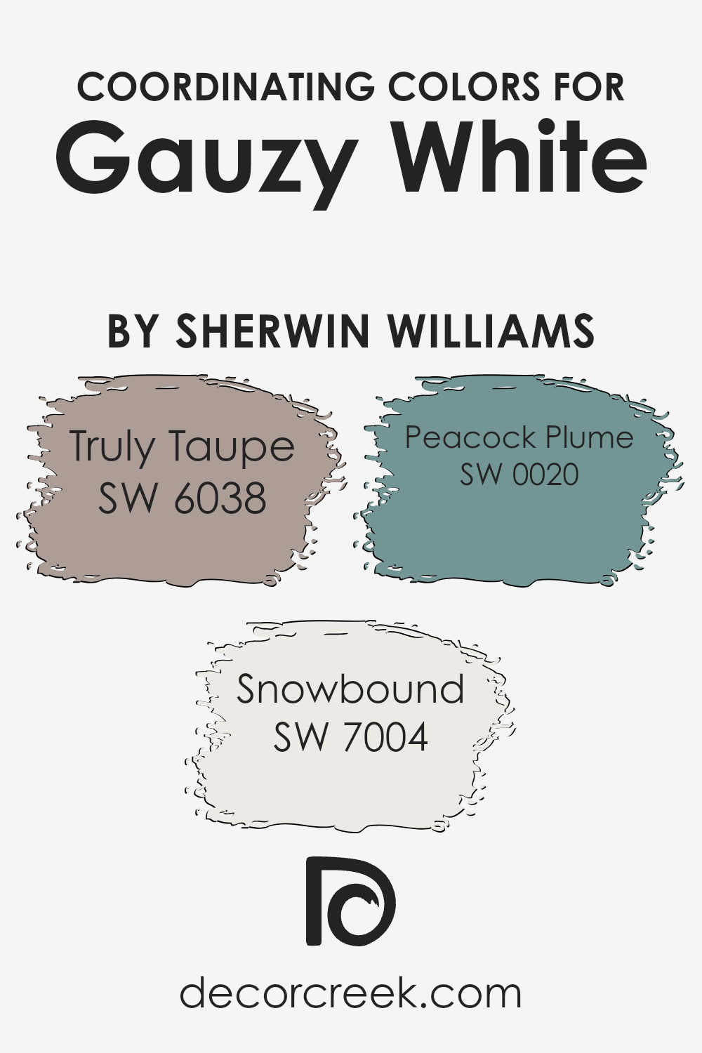
Coordinating Colors of Gauzy White SW 6035 by Sherwin Williams
Coordinating colors are hues that complement each other when used in the same space. They create harmony and balance in a room by ensuring that the colors don’t clash.
For the color Gauzy White by Sherwin Williams, coordinating colors like Truly Taupe, Snowbound, and Peacock Plume come together to enhance its subtle warmth. These colors work in unison to create a soothing and cohesive atmosphere.
Gauzy White serves as a neutral backdrop, allowing the other colors to stand out without overwhelming the space.
Truly Taupe (SW 6038) is a warm, earthy tone that adds depth to a room. It pairs well with light colors, adding a grounded feel without being too dark.
Snowbound (SW 7004) is a crisp, clean white that complements Gauzy White by brightening up a space and making it feel more open. Peacock Plume (SW 0020) is a rich, deep teal that introduces a bold splash of color.
It adds a touch of elegance and serves as a striking accent against the softer shades. Together, these colors create a balanced and inviting environment, making a room feel both cozy and refined without being stark or overwhelming.
You can see recommended paint colors below:
- SW 6038 Truly Taupe
- SW 7004 Snowbound
- SW 0020 Peacock Plume
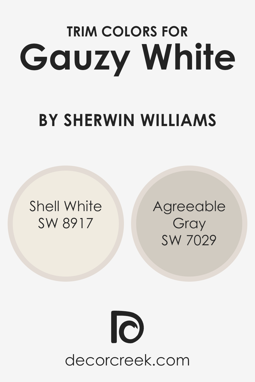
What are the Trim colors of Gauzy White SW 6035 by Sherwin Williams?
Trim colors are the shades used for the moldings, baseboards, and frames in a room and play a crucial role in the overall look of a space. Trim colors can add contrast or harmony to the main wall color and set the tone of the room.
Using trim colors like SW 8917 – Shell White and SW 7029 – Agreeable Gray with Gauzy White by Sherwin Williams can enhance the aesthetics of a space beautifully. Gauzy White is a soft, inviting white that has a gentle warmth, making it a perfect backdrop.
When paired with the right trim colors, it can have a refined, balanced look.
SW 8917 – Shell White provides a subtle, creamy tint with a touch of warmth, making it an excellent choice for pairing with the gentle gauzy white of the walls. Its understated elegance can complement the space, while its warmer undertones add a bit of coziness.
Meanwhile, SW 7029 – Agreeable Gray, with its warm gray hue, offers a versatile option that blends well with both cool and warm palettes. This soft gray has a hint of beige, adding a level of depth to the room without overwhelming it.
Together, these colors can enhance the inviting nature of your space, providing a harmonized and welcoming atmosphere without being overdone.
You can see recommended paint colors below:
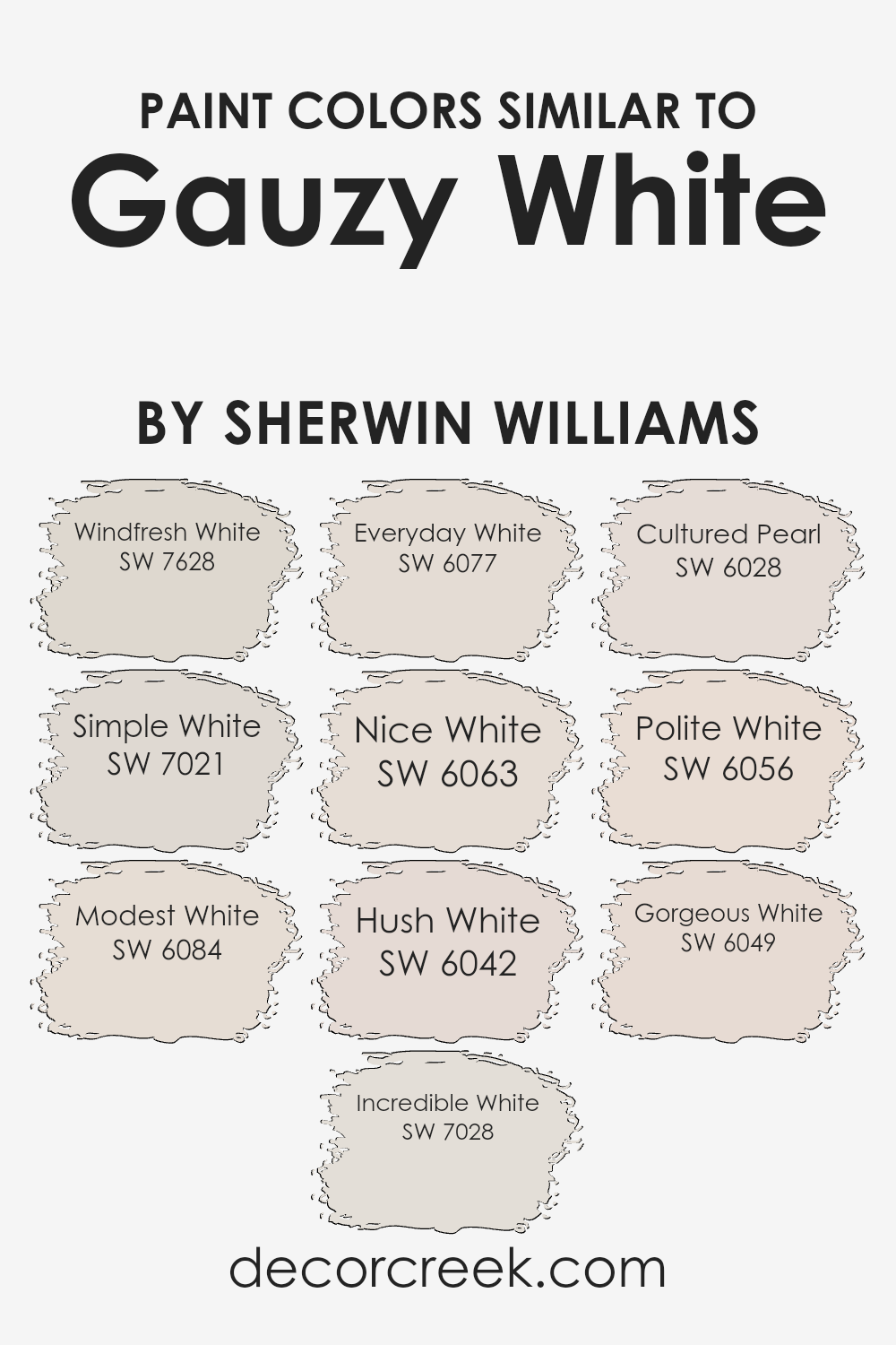
Colors Similar to Gauzy White SW 6035 by Sherwin Williams
Choosing colors similar to Gauzy White by Sherwin Williams can create a cohesive and harmonious atmosphere in any space. These colors blend well with each other, making it easy to design a room that feels unified and calm.
Windfresh White is a soft color with a hint of freshness, making it great for open spaces. Simple White offers a clean and bright look, perfect for minimalistic settings. Modest White brings a warm tone that feels inviting, especially in living areas.
Incredible White adds a touch of elegance with its subtle sophistication, making it ideal for more formal rooms. Everyday White is a versatile shade that suits almost any setting due to its gentle, neutral hue.
Nice White boasts a warm and cozy feel, while Hush White softly whispers of tranquility, making it suitable for bedrooms or quiet corners.
Cultured Pearl has an understated charm with its light grey undertone, providing depth without being overpowering. Polite White gives a friendly, welcoming atmosphere, perfect for entryways. Lastly, Gorgeous White provides a sense of crispness with its pure brightness, enhancing natural light in the room.
Each of these colors complements Gauzy White in its own way, allowing homeowners to craft spaces that are harmonious and inviting without any harsh contrasts.
You can see recommended paint colors below:
- SW 7628 Windfresh White
- SW 7021 Simple White
- SW 6084 Modest White
- SW 7028 Incredible White
- SW 6077 Everyday White
- SW 6063 Nice White
- SW 6042 Hush White
- SW 6028 Cultured Pearl
- SW 6056 Polite White
- SW 6049 Gorgeous White
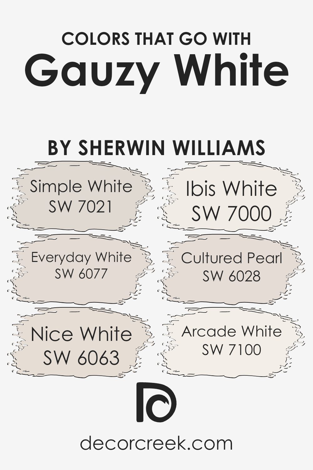
Colors that Go With Gauzy White SW 6035 by Sherwin Williams
When choosing colors to pair with Gauzy White SW 6035 by Sherwin Williams, the right combination can make a room feel more balanced and inviting.
Colors like SW 7021 – Simple White work beautifully, as its clean, bright nature highlights the softness of Gauzy White while maintaining a harmonious atmosphere.
SW 6077 – Everyday White has a touch of warmth that complements Gauzy White’s subtle undertones, providing a cozy and relaxed feel to any room. Then there’s SW 6063 – Nice White, which offers a perfect backdrop with its very slight tint, adding depth and dimension without overwhelming the space.
Ibis White SW 7000 is another great partner due to its crisp and fresh appearance, which accentuates the gentle quality of Gauzy White and makes the space feel airy and open.
SW 6028 – Cultured Pearl introduces a graceful, light nuance with a hint of sophistication, enriching the overall palette when paired with Gauzy White. Lastly, Arcade White SW 7100 brings a slight sheen that can add a touch of elegance to the room, enhancing its beauty and simplicity.
Together, these colors create a balanced palette, ensuring that Gauzy White remains the centerpiece without losing its subtle charm.
You can see recommended paint colors below:
- SW 7021 Simple White
- SW 6077 Everyday White
- SW 6063 Nice White
- SW 7000 Ibis White
- SW 6028 Cultured Pearl
- SW 7100 Arcade White
How to Use Gauzy White SW 6035 by Sherwin Williams In Your Home?
Gauzy White SW 6035 by Sherwin Williams is a versatile and soft off-white color that can make a home feel inviting and airy.
It pairs well with a variety of other colors and works in many rooms, helping to create a warm and welcoming atmosphere. You can use it on the walls of a living room to make the space feel more open and fresh.
It also works well in a bedroom, where it offers a peaceful background for relaxing. If you’re updating a kitchen, painting cabinets in Gauzy White can brighten the space without feeling too stark.
This color works well with natural wood tones, adding a nice contrast to the warm hues of wood flooring or furniture. It also complements neutral grays and soft blues, allowing for a cohesive look throughout your home.
Whether you’re repainting walls or refreshing your space, this color can add a touch of warmth and modernity.
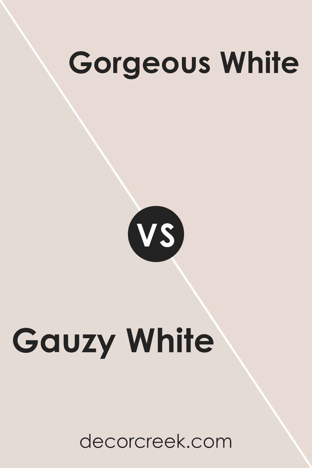
Gauzy White SW 6035 by Sherwin Williams vs Gorgeous White SW 6049 by Sherwin Williams
Gauzy White SW 6035 by Sherwin Williams and Gorgeous White SW 6049 by Sherwin Williams are both soft, neutral paints.
Gauzy White is a warm shade with a subtle hint of beige, giving it a cozy and inviting feel. It works well in living spaces where you want a comfortable atmosphere. On the other hand, Gorgeous White is slightly cooler and leans more toward a crisp white with a touch of gray. This makes it ideal for a modern, clean look.
It can make spaces feel more open and airy. Both colors can pair nicely with a variety of other shades, but the choice between them depends on whether you prefer the warmth of Gauzy White or the cooler vibe of Gorgeous White.
Each brings its unique feel to a room, with Gauzy White offering warmth and Gorgeous White providing a fresh, contemporary look.
You can see recommended paint color below:
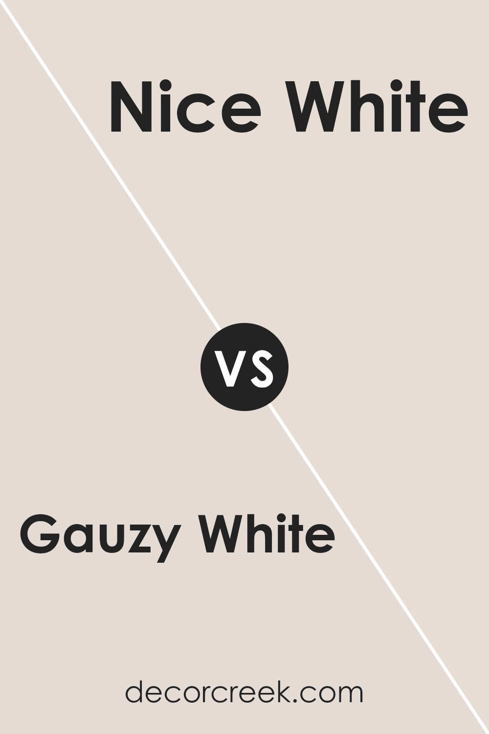
Gauzy White SW 6035 by Sherwin Williams vs Nice White SW 6063 by Sherwin Williams
Gauzy White (SW 6035) and Nice White (SW 6063) by Sherwin Williams are both versatile, light shades, yet they have distinct differences.
Gauzy White is a soft, warm white with subtle beige undertones, adding a cozy and inviting feel to any space. It’s perfect for creating a relaxing atmosphere and works well in living rooms or bedrooms.
Nice White, on the other hand, is a neutral, clean white with a slight hint of warmth. It offers a brighter look without being stark. This makes it a great option for those who want a fresh and airy feel, perfect for kitchens or bathrooms.
While both colors serve as excellent backdrops, Gauzy White gives off a warmer vibe, whereas Nice White provides a crisp and clean appearance. Choosing between them depends on whether you prefer a more comforting feel or a bright and open look for your space.
You can see recommended paint color below:
Gauzy White SW 6035 by Sherwin Williams vs Incredible White SW 7028 by Sherwin Williams
Gauzy White SW 6035 and Incredible White SW 7028 by Sherwin Williams are two versatile off-whites suitable for a variety of spaces.
Gauzy White is slightly warmer and has a hint of pink, giving it a soft, inviting feel. It’s perfect for creating cozy, intimate environments.
On the other hand, Incredible White is a cool-toned off-white with subtle gray undertones, offering a more modern and crisp look. It’s ideal for spaces where a clean and fresh appearance is desired.
Both colors act as excellent neutrals, allowing them to pair well with various other shades and decorative elements. Gauzy White might be better in traditionally styled rooms, while Incredible White could complement contemporary or minimalist designs.
The choice between these two colors depends on the mood and feel you want for your space—warm and welcoming, or cool and refreshing. Both are excellent options, but their undertones lead to different atmospheres.
You can see recommended paint color below:

Gauzy White SW 6035 by Sherwin Williams vs Everyday White SW 6077 by Sherwin Williams
Gauzy White SW 6035 and Everyday White SW 6077 by Sherwin Williams are both soft, light neutral colors, but they have distinct differences. Gauzy White is a delicate white with subtle undertones of pink, giving it a warm, gentle feel.
It adds a touch of warmth to a space without feeling too creamy or yellow.
Everyday White, on the other hand, is slightly cooler and more neutral. It has a subtle gray undertone, which can make it feel more clean and crisp compared to Gauzy White.
This makes it a versatile choice for spaces seeking a more neutral backdrop without too much warmth.
Both colors work well in various settings, but the choice between them depends on the desired atmosphere. Gauzy White is great for creating a cozy, inviting environment, while Everyday White provides a more straightforward, adaptable backdrop that pairs well with other colors.
You can see recommended paint color below:
Gauzy White SW 6035 by Sherwin Williams vs Modest White SW 6084 by Sherwin Williams
Gauzy White SW 6035 and Modest White SW 6084, both by Sherwin Williams, are subtle and neutral shades that suit various spaces.
Gauzy White is a soft, airy white with gentle warm undertones. It reflects light well, creating an open, fresh look in any room. This makes it a popular choice for areas where you want a light and inviting atmosphere.
On the other hand, Modest White has a slightly warmer beige tint compared to Gauzy White. It adds a touch of coziness and warmth, making a space feel more intimate and welcoming.
While both colors are versatile and work well with many decor styles, Modest White is better for adding warmth without overwhelming a room with too much color.
Overall, Gauzy White is ideal for creating a clean and bright space, while Modest White adds a touch of warmth and comfort.
Both colors complement various design elements and can enhance the overall feel of a room.
You can see recommended paint color below:
Gauzy White SW 6035 by Sherwin Williams vs Cultured Pearl SW 6028 by Sherwin Williams
Gauzy White and Cultured Pearl from Sherwin Williams are two subtle, light colors that bring different feelings to a space.
Gauzy White is a soft, gentle white with warm undertones, creating a cozy and inviting atmosphere. It’s perfect for spaces where you want to keep things light and airy while adding a touch of warmth.
On the other hand, Cultured Pearl is more of a soft gray with a hint of coolness. It can add a sophisticated touch to rooms, giving them a clean, modern feel. While Gauzy White leans more towards creating a comforting and warm vibe, Cultured Pearl gives off a cooler, more refined look.
Both colors are versatile and can work well in various settings. Gauzy White pairs nicely with other warm hues and natural materials, while Cultured Pearl complements cooler tones and metallic accents beautifully.
Choosing between them depends on whether you prefer a warm or cool ambiance.
You can see recommended paint color below:
- SW 6028 Cultured Pearl
Gauzy White SW 6035 by Sherwin Williams vs Polite White SW 6056 by Sherwin Williams
Gauzy White (SW 6035) by Sherwin Williams and Polite White (SW 6056) by Sherwin Williams are two subtle yet distinct shades. Gauzy White is a soft, airy color with a slight hint of gray, giving it a light and neutral appearance.
It works well in spaces where a clean and open feel is desired. Its understated tone makes it versatile for different styles and combinations with other colors.
On the other hand, Polite White is slightly warmer with faint beige undertones. This color provides a gentle warmth to a room, making it feel cozy and welcoming.
It’s perfect for areas where a touch of warmth and comfort is needed without being overwhelming.
While both colors are light and neutral, Gauzy White leans more toward a cool, airy vibe, and Polite White offers a warmer, more inviting atmosphere. Both can brighten up a space, but their subtle differences can set the mood significantly.
You can see recommended paint color below:
- SW 6056 Polite White
Gauzy White SW 6035 by Sherwin Williams vs Hush White SW 6042 by Sherwin Williams
Gauzy White and Hush White are two soft, light colors by Sherwin Williams. Gauzy White SW 6035 has a warm undertone, giving it a slightly creamy appearance. It’s a versatile color, suitable for creating a cozy and inviting atmosphere. This shade can make spaces feel larger and more open due to its lightness, and it often works well in living rooms and bedrooms.
Hush White SW 6042, on the other hand, also has a warm base but with a hint of taupe. It appears a bit deeper than Gauzy White, offering a more grounded feel. This makes it a good choice for areas where a subtle, warm backdrop is desired without being too bright.
Both colors are gentle on the eyes and can pair well with various decor styles, but Hush White will add a slightly more pronounced warmth due to its delicate undertone.
You can see recommended paint color below:
Gauzy White SW 6035 by Sherwin Williams vs Windfresh White SW 7628 by Sherwin Williams
Gauzy White (SW 6035) by Sherwin Williams is a soft, warm white with a hint of pink or peach undertones. This gives it a cozy, inviting feel, suitable for spaces where you want warmth and a touch of softness. It works well in living rooms or bedrooms where a comfortable atmosphere is desired.
On the other hand, Windfresh White (SW 7628) by Sherwin Williams is a cooler, crisp white with slight gray undertones. This color provides a more modern and clean look. It’s versatile and can be used in various spaces, from kitchens to bathrooms, where a fresh and airy vibe is preferred.
While both are shades of white, Gauzy White adds warmth and coziness, making it feel more intimate, whereas Windfresh White’s coolness offers a more minimalist and spacious appearance. Choosing between them depends on whether you want your space to feel warm and cozy or cool and refreshing.
You can see recommended paint color below:
Gauzy White SW 6035 by Sherwin Williams vs Simple White SW 7021 by Sherwin Williams
Gauzy White SW 6035 and Simple White SW 7021 by Sherwin Williams are both soft, neutral whites, but they have subtle differences that can impact a room’s feel. Gauzy White has a hint of warmth, with a slight blush or taupe undertone, giving it a cozy and inviting appearance. It pairs well with earthy tones and provides a gentle backdrop without being stark.
In contrast, Simple White is a purer, cleaner white with neutral undertones. It leans slightly toward the cool side without being too cold, making it a versatile choice for modern settings. It works well with a variety of colors, allowing you to create crisp, clean, and airy spaces.
Both colors are excellent choices for a minimalist look, but Gauzy White offers a touch of warmth, while Simple White delivers a classic, clean feel. Your choice depends on whether you prefer a subtle warmth or a cleaner, more neutral vibe.
You can see recommended paint color below:
Conclusion
After spending time learning about SW 6035 Gauzy White by Sherwin-Williams, I’ve come to see why it’s such a popular choice. This paint has a soft, gentle feel, almost like a cozy blanket. It works really well in lots of different rooms, from bedrooms to living rooms, because it gives a nice, clean look without being too bright.
I think what makes Gauzy White special is how it changes the look of other colors and things in a room. It acts like a quiet friend that lets other colors shine, but still has its own beauty. It makes rooms look open and friendly, which can be really comforting.
Whether you want a peaceful bedroom or a welcoming hallway, you can rely on Gauzy White to help you create a nice look.
You don’t have to worry about it ever going out of style, either. It’s one of those colors that always stays in fashion, helping rooms feel both warm and stylish at the same time.
So, if you’re thinking about painting your room, Gauzy White could be the perfect choice. It’s like the secret ingredient that can help keep your house looking just right, not too fancy but always pleasing. I hope you have fun picking colors and enjoy the way they can improve your home.

Ever wished paint sampling was as easy as sticking a sticker? Guess what? Now it is! Discover Samplize's unique Peel & Stick samples.
Get paint samples

