I recently came across SW 6629 Jalapeno by Sherwin Williams, a vibrant shade of green that injects a refreshing burst of energy into any room. As you look at this color, you might feel a sense of freshness that mimics the crispness of a Jalapeno pepper. It’s the perfect choice if you’re thinking about giving a room in your home a lively touch or just want to add a splash of invigorating color to an accent wall.
This hue is flexible, working well in kitchens, living areas, or even as a welcoming color in entryways. Its brightness brings a playful yet refined vibe, making it easy to pair with both neutral tones and bolder colors.
Whether you’re repainting an old piece of furniture or changing the walls of your room, SW 6629 Jalapeno can be a fantastic addition to your color palette. The energy it brings can stimulate creativity and bring an uplifting mood to any environment you choose to use it in.
Let’s look at how this unique green can offer more than just a visual upgrade to your rooms.
What Color Is Jalapeno SW 6629 by Sherwin Williams?
The color Jalapeno by Sherwin Williams is a vibrant and bold green hue that brings a lively burst of energy to any room. This shade possesses a fresh and crisp look, much like the pepper it’s named after. It’s a color that manages to be both lively and comforting, making it a flexible choice for different decorating styles.
Jalapeno works beautifully in interiors intended to have a natural, organic feel, such as rustic or bohemian designs. It pairs well with natural materials like wood, jute, and linen, enhancing rooms with a touch of nature-inspired vibrance. This vigorous green can also act as a stunning backdrop in more modern and minimalistic designs, where it adds a pop of color without feeling too strong on the senses.
When looking to create a balanced and dynamic interior, Jalapeno can be coordinated with neutrals like warm beiges or soft grays to soften its intensity. In rooms that aim for a more energetic vibe, combining it with bold colors like mustard yellow or burnt orange can make the room feel lively and inviting. Adding textures such as velvet cushions or glossy metallic finishes can also complement the depth of Jalapeno, creating a room that feels both grounded and stylish.

Is Jalapeno SW 6629 by Sherwin Williams Warm or Cool color?
Jalapeno 6629 by Sherwin Williams is a vibrant and bold color that brings a lively splash to any room. This shade of green has a touch of warmth, making it welcoming and energetic.
It’s perfect for rooms where you want to add vitality and a sense of fun, like kitchens or playrooms. Because it’s so dynamic, it works well as an accent wall or for smaller decorative elements which can give a room a fresh feel without overpowering it.
In home offices, using Jalapeno 6629 can help stimulate creativity and keep the energy levels up. When paired with neutral tones like whites or light grays, this color stands out and brings a room to life, while darker furniture helps balance its brightness. Overall, Jalapeno 6629 is a great choice for those looking to add some vibrancy to their home decor.
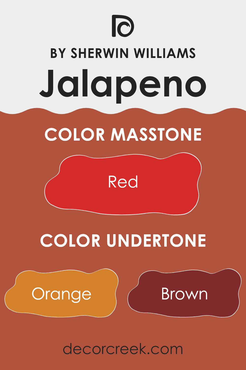
Undertones of Jalapeno SW 6629 by Sherwin Williams
JalapenoSW 6629 is a vibrant paint color known for its bold and lively appearance. The undertones of a paint color significantly influence how it is perceived and can subtly change depending on the lighting. For this particular color, the undertones include orange, brown, olive, pink, pale pink, purple, and grey. These underlying colors add depth and complexity, affecting how Jalapeno appears in different environments.
Undertones are crucial because they can either warm up or cool down the color. For example, orange and brown undertones in Jalapeno create a warmth that makes a room feel cozy and inviting. Alternatively, olive and grey provide a muted, earthy feel that can make the color appear more subdued and natural. Pink and purple undertones add a hint of unexpected vibrance, giving the walls a unique twist that can complement various decor styles.
When used on interior walls, the mix of undertones in Jalapeno affects the room’s atmosphere. In natural light, the warmer undertones might become more prominent, making the room feel sunny and cheerful. In artificial lighting, the cooler undertones could stand out, giving the room a more grounded and calm feel. This makes Jalapeno a flexible color choice for different rooms and settings, adjusting well to various styles and lighting conditions.
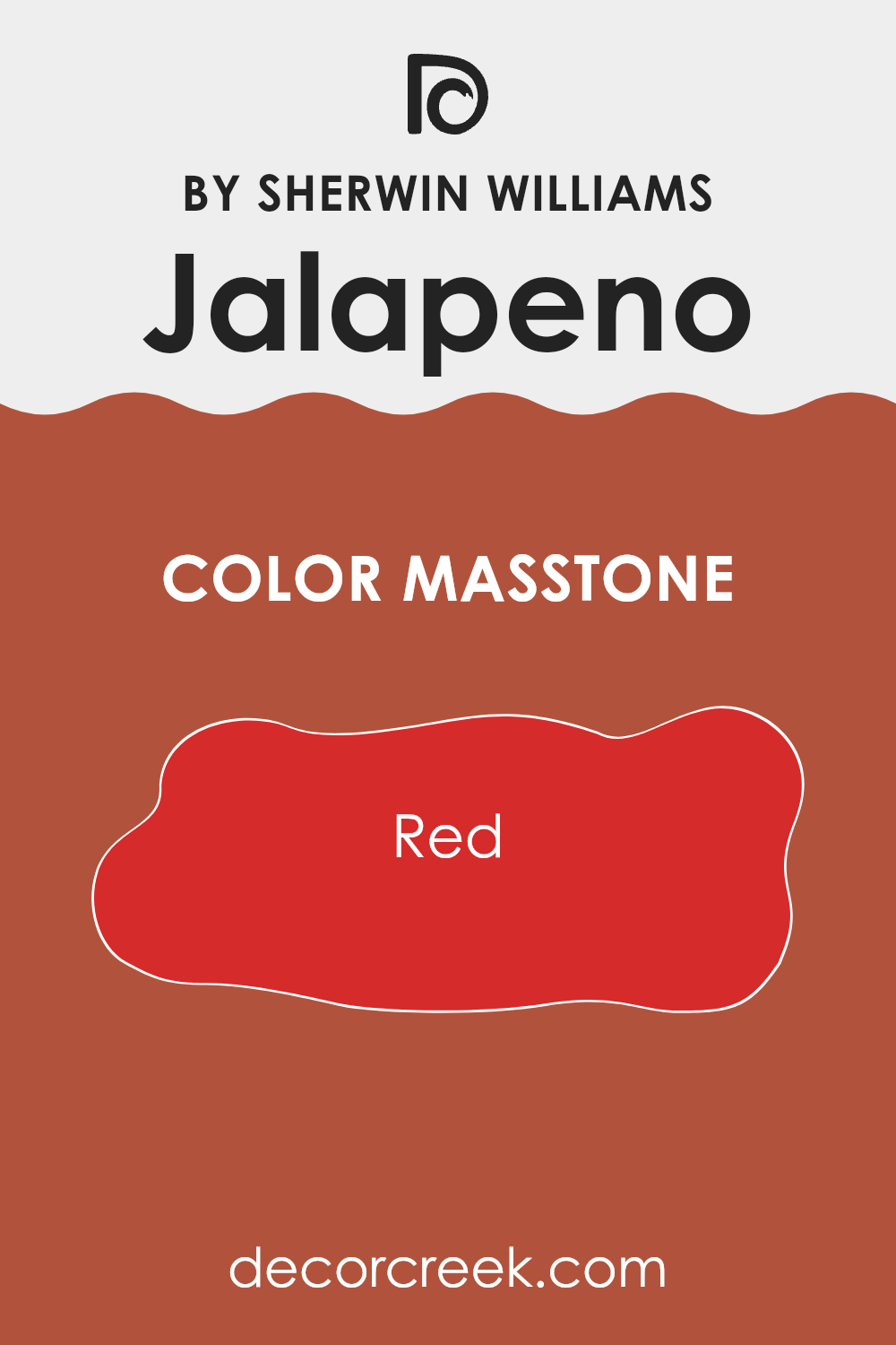
What is the Masstone of the Jalapeno SW 6629 by Sherwin Williams?
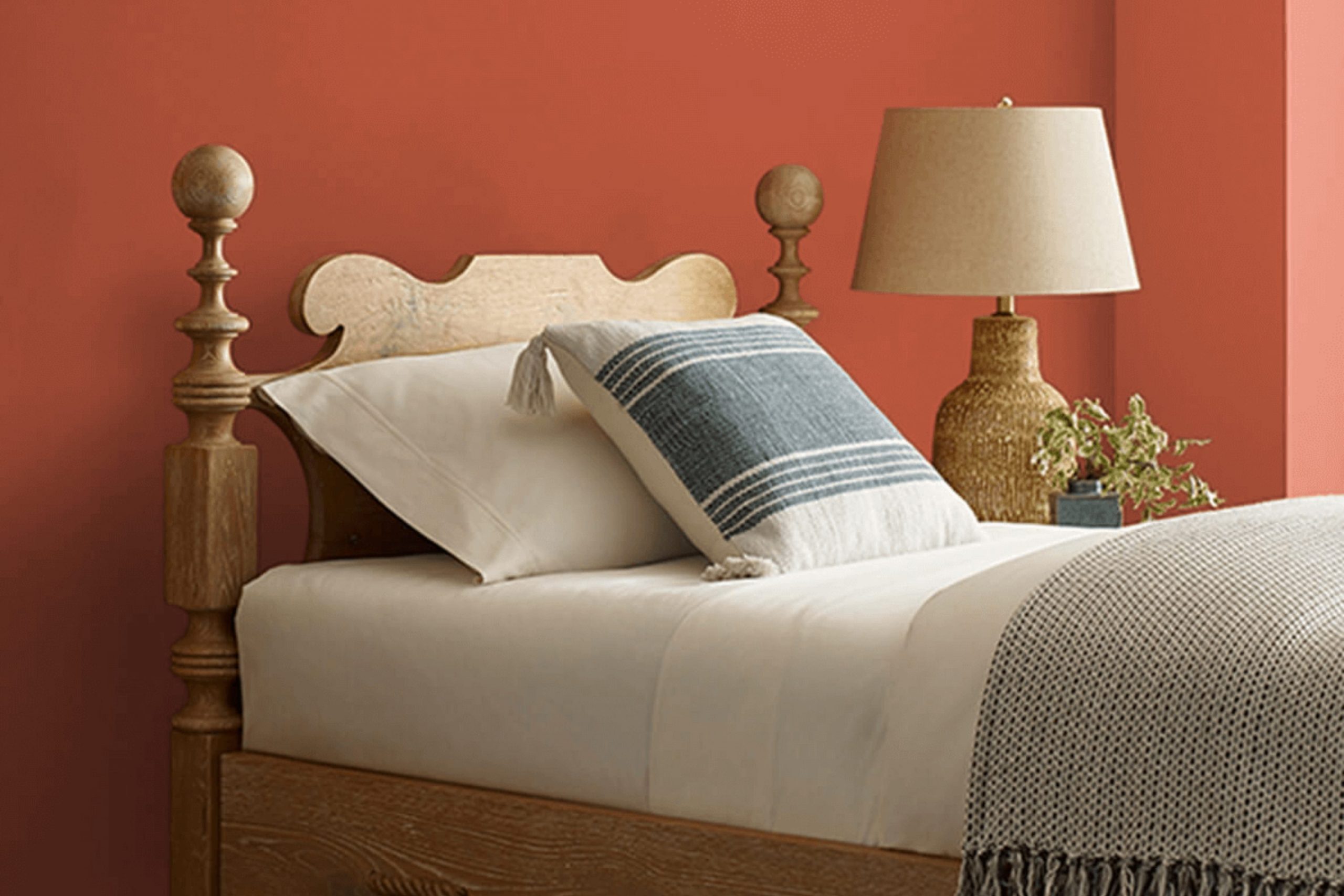
The color known as JalapenoSW 6629 by Sherwin Williams is a rich and vibrant shade of red, specifically #D52B2B. This vivid color brings warmth and energy into any home. It can make large rooms feel cozy and welcoming while giving smaller rooms a dynamic and lively flair.
When used on a feature wall, this red hue can serve as a bold backdrop, perfect for areas like the living room or dining room where you often have visitors. In these rooms, it pairs well with neutral furniture, allowing the color to pop without feeling too intense.
Additionally, this shade can add a festive touch to your kitchen or game room, inspiring lively conversations and gatherings. However, it’s wise to use it sparingly in bedrooms or study areas where you generally want a calmer atmosphere, as its energy might be too stimulating for rest or concentration.
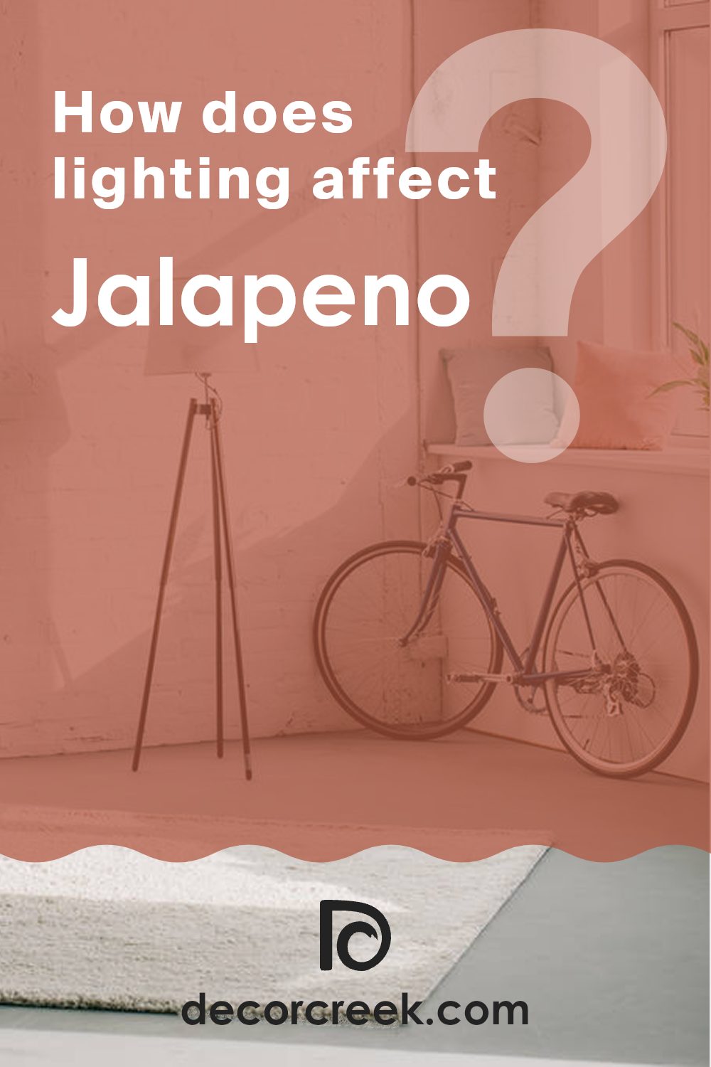
How Does Lighting Affect Jalapeno SW 6629 by Sherwin Williams?
Lighting plays a crucial role in how colors appear in a room, affecting the mood and the atmosphere. The way light interacts with paint colors can change their appearance dramatically. For instance, consider a color like Jalapeno by Sherwin Williams. This is a vibrant, medium green with subtle yellow undertones. The way this color looks can significantly change depending on the light source.
In artificial light, Jalapeno tends to look warmer and more muted, especially under yellow or soft white bulbs. This is because artificial lighting lacks the spectrum of sunlight, and the yellow tones in the bulbs enhance the yellow undertones in the paint. Jalapeno under cooler LED lights might appear slightly truer to its original shade, but still lean towards warmth due to its inherent undertones.
In natural light, this color can look quite different throughout the day. Natural light brings out the truest form of the color, making Jalapeno appear lively and vibrant. The quality and angle of sunlight exposure make a significant difference. In north-facing rooms, light is cooler and more consistent, which might make Jalapeno appear slightly more subdued and less warm. These rooms don’t get a lot of direct sunlight, so the color stays more true and less influenced by changing light conditions.
South-facing rooms receive more intense, direct sunlight throughout the day, making colors like Jalapeno appear brighter and more vivid. This exposure tends to enhance the paint’s natural vibrancy.
East-facing rooms receive light in the morning when the sun is rising. This means Jalapeno will appear bright and lively in the morning, fading to a softer, more shadowed green in the afternoon and evening.
West-facing rooms get the evening sun, which is warmer and golden. This can make Jalapeno look very warm in the afternoons and evenings, enhancing its yellow undertones more pronouncedly than in any other room orientation.
Understanding how Jalapeno reacts in different lighting conditions helps in choosing the right paint for the desired effect in a room.
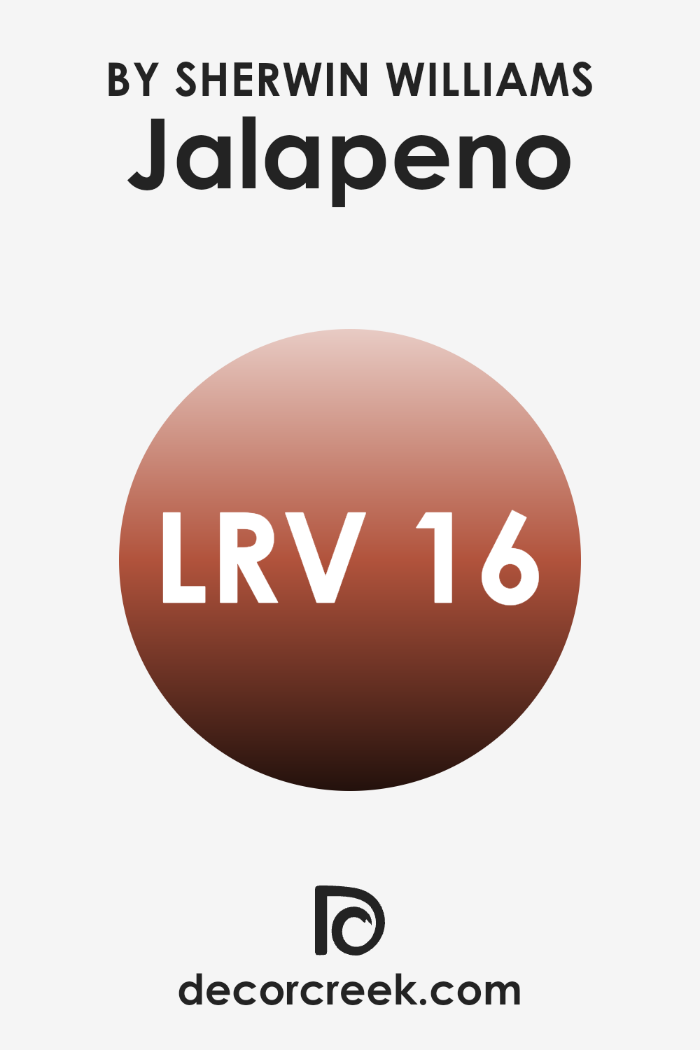
What is the LRV of Jalapeno SW 6629 by Sherwin Williams?
LRV stands for Light Reflectance Value, which measures the percentage of light a paint color reflects when it’s on a surface. Think of it as a scale where darker colors have lower LRVs because they absorb more light, and lighter colors have higher values because they reflect more light back.
This value is crucial because it helps you understand how bright or dark a color will appear once it’s applied to your walls. For example, a higher LRV can make a small room feel more open and airy, while a lower LRV can make a large room feel smaller and cozier.
The LRV for the color in question, 15.912, indicates it’s quite a dark color. This means that it won’t reflect much light, absorbing more instead. In practical terms, this color will make a room appear smaller and more enclosed, which might be perfect if you’re looking for a color that provides a sense of intimacy and warmth.
However, this low LRV could make a small room feel even smaller, so it’s usually better used in larger or well-lit rooms to avoid making the room feel cramped. Additionally, the choice of lighting and furnishings will play a significant role in balancing out the darkness of the paint and ensuring the room does not become too gloomy.
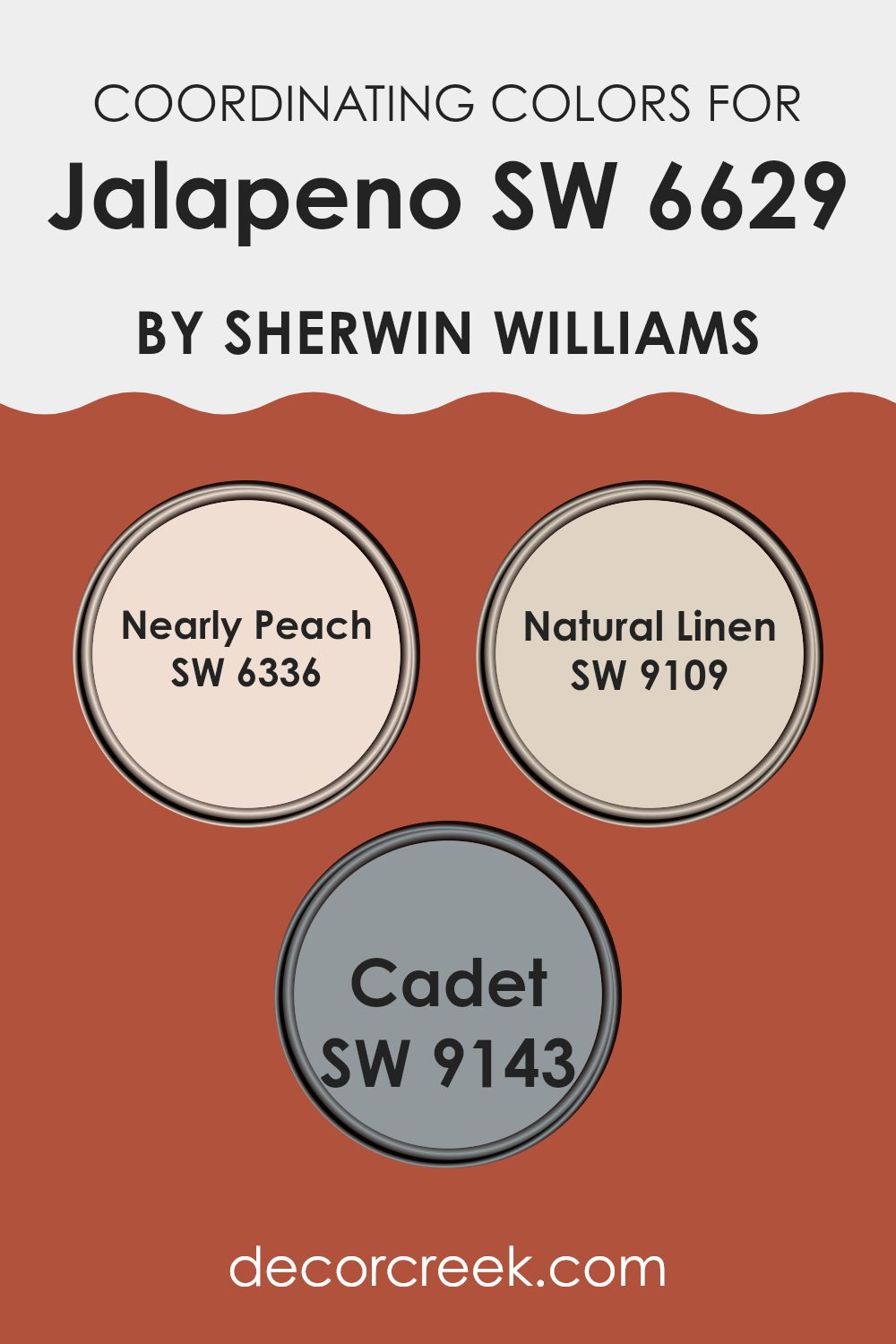
Coordinating Colors of Jalapeno SW 6629 by Sherwin Williams
Coordinating colors are shades that complement each other when used together in a room, enhancing the overall aesthetic without feeling too strong. The idea behind coordinating colors is to create a balanced and harmonious environment where each color supports and highlights the others. For a vibrant color like SW 6629 Jalapeno by Sherwin Williams, which is a bold, lively green, finding the right coordinating colors ensures that the room feels both lively and comfortable.
One coordinating color, SW 6336 Nearly Peach, provides a subtle, soft contrast to the robust green of Jalapeno. Nearly Peach is a gentle hue reminiscent of the inside of a peach, offering a light, airy quality that can help soften stronger colors around it.
On the other side of the palette, SW 9109 Natural Linen acts as a neutral backdrop, a warm beige that pairs well with almost any color but particularly helps in toning down the energy of Jalapeno, providing a calming effect in any room. Additionally, SW 9143 Cadet, a muted blue-gray, complements Jalapeno by introducing a cool counterbalance that is ideal for creating a more grounded and cohesive look. These coordinating colors work together seamlessly to enhance the beauty and vibrancy of any room styled with Jalapeno.
You can see recommended paint colors below:
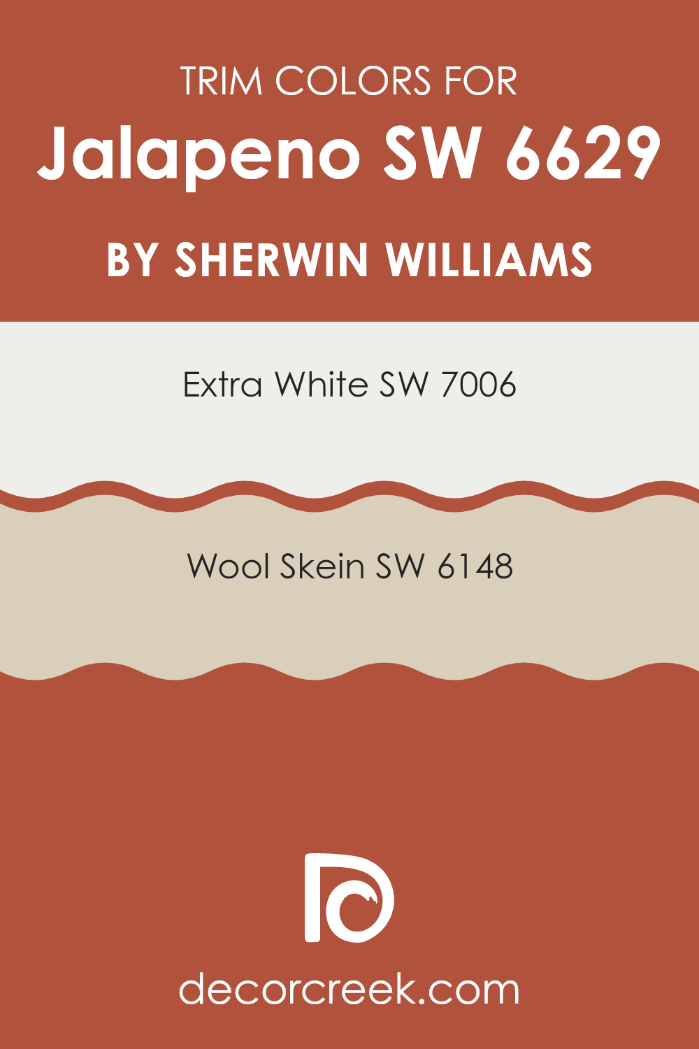
What are the Trim colors of Jalapeno SW 6629 by Sherwin Williams?
Trim colors are used to highlight or accentuate the architectural details and edges of walls, doors, windows, and moldings. By choosing the right trim color, you can subtly enhance the primary wall colors and unify various elements of a room’s decor. In the case of a vibrant paint like Jalapeno by Sherwin Williams, selecting complementary trim colors can also help balance the overall intensity of the color scheme and create a visually appealing and harmonious interior.
For a lively color like Jalapeno, SW 7006 – Extra White is an excellent choice for trim, as it provides a crisp and clean contrast, making the green stand out while also adding a sense of freshness and clarity to the interior.
On the other hand, SW 6148 – Wool Skein, with its soft and warm beige tone, offers a subtle, soothing contrast that can soften the boldness of a vibrant color, providing a relaxing and warm feel that complements without feeling too strong. These trim colors offer styling flexibility and can work well in various lighting conditions, enhancing the overall aesthetic of the room.
You can see recommended paint colors below:
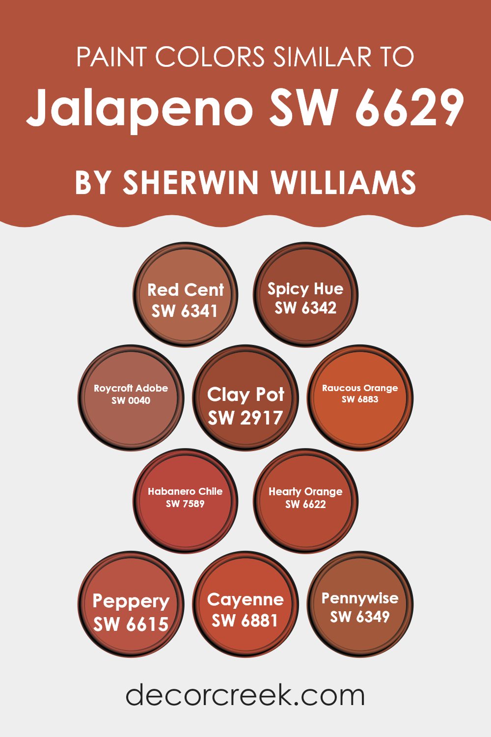
Colors Similar to Jalapeno SW 6629 by Sherwin Williams
Choosing similar colors can be essential for creating a harmonious and visually appealing room. Colors that share similarities in hue, saturation, or brightness can tie a room together or accentuate a particular design style. For instance, when looking at colors like Red Cent, a rusted red with a hint of brown, it extends warmth and earthiness, which makes it excellent for cozy, inviting interiors. Spicy Hue similarly offers a warm splash, but with a more pronounced orange undertone, it imparts a lively zest that’s perfect for energizing a room.
Roycroft Adobe brings an even deeper, richer clay color that grounds a room with its sturdy, reliable vibe. Similarly, Clay Pot has that terracotta tone that feels naturally rustic and comforting. With a shift toward a more vivid palette, Raucous Orange offers a bold, bright punch of color, ideal for making strong, cheerful statements.
Habanero Chile is another robust color, this one deeper and infused with a fiery presence that makes it stand out, while Hearty Orange shares a similar robustness but with a cozier touch. In the realm of spices, Peppery’s burnt orange is sharp and precise, excellent for accents. Cayenne’s vibrant red-orange is an energizer, perfect for rooms meant to stimulate and excite. Lastly, Pennywise has a muted copper hue, adaptable and understated, suitable for rooms that aim for a subtle yet warm atmosphere. Together, these hues work wonderfully to create environments that are both vibrant and cohesive, reflecting various aspects of warmth and energy.
You can see recommended paint colors below:
- SW 6341 Red Cent
- SW 6342 Spicy Hue
- SW 0040 Roycroft Adobe
- SW 2917 Clay Pot
- SW 6883 Raucous Orange
- SW 7589 Habanero Chile
- SW 6622 Hearty Orange
- SW 6615 Peppery
- SW 6881 Cayenne
- SW 6349 Pennywise
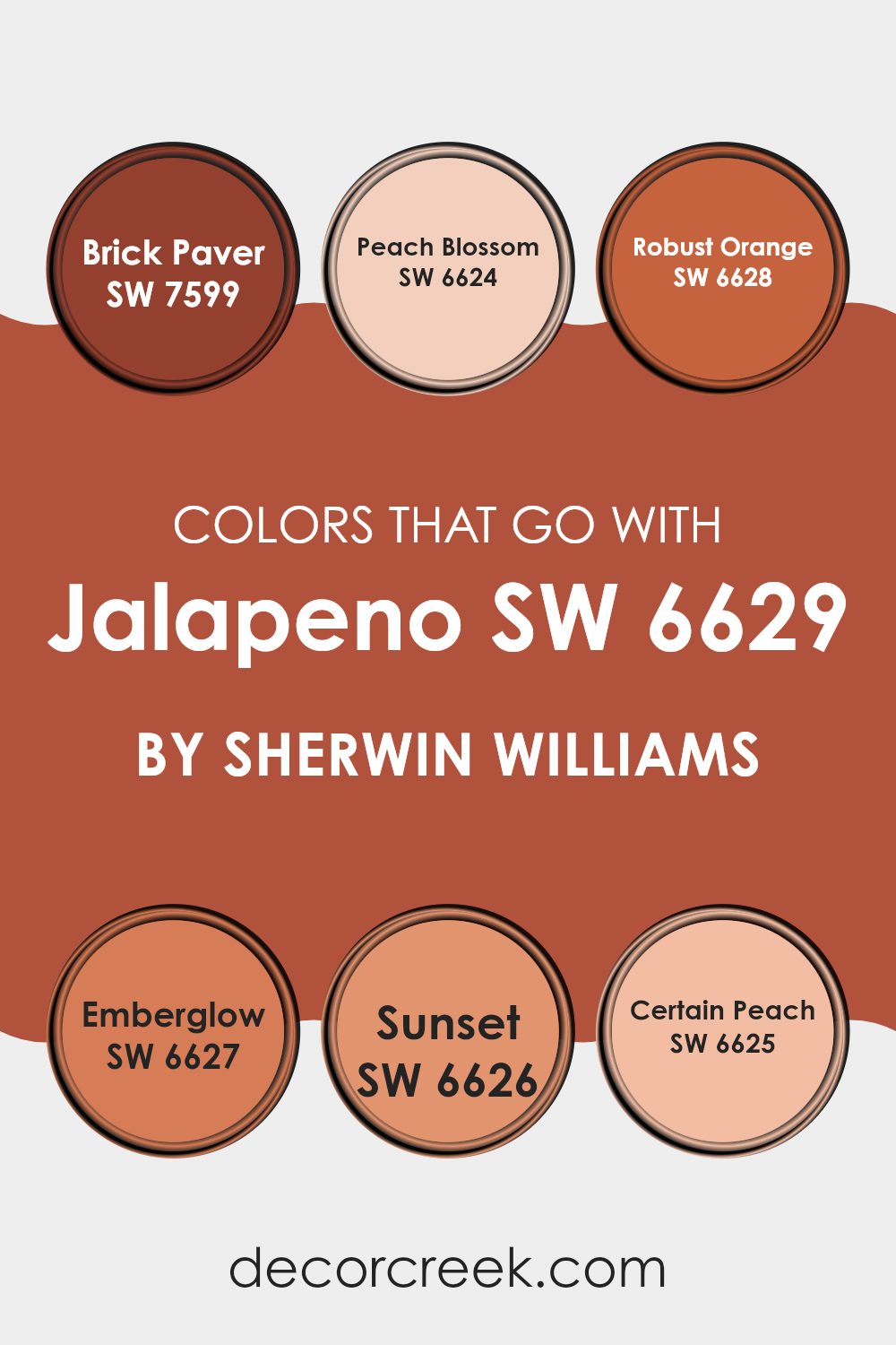
Colors that Go With Jalapeno SW 6629 by Sherwin Williams
Choosing the right colors that harmonize with Jalapeno SW 6629 by Sherwin Williams can impact the feel and look of a room significantly. The interaction of colors can set the mood, enhance the visual appeal, and even influence the perceived size and warmth of an interior. When paired correctly, these colors create a cohesive and inviting environment.
Jalapeno SW 6629 can be beautifully complemented by colors like Brick Paver SW 7599, which is a deep, warm red, adding a cozy and welcoming touch to any room. Peach Blossom SW 6624 provides a soft, gentle peach hue that brings lightness and a breath of fresh air when used alongside the vibrant Jalapeno. Robust Orange SW 6628 offers a lively, bold orange that injects energy and fun into interiors, making it great for areas where excitement is key.
Emberglow SW 6627 is a muted, earthy orange-red that pairs nicely with Jalapeno for a more grounded, warm feel. Sunset SW 6626 exhibits a rich, golden orange, perfect for adding a sunset-like glow that enhances the room’s warmth. Lastly, Certain Peach SW 6625 features a subdued peach tone that complements Jalapeno by providing a soft contrast, balancing the vividness of Jalapeno with its soothing presence. These colors together can help create a room that is warm, welcoming, and lively, ideal for active family rooms or energizing work environments.
You can see recommended paint colors below:
- SW 7599 Brick Paver
- SW 6624 Peach Blossom
- SW 6628 Robust Orange
- SW 6627 Emberglow
- SW 6626 Sunset
- SW 6625 Certain Peach
How to Use Jalapeno SW 6629 by Sherwin Williams In Your Home?
Jalapeno SW 6629 by Sherwin Williams is a vibrant and lively green paint that adds a fresh look to any room. This bold, energetic shade works well in areas where you want to create a sense of fun and enthusiasm, like kitchens or playrooms. Applying Jalapeno on an accent wall can make a room feel more dynamic, while pairing it with neutral tones helps balance its intensity.
This color is also great for furniture pieces that you want to stand out. Think about painting a bookshelf or a side table in Jalapeno to give new life to an old item and add a splash of color. It’s also ideal for exterior doors, giving guests a warm welcome with its cheerful vibe.
For those who like a little adventure in their decor, Jalapeno provides an easy way to bring a touch of nature’s freshness indoors, without feeling too strong. Whether you use it for small accents or larger areas, Jalapeno SW 6629 makes it simple to refresh your home.
Jalapeno SW 6629 by Sherwin Williams vs Hearty Orange SW 6622 by Sherwin Williams
Jalapeno and Hearty Orange, both by Sherwin Williams, offer vivid and distinct hues that can greatly influence the mood of a room. Jalapeno is a vibrant green that brings to mind fresh, lively nature scenes.
It’s well-suited for kitchens or workspaces where you want to add some energy without overpowering the senses. On the other hand, Hearty Orange has a rich, bold presence that suggests warmth and enthusiasm.
This color works great in dining areas or social rooms where you want to create a welcoming, cheerful atmosphere. Both colors stand out because of their brightness and can effectively add character to a room depending on the feeling you want to establish. Their differences lie mainly in the feelings they evoke—Jalapeno offers a cooler, refreshing vibe while Hearty Orange heats things up with its cozy, dynamic appeal.
You can see recommended paint color below:
- SW 6622 Hearty Orange
Jalapeno SW 6629 by Sherwin Williams vs Roycroft Adobe SW 0040 by Sherwin Williams
Jalapeno SW 6629 by Sherwin Williams is a vibrant and lively shade of green. It has a bright, punchy quality that can easily bring energy and freshness to a room. This color resembles the lively tone of a fresh jalapeno pepper, giving a youthful and invigorating feel to any interior.
On the other hand, Roycroft Adobe SW 0040, also by Sherwin Williams, is a much warmer, earthy color. This shade is reminiscent of terracotta clay, providing a cozy and grounding effect. It’s a rich, muted red that can make large rooms feel more intimate and smaller areas feel more enveloped and cozy.
When comparing the two, Jalapeno is more likely to catch the eye, making it ideal for an accent wall or for rooms where creativity and energy are encouraged. Roycroft Adobe, with its warmth and depth, is perfect for creating a welcoming atmosphere in living rooms or dining areas. Both colors offer distinct vibes and can significantly influence the mood of a room based on how they are applied.
You can see recommended paint color below:
- SW 0040 Roycroft Adobe
Jalapeno SW 6629 by Sherwin Williams vs Peppery SW 6615 by Sherwin Williams
Jalapeno and Peppery, both from Sherwin Williams, are vibrant colors with unique tones that offer distinct vibes for any room. Jalapeno is a deep, rich green that leans a bit towards olive, giving a cozy and earthy feel.
It’s perfect for rooms where you want to add a hint of nature-inspired warmth. On the other hand, Peppery is a bold, fiery red that packs a punch. This color can instantly brighten an area and add a lively, energetic feel.
Peppery works well in rooms that benefit from a splash of excitement, such as dining rooms or kitchens. While both colors are strong and lively, Jalapeno offers a grounding, calming effect due to its green hues, whereas Peppery, with its red tones, is more stimulating and dynamic. Choosing between them depends on the atmosphere you want to create: soothing and natural with Jalapeno or vibrant and spirited with Peppery.
You can see recommended paint color below:
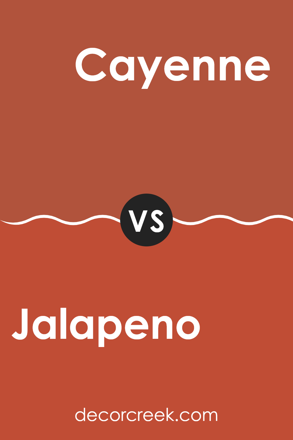
Jalapeno SW 6629 by Sherwin Williams vs Cayenne SW 6881 by Sherwin Williams
The main color, Jalapeno, and the secondary color, Cayenne, both by Sherwin Williams, offer distinct vibes for any room. Jalapeno is a vibrant, lively green that brings a fresh and energetic feel. It’s a rich shade that really stands out and can make an area feel alive and full of vitality.
On the other hand, Cayenne is a bold, fiery red that’s sure to make a strong statement. This color can add a lot of warmth and excitement to an interior, perfect for creating a dynamic and inviting atmosphere.
While Jalapeno could be better suited for rooms where you want a touch of nature and rejuvenation, Cayenne works well in areas where you aim to stimulate conversation and enthusiasm. Both colors are striking but serve different moods and themes in interior design.
You can see recommended paint color below:
- SW 6881 Cayenne
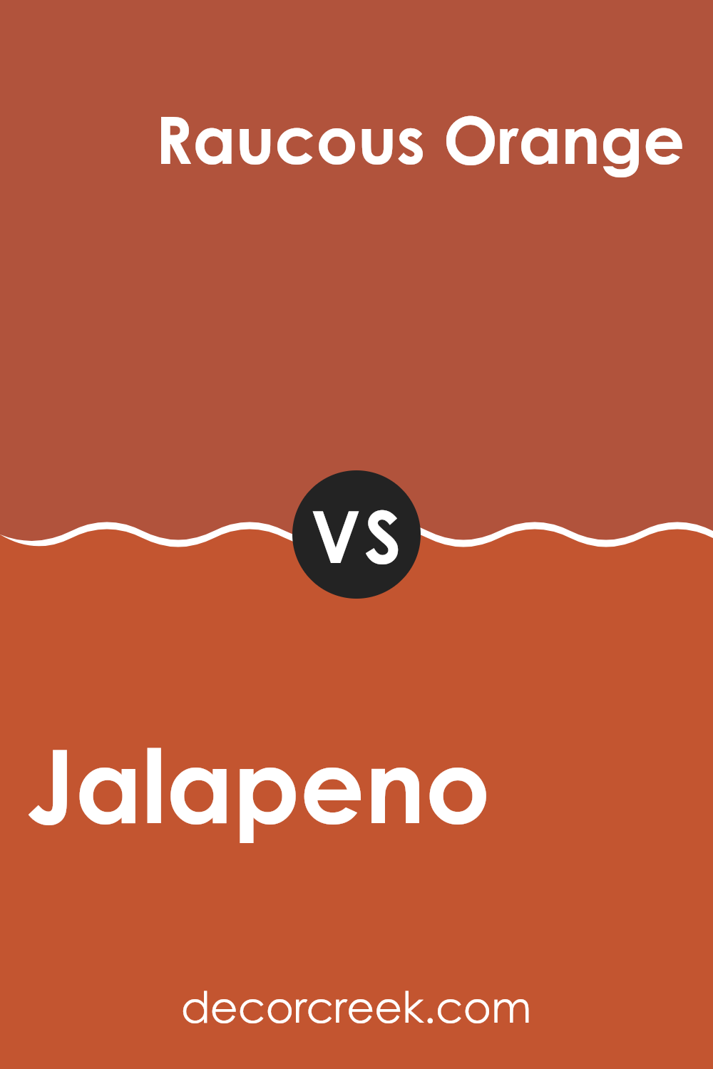
Jalapeno SW 6629 by Sherwin Williams vs Raucous Orange SW 6883 by Sherwin Williams
Jalapeno by Sherwin Williams is a vibrant, slightly muted green color that evokes the fresh, spicy zest of its namesake pepper. It brings a lively splash of nature-inspired freshness to any room, making it ideal for rejuvenating an area that needs a touch of vitality without feeling too strong.
In contrast, Raucous Orange by Sherwin Williams stands out with its bold, energetic orange hue. This color is enthusiastic and cheerful, providing a strong statement that can instantly warm up and enliven a room. It’s a perfect choice if you want to create a focal point or add a burst of sunshine to any interior.
While both Jalapeno and Raucous Orange are energetic and can stimulate a refreshing vibe, they create different moods. Jalapeno leans toward a natural, earthy feel, while Raucous Orange offers a more vibrant and dynamic atmosphere. When deciding between them, consider the effect you want: the calm energy of a green hue or the vivid excitement of orange.
You can see recommended paint color below:
- SW 6883 Raucous Orange
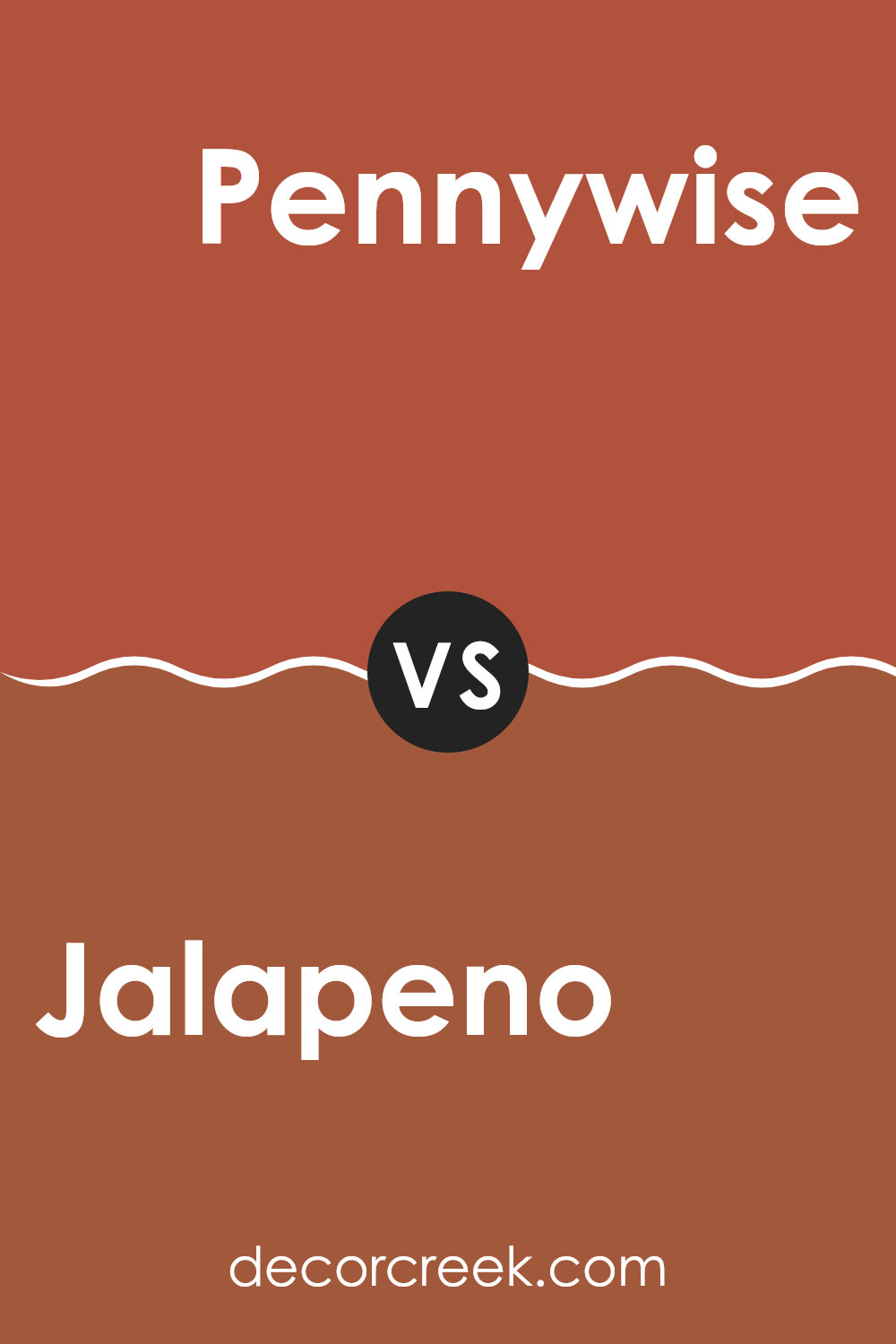
Jalapeno SW 6629 by Sherwin Williams vs Pennywise SW 6349 by Sherwin Williams
Jalapeno and Pennywise by Sherwin Williams are two distinct shades that can create very different atmospheres in a room. Jalapeno is a vibrant, deep green. It’s lively and brings a lot of energy to an interior, making it a great choice for rooms where you spend a lot of time during the day. It has the freshness of greenery and can liven up a room with a natural vibe.
On the other hand, Pennywise is a warm, muted orange. It provides a cozy and inviting feeling, suitable for relaxing areas like living rooms or bedrooms. It pairs well with soft lighting and can make a room feel warm and snug.
Both colors are strong on their own and can set completely different moods depending on what you are looking for—Jalapeno invigorates and refreshes a room with its natural green, while Pennywise warms up an interior with its subdued orange. They can also complement each other well in a color scheme, offering a balance between energy and comfort.
You can see recommended paint color below:
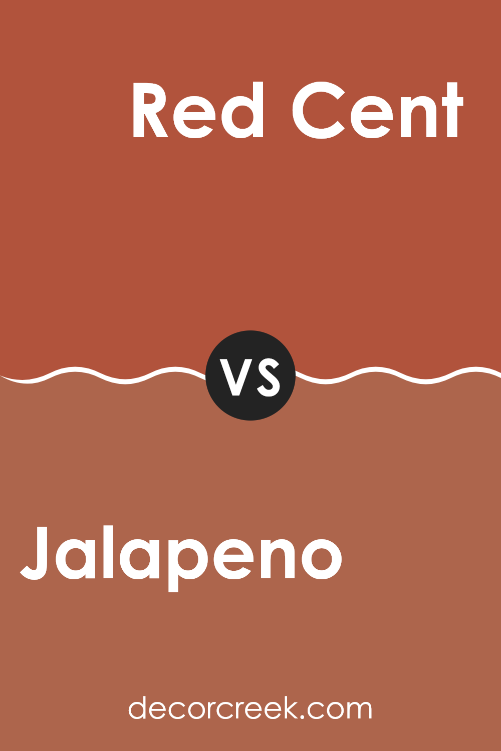
Jalapeno SW 6629 by Sherwin Williams vs Red Cent SW 6341 by Sherwin Williams
Jalapeno and Red Cent, both by Sherwin Williams, offer distinct vibes for interior rooms. Jalapeno is a fresh, lively green with a vibrant, leafy tone that can add energy and a sense of growth to a room.
It’s perfect for creating a cheerful, welcoming atmosphere. In contrast, Red Cent has a deep, warm terracotta color that evokes a rustic or southwestern feel. This color can make a room feel cozy and grounded, especially in well-lit interiors.
While Jalapeno is more about vibrancy and freshness, Red Cent provides a sense of warmth and earthiness. Both colors are bold, yet they cater to different aesthetic preferences and can set very different moods within a room. So, your choice between them would depend on whether you’re aiming for a brighter, energetic vibe or a more subdued, warm ambiance.
You can see recommended paint color below:
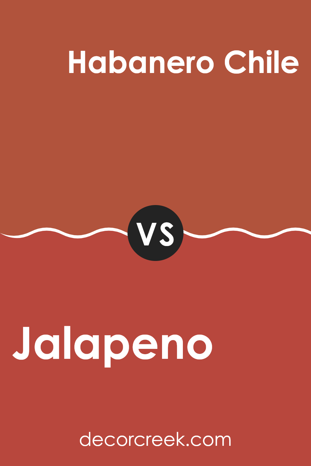
Jalapeno SW 6629 by Sherwin Williams vs Habanero Chile SW 7589 by Sherwin Williams
Jalapeno and Habanero Chile are both vibrant colors from Sherwin Williams that pack a punch, but they set quite different moods. Jalapeno is a bright, cheerful green that brings freshness and energy to any room. It’s perfect for creating a lively atmosphere, much like the zest of the jalapeno pepper it’s named after. This color works well in kitchens or playrooms where you want an upbeat and refreshing vibe.
On the other hand, Habanero Chile is a deep, fiery red that is bold and intense. It can add warmth and a strong presence to a room, evoking the heat of its namesake chili pepper. This color is ideal for accent walls or areas where you want to make a strong statement and generate excitement.
Both colors are great choices for anyone looking to add some enthusiasm to their decor, but the choice between a cooling green and a spicy red depends on the specific mood and energy you want to create in your room.
You can see recommended paint color below:
- SW 7589 Habanero Chile
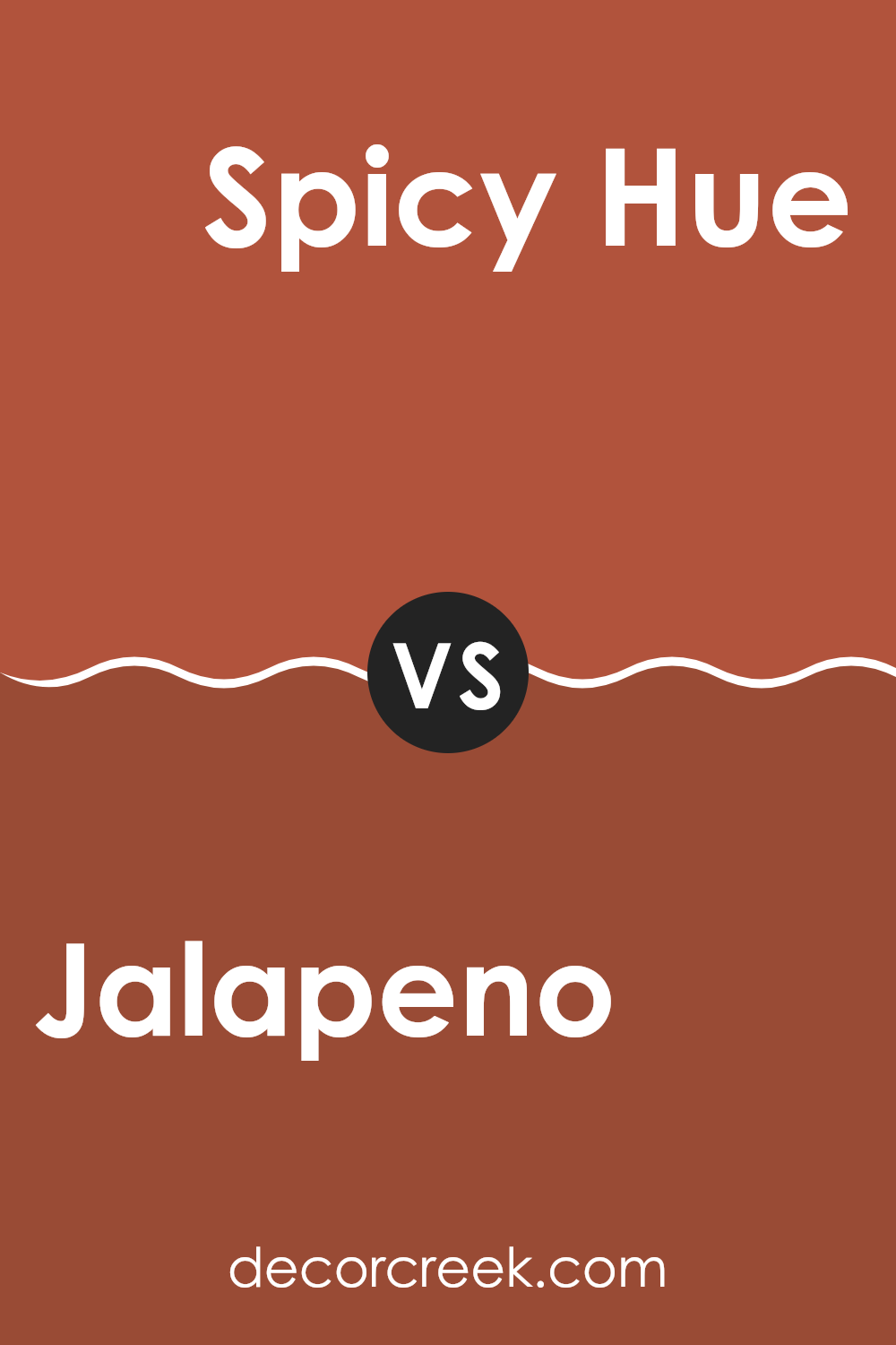
Jalapeno SW 6629 by Sherwin Williams vs Spicy Hue SW 6342 by Sherwin Williams
The main color, Jalapeno, is a vibrant and bright green that brings a lively and fresh feel to any room. It’s a shade that stands out due to its energetic and natural tones, much like the peppery zest of the vegetable it’s named after. This color works well in areas that benefit from a pop of brightness, such as kitchens or creative rooms, injecting a sense of vigor and freshness.
On the other hand, Spicy Hue is a warm and inviting orange-red. This color is deeper and has a cozy warmth to it, making it ideal for living rooms or dining areas where a welcoming atmosphere is desired. The rich, deep tone of Spicy Hue also pairs beautifully with earthy textures and materials, providing a grounded yet dynamic aesthetic.
Overall, while both colors are bold, Jalapeno has a more refreshing and energetic punch, suitable for reviving a room, whereas Spicy Hue offers a warm and cozy vibe, perfect for creating a snug and inviting environment.
You can see recommended paint color below:
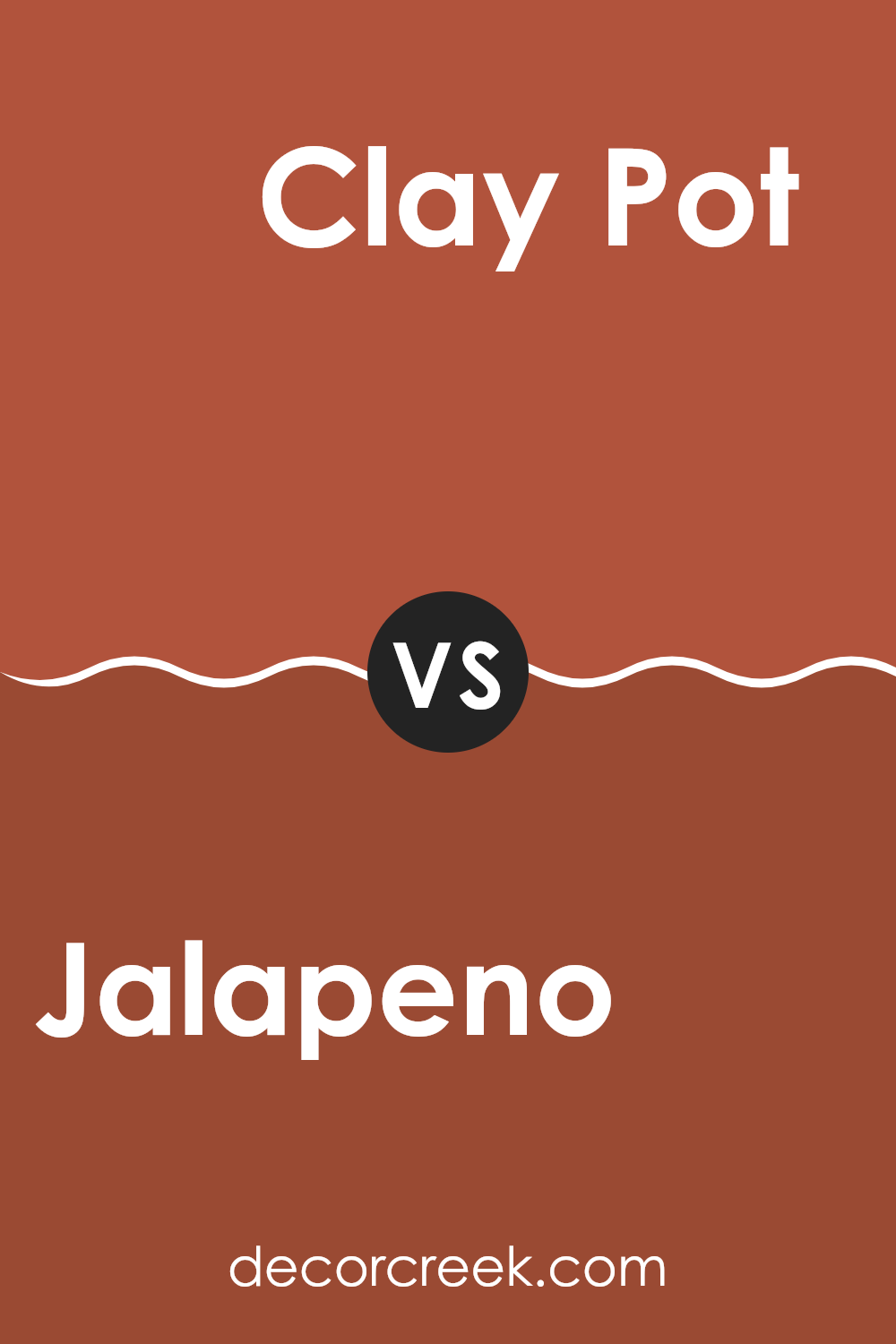
Jalapeno SW 6629 by Sherwin Williams vs Clay Pot SW 2917 by Sherwin Williams
The main color, Jalapeno, is a vibrant and bold green shade. It brings to mind the freshness and zest of the jalapeno pepper after which it’s named. This color is lively and has a natural energy that’s well-suited for rooms where you want an element of freshness or a hint of nature. It works beautifully in kitchens, living rooms, or any area that benefits from a splash of lively color.
In contrast, Clay Pot is a rich, earthy orange. It resembles the warm, welcoming color of terracotta and offers a cozy feel to any room. This hue is great for creating a comforting and inviting atmosphere, making it ideal for dining rooms, entryways, or living areas where you want to encourage a sense of warmth.
Both Jalapeno and Clay Pot are unique; Jalapeno adds vibrancy and energy, while Clay Pot creates warmth and comfort, making them suitable for different moods and settings.
You can see recommended paint color below:
- SW 2917 Clay Pot
In summary, SW 6629 Jalapeno by Sherwin Williams is an exciting paint color that adds a bold and lively touch to any room. The name “Jalapeno” perfectly fits because, just like the pepper, this color can make things pop and add a bit of fun. It’s a warm, vibrant green that looks great and can cheer up areas that might otherwise look boring.
This color can be a great choice if you’re looking to make a statement in rooms like the kitchen or living room, where you spend a lot of time and want a cheerful atmosphere. It can also be a good pick for smaller items like a chair or a bookshelf if you’re not ready to commit to painting a whole wall.
The color Jalapeno by Sherwin Williams is not just pretty to look at, but it also creates a positive vibe in the home. Lastly, it’s a color that brings joy and energy into a room, making it feel alive and welcoming. Getting the walls painted in Jalapeno might just be what your home needs to feel more playful and bright.

Ever wished paint sampling was as easy as sticking a sticker? Guess what? Now it is! Discover Samplize's unique Peel & Stick samples.
Get paint samples

