Choosing the right paint color for your home can sometimes feel intense with all the available options. If you’re on the lookout for a hue that exudes warmth and adds a vibrant touch, Sherwin Williams SW 6627 Emberglow is a contender that deserves your attention.
This color strikes a delightful balance between red and orange, resulting in a rich, glowing tone that suggests the cozy feel of embers in a winter hearth. It has a lively vibe that can rejuvenate your area, making it ideal for spots where you and your guests gather, like the living room or dining area.
When you use Emberglow in your home, it pairs beautifully with neutral shades, deep greens, or royal blues, providing a adaptable base for your decor preferences. Whether you’re hoping to create a focal point or simply wish to warm up a room, SW 6627 Emberglow can offer just the right amount of color to make your area feel inviting and lively.
Coming with the trusted quality of Sherwin Williams, this paint promises not only a beautiful shade but also durability and excellent coverage. Let’s see how this vibrant color can renew your home and reflect your personality!
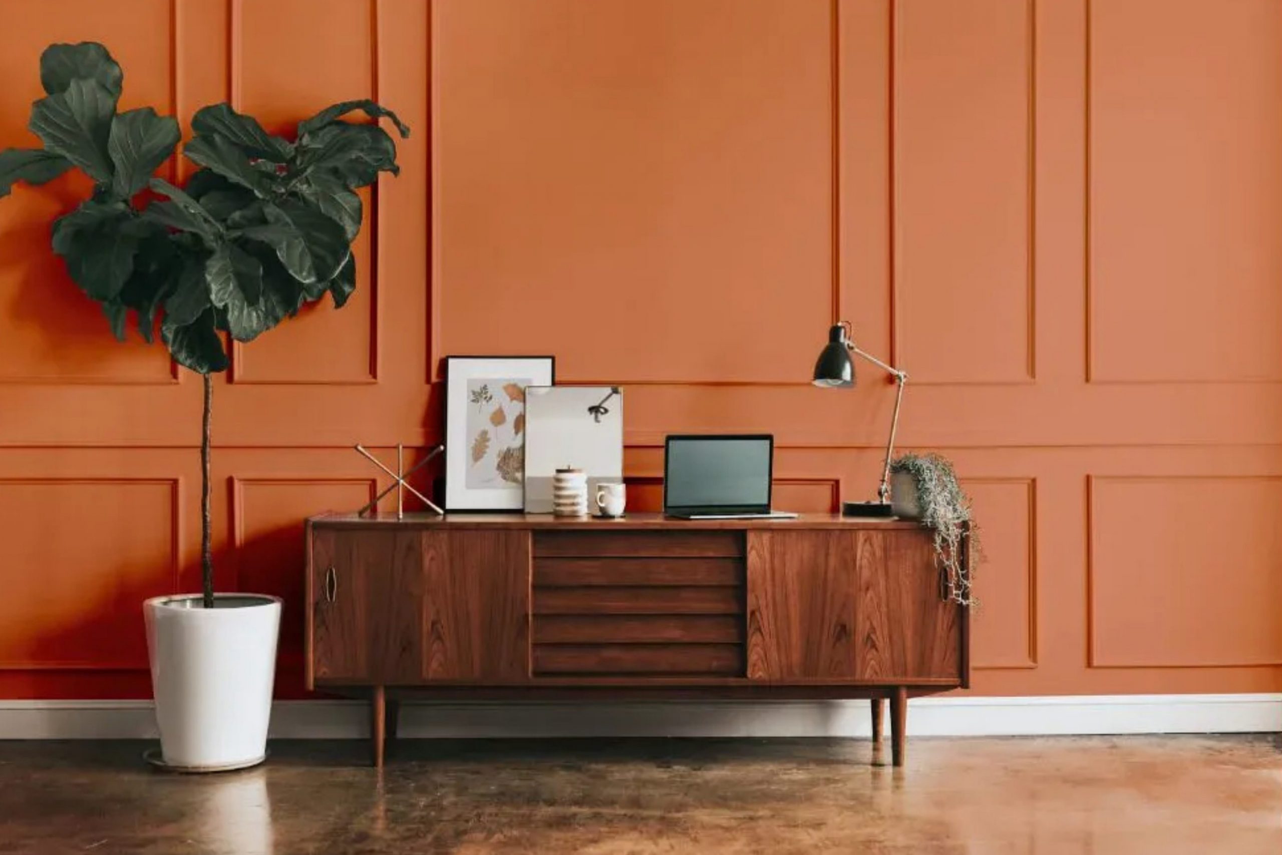
What Color Is Emberglow SW 6627 by Sherwin Williams?
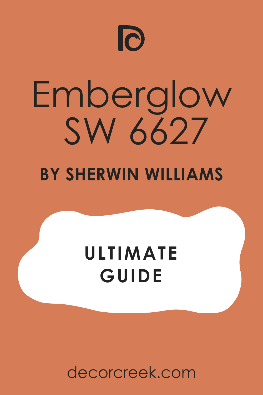
Emberglow is a warm, vibrant shade of orange that adds a cozy and cheerful atmosphere to any room. It’s a color that is reminiscent of autumn leaves and fiery sunsets, creating a sense of warmth and comfort. Its radiant quality makes it perfect for areas where a touch of energy and personality is desired.
This color works particularly well in interior styles that lean towards the rustic, bohemian, or even traditional. It has the adaptability to enliven a living room, create a welcoming kitchen, or make a dining area more inviting. Because of its warm undertones, it particularly complements natural materials such as wood, leather, and woven textures, enhancing the richness of these elements.
When it comes to pairing with materials, Emberglow coordinates beautifully with wood, from dark walnut to lighter oak, which helps ground its brightness. It also looks stunning when contrasted with metals like bronze or copper, which reflect its warmth. For fabrics, consider soft textures like wool, cotton, or linen in neutral shades to balance its intensity. Adding elements in creamy whites or subtle earth tones can also help in creating a balanced, yet dynamic, aesthetic.
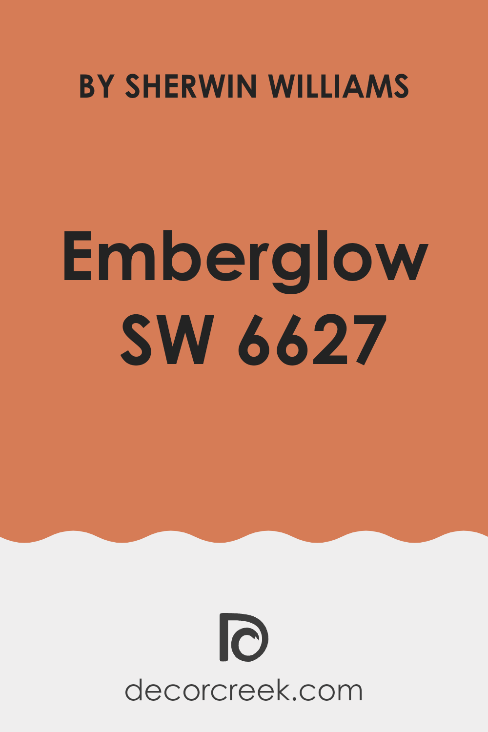
Is Emberglow SW 6627 by Sherwin Williams Warm or Cool color?
Emberglow is a warm and inviting paint color from Sherwin Williams. Its rich, orange tone can create a cozy atmosphere in any room of a house. This color works well in areas where you want to add a sense of comfort and warmth, such as living rooms or dining areas. When used on walls, Emberglow can make a room feel more welcoming and snug, which is perfect for gatherings or relaxing evenings.
Its orange hue is also great for pairing with neutral colors like whites or browns, providing a striking contrast that can really make an area stand out. Plus, in rooms with lots of natural light, this color can appear even more vibrant and lively, bringing a fresh and energetic feel.
Overall, opting for Emberglow in your home can help create a pleasant and cheerful environment, perfect for places where you spend a lot of time with family or friends.
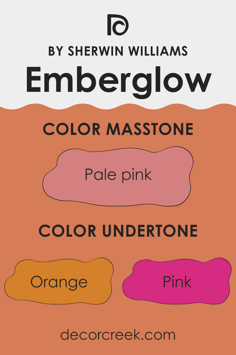
Undertones of Emberglow SW 6627 by Sherwin Williams
Emberglow is a vibrant and warm paint color that can significantly influence the ambiance of a room. This color has a variety of undertones, which are subtle hues mixed into the main color, affecting how it appears under different lighting conditions. The undertones for this color include shades like orange, pink, red, and yellow, which contribute to its warmth and richness. Grey, olive, and brown add depth and complexity, making it a adaptable choice for home interiors.
Undertones play a crucial role in color perception. For instance, in natural light, Emberglow’s red or orange undertones might become more pronounced, giving the walls a cozy and inviting feel. Conversely, under artificial lighting, the grey or olive undertones could appear more dominant, providing a grounding effect.
This dynamic range of undertones means Emberglow can adjust well to various settings and decor styles. In a living room, the warmer undertones can create a welcoming atmosphere, while in a study or home office, the deeper tones can help focus and define the area.
However, when choosing this color for interior walls, it’s essential to consider other room elements such as furniture, flooring, and natural light. These factors can either enhance or subdue its undertones, affecting the overall look and feel of the area. Always testing the paint on a small section of the wall to see how the color and its undertones behave throughout the day is a wise decision before fully committing to it.
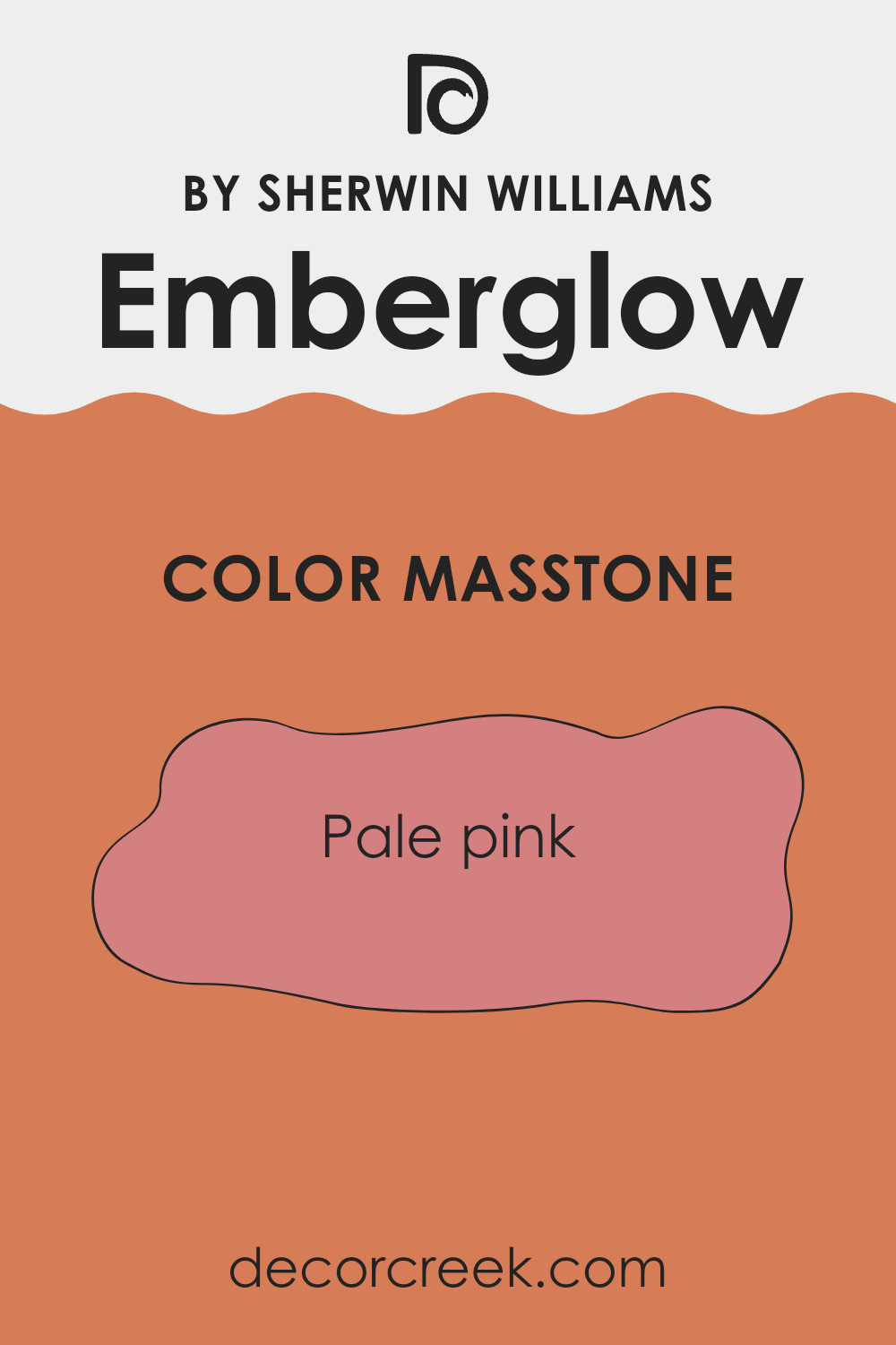
What is the Masstone of the Emberglow SW 6627 by Sherwin Williams?
Emberglow SW 6627 by Sherwin Williams has a masstone of pale pink, represented by the color code #D58080. This soft and gentle shade of pink brings a cozy and warm feeling to any room. It’s ideal for areas where relaxation is key, such as bedrooms and living rooms.
The light pink tone helps create a welcoming environment, making it easy for you to unwind after a busy day. It’s also adaptable, matching well with various decor styles and colors, from classic whites to bolder hues like deep blues or greens.
This paint color is great for those wanting to add a subtle touch of warmth without overpowering the area. Its ability to reflect light can make smaller areas feel slightly larger and more open. Overall, Emberglow SW 6627 can brighten and soften your home environment, offering a pleasant backdrop for daily life.
How Does Lighting Affect Emberglow SW 6627 by Sherwin Williams?
Lighting plays a crucial role in how we perceive colors. The same paint can look very different depending on the type of light shining on it. Natural light typically shows the truest color since sunlight has a balanced spectrum. Artificial lights, such as LEDs or fluorescent bulbs, can alter the way colors look because of their color temperatures and intensities.
Emberglow is a warm, vibrant shade that can change based on the lighting condition. In artificial light, especially under warm bulbs, Emberglow radiates a cozy, welcoming glow. This makes it a great choice for living areas where a soothing feel is desired. Under cooler lights, the hue may look slightly muted, but it still keeps its rich, inviting character.
Now, consider Emberglow in rooms with different natural light exposures:
- North-facing rooms receive less direct sunlight, which means the light is often cooler and may cause Emberglow to appear more subdued and slightly darker. It’s still warm, but the intensity might be a bit less vivid.
- South-facing rooms get plenty of bright, direct light for most of the day. This can make Emberglow look very lively and luminous, enhancing its warm undertones. It’s an ideal scenario for this color if you want to maximize its vibrancy.
- East-facing rooms see most light in the morning. Morning light is generally gentle and warm, making Emberglow look soft and bright in the early hours, but it will transition as the light fades and may appear less intense by the afternoon.
- West-facing rooms are flooded with light in the late afternoon to evening, which is warmer. During these times, Emberglow will look especially warm and inviting, glowing almost like the sunset outside.
Overall, Emberglow’s perception is hugely dependent on the lighting conditions in a room, varying from bright and lively to subdued and cozy. This adaptability can be an advantage when planning a room’s design based around this particular color.
What is the LRV of Emberglow SW 6627 by Sherwin Williams?
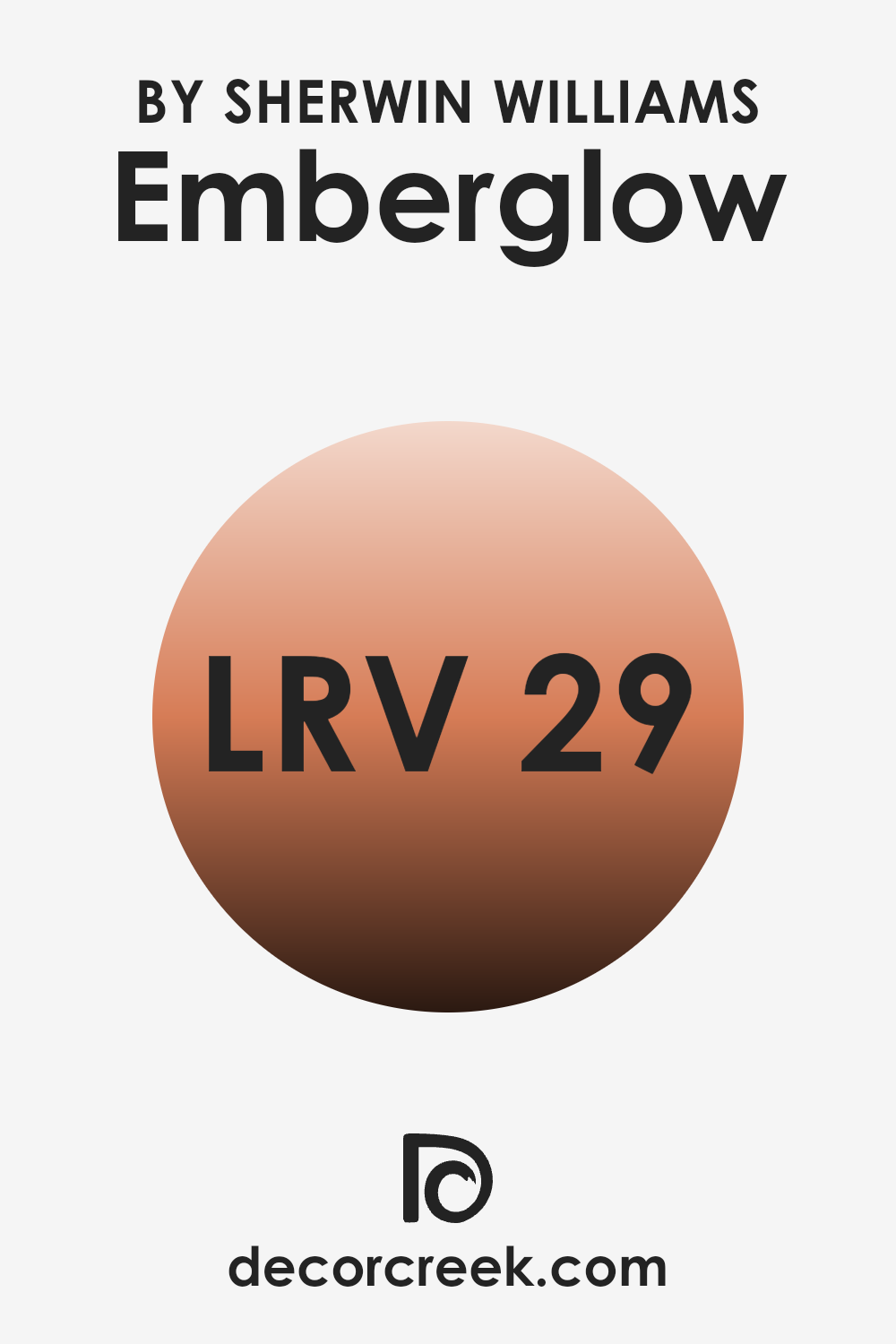
LRV stands for Light Reflectance Value, which is a measure used to describe how much light a paint color reflects back into the room versus how much it absorbs. This value is given on a scale from zero to one hundred, where zero indicates that the color absorbs all light (black), and one hundred means it reflects all light (white).
The LRV helps you understand how light or dark a color will look once applied to your walls and how it will affect the ambiance of a room. For instance, colors with a higher LRV make an area feel more open and brighter because they reflect more light.
The LRV of Emberglow SW 6627 is 29.321, which means it is on the darker side since it does not reflect much light. When painted on walls, this color will give the area a warmer and more enveloping feel because it absorbs more light than it reflects. This can make large areas feel cozier but might make small areas appear somewhat smaller.
The lower LRV also implies that in areas with less natural light, Emberglow SW 6627 may appear even darker, altering the intended effect unless well-lit with artificial lighting. Thus, this color works best in areas where a warm, cozy atmosphere is desired and adequate lighting is available.
Coordinating Colors of Emberglow SW 6627 by Sherwin Williams
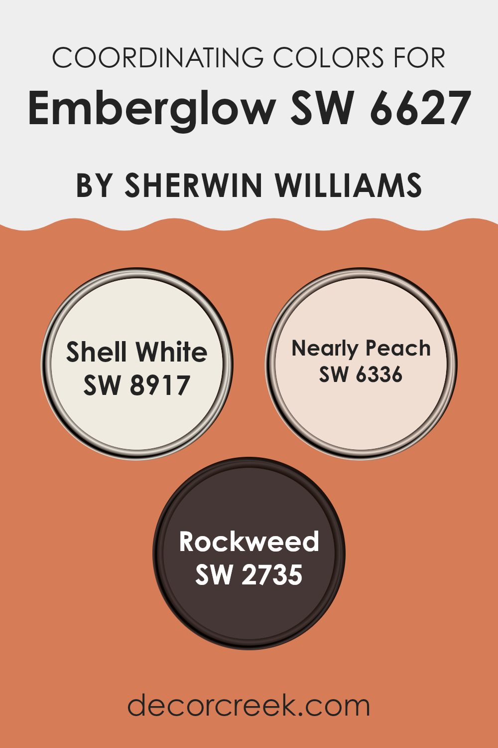
Coordinating colors are selected to harmonize with a main color to create a visually appealing and balanced look. In interior design, choosing coordinating colors helps to ensure that the different colors in a room work well together rather than clashing. Emberglow, a vibrant and warm shade, serves as a striking focal point, and when paired with the right coordinating colors, it helps create a cohesive and inviting atmosphere.
Shell White, for example, is a crisp and clean white that can lighten up an area and provide a subtle contrast to the richer tones of Emberglow. This color is often used to bring a sense of freshness and brightness to an area, making it feel more open.
Nearly Peach is another coordinating color, offering a gentle hint of pink that adds warmth to the environment without being too strong on the senses. It works well in areas looking to achieve a soft, warm aesthetic that complements Emberglow without competing for attention.
Lastly, Rockweed is a deep, muted green with earthy undertones that ground the palette. It acts as a natural counterpart to the more intense Emberglow, introducing a calm and soothing element to the overall design. These coordinating colors together provide a harmonious blend, enhancing the ambiance of any area.
You can see recommended paint colors below:
- SW 8917 Shell White (CHECK A SAMPLE)
- SW 6336 Nearly Peach (CHECK A SAMPLE)
- SW 2735 Rockweed (CHECK A SAMPLE)
What are the Trim colors of Emberglow SW 6627 by Sherwin Williams?
Trim colors are essential in painting as they help define and accentuate the architectural details and character of a room. By choosing a complementary trim color, you can enhance the main color’s visual appeal and make the area feel more finished.
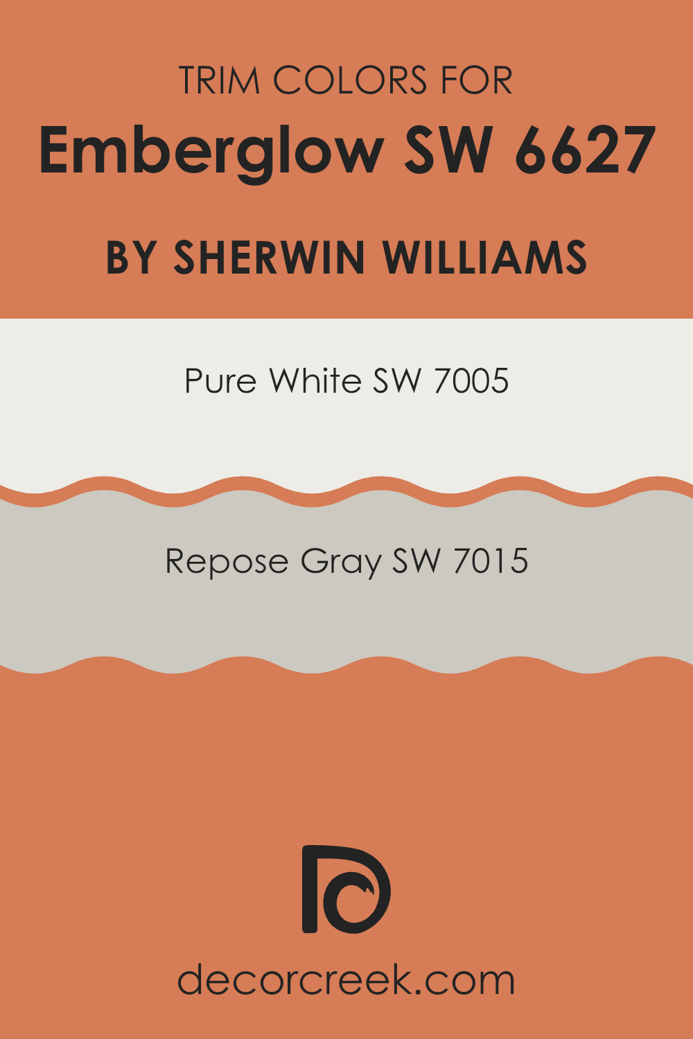
For instance, using trim colors such as SW 7005 – Pure White or SW 7015 – Repose Gray with a vibrant shade like Emberglow can create a striking contrast that frames the area beautifully. This contrast not only highlights the richness of Emberglow but also adds a crisp, clean edge to the overall design.
SW 7005 – Pure White is a bright and clean shade that provides a sharp contrast, making it perfect for trim with rich and intense colors. This color can make darker shades pop and give a refreshing look to an area.
On the other hand, SW 7015 – Repose Gray is a warmer, lighter gray that offers a softer contrast. This color works well if you prefer a subtle differentiation between the wall color and trim, adding a hint of depth without overpowering the main hue. Both choices work well with a prominent color like Emberglow, depending on the effect you’re aiming for in your area.
You can see recommended paint colors below:
Colors Similar to Emberglow SW 6627 by Sherwin Williams
Similar colors play a crucial role in creating harmonious and visually appealing color schemes in interior design. They have a natural affinity for each other, promoting a sense of continuity and flow that can make areas feel more cohesive and thoughtfully arranged.
These hues share common undertones or are adjacent to each other on the color wheel, which makes them easy to combine without causing visual discord. For example, using variations of a primary color like orange can enhance a room’s warmth without being too strong with contrast.
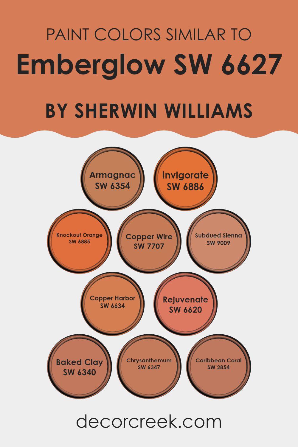
Among the colors similar to Emberglow by Sherwin Williams, we find SW 6354 – Armagnac, which boasts a rich, deep orange that adds a refined earthiness to walls or accents. SW 6886 – Invigorate is a vivid, energetic orange that can breathe life into a dull area.
SW 6885 – Knockout Orange provides a bold, striking look, perfect for focal points. SW 7707 – Copper Wire is a darker, burnished orange that suggests a vintage or industrial aesthetic. SW 9009 – Subdued Sienna offers a more muted, dusty coral, ideal for creating a soft, warm vibe.
SW 6634 – Copper Harbor presents a bright, dynamic shade that instills a sense of excitement. In contrast, SW 6620 – Rejuvenate gives off a fresh, citrusy hue enhancing vibrancy. SW 6340 – Baked Clay features a terracotta color, excellent for adding a touch of traditional charm.
SW 6347 – Chrysanthemum displays a saturated, floral-inspired orange that can liven up any area. Lastly, SW 2854 – Caribbean Coral has a lighter, pinkish-orange tone that is perfect for bringing a sunny, inviting feel to interiors.
You can see recommended paint colors below:
- SW 6354 Armagnac (CHECK A SAMPLE)
- SW 6886 Invigorate (CHECK A SAMPLE)
- SW 6885 Knockout Orange (CHECK A SAMPLE)
- SW 7707 Copper Wire (CHECK A SAMPLE)
- SW 9009 Subdued Sienna (CHECK A SAMPLE)
- SW 6634 Copper Harbor (CHECK A SAMPLE)
- SW 6620 Rejuvenate (CHECK A SAMPLE)
- SW 6340 Baked Clay (CHECK A SAMPLE)
- SW 6347 Chrysanthemum (CHECK A SAMPLE)
- SW 2854 Caribbean Coral
Colors that Go With Emberglow SW 6627 by Sherwin Williams
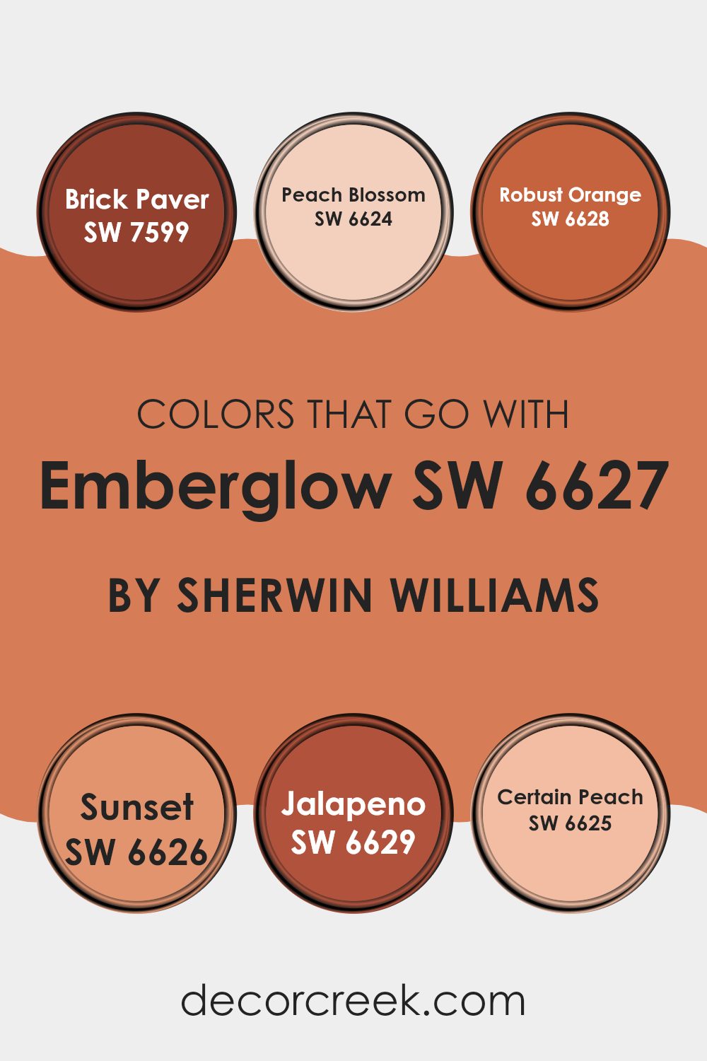
Understanding the importance of coordinating colors with Emberglow SW 6627 by Sherwin Williams is crucial because it helps create a cohesive and aesthetically pleasing atmosphere in any area. The right combination of colors can enhance the vibrancy of Emberglow SW 6627, a warm, inviting shade, by balancing its intensity and adding visual interest.
For example, using SW 7599 – Brick Paver, a solid and earthy red, complements Emberglow’s fiery undertone perfectly by reinforcing a warm, welcoming setting. Similarly, SW 6624 – Peach Blossom, with its gentle, lighter peach hue, softens the boldness of Emberglow, providing a delicate contrast that is soothing to the eye.
On the other hand, SW 6628 – Robust Orange further enlivens the area by introducing a zestful color that matches the energy of Emberglow. This makes the room feel more dynamic and lively. Next to these, SW 6626 – Sunset offers a slightly muted orange tone which works well by giving depth and variety, preventing the palette from feeling too strong on the senses.
SW 6629 – Jalapeno, a spicy, energetic green, introduces an unexpected pop that freshens the overall palette, while SW 6625 – Certain Peach brings it all together with its subdued, nearly neutral peach shade, ensuring the combination remains harmonious and pleasing, not clashing or too intense. These companion colors help in achieving a balanced and inviting decor scheme that complements the warmth and character of Emberglow SW 6627.
You can see recommended paint colors below:
- SW 7599 Brick Paver (CHECK A SAMPLE)
- SW 6624 Peach Blossom (CHECK A SAMPLE)
- SW 6628 Robust Orange (CHECK A SAMPLE)
- SW 6626 Sunset (CHECK A SAMPLE)
- SW 6629 Jalapeno (CHECK A SAMPLE)
- SW 6625 Certain Peach (CHECK A SAMPLE)
How to Use Emberglow SW 6627 by Sherwin Williams In Your Home?
Emberglow SW 6627 by Sherwin Williams is a warm, rich shade of reddish orange that brings to mind the cozy glow of a sunset. This vibrant color can add a bold and inviting touch to any room in your home. It works especially well in living areas like the living room or dining area where you gather with family or entertain guests. The cheerful tone of Emberglow can help create a welcoming atmosphere that makes people feel at ease immediately.
When thinking about using this color, you could paint an accent wall in Emberglow to make it the focal point of a room. Pair it with neutral colors like soft whites or light grays to keep the balance and let the orange hue stand out without feeling too strong in the area. This color also looks fantastic with wooden furniture and natural textures, adding a warm and earthy element to the decor.
In smaller doses, Emberglow can be used in decorative accessories like throw pillows, rugs, or artwork. This adds just a hint of color and keeps the overall look fresh and lively. Whether you choose to go bold with a full wall or subtle with accents, Emberglow adds a cheerful splash of color to your home.
Emberglow SW 6627 by Sherwin Williams vs Invigorate SW 6886 by Sherwin Williams
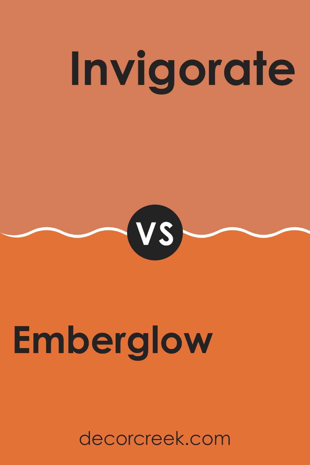
The main color, Emberglow, is a warm and welcoming orange that seems to hold a hint of pink. It’s like the glow of a sunset or the cozy feel of a softly lit room, creating a cheerful and inviting atmosphere in any area. It pairs well with neutral tones and can make a room feel more intimate and comfortable.
In contrast, Invigorate is a bright and bold orange that’s packed with energy. This vivid color is more intense and can really make an area pop with vibrancy. It’s perfect for accent walls or spots where you want to add a lively touch to the decor.
Both colors bring warmth to any room but in different ways. Emberglow with its softer hues invites relaxation, while Invigorate offers a dynamic burst that can energize an area. Depending on the mood you want to set, either color can enhance your home with their unique shades of orange.
You can see recommended paint color below:
- SW 6886 Invigorate (CHECK A SAMPLE)
Emberglow SW 6627 by Sherwin Williams vs Copper Wire SW 7707 by Sherwin Williams
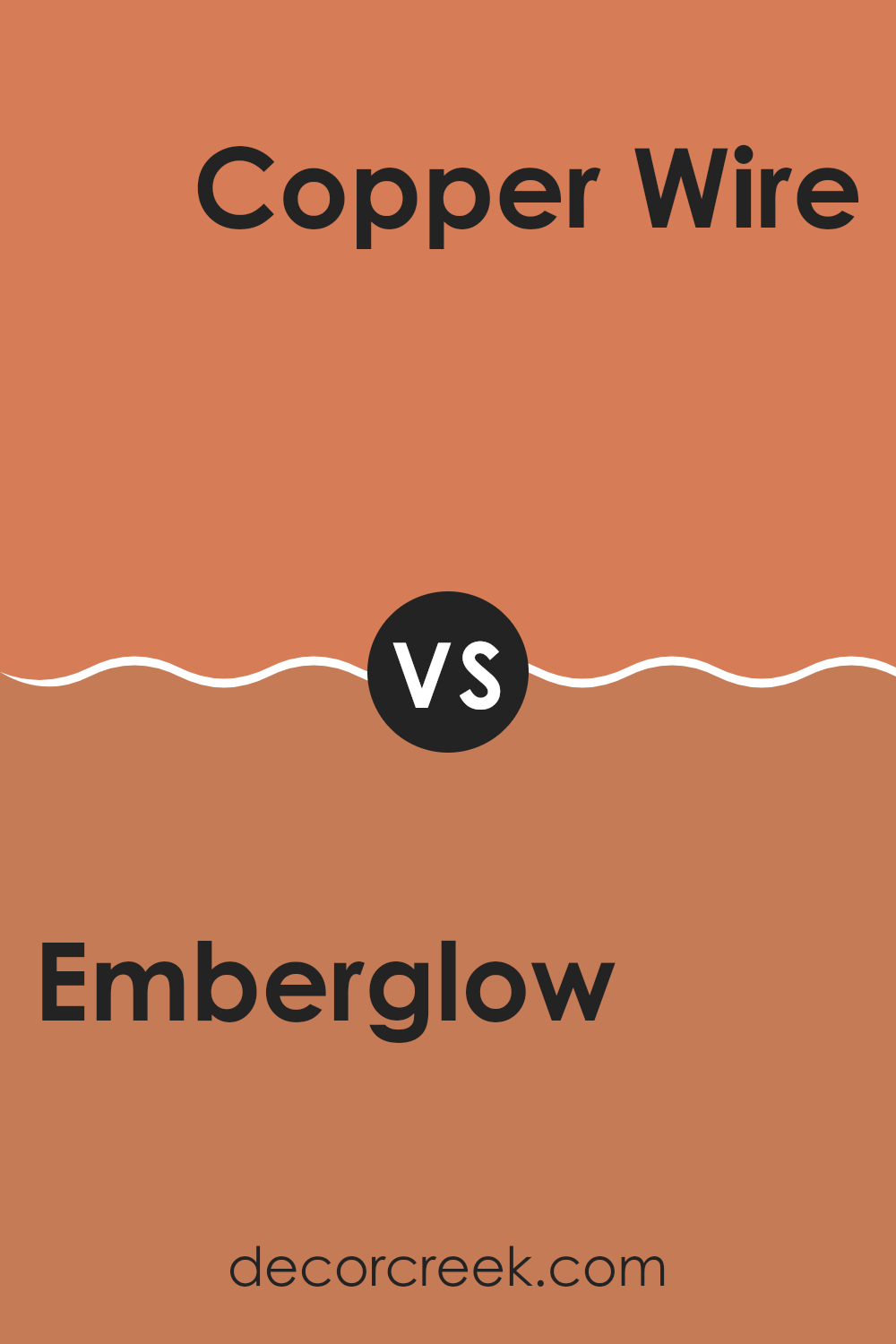
Emberglow and Copper Wire by Sherwin Williams are both warm, inviting shades but have distinct tones. Emberglow is a vibrant, rich coral with a pinkish-orange hue that adds a cheerful pop of color to areas.
It’s bright and can make a statement in a room, ideal for accent walls or decorative elements that you want to stand out. On the other hand, Copper Wire has a deeper, burnt orange tone that resembles the rustic color of aged copper. This color is more subdued than Emberglow and offers a cozy, warm atmosphere that’s perfect for living areas where you want a more relaxed feel.
While Emberglow draws more attention, Copper Wire provides a subtle warmth, making it adaptable for broader use across various walls and areas without being too strong on the senses. Together, these colors can complement each other well in an area, balancing bright flare and earthy warmth.
You can see recommended paint color below:
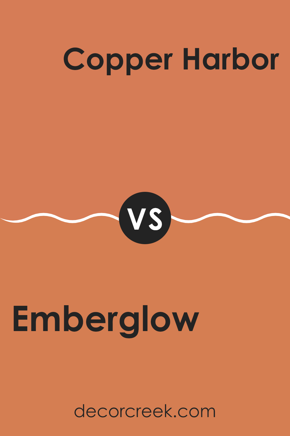
Emberglow SW 6627 by Sherwin Williams vs Copper Harbor SW 6634 by Sherwin Williams
The two colors, Emberglow and Copper Harbor by Sherwin Williams, offer distinct but complementary shades suitable for warm, inviting areas. Emberglow is a rich, deep orange that has a hint of coral. This warmth makes it excellent for creating a cozy, welcoming feel in a room. It stands out more in areas that need a vibrant splash of color.
On the other hand, Copper Harbor is a bolder, more intense shade that leans more towards a true copper color. This hue is striking and can act as a strong focal point in a decor scheme. It carries an earthy, robust quality that pairs well with natural materials like wood or leather.
Both colors work well in areas that aim for a warm atmosphere, but their impact differs. Emberglow offers a softer approach while Copper Harbor provides a statement through its deeper and more pronounced tone. Whether you choose Emberglow for its gentle warmth or Copper Harbor for its dynamic presence, both colors add a unique charm to interiors.
You can see recommended paint color below:
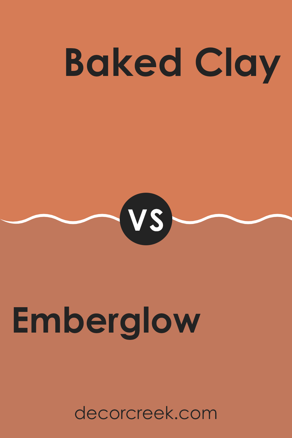
Emberglow SW 6627 by Sherwin Williams vs Baked Clay SW 6340 by Sherwin Williams
The colors Emberglow and Baked Clay by Sherwin Williams both offer warm, inviting tones, but they have distinct differences. Emberglow is a vibrant, energetic orange that has a lively feel to it. It’s bold and can add a punch of cheeriness to any area, making it stand out.
In contrast, Baked Clay is more subdued with a deeper, earthier orange tone resembling red clay. This color provides a cozy and comforting atmosphere, making it ideal for areas where you want a more grounded, subtle ambiance.
While Emberglow is great for accent walls or spots where you want to make a statement, Baked Clay works well as a main color in a room, offering a sense of warmth without being too strong in the area. Both colors can enhance a room’s character but in different ways: Emberglow brings excitement, whereas Baked Clay offers a soothing warmth.
You can see recommended paint color below:
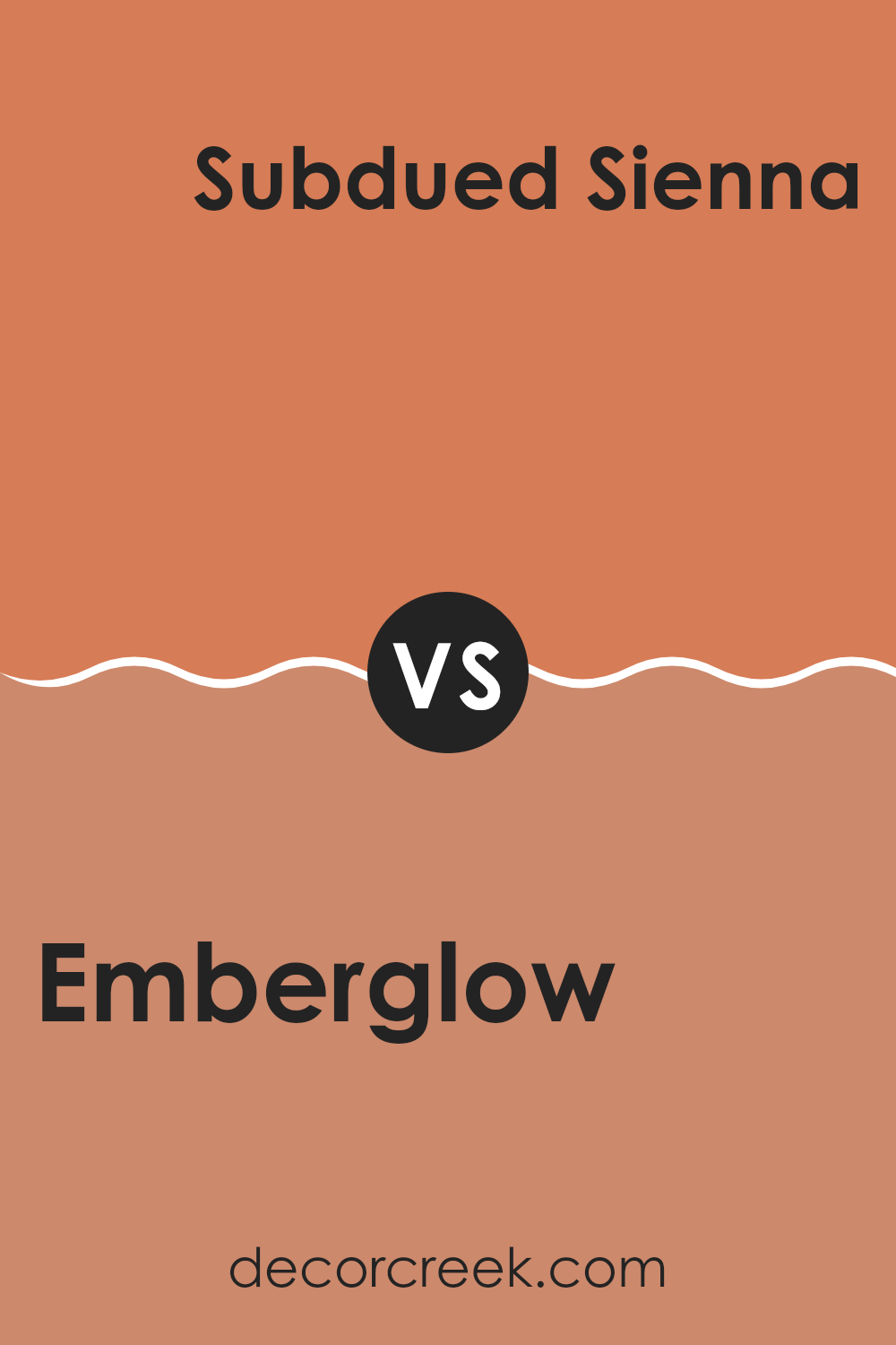
Emberglow SW 6627 by Sherwin Williams vs Subdued Sienna SW 9009 by Sherwin Williams
Emberglow and Subdued Sienna by Sherwin Williams are both warm and inviting colors, yet they present distinct tones that set them apart. Emberglow is a vibrant, rich orange with a slightly reddish tint. It’s bold and energetic, making it a great choice for areas where you want to add a pop of warmth and cheerfulness.
This color truly stands out and can make a strong statement when used on a feature wall or in a creative area. On the other hand, Subdued Sienna offers a more muted, earthy shade of brown with a soft orange undertone. It’s less intense than Emberglow and leans towards a natural, soothing feel.
This color is adaptable, ideal for creating a cozy atmosphere in living rooms, bedrooms, or anywhere you want a gentle touch of warmth without being too strong in the area. In summary, while both colors share a warm base, Emberglow provides a lively burst of color, whereas Subdued Sienna offers a calmer, more grounded appeal.
You can see recommended paint color below:
- SW 9009 Subdued Sienna (CHECK A SAMPLE)
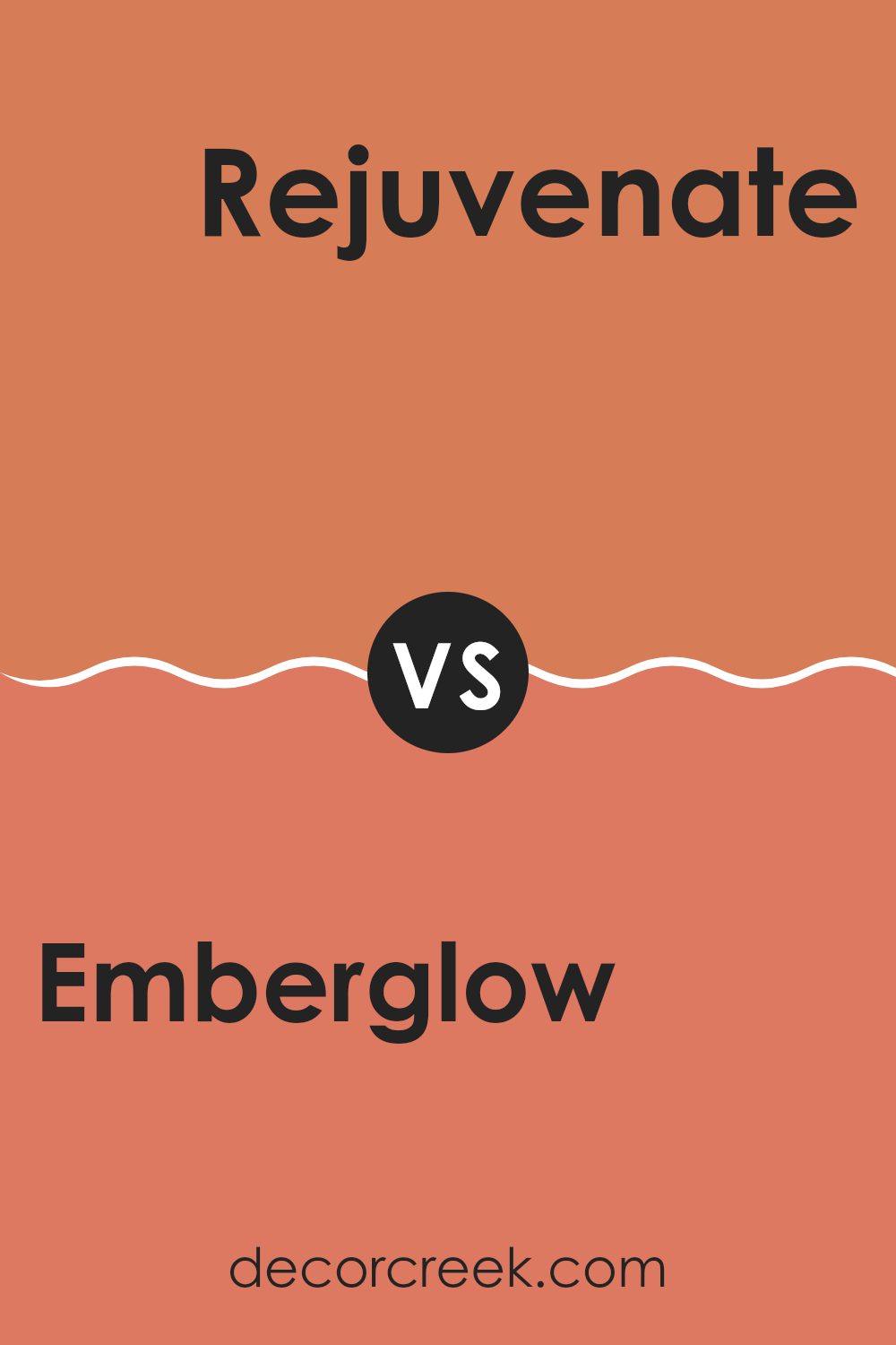
Emberglow SW 6627 by Sherwin Williams vs Rejuvenate SW 6620 by Sherwin Williams
Emberglow and Rejuvenate are two vibrant colors from Sherwin Williams. Emberglow is a warm, orange-red hue, similar to the glow of embers in a cozy fireplace. This color has a welcoming and energetic feel, making it ideal for lively areas like a kitchen or a dining room where you gather with friends and family. It carries the brightness of orange but with a soothing depth provided by its reddish tone.
On the other hand, Rejuvenate offers a fresh, bright green, reminiscent of new leaves in spring. It’s a cheerful and refreshing color that can liven up any area. Rejuvenate works beautifully in areas that receive a lot of natural sunlight, such as sunrooms, playrooms, or home offices.
It pairs well with natural elements and light woods, giving a room an open, airy feel. Both colors are distinct and bold, each offering a unique vibe—Emberglow with its warm, inviting aura, and Rejuvenate with its crisp, energizing freshness.
You can see recommended paint color below:
- SW 6620 Rejuvenate (CHECK A SAMPLE)
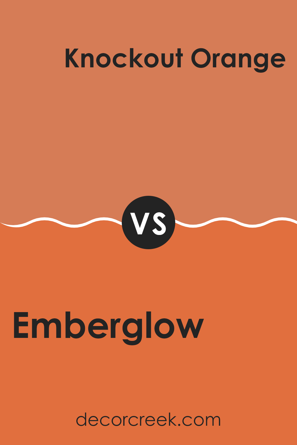
Emberglow SW 6627 by Sherwin Williams vs Knockout Orange SW 6885 by Sherwin Williams
Emberglow and Knockout Orange, both by Sherwin Williams, offer distinct tones that could perk up any area. Emberglow is a warm, muted orange with a soft, welcoming vibe. It’s less intense, making it easier to blend with a variety of decor elements and settings. This color can add a gentle pop of warmth without being too strong in a room.
Knockout Orange, on the other hand, stands out with its vibrant, energetic hue. It’s a bolder choice that commands attention, ideal for creating a focal point in an area or adding a burst of energy. This shade is perfect for those who aren’t shy about using strong, lively colors in their decor.
When choosing between the two, consider the mood and function of your area. Emberglow suits subtle, warm themes, while Knockout Orange is your go-to for making a bold statement.
You can see recommended paint color below:
- SW 6885 Knockout Orange (CHECK A SAMPLE)
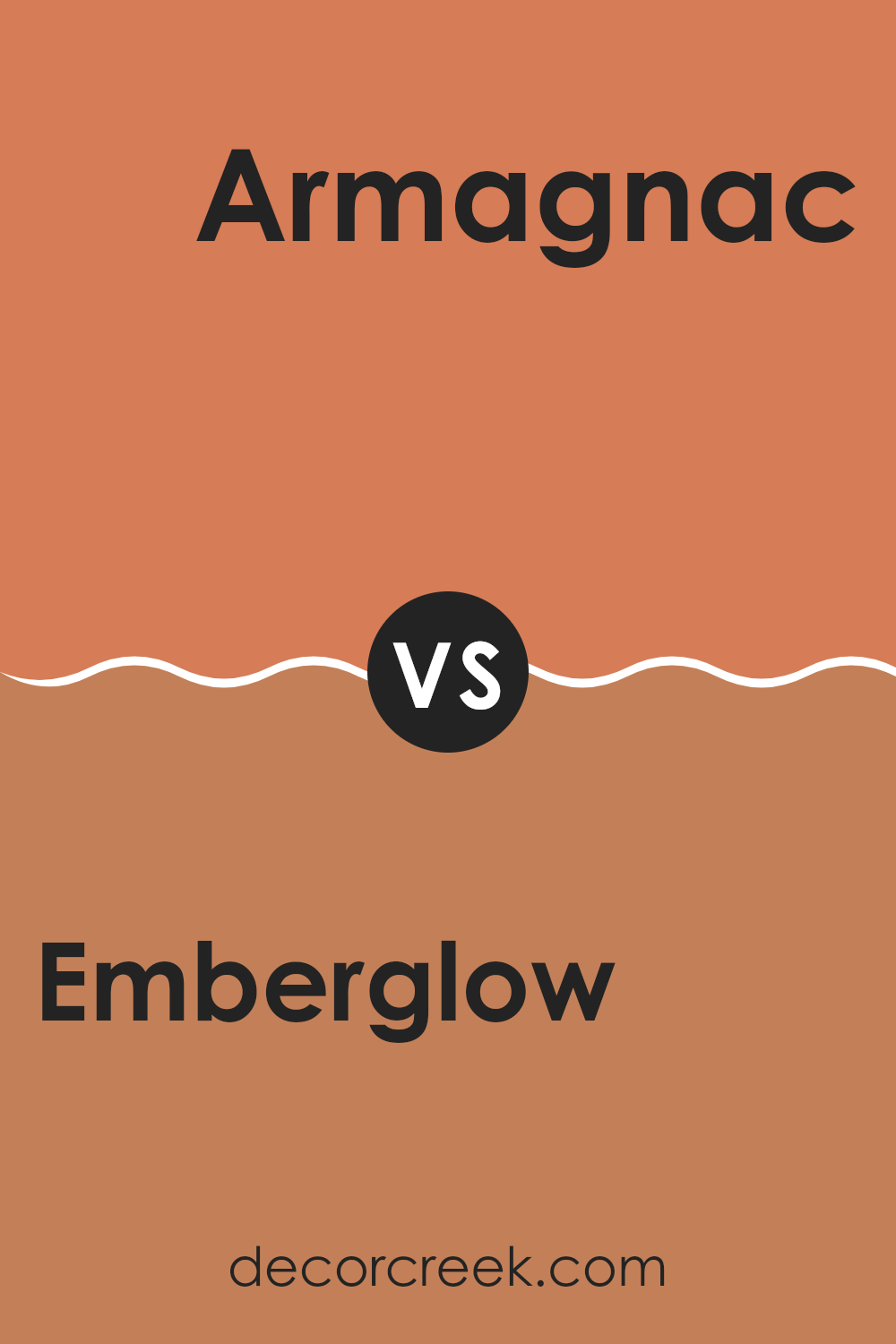
Emberglow SW 6627 by Sherwin Williams vs Armagnac SW 6354 by Sherwin Williams
The two colors Emberglow and Armagnac from Sherwin-Williams have their unique appeal. Emberglow is a bright, vibrant shade of orange that brings a sense of energy and warmth to an area. It’s like the glowing embers of a warm fire and works well in areas where you want to add liveliness and a cheerful pop of color. It’s particularly suited for social areas like living rooms or dining areas where you want a conversational, inviting atmosphere.
On the other hand, Armagnac is a deep, rich burgundy color that leans towards a refined wine red with cozy undertones. This color is perfect for creating a cozy and slightly formal look, ideal for areas where relaxation or a bit more formality is desired, like studies or bedrooms.
It offers warmth but with a touch of depth that can make a room feel more grounded and secure. Both colors offer warmth, but while Emberglow is more about brightness and energy, Armagnac provides depth and a comforting richness.
You can see recommended paint color below:
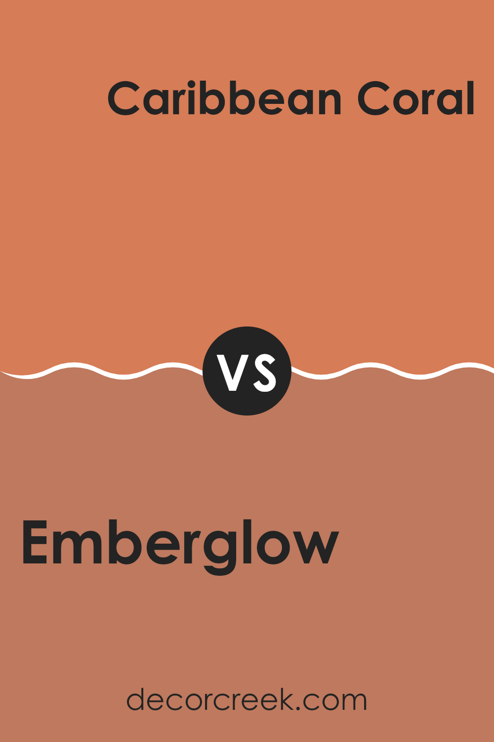
Emberglow SW 6627 by Sherwin Williams vs Caribbean Coral SW 2854 by Sherwin Williams
Emberglow and Caribbean Coral, both by Sherwin Williams, offer distinct yet warm vibes for any area. Emberglow is a vibrant, deep coral with a rich, fiery undertone that brings a cozy warmth to rooms, reminiscent of a glowing sunset.
It’s bold enough to make a statement yet muted enough to remain welcoming and not overpowering. On the other hand, Caribbean Coral is a lighter, more subdued shade, leaning more towards a pinkish-coral hue.
It has a softer presence, providing a gentle pop of color that is both refreshing and inviting, like a tropical sunrise. While Emberglow offers depth and intensity, Caribbean Coral brings a lighter, cheerier mood. Both colors add warmth but in distinctively different intensities and shades, allowing for adaptability in mood setting depending on personal preference or area requirements.
You can see recommended paint color below:
- SW 2854 Caribbean Coral
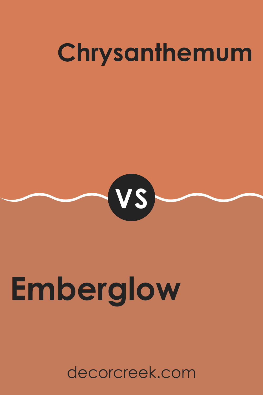
Emberglow SW 6627 by Sherwin Williams vs Chrysanthemum SW 6347 by Sherwin Williams
Emberglow and Chrysanthemum are two vibrant paint colors from Sherwin Williams. Emberglow is a warm, deep orange with a touch of red, giving it a cozy and inviting feeling. It works well in areas where you want to add a splash of energy and warmth, making it great for a kitchen or living room.
On the other hand, Chrysanthemum is a rich, golden yellow with a slight orange tint. This color is sunny and cheerful, perfect for creating a bright and welcoming atmosphere. It’s an excellent choice for areas where natural light is abundant, like a sunroom or breakfast nook.
Both colors add a lot of personality and warmth to a room. While Emberglow leans more towards a fiery tone, Chrysanthemum offers a milder, more golden hue. Choosing between them depends on the kind of mood or effect you want to achieve in your area. Whether you go for the boldness of Emberglow or the sunny disposition of Chrysanthemum, both colors will make a strong impression.
You can see recommended paint color below:
- SW 6347 Chrysanthemum (CHECK A SAMPLE)
After reading about SW 6627 Emberglow by Sherwin Williams, I’ve learned a lot about this unique paint color. Emberglow is a warm, inviting orange that reminds you of autumn leaves or a cozy sunset. It has a bright, cheerful vibe that can make any room feel more welcoming.
Using Emberglow in a home can be very exciting. It works well in areas where you want to add a splash of color or create a focal point. Think about painting one wall in your living room or using it in a hallway for a pop of warmth. Since it’s such a lively color, it goes well with neutral shades like white, beige, or light grey. These combinations can create a happy balance in your room.
Decorating with Emberglow can also be fun during different times of the year. It fits perfectly with fall decorations like pumpkins and leaves, and during summer, it can pair well with bright blues and greens to bring in a tropical feel.
Overall, SW 6627 Emberglow by Sherwin Williams is a fantastic choice for anyone looking to brighten up their home with some color. It’s cheerful, cozy, and has the power to make an area feel more warm and inviting. If you like colors that make you feel happy and cozy, Emberglow might just be the color for you to try out in your own area!
Ever wished paint sampling was as easy as sticking a sticker? Guess what? Now it is! Discover Samplize's unique Peel & Stick samples.
Get paint samples


