Before you decide to use SW 6216 Jasper by Sherwin Williams in your next home project, there are a few things you should know about this unique shade. Many describe Jasper as a deep, calming green, which combines hints of gray to create a soothing yet elegant atmosphere.
From my own experience using this paint, I can say that its adaptable nature makes it suitable for both modern and traditional rooms. Whether you plan to refresh your living room or give your office a new look, understanding Jasper’s characteristics will help you make an informed decision.
Keep in mind its shade can appear quite different depending on the lighting. Under natural light, Jasper reveals a more vibrant green tone, while artificial lighting brings out its muted, earthy aspects. Pairing it with contrasting or harmonious colors also affects its final appearance. I will share tips on how to complement Jasper effectively with your decor and maximize its potential in your room.
Also, let’s discuss the practical aspects like finish options and durability, ensuring you get not only the color but the quality that meets your needs.
Is Jasper SW 6216 Right for My Home?
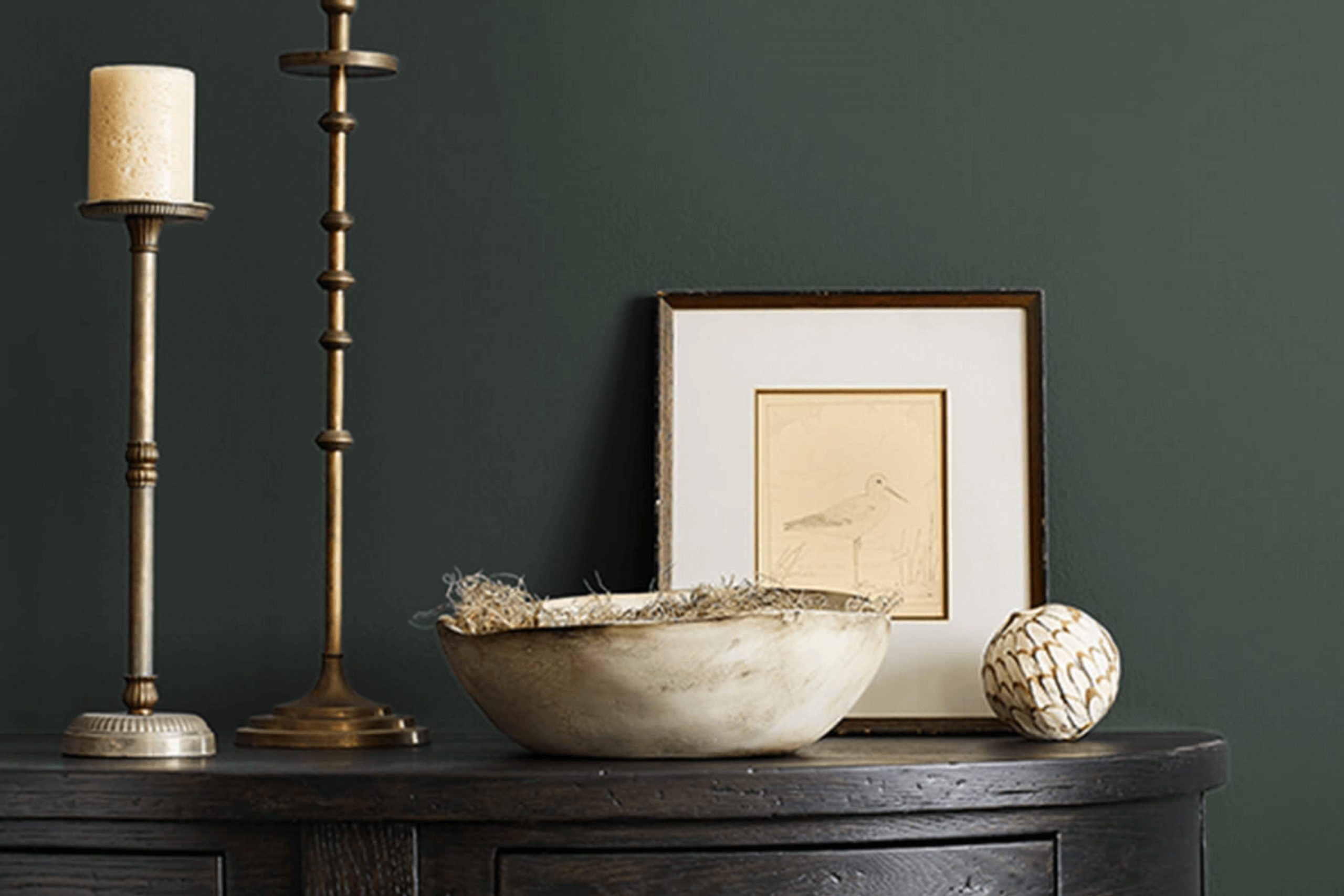
Ah, Jasper, what a rich and vibrant green this color is! It reminds me of lush forests and nature’s calmness. With its deep, earthy tones, it brings a feeling of calm and freshness into any room. This color has a kind of rustic charm that works wonderfully in a variety of interior design styles.
Personally, I find that Jasper fits best in rooms that aim for a natural, cozy vibe. Think about styles like rustic, traditional, and even modern farmhouse. It’s an adaptable shade that manages to be both bold and welcoming at the same time.
In terms of pairing, this color loves natural materials. Wood, particularly in darker or weathered finishes, goes hand in hand with its earthy essence. I also like to add elements of woven textures, such as rattan or wicker, to give a room a touch of warmth.
Additionally, for a more refreshing look, I often match Jasper with lighter fabrics like linen or soft cotton, which beautifully offset its depth. Metals, especially brass or copper, also blend magnificently with this green, adding just the right amount of shimmer and elegance. All in all, Jasper is more than just a paint color—it’s a way to invite nature into my home, pairing beautifully with a range of materials and bringing life to various decor styles.
decorcreek.com
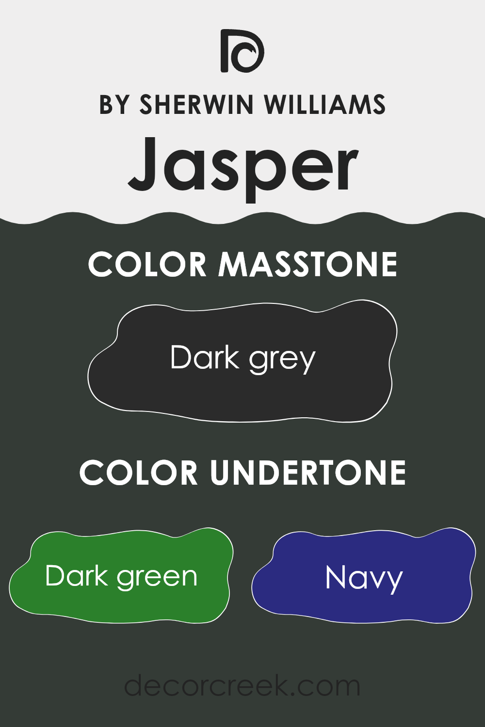
What are the right undertones of Jasper SW 6216 ?
Jasper, a color by Sherwin Williams, has a rich composition that subtly shifts depending on the lighting and surrounding colors. One of the main characteristics of this color is its undertones. These are hints of other colors that can be seen when looking at the main color under different conditions. This color includes undertones like dark green, navy, brown, dark turquoise, olive, purple, and grey.
Understanding undertones is essential as they can alter the perception of a color. For instance, a color with grey undertones might look cooler, creating a more muted appearance, while a color with brown undertones gives off a warmer feel, enriching the room with a cozy vibe.
When used on interior walls, the variety of undertones in Jasper can play a significant role in the room’s atmosphere. On a bright sunny day, the green and turquoise might become more pronounced, giving the room a refreshing, natural feel. In artificial light or during the evening, the darker undertones like navy and brown can make the room feel more grounded and intimate.
Overall, the complexity of Jasper’s undertones allows it to adjust subtly to various settings and decor styles, making it an adaptable choice for many homes. Whether you want to energize your room or keep it calm and grounded, paying attention to the undertones can help you achieve the desired effect.
decorcreek.com
Best Coordinating Colors to use with Jasper SW 6216 by Sherwin Williams this year.
Coordinating colors are chosen to complement and enhance the primary color in a room or palette, creating a cohesive and aesthetically pleasing environment. In the case of Jasper SW 6216 by Sherwin Williams, a flexible and vibrant shade, its coordinating colors have been specially selected to harmonize and offer a balanced look.
Coordinating colors work by either contrasting or blending with the main color, depending on the desired effect. This could mean selecting shades that are lighter, darker, or of a similar tone but differing slightly to provide depth and interest to a room.
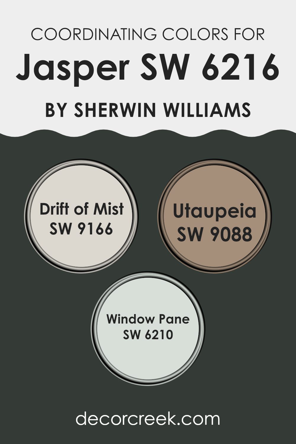
For instance, SW 9166 Drift of Mist provides a soft, gentle contrast to the bolder Jasper. This light gray hue is subtle, making it an excellent choice for expansive surfaces like walls where it can complement without overpowering the stronger tones of Jasper.
SW 9088 Utaupeia is another coordinating shade, a warm taupe that offers a natural look, pairing beautifully with Jasper’s depth to foster a cozy and welcoming atmosphere. Lastly, SW 6210 Window Pane serves as a light, airy complement, suggesting the freshness of clean linen or early morning sky, which can effectively lighten a room and give a gentle lift to the grounding Jasper. Together, these colors harmonize to create environments that are visually balanced and appealing.
You can see recommended paint colors below:
- SW 9166 Drift of Mist
- SW 9088 Utaupeia
- SW 6210 Window Pane
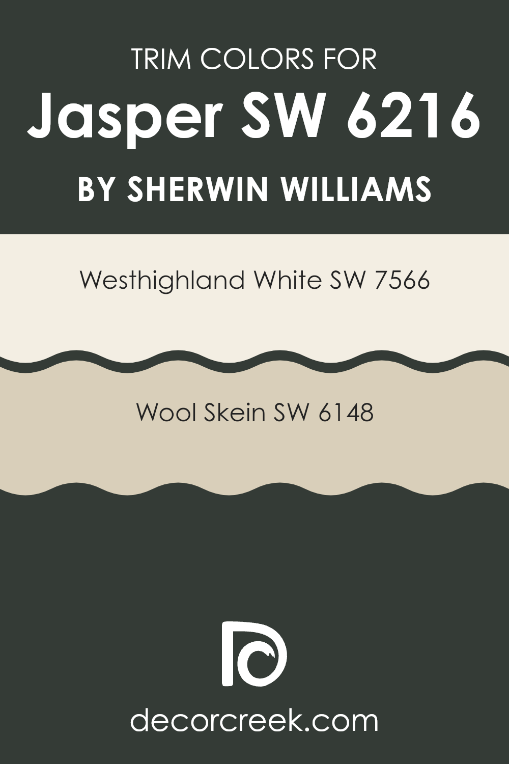
Trendy Trim Colors of Jasper SW 6216 by Sherwin Williams to use this year.
Trim colors are specific shades used to accentuate or highlight architectural details and edges such as door frames, moldings, and window trims. By selecting the appropriate trim color, you can enhance the overall aesthetics of a room, providing a subtle but impactful contrast that defines rooms neatly.
Trims painted in contrasting colors not only define the architectural lines but also can create a clean and finished look that accentuates the main color palette of the room, which, in this scenario, is Jasper SW 6216 by Sherwin Williams.
SW 7566 Westhighland White is a bright and inviting white which provides a fresh and clear boundary that can make the rich tones of Jasper appear more pronounced and appealing. This color adds a clear distinction without overpowering the primary color, allowing for a neat and tidy appearance.
Similarly, SW 6148 Wool Skein, which is a soft, muted beige, offers a softer contrast, giving a room a more seamless transition between the wall and trim. This color works very well in rooms where a gentle and harmonious feel is desired, subtly enhancing the richness of the Jasper shade without creating too stark of a contrast.
You can see recommended paint colors below:
- SW 7566 Westhighland White
- SW 6148 Wool Skein
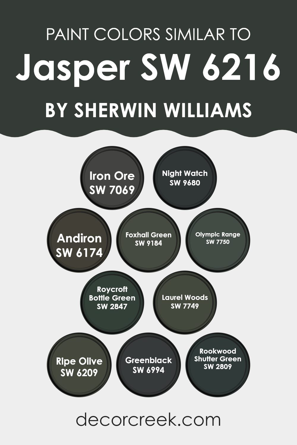
Evergreen Colors Similar to Jasper SW 6216 by Sherwin Williams
Choosing similar colors can significantly enhance both the aesthetic appeal and the cohesiveness of a room. When colors like those similar to JasperSW 6216 from Sherwin Williams are used together, they create a harmonious look that is pleasing to the eye. These colors are not strictly identical but share a commonality in hue, saturation, or value, allowing for a visually smooth transition from one area to another or between various elements of a room.
For example, Iron Ore SW 7069 is a deep, dark gray with a subtle green undertone, which complements rooms seeking a strong, bold feel. Night Watch SW 9680, on the other hand, is a dark, rich green that works well in environments where a sense of depth and natural elegance is desired.
Andiron SW 6174 offers a similar dark, almost black feel but with a smoky undertone, making it perfect for accentuating modern and minimalistic styles. Foxhall Green SW 9184 has an elegant earthiness, ideal for adding a touch of nature-inspired comfort.
Olympic Range SW 7750 is an elegant muted green that is quite adaptable in various light conditions, giving rooms a fresh, open sensation. Roycroft Bottle Green SW 2847 presents a more traditional vibe with its deep, historical green, providing a touch of heritage and richness.
Laurel Woods SW 7749 brings a rich, almost woodland green shade that suggests stability and grounding. Ripe Olive SW 6209 offers a deep, rich olive tone, excellent for creating a cozy, sheltered feel in a room.
Greenblack SW 6994 is a deep charcoal with green undertones, perfect for making dramatic statements in a room. Lastly, Rookwood Shutter Green SW 2809 is a classic, dark green that pairs well with more natural, rustic interiors or craftsman styles, completing the palette of rich, usable greens. Using these similar colors can pull a room together, creating a cohesive and inviting room.
You can see recommended paint colors below:
- SW 7069 Iron Ore
- SW 9680 Night Watch
- SW 6174 Andiron
- SW 9184 Foxhall Green
- SW 7750 Olympic Range
- SW 2847 Roycroft Bottle Green
- SW 7749 Laurel Woods
- SW 6209 Ripe Olive
- SW 6994 Greenblack
- SW 2809 Rookwood Shutter Green
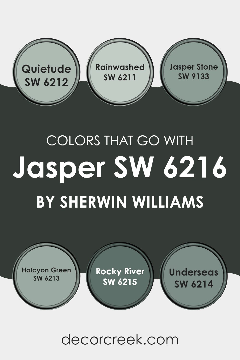
Colors that Go With Jasper SW 6216 by Sherwin Williams
Choosing the right colors to accompany Jasper SW 6216 by Sherwin Williams is crucial for creating a harmonious and pleasing aesthetic in any room. Colors like Quietude SW 6212, Rainwashed SW 6211, Jasper Stone SW 9133, Halcyon Green SW 6213, Rocky River SW 6215, and Underseas SW 6214 offer a range of possibilities that can help balance, complement, or contrast with Jasper, depending on the desired effect.
Whether you’re painting a room, choosing furniture, or selecting decorations, these coordinating colors can enhance the overall visual experience, making the environment more enjoyable and pleasing to the eye.
Quietude SW 6212 is a soft, subdued gray-blue that brings a calm and gentle vibe to any room, making it feel more relaxed and peaceful. Rainwashed SW 6211 has a slightly brighter, more turquoise tone that adds a touch of freshness and vitality, perfect for brightening up any room. Jasper Stone SW 9133, named similarly to Jasper but with a deeper, greener hue, offers a bold contrast that can make elements stand out when used as an accent. Halcyon Green SW 6213 combines green and blue in a way that mimics the peacefulness of a quiet sea, suitable for creating a restful ambiance.
Rocky River SW 6215 is a darker teal that creates depth and drama, ideal for an impactful look. Finally, Underseas SW 6214 has a deep, oceanic feel to it, adding mystery and intensity to rooms, making them more dynamic and full of character. By selecting any of these colors to go with Jasper, you can achieve a beautifully coordinated decor that enhances both the style and comfort of your environment.
You can see recommended paint colors below:
- SW 6212 Quietude
- SW 6211 Rainwashed
- SW 9133 Jasper Stone
- SW 6213 Halcyon Green
- SW 6215 Rocky River
- SW 6214 Underseas
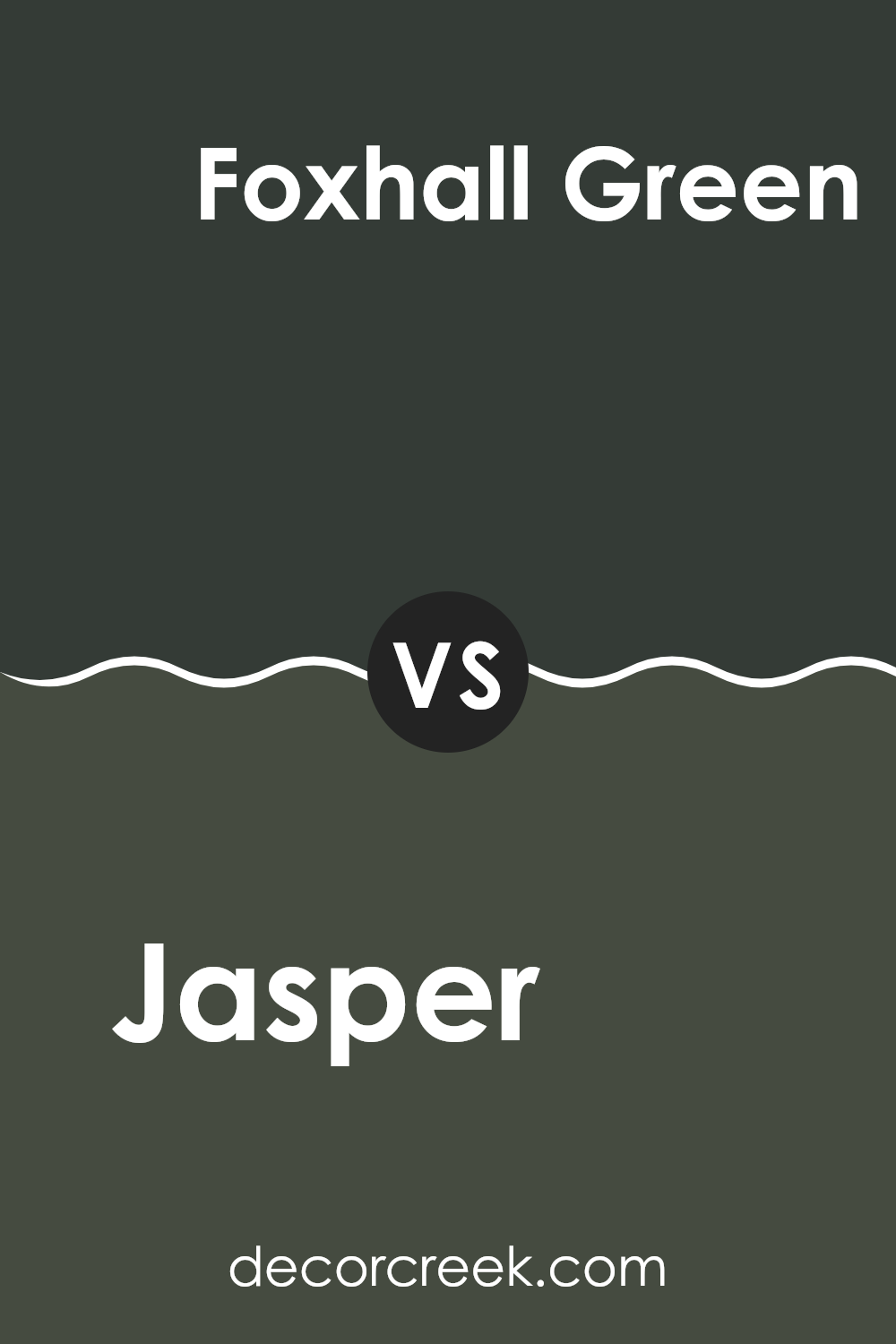
Jasper SW 6216 by Sherwin Williams vs Foxhall Green SW 9184 by Sherwin Williams
The main color, Jasper, is a deep, rich shade of green with hints of blue that give it a vibrant, natural feel. This hue resembles the dense foliage of a forest, creating a cozy and grounding atmosphere in any room. On the other hand, Foxhall Green is lighter and leans toward a grayish-green tone.
It offers a subtle and calm look, making it excellent for rooms where a softer, more neutral palette is desired. Both colors add distinct character to rooms but serve different aesthetic purposes.
Jasper’s boldness works well in areas where a striking impact is wanted, while Foxhall Green is better suited for rooms needing a gentle touch of color without feeling too intense to the senses. Together or separately, they can enhance a variety of designs, from traditional to modern.
You can see recommended paint color below:
Jasper SW 6216 by Sherwin Williams vs Laurel Woods SW 7749 by Sherwin Williams
Jasper and Laurel Woods are two distinct paint colors by Sherwin Williams, each bringing its own unique vibe to a room. Jasper is a deep, rich red with a hint of maroon, making it perfect for adding warmth and a touch of drama to any room.
It works well in rooms like living rooms or dining areas, where you want to create a cozy, welcoming feel. On the other hand, Laurel Woods is a deep, dark green that almost resembles a forest shade.
This color is great for those looking to add a natural and grounding feel to their environment. It’s especially suitable for bedrooms or offices where a calm, focused atmosphere is desired. Both colors are deep and bold, but while Jasper adds a fiery warmth, Laurel Woods offers a cooler, earthy tone.
You can see recommended paint color below:
Jasper SW 6216 by Sherwin Williams vs Rookwood Shutter Green SW 2809 by Sherwin Williams
Jasper and Rookwood Shutter Green are two distinct shades from Sherwin Williams. Jasper is a deep, rich navy with hints of teal, adding a bold yet calming feel to rooms. It pairs well with neutral tones and wood finishes, enhancing the cozy vibe of a room.
On the other hand, Rookwood Shutter Green is a dark, earthy green that gives off a natural and grounded atmosphere. This color works great in rooms that aim for a connection to nature or a traditional aesthetic, complementing materials like stone and dark wood.
While Jasper might suit modern or nautical themes better, Rookwood Shutter Green is ideal for rustic or classical settings. Both provide strong color statements but cater to different style preferences and moods, with Jasper leaning cooler and Rookwood Shutter Green warmer.
You can see recommended paint color below:
- SW 2809 Rookwood Shutter Green
Jasper SW 6216 by Sherwin Williams vs Ripe Olive SW 6209 by Sherwin Williams
Jasper and Ripe Olive, both from Sherwin Williams, are distinctive colors that serve different purposes in decor. Jasper is a deep, rich blue with a hint of green. It’s bold and can make a strong statement in a room, ideal for accent walls or furniture pieces. It can give a vibrant pop to rooms and works well in energetic, lively areas like living rooms or creative rooms.
Ripe Olive, in contrast, is a dark, saturated green that resembles the deep shades of olive leaves. It is more subdued than Jasper and has a grounding effect, making it suitable for rooms where a calming, nature-inspired ambiance is desired, like studies or bedrooms. It pairs well with natural materials and earth tones, adding depth and a sense of warmth to interiors.
Using Jasper and Ripe Olive together can balance vibrancy with calmness, crafting a harmonious and inviting room.
You can see recommended paint color below:
Jasper SW 6216 by Sherwin Williams vs Iron Ore SW 7069 by Sherwin Williams
Jasper SW 6216 by Sherwin Williams is a rich, warm red shade with a hint of terra cotta, giving it a cozy and welcoming vibe. It is vibrant enough to make a statement, yet subdued enough to be used in various settings like living rooms or dining areas.
On the other hand, Iron Ore SW 7069, also from Sherwin Williams, is a much darker color, almost like a soft black with grey undertones. This color lends a bold, grounding effect, making it excellent for accent walls or exterior trim.
Both colors offer distinct atmospheres: Jasper adds warmth and energy, while Iron Ore offers depth and a strong foundation. Using them together could provide a striking contrast that highlights specific architectural features or design elements within a room.
You can see recommended paint color below:
- SW 7069 Iron Ore
Jasper SW 6216 by Sherwin Williams vs Greenblack SW 6994 by Sherwin Williams
Jasper SW 6216 and Greenblack SW 6994 by Sherwin Williams are two distinct shades that can set very different moods in a room. Jasper is a rich, deep red color with burgundy tones. It’s warm and inviting, making it great for areas where you want a cozy and welcoming atmosphere, like living rooms or dining areas.
On the other hand, Greenblack is a very dark shade that blends green and black. This color is more muted and grounding. It works well in rooms where you want to promote a sense of calm and focus, such as an office or a bedroom.
While both colors are dark, Jasper adds a splash of color and warmth, whereas Greenblack offers depth and a touch of nature’s calm. They both can make a room feel smaller because of their intensity, so they’re best used in larger rooms or as accent walls.
You can see recommended paint color below:
Jasper SW 6216 by Sherwin Williams vs Night Watch SW 9680 by Sherwin Williams
The main color Jasper and the secondary color Night Watch both offer unique hues suitable for varied design preferences. Jasper is a rich, deep red with a vibrant tone that adds warmth and energy to any room. It can create a cozy atmosphere in a room, making it perfect for living areas or dining rooms where you want to create a welcoming feel.
On the other hand, Night Watch is a dark, green shade that leans towards a greenish-black depending on the lighting. This color is more subdued and can be used to bring a feeling of nature and calm into a home. It works well in studies or bedrooms where a darker, more calming color is often desired.
While both colors are bold in their own rights, Jasper, with its red undertones, tends to stand out more and can be the focal point in a room. Night Watch, however, is ideal for those looking for a more toned-down backdrop that still adds depth and interest.
You can see recommended paint color below:
Jasper SW 6216 by Sherwin Williams vs Olympic Range SW 7750 by Sherwin Williams
Jasper SW 6216 and Olympic Range SW 7750, both by Sherwin Williams, stand out with distinct tones. Jasper is a rich, earthy red that brings warmth and coziness to any room. This color works well in areas where you want to add a splash of vibrancy without overpowering the room. On the other hand, Olympic Range is a deep, muted green that imparts a natural and grounded feel, making it perfect for creating a calm and restful environment.
While Jasper infuses energy and can make larger rooms feel more welcoming, Olympic Range tends to recede, which can help smaller rooms appear larger. The red hue of Jasper is ideal for accent walls or furniture pieces, whereas the soothing green of Olympic Range suits well for main walls, especially in bedrooms or study areas.
Combining these colors can offer a beautiful contrast, with Jasper adding bursts of energy and Olympic Range providing a calming backdrop, suitable for various aesthetic preferences and room functions.
You can see recommended paint color below:
- SW 7750 Olympic Range
Jasper SW 6216 by Sherwin Williams vs Roycroft Bottle Green SW 2847 by Sherwin Williams
Jasper SW 6216 is a rich, deep red color with a burgundy tone. It gives a strong and warm feel to any room, making it cozy and inviting. This color works well in living rooms or dining areas where you want a touch of elegance without overpowering the room.
On the other hand, Roycroft Bottle Green SW 2847 is a dark, muted green. It resembles the color of dense forest foliage and can bring a grounded, nature-inspired feel to an environment. This green is perfect for rooms that benefit from a calm and stable atmosphere, such as studies or bedrooms.
While both colors are dark and can anchor a room’s decor, Jasper leans towards a red warmth that can make a room feel smaller and more intimate. Roycroft Bottle Green offers a cool calmness, potentially enlarging a room and giving it a fresh openness. Both have their unique appeal and can effectively define a room’s character depending on what feeling you want to create.
You can see recommended paint color below:
Jasper SW 6216 by Sherwin Williams vs Andiron SW 6174 by Sherwin Williams
Jasper and Andiron, both by Sherwin Williams, offer distinct yet complementary color tones for different design needs. Jasper is a deep, rich red with a slight burgundy undertone, providing a bold and warm feel that works well in vibrant rooms or as an accent to liven up a room. This color is perfect for those looking to add a touch of drama and coziness to their environment.
On the other hand, Andiron is a dark gray shade that exudes a more neutral and calm presence, making it a great choice for areas where you want to keep the mood subdued and classy. It pairs beautifully with a wide range of colors and is excellent for creating a grounded, stable look in a room.
Both colors have their unique appeal; Jasper stands out more and can define a room, while Andiron supports and enhances other hues within a design scheme. Depending on your room’s purpose and the atmosphere you want to set, each color has its merits.
You can see recommended paint color below:
- SW 6174 Andiron
Having talked about SW 6216 Jasper by Sherwin Williams, I think it’s a pretty cool paint color. It’s like a deep, ocean-like blue-green that can make any room feel like a cozy little secret hideaway. This color seems like it would be great for a bedroom or a reading nook where you can relax and feel like you’re in your own little world.
Jasper is also really nice because it’s not too bright but still has enough color to make a wall stand out. It’s kind of like when you find that perfect rock by the sea – not too flashy, but it still catches your eye.
If you were thinking about changing up a room in your house, Jasper might be a fun choice. It adds a splash of color without being too loud and it can go with a lot of different stuff you might already have in your room. Plus, it can make your room feel cozy and inviting, which is exactly what you want when you’re looking to chill out or have a good time with friends.
Overall, SW 6216 Jasper could be a great pick if you want to add some new color to your home in a calm and cool way. It reminds me of the sea and the sky, and I think it could help make any room a little more special.
decorcreek.com
Ever wished paint sampling was as easy as sticking a sticker? Guess what? Now it is! Discover Samplize's unique Peel & Stick samples.
Get paint samples

