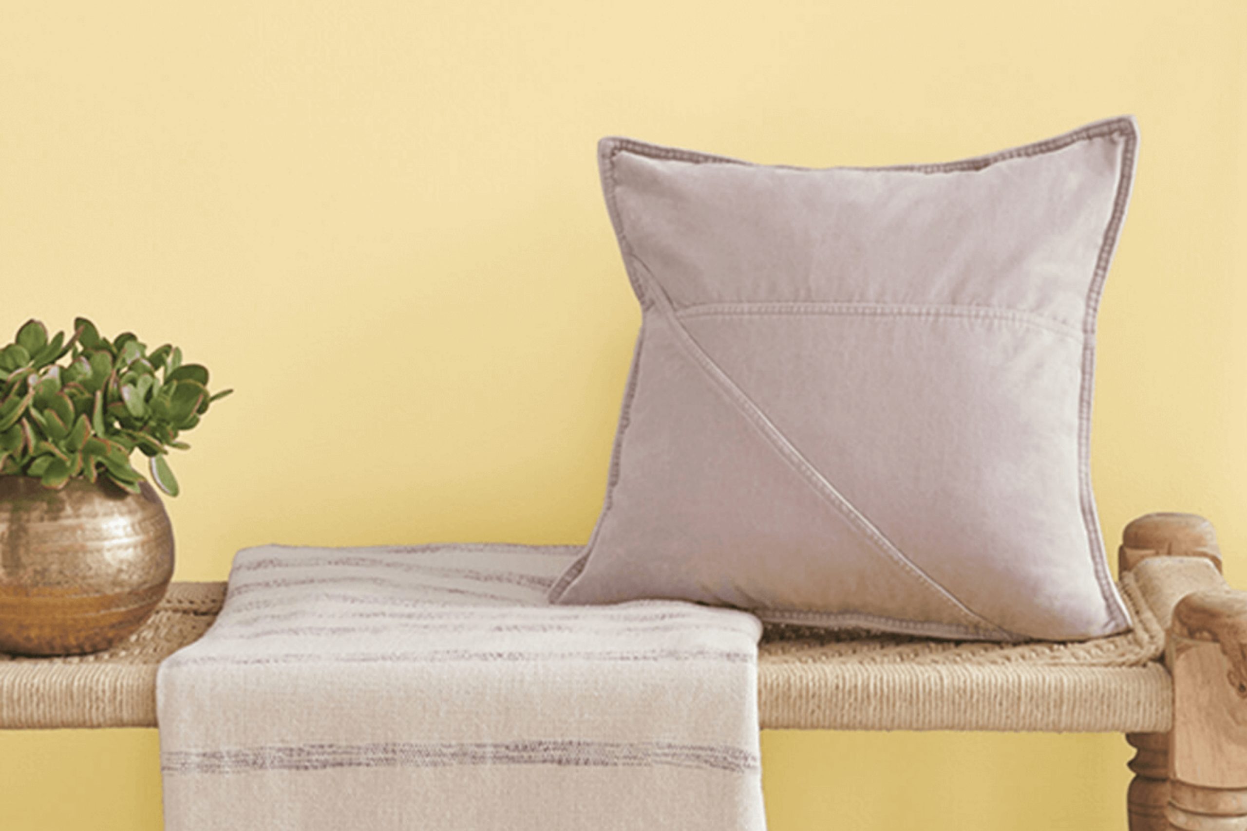
There’s something about finding the perfect paint color that just feels right, and for me, SW 6687 Lantern Light by Sherwin-Williams hits that sweet spot. It’s not merely a hue—it’s a mood, an ambiance, a breath of fresh air. Lantern Light is not too bold, yet it doesn’t fade into the background—it finds that delicate balance that brings warmth and cheer to any room. The moment you lay eyes on it, you get a sense of bright optimism, like a soft ray of morning sunlight peeking in.
As I considered different shades for my project, I was drawn to its inviting glow. It feels comforting and friendly, making it a fantastic choice for rooms where you want to feel relaxed yet energized. Whether you’re updating a living room, refreshing a kitchen, or adding some brightness to a hallway, Lantern Light manages to bring everything together effortlessly.
Its subtle hint of golden undertones offers a sense of coziness that isn’t too strong. Incorporating Lantern Light into your home can lift the mood, reflecting warmth throughout the room.
It brings a gentle lightness that can make a room feel more open and welcoming—a color that doesn’t scream for attention, but instead, warmly invites it.
What Color Is Lantern Light SW 6687 by Sherwin Williams?
Lantern Light by Sherwin Williams is a warm, sunny yellow that brings a cheerful energy to any room. It’s the kind of color that feels like a burst of sunshine, instantly lifting the mood of a room. This light, airy yellow works beautifully in styles that focus on warmth and comfort, like farmhouse or bohemian interiors. Its inviting nature makes it a great choice for living rooms, dining areas, or kitchens where you want a lively, welcoming atmosphere.
Pairing Lantern Light with materials like natural wood creates a harmonious look, as wood’s earthy tones blend seamlessly with the warmth of this yellow. Textured fabrics like cotton or linen in neutral shades provide a nice balance, adding depth without overpowering the paint’s brightness.
If you want to add some contrast, consider using cool grays or soft blues in your decor elements to create a pleasing balance between warm and cool tones. Additionally, Lantern Light complements rustic elements such as stone or brick. These materials enhance its sunny quality, while metal accents like brass or copper add a touch of elegance without clashing with its vibrancy.
Overall, Lantern Light is an easy-to-use color that can bring a joyful touch to many styles and settings.
Is Lantern Light SW 6687 by Sherwin Williams Warm or Cool color?
Lantern Light, also known as SW 6687 by Sherwin Williams, is a warm and inviting yellow shade that can bring a cheerful and cozy feel to a home. Its soft, sunny tone makes it an excellent choice for rooms where you want to create a welcoming and bright atmosphere. This color works well in living rooms, kitchens, and dining areas, adding a touch of warmth and energy without feeling too strong.
When used in smaller rooms, Lantern Light can help make the room feel more open and airy. It’s a flexible color that pairs nicely with neutral shades like whites, creams, and grays, allowing for a balanced and harmonious look.
In homes with abundant natural light, Lantern Light reflects sunlight beautifully, enhancing its warm aura. This color can be both uplifting and soothing, making it a great option for creating an upbeat yet comforting environment in any home.
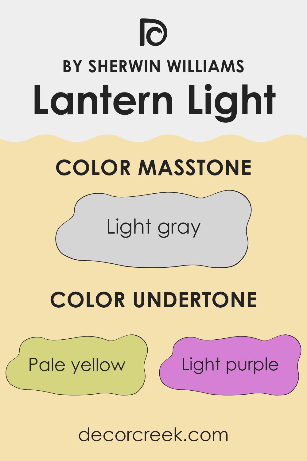
Undertones of Lantern Light SW 6687 by Sherwin Williams
Lantern Light by Sherwin Williams is a paint that has an interesting mix of undertones. These undertones include pale yellow, light purple, pale pink, light blue, mint, lilac, and grey. The combination of these colors influences how Lantern Light appears on your walls.
Undertones are the subtle hints of color that can give a paint its unique character. They can change how a color looks under different lighting conditions. For example, a color might look brighter in natural sunlight and more subdued in artificial light.
When Lantern Light is applied to walls, the pale yellow undertone makes the room feel sunny and warm. The hint of pale pink brings a soft and cozy touch, while the mint undertone adds a fresh, airy vibe. Light blue and lilac add coolness, keeping the color from feeling too strong.
The grey undertone provides balance, grounding the lighter colors. In different rooms, these undertones can make Lantern Light feel more lively or more relaxing. In a living room with lots of natural light, the pale yellow and mint undertones might stand out more, giving the room an upbeat, fresh feeling. In a bedroom, the pale pink and lilac could contribute to a more restful atmosphere.
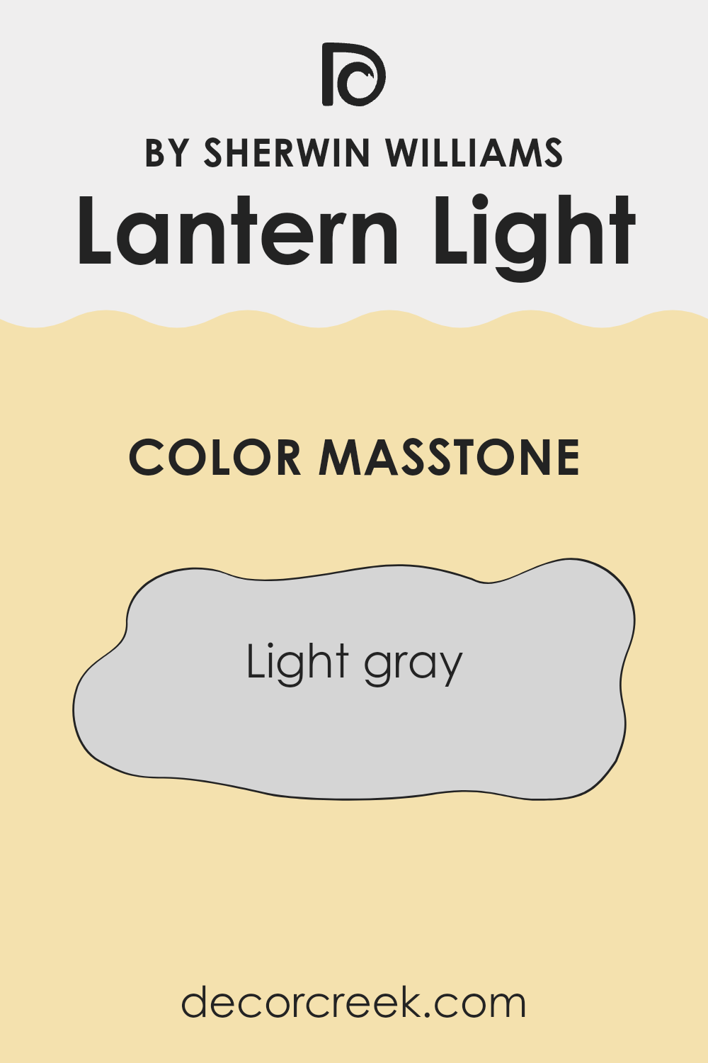
What is the Masstone of the Lantern Light SW 6687 by Sherwin Williams?
Lantern Light SW 6687 by Sherwin Williams is a light yellow color that works well in homes thanks to its adaptable and gentle nature. As a soft yellow, it acts like a cheerful neutral, making it easy to pair with various other colors and styles within a room.
This color creates a clean and airy feel, which can make rooms look larger and more open. It’s a great choice for smaller areas or spots with limited natural light, as it can help brighten up the room without feeling too strong.
In living rooms or bedrooms, Lantern Light can serve as a gentle backdrop that allows furniture and decor to stand out. While it is subtle, it isn’t dull, providing just enough warmth to make a room feel cozy and inviting. This makes Lantern Light a practical choice for anyone looking to add a touch of modernity and comfort to their home.
How Does Lighting Affect Lantern Light SW 6687 by Sherwin Williams?
Lighting has a big impact on how we see colors. The same color can look different depending on the type of light it’s in. This happens because lighting changes the way colors are perceived by our eyes. For example, a color might look warmer (more yellow or red) under incandescent light, while it might appear cooler (more blue) under fluorescent lights. Natural sunlight also changes throughout the day, affecting color appearance.
Let’s look at how lighting affects Lantern Light SW 6687 by Sherwin Williams. This color is a warm, soft yellow. Under artificial lighting, such as incandescent bulbs, Lantern Light will appear even warmer and cozier, as these bulbs tend to enhance warm tones. Under fluorescent lighting, the yellow may appear slightly duller or cooler, as fluorescents often bring out blue tones in colors.
In natural light, the direction a room faces plays a big role in color perception. In north-facing rooms, which get cooler and indirect light, Lantern Light can appear more muted or slightly grayish, since northern light tends to have a blue tint. This might tone down the warmth of the yellow.
In south-facing rooms, which receive plenty of direct sunlight, Lantern Light looks brighter and more vibrant. The strong, warm sunlight enhances the yellow tones, making the room feel inviting and sunny.
In east-facing rooms, the morning light is bright and sharp, casting a clear glow on colors. Lantern Light will appear fresh and lively in the morning. As the day progresses and the sunlight fades, the color might soften.
In west-facing rooms, the afternoon and evening light is warm and golden. Lantern Light will deepen and glow warmly, creating a cozy atmosphere as the day ends.
So, lighting changes how Lantern Light appears, highlighting its warm, inviting qualities differently depending on the room’s orientation and light source.
What is the LRV of Lantern Light SW 6687 by Sherwin Williams?
Light Reflectance Value, or LRV, is a measure that tells us how much light a color reflects back into a room, with 0 being absolute black and 100 being pure white. Basically, it gives an idea of how light or dark a color will look on the wall and how it can affect the feel of a room. Higher LRV values mean the color reflects more light, making a room feel brighter and more open.
Conversely, lower LRV values indicate that the color absorbs more light, making rooms feel cozier or even smaller. When picking paint, it’s crucial to pay attention to LRV, as it can significantly alter the look and feel of a room depending on the lighting conditions.
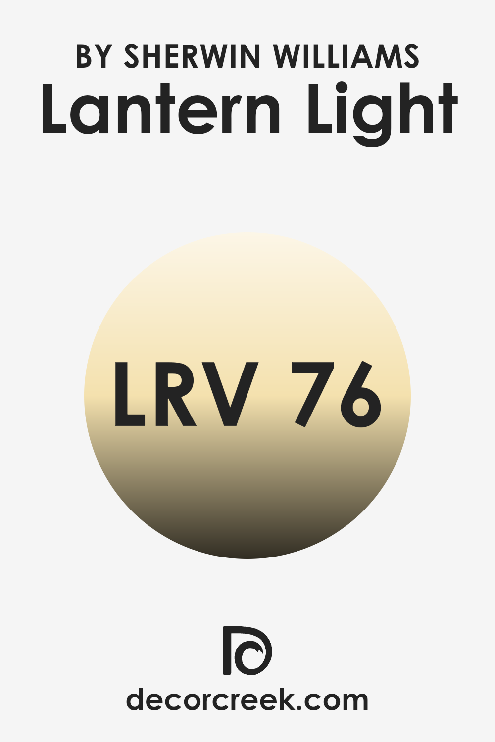
With an LRV of 76.048, Lantern Light is relatively high on the scale, meaning it reflects a good amount of light. This makes it a great choice for rooms where you want to maintain a bright and airy atmosphere. Lantern Light will boost the natural light in a room, potentially making it feel larger and more open.
It’s a warm color, so even with the increased light, it can also add a comfortable and inviting feel to a room. In rooms with limited natural light, this color can help lift the mood, making it a flexible option for many settings.
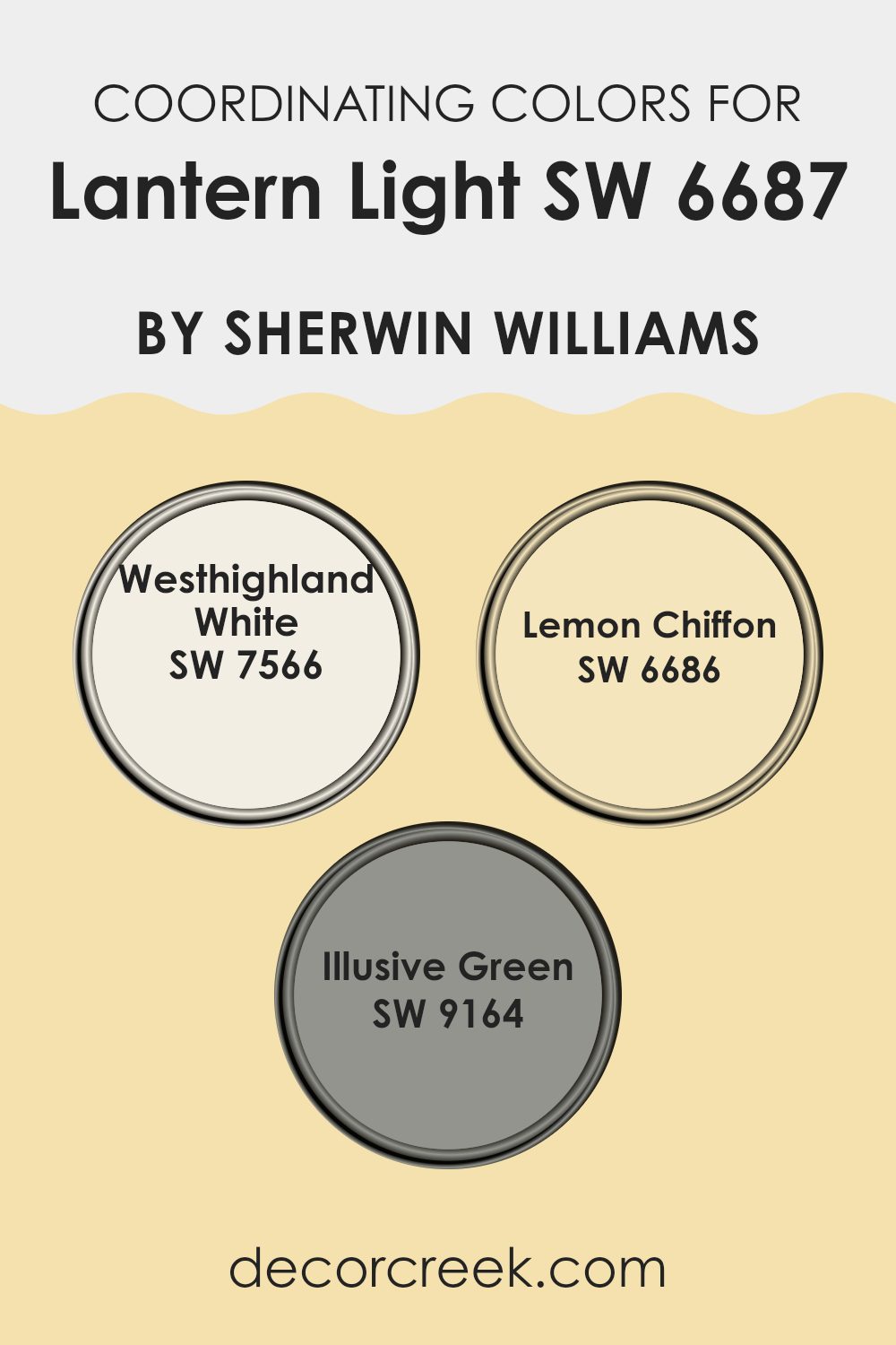
Coordinating Colors of Lantern Light SW 6687 by Sherwin Williams
Coordinating colors are those that work well together to create a balanced color scheme in a room. They complement each other and improve the overall look without clashing. When pairing colors with Lantern Light by Sherwin Williams, consider using Westhighland White, Lemon Chiffon, and Illusive Green. Each of these colors brings its own charm to a room, and together they can help build a welcoming and unified feel.
Westhighland White is a soft, warm white that lends a sense of spaciousness and brightness to any room. It provides a clean, neutral backdrop that allows brighter colors to stand out. Lemon Chiffon is a cheerful, light yellow that adds a sunny touch, perfectly complementing the slightly bolder tones of Lantern Light.
Its subtle warmth can evoke a sense of comfort and cheerfulness. Meanwhile, Illusive Green is a gentle, muted green that introduces an element of calm and naturalness. It pairs nicely with brighter yellows by offering a touch of peaceful contrast, ensuring the room feels lively yet grounded. Together, these colors can create a delightful and cohesive environment that enhances the beauty of each individual shade.
You can see recommended paint colors below:
What are the Trim colors of Lantern Light SW 6687 by Sherwin Williams?
Trim colors are the accent colors used on the edges and borders of a room, such as the baseboards, door frames, and window sills. They help highlight the main wall color and add a sense of depth to the room. Trim colors are crucial for Lantern Light by Sherwin Williams because they can enhance its warmth and bring balance to the room’s design.
A well-chosen trim color can highlight the inviting yellow undertones of Lantern Light, making the room feel cozy yet vibrant. Trim colors also provide a visual break that helps define architectural features, creating a more polished and put-together look for the room.
Using SW 7004 Snowbound as a trim color brings a clean, crisp finish to the room. It has a soft, cool white tone that complements Lantern Light without overpowering it, offering a delicate contrast without clashing. On the other hand, SW 7013 Ivory Lace gives a slightly warmer, creamy touch that pairs beautifully with Lantern Light’s sunny hue.
This soft white adds a subtle, warm accent, enhancing the overall cozy feel of the room. Both choices highlight the warm qualities of Lantern Light, serving to refine the rooms atmosphere while bringing all the elements together harmoniously.
You can see recommended paint colors below:

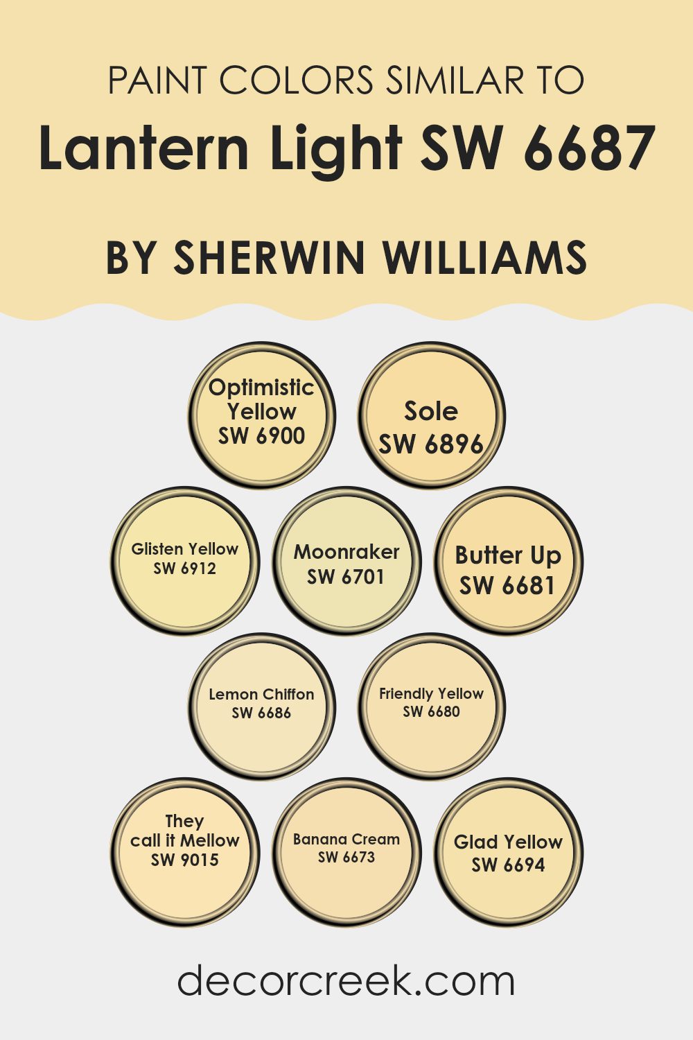
Colors Similar to Lantern Light SW 6687 by Sherwin Williams
Similar colors play a key role in creating a harmonious and cohesive look, particularly in interior design. These colors are visually compatible, creating a sense of balance and appeal when used together. For example, Optimistic Yellow (SW 6900) is a bright, sunny hue that can bring energy to a room, while Sole (SW 6896) offers a more gentle, calming yellow that adds warmth without feeling too strong.
Glisten Yellow (SW 6912) has a gentle glow, similar to Lantern Light, making it ideal for adding a soft, welcoming feel to any room. Moonraker (SW 6701), with its subtle touch, blends well with these brighter yellows, providing a neutral base that highlights the more vivid tones.
Butter Up (SW 6681) is a creamy yellow that feels comforting and inviting, while Lemon Chiffon (SW 6686) adds a touch of playfulness with its bright yet relaxed tone. Friendly Yellow (SW 6680) can lighten up any room with its cheerful and fresh personality. They Call It Mellow (SW 9015) perfectly describes its laid-back nature, offering quiet charm.
Banana Cream (SW 6673) is a soft, gentle yellow that envelops a room in warmth. Finally, Glad Yellow (SW 6694) evokes happiness and positivity, serving to brighten and enliven rooms effectively. Together, these colors work well to complement Lantern Light, crafting environments that feel both lively and coherent.
You can see recommended paint colors below:
- SW 6900 Optimistic Yellow
- SW 6896 Sole
- SW 6912 Glisten Yellow
- SW 6701 Moonraker
- SW 6681 Butter Up
- SW 6686 Lemon Chiffon
- SW 6680 Friendly Yellow
- SW 9015 They call it Mellow
- SW 6673 Banana Cream
- SW 6694 Glad Yellow
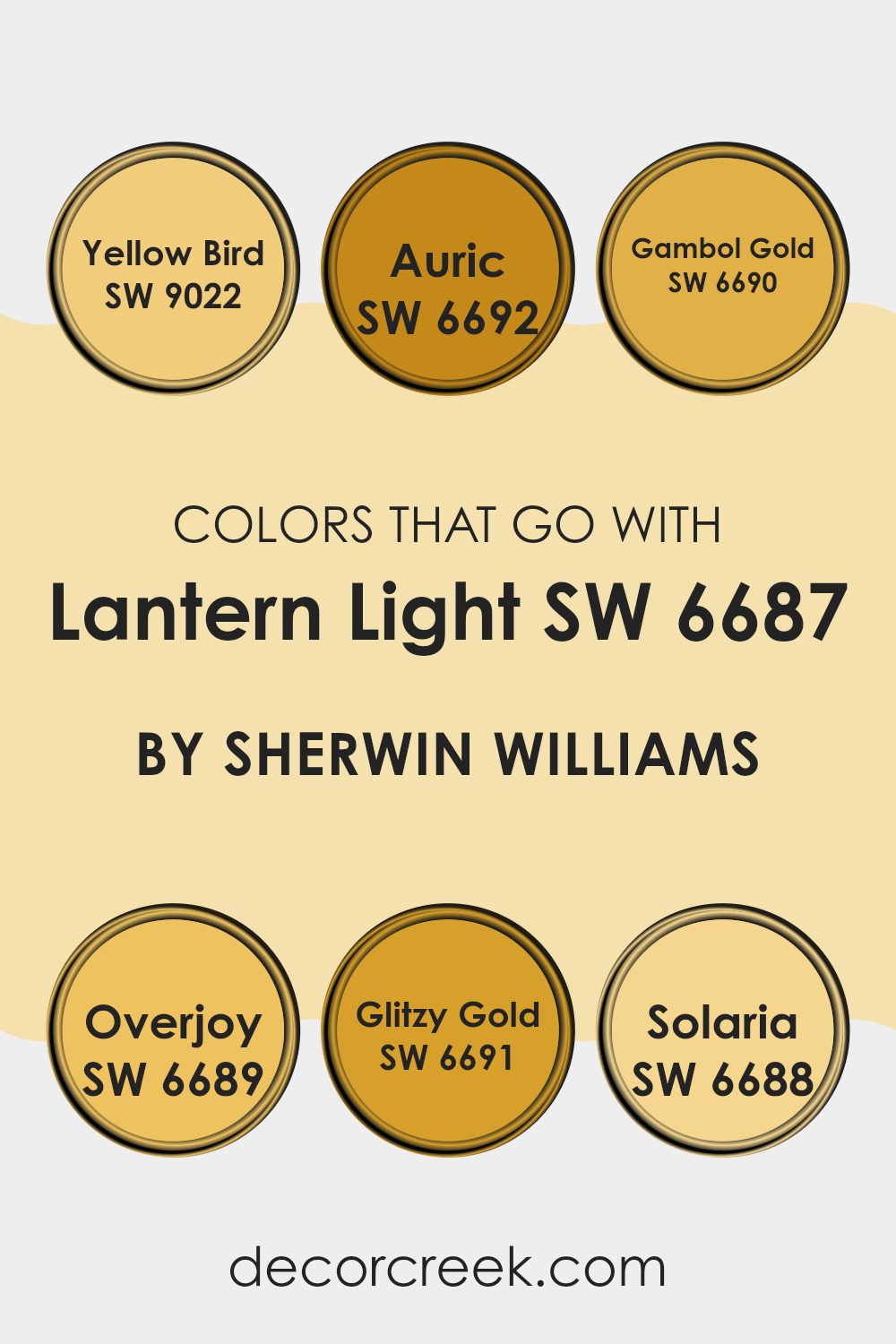
Colors that Go With Lantern Light SW 6687 by Sherwin Williams
Colors that pair with Lantern Light SW 6687 by Sherwin Williams are essential for creating harmonious and visually appealing rooms. By choosing complementary colors, you can enhance and balance the vibrant energy of Lantern Light. This shade leans into a sunny, uplifting yellow, reminiscent of a warm day bathed in sunlight. To complete a room with this hue, consider incorporating colors that share its lively spirit while offering their own unique charm.
SW 9022 Yellow Bird is a cheerful and soft yellow that feels like a gentle morning sunbeam, perfect for brightening any area. SW 6692 Auric is a deeper, richer yellow that adds a touch of luxury and warmth, making it feel inviting and cozy.
For a more earthy touch, SW 6690 Gambol Gold offers warmth with its slightly caramelized tone, bringing a natural and grounded feel. SW 6689 Overjoy is a vibrant, happy yellow that radiates positivity, perfect for adding energy to any room. SW 6691 Glitzy Gold shines with a bright, golden hue, evoking a sense of joy and happiness. Finally, SW 6688 Solaria is a saturated, bold yellow that brings an energetic and strong presence, great for making a room feel lively and engaging. These colors, when paired with Lantern Light, can create a home filled with cheer, warmth, and vitality.
You can see recommended paint colors below:
- SW 9022 Yellow Bird
- SW 6692 Auric
- SW 6690 Gambol Gold
- SW 6689 Overjoy
- SW 6691 Glitzy Gold
- SW 6688 Solaria
How to Use Lantern Light SW 6687 by Sherwin Williams In Your Home?
Lantern Light SW 6687 by Sherwin Williams is a warm, sunny yellow that can bring a cheerful and inviting atmosphere to any home. This paint color is perfect for rooms that need a little brightness and energy.
You can use Lantern Light in a kitchen to create a welcoming environment where family and friends gather. It works well in living rooms, helping to create a cozy, comfortable room. Lantern Light is also a great choice for a child’s room, as it adds a bright and happy feel.
It can be paired with white trim for a clean, fresh look or combined with darker colors for a warm contrast. When used in a hallway or entryway, Lantern Light can make the room feel more open and welcoming. This adaptable color works in almost any room, creating a lively and joyful atmosphere in your home.
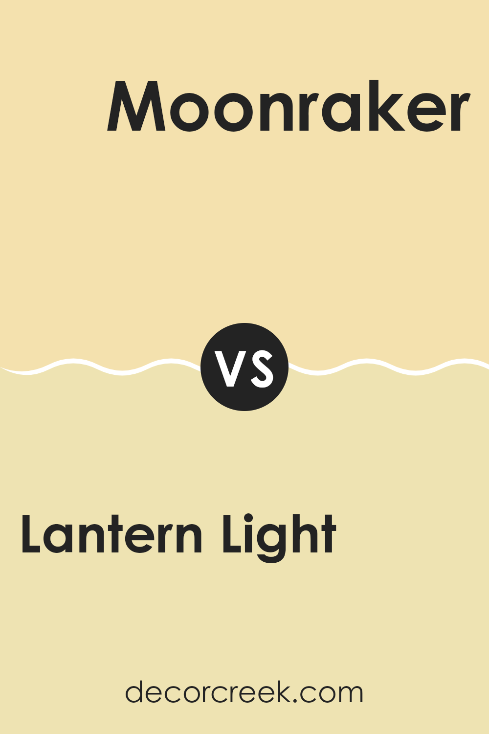
Lantern Light SW 6687 by Sherwin Williams vs Moonraker SW 6701 by Sherwin Williams
Lantern Light (SW 6687) and Moonraker (SW 6701) are two different shades of yellow by Sherwin Williams. Lantern Light is a warmer, more vibrant yellow with a cheerful and sunny vibe. It brings a lively and bright feel to any room, making it great for areas where you want a lot of energy and warmth.
In contrast, Moonraker is a softer, more pastel yellow that feels calmer and more subtle. It has a gentler presence, offering a soothing and light atmosphere. This makes Moonraker suitable for rooms where you want a more relaxed and quiet setting without too much brightness.
Both colors can add a touch of happiness, but Lantern Light is for those who prefer a bold pop of color, while Moonraker suits those who like a gentle, mellow ambiance. Each has its own charm depending on the mood you want to create.
You can see recommended paint color below:
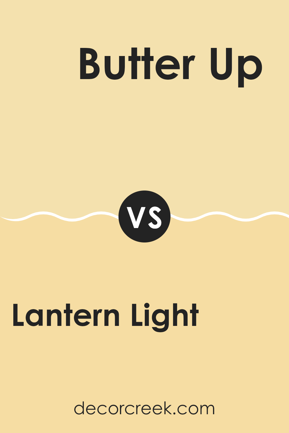
Lantern Light SW 6687 by Sherwin Williams vs Butter Up SW 6681 by Sherwin Williams
Lantern Light and Butter Up by Sherwin Williams are both warm yellow shades, but they offer slightly different vibes. Lantern Light is a bright, cheerful yellow that brings a sunny, vibrant feel to a room, making it lively and energetic. It’s like a burst of sunshine indoors.
On the other hand, Butter Up is a softer, more muted yellow. It’s like the color of warm butter, offering a cozy and welcoming atmosphere. While Lantern Light might be perfect for a lively kitchen or a playroom, Butter Up could suit a bedroom or living room where a softer ambiance is desired.
Both colors fit well with neutral tones like white or beige and can complement darker woods and navy blues. The choice between the two would depend on the feel you want in your room: energetic and bold or warm and comforting.
You can see recommended paint color below:
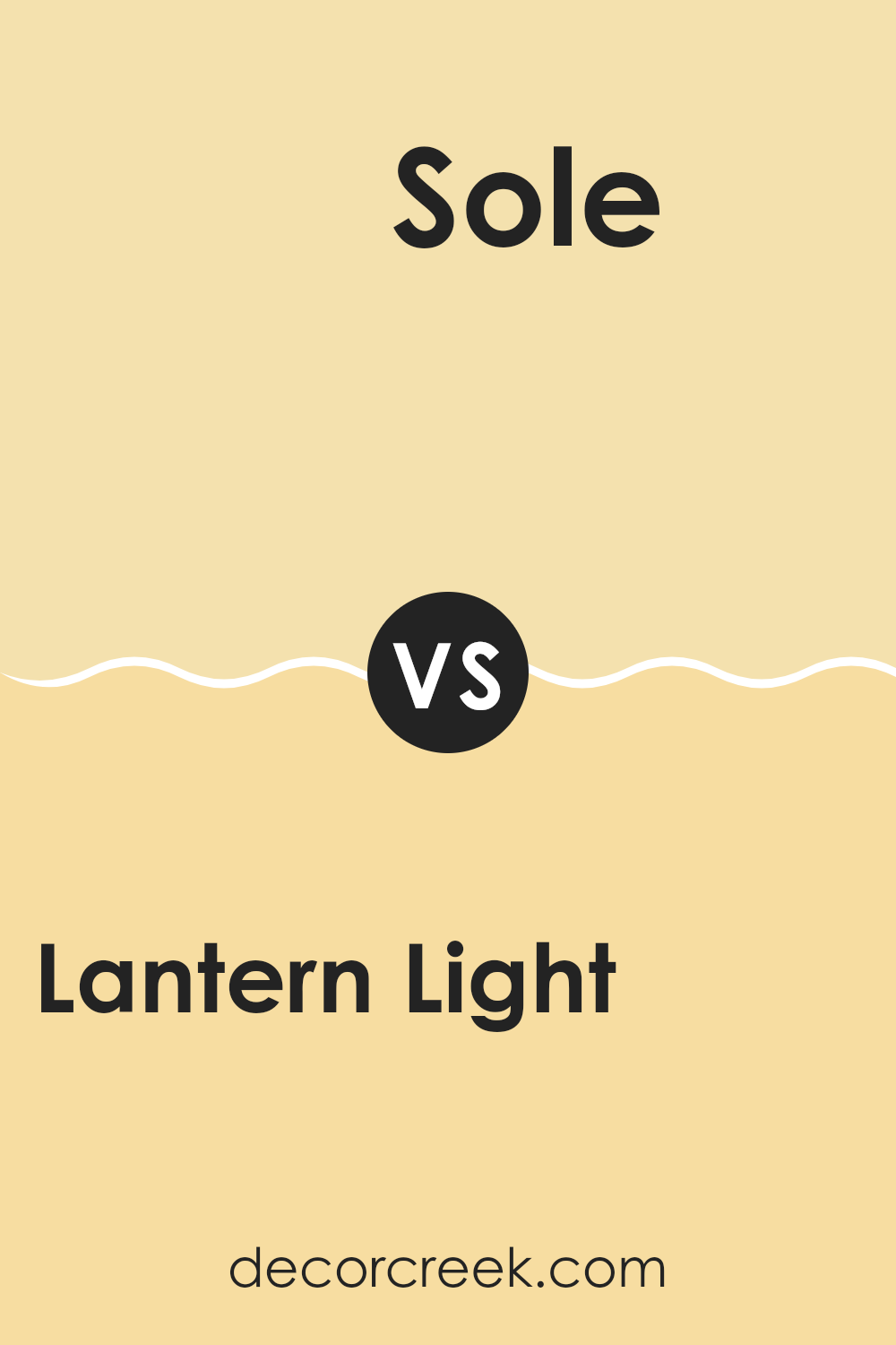
Lantern Light SW 6687 by Sherwin Williams vs Sole SW 6896 by Sherwin Williams
Lantern Light SW 6687 and Sole SW 6896, both from Sherwin Williams, are bright and lively yellows that bring cheer to a room. Lantern Light is a soft, sunny yellow, reminiscent of gentle sunlight streaming through a window.
It’s warm and inviting, making it a great choice for kitchens or living areas where you want a touch of brightness without feeling too strong. In contrast, Sole is a bolder, more vibrant hue, akin to a sunflower in full bloom.
This color is full of energy and can add a splash of excitement to any room. It’s ideal for accents or areas where you want to make a strong statement. While both colors can brighten a room, Lantern Light offers a gentler warmth, while Sole delivers a more intense burst of color, each serving different moods and purposes within a home.
You can see recommended paint color below:
- SW 6896 Sole
Lantern Light SW 6687 by Sherwin Williams vs Glisten Yellow SW 6912 by Sherwin Williams
Lantern Light SW 6687 and Glisten Yellow SW 6912 from Sherwin Williams are two cheerful shades of yellow, each with its unique feel. Lantern Light is soft and warm, resembling the gentle glow of a lantern on a summer evening. It offers a comforting and cozy vibe, making rooms feel welcoming and relaxed.
On the other hand, Glisten Yellow is brighter and more vibrant. It’s like a sunny day, bringing energy and a sense of fun to any room. This color can instantly lift the mood and make a room feel more lively and spirited.
While both colors are cheerful, Lantern Light is more subdued and gentle, perfect for creating a warm and relaxed setting. Glisten Yellow, with its bold and radiant presence, is ideal for making a statement and adding a burst of joy and brightness to a room. Both can be used to create inviting and joyful rooms.
You can see recommended paint color below:
- SW 6912 Glisten Yellow
Lantern Light SW 6687 by Sherwin Williams vs Optimistic Yellow SW 6900 by Sherwin Williams
Lantern Light SW 6687 by Sherwin Williams and Optimistic Yellow SW 6900 by Sherwin Williams are both cheerful yellow shades, but they offer different feels. Lantern Light SW 6687 is a softer, warm yellow with a gentle glow. It brings a cozy and inviting feel to rooms, making them feel sunny and warm. It has a hint of creaminess, which can add a touch of charm to the room.
On the other hand, Optimistic Yellow SW 6900 is a brighter and bolder shade. It’s more vibrant and lively, adding energy and fun to any area. This color is great for rooms where you want to encourage activity and enthusiasm.
In comparison, Lantern Light SW 6687 is more subdued and calming, making it suitable for bedrooms or living rooms. Optimistic Yellow SW 6900, being more dynamic, is ideal for kitchens, playrooms, or any room where you want to encourage creativity and conversation. Both are uplifting but suit different moods.
You can see recommended paint color below:
Lantern Light SW 6687 by Sherwin Williams vs Banana Cream SW 6673 by Sherwin Williams
Lantern Light SW 6687 and Banana Cream SW 6673, both by Sherwin Williams, are two warm and cheerful shades of yellow. Lantern Light is a brighter, more vibrant yellow, reminiscent of a sunny day. It’s perfect for adding a burst of energy to any room, making rooms feel lively and inviting.
On the other hand, Banana Cream has a softer, more subdued tone. It brings a touch of warmth but in a gentler way, similar to a ripe banana. This makes it suitable for creating cozy and comfortable rooms without being too intense.
While both colors can brighten up a room, Lantern Light is ideal if you’re looking for something bold and eye-catching. Banana Cream, however, is better if you prefer a more subtle, calming effect that still adds warmth and friendliness. In short, choose Lantern Light for a more vibrant look and Banana Cream for a softer, more comforting vibe.
You can see recommended paint color below:
- SW 6673 Banana Cream
Lantern Light SW 6687 by Sherwin Williams vs Lemon Chiffon SW 6686 by Sherwin Williams
Lantern Light SW 6687 and Lemon Chiffon SW 6686, both from Sherwin Williams, are yellow shades with distinctive qualities. Lantern Light is a cheerful, bold yellow that brings a sense of sunshine and energy to a room. It’s bright and can instantly lighten up a room, making it ideal for areas that need a lively touch, like kitchens or playrooms.
Lemon Chiffon, on the other hand, is a softer yellow. It has a gentler tone that is more soothing compared to the vibrancy of Lantern Light. This makes it suitable for rooms where a more subtle, calming atmosphere is desired, such as bedrooms or living rooms.
While both colors share a warm undertone, Lantern Light stands out for its intensity, whereas Lemon Chiffon offers a more laid-back vibe. Choosing between them depends on whether you want a room that feels energetic or one that highlights ease and relaxation.
You can see recommended paint color below:
Lantern Light SW 6687 by Sherwin Williams vs They call it Mellow SW 9015 by Sherwin Williams
“Lantern Light” and “They Call It Mellow” are two colors by Sherwin Williams that offer different vibes. “Lantern Light” is a bright, cheerful yellow that can really light up a room. It feels warm and lively, perfect for rooms where you want to create energy and happiness. It’s a great choice for kitchens or living rooms where people gather and chat.
On the other hand, “They call it Mellow” is a softer, more subdued yellow. It brings a feeling of calm and relaxation. This color is ideal for bedrooms or reading nooks where you want a more laid-back atmosphere. It’s gentle on the eyes and not as attention-grabbing as “Lantern Light.”
Overall, both yellows have their place. “Lantern Light” is vibrant and exciting, while “They Call It Mellow” is gentle and relaxed. Choosing between them depends on the mood you want to create in your room.
You can see recommended paint color below:
- SW 9015 They call it Mellow
Lantern Light SW 6687 by Sherwin Williams vs Friendly Yellow SW 6680 by Sherwin Williams
Lantern Light and Friendly Yellow are two cheerful yellow shades by Sherwin Williams that bring warmth and brightness to a room. Lantern Light is a vivid, sunny yellow, full of energy and optimism. It can make any room feel lively and inviting.
On the other hand, Friendly Yellow is a softer, more muted shade, providing a warm, welcoming feel without being overpowering. While Lantern Light fills a room with a bold and vibrant presence, Friendly Yellow offers a softer touch, creating a cozy atmosphere. Both colors are excellent for adding a splash of happiness to interiors but serve slightly different purposes.
Lantern Light is great for creating an energizing environment, perfect for kitchens or play areas. Friendly Yellow, with its gentle tone, is more suited for rooms like living rooms or bedrooms where a warm, comfortable feel is desired. Both colors bring positivity to homes in their own unique ways.
You can see recommended paint color below:
Lantern Light SW 6687 by Sherwin Williams vs Glad Yellow SW 6694 by Sherwin Williams
Lantern Light SW 6687 and Glad Yellow SW 6694 are both vibrant yellow shades from Sherwin Williams, but they have distinct characteristics. Lantern Light is a warm, cheerful yellow that brings a sunny, inviting feel to any room.
It’s bright but soft enough not to feel too strong, making it flexible for various rooms. On the other hand, Glad Yellow SW 6694 is a bolder, more intense yellow. It has more depth and richness, making it ideal for creating an energizing atmosphere. While Lantern Light is perfect for adding a touch of warmth and friendliness, Glad Yellow is great for making a statement and adding drama.
Used together, they can complement each other well, with Lantern Light providing the subtle backdrop and Glad Yellow acting as an accent to highlight architectural features or furniture. Both colors are excellent for brightening up a room and bringing a burst of positivity.
You can see recommended paint color below:
- SW 6694 Glad Yellow
In the end, SW 6687 Lantern Light by Sherwin Williams is a really nice color. Imagine the warm yellow of a lantern on a summer night; that’s the kind of feeling this paint brings to a room. It’s like having a little piece of sunshine inside your house, making you feel cozy and happy. You could use this color in different rooms – maybe where you eat with your family or where you do homework. It helps make places feel cheerful and bright.
This color works well because it stands out without being too loud. It’s great if you want something warm and inviting. When I think about Lantern Light, I picture people smiling and having a nice time together. It’s also a good choice because it matches other colors easily, sort of like how vanilla ice cream goes with so many other flavors.
In using Lantern Light, you’re choosing something that brings joy. It turns any area into a place you want to be in. It’s like a friendly hug for your walls.
I think anyone who paints with this color will find themselves feeling just a bit happier each day.
Ever wished paint sampling was as easy as sticking a sticker? Guess what? Now it is! Discover Samplize's unique Peel & Stick samples.
Get paint samples

