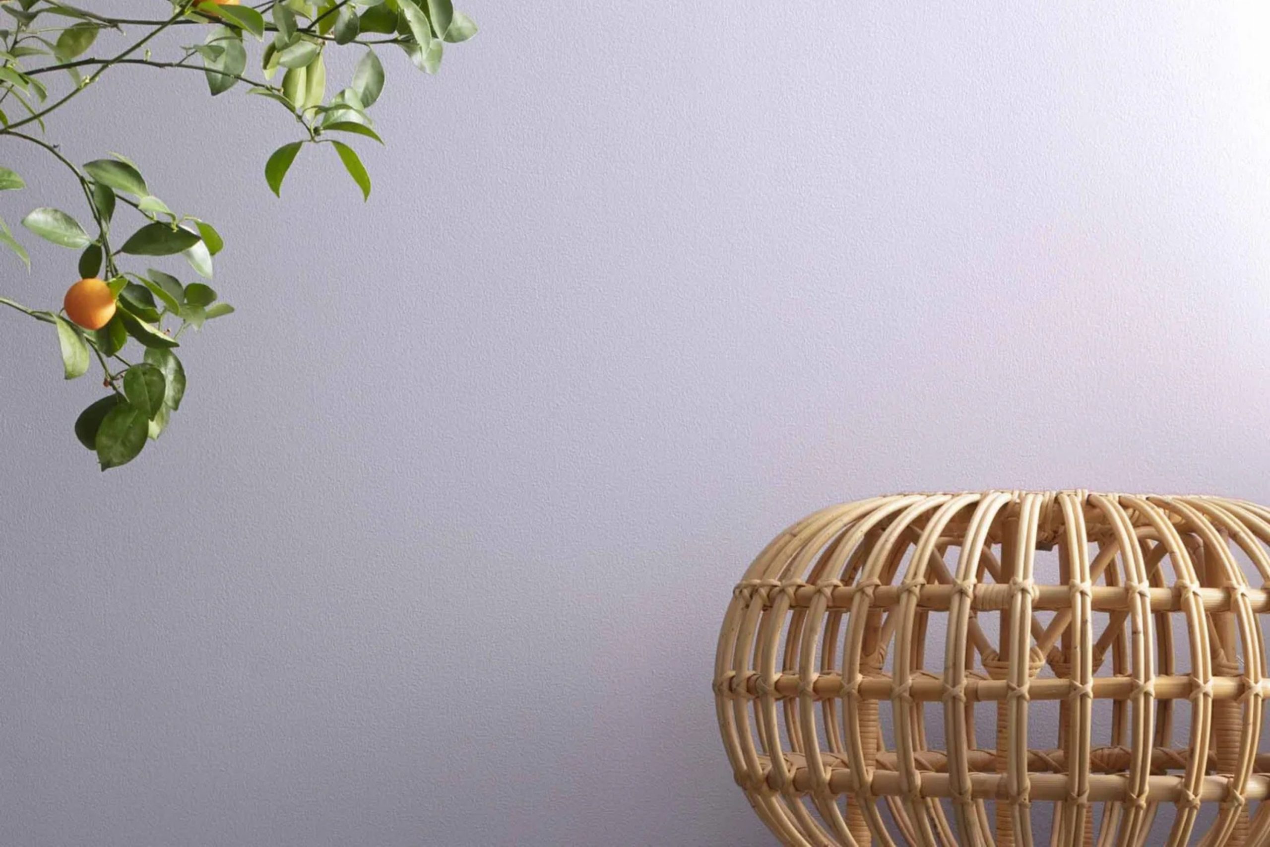
If you love soft, soothing colors, then you might really like 2069-60 Lavender Ice by Benjamin Moore. I recently considered this color for my bedroom because I wanted something that would help create a peaceful and calming atmosphere. Lavender Ice, as the name suggests, has a gentle touch of lavender, blended beautifully with a hint of ice blue, which gives it a very subtle and light appearance.
This color is perfect if you’re looking for a hue that provides a sense of relaxation without being too bold or overpowering. It’s a great choice for rooms where you want to unwind, like bedrooms or bathrooms. The airy feel of Lavender Ice can make a small room appear bigger and brighter.
I imagine pairing it with soft whites or even some darker greys to add a little contrast. The flexibility of Lavender Ice makes it easy to accessorize with different textures and complementary colors in decor items like cushions, curtains, and throws.
So, if you’re thinking about giving your room a fresh, calm look, consider Lavender Ice—a color that adds a touch of peacefulness without demanding too much attention.
What Color Is Lavender Ice 2069-60 by Benjamin Moore?
Lavender Ice by Benjamin Moore is a soft and gentle shade that works perfectly to add a light, airy feel to any room. This color has a subtle hint of purple that brings a fresh and inviting vibe, making it a great choice for creating a restful environment. Its pale lavender hue pairs beautifully with a wide range of colors and materials, adding a touch of warmth without overpowering the room.
Ideal for modern and minimalist interior styles, Lavender Ice also fits well in shabby chic and Scandinavian designs due to its calming and understated nature. It serves as an excellent backdrop for natural wood finishes, from light beech to darker walnut, enhancing the organic feel of the room. Additionally, this color complements soft textures like cotton throws and linen cushions, which help to create a cozy, comfortable atmosphere.
Metallic accents, particularly in silver or brushed nickel, also go well with Lavender Ice, adding a touch of glamour to the subtle refined look of the hue. It can be paired with glass and mirrored surfaces to reflect light and make smaller rooms appear larger.
Overall, Lavender Ice is adaptable and easy to work with, fitting smoothly into various decor styles and enhancing the overall appeal of your home with its gentle charm.
Is Lavender Ice 2069-60 by Benjamin Moore Warm or Cool color?
Lavender Ice 2069-60 by Benjamin Moore is a soft, subtle shade of lavender with understated gray undertones that add a hint of neutrality, making it incredibly adaptable for home decor. This light purple color is mild enough not to overpower a room but gives just enough presence to add personality and warmth. It works well in rooms that need a gentle touch of color without the dominating brightness some purples can bring.
Lavender Ice is perfect for bedrooms, where its gentle tone can create a cozy and calming atmosphere, ideal for relaxation. In living rooms, it pairs beautifully with creams, soft whites, and even sage greens, offering a fresh and modern palette.
For those looking to refresh their room, Lavender Ice 2069-60 is a great option for painting an accent wall or for use in a bathroom for a light, airy feel. The color’s flexibility makes it easy to match with various furnishings and styles, whether contemporary or traditional.
Undertones of Lavender Ice 2069-60 by Benjamin Moore
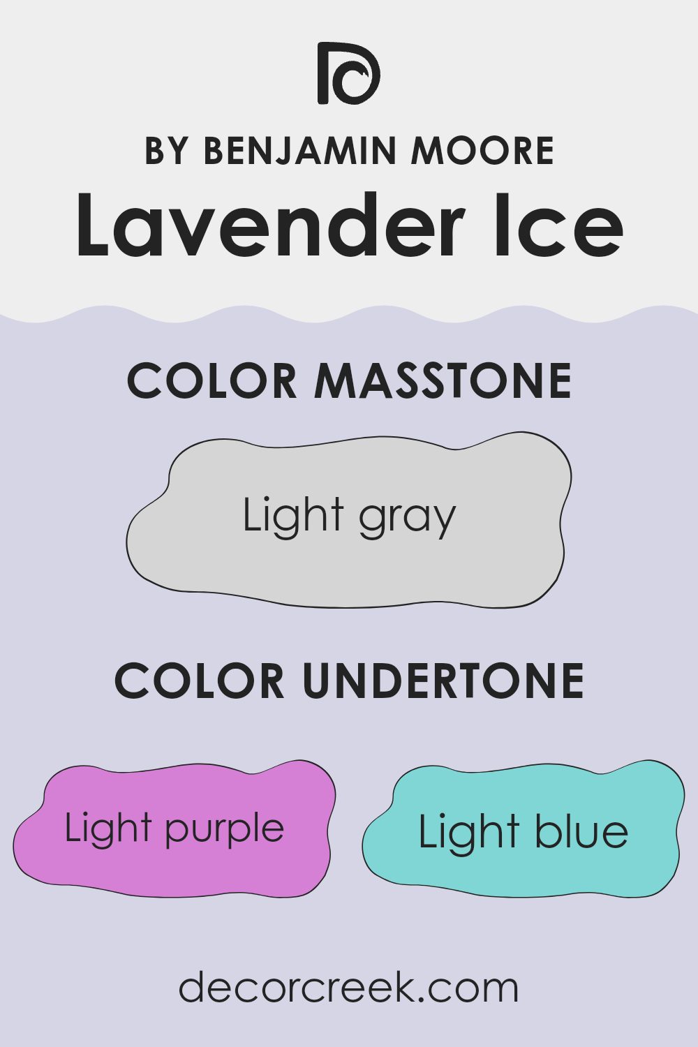
Lavender Ice, a gentle shade from Benjamin Moore, is subtly complex because of its various undertones. Undertones are secondary colors that influence the primary hue, affecting how we perceive the color under different lighting conditions. For Lavender Ice, these undertones include light purple, light blue, pale yellow, lilac, pale pink, mint, and grey.
These undertones play a key role in how Lavender Ice looks on interior walls. Light purple and lilac undertones add a cool, calm feel to the color, making it a great option for bedrooms or rooms intended for relaxation. Light blue and mint introduce a freshness that can help a room feel airy and light. Pale yellow brings a subtle warmth that can make the setting feel more welcoming, balancing the cooler blue and purple shades.
The pale pink undertone provides a soft, almost nurturing quality, which works beautifully in living areas or rooms where comfort is key. Lastly, the grey undertone helps ground the color, preventing it from feeling too whimsical and ensuring it blends well with modern and minimalistic decor.
In practical terms, the presence of these undertones in Lavender Ice means the color can appear differently based on the time of day and lighting conditions. Morning light might emphasize its warmer yellow or pink undertones, while artificial lighting in the evening could highlight its cooler blue or lilac sides. This makes Lavender Ice an adaptable choice, adjusting subtly to both natural and artificial light environments, enhancing the mood and overall look of a room effortlessly.
decorcreek.com
What is the Masstone of the Lavender Ice 2069-60 by Benjamin Moore?
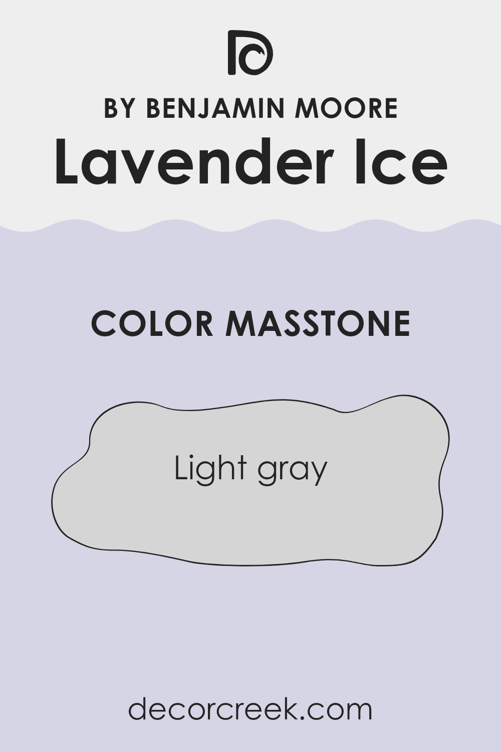
Lavender Ice 2069-60 by Benjamin Moore has a masstone of light gray, color code #D5D5D5. This subtle shade works well in homes because it provides a clean and calm background that blends easily with various decor styles.
Since light gray is a neutral color, it allows other colors in the room, like furniture or artwork, to stand out without clashing. This makes it an adaptable choice, fitting well in rooms like living rooms, bedrooms, or bathrooms, where a gentle and unobtrusive backdrop is desirable.
The light gray tone also helps to make small rooms appear larger and more open, reflecting light and giving an airy feeling to the room. It’s a practical option for anyone looking to create a fresh and neat setting in their home, offering a tidy look while keeping a friendly atmosphere. This color is especially useful in areas that don’t get much natural light, as it helps brighten the room.
How Does Lighting Affect Lavender Ice 2069-60 by Benjamin Moore?
Lighting plays a crucial role in how colors appear in different environments. The color Lavender Ice by Benjamin Moore is a good example to show how light conditions can affect the perception of color.
In artificial light, Lavender Ice might appear slightly different depending on the type of bulbs used. Warm bulbs can make it look softer and more muted, giving the room a cozy feel. In contrast, cool bulbs could enhance the blue undertones in Lavender Ice, making it appear crisper and brighter.
Natural light can significantly impact how Lavender Ice appears through the day. In north-facing rooms, which get less direct sunlight, Lavender Ice may look more subtle and slightly grey-ish, maintaining a consistent shade throughout the day. This can be ideal for rooms where you want a steady appearance without dramatic changes in color perception.
In south-facing rooms, where sunlight is abundant throughout the day, Lavender Ice will likely look vibrant and quite bright. The high presence of natural light can bring out the liveliness of the color, making it appear more vivid and dynamic.
East-facing rooms receive a lot of light in the morning. Here, Lavender Ice can look especially bright and fresh in the morning, with a more neutral tone as the day progresses and the natural light decreases. Conversely, in west-facing rooms, Lavender Ice will change its character as the day moves from afternoon to evening. During the late afternoons and evenings, when the sunlight is warmer, Lavender Ice can take on a softer, warmer appearance, contrasting with the cooler, more subtle look during the morning hours when sunlight is less intense. Overall, Lavender Ice is an adaptable color that will vary quite a bit depending on the lighting conditions, potentially creating different moods in a room throughout the day.
What is the LRV of Lavender Ice 2069-60 by Benjamin Moore?
LRV stands for Light Reflectance Value, which measures the amount of light a paint color reflects back into the room as opposed to absorbing it. It’s rated on a scale where higher numbers indicate that the color reflects more light.
This value is crucial when choosing paint colors because it affects how light or dark a color appears on your walls. For instance, a high LRV can make a small room feel more open and airy as more light is bounced around the room, whereas a low LRV can make a room feel cozier and more enclosed because it absorbs more light.
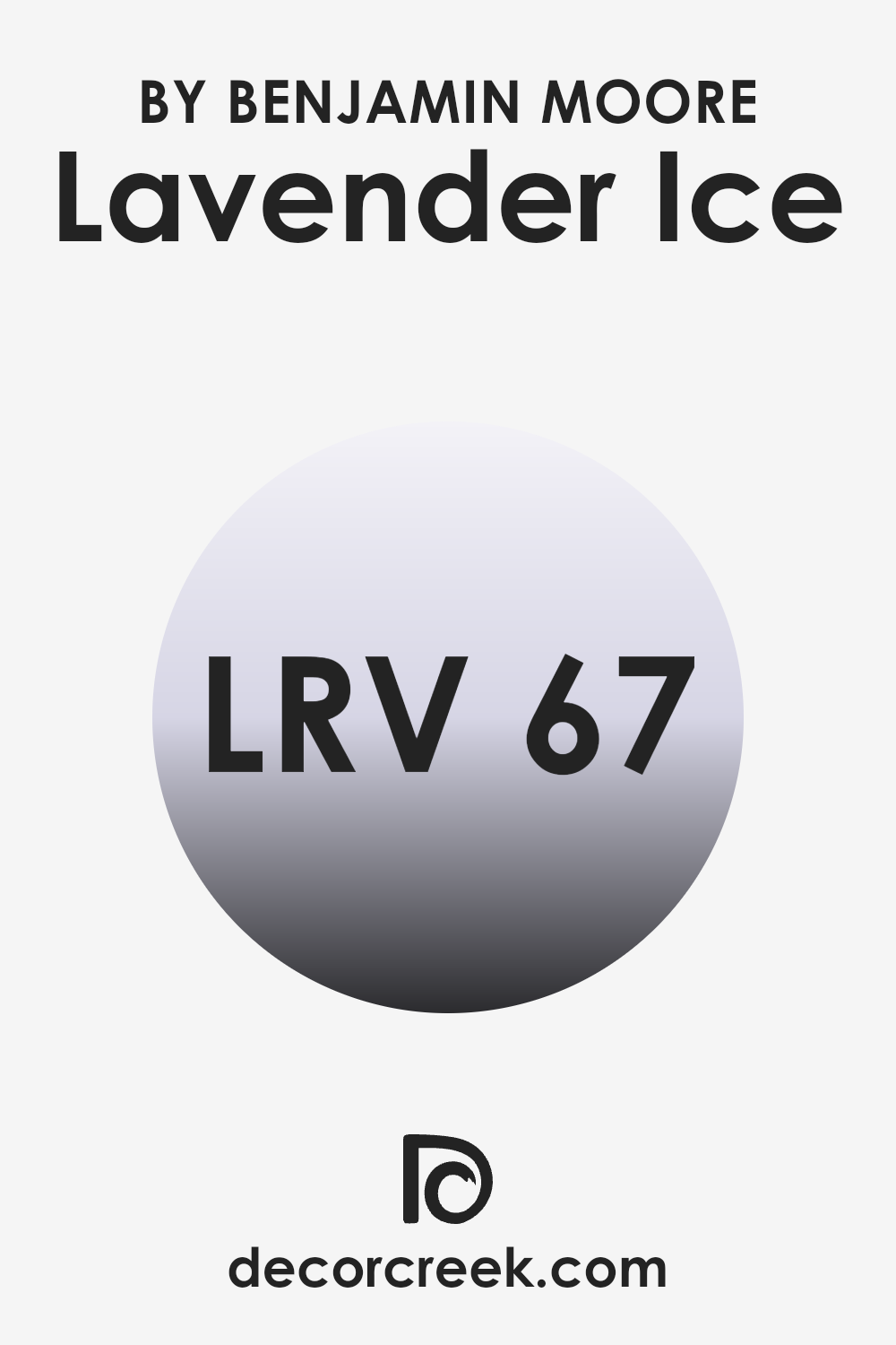
In the case of Lavender Ice with an LRV of 66.54, this paint color falls on the higher side of the scale, meaning it reflects a good amount of light. When applied to walls, Lavender Ice will appear relatively light and can help brighten up a room that doesn’t receive a lot of natural sunlight. This makes it a good choice for rooms like north-facing rooms or any area that you want to feel brighter and more inviting. Its ability to reflect light well also means that the color can subtly change in appearance under different lighting conditions throughout the day.
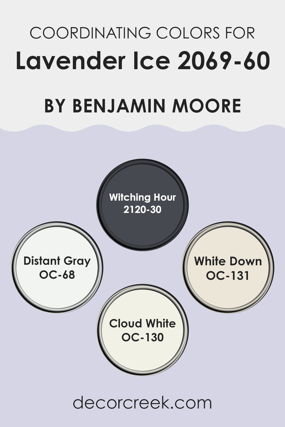
Coordinating Colors of Lavender Ice 2069-60 by Benjamin Moore
Coordinating colors are those that complement each other well when used together in design and decorating. They create a harmonious balance in a room, enhancing the aesthetic qualities without overpowering one another. When coordinating colors with a base color like Lavender Ice, a soft and subtle hue, it’s important to select colors that will both contrast and blend smoothly with this tone, providing flexibility and a pleasing visual impact.
For example, when discussing colors like Witching Hour, a deep, dark, almost black blue, it acts as a strong contrast to Lavender Ice, making the lighter color appear more vibrant and stand out in any decor setting. Distant Gray, on the other hand, is a very light gray that almost whispers in shades, merging smoothly with most colors for a quiet cohesion.
Another great complement is White Down, a soft, creamy off-white that offers warmth without overpowering lighter lavender tones. Lastly, Cloud White has a clean, refreshing quality that pairs perfectly with virtually any color by offering a crisp boundary that makes colors stand out while still lending itself to a unified design. Using these colors in combination with Lavender Ice can truly enhance the room, creating an inviting and attractive setting.
You can see recommended paint colors below:
- 2120-30 Witching Hour
- OC-68 Distant Gray
- OC-131 White Down
- OC-130 Cloud White
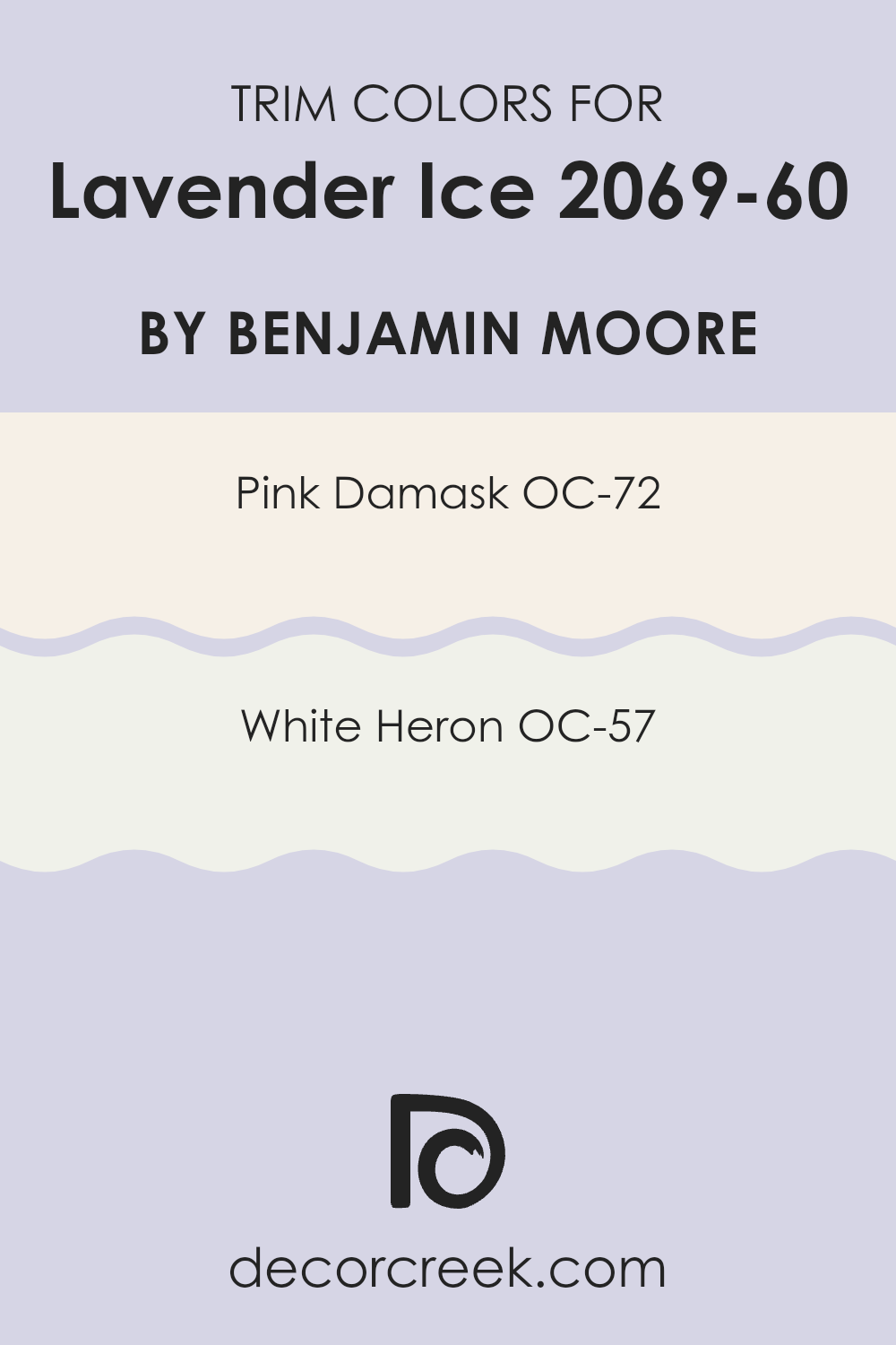
What are the Trim colors of Lavender Ice 2069-60 by Benjamin Moore?
Trim colors play a crucial role in interior and exterior design by accentuating the architectural details and features of a room or building, such as window frames, doors, and baseboards. When it comes to combining trim colors with a subtle shade like Lavender Ice by Benjamin Moore, choosing the right hues is essential to creating a cohesive and appealing look.
OC-72 Pink Damask and OC-57 White Heron are excellent choices for trims, as they complement the gentle tone of Lavender Ice without overpowering it. The choice of these trim colors can help outline and define rooms effectively, adding depth and contrast to the overall look.
OC-72 Pink Damask is a soft, muted pink that has a warm undertone, making it a delightful trim choice that adds a gentle splash of color without overpowering the senses. It pairs beautifully with Lavender Ice, offering a hint of warmth to rooms that benefit from a subtle yet inviting atmosphere. On the other hand, OC-57 White Heron is a clean and bright white that provides a sharp, crisp edge to any area. It is an excellent option for making Lavender Ice stand out and enhancing the perceived spaciousness of a room. Opting for White Heron as a trim color ensures that the walls are neatly defined, giving the room a fresh and orderly appearance.
You can see recommended paint colors below:
- OC-72 Pink Damask
- OC-57 White Heron
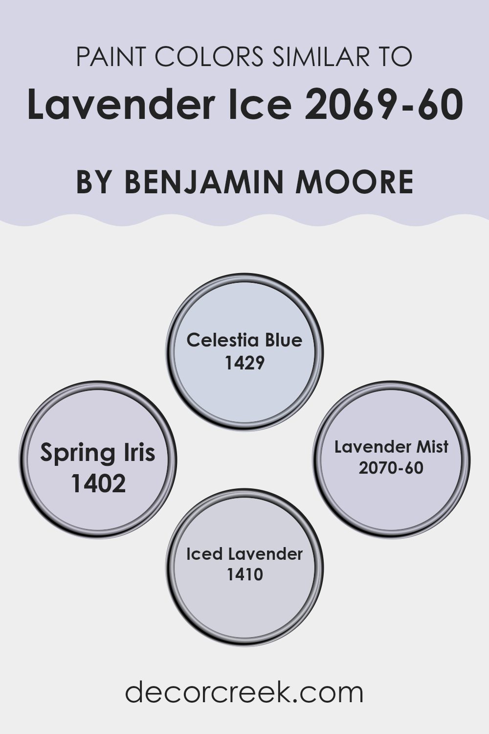
Colors Similar to Lavender Ice 2069-60 by Benjamin Moore
Similar colors play a crucial role in design by creating a cohesive aesthetic while allowing subtle differences to add depth and interest to a room. When colors like Lavender Ice are accented with hues such as Celestia Blue, Spring Iris, Lavender Mist, and Iced Lavender, it allows for a harmonious palette that is easy on the eyes yet engaging enough to keep the room lively. These similar shades can be used to paint different walls in a room or as a scheme for painting and accessorizing different rooms to maintain a cohesive feel throughout the home.
For example, Celestia Blue offers a gentle touch of sky blue that works beautifully with the soft purple undertones of Lavender Ice, providing a calm yet fresh atmosphere. Spring Iris, with its slightly deeper and richer purple hue, contrasts nicely to bring in a bit of warmth while still holding onto the core palette.
Lavender Mist shares a similar lineage but is lighter, lending an airy feel that keeps interiors feeling spacious and airy. Lastly, Iced Lavender provides a pastel variation which combines well with the rest, ensuring that the overall look remains fluid and consistent throughout the design. Using these closely related colors creates a refined and coordinated look that enhances both the appeal and functionality of any living room.
You can see recommended paint colors below:
- 1429 Celestia Blue
- 1402 Spring Iris
- 2070-60 Lavender Mist
- 1410 Iced Lavender
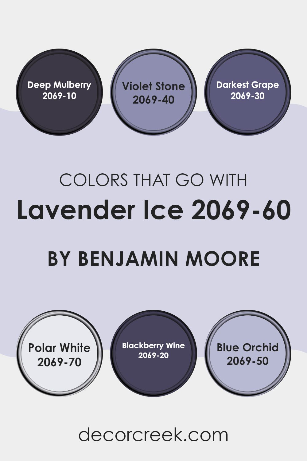
Colors that Go With Lavender Ice 2069-60 by Benjamin Moore
Choosing colors that complement Lavender Ice 2069-60 by Benjamin Moore is essential for creating a harmonious room that feels cohesive and pleasing to the eye. When paired thoughtfully, these colors enhance the beauty of Lavender Ice, a delicate hue, while bringing their own charm to the overall design.
Take Deep Mulberry 2069-10, which offers a deeply saturated tone that contrasts nicely with the lightness of Lavender Ice, adding depth and interest to the room. Similarly, Violet Stone 2069-40 has a rich vibe with gentle purple undertones that create a subtle connection to Lavender Ice. On the darker end, Darkest Grape 2069-30 provides a bold and dramatic effect, ensuring that the room feels grounded yet vibrant.
For a stark contrast, Polar White 2069-70 is a crisp, clean shade that makes Lavender Ice stand out and brings a refreshing burst of brightness. Another great companion is Blackberry Wine 2069-20, which has a lush, berry-like tone that echoes warmth and coziness, pairing beautifully with the cooler lavender. Lastly, Blue Orchid 2069-50 introduces a softer yet lively blue that adds a unique twist and additional layer of calmness to rooms featuring Lavender Ice. Together, these colors create a palette that allows for adaptable styling options, from calm and restful to dynamic and striking.
You can see recommended paint colors below:
- 2069-10 Deep Mulberry
- 2069-40 Violet Stone
- 2069-30 Darkest Grape
- 2069-70 Polar White
- 2069-20 Blackberry Wine
- 2069-50 Blue Orchid
How to Use Lavender Ice 2069-60 by Benjamin Moore In Your Home?
Lavender Ice 2069-60 by Benjamin Moore is a gentle, soft purple paint color that can add a light and airy feel to any room in your home. It’s perfect for creating a soothing atmosphere in rooms like bedrooms and bathrooms, where a calming effect is often desired. The color’s subtle tone makes it easy to pair with various decor styles, from modern to traditional.
When using Lavender Ice in your home, consider applying it as a main wall color in smaller rooms to make them appear larger and brighter. In larger rooms, such as living rooms, this paint can be used on an accent wall to add a pop of color without overpowering the area. This shade also works beautifully in children’s rooms, giving a playful yet soft backdrop that pairs well with many different colors and accessories.
To complement Lavender Ice, consider neutral furniture and textiles. Adding elements in white, beige, or light gray can keep the overall look fresh and inviting. For a touch of warmth, incorporate natural wood tones in your furniture or flooring.
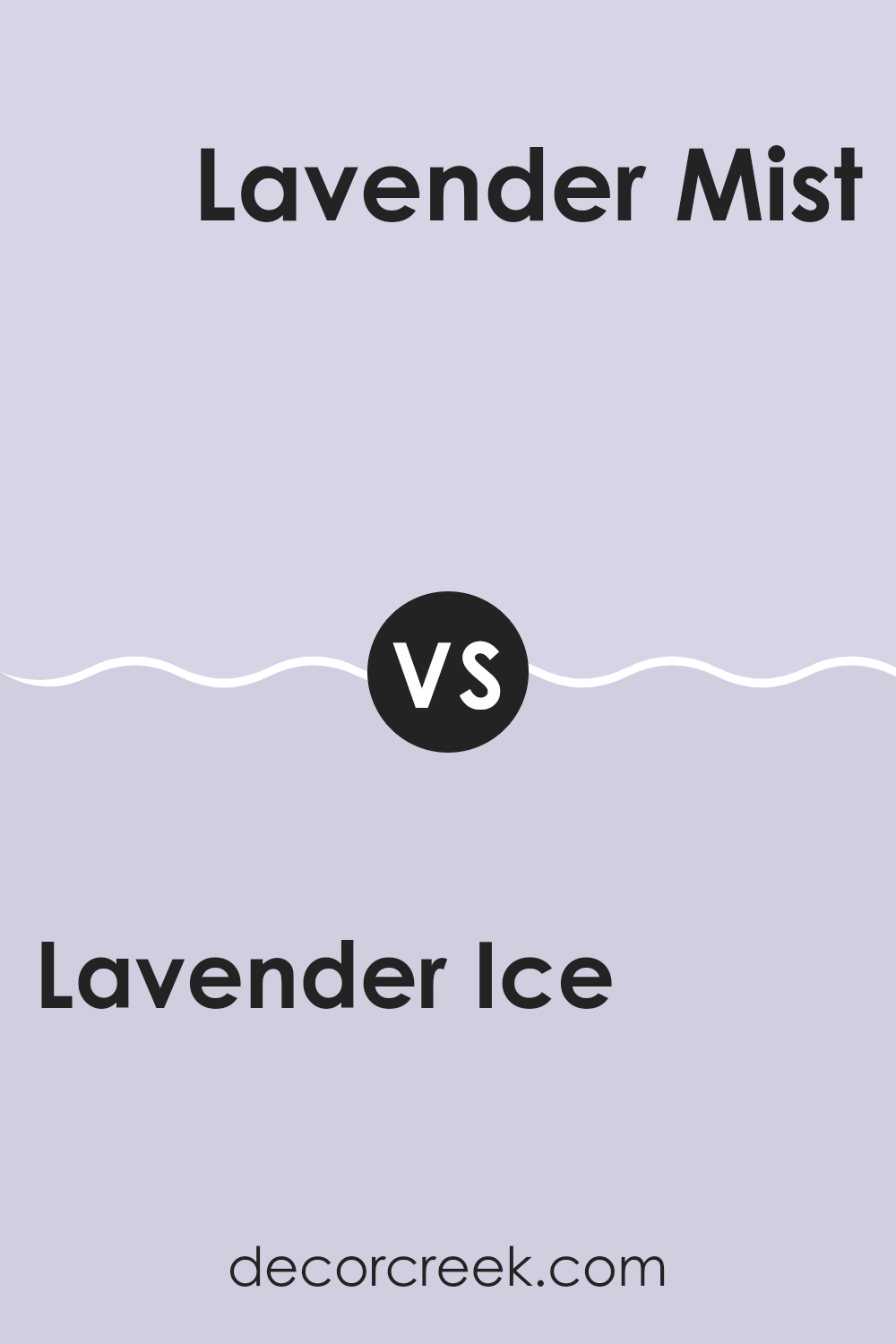
Lavender Ice 2069-60 by Benjamin Moore vs Lavender Mist 2070-60 by Benjamin Moore
Lavender Ice 2069-60 and Lavender Mist 2070-60 by Benjamin Moore are both soothing lavender hues, but they have subtle differences that can affect the mood of a room. Lavender Ice has a slightly cooler tone, lending a fresh and calming feel to rooms.
It’s a great choice if you want a room that feels airy and light. Lavender Mist, on the other hand, has a hint more warmth in its color. This makes it feel a bit cozier and more inviting than Lavender Ice. Both colors work well in rooms meant for relaxation such as bedrooms and bathrooms.
Depending on your decor and the amount of natural light in your room, one may suit your room better than the other. Lavender Ice could be more refreshing in a well-lit kitchen, while Lavender Mist might make a living room feel snug.
You can see recommended paint color below:
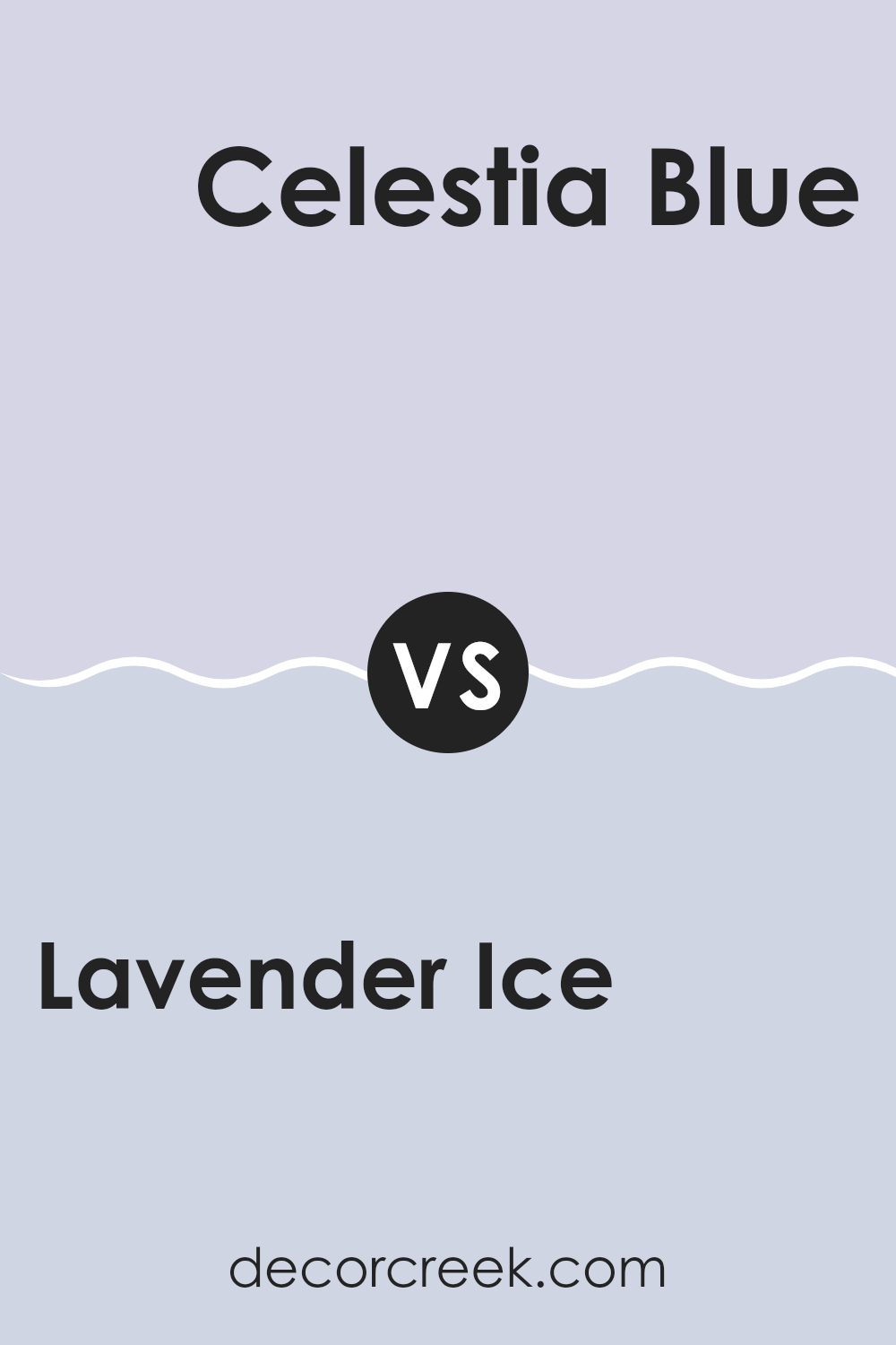
Lavender Ice 2069-60 by Benjamin Moore vs Celestia Blue 1429 by Benjamin Moore
Lavender Ice is a pale, soft lavender hue that adds a gentle touch to any room, making it feel light and airy. It has a subtle hint of pink which warms up the coolness typically associated with lavender, providing a welcoming atmosphere.
On the other hand, Celestia Blue is a soothing shade of soft blue with a grayish tint, creating a calm and cooling presence. This color is reminiscent of a clear sky on a sunny day and can make a room feel more spacious and open.
Both colors, while distinct, offer their unique way of brightening a room. Lavender Ice leans toward a youthful and tender look, whereas Celestia Blue offers a sense of mature calmness. They could complement each other well in a setting that aims for a balance between warmth and coolness. Either color would work nicely in bedrooms or living rooms where a relaxed environment is desired.
You can see recommended paint color below:
Lavender Ice 2069-60 by Benjamin Moore vs Iced Lavender 1410 by Benjamin Moore
Lavender Ice and Iced Lavender by Benjamin Moore are both soft, soothing colors, but they have subtle differences that set them apart. Lavender Ice has a lighter, almost airy feel to it, making it great for creating a relaxed, peaceful atmosphere in rooms like bedrooms or bathrooms. It leans a bit more toward a very pale, neutral lavender tone, which is adaptable and easy to match with various decor styles.
On the other hand, Iced Lavender is slightly deeper and has a hint more saturation, giving it a richer presence. This quality makes it superb for areas where you want a hint of color while maintaining a gentle, calming vibe. It can add a touch more personality to a room without overpowering it, ideal for accent walls or pairings with darker furniture.
Both colors share a lavender base, but the choice between them depends on how subtle or pronounced you want the color effect to be in your room.
You can see recommended paint color below:
- 1410 Iced Lavender
Lavender Ice 2069-60 by Benjamin Moore vs Spring Iris 1402 by Benjamin Moore
Lavender Ice and Spring Iris, both by Benjamin Moore, showcase different hues that can significantly affect the mood and style of a room. Lavender Ice is a soft, muted lavender shade with a subtle hint of gray. Its light tone makes it ideal for creating a gentle and calming atmosphere, perfect for relaxing rooms like bedrooms or quiet seating areas.
On the other hand, Spring Iris is a more intense purple with blue undertones. This color has a richer and bolder appearance, making it perfect for adding a splash of vibrancy to any room. It works well in rooms where you want to make a statement or add a touch of drama, such as dining areas or entryways.
Choosing between them depends on the desired impact: Lavender Ice for a soft, gentle vibe, or Spring Iris for a more dynamic and lively feel. Both colors offer their unique charm and can beautifully enhance the overall look of a home.
You can see recommended paint color below:
In conclusion, after looking at the paint color 2069-60 Lavender Ice from Benjamin Moore, I’ve shared lots of thoughts on how it looks and feels. This paint color is soft and gentle, reminding me of the light purple shades of early morning skies. It’s perfect for anyone wanting to make their room feel calm and welcoming.
Whether you’re painting a bedroom or a cozy corner in your living room, Lavender Ice brings a warmth that makes any area more inviting. From what I’ve learned, using this color can also make small rooms appear bigger, which is a nice bonus.
For anyone thinking of adding a new color to their home, Lavender Ice could be a beautiful choice. It’s pretty without being too bright, making it easy to match with other colors and decorations. Overall, Benjamin Moore’s Lavender Ice offers a lovely option for bringing a fresh, peaceful look to your home, without making things too complicated or bold.

Ever wished paint sampling was as easy as sticking a sticker? Guess what? Now it is! Discover Samplize's unique Peel & Stick samples.
Get paint samples

