Color is not merely a visual experience but a crucial element in design, often setting the tone for a space and influencing our perceptions. A particular shade can evoke emotions, create illusions of space, or offer a glimpse into the personality of a home.
Spring Iris 1402 is one such hue that deserves attention for its versatile character and aesthetic flexibility in interior design.
What Color Is Spring Iris 1402?
Spring Iris 1402, a unique paint color by Benjamin Moore, embodies the refreshing essence of a garden in bloom. This hue presents a soft, muted shade that seems to float between lavender and blue, imbued with a subtle gray tone that adds a sophisticated touch.
In terms of interior styles, Spring Iris 1402 shines in spaces that aim for a calming and serene atmosphere, such as Scandinavian and modern minimalist designs. It pairs exquisitely with natural materials like light woods and stone, while fabrics such as linen and cotton in similar cool hues can complement its tranquil vibe.
Ever wished paint sampling was as easy as sticking a sticker? Guess what? Now it is! Discover Samplize's unique Peel & Stick samples.
Get paint samples

Is It a Warm Or Cool Color?
Spring Iris 1402 leans comfortably into the category of cool colors. Its blue and lavender notes give it a crisp freshness, while the gray undertones offer a grounding effect. The cool nature of Spring Iris 1402 means it can have a calming and soothing impact in homes, making spaces appear more open and airy. When applied in interior design, this color can create an illusion of expansiveness, ideal for smaller rooms or areas with limited natural light.
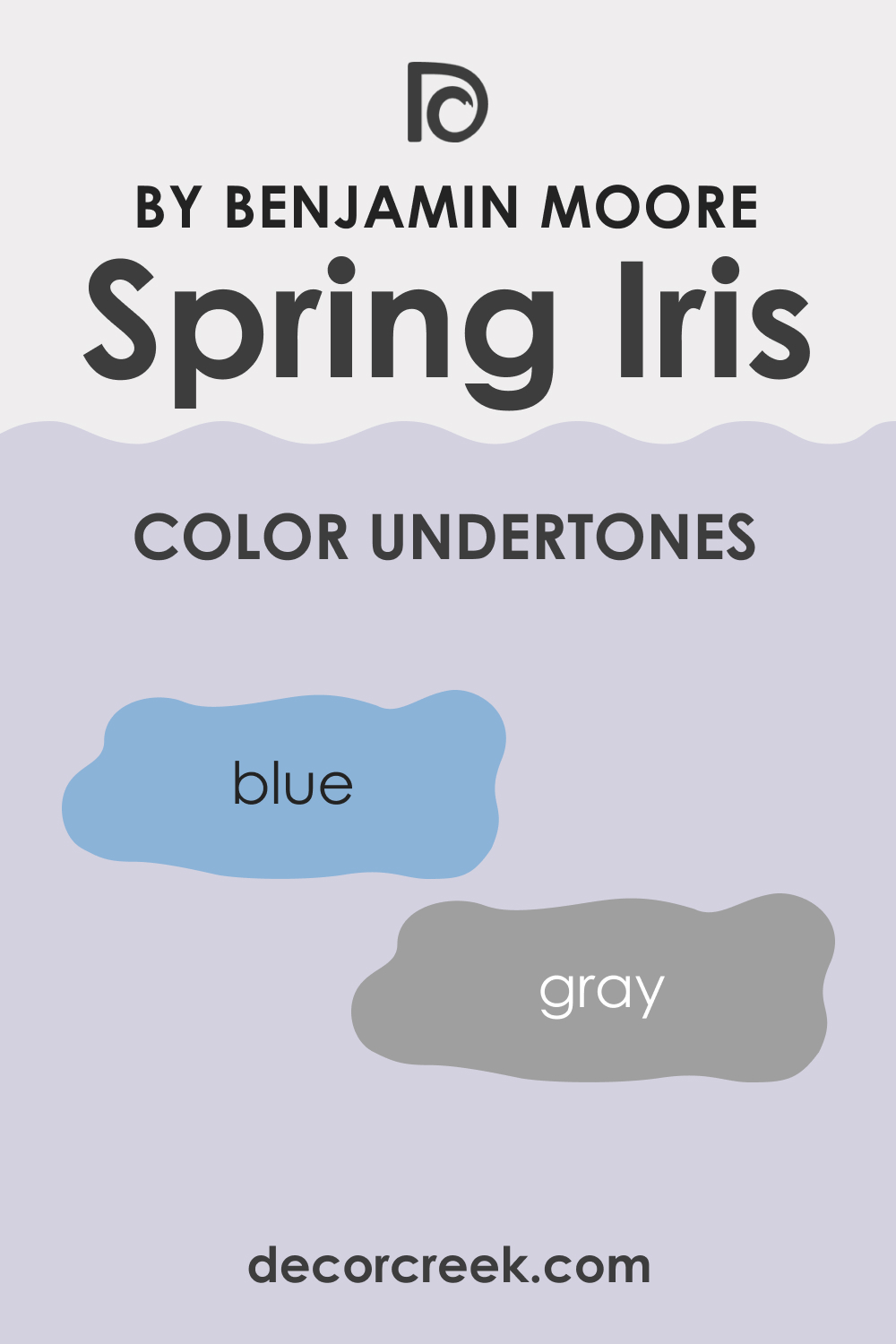
Undertones of Spring Iris 1402
The undertones of a color are like the secret ingredients that define its true essence. For Spring Iris 1402, these are subtle yet significant hints of blue and gray. Undertones can affect how we perceive color, with Spring Iris 1402 sometimes reflecting more of its lavender aspect and other times revealing a cooler, more muted appearance, depending on the lighting and surrounding colors.
On interior walls, these undertones can bring a dynamic quality, shifting and playing with the light throughout the day.
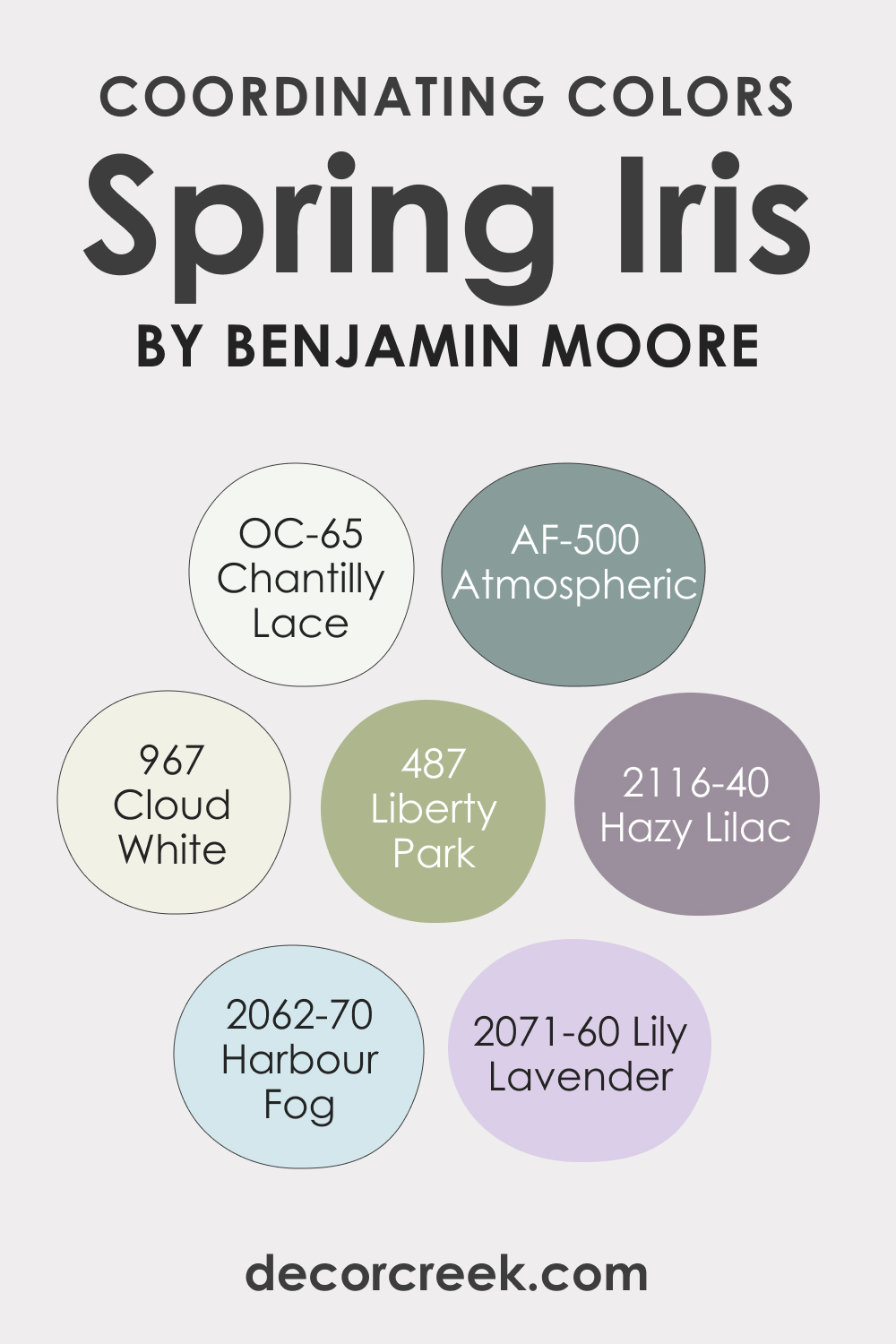
Coordinating Colors of Spring Iris 1402
Coordinating colors are hues that harmonize on the color wheel, enhancing the primary paint selection while creating a cohesive look. Spring Iris 1402 has a range of coordinating colors, including:
- BM OC-31 Cloud White: A soft, airy white that can brighten and lift the muted tones of Spring Iris 1402.
- BM 487 Liberty Park: A deep, rich green that contrasts elegantly with Spring Iris 1402, grounding the space.
- OC-65 Chantilly Lace: A crisp, clean white with a slightly warmer undertone that offers a smooth transition from walls to trim.
- BM 2116-40 Hazy Lilac: A more pronounced lavender that resonates with Spring Iris 1402, providing a layered monochromatic scheme.
Adding to these are three additional colors that harmonize beautifully with Spring Iris 1402:
- AF-500 Atmospheric: An airy blue that complements the coolness of Spring Iris.
- BM 2062-70 Harbour Fog: A pale, serene blue with a tranquil presence.
- BM 2071-60 Lily Lavender: A light lavender that echoes the floral essence of Spring Iris.
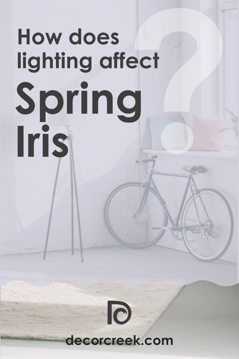
How Does Lighting Affect Spring Iris 1402?
Lighting can dramatically alter the appearance of colors. Spring Iris 1402, with its mid-range LRV, responds distinctively to different light sources. In natural light, the color can shift throughout the day; a soft blue in the morning light, transitioning to a more pronounced lavender as the sun sets.
Artificial light brings out its gray undertones, providing a more consistent hue but potentially muting its vibrancy. In north-facing rooms, it may appear cooler and more subdued, while in south-facing rooms, it becomes slightly warmer. East and west-facing rooms will see a play of shadows that highlight the complexity of Spring Iris 1402’s undertones.
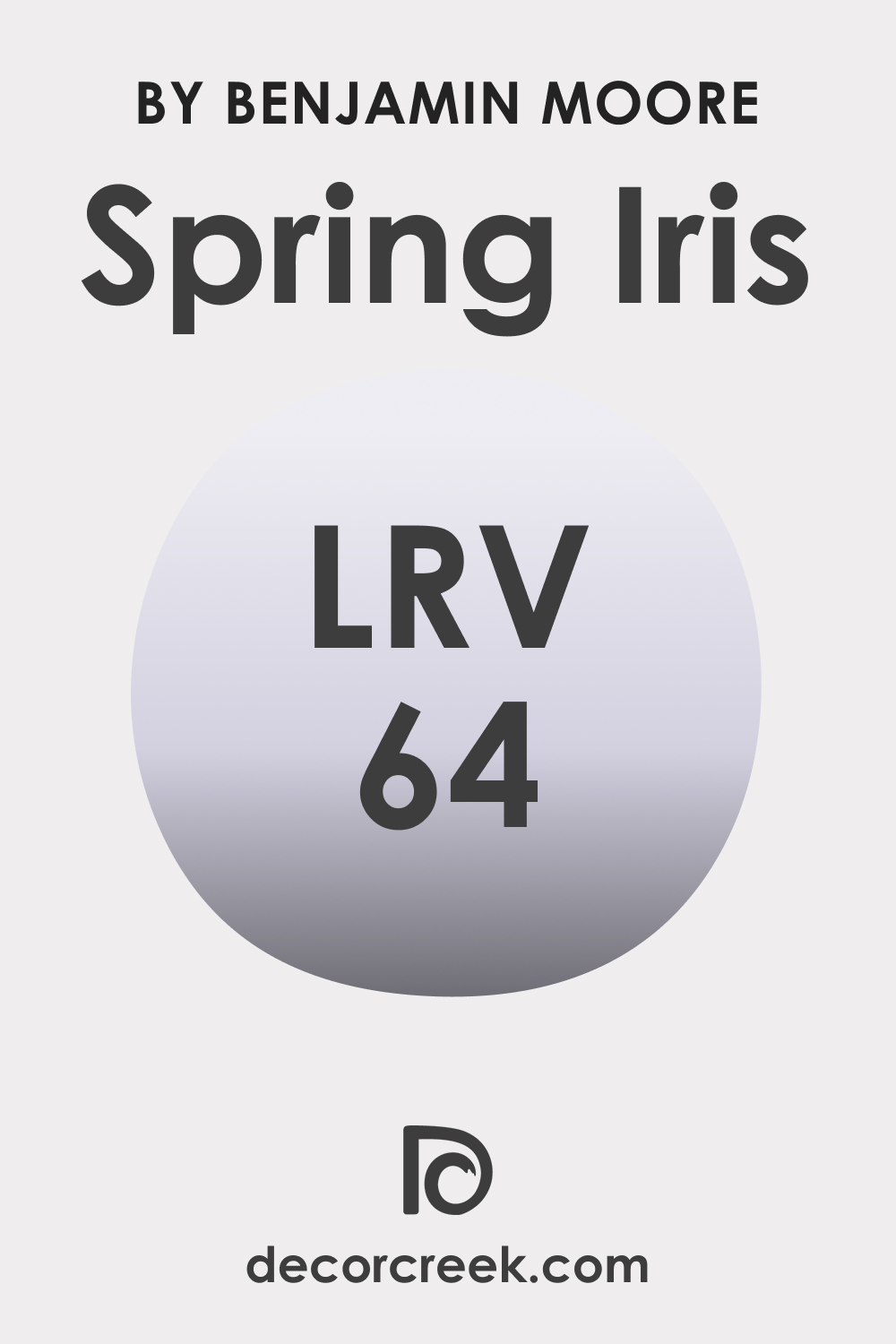
LRV of Spring Iris 1402
LRV, or Light Reflectance Value, is a scale that measures the percentage of light a paint color reflects. With an LRV of 64, Spring Iris 1402 is considered a mid-tone color. It has the capacity to reflect a significant amount of light, without being overwhelmingly bright, making it versatile for various lighting conditions.
This particular LRV makes Spring Iris 1402 a color that can maintain its integrity without being washed out by natural light, nor too imposing in dimmer, artificially lit areas.
LRV – what does it mean? Read This Before Finding Your Perfect Paint Color
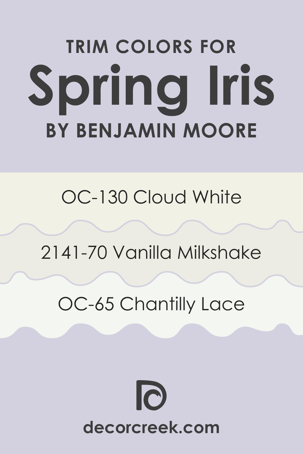
Trim Colors of Spring Iris 1402
Trim colors are essential in interior design as they define and frame the walls, impacting the room’s overall aesthetics. For Spring Iris 1402, shades of white make ideal trim colors, such as:
- OC-130 Cloud White: Offering a subtle contrast with a soft, warm tone.
- OC-65 Chantilly Lace: Providing a sharp, clean edge to the softer Spring Iris 1402.
- BM 2141-70 Vanilla Milkshake: A creamy white that softens the transition between the wall and trim, enriching the room’s ambiance.
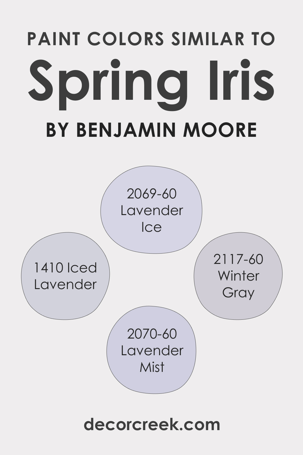
Colors Similar to Spring Iris 1402
Identifying colors similar to Spring Iris 1402 is crucial for creating a cohesive color scheme within a home. For a color similar to Whispering Wind 1416, consider these Benjamin Moore shades:
- BM 2069-60 Lavender Ice: A soft lavender with a cool undertone that provides a light and airy feel.
- BM 2070-60 Lavender Mist: This color offers a slightly more saturated hue, giving depth while maintaining the calmness of a lavender shade.
- BM 1410 Iced Lavender: It’s a muted lavender that delivers a sense of tranquility to any space.
- BM 2117-60 Winter Gray: A cool gray with a hint of lavender, echoing the subtlety of Spring Iris 1402.
Each color presents a variation of the original, allowing for a harmonious palette that can be used throughout different rooms or features.
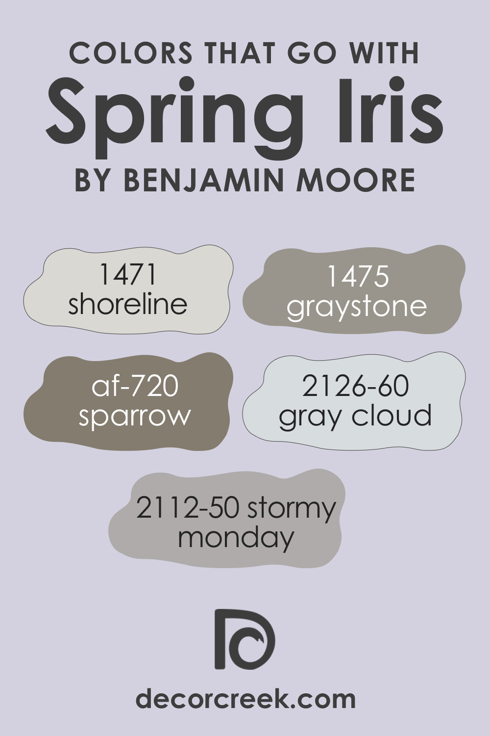
Colors That Go With Spring Iris 1402
Using complementary colors ensures a balanced and appealing interior design. Colors by Benjamin Moore that go well with Spring Iris 1402 include:
- BM 1471 Shoreline: A neutral beige that supports the cool tones of Spring Iris without overwhelming it.
- BM 2126-60 Gray Cloud: An off-white with a neutral base, providing a soft backdrop for furnishings.
- BM 1475 Graystone: A medium gray that adds a contemporary contrast to Spring Iris 1402.
- AF 720 Sparrow: A rich, warm gray-brown that provides an earthy counterbalance to the cool hue.
- BM 2112-50 Stormy Monday: A deeper gray that can create a sophisticated, modern look when paired with Spring Iris 1402.
Each of these colors complements Spring Iris 1402 without competing for attention, allowing for a design that’s cohesive and thoughtfully layered.
How to Use Spring Iris 1402 In Your Home?
Spring Iris 1402 offers a versatile palette for various rooms, thriving in spaces that benefit from a calm and serene atmosphere. Its muted lavender-blue shade fits perfectly within bedrooms and bathrooms, creating a tranquil retreat. In living areas, it pairs well with natural light, enhancing modern and minimalist designs while also being a sophisticated backdrop in a traditional setting. This hue can be confidently used in a kitchen, whether on walls or cabinets, adding a unique and subtle character.
For exteriors, Spring Iris 1402 stands out as an elegant choice, especially for front doors or accents, complementing natural stone or brick with its soft yet inviting allure.
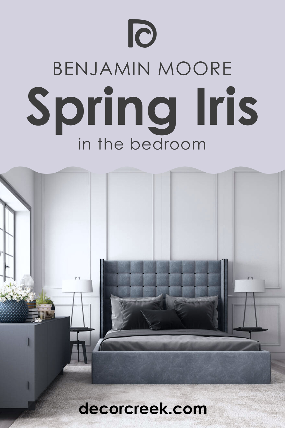
How to Use Spring Iris 1402 in the Bedroom?
In the bedroom, Spring Iris 1402 acts as a tranquil backdrop for rest and rejuvenation. This color can be applied on all walls for a cocooning effect or used on a feature wall to create a focal point behind the bed. Its soothing tones pair well with crisp white bedding and natural wood furniture, adhering to a minimalist aesthetic.
For a more romantic and traditional style, combine it with floral patterns and soft, flowing fabrics to enhance its gentle nature. Spring Iris 1402’s calming effect makes it ideal for creating a peaceful sanctuary in any bedroom.
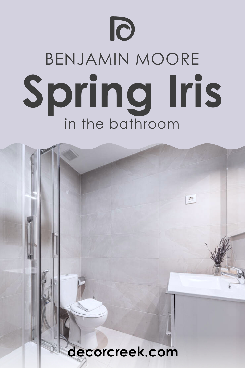
How to Use Spring Iris 1402 in the Bathroom?
Spring Iris 1402 transforms a bathroom into a spa-like oasis. Utilize it on walls to create a serene and uplifting space that enhances natural light. It complements white fixtures and marble countertops exquisitely, offering a contrast that is both striking and harmonious.
For added texture, incorporate towels and mats in coordinating colors like soft grays or muted greens. Accessories in silver or glass can add a touch of elegance, ensuring Spring Iris 1402 not only calms but also elevates the bathroom environment.
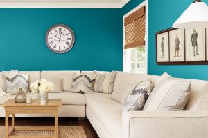
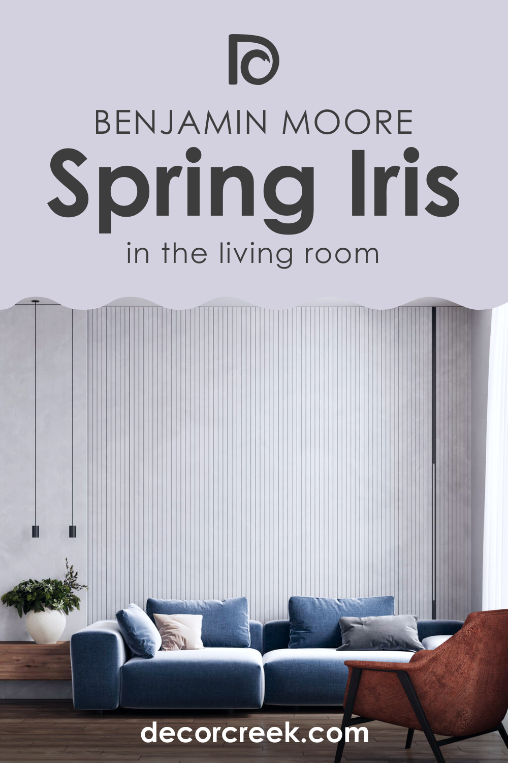
How to Use Spring Iris 1402 in the Living Room?
In a living room, Spring Iris 1402 can create a serene and welcoming environment. As a wall color, it offers a neutral yet distinctive backdrop for art and can make the space feel more open and airy. It suits a modern decor scheme when paired with sleek furniture and metal accents or a bohemian style with rich textures and layered fabrics. For a traditional living room, Spring Iris 1402 works well with dark woods and classic patterns, providing a contemporary twist to timeless designs.
How to Use Spring Iris 1402 for an Exterior?
Spring Iris 1402 isn’t just for interiors; it can also be a distinctive choice for exterior use. Consider it for doors or shutters to bring a pop of color to a neutral facade. This shade harmonizes beautifully with natural elements like stone or brick and stands out against the greenery of a landscape.
For a cohesive look, pair it with trim colors in white or light gray. In full sunlight, Spring Iris 1402 appears lively and welcoming, making it a stylish statement for any home exterior.

How to Use Spring Iris 1402 in the Kitchen?
In the kitchen, Spring Iris 1402 can bring a fresh and airy feel to the heart of the home. It’s a delightful color for walls, especially in a kitchen with ample natural light. Pair it with countertops and backsplashes in light neutrals or cool marbles to maintain a clean and open atmosphere. Accentuate with brushed nickel or chrome hardware for a modern touch.
This color is especially effective in a space with open shelving or glass-front cabinets, where it can serve as a subtle backdrop to displayed dishware and decor.

How to Use Spring Iris 1402 on Kitchen Cabinets?
For a unique and modern twist, Spring Iris 1402 can be used on kitchen cabinets. This soft hue offers a refreshing alternative to traditional white or wood finishes. It pairs wonderfully with brushed gold or silver hardware, bringing out its subtle undertones. In a kitchen with limited natural light, Spring Iris 1402 cabinets can help to brighten the space.
Balance the look with neutral walls and countertops, or for a bold statement, contrast it with dark granite or wooden counters. This approach injects personality and modern charm into the kitchen.

Comparing Spring Iris 1402 With Other Colors
Comparing different colors is important to understand their individual character and how they influence mood and space. It highlights contrasts in hues and undertones, which is critical when creating a color scheme for harmonious interiors.
Spring Iris 1402 stands out as a versatile color, but comparing it with other colors can define its role as either a primary color or an accent within a palette, ensuring it complements other colors and contributes to the desired atmosphere.
Spring Iris 1402 vs. BM 1407 Mauve Bauhaus
While Spring Iris 1402 is a soft, tranquil lavender blue, BM 1407 Mauve Bauhaus leans towards a richer, warmer mauve with a hint of gray. Mauve Bauhaus brings a more traditional and sophisticated feel, offering depth and warmth that can make spaces feel more enclosed and intimate compared to the breezier and more expansive feel of Spring Iris 1402. The latter’s cooler undertones provide a modern edge suitable for creating a restful environment, contrasting with the cozy ambiance that Mauve Bauhaus can inspire.
Spring Iris 1402 vs. BM 1406 Purple Heart
Spring Iris 1402, with its subdued and airy feel, differs significantly from BM 1406 Purple Heart, which boasts a deeper and more saturated purple hue. Purple Heart exudes boldness and luxury, making a statement in a space that Spring Iris 1402 would fill with tranquility and lightness. Purple Heart can shrink the perception of space with its intensity, while Spring Iris 1402 is likely to expand it, making it a better choice for smaller, light-filled rooms.
Spring Iris 1402 vs. BM 1418 Oriental Iris
BM 1418 Oriental Iris presents a more dramatic and exotic appeal with its deep, intense tones compared to the softness of Spring Iris 1402. Oriental Iris can act as a stunning accent color, while Spring Iris 1402 works beautifully as a main wall color due to its lightness. The vividness of Oriental Iris can create a focal point, whereas Spring Iris 1402 serves as a serene backdrop, suitable for spaces that seek to evoke calmness and relaxation.
Spring Iris 1402 vs. BM 1405 Snugglepuss
BM 1405 Snugglepuss is a warm, muted pink that offers a contrasting approach to the coolness of Spring Iris 1402. Snugglepuss, with its cozy and inviting nature, is ideal for creating intimate and nurturing spaces, while Spring Iris 1402 has a refreshing clarity that can open up a room. The former can complement wooden textures and golden accents, whereas Spring Iris 1402 pairs well with sleek metals and glass for a more contemporary vibe.
Spring Iris 1402 vs. BM 1404 Crocus
BM 1404 Crocus has a yellow undertone, giving it a sunnier disposition that contrasts with the cooler, more contemplative Spring Iris 1402. Crocus can infuse energy and cheerfulness into a space, which can be quite stimulating, while Spring Iris 1402 maintains an atmosphere of serene sophistication. In terms of application, Crocus may be more suited to social and active spaces, whereas Spring Iris 1402 is ideal for areas meant for rest and calm.
Spring Iris 1402 vs. BM 1403 French Lilac
Spring Iris 1402 is paler and less saturated than BM 1403 French Lilac, which has a more pronounced purple hue and brings a vintage feel to interiors. French Lilac, reminiscent of traditional florals, is well-suited for spaces with antique decor and rich textures, while Spring Iris 1402 fits seamlessly into modern and minimalistic designs with its understated elegance.
Conclusion
Comparing Spring Iris 1402 with a spectrum of other hues from Benjamin Moore’s palette accentuates its unique position as a color that imparts a sense of peace and space. It serves as a reminder of the complexity of color interactions and the varied effects they can have within a room, highlighting the importance of thoughtful color selection.
Whether seeking to create a statement or a subtle ambiance, understanding how Spring Iris 1402 measures up against other colors is key to making informed design choices that resonate with personal taste and the intended emotional impact of the space.

Ever wished paint sampling was as easy as sticking a sticker? Guess what? Now it is! Discover Samplize's unique Peel & Stick samples.
Get paint samples
Frequently Asked Questions
⭐What undertones does Spring Iris have?
Spring Iris possesses subtle cool undertones, with hints of lavender and gray, creating a soft and inviting atmosphere.
⭐Can Spring Iris be used in a living room?
Yes, its tranquil and soothing hue makes Spring Iris a great choice for living rooms, promoting a serene and welcoming environment.
⭐What is the best way to complement Spring Iris in a bedroom?
Pair it with light neutrals like creamy whites or soft greys for a relaxing and restful ambiance. Accents in silver or pale wood also work beautifully.
⭐How does natural light affect the color Spring Iris?
Natural light can enhance the lavender tones in Spring Iris, making it appear more vibrant during the day. In rooms with less light, its grey undertones become more pronounced.
⭐What trim color works best with Spring Iris?
Crisp whites such as Benjamin Moore's Chantilly Lace (OC-65) or Simply White (OC-117) are perfect for trim, offering a clean contrast that highlights Spring Iris's depth.
⭐ Is Spring Iris suitable for small spaces?
Absolutely. Its light and airy vibe can make small spaces appear larger and more open, especially when paired with good lighting and minimal decor.
⭐Can Spring Iris be used in a bathroom?
Definitely. Its soothing qualities make it an excellent choice for creating a spa-like retreat in bathrooms. Pair with soft towels and natural accents for a complete look.