Colors have the power to transform spaces, influence our moods, and even define entire generations. Among the vast spectrum of hues, Celestia Blue 1429 stands out as a captivating and versatile choice for interiors.

What Color Is Celestia Blue 1429?
Emanating both depth and sophistication, Celestia Blue 1429 is reminiscent of a serene sky just before twilight. The delicate interplay of blue with hints of grey makes it a remarkable choice for those seeking tranquility and elegance. Best suited for contemporary and minimalist interior styles, this hue beautifully complements metallic accents, glass textures, and light wood finishes.

Ever wished paint sampling was as easy as sticking a sticker? Guess what? Now it is! Discover Samplize's unique Peel & Stick samples.
Get paint samples

Is It a Warm Or Cool Color?
Celestia Blue 1429 leans more towards the cool spectrum, bestowing a calm and composed ambiance. This cool nature allows it to create a peaceful setting in homes, especially when paired with similar cool-toned furnishings and accents.
Undertones of Celestia Blue 1429
Every color carries undertones, subtle shades that influence its overall appearance. Celestia Blue 1429 possesses gentle grey undertones, lending it a muted sophistication.
These undertones affect its visual depth, making it appear slightly muted in some lights and vibrant in others. When painted on interior walls, these undertones come to life, adding dimension and a dynamic appeal.
Coordinating Colors of Celestia Blue 1429
Coordinating colors enhance and complement the primary shade. For Celestia Blue 1429, its coordinators are:
- BM 869 Oxford White: A crisp, clean white with subtle undertones.
- OC-121 Mountain Peak White: A warm white reminiscent of fresh snow.
- BM 451 Pine Forest: A deep green that evokes dense woodlands.
- BM 2145-50 Limesicle: A vibrant lime that adds a pop of cheerfulness.
Three additional coordinating colors are:
- Moonlit Snow: A soft, creamy white.
- Emerald Whisper: A muted green with a hint of blue.
- Sunny Lime: A bright, refreshing shade of green.

How Does Lighting Affect Celestia Blue 1429?
Lighting plays a pivotal role in how we perceive colors. Celestia Blue 1429, under natural light, radiates a serene aura, especially during golden hours. In artificial lighting, depending on the type (warm or cool), it can either appear more vibrant or subdued.
In north-faced rooms, where the light is cooler, the blue undertones become prominent. South-faced rooms imbue it with a consistent, balanced appearance.
East-faced rooms during mornings can make it look lively, while west-faced rooms during evenings add a touch of warmth.

LRV of Celestia Blue 1429
LRV, or Light Reflectance Value, gauges how much light a color reflects. With an LRV of 66, Celestia Blue 1429 is moderately reflective, making spaces feel airy and spacious.
Its specific LRV means it has the versatility to be used in both smaller rooms without feeling constrictive and larger areas without overwhelming the space.

Trim Colors of Celestia Blue 1429
Trim colors serve to highlight and frame a room’s main color. For Celestia Blue 1429, soft shades of white from the same brand offer a seamless transition. Consider using these paint colors:
- BM 2126-70 Chalk White
- BM 869 Oxford White
- OC-121 Mountain Peak White
- BM 912 Linen White
for an elegant finish.

Colors Similar to Celestia Blue 1429
Understanding similar colors aids in achieving a harmonious design. Comparable hues to Senora Gray 1530 include:
- BM 1416 Whispering Wind: A gentle hue with lavender undertones.
- BM 1415 Lavender Secret: A muted lavender offering warmth.
- BM 1410 Iced Lavender: A cooler tone, almost ethereal.
- BM 1417 English Hyacinth: A deeper shade with hints of blue.

Colors That Go With Celestia Blue 1429
Pairing colors that complement each other ensures aesthetic fluidity. Benjamin Moore offers a myriad of colors that align beautifully with Celestia Blue 1429. Consider the following options:
- BM 2015-40 Peach Sorbet for a warm contrast,
- BM 547 Mint Julep for a refreshing feel,
- BM 1446 Dusky Dawn to maintain cool tones,
- BM 2152-50 Golden Straw for a sunny touch,
- BM 2010-60 Rose Petal for a soft, romantic ambiance.
Each hue, in its unique way, elevates the elegance of Celestia Blue 1429.

How to Use Celestia Blue 1429 In Your Home
Celestia Blue 1429’s versatility means it can be employed in various rooms, from serene bedrooms to vibrant living areas. Its subtle elegance fits seamlessly into contemporary, minimalist, coastal, and Scandinavian designs.
It can create an expansive feel in smaller spaces like bathrooms and cozy atmospheres in larger rooms such as living or dining areas. Its adaptability makes it a top choice for homeowners aiming for both style and comfort.
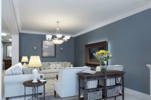
How to Use Celestia Blue 1429 in the Bedroom
The calmness of Celestia Blue 1429 makes it perfect for bedrooms, evoking feelings of tranquility and relaxation. Paired with soft whites or light wooden furnishings, it can create a haven for rest. Complement with muted gold or silver accents to introduce a touch of luxury, crafting a serene retreat.

How to Use Celestia Blue 1429 in the Bathroom
In bathrooms, Celestia Blue 1429 can mimic the soothing qualities of spa-like environments. Its cool undertones work well with white tiles, marble countertops, and silver fixtures. Paired with lush green plants and soft lighting, it transforms any bathroom into an oasis of calm.

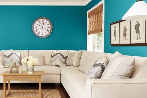
How to Use Celestia Blue 1429 in the Living Room
Celestia Blue 1429 in a living room sets a welcoming tone. Its serene hue can be paired with neutral-toned sofas and light wood coffee tables for a minimalist look.
Adding vibrant throw pillows or art can introduce contrast, while soft draperies in complementary colors can elevate the overall aesthetic.

How to Use Celestia Blue 1429 for an Exterior
For exteriors, Celestia Blue 1429 provides a fresh, modern touch. It beautifully contrasts with white trims, giving homes a coastal or cottage feel. This shade can also be paired with stone pathways or wooden deck furnishings, blending nature with architectural finesse.

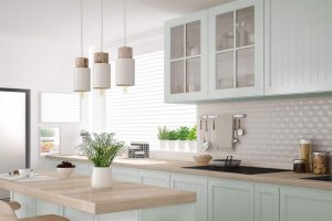
How to Use Celestia Blue 1429 in the Kitchen
In kitchens, Celestia Blue 1429 is a refreshing backdrop. It works harmoniously with stainless steel appliances, white countertops, and natural wooden elements. Using this hue on walls can offset brighter tones in kitchenware or backsplash tiles, creating a balanced culinary space.

How to Use Celestia Blue 1429 for the Kitchen Cabinets
Using Celestia Blue 1429 for kitchen cabinets introduces a contemporary twist. It offers a cool counterpoint to warm wooden countertops or bright tiles. Combined with gold or brass handles, these cabinets can become a stylish focal point, elevating the kitchen’s entire ambiance.
Comparing Celestia Blue 1429 With Other Colors
Comparing colors is vital in the realm of interior design, allowing homeowners and designers to visualize how hues interact and contrast. The interplay between different colors can either create harmony or bring attention to specific areas.
By contrasting Celestia Blue 1429 with other shades, one can determine its adaptability, complementary potential, and how it might serve as a backdrop or standout feature in various settings.
Celestia Blue 1429 vs. BM 2069-70 Polar White
Celestia Blue 1429 and Polar White stand on opposite ends of the spectrum. While Celestia Blue offers depth and serenity, Polar White brings forth purity and simplicity. Together, they create a classic contrast, with the white accentuating the rich undertones of the blue.

Celestia Blue 1429 vs. BM 1430 Spring Flowers
Spring Flowers is a lively and cheerful hue. When juxtaposed with the calmness of Celestia Blue, it introduces an energetic burst, making spaces feel invigorated while still anchored by the grounding presence of the blue.

Celestia Blue 1429 vs. BM 1432 Freesia
Freesia’s subtle warmth and floral undertones present a delightful counter to Celestia Blue. The interplay between the two hues can curate a space reminiscent of a blooming garden at dusk, full of contrast yet harmonious.

Celestia Blue 1429 vs. BM 2069-20 Blackberry Wine
Blackberry Wine is a deep, intoxicating shade. Its richness, when paired with Celestia Blue, offers an elegant palette, imbued with sophistication and depth. Spaces featuring these two colors evoke a sense of luxury and opulence.

Celestia Blue 1429 vs. BM 1434 In the Twilight
In the Twilight, as its name suggests, shares some nocturnal elements with Celestia Blue. However, its slightly more muted undertones serve as a softer companion, creating spaces that are both tranquil and layered in their color interplay.

Celestia Blue 1429 vs. BM 1433 Blue Pearl
Blue Pearl is a shimmering, lustrous shade. Its brilliance highlights the depth of Celestia Blue, making for a palette that feels both maritime and contemporary. The combination is reminiscent of deep oceans meeting sunlit waves.

Conclusion
The beauty of Celestia Blue 1429 is magnified when juxtaposed with other hues. Its versatility shines, whether contrasting with brighter shades or complementing deeper tones.
Understanding these comparisons not only underscores the adaptability of Celestia Blue but also provides insights into crafting interiors that resonate with emotion, depth, and purpose.
When chosen thoughtfully, colors become more than just paint on a wall; they transform spaces into experiences.

Ever wished paint sampling was as easy as sticking a sticker? Guess what? Now it is! Discover Samplize's unique Peel & Stick samples.
Get paint samples
Frequently Asked Questions
⭐What is the LRV of Celestia Blue 1429?
The LRV (Light Reflectance Value) of Celestia Blue 1429 is 66. This value indicates that the color reflects a considerable amount of light, making it a moderately bright color suitable for a variety of spaces.
⭐Is Celestia Blue 1429 a warm or cool shade?
Celestia Blue 1429 leans towards the cool spectrum. Its serene blue undertones evoke feelings of tranquility and calmness, making it perfect for creating peaceful environments.
⭐What interior design styles work best with Celestia Blue 1429?
Celestia Blue 1429 is versatile and fits seamlessly into contemporary, minimalist, coastal, and Scandinavian designs. Its subtle elegance can complement various styles, from modern to traditional.
⭐Which trim colors complement Celestia Blue 1429?
Shades of white, especially from the same brand, work beautifully as trim colors with Celestia Blue 1429. Consider whites with subtle undertones to enhance and frame the blue effectively.
⭐Can Celestia Blue 1429 be used for exteriors?
Yes, Celestia Blue 1429 can be used for exteriors. Its refreshing hue provides a modern touch and contrasts well with white trims, offering a coastal or cottage feel to homes.