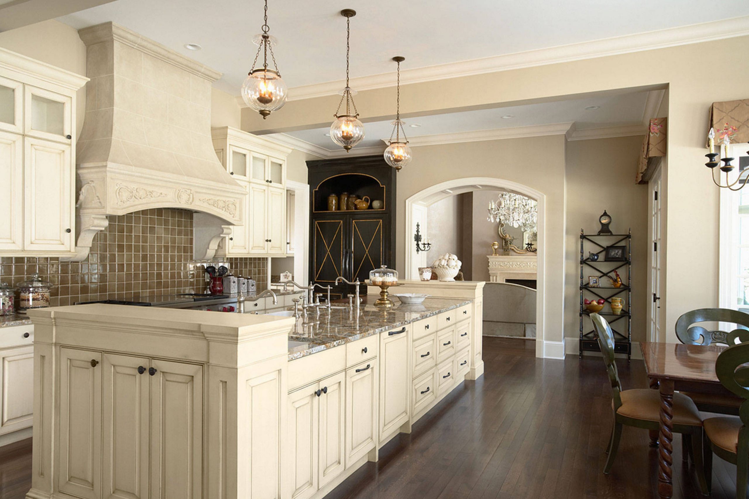
If you’re on the hunt for a paint color that radiates warmth and comfort, let me introduce you to SW 6142 Macadamia by Sherwin Williams. As I researched various shades to freshen up my living room, Macadamia stood out with its rich, creamy hue. This delightful beige adds a touch of understated elegance to any room, making it feel instantly more inviting.
With its adaptable nature, Macadamia seamlessly fits into a variety of decor styles, from rustic to contemporary. It works wonders in rooms that crave a cozy atmosphere without overpowering the senses.
The color pairs beautifully with both bold and subdued accents, making it easy for you to personalize your decor. Whether you’re revamping a single room or planning a full home makeover, Macadamia offers a solid foundation to build upon.
Throughout my own home improvement journey, I’ve found that choosing the right paint color makes a huge difference in setting the ambiance. Selecting SW 6142 Macadamia could be the perfect starting point for your project. So, why not consider this soothing beige to enhance your living environment? It could be just what you need to create that warm, welcoming vibe you’ve been seeking.
What Color Is Macadamia SW 6142 by Sherwin Williams?
The color Macadamia by Sherwin Williams is a warm, gentle beige that exudes a cozy and inviting atmosphere. This hue has the comforting feel of toasted nuts, offering a perfect balance of warmth without overpowering a room.
Its subtle natural undertones make it highly adaptable for various decorating styles, especially those that lean towards a rustic or cottage aesthetic. It can also fit beautifully into a modern farmhouse look or a traditional setting, providing a soft, neutral background that complements a range of decor.
When it comes to pairing materials, Macadamia goes wonderfully with natural wood, from light pine to rich, dark walnut. These combinations can enhance the warmth of the room, making it feel more welcoming.
Textiles like cotton and linen in creamy whites or soft pastels work well to maintain a light and airy feel. For a bit of contrast, you can introduce soft, plush textures such as velvet in darker shades like navy or charcoal, which add a lovely depth to the room.
Macadamia also provides a great backdrop for decorative elements. It harmonizes well with metals such as bronze, gold, and brushed nickel, bringing an understated elegance without making the room feel too flashy. This color is equally effective in living areas, bedrooms, or even kitchens, where it creates a calm, nurturing atmosphere.
Is Macadamia SW 6142 by Sherwin Williams Warm or Cool color?
Macadamia by Sherwin Williams is a warm, neutral color that creates a cozy and welcoming atmosphere in any home. This shade is perfect for living rooms and bedrooms, where comfort is key. Its undertones are a mix of soft beige and light brown, which make it adaptable for pairing with various decor styles and colors.
Whether your home features modern, minimalist furniture or more traditional pieces, Macadamia provides a subtle backdrop that complements wooden accents and bold colors alike. It works well in rooms with natural light, enhancing the room’s warmth, and also in less brightly lit areas, where it adds depth without making the room feel too enclosed.
Because it’s not overly bold, Macadamia is great for larger areas like open-floor living rooms, helping to tie different sections together harmoniously. This color is ideal for anyone looking to create a relaxed and inviting home atmosphere.
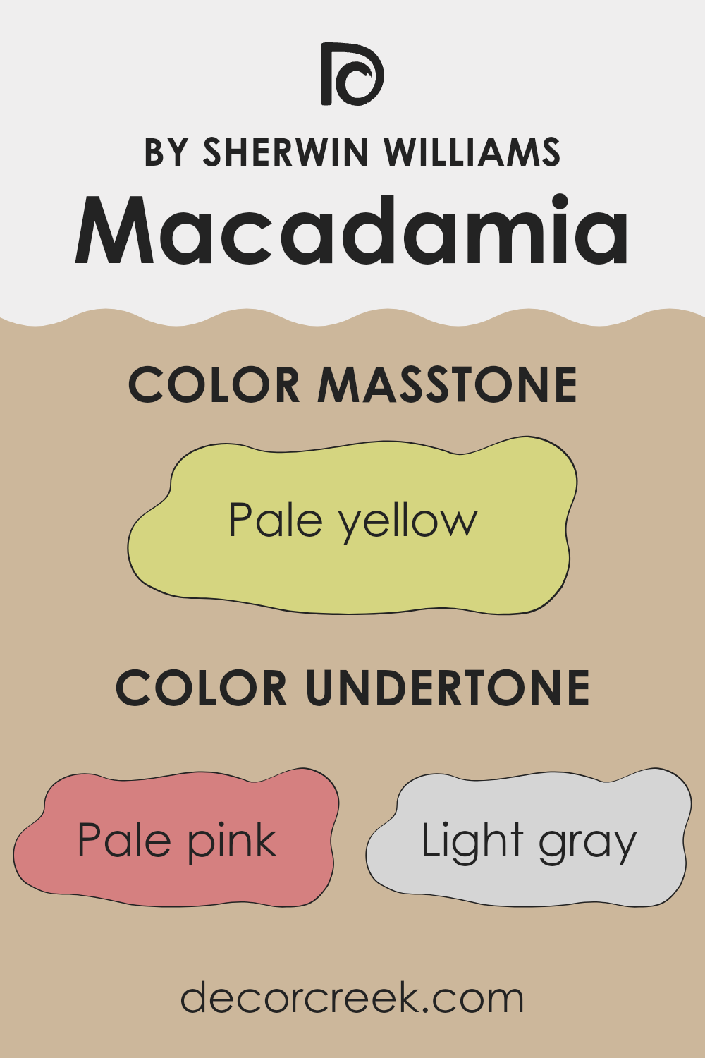
Undertones of Macadamia SW 6142 by Sherwin Williams
Macadamia is a popular paint color known for its warmth and adaptability. It can look significantly different depending on the lighting and surrounding colors because it harbors a diverse range of undertones. Understanding these undertones can help in predicting how the color will respond to various environments, making it easier to use effectively in home décor.
The undertones in Macadamia include shades like pale pink, light gray, and light purple, which can impart a soft, subtle richness to the paint. Mint, light blue, and lilac add a cool freshness that might pop under certain lighting conditions, giving the walls a dynamic appearance throughout the day.
Meanwhile, yellow and orange undertones bring a cozy warmth that can make a room feel more inviting. Light green and olive lend an earthy, natural vibe, which is great for rooms meant to feel relaxing and grounded.
When Macadamia is used on interior walls, these undertones play a crucial role in the color’s appearance. In a brightly lit room with plenty of natural light, the cooler undertones (like mint and light blue) might become more noticeable, giving the room a crisp look. In rooms with less natural light or during evening hours, the warmer undertones (like yellow and orange) may take the lead, creating a snug, welcoming atmosphere.
Therefore, choosing furniture and decorations that complement or contrast these undertones effectively can enhance the overall aesthetic of a room. For example, pairing Macadamia with soft blues can highlight its cooler undertones, while rich wooden furniture can emphasize its warmer qualities. Understanding these nuances allows for more intentional and harmonious interior design choices.
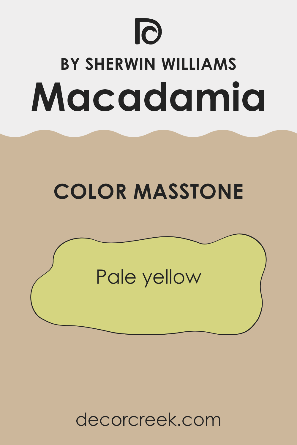
What is the Masstone of the Macadamia SW 6142 by Sherwin Williams?
Macadamia SW 6142 by Sherwin Williams has a masstone of pale yellow, which is a soft and comforting shade. This color works great in homes because it creates a light and airy feel. Its subtle hue doesn’t overpower a room but adds a touch of warmth and brightness, making rooms appear more welcoming and bigger.
This pale yellow shade works well in many parts of the house, especially in living rooms, kitchens, or bedrooms where you want a calm atmosphere but with a bit of cheerfulness. It’s also adaptable because it pairs easily with other colors, whether you’re going for a neutral palette or adding splashes of bolder shades.
This makes it a flexible choice that can fit into many different decor styles without clashing or overpowering the existing design elements. Overall, its gentle presence can lift the mood of any room without dominating it, ensuring a balanced and pleasing aesthetic.
How Does Lighting Affect Macadamia SW 6142 by Sherwin Williams?
Lighting plays a crucial role in how we perceive colors. The type of light and its intensity can significantly affect the appearance of a color on the walls of a room. Depending on whether the light is artificial or natural, a color can look different at various times of the day or under different lighting conditions.
Let’s consider a neutral color like Macadamia, a warm hue from Sherwin Williams. In artificial light, such as that from LED bulbs or incandescent lamps, this color can appear slightly warmer. This is because artificial light tends to enhance yellow and orange tones, making Macadamia feel more cozy and welcoming, especially during the evening.
In natural light, the appearance of Macadamia can vary depending on the direction the room faces and the time of day. In north-facing rooms, which receive less direct sunlight and tend to have cooler, bluish light, Macadamia might look slightly muted and cooler than it actually is. This can make the room feel calm but somewhat dim, so additional lighting might be necessary to warm it up.
In south-facing rooms, which get plenty of bright, warm light throughout the day, Macadamia will look vibrant and true to its original hue. The abundant light enhances its warm undertones, making the room feel open and lively.
East-facing rooms receive the most light in the morning when the sun rises. In these rooms, Macadamia will look bright and cheerful in the morning but may lose some of its vibrancy as natural light fades and turns cooler through the afternoon.
Conversely, in west-facing rooms, the color will appear softer in the morning and gain warmth in the late afternoon and evening as the sun sets. Here, Macadamia can create a relaxing environment that’s perfect for evenings.
Understanding how lighting affects colors like Macadamia can help in planning interiors that stay visually balanced throughout the day.
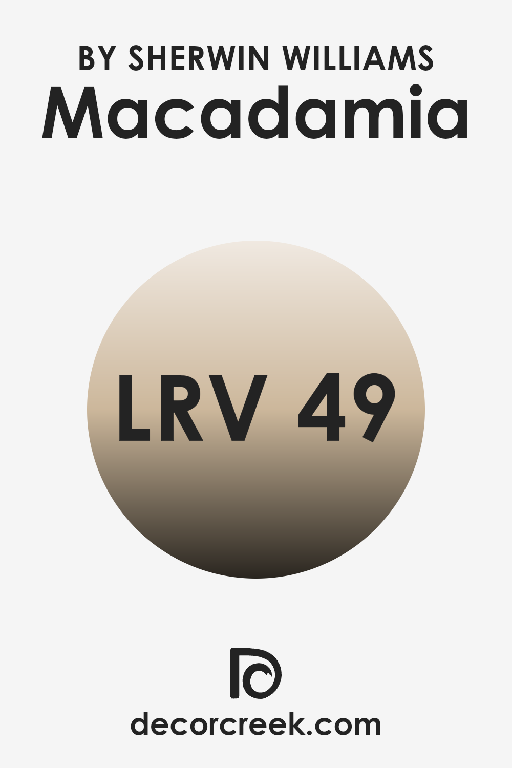
What is the LRV of Macadamia SW 6142 by Sherwin Williams?
LRV stands for Light Reflectance Value, which is a measurement used to indicate how much light a paint color reflects or absorbs when applied to a surface. Think of it like this: the higher the LRV number, the lighter the color will appear, reflecting more light back into the room. Conversely, colors with lower LRVs absorb more light, making them appear darker.
This value is vital when choosing paint colors because it can significantly impact how bright or dim a room feels. A room painted with a high LRV color will generally feel airier and more open, while a low LRV color might make the same room feel more cozy and enclosed.
Looking at the specific color with an LRV of 49.125, it strikes a balance, neither too light nor too dark. This kind of middle-ground LRV makes it adaptable for use in various settings and lighting conditions. In bright, well-lit rooms, this color will appear slightly lighter, subtly reflecting some of the incoming light, thereby maintaining some of its luminosity.
In contrast, in a room with less natural light, it will appear richer and slightly darker, enhancing a more intimate and snug ambiance. When choosing decor pieces or furniture, it’s helpful to consider this flexibility of the color under different lighting environments to maintain the intended visual effect.
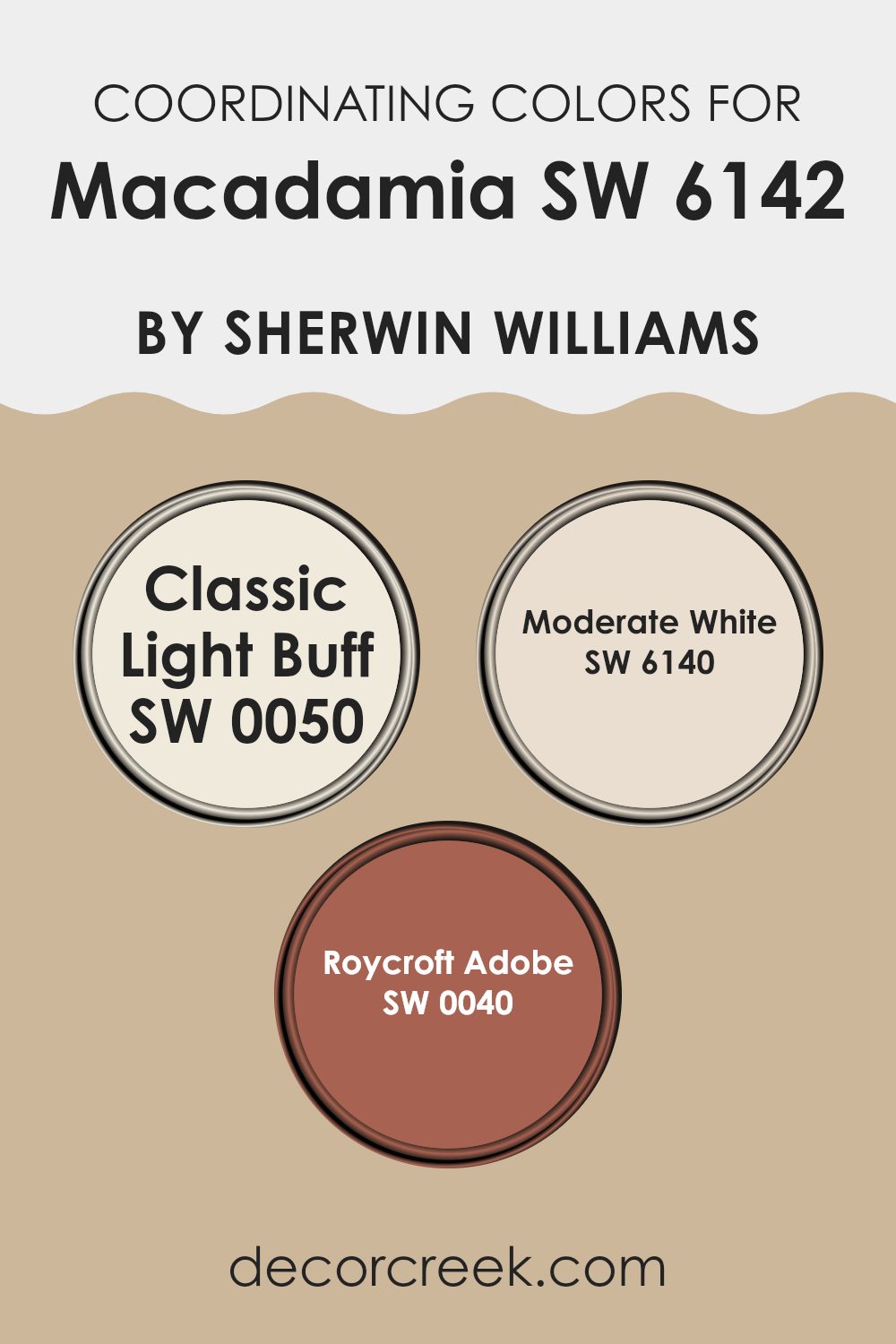
Coordinating Colors of Macadamia SW 6142 by Sherwin Williams
Coordinating colors are selected shades that harmoniously blend with a primary color to enhance the aesthetic appeal of a room. When using a base color like Macadamia by Sherwin Williams, it’s essential to pick coordinating colors that complement or contrast beautifully without clashing. These colors can be used on walls, trim, accent areas, or even in furnishings and decor to create a cohesive and appealing design in any room.
For example, Classic Light Buff is a subtle and gentle color that pairs nicely with the warmth of Macadamia, providing a calm and welcoming feel ideal for living rooms and bedrooms. It is soft enough to not overpower the senses but offers a contrasting lightness that can make smaller rooms appear larger.
Another coordinating color, Moderate White, is a clean and neutral shade that works perfectly for creating a refreshed and open feeling. It’s an excellent option for trim or ceilings, offering a crisp border that defines the room without creating harsh lines. Lastly, Roycroft Adobe brings a richer, earthier tone that adds depth and character to the setting, making it a fantastic choice for accent walls or decorative elements that draw the eye while maintaining a natural flow throughout the room.
You can see recommended paint colors below:
- SW 0050 Classic Light Buff
- SW 6140 Moderate White
- SW 0040 Roycroft Adobe
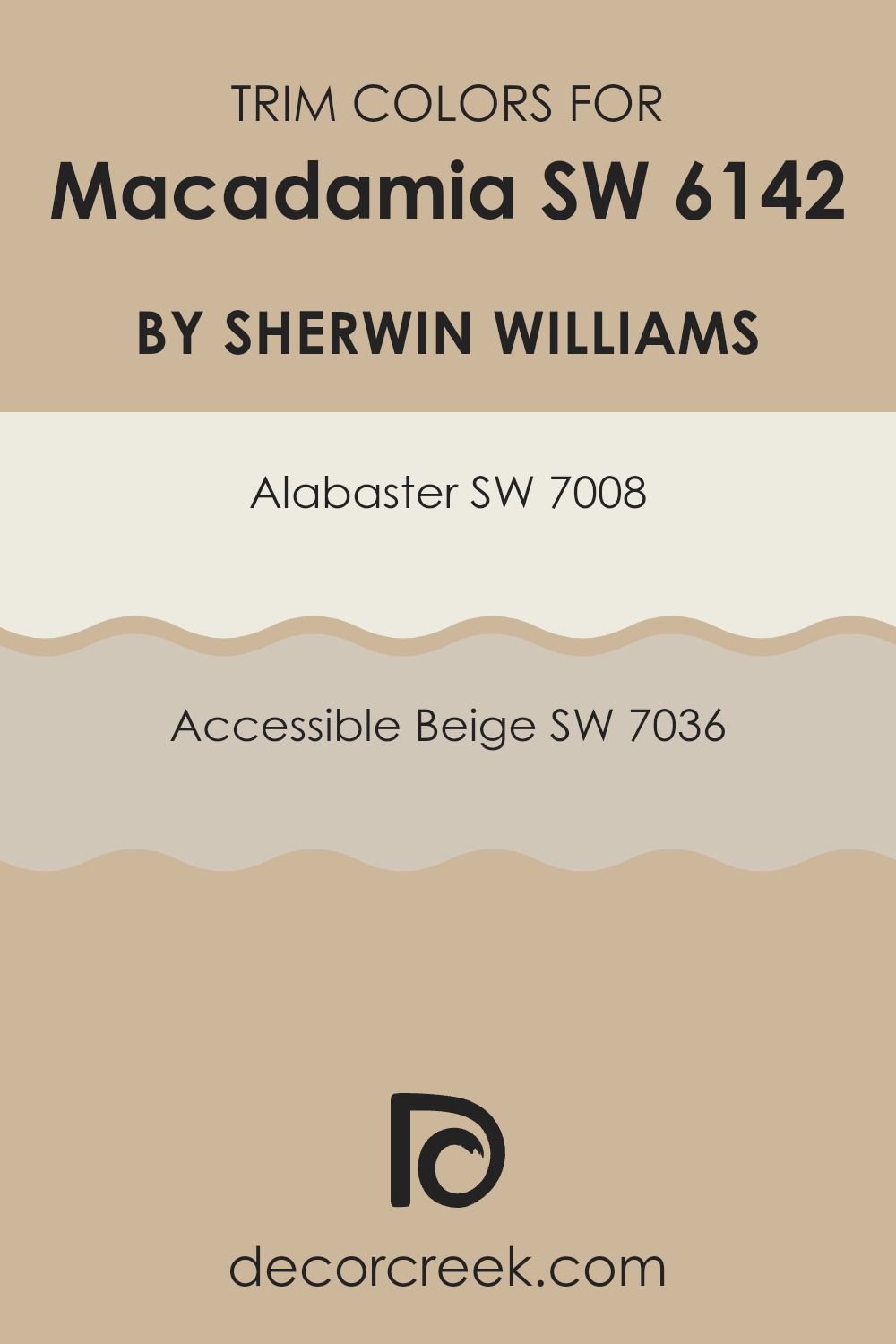
What are the Trim colors of Macadamia SW 6142 by Sherwin Williams?
Trim colors are essentially accent shades used on molding, door frames, window frames, and other architectural features that can complement or contrast the primary wall colors. Choosing the right trim color is crucial as it helps define and visually separate different elements within a room, which can enhance the overall appearance and feel of the area.
A key aspect is to select a trim color that harmonizes with the main wall color to create a coherent look. In the case of using SW 6142 Macadamia by Sherwin Williams, a warm, neutral hue, trim colors like SW 7008 – Alabaster and SW 7036 – Accessible Beige are great choices.
SW 7008 – Alabaster is a clean, bright white that tends to make the warm tones of Macadamia stand out, providing a fresh and crisp contrast that highlights architectural features effectively. On the other hand, SW 7036 – Accessible Beige offers a softer contrast, slightly deeper than Macadamia, ensuring a smooth transition between the wall and trim, which creates a subtle yet appealing enhancement to the room’s aesthetics.
You can see recommended paint colors below:
Colors Similar to Macadamia SW 6142 by Sherwin Williams
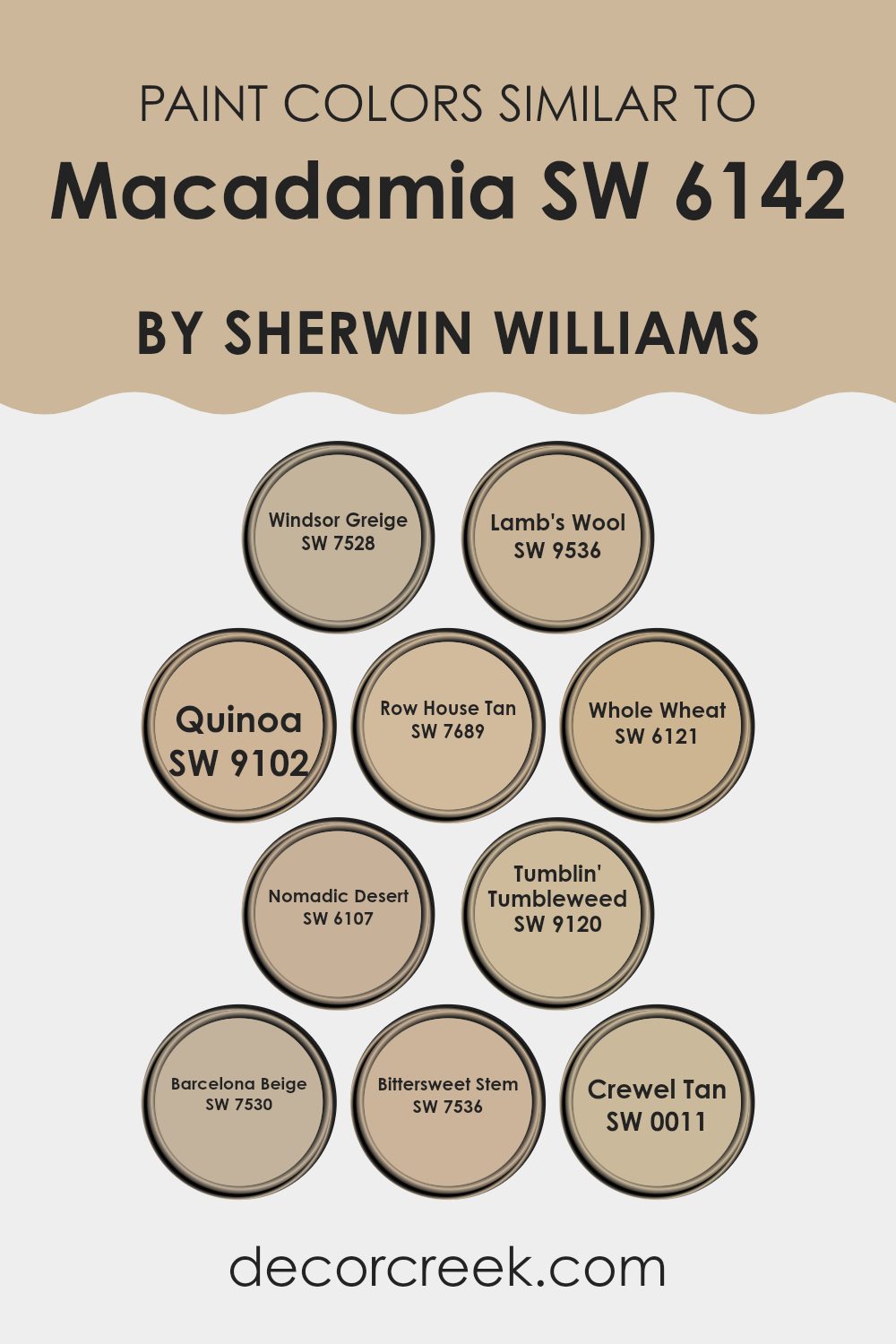
Using similar colors in design is important when aiming to create a cohesive and harmonious room. Colors that are alike, like those similar to Macadamia by Sherwin Williams, work together seamlessly, providing a subtle variation that enriches the environment without causing visual discord. When colors closely relate to each other, such as greiges, beiges, and soft tans, they can blend effortlessly across different surfaces and decor, enhancing the aesthetic flow within a room.
SW 7528 Windsor Greige offers a touch of elegance in its blend of gray and beige, perfect for adding a refined yet understated backdrop. SW 9536 Lamb’s Wool is a gentle beige that evokes the softness and warmth of wool, making it ideal for cozy, inviting rooms.
With hints of a rich nutty tone, SW 9102 Quinoa introduces a deeper shade, setting a base that complements lighter accents beautifully. SW 7689 Row House Tan provides a robust and earthy presence, recalling the sturdy charm of historical architecture. SW 6121 Whole Wheat draws on golden hues to enhance rooms with a sunny, welcoming vibe.
SW 6107 Nomadic Desert echoes the arid landscapes, offering a dusty beige that works well with rustic and contemporary themes alike. SW 9120 Tumblin’ Tumbleweed has a muted, dusty tone that suggests a sense of calm and simplicity.
SW 7530 Barcelona Beige is slightly deeper, capturing the essence of a historic Mediterranean city, perfect for a warmer touch. SW 7536 Bittersweet Stem, with a hint of green, looks naturally soothing, reminiscent of the colors found in woodlands. Lastly, SW 0011 Crewel Tan is adaptable, functioning well in various lighting conditions, adding a balanced lightness to any room.
Together, these shades complement and support one another, making them excellent choices for those looking to achieve a coherent and inviting aesthetic in their homes or projects.
You can see recommended paint colors below:
- SW 7528 Windsor Greige
- SW 9536 Lamb’s Wool
- SW 9102 Quinoa
- SW 7689 Row House Tan
- SW 6121 Whole Wheat
- SW 6107 Nomadic Desert
- SW 9120 Tumblin’ Tumbleweed
- SW 7530 Barcelona Beige
- SW 7536 Bittersweet Stem
- SW 0011 Crewel Tan
Colors that Go With Macadamia SW 6142 by Sherwin Williams
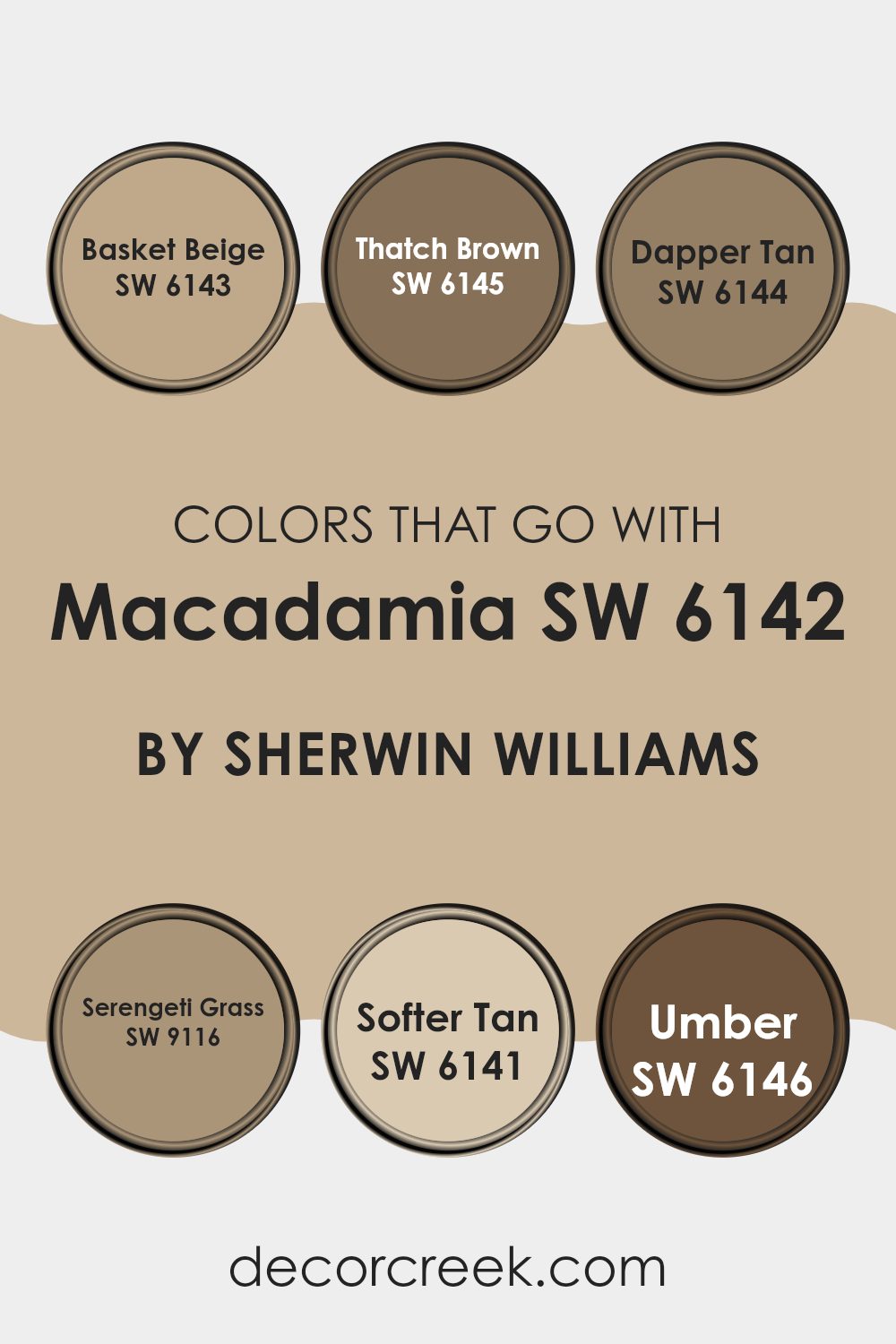
Colors that complement Macadamia SW 6142 by Sherwin Williams are essential for creating a cohesive and appealing color scheme in any room. Choosing the right accompanying shades, such as Basket Beige, Thatch Brown, Dapper Tan, Serengeti Grass, Softer Tan, and Umber, ensures that the environment feels balanced and harmonious. These colors work together to enhance the warmth and adaptability of Macadamia, making it a perfect choice for living rooms, bedrooms, or any area that benefits from a cozy and welcoming atmosphere.
Basket Beige is a light and airy shade that adds a subtle freshness to the room, pairing nicely with the depth of Macadamia. Thatch Brown is deeper, bringing a sense of earthiness that grounds the room beautifully. Dapper Tan offers a mid-tone option that bridges the lighter and darker hues, providing a smooth transition across the palette.
Serengeti Grass introduces a hint of green, adding a natural and lively touch that complements the warmer tones. Softer Tan is similar to Basket Beige but with a touch more warmth, making it ideal for adding a sunny charm. Lastly, Umber serves as a robust, dark anchor in the palette, offering a striking contrast that highlights the richness of the other shades. Together, these tones create a visually appealing palette that enhances the beauty of Macadamia and makes any room feel more inviting.
You can see recommended paint colors below:
- SW 6143 Basket Beige
- SW 6145 Thatch Brown
- SW 6144 Dapper Tan
- SW 9116 Serengeti Grass
- SW 6141 Softer Tan
- SW 6146 Umber
How to Use Macadamia SW 6142 by Sherwin Williams In Your Home?
Macadamia by Sherwin Williams is a warm, subtle cream color that can bring a cozy and welcoming feel to any room in your home. When considering where to use this paint, think about rooms where you want to encourage relaxation and comfort. Its soft hue works really well in living rooms or bedrooms where it pairs beautifully with both bright and dark colors, allowing for flexible design options.
You can also use Macadamia in kitchens or dining areas to create a friendly atmosphere that makes family and guests feel right at home. Whether used on all walls for a gentle and inviting ambiance or as an accent wall to add a subtle touch of warmth against cooler tones, Macadamia adapts to your decorating style.
Furthermore, this color supports various decor elements, from modern metallics to rustic woods, making it easy to blend with existing interiors. It’s an ideal choice if you’re looking for a paint color that helps hide everyday wear and tear due to its mid-tone nature.
Macadamia SW 6142 by Sherwin Williams vs Quinoa SW 9102 by Sherwin Williams
Macadamia by Sherwin Williams is a soft, creamy beige that brings a warm and cozy feel to any room—it’s like the gentle color of a lightly roasted nut. It works well in rooms where you want a light, inviting atmosphere without the sharpness of pure white. It pairs beautifully with darker colors and natural wood finishes that highlight its warmth.
On the other hand, Quinoa by Sherwin Williams is a slightly darker beige that leans towards a taupe shade. This color offers a more grounded, earthy feel, making it a great option for those looking to add a bit more depth to their walls while maintaining a warm neutral palette. Quinoa works exceptionally well in rooms that receive plenty of natural light, as the color shifts subtly throughout the day.
Both colors are adaptable and can be used in various decorating styles, from casual to formal, offering a calming neutral backdrop that allows other design elements to stand out.
You can see recommended paint color below:
- SW 9102 Quinoa
Macadamia SW 6142 by Sherwin Williams vs Nomadic Desert SW 6107 by Sherwin Williams
Macadamia and Nomadic Desert are both warm, neutral colors from Sherwin Williams, but they have distinct differences. Macadamia is a softer, lighter beige that adds a gentle, airy feel to rooms. It’s a great choice for creating a cozy and inviting atmosphere without making rooms feel too closed in.
It works well in areas that get a lot of natural light, as it reflects the light beautifully and can make small rooms appear larger. On the other hand, Nomadic Desert is a deeper beige with a stronger presence of brown undertones. This color is ideal for those looking for a bit more warmth and depth in their room decor.
It gives off a richer vibe and can be a good fit for large rooms or areas where you want to add more character without overpowering with darker shades. Both colors are adaptable and pair well with a wide range of decor styles, but the choice between them would depend on the specific mood you want to set and the size and lighting of your room.
You can see recommended paint color below:
Macadamia SW 6142 by Sherwin Williams vs Whole Wheat SW 6121 by Sherwin Williams
Macadamia and Whole Wheat by Sherwin Williams are both warm, neutral colors but they have some clear differences. Macadamia is a softer, lighter beige with a gentle and creamy appearance. This color is perfect for creating a cozy and inviting room without making it feel too enclosed.
In contrast, Whole Wheat has a deeper, golden beige tone that adds a bit more richness and warmth to a room. It works well in rooms that benefit from a warm, welcoming ambiance but where you might also want a touch of earthiness.
Both colors pair well with a variety of decor styles and can be used in many rooms, from living areas to bedrooms. Whole Wheat’s deeper tone makes it slightly more dominant in style, whereas Macadamia’s lighter shade offers more flexibility and a subtle background hue.
You can see recommended paint color below:
- SW 6121 Whole Wheat
Macadamia SW 6142 by Sherwin Williams vs Windsor Greige SW 7528 by Sherwin Williams
The main color, Macadamia, and the second color, Windsor Greige, are both neutral shades from Sherwin Williams, each with its unique appeal. Macadamia is a light, creamy hue that brings a soft warmth to any room, making it look more inviting.
It works well in living areas and bedrooms where a subtle, cozy atmosphere is desired. On the other hand, Windsor Greige has a deeper, richer tone that combines gray with touches of beige. This color is excellent for creating a grounded, calm feeling in a room.
It suits areas that require a bit more depth and definition, such as dining rooms and entryways. While Macadamia reflects more light due to its lighter tone, Windsor Greige offers a stronger presence and can help emphasize furniture and art. Both colors are adaptable and work well in various decorative styles, from modern to traditional.
You can see recommended paint color below:
Macadamia SW 6142 by Sherwin Williams vs Bittersweet Stem SW 7536 by Sherwin Williams
The color Macadamia by Sherwin Williams is a light, creamy beige with warm undertones, providing a cozy and inviting feel to any room. It’s subtle enough to work as a neutral backdrop, enhancing other colors used around it.
In contrast, Bittersweet Stem is a deeper, muted shade of green with gray undertones, imparting a more grounded and earthy vibe. This color can add a touch of nature-inspired calmness to rooms, making it ideal for areas where you want to promote a sense of relaxation and comfort.
While Macadamia is adaptable and can brighten up smaller, less lit rooms, Bittersweet Stem is better suited for larger areas or as an accent wall, where its depth can be fully appreciated without overpowering the room’s aesthetics. Both colors offer unique atmospheres, but they cater to different design needs and preferences in interior style.
You can see recommended paint color below:
- SW 7536 Bittersweet Stem
Macadamia SW 6142 by Sherwin Williams vs Tumblin’ Tumbleweed SW 9120 by Sherwin Williams
Macadamia and Tumblin’ Tumbleweed are both neutral paint colors by Sherwin Williams, but they have distinct tones that set them apart. Macadamia is a warmer shade that has a soothing beige undertone.
It resembles a creamy coffee color that gives off a cozy and welcoming vibe, making it a great choice for living rooms and bedrooms. On the other hand, Tumblin’ Tumbleweed has a dustier, grayer tone, leaning toward a light taupe color.
This shade might be seen more like faded, dry grass, which could match well with a modern or minimalistic decor style, offering a subtly muted backdrop in rooms like kitchens or home offices. While both colors provide a calm and neutral setting, Macadamia adds warmth, whereas Tumblin’ Tumbleweed offers a cooler and more understated palette.
You can see recommended paint color below:
- SW 9120 Tumblin’ Tumbleweed
Macadamia SW 6142 by Sherwin Williams vs Lamb’s Wool SW 9536 by Sherwin Williams
Macadamia and Lamb’s Wool by Sherwin Williams are both warm neutrals, but they have distinct differences. Macadamia has a more beige tone, giving it a cozy and welcoming feel. It’s perfect for creating a relaxed atmosphere in rooms like living areas or bedrooms.
On the other hand, Lamb’s Wool leans toward a slightly lighter and creamier hue. This color is great for making small rooms appear bigger and brighter because of its ability to reflect light well.
Both shades work well with a variety of decor styles, from rustic to modern, but Macadamia might be the better choice for those looking for a richer, earthier vibe, whereas Lamb’s Wool could be preferred for a lighter, airy feel. Whichever you choose depends on the mood you want to set and the size of the room you’re working with.
You can see recommended paint color below:
Macadamia SW 6142 by Sherwin Williams vs Crewel Tan SW 0011 by Sherwin Williams
Macadamia and Crewel Tan, both from Sherwin Williams, offer distinct shades that cater to different preferences in decor. Macadamia is a soft, creamy beige that gives a gentle, welcoming feel to any room. It’s light enough to make small rooms appear larger and provides a warm, inviting backdrop that pairs well with a variety of accent colors.
On the other hand, Crewel Tan is a richer, deeper tan shade that brings a bit more warmth and depth to a room. This color is excellent for creating a cozy atmosphere, ideal for rooms where you want to relax or entertain.
Crewel Tan can work exceptionally well in rooms with ample natural light, as it highlights the color’s richness without making the room feel too enclosed. Both shades are adaptable, but the choice between a lighter or a deeper tan will depend on the specific requirements and lighting of your room.
You can see recommended paint color below:
- SW 0011 Crewel Tan
Macadamia SW 6142 by Sherwin Williams vs Barcelona Beige SW 7530 by Sherwin Williams
Macadamia and Barcelona Beige are both neutral paint colors by Sherwin Williams, but they have distinct tones that set them apart. Macadamia is a softer, lighter shade with a creamy, almost buttery feel to it. This makes it a great choice if you want a room to feel cozy and welcoming. It’s a flexible color that works well in many rooms, adding a gentle touch of warmth.
Barcelona Beige, on the other hand, is darker and has more gray undertones. This gives it a sturdier feel, making it suitable for rooms where you want a more grounded, solid appearance. It’s great for adding depth to a room without making it feel too heavy.
Both shades pair well with a variety of decor styles and other colors. Macadamia is particularly good for creating a light, airy atmosphere, while Barcelona Beige is excellent for establishing a more defined, robust mood. Depending on the feeling you want to create in your room, you can choose either to form a warm backdrop or a firm statement.
You can see recommended paint color below:
Macadamia SW 6142 by Sherwin Williams vs Row House Tan SW 7689 by Sherwin Williams
Macadamia by Sherwin Williams is a light, creamy beige that can make any room feel warm and welcoming. It has a soft and subtle appeal that works well in rooms where you want a calm and cozy ambiance. Its lightness makes it great for smaller rooms or areas with limited natural light, as it can help make them appear more open and brighter.
Row House Tan, on the other hand, is a deeper, richer tan shade. It adds a bit more depth and warmth to a room than Macadamia. This color is perfect for larger areas or rooms that get plenty of light, where its richness can really come to life. It also pairs well with a wide range of other colors and home decor styles, making it quite adaptable.
Overall, both shades offer their unique charm. Macadamia is excellent for creating a light, airy atmosphere, while Row House Tan provides a more grounded, cozy effect. Your choice between them would depend on the mood you want to achieve and the specific characteristics of the room.
You can see recommended paint color below:
- SW 7689 Row House Tan
After reading about SW 6142 Macadamia by Sherwin Williams, I’ve learned quite a bit about this unique paint color. Macadamia is a warm, inviting shade that looks like the yummy inside of a macadamia nut. It has a cozy feel that makes rooms look friendly and welcoming. This color works well in many different rooms, whether it’s a kitchen, a bedroom, or a living area.
I found out that Macadamia is not just pretty, but also really practical. It hides smudges and marks better than lighter colors, which can be super helpful, especially in homes with kids or pets. The shade also pairs nicely with lots of other tones. You can match it with dark greens, blues, or even rich browns and creams for a lovely look.
Using Macadamia on walls can make your home feel warm, especially during cooler months. It makes rooms feel like a cozy nook, perfect for reading a book or watching movies. So, if you’re thinking about giving your room a new look, SW 6142 Macadamia is a strong choice that creates a friendly and soothing atmosphere, making your home a wonderful place to be.
Ever wished paint sampling was as easy as sticking a sticker? Guess what? Now it is! Discover Samplize's unique Peel & Stick samples.
Get paint samples

