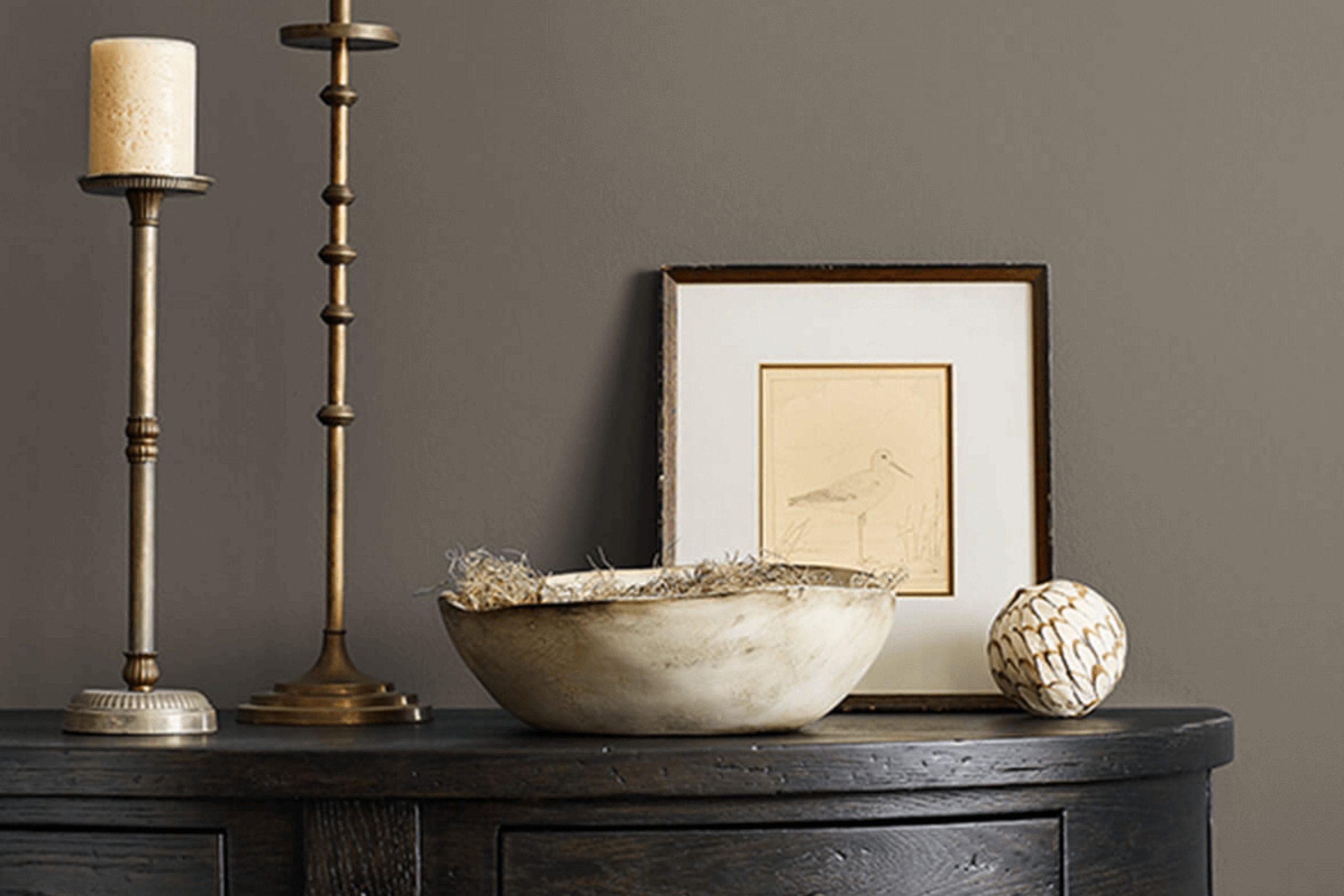
If you’re thinking about refreshing your space with a new paint color, SW 7047 Porpoise by Sherwin Williams might just catch your eye. This color is a beautiful neutral that strikes a balance between gray and brown, offering a perfect backdrop for both vibrant and muted decor styles.
I find that its charm lies in its versatility—it really can blend seamlessly into any room, whether it’s a bustling kitchen or a quiet study.
In using SW 7047 Porpoise, the warmth it provides creates a cozy atmosphere, which is perfect as I enjoy unwinding after a long day. Moreover, its understated elegance allows the furniture and art in my home to really stand out. If you prefer a color that supports a wide range of matching possibilities, from bright yellows to deep blues, Porpoise is a contender.
Choosing the right paint can sometimes feel overwhelming with all the options out there, but I recommend giving Porpoise a look if you want something that will enhance your home’s aesthetic without dominating it.
Plus, it’s a shade that won’t easily go out of fashion.
What Color Is Porpoise SW 7047 by Sherwin Williams?
Porpoise by Sherwin Williams is a warm, inviting gray color with hints of brown. This neutral hue is versatile and timeless, making it exceptionally easy to work with in various interior designs. The earthy undertones in Porpoise help create a cozy and welcoming vibe in any room, particularly well-suited for living spaces, bedrooms, and kitchens.
One of the key strengths of Porpoise is its ability to complement a wide range of interior styles. It works particularly well in rustic settings due to its warm nature, adding a sense of homeliness and comfort. It also fits seamlessly into modern and contemporary interiors, providing a neutral backdrop that allows furniture and art to stand out.
When it comes to materials and textures, Porpoise pairs well with natural wood, enhancing the wood’s textures and tones without overpowering them. It also matches beautifully with stone elements, like granite or marble, creating a subtle yet striking contrast. For a softer approach, combining it with textiles like wool or linen in lighter shades like creams or soft pastels can add a layer of warmth and texture to the space. Overall, Porpoise is a flexible color choice that can help achieve a balanced and inviting look in any home.
Is Porpoise SW 7047 by Sherwin Williams Warm or Cool color?
PorpoiseSW 7047 by Sherwin Williams is a versatile gray paint color with a warm base that makes it ideal for creating a cozy atmosphere in any home. This neutral shade pairs well with a wide range of decor styles, from modern to traditional, making it an excellent choice for any room. Its ability to blend seamlessly with other colors helps in achieving a cohesive look throughout the space.
In living rooms or bedrooms, Porpoise can provide a soft backdrop that complements both bright and muted accents, such as colorful throw pillows or subdued furniture pieces. In kitchens and bathrooms, this color works well with white cabinetry or marble countertops, adding depth while maintaining a clean and inviting vibe.
The warm undertones of Porpoise also mean it can help in making a space feel more inviting, which is great for rooms that lack natural light. Overall, its adaptability and warm charm make it a popular choice for those looking to refresh their home environment.
Undertones of Porpoise SW 7047 by Sherwin Williams
PorpoiseSW 7047 is a paint color by Sherwin Williams that showcases a complex interplay of undertones, contributing to its versatility and uniqueness in appearance. Undertones are subtle colors that are mixed into the main hue of the paint which can influence how the color is perceived under different lighting conditions and when placed alongside other colors.
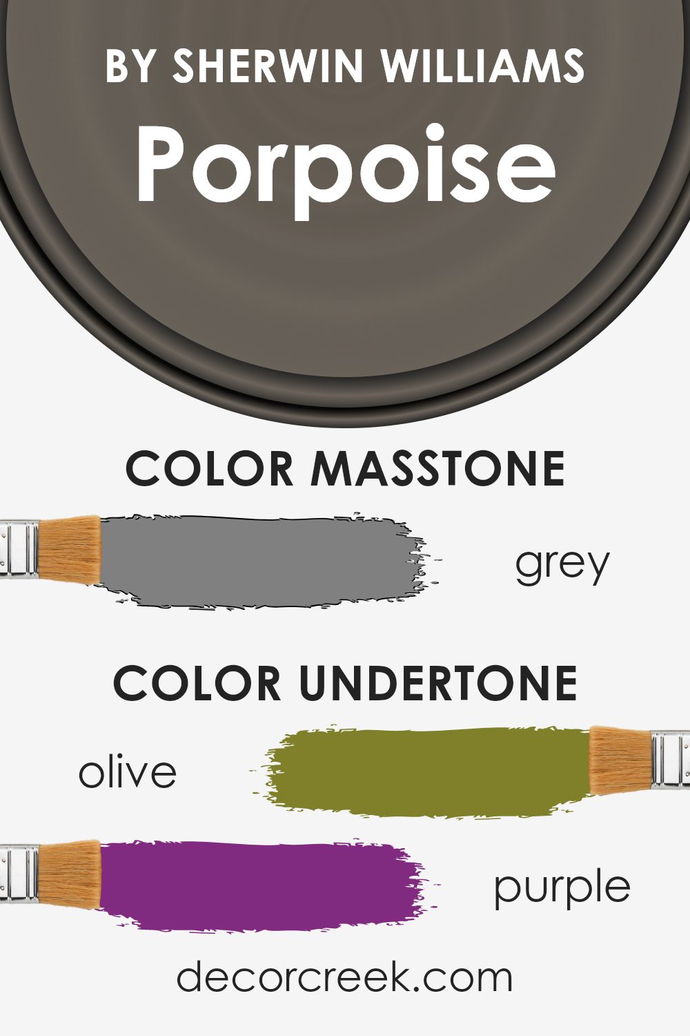
The undertones of PorpoiseSW 7047 span a broad spectrum, including shades like olive, purple, and brown, as well as variations of turquoise, green, blue, and gray. These undertones can make the paint appear warmer or cooler depending on the lighting.
For instance, in a room with ample natural light, the purple or blue undertones might become more noticeable, giving the color a cooler feel. Conversely, in artificial light, brown and olive undertones might stand out, lending the color a warmer atmosphere.
On interior walls, the effect of these undertones can significantly impact the mood and aesthetic of a space.
For example, the presence of dark turquoise and dark green undertones can add depth to the color, making it an excellent choice for creating a cozy and inviting atmosphere in living rooms or bedrooms. The subtle interplay of these undertones also means that PorpoiseSW 7047 can easily complement various decor styles and color schemes, from natural wood furniture to metallic accents.
Overall, the multi-dimensional nature of PorpoiseSW 7047 thanks to its complex undertones allows it to adapt subtly to different environments and design elements, making it a flexible and appealing choice for many interior spaces.
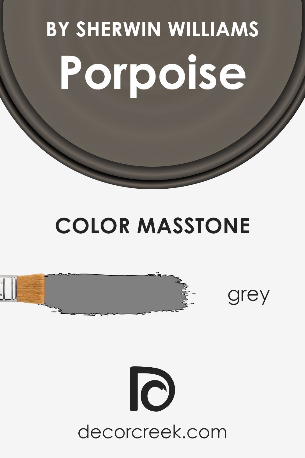
What is the Masstone of the Porpoise SW 7047 by Sherwin Williams?
PorpoiseSW 7047 by Sherwin Williams is a versatile grey shade that pairs well in many homes. The masstone, which is a true grey (#808080), means it doesn’t lean too much toward either blue or brown. This color can create an even, neutral background in any room. This neutrality makes it easy to combine Porpoise with a wide variety of other colors, from bright and bold to soft and subtle, allowing for flexibility in decorating styles.
Because of its balanced grey tone, Porpoise can help smaller spaces feel a bit larger and more open, as it doesn’t overpower the room. In bigger, well-lit areas, it acts as a soft backdrop that can pull together diverse decorative elements.
Additionally, grey is generally easy on the eyes, creating a calm and pleasant environment that doesn’t distract or overwhelm, making this color a good choice for busy or clutter-prone areas such as living rooms or entryways.
How Does Lighting Affect Porpoise SW 7047 by Sherwin Williams?
Lighting plays a crucial role in how we perceive colors in our environment. The type, direction, and intensity of light can drastically change the appearance of a paint color on the walls. Let’s take the color Porpoise by Sherwin Williams as an example to see how different lighting conditions affect its appearance.
Porpoise is a warm, neutral gray with subtle brown undertones. Under artificial light, such as incandescent or LED bulbs, this color can look slightly different depending on the warmth or coolness of the bulb. Warm lighting tends to enhance the brown undertones, making the color appear cozier and richer. Cool lighting, on the other hand, may make it look more strictly gray, minimizing the warmth.
In natural light, the appearance of Porpoise also varies throughout the day and depends on the direction your room faces:
- 1. North-Facing Rooms: These rooms get less direct sunlight, which can make light colors like Porpoise appear slightly darker and more shadowed. The cool, indirect light enhances the gray aspects, giving a crisp look.
- 2.South-Facing Rooms: These rooms benefit from abundant sunlight for most of the day, which can lighten and warm up Porpoise, highlighting its subtle brown undertones. This makes the room feel welcoming and warm.
- 3.East-Facing Rooms: With morning light, Porpoise will appear brighter and warmer in the morning but might lose some of its vibrancy as the day progresses. The morning light can make it look very inviting and fresh.
- 4.West-Facing Rooms: Evening light in these rooms is warm and golden, so Porpoise will take on a warmer and more comforting glow by the end of the day, especially during sunset.
Overall, Porpoise is a flexible color that adapts well to various lighting conditions, offering different looks and feels throughout the day and in different settings. This makes it a versatile choice suitable for many spaces.
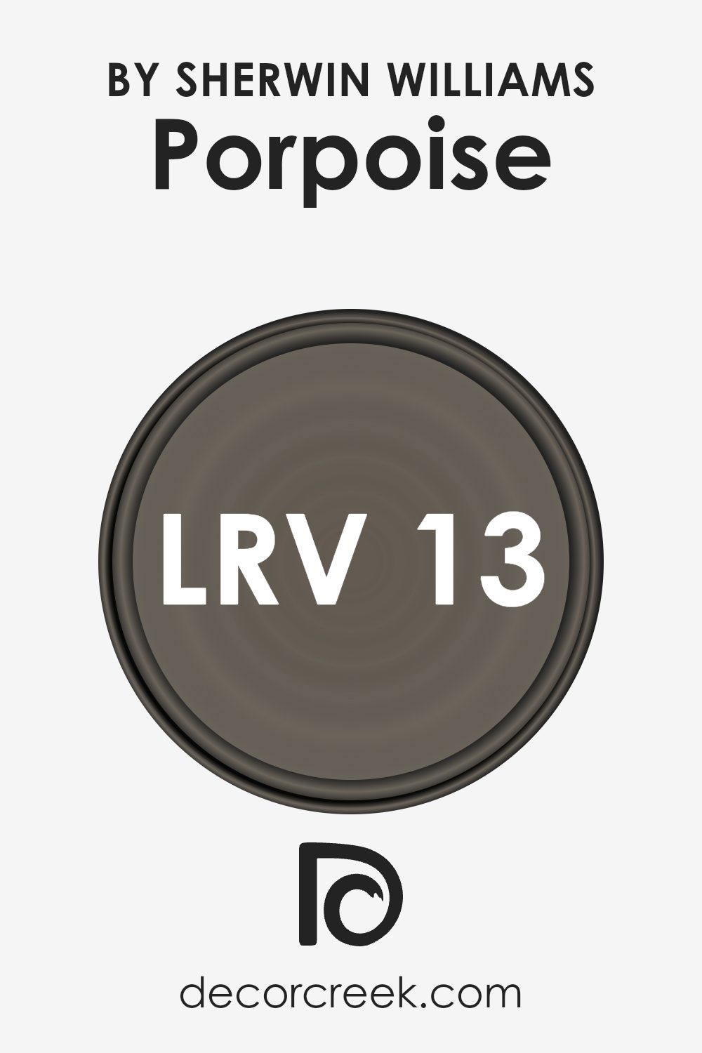
What is the LRV of Porpoise SW 7047 by Sherwin Williams?
LRV stands for Light Reflectance Value, a measure that tells us how much light a color reflects back into the room. This scale runs from 0, which means it absorbs all light, to a higher number which indicates more light being reflected. A high LRV can make a room feel brighter and more open, while a low LRV tends to absorb light, making a space appear smaller and cozier. This value helps in choosing paint colors effectively based on how light or dark you want your room to appear.
With an LRV of 12.953, Porpoise by Sherwin Williams, a robust gray shade, falls on the lower end of the reflectiveness scale. This means it doesn’t reflect much light, absorbing more instead, which gives walls a deeper, richer appearance.
In rooms with sufficient natural lighting, using a color like this can add depth and character, enhancing the ambiance without making the space feel cramped. However, in a poorly lit room, it might make the room seem darker and smaller, so additional lighting might be necessary to balance the effect of the paint.
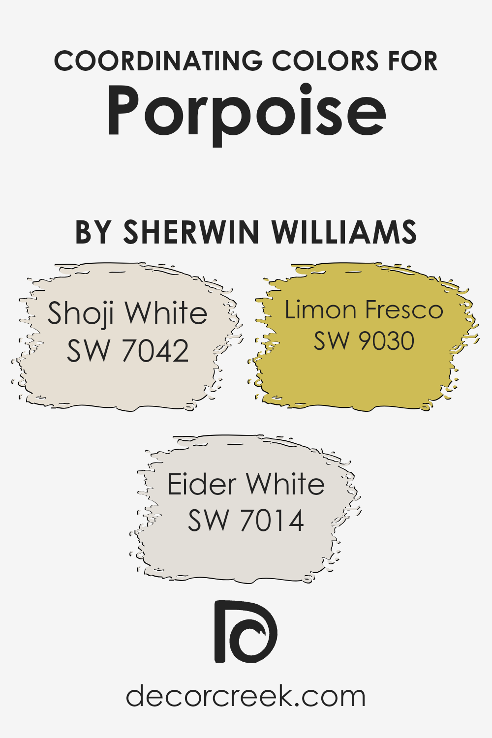
Coordinating Colors of Porpoise SW 7047 by Sherwin Williams
Coordinating colors are chosen to complement a primary color, enhancing the overall look of a space without overwhelming it. For instance, Porpoise SW 7047 by Sherwin Williams is a versatile shade that pairs well with several coordinating colors to create harmonious color schemes. These coordinating hues bring out the best in each other, providing balance and adding depth to decor.
Shoji White SW 7042 has a subtly warm undertone, making it a great choice for those who wish to soften a room while keeping the ambiance light and airy. It acts as a neutral backdrop that can brighten spaces, lending a gentle contrast that is neither too stark nor overpowering.
Eider White SW 7014 is another excellent companion, offering a slightly grayer tone that can help in achieving a modern, clean look. It adds a hint of sophistication without requiring dramatic changes in your decor. Lastly, Limon Fresco SW 9030 adds a vibrant pop of color. This cheerful shade can be used to inject life and energy into a room, pairing well with Porpoise to produce a lively yet balanced atmosphere.
You can see recommended paint colors below:
- SW 7042 Shoji White
- SW 7014 Eider White
- SW 9030 Limon Fresco
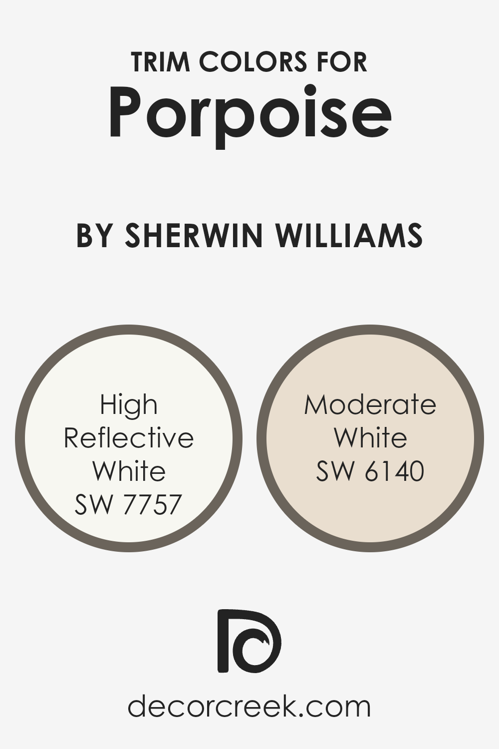
What are the Trim colors of Porpoise SW 7047 by Sherwin Williams?
Trim colors play an essential role in enhancing the overall look of a room painted in Porpoise SW 7047 by Sherwin Williams, acting as a frame to highlight architectural details and define boundaries. Using a contrasting trim color can accentuate windows, doors, and moldings, making them stand out against the main wall color. High Reflective White SW 7757 and Moderate White SW 6140 are popular choices for trim, complementing the gray tones of Porpoise effectively.
High Reflective White SW 7757 is a very bright white that brings a clean and crisp look to the trim, making it pop against darker colors like Porpoise SW 7047. It reflects light well, adding a fresh vibrancy to the room and helping to make small spaces appear larger.
Moderate White SW 6140, on the other hand, offers a softer approach with its subtle, creamy undertones, providing a smooth transition that softens the contrast with deeper wall colors, creating a more cohesive appearance in the space.
You can see recommended paint colors below:
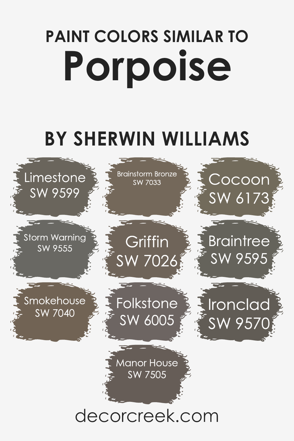
Colors Similar to Porpoise SW 7047 by Sherwin Williams
Using similar colors in design can help create a unified and harmonious look. This approach uses variations of a primary shade to enhance aesthetic appeal without causing a visual clash. For instance, if you’re a fan of a mid-tone grey like SW 7047, you might find that incorporating shades that complement or subtly differ from this color can enrich your space without overwhelming it. Colors that share the same undertone or are adjacent to each other on the color wheel can link different elements of a room cohesively.
Consider SW 9599 – Limestone, a gentle grey that mirrors the calmness of a cloudy sky, perfect for creating a peaceful backdrop. Similarly, SW 9555 – Storm Warning offers a deeper grey, reminiscent of a stormy evening, ideal for adding a touch of mystery. SW 7040 – Smokehouse brings in a slightly smoky hue, enhancing spaces with a unique charm. If you prefer something more grounded, SW 7505 – Manor House provides a robust grey that can anchor a room beautifully.
For those who like a hint of warmth, SW 7033 – Brainstorm Bronze, a grey with bronze undertones, offers coziness. SW 7026 – Griffin and SW 6005 – Folkstone lean more towards a classic grey, versatile for any setting. Delving into the warmer tones, SW 6173 – Cocoon wraps you in its subtle warmth reminiscent of a quiet retreat.
SW 9595 – Braintree adds a hint of shadow, deep yet inviting, and SW 9570 – Ironclad presents a bold, nearly black grey, perfect for dramatic accents. Together, these shades provide a spectrum of options that can enhance spaces while maintaining a cohesive aesthetic.You can see recommended paint colors below:
- SW 9599 Limestone
- SW 9555 Storm Warning
- SW 7040 Smokehouse
- SW 7505 Manor House
- SW 7033 Brainstorm Bronze
- SW 7026 Griffin
- SW 6005 Folkstone
- SW 6173 Cocoon
- SW 9595 Braintree
- SW 9570 Ironclad
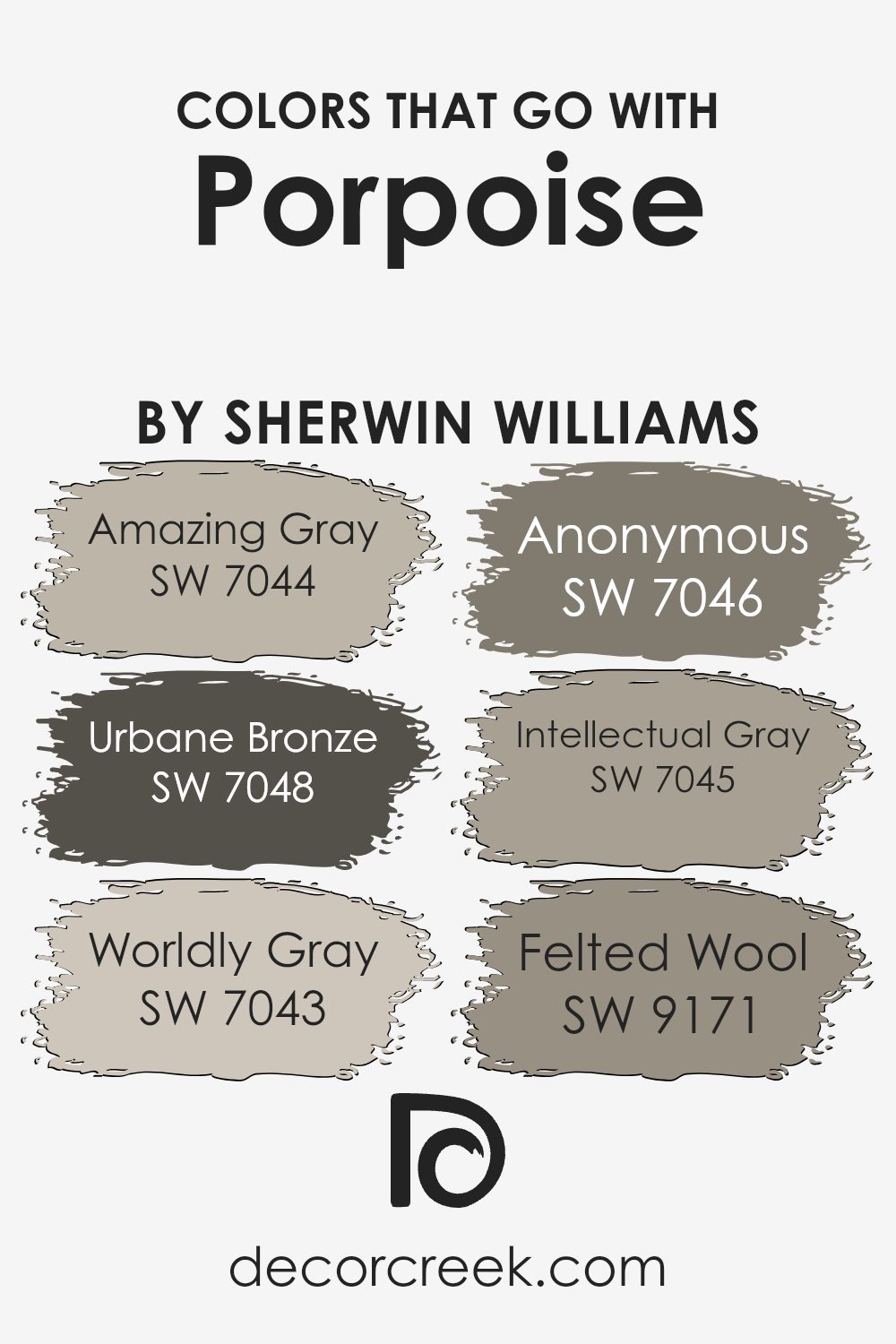
Colors that Go With Porpoise SW 7047 by Sherwin Williams
Choosing the right colors that complement Porpoise SW 7047 by Sherwin Williams can greatly enhance the aesthetic of any room. Pairing colors successfully can dictate the mood and style of a space, allowing for a cohesive and harmonious design. Opting for colors like Amazing Gray SW 7044, a soft and versatile gray, creates a soothing backdrop that pairs wonderfully with the deeper tone of Porpoise. Pairing it with Urbane Bronze SW 7048, a dark, warm gray, adds a striking contrast that can give a room a bold yet balanced feel.
Continuing with complementary colors, Worldly Gray SW 7043 offers a lighter, more muted option that works well in spaces that seek a subtle distinction without overwhelming the senses. Anonymous SW 7046, another gray, though with a hint of green, brings an earthy quality that softens interiors with a natural touch.
Intellectual Gray SW 7045 moves slightly towards taupe, providing a warm and inviting feel that’s perfect for cozy, reflective spaces. Lastly, Felted Wool SW 9171, a rich mid-tone gray, can create depth when paired with Porpoise, making it ideal for adding dimension to a room. By selecting any of these colors, you ensure a stylish, coherent look that enhances the overall appeal of your environment.
You can see recommended paint colors below:
- SW 7044 Amazing Gray
- SW 7048 Urbane Bronze
- SW 7043 Worldly Gray
- SW 7046 Anonymous
- SW 7045 Intellectual Gray
- SW 9171 Felted Wool
How to Use Porpoise SW 7047 by Sherwin Williams In Your Home?
Porpoise SW 7047 by Sherwin Williams is a versatile gray paint colour with warm undertones, making it a cozy choice for any room in your home. Its subtlety allows it to blend well with other colors, ensuring it won’t clash with your existing decor.
You can paint your living room or bedroom walls with Porpoise to create a cozy, inviting atmosphere. It’s particularly effective in areas with plenty of natural light, where the warm tones become more apparent, enhancing a welcoming vibe.
Moreover, Porpoise works well as a base color for kitchens and bathrooms too, providing a neutral backdrop that allows you to play with colorful accents like towels or kitchenware. It also pairs nicely with white trims and moldings, highlighting architectural details without overwhelming the space. For a coordinated look, consider using Porpoise on cabinets or furniture pieces. This color is easy to work with, making it great for anyone looking to refresh their home with a new look.
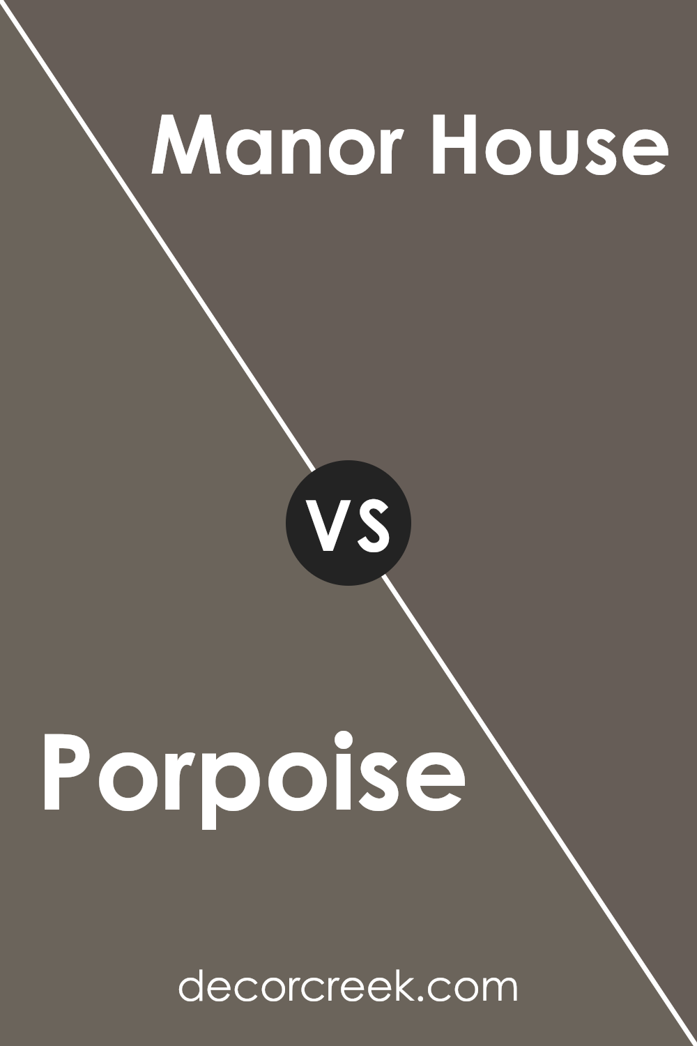
Porpoise SW 7047 by Sherwin Williams vs Manor House SW 7505 by Sherwin Williams
Porpoise and Manor House, both from Sherwin Williams, offer two distinguished looks for any space. Porpoise is a soft, neutral gray that provides a light and airy feel to rooms. It has a balanced tone that pairs well with brighter colors or can stand alone for a minimalist style.
On the other hand, Manor House is a deeper gray, almost bordering on a soft black. This color adds a stronger, more grounding feel to spaces, making it ideal for those who prefer a bold yet subtle backdrop.
While Porpoise reflects more light and can make a room feel more open, Manor House draws in a sense of sturdiness and depth, perfect for creating a cozy and enveloping atmosphere. Each color has its unique charm, whether you’re looking for something lighter or a hue with more presence.
You can see recommended paint color below:
- SW 7505 Manor House
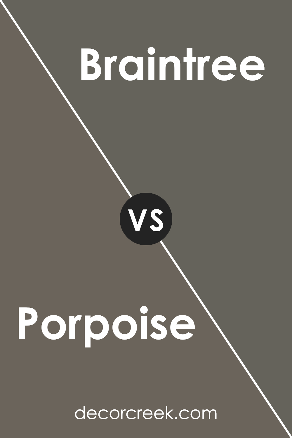
Porpoise SW 7047 by Sherwin Williams vs Braintree SW 9595 by Sherwin Williams
Porpoise SW 7047 and Braintree SW 9595, both by Sherwin Williams, offer distinct shades suitable for various spaces. Porpoise is a versatile gray with a subtle warm tone that can make a room feel cozy yet modern.
It’s perfect for living areas or bedrooms where you want a neutral backdrop that complements various decor styles. On the other hand, Braintree is a much darker color, leaning towards a deep charcoal. This shade is great for creating dramatic, bold accents in a space, ideal for feature walls or cabinetry.
While Porpoise provides a light, airy feel, Braintree offers a stronger, more commanding presence, making it better suited for larger or well-lit areas to prevent the space from feeling too enclosed. Both colors work well in contemporary homes, but their impact and usage will differ significantly based on the room’s function and size.
You can see recommended paint color below:
- SW 9595 Braintree
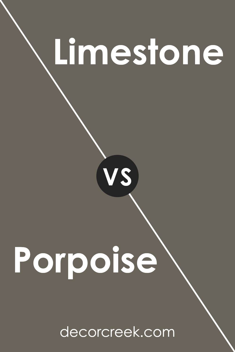
Porpoise SW 7047 by Sherwin Williams vs Limestone SW 9599 by Sherwin Williams
Porpoise SW 7047 by Sherwin Williams is a deep, cool gray that brings a sense of calm and solidity to a space. It has blue undertones which make it more vibrant than a typical gray. This color works well in modern designs or any area where you want to add a bit of a sleek, contemporary touch.
On the other hand, Limestone SW 9599 is a lighter gray that leans towards a soft, warm tone. It’s a great choice for creating a bright, airy feel in a room, enhancing natural light. Limestone’s gentle hue makes it flexible for use in various settings, complementing both rustic and modern decor.
While Porpoise has a bold depth that anchors a room, Limestone offers a gentle backdrop that can make a space feel larger and more open. Each color brings its unique mood to interiors, with Porpoise lending a more dramatic feel and Limestone providing a subtle, soothing effect.
You can see recommended paint color below:
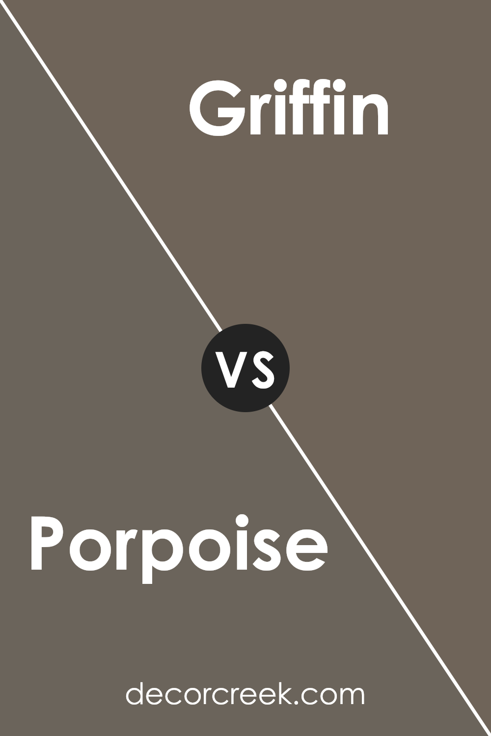
Porpoise SW 7047 by Sherwin Williams vs Griffin SW 7026 by Sherwin Williams
Porpoise SW 7047 and Griffin SW 7026 by Sherwin Williams are two distinct shades of gray, each offering a unique feel to any space. Porpoise, the lighter of the two, has a soft and subtle quality that can make a room feel airy and more open. This color works well in areas where you want to maintain a light but cozy atmosphere, such as living rooms or bedrooms.
On the other hand, Griffin is a deeper gray, providing a stronger, more grounded presence. It’s perfect for spaces that need a touch of drama or formality, such as a dining room or an office. This shade can give a room a more defined look, adding depth and a sense of solidity.
Both colors are versatile and can be paired with a variety of decor styles and other colors, but the choice between them depends largely on the mood and function you want to achieve in your space. Porpoise lends a gentler touch, while Griffin offers more impact and authority.
You can see recommended paint color below:
- SW 7026 Griffin
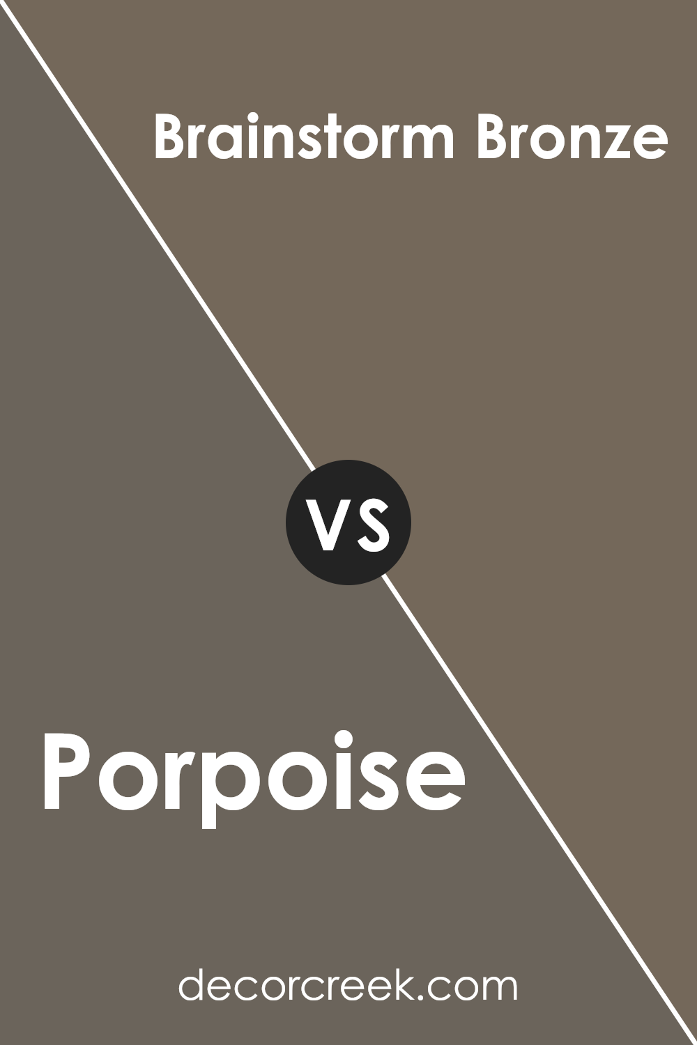
Porpoise SW 7047 by Sherwin Williams vs Brainstorm Bronze SW 7033 by Sherwin Williams
Porpoise and Brainstorm Bronze are two distinct colors by Sherwin Williams that both offer unique vibes to any space. Porpoise is a soft, cool gray that provides a subtle backdrop, making it versatile for various room styles and sizes. It’s a gentle color that reflects light nicely, making spaces appear larger and airy.
On the other hand, Brainstorm Bronze is a deeper, warmer taupe. This color brings a cozy and inviting feel to rooms, perfect for creating a snug and welcoming atmosphere. It pairs beautifully with rich textures and natural materials like wood and leather.
While Porpoise is more neutral and might be preferred for a modern, minimalist aesthetic, Brainstorm Bronze offers a heartier, richer tone that works well in traditional or rustic decors. Both colors are ideal for those looking to add a touch of elegance without overwhelming their spaces with bold color choices.
You can see recommended paint color below:
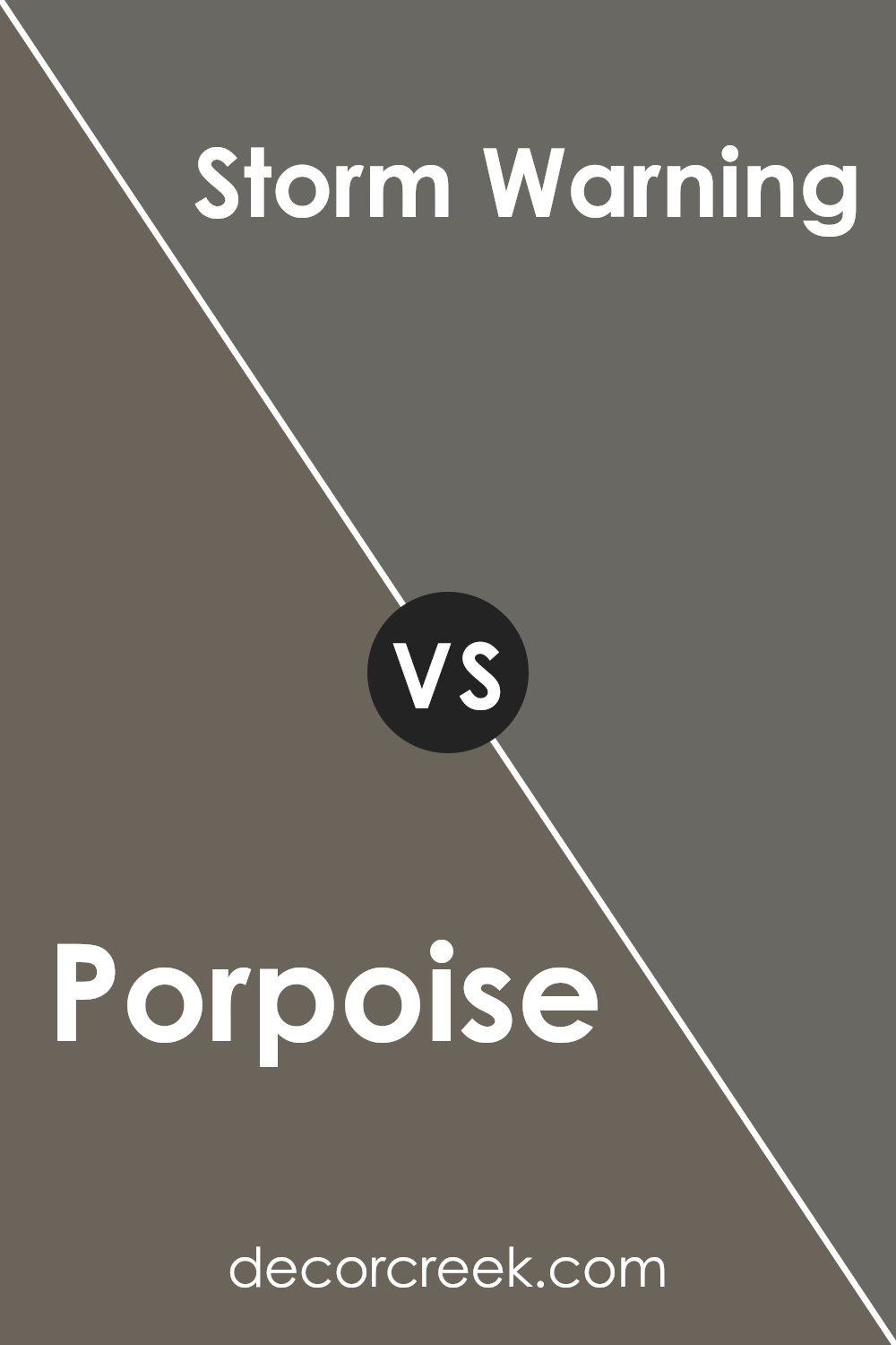
Porpoise SW 7047 by Sherwin Williams vs Storm Warning SW 9555 by Sherwin Williams
Porpoise SW 7047 and Storm Warning SW 9555, both by Sherwin Williams, present subtle yet distinctly different shades. Porpoise is a medium gray that holds a balanced, neutral tone, making it very versatile for various spaces.
It’s light enough to keep rooms feeling airy but sufficiently dark to add a touch of warmth. On the other hand, Storm Warning is a deeper gray that leans towards a charcoal hue. This color is bolder and can create more drama in a space, giving it a pronounced presence.
While Porpoise works well as a backdrop for brighter colors or wood tones, enhancing the other elements in a room without overpowering them, Storm Warning might be used to make a stronger statement or anchor a larger space. Both colors can complement a modern aesthetic, but your choice would depend on the mood you want to achieve—lighter and softer with Porpoise, or more striking and grounded with Storm Warning.
You can see recommended paint color below:
Porpoise SW 7047 by Sherwin Williams vs Ironclad SW 9570 by Sherwin Williams
Porpoise SW 7047 by Sherwin Williams is a soft, subtle shade of gray that leans slightly towards the cooler end of the spectrum. It’s a versatile color that brings a calm and gentle ambiance to any room, making it a great choice for spaces where you want to relax, such as bedrooms or living rooms.
On the other hand, Ironclad SW 9570 is a much darker gray that could be described as heavy and robust. This color offers a stronger presence, providing a sense of boldness and strength to the area it’s applied. Perfect for making a statement, Ironclad works well in areas where you want to draw attention or anchor lighter colors, like accent walls or on cabinetry.
Both colors showcase different aspects of gray, where Porpoise provides a light, airy feel, and Ironclad offers depth and impact. They can be used together to create a layered look that combines lightness and depth in your decorating scheme.
You can see recommended paint color below:
- SW 9570 Ironclad
Porpoise SW 7047 by Sherwin Williams vs Smokehouse SW 7040 by Sherwin Williams
Porpoise SW 7047 by Sherwin Williams and Smokehouse SW 7040 by Sherwin Williams are two distinct colors, each bringing its unique presence into any space. Porpoise is a soft, gentle gray that offers a neutral background, perfect for complementing a variety of decor styles and color schemes. This shade is versatile – it’s light enough to make small rooms feel larger but has enough depth to stand out in spacious settings as well.
On the other hand, Smokehouse is a darker, more intense gray. This color has a strong presence that can add a dramatic flair to any room. It is ideally suited for those looking to make a bolder statement or anchor a space with a deep, rich tone. While Porpoise brightens spaces, Smokehouse adds depth and definition.
Both colors pair well with a wide range of other hues, but the choice between them would depend on the desired effect in your space – whether looking for a lighter, airier feel or aiming for a moodier, more striking ambiance.
You can see recommended paint color below:
Porpoise SW 7047 by Sherwin Williams vs Cocoon SW 6173 by Sherwin Williams
Porpoise SW 7047 and Cocoon SW 6173 from Sherwin Williams are both neutral colors but have different tones that set distinct moods in a space. Porpoise is a medium gray that gives a cooler feel, making it great for modern and sleek looks. It can pair nicely with a variety of decor styles and tends to work well in spaces that aim for a more contemporary feel.
On the other hand, Cocoon is a deeper, warmer beige-gray tone. This color adds a cozy and welcoming touch to any room, making it ideal for spaces where comfort is key, such as living rooms and bedrooms. It offers a certain depth that can help make large rooms feel more intimate.
Both colors provide a flexible base for a range of decorating choices, from bright and bold accents to more muted, earthy accessories. Whether you choose the coolness of Porpoise or the warmth of Cocoon, both colors are versatile and easy to work with in any home.
You can see recommended paint color below:
- SW 6173 Cocoon
Porpoise SW 7047 by Sherwin Williams vs Folkstone SW 6005 by Sherwin Williams
Porpoise SW 7047 is a gentle gray that has a warm, soft feel to it. It’s perfect for creating a cozy and inviting atmosphere in any room. On the other hand, Folkstone SW 6005 is a deeper gray that carries a more solid and robust appearance.
This color is excellent for adding a touch of strength and presence to spaces, making it ideal for accent walls or for rooms that need a bit more visual weight. Both colors work well in modern décor schemes and can blend smoothly with various furnishings and accents. Porpoise tends to lighten up spaces with its softer hue, while Folkstone provides a sturdier, more anchoring effect.
Depending on the room’s lighting and size, each color has its unique way of enhancing the environment. Whether seeking to calm down a busy area with Porpoise or give a room a more grounded feel with Folkstone, both options offer beautiful and practical solutions.
You can see recommended paint color below:
- SW 6005 Folkstone
In conclusion, SW 7047 Porpoise by Sherwin Williams is a paint color that I find very useful and pretty. It’s a quiet gray that doesn’t shout for attention yet makes any room feel cozy and welcoming. When I used it in my living room, it matched well with all my furniture, showing how easily it goes with different styles. Whether I put it in a space with lots of light or in a room that’s a bit darker, Porpoise kept looking great, reflecting light beautifully without becoming too bright or too dull.
I noticed, too, that this color works well in various types of rooms, from kitchens and bathrooms to bedrooms and even hallways. This makes it a good pick if you want your whole house to have a flow with colors that match nicely. Plus, cleaning up marks and scuffs from the walls was easy, making it a practical choice for families or anyone who doesn’t want to fuss too much over maintaining their wall paint.
Overall, SW 7047 Porpoise is a color I would recommend if you’re thinking about giving your home a new look with paint that is quiet, pretty, and easy to live with.
It’s great for creating a comfy and inviting atmosphere without making too much fuss.

Ever wished paint sampling was as easy as sticking a sticker? Guess what? Now it is! Discover Samplize's unique Peel & Stick samples.
Get paint samples

