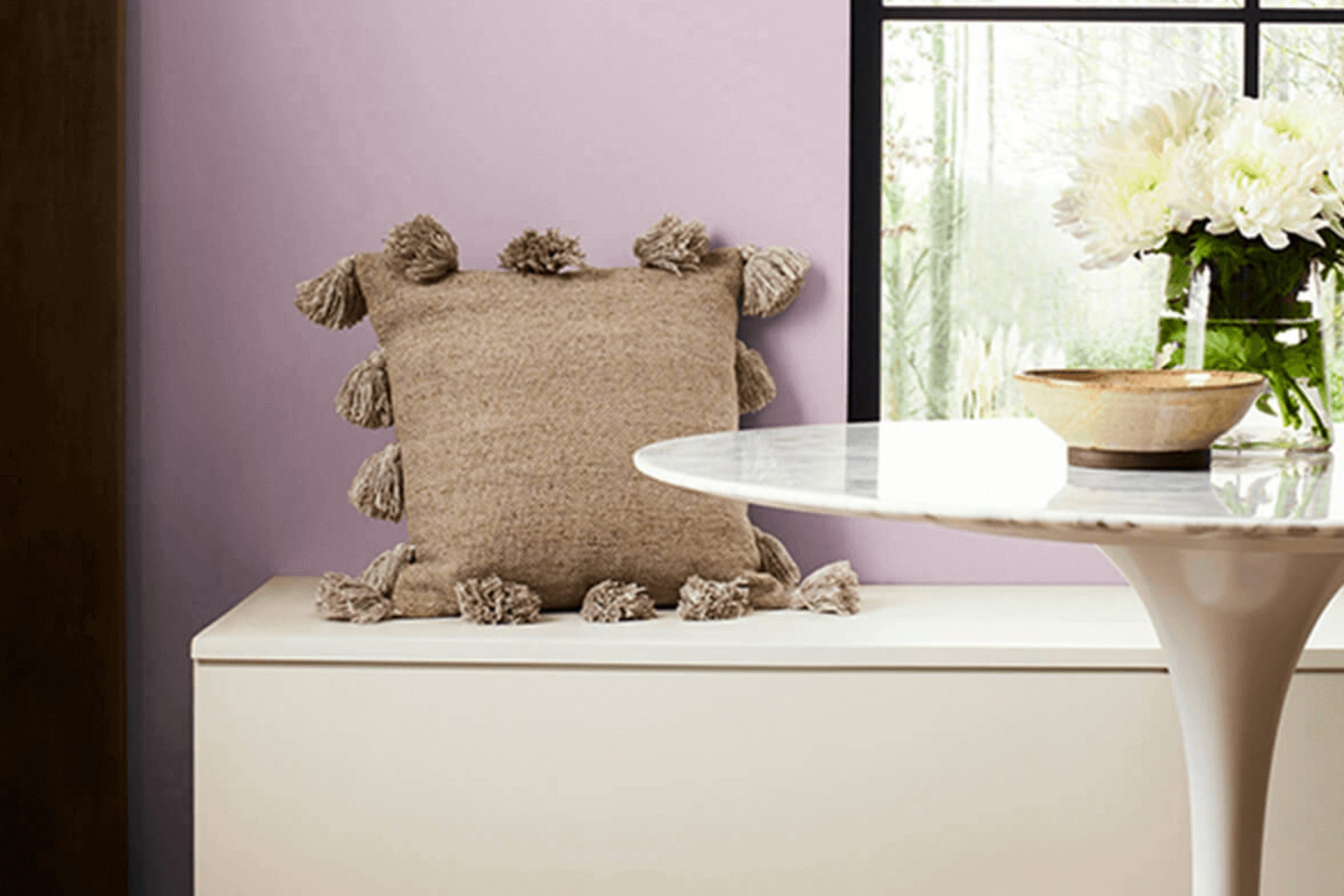
If you’re looking to refresh your room with a new color and style, consider SW 6282 Mauve Finery by Sherwin Williams. First of all, the name itself sets the tone for this paint color: an elegant twist on traditional mauve. Not too pink, not too purple, Mauve Finery provides a balanced hue that adds warmth and depth to a room without overpowering the senses.
When you apply Mauve Finery to your walls, you can expect the color to subtly shift in intensity and tone depending on the natural light available. This makes it an excellent choice for rooms that vary in light exposure throughout the day. Additionally, it’s adaptable enough to blend seamlessly with both modern and classical decor, encouraging you to use it in various rooms, from a cozy bedroom to a bustling kitchen.
Moreover, pairing Mauve Finery with contrasting colors or similar hues can enhance the visual appeal of your room. Whether you opt to match it with crisp whites for a fresh look, or with darker shades to create a more intimate atmosphere, this color adjusts easily.
If you’ve been looking for a paint color that can refresh your room and provide a durable and pleasing aesthetic, SW 6282 Mauve Finery might just be your perfect match.
What Color Is Mauve Finery SW 6282 by Sherwin Williams?
Mauve Finery by Sherwin Williams is a soft, muted shade of purple with subtle pink undertones, providing a gentle and soothing feel to any room. This color is adaptable, creating a cozy atmosphere in a variety of settings. Its gentle hue works particularly well in bedrooms and living rooms, where a calming influence is often desired.
This color pairs beautifully with natural materials like wood and linen, enhancing their organic look and feel. Wood, whether light oak or rich walnut, brings warmth to the subtle coolness of Mauve Finery, while linen adds a textural contrast that makes the room feel welcoming and lived-in.
Additionally, metallic finishes like brushed nickel or soft copper can add a slight shimmer, providing a hint of modernity without overpowering the room’s gentle aesthetic.
Mauve Finery fits seamlessly into interior styles such as shabby chic, where its vintage vibe complements distressed furniture and soft, floral patterns.
It also has a place in contemporary settings, especially when combined with minimalist designs and clean lines, allowing the color itself to stand out.
Fabrics like velvet or silk used in cushions or curtains can add a luxurious touch to the understated elegance Mauve Finery brings to interiors.
Is Mauve Finery SW 6282 by Sherwin Williams Warm or Cool color?
Mauve Finery by Sherwin Williams is a unique shade of muted purple that brings a calm and gentle atmosphere to any room. It works well as a soft backdrop in bedrooms and living areas, making rooms feel cozy and inviting without being too bold or intense.
This color also pairs nicely with natural elements like wood and stone, enhancing earthy textures in the home. When used in small rooms, such as a bathroom or an entryway, Mauve Finery can add a touch of warmth, creating a welcoming vibe. It’s adaptable enough to match with other colors, from light neutrals to darker shades, allowing for easy decoration and style adjustments.
In a home office, this color can help maintain a relaxed environment that’s helpful for focus and creativity. Overall, Mauve Finery by Sherwin Williams is a great choice for anyone looking to add a gentle pop of color to their home decor.
Undertones of Mauve Finery SW 6282 by Sherwin Williams
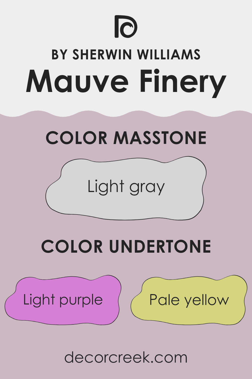
Mauve Finery is a unique color because it contains several undertones that can influence how it appears in different settings. These undertones include light purple, pale yellow, light blue, pale pink, lilac, mint, and grey. Each of these shades brings its own flair to the primary color, affecting how Mauve Finery is perceived in various environments.
Undertones are subtle colors that lie beneath the surface of the main color. They play a crucial role in how a color looks, especially under different lighting conditions. For instance, light purple and lilac undertones in Mauve Finery can make the walls feel slightly cooler, giving a calm and gentle ambiance to a room. Meanwhile, pale yellow and pale pink can add a touch of warmth, making a room feel more welcoming.
When applied to interior walls, the combination of these undertones can create adaptable effects. In natural light, Mauve Finery might appear more vibrant, with its purple and pink undertones becoming more prominent, setting a soft yet cheerful tone. In artificial lighting, the grey and mint undertones might become more noticeable, providing a more subdued and neutral appearance.
This makes Mauve Finery a flexible choice for various styles and settings in home decor. Whether it enhances the coziness of a bedroom or adds a gentle hue to a living room, its undertones play a significant role in achieving the desired atmosphere.
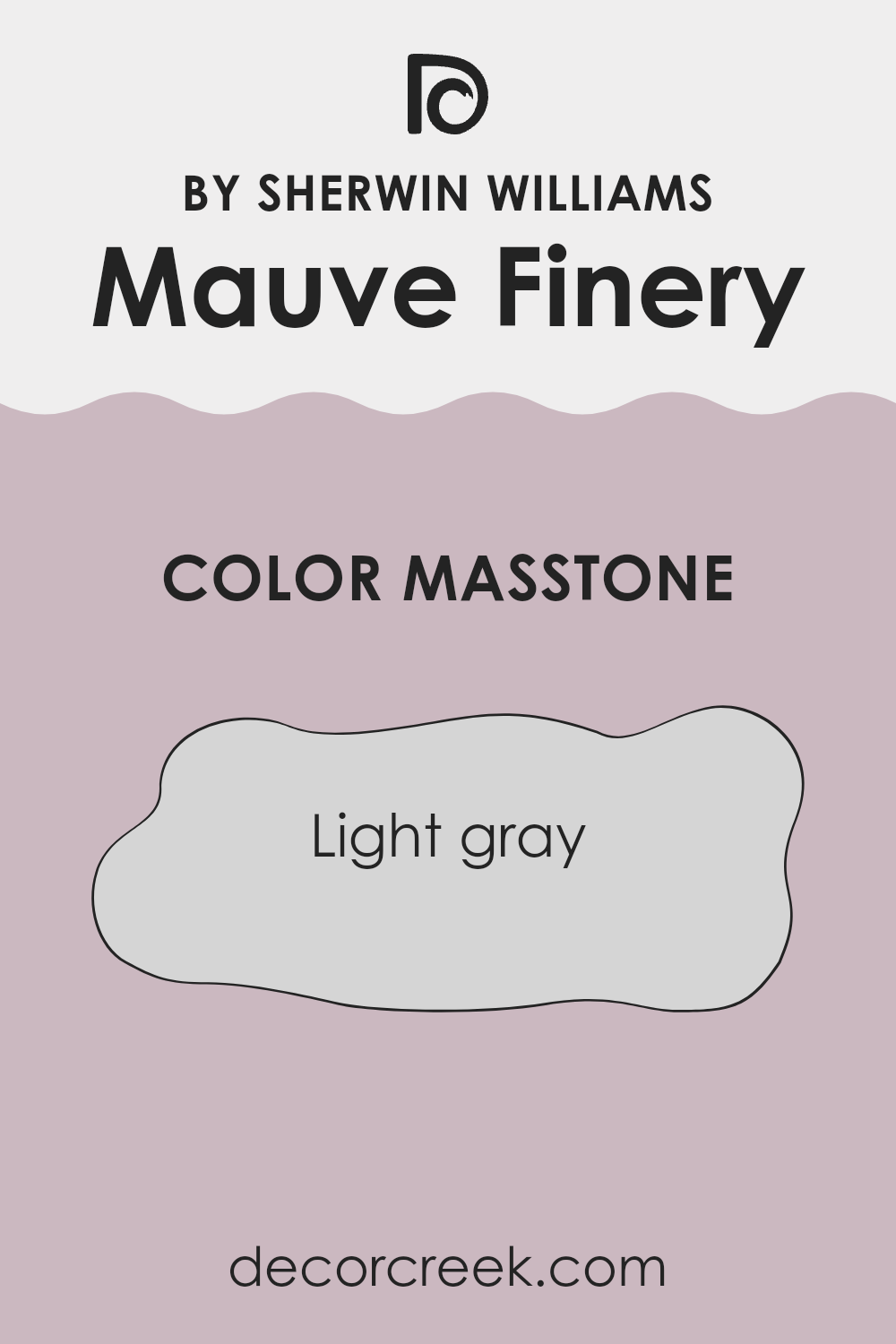
What is the Masstone of the Mauve Finery SW 6282 by Sherwin Williams?
Mauve Finery is a subtle and gentle color with a masstone of light gray. This soft shade creates a clean, calm atmosphere in any room, making it an adaptable option for homes. It’s especially effective in rooms that could use a touch of understated elegance without overpowering the senses.
This light gray hue helps to enhance natural light, making rooms feel larger and more open. Furthermore, its neutrality allows it to blend seamlessly with a variety of decor styles and color schemes.
Whether you’re decorating a living room, bedroom, or even a kitchen, this color provides a fresh canvas that can support both bold accents or softer, complementary tones. It’s a practical choice for homeowners looking for a background color that is easy to work with and maintain, offering an enduring appeal without being too demanding in terms of styling.
How Does Lighting Affect Mauve Finery SW 6282 by Sherwin Williams?
Lighting plays a crucial role in how we perceive colors. Different light sources can significantly alter the appearance of a color due to the way light interacts with an object’s surface and reflects back towards the viewer. The type of light—whether it’s natural or artificial—can change a color’s hue, brightness, and saturation.
For instance, consider the color Mauve Finery, a gentle shade of purple. In natural light, which is often considered the best light for showing true colors, Mauve Finery appears soft and true to its palette. The natural sunlight highlights its subtle lavender undertones, making it look fresh and lively.
Under artificial light, such as LED or fluorescent bulbs, the perception of Mauve Finery shifts. Fluorescent lighting tends to emit a cooler tone, which can enhance the blue undertones of the color, making it appear slightly more muted than in natural light. LED lights, depending on their color temperature, can either warm the color up or keep it cool, altering its appearance.
The direction a room faces also impacts how Mauve Finery looks throughout the day. In north-facing rooms, which don’t get direct sunlight and tend to have cooler light, the color might look more subdued and shadowy. In south-facing rooms, where warm, bright sunlight floods in, the color can look brighter and more vibrant throughout most of the day.
East-facing rooms receive natural light in the morning, making Mauve Finery appear warm and soft in the early hours but potentially duller as the day progresses and the natural light diminishes. Conversely, in west-facing rooms, the color will appear more muted in the morning and gain vibrancy in the afternoon as it reflects the warmer sunset hues. Therefore, when choosing colors for a room, considering both the room’s orientation and the type of lighting used is essential to ensure the color appears as desired under different conditions.
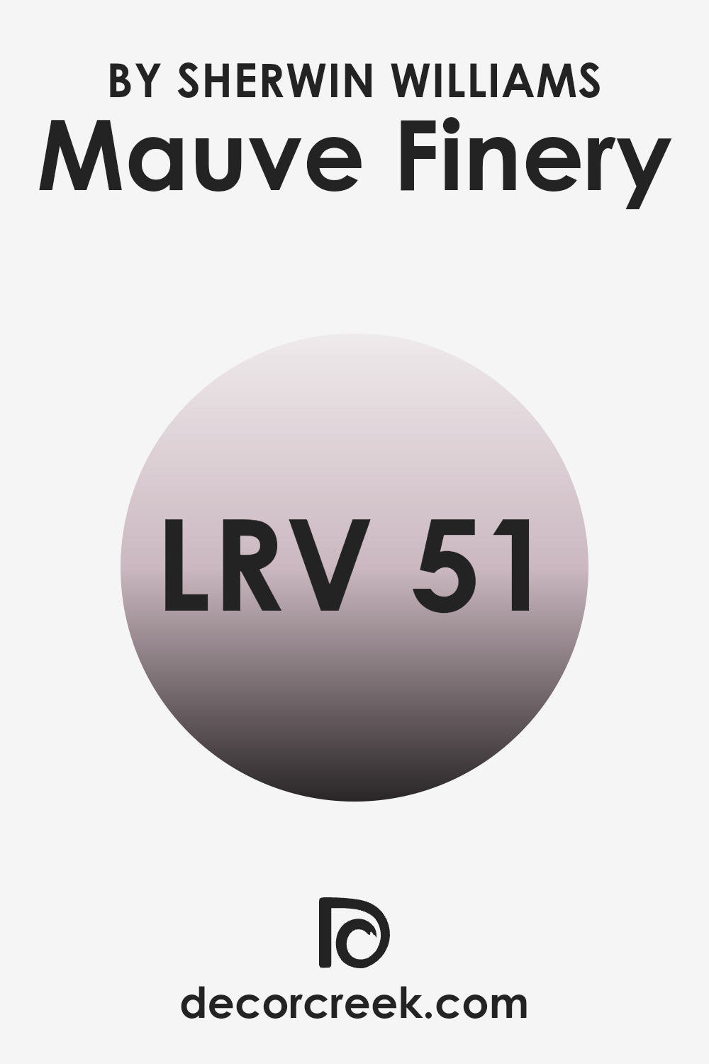
What is the LRV of Mauve Finery SW 6282 by Sherwin Williams?
LRV stands for Light Reflectance Value, a measure used to indicate how much light a paint color reflects or absorbs when applied to a surface. This value is expressed on a scale from zero to one hundred, where zero means no light is reflected (completely black) and one hundred reflects all light (pure white). The LRV of a color can greatly influence the atmosphere and appearance of a room.
A higher LRV means a color will reflect more light, making a room feel more open and airy, while a lower LRV means a color will absorb more light, potentially making a room feel cozy yet smaller. For the color with an LRV of 50.819, it sits right around the midpoint of the LRV scale. This means it neither absorbs nor reflects light excessively, making it an adaptable choice for interior rooms.
In different lighting conditions, this color might appear differently; in a well-lit room, it will seem lighter, while in a dimly lit room, it might seem a bit deeper. Such a balanced LRV makes it suitable for various rooms, both small and large, as it helps maintain a balanced look without dramatically altering the perception of room size.
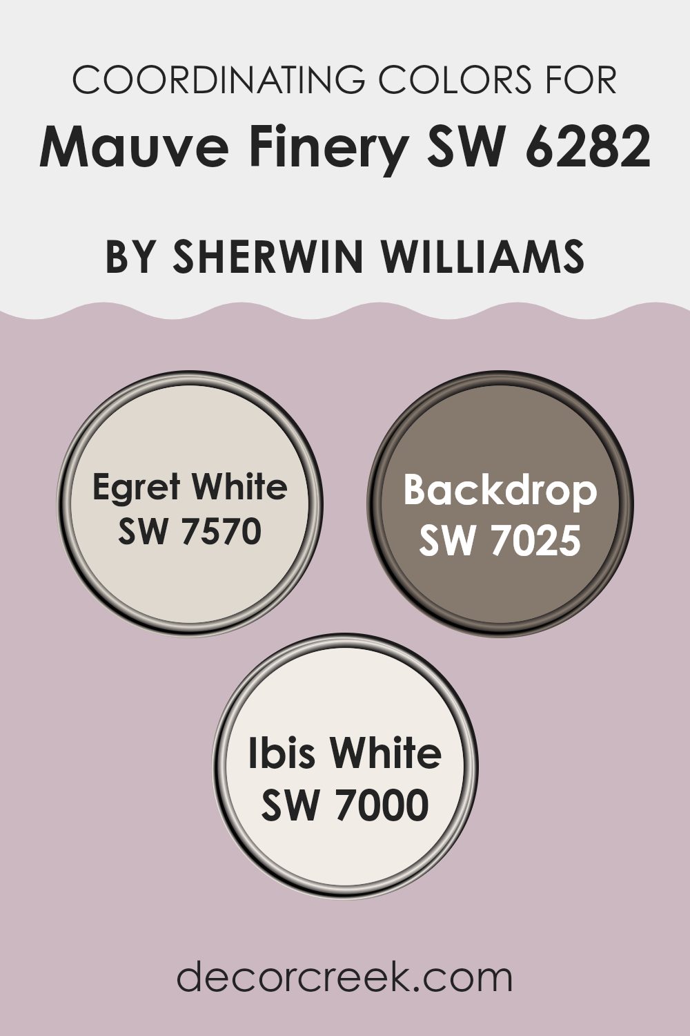
Coordinating Colors of Mauve Finery SW 6282 by Sherwin Williams
Coordinating colors are shades that complement a primary color, enhancing the overall aesthetic of a room. These colors work together because their tones either contrast or harmonize with the main color, creating a balanced and pleasing look. When working with a shade like Mauve Finery, coordinating colors such as Egret White, Backdrop, and Ibis White from Sherwin Williams can be used to design a cohesive color scheme.
Egret White is a soft, warm white with a subtle hint of beige, making it a gentle color that can brighten rooms without overpowering them. It works beautifully as a background for deeper shades, providing a calm and light canvas that highlights richer colors. Backdrop, on the other hand, is a deeper, neutral gray that provides a stunning contrast to lighter tones, making it ideal for creating depth and interest in a room.
Ibis White is another clean and bright shade of white yet carries a crisp vibrance that enhances the visual appeal. It serves well in trims, ceilings, or even as a main wall color if one desires a fresher, more invigorating room. Together, these colors coordinate effortlessly with Mauve Finery, offering flexibility in design and adaptability in styling different rooms.
You can see recommended paint colors below:
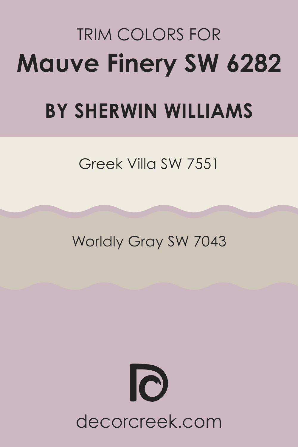
What are the Trim colors of Mauve Finery SW 6282 by Sherwin Williams?
Trim colors are those used on the molding, door frames, window frames, and other architectural elements to accentuate the main color of a room or exterior. In the case of Mauve Finery by Sherwin Williams, applying trim colors can highlight its unique shade, adding depth and definition to the room.
By selecting appropriate trims such as Greek Villa or Worldly Gray, you can enhance the visual appeal and contrast in the environment where Mauve Finery is applied. These chosen hues help in creating a balanced look, bringing together the design elements harmoniously. Greek Villa SW 7551 is a warm and clean white tone that provides a fresh contrast to Mauve Finery, making the latter stand out while maintaining a neat overall appearance.
On the other side, Worldly Gray SW 7043 offers a slightly deeper, mid-tone gray that complements the underlying tones in Mauve Finery. Using Worldly Gray as a trim can ground the lighter Mauve color, adding depth and a subtle distinction that enriches the room. Both of these colors contribute to a more dynamic visual environment without overpowering Mauve Finery’s charm.
You can see recommended paint colors below:
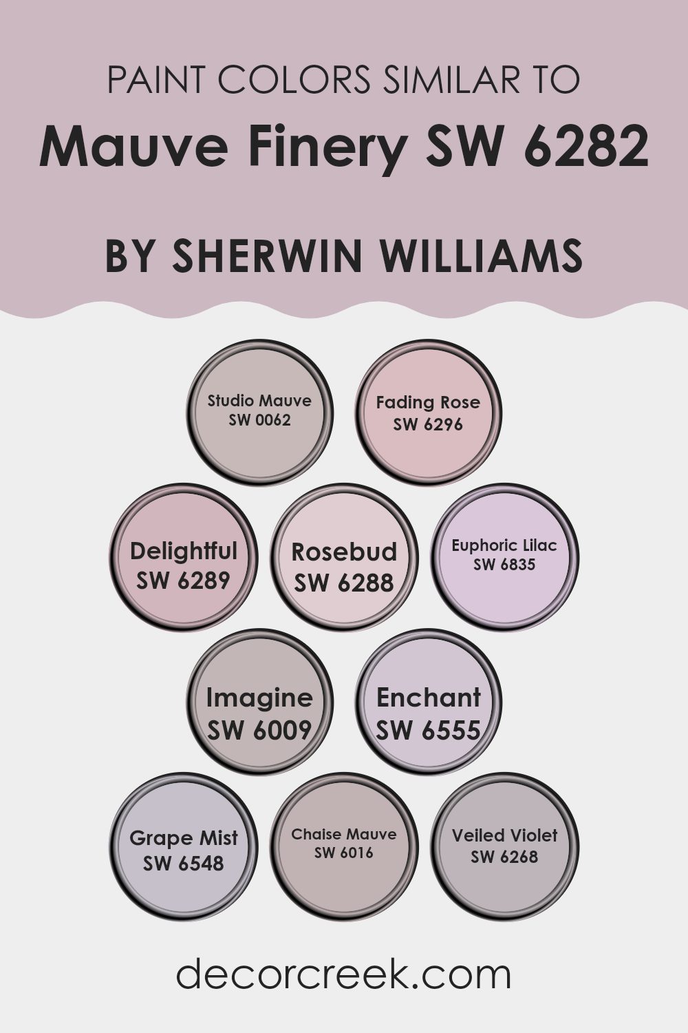
Colors Similar to Mauve Finery SW 6282 by Sherwin Williams
Similar colors are essential in creating a harmonious and appealing visual experience, particularly in interior design and painting. Colors like SW 0062 Studio Mauve, SW 6296 Fading Rose, and SW 6289 Delightful share subtle variations that make them adaptable for blending smoothly within a room while maintaining interest and depth.
These similar shades allow for an easy mix-and-match approach, supporting a cohesive look throughout your home. For instance, Studio Mauve offers a subdued yet inviting atmosphere with its soft purple tone, while Fading Rose is a gentle blush, perfect for creating a warm, welcoming feel. Delightful, on the other hand, is a light, cheerful lavender that brightens rooms effortlessly.
Expanding the palette, SW 6288 Rosebud and SW 6835 Euphoric Lilac introduce lively yet soothing elements that work well in bedrooms or living areas. Rosebud is a fresh, floral pink that acts as a delicate backdrop, and Euphoric Lilac is a vibrant yet calm purple that stimulates creativity without overpowering.
Further enriching the spectrum, SW 6009 Imagine and SW 6555 Enchant provide a deeper look into the realm of calmness, with Imagine presenting a muted taupe with purple undertones and Enchant revealing a deeper mauve that adds a touch of mystery and depth.
Colors like SW 6548 Grape Mist, SW 6016 Chaise Mauve, and SW 6268 Veiled Violet round out the choices, from the more assertive Grape Mist, a clear light violet, to the subtle elegance and understated refinement of Chaise Mauve, and finally, Veiled Violet, which provides a muted, shadowy hue, ideal for accent walls or cozy nooks. The use of similar colors, therefore, offers both adaptability and an opportunity to create a room that feels connected and thoughtfully designed.
You can see recommended paint colors below:
- SW 0062 Studio Mauve
- SW 6296 Fading Rose
- SW 6289 Delightful
- SW 6288 Rosebud
- SW 6835 Euphoric Lilac
- SW 6009 Imagine
- SW 6555 Enchant
- SW 6548 Grape Mist
- SW 6016 Chaise Mauve
- SW 6268 Veiled Violet
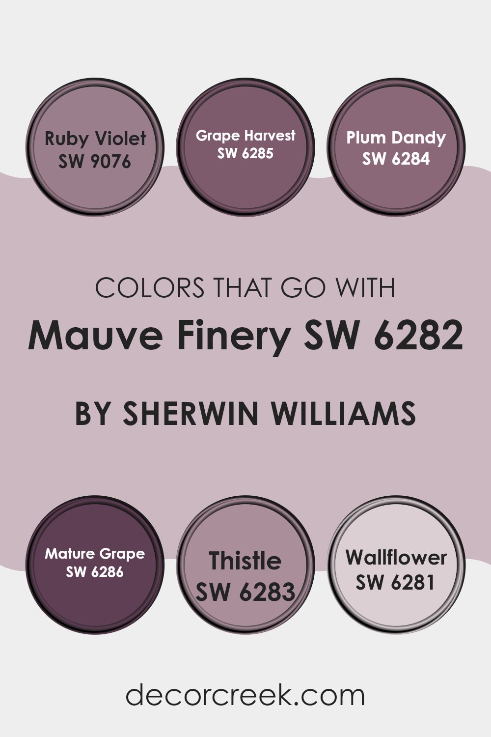
Colors that Go With Mauve Finery SW 6282 by Sherwin Williams
Choosing colors that complement Mauve Finery SW 6282 by Sherwin Williams is important because they help to create a coherent and appealing color scheme in any room. These matching colors can enhance the overall aesthetic, bring balance, and highlight specific features of a room.
For example, pairing Mauve Finery with shades like Ruby Violet or Grape Harvest creates a rich, harmonious look that is pleasing to the eye. These color combinations are vital as they can influence the mood and atmosphere of a room, making it more inviting and comfortable.
Ruby Violet is a deep, bold shade that adds a touch of drama and intensity to Mauve Finery, perfect for accent walls or textile highlights. Grape Harvest complements with an earthy, deep purple that works well in providing a grounded, natural feel to interiors. For a slightly lighter hue, Plum Dandy is an excellent choice; this soft, subtle purple can lighten the darker tones of Mauve Finery, offering a smooth gradient of similar hues.
Mature Grape, a robust and deeper hue, enriches rooms with its depth, great for creating focal points or cozy nooks. Thistle is lighter and provides a gentle contrast, giving a fresh, airy feel when paired with Mauve Finery. Lastly, Wallflower is a dusty, muted purple that superbly harmonizes, ensuring the room maintains a calm and cohesive look. These color interactions are crucial for anyone wanting to create a visually appealing and harmonious room.
You can see recommended paint colors below:
- SW 9076 Ruby Violet
- SW 6285 Grape Harvest
- SW 6284 Plum Dandy
- SW 6286 Mature Grape
- SW 6283 Thistle
- SW 6281 Wallflower
How to Use Mauve Finery SW 6282 by Sherwin Williams In Your Home?
Mauve Finery by Sherwin Williams is a unique shade of soft purple with hints of gray that brings a cozy and warm feel to any room. This adaptable color can be used in various ways around your home. In the living room or bedroom, it offers a soothing backdrop that pairs well with natural elements like wood or wicker, enhancing the overall cozy vibe.
This color works great in a bathroom too, adding a touch of gentleness that complements white tiles or fixtures, creating a clean and inviting room. For those wanting a modern look, Mauve Finery pairs nicely with metallic accents like silver or gold, which add a touch of elegance without overpowering the room.
It’s also ideal for smaller rooms such as a hallway or an accent wall, where it can make the area seem bigger and more open. Consider using Mauve Finery in your home for a gentle yet effective update to your living areas.
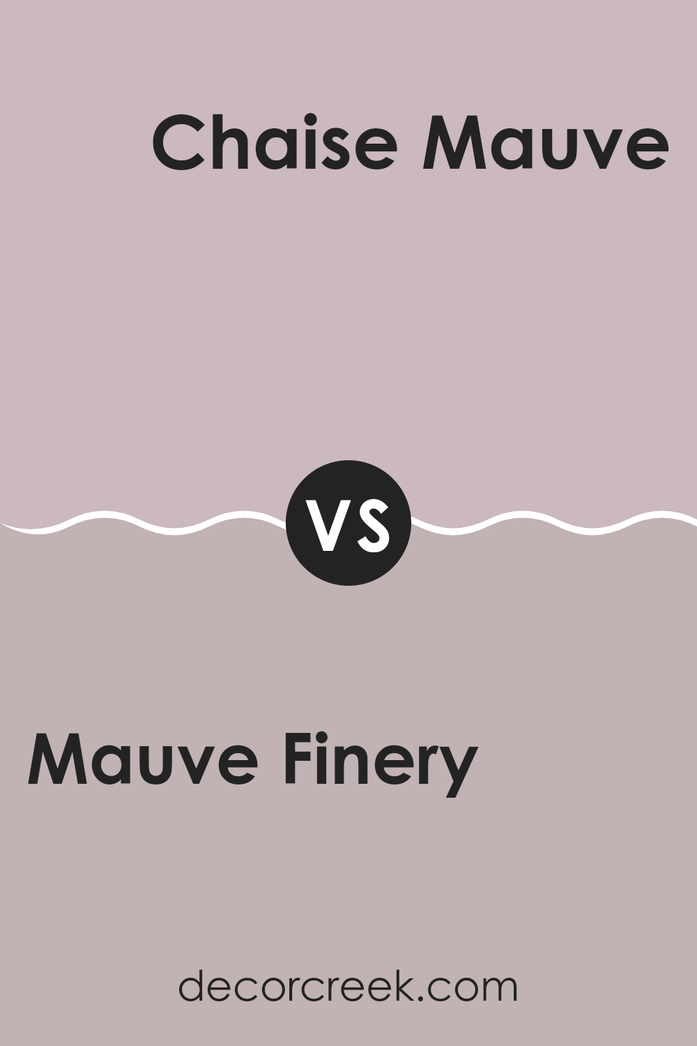
Mauve Finery SW 6282 by Sherwin Williams vs Chaise Mauve SW 6016 by Sherwin Williams
The main color, Mauve Finery, is a light, soft purple with a dusty rose undertone. It’s quite subtle and gives off a gentle and airy feel, making rooms look soothing and inviting. Compared to Mauve Finery, Chaise Mauve is a deeper shade of purple.
It carries more gray in its composition, which makes it look slightly more muted and shadowy. This color provides a stronger presence in a room and might make rooms feel a bit cozier and more enclosed than the lighter Mauve Finery.
Both colors share a purple base, but Mauve Finery looks a bit warmer due to its rosier undertones, while Chaise Mauve appears cooler because of its grayer undertones. These differences make Mauve Finery better suited for rooms where a light and breezy atmosphere is desired, whereas Chaise Mauve is ideal for creating a more defined and cozy feeling.
You can see recommended paint color below:
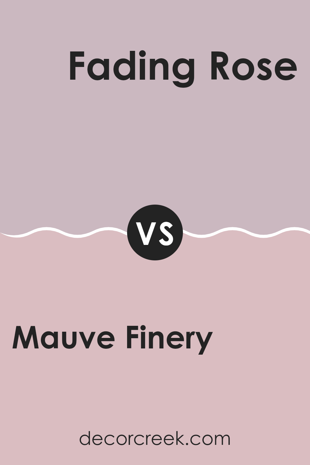
Mauve Finery SW 6282 by Sherwin Williams vs Fading Rose SW 6296 by Sherwin Williams
Mauve Finery and Fading Rose are two distinct shades by Sherwin Williams. Mauve Finery leans towards a soft, light purple with gentle gray undertones, giving it a subtle and calming look. It’s an adaptable color that pairs well in rooms meant for relaxation or even as a neutral backdrop in a more lively room.
On the other hand, Fading Rose has a warmer tone, closely resembling a blush or soft pink. This color adds a touch of warmth and is ideal for creating a cozy and welcoming atmosphere in any room. It’s especially charming in areas where you want a bit of softness and comfort, like bedrooms or living rooms.
Both colors share a muted elegance, but while Mauve Finery offers a cool undertone, Fading Rose brings a warmer presence. Each creates a different mood and can be used effectively for contrasting themes or complementary schemes in home decor.
You can see recommended paint color below:
- SW 6296 Fading Rose
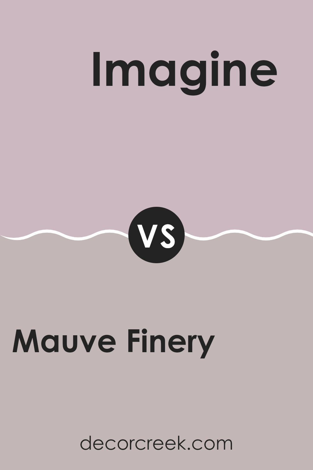
Mauve Finery SW 6282 by Sherwin Williams vs Imagine SW 6009 by Sherwin Williams
Mauve Finery and Imagine by Sherwin Williams are two different yet subtly harmonious paint colors. Mauve Finery falls into a soft, muted range with a gentle pinkish-purple tone. It gives off a calm and cozy vibe, making it a great choice for creating a soothing atmosphere in a room such as a bedroom or living area.
On the other hand, Imagine is a slightly darker shade, leaning more towards a neutral taupe with a mix of gray and brown undertones. This color is adaptable and fits well in various settings, providing a grounding effect. It works well in rooms that require a bit of a stronger presence without overpowering the senses.
Both colors work well together for a two-tone room scheme, where Mauve Finery could lighten up the room, and Imagine could add depth and contrast. Whether used separately or in combination, they offer unique ways to enhance your living areas gently and invitingly.
You can see recommended paint color below:
- SW 6009 Imagine
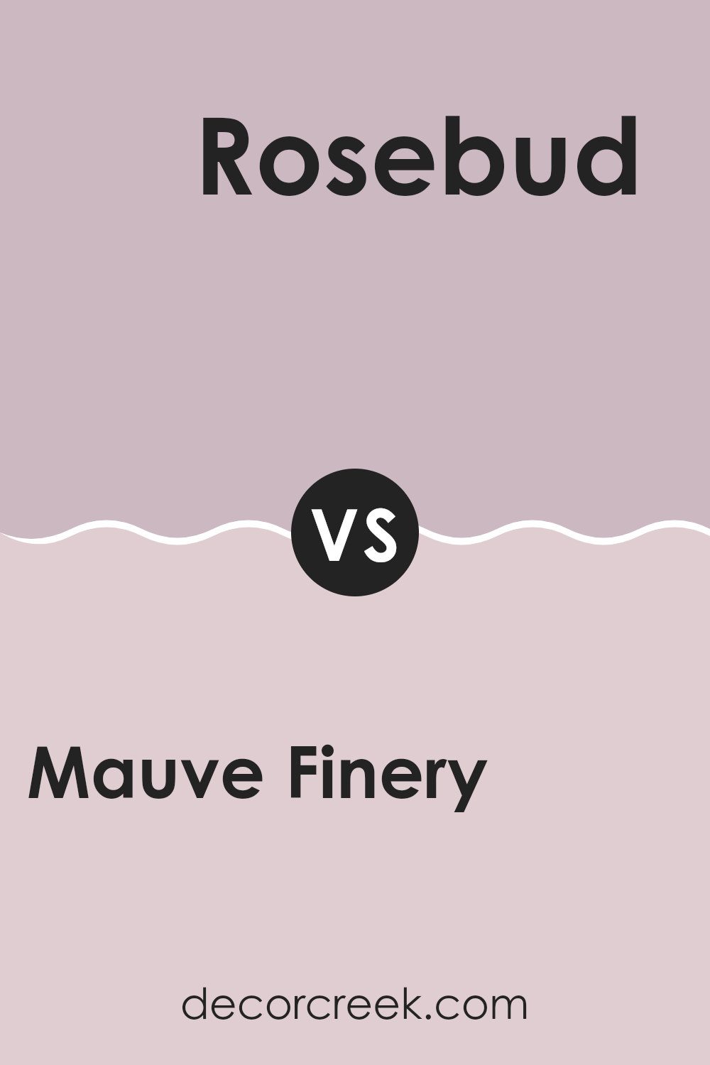
Mauve Finery SW 6282 by Sherwin Williams vs Rosebud SW 6288 by Sherwin Williams
Mauve Finery and Rosebud are two distinct colors from Sherwin Williams. Mauve Finery is a subtle, soft purple with a hint of gray. This color has a muted quality, making it a great choice for a calming and gentle ambiance in a room. It leans towards a cooler tone, providing a soothing background that pairs well with both bold and neutral shades.
On the other hand, Rosebud is a richer, more vivid pink with warm undertones. This color has a lively and welcoming feel, making it perfect for rooms where you want to add a pop of brightness. Its warm hue infuses a sense of cheerfulness and coziness into a room, contrasting with the cooler and more understated Mauve Finery.
Together, these colors offer a nice balance between calm and vibrancy, depending on what atmosphere you want to create. While Mauve Finery works well for a quiet and peaceful setting, Rosebud is ideal for more energetic and warm rooms.
You can see recommended paint color below:
- SW 6288 Rosebud
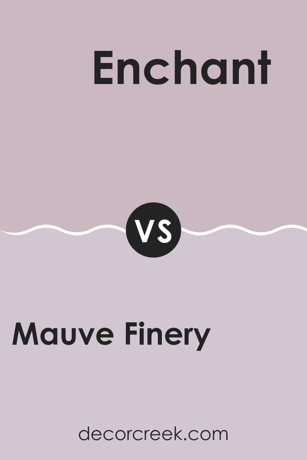
Mauve Finery SW 6282 by Sherwin Williams vs Enchant SW 6555 by Sherwin Williams
Mauve Finery and Enchant, both by Sherwin Williams, offer unique shades that could suit different tastes and rooms. Mauve Finery is a softer, muted color that looks like a blend of light purple with hints of gray. This color is gentle and calming, making it perfect for creating a relaxing atmosphere in places like bedrooms or living rooms.
On the other hand, Enchant is a bolder and brighter shade. It stands out with its deep purple hue that can add a punch of color and personality to a room. This shade would be great in an area where you want to make a statement, like an accent wall or a dining room.
Although both colors come from the purple family, Mauve Finery is subtler and leans towards a pastel tone, while Enchant is more vibrant and eye-catching. Depending on what mood or style you’re going for in a room, either could be a great choice.
You can see recommended paint color below:
- SW 6555 Enchant
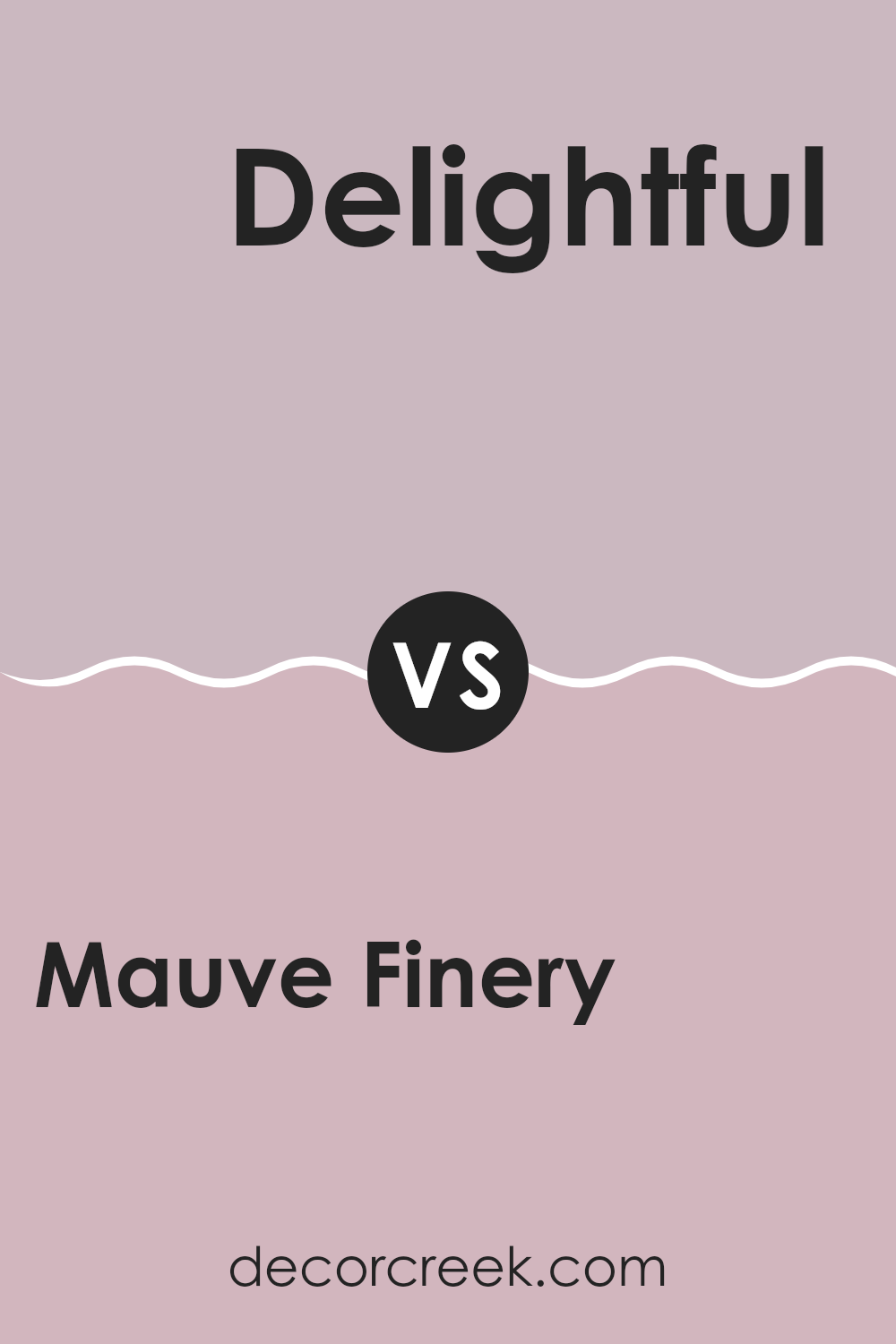
Mauve Finery SW 6282 by Sherwin Williams vs Delightful SW 6289 by Sherwin Williams
Mauve Finery is a subtle and gentle pink with a hint of gray, creating a calming and soft atmosphere in any room. It works well in rooms where a light, soothing touch is desired. This color leans more towards a neutral tone, making it easy to pair with a variety of decor styles and other colors.
On the other hand, Delightful is a brighter and more cheerful pink. It has a slightly more vivid appearance, infusing more energy into a room compared to Mauve Finery. Delightful is perfect for areas where a playful and inviting feel is wanted. It can really help to make a room feel more lively and upbeat.
In comparison, while both colors share a pink base, Mauve Finery offers a more muted and understated look, whereas Delightful brings a more vibrant and energetic vibe. Depending on the mood you want to create, you can choose the subdued elegance of Mauve Finery or the cheerful brightness of Delightful.
You can see recommended paint color below:
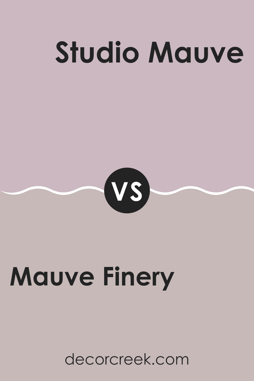
Mauve Finery SW 6282 by Sherwin Williams vs Studio Mauve SW 0062 by Sherwin Williams
Mauve Finery and Studio Mauve are two shades from Sherwin Williams that offer subtle variances in the mauve color family. Mauve Finery is a slightly lighter and softer tone which could be described as pastel-like, giving a gentle and airy feel to the room it’s used in. Its lighter hue makes it a good choice for smaller rooms or areas where you want a sense of openness and light.
In contrast, Studio Mauve presents a bit of a deeper and richer mauve tone. This hue leans towards a more pronounced mauve presence, which can add a certain depth and warmth to a room. It stands out a bit more than Mauve Finery and would work well in larger areas or as an accent wall to create a focal point in a room.
Overall, while both colors share the same mauve base, Mauve Finery is best where a lighter, more soothing presence is desired, while Studio Mauve offers a more noticeable and warmer touch.
You can see recommended paint color below:
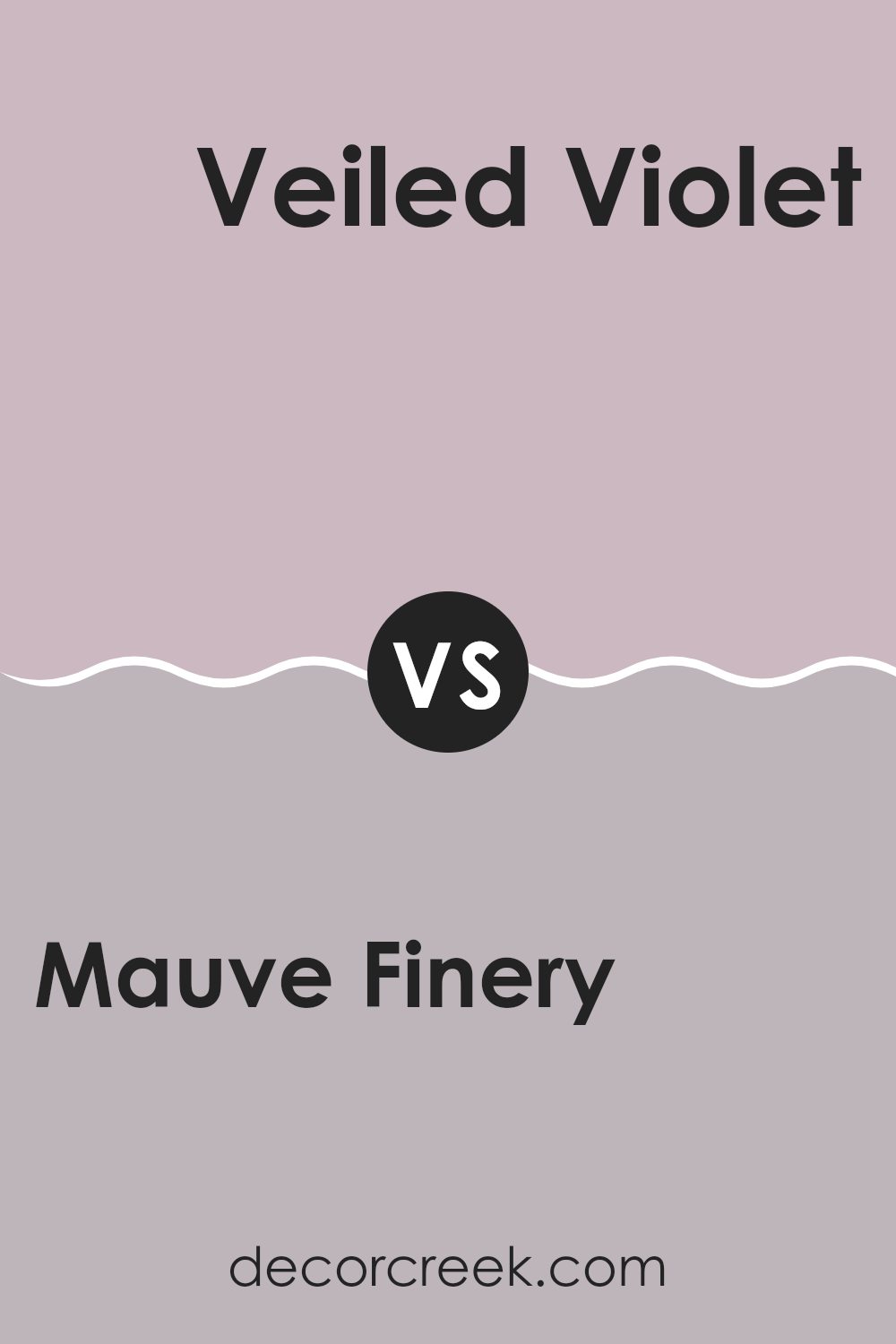
Mauve Finery SW 6282 by Sherwin Williams vs Veiled Violet SW 6268 by Sherwin Williams
Mauve Finery and Veiled Violet are both beautiful, subtle colors with their own unique charm. Mauve Finery has a soft, muted tone that leans toward a pale pinkish-purple. It gives a gentle and calming feel to any room, making it ideal for areas where you want a touch of elegance without overpowering brightness.
Veiled Violet, on the other hand, is slightly deeper with more pronounced purple hues. It provides a warmer and cozier atmosphere, suitable for creating a welcoming room in homes. This color can also add a bit of mystery and depth to a room, offering a richer backdrop compared to the lighter Mauve Finery.
Both colors work well in rooms that aim for a peaceful, understated look. They complement each other beautifully, with Mauve Finery offering a lighter option and Veiled Violet providing a deeper alternative. Each can be paired with various decor styles, from modern minimalist to traditional, depending on the preference and existing elements in the room.
You can see recommended paint color below:
- SW 6268 Veiled Violet
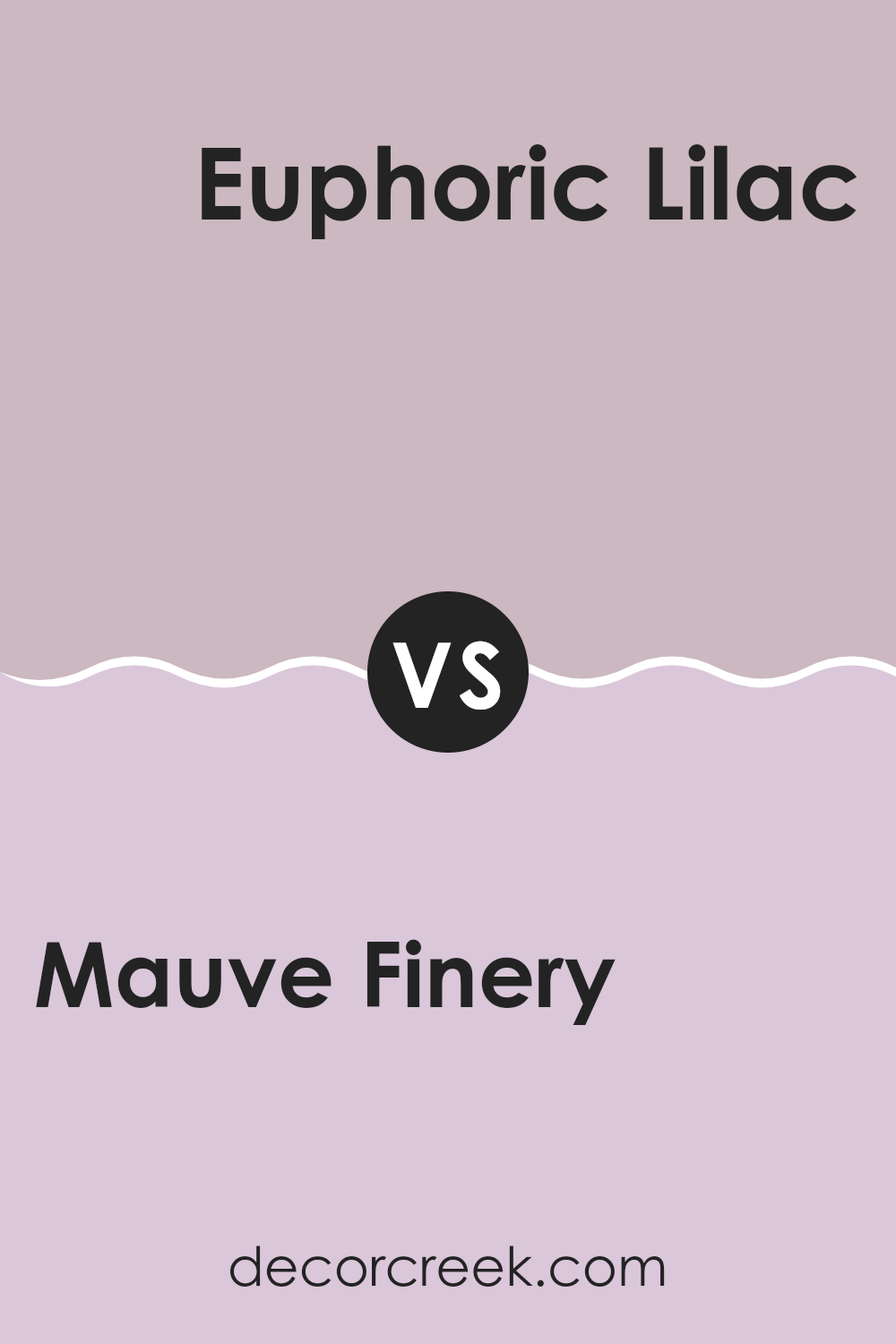
Mauve Finery SW 6282 by Sherwin Williams vs Euphoric Lilac SW 6835 by Sherwin Williams
Mauve Finery and Euphoric Lilac are two distinct colors from Sherwin Williams, each with its own unique appeal. Mauve Finery is a subtle, muted shade that veers towards a soft pink with a touch of gray. This gentle hue is perfect for creating a cozy, inviting atmosphere in rooms like living areas or bedrooms. It’s understated yet warm, making it adaptable for pairing with various decor styles.
On the other hand, Euphoric Lilac is a brighter, more vivid color. It has a lively purple tone that’s clearly more intense and playful compared to Mauve Finery. Euphoric Lilac can really brighten up a room and is great for adding a splash of cheerfulness to areas that might otherwise seem dull. It works well in rooms that aim to stimulate energy and creativity, like a home office or a children’s playroom.
In short, while both colors share a base in the purple family, Mauve Finery leans towards a calm, muted aesthetic, and Euphoric Lilac offers a more energetic and vibrant vibe. Depending on what mood or atmosphere you want to create, each color has its benefits.
You can see recommended paint color below:
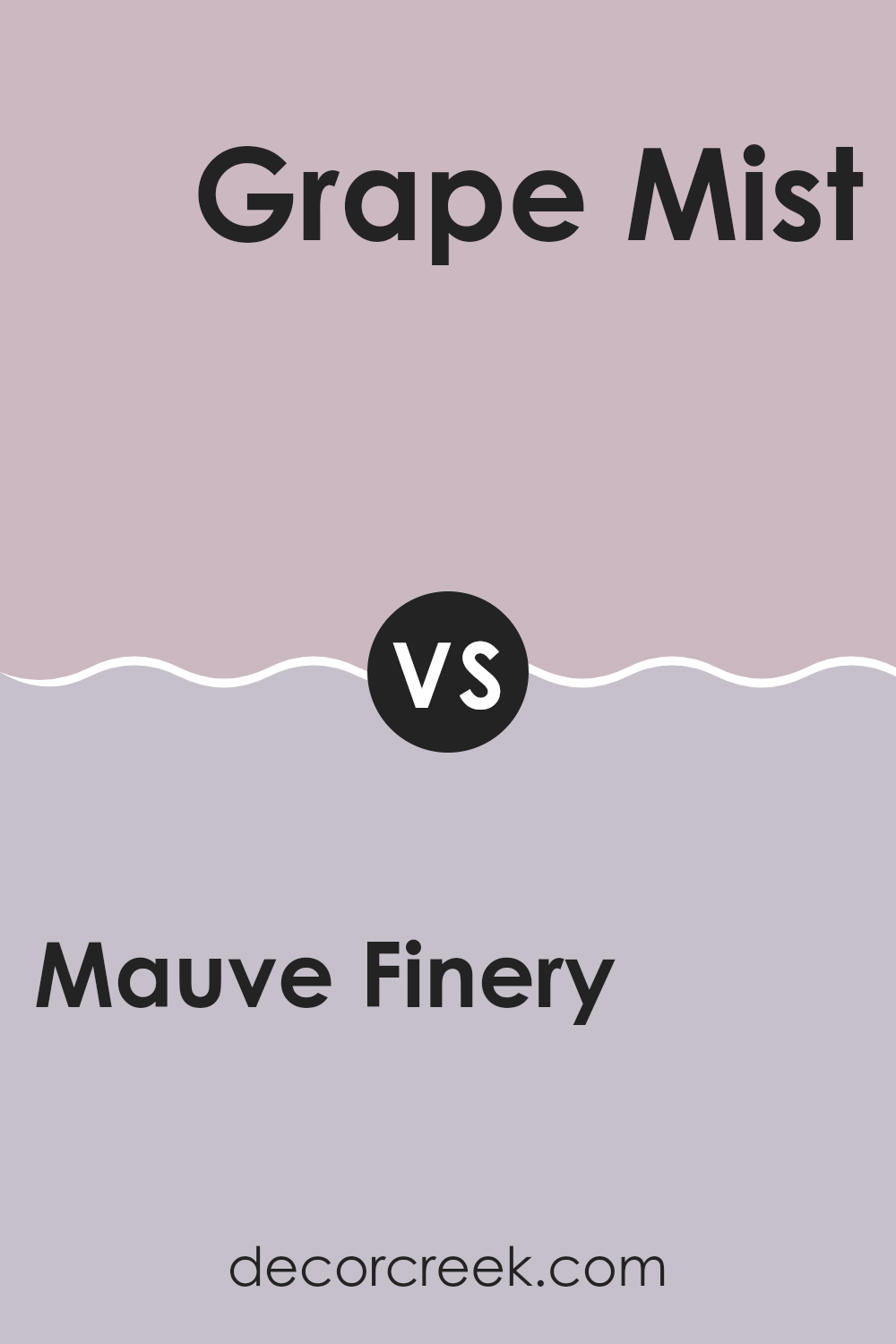
Mauve Finery SW 6282 by Sherwin Williams vs Grape Mist SW 6548 by Sherwin Williams
Mauve Finery and Grape Mist are both unique colors that can create a calm and inviting mood in any room. Mauve Finery is a soft, subtle purple with hints of gray, making it a great choice for a neutral setting that still carries a touch of color. It strikes a balance between being noticeable without overpowering a room’s design, good for walls or accents alike.
On the other hand, Grape Mist presents a lighter and cooler shade of purple. This color leans towards a more airy and youthful feel, making it perfect for rooms intended to have a refreshing and light vibe. It works exceptionally well in bedrooms or bathrooms where you want a fresh and gentle atmosphere.
Overall, while both shades come from the purple family, Mauve Finery is darker and more muted, offering a touch of elegance without being too bold. Grape Mist is lighter and provides a breezy feeling, ideal for creating a relaxed environment. Choosing between them depends on the mood you want to set in your room.
You can see recommended paint color below:
- SW 6548 Grape Mist
As I wrap up my thoughts on SW 6282 Mauve Finery by Sherwin Williams, I must say, it’s a pretty special color. Mauve Finery is not just a typical pink or purple; it brings something really unique to the table. When I used it on my walls, it made my room feel warm and cozy, like a gentle hug. It’s soft enough not to stand out too much, but it still adds a nice touch of color that makes you feel happy.
Using this paint was a breeze. It went on the wall smoothly, and I didn’t even need too many coats to get the color to look just right. After adding some decorations and furniture, everything in the room just seemed to fit together better. It’s amazing how a single color can refresh the feel of a whole room.
If you’re thinking about adding a new color to your room and want something that feels warm and welcoming, I definitely recommend giving Mauve Finery a try. It’s a kind of color that makes your room feel more like home, and I think a lot of people will appreciate its gentle charm.
Whether you’re painting a bedroom or just a spot for reading and relaxing, this color is sure to make it better.
Ever wished paint sampling was as easy as sticking a sticker? Guess what? Now it is! Discover Samplize's unique Peel & Stick samples.
Get paint samples

