Imagine strolling into a room that exudes an air of sophisticated comfort, wrapped in a color that balances neutral elegance with the versatility to blend with any decor style. This is what Sherwin Williams 7025, more commonly known as Backdrop, brings to the table.
As a color that beautifully sits at the crossroads of classic and modern, Backdrop has grown in popularity among interior designers and homeowners alike.
This article will delve deep into the intricacies of this captivating color, exploring its warmth, undertones, coordinating colors, effects of lighting, Light Reflectance Value (LRV), trim colors, similar colors, and its harmonizing shades.

What Color Is SW 7025 Backdrop?
Sherwin-Williams 7025, Backdrop, is a unique medium-dark gray with a tinge of taupe undertones, making it a rich and inviting neutral hue. It sways towards the warm side of the color spectrum but retains a subtle coolness that allows it to remain incredibly versatile. This balanced hue is complex yet soothing, offering a stunning base for any room design.
Its depth is ideal for grounding more extensive spaces, providing a backdrop that enhances the room’s visual interest without overwhelming it.
It’s the perfect color for individuals seeking a shade that combines the simplicity of neutral grays with the cozy warmth of taupe tones, making it an excellent choice for a variety of interior styles.

Ever wished paint sampling was as easy as sticking a sticker? Guess what? Now it is! Discover Samplize's unique Peel & Stick samples.
Get paint samples

Is It a Warm Or Cool Color?
SW Backdrop is a warm color with a hint of cool undertones. This trait allows it to blend effortlessly with both warm and cool shades, enhancing its versatility. Its warm side comes from its beige undertones, making it a perfect choice for a cozy and inviting environment.
Simultaneously, the touch of coolness prevents it from being too overwhelming, ensuring a balanced, tranquil ambiance.
Undertones of SW 7025 Backdrop
Understanding the undertones of color is vital as they subtly influence how the color interacts with other hues and how it appears under different lighting conditions. SW Backdrop is complex with a blend of undertones:
- Taupe: This undertone brings warmth and depth, adding a sense of comfort and elegance.
- Gray: This undertone provides a neutral base, contributing to the versatility of Backdrop.
- Beige: This undertone adds warmth, making it a cozy, inviting shade.
The taupe undertone is the dominant one in Backdrop, with gray and beige as secondary undertones. These undertones affect the way we perceive the color, allowing it to swing between warm and cool depending on the lighting and accompanying colors in a room.

Coordinating Colors of SW 7025 Backdrop
Coordinating colors are those that harmonize well with a particular shade, creating a balanced and aesthetically pleasing palette. Here are some of the coordinating colors for SW Backdrop:
- Raindrop (SW 6485) : A fresh, light blue that adds a refreshing contrast to Backdrop.
- Colonnade Gray (SW 7641) : A soft, medium-gray that blends seamlessly with Backdrop for a monochromatic look.
- Gauzy White (SW 6035) : A clean, bright white that provides a crisp contrast and highlights the warmth of SW Backdrop.
- Useful Gray (SW 7050) : A lighter gray with green undertones that pairs beautifully with Backdrop for a subtle, layered look.
- Indigo Batik (SW 7602) : A deep, rich blue that provides a bold contrast, adding depth and interest to a Backdrop base.

How Does Lighting Affect SW 7025 Backdrop?
Lighting dramatically impacts how we perceive Backdrop, like any other color. In bright, natural light, Backdrop’s gray undertones come to the forefront, giving it a more neutral appearance. However, in artificial or low lighting, its taupe and beige undertones surface infusing the space with warmth.
Directional lighting also plays a role. For instance, in a south-facing room with abundant light, Backdrop can feel warmer and cozier, while in a north-facing room, it may appear cooler and more neutral. It’s always wise to test a large swatch in the intended room at different times of the day before finalizing.

LRV of SW 7025 Backdrop
Light Reflectance Value, or LRV, is a measure of how much light a color reflects. It ranges from 0 (absolute black, absorbing all light) to 100 (pure white, reflecting all light). Backdrop has an LRV of 20, placing it on the darker end of the spectrum.
This lower LRV means Backdrop absorbs more light than it reflects, creating depth and richness. It can make a large, brightly lit room feel cozier, but in a small or poorly lit space, it may feel too dark. That said, its medium-dark tone can also add a dramatic flair to a small room when used correctly.

LRV – what does it mean? Read This Before Finding Your Perfect Paint Color
Trim Colors of SW 7025 Backdrop
Trim colors, often used for baseboards, window frames, and door frames, help to highlight and frame a wall color. With Backdrop, shades of white make an excellent choice for trim:
- Pure White (SW 7005) : A clean and neutral white that provides a crisp, sharp contrast.
- Alabaster (SW 7008) : A softer, creamier white that maintains contrast while adding a touch of warmth.
- Extra White (SW 7006) : A bright, stark white that delivers a bold contrast, highlighting the depth of SW Backdrop.

Colors Similar to SW 7025 Backdrop
Knowing similar colors can be beneficial when you want to maintain a certain color’s essence but require a slight variation. For SW Backdrop, we offer the following similar colors:
- Anonymous (SW 7046) : A darker, more complex gray with a similar warm/cool balance.
- Spalding Gray (SW 6074) : A slightly cooler shade of gray, leaning towards the blue side.
- Adaptive Shade (SW 7053) : A lighter, softer gray that’s more neutral.
- Poised Taupe (SW 6039) : A warmer, taupe-leaning color with similar balance and versatility.
Note that each color slightly differs anyway since each of them has a unique LRV and different undertones.

Colors That Go With SW 7025 Backdrop
Having a palette of colors that complement each other is crucial for a well-designed space. Colors that work well with Backdrop include:
- Useful Gray (SW 7050)
- Indigo Batik (SW 7602)
- Foothills (SW 7514)
- Honey Bees (SW 9018)
- Daphne (SW 9151)
These colors offer a range from light to dark and warm to cool, ensuring that Backdrop can adapt to a multitude of interior styles and moods. The key is to identify the ambiance you want for your space and choose colors that help evoke that feeling.

How to Use SW 7025 Backdrop In Your Home?
SW Backdrop is an incredibly versatile color that can be used in almost any room, given its warm yet neutral nature. It can seamlessly blend into various interior design styles, including modern, traditional, rustic, coastal, or even a mix of several styles. Whether you want a wall color that lets your decor do the talking or a base that adds significant depth and character, Backdrop could be the ideal choice.
Using SW 7025 Backdrop in the Bedroom?
In the bedroom, Backdrop can create a cozy, relaxing sanctuary. Its warm undertones infuse a soothing ambiance that’s perfect for unwinding after a long day. Pair it with crisp whites for a fresh, clean look, or go for rich, earthy tones like muted greens or deep blues for a more intimate feel.
SW Backdrop also pairs well with different types of wood, making it suitable for a wide variety of furniture. Whether your bedroom features rich mahogany dressers or light, natural oak pieces, Backdrop can bring out the best in them.

Using SW 7025 Backdrop in the Bathroom?
For the bathroom, Backdrop can offer a spa-like atmosphere. Its balanced undertones work beautifully against white bathroom fixtures, enhancing their crispness while bringing warmth to the room. Pairing it with cool blues or greens can create a serene, calming space that feels refreshing.
In smaller bathrooms, using Backdrop can add a sense of depth. Pair it with bright whites and good lighting to ensure the room doesn’t feel too enclosed.

Using SW 7025 Backdrop in the Living Room?
In the living room, Backdrop’s versatility shines. As a neutral color with depth, it provides the perfect canvas for various decor styles. Pair it with cool blues for a modern, chic look or warm earth tones for a cozy, inviting space.
SW Backdrop can work with different furniture colors and finishes as well, from rich leather to light, textured fabrics. Using it on a feature wall can add a dramatic touch to your living room, drawing attention to a fireplace or an art collection.

Using SW 7025 Backdrop for an Exterior?
SW Backdrop can also make an appealing choice for an exterior paint color. It provides a sophisticated alternative to traditional neutrals, adding character and depth to your home’s facade. Its warm undertones glow in the sunlight, offering a welcoming first impression.
Consider pairing it with crisp white trims for a timeless look, or use it as a trim color against a lighter siding color for a striking, modern aesthetic. And remember, always consider the roofing color, landscape, and surroundings when choosing an exterior color.

Using SW 7025 Backdrop for the Kitchen?
A kitchen painted in Backdrop exudes a warm and inviting atmosphere that’s perfect for the heart of the home. It pairs beautifully with stainless steel appliances, white or natural wood cabinets, and most countertop materials, creating a balanced and stylish look.
You can use it on the walls for a subtle backdrop or on the kitchen island for a standout feature. Consider pairing it with whites for a modern farmhouse feel or with bold colors for a more eclectic vibe.

Using SW 7025 Backdrop for the Kitchen Cabinets?
Choosing SW Backdrop for your kitchen cabinets can create a stunning effect. It offers a warm and sophisticated alternative to traditional white or wood cabinets. The color works beautifully against white or light-colored walls, allowing the cabinets to take center stage.
On the other hand, using Backdrop on the cabinets against a Backdrop wall can create a sleek, monochromatic look. Accentuate this with hardware in brass or stainless steel for a touch of elegance, and you’ll have a kitchen that’s both contemporary and inviting.

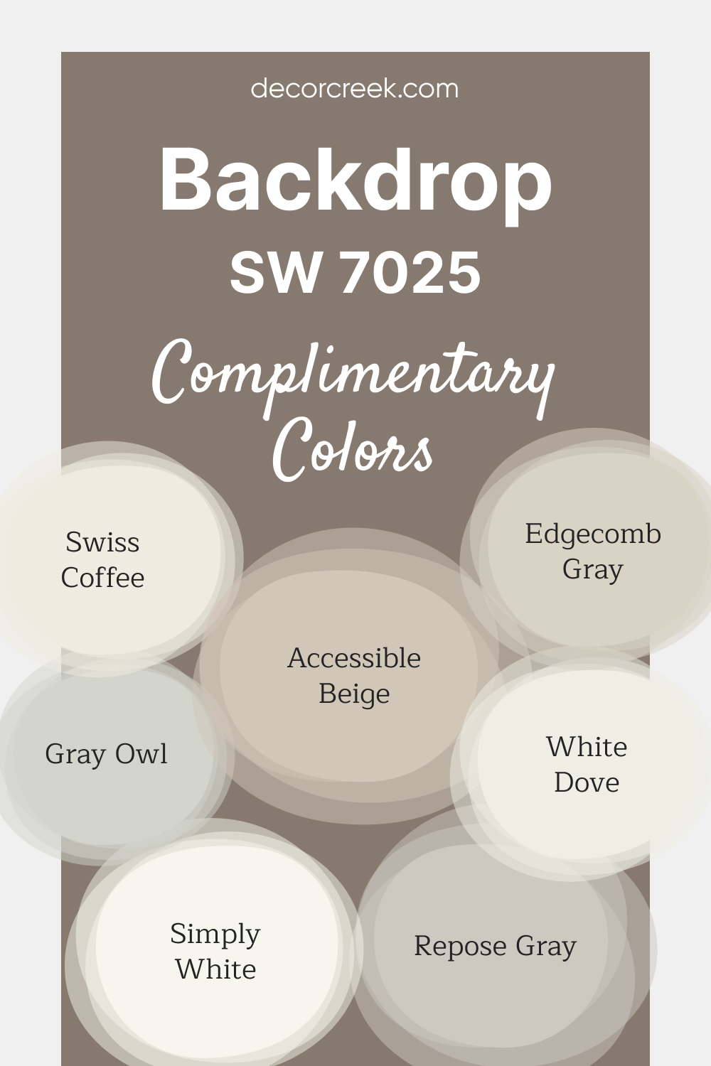
Complimentary Colors for Backdrop SW 7025 Paint Color by Sherwin-Williams
Backdrop SW 7025 by Sherwin-Williams is a warm, versatile taupe that brings sophistication and coziness to any space. This rich neutral is perfect for adding depth to living rooms, bedrooms, or entryways, creating an inviting and elegant ambiance.
Its warm undertones make it adaptable for pairing with a range of complementary colors. For a fresh, airy contrast, pair Backdrop with warm whites like Swiss Coffee OC-45 and White Dove OC-17.
Soft neutrals like Repose Gray SW 7015 and Edgecomb Gray HC-173 provide subtle contrast, while Accessible Beige SW 7036 and Gray Owl OC-52 add warmth and refinement.
Simply White OC-117 completes the palette, bringing a crisp, polished touch to the overall look.
Comparing SW 7025 Backdrop With Other Colors
Understanding the importance of color comparison is key in creating harmonious color schemes in interior design. It helps identify how various shades interact with each other, influencing the overall mood and aesthetic of a space. Comparing colors can highlight subtle differences in undertones, help in selecting complementary shades, and aid in achieving the desired balance of warm and cool tones.
SW 7025 Backdrop vs. SW 6108 Latte
SW Latte is a warm, medium-toned neutral with rich, creamy undertones that resemble the comforting hue of a milky coffee. Comparing it to Backdrop, you’ll notice that Latte is noticeably warmer and earthier. In a color scheme, the two can create a balance of depth and warmth, with Backdrop adding a cooler counterpoint to Latte’s cozy appeal.

SW 7025 Backdrop vs. SW 6003 Turkish Coffee
SW Turkish Coffee is a dark, almost black-brown color, offering a deep, rich contrast to the mid-toned Backdrop. When used together, Backdrop appears lighter and cooler, with its gray and taupe undertones standing out against the intense warmth of Turkish Coffee.

SW 7025 Backdrop vs. SW 6255 Morning Fog
SW Morning Fog is a light, cool gray with subtle blue undertones. Next to Morning Fog, Backdrop appears much warmer and deeper, with its taupe and beige undertones becoming more prominent. This pair can create a beautiful balance of warm and cool tones, with each color accentuating the other’s characteristics.

SW 7025 Backdrop vs. SW 7566 Westhighland White
SW Westhighland White is a light, creamy white that leans slightly towards the warm side. When paired with Backdrop, Westhighland White appears even brighter and lighter, providing a crisp contrast against Backdrop’s mid-tone depth. This combination can create a classic, timeless look, especially in traditional or transitional spaces.

SW 7025 Backdrop vs. SW 7604 Smoky Blue
SW Smoky Blue is a medium to dark blue with gray undertones. Next to Smoky Blue, Backdrop’s warm and neutral qualities become more noticeable, providing a complementary contrast to Smoky Blue’s cool dominance. This pair works well in spaces where you want to incorporate both warmth and cool freshness.

SW 7025 Backdrop vs. SW 7069 Iron Ore
SW Iron Ore is a rich, dark gray with a slightly cool undertone. Compared to Iron Ore, Backdrop appears much lighter and warmer. The contrast between these two can create a dramatic and sophisticated palette, with Iron Ore bringing out the warmer beige and taupe undertones of Backdrop.

Conclusion
In conclusion, Sherwin-Williams 7025, known as Backdrop, is a versatile, warm gray that balances depth with neutrality. Its chameleon-like nature, with a perfect mix of warm and cool undertones, makes it a superb choice for almost any room and style. Whether used as a wall color, an accent, or for kitchen cabinets, it adds sophistication and character.
By comparing Backdrop with other colors, you can explore a variety of color schemes that cater to different moods and aesthetics, enhancing its versatility even further. So if you’re seeking a shade that’s warm, neutral, and impactful, Backdrop might be your ideal pick.

Ever wished paint sampling was as easy as sticking a sticker? Guess what? Now it is! Discover Samplize's unique Peel & Stick samples.
Get paint samples
Frequently Asked Questions
⭐Is SW 7025 Backdrop a warm or a cool color?
SW Backdrop is a warm gray, but it is quite neutral with a perfect balance of warm and cool undertones, making it a versatile color that can lean either way depending on its surroundings and the lighting in the room.
⭐What are the best coordinating colors for SW 7025 Backdrop?
SW Backdrop works well with a range of colors. It pairs beautifully with Raindrop (SW 6485), Colonnade Gray (SW 7641), and Gauzy White (SW 6035). Other compatible colors include Useful Gray (SW 7050), Indigo Batik (SW 7602), Foothills (SW 7514), Honey Bees (SW 9018), and Daphne (SW 9151).
⭐What lighting conditions work best for SW 7025 Backdrop?
SW Backdrop is quite adaptable to various lighting conditions. In bright, natural light, its gray undertones are more noticeable. However, in artificial or low lighting, its warmer beige and taupe undertones become more prominent.
⭐What is the LRV of SW 7025 Backdrop?
The Light Reflectance Value (LRV) of SW Backdrop is 20. This places it on the darker end of the spectrum, meaning it absorbs more light than it reflects. This gives Backdrop a depth and richness, making it a great choice for adding a touch of drama and sophistication to a space.
⭐Can SW 7025 Backdrop be used in exterior paint schemes?
Absolutely! SW Backdrop can make a beautiful and sophisticated choice for an exterior paint color. It works well with crisp white trims for a classic look, or as a trim color against lighter siding for a modern aesthetic.


