An embodiment of tranquility and rejuvenating energy, Cool Mint 582 is not just a paint choice; it’s a design statement. Let’s delve into the specifics of this color, its characteristics, and its remarkable versatility in home interiors.

What Color Is Cool Mint 582?
Cool Mint 582 is a soft, airy hue that captures the ephemeral beauty of an early spring morning. It’s a pale green with a hint of blue, reminiscent of the first tender leaves unfurling to the sun’s warmth. This color has a lightness that brings a sense of openness and calm to any room. It is particularly suited to modern and Scandinavian interior styles, where simplicity and minimalism are key.
The color pairs wonderfully with natural materials like light woods, wicker, and cotton, as well as with sleek surfaces like glass and brushed metal. Textures like linen and jute also complement its airy vibe, making it a versatile choice for those seeking to create a serene and inviting space.

Ever wished paint sampling was as easy as sticking a sticker? Guess what? Now it is! Discover Samplize's unique Peel & Stick samples.
Get paint samples

Is It a Warm Or Cool Color?
Despite its name, Cool Mint 582 leans towards the cool side of the color spectrum. Its subtle blue undertones contribute to a refreshing and crisp presence that can make a space feel more expansive and luminous. The coolness of the color works exceptionally well in homes that are drenched in natural light, as it reflects and enhances the airy quality of the space.
In cooler climates or spaces with limited natural light, it can be balanced with warm textures and lighting to prevent it from feeling too chilly.
Undertones of Cool Mint 582
The undertones of a color are the hues that lurk beneath the surface, subtly influencing the overall perception of the color. Cool Mint 582 carries understated blue and gray undertones that give it a clean, almost ethereal look on interior walls. These undertones are the secret to its calming effect, making it a popular choice for bedrooms and bathrooms where a serene atmosphere is desired.
On the walls, these undertones can become more pronounced in certain lighting conditions, adding depth and interest to the space.

Coordinating Colors of Cool Mint 582
Coordinating colors are hues that work in harmony with the main color to enhance its beauty and create a cohesive look. For Cool Mint 582, a palette of subtle neutrals and complementary greens is ideal. OC-65 Chantilly Lace is a crisp, pure white with a hint of warmth, making it a perfect trim color. BM 873 Baby’s Breath is a gentle off-white with a soft touch that complements without competing. AF-545 Solitude is a mid-tone blue that offers a tranquil contrast, while BM 1452 After the Rain is a muted lavender that provides a subtle, romantic accent
In addition, hues like BM 2142-50 Gray Mirage , a soft gray-green; BM 2141-50 Horizon Gray , a pale gray with green undertones; and BM 1485 Brushed Aluminum , a light gray with a whisper of blue, work beautifully with Cool Mint 582 , offering a range of options for accent walls, trim, or decorative elements.

How Does Lighting Affect Cool Mint 582?
Lighting can dramatically impact the way we perceive color, and Cool Mint 582 is no exception. Under artificial light, its blue undertones may become more pronounced, giving the color a crisper appearance. In contrast, natural daylight tends to highlight its green essence, enhancing its organic feel. In north-facing rooms, the color can appear more muted due to the cooler quality of light, while in south-facing rooms, it may feel brighter and more vibrant.
East-facing rooms reveal the color’s softer side in the morning light, and as the day progresses, west-facing rooms bath the color in a warm glow, emphasizing its depth.

LRV of Cool Mint 582
The Light Reflectance Value (LRV) of a color measures the amount of light it reflects. With an LRV of 81, Cool Mint 582 is considered a light color that reflects a significant amount of light. This high LRV means it can make small rooms feel more spacious and airy.
In spaces with ample natural light, the color will appear almost luminous, while in areas with less light, it retains its lightness without looking stark or cold. The LRV of Cool Mint 582 makes it an excellent choice for creating a bright, open feel in any interior.

LRV – what does it mean? Read This Before Finding Your Perfect Paint Color
Trim Colors of Cool Mint 582
Trim colors are the accents to your primary wall color, outlining and defining the architectural features of a room. For Cool Mint 582, trim colors should be chosen to enhance its freshness and lightness. Shades of white like OC-65 Chantilly Lace , OC-149 Decorator’s White , and OC-17 White Dove by Benjamin Moore are excellent choices.
They offer a crisp boundary that defines the space without creating a jarring contrast. The right trim color frames a room much like a mat frames a painting, completing the look with finesse.

Colors Similar to Cool Mint 582
Exploring colors similar to Cool Mint 582 is important when you’re seeking alternatives that maintain a room’s intended atmosphere. BM 596 Spearmint Ice offers a slightly icier touch, bringing a cool breath to spaces. BM 849 Carried Away is a touch more blue, ideal for a breezier feel. BM 617 Lido Green has a hint of yellow, softening the coolness slightly, and BM 2037-70 Fresh Mint is the lightest, providing a subtle minty presence.

Colors That Go With Cool Mint 582
The art of color pairing is essential for a harmonious interior palette. Colors that go well with Cool Mint 582 by Benjamin Moore include the soothing gray of BM 2121-30 Pewter , the soft tan of BM 1037 Muslin , the subtle blush of BM 2091-60 Heather Pink , the rich charcoal of BM 2124-10 Wrought Iron , and the pale blue of BM 2056-70 Icy Moon Drops . Each of these colors complements Cool Mint 582, contributing to a balanced and appealing color scheme that enhances the overall design aesthetic.

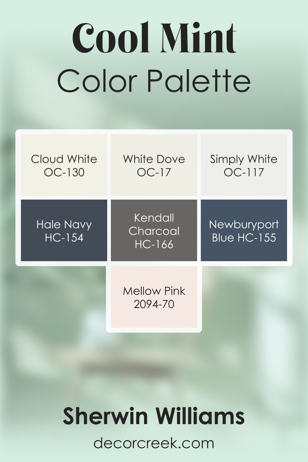
Cool Mint 582 by Benjamin Moore Color Palette
Cool Mint brings a refreshing, uplifting character that feels bright, cheerful, and full of gentle charm. This palette expands that fresh feeling with soft whites, warm light tones, and steady grounding accents.
Cloud White, White Dove, and Simply White brighten the palette with a clean, airy glow that supports Cool Mint’s lively presence.
Mellow Pink adds a tender, friendly note of color that pairs beautifully with the minty freshness, giving the palette a pleasant warmth that softens its brightness. Newburyport Blue and Hale Navy introduce deeper blue accents that add structure, shaping the palette with confident contrast while still staying harmonious with the light, cheerful tones.
Kendall Charcoal grounds the palette with strength, adding clarity and calmness that keep Cool Mint balanced.
Together, this palette feels upbeat, light, and naturally inviting. It works beautifully in bathrooms, playrooms, bedrooms, and kitchens where a feeling of freshness and soft positivity makes the space feel welcoming and bright.
The combination offers a blend of uplifting color and steady grounding that feels smooth, clean, and pleasant to live with.
How to Use Cool Mint 582 In Your Home?
Cool Mint 582 is a versatile hue ideal for creating a serene atmosphere in various rooms. Its soft, airy quality fits perfectly in interiors inspired by modern minimalism, Scandinavian simplicity, and even coastal chic designs. Use it in spaces where you want to evoke calmness and restoration, such as bedrooms, bathrooms, and living areas. It pairs beautifully with natural materials like light woods and cotton, as well as more reflective surfaces, contributing to a space that feels both grounded and open.
Cool Mint 582 can also act as a refreshing backdrop for vibrant art and can be balanced with warm woods and textures in communal spaces to encourage a welcoming ambiance.
How to Use Cool Mint 582 in the Bedroom?
In the bedroom, Cool Mint 582 serves as an excellent backdrop for a restful retreat. It’s conducive to relaxation and can help in creating a peaceful sanctuary away from the busy world. Pair it with soft linens, plush textures, and subtle lighting to enhance its restorative qualities. Complement it with shades of soft grays and creamy whites for bedding and accessories to maintain a light, dreamy quality.
The color is particularly suited to a bedroom that receives plenty of natural light, where its full, luminous potential can be realized, setting the stage for a tranquil haven.

How to Use Cool Mint 582 in the Bathroom?
Cool Mint 582 is a natural fit for bathrooms, where it can evoke the crisp freshness of a luxury spa. Its cool undertones complement the shiny surfaces of mirrors, glass, and metal fixtures, contributing to a clean and invigorating space. Consider it on all walls for a monochromatic look or as an accent against white tiling to create visual interest.
Accessories in bamboo, teak, or brushed nickel can reinforce the spa-like feel, while fluffy white towels and natural woven baskets complete the refreshing ambiance.

How to Use Cool Mint 582 in the Living Room?
Implement Cool Mint 582 in the living room to create a space that feels open and lively. It’s a backdrop that works with a range of décor, from contemporary to beach house styles. Pair with soft beiges and whites for a subtle look, or introduce navy and coral accents for a bolder statement.
Furniture in light wood or white can accentuate the color’s freshness, while a mix of metals can add a modern twist. Use textured throws and cushions to add depth and comfort, creating an inviting and stylish area for relaxation and socializing.

How to Use Cool Mint 582 for an Exterior?
Cool Mint 582 on the exterior can reflect a home’s natural surroundings and evoke a light, beachy feel. It’s particularly striking when used on homes with ample natural greenery, as the color harmonizes with outdoor landscapes. Pair it with crisp white trims, natural stone, and dark roofing for a classic, enduring look.
It’s well-suited for porch walls or as an accent on shutters and doors, providing a welcoming touch to the façade without overwhelming the senses.

How to Use Cool Mint 582 in the Kitchen?
In the kitchen, Cool Mint 582 can introduce a refreshing energy that’s perfect for the heart of the home. Utilize it on walls to serve as a calming counterpoint to the hustle and bustle of kitchen activity. It pairs splendidly with white or light gray cabinetry and marble or butcher block countertops.
Consider accenting with copper or chrome fixtures and appliances to add a dash of sophistication. For an organic touch, incorporate wooden elements and potted herbs, which complement the color’s natural vibe.

How to Use Cool Mint 582 on Kitchen Cabinets?
Cool Mint 582 on kitchen cabinets offers a unique and invigorating twist to traditional kitchen color schemes. This hue on cabinets is like a breath of fresh air, transforming the space into one that feels clean and new. Balance the coolness with warm wood or butcher block countertops, and consider brass or gold hardware for an elegant touch.
Pair with walls in a soft white to allow the cabinetry to stand out, making the kitchen a showcase of contemporary freshness and stylish design.

Comparing Cool Mint 582 With Other Colors
Comparing different colors is an essential part of the design process as it allows individuals to understand the nuances between shades and how they can impact the mood and aesthetics of a space. Side-by-side comparisons are particularly useful in discerning undertones, depth, and compatibility with other colors within a palette. They can also highlight which hues work best for a particular room’s function or atmosphere. It’s about understanding the visual synergy colors can create and how they can be manipulated through coordination and contrast to achieve a desired effect.
Cool Mint 582 vs. BM 583 Mountainview
Cool Mint 582 presents as a refreshing, light pastel green with a breezy and invigorating effect, whereas BM 583 Mountainview steps into a bolder territory with its deeper, earthy green that draws inspiration from nature’s more lush landscapes. While Cool Mint 582 carries an airiness that lends itself to more serene and minimalist aesthetics, Mountainview offers a grounding presence, ideal for spaces that aim to echo the outdoors. Pairing these two could offer a balance between levity and depth within a space.

Cool Mint 582 vs. BM 585 Lady Liberty
Cool Mint 582 is a soft whisper of green that brings a hint of coolness to a room, evoking a minty freshness. In contrast, BM 585 Lady Liberty is a more assertive shade, with a marine-like depth that suggests sophistication and strength. Lady Liberty might dominate a space, anchoring it firmly, whereas Cool Mint 582 would blend more subtly into the background, gently enhancing other design elements.

Cool Mint 582 vs. BM 577 Mermaid’s Tale
Against BM 577 Mermaid’s Tale , Cool Mint 582 looks almost ethereal. Mermaid’s Tale is a rich, enchanted teal that speaks of ocean depths and the dramatic flair of underwater worlds. Cool Mint is the soft lightness to Mermaid’s Tale’s deep embrace, offering a contrast that is at once striking and harmoniously aligned with water elements.

Cool Mint 582 vs. BM 586 Northern Lights
BM 586 Northern Lights shares a similar spirit to Cool Mint 582, as both colors have a calming effect, yet Northern Lights takes a slightly more saturated approach. It’s the color of the clear sky on a crisp morning, while Cool Mint is the dew on the grass under that same sky. Northern Lights would be a step up in intensity and would be more of a statement in a space, while Cool Mint remains a gentle backdrop.

Cool Mint 582 vs. BM 587 Scotch Plains Green
BM 587 Scotch Plains Green brings to mind the stately foliage of an evergreen forest, presenting a more traditional and reserved green. It contrasts with Cool Mint 582’s lighter, more playful character. Scotch Plains Green works well in areas that command formality and heritage, while Cool Mint is better suited to spaces that require an airy lightness and a touch of modernity.

Cool Mint 582 vs. BM 588 Luck of the Irish
Cool Mint 582, with its soft, almost neutral appeal, stands in stark contrast to BM 588 Luck of the Irish , which boasts a bold, vibrant green that’s rich and lively. Luck of the Irish is evocative of spring’s rebirth and the lush landscapes of Ireland, capable of making a strong statement in a space. In comparison, Cool Mint is the gentle sigh of an early spring breeze — subtle, refreshing, and understated.

Conclusion
Cool Mint 582 by Benjamin Moore is a color of surprising versatility and gentle allure. Whether it’s the primary hue in a room or an accent, its ability to adapt and enhance a space is remarkable. By understanding its undertones, coordinating colors, and the impact of lighting and LRV, one can harness the full potential of this refreshing color.
Paired with the right trim and complementary colors, Cool Mint 582 is capable of transforming a house into a home, brimming with style, comfort, and a breath of fresh air.

Ever wished paint sampling was as easy as sticking a sticker? Guess what? Now it is! Discover Samplize's unique Peel & Stick samples.
Get paint samples


