When you first look at Sherwin Williams SW 9584 Mortar, you’re drawn into its subtle yet distinct presence. It’s not just a color on the wall; it’s a feeling, a mood, a statement that can transform any space. Mortar is a warm greige with hints of both gray and beige, giving it the ability to blend seamlessly with a variety of other colors and styles.
Imagine walking into a room painted with Mortar; there’s an immediate sense of calm. It’s a shade that doesn’t shout for attention but quietly makes its mark. You might find it perfect for creating a cozy living room or a sophisticated foyer. It works well with natural lighting, enhancing its earthy tones throughout the day and taking on a comforting glow in the evening.
Pairing Mortar with wood accents or metal furnishings can highlight its versatility. Whether your style leans toward the traditional or the modern, this color finds a way to complement your vision. It’s a backdrop that supports and enhances other elements in the room without overpowering them.
If you’re considering a home update, SW 9584 Mortar might be the choice that brings balance and harmony to your space. It’s a color that doesn’t just sit on the walls but becomes part of the home’s personality.
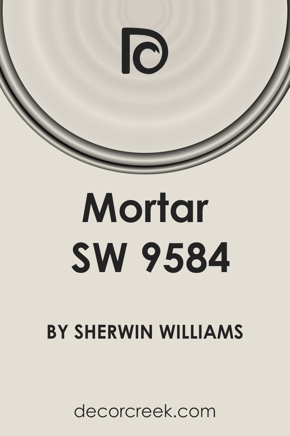
What Color Is Mortar SW 9584 by Sherwin Williams?
Mortar SW 9584 by Sherwin Williams is a versatile and timeless color. It is a warm, muted gray with earthy undertones, reminiscent of natural stone or clay. This color can create a calming and sophisticated backdrop in a variety of spaces. Mortar works well in modern, minimalist, and industrial interior styles, due to its neutral tone that complements clean lines and simple designs.
In a modern setting, Mortar pairs beautifully with metals such as brushed nickel or chrome, creating a sleek, contemporary look. For a cozier atmosphere, it complements wooden textures, like oak or walnut, adding warmth and depth to the room. Industrial spaces benefit from this color when combined with raw materials like concrete and exposed brick, enhancing the overall aesthetic.
Textures like soft linens or wool in furnishings create a comforting contrast with Mortar’s matte finish. Accessories in natural fibers or leather also harmonize well with this color, adding an organic touch. Mortar SW 9584 is an excellent choice for living rooms, bedrooms, and even kitchens, as it provides a neutral canvas that allows other design elements to shine. Its adaptable nature makes it easy to incorporate into various design schemes, ensuring it remains a favorite in interior design.
Is Mortar SW 9584 by Sherwin Williams Warm or Cool color?
Mortar SW 9584 by Sherwin Williams is a versatile and neutral paint color that fits well in many home settings. Its warm undertones make it inviting, providing a cozy feel without overwhelming a space. This shade pairs nicely with both light and dark colors, making it an excellent choice for various design styles, from traditional to contemporary.
In living rooms, Mortar can create a calm and relaxed environment, serving as a great backdrop for other accent colors. In kitchens and dining areas, it adds warmth and complements wood tones and metal finishes, making these spaces feel more welcoming. Bedrooms painted in Mortar feel comfortable and restful, promoting a sense of relaxation.
Overall, Mortar SW 9584 works well in open-plan layouts, helping different areas flow together smoothly. Its subtle warmth offers enough character to make an impact, while still allowing furniture and decor to stand out beautifully.
Undertones of Mortar SW 9584 by Sherwin Williams
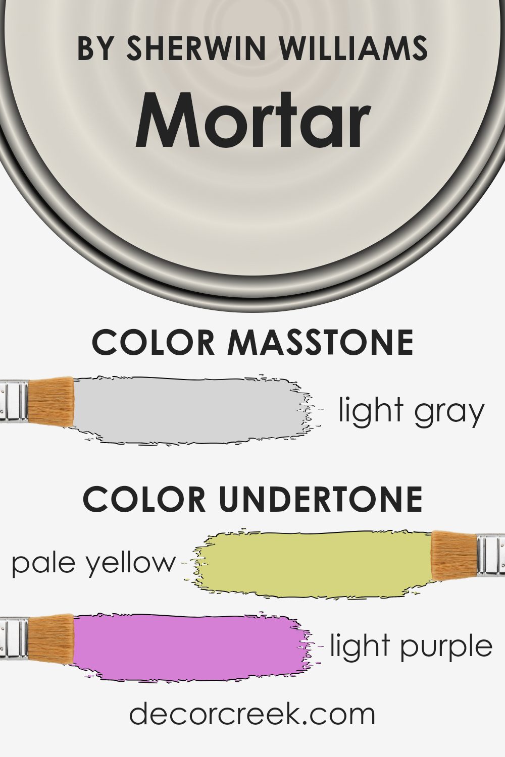
Mortar SW 9584 by Sherwin Williams is a unique color that includes a variety of undertones. It features hints of pale yellow, light purple, light blue, pale pink, mint, lilac, and grey. These subtle undertones can change how the color appears, depending on the lighting and the surroundings. Undertones are like the hidden shades that blend to create the overall color. When light hits a surface painted with this color, these undertones may shift how the color looks, making it appear warmer, cooler, or more muted than it is.
In a room, Mortar SW 9584 can display different moods. The pale yellow and mint undertones can add a hint of warmth, making a room feel welcoming. Meanwhile, the grey and lilac undertones can bring a soft, calming effect, which might make spaces feel a bit more soothing and relaxed. Light purple and pale pink can sometimes add a touch of playfulness or romance, while light blue adds a dash of cool freshness.
The way this color interacts with natural and artificial light can further influence its appearance. In bright natural light, the color might take on a more vibrant or cheerful look due to the yellow and blue undertones.
In dimmer settings, the grey and lilac might stand out, giving the room a soft, muted feeling.
What is the Masstone of the Mortar SW 9584 by Sherwin Williams?
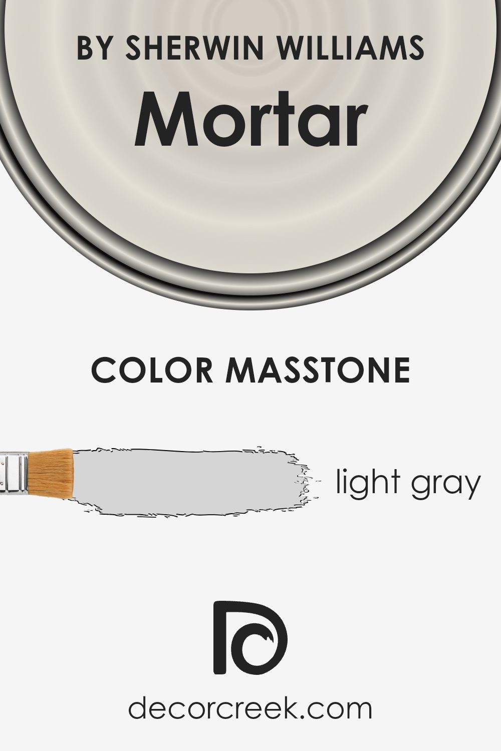
Mortar SW 9584 by Sherwin Williams is a light gray color, denoted as #D5D5D5. Its soft and neutral tone makes it a versatile choice for homes. Light gray has a subtle presence that doesn’t overpower a space, making it a popular option for walls, ceilings, and even furniture.
This color pairs well with both warm and cool tones. In homes with natural light, Mortar SW 9584 can make rooms feel open and airy, giving a sense of space without being too stark. It can serve as a backdrop for more vibrant colors, allowing brighter accents to stand out. Additionally, it complements natural materials like wood and stone, enhancing textures in a room.
In smaller spaces or rooms with less light, this shade can prevent the area from feeling cramped or dark, offering a balanced and calming effect. Overall, its subtlety lets it fit seamlessly into various home styles, from modern to traditional.
How Does Lighting Affect Mortar SW 9584 by Sherwin Williams?
Lighting plays a crucial role in how we perceive colors. Different types of light can make the same color look different. For example, natural daylight shows colors in their true form, while artificial light sources can alter the appearance of colors.
The color Mortar, SW 9584, by Sherwin Williams is a muted, warm gray. Its appearance can change quite a bit based on the lighting in the room. In natural light, this color tends to show its true, neutral tone because it reflects the full spectrum of light.
However, in artificial light, such as incandescent or LED lighting, the color can shift. Incandescent lighting, which has a warm glow, can make it look slightly warmer or more beige, while cooler LED lights can give it a slightly cooler tone.
Let’s consider how Mortar looks in rooms with different orientations:
– North-facing rooms: These rooms tend to get cool, indirect light. Colors in north-facing rooms can appear a bit duller and bluer. Mortar SW 9584 might look cooler and grayer in these spaces, losing some of its warmth.
– South-facing rooms: These rooms are bright and bathed in warm, direct sunlight for most of the day, especially during midday. In this light, Mortar can look warm and inviting. The natural light brings out the subtle warmth in the paint, emphasizing its beige undertones.
– East-facing rooms: These rooms receive warm, bright light in the morning, but the light is cooler in the afternoon and evening. Mortar might look warmer in the morning light, but take on a slightly cooler, muted tone later in the day.
– West-facing rooms: These rooms get weaker, cooler light in the morning and warm, intense light in the afternoon and evening. Mortar in a west-facing room will appear warmer and more vibrant in the later part of the day when the sunlight is softer and warmer.
Understanding these effects can help you choose lighting and decor that complement Mortar’s unique color qualities.
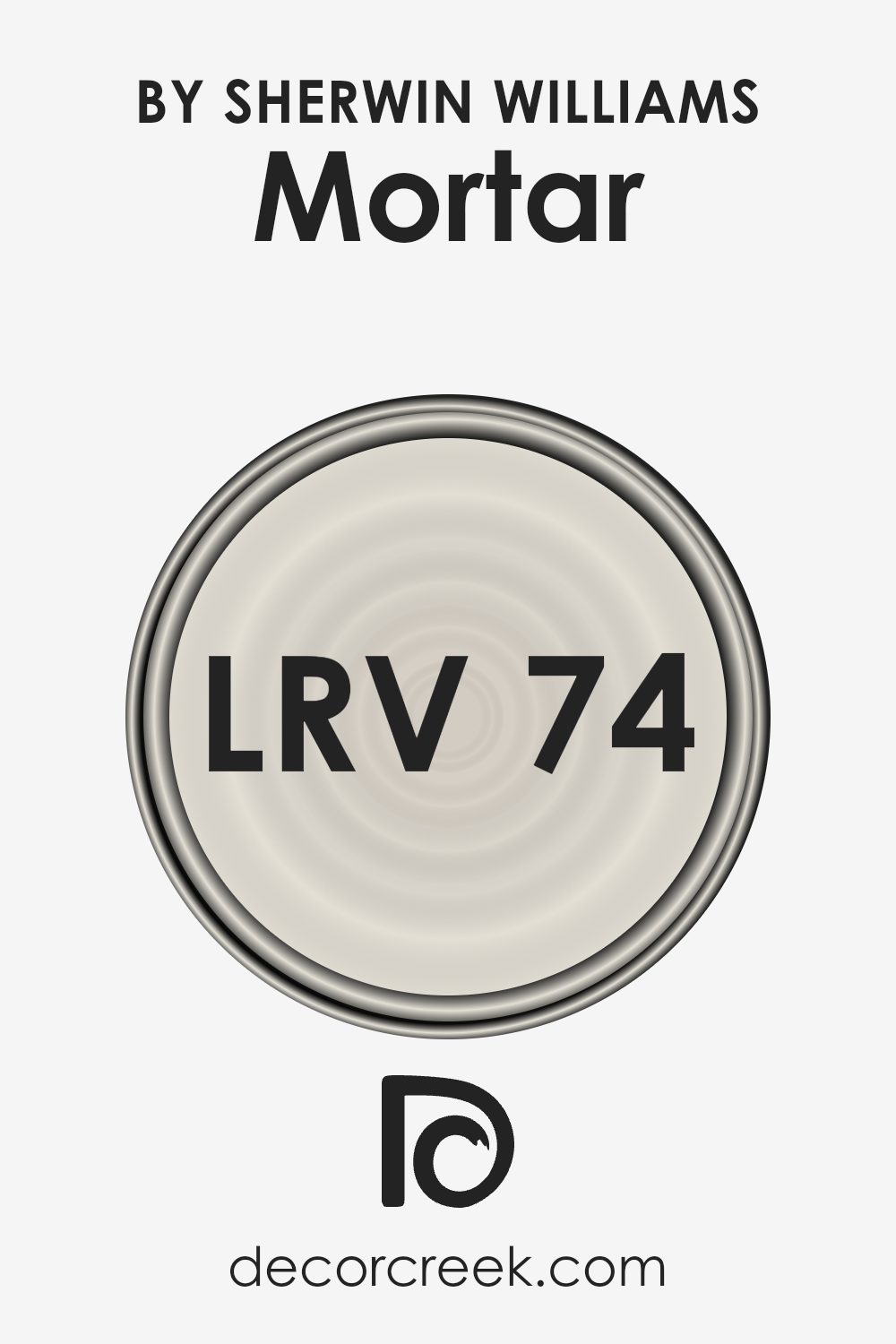
What is the LRV of Mortar SW 9584 by Sherwin Williams?
LRV, or Light Reflectance Value, is a measure that indicates how much light a color reflects and absorbs. On a scale from 0 to 100, where 0 is pure black and 100 is pure white, LRV helps in understanding a color’s brightness and its impact on a space.
A higher LRV value means the color reflects more light and feels lighter and brighter, while a lower LRV value indicates a darker color that absorbs more light. Understanding LRV is crucial for choosing paint colors, as it affects how a color will make a room feel regarding light and space.
For Mortar SW 9584 by Sherwin Williams, with an LRV of 73.686, it reflects a significant amount of light. This value suggests that Mortar is a fairly light color, one that can help brighten up a room by making the most out of available light. Such a color can make smaller spaces feel larger or open areas feel even airier and more expansive.
The high LRV indicates that the color will appear consistent across different lighting conditions but can be more prominent and less shadowed in well-lit spaces. This makes it a versatile choice for various rooms, especially where a clean, more spacious feel is desired.
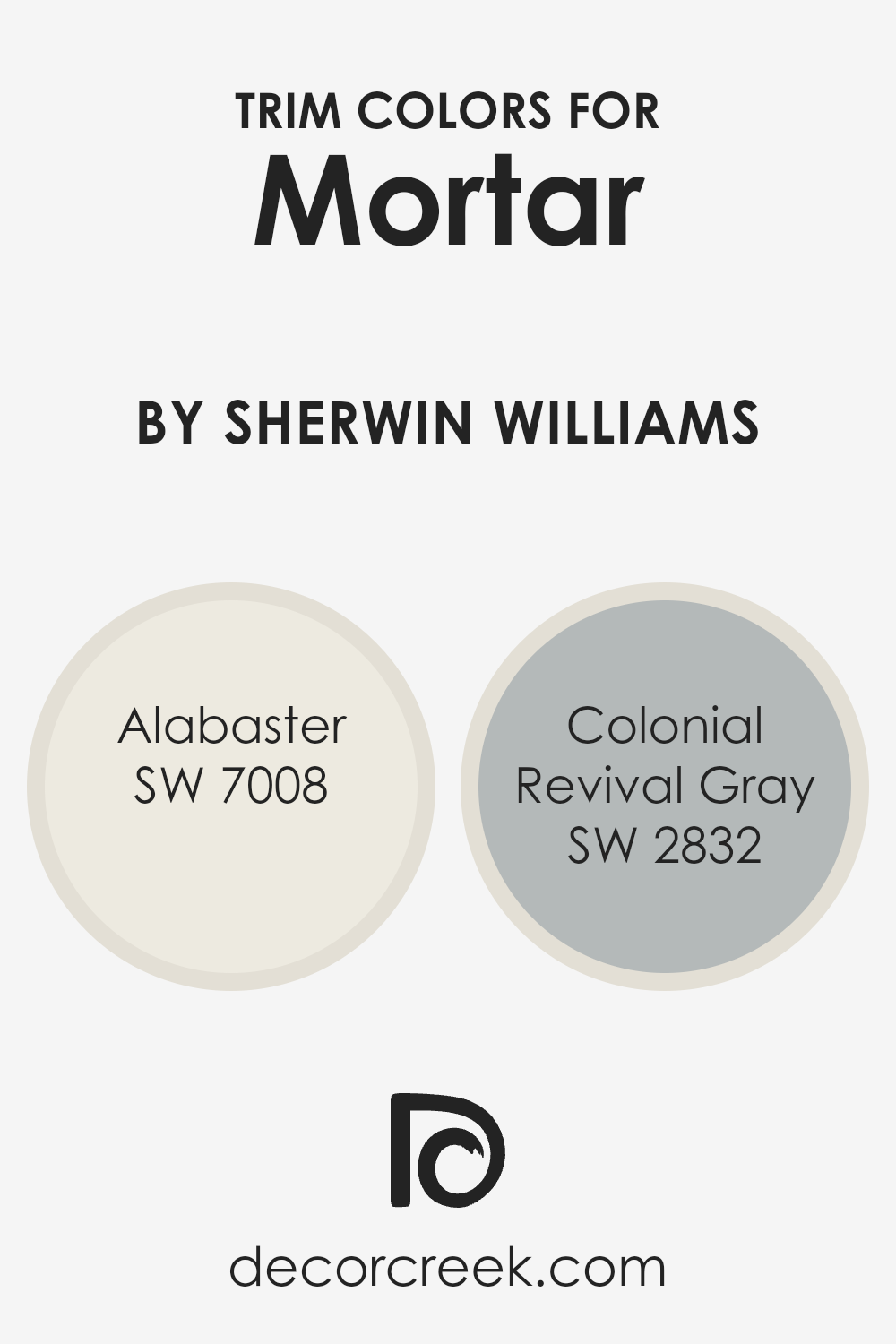
What are the Trim colors of Mortar SW 9584 by Sherwin Williams?
Trim colors are the shades applied to the edges or borders of walls, such as the baseboards, window frames, and door frames. They play a crucial role in highlighting and defining architectural features of a house. When considering Mortar SW 9584 as a primary wall color, the choice of trim color can significantly affect the overall look and feel of a space.
Trim colors add dimension and contrast, making the walls stand out more vibrantly. They can also help tie together different elements of a room, ensuring a cohesive design.
SW 7008 – Alabaster is a soft, creamy white that offers a warm and welcoming touch. It’s perfect for brightening up spaces and creating a fresh appearance. On the other hand, SW 2832 – Colonial Revival Gray is a cool, muted gray that adds sophistication and subtle contrast without overpowering the main wall color.
Both colors are excellent choices for trim, complementing Mortar and enhancing its natural beauty. They provide a delicate balance between standing out and blending in, ensuring that the room feels harmonious and inviting.
You can see recommended paint colors below:
- SW 7008 Alabaster
- SW 2832 Colonial Revival Gray
Colors Similar to Mortar SW 9584 by Sherwin Williams
Using similar colors to Mortar SW 9584 by Sherwin Williams can create a cohesive and calming palette in any space. Colors such as Heron Plume SW 6070 and Aesthetic White SW 7035 offer a warm touch, with soft undertones that pair well with Mortar’s subtle depth. Pearly White SW 7009 has a clean, fresh look that brightens up rooms while maintaining a cozy vibe.
Grey Mist SW 9625 provides a gentle, muted tone perfect for enhancing softer moods, adding a touch of neutral calmness to your decor.
Sunbleached SW 9585 introduces a pale, sun-kissed look, adding a light and airy quality that complements the darker Mortar. Meanwhile, Nuance SW 7049 embodies a delicately balanced hue, sitting comfortably between cool and warm, which makes it versatile and harmonious. Origami White SW 7636 offers a crisp, bright feeling ideal for spaces where you want to maximize light.
Moderne White SW 6168 gives off a slightly warmer shade, enriching the room while maintaining sophistication. White Heron SW 7627 stands out with its light and gentle nature, easily fitting into any design scheme. Finally, Sanctuary SW 9583 offers a soothing, serene tone, effortlessly promoting a relaxing atmosphere throughout your home. These colors work together to offer a balanced, inviting environment perfect for any space.
You can see recommended paint colors below:
- SW 6070 Heron Plume
- SW 7035 Aesthetic White
- SW 7009 Pearly White
- SW 9625 Grey Mist
- SW 9585 Sunbleached
- SW 7049 Nuance
- SW 7636 Origami White
- SW 6168 Moderne White
- SW 7627 White Heron
- SW 9583 Sanctuary

How to Use Mortar SW 9584 by Sherwin Williams In Your Home?
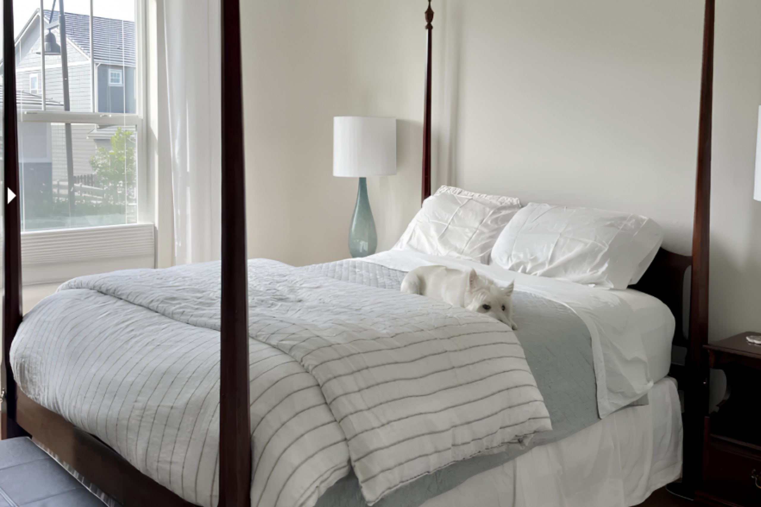
Sherwin Williams’ Mortar SW 9584 is a neutral paint color that falls into the warm gray category. It’s a soft, versatile color that can be used in many areas of a home to create a cozy and inviting atmosphere. Mortar SW 9584 works well in living rooms as it provides a comfortable backdrop that complements a variety of furniture styles, from modern to traditional. It can help create a calming environment in a bedroom, paired with white or light-colored bedding for a fresh look.
In kitchens, it pairs nicely with white cabinets and can be accented with colorful accessories for a balanced appearance. This color is also suitable for hallways and entryways, providing a clean, neutral space that can make other colors stand out. Adding Mortar SW 9584 to a feature wall or using it to highlight architectural details can add depth to a room without overwhelming it.
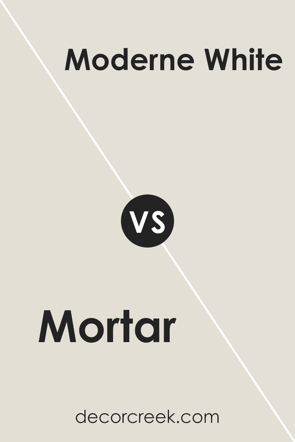
Mortar SW 9584 by Sherwin Williams vs Moderne White SW 6168 by Sherwin Williams
Mortar SW 9584 and Moderne White SW 6168 are two distinct shades by Sherwin Williams. Mortar is a soft, warm gray, while Moderne White is a light, creamy off-white. Mortar brings a cozy, grounded feel to a space with its muted tone, making it perfect for adding depth and interest without overpowering. It’s a versatile choice for walls and accents alike.
On the other hand, Moderne White offers a fresh, clean backdrop with its gentle warmth. This color is an ideal choice for brightening up spaces while offering a subtle hint of warmth. It can open up a room, making it feel more spacious and airy.
When paired together, Mortar can add contrast and highlight Moderne White’s clean appearance, creating a balanced and harmonious look in any room. Both colors work well in various settings, from modern to more traditional interiors, adapting to different styles and preferences.
You can see recommended paint color below:
- SW 6168 Moderne White
Mortar SW 9584 by Sherwin Williams vs Origami White SW 7636 by Sherwin Williams
Mortar SW 9584 and Origami White SW 7636 are two popular colors by Sherwin Williams with distinct characteristics. Mortar is a warm gray with slight brown undertones, giving it a cozy, grounding feel. It fits well in spaces where you want a hint of color without being too bold.
In contrast, Origami White is a very light, soft white with subtle gray undertones. This color is versatile and often used to create bright, airy spaces, making it great for reflecting natural light.
While Mortar can add depth and make a room feel more intimate, Origami White helps rooms feel larger and more open. Pairing them together can create a balanced look, with Mortar providing contrast against the bright neutrality of Origami White. Mortar works well as an accent or feature color, while Origami White is perfect for walls when you want a clean, minimalist look. Both colors can complement various styles and decor.
You can see recommended paint color below:
Mortar SW 9584 by Sherwin Williams vs Pearly White SW 7009 by Sherwin Williams
Mortar SW 9584 and Pearly White SW 7009 by Sherwin Williams are both neutral shades, but they bring different vibes to a space. Mortar is a warm, medium-toned gray with brown undertones, giving rooms a cozy, inviting feel. It can act as a grounding background color, pairing well with both warm and cool accents depending on the desired atmosphere.
On the other hand, Pearly White is a soft, off-white with subtle hints of gray, offering a clean and bright look. It is versatile and works well in spaces where a fresh and airy feeling is desired. While Mortar adds depth and warmth to rooms, Pearly White enhances light and creates an open, spacious feeling.
Together, they can complement each other, with Pearly White bringing a light contrast to the richness of Mortar, making them a perfect duo for combining warmth with brightness in home design.
You can see recommended paint color below:
Mortar SW 9584 by Sherwin Williams vs White Heron SW 7627 by Sherwin Williams
Mortar SW 9584 and White Heron SW 7627 are two distinct paint colors by Sherwin Williams, each creating a unique atmosphere in a space. Mortar is a warm, earthy gray with subtle taupe undertones.
It provides a cozy and grounded feeling, making it a great choice for living rooms or bedrooms where an inviting environment is desired. On the other hand, White Heron is a clean, crisp white with cool undertones. This shade brightens spaces and gives them a fresh, airy vibe, ideal for kitchens or bathrooms.
While Mortar adds depth and warmth, White Heron reflects light and enhances openness. Together, they can complement each other beautifully in a home, where White Heron can be used for walls to open up a space, and Mortar can be used as an accent color to add texture and warmth. This combination can bring balance, contrast, and harmony to a room.
You can see recommended paint color below:
Mortar SW 9584 by Sherwin Williams vs Sunbleached SW 9585 by Sherwin Williams
Mortar SW 9584 and Sunbleached SW 9585, both by Sherwin Williams, offer a gentle palette with different vibes. Mortar is a soft, warm gray that provides a neutral and cozy feel. It’s versatile and works well in various settings, creating a calm and understated backdrop for other colors and decor.
On the other hand, Sunbleached is a light beige with subtle hints of warmth, resembling the look of driftwood. This color brings a touch of warmth and lightness to a space, making rooms feel open and inviting. It’s great for areas where you want to add a bit more brightness without overpowering.
Used together, Mortar can ground a room with its muted tone, while Sunbleached can add light and warmth, making them ideal for a harmonious and balanced environment. Both colors suit relaxed, airy spaces and pair well with natural materials and textures.
You can see recommended paint color below:
- SW 9585 Sunbleached
Mortar SW 9584 by Sherwin Williams vs Heron Plume SW 6070 by Sherwin Williams
Mortar SW 9584 by Sherwin Williams is a rich, earthy neutral with a gray undertone. It creates a cozy and grounded atmosphere, making it ideal for spaces where you want a stable and warm background. The color has a subtle depth that can add character to a room without overwhelming it.
On the other hand, Heron Plume SW 6070 is a light, soft greige that leans more toward the beige side. This color is perfect for brightening up a room while still maintaining warmth. Heron Plume has a gentle and airy vibe, making it versatile for any indoor setting.
When comparing the two, Mortar is darker and more intense, providing a solid backdrop, while Heron Plume is lighter, promoting a more open and inviting space. They both work well as neutrals but suit different needs—Mortar for a cozier feel and Heron Plume for a light, easy-going environment.
You can see recommended paint color below:
Mortar SW 9584 by Sherwin Williams vs Grey Mist SW 9625 by Sherwin Williams
Mortar SW 9584 by Sherwin Williams is a warm neutral color. It’s a blend of beige and gray, often called greige. This color adds a cozy and inviting feel to a room, making it versatile for different spaces.
On the other hand, Grey Mist SW 9625 is a lighter gray tone. It’s airy and fresh, bringing a soft, gentle vibe. This color is great for making a space feel larger and more open.
When comparing the two, Mortar is warmer, with more beige, while Grey Mist leans towards a cooler palette. Mortar can make a room feel snug, suitable for living rooms or bedrooms. Grey Mist is ideal for brightening up smaller spaces or creating a calm atmosphere in bathrooms or kitchens. Both colors work well with various furniture and decor, but the choice between them depends on whether you prefer a warm or cool ambiance.
You can see recommended paint color below:
Mortar SW 9584 by Sherwin Williams vs Sanctuary SW 9583 by Sherwin Williams
Mortar SW 9584 and Sanctuary SW 9583 by Sherwin Williams are two closely related colors that complement each other well. Mortar is a soft, muted gray with warm undertones, giving it a cozy and inviting feel.
It works well as a neutral backdrop and pairs beautifully with both vibrant and subtle colors. On the other hand, Sanctuary is a lighter gray with slightly cooler undertones, providing a fresh and calming effect. It is perfect for creating a peaceful and relaxing atmosphere in any space. While both colors share a similar base, Mortar leans warmer, providing more comfort, whereas Sanctuary offers a cleaner, more refreshing vibe.
They can be used together in a space to create a balanced look, with Mortar providing depth and grounding, while Sanctuary brings in lightness and airiness. They are versatile choices for any room in the home.
You can see recommended paint color below:
Mortar SW 9584 by Sherwin Williams vs Nuance SW 7049 by Sherwin Williams
Mortar SW 9584 and Nuance SW 7049 are both sophisticated neutral colors from Sherwin Williams, but they offer different vibes and uses. Mortar SW 9584 is a warm gray with subtle brown undertones. It’s a great choice for creating a cozy, grounded space. It pairs well with earthy decor, adding a touch of warmth to a room without overpowering it.
On the other hand, Nuance SW 7049 is a soft, light greige color. It has a lighter feel compared to Mortar, bringing a fresh and airy vibe to any space. Nuance works well in smaller rooms or areas lacking natural light, as it can make spaces feel more open and bright.
While Mortar is ideal for creating intimate, warm environments, Nuance serves those who prefer a light, calming atmosphere. Both can be used effectively as backdrops, matching well with a variety of colors and decor styles.
You can see recommended paint color below:
- SW 7049 Nuance
Mortar SW 9584 by Sherwin Williams vs Aesthetic White SW 7035 by Sherwin Williams
Mortar SW 9584 and Aesthetic White SW 7035, both by Sherwin Williams, are two soft and subtle colors, yet they each bring distinct vibes. Mortar is a muted, warm gray with subtle beige undertones. It’s versatile and can create a cozy, grounded feel without being too dark. Think of it as a comforting, neutral backdrop that adds a touch of sophistication to any room.
On the other hand, Aesthetic White is a lighter, creamier shade. It has a warm, gentle undertone that slightly leans towards beige. This color can brighten a space while maintaining a subtle and inviting warmth. It’s an excellent choice if you’re looking for a light, airy vibe without the starkness of pure white.
Both colors are great for interiors, but Mortar is better if you want a deeper, more solid feel, while Aesthetic White works well to make spaces feel open and bright yet cozy.
You can see recommended paint color below:

I think what makes SW 9584 Mortar special is its ability to make a room feel comfy without being too loud or bright. Some colors can shout at you, but this one seems to whisper, “Relax, you’re home.” It’s not dull, though—it has its own quiet charm that I imagine would match pretty much anything in a room.
Another great thing about Mortar is how it fits with lots of other colors. Whether it’s bright, lively accents or darker, more dramatic tones, it seems to play well with others. It’s like the friend who gets along with everyone at a party.
Overall, Mortar comes across as a solid choice for those looking to paint a wall or even a whole room. It’s plain but not boring, and I think it would really make any place feel homier and more put together. I find it exciting to think about all the different ways you could use a color like Mortar in your home.
Ever wished paint sampling was as easy as sticking a sticker? Guess what? Now it is! Discover Samplize's unique Peel & Stick samples.
Get paint samples

