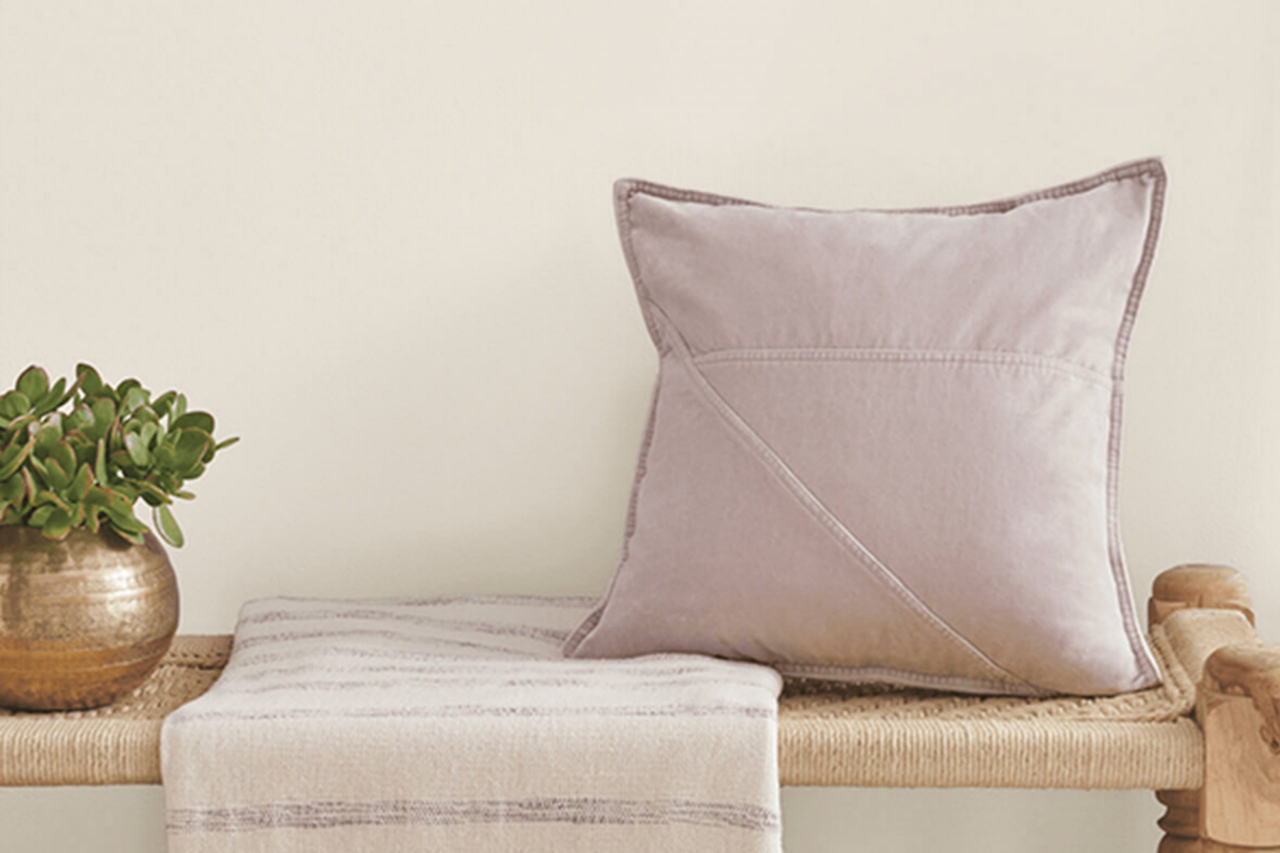
When I first came across SW 7627 White Heron by Sherwin Williams, I was immediately struck by its subtle elegance and versatile charm. This paint color offers a gentle blend of warmth and coolness, making it an ideal choice for a variety of settings.
In my experience, White Heron creates a serene backdrop that effortlessly complements both modern and traditional décor styles.
I found that using White Heron in a space brings a sense of calm and lightness. Its soft hue reflects natural light beautifully, opening up the room and making it feel more spacious. Whether you’re considering it for a cozy living room, a peaceful bedroom, or a clean and inviting kitchen, this color works wonders.
What appealed to me most about White Heron is its ability to harmonize with other colors. It pairs well with bolder accents and furniture pieces, allowing you to personalize your space without overwhelming the senses.
When I applied it to my walls, I noticed how it created a sense of balance and unity throughout my home. If you’re looking for a paint color that offers both simplicity and sophistication, White Heron could be just what you need.
What Color Is White Heron SW 7627 by Sherwin Williams?
White Heron by Sherwin Williams is a soft, warm white with a subtle depth that makes it very versatile. It doesn’t lean too stark or cold, making it a popular choice for creating a cozy and inviting atmosphere in any space.
This color works particularly well in interior styles like modern farmhouse, coastal, and Scandinavian, where a neutral, gentle backdrop is often desired.
Its understated warmth provides a perfect canvas for layering textures and colors.
In terms of materials, White Heron pairs beautifully with natural elements. Think light wood finishes, which enhance its warmth, or a touch of cool gray stone for contrast. Textures like linen or cotton in neutral shades further complement this white, adding a layer of interest without overwhelming its simplicity.
Metallic accents in brushed nickel or matte brass can introduce a touch of elegance that aligns well with White Heron’s gentle tone.
For a harmonious look, use this color on walls, trim, or even cabinetry. It holds up beautifully to both artificial and natural light, maintaining its warm undertone throughout the day.
White Heron is perfect for anyone looking to create a space that feels calm and inviting without feeling too plain or clinical.
Is White Heron SW 7627 by Sherwin Williams Warm or Cool color?
White Heron by Sherwin Williams is a versatile paint color that brings a sense of calmness and freshness to any home. It’s a soft, warm white with subtle undertones that make it less stark than pure white, creating a cozy atmosphere. This color works well in different lighting conditions, adapting to both natural and artificial lights.
It’s an excellent choice for living rooms, bedrooms, and kitchens, where it can make spaces appear brighter and more open. White Heron pairs beautifully with a variety of other colors, making it easy to coordinate with existing furniture and decor.
It acts as a neutral backdrop, allowing other design elements to stand out. This makes it suitable for modern minimalist designs as well as more traditional settings.
Its understated elegance helps create a welcoming environment, making it a popular choice for homeowners looking to refresh their interiors without making bold color statements.
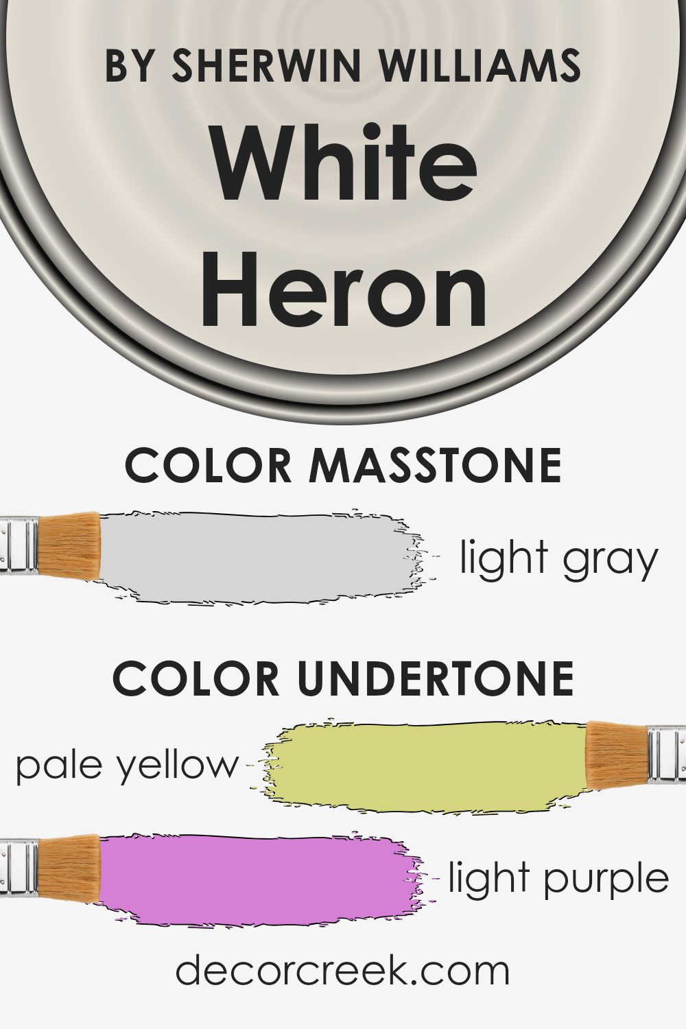
Undertones of White Heron SW 7627 by Sherwin Williams
White Heron by Sherwin Williams is a versatile color with several undertones that can subtly change its appearance depending on the environment. The undertones include pale yellow, light purple, light blue, pale pink, mint, lilac, and grey. Each of these undertones can affect the look of the paint, making it a flexible choice for different spaces.
Undertones are the hidden colors within a paint that become more visible depending on lighting and surrounding colors. They can give a room warmth or coolness and can subtly shift the mood.
For example, a paint with a yellow undertone may look warmer and more inviting, while a grey undertone might make it appear more subdued and calming.
In the case of White Heron, the pale yellow and light blue undertones can make the wall color feel airy and fresh, perfect for brightening up a room with limited natural light. The light purple and pale pink undertones can add a touch of softness, making spaces feel cozy and welcoming.
Mint and lilac hints can introduce a slight modern edge. Meanwhile, the grey undertone keeps the color grounded, ensuring it remains neutral and adaptable to various room styles. Thus, White Heron works well in both traditional and modern settings, easily complementing different decor elements.
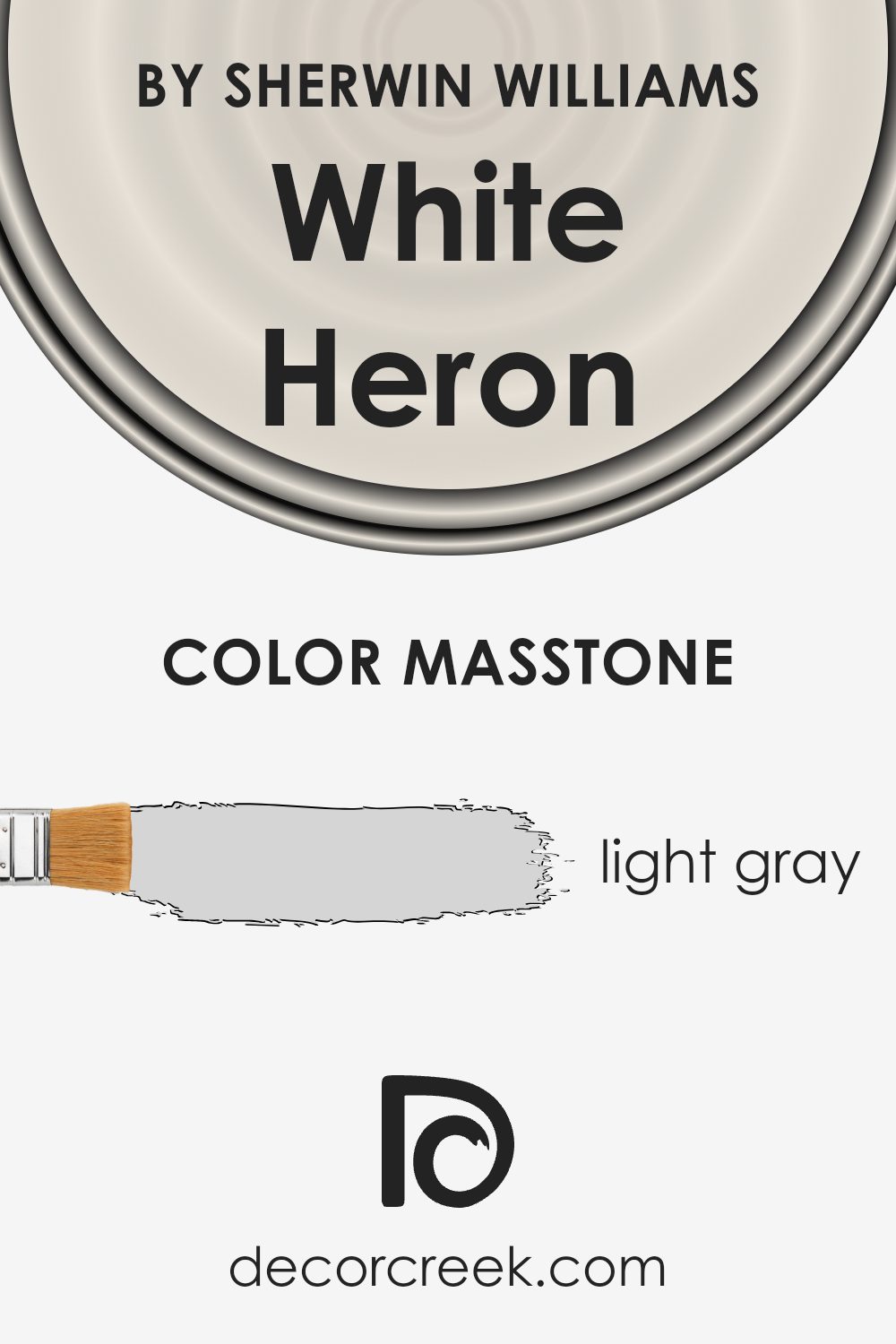
What is the Masstone of the White Heron SW 7627 by Sherwin Williams?
White Heron (SW 7627) by Sherwin Williams is a light gray that can make rooms in your home feel bright and spacious. Because it’s a soft shade, it reflects light well, which can help a room seem larger and more open. This color can work in many different spaces, from living rooms to kitchens, offering a neutral backdrop that allows other elements, like furniture and art, to stand out.
White Heron (SW 7627) pairs nicely with both dark and light colors, providing flexibility in design choices. It can be used to create a calm atmosphere, making it a great choice for bedrooms as well. The light gray does not overpower, instead, it gently complements the overall design.
This makes it easy to update your decor without having to change the wall color, as it accommodates various styles and accents gracefully.
How Does Lighting Affect White Heron SW 7627 by Sherwin Williams?
Lighting plays a crucial role in how we perceive color. The same color paint can look different depending on the type of light it is exposed to. This is because light has varying degrees of warmth and intensity that affect how colors are seen.
White Heron SW 7627 by Sherwin Williams is a soft, warm white. In natural light, it may look different depending on which direction the room is facing. In a north-facing room, the light is cooler and indirect. As a result, White Heron can appear slightly grayer or bluer.
It won’t look as warm or bright as it might in more direct sunlight. In a south-facing room, which gets plenty of warmer daylight, White Heron will display its warmer undertones. This makes the room feel more inviting and cozy.
In east-facing rooms, the morning light is soft and yellow, which can enhance the warmth of White Heron. However, as the day progresses, the light becomes more neutral, possibly causing the color to appear less warm.
On the other hand, in west-facing rooms, the mornings will show the color more muted because of the lack of direct light. But in the afternoon and evening, the light becomes warmer and more intense, making White Heron appear richer and creamier.
Artificial lighting also affects the appearance of this shade. Under warm incandescent bulbs, White Heron will show off its warmer aspects, feeling soft and inviting. If the light is fluorescent or LED with a cooler temperature, it may bring out more of the color’s neutral tones, making it a bit crisper but still cozy.
Overall, both the type of light and the room’s orientation play key roles in how White Heron appears throughout the day.
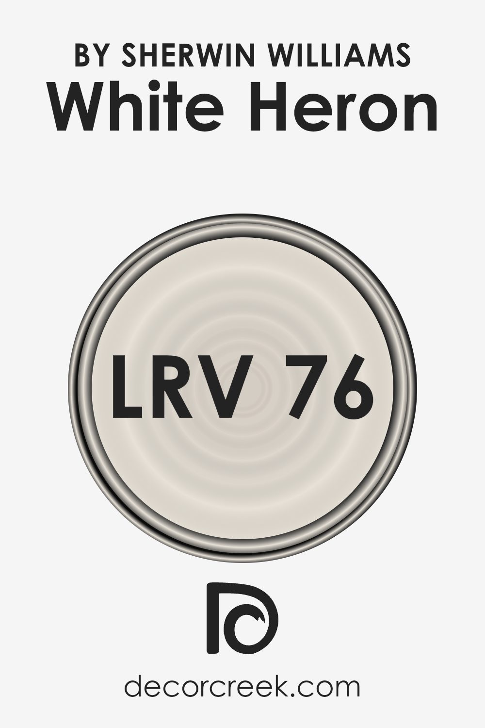
What is the LRV of White Heron SW 7627 by Sherwin Williams?
Light Reflectance Value (LRV) is a measurement used to determine how much light a paint color reflects. It’s a scale from 0 to 100, where 0 is absolute black, reflecting no light, and 100 is pure white, reflecting all the light. Higher LRV values mean that the color will reflect more light, making a space feel brighter and more open. Lower LRV values indicate that a color will absorb more light, making a room feel cozier and possibly smaller.
This measure is crucial when selecting paint for a space, as it affects how the color will look in different lighting conditions and can influence the overall feel of a room.
For White HeronSW 7627, which has an LRV of 76.041, this means it reflects a fair amount of light. The color will make rooms feel airy and bright, as it bounces back a lot of light into the space. This is ideal for smaller rooms or areas that don’t get much natural light, since it can help them feel larger and more inviting. A color with this level of LRV can work well in both modern and traditional settings, offering a clean backdrop without being too stark or clinical.
It won’t overpower a room and allows for flexibility with different accent colors and furnishings.
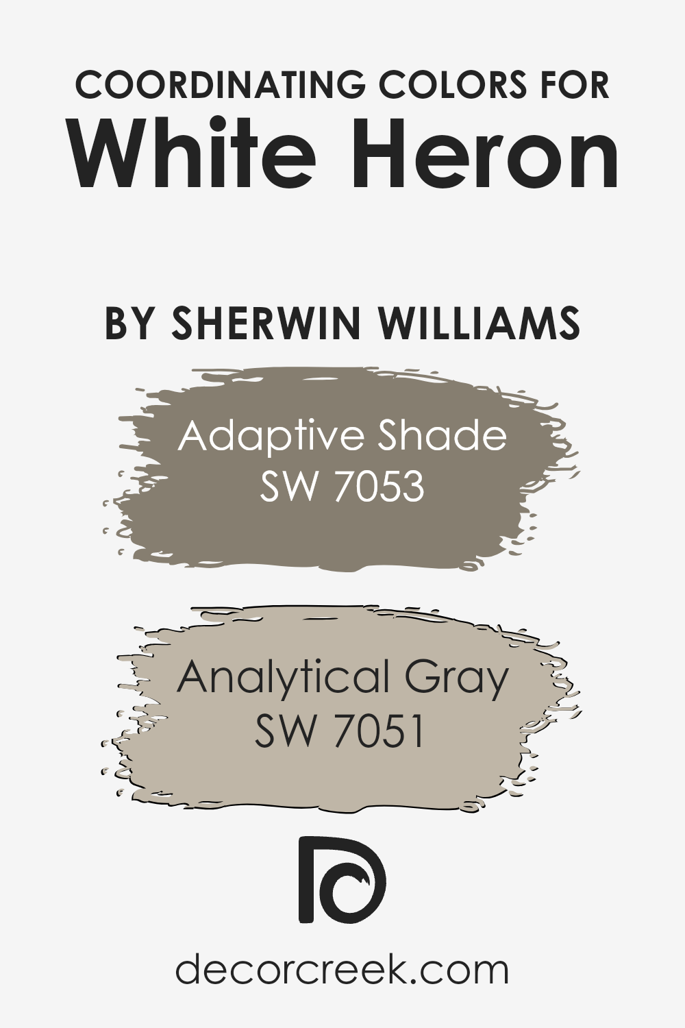
Coordinating Colors of White Heron SW 7627 by Sherwin Williams
Coordinating colors are hues that complement each other and work well together in a space, creating a balanced and harmonious look. When choosing colors to coordinate with White Heron by Sherwin Williams, it’s important to select shades that enhance its clean and bright nature.
Two great coordinating colors are Adaptive Shade (SW 7053) and Analytical Gray (SW 7051), which both bring warmth and subtlety to a room without overpowering the main color.
Adaptive Shade is a warm, taupe-like color that adds depth and coziness to spaces. It pairs well with White Heron as it brings a touch of earthiness and subtle contrast, making it perfect for a soothing backdrop. On the other hand, Analytical Gray is a cool and sophisticated neutral that adds a gentle contrast to the crispness of White Heron.
It’s a versatile shade that works well in various styles, offering a slightly muted backdrop that allows the main color to stand out.
Both of these colors provide a well-rounded palette that enhances and complements the creaminess and brightness of White Heron, creating a visually appealing and cohesive look.
You can see recommended paint colors below:
- SW 7053 Adaptive Shade
- SW 7051 Analytical Gray
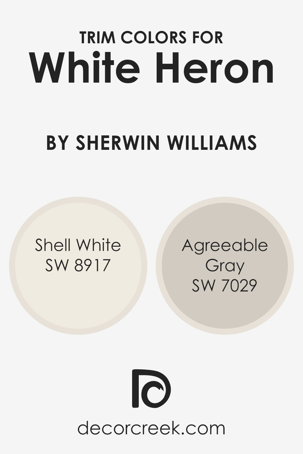
What are the Trim colors of White Heron SW 7627 by Sherwin Williams?
Trim colors refer to the paint colors used on the edges or borders of walls, doors, and windows to create a finished look. These colors frame your main wall color and can highlight architectural features or create contrast.
When it comes to White Heron by Sherwin Williams, choosing the right trim colors is important because it helps highlight the clean, crisp nature of the white, ensuring that it doesn’t look too stark or flat. By using specific trims, you can either create a seamless flow or draw attention to the room’s details.
Shell White and Agreeable Gray are two excellent choices for this purpose and complement White Heron beautifully.
Shell White (SW 8917) adds warmth and softness to a space without overwhelming it. It is an off-white with a hint of cream that can subtly differentiate the trim from the walls, adding depth to the room. Meanwhile, Agreeable Gray (SW 7029) is a warm gray that balances nicely with White Heron.
It provides a gentle contrast, which can help define the edges of rooms without clashing with the wall color. Together, these trim colors with White Heron can make a space feel welcoming and harmonious while enhancing its overall elegance.
You can see recommended paint colors below:
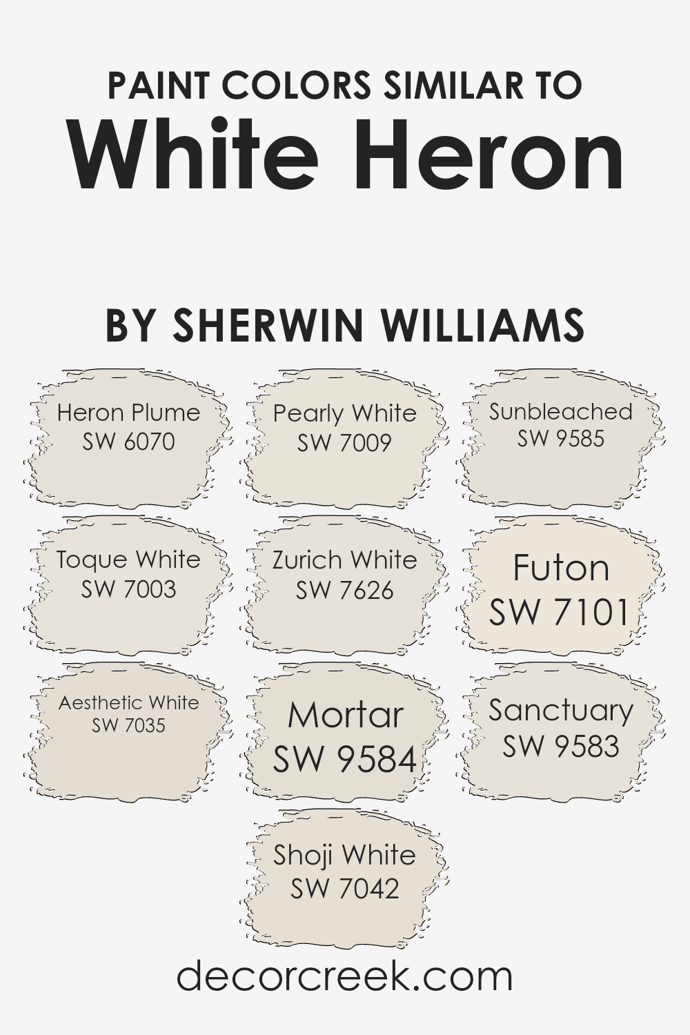
Colors Similar to White Heron SW 7627 by Sherwin Williams
Similar colors play a crucial role in creating harmonious and balanced spaces. They are often used to bring together different elements in a room, creating a cohesive and relaxing environment. For instance, colors like Heron Plume and Toque White pair beautifully with White Heron, giving a sense of continuity and softness.
Heron Plume offers a gentle warmth, while Toque White brings a crisp, clean feel. Aesthetic White and Shoji White add subtle variations in tone, enhancing the depth and character of the space. Aesthetic White is cozy and inviting, while Shoji White offers a delicate touch.
Pearly White and Zurich White complement each other, bringing a slightly cool undertone to the palette. Pearly White is fresh and bright, providing a sense of openness, whereas Zurich White adds a soft, neutral base. Colors like Mortar and Sunbleached provide an earthy balance, adding texture and grounding the overall look.
Mortar is a solid, warm grey, while Sunbleached offers a light, airy feel. Futon and Sanctuary bring warmth and calmness, enhancing the inviting atmosphere. Futon is warm and natural, while Sanctuary offers a peaceful, nature-inspired vibe.
These similar colors help to create a unified and aesthetically pleasing environment, making spaces feel balanced and well-thought-out.
You can see recommended paint colors below:
- SW 6070 Heron Plume
- SW 7003 Toque White
- SW 7035 Aesthetic White
- SW 7042 Shoji White
- SW 7009 Pearly White
- SW 7626 Zurich White
- SW 9584 Mortar
- SW 9585 Sunbleached
- SW 7101 Futon
- SW 9583 Sanctuary
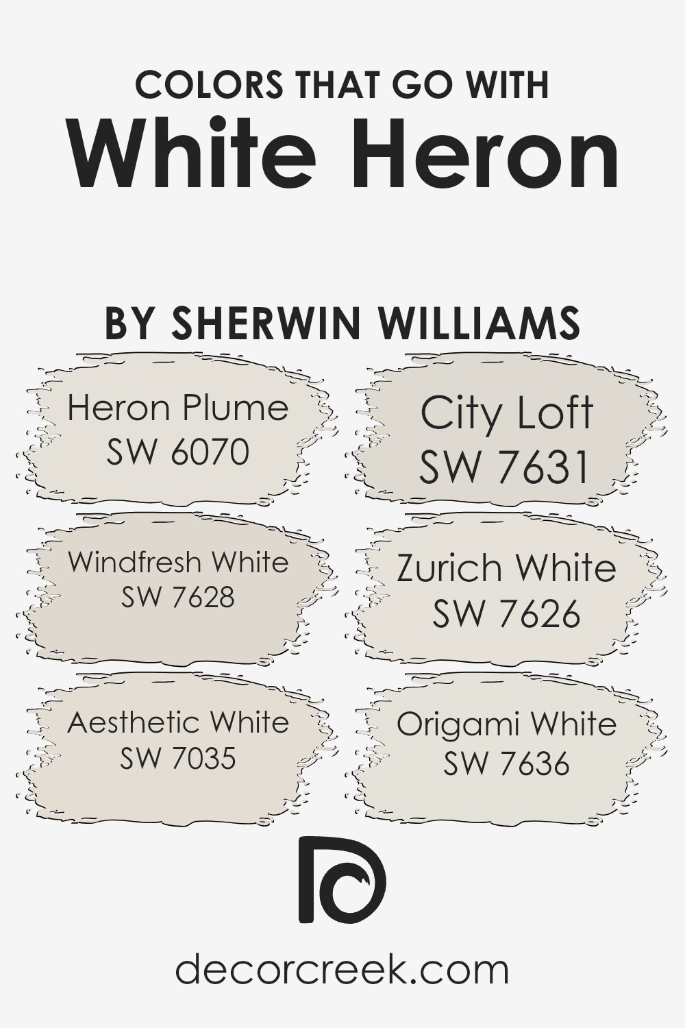
Colors that Go With White Heron SW 7627 by Sherwin Williams
White Heron SW 7627 by Sherwin Williams is a versatile and soft white that pairs beautifully with a range of complementary colors to create a harmonious space. Heron Plume SW 6070 is a warm and subtle off-white that adds a touch of coziness, perfect for building a welcoming atmosphere.
Windfresh White SW 7628 combines cool undertones with a gentle presence, refreshing a room without being too stark. Aesthetic White SW 7035 lends its soft, muted warmth to make spaces feel more inviting and lived-in, providing a comfortable backdrop suitable for any room.
City Loft SW 7631 offers a light and airy feel with its slightly gray undertone, ideal for those who want a sophisticated, yet warm palette. Zurich White SW 7626 is a crisp off-white, offering a bright and clean look that pairs wonderfully with White Heron, adding depth without overwhelming.
Origami White SW 7636 introduces a hint of beige, setting a neutral scene that can easily blend with other colors and textures in your space.
Together, these colors can create a cohesive and balanced environment, allowing for both variation in shades and a cohesive look that complements White Heron beautifully.
You can see recommended paint colors below:
- SW 6070 Heron Plume
- SW 7628 Windfresh White
- SW 7035 Aesthetic White
- SW 7631 City Loft
- SW 7626 Zurich White
- SW 7636 Origami White
How to Use White Heron SW 7627 by Sherwin Williams In Your Home?
White Heron SW 7627 by Sherwin Williams is a soft, clean white with a slightly warm undertone. It’s a versatile color that can brighten up any room, making it feel fresh and inviting. This paint is perfect for those who want a neutral backdrop that won’t clash with other colors or decorations.
In living rooms, you can use White Heron on the walls to create a light and airy atmosphere, which makes furniture and artworks stand out beautifully. It’s also an excellent choice for kitchens and bathrooms, reflecting light to make smaller spaces feel bigger and more open.
For bedrooms, it offers a calm and peaceful vibe that’s perfect for relaxing. Pair White Heron with natural wood or soft pastel accents to enhance the cozy feel. Whether for a modern minimalist look or a classic theme, White Heron provides a simple yet elegant base for your home design.
White Heron SW 7627 by Sherwin Williams vs Zurich White SW 7626 by Sherwin Williams
White Heron SW 7627 and Zurich White SW 7626 by Sherwin Williams are two subtle and versatile shades of white. White Heron is a soft white with a slight undertone of warmth, making it feel inviting without being too bright. It works well in rooms where a gentle, comforting atmosphere is desired.
On the other hand, Zurich White is slightly cooler and greyer. It offers a crisp, clean look, ideal for modern spaces or areas where a more neutral tone is preferred. Both colors provide great backdrops for various design styles, but their different undertones can complement different settings and moods.
White Heron tends to suit spaces needing a touch of warmth, while Zurich White pairs well with cooler color palettes. Whether chosen for a living room, bedroom, or kitchen, each color can highlight architectural features and décor beautifully depending on the desired aesthetic.
You can see recommended paint color below:

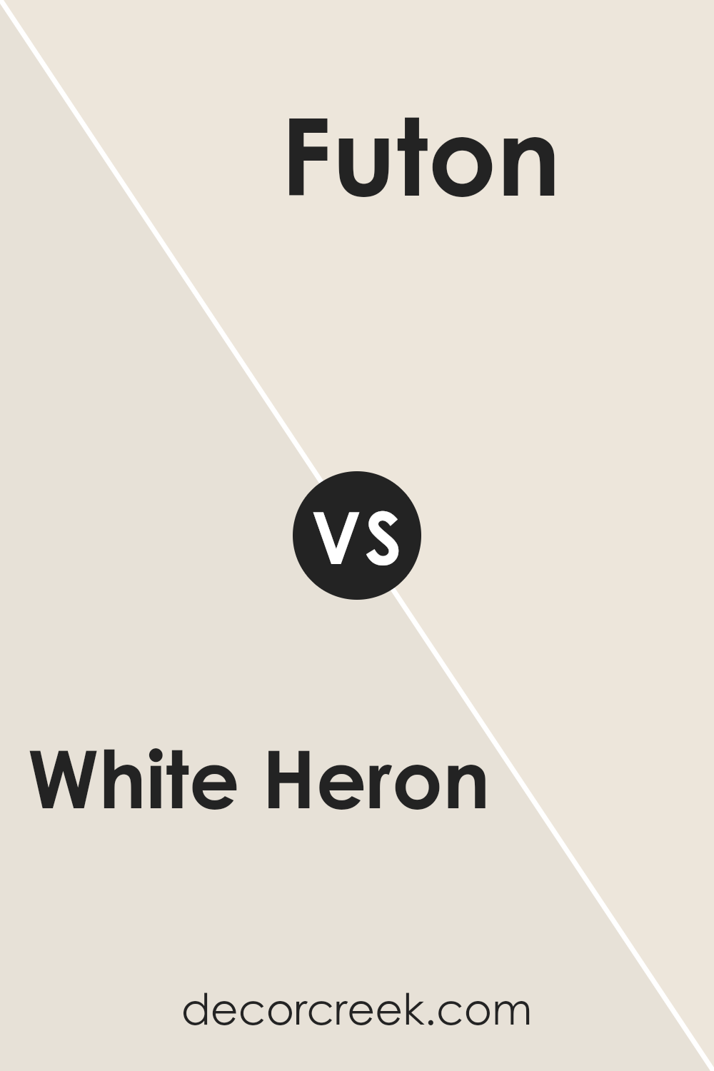
White Heron SW 7627 by Sherwin Williams vs Futon SW 7101 by Sherwin Williams
White Heron SW 7627 by Sherwin Williams is a soft, warm white with a hint of gray, giving it a gentle, neutral feel. It works well as a primary wall color, providing a clean and bright background that can make a room feel open and airy. It complements a variety of styles and is versatile for different color accents.
On the other hand, Futon SW 7101, also by Sherwin Williams, is a pale pastel pink with a slightly muted tone. It’s a more distinct choice compared to White Heron and adds a subtle touch of warmth and color to a space. While White Heron maintains a more neutral base, Futon can add personality and a soft blush to any room.
When compared, White Heron is more neutral and adaptable, while Futon offers a little more character and warmth with its pink hue. Both can be used together for a harmonious effect in interiors.
You can see recommended paint color below:
- SW 7101 Futon
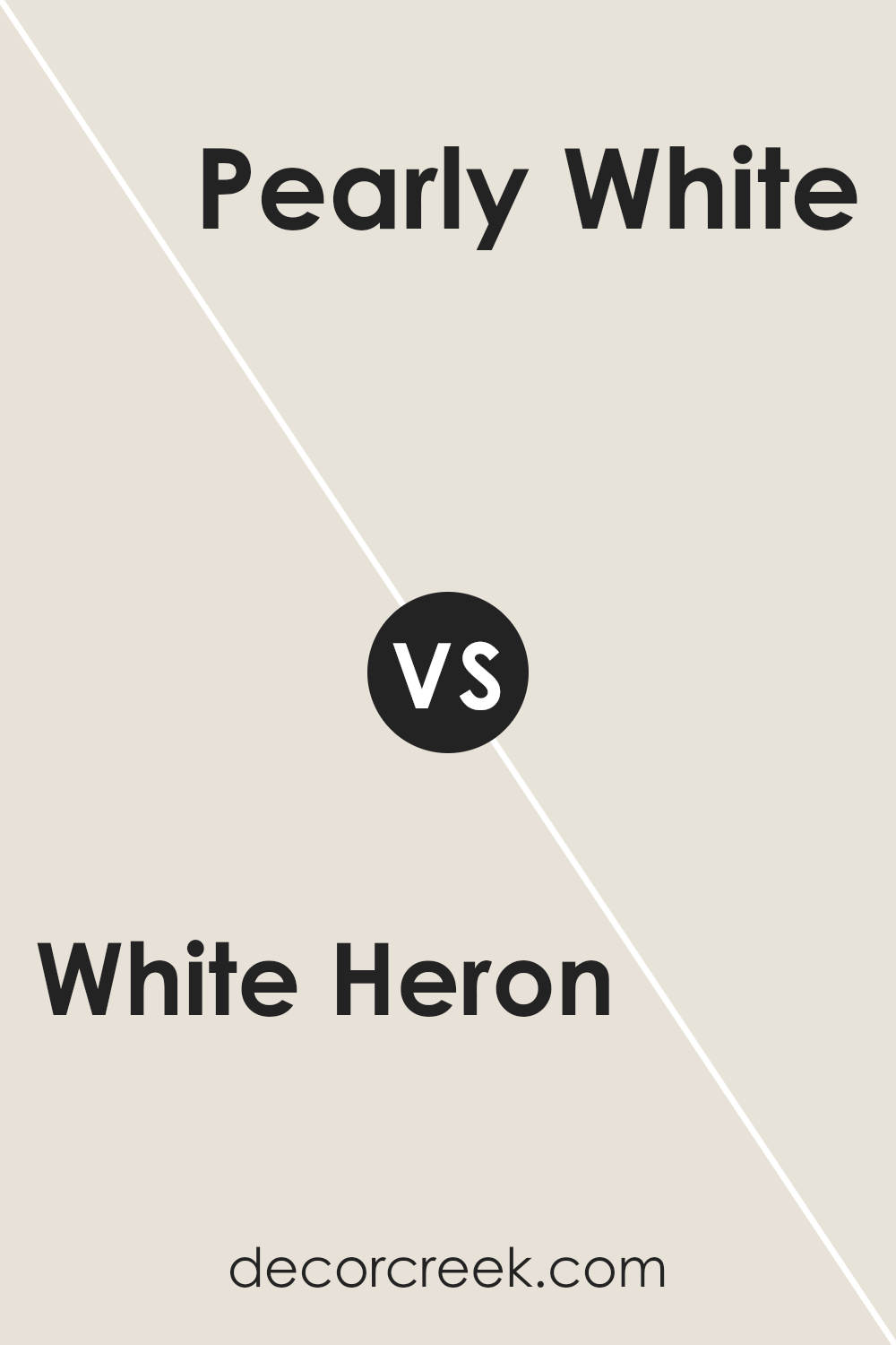
White Heron SW 7627 by Sherwin Williams vs Pearly White SW 7009 by Sherwin Williams
White Heron (SW 7627) and Pearly White (SW 7009) by Sherwin Williams are two beautiful, soft whites that bring brightness to any space but have distinct differences. White Heron is a clean and slightly cool-toned white with subtle blueish undertones. It provides a crisp, fresh look that makes a room feel open and airy. It’s ideal for modern spaces or anywhere you want a true, clean white.
On the other hand, Pearly White is a warmer shade. It has more yellow and beige undertones, which give it a creamy and inviting feel. This makes Pearly White great for creating cozy, welcoming environments. It works well in traditional settings or spaces where you want a softer ambiance.
Choosing between White Heron and Pearly White depends on the mood you want to create. White Heron fits well in minimalist or contemporary designs, while Pearly White offers warmth and suits more classic or rustic spaces.
You can see recommended paint color below:
White Heron SW 7627 by Sherwin Williams vs Sunbleached SW 9585 by Sherwin Williams
White Heron SW 7627 by Sherwin Williams is a soft, clean white color with a hint of warmth. It’s perfect for creating a bright and airy feeling in a room. Its neutrality makes it versatile and easy to pair with various other colors and styles, fitting well in both modern and traditional spaces.
Sunbleached SW 9585, on the other hand, has a gentle, muted quality. It’s a light neutral shade that carries a slight undertone of beige or tan, reminiscent of sand touched by sunlight. Sunbleached adds a cozy warmth to spaces without being overly bold.
When comparing the two, White Heron brings more of a pure, crisp brightness, while Sunbleached offers a touch of warmth and depth. They both serve well as background colors, but White Heron is likely to provide a crisper and cleaner backdrop, whereas Sunbleached will give a room a slightly more relaxed and warm feeling.
You can see recommended paint color below:
- SW 9585 Sunbleached
White Heron SW 7627 by Sherwin Williams vs Sanctuary SW 9583 by Sherwin Williams
White Heron SW 7627 by Sherwin Williams is a soft, clean white. It’s bright but not stark, making it a versatile choice for spaces where you desire a pure and fresh feel. It can open up a room and reflect light well, contributing to a sense of spaciousness and airiness.
On the other hand, Sanctuary SW 9583 is an earthy, warm neutral shade with hints of brown and gray. It has a calming and grounding effect, often providing a cozy and inviting atmosphere. While White Heron is crisp and light, Sanctuary brings a sense of warmth and comfort, perfect for areas where you want to feel relaxed and at ease.
Both colors are elegant but serve different purposes. White Heron is ideal for modern, airy spaces, while Sanctuary adds warmth and coziness. They can complement each other well, with White Heron brightening and Sanctuary grounding a room.
You can see recommended paint color below:
White Heron SW 7627 by Sherwin Williams vs Mortar SW 9584 by Sherwin Williams
White Heron SW 7627 by Sherwin Williams is a soft, warm white that creates a clean and airy feel. It reflects light beautifully, making spaces feel larger and more open. This color is versatile, providing a neutral backdrop that pairs well with almost any other hue, making it ideal for walls, trim, and ceilings.
In contrast, Mortar SW 9584 is a darker, earthy gray with a touch of warmth. It adds depth and coziness to a room, making it suitable for spaces where you want a more grounded and intimate atmosphere. Mortar has a more dramatic presence compared to the light and airy feel of White Heron.
While White Heron opens up a space with its brightness, Mortar provides a cozy, welcoming feeling. Together, these colors can create a balanced look, with White Heron adding lightness and Mortar offering a cozy contrast, perfect for accent walls or furnishings.
You can see recommended paint color below:
- SW 9584 Mortar
White Heron SW 7627 by Sherwin Williams vs Toque White SW 7003 by Sherwin Williams
White Heron by Sherwin Williams is a bright, clean white that can bring a sense of freshness to any room. It reflects a lot of light, making spaces feel open and airy. This color is quite versatile, blending well with a variety of palettes and styles.
On the other hand, Toque White by the same brand is a softer, warmer white. It has a subtle hint of beige, giving it a cozy and inviting feel. While White Heron is great for creating a crisp and modern look, Toque White is ideal for adding warmth and comfort.
Both colors work well for trim, walls, or ceilings but the choice depends on the mood you want to create. White Heron suits contemporary spaces, while Toque White complements traditional or farmhouse settings, adding a touch of warmth and softness.
You can see recommended paint color below:
White Heron SW 7627 by Sherwin Williams vs Heron Plume SW 6070 by Sherwin Williams
White Heron SW 7627 and Heron Plume SW 6070 by Sherwin Williams are both light, neutral colors that offer different feels for a space.
White Heron is a clean, crisp white with a slight tint that creates a bright and airy atmosphere. It is often used to create a fresh, modern look. Its simplicity and purity make it versatile, easy to pair with other colors and styles.
Heron Plume, on the other hand, has a warmer, greige tone. This means it combines gray and beige shades, offering a soft, inviting feel. This color is perfect for creating a cozy environment and adds a touch of warmth without being overpowering.
While White Heron provides a more straightforward, clean backdrop, Heron Plume offers depth and warmth. Choosing between them depends on whether you want a stark, open feel or a muted, welcoming vibe for your room.
You can see recommended paint color below:
White Heron SW 7627 by Sherwin Williams vs Shoji White SW 7042 by Sherwin Williams
White Heron SW 7627 and Shoji White SW 7042 are two popular neutral colors from Sherwin Williams, each offering its unique appeal. White Heron is a crisp, clean white that brings a sense of freshness and brightness to a space. It is ideal for creating a pure and contemporary look, making it versatile for modern and minimalist designs.
On the other hand, Shoji White is a softer, warmer color with subtle taupe undertones. This shade offers a more comforting and inviting atmosphere, adding a touch of coziness to any room. Shoji White is perfect for areas where you want a neutral that isn’t too stark but still feels light and airy.
Both colors work well with various other shades, such as grays, blues, and greens, but the choice between them depends on the mood you want to create. White Heron suits those looking for a brighter, cleaner feel, while Shoji White is better for spaces that require warmth and a bit more depth.
You can see recommended paint color below:
White Heron SW 7627 by Sherwin Williams vs Aesthetic White SW 7035 by Sherwin Williams
White Heron SW 7627 and Aesthetic White SW 7035 are both popular paint colors by Sherwin Williams. White Heron is a soft, light white with gentle gray undertones, giving it a clean and airy feel. It works well in spaces that need a light, fresh touch without feeling too stark or cold.
On the other hand, Aesthetic White is a warm off-white with subtle beige undertones. It tends to provide a cozy and inviting atmosphere, making it suitable for rooms that benefit from a hint of warmth. Compared to White Heron, Aesthetic White feels slightly richer and more grounding.
In choosing between the two, consider your room’s lighting and the mood you want to create. White Heron suits modern, minimalist designs where a crisp look is desired. Aesthetic White, however, complements spaces that seek a welcoming, cozy vibe with more traditional or transitional styles. Both colors offer versatility and elegance for various designs.
You can see recommended paint color below:
Imagine looking at a fresh, clear sky. White Heron is not just plain white. It’s warm and soft, making rooms feel friendly and open.
It’s like wearing a comfy sweater everyone loves. When I see it on walls, I notice how it helps both dark and bright colors look their best, making it a bit like a team player in your favorite game. Kids might say it’s like using a favorite crayon because it works well with many others.
It’s great for any room, whether it’s a bedroom where we sleep or a lively place to play. When sunlight hits it, White Heron glows with a happy warmth. It doesn’t yell for attention; it quietly stands out, like a good friend who is always there for you.
For anyone painting a house or room, White Heron is a smart choice. It’s reliable and doesn’t go out of style, sort of like choosing a classic snack that everyone enjoys. White Heron makes each room feel just right, helping every wall tell a special story.

Ever wished paint sampling was as easy as sticking a sticker? Guess what? Now it is! Discover Samplize's unique Peel & Stick samples.
Get paint samples

