I recently stumbled upon SW 6088 Nuthatch by Sherwin Williams, a paint color that might just be what you’re looking for to refresh your room. With its warm, comforting earth tones, Nuthatch offers a subtle yet powerful backdrop for any room in your home. Whether you’re thinking about revitalizing your living room or giving your bedroom a cozy update, this color has a flexible charm that pairs well with various decors and styles.
In my experience, choosing the right paint color can be a bit daunting given the myriad of options out there. However, Nuthatch stands out for its unique ability to blend with natural elements like wooden furniture and woven textures, enhancing the overall warmth of a room. Additionally, it works beautifully in well-lit areas, bringing out a vibrant yet soothing earthiness that makes the room feel inviting.
For those of you considering a new paint project, I think Nuthatch could provide the perfect balance between neutrality and richness, enabling you to create an environment that feels both harmonious and stylish. If you’re curious about how this color might change your home, it’s certainly worth checking out.
You might find it to be just the right shade to refresh your walls and bring a sense of comfort to your everyday surroundings.
What Color Is Nuthatch SW 6088 by Sherwin Williams?
Nuthatch by Sherwin Williams is a warm, earthy brown with a touch of gray that gives it a modern twist. This color brings a cozy sensation to any room, making it perfect for creating an inviting atmosphere. It’s a flexible shade that pairs well with a variety of decorating styles, especially rustic, farmhouse, and modern interiors.
The muted quality of Nuthatch makes it an excellent choice for living rooms or bedrooms where a calm, welcoming feel is desired. When it comes to materials, this shade coordinates beautifully with natural wood, adding depth and warmth to wooden floors or furniture pieces. It also goes well with textured fabrics like wool or linen, enhancing the comfort level of a room.
For those looking to complement the color with metals, brushed nickel or aged bronze fixtures can offer a stunning contrast without overpowering the subtlety of the hue. In terms of accent colors, soft creams, warm beiges, and even muted greens can create a harmonious palette that enriches the overall aesthetic of a room.
In summary, Nuthatch is an adaptable color that works seamlessly with a variety of materials and textures, making it a strong candidate for those looking to refresh their interior with a touch of nature-inspired warmth.
Is Nuthatch SW 6088 by Sherwin Williams Warm or Cool color?
Nuthatch SW 6088 by Sherwin Williams is a warm, cozy shade of brown. This color feels welcoming and creates a sense of comfort in any home. It’s perfect for living rooms or bedrooms where you want to establish a relaxed and soothing atmosphere.
Because it’s a neutral color, Nuthatch pairs well with a wide range of other colors, from soft whites to bolder hues. This makes it very flexible in home decor. It can act as a backdrop for more vivid colors or can stand alone to bring warmth to the room.
In rooms with lots of natural light, Nuthatch looks lighter and can make the room appear more open. In darker rooms, it adds depth and richness. This color is great for painting walls but also works well for cabinets or furniture, giving them a grounded, earthy look. If you’re looking for a color that adds warmth without being too strong, Nuthatch is worth considering.
Undertones of Nuthatch SW 6088 by Sherwin Williams
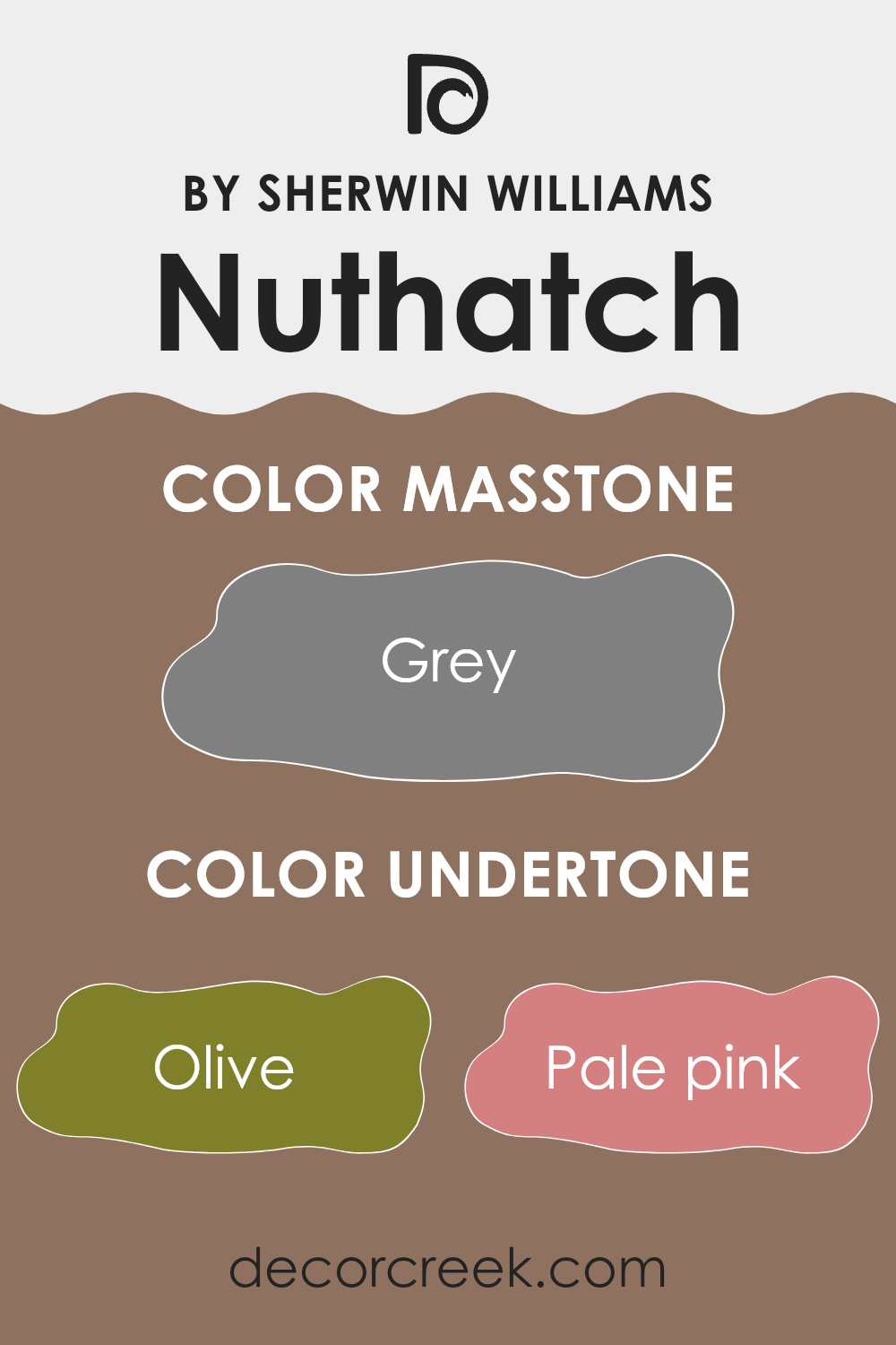
Nuthatch, a nuanced paint color by Sherwin Williams, holds a spectrum of subtle undertones that play a significant role in how it is perceived in various settings. Undertones are underlying hues that affect the overall look of a color under different lighting conditions and when paired with other colors.
This particular shade has a rich mix of undertones ranging from olive to fuchsia. These undertones can make the color appear differently based on the room’s lighting and surrounding colors. For instance, in a room with ample natural light, the pale pink or light gray undertones might become more prominent, giving the walls a softer appearance.
Conversely, in a room with less natural light, darker undertones like dark grey or navy might stand out, giving the walls a bolder look. When used on interior walls, these undertones allow Nuthatch to adapt easily to various decorating styles and color schemes. The presence of green and brown undertones can make it a natural fit for rooms aiming for a connection to nature, while pink or lilac undertones can add a gentle warmth.
Moreover, the complexity of Nuthatch means that it can interact attractively with both dark and light furniture, creating diverse atmospheres depending on the chosen décor. Whether aiming for a cozy, warm feel or a more grounded, earthy vibe, the multifaceted nature of Nuthatch, enriched by its undertones, provides a flexible backdrop for any room.
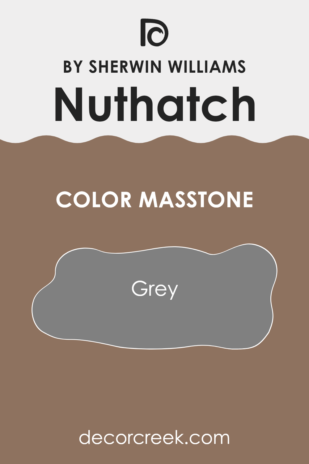
What is the Masstone of the Nuthatch SW 6088 by Sherwin Williams?
Nuthatch SW 6088 by Sherwin Williams has a masstone of grey, specifically Grey (#808080). This neutral shade is adaptable and easy to use in any room. It provides a solid background that works well with a variety of decor styles, from modern to traditional.
This kind of grey doesn’t overpower a room but rather brings a balanced and calm tone that makes it great for bedrooms, living rooms, and even kitchens. It can also help other colors pop, such as bright colors like red or soft colors like light blue, without causing any clash. Being neutral, it’s great for people who like to change their decorating styles often.
You can easily switch up accessories or furniture while keeping the walls the same, saving both time and money. Overall, this grey shade from Sherwin Williams is a practical choice for anyone looking to refresh their home’s look with something that offers flexibility and a classic appeal.
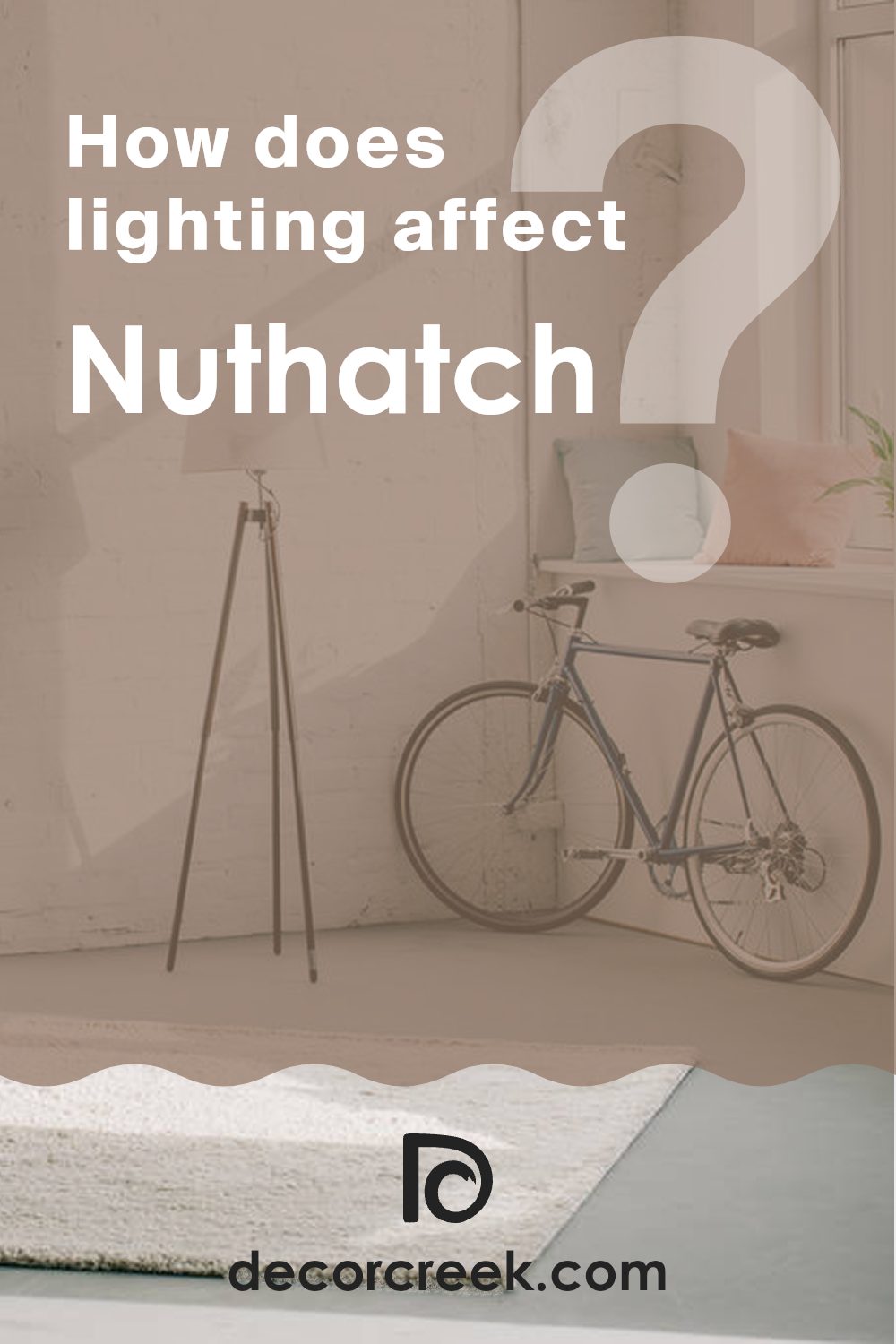
How Does Lighting Affect Nuthatch SW 6088 by Sherwin Williams?
Lighting plays a crucial role in how we perceive colors in different environments. When it comes to understanding this effect, considering both natural and artificial light sources is essential. In natural light, colors can appear different depending on the time of day and the direction of the sunlight. For a color like Nuthatch by Sherwin Williams, which is a warm, muted hue, its appearance can vary significantly.
In a room with north-facing windows, which receives less direct sunlight and tends to have a cooler, softer light, Nuthatch might look slightly darker and less vibrant. This is because cooler light can dampen the intensity of warm colors.
Conversely, in south-facing rooms that receive a lot of direct sunlight, Nuthatch will likely appear much brighter and more vivid. The abundant light accentuates the warmth of the color, making the room feel cozy and inviting.
East-facing rooms get plenty of light in the morning but less in the afternoon, which means a color like Nuthatch will appear lighter and more lively in the morning but may lose some of its vitality by the afternoon. It will also change as the natural light fades and transitions to artificial lighting.
Rooms that face west receive the most intense light in the late afternoon, so the color will look different throughout the day. It starts off darker in the morning and becomes brighter and richer towards the evening. This dynamic change can add an interesting effect to the overall feel of the room.
Artificial lighting, such as LED or incandescent bulbs, also affects how Nuthatch looks. LED lights, which often have a cooler temperature, can make the color appear softer and less warm, whereas incandescent bulbs, with their warmer tones, will enhance the cozy, welcoming quality of the color. Understanding these variations can help when deciding on paint colors for different rooms, ensuring you achieve the desired effect regardless of the type of light the room receives.
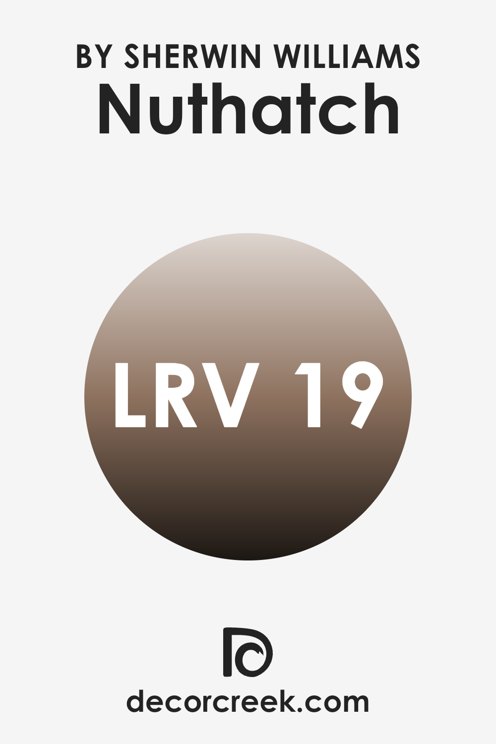
What is the LRV of Nuthatch SW 6088 by Sherwin Williams?
LRV stands for Light Reflectance Value, which is a measure of how much light a color reflects or absorbs when painted on a surface. It’s essentially a scale that helps gauge the brightness of a paint color once it’s on the walls.
A higher LRV means the color reflects more light, making a room feel airier and more open. Conversely, a lower LRV means the color absorbs more light, which can make a room feel cozier but smaller. With an LRV of 18.679, the color Nuthatch is a darker shade that absorbs a good amount of light rather than reflecting it.
This characteristic means it can make a room feel more intimate and enclosed. However, one should be mindful of using it in smaller rooms or rooms with limited natural light, as it could make the area seem quite dark. For larger areas or rooms with plenty of natural or artificial light, this color could add a warm and inviting atmosphere without overly darkening the room.
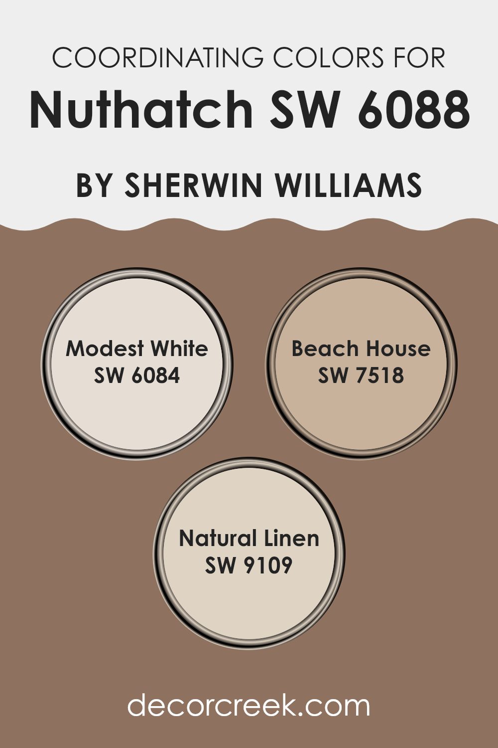
Coordinating Colors of Nuthatch SW 6088 by Sherwin Williams
Coordinating colors are chosen to complement a primary color, enhancing the overall aesthetic of a room while creating a harmonious look. These colors are selected based on their ability to pair well together, offering balance and continuity in design. Coordinating colors can be contrasting to add vibrancy or similar in tone for a subtle and cohesive appearance.
For the color Nuthatch, the coordinating colors include Modest White, Beach House, and Natural Linen. Modest White is a gentle and clean shade, ideal for creating a calm and light atmosphere that matches well with darker hues.
Beach House is a rich, warm gray that offers a comforting and inviting feel, perfect for rooms that aim to be cozy yet modern. Natural Linen brings a soft and earthy tone to the mix, providing a neutral background that allows other colors to stand out without being too strong. Together, these colors support Nuthatch by adding depth and warmth, making any room feel more welcoming and stylish.
You can see recommended paint colors below:
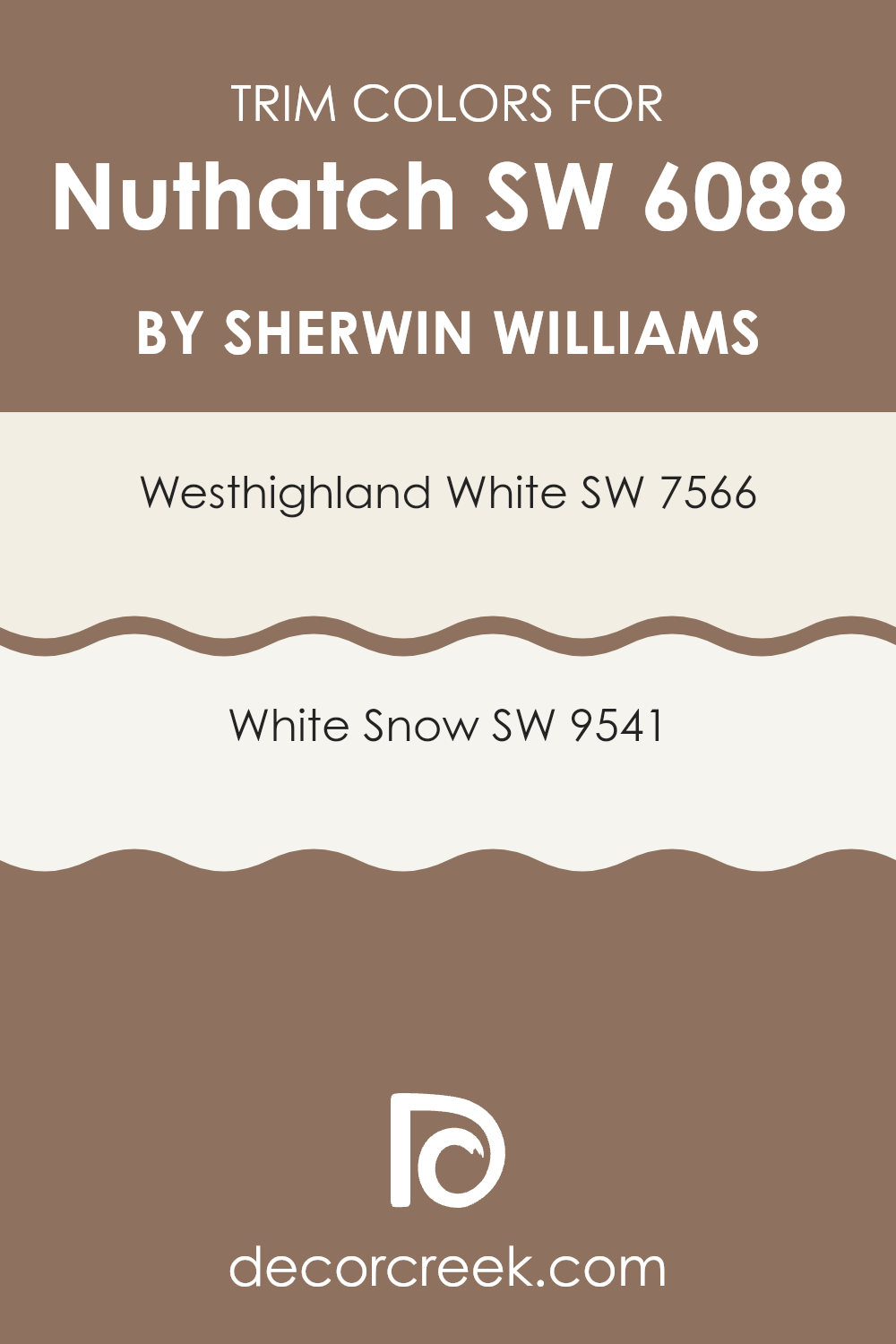
What are the Trim colors of Nuthatch SW 6088 by Sherwin Williams?
Trim colors, like SW 7566 – Westhighland White and SW 9541 – White Snow, are used to accentuate specific architectural features of a house or a room, such as window frames, door frames, and skirtings. These colors highlight the transitions between different surfaces, helping to define the room visually and adding a clean, finished look to the edges of the painted areas.
The right trim color complements the main wall color, in this case, Nuthatch SW 6088 by Sherwin Williams, by creating a subtle yet impactful contrast that enhances the overall aesthetic of the room. Westhighland White SW 7566 is a warm white with a creamy undertone that imparts a cozy and inviting feel, making it a great choice for a trim color that softens the richer hues of the walls.
On the other hand, White Snow SW 9541 offers a brighter, crisper white that provides a more striking contrast, which can help make the wall color stand out beautifully and give a fresh and clean look. Both trim colors are adaptable and work well with a wide range of color palettes, ensuring they complement rather than compete with the main color, Nuthatch.
You can see recommended paint colors below:
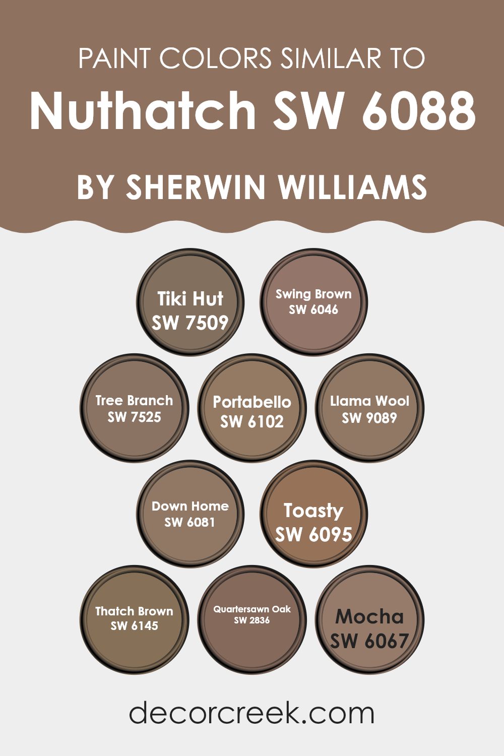
Colors Similar to Nuthatch SW 6088 by Sherwin Williams
Colors that are similar to each other provide a seamless and cohesive look that enhances the aesthetic appeal of any room. These similar hues work well together by creating a subtle variation that adds depth and complexity without the stark contrast that comes with using opposite colors.
For instance, when decorating a room, using shades like SW 7509 Tiki Hut, a warm, sandy brown, alongside SW 6046 Swing Brown, a deeper, chocolate shade, can produce a rich, inviting atmosphere. This strategy ensures that the colors in the room flow naturally from one to another, making the room feel unified and harmonious.
Among the similar colors, SW 7525 Tree Branch is a taupe-like hue that offers a neutral backdrop perfect for highlighting decor elements. Similarly, SW 6102 Portabello, with its soft, earthy brown, provides an adaptable foundation that can enhance the warmth of a room.
The lighter SW 9089 Llama Wool brings a gentle, creamy texture to the mix, contrasting subtly with darker tones like SW 6081 Down Home, which exudes warmth through its deep, russet brown. SW 6095 Toasty is another cozy shade, reminiscent of golden-brown toast, ideal for creating a welcoming feel.
SW 6145 Thatch Brown and SW 2836 Quartersawn Oak, with their hints of nuttiness and crafted wood respectively, add layers of rustic charm. Finally, SW 6067 Mocha offers a hint of darkness, like the rich, dark coffee, perfect for grounding the lighter tones. Together, these colors weave a tapestry of earth-inspired hues that make any room inviting and comfortable.
You can see recommended paint colors below:
- SW 7509 Tiki Hut
- SW 6046 Swing Brown
- SW 7525 Tree Branch
- SW 6102 Portabello
- SW 9089 Llama Wool
- SW 6081 Down Home
- SW 6095 Toasty
- SW 6145 Thatch Brown
- SW 2836 Quartersawn Oak
- SW 6067 Mocha
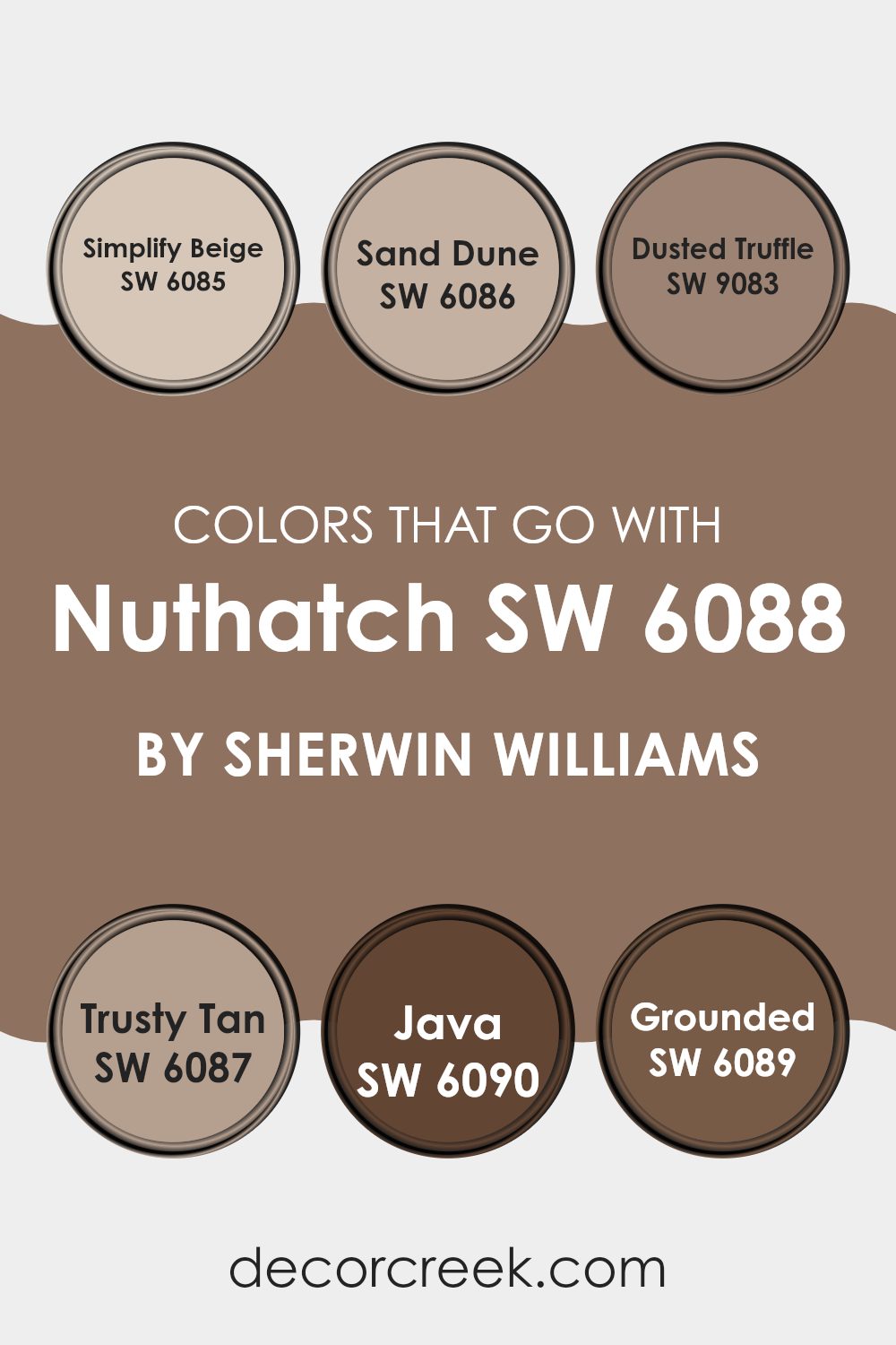
Colors that Go With Nuthatch SW 6088 by Sherwin Williams
Choosing colors that complement Sherwin Williams Nuthatch SW 6088 is crucial because it ensures a harmonious look in any room. Matching colors like Simplify Beige, Sand Dune, Dusted Truffle, Trusty Tan, Java, and Grounded helps create a coordinated color scheme that is pleasing to the eye. These colors work well with Nuthatch SW 6088 by adding depth and variety while maintaining a fluid visual flow, enhancing the overall aesthetic of your room without being too strong with contrasting hues.
Simplify Beige and Trusty Tan are warm, welcoming colors that provide a soft backdrop, making them ideal for creating a cozy and inviting environment. Sand Dune is a slightly darker shade that offers a beautiful contrast against lighter colors, increasing the depth of the room.
Dusted Truffle is a richer, deeper color that adds a luxurious feel. Java brings a bold, strong element with its deep, rich brown tone, perfect for highlighting key areas. Lastly, Grounded offers a robust, earthy quality that complements greenery and natural elements superbly, making it an excellent choice for rooms that aspire to a nature-inspired theme. Together, these colors form an adaptable palette that works seamlessly with Nuthatch SW 6088, ensuring a stylish yet cohesive living room.
You can see recommended paint colors below:
- SW 6085 Simplify Beige
- SW 6086 Sand Dune
- SW 9083 Dusted Truffle
- SW 6087 Trusty Tan
- SW 6090 Java
- SW 6089 Grounded
How to Use Nuthatch SW 6088 by Sherwin Williams In Your Home?
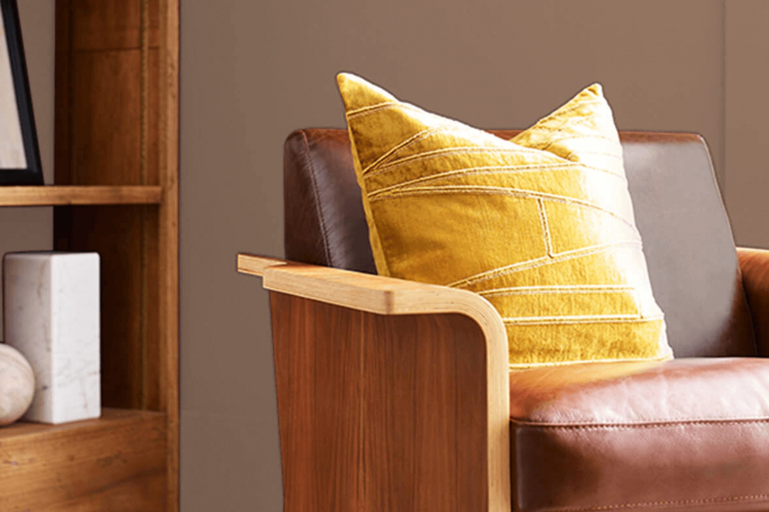
Nuthatch SW 6088 by Sherwin Williams is an adaptable paint color that offers a soothing, warm brown shade suitable for various rooms in your home. This color works well in living rooms or bedrooms, where its calming effect makes the room feel cozy and welcoming.
It pairs beautifully with natural materials like wood and leather, enhancing the rustic charm of your decor. You can use it as a main wall color or for accent walls to add depth and interest to the room. For a balanced look, complement Nuthatch with lighter shades like creams or soft whites for trim and moldings.
This color also suits exterior areas, making it a good choice for front doors or shutters, adding a natural aesthetic to your home’s outside. Whether modern or traditional, incorporating Nuthatch can help create a comfortable and stylish atmosphere in any home setting.
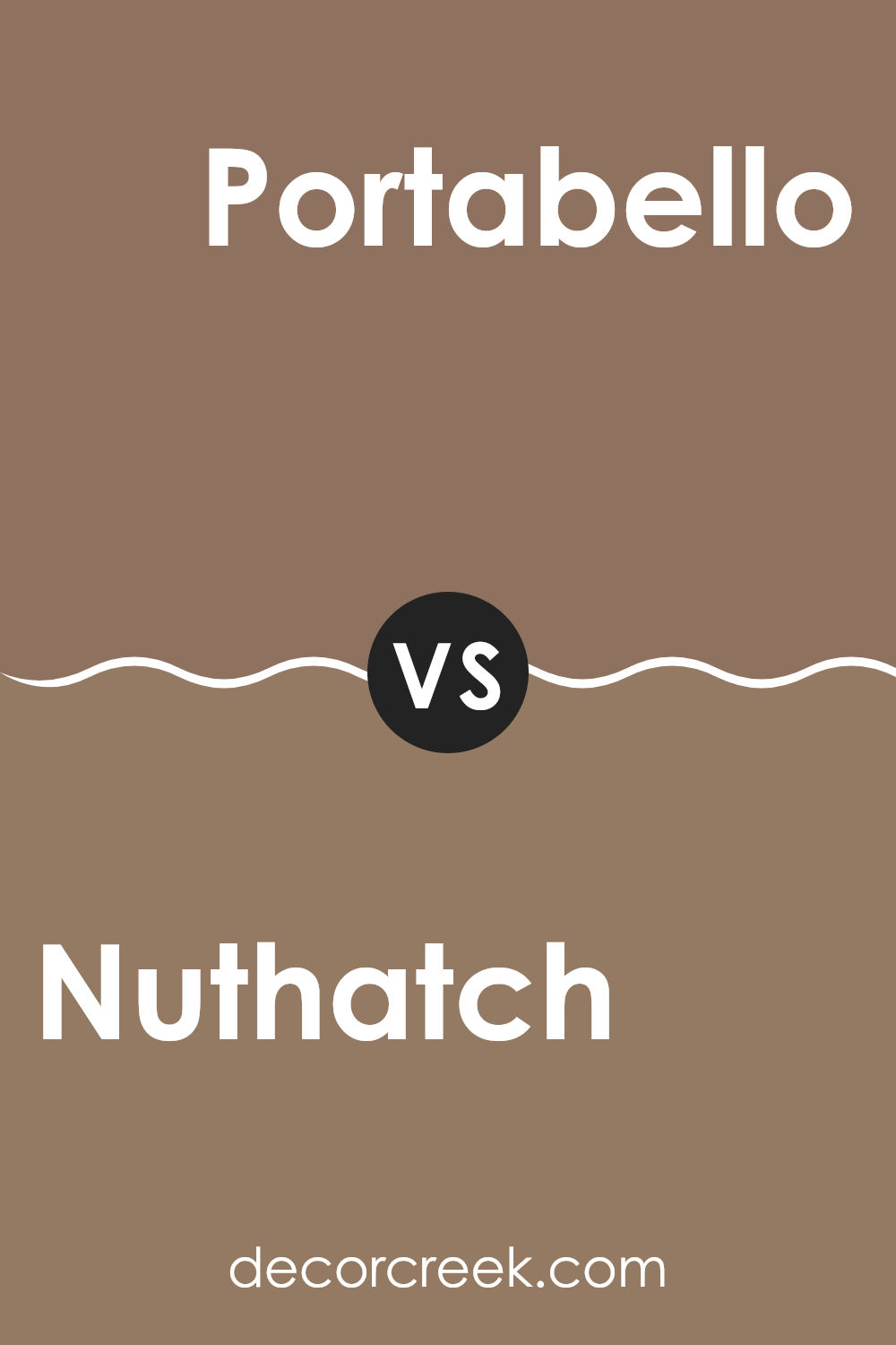
Nuthatch SW 6088 by Sherwin Williams vs Portabello SW 6102 by Sherwin Williams
Nuthatch and Portabello, both from Sherwin Williams, are warm, earthy tones that offer a cozy vibe to any room. Nuthatch is a lighter, sandy beige that brightens rooms with its soft and subtle hue. It’s perfect for creating a gentle, welcoming atmosphere.
On the other hand, Portabello is a deeper, richer shade of brown that provides a sense of stability and groundedness. This color tends to make rooms feel more enclosed and snug, making it ideal for larger rooms that you want to feel more intimate.
When used together, these two colors can complement each other nicely, with Nuthatch bringing lightness to a room and Portabello adding depth and warmth. Both colors work well in a variety of settings, making them adaptable choices for home decor.
You can see recommended paint color below:
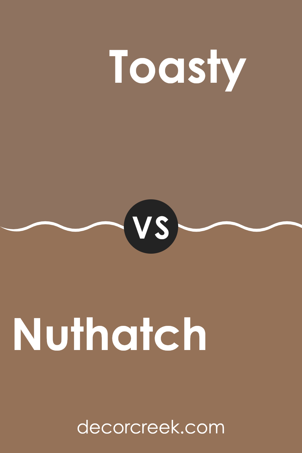
Nuthatch SW 6088 by Sherwin Williams vs Toasty SW 6095 by Sherwin Williams
Nuthatch and Toasty by Sherwin Williams are two warm, inviting shades, but they definitely have their differences. Nuthatch is a deeper, earthy beige with hints of gray, giving it a solid and grounded feel.
It works well in rooms that aim for a cozy yet strong atmosphere, like living rooms or bedrooms. On the other hand, Toasty is a lighter, softer beige, leaning slightly towards a peachy tone. This color is ideal for creating a gentle and welcoming vibe, making it great for places where you want to relax, such as a sunny breakfast nook or a casual sitting area.
While Nuthatch offers a more robust backdrop, Toasty brings a lighter, cheerier touch. Both shades work beautifully with natural materials and can warm up a room, but the choice between them depends on the mood you want to set.
You can see recommended paint color below:
- SW 6095 Toasty
Nuthatch SW 6088 by Sherwin Williams vs Swing Brown SW 6046 by Sherwin Williams
Nuthatch and Swing Brown are both warm, cozy colors from Sherwin Williams, but they have distinct tones that set them apart. Nuthatch is a lighter, more neutral brown with a soft, approachable feel. It resembles the gentle shades of a sandy beach or a light clay, making it perfect for creating a calm and welcoming atmosphere in a room.
On the other hand, Swing Brown is darker and richer, reminiscent of dark chocolate or the deep, fertile earth. It can add a bit of drama and warmth to a room, making it ideal for areas where you want a stronger, more grounded feel.
While both colors can effectively warm up a room, Nuthatch offers a lighter, airier vibe, whereas Swing Brown provides depth and robustness. Each color works well in a variety of settings, depending on the mood you want to achieve.
You can see recommended paint color below:
- SW 6046 Swing Brown
Nuthatch SW 6088 by Sherwin Williams vs Quartersawn Oak SW 2836 by Sherwin Williams
Nuthatch and Quartersawn Oak, both by Sherwin Williams, present distinct tones that could beautifully complement various rooms and styles. Nuthatch is a warm beige with a subtle gray undertone, offering a cozy and inviting feel perfect for living rooms or bedrooms. It pairs well with various decor styles and brings a soft, natural look to a room.
On the other hand, Quartersawn Oak leans towards a richer, darker brown. This color is ideal for creating a strong statement, suitable for accent walls or cabinets. It has an earthy vibe, adding depth and warmth to larger rooms or furniture, making it appear more grounded and stable.
Both colors work well in traditional and modern settings, but where Nuthatch offers a light, airy feel, Quartersawn Oak provides a heavier, more anchored appearance. Depending on the mood you want to set or the room you’re decorating, either could be an excellent choice, but they cater to different aesthetic needs.
You can see recommended paint color below:
- SW 2836 Quartersawn Oak
Nuthatch SW 6088 by Sherwin Williams vs Down Home SW 6081 by Sherwin Williams
Nuthatch SW 6088 and Down Home SW 6081 are two distinct colors offered by Sherwin Williams that each bring their unique atmosphere to a room. Nuthatch is a darker, rich brown that creates a warm and cozy feeling, making it ideal for rooms where you want comfort, like living rooms or bedrooms. It has an earthy tone that pairs well with natural materials like wood or leather.
On the other hand, Down Home is a lighter, sandy brown. This color feels more laid-back and is excellent for creating a relaxed, inviting environment. It’s perfect for areas where you want a lighter touch but still appreciate the warmth of a brown hue, such as in kitchens or dining areas.
Both colors provide a sense of warmth but vary in their intensity and the mood they set. While Nuthatch offers a deeper, more enveloping warmth, Down Home brings a lighter, softer atmosphere. This difference can affect how you choose between them depending on the room and the ambiance you aim to achieve.
You can see recommended paint color below:
- SW 6081 Down Home
Nuthatch SW 6088 by Sherwin Williams vs Tree Branch SW 7525 by Sherwin Williams
Nuthatch and Tree Branch are two colors by Sherwin Williams with distinct tones perfect for creating a warm, cozy vibe in any room. Nuthatch is a soft, muted beige with a warm undertone, making it feel welcoming and comfortable. It’s an excellent choice for those who want a neutral backdrop that still adds a hint of warmth to their room.
On the other hand, Tree Branch is a darker taupe that leans more towards a grayish-brown. This color is deeper and can add a stronger statement to a room while still maintaining a neutral palette. Tree Branch works well in areas where you might want to add some depth and definition, such as an accent wall or a room with ample natural light to prevent it from feeling too dark.
Both colors work well together, offering a nice contrast between lighter and darker neutral shades, enabling you to layer your neutrals in a way that adds interest and variety while keeping the overall feel very grounded and natural.
You can see recommended paint color below:
- SW 7525 Tree Branch
Nuthatch SW 6088 by Sherwin Williams vs Llama Wool SW 9089 by Sherwin Williams
The colors Nuthatch and Llama Wool by Sherwin Williams have their unique characteristics. Nuthatch is a warmer, medium brown with hints of yellow undertones, giving it a cozy and inviting feel. It’s a flexible color that works well in many rooms, especially ones that aim to have a warm, welcoming atmosphere.
On the other hand, Llama Wool is a lighter and cooler tone, resembling the soft, pale grey of natural wool. It brings a more subdued and gentle feel to rooms, making it excellent for areas where you want a softer, more neutral backdrop.
In comparing these two, Nuthatch provides a richer, earthier effect, suitable for making a room feel grounded and snug. Llama Wool, with its lighter, almost beige-like appearance, offers a cleaner, more airy feel, perfect for creating a calm and light environment. Both colors can be beautifully complementary in the right setting, depending on the mood and style you’re aiming to achieve.
You can see recommended paint color below:
- SW 9089 Llama Wool
Nuthatch SW 6088 by Sherwin Williams vs Mocha SW 6067 by Sherwin Williams
Nuthatch is a warm, inviting beige color with earthy undertones that makes any room feel cozy and welcoming. It’s a flexible shade that works well in various settings, providing a soft backdrop that pairs easily with other colors. This means you can use it in a living room, bedroom, or even a kitchen, and it will help make the room feel relaxed and comfortable.
On the other hand, Mocha is darker and richer, resembling the comforting essence of its namesake. This color is deeper and more intense, making it ideal for creating a strong statement in a room. It’s perfect for accent walls or for rooms where you want to evoke a sense of warmth and depth, like dining rooms or studies.
Both colors offer a sense of warmth, but Nuthatch tends to lighten a room with its softer hue, while Mocha adds drama and intensity, drawing in the eye with its deeper, bolder tone.
You can see recommended paint color below:
- SW 6067 Mocha
Nuthatch SW 6088 by Sherwin Williams vs Tiki Hut SW 7509 by Sherwin Williams
Nuthatch and Tiki Hut by Sherwin Williams are both warm, inviting colors, but they bring different vibes to a room. Nuthatch is a darker brown that feels more like a rich soil or wet tree bark. This color makes a room feel cozy and grounded. It works well in rooms where you want a sense of warmth and comfort, like living rooms or studies.
On the other hand, Tiki Hut is a lighter, beige color with a dusty appearance. It’s more neutral and adaptable, fitting well in any room without overpowering it. Tiki Hut can help make a small room look bigger because it reflects more light.
In summary, if you are looking for a color that adds depth and a touch of nature, Nuthatch is the way to go. If you prefer something lighter and more flexible, Tiki Hut would be a better choice.
You can see recommended paint color below:
Nuthatch SW 6088 by Sherwin Williams vs Thatch Brown SW 6145 by Sherwin Williams
Nuthatch and Thatch Brown are two distinct shades offered by Sherwin Williams. Nuthatch is a muted, warm brown that provides a cozy and comforting feel to any room. It is adaptable and can work well in many areas of a home, such as living rooms or bedrooms, adding a subtle richness to the walls.
On the other hand, Thatch Brown is a deeper, darker brown. This color has a stronger presence and can make a bold statement when used in interior rooms. It is ideal for creating a focal point, either as an accent wall or for cabinetry.
Both colors can create inviting atmospheres but serve different purposes based on their tones. Nuthatch works best for those looking for a soft and neutral backdrop, while Thatch Brown is suited for adding dramatic flair or grounding a room with its depth. When choosing between these two, consider the lighting and size of your room, as Thatch Brown might absorb more light due to its darker tone.
You can see recommended paint color below:
- SW 6145 Thatch Brown
As I wrap up my thoughts on SW 6088 Nuthatch by Sherwin Williams, I’m really impressed by how cozy and warm the color feels. Nuthatch is a unique shade of brown that can make any room feel more welcoming. It’s not too dark or too light, which makes it perfect for places where you want to relax, like a living room or a bedroom.
What’s great about Nuthatch is that it goes well with many other colors. You can pair it with soft whites or creamy colors for a gentle look, or with bright colors for something fun and lively. It also looks nice with natural materials like wood and leather, which helps to create a comfortable and inviting atmosphere.
Using Nuthatch in your home can help brighten up darker rooms or make a large room feel more intimate and cozy. Whether you’re just repainting a wall or redoing the whole room, this color can really add to the overall feel of your home.
Overall, I think SW 6088 Nuthatch is a fantastic choice for anyone looking to make their home feel more warm and welcoming. It’s easy to see why this color would be popular—it’s not just pretty, but it also creates a nice, homey feeling that makes every room feel just right.
Ever wished paint sampling was as easy as sticking a sticker? Guess what? Now it is! Discover Samplize's unique Peel & Stick samples.
Get paint samples

