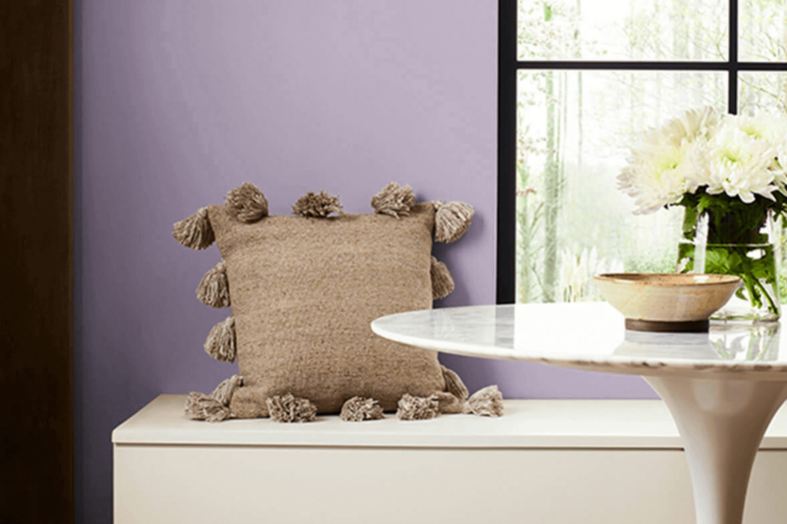
When you paint a wall in your home, the color you choose sets the mood for the entire room. SW 6556 Obi Lilac by Sherwin Williams is one such hue that can genuinely light up your room. This shade of lilac isn’t just any ordinary purple; it has elements that can make a room feel fresh and lively, yet soothing.
As someone who enjoys seeing how different colors can influence the ambiance of a room, I find Obi Lilac intriguing for its blend of calm and vibrant energy. Using Obi Lilac is especially appealing if you’re looking to inject a spirited yet peaceful essence into a bedroom or a reading nook.
This color meshes well with soft whites or deep greys, making it flexible for various decorative styles, whether minimalist or eclectic. It’s fascinating to see how this color can change an ordinary room into a cozy, welcoming room.
The right color, such as SW 6556 Obi Lilac, does more than just color walls—it builds a feeling of comfort and personality.
What Color Is Obi Lilac SW 6556 by Sherwin Williams?
Obi Lilac is a gentle and soft purple hue that gives a cozy and inviting vibe to any room it adorns. As part of the cool color spectrum, it brings a touch of subtle freshness that isn’t overpowering, making it a fantastic choice for enhancing the subtle beauty of any interior.
This color works exceptionally well in interior designs that aim for a calm and soothing atmosphere, such as minimalistic, contemporary, and Scandinavian styles. Its muted tone pairs beautifully with clean lines and simple forms, helping to create areas that feel both refined and comfortable.
When it comes to materials, Obi Lilac pairs marvelously with natural wood tones, from light beech to rich walnut. These combinations highlight the warmth of the wood while maintaining the cool, fresh feel of the lilac. Additionally, textiles like cotton and linen in white or soft gray can complement Obi Lilac, adding to the soft, airy mood of a room.
For a bit of contrast, metallic elements in silver or brushed nickel can also go well with this hue, providing a modern twist to its overall softness. Whether you’re aiming to freshen up a living room, bedroom, or just a small nook, this color is flexible enough to adapt to various rooms and styles, always adding a gentle touch of character.
Is Obi Lilac SW 6556 by Sherwin Williams Warm or Cool color?
Obi Lilac by Sherwin Williams is a muted, gentle shade of purple that brings a soft and soothing ambiance to any room. This color is ideal for bedrooms, bathrooms, or any area in a home where a calm and restful environment is desired.
Because it’s not too bright, Obi Lilac blends beautifully with neutral tones like whites, greys, and beiges, making it easy to match with existing decor and furniture. It’s perfect for someone looking to add a hint of color without overpowering a room.
This color is particularly effective in smaller rooms or rooms without much natural light, as its lightness can help make the room feel bigger and more open. Additionally, Obi Lilac works well in children’s rooms due to its gentle hue which is playful yet not too vibrant, creating a comforting setting for sleep and study.
Undertones of Obi Lilac SW 6556 by Sherwin Williams
Obi Lilac is a unique paint color that carries a blend of subtle undertones, making it flexible and adaptive to different room settings and lighting conditions. The primary undertone of this color is lilac, which gives a gentle, soft purple hue that feels light and airy. Alongside are shades of light gray, adding a cool neutrality that tempers the warmth of lilac, making it more understated and calming.
This color also contains traces of pale pink, which adds a touch of warmth, and light blue, which contributes to a fresh, clean look. The mixed presence of grey stabilizes these brighter hints, ensuring that the color maintains its balance without becoming too vibrant or overpowering. Furthermore, touches of pale yellow introduce a subtle brightness, enhancing the overall luminosity of the color.
When applied to interior walls, the combination of these undertones can greatly influence the mood and perception of the room. For instance, in a room with ample natural light, the pale yellow and light blue undertones can make the walls seem more vibrant and welcoming. In contrast, in a dimly lit room, the gray undertones might become more prominent, giving the room a more reserved and quiet feel. Moreover, the presence of mint and fuchsia undertones can bring an additional layer of complexity, depending on adjacent colors and decor elements.
These hints can sometimes emerge subtly in certain lighting conditions, adding an unexpected twist to the ambiance of the room. As flexible as it is, Obi Lilac adapts well, making it a popular choice for those looking to add both warmth and freshness to their room without overpowering it with color.
What is the Masstone of the Obi Lilac SW 6556 by Sherwin Williams?
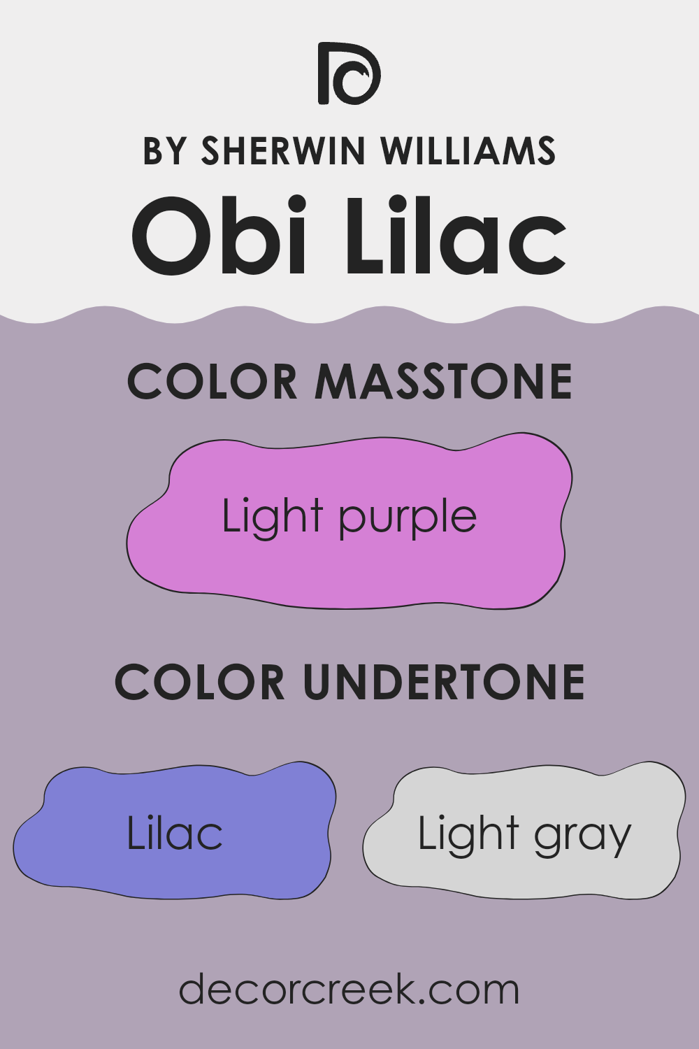
Obi Lilac SW 6556 by Sherwin Williams, with its masstone of Light Purple (#D580D5), offers a delightful and inviting hue for home interiors. This light purple shade provides a gentle splash of color that is not overpowering, making it ideal for creating a cozy and welcoming room.
Its softness allows for flexibility in decorating, as it pairs beautifully with both light neutrals and darker shades, enabling a wide range of design options. In rooms like bedrooms and bathrooms, where a calm and relaxing atmosphere is often desired, Obi Lilac helps set a relaxed mood without being too subdued.
Since the color is not very saturated, it can help small areas appear slightly larger, reflecting light beautifully and making the area feel more open. This adaptable color works equally well in children’s rooms, where its playful yet gentle tone can grow with them. Overall, Obi Lilac is a fantastic choice for those looking to add a subtle touch of warmth and color to their home.
How Does Lighting Affect Obi Lilac SW 6556 by Sherwin Williams?
Lighting plays a crucial role in the way colors appear in any room. Different light sources can significantly alter the perception of colors due to their light temperature and intensity. Take the color Obi Lilac for instance. This shade behaves differently under natural and artificial light. In artificial lighting, such as incandescent bulbs which emit a warmer glow, Obi Lilac tends to look softer and slightly more pinkish.
This is because the yellowish hue of incandescent bulbs can add a cozy warmth to the color. Under fluorescent lighting, which is generally cooler, the same color might lean towards a more bluish tone, making it appear cooler than it is.
In natural lighting, the appearance of this color changes depending on the time of the day and the amount of sunlight. During the early morning or late afternoon, when the sun emits a warmer, softer light, Obi Lilac will display more of its warm pink undertones. However, at midday, when sunlight is brightest and whitest, the color may appear cooler and truer to its original lilac shade.
The orientation of rooms also affects how Obi Lilac is perceived due to the varying qualities of light throughout the day. In north-faced rooms, which receive less direct sunlight, the color can appear slightly duller and cooler, making it look more greyish. In south-faced rooms, flooded with bright direct sunlight for most of the day, the color becomes vibrant and lively, maintaining its true lilac hue.
East-facing rooms get bright morning light, making the Obi Lilac appear fresh and lively in the mornings but softer as the day progresses. Conversely, in west-facing rooms, the color will start off cooler in the morning and grow warmer and richer towards the evening, due to the warm sunset light. This dynamic change can make the room feel different at various times of the day.
Understanding these nuances can assist in choosing the right paint color for the desired effect in a room, factoring in both the type of light and the room’s orientation.
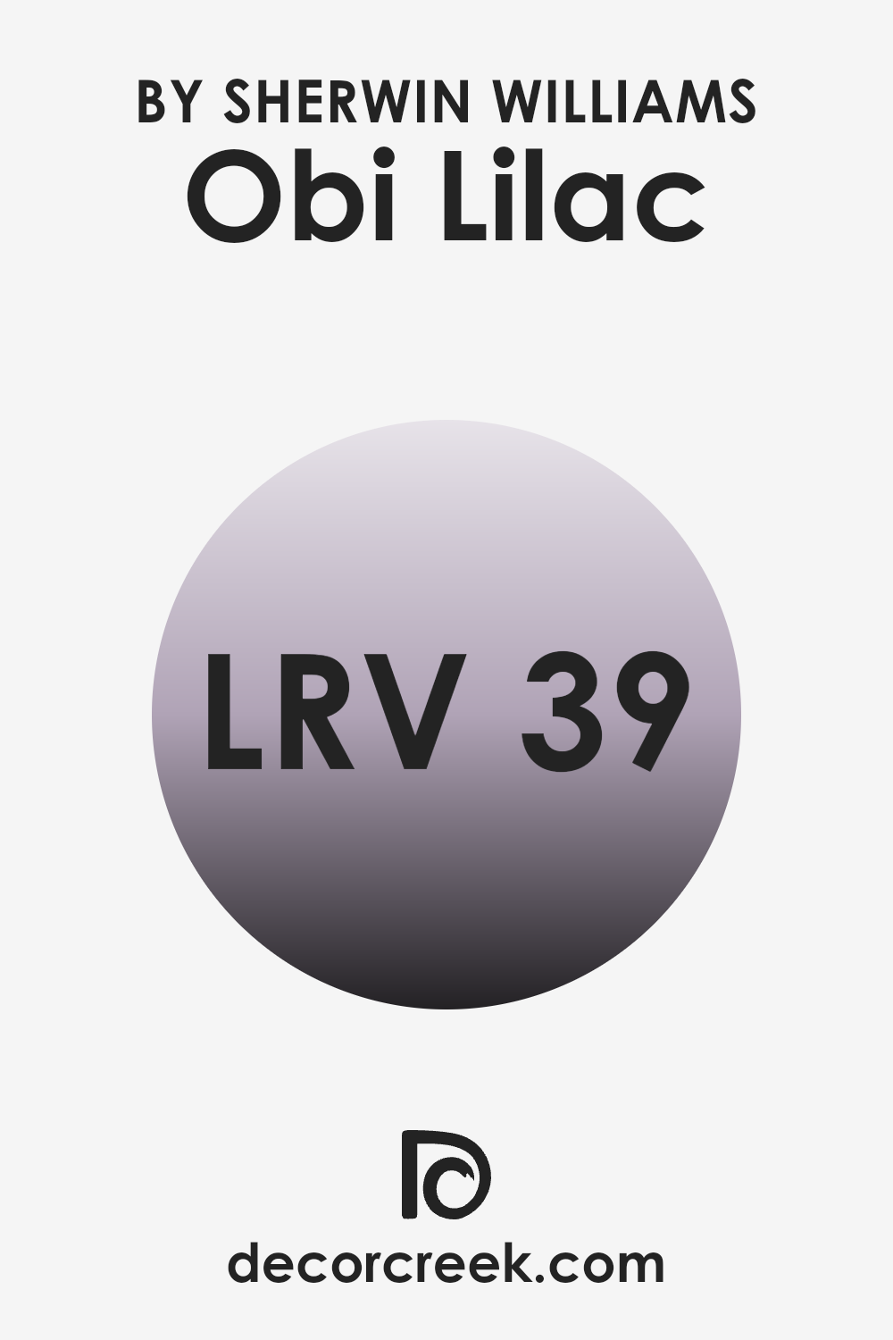
What is the LRV of Obi Lilac SW 6556 by Sherwin Williams?
LRV, or Light Reflectance Value, is a measurement that indicates how much light a color reflects and how much it absorbs. When a paint color has a higher LRV, it reflects more light, making a room feel brighter and more open. Conversely, a lower LRV means the color absorbs more light, which can make a room feel smaller or cozier.
This value is crucial when choosing paint colors because it helps you understand how the color will behave under different lighting conditions and can influence the mood and visual size of a room. In the case of the color with an LRV of around 38.707, such as the mentioned lilac shade, it is more on the darker side of the scale, reflecting less than half of the light.
This means it could make a rm look more intimate and enveloped, ideal for creating a cozy atmosphere in private areas like bedrooms or living areas. However, if used in a smaller or poorly lit room, it might make the room feel even smaller and darker.
Therefore, it’s important to consider both the size of the room and the amount of natural or artificial light it receives before deciding if this mid-range LRV shade is a suitable choice.
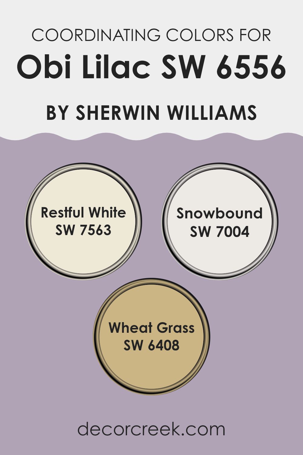
Coordinating Colors of Obi Lilac SW 6556 by Sherwin Williams
Coordinating colors are shades that complement or enhance each other when used together in a design scheme. These colors help create a balanced and harmonious look, whether used in large areas like walls or in smaller accents such as furniture or decorative pieces. For example, when pairing a main color like a pale purple with its coordinating colors, the result can be a visually appealing and coherent room.
Obi Lilac is a gentle shade of purple that goes well with specific coordinating colors such as Restful White, Snowbound, and Wheat Grass. Restful White is a soothing white with a minimalistic feel that can help highlight the subtlety of Obi Lilac, giving a fresh and clean look to any room.
Snowbound is another white but with a slightly warmer undertone that softens areas and works beautifully to offset the cool tones in Obi Lilac, creating a cozy environment. Wheat Grass, a calming shade of green, adds a natural element to the palette, inviting a sense of freshness that complements the floral-inspired Obi Lilac. Together, these colors support one another to fashion a charming and pleasing aesthetic.
You can see recommended paint colors below:
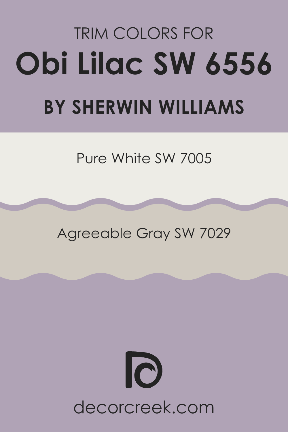
What are the Trim colors of Obi Lilac SW 6556 by Sherwin Williams?
Trim colors are specifically chosen paint hues used for decorating elements like door frames, baseboards, moldings, and window frames. These colors are essential as they highlight the architectural details of a room and enhance the overall aesthetic by providing a contrast or complement to the main wall color.
For a color like Obi Lilac by Sherwin Williams, selecting the right trim color can significantly influence how the color appears and feels within a room. Using trim colors like Pure White or Agreeable Gray can provide a clean and harmonious look that allows the lilac hue to stand out without overpowering the senses.
Pure White by Sherwin Williams is a crisp and clean shade that pairs beautifully with almost any wall color. It offers a fresh look and can make the lilac walls appear more vibrant, giving a room a light and airy feel. On the other hand, Agreeable Gray is a gentle gray with warm undertones that acts as a subtle contrast to lilac, promoting a soothing environment. This color can help in softening the intensity of the lilac, providing a smooth transition between the wall and the trim, thereby helping the room feel well-coordinated and pleasant.
You can see recommended paint colors below:
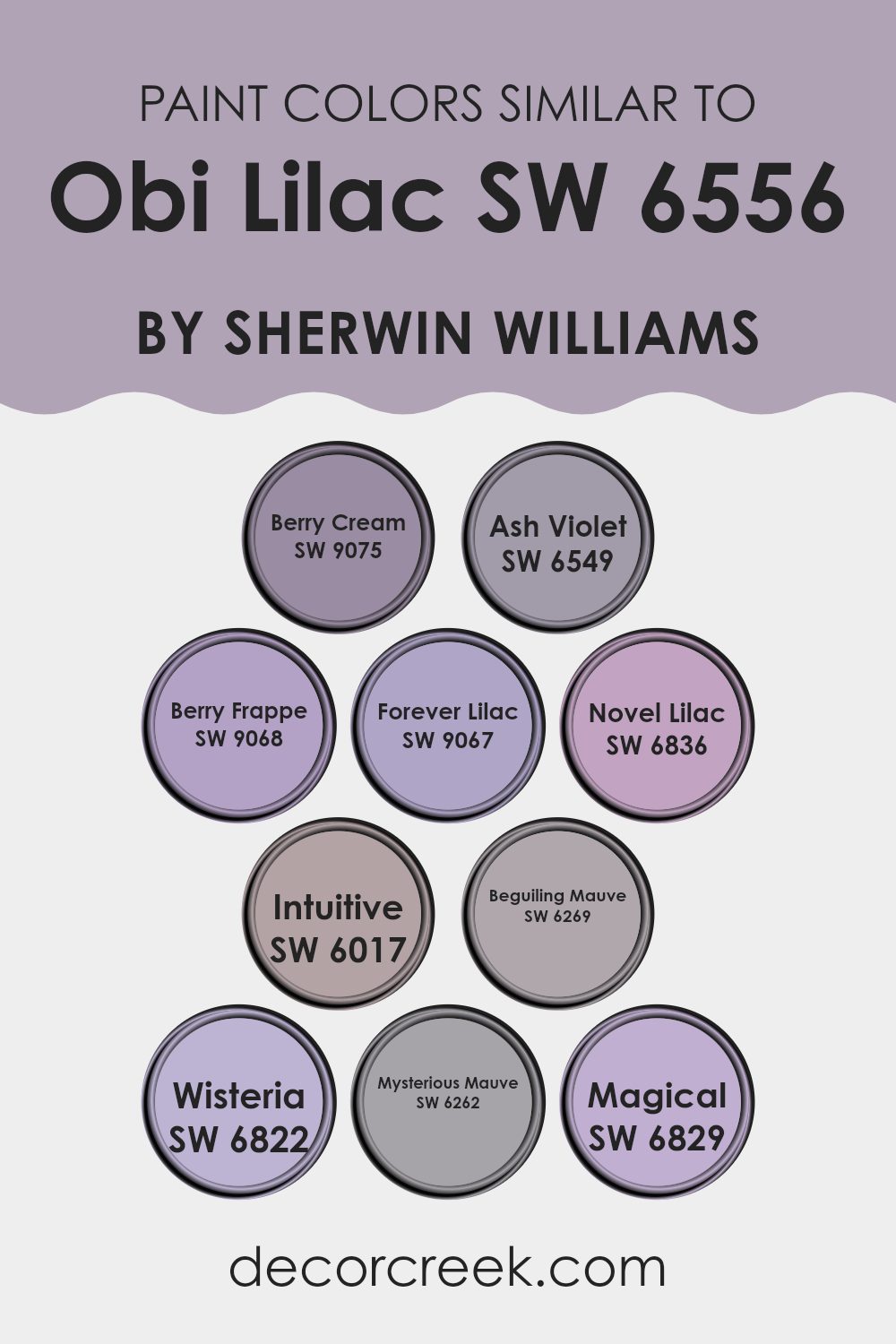
Colors Similar to Obi Lilac SW 6556 by Sherwin Williams
When decorating or designing a room, selecting the right shades of colors similar to each other can create a harmonious and visually appealing environment. A coordinated palette such as that of SW 6556 – Obi Lilac and its similar colors promotes a cohesive look that is pleasing to the eye.
These similar colors work well together because they share common hues that subtly differ in brightness and saturation, providing a refined layering effect without overpowering the senses. For example, SW 9075 – Berry Cream is a soft, creamy tone that whispers elegance and gently complements more assertive colors. SW 6549 – Ash Violet offers a deeper, dusky lavender hue that brings depth to a palette.
Further enriching the palette, SW 9068 – Berry Frappe introduces a playful, light purple, while SW 9067 – Forever Lilac has a touch more red, giving it a warmer presence. SW 6836 – Novel Lilac leans towards a more cheerful lavender, perfect for refreshing any room.
SW 6017 – Intuitive is a subtler mauve that works beautifully in shadowy areas, adding mystery without darkness. SW 6269 – Beguiling Mauve is intriguing with its blend of gray and violet, ideal for creating a cozy corner.
SW 6822 – Wisteria, true to its name, brings the gentle charm of the wisteria flower into the room, while SW 6262 – Mysterious Mauve deepens the intrigue with its richer tones. Lastly, SW 6829 – Magical lights up the collection with a luminous, almost mystical purple, adding a touch of whimsy. By using these colors together, one can achieve a dynamic yet unified look that enhances the visual appeal of any room.
You can see recommended paint colors below:
- SW 9075 Berry Cream
- SW 6549 Ash Violet
- SW 9068 Berry Frappe
- SW 9067 Forever Lilac
- SW 6836 Novel Lilac
- SW 6017 Intuitive
- SW 6269 Beguiling Mauve
- SW 6822 Wisteria
- SW 6262 Mysterious Mauve
- SW 6829 Magical
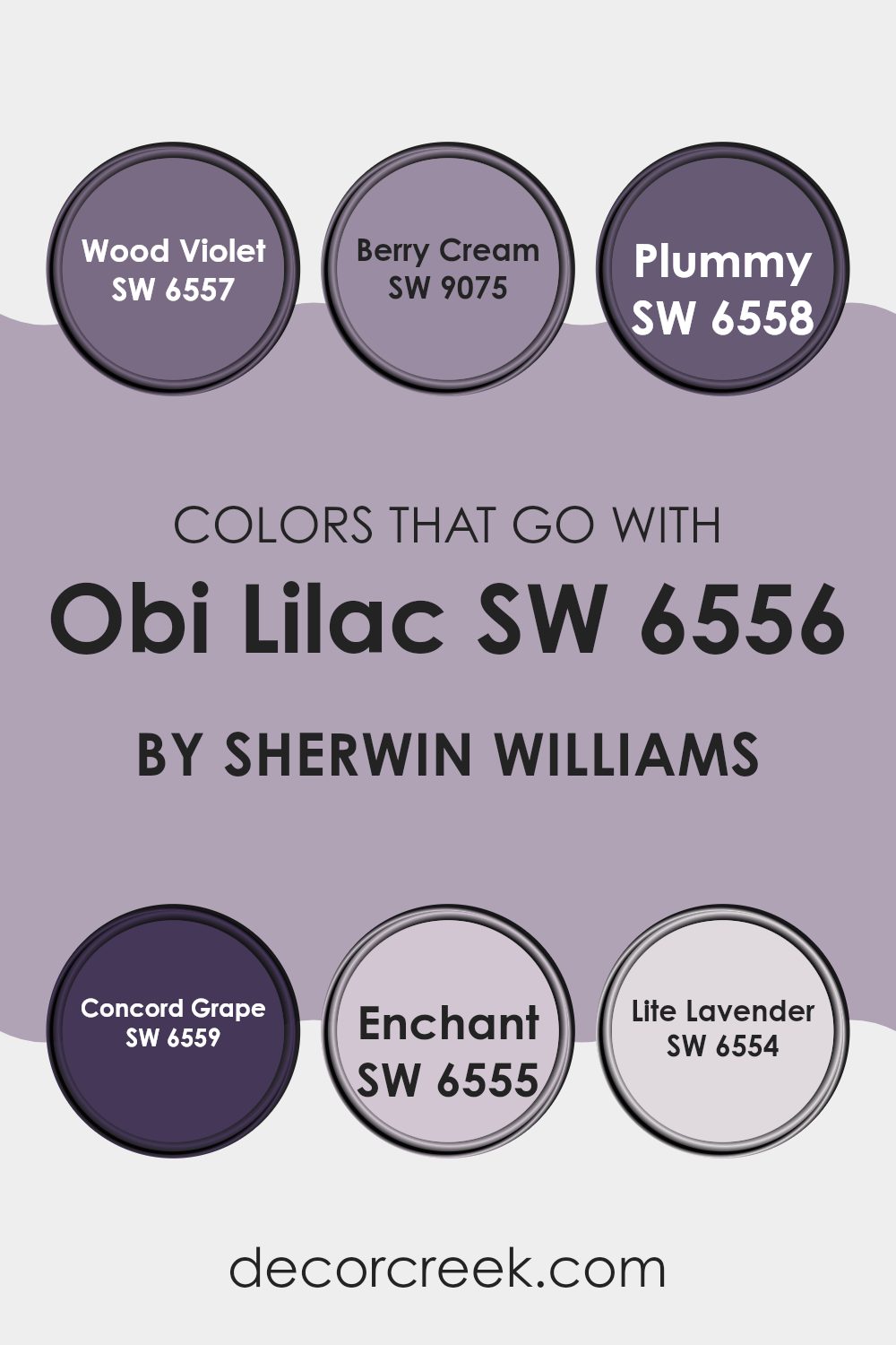
Colors that Go With Obi Lilac SW 6556 by Sherwin Williams
When decorating with Obi LilacSW 6556 by Sherwin Williams, selecting harmonious colors is essential for creating an attractive and coherent look in your room. The colors that pair well with Obi Lilac encompass a variety of shades that together bring balance and enhance the beauty of the primary lilac hue.
Colors like SW 6557 – Wood Violet and SW 9075 – Berry Cream complement Obi Lilac by adding depth or softness to the overall atmosphere. Wood Violet is a deeper, richer purple that adds a touch of luxury and warmth, making it perfect for rooms that need a bit of cozy drama. On the other hand, Berry Cream is a lighter, soothing pink that injects a soft, delicate feel conducive to relaxed environments.
Further enriching the palette, SW 6558 – Plummy and SW 6559 – Concord Grape offer delightful purple tones that are both warm and inviting. Plummy is a muted, understated purple with earthy undertones, ideal for creating a comforting and inviting area. Concord Grape is a bold, vibrant purple that brings energy and vibrancy to rooms in need of a lively touch. For a lighter approach, SW 6555 – Enchant and SW 6554 – Lite Lavender are excellent choices.
Enchant is a gentler, more subdued purple that works well in areas that aim for a softer, more understated elegance. Lite Lavender is the lightest shade, offering a fresh and airy feel that enhances rooms with a gentle, uplifting vibe. Using these colors together with Obi Lilac allows for a playful yet harmonious palette that enhances any interior design.
You can see recommended paint colors below:
- SW 6557 Wood Violet
- SW 9075 Berry Cream
- SW 6558 Plummy
- SW 6559 Concord Grape
- SW 6555 Enchant
- SW 6554 Lite Lavender
How to Use Obi Lilac SW 6556 by Sherwin Williams In Your Home?
Obi Lilac SW 6556 from Sherwin Williams is a gentle purple shade that adds a soft touch of color to any room without being too overpowering. This makes it a great choice for those who want to add a bit of personality and warmth to their room.
It’s especially nice for bedrooms where a calm and cozy atmosphere is important, or bathrooms where you might want a more relaxing vibe. You can paint all the walls with Obi Lilac SW 6556 for a unified look or just one as an accent wall if you prefer a more subtle hint of color.
It also pairs well with neutral tones like whites and greys, making it very flexible. Adding this color can really spruce up a living room when used on throw pillows or curtains, blending well with other colors and decor styles. Whether you have modern tastes or lean towards more classic designs, Obi Lilac can fit beautifully into your home.
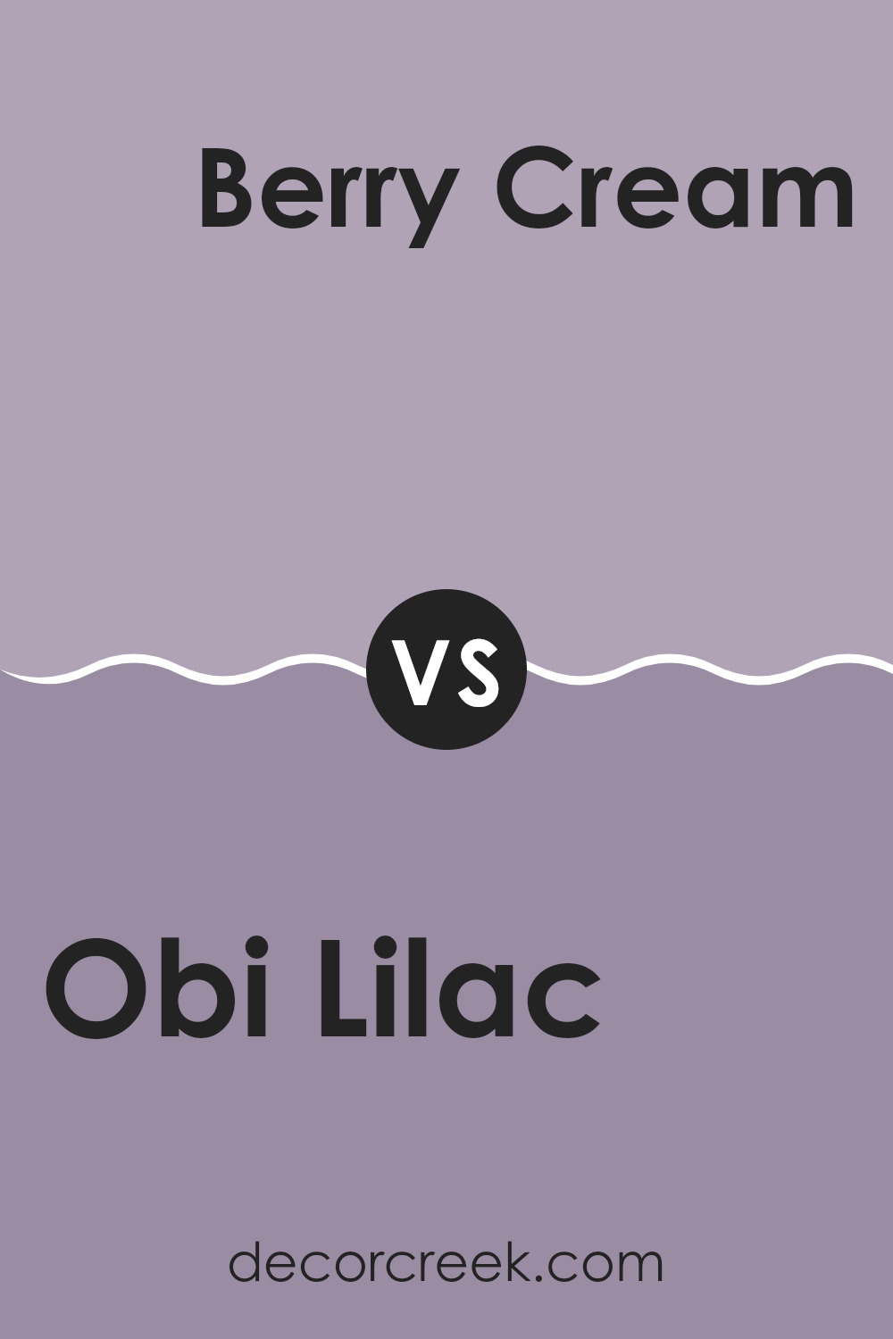
Obi Lilac SW 6556 by Sherwin Williams vs Berry Cream SW 9075 by Sherwin Williams
Obi Lilac and Berry Cream are two distinct colors by Sherwin Williams that bring different vibes to a room. Obi Lilac is a gentle, light purple with soft, grayish undertones. It’s a subtle shade that adds a hint of calmness to any room without being too bold.
On the other hand, Berry Cream has a warmer, deeper pink tone that feels welcoming and cozy. This color is richer and can make a room feel more intimate and cheerful.
Both colors have their unique appeal, where Obi Lilac might be better suited for achieving a light and airy feel, and Berry Cream would work well in creating a more comforting and snug environment. Each can effectively enhance the aesthetic of a room depending on the mood you want to set.
You can see recommended paint color below:
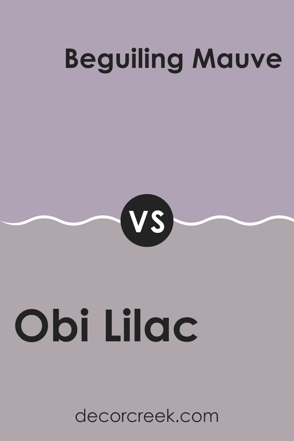
Obi Lilac SW 6556 by Sherwin Williams vs Beguiling Mauve SW 6269 by Sherwin Williams
Obi Lilac and Beguiling Mauve, both by Sherwin Williams, are interesting shades to consider when you want to add some soft, soothing touches to your room. Obi Lilac, the main color, has a gentle purple hue with subtle undertones that can make a room feel welcoming and calm without being overpowering. It’s light enough to be used on all walls of a small room without making the room feel cramped.
On the other hand, Beguiling Mauve is a deeper, more muted tone. It leans more towards a grayish purple, giving it a more neutral look compared to Obi Lilac. This color works well in providing a cozy, grounding effect in a room, perfect for creating a relaxing corner or as a feature wall to add depth and interest to neutral surroundings.
Both colors offer their unique charm and can work beautifully together or separately, depending on the mood and style you want to achieve in your home.
You can see recommended paint color below:
- SW 6269 Beguiling Mauve
Obi Lilac SW 6556 by Sherwin Williams vs Forever Lilac SW 9067 by Sherwin Williams
Obi Lilac and Forever Lilac by Sherwin Williams are both shades of lilac, but they have distinct tones that set them apart. Obi Lilac is a subdued, lighter lilac with a soft, almost pastel-like quality. It gives off a gentle, calming vibe, making it perfect for creating a relaxing room.
In contrast, Forever Lilac is a deeper, more intense shade. It has a richer, more vibrant purple hue, which adds a sense of depth and warmth to a room. While Obi Lilac is more understated and could be used for a minimalist or a more delicate look.
Forever Lilac stands out more and can be a great choice if you want to make more of a statement in your decor. Both colors bring their unique personalities to a room, with Obi Lilac leaning towards lightness and Forever Lilac offering a bolder presence.
You can see recommended paint color below:
- SW 9067 Forever Lilac
Obi Lilac SW 6556 by Sherwin Williams vs Magical SW 6829 by Sherwin Williams
Obi Lilac is a gentle and soft purple with a hint of gray. It creates a soothing atmosphere that’s perfect for areas meant for relaxation, such as bedrooms or bathrooms. The gray undertone makes it quite flexible and easy to match with various decor styles and colors.
On the other hand, Magical is a vivid, bright purple with a more energetic feel. This color is bolder and stands out more, making it a great choice for areas where you want to add a splash of brightness, such as playrooms or accent walls. It has a youthful and fun vibe that can liven up a room.
Both Obi Lilac and Magical offer distinct purple shades, but their impacts are quite different. If you want a calm, understated look, Obi Lilac is ideal. For making a statement or adding a burst of energy, Magical is the way to go. This choice depends on what mood or style you’re aiming for in your room.
You can see recommended paint color below:
- SW 6829 Magical
Obi Lilac SW 6556 by Sherwin Williams vs Wisteria SW 6822 by Sherwin Williams
Obi Lilac and Wisteria are two distinct shades from Sherwin Williams. Obi Lilac is a subtle, muted purple with a soothing gray undertone. This color has a gentle and calming effect, making it perfect for creating a relaxed atmosphere in places like bedrooms or living areas where you want a soft background hue.
On the other hand, Wisteria is a brighter, more vivid purple. It has a lively and more energetic feel, which makes it a great choice for areas where you want to add a splash of color without overpowering the sense. Wisteria can bring a cheerful and dynamic touch to areas such as playrooms or creative workspaces.
Both colors offer different moods and can be used effectively depending on the environment and the effect you want to achieve. Obi Lilac leans towards a reserved and soothing vibe, while Wisteria offers a playful and bold ambiance.
You can see recommended paint color below:
- SW 6822 Wisteria
Obi Lilac SW 6556 by Sherwin Williams vs Novel Lilac SW 6836 by Sherwin Williams
Obi Lilac and Novel Lilac by Sherwin Williams are both interesting shades, but they have their own unique elements. Obi Lilac is a subtle, softer purple with a more muted tone. It’s excellent for creating a gentle, calming atmosphere in a room, ideal for areas where you want a hint of color without overpowering the senses.
On the other hand, Novel Lilac is a deeper, more vibrant purple. This color adds a bit more punch and presence, making it great for areas where you want to make a statement or add some dynamic flair. It’s bolder and can draw more attention compared to the understated nature of Obi Lilac.
In comparing the two, Obi Lilac offers a lighter touch, perfect for a relaxed and low-key vibe. Novel Lilac provides a lively burst of purple, suited for more energetic or creative rooms. Your choice between the two would depend on the mood and character you want to bring to a room.
You can see recommended paint color below:
Obi Lilac SW 6556 by Sherwin Williams vs Intuitive SW 6017 by Sherwin Williams
Obi Lilac and Intuitive are two distinct colors by Sherwin Williams that offer unique vibes for home interiors. Obi Lilac is a gentle purple with a soft, almost pastel tone. It brings a light and airy feel to any room, perfect for creating a calming and pleasant ambiance. In contrast, Intuitive is a gray shade that leans slightly towards green, providing a neutral and subtle backdrop ideal for various decor styles.
While Obi Lilac might be more suited for areas where you want a touch of gentle color, like bedrooms or nurseries, Intuitive works well in areas where a flexible and understated look is desired, such as living rooms or offices. The coolness of Intuitive offers a modern and clean appearance, which can easily match with different colors and furnishings.
Both colors reflect light differently; Obi Lilac tends to brighten rooms with its lighter lilac hue, whereas Intuitive can make rooms appear more spacious due to its neutral gray-green tone. Choosing between them depends on the mood and function you want for your room.
You can see recommended paint color below:
- SW 6017 Intuitive
Obi Lilac SW 6556 by Sherwin Williams vs Mysterious Mauve SW 6262 by Sherwin Williams
Obi Lilac is a gentle and softly vibrant shade of lilac that has a calming and pleasant feel to it. This color is great for areas where you want to create a soothing and inviting atmosphere, like bedrooms or living rooms. It’s a bit on the lighter side, bringing a fresh and airy quality to any room.
Mysterious Mauve, on the other hand, has a deeper, more subdued tone. It leans more towards a grayish-purple, giving it a more muted feel compared to Obi Lilac. This color is ideal for those who prefer something less bright but still want a touch of warmth and color in their room. It works well in areas where a more understated elegance is desired.
Both colors offer unique ways to add a touch of color to a room without overpowering it. While Obi Lilac brings more light and freshness, Mysterious Mauve offers a sense of subtle sophistication. Your choice between them would depend on the mood and tone you want to set in your room.
You can see recommended paint color below:
- SW 6262 Mysterious Mauve
Obi Lilac SW 6556 by Sherwin Williams vs Ash Violet SW 6549 by Sherwin Williams
Obi Lilac is a gentle and bright shade of lilac, giving off a fresh and youthful vibe. It stands out more due to its relatively lively and light characteristics. This color can brighten up a room well, making it feel airy and spacious. It’s particularly well-suited for areas like bedrooms or living areas where a touch of softness adds to the overall cozy atmosphere.
On the other hand, Ash Violet sports a darker, more subdued tone compared to Obi Lilac. This color leans towards a more muted and subtle expression, ideal for creating a feeling of modesty and understatement in a room. Ash Violet works well in areas that benefit from a calm and low-key backdrop, such as studies or dens.
Both colors are variations of violet, but each offers a distinct mood depending on how much brightness or restraint you want in your room.
You can see recommended paint color below:
Obi Lilac SW 6556 by Sherwin Williams vs Berry Frappe SW 9068 by Sherwin Williams
Obi Lilac and Berry Frappe are two distinct colors from Sherwin Williams that can have different impacts on a room. Obi Lilac is a soft, muted purple with a hint of gray, giving it a subtle and calming vibe. It is light enough to make a room feel airy yet has enough depth to add character.
On the other hand, Berry Frappe is a richer, deeper purple with strong red undertones, making it a more vibrant and energizing color. Berry Frappe can add a dramatic flair to a room and is great for making a statement.
In terms of combining these colors, Obi Lilac works well as a base or background color due to its lighter and more neutral tone, while Berry Frappe can serve as an accent, bringing warmth and energy to a room. Both colors offer unique possibilities and can beautifully complement each other if used thoughtfully in decor.
You can see recommended paint color below:
- SW 9068 Berry Frappe
As I wrap up talking about SW 6556 Obi Lilac by Sherwin Williams, I’ve got to say, I’m really impressed with this paint color. It’s a unique shade of purple that brings a fresh and lively vibe to any room. Whether you’re painting a bedroom, living room, or even a bathroom, Obi Lilac adds that perfect touch of fun without being too loud.
This color works well with all sorts of furniture and decorations. It has a way of making things look new and interesting. If you’re thinking about changing up a room in your house, this color could be a great choice. It’s different from typical colors like blue or grey, and it sure adds personality to a room.
Also, I noticed that it works well in both bright rooms with a lot of natural light and in rooms that might not get as much light. In bright light, Obi Lilac looks cheerful, and in dimmer light, it gives off a cozy and inviting feel.
So, if you’re looking for a paint color that’s fun, fresh, and can make any room look neat, SW 6556 Obi Lilac by Sherwin Williams might just be what you need. It’s easy to see why it could be a favorite choice for someone wanting to brighten up their home with something a little different. Give it a try, and see how it changes your room!
Ever wished paint sampling was as easy as sticking a sticker? Guess what? Now it is! Discover Samplize's unique Peel & Stick samples.
Get paint samples

