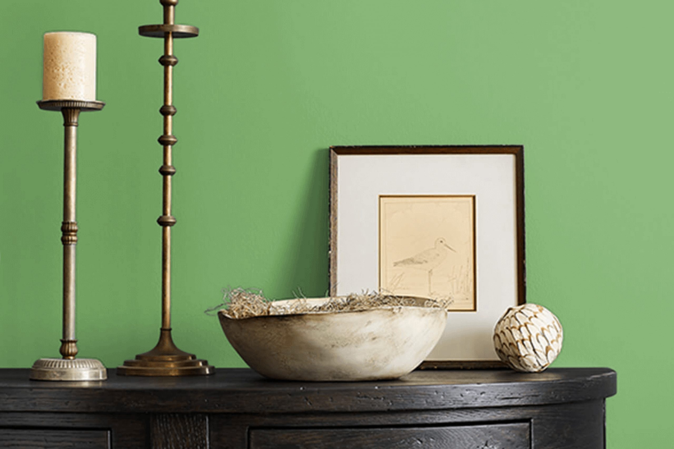
SW 6732 Organic Green by Sherwin Williams is like a breath of fresh air for any room. Whenever I think about colors that bring life and vibrancy, this shade comes to mind. It’s the kind of green that feels alive, almost as if you’ve invited a piece of the outdoors into your home. With its natural and soothing tone, it creates an atmosphere that feels both refreshing and comforting.
What strikes me about Organic Green is its versatility. Whether you’re looking to add a pop of color to a neutral room or want to create a lush backdrop for your favorite furniture and decor, this shade seems to fit right in. It has this unique ability to energize a room while also promoting a sense of calm.
I find that it pairs wonderfully with other earthy tones and even bold colors, making it a great choice for those who love to mix and match. Adding Organic Green to a room can change the entire mood, making it feel more inviting.\
If you’re searching for a color that brings warmth and nature together, this is definitely one to consider.
What Color Is Organic Green SW 6732 by Sherwin Williams?
Organic Green (SW 6732) by Sherwin Williams is a vibrant shade that feels fresh and lively. It brings a hint of nature into interiors, reminiscent of lush greenery. This color works well in areas that aim for a lively atmosphere, fitting perfectly in modern, bohemian, and tropical-inspired interiors.
In a modern setting, Organic Green can serve as a bold accent wall or be used for kitchen cabinets, adding a pop of color that stands out against neutral backgrounds like white or gray. It’s equally at home in a bohemian style, where it complements natural elements such as woven baskets, wooden furniture, and macramé hangings, creating an eclectic and warm vibe.
In tropical rooms, this green hue enhances the feeling of an indoor oasis, pairing beautifully with palm prints, rattan chairs, and light, airy fabrics. Organic Green shines when combined with materials such as light woods, natural fibers, and matte black or brass fixtures. Textures such as soft linen, cozy wool throws, and smooth ceramics can add depth and contrast to this color, creating a dynamic and inviting room that feels both comfortable and refreshing. Whether used sparingly or generously, this green shade adds energy and a touch of the outdoors to any room.
Is Organic Green SW 6732 by Sherwin Williams Warm or Cool color?
Organic Green SW 6732 by Sherwin Williams is a fresh and natural shade that brings the outdoors inside your home. This color is a soothing green, reminiscent of lush gardens and nature, making it perfect for creating a calm and inviting atmosphere.
It’s flexible enough to be used in various rooms, whether it’s the living room, bedroom, or even a kitchen. The gentle tone of Organic Green feels warm and welcoming, helping to make rooms feel larger and more open.
When paired with neutral colors like whites and off-whites, Organic Green can brighten up a room without being overpowering. It works well with natural materials like wood and stone, enhancing the earthy feel. Adding plants and other green accents can amplify the relaxing vibe. This color choice can make your home feel peaceful, giving you a cozy retreat where you can unwind and feel connected to nature.
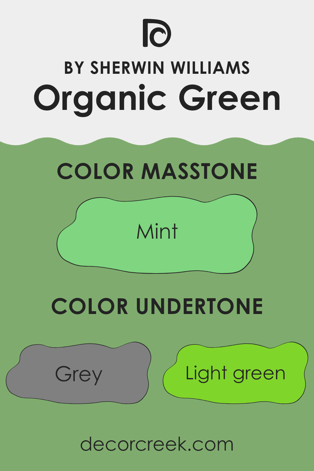
Undertones of Organic Green SW 6732 by Sherwin Williams
Organic Green by Sherwin Williams is a rich, complex color with a variety of undertones. These undertones include shades like grey, light green, olive, and light turquoise. When you have a color like this, its undertones can influence how it looks in different lighting or when paired with other colors in a room.
For example, the grey undertone can give Organic Green a more muted, calming feel, making it suitable for relaxing areas like living rooms or bedrooms. The light green and olive undertones bring out a natural, earthy vibe, which can make a room feel fresh and comforting. When these are highlighted, the color might remind you of lush plants or a peaceful garden.
Meanwhile, the turquoise undertones can add a touch of vibrancy, preventing the color from feeling too dull. This hint of brightness can make rooms feel more lively without being overpowering. The pale yellow and light blue nuances give warmth and balance, ensuring that the green doesn’t appear too cold or too stark.
On walls, these undertones help Organic Green adapt to various settings. In bright light, the lighter undertones might stand out more, making the room feel airy. In dimmer lighting, the darker or more muted tones might become more noticeable, giving the room a cozy atmosphere. Thus, these undertones play a crucial role in the overall feel of an interior room.
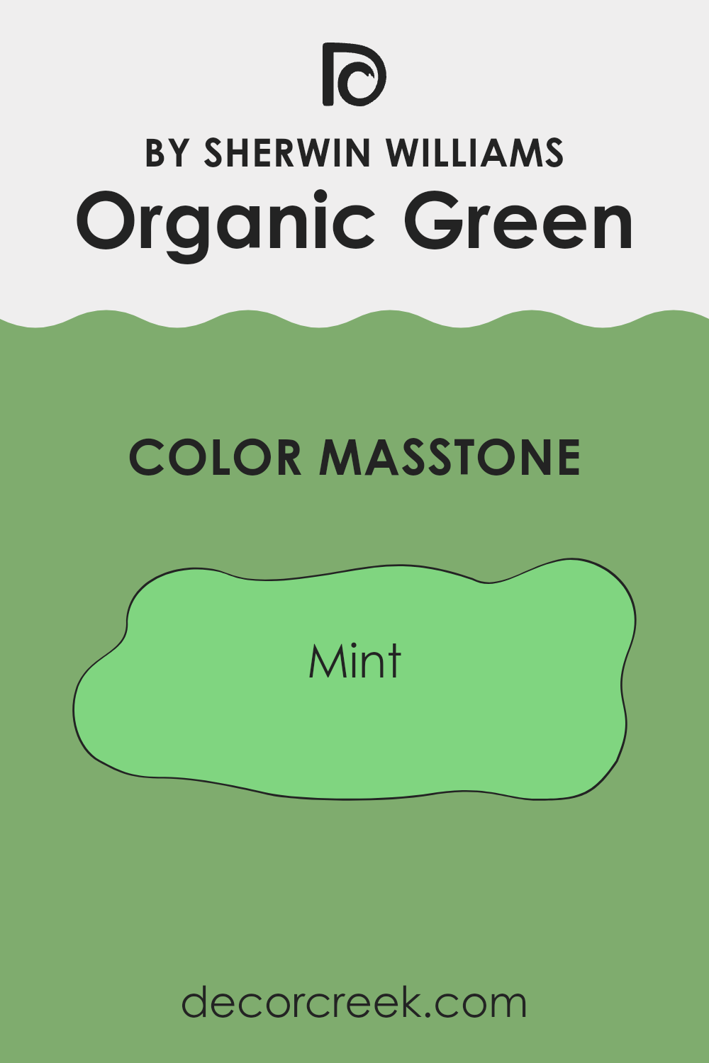
What is the Masstone of the Organic Green SW 6732 by Sherwin Williams?
Organic Green SW 6732 by Sherwin Williams is a soft, refreshing shade of mint green, represented by the color code #80D580. Its masstone, a clean and fresh mint, brings a light and airy feel to any room in a home. This gentle green is perfect for creating a peaceful environment, ideal for bedrooms or living rooms where you want a sense of calm and relaxation.
In kitchens, Organic Green can add a splash of nature-inspired charm, making the room feel inviting and lively without being overpowering. Its subtle, natural vibe works well with both modern and traditional styles, complementing a range of other colors like whites, soft grays, and natural wood tones.
Organic Green’s lightness helps small rooms feel more open, while its cool undertones offer a refreshing atmosphere. This makes it a flexible choice for those aiming to add softness and freshness to their home decor.
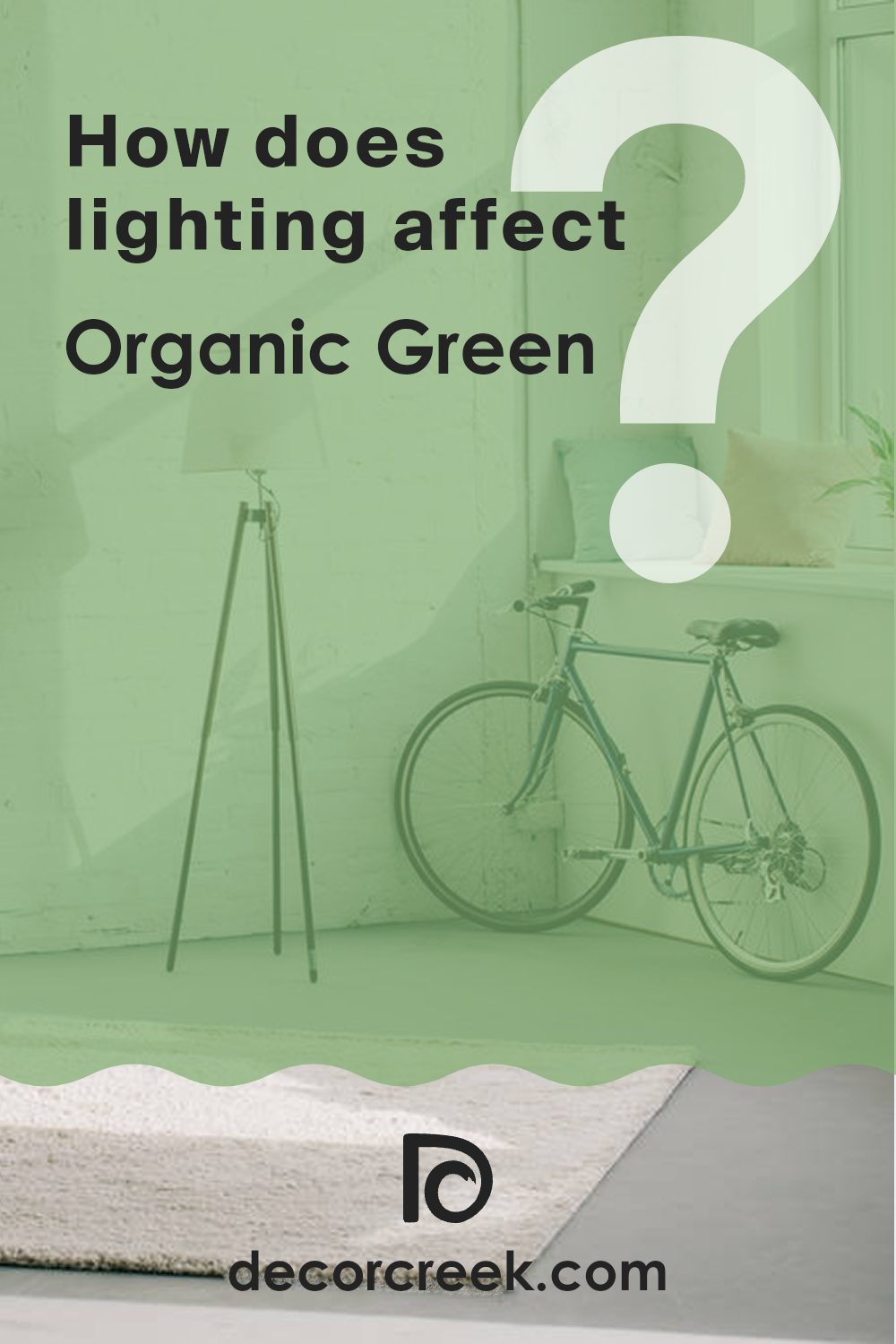
How Does Lighting Affect Organic Green SW 6732 by Sherwin Williams?
Lighting plays a significant role in how we perceive colors. Depending on the type of light—whether natural or artificial—colors can shift and change in appearance. This is important when choosing paint colors for a room.
During the day, natural light impacts colors based on the room’s orientation. In north-facing rooms, the light is cooler and can add blue tones, making colors appear more muted. For the color Organic Green (SW 6732) by Sherwin Williams, this means it might look a bit more subdued and muted, leaning slightly towards a gray-green.
North-facing rooms often give a softer look to colors, which can make Organic Green feel calming but less vibrant. In contrast, south-facing rooms receive warm, direct sunlight for most of the day. This type of light enhances colors and makes them appear more intense and vivid. Organic Green in a south-facing room will likely look brighter and more saturated, showing off its green tones more vividly than in a room that faces north.
East-facing rooms get warm, soft light in the morning. As the day progresses, the sunlight fades, and the room might seem dimmer. Organic Green in an east-facing room will look warmer in the morning with a gentle glow, but it may appear cooler and darker in the afternoon when the room is not lit by the sun.
West-facing rooms receive light that is warmer and more intense in the late afternoon and evening. In these rooms, Organic Green will seem cooler in the morning and become more vibrant as the sun sets, bringing out the richness of the green color.
Under artificial light, which can be incandescent, LED, or fluorescent, the color can change, too. Incandescent light tends to make colors appear warmer, while fluorescent light can add a bluish tone. LED lights vary, but they can either mimic natural daylight or lean towards warmer light. When Organic Green is lit artificially, its appearance will depend on the light bulb used, so it can either look slightly warmer or cooler depending on the bulb’s color temperature.
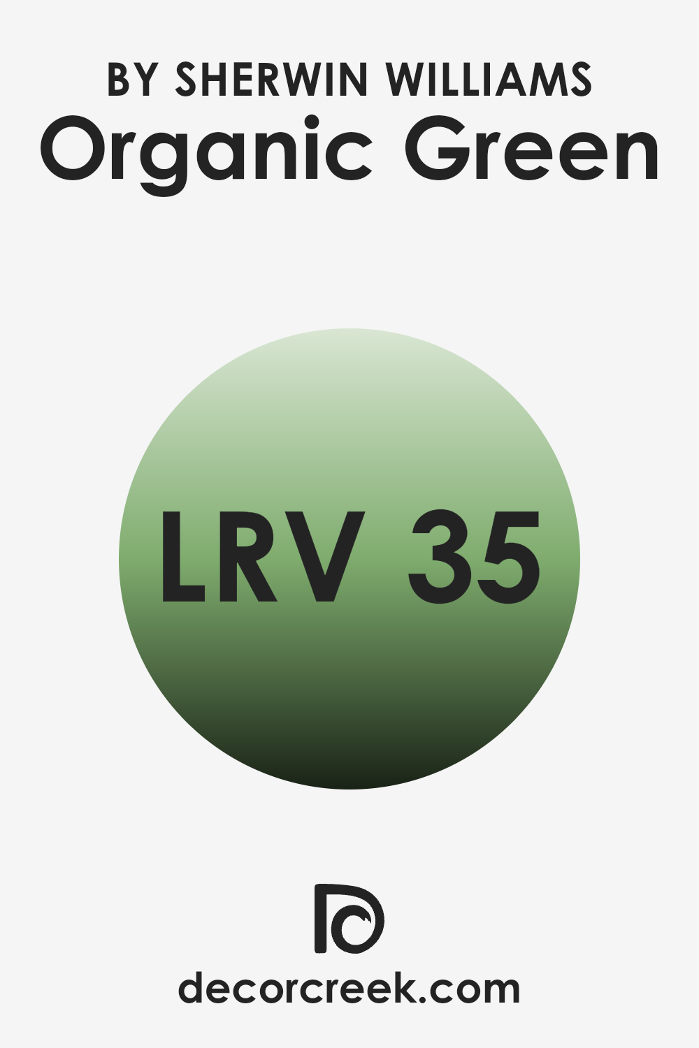
What is the LRV of Organic Green SW 6732 by Sherwin Williams?
LRV stands for Light Reflectance Value, which is a measurement used to determine how much light a color reflects or absorbs. It is an important concept when choosing paint colors because it tells you how bright or dark a color will appear on your walls. The LRV scale goes from 0, representing absolute black (which absorbs all light and reflects none), to 100, which is pure white (reflecting all light).
An LRV of 35.361, like that of Organic Green, means it reflects a moderate amount of light, making it neither too dark nor too bright. This middle-range LRV indicates that the color will absorb more light than it reflects, making it appear more subdued and not overly vibrant on your walls.
For Organic Green, an LRV of 35.361 affects how the color will look in different lighting conditions in your home. In a well-lit room with a lot of natural light, the paint will appear lighter and show its green undertones more clearly, giving the room a fresh and earthy feel without overpowering the senses.
In dimly lit rooms or areas with less natural light, the color will appear darker and cozier, creating a more intimate atmosphere. It’s important to consider the LRV when selecting paint colors to ensure the room achieves the desired mood and appearance, and Organic Green’s balanced LRV provides flexibility in various lighting environments.
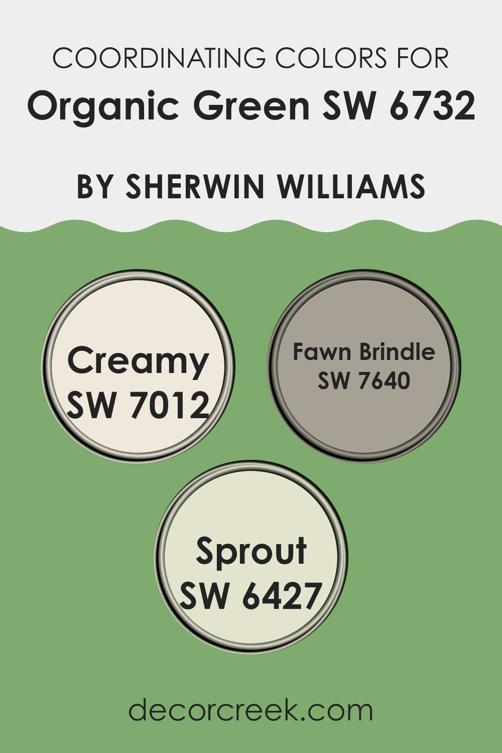
Coordinating Colors of Organic Green SW 6732 by Sherwin Williams
Coordinating colors are hues that complement or enhance each other, creating a harmonious palette when used together in design. They are chosen based on their ability to work well with a main color, offering balance and contrast that make an overall design pleasing to the eye. For example, Organic Green by Sherwin Williams is a vibrant shade that evokes a sense of nature and freshness.
To highlight its beauty, coordinating colors like Creamy, Fawn Brindle, and Sprout can be used effectively. Creamy (SW 7012) is a soft, warm off-white that adds a sense of warmth and coziness, acting as a neutral base that can calm the liveliness of Organic Green.
Fawn Brindle (SW 7640) is a muted taupe with gray undertones, providing a subtle depth that enhances the green’s natural feel without overpowering it. Meanwhile, Sprout (SW 6427) is a lighter, more pastel green that complements Organic Green by adding a gentle, refreshing touch. Together, these colors create a balanced palette that is lively yet smooth, perfect for creating inviting and stylish areas.
You can see recommended paint colors below:
- SW 7012 Creamy
- SW 7640 Fawn Brindle
- SW 6427 Sprout
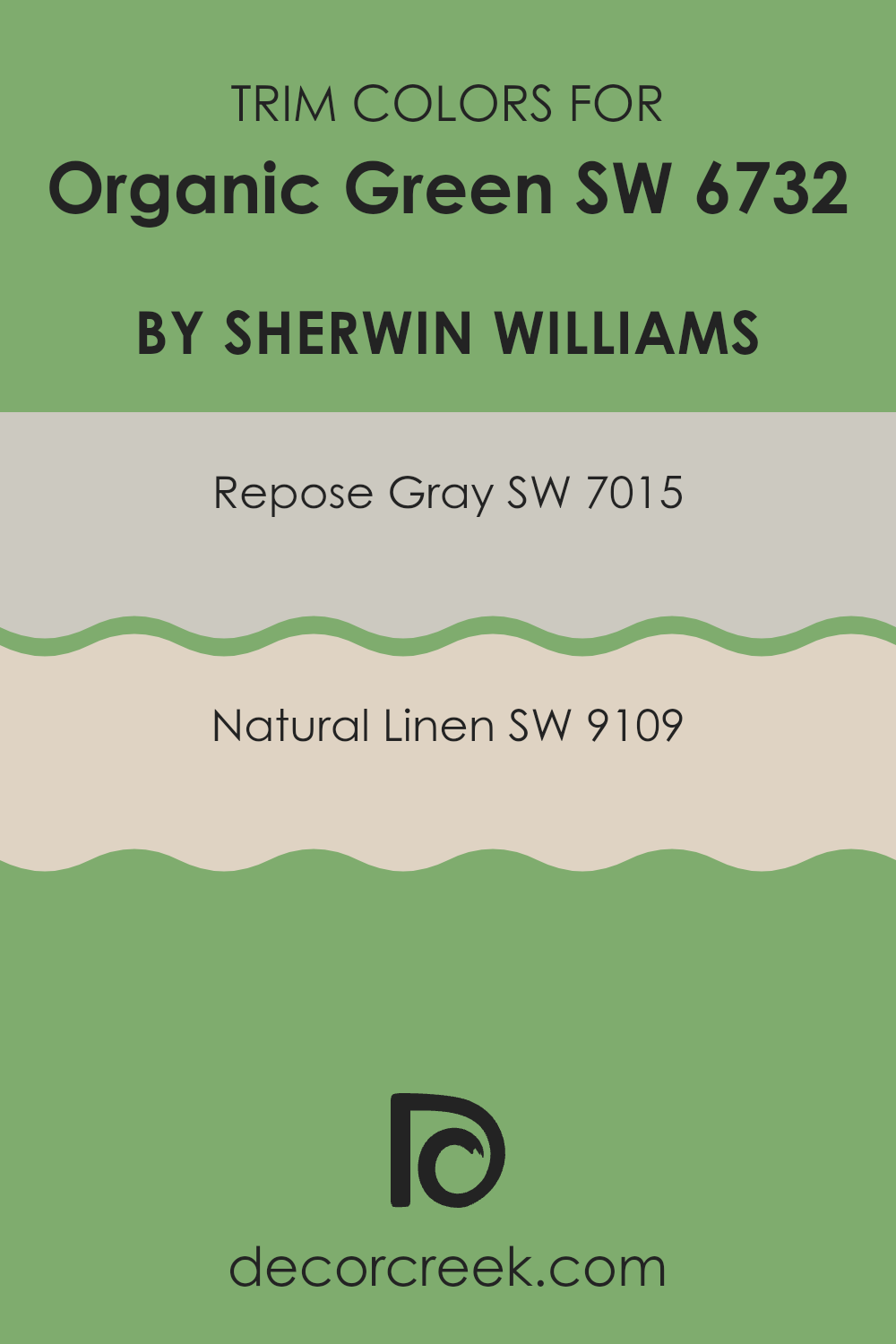
What are the Trim colors of Organic Green SW 6732 by Sherwin Williams?
Trim colors are the colors used to paint the edges and borders of walls, doors, windows, and other architectural features of a room. They create a frame that can highlight or complement the primary wall color, adding depth and dimension to the room.
Using the right trim colors with Organic Green by Sherwin Williams can enhance the room’s look and make each element stand out. Trim colors like Repose Gray and Natural Linen can bring out the beauty of the main green shade, providing a pleasing contrast or soft harmony that pleases the eye.
Repose Gray is a flexible light gray with warm undertones, which can present a subtle contrast when paired with the rich tone of Organic Green. Its neutrality ensures it won’t overshadow the green, instead contributing to a seamless and airy flow between walls and trim. On the other hand, Natural Linen, which is a soft and warm beige, can add warmth and coziness to the greener shades when used as a trim.
Its comforting hue can bring a cozy, inviting feel to the room, making the green appear more vibrant and lively. Both these trim colors work well with Organic Green to craft a balanced and pleasant room.
You can see recommended paint colors below:
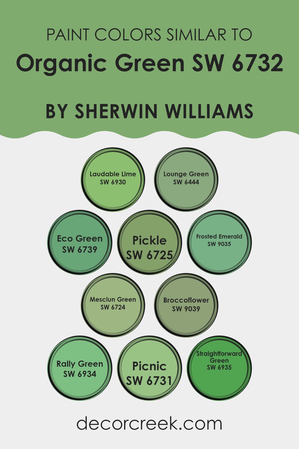
Colors Similar to Organic Green SW 6732 by Sherwin Williams
Similar colors are crucial in design as they create a harmonious and balanced look. When colors are close together on the color wheel, they have a natural affinity that makes them soothing and pleasant to the eye. These colors, such as those similar to Organic Green by Sherwin-Williams, can be used to achieve a cohesive aesthetic.
For example, SW 6930 – Laudable Lime is a light and energetic green that adds a fresh vibe, just like spring leaves. SW 6444 – Lounge Green provides a calm and inviting feel, ideal for areas meant for relaxation. Meanwhile, SW 6739 – Eco Green carries a lively and invigorating shade reminiscent of lush gardens.
The selection of similar colors allows designers to subtly shift tones without creating visual dissonance. SW 6725 – Pickle offers a deeper, more mature green, while SW 9035 – Frosted Emerald brings a jewel-toned richness to the palette. SW 6724 – Mesclun Green is a vibrant, salad-like green, adding a touch of vitality. SW 9039 – Broccoflower presents a yellow-green hue that stands out while harmonizing with softer greens.
SW 6934 – Rally Green is a classic, clean shade, and SW 6731 – Picnic is playful and soft. Lastly, SW 6935 – Straightforward Green offers a simple, bold green that ties them all together. Together, these colors allow for a seamless and flexible design.
You can see recommended paint colors below:
- SW 6930 Laudable Lime
- SW 6444 Lounge Green
- SW 6739 Eco Green
- SW 6725 Pickle
- SW 9035 Frosted Emerald
- SW 6724 Mesclun Green
- SW 9039 Broccoflower
- SW 6934 Rally Green
- SW 6731 Picnic
- SW 6935 Straightforward Green
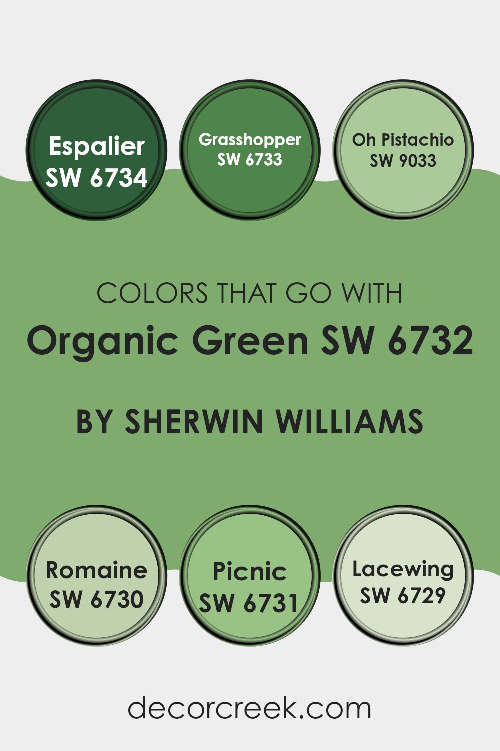
Colors that Go With Organic Green SW 6732 by Sherwin Williams
When decorating with Organic Green by Sherwin Williams, choosing the right complementary colors is important because they can enhance the aesthetic of your room and create the desired mood. Organic Green is a rich, earthy tone that pairs well with other shades in the green family, offering a harmonious and refreshing vibe.
Colors like Espalier and Grasshopper work beautifully alongside Organic Green. Espalier is a delicate, muted tone reminiscent of green fields, while Grasshopper brings a bold, lively touch with its vibrant, energetic hue. These colors, when used together, can bring life to a room, making it feel like an extension of nature.
Adding Oh Pistachio to the palette introduces a soft, creamy green, offering a gentle contrast that can lighten the overall look of a room. Meanwhile, Romaine provides a crisp, fresh vibe, reminiscent of a garden salad. Picnic adds brightness and cheer, creating a playful atmosphere, and Lacewing, with its subtle, pastel tone, acts as a great backdrop that doesn’t overpower the other shades.
By combining these colors with Organic Green, you create a balanced and refreshing environment that feels welcoming and connected to the outdoors.
You can see recommended paint colors below:
- SW 6734 Espalier
- SW 6733 Grasshopper
- SW 9033 Oh Pistachio
- SW 6730 Romaine
- SW 6731 Picnic
- SW 6729 Lacewing
How to Use Organic Green SW 6732 by Sherwin Williams In Your Home?
Organic Green SW 6732 by Sherwin-Williams is a flexible paint color that can bring a fresh, nature-inspired feel to any room. It is a soothing, medium green shade that works well in many rooms. In a living room, this color can create a calming atmosphere, especially when paired with neutral furniture and natural textures like wood or linen.
In the kitchen, Organic Green can add a lively touch to cabinets or walls, making the room feel more welcoming and vibrant. If you’re looking to update a bedroom, this green can be used on the walls to create a restful environment, promoting relaxation.
Adding white or cream-colored linens and curtains can complete the look. Even in a home office, a feature wall in Organic Green can enhance focus while keeping the area inviting. Whether used as an accent or a main color, Organic Green SW 6732 offers a lovely home refresh.
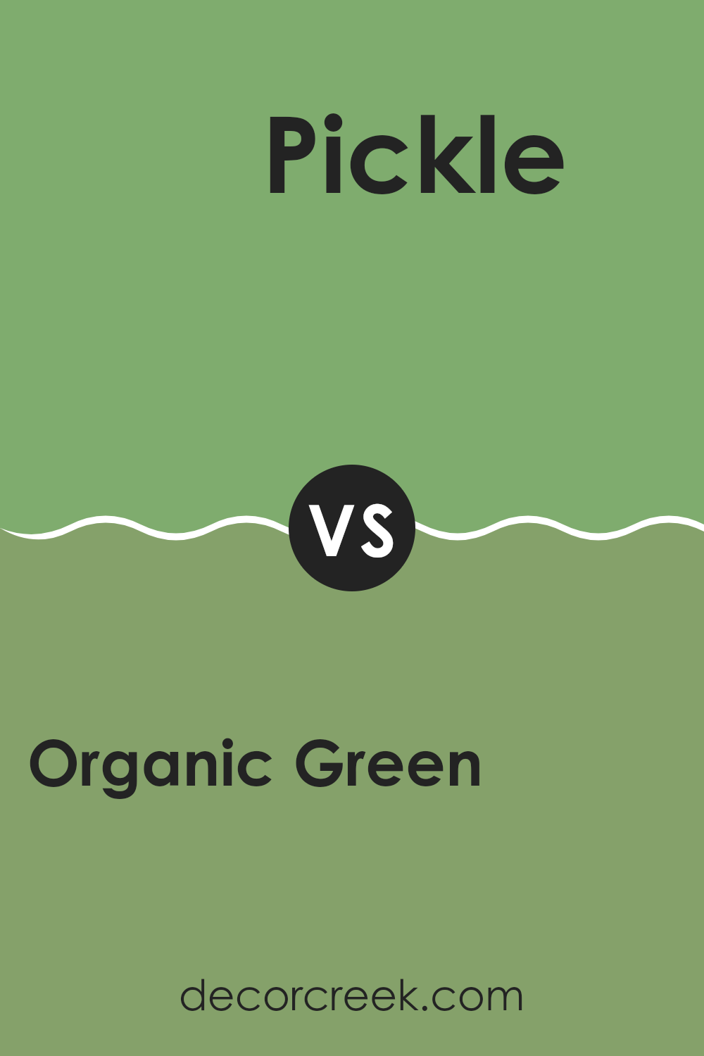
Organic Green SW 6732 by Sherwin Williams vs Pickle SW 6725 by Sherwin Williams
Organic Green SW 6732 and Pickle SW 6725 by Sherwin Williams are two shades of green that offer different vibes for a room. Organic Green is a softer, more muted green. It feels fresh and calming, great for creating a natural atmosphere. It works well in living rooms or bedrooms where a peaceful mood is desired.
On the other hand, Pickle is a bit more vibrant and bold. It’s a deeper hue with more intensity, bringing more energy and a lively feel to a room. This makes it suitable for areas like kitchens or bathrooms where a bit more zest is welcome.
When comparing the two, Organic Green is more subtle and laid-back, while Pickle makes a stronger statement. Choosing between them depends on whether you want a gentle touch of nature or something with a bit more punch and presence. Both greens have their place, depending on the feeling you want in a room.
You can see recommended paint color below:
- SW 6725 Pickle
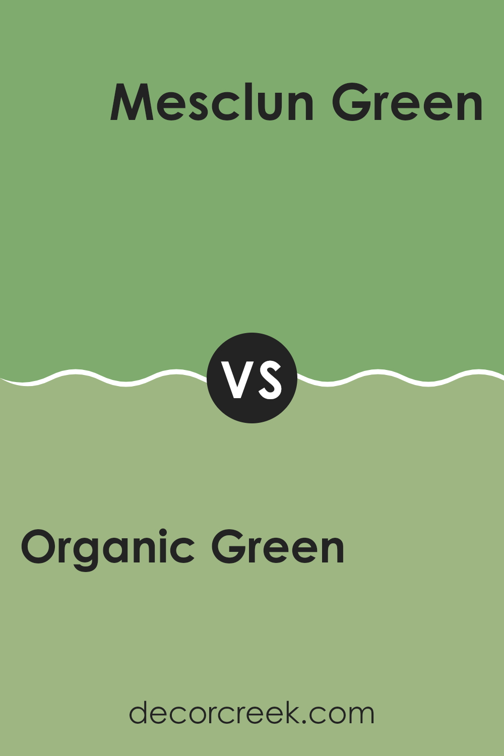
Organic Green SW 6732 by Sherwin Williams vs Mesclun Green SW 6724 by Sherwin Williams
Organic Green SW 6732 and Mesclun Green SW 6724 by Sherwin Williams offer two distinct green shades. Organic Green is a vibrant, lively hue with a hint of yellow that brings a fresh, lively feeling to any room. It’s perfect for areas where you want to feel energized and connected to nature.
In contrast, Mesclun Green is a deeper, richer shade with more of an earthy tone. This color has more grey undertones, which can give a room a calm and grounded look. While Organic Green is bold and bright, Mesclun Green is more subdued and refined.
Both colors capture the essence of nature but in different ways—one is through its vivid brightness and the other through its calm composure. Whether you want to liven up a room or create a soothing atmosphere, these colors offer great options for different vibes.
You can see recommended paint color below:
- SW 6724 Mesclun Green
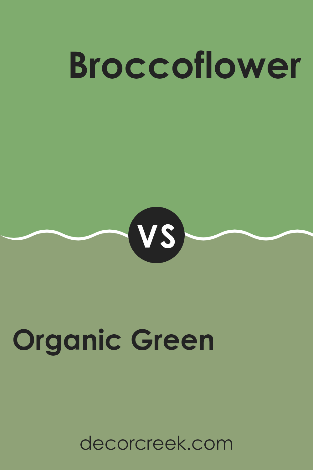
Organic Green SW 6732 by Sherwin Williams vs Broccoflower SW 9039 by Sherwin Williams
Organic Green SW 6732 and Broccoflower SW 9039 by Sherwin Williams offer two lively and fresh green shades. Organic Green is a rich, natural green that resembles lush foliage and brings a touch of the outdoors inside. It’s a flexible color that works well in many settings, from living rooms to kitchens, adding energy and a sense of nature.
On the other hand, Broccoflower is a lighter, more playful green with yellow undertones, reminiscent of the soft green found in fresh vegetables. It’s a cheerful color that can brighten up smaller rooms or add a playful touch to areas like bathrooms or kids’ rooms.
While both colors have the vibrancy and freshness of green, Organic Green leans towards a deeper, more grounded look, whereas Broccoflower offers a sunnier, more whimsical feel. Choosing between them depends on whether you prefer a deeper, more natural vibe or a lighter, airy atmosphere.
You can see recommended paint color below:
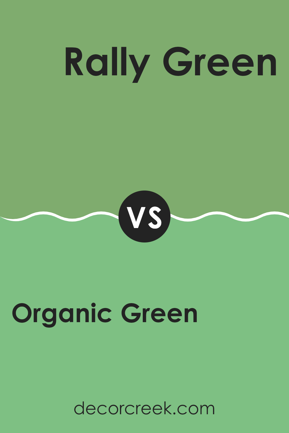
Organic Green SW 6732 by Sherwin Williams vs Rally Green SW 6934 by Sherwin Williams
Organic Green SW 6732 and Rally Green SW 6934 are two shades of green from Sherwin Williams, but they each have a unique character. Organic Green SW 6732 is a soft, muted green, often evoking a natural and calming feel.
It’s flexible and works well in rooms designed for relaxation or where a subtle pop of color is needed. In contrast, Rally Green SW 6934 is a much bolder and brighter green. It’s vivid and energetic, bringing a sense of liveliness to a room.
Rally Green can act as a statement color, ideal for accent walls or areas where you want to draw attention. When comparing these colors, Organic Green is more understated and soothing, while Rally Green is vibrant and lively. Choosing between them would depend on whether you’re aiming for subtlety and calm or energy and excitement in your room.
You can see recommended paint color below:
- SW 6934 Rally Green
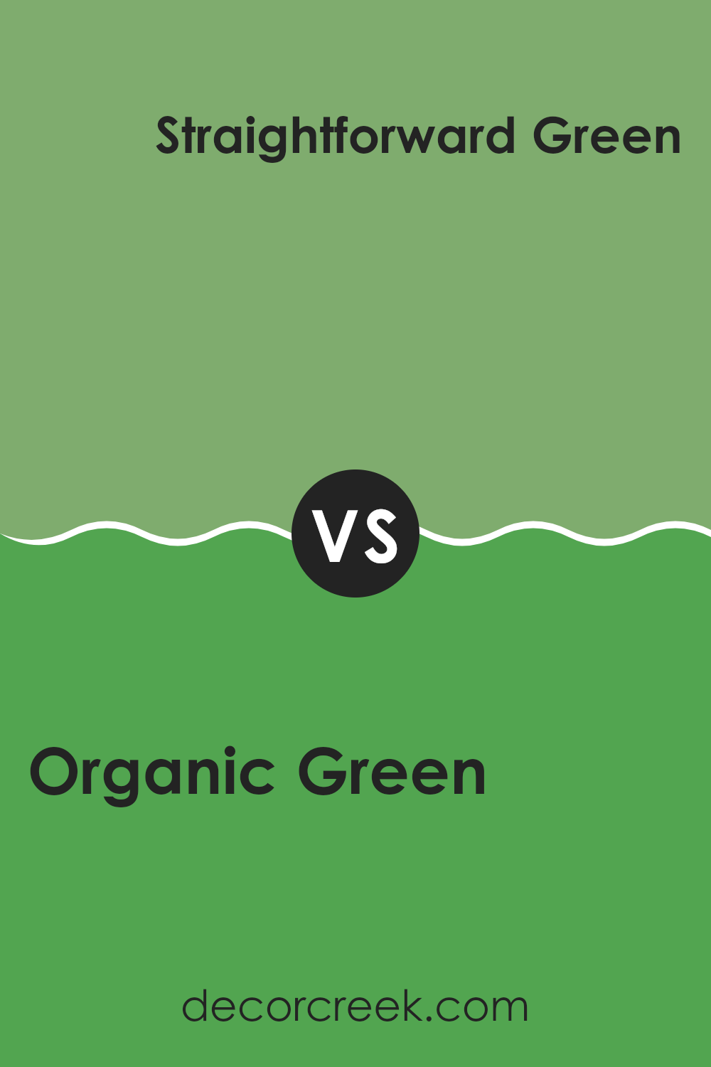
Organic Green SW 6732 by Sherwin Williams vs Straightforward Green SW 6935 by Sherwin Williams
Organic Green SW 6732 by Sherwin Williams and Straightforward Green SW 6935 by Sherwin Williams are both vibrant shades of green but offer different vibes. Organic Green is a medium-shade green that feels natural and calming. It’s like looking at healthy plant leaves, bringing a sense of peace to rooms. It’s soft and grounded, making it flexible for various rooms.
On the other hand, Straightforward Green is brighter and more vivid. It stands out and feels more energetic and lively. It can be a fun, bold choice for areas needing a splash of color. It’s more intense than Organic Green, giving it a more pronounced presence in a room.
Together, these shades offer different moods. Organic Green is suitable for a relaxed, nature-inspired look, while Straightforward Green is great for creating a lively and uplifting atmosphere. Both can add a touch of nature, but their impact is unique.
You can see recommended paint color below:
- SW 6935 Straightforward Green
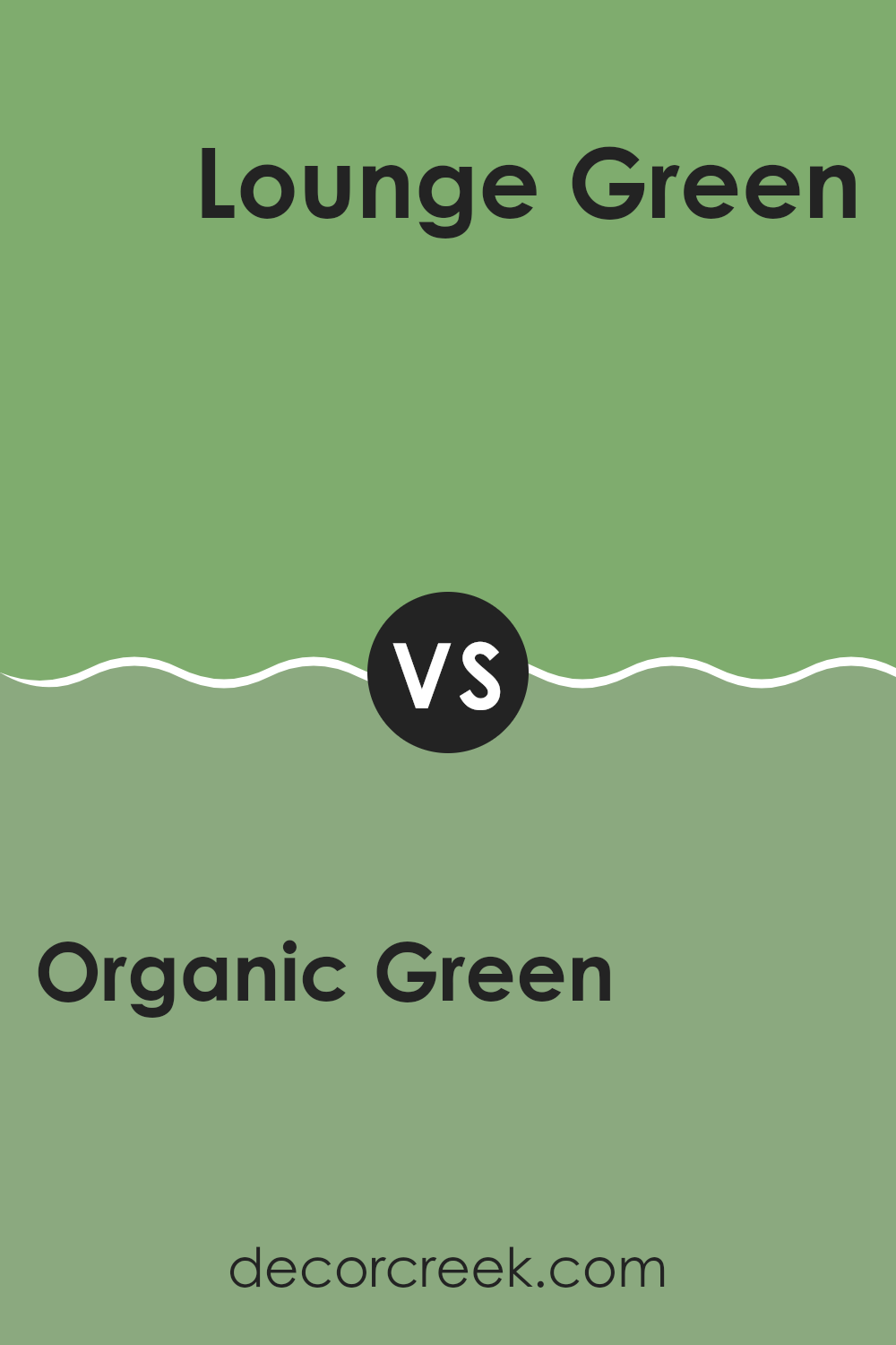
Organic Green SW 6732 by Sherwin Williams vs Lounge Green SW 6444 by Sherwin Williams
Organic Green (SW 6732) and Lounge Green (SW 6444), both by Sherwin Williams, are beautiful shades of green, but they have distinct differences. Organic Green is a fresh, lively color with a yellowish undertone, evoking a sense of nature and energy. It’s bright and vibrant, making room feel open and cheerful.
On the other hand, Lounge Green is a bit darker and has a more subdued tone, reminiscent of lush foliage. It feels more grounded and relaxed. While Organic Green is great for areas where you want to feel awake and invigorated, Lounge Green is better for creating a cozy, calming environment.
In terms of style, Organic Green fits well in modern, dynamic interiors, while Lounge Green pairs nicely with traditional or earthy decor. Both colors offer their own charm, but your choice would depend on whether you want a room that feels lively or one that’s more soothing.
You can see recommended paint color below:
Organic Green SW 6732 by Sherwin Williams vs Laudable Lime SW 6930 by Sherwin Williams
Organic Green SW 6732 by Sherwin Williams is a natural and subtle green. It gives a calm and fresh feel, like being in a forest. It’s a good choice for those who enjoy a simple yet refreshing atmosphere. Meanwhile, Laudable Lime SW 6930 is a brighter and more energetic green.
It’s lively and vibrant, like a burst of sunshine on a green field. This makes it great for areas where you want to feel more cheerful and active. While both colors are green, Organic Green is softer and more muted, creating a peaceful mood, whereas Laudable Lime stands out with its bold brightness.
They each bring a different vibe to a room: Organic Green is more relaxing, while Laudable Lime is full of energy and zest. Depending on your style and the mood you want, you can choose either the calmness of Organic Green or the lively spirit of Laudable Lime.
You can see recommended paint color below:
- SW 6930 Laudable Lime
Organic Green SW 6732 by Sherwin Williams vs Frosted Emerald SW 9035 by Sherwin Williams
Organic Green (SW 6732) and Frosted Emerald (SW 9035) by Sherwin Williams are two shades of green that bring different vibes to a room. Organic Green is a lively and fresh hue, reminiscent of lush grass or vibrant leaves.
It has a warm undertone, making it feel inviting and full of life. It’s a great choice for rooms where you want to boost energy and create a natural feel. On the other hand, Frosted Emerald is a richer and more muted green.
It has a cool undertone and comes across as more calming and refined compared to Organic Green. It can add depth to a room, making it feel cozier and more grounded. Frosted Emerald is ideal for rooms where you want a touch of elegance and a more subdued atmosphere. Both colors offer different takes on green, allowing for varied design choices depending on the mood you want to create.
You can see recommended paint color below:
- SW 9035 Frosted Emerald
Organic Green SW 6732 by Sherwin Williams vs Eco Green SW 6739 by Sherwin Williams
Organic Green SW 6732 and Eco Green SW 6739 by Sherwin Williams are two shades that share a natural theme but differ in tone and intensity. Organic Green presents a warm, natural green reminiscent of fresh leaves or grassy landscapes.
It’s lively and vibrant, perfect for creating a cheerful and inviting room. Its slightly warmer undertones make it suitable for areas where you want to feel connected with the outdoors.On the other hand, Eco Green SW 6739 is a lighter, softer green that exudes a calm feeling.
It tends to be cooler, providing a gentle backdrop that can make rooms feel airy and spacious. This color works well in spaces where you want a touch of green without overpowering the senses. While both colors celebrate nature, Organic Green is more vivid, whereas Eco Green offers a subtler, more restful effect.
You can see recommended paint color below:
- SW 6739 Eco Green
Organic Green SW 6732 by Sherwin Williams vs Picnic SW 6731 by Sherwin Williams
Organic Green (SW 6732) and Picnic (SW 6731) are two green shades by Sherwin Williams that sit next to each other in the color palette. Organic Green is a more muted and earthy shade, bringing to mind the calming essence of nature. It is a practical choice for those looking for a color that adds a touch of the outdoors inside their homes.
Picnic, on the other hand, is a bit brighter and more playful. It has a lively and fresh feel, creating an energetic and cheerful atmosphere. While Organic Green might be better for rooms where you want to relax and unwind, Picnic could work well in areas where you want to encourage activity and conversation.
Both colors share a green base, but the contrast between Organic Green’s soothing vibe and Picnic’s liveliness provides options depending on the mood you want to set in your room.
You can see recommended paint color below:
- SW 6731 Picnic
After reading about SW 6732 Organic Green from Sherwin Williams, I feel it’s an amazing color for adding freshness to a room. It’s like bringing nature inside your home. Organic Green looks great because it reminds me of trees and the outdoors. It can make a room feel lively and full of life.
What I really like about this color is how it can fit in many different places. You could use it in a bedroom to make it cozy, or in a kitchen to make it feel fresh. It’s also a good choice for living rooms where people gather, bringing a sense of calm and peace that everyone can enjoy.
Plus, Organic Green is easy to match with other colors. Pairing it with white or beige keeps things simple and clean, while adding darker colors gives a richer, more dramatic look. It’s great for anyone who wants to try something new with their home without it feeling too bold or too plain.
In the end, this color makes me think about balance and nature. It’s perfect for those who love the idea of bringing a little bit of the outside world into their homes. It’s a fun and fresh way to make any room feel bright and lively, just like a sunny day outside.
Ever wished paint sampling was as easy as sticking a sticker? Guess what? Now it is! Discover Samplize's unique Peel & Stick samples.
Get paint samples

