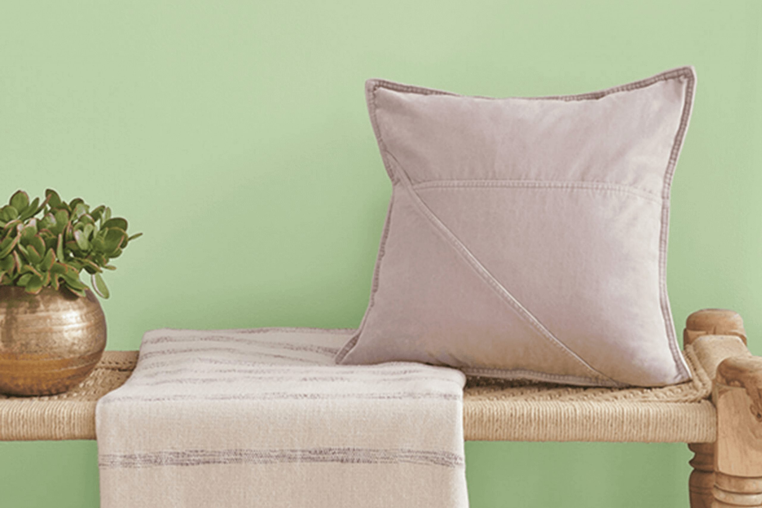
If you’re searching for a unique shade of green for your next painting project, you might want to consider SW 6730 Romaine by Sherwin Williams. This color has a vibrant yet natural appeal that can refresh any space. Romaine is not just any green; it carries a brightness that reminds me of spring leaves under a bright sun.
What’s particularly appealing about this shade is how it blends both a touch of energy and soothing calm, making it versatile for various applications, from accent walls in a bedroom to the backdrop of a bustling kitchen.
When I chose SW 6730 Romaine for my study, it transformed the room into a lively yet serene sanctuary. The color works well with natural light and also adds vibrance to the area when illuminated by artificial lighting.
Additionally, Romaine pairs beautifully with a broad spectrum of decor styles and adjacent colors, from stark whites to rich wood tones, ensuring that integrating it into your existing decor is smooth and effortless.
Whether you’re looking to liven up a space or create a harmonic environment, this shade of green might just be the perfect fit.
What Color Is Romaine SW 6730 by Sherwin Williams?
The color Romaine by Sherwin Williams is a vibrant and refreshing shade of green. Resembling the crisp leaves of romaine lettuce, this color brings a lively and natural feel to any space. It has a certain brightness that makes it very eye-catching, yet it maintains a sense of calmness typical of green hues. This makes it extremely versatile and suitable for a variety of interior styles, including modern minimalism, rustic charm, and even tropical-inspired themes.
Romaine works best in spaces that aim to create a fresh and invigorating atmosphere. It is an excellent choice for kitchen walls or in a sunroom where its natural green tones can complement indoor plants or garden views. In a bedroom or living room, pairing it with soft, neutral-toned fabrics and natural wood furniture can create a balanced and refreshing look.
This color pairs wonderfully with materials like light woods, wicker, and linen. Textures that work well with Romaine include soft cottons for a smooth look or rougher textures like burlap for a more rustic approach. The addition of metallic elements in either matte or glossy finishes can introduce a modern twist, making the space feel grounded yet dynamic.
Overall, Romaine is a versatile color that offers multiple pairing possibilities to create pleasant, visually appealing environments.
Is Romaine SW 6730 by Sherwin Williams Warm or Cool color?
RomaineSW 6730 by Sherwin Williams is a vibrant and striking shade of green that brings a fresh and lively feel to any room in the house. This particular color is great for adding a pop of brightness to spaces that need a little more energy or light. One of the best features of RomaineSW 6730 is how it can make smaller or darker rooms appear more open and airy, especially when paired with good natural lighting.
This color works well in various parts of the home. For example, in a kitchen, it can create a cheerful and welcoming environment, while in a home office, it might help boost creativity and focus. What’s also great about this shade is its versatility in terms of decor and style.
It complements both modern and traditional furnishings, allowing for a wide range of design options. Whether you’re looking to paint an entire room or just an accent wall, RomaineSW 6730 offers a lively yet harmonious choice that can liven up your living space.
Undertones of Romaine SW 6730 by Sherwin Williams
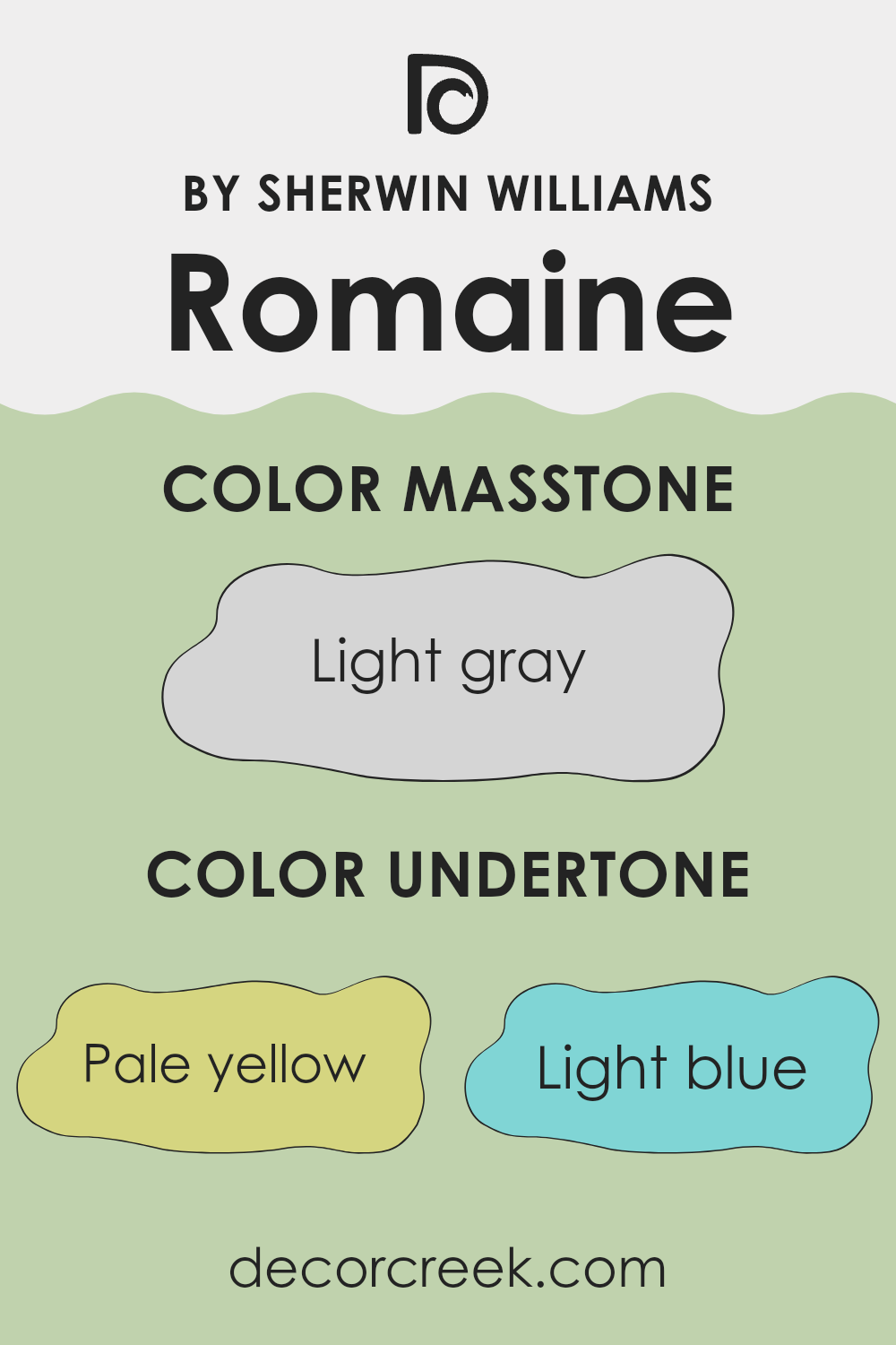
Romaine is a vibrant shade of green, which can subtly change its appearance depending on its undertones. Undertones are the colors that lie beneath the surface of the paint, influencing how it looks under different lighting conditions and when placed next to other colors. The undertones for this particular shade include pale yellow, light blue, mint, light purple, pale pink, lilac, and grey.
These varied undertones can make the green appear calmer or more energetic. For instance, pale yellow can give the paint a fresher, more lively look, making a room feel more welcoming. Light blue and mint lend a cooling, almost refreshing feel to the space, which can be great for creating a relaxed atmosphere.
Light purple and lilac bring in a subtle richness that can make the walls look more refined yet approachable. Pale pink softens the green, adding a touch of warmth. Lastly, grey undertones provide a neutral balance, making the green less intense and easier to integrate with different decor styles. When used on interior walls, the multiple undertones of this paint mean it can complement a wide range of furnishings and decor themes, from modern and minimalist to rustic and cozy.
The way the color changes with different light sources (natural vs. artificial) adds an interesting dynamic to any room. It’s important to consider these undertones when choosing complementary colors for furniture, curtains, or decorations to ensure everything comes together harmoniously.
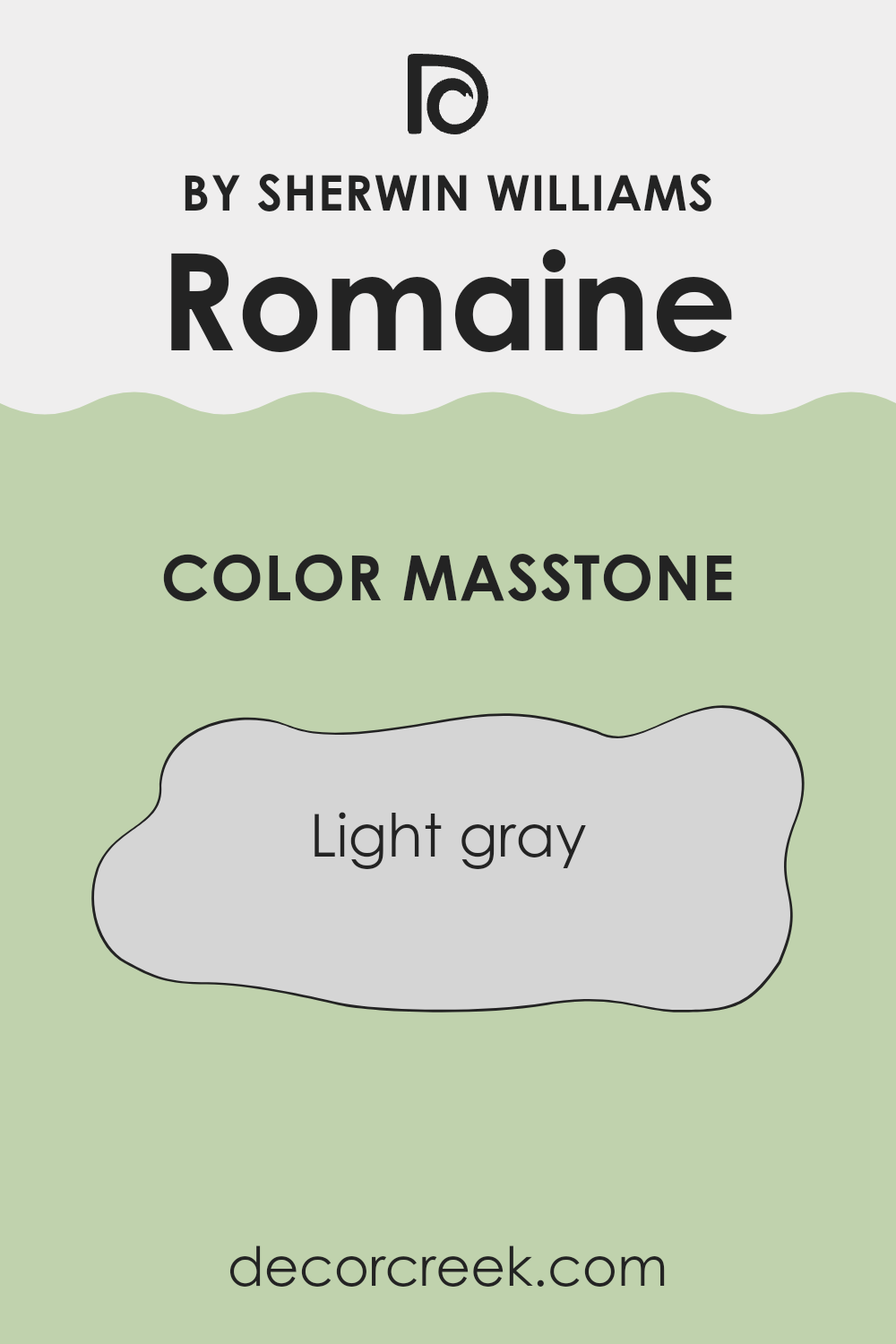
What is the Masstone of the Romaine SW 6730 by Sherwin Williams?
RomaineSW 6730 by Sherwin Williams has a masstone of light gray, labeled as #D5D5D5. This specific shade is especially useful for bringing a clean and gentle feel to any room in a home. Light gray works well because it doesn’t overpower other colors.
This makes it a great choice for walls if you want your furniture, art, or decor items to stand out. Additionally, since light gray is a neutral color, it matches easily with most other colors. Whether you have bright throw pillows, colorful curtains, or deeper hues like navy or burgundy in your room, light gray walls will complement them nicely.
It’s also a practical choice as it doesn’t show minor marks or dirt easily, which can be particularly helpful in busy homes or those with young kids. Using RomaineSW 6730 can add a touch of neatness and understated style to any space, making the room feel larger and more open without too much effort.
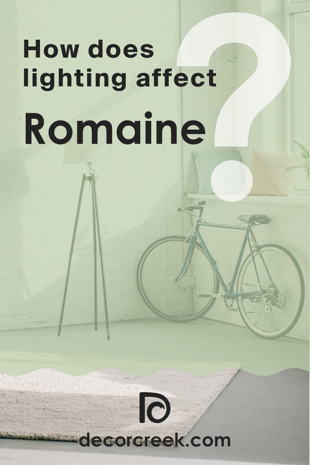
How Does Lighting Affect Romaine SW 6730 by Sherwin Williams?
Lighting plays a crucial role in how we perceive colors. The type of light and its intensity can significantly alter the appearance of a color in any space. For instance, the color Romaine by Sherwin Williams, a vibrant shade of green, can look different under various lighting conditions.
In artificial light, Romaine might appear warmer or more muted depending on the type of bulbs used. Incandescent bulbs, which produce a warm, yellowish light, can make this green look more subdued and less bright. On the other hand, fluorescent lighting, which emits a cooler, bluish light, might enhance the green, making it appear brighter and more vivid.
In natural light, Romaine benefits greatly, as natural sunlight tends to show the truest version of colors. During the day, as the quality of sunlight changes, Romaine might shift from a lively, bright green in direct sunlight to a softer and more subtle green in the softer light of the afternoon or on cloudy days.
The orientation of the room also affects how Romaine looks:
1. North-facing rooms – These rooms get less direct sunlight, which can make colors appear cooler. In north-facing rooms, Romaine might look slightly darker and less vibrant, taking on a more reserved green tone.
2. South-facing rooms – With more exposure to direct sunlight, south-facing rooms can make Romaine look very bright and vibrant, enhancing its lively qualities.
3. East-facing rooms – These rooms enjoy bright light in the morning, which can make Romaine look fresh and lively. As the day progresses and the light diminishes, the color may appear softer and more muted.
4. West-facing rooms – In west-facing rooms, Romaine might appear duller in the morning but gain vibrancy during the afternoon and evening as sunlight intensifies, highlighting the dynamic range of this green.
Understanding how the light in your room changes throughout the day is key to anticipating how Romaine will look and ensuring that you’re happy with its appearance in different conditions.
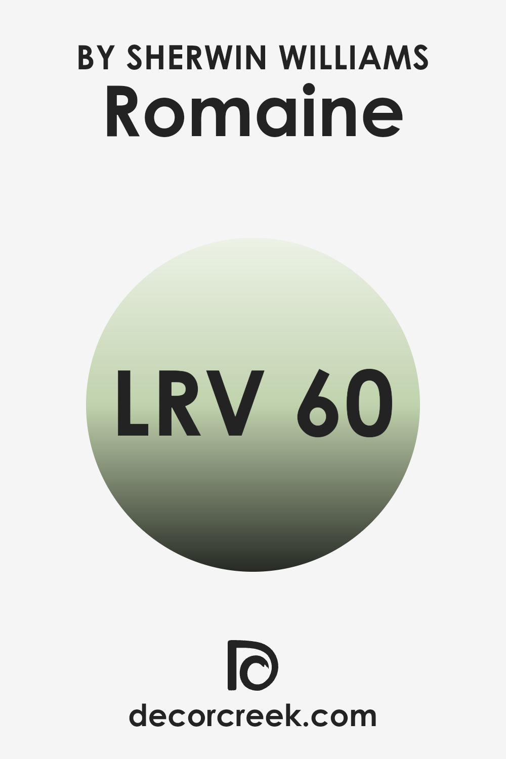
What is the LRV of Romaine SW 6730 by Sherwin Williams?
LRV stands for Light Reflectance Value, a measure used to describe the percentage of light a paint color reflects when it’s applied on walls. It plays a critical role in determining how light or dark a shade appears once it’s up on your walls and affects how much artificial light you might need in a room.
Lower LRV values mean the color absorbs more light, making spaces cozy but potentially dim without sufficient lighting. Conversely, higher LRV values make colors appear lighter, brightening rooms naturally and possibly reducing the need for lots of artificial lighting.
The specific LRV of 60.274 for a certain shade of green suggests it’s a moderately light color, capable of reflecting a good amount of light without being too pale. This particular value makes it versatile for rooms that might get a fair amount of natural sunlight, enhancing its green tone without overpowering the space.
In dimmer areas, it may lose some of its vibrancy but will still maintain a refreshing presence, providing a balance of brightness and color depth that can make both spacious and smaller rooms feel more open and lively.
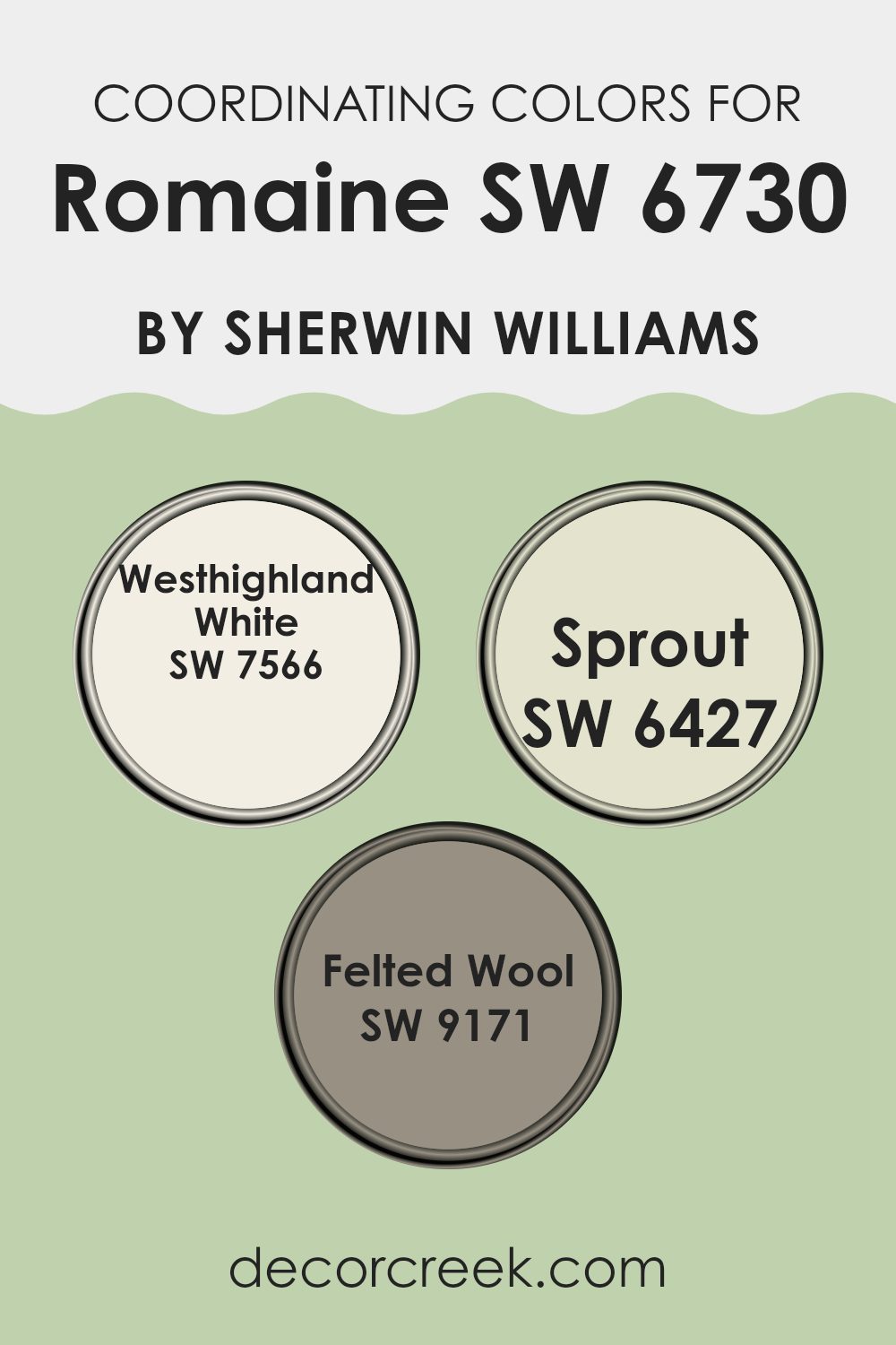
Coordinating Colors of Romaine SW 6730 by Sherwin Williams
Coordinating colors are shades that complement each other when used together in decorating or design, enhancing the overall aesthetic without overpowering the space. When used thoughtfully, coordinating colors can create a harmonious and visually appealing environment. For instance, colors chosen to coordinate with Romaine, a vibrant green, include Westhighland White, Sprout, and Felted Wool. These colors each bring their own unique qualities to the palette while still supporting the lively green hue.
Westhighland White is a clean and bright shade that offers a crisp contrast, making it a perfect backdrop that allows Romaine to truly stand out. It’s like a fresh canvas, ready to be livened up with richer tones. Sprout, a gentle light green, works beautifully alongside Romaine by providing a subtle gradient effect, enhancing the depth and layering of green tones.
This milder green echoes the natural world and adds delicacy to the composition. Felted Wool, on the other hand, is a soothing mid-tone grey that grounds the brighter greens. It offers a neutral balance, ensuring that the environment remains pleasant and not overly vibrant, which helps in creating a soothing but cheerful space. Together, these coordinating colors provide a well-rounded and inviting palette.
You can see recommended paint colors below:
- SW 7566 Westhighland White
- SW 6427 Sprout
- SW 9171 Felted Wool
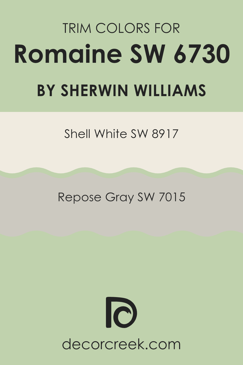
What are the Trim colors of Romaine SW 6730 by Sherwin Williams?
Trim colors, such as SW 8917 – Shell White and SW 7015 – Repose Gray, are essential in painting and decor because they help delineate and accentuate the architectural features of a room. By using contrasting trim colors, features like door frames, moldings, and baseboards stand out, enhancing the overall aesthetic appeal of the space.
For a lively green like Romaine from Sherwin Williams, choosing the right trim color can add a clean and polished look, providing a nice visual break and tying the room’s elements together seamlessly. Shell White is a gentle and neutral white shade that brings a light and airy feel to any space, making it a versatile choice that complements many brighter and bolder colors like Romaine.
Meanwhile, Repose Gray is a muted gray with enough warmth to offer a subtle contrast without overpowering the primary color. It works beautifully to soften the visual impact of more intense shades, ensuring that the design feels cohesive and thoughtfully planned. Together, these trim colors offer flexible options to frame and define spaces attractively while working harmoniously with dynamic color choices.
You can see recommended paint colors below:
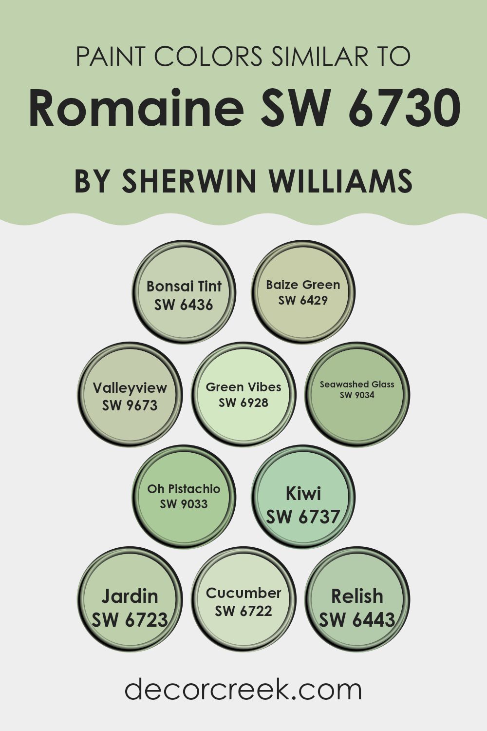
Colors Similar to Romaine SW 6730 by Sherwin Williams
Similar colors play an important role in creating a harmonious and appealing color scheme. They help maintain balance while allowing for subtle variations that add depth and interest to a space. For instance, colors like Bonsai Tint, a gentle green with a soft hint of blue, works well with Green Vibes, a lively, vibrant green, giving a fresh and energetic feel. Baize Green, which has a deeper, sage-like quality, complements Jardin, a slightly muted green with earthy undertones, promoting a cohesive yet richly layered look.
Valleyview offers a slightly dusty green hue that feels calming when paired with Cucumber’s light, refreshing tone. Seawashed Glass, on the lighter end of the spectrum, looks ethereal next to Oh Pistachio, which is characterized by a distinctly cheerful and light-hearted green.
Kiwi, with its vivid, leafy appeal, meshes seamlessly with Relish, a bold, deep green that provides depth to any palette. Integrating these similar colors can smoothly tie together the various elements of a room, making it feel unified without appearing monotonous. Using colors effectively can enrich the visual experience, enhancing the aesthetic of any environment.
You can see recommended paint colors below:
- SW 6436 Bonsai Tint
- SW 6429 Baize Green
- SW 9673 Valleyview
- SW 6928 Green Vibes
- SW 9034 Seawashed Glass
- SW 9033 Oh Pistachio
- SW 6737 Kiwi
- SW 6723 Jardin
- SW 6722 Cucumber
- SW 6443 Relish
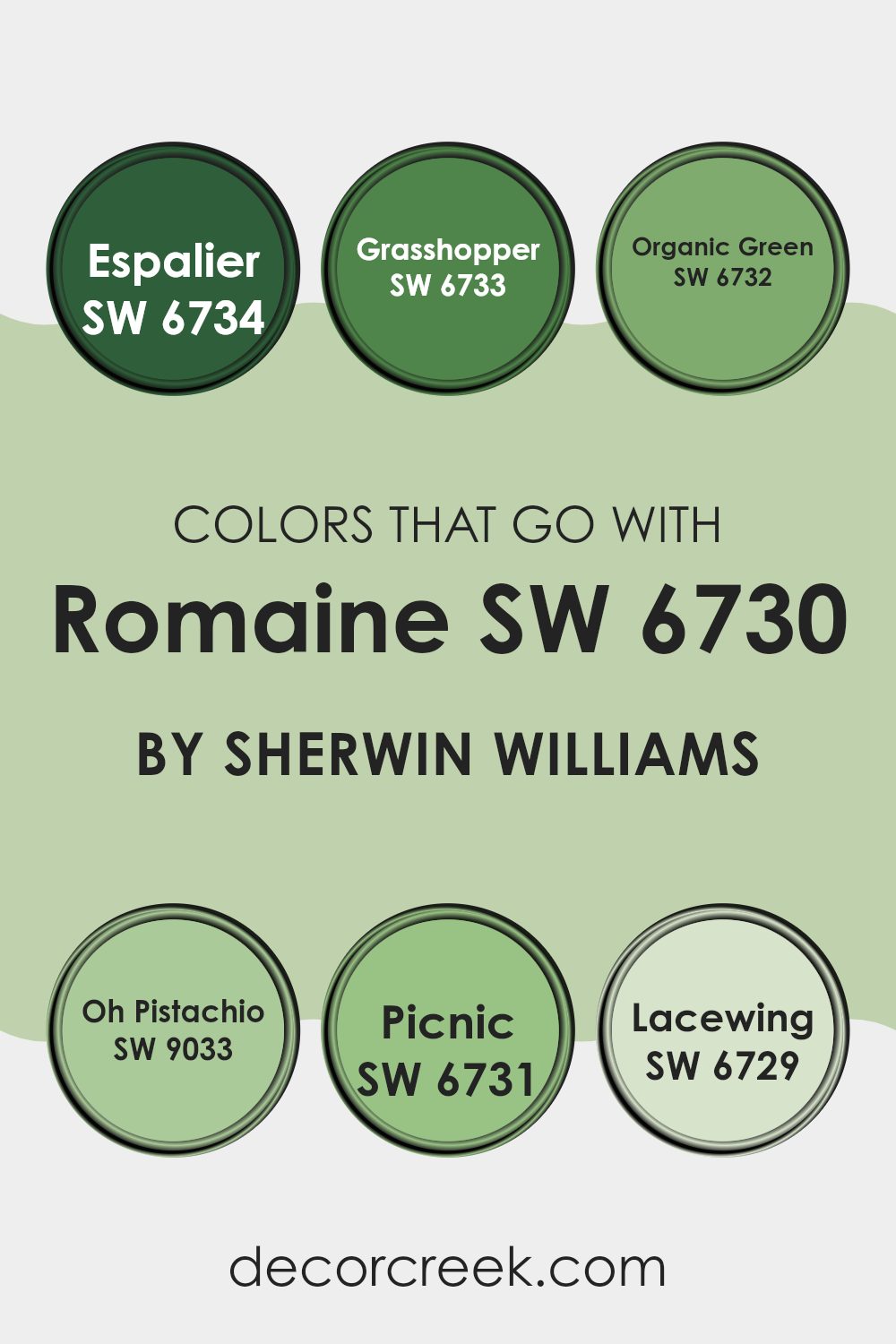
Colors that Go With Romaine SW 6730 by Sherwin Williams
Choosing colors that harmonize with Romaine SW 6730 by Sherwin Williams is crucial because it ensures that your space feels balanced and visually appealing. When these colors are complementary, they create a smooth transition between spaces and elements in a room, enhancing the overall aesthetic and mood.
For example, colors like Espalier and Grasshopper add a lively vibe without overpowering Romaine, allowing for a fresh and cohesive look. On the other hand, softer tones such as Organic Green and Oh Pistachio provide a gentle contrast, bringing a calm and collected feel to the environment. These combinations can help in achieving a desired atmosphere, whether it’s energetic or relaxed.
Espalier SW 6734 is a darker green that provides depth and contrast to the lighter Romaine, making it ideal for accent walls or furniture. Grasshopper SW 6733 is a bright, lively green that injects vibrancy and energy, perfect for areas that require a pop of color.
Organic Green SW 6732 offers a subtler hue, closely aligned with nature, fitting well in spaces that aim for a natural, grounded look. Oh Pistachio SW 9033 is a soft, muted green with a hint of freshness, ideal for creating soothing, light-filled rooms.
Picnic SW 6731 leans towards a cheerful, spirited green, great for invigorating spaces with a playful touch. Lastly, Lacewing SW 6729 provides a very light, almost neutral green, which works wonderfully as a background color, allowing other elements to stand out. All these colors, when used thoughtfully, enhance the liveliness and comfort of any space decorated around Romaine SW 6730.
You can see recommended paint colors below:
- SW 6734 Espalier
- SW 6733 Grasshopper
- SW 6732 Organic Green
- SW 9033 Oh Pistachio
- SW 6731 Picnic
- SW 6729 Lacewing
How to Use Romaine SW 6730 by Sherwin Williams In Your Home?
Romaine SW 6730 by Sherwin Williams is a unique shade of green that brings a refreshing vibe to any room. This color is perfect if you’re thinking about adding a touch of nature and freshness to your living space. You can use it in various parts of your home.
For instance, painting an accent wall in the living room with this shade can make the room feel more lively and cozy. It’s also a great choice for bedrooms, where it can help create a calm and comfortable atmosphere, making it easier to relax and get a good night’s sleep.
In the kitchen, Romaine can brighten up the space and give it a clean, fresh look. Pairing it with white cabinets or countertops can make the green pop and add a modern touch. If you’re not ready to commit to painting entire walls, think about using this color for smaller projects like painting a piece of furniture or the frames of your windows.
Romaine SW 6730 by Sherwin Williams vs Baize Green SW 6429 by Sherwin Williams
Comparing Romaine and Baize Green by Sherwin Williams, both shades are unique. Romaine is a vibrant, leafy green that pops with freshness and energy. It’s the kind of color that brings a lively touch to any space, making it feel instantly more dynamic and cheerful.
In contrast, Baize Green has a more subdued, softer look. It leans towards a natural, earthy tone that can make rooms feel cozy and welcoming without being too bright or overwhelming. If you’re looking to create an upbeat, invigorating environment, Romaine would be the go-to choice.
Baize Green, on the other hand, is perfect for those seeking a gentler, more grounded ambiance in their decorating. Despite both being greens, their impact and mood are quite distinct, catering to different tastes and interior needs.
You can see recommended paint color below:
- SW 6429 Baize Green

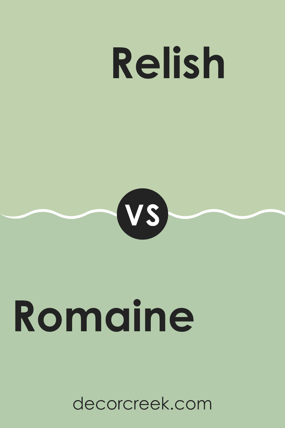
Romaine SW 6730 by Sherwin Williams vs Relish SW 6443 by Sherwin Williams
Romaine and Relish by Sherwin Williams are both vibrant colors that bring a lot of energy to a space. Romaine is a deep, bold green with a hint of blue undertones, which gives it a fresh, lively feel. It’s a color that could remind you of a lush forest or the deep sea, making it a great choice for spaces where you want a touch of nature.
On the other hand, Relish is a brighter, more intense green. It has a yellowish tint, making it feel warmer compared to Romaine. Relish is reminiscent of spring leaves or grass under the bright sun, perfect for areas where you want to add cheerfulness and a spark of brightness.
Both colors are great for adding personality and a natural vibe to a room. Choosing between them depends on the effect you want: Romaine for a more refreshing and calm environment, and Relish for a sunny, lively atmosphere.
You can see recommended paint color below:
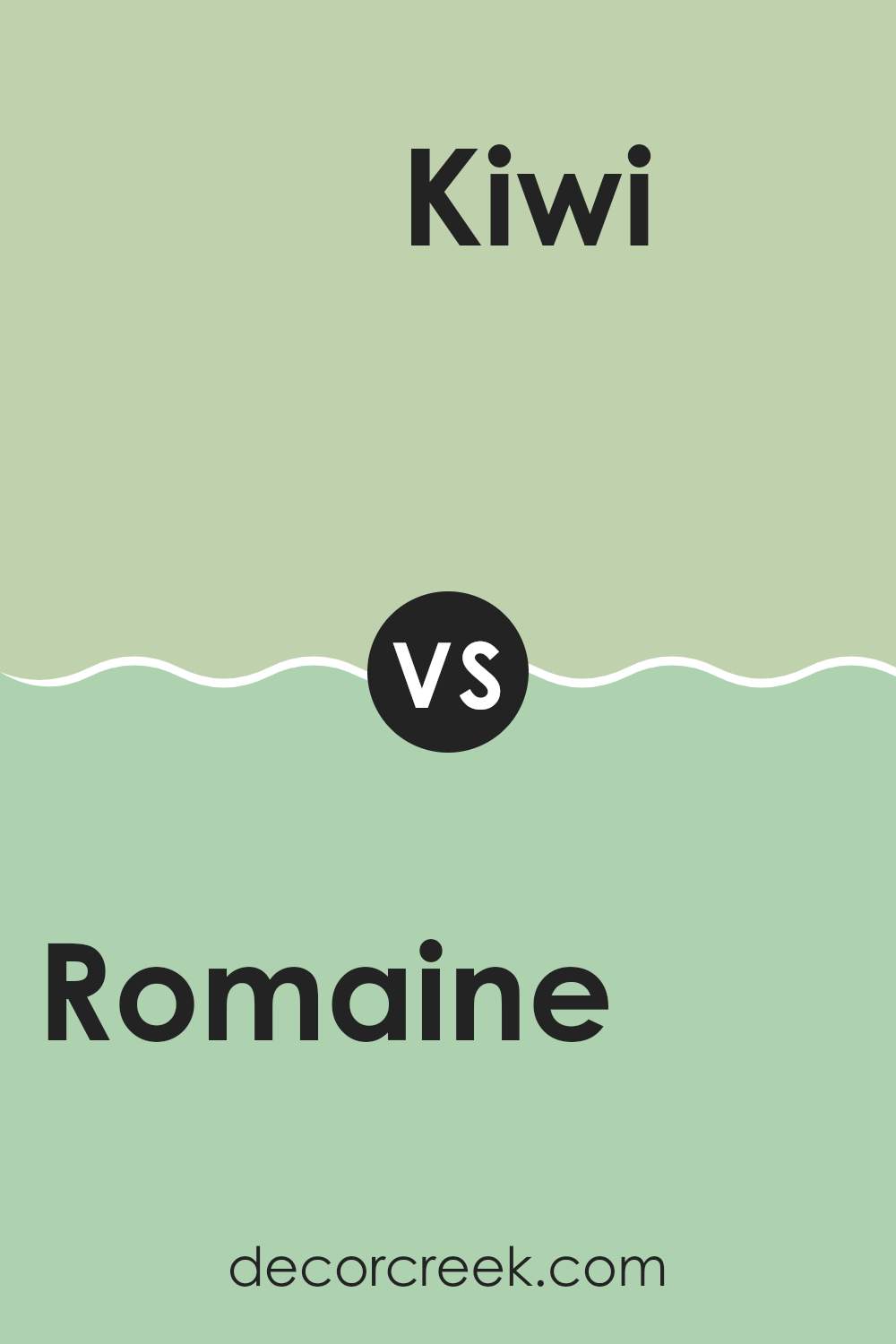
Romaine SW 6730 by Sherwin Williams vs Kiwi SW 6737 by Sherwin Williams
The main color, Romaine, and Kiwi are both vibrant, energetic greens from Sherwin Williams, but they differ in their tones and the feel they bring to a space. Romaine has a deeper, almost forest-like green that suggests freshness and natural settings.
It’s a color that could add depth and a sense of growth to a room. On the other hand, Kiwi is a brighter, more playful green. This shade is lighter and brings a lively, youthful vibe wherever it’s used.
It can instantly brighten up a space and make it feel more open and energetic. Both colors are great for adding a touch of nature to any décor, but the choice between them depends on whether you want the richness of a darker green or the cheerful brightness of a lighter shade.
You can see recommended paint color below:
- SW 6737 Kiwi
Romaine SW 6730 by Sherwin Williams vs Green Vibes SW 6928 by Sherwin Williams
Romaine and Green Vibes, both by Sherwin Williams, offer distinct shades of green, yet each presents a unique vibe. Romaine is a deeper, more subdued green, leaning towards a natural, leafy color that reminds one of a dense forest. This makes it ideal for spaces where you want to create a feeling of calmness and closeness to nature, like in a study or bedroom.
On the other hand, Green Vibes is a much brighter and more vibrant shade. It has a lively, energetic feel, much like the color of spring grass or bright lime. This makes it perfect for areas where you want to add a pop of color to energize the space, such as a playroom or a creative workspace.
Both colors offer a fresh feel but cater to different tastes and uses, where Romaine provides a more grounded and soothing look, while Green Vibes brings an exciting and cheerful touch to any room.
You can see recommended paint color below:
- SW 6928 Green Vibes
Romaine SW 6730 by Sherwin Williams vs Seawashed Glass SW 9034 by Sherwin Williams
Romaine and Seawashed Glass, both by Sherwin Williams, are two distinct shades that bring different vibes to a space. Romaine is a deep, vibrant green that seems lively and refreshing. It’s a color that can make a room feel more energetic and full of life.
On the other hand, Seawashed Glass has a much softer look. It’s a pale, muted turquoise that provides a calm, light-hearted feel, perfect for creating a relaxing atmosphere. When comparing these colors for a decorating project, consider the mood you want to set.
Romaine works great in high-energy areas like kitchens or playrooms, while Seawashed Glass is ideal for spaces where you want to unwind, such as bathrooms or bedrooms. While both colors can effectively enhance a space, your choice depends on whether you prefer a bold impact or a gentle touch.
You can see recommended paint color below:
- SW 9034 Seawashed Glass
Romaine SW 6730 by Sherwin Williams vs Valleyview SW 9673 by Sherwin Williams
The colors Romaine and Valleyview, both by Sherwin Williams, offer distinct vibes for decorating spaces. Romaine is a vibrant, deep green with a fresh and lively feel, reminiscent of lush foliage in a dense garden. It’s a bold choice that stands out and can breathe life into any area, making it feel more energetic and refreshing.
On the other hand, Valleyview is a softer, more muted green with gray undertones, providing a more understated and calming look. This color is great for creating a relaxing atmosphere in spaces meant for unwinding or concentrating, like a study room or a bedroom.
While Romaine injects vibrancy and a touch of nature’s energy, Valleyview offers a gentler backdrop, conducive to soothing and grounding environments. Depending on what you want from a space—either a burst of energy or a calm retreat—the choice between these two colors can help achieve those different moods effectively.
You can see recommended paint color below:
Romaine SW 6730 by Sherwin Williams vs Bonsai Tint SW 6436 by Sherwin Williams
The color “Romaine” is a lively, bold green that stands out with its vibrancy. It has a fresh and energetic feeling, perfect for adding a pop of brightness to a space. This color could liven up a room when used on an accent wall or in decorative accessories.
On the other hand, “Bonsai Tint” is a softer, more muted green with a hint of gray, making it much more subdued compared to “Romaine.” It’s ideal for those who prefer colors that aren’t too loud, offering a gentle and calming tone to interiors. This color would work well in rooms where a more relaxed, subtle atmosphere is desired, such as bedrooms or living rooms.
Together, these two greens offer interesting contrasts—one bright and eye-catching, the other gentle and understated—providing options for different tastes and styles in home décor.
You can see recommended paint color below:
Romaine SW 6730 by Sherwin Williams vs Cucumber SW 6722 by Sherwin Williams
Romaine and Cucumber are two green shades from Sherwin Williams that have their unique feel even though they share the same color family. Romaine is a vibrant, lively green that is deeper and tends to stand out more in a space. It can be considered ideal for adding a sense of freshness and energy to any room, making it perfect for accent walls or spaces where you want a pop of color.
On the other hand, Cucumber is lighter and has a more subdued tone compared to Romaine. This makes it easier to use across larger areas without overwhelming the space. It’s great for creating a light, airy feel in rooms, potentially making them feel bigger and more open.
In summary, if you’re looking for a bolder, standout shade, Romaine is the better choice. But if you prefer something gentler and more widespread, then Cucumber is the way to go. They both bring their distinct green hues to interiors but offer different impacts based on their depth and brightness.
You can see recommended paint color below:
- SW 6722 Cucumber
Romaine SW 6730 by Sherwin Williams vs Oh Pistachio SW 9033 by Sherwin Williams
Romaine and Oh Pistachio are both green paints from Sherwin Williams, yet they offer distinct vibes. Romaine is a deep, vibrant green that resembles the lush, healthy leaves of its namesake lettuce. This color brings a bold and lively flair to any space, making it perfect for creating a standout feature wall or adding a touch of nature’s vitality to a room.
On the other hand, Oh Pistachio is much softer and lighter, reminiscent of the mild, creamy shade of pistachio nuts. It’s a gentle color that provides a subtle and refreshing feel, ideal for spaces where you want a touch of color without overwhelming the senses. This hue works well in bedrooms or bathrooms where a calm and inviting atmosphere is desired.
Both colors can breathe life into a space, but your choice would depend on the type of energy and mood you want to set: bold and energetic with Romaine or soft and soothing with Oh Pistachio.
You can see recommended paint color below:
- SW 9033 Oh Pistachio
Romaine SW 6730 by Sherwin Williams vs Jardin SW 6723 by Sherwin Williams
The two colors, Romaine and Jardin by Sherwin Williams, have distinct yet harmonious green tones that can add vibrancy to any space. Romaine is a deeper, more intense green, reminiscent of leafy forests. It’s bold and can make a strong statement when used in decoration.
On the other hand, Jardin is lighter and fresher, evoking the softness of early spring foliage. Its soothing quality makes it ideal for creating a relaxed environment.
Together, these colors can provide a dynamic contrast – Romaine’s richness perfectly balances Jardin’s airy feel. Whether used together for a layered green effect or individually to suit different moods and settings, both colors offer versatile options for interior design.
You can see recommended paint color below:
My review of SW 6730 Romaine by Sherwin Williams has shown me that this is a really fun and lively green paint color. It’s perfect for anyone wanting to brighten up a room! From what I’ve tested, it works well in spaces like kitchens, playrooms, or even outdoor areas because it adds a splash of energy and cheer.
In different lights, Romaine shifts its shades a bit, which keeps things interesting. In bright sunlight, it looks fresh and vibrant, while in dimmer light it takes on a softer, more soothing green. I discovered that it especially looks great with white or light wood furniture, which makes the green pop even more!
It’s important to check how it looks in your own home because lighting can change its appearance, and your own decor will interact with the color too. A sample on your wall for a few days would be a smart move.
All in all, choosing this color can be a super choice if you want a room that feels alive and inviting. It’s not only pretty but also has a cheerful vibe that could make anyone smile when they walk in. I would definitely think about using SW 6730 Romaine in a place where I want delight and fun to blend with a beautiful environment.
Ever wished paint sampling was as easy as sticking a sticker? Guess what? Now it is! Discover Samplize's unique Peel & Stick samples.
Get paint samples

