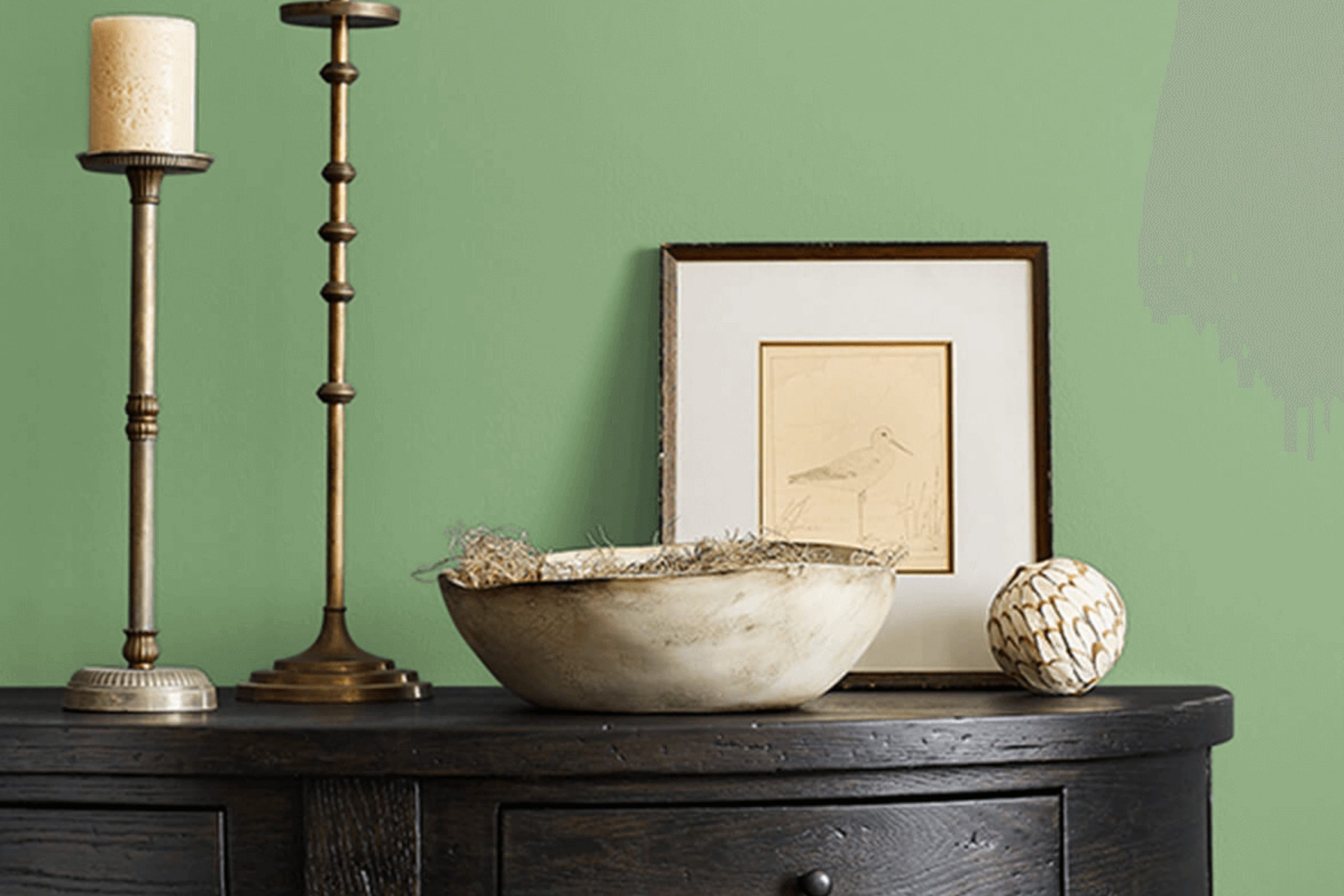
Have you ever looked at a color and felt instantly drawn to its calmness and depth? That’s exactly the experience I had with SW 6444 Lounge Green by Sherwin Williams. This shade of green strikes a perfect balance between being soothing and rich, making any room feel more grounded and inviting.
As I started using this color in different spaces, I noticed how versatile it could be. Whether I was looking to create a statement wall or give an entire room a new vibe, Lounge Green was up to the task. Its earthy tones blend beautifully with natural elements like wood and stone, as well as with both classic and contemporary decor.
Choosing the right paint color can sometimes feel overwhelming, but Lounge Green makes it easy. It’s a go-to color that doesn’t overpower, yet it holds its own with a presence that enriches the aesthetics of a space.
Perfect for anyone looking to refresh their home with a touch of nature-inspired serenity, this color is as practical as it is beautiful.
What Color Is Lounge Green SW 6444 by Sherwin Williams?
Lounge Green by Sherwin Williams is a vibrant and lush color, perfect for creating a lively and welcoming atmosphere in any room. This shade of green has a touch of warmth, making it versatile and suitable for various interior styles. It’s particularly effective in adding a pop of color to modern, eclectic, or even traditional settings. The color pulls in the freshness of nature, making it a fantastic choice for living rooms, studies, or bedrooms where a connection to the outdoors is desired.
In terms of compatibility, Lounge Green pairs wonderfully with natural materials like wood and leather, enhancing their rich textures. These combinations can create a grounded, organic feel in a space. When it comes to fabrics, velvet or silk in neutral tones such as beige, ivory, or soft gray complements this green shade beautifully, providing a luxurious feel without overwhelming the senses.
The color also works well with metallic finishes like brass or gold, which add a touch of glamour and elegance to the overall look. Combining Lounge Green with such elements can create a balanced and inviting space that feels both refreshed and cozy.
Whether applied on an accent wall, as part of a patterned wallpaper, or through various decor items, Lounge Green has the ability to breathe life into your home’s design.
Is Lounge Green SW 6444 by Sherwin Williams Warm or Cool color?
Lounge Green by Sherwin Williams is a unique and fresh color that can really enhance the atmosphere of a home. Being a vivid shade of green, it brings a lively and organic feel to any room. When used in a living area or a kitchen, it injects energy and can make the space feel more alive and inviting. This color is versatile enough to work well with various decor styles, from modern to rustic.
In smaller spaces like bathrooms or studies, applying Lounge Green can visually open up the area, making it feel larger and more airy. It pairs well with natural materials like wood or stone, which helps to create a cohesive and grounded look. Furthermore, this shade of green works beautifully with neutral colors like whites, grays, and tans, adding a pop of color that is neither overwhelming nor too bold.
Overall, Lounge Green has the ability to make a home feel connected to nature and is a great choice for anyone looking to refresh their living space with a touch of vibrant yet natural color.
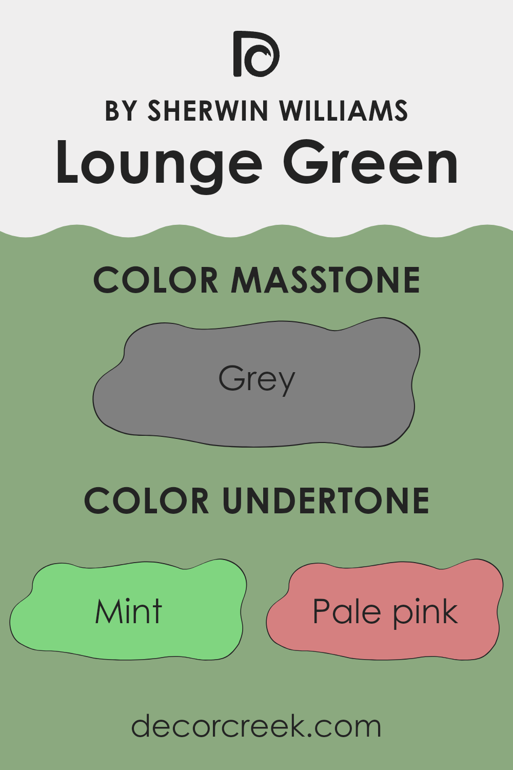
Undertones of Lounge Green SW 6444 by Sherwin Williams
Sherwin Williams’ Lounge Green SW 6444 is a compelling choice for interior walls, primarily because of its array of undertones that can subtlety influence the mood and feel of a room. Undertones are the colors lurking beneath the surface of the paint that can be seen in different lighting conditions, affecting how we perceive the main color.
For instance, the mint undertone in Lounge Green offers a fresh and rejuvenating vibe, making it ideal for bathrooms or kitchens where a clean, refreshing look is desired. Meanwhile, the pale pink undertone softens the appearance, providing a gentle warmth that can make living spaces feel more welcoming.
Pale yellow brings a subtle cheeriness to Lounge Green, enhancing its vibrancy in well-lit areas. On the other hand, olive adds depth and earthiness, complementing wooden furnishings and natural materials beautifully. Similarly, light green and light blue undertones inject a sense of calmness, perfect for creating a relaxing atmosphere in bedrooms.
Another interesting aspect of Lounge Green’s undertones like dark turquoise and light turquoise is their ability to impact the perception of space and light. These cooler tones can make smaller rooms feel larger and brighter.
In terms of room orientation, colors like orange and pale yellow can make the paint feel warmer in north-facing rooms which receive less direct sunlight. On walls facing south, where the light is warmer, undertones like light blue and lilac can provide balance by bringing in cooler notes.
Overall, the mix of undertones in Lounge Green allows it to adapt flexibly across various spaces and styles, enhancing the natural light and complementing different décor elements effectively. This balance of affecting mood while working in harmony with both light and surrounding elements makes Lounge Green a versatile choice for home interiors.
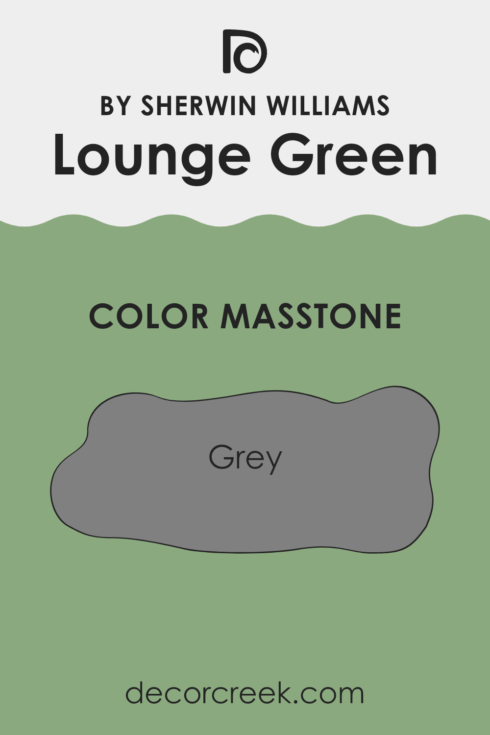
What is the Masstone of the Lounge Green SW 6444 by Sherwin Williams?
Lounge Green SW 6444 by Sherwin Williams has a masstone of grey, which is a balanced and neutral color. This grey tone makes it a versatile choice for homes. It works well in various settings because it doesn’t clash with other colors. You can use it in living rooms, bedrooms, and even kitchens, and it will still look good.
Its versatility also means it can fit into different styles, from modern to traditional. The neutrality of grey helps create a calm, comfortable space. It’s easy on the eyes, making it great for areas where you spend a lot of time relaxing.
Because this shade of grey isn’t too dark or too light, it can help make a room feel more spacious and airy while still adding enough character to the space. Lastly, it pairs well with both bright colors and softer tones, giving homeowners the freedom to add personal touches through decor and furniture.
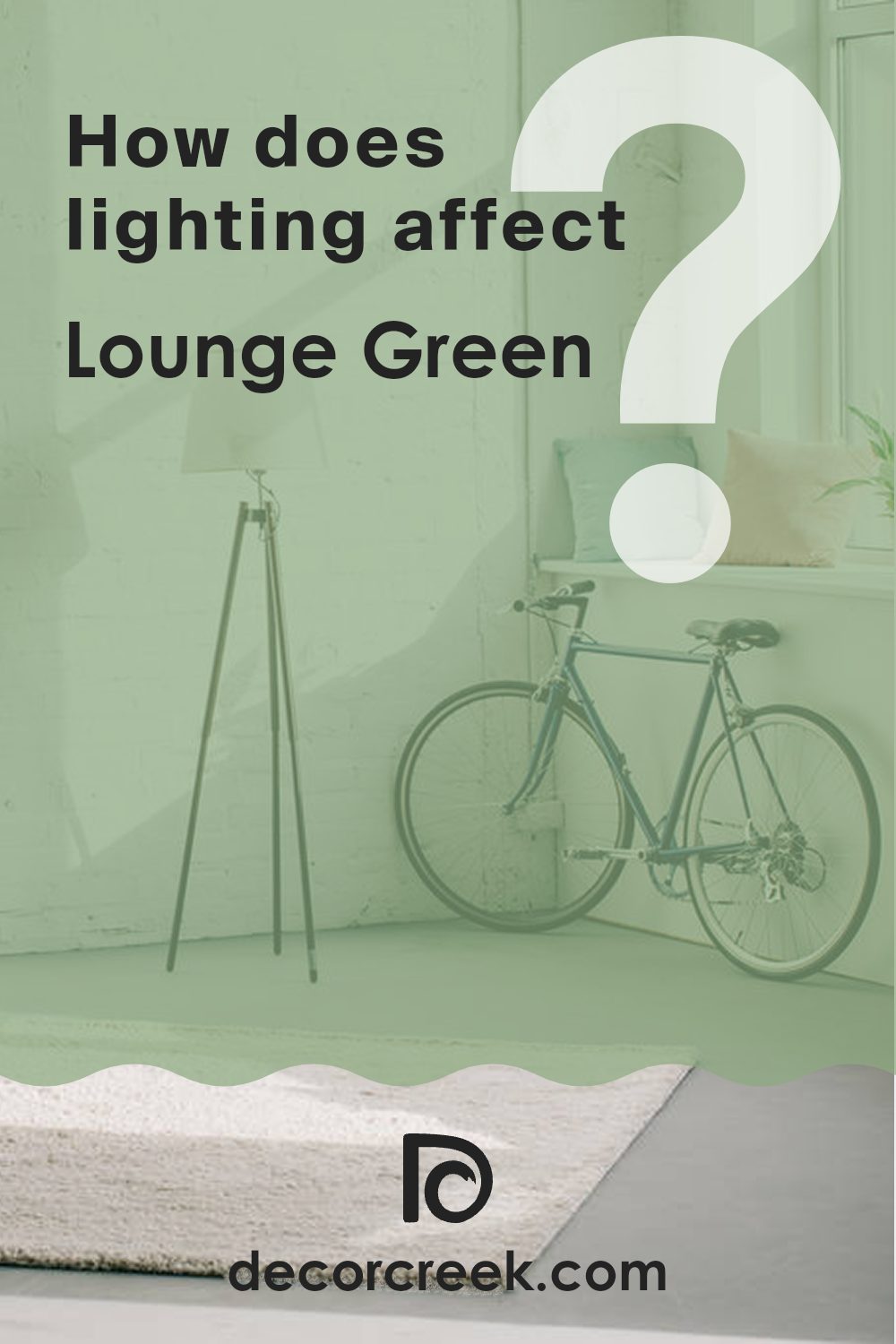
How Does Lighting Affect Lounge Green SW 6444 by Sherwin Williams?
Lighting plays a crucial role in how colors appear in different environments. The type of light can enhance, distort, or mute the hues we see. For example, artificial light can have varying undertones, such as yellow in incandescent bulbs or blue in fluorescent lights, which affect the way colors are perceived.
Taking the color Lounge Green as an example, how it looks can significantly change depending on the light source. Under artificial light, Lounge Green tends to look warmer and more muted because artificial lighting often lacks the spectrum of light that natural daylight provides. This makes the green seem less vibrant and more subdued.
In contrast, under natural light, Lounge Green can appear more vivid and true to its original hue. Natural light, especially around midday, provides a balanced light that enhances the true vibrancy and depth of colors.
The orientation of a room can further influence how Lounge Green looks:
- North-facing rooms: These rooms get less direct sunlight, which can make Lounge Green appear more somber and shadowed. The cool, indirect light may make the green look darker and less lively.
- South-facing rooms: These rooms benefit from ample sunlight, making Lounge Green look vibrant and energetic. The abundant natural light helps reveal the true character of the green, making it look fresh and lively throughout the day.
- East-facing rooms: With morning light, Lounge Green can look bright and cheerful in the morning, but it might look less vibrant as the day progresses. Morning light is generally warmer, so the green will look softer and more welcoming early in the day.
- West-facing rooms: Evening light floods west-facing rooms, which can make Lounge Green look intensely vibrant and dynamic in the late afternoon and evening, especially during sunset when the light is warmest.
Understanding how lighting affects color can help in decorating decisions, ensuring that the colors you choose work well under different lighting conditions throughout your space.
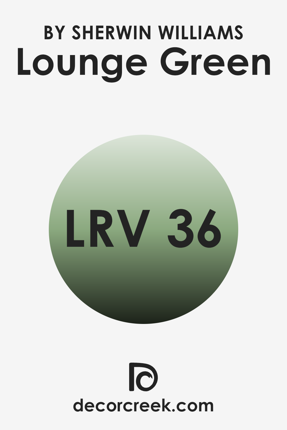
What is the LRV of Lounge Green SW 6444 by Sherwin Williams?
LRV stands for Light Reflectance Value, a measure that indicates how much light a paint color reflects when it’s on your walls. This value ranges from 0, which is the darkest, absorbing most of the light, to 100, the brightest, reflecting most of the light. The LRV can have a big impact on the appearance and feel of a room. High LRV colors can make a room feel more open and airy because they reflect more light around the space. Conversely, colors with lower LRVs absorb more light, which can make a room feel cozier but smaller and darker.
For the color in question, with an LRV of about 35.557, it falls into the category of mid-range colors that don’t reflect a large amount of light but aren’t extremely dark either.
This particular shade of green will add a moderate level of brightness to a room but will not brighten it as much as a color with a higher LRV. It’s a good choice if you’re looking for a color that brings character and moodiness without making the space feel too enclosed or dark. Because it won’t reflect a lot of light, artificial lighting or strategic placement of lamps can be used to enhance the room’s ambiance when using this color.
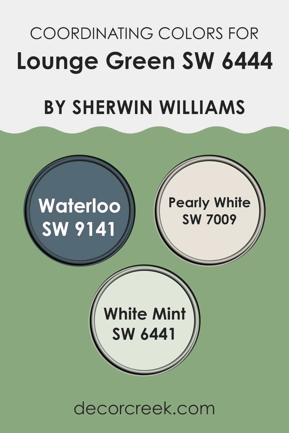
Coordinating Colors of Lounge Green SW 6444 by Sherwin Williams
Coordinating colors work together harmoniously to create a visually appealing palette for any space. When it comes to colors like Lounge Green by Sherwin Williams, its bold and vibrant hue pairs well with colors that complement or subtly contrast with it to create a balanced look. For instance, using colors like Waterloo, Pearly White, and White Mint as coordinating colors provides a range of possibilities that ensure a well-rounded and attractive design.
Waterloo is a deep, muted blue that offers a strong contrast to Lounge Green, making it ideal for creating a striking and balanced look. This color can be used for accent walls or furniture to bring depth and interest to a room.
On the other hand, Pearly White is a soft, warm white that works beautifully to offset the intensity of Lounge Green, providing a light and airy feel to any space. It’s perfect for trim, ceilings, or even as the main color in a room to create a fresh, clean backdrop.
Lastly, White Mint offers a gentle touch of color with its subtle green undertone, infusing a space with a hint of freshness without overpowering the boldness of Lounge Green. This color is excellent for smaller accents or in areas that need a slight injection of vibrancy. By choosing these coordinating colors, you can beautifully enhance the aesthetics of a room while maintaining a cohesive look.
You can see recommended paint colors below:
- SW 9141 Waterloo
- SW 7009 Pearly White
- SW 6441 White Mint
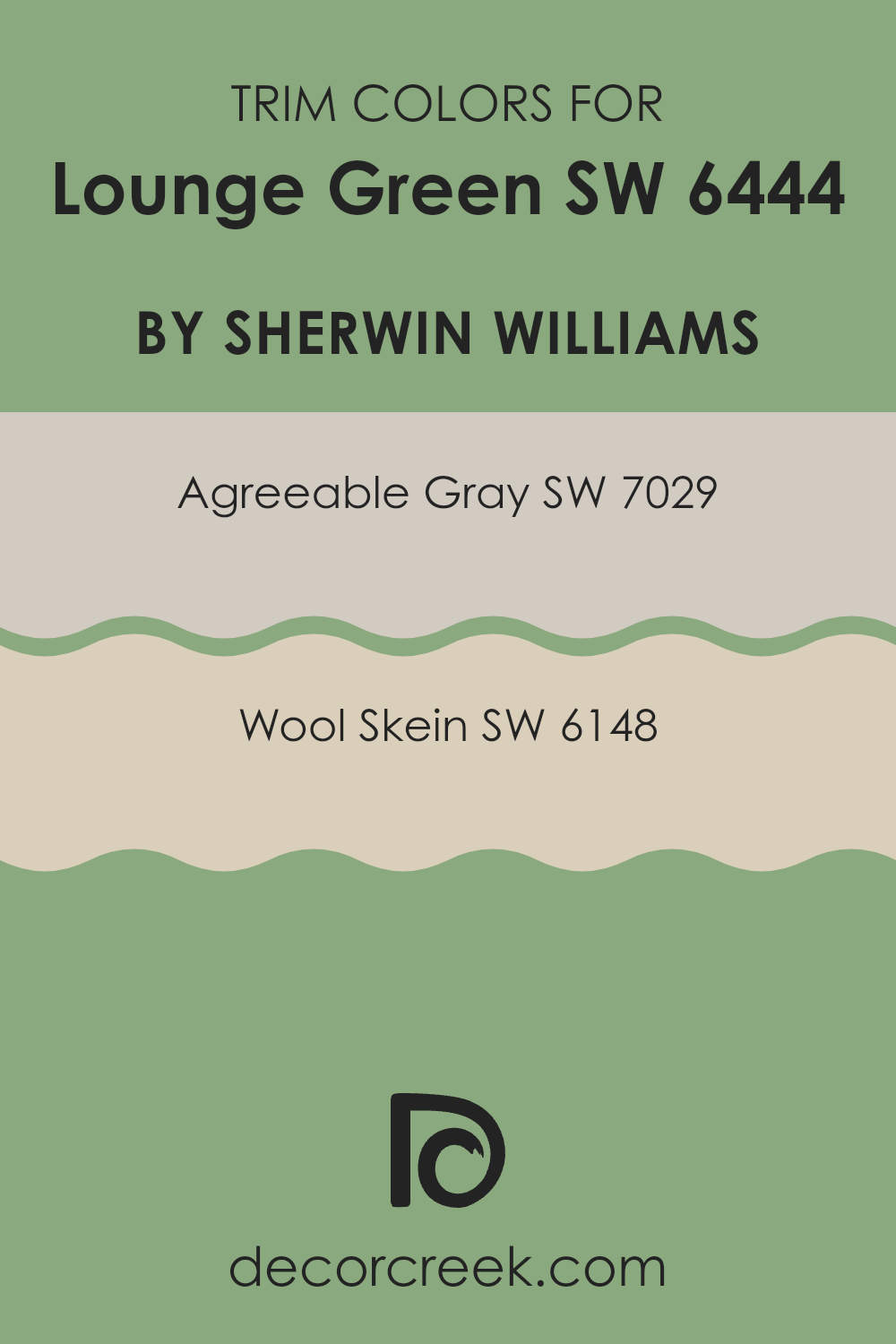
What are the Trim colors of Lounge Green SW 6444 by Sherwin Williams?
Trim colors are used to accentuate the main color on walls, providing a subtle yet effective contrast that can make architectural details pop and give a finished look to a room. For a vivid color like Lounge Green by Sherwin Williams, selecting the right trim color is essential to balance the intensity of the green and ensure that the room feels harmonious rather than overwhelming.
Agreeable Gray and Wool Skein, both by Sherwin Williams, are ideal trim choices for Lounge Green as they offer muted tones that can help to soften and balance the boldness of the green.
Agreeable Gray is a gentle gray shade that provides a neutral backdrop, making it a versatile choice that complements the lively Lounge Green without competing for attention. It brings a calm and balancing effect, helping to smooth the transition between the vibrant green and other elements in the room. On the other hand, Wool Skein is a warmer, soft beige that adds a subtle warmth to the space, creating a cozy atmosphere when paired with Lounge Green. Its natural hue helps to maintain a grounded look, ensuring that the green doesn’t overpower the environment but rather enhances it gracefully.
You can see recommended paint colors below:
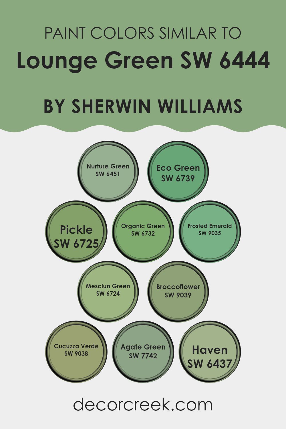
Colors Similar to Lounge Green SW 6444 by Sherwin Williams
Similar colors play a crucial role in interior design by creating a harmonious and visually pleasing environment. For example, if you consider colors similar to Lounge Green, such as Nurture Green, Eco Green, and others, they help maintain a consistent mood in a space while allowing subtle variations that add interest without overwhelming the senses. These shades echo elements of nature, which can bring a fresh and inviting feel to any room.
Nurture Green provides a gentle, leafy hue that is both refreshing and calm, perfect for spaces meant to relax. Eco Green has a slightly more vibrant character, lending a dash of energy to any area. Pickle introduces a light, playful twist with its hint of yellow undertones.
Organic Green remains true to its name with an earthy and natural vibe, ideal for creating an organic atmosphere. Frosted Emerald gives off a cooler, more elegant green, enhancing spaces with a touch of sophistication while still feeling grounded. Mesclun Green serves a muted, dusty appearance that works well in subdued or vintage-themed settings. Broccoflower pulls towards a pale, soothing palette, blending seamlessly with neutral tones.
Cucuzza Verde offers a lively, bright option that can invigorate a room without overpowering it. Agate Green possesses a deep, rich undertone, making it perfect for more dramatic and focused areas. Lastly, Haven exudes a soft, secure feeling, making it great for bedrooms or study areas where comfort is key. Together, these shades create versatile options for both vibrant and understated design schemes.
You can see recommended paint colors below:
- SW 6451 Nurture Green
- SW 6739 Eco Green
- SW 6725 Pickle
- SW 6732 Organic Green
- SW 9035 Frosted Emerald
- SW 6724 Mesclun Green
- SW 9039 Broccoflower
- SW 9038 Cucuzza Verde
- SW 7742 Agate Green
- SW 6437 Haven
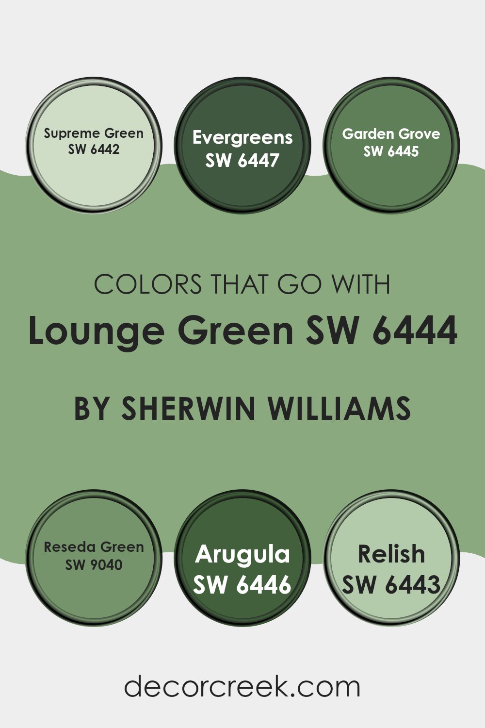
Colors that Go With Lounge Green SW 6444 by Sherwin Williams
Choosing complementary colors for Lounge Green SW 6444 by Sherwin Williams is crucial because finding the right combinations can enhance the overall aesthetic of a space and create a harmonious environment. Colors like Supreme Green, Evergreens, Garden Grove, Reseda Green, Arugula, and Relish each contribute uniquely to the atmosphere and mood of a room.
These colors are specifically selected to work well with Lounge Green due to their varying tones and shades which allow for flexible design choices, whether you are looking for contrast or a more subtle color scheme.
For instance, Supreme Green SW 6442 is a deeper green that adds a strong presence and richness when paired with Lounge Green, offering a solid grounding effect. Evergreens SW 6447, on the other hand, brings a more muted and earthy feel, perfect for spaces aiming for a natural vibe.
Garden Grove SW 6445 introduces a lighter and fresher shade of green, which can help brighten a space effectively while staying within the green palette. Reseda Green SW 9040 brings an old-world charm with its muted, dusty green hue, creating a nostalgic and cozy atmosphere.
Arugula SW 6446 has a lively and vibrant touch, sparking energy and freshness into the room. Lastly, Relish SW 6443 offers a slightly yellowish-green tint, injecting a playful and dynamic character into interiors. Together, these colors provide ample opportunities to create a diverse yet cohesive look when coordinating with Lounge Green.
You can see recommended paint colors below:
- SW 6442 Supreme Green
- SW 6447 Evergreens
- SW 6445 Garden Grove
- SW 9040 Reseda Green
- SW 6446 Arugula
- SW 6443 Relish
How to Use Lounge Green SW 6444 by Sherwin Williams In Your Home?
Lounge Green SW 6444 by Sherwin Williams is a rich and soothing shade of green that can add a cozy and welcoming touch to any room in your home. If you’re thinking about refreshing your living room or bedroom, this color provides a wonderful backdrop, encouraging a relaxed mood.
It pairs beautifully with natural wood tones, bringing out their warmth, and it also works well with both modern and classic decor. In a kitchen, Lounge Green can offer a unique touch when used on cabinets or an accent wall, complementing white or metallic fixtures.
Similarly, in a bathroom, applying this color can create a comforting retreat, especially when matched with soft towels and natural decor elements. Overall, Lounge Green is a versatile paint choice that can help make your home feel more inviting.
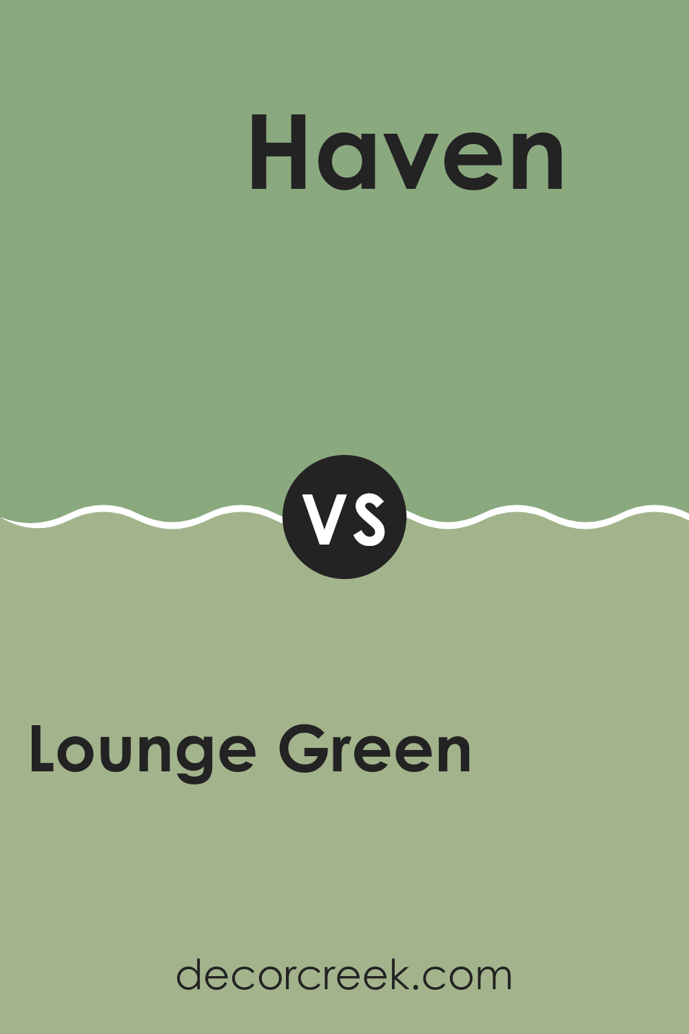
Lounge Green SW 6444 by Sherwin Williams vs Haven SW 6437 by Sherwin Williams
Lounge Green and Haven are both colors by Sherwin Williams but have distinct tones and vibes that suit different settings. Lounge Green is a vivid, rich green that carries a sense of freshness and vitality.
It’s perfect for creating a lively and inviting space, great for areas like living rooms or kitchens where energy is appreciated. On the other hand, Haven is a softer, more muted green with a subtle, calming quality.
This color works well in places where you want to relax, such as bedrooms or bathrooms. While Lounge Green stands out and attracts attention, Haven blends smoothly into the surroundings, providing a gentle background that’s easy on the eyes. Both colors offer unique atmospheres and can be chosen based on the mood you wish to achieve in your space.
You can see recommended paint color below:
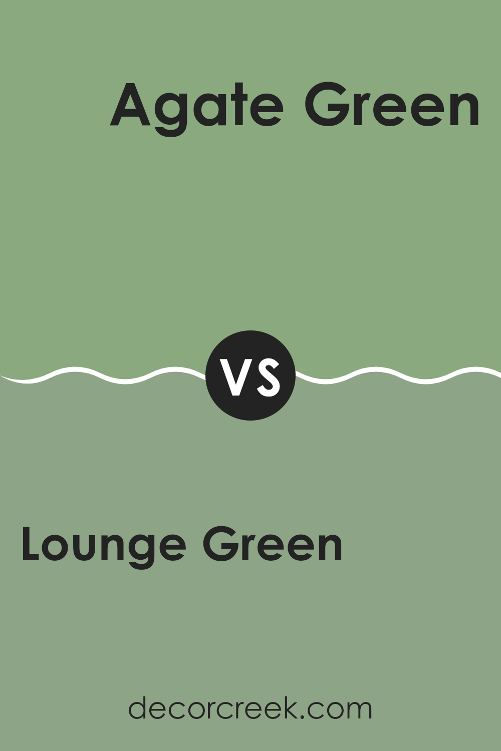
Lounge Green SW 6444 by Sherwin Williams vs Agate Green SW 7742 by Sherwin Williams
Lounge Green and Agate Green by Sherwin Williams are both unique shades of green, yet they bring different vibes to a space. Lounge Green is a darker, more intense color. It has a bold presence and adds a sense of depth to any room, making it ideal for an accent wall or a space where you want a strong backdrop.
On the other hand, Agate Green is lighter and more subtle. It feels fresh and airy, perfect for creating a relaxed, inviting atmosphere in places like kitchens or bathrooms.
When comparing these two, Lounge Green stands out as a more vibrant choice, which might not blend as effortlessly into all spaces as Agate Green can. Agate Green’s softer hue offers more flexibility and can be easier to match with a variety of decor styles and other colors. Either color could be a great choice, depending on what mood or style you’re aiming to achieve in your room.
You can see recommended paint color below:
Lounge Green SW 6444 by Sherwin Williams vs Eco Green SW 6739 by Sherwin Williams
Lounge Green and Eco Green are two distinct shades from Sherwin Williams, each offering a unique character and mood for interior spaces. Lounge Green is a darker, more muted green.
This makes it great for creating a cozy and comfortable atmosphere in spaces like living rooms or bedrooms, where a calming effect is desired. On the other hand, Eco Green has a brighter, more vibrant tone. It injects energy and cheer into a room, making it a fantastic choice for kitchens, bathrooms, or any area where a lively, refreshing vibe is wanted.
Although both colors share a green base, Lounge Green leans towards a subtler, richer depth, while Eco Green stands out with its lively brightness. Deciding between them depends on the kind of mood you want to set in your space.
You can see recommended paint color below:
- SW 6739 Eco Green
Lounge Green SW 6444 by Sherwin Williams vs Pickle SW 6725 by Sherwin Williams
Lounge Green and Pickle are two distinct colors by Sherwin Williams, each bringing its unique vibe to spaces. Lounge Green is a rich, deep shade that leans towards a traditional green with a hint of darkness, making it ideal for creating a cozy, welcoming atmosphere in rooms. It’s a great choice for living rooms or libraries, where you want a touch of nature’s calmness without going too bright.
On the other hand, Pickle is a much lighter and vibrant green. It has a fresh, lively look that can instantly brighten up a space. This color is perfect for kitchens, bathrooms, or any area that benefits from a splash of cheerfulness. Its energetic tone contrasts sharply with the more reserved Lounge Green, offering a more playful and youthful vibe.
When choosing between these two, consider the mood you want to set. Lounge Green works well in relaxed, refined settings, while Pickle is better suited for fun, dynamic spaces.
You can see recommended paint color below:
- SW 6725 Pickle
Lounge Green SW 6444 by Sherwin Williams vs Nurture Green SW 6451 by Sherwin Williams
Lounge Green and Nurture Green are both versatile shades by Sherwin Williams, but they serve different vibes. Lounge Green is a deeper, more saturated color, resembling the lushness of a dense forest. This makes it great for creating a cozy and inviting atmosphere in spaces like living rooms or studies where you spend a lot of time relaxing.
On the other hand, Nurture Green is lighter and has a fresher appearance. It leans slightly towards a spring-like feel, making it ideal for spaces that you want to keep bright and airy, such as kitchens or sunrooms. It reflects more light, which can make smaller rooms feel bigger and more open.
Both colors can work beautifully in different areas of the home, depending on the mood you want to set and the natural lighting available in each room. Whether you choose the rich depth of Lounge Green or the refreshing vibe of Nurture Green, both bring a touch of nature indoors.
You can see recommended paint color below:
Lounge Green SW 6444 by Sherwin Williams vs Cucuzza Verde SW 9038 by Sherwin Williams
Lounge Green is a vibrant, deep green with a hint of gray, making it a rich and cozy color for spaces where a touch of nature’s depth is desired. It pairs well in rooms that benefit from a grounding, yet lively atmosphere, such as living rooms or studies.
On the other hand, Cucuzza Verde is a lighter, more subtle green. It has an airy, fresh feel that’s perfect for brightening up spaces and giving them a clean, refreshing vibe. This color works well in kitchens, bathrooms, and spaces that need a touch of lightness.
While both colors are green, Lounge Green is darker and more intense, providing a bold backdrop that makes white trims or bright colors pop. Cucuzza Verde’s lighter tone offers a more understated look, ideal for creating a breezy and open feeling. They serve different purposes based on how much impact you want the color to have in your space.
You can see recommended paint color below:
- SW 9038 Cucuzza Verde
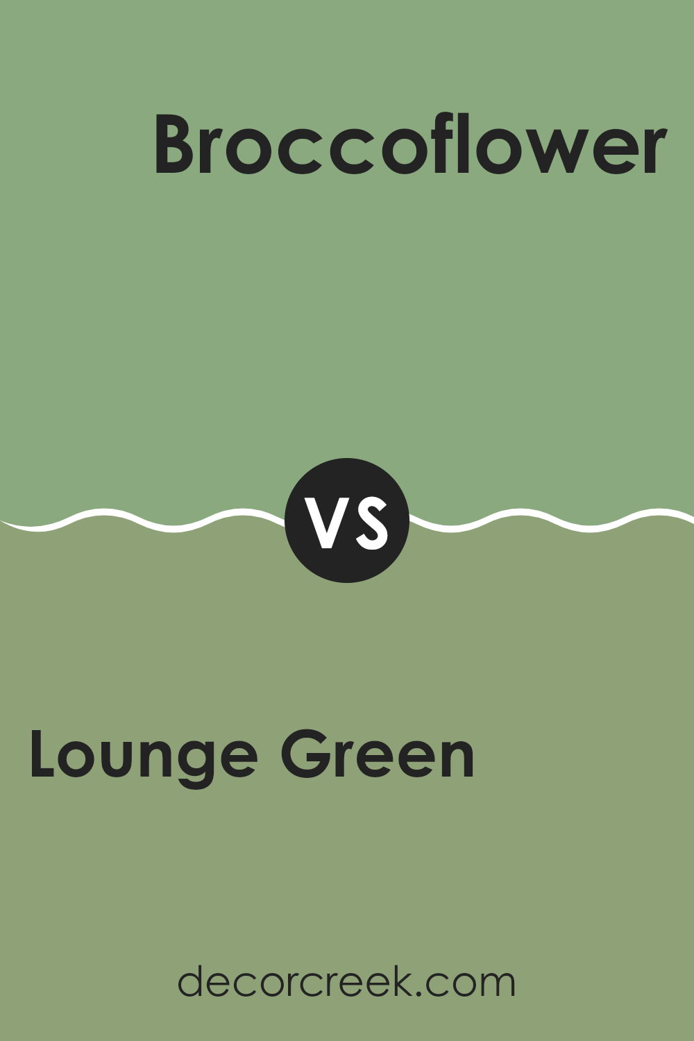
Lounge Green SW 6444 by Sherwin Williams vs Broccoflower SW 9039 by Sherwin Williams
Lounge Green by Sherwin Williams is a bold, vivid shade of green. It carries a lively, vibrant vibe with its deep and rich tone. This color can make a strong statement in a space, perfect for someone looking to give their room a touch of drama.
On the other hand, Broccoflower is a much softer green. This color is muted and subtle, making it very easy to match with different decor styles. It has a gentle, calming effect, and is ideal for creating a relaxed atmosphere.
While Lounge Green is more suited for a focal point or an accent wall due to its deeper tone, Broccoflower works well for larger areas, providing a neutral backdrop that is easy on the eyes. Both colors offer distinct mood-setting abilities, with Lounge Green adding energy and Broccoflower promoting a soft, peaceful environment.
You can see recommended paint color below:
- SW 9039 Broccoflower
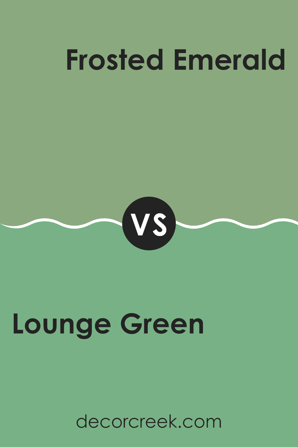
Lounge Green SW 6444 by Sherwin Williams vs Frosted Emerald SW 9035 by Sherwin Williams
Lounge Green and Frosted Emerald are two distinct shades by Sherwin Williams, each offering a unique vibe. Lounge Green is a deeper, richer green that has a cozy and warm feel, perfect for spaces where you want to relax and feel snug. This color can make a room feel more enclosed and intimate, due to its darker tone.
On the other hand, Frosted Emerald is lighter and has a fresher appearance. It suits spaces that aim for a lively and refreshing ambience. Its brightness brings a more open and airy feel to a room, making it feel more spacious and invigorating.
While both colors are green, their impact is quite different based on their depth and brightness. Lounge Green works well in areas for unwinding, like dens or bedrooms, whereas Frosted Emerald is great for energizing a space, such as kitchens or bathrooms. Each color sets a different mood, allowing for personal preference depending on the desired atmosphere of the room.
You can see recommended paint color below:
- SW 9035 Frosted Emerald
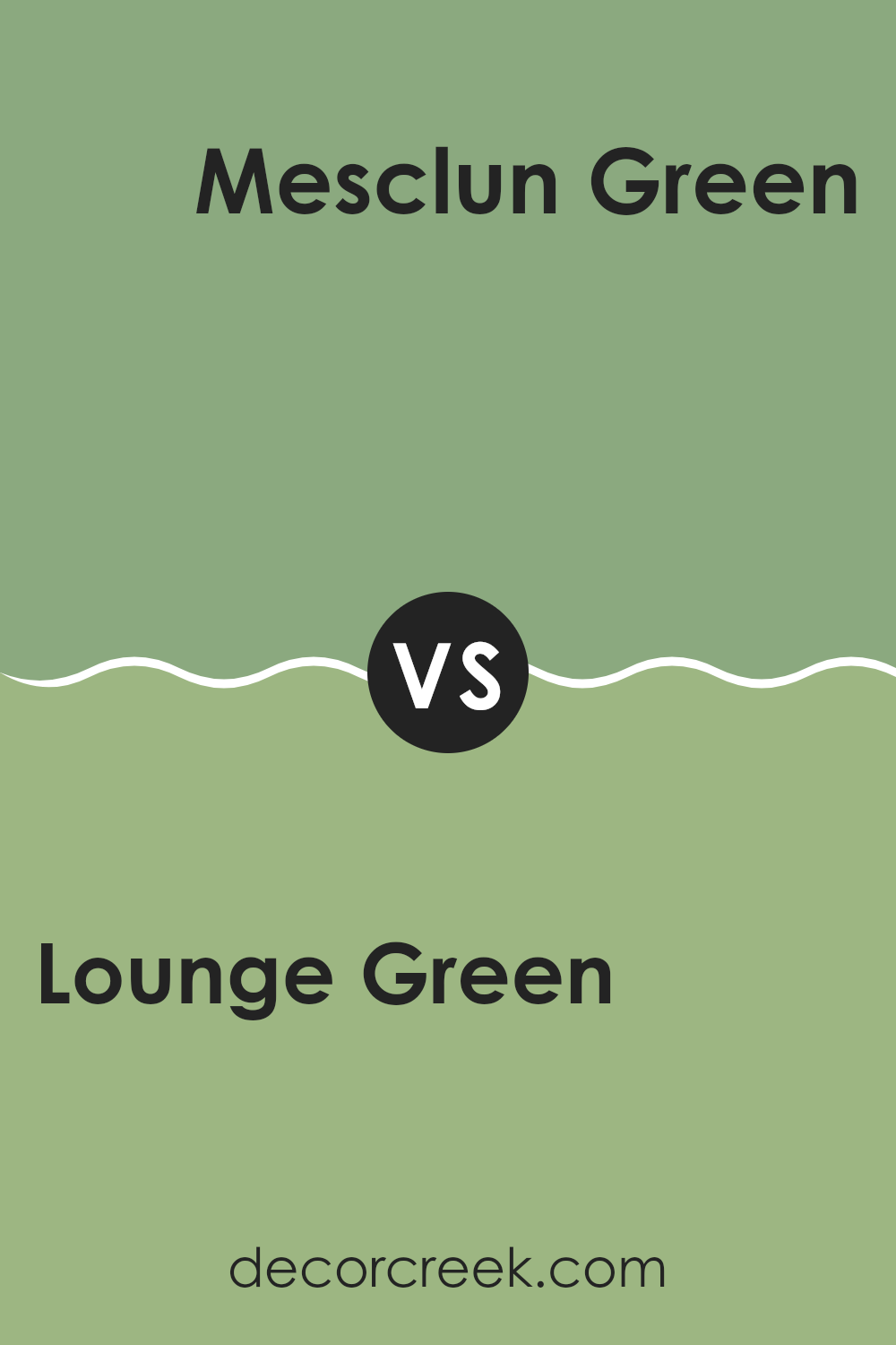
Lounge Green SW 6444 by Sherwin Williams vs Mesclun Green SW 6724 by Sherwin Williams
Lounge Green and Mesclun Green are both unique shades from Sherwin Williams but they cater to different tastes in color. Lounge Green is a deep, lush green that brings to mind the dense foliage of a forest. It’s perfect for spaces where you want to add a sense of richness and depth.
This color can make a room feel cozy and inviting, especially in well-lit areas or where you want to create a focal point. On the other hand, Mesclun Green is noticeably lighter and has a fresh, vibrant quality that resembles spring greens or young leaves.
It’s brighter and can make a room look more lively and bright. Mesclun Green works well in spaces that aim for a cheerful and airy atmosphere. While both are greens, Lounge Green leans towards a moodier, more traditional look, whereas Mesclun Green is fresher and more modern.
You can see recommended paint color below:
- SW 6724 Mesclun Green
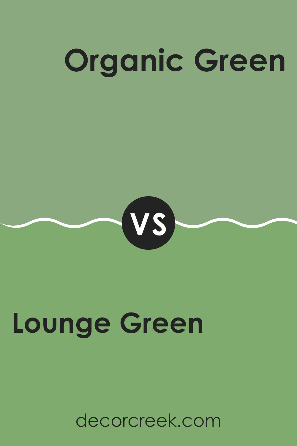
Lounge Green SW 6444 by Sherwin Williams vs Organic Green SW 6732 by Sherwin Williams
Lounge Green SW 6444 and Organic Green SW 6732, both from Sherwin Williams, offer unique but contrasting green tones for different vibes in your space. Lounge Green is a dark, rich green, giving a room a cozy, grounding effect. It displays a traditional elegance, perfect for creating a focal point in living areas or bedrooms without overwhelming the senses.
On the other hand, Organic Green is a vibrant, lively shade. It radiates energy and brightness, making it ideal for spaces that aim to stimulate positivity and creativity, such as kitchens or playrooms. Its vividness brings a refreshing atmosphere, especially in well-lit, airy settings.
While Lounge Green sets a moodier, more reserved tone, Organic Green punches up the vibrancy, offering a cheerier ambiance. Both colors carry the inherent calmness and natural feel typical of greens but cater to different emotional and decorative outcomes, depending on your room’s purpose and lighting.
You can see recommended paint color below:
- SW 6732 Organic Green
Conclusion
After learning all about SW 6444 Lounge Green by Sherwin Williams, I feel like it’s a fantastic choice for anyone looking to give their room a fresh and lively touch. This paint color is a dark and rich green that seems to bring a bit of the outside world into any home.
It reminds me of being in the middle of a deep, enchanting forest. The beauty of Lounge Green is that it can make a place feel cozy and warm, perfect for rooms where you want to relax, like living rooms or bedrooms.
Using Lounge Green can also add a lot of character to furniture if you’re thinking of painting an old chair or table. It pairs well with so many colors, from bright whites to much softer tones.
So, if you’re someone who loves nature or just wants to liven up your home with a color that’s both beautiful and not too in-your-face, Lounge Green could be the way to go. I can definitely see it making any room better with its lovely, eye-catching shade.
Ever wished paint sampling was as easy as sticking a sticker? Guess what? Now it is! Discover Samplize's unique Peel & Stick samples.
Get paint samples

